Embed Size (px)
Citation preview
On the Subject of the Ready-Madeor Using a Rembrandt as an Ironing Board
Works from the Daimler Art Collection
selected by Bethan Huws on the occasion of 100 years of the ready-made
With loans from the Duchamp Archive of Staatsgalerie Stuttgart
November 25th, 2016 — May 14th, 2017
Daimler Contemporary Berlin

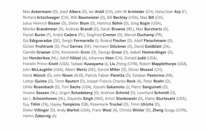
Max Ackermann (D), Josef Albers (D), Ian Anüll (CH), John M Armleder (CH), Hans/Jean Arp (F), Richard Artschwager (CH), Willi Baumeister (D), Bill Beckley (USA), Max Bill (CH), Julius Heinrich Bissier (D), Dieter Blum (D), Hartmut Böhm (D), Greg Bogin (USA), Monika Brandmeier (D), Andreas Brandt (D), Sarah Browne (IRL), Max Burchartz (D), Daniel Buren (F), André Cadere (PL), Siegfried Cremer (D), Marcel Duchamp (FR), Gia Edzgveradze (GE), Sergio Fermariello (I), Roland Fischer (D), Adolf Fleischmann (D), Günter Fruhtrunk (D), Poul Gernes (DK), Hermann Glöckner (D), David Goldblatt (ZA), Camille Graeser (CH), Konstantin Grcic (D), George Grosz (D), Isabell Heimerdinger (D), Jan Henderikse (NL), Adolf Hölzel (A), Johannes Itten (CH), Donald Judd (USA), Franklin Prince Knott (USA), Tadaaki Kuwayama (J), Liu Zheng (CHN), Robert Mapplethorpe (USA), John McLaughlin (USA), Albert Mertz (DK), Gerold Miller (D), Olivier Mosset (CH), Horst Münch (D), John Nixon (AUS), Patrick Fabian Panetta (D), Esteban Pastorino (AR), Lothar Quinte (D), Timm Rautert (D), Joseph Francis Charles Rock (A), Peter Roehr (D), Ulrike Rosenbach (D), Tom Sachs (USA), Kiyoshi Sakamoto (J), Pietro Sanguineti (D), Viviane Sassen (NL), Jürgen Schadeberg (D), Andreas Schmid (D), Leonhard Schmidt (D), Jan J. Schoonhoven (NL), Dayanita Singh (IND), Anton Stankowski (D), Elaine Sturtevant (USA), Guy Tillim (ZA), Hayley Tompkins (GB), Rosemarie Trockel (D), Timm Ulrichs (D), Dieter Villinger (D), Andy Warhol (USA), Franz West (A), Christa Winter (D), Zheng Guogu (CHN), Heimo Zobernig (A)
4
The concept of the ready-made was “born” in 1916 when
Marcel Duchamp, in New York, defined it in a letter to his
sister in Paris. The aim of the ready-made is to achieve a
radical revaluation of artistic production: this consists
principally of an act of selection and reduction applied to
already existing elements, with the focus on “exhibition-
immanent” aspects such as presentation, communication,
documentation, and dissemination. Furthermore, the
ready-made redefines the reality character and the repro-
duction function of the artwork as well as the role of ob-
servers as “interpreters.”
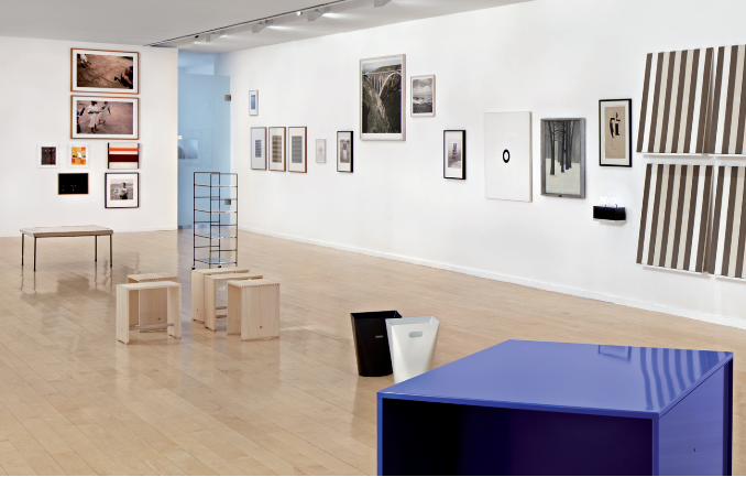
Whilst the Daimler Art Collection’s serial exhibition blocks
have previously concentrated on the collection’s own ar-
eas of interest in the realm of minimalist and conceptual
tendencies from the 20th century to the present day, the
exhibition “On the Subject of the Ready-Made” explores
the historical and contemporary significance of the ready-
made, using artworks from the collection. The intention
is that the aspects of art theory and art criticism should
be incorporated as critical factors in the history of the
reception of ready-mades.
Bethan Huws is a conceptual artist who synthesizes a va-
riety of artistic media in location-specific and space-related
artworks, each time renegotiating the significance of art
in society. The basis for her work is provided by language:
the spoken word, and the communicative system. Her ar-
tistic praxis unites language artworks in the form of wall
texts, book objects, neon sign texts, readings, perfor-
mances, and text vitrines with ready-mades, sculptures,
and films. For the exhibition “On the Subject of the Ready-
Made” the artist has devised a location specific project,
selecting examples of artwork from the Daimler Art Col-
lection.
Bethan Huws’ curatorial concept starts with Duchamp’s
praxis of a combinatorial thinking, the inherent logic and
the analytical wealth of allusions found in Duchamp’s con-
5
ceptual approach. She represents these aspects through
the visual neighborhood of artworks from one hundred
years of art history, surprisingly juxtaposed so that they
provide a commentary on one another. The exhibition’s
title is a play-on-words on the famous dictum of Lautré-
amont: “As beautiful as the chance meeting on a dissect-
ing-table of a sewing-machine and an umbrella,” 1874,
which became a defining slogan of the Surrealists, and
also anticipated the ready-made in linguistic form. In 1959,
Duchamp adapted this for the concept of a “reciprocal
ready-made”: “You take a picture by Rembrandt and, in-
stead of looking at it, simply use it as an ironing-board.”1
Renate Wiehager
Head of Daimler Art Collection, Stuttgart/Berlin
Endnotes
1 Marcel Duchamp: Duchamp du signe, suivi de Notes, ed. by Paul Matisse and Michel Sanouillet, Flammarion, Paris 1994, p. 49.
6
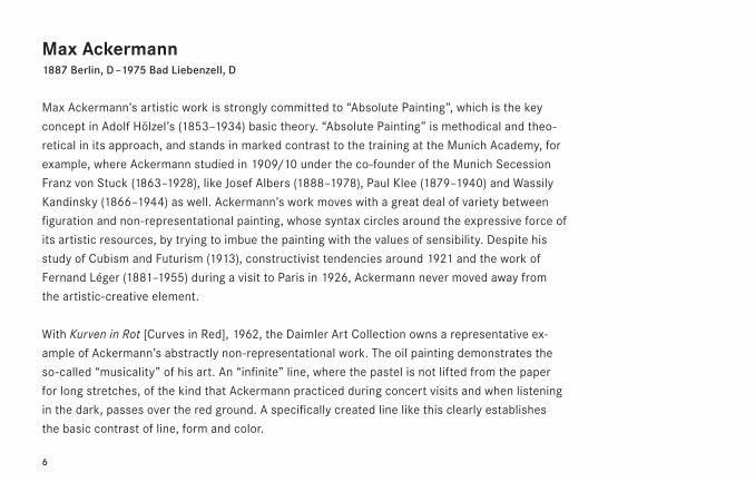
Max Ackermann1887 Berlin, D – 1975 Bad Liebenzell, D
Max Ackermann’s artistic work is strongly committed to “Absolute Painting”, which is the key
concept in Adolf Hölzel’s (1853–1934) basic theory. “Absolute Painting” is methodical and theo-
retical in its approach, and stands in marked contrast to the training at the Munich Academy, for
example, where Ackermann studied in 1909/10 under the co-founder of the Munich Secession
Franz von Stuck (1863–1928), like Josef Albers (1888–1978), Paul Klee (1879–1940) and Wassily
Kandinsky (1866–1944) as well. Ackermann’s work moves with a great deal of variety between
figuration and non-representational painting, whose syntax circles around the expressive force of
its artistic resources, by trying to imbue the painting with the values of sensibility. Despite his
study of Cubism and Futurism (1913), constructivist tendencies around 1921 and the work of
Fernand Léger (1881–1955) during a visit to Paris in 1926, Ackermann never moved away from
the artistic-creative element.
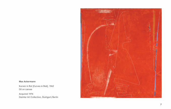
With Kurven in Rot [Curves in Red], 1962, the Daimler Art Collection owns a representative ex-
ample of Ackermann’s abstractly non-representational work. The oil painting demonstrates the
so-called “musicality” of his art. An “infinite” line, where the pastel is not lifted from the paper
for long stretches, of the kind that Ackermann practiced during concert visits and when listening
in the dark, passes over the red ground. A specifically created line like this clearly establishes
the basic contrast of line, form and color.
7
Max Ackermann
Kurven in Rot [Curves in Red], 1962 Oil on canvas
Acquired 1976 Daimler Art Collection, Stuttgart/Berlin
8
Josef Albers1888 Bottrop, D – 1976 New Haven, USA
In 1922 Josef Albers came to the Bauhaus at the age of 32 and became technical director of the
glass workshop as a Bauhaus journeyman. Before he had studied at the Kunstgewerbeschule
[arts-and-crafts school] in Essen from 1916-19 under Jan Thorn Prikker (1868–1932) who was
already almost entirely committed to working with glass by this time, and introduced Albers to
this art. At the Bauhaus Alber’s principle was to instill the idea of deploying available resources
economically, using newspapers among other things to show his students how to think construc-
tively and to prefer handling materials skillfully to a beautiful result. As well as teaching, Albers
designed furniture, cutlery and crockery, including for example the occasional tables now known
as Nesting Tables.
9
Josef Albers
Nesting Tables (Draft), 1926/27 Re-Edition Vitra Design 2005, set of four tables Oak massive, painted acrylic glass
Acquired 2005 Daimler Art Collection, Stuttgart/Berlin
10
Ian Anüll *1948 in Sempach, CH – lives in Zurich, CH
The issue of the significance of art within the fabric of the market and consumerism, power and
money, is a central theme in the artistic work of Ian Anüll. His artworks reflect the current opera-
tion of the art world, which understands pictures largely as brand articles, in a critical and ironic
fashion. The painting acquired by the Daimler Art Collection—Untitled, 1985/86—is part of
Anüll’s series of script images, which are variations on the term “product”. The Latin letters O
and P, plus their Cyrillic equivalents, are taken from that term and placed on the central axis
of an ensemble consisting of seven canvases, arranged in the form of a cross. Thus, the semantic
sign of art is placed in an object context that allows new associations to form. Fittingly, Anüll’s
canvases reference the monochrome paintings of Kasimir Malevich (1878-1935) and Yves Klein
(1928-62), but with the coloration on prosaic cardboard packaging material. The shape of the
cross also references the central motif of Christian iconography and children’s hopping games,
which use fields marked out in chalk on the street. Through the unaccustomed bringing together
of diverse and, properly speaking, fixed terms, signs, and symbols, Anüll’s artworks open up
a new visual system that simultaneously shows up and disrupts the fetishized character of art.
11
Ian Anüll
Untitled, 1985/86 Oil on canvas
Acquired 2003 Daimler Art Collection, Stuttgart/Berlin
12
John M Armleder*1948 in Geneva, CH – lives in Geneva, CH
Since the early 1980s, John M Armleder has been subjecting the “meaningful” content of art to
critical reflection. The references in his paintings relate to the pioneers of Abstraction—i.e. Con-
structivist or Concrete Art. However, they neither resume the relevant art trends nor do they
represent an analytical genealogy nor do they quote word for word. Armleder’s treatment of
these styles is characterized by a critical reflection of culture: he separates the inherently uto-
pian, artistic and social approaches of these art trends from the formulation of his pictures which
thereby lose all discursive structure and flirt with decoration. In this way, the signs of abstraction
transform into formal vocabulary, devoid of content, into ready-mades which can be arranged in
ever-new combinations.
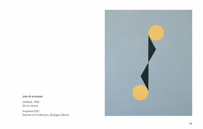
13
John M Armleder
Untitled, 1985 Oil on canvas
Acquired 2001 Daimler Art Collection, Stuttgart/Berlin
14
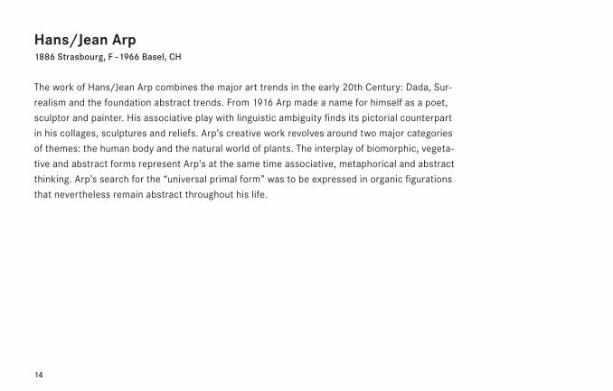
Hans/Jean Arp1886 Strasbourg, F – 1966 Basel, CH
The work of Hans/Jean Arp combines the major art trends in the early 20th Century: Dada, Sur-
realism and the foundation abstract trends. From 1916 Arp made a name for himself as a poet,
sculptor and painter. His associative play with linguistic ambiguity finds its pictorial counterpart
in his collages, sculptures and reliefs. Arp’s creative work revolves around two major categories
of themes: the human body and the natural world of plants. The interplay of biomorphic, vegeta-
tive and abstract forms represent Arp’s at the same time associative, metaphorical and abstract
thinking. Arp’s search for the “universal primal form” was to be expressed in organic figurations
that nevertheless remain abstract throughout his life.
15
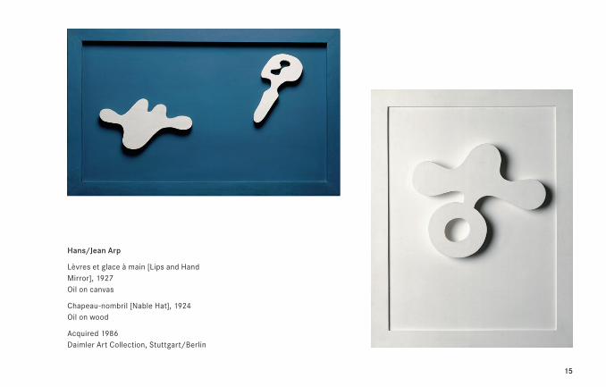
Hans/Jean Arp
Lèvres et glace à main [Lips and Hand Mirror], 1927 Oil on canvas
Chapeau-nombril [Nable Hat], 1924 Oil on wood
Acquired 1986 Daimler Art Collection, Stuttgart/Berlin
16
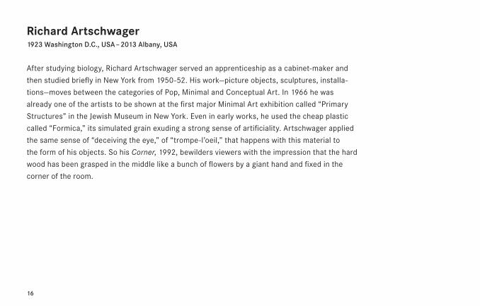
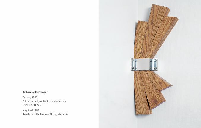
Richard Artschwager1923 Washington D.C., USA – 2013 Albany, USA
After studying biology, Richard Artschwager served an apprenticeship as a cabinet-maker and
then studied briefly in New York from 1950-52. His work—picture objects, sculptures, installa-
tions—moves between the categories of Pop, Minimal and Conceptual Art. In 1966 he was
already one of the artists to be shown at the first major Minimal Art exhibition called “Primary
Structures” in the Jewish Museum in New York. Even in early works, he used the cheap plastic
called “Formica,” its simulated grain exuding a strong sense of artificiality. Artschwager applied
the same sense of “deceiving the eye,” of “trompe-l’oeil,” that happens with this material to
the form of his objects. So his Corner, 1992, bewilders viewers with the impression that the hard
wood has been grasped in the middle like a bunch of flowers by a giant hand and fixed in the
corner of the room.
17
Richard Artschwager
Corner, 1992 Painted wood, melamine and chromed steal, Ed. 18/30
Acquired 1998 Daimler Art Collection, Stuttgart/Berlin
18
Willi Baumeister1889 – 1955 Stuttgart, D
“The purification of painting as an art reveals the very specific basic laws which belong to it
alone. They spring partly from technical production, partly from higher elementary factors
(perceptions of the surface, the sculptural, the color) of the fundamental,” wrote Baumeister
in his book The Unknown in Art in 1947. Two years previously, he had accepted a chair at the
Stuttgarter Akademie, where he and Oskar Schlemmer (1888–1943) had studied around 1910.
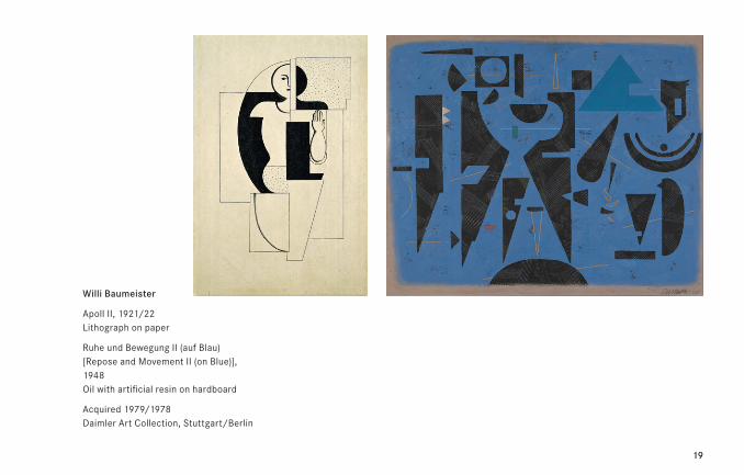
Willi Baumeister’s work Ruhe und Bewegung II (auf Blau) [Repose and Movement II (on Blue)],
1948, renders the theme indicated by the title as an abstract play of forms which seem to float
against the light-blue background like shadow-pictures. While the theme of “Ruhe” [quietness]
is shown by the strictly geometrical forms, “Bewegung” [movement] is shown by the effect of
alternating relationships between figure and background. Emphasizing color as material finds
an appropriate mode of application in this work.
19
Willi Baumeister
Apoll II, 1921/22 Lithograph on paper
Ruhe und Bewegung II (auf Blau) [Repose and Movement II (on Blue)], 1948 Oil with artificial resin on hardboard
Acquired 1979/1978 Daimler Art Collection, Stuttgart/Berlin
20
21
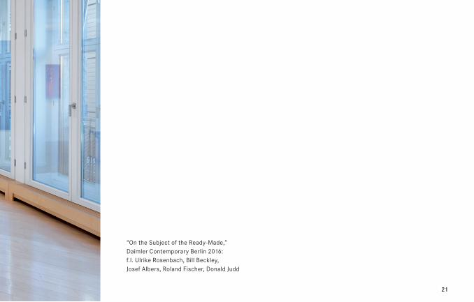
“On the Subject of the Ready-Made,” Daimler Contemporary Berlin 2016: f.l. Ulrike Rosenbach, Bill Beckley, Josef Albers, Roland Fischer, Donald Judd
22
Bill Beckley*1946 in Hamburg, Pennsylvania, USA – lives in New York, USA
Born in Hamburg, Pennsylvania, a small farming town in the Amish countryside, Bill Beckley stud-
ied from 1964 to 1970, finalizing at Tyler School of Art, Temple University, where he met Bruce
Nauman, Dan Flavin, Sol LeWitt, and Marcia Tucker, then a curator at the Whitney Museum.
Through Tucker his work was included in “Art in the Mind” (1969), the first conceptual art exhibi-
tion in the United States. Beckley moved to New York City in 1970. He was one of the artists
(along with Gordon Matta-Clark, Barry Le Va or Bill Bollinger) who organized the first exhibition
of the legendary gallery 112 Greene Street. He met Louise Bourgeois and Vito Acconci, Dennis
Oppenheim became a lifelong friend. He married his second wife in 1986 Laurie Johenning,
a sculptor. They have two sons and live in New York City. Beckley’s staged photographic still lifes,
put together with visual material from different sources, have been of important influence for the
New York artists group “The Pictures Generation” (Cindy Sherman, Robert Longo, Richard Prince,
Louise Lawler et al.).
23
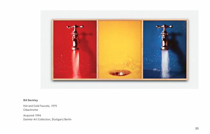
Bill Beckley
Hot and Cold Faucets, 1975 Cibachrome
Acquired 1994 Daimler Art Collection, Stuttgart/Berlin
24
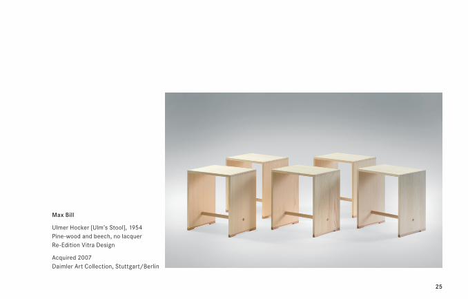
Max Bill1908 Winterthur, CH – 1944 Berlin, D
The commencement of building the Hochschule für Gestaltung Ulm (HfG Ulm) in 1953 marks the
culmination in Max Bill’s biography of all of his previous studies and work. As the founding rector
at the college he was responsible for the future of its comprehensive tuition, as the college’s
architect he clearly formulated the idea of continuing the Bauhaus tradition in post-war Germany
and as director of the architecture and design department Bill continued his activities as an
all-round designer. The mobile seating Ulmer Hocker [Ulm’s Stool], 1954, designed together with
Hans Gugelot (1920–65) for the students of the HfG Ulm, is exemplary for his idea of “good
design” in which Bill combined functional, cultural and economic demands with new ideas of use.
In the 1950s Bill also designed clocks and watches for the company Junghans. Also dating from
1949 to 1960 is a series of furniture designs, including three-legged stools, the threeroundtable
and square-round-table.
25
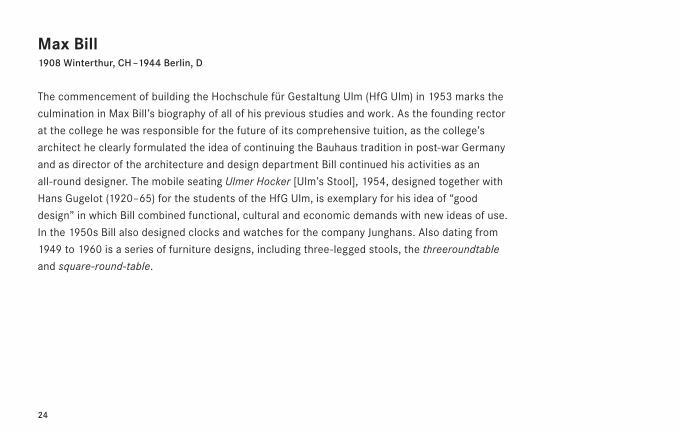
Max Bill
Ulmer Hocker [Ulm’s Stool], 1954 Pine-wood and beech, no lacquer Re-Edition Vitra Design
Acquired 2007 Daimler Art Collection, Stuttgart/Berlin
26
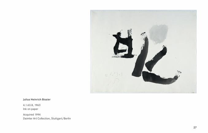
Julius Heinrich Bissier1893 Freiburg/Breisgau, D – 1965 Ascona, CH
Julius Heinrich Bissier’s metaphysical and meditative artworks place him somewhere between
the early abstract art of the first half of the 20th century and the expressive phase of Informel
post-war art. Bissier arrived at abstract art through the route of “old master” traditional German
painting and Neue Sachlichkeit [New Objectivity], also consistently retaining a sense of spiritual
aspiration. Ink drawings are nothing new for Bissier, who created his first ink drawing in 1926.
Four years later, during a trip to Paris, Bissier met the sculptor Constantin Brâncuşi (1876–1957).
He subsequently began to experiment with non-representational ink drawings, which were to
rapidly become a key part of his oeuvre. These well-known abstract images inspired by Chinese
calligraphy clearly show the influence of the sinologist Ernst Grosse (1862–1927) on the young
artist. Grosse was a friend and father figure who first introduced Bissier to the art and philosophy
of Asia in 1919. 4.1.63.8 from the year 1963 is an ink drawing of this type, very reminiscent
of Asiatic script.
27
Julius Heinrich Bissier
4.1.63.8, 1963 Ink on paper
Acquired 1994 Daimler Art Collection, Stuttgart/Berlin
28
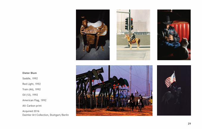
Dieter Blum*1936 in Esslingen, D – lives in Düsseldorf, D
Dieter Blum was invited to a first test shoot for Marlboro in the USA in 1992. The pictures from
this shoot provided the basis for Blum’s subsequent fame as the most internationally kown
photographer working in this context. Blum was a strong influence not only on the Marlboro
campaign, but on the product advertising and documentary photography of the era in general.
A short while later, his photographs provided the “material” for the famous cowboy photos
by Richard Prince (*1949)—making his work indirectly relevant to the art context, too.
Blum has been creating commercial and free artistic photography since the 1960s. His photo-
graphic series are dedicated to themes such as Africa, Nippon, German landmarks, dance, Shell,
and portraits of artists and musicians. His artwork has been exhibited in numerous German and
international galleries and museums. In 2015, Blum received the “Grande Médaille de Vermeil”
from the “Société des Arts-Sciences-Lettres” for his life’s work—the first photographer, and one
of only a small number of Germans, to do so in the society’s 100-year history.
29
Dieter Blum
Saddle, 1992
Red Light, 1992
Train (46), 1992
Oil (12), 1992
American Flag, 1992
All: Carbon print
Acquired 2016 Daimler Art Collection, Stuttgart/Berlin
30
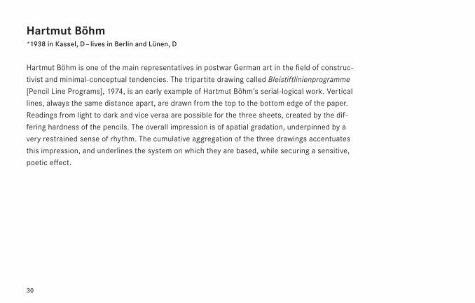
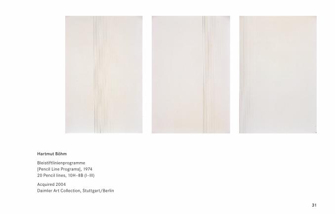
Hartmut Böhm*1938 in Kassel, D – lives in Berlin and Lünen, D
Hartmut Böhm is one of the main representatives in postwar German art in the field of construc-
tivist and minimal-conceptual tendencies. The tripartite drawing called Bleistiftlinienprogramme
[Pencil Line Programs], 1974, is an early example of Hartmut Böhm’s serial-logical work. Vertical
lines, always the same distance apart, are drawn from the top to the bottom edge of the paper.
Readings from light to dark and vice versa are possible for the three sheets, created by the dif-
fering hardness of the pencils. The overall impression is of spatial gradation, underpinned by a
very restrained sense of rhythm. The cumulative aggregation of the three drawings accentuates
this impression, and underlines the system on which they are based, while securing a sensitive,
poetic effect.
31
Hartmut Böhm
Bleistiftlinienprogramme [Pencil Line Programs], 1974 20 Pencil lines, 10H–8B (I–III)
Acquired 2004 Daimler Art Collection, Stuttgart/Berlin
32
33
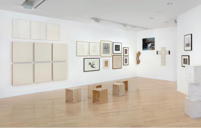
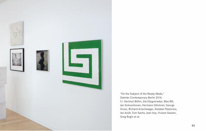
“On the Subject of the Ready-Made,” Daimler Contemporary Berlin 2016: f.l. Hartmut Böhm, Gia Edzgveradze, Max Bill, Jan Schoonhoven, Hermann Glöckner, George Grosz, Richard Artschwager, Esteban Pastorino, Ian Anüll, Tom Sachs, Jean Arp, Viviane Sassen, Greg Bogin et al.
34
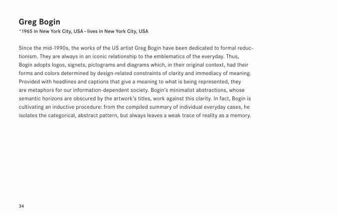
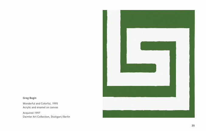
Greg Bogin*1965 in New York City, USA – lives in New York City, USA
Since the mid-1990s, the works of the US artist Greg Bogin have been dedicated to formal reduc-
tionism. They are always in an iconic relationship to the emblematics of the everyday. Thus,
Bogin adopts logos, signets, pictograms and diagrams which, in their original context, had their
forms and colors determined by design-related constraints of clarity and immediacy of meaning.
Provided with headlines and captions that give a meaning to what is being represented, they
are metaphors for our information-dependent society. Bogin’s minimalist abstractions, whose
semantic horizons are obscured by the artwork’s titles, work against this clarity. In fact, Bogin is
cultivating an inductive procedure: from the compiled summary of individual everyday cases, he
isolates the categorical, abstract pattern, but always leaves a weak trace of reality as a memory.
35
Greg Bogin
Wonderful and Colorful, 1995 Acrylic and enamel on canvas
Acquired 1997 Daimler Art Collection, Stuttgart/Berlin
36
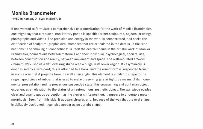
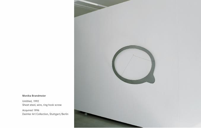
Monika Brandmeier*1959 in Kamen, D – lives in Berlin, D
If one wanted to formulate a comprehensive characterization for the work of Monika Brandmeier,
one might say that a reduced, non-literary poetic is specific for her sculptures, objects, drawings,
photographs and videos. The precision and energy in the work is concentrated, and seeks the
clarification of sculptural-graphic circumstances that are articulated in the details, in the “con-
nections.” The “making of connections” is itself the central theme in the artistic work of Monika
Brandmeier, connections between materials and their individual, psychological, societal use,
between construction and reality, between movement and space. The wall-mounted artwork
Untitled, 1992, shows a flat, oval ring shape with a bulge in its lower region. Its asymmetry is
emphasised by a wire cord; this is attached to a hook, and the round form is suspended from it
in such a way that it projects from the wall at an angle. This element is similar in shape to the
ring-shaped piece of rubber that is used to make preserving jars airtight. By means of its monu-
mental presentation and its precarious suspended state, this unassuming and utilitarian object
experiences an elevation to the status of an autonomous aesthetic object. The wall piece evades
clear and unambiguous perception; as the viewer shifts position, it appears to undergo a meta-
morphosis. Seen from this side, it appears circular, and, because of the way that the oval shape
is obliquely positioned, it can also appear as an upright shape.
37
Monika Brandmeier
Untitled, 1992 Sheet steel, wire, ring hook screw
Acquired 1996 Daimler Art Collection, Stuttgart/Berlin
38
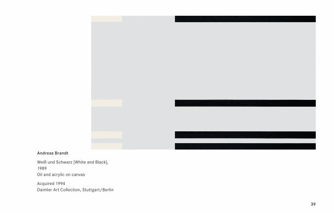
Andreas Brandt1935 Halle/Saale, D – 2016 Niebüll, D
“There is nothing to be said about painting, all we can talk about is the method used to deploy
creative resources in realizing a concept. […] Material is the picture surface, the colors. The sur-
face—in its limitations and extend—has to be set in motion by color.” (A.B.)
Andreas Brandt studied from 1955 to 1961 painting at the Hochschule für Bildende Künste in
Berlin. From 1968/69 onwards he produced works determined by stripes of color on a white
background which display a certain affinity to Joseph Albers’ color studies. The visual weighting
of the colors that confer rhythm and dynamism on the picture space makes vivid impact.
However, Brandt’s early pieces also show recognizable aesthetic relationships with the circle
pictures of Alexander Liberman (1912–99). The reductionist painting of both Liberman and Brandt
shows links in terms of color and form that create an effect not just on color sounds, but also
on spacial quality. From 1980–82 Brandt composed a series of works, in which the colored or
black and white stripes are more strongly emphasized in the left half of the picture. In 1984/85
he developed further variations on this theme—often a large white or gray surface is framed by
colored stripes on the right hand side of the picture. After 1987 he repeatedly interlocked verti-
cal and horizontal stripes with one another in a grid-like manner. In 1989 he began a new series
of pictures, in which only horizontal stripes appear in dialog with the white picture surface.
39
Andreas Brandt
Weiß und Schwarz [White and Black], 1989 Oil and acrylic on canvas
Acquired 1994 Daimler Art Collection, Stuttgart/Berlin
40
Sarah Browne*1981 in Dublin, IRL – lives in Dublin, IRL
Sarah Browne’s work uses “economies” as the dominant metaphor for social and political rela-
tionships as well as classic minimalism—for instance, in the disparities in the machine-produced
object and its status as a “useless” object of non-definable value. Her artistic techniques and
materials reference a milieu of homeliness, housework and personal traces. The emphasis of the
edition of three metallic doorstops for the Daimler Art Collection is also on the idea of a crafted,
functional “everyday sculpture” that fits invisibly into the room while in use. Once it has been
perceived as an artistic contribution, the door stop demonstrates the elements of wit and under-
statement that Browne considers the essence of Eileen Gray’s (1878–1976) design philosophy.
It also represents a concrete answer to the themes dealt with in the artist’s book that forms the
other part of her artwork—concept, seeking, loss and disappearance.
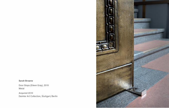
Sarah Browne
Door Stops (Eileen Gray), 2010 Metal
Acquired 2010 Daimler Art Collection, Stuttgart/Berlin
42
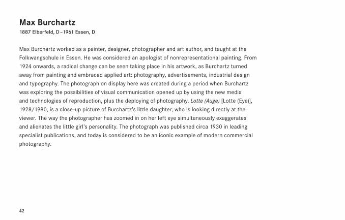
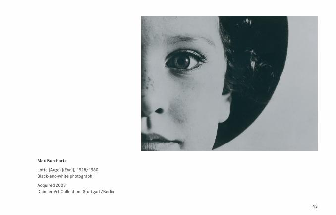
Max Burchartz1887 Elberfeld, D – 1961 Essen, D
Max Burchartz worked as a painter, designer, photographer and art author, and taught at the
Folkwangschule in Essen. He was considered an apologist of nonrepresentational painting. From
1924 onwards, a radical change can be seen taking place in his artwork, as Burchartz turned
away from painting and embraced applied art: photography, advertisements, industrial design
and typography. The photograph on display here was created during a period when Burchartz
was exploring the possibilities of visual communication opened up by using the new media
and technologies of reproduction, plus the deploying of photography. Lotte (Auge) [Lotte (Eye)],
1928/1980, is a close-up picture of Burchartz’s little daughter, who is looking directly at the
viewer. The way the photographer has zoomed in on her left eye simultaneously exaggerates
and alienates the little girl’s personality. The photograph was published circa 1930 in leading
specialist publications, and today is considered to be an iconic example of modern commercial
photography.
43
Max Burchartz
Lotte (Auge) [(Eye)], 1928/1980 Black-and-white photograph
Acquired 2008 Daimler Art Collection, Stuttgart/Berlin
44
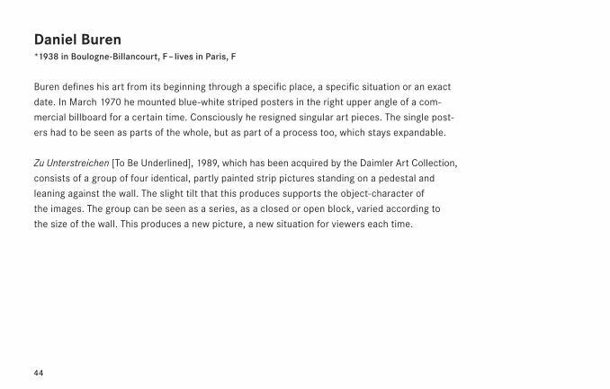
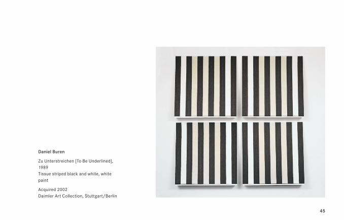
Daniel Buren*1938 in Boulogne-Billancourt, F – lives in Paris, F
Buren defines his art from its beginning through a specific place, a specific situation or an exact
date. In March 1970 he mounted blue-white striped posters in the right upper angle of a com-
mercial billboard for a certain time. Consciously he resigned singular art pieces. The single post-
ers had to be seen as parts of the whole, but as part of a process too, which stays expandable.
Zu Unterstreichen [To Be Underlined], 1989, which has been acquired by the Daimler Art Collection,
consists of a group of four identical, partly painted strip pictures standing on a pedestal and
leaning against the wall. The slight tilt that this produces supports the object-character of
the images. The group can be seen as a series, as a closed or open block, varied according to
the size of the wall. This produces a new picture, a new situation for viewers each time.
45
Daniel Buren
Zu Unterstreichen [To Be Underlined], 1989 Tissue striped black and white, white paint
Acquired 2002 Daimler Art Collection, Stuttgart/Berlin
46
47
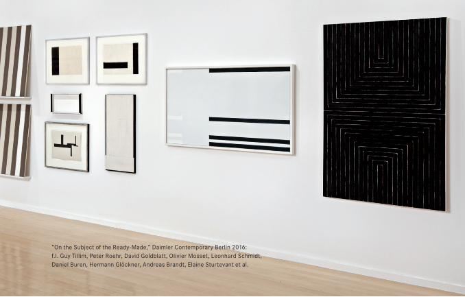
“On the Subject of the Ready-Made,” Daimler Contemporary Berlin 2016: f.l. Guy Tillim, Peter Roehr, David Goldblatt, Olivier Mosset, Leonhard Schmidt, Daniel Buren, Hermann Glöckner, Andreas Brandt, Elaine Sturtevant et al.
48
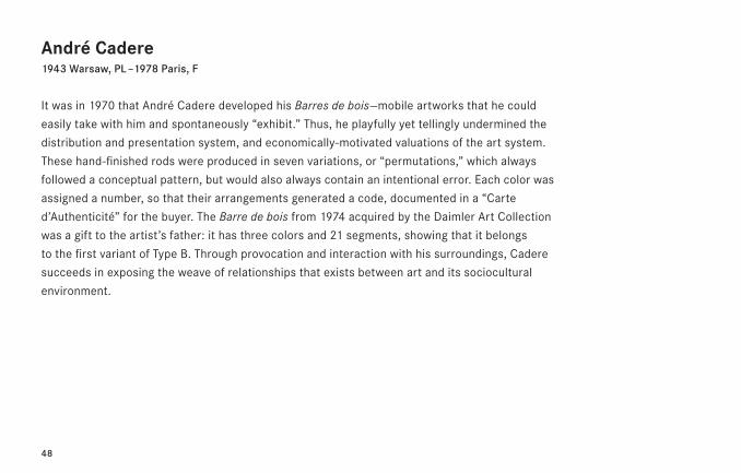
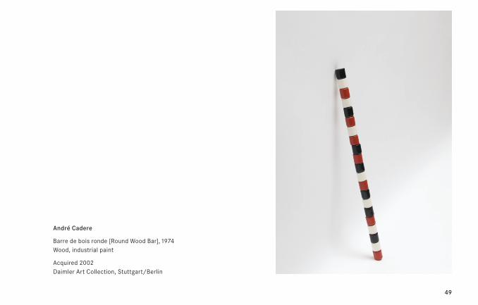
André Cadere1943 Warsaw, PL – 1978 Paris, F
It was in 1970 that André Cadere developed his Barres de bois—mobile artworks that he could
easily take with him and spontaneously “exhibit.” Thus, he playfully yet tellingly undermined the
distribution and presentation system, and economically-motivated valuations of the art system.
These hand-finished rods were produced in seven variations, or “permutations,” which always
followed a conceptual pattern, but would also always contain an intentional error. Each color was
assigned a number, so that their arrangements generated a code, documented in a “Carte
d’Authenticité” for the buyer. The Barre de bois from 1974 acquired by the Daimler Art Collection
was a gift to the artist’s father: it has three colors and 21 segments, showing that it belongs
to the first variant of Type B. Through provocation and interaction with his surroundings, Cadere
succeeds in exposing the weave of relationships that exists between art and its sociocultural
environment.
49
André Cadere
Barre de bois ronde [Round Wood Bar], 1974 Wood, industrial paint
Acquired 2002 Daimler Art Collection, Stuttgart/Berlin
50
Siegfried Cremer1929 Dortmund, D – 2015 Stuttgart, D
Born during the period of German National Socialism, Siegfried Cremer could not, like the elder
generation of artists, pick up again the thread before 1933. Like many other artists at that same
time, Cremer left the framework of Tachism towards an alternating effort with Impressionism
and Constructivism in 1958. Groups of works are recognizable: At first the Wire Sculptures,
1958, the Static Objects, 1959, the Kinetic Objects, 1959/60, the Kinetic Sculptures, 1961/62,
and from 1975 the Peripheral Zones and Distance Images. Following the Wood Collages, 1959,
the work with packaging materials, 1965, the Pictures Behind Glass, 1964/65, the Alphabet
Pictures and Portraits as well as the Wood Reliefs dating from 1975. Consequently, Cremer hit
upon the question of space as the problem in his work by logical application of his experience
gained from training as both a painter and a sculptor.
51
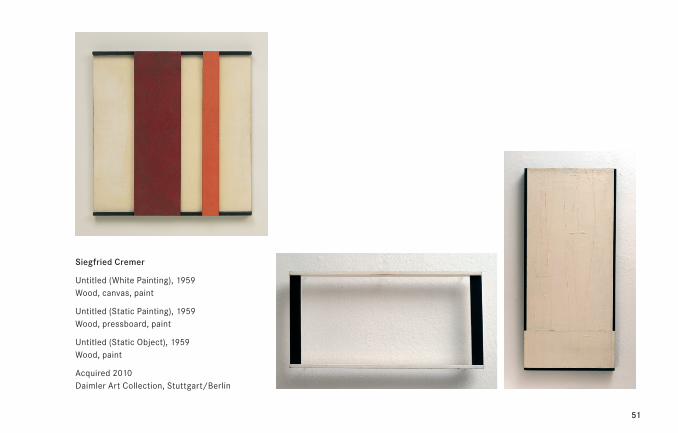
Siegfried Cremer
Untitled (White Painting), 1959 Wood, canvas, paint
Untitled (Static Painting), 1959 Wood, pressboard, paint
Untitled (Static Object), 1959 Wood, paint
Acquired 2010 Daimler Art Collection, Stuttgart/Berlin
52
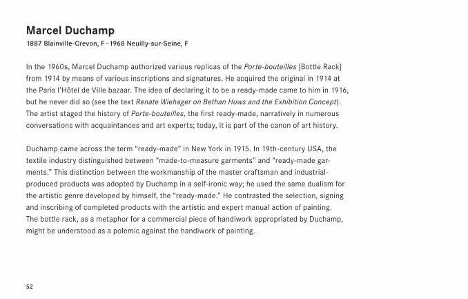
Marcel Duchamp1887 Blainville-Crevon, F – 1968 Neuilly-sur-Seine, F
In the 1960s, Marcel Duchamp authorized various replicas of the Porte-bouteilles [Bottle Rack]
from 1914 by means of various inscriptions and signatures. He acquired the original in 1914 at
the Paris l’Hôtel de Ville bazaar. The idea of declaring it to be a ready-made came to him in 1916,
but he never did so (see the text Renate Wiehager on Bethan Huws and the Exhibition Concept).
The artist staged the history of Porte-bouteilles, the first ready-made, narratively in numerous
conversations with acquaintances and art experts; today, it is part of the canon of art history.
Duchamp came across the term “ready-made” in New York in 1915. In 19th-century USA, the
textile industry distinguished between “made-to-measure garments” and “ready-made gar-
ments.” This distinction between the workmanship of the master craftsman and industrial-
produced products was adopted by Duchamp in a self-ironic way; he used the same dualism for
the artistic genre developed by himself, the “ready-made.” He contrasted the selection, signing
and inscribing of completed products with the artistic and expert manual action of painting.
The bottle rack, as a metaphor for a commercial piece of handiwork appropriated by Duchamp,
might be understood as a polemic against the handiwork of painting.
53
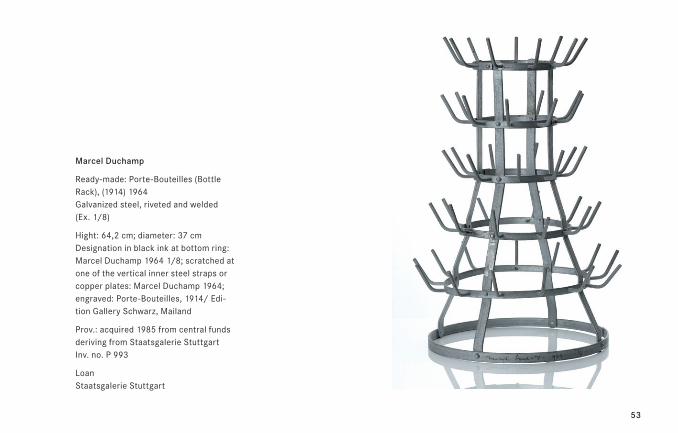
Marcel Duchamp
Ready-made: Porte-Bouteilles (Bottle Rack), (1914) 1964 Galvanized steel, riveted and welded (Ex. 1/8)
Hight: 64,2 cm; diameter: 37 cm Designation in black ink at bottom ring: Marcel Duchamp 1964 1/8; scratched at one of the vertical inner steel straps or copper plates: Marcel Duchamp 1964; engraved: Porte-Bouteilles, 1914/ Edi-tion Gallery Schwarz, Mailand
Prov.: acquired 1985 from central funds deriving from Staatsgalerie Stuttgart Inv. no. P 993
Loan Staatsgalerie Stuttgart
54
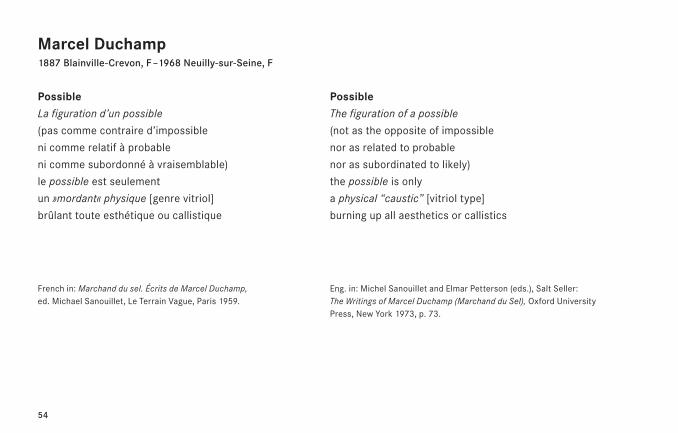
Marcel Duchamp1887 Blainville-Crevon, F – 1968 Neuilly-sur-Seine, F
PossibleLa figuration d’un possible
(pas comme contraire d’impossible
ni comme relatif à probable
ni comme subordonné à vraisemblable)
le possible est seulement
un »mordant« physique [genre vitriol]
brûlant toute esthétique ou callistique
French in: Marchand du sel. Écrits de Marcel Duchamp, ed. Michael Sanouillet, Le Terrain Vague, Paris 1959.
PossibleThe figuration of a possible
(not as the opposite of impossible
nor as related to probable
nor as subordinated to likely)
the possible is only
a physical “caustic” [vitriol type]
burning up all aesthetics or callistics
Eng. in: Michel Sanouillet and Elmar Petterson (eds.), Salt Seller: The Writings of Marcel Duchamp (Marchand du Sel), Oxford University Press, New York 1973, p. 73.
55
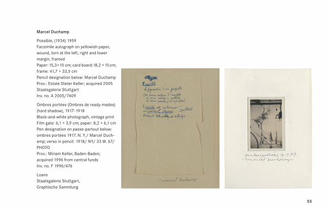
Marcel Duchamp
Possible, (1934) 1959 Facsimile autograph on yellowish paper, wound, torn at the left, right and lower margin, framed Paper: 15,3 × 10 cm; card board: 18,2 × 15 cm; frame: 41,7 × 33,5 cm Pencil designation below: Marcel Duchamp Prov.: Estate Dieter Keller; acquired 2005 Staatsgalerie Stuttgart Inv. no. A 2005/7409
Ombres portées (Ombres de ready-mades) (hard shadow), 1917–1918 Black-and-white photograph, vintage print Film gate: 6,1 × 3,9 cm; paper: 8,2 × 6,1 cm Pen designation on passe-partout below: ombres portées 1917. N. Y./ Marcel Duch-amp; verso in pencil: 1918/ NY/ 33 W. 67/ PHOTO Prov.: Miriam Keller, Baden-Baden; acquired 1996 from central funds Inv. no. F 1996/476
Loans Staatsgalerie Stuttgart, Graphische Sammlung
56
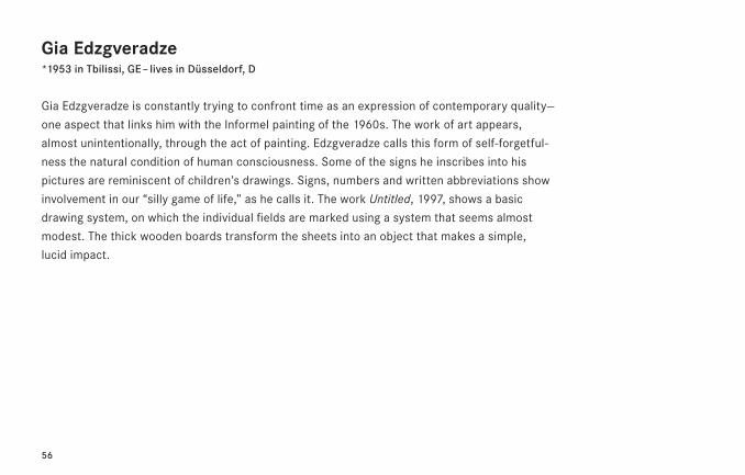
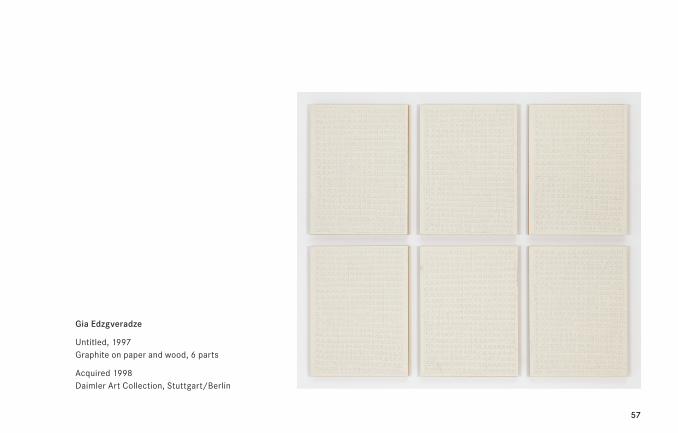
Gia Edzgveradze*1953 in Tbilissi, GE – lives in Düsseldorf, D
Gia Edzgveradze is constantly trying to confront time as an expression of contemporary quality—
one aspect that links him with the Informel painting of the 1960s. The work of art appears,
almost unintentionally, through the act of painting. Edzgveradze calls this form of self-forgetful-
ness the natural condition of human consciousness. Some of the signs he inscribes into his
pictures are reminiscent of children’s drawings. Signs, numbers and written abbreviations show
involvement in our “silly game of life,” as he calls it. The work Untitled, 1997, shows a basic
drawing system, on which the individual fields are marked using a system that seems almost
modest. The thick wooden boards transform the sheets into an object that makes a simple,
lucid impact.
57
Gia Edzgveradze
Untitled, 1997 Graphite on paper and wood, 6 parts
Acquired 1998 Daimler Art Collection, Stuttgart/Berlin
58
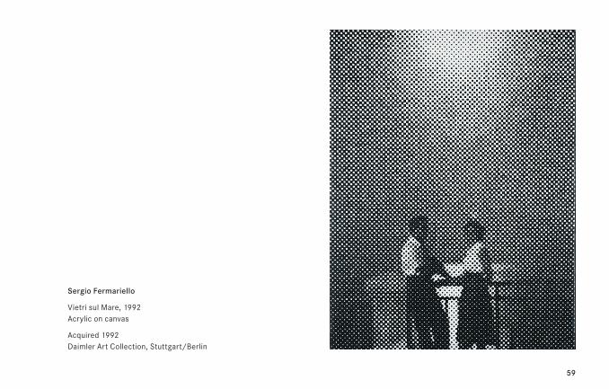
Sergio Fermariello*1961 in Naples, I – lives in Naples, I
Sergio Fermariello’s art explores universal archaisms that characterize the human collective
unconscious. He created the warrior figure—inspired by prehistoric cave paintings—that still
shapes his work in various variations as early as the late 1980s. Another factor is Fermariello’s
interest in his home city of Naples and environs, its history and tradition. The work called
Vietri sul Mare, 1992, takes its title from the place near Salerno that is the gateway to the Amalfi
coast. The work is in black and white, and looks rather like a photograph in half-tone dots, but
the little squares are executed irregularly. The diffuse image can be made out by standing back
from the canvas: a man and woman standing in front of a parapet, perhaps in front of the dream
backdrop that is the Amalfi coast? The abstract grid leaves sufficient scope for the viewer’s im-
agination, which is stimulated by the title, interprets the picture space and reconstructs a story.
59
Sergio Fermariello
Vietri sul Mare, 1992 Acrylic on canvas
Acquired 1992 Daimler Art Collection, Stuttgart/Berlin
60
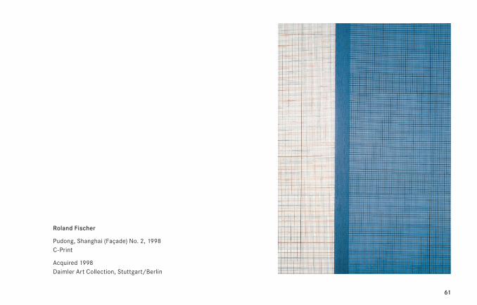
Roland Fischer*1958 in Saarbrücken, D – lives in Munich, D and Beijing, CHN
Serial working, large formats and formally austere treatment of his pictorial subjects are the
central characteristics of Roland Fischer’s photographic oeuvre, which is devoted to the themes
“man” and “architecture.” Fischer has been experimenting since 1980 with large format portrait
shots, which is why he can be included among the trailblazers for artists who have made a
name for themselves in these fields such as Thomas Ruff (*1958), Thomas Struth (*1954) and
Andreas Gursky (*1955). In the Fassadenbilder [Façade Pictures] Fischer is interested in the
structured surface of high-rise façades that begin to work like abstract paintings and show
a concern with concepts such as structure, color, rhythm, reduced forms and geometry. Here
the artist is not just detaching the buildings from their urban context, but also from their spatial
and temporal fabric, in order to subject them to a formal examination devoted to the abstract
surface structure. As Fischer puts it, he is least interested in “the illustrative, in other words the
documentary, reportage-like elements etc. in photography as a medium.” (R.F.) So photography’s
documentary illustrative function is abandoned in favor of developing pictorial worlds defined
aesthetically, formally and in terms of content.
61
Roland Fischer
Pudong, Shanghai (Façade) No. 2, 1998 C-Print
Acquired 1998 Daimler Art Collection, Stuttgart/Berlin
62
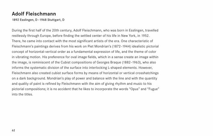
Adolf Fleischmann1892 Esslingen, D – 1968 Stuttgart, D
During the first half of the 20th century, Adolf Fleischmann, who was born in Esslingen, travelled
restlessly through Europe, before finding the settled center of his life in New York, in 1952.
There, he came into contact with the most significant artists of the era. One characteristic of
Fleischmann’s paintings derives from his work on Piet Mondrian’s (1872–1944) idealistic pictorial
concept of horizontal-vertical order as a fundamental expression of life, and the theme of color
in vibrating motion. His preference for oval image fields, which in a sense create an image within
the image, is reminiscent of the Cubist compositions of Georges Braque (1882–1963), who also
informs the systematic division of the surface into interlocking L-shaped elements. However,
Fleischmann also created cubist surface forms by means of horizontal or vertical crosshatchings
on a dark background. Mondrian’s play of power and balance with the line and with the quantity
and quality of paint is refined by Fleischmann with the aim of giving rhythm and music to his
pictorial compositions; it is no accident that he likes to incorporate the words “Opus” and “Fugue”
into the titles.
63
Adolf Fleischmann
Untitled, 1963 Charcoal on paper
Acquired 2011 Daimler Art Collection, Stuttgart/Berlin
64
“On the Subject of the Ready-Made,” Daimler Contemporary Berlin 2016: f.l. Dieter Blum, Anton Stankowski, Adolf Fleischmann, Adolf Hoelzel, Liu Zheng, Christa Winter, Hartmut Böhm, Gia Edzgveradze, Max Bill
65
66
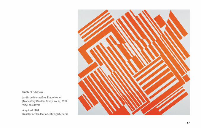
Günter Fruhtrunk1923 – 1982 Munich, D
“The status of pictures is not decided by externals that can be named, but is revealed in the
profound excitement of rhythm, measure and sound.” (G.F.) These words could have been written
about Fruhtrunk’s Jardin de Monastère, Étude No. 6 [Monastery Garden, Study No. 6], 1962, of
which eight versions exist—in different formats and materials. The way the square parallel grids
slide into each other is reminiscent of Georges Braque’s (1882–1963) cubically splintered pictorial
structure; the diagonally dynamized movement connects to Kasimir Malevich (1878–1935) and
El Lissitzky (1890–1941); linking narrow and wide stripes make us think of piano keys, reinforced
by the word “étude” [study] added to the title, and refer to a musical structure; finally the recur-
ring square module evokes the idea of the austerely geometrically disposed square of a monas-
tery garden, with beds, paths and arcades running into each other.
67
Günter Fruhtrunk
Jardin de Monastère, Étude No. 6 [Monastery Garden, Study No. 6], 1962 Vinyl on canvas
Acquired 1989 Daimler Art Collection, Stuttgart/Berlin
68
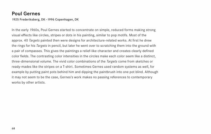
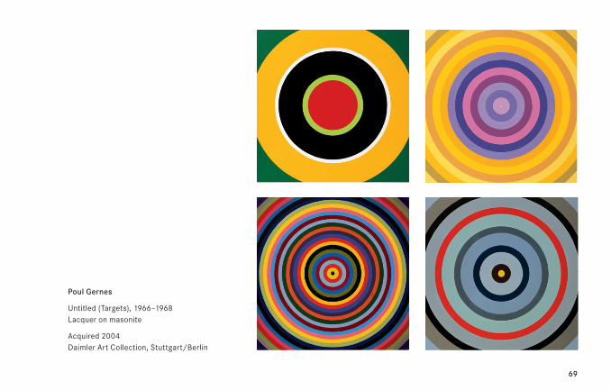
Poul Gernes1925 Frederiksberg, DK – 1996 Copenhagen, DK
In the early 1960s, Poul Gernes started to concentrate on simple, reduced forms making strong
visual effects like circles, stripes or dots in his painting, similar to pop motifs. Most of the
approx. 40 Targets painted then were designs for architecture-related works. At first he drew
the rings for his Targets in pencil, but later he went over to scratching them into the ground with
a pair of compasses. This gives the paintings a relief-like character and creates clearly defined
color fields. The contrasting color intensities in the circles make each color seem like a distinct,
three-dimensional volume. The vivid color combinations of the Targets come from sketches or
ready-mades like the stripes on a T-shirt. Sometimes Gernes used random systems as well, for
example by putting paint pots behind him and dipping the paintbrush into one pot blind. Although
it may not seem to be the case, Gernes’s work makes no passing references to contemporary
works by other artists.
69
Poul Gernes
Untitled (Targets), 1966–1968 Lacquer on masonite
Acquired 2004 Daimler Art Collection, Stuttgart/Berlin
70
Hermann Glöckner1889 Cotta, D – 1987 Berlin, D
Hermann Glöckner, one of the former GDR’s leading abstract artists, developed his “Tafelwerk”
between 1930 and 1935, and used it to explore the three-dimensional potential of rigorously
systematized and reduced geometrical forms. These “Tafeln” anticipated work that was to con-
dense after 1935 into collage-like folded pieces. These were Glöckner’s key contribution to
20th century art, and at the same time prepared the way for 1960s minimalist tendencies. The
regime did not object to his use of abstract formal language in public places, but Glöckner as
an autonomous artist was a “formalism suspect” in campaigns the GDR started in 1950. It was
not before 1969 that the Dresden Museum could organize a first solo show for the then 80-year-
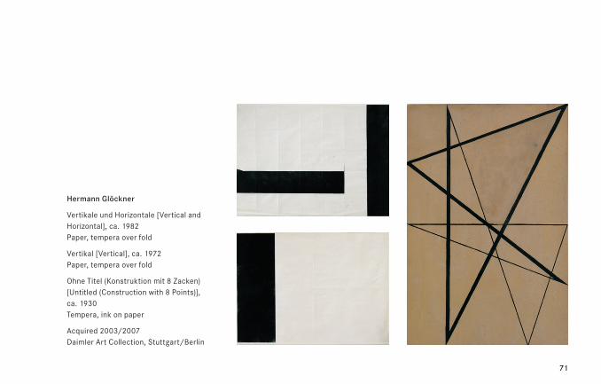
old artist. The displayed black and white foldings are part of a series developed around 1970,
in which the interplay of black surfaces and white paper foldings bring about the idea of a picto-
rial entity.
71
Hermann Glöckner
Vertikale und Horizontale [Vertical and Horizontal], ca. 1982 Paper, tempera over fold
Vertikal [Vertical], ca. 1972 Paper, tempera over fold
Ohne Titel (Konstruktion mit 8 Zacken) [Untitled (Construction with 8 Points)], ca. 1930 Tempera, ink on paper
Acquired 2003/2007 Daimler Art Collection, Stuttgart/Berlin
72
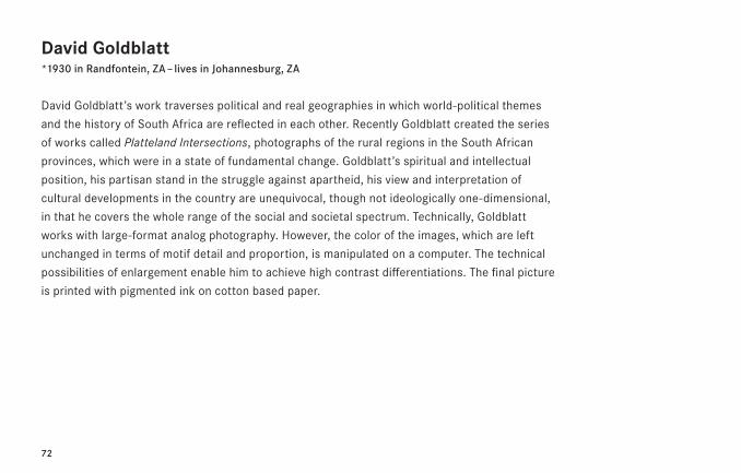
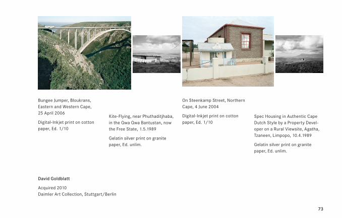
David Goldblatt*1930 in Randfontein, ZA – lives in Johannesburg, ZA
David Goldblatt’s work traverses political and real geographies in which world-political themes
and the history of South Africa are reflected in each other. Recently Goldblatt created the series
of works called Platteland Intersections, photographs of the rural regions in the South African
provinces, which were in a state of fundamental change. Goldblatt’s spiritual and intellectual
position, his partisan stand in the struggle against apartheid, his view and interpretation of
cultural developments in the country are unequivocal, though not ideologically one-dimensional,
in that he covers the whole range of the social and societal spectrum. Technically, Goldblatt
works with large-format analog photography. However, the color of the images, which are left
unchanged in terms of motif detail and proportion, is manipulated on a computer. The technical
possibilities of enlargement enable him to achieve high contrast differentiations. The final picture
is printed with pigmented ink on cotton based paper.
73
David Goldblatt
Acquired 2010 Daimler Art Collection, Stuttgart/Berlin
Bungee Jumper, Bloukrans, Eastern and Western Cape, 25 April 2006
Digital-Inkjet print on cotton paper, Ed. 1/10
Kite-Flying, near Phuthaditjhaba, in the Qwa Qwa Bantustan, now the Free State, 1.5.1989
Gelatin silver print on granite paper, Ed. unlim.
On Steenkamp Street, Northern Cape, 4 June 2004
Digital-Inkjet print on cotton paper, Ed. 1/10
Spec Housing in Authentic Cape Dutch Style by a Property Devel-oper on a Rural Viewsite, Agatha, Tzaneen, Limpopo, 10.4.1989
Gelatin silver print on granite paper, Ed. unlim.
74
Camille Graeser1925 Frederiksberg, DK – 1996 Copenhagen, DK
Camille Graeser was one of the founding members of the “Allianz,” an association of artists of
the Zurich Concrete school, who advocated a geometrical/constructive language of forms, as
opposed to conservative, reactionary tendencies in art. Graeser had been developing his highly
specific geometric design principles since the 1940s. In his drawings in particular, these are
articulated in the form of clear linear construction plans. The pictorial themes that are visualized
in Synthetische Konstruktion [Synthetic Construction] of 1946 and are also characteristic of
Graeser’s artworks in general can be described as a grouping of elementary progressions based
upon mathematical and geometric relationships. In the upper area, the broad central horizontal
bar develops into a half-length. To the right, the latter is halved once again. It unites the con-
struction with the lower, and, going further, with the right-hand edge of the picture. The severe
black-and-white of the ink drawing provides Graeser with what might be called a conceptual
basis for his form decisions, and for exploring exact design: “Before the artwork can be imple-
mented in painting form, it should be entirely conceived and pre-formed within one’s conscious-
ness.” (C.G.)
75
Camille Graeser
Synthetische Konstruktion [Synthetic Construction] (Z1946.1A), 1946 Ink on textured paper
Acquired 1986 Daimler Art Collection, Stuttgart/Berlin
76
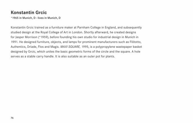
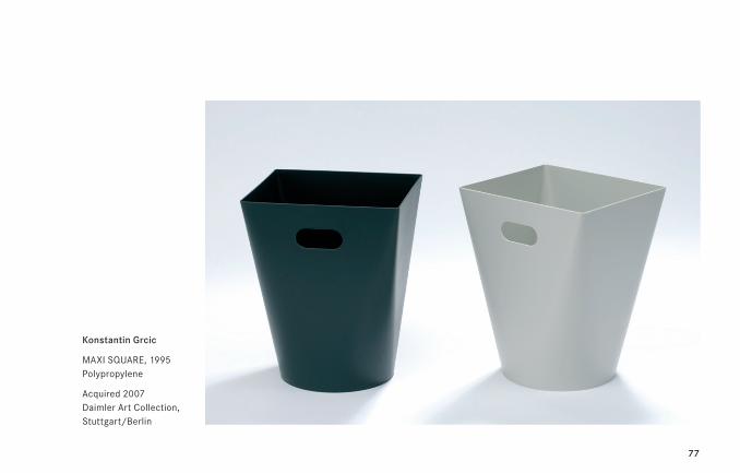
Konstantin Grcic*1965 in Munich, D – lives in Munich, D
Konstantin Grcic trained as a furniture maker at Parnham College in England, and subsequently
studied design at the Royal College of Art in London. Shortly afterward, he created designs
for Jasper Morrison (*1959), before founding his own studio for industrial design in Munich in
1991. He designed furniture, objects, and lamps for prominent manufacturers such as Flötotto,
Authentics, Driade, Flos and Magis. MAXI SQUARE, 1995, is a polypropylene wastepaper basket
designed by Grcic, which unites the basic geometric forms of the circle and the square. A hole
serves as a stable carry handle. It is also suitable as an outer pot for plants.
77
Konstantin Grcic
MAXI SQUARE, 1995 Polypropylene
Acquired 2007 Daimler Art Collection, Stuttgart/Berlin
78
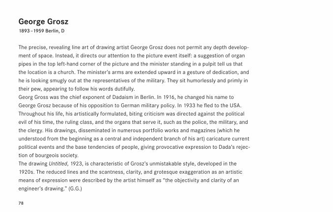
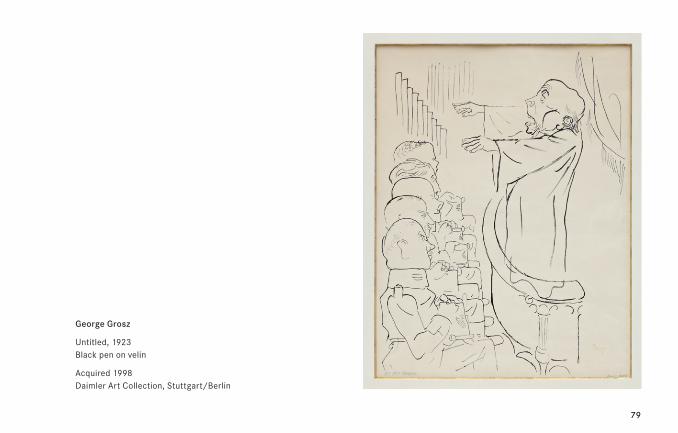
George Grosz1893 – 1959 Berlin, D
The precise, revealing line art of drawing artist George Grosz does not permit any depth develop-
ment of space. Instead, it directs our attention to the picture event itself: a suggestion of organ
pipes in the top left-hand corner of the picture and the minister standing in a pulpit tell us that
the location is a church. The minister’s arms are extended upward in a gesture of dedication, and
he is looking smugly out at the representatives of the military. They sit humorlessly and primly in
their pew, appearing to follow his words dutifully.
Georg Gross was the chief exponent of Dadaism in Berlin. In 1916, he changed his name to
George Grosz because of his opposition to German military policy. In 1933 he fled to the USA.
Throughout his life, his artistically formulated, biting criticism was directed against the political
evil of his time, the ruling class, and the organs that serve it, such as the police, the military, and
the clergy. His drawings, disseminated in numerous portfolio works and magazines (which he
understood from the beginning as a central and independent branch of his art) caricature current
political events and the base tendencies of people, giving provocative expression to Dada’s rejec-
tion of bourgeois society.
The drawing Untitled, 1923, is characteristic of Grosz’s unmistakable style, developed in the
1920s. The reduced lines and the scantness, clarity, and grotesque exaggeration as an artistic
means of expression were described by the artist himself as “the objectivity and clarity of an
engineer’s drawing.” (G.G.)
79
George Grosz
Untitled, 1923 Black pen on velin
Acquired 1998 Daimler Art Collection, Stuttgart/Berlin
80
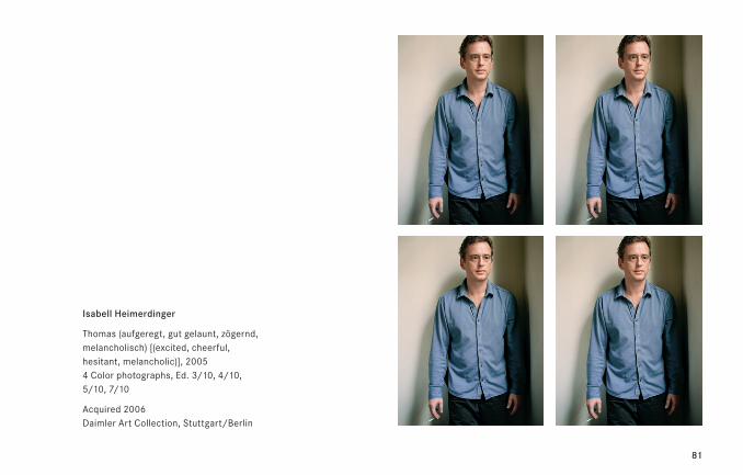
Isabell Heimerdinger*1963 in Stuttgart, D – lives in Berlin, D
Isabell Heimerdinger has with several conceptually based photographic series and videos since
the mid-1990s been working on the blurring boundaries between cinematic reality and the reality
of everyday life, between medial appearance and factual being. For this purpose she has been
dealing for some time with the figure and role understanding of the actor. In photographic,
cinematic or installation-type experimental designs she explores the subtle difference between
pose and (actor) personality, between the self and self-projection, between role and identity.
In the photo series Thomas, 2005, for example, different psychological states (excited, cheerful,
hesitant, melancholic) all serve as titles for one and the same photo.
81
Isabell Heimerdinger
Thomas (aufgeregt, gut gelaunt, zögernd, melancholisch) [(excited, cheerful, hesitant, melancholic)], 2005 4 Color photographs, Ed. 3/10, 4/10, 5/10, 7/10
Acquired 2006 Daimler Art Collection, Stuttgart/Berlin
82
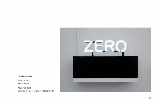
Jan Henderikse*1937 in Delft, NL – lives in Antwerp, B
Henderikse, a co-founder of the Nederlandse Informel Group, moved in 1959 to Düsseldorf,
where he created his first assemblages using trash and found objects. He made contact with
the ZERO artists and Nouveaux Réalistes, and became a member of the Dutch NUL group.
Henderikse settled on the Caribbean island of Curaçao from 1963 to 1967, where he started to
fill empty crates with trash and to create serial works using photographs—some taken himself,
some found by chance and inserted as ready-mades—with money and license plates. The artist
moved to New York in 1968, working, in addition to assemblages and found objects, mainly
on photographic sequences, which also appeared in book form, and film. From the eighties on,
artists’ books turned out to be an important medium for Henderikse, allowing artistic concepts,
observations, and statements to be circulated outside the closed circuits of the museum con-
text. In 1987/88 Henderikse moved to Berlin at the invitation of the German Academic Exchange
Service (DAAD), and had a second studio there until 2000. His work has continued to focus on
conceptually based photographic products, multiples, and ready-mades.
83
Jan Henderikse
Zero, 2010 Neon, wood
Acquired 2011 Daimler Art Collection, Stuttgart/Berlin
84
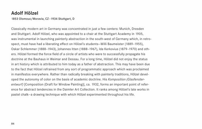
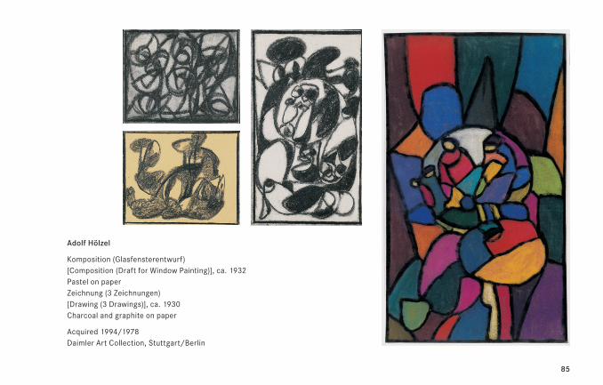
Adolf Hölzel1853 Olomouc/Moravia, CZ – 1934 Stuttgart, D
Classically modern art in Germany was concentrated in just a few centers: Munich, Dresden
and Stuttgart. Adolf Hölzel, who was appointed to a chair at the Stuttgart Academy in 1905,
was instrumental in launching painterly abstraction in the south-west of Germany which, in retro-
spect, must have had a liberating effect on Hölzel’s students—Willi Baumeister (1889–1955),
Oskar Schlemmer (1888–1943), Johannes Itten (1888–1967), Ida Kerkovius (1879–1970) and oth-
ers. Hölzel formed the force field of a circle of artists who were to successfully propagate his
doctrine at the Bauhaus in Weimar and Dessau. For a long time, Hölzel did not enjoy the status
in art history which is attributed to him today as a father of abstraction. This may have been due
to the fact that Hölzel refrained from any sort of programmatic approach which was proclaimed
in manifestos everywhere. Rather than radically breaking with painterly traditions, Hölzel devel-
oped the autonomy of color on the basis of academic doctrine. His Komposition (Glasfenster-
entwurf) [Composition (Draft for Window Painting)], ca. 1932, forms an important point of refer-
ence for abstract tendencies in the Daimler Art Collection. It ranks among Hölzel’s late works in
pastel chalk—a drawing technique with which Hölzel experimented throughout his life.
85
Adolf Hölzel
Komposition (Glasfensterentwurf) [Composition (Draft for Window Painting)], ca. 1932 Pastel on paper Zeichnung (3 Zeichnungen) [Drawing (3 Drawings)], ca. 1930 Charcoal and graphite on paper
Acquired 1994/1978 Daimler Art Collection, Stuttgart/Berlin
86
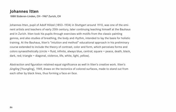
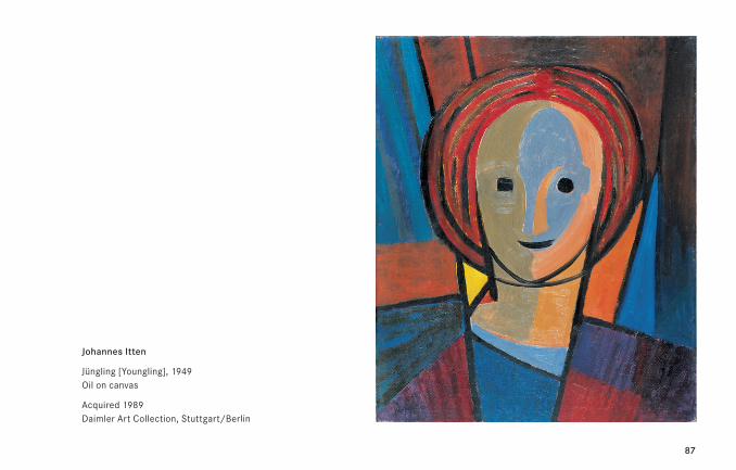
Johannes Itten1888 Süderen-Linden, CH – 1967 Zurich, CH
Johannes Itten, pupil of Adolf Hölzel (1853–1934) in Stuttgart around 1910, was one of the emi-
nent artists and teachers of early 20th century, later continuing teaching himself at the Bauhaus
and in Zurich. Itten took his pupils through exercises with motifs from the classic painting
genres, and also studies of breathing, the body and rhythm, intended to lay the basis for holistic
training. At the Bauhaus, Itten’s “intuition and method” educational approach in his preliminary
course extended to include the theory of contrast, color and form, which perceives forms and
colors synaesthetically (circle = fluid, infinite, always blue, central; square = peace, death, black,
dark, red; triangle = diagonal, violence, life, white, light, yellow).
Abstraction and figuration retained equal significance as well in Itten’s creative work. Itten’s
Jüngling [Youngling], 1949, draws on the tectonics of colored surfaces, made to stand out from
each other by black lines, thus forming a face en face.
87
Johannes Itten
Jüngling [Youngling], 1949 Oil on canvas
Acquired 1989 Daimler Art Collection, Stuttgart/Berlin
88
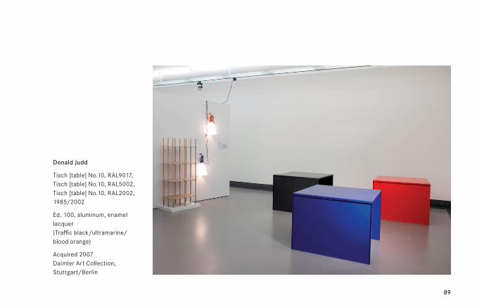
Donald Judd1928 Excelsior Springs, Missouri, USA – 1994 New York, USA
In addition to his artistic work Donald Judd also made his name designing furniture, as an architect,
and with his theoretical writings. The translation of the formal canon of minimalist art into
something practical for life took on a special meaning for Judd in 1968 with his acquisition of
101 Spring Street in New York’s Soho that served equally as a studio, exhibition space and living
space for him and his family. His exacting search for unpretentious, functional yet aesthetically
demanding furniture and fittings was futile and triggered the conception of an own group of
works in the sculptural oeuvre of Judd: a large complex of furniture designs in wood, metal and
stone. In the 1980s Judd deepened his occupation with the design and materials used for furni-
ture. “Furniture became something new for me, the more I dealt with reality. A good chair is
a good chair. From the specific existing conditions, peculiar shaped furniture slowly evolved
that no longer had pure derivatives.” (D.J.)
89
Donald Judd
Tisch [table] No.10, RAL9017, Tisch [table] No.10, RAL5002, Tisch [table] No.10, RAL2002, 1985/2002
Ed. 100, aluminum, enamel lacquer (Traffic black/ultramarine/blood orange)
Acquired 2007 Daimler Art Collection, Stuttgart/Berlin
90
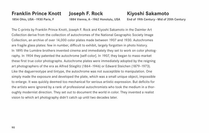
Franklin Prince Knott1854 Ohio, USA – 1930 Paris, F
The C-prints by Franklin Prince Knott, Joseph F. Rock and Kiyoshi Sakamoto in the Daimler Art
Collection derive from the collection of autochromes of the National Geographic Society Image
Collection, an archive of over 14,000 color plates made between 1907 and 1930. Autochromes
are fragile glass plates: few in number, difficult to exhibit, largely forgotten in photo history.
In 1895 the Lumière brothers invented cinema and immediately they set to work on color photog-
raphy. In 1904 they patented the autochrome [self-color]. In 1907, they began to mass-market
these first true color photographs. Autochrome plates were immediately adopted by the reigning
art photographers of the era as Alfred Stieglitz (1864–1946) or Edward Steichen (1879–1973).
Like the daguerreotype and tintype, the autochrome was not susceptible to manipulation. One
simply made the exposure and developed the plate, which was a small unique object, impossible
to enlarge. It was quickly deemed too mechanical for serious artistic expression. But deficits for
the artists were ignored by a rank of professional autochromists who took the medium in a thor-
oughly modernist direction. They set out to document the world in color. They invented a realist
vision to which art photography didn’t catch up until two decades later.
Joseph F. Rock1884 Vienna, A – 1962 Honolulu, USA
Kiyoshi SakamotoEnd of 19th Century – Mid of 20th Century
91
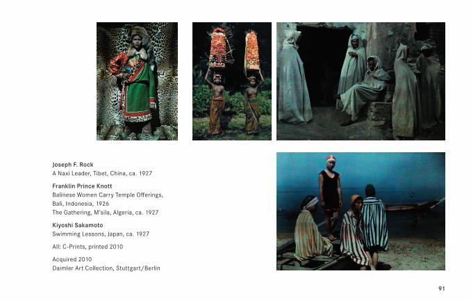
Joseph F. Rock A Naxi Leader, Tibet, China, ca. 1927
Franklin Prince Knott Balinese Women Carry Temple Offerings, Bali, Indonesia, 1926 The Gathering, M’sila, Algeria, ca. 1927
Kiyoshi Sakamoto Swimming Lessons, Japan, ca. 1927
All: C-Prints, printed 2010
Acquired 2010 Daimler Art Collection, Stuttgart/Berlin
92
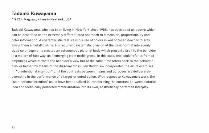
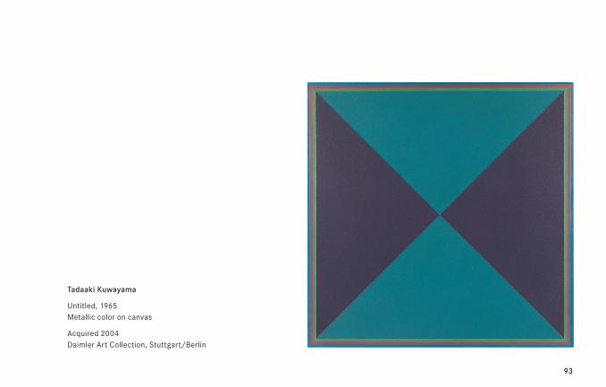
Tadaaki Kuwayama*1932 in Nagoya, J – lives in New York, USA
Tadaaki Kuwayama, who has been living in New York since 1958, has developed an oeuvre which
can be described as the extremely differentiated approach to dimension, proportionality and
color information. A characteristic feature is his use of colors mixed or toned down with gray,
giving them a metallic shine. His recurrent systematic division of the basic format into evenly
sized color segments creates an autonomous pictorial body which presents itself to the beholder
in a matter-of-fact way, as if emerging from nothingness. In this case, one could refer to framed
emptiness which attracts the beholder’s view but at the same time refers back to the beholder
him- or herself by means of the diagonal cross. Zen Buddhism incorporates the art of exercises
in “unintentional intention” until the contrasts between means and purposes are deliberately
overcome in the performance of a target-oriented action. With respect to Kuwayama’s work, the
“unintentional intention” could have been realized in transforming the contrast between pictorial
idea and technically perfected materialization into its own, aesthetically perfected interplay.
93
Tadaaki Kuwayama
Untitled, 1965 Metallic color on canvas
Acquired 2004 Daimler Art Collection, Stuttgart/Berlin
94
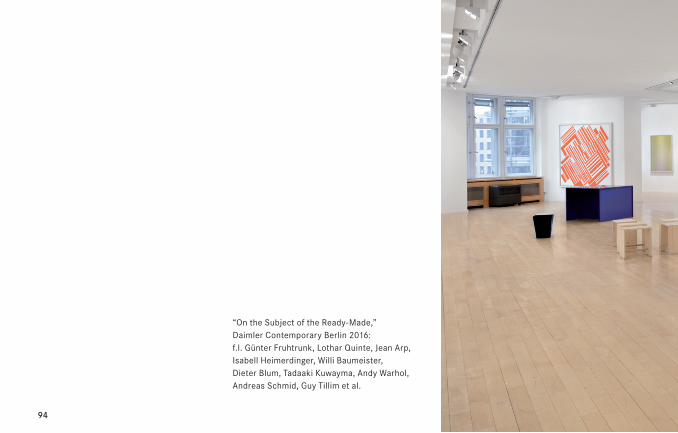
“On the Subject of the Ready-Made,” Daimler Contemporary Berlin 2016: f.l. Günter Fruhtrunk, Lothar Quinte, Jean Arp, Isabell Heimerdinger, Willi Baumeister, Dieter Blum, Tadaaki Kuwayma, Andy Warhol, Andreas Schmid, Guy Tillim et al.
95
96
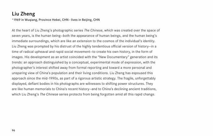
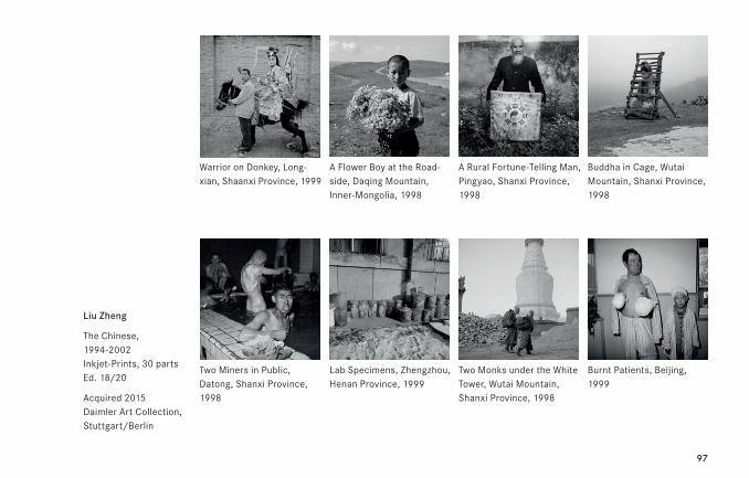
Liu Zheng*1969 in Wuqiang, Province Hebei, CHN – lives in Beijing, CHN
At the heart of Liu Zheng’s photographic series The Chinese, which was created over the space of
seven years, is the human being—both the appearance of human beings, and the human being’s
immediate surroundings, which are like an extension to the cosmos of the individual’s identity.
Liu Zheng was prompted by his distrust of the highly tendentious official version of history—in a
time of radical upheaval and rapid social movement—to create his own history, in the form of
images. His development as an artist coincided with the “New Documentary” generation and its
trends: an approach distinguished by a conceptual, experimental mode of expression, with the
photographer’s interest shifted away from formal reporting and toward a more personal and
unsparing view of China’s population and their living conditions. Liu Zheng has espoused this
approach since the mid-1990s, as part of a rigorous artistic strategy. The fragile, unforgettably
displayed, defiant bodies in his photographs are witnesses to shifting power structures. They
are like human memorials to China’s recent history—and to China’s declining ancient traditions,
which Liu Zheng’s The Chinese series protects from being forgotten amid all this rapid change.
97
Liu Zheng
The Chinese, 1994-2002 Inkjet-Prints, 30 parts Ed. 18/20
Acquired 2015 Daimler Art Collection, Stuttgart/Berlin
Warrior on Donkey, Long-xian, Shaanxi Province, 1999
A Flower Boy at the Road-side, Daqing Mountain, Inner-Mongolia, 1998
A Rural Fortune-Telling Man, Pingyao, Shanxi Province, 1998
Two Monks under the White Tower, Wutai Mountain, Shanxi Province, 1998
Buddha in Cage, Wutai Mountain, Shanxi Province, 1998
Burnt Patients, Beijing, 1999
Two Miners in Public, Datong, Shanxi Province, 1998
Lab Specimens, Zhengzhou, Henan Province, 1999
98
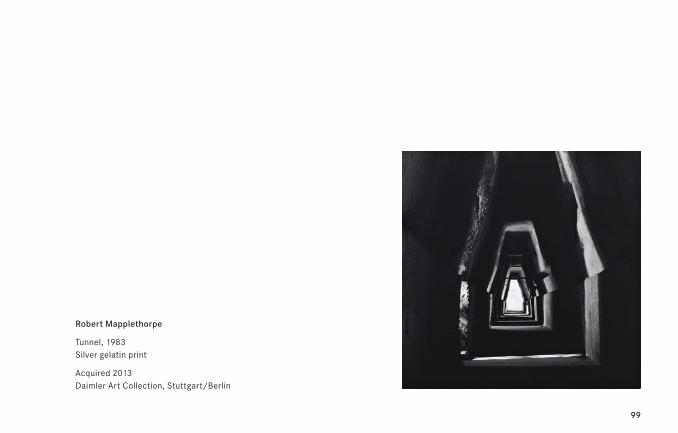
Robert Mapplethorpe1946 Floral Park, New York, USA – 1989 Boston, USA
From a contemporary point of view the work of Robert Mapplethorpe, one of the most contro-
versial artists of the last century, appears today almost disciplined as well as intimate. The clas-
sical idealization of the body in his work attests to a type of Humanism, which regardless of
the ambiguity of gender or ethnicity exalts the human body to sculptural perfection. Arguably,
Mapplethorpe elevated the photographic medium to the level of sculpture and painting. Before
him, photography while appreciated, was nevertheless considered as a lower technique in the art
historical hierarchy and museum departments, more as a document than an intrinsic artwork.
Tunnel, 1983, is the corridor carved in volcanic stone of Cumae, an ancient site located in the
south of Italy, renowned as the dwelling of an implacable oracle portrayed by Dante and Michel-
angelo. Ascribed as an “entrance to the underworld,” a mythological detail that echoes the
somber path walked by the artist, Mapplethorpe took the picture during his sojourn in Naples
to prepare an exhibition with Lucio Amelio. In the framework of a body close up, the rudimentary
architecture appears like an organic orifice.
99
Robert Mapplethorpe
Tunnel, 1983 Silver gelatin print
Acquired 2013 Daimler Art Collection, Stuttgart/Berlin
100
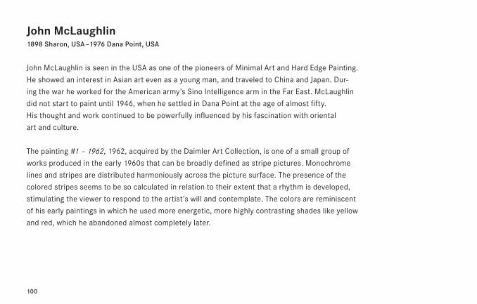
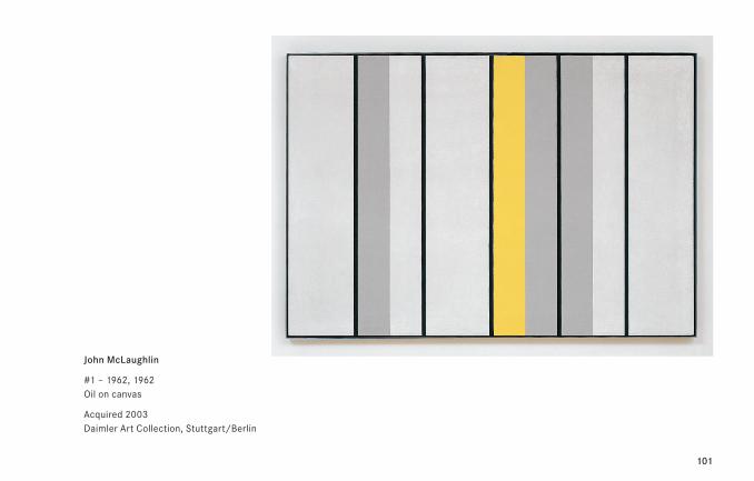
John McLaughlin1898 Sharon, USA – 1976 Dana Point, USA
John McLaughlin is seen in the USA as one of the pioneers of Minimal Art and Hard Edge Painting.
He showed an interest in Asian art even as a young man, and traveled to China and Japan. Dur-
ing the war he worked for the American army’s Sino Intelligence arm in the Far East. McLaughlin
did not start to paint until 1946, when he settled in Dana Point at the age of almost fifty.
His thought and work continued to be powerfully influenced by his fascination with oriental
art and culture.
The painting #1 – 1962, 1962, acquired by the Daimler Art Collection, is one of a small group of
works produced in the early 1960s that can be broadly defined as stripe pictures. Monochrome
lines and stripes are distributed harmoniously across the picture surface. The presence of the
colored stripes seems to be so calculated in relation to their extent that a rhythm is developed,
stimulating the viewer to respond to the artist’s will and contemplate. The colors are reminiscent
of his early paintings in which he used more energetic, more highly contrasting shades like yellow
and red, which he abandoned almost completely later.
101
John McLaughlin
#1 – 1962, 1962 Oil on canvas
Acquired 2003 Daimler Art Collection, Stuttgart/Berlin
102
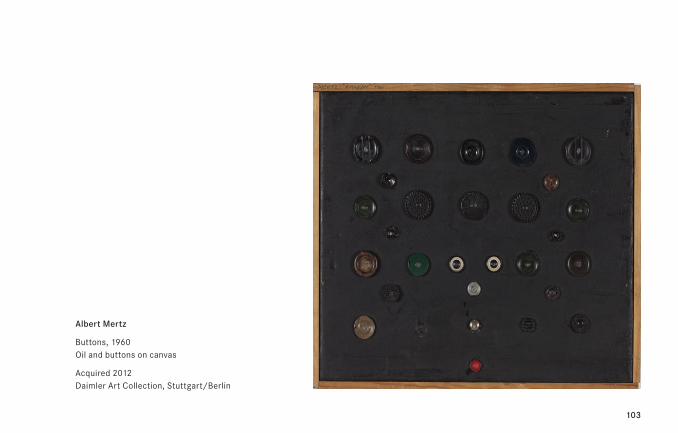
Albert Mertz1920 Copenhagen, DK – 1990 Slagelse, DK
The name Albert Mertz stands on the horizon of the European post-war avant-gardists for an
anarchistic and deliberately destructive opus, whose underlying conceptual and constructive
strictness nevertheless always reveals the emphatic questioning of the social and communicative
roles of art. Mertz demonstratively emphasized the “non-intact” and conservationally speaking
the battered nature of the physical form of his works to focus the viewer’s attention on the
authenticity and stringency of the thought. Mertz—that was the representative of an artistic at-
titude which slaved away on the question of whether aesthetics and responsibility are to
be understood as mutually exclusive or symbiotic. In his object image Buttons, 1960, he en-
gages with the various different artistic movements that have shaped his own artistic work:
Dada, Schwitters, and the European developments of Zero and Nouveau Réalisme.
103
Albert Mertz
Buttons, 1960 Oil and buttons on canvas
Acquired 2012 Daimler Art Collection, Stuttgart/Berlin
104
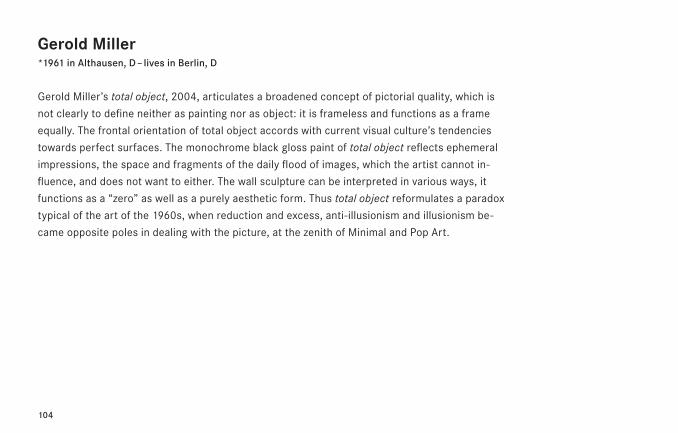
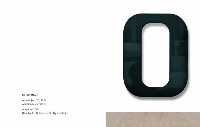
Gerold Miller*1961 in Althausen, D – lives in Berlin, D
Gerold Miller’s total object, 2004, articulates a broadened concept of pictorial quality, which is
not clearly to define neither as painting nor as object: it is frameless and functions as a frame
equally. The frontal orientation of total object accords with current visual culture’s tendencies
towards perfect surfaces. The monochrome black gloss paint of total object reflects ephemeral
impressions, the space and fragments of the daily flood of images, which the artist cannot in-
fluence, and does not want to either. The wall sculpture can be interpreted in various ways, it
functions as a “zero” as well as a purely aesthetic form. Thus total object reformulates a paradox
typical of the art of the 1960s, when reduction and excess, anti-illusionism and illusionism be-
came opposite poles in dealing with the picture, at the zenith of Minimal and Pop Art.
105
Gerold Miller
total object 30, 2004 Aluminum, varnished
Acquired 2005 Daimler Art Collection, Stuttgart/Berlin
106
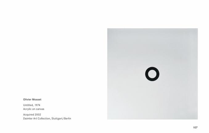
Olivier Mosset*1944 in Bern, CH – lives in Tucson, USA
The BMPT group was started in 1966 during the student risings in Paris. It united the artists Daniel
Buren, Olivier Mosset, Michel Parmentier, and Niele Toroni. Their declared objective was to neutralize
art and make it anonymous until it finally would disappear from the art market and art history. The
group published pamphlets and carried out public painting actions with the intention of doing away
with the traditional concept of painting. Its members tried to establish connections between the
concept of a “new,” or radical, work of art and its political impact. Against this backdrop, the artists
practiced a minimalist form language: their artworks were characterized by circles (Mosset), stripes
(Buren und Parmentier) and brush markings (Toroni). Olivier Mosset exhibited his first circle images
in 1966; by 1974, the number had increased to 200 identical artworks. The circle images appear
to have been robbed of their development possibilities by their unchangeability, knowing no past or
future. Through the endless repetition of a sign charged with symbolic content such as the circle,
they destroy the painterly aura of the artwork, negating its originality and authenticity.
107
Olivier Mosset
Untitled, 1974 Acrylic on canvas
Acquired 2002 Daimler Art Collection, Stuttgart/Berlin
108
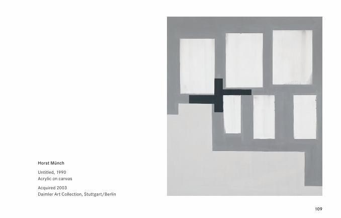
Horst Münch*1951 in Nuremberg, D – lives in Cologne, D
The oeuvre of the sculptor, film-maker, painter and poet Horst Münch, who was awarded the
Käthe Kollwitz Preis in 2003, is full of references and variations. His former tutor, Alfonso Hüppi
(*1935), explaining the jury’s decision, said that the artist gave thought a pictorial form. Münch’s
abstract paintings such as Untitled, 1990, are experimental geometric variations on Kazimir
Malevich’s (1878–1935) constructivist formal vocabulary, while his poems explore language and
its different representational modes. Words and quotations play a major role in the artist’s work.
Sometimes they link with the visual—in his videos, for instance—and sometimes they show social
issues in a humorous and cryptic light.
109
Horst Münch
Untitled, 1990 Acrylic on canvas
Acquired 2003 Daimler Art Collection, Stuttgart/Berlin
110
John Nixon*1949 in Sydney, AUS – lives in Sydney, AUS
For John Nixon, his work represents a continuation of the historical avant-garde. He called the
project that he initiated in 1968 to investigate non-representational painting Experimental Paint-
ing Workshop (EPW). The first works completed in this spirit were small-format object-like
Block Paintings of the kind that he still produces today. Since spending time in a New York studio
in 1995, his paintings have been committed to the color orange, which Nixon sees as a color
as yet unclaimed by traditional fine art, and thus independent of any art-historical or ideological
ties. Nixon’s “workshops” also always include interviews, lectures, seminars, essays as well as
booklets he has written himself and which extend his aesthetical and artistic work theoretically.
Nixon finds some key reference points in the two men who paved the way for Modernism:
Kazimir Malevich (1878–1935) and Marcel Duchamp (1887–1968). Malevich’s Black Square,
1913, coined the notion of painting’s self-referential and absolute quality, while Duchamp intro-
duced ready-mades, everyday objects, into the context of art. Nixon takes full advantage of
the possibilities of the monochrome and the ready-made, generally developing them within his
own oeuvre in dialog with other protagonists of modernism, such as El Lissitzky (1890–1941)
and Piero Manzoni (1933–63).
111
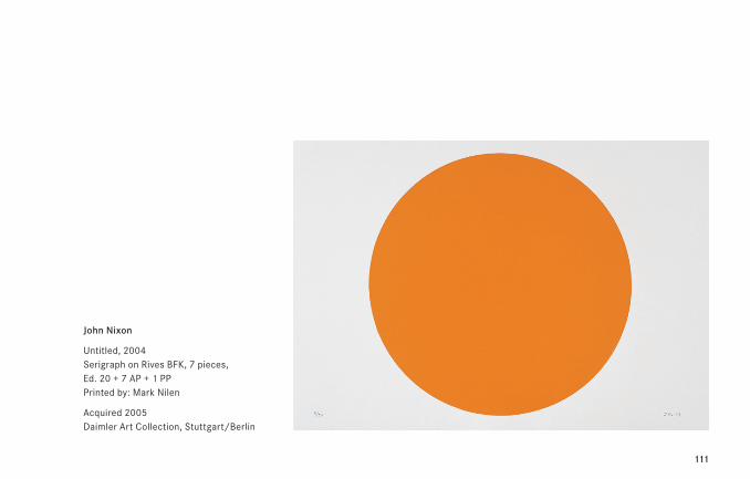
John Nixon
Untitled, 2004 Serigraph on Rives BFK, 7 pieces, Ed. 20 + 7 AP + 1 PP Printed by: Mark Nilen
Acquired 2005 Daimler Art Collection, Stuttgart/Berlin
112
113
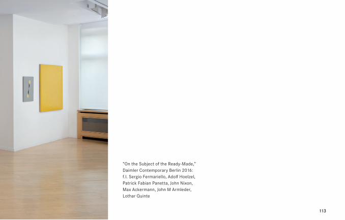
“On the Subject of the Ready-Made,” Daimler Contemporary Berlin 2016: f.l. Sergio Fermariello, Adolf Hoelzel, Patrick Fabian Panetta, John Nixon, Max Ackermann, John M Armleder, Lothar Quinte
114
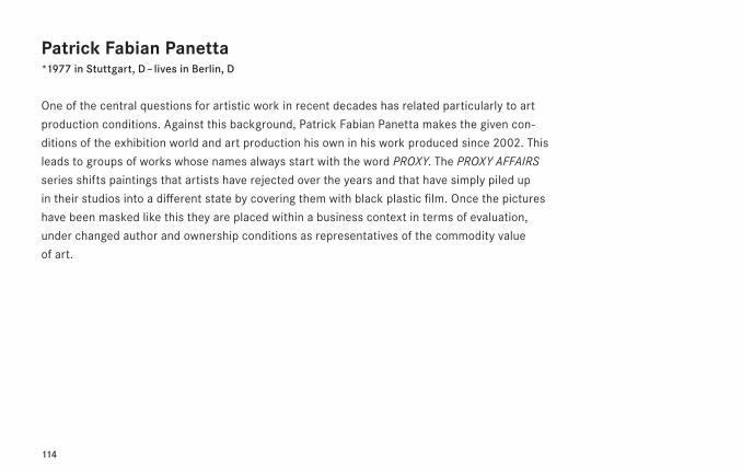
Patrick Fabian Panetta*1977 in Stuttgart, D – lives in Berlin, D
One of the central questions for artistic work in recent decades has related particularly to art
production conditions. Against this background, Patrick Fabian Panetta makes the given con-
ditions of the exhibition world and art production his own in his work produced since 2002. This
leads to groups of works whose names always start with the word PROXY. The PROXY AFFAIRS
series shifts paintings that artists have rejected over the years and that have simply piled up
in their studios into a different state by covering them with black plastic film. Once the pictures
have been masked like this they are placed within a business context in terms of evaluation,
under changed author and ownership conditions as representatives of the commodity value
of art.
115
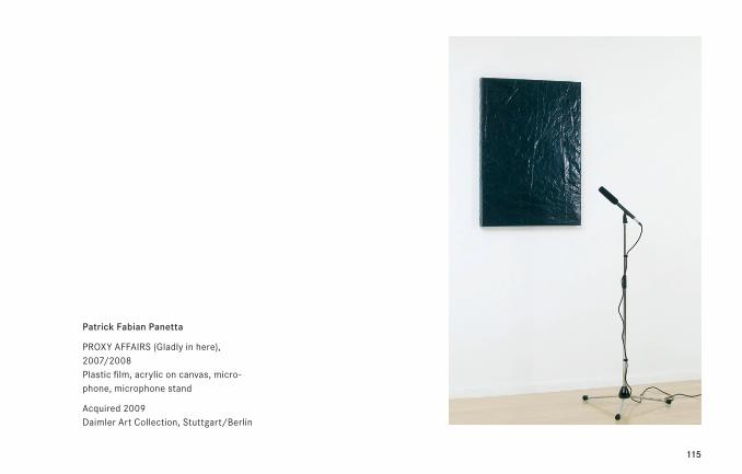
Patrick Fabian Panetta
PROXY AFFAIRS (Gladly in here), 2007/2008 Plastic film, acrylic on canvas, micro-phone, microphone stand
Acquired 2009 Daimler Art Collection, Stuttgart/Berlin
116
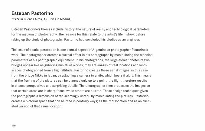
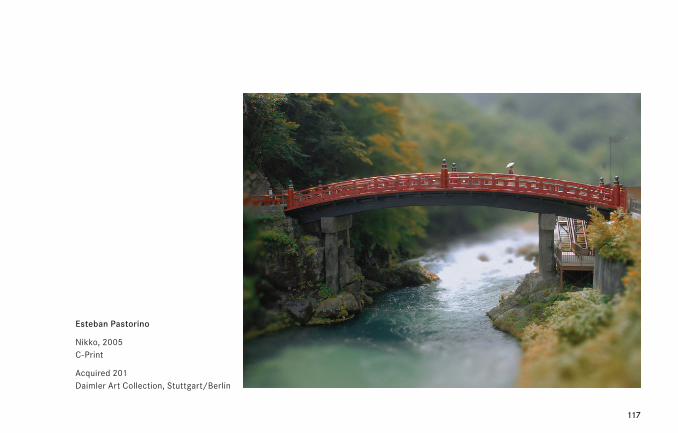
Esteban Pastorino*1972 in Buenos Aires, AR – lives in Madrid, E
Esteban Pastorino’s themes include history, the nature of reality and technological parameters
for the medium of photography. The reasons for this relate to the artist’s life history: before
taking up the study of photography, Pastorino had concluded his studies as an engineer.
The issue of spatial perception is one central aspect of Argentinean photographer Pastorino’s
work. The photographer creates a surreal effect in his photographs by manipulating the technical
parameters of his photographic equipment. In his photographs, the large-format photos of two
bridges appear like neighboring miniature worlds; they are images of real locations and land-
scapes photographed from a high altitude. Pastorino creates these aerial images, in this case
from the bridge Nikko in Japan, by attaching a camera to a kite, which bears it aloft. This means
that the framing of the pictures can be planned only up to a point; the flight therefore results
in chance perspectives and surprising details. The photographer then processes the images so
that certain areas are in sharp focus, while others are blurred. These design techniques gives
the photographs a dimension of the seemingly unreal. By manipulating the pictures, Pastorino
creates a pictorial space that can be read in contrary ways; as the real location and as an alien-
ated version of that same location.
117
Esteban Pastorino
Nikko, 2005 C-Print
Acquired 201 Daimler Art Collection, Stuttgart/Berlin
118
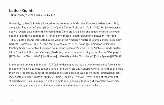
Lothar Quinte1923 in Neiße, D – 2000 in Wintzenbach, F
Generally, Lothar Quinte is allocated to the generation of German Concrete artists after 1945,
along with Rupprecht Geiger (1908–2009) and Günter Fruhtrunk (1923–1983). But his extensive
oeuvre reveals developments indicating that Concrete Art is only one aspect of his artist exami-
nation of painterly abstraction. After an early phase of gestural painting, between 1957 and
1960, Quinte became interested in the work of the American Abstract Expressionists, especially
Barnett Newman’s (1905–70) and Mark Rothko’s (1903–70) paintings. American Color Field
Painting finds its effective European counterpart in Quinte’s work; in the “Schleier- und Fenster-
bilder” [Veil and Window Paintings] (1961–64), but also in later work groups like the “Drippings”
(1979–84), the “Netzbilder” [Net Pictures] (1980–84) and the “Farbräume” [Color Spaces] (1977–97).
In the period between 1964 and 1979 Quinte developed works that come very close formally to
the geometrically abstract compositions of the Concrete and Constructivist artists, though unlike
them they repeatedly suggest reflection on picture space as well as the three-dimensional light-
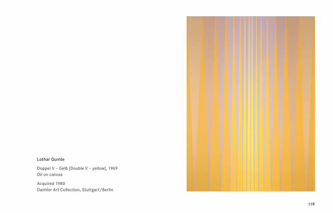
ing effects of color. Quinte’s Doppel V – Gelb [Double V – yellow], 1969, is one of the group of
“Fächerbilder” [Fan Paintings], which are built up of conically tapering, dichromatic color verti-
cals, creating an impression of spatial curves, of cylindrical or conical surfaces.
119
Lothar Quinte
Doppel V – Gelb [Double V – yellow], 1969 Oil on canvas
Acquired 1980 Daimler Art Collection, Stuttgart/Berlin
120
Timm Rautert*1941 in Tuchel, D – lives in Essen and Leipzig, D
Between 1966 and 1971, Timm Rautert studied photography with Otto Steinert (1915–78) at the
Folkwangschule für Gestaltung in Essen. During the 1970s, he worked as a photographic journalist
for a number of publications, including ZEIT magazine. From 1993 to 2007, he was professor of
photography at the Hochschule für Grafik und Buchkunst in Leipzig. Stylistically and thematically,
Rautert stands at the intersection between applied and artistic photography. In addition to pho-
tographic projects intended for exhibitions, he has created photographic series for international
magazines, journals and companies. He addresses social themes in a critical way—such as
changes to the working world, the significance of work (e.g. in his book “Menschen in Uniformen”
[People in Uniform], 1974) or with peripheral social groups such as thalidomide children or the
homeless.
Alongside his journalistic activities, he has consistently produced independent projects such as,
in the early 1970s, his series on Andy Warhol’s Factory and the 12-part photographic series
on Walter de Maria’s New York Loft. “In the upcoming years I have traveled to New York several
times and have often visited Walter. In 1971, I suggested to him to form his portrait with the
photos I had made in his loft. He agreed, selected twelve and sent those as his portrait to the
magazine ‘Avalanche’ in 1972, where they have been published for the first time.” (T.R.)
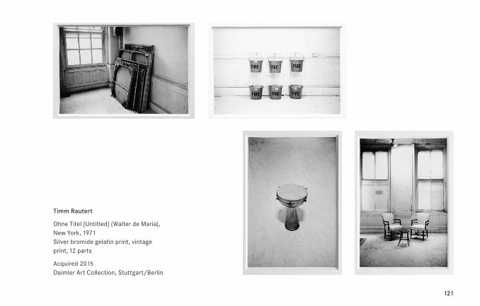
121
Timm Rautert
Ohne Titel [Untitled] (Walter de Maria), New York, 1971 Silver bromide gelatin print, vintage print, 12 parts
Acquired 2015 Daimler Art Collection, Stuttgart/Berlin
122
Peter Roehr1944 Lauenburg, PL – 1968 Frankfurt/Main, D
The slender Roehr oeuvre includes text and typo-visual montages as well as film and audio-mon-
tages, all untitled and uniformly numbered. Among the first montages are the typo-montages—
quadratic fields of single letters, numbers or punctuation marks, typed without any spaces on an
ordinary typewriter. From the perspective of historical development of art during the early 1960s,
Roehr’s typomontages represented a radicalization of the serial structures of Zero art, as well
as offering a counterpart to Carl Andre’s Typewriter Drawings, which were being developed at the
same time in New York.
Roehr’s first photomontages were inspired by an advertising campaign for Maxwell coffee in
autumn 1964. The images were cut directly from proofs, and were mounted on a solid back-
ground, without prior manipulation. Roehr exhibited approximately 130 photomontages between
1964 and 1966; among these was the large group of montages from the Volkswagen, Mercedes
or Chevrolet advertising brochures. The artistic decision only applied to the selection of the
raw material and the number and organization of the various elements. Roehr was endeavoring
to find a defining point between a small collection and a large quantity, where the individual
image is still distinctly recognizable while at the same time connecting with its montage environ-
ment in such a way as to repeat the form and color structures of the individual images in serial
multiplications.
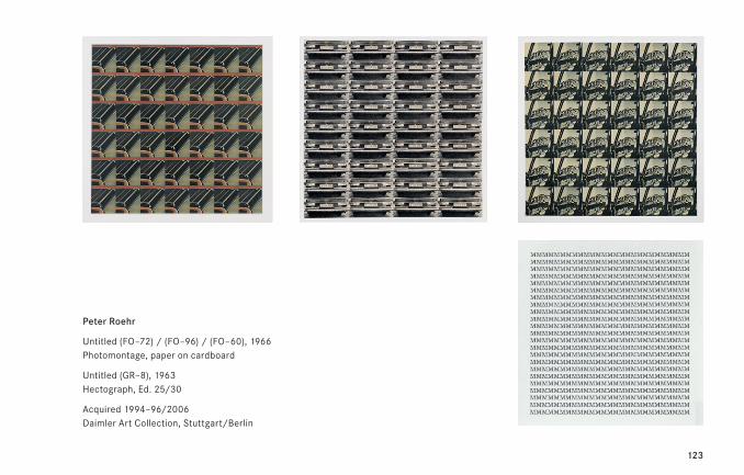
123
Peter Roehr
Untitled (FO–72) / (FO–96) / (FO–60), 1966 Photomontage, paper on cardboard
Untitled (GR–8), 1963 Hectograph, Ed. 25/30
Acquired 1994–96/2006 Daimler Art Collection, Stuttgart/Berlin
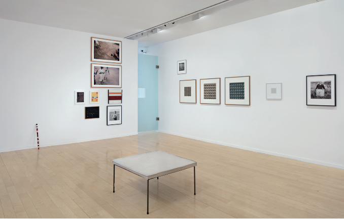
124
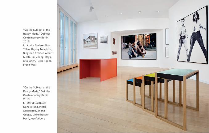
125
“On the Subject of the Ready-Made,” Daimler Contemporary Berlin 2016: f.l. David Goldblatt, Donald Judd, Pietro Sanguineti, Zheng Guogu, Ulrike Rosen-bach, Josef Albers
“On the Subject of the Ready-Made,” Daimler Contemporary Berlin 2016: f.l. Andre Cadere, Guy Tillim, Hayley Tompkins, Siegfried Cremer, Albert Mertz, Liu Zheng, Daya-nita Singh, Peter Roehr, Franz West
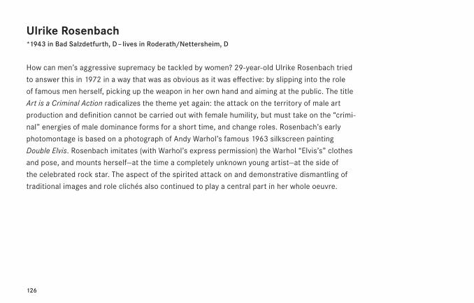
126
Ulrike Rosenbach*1943 in Bad Salzdetfurth, D – lives in Roderath/Nettersheim, D
How can men’s aggressive supremacy be tackled by women? 29-year-old Ulrike Rosenbach tried
to answer this in 1972 in a way that was as obvious as it was effective: by slipping into the role
of famous men herself, picking up the weapon in her own hand and aiming at the public. The title
Art is a Criminal Action radicalizes the theme yet again: the attack on the territory of male art
production and definition cannot be carried out with female humility, but must take on the “crimi-
nal” energies of male dominance forms for a short time, and change roles. Rosenbach’s early
photomontage is based on a photograph of Andy Warhol’s famous 1963 silkscreen painting
Double Elvis. Rosenbach imitates (with Warhol’s express permission) the Warhol “Elvis’s” clothes
and pose, and mounts herself—at the time a completely unknown young artist—at the side of
the celebrated rock star. The aspect of the spirited attack on and demonstrative dismantling of
traditional images and role clichés also continued to play a central part in her whole oeuvre.
127
Ulrike Rosenbach
Art is a Criminal Action, 1972/96 Black-and-white photograph, diasec
Acquired 2005 Daimler Art Collection, Stuttgart/Berlin
128
Tom Sachs*1966 in New York, USA – lives in New York, USA
With simple material from the construction market American sculptor Tom Sachs reconstructs,
deconstructs and parodies symbols of consumption and entertainment culture. Rebuilding and
converting everything that is regarded as “hip”; what is shocking, vulgar or fetish-like does not
even exclude works from the recent history of art.
Brillo Boxes, 2003, references the 1969 artwork by Andy Warhol (1928-87) of the same name—an
artist who, as a founder of Pop Art, has himself been stylized into a brand. Sachs’s Brillo boxes fit
seamlessly into an “aesthetic interconnection machinery” in more than one way: on the one
hand, they are reproduced images of a commercial product—the packaging cartons of the steel
wool cleaning pads patented under the brand name “Brillo”—on the other hand, they reference
Warhol’s “myth as brand”. Thus, they are part of a world that welcomes “trademarks” of any kind,
because their aura can be used for (artistic) consumer critique.
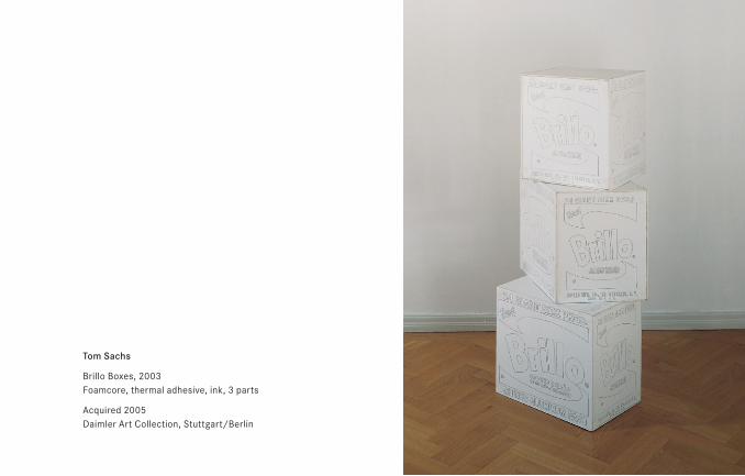
129
Tom Sachs
Brillo Boxes, 2003 Foamcore, thermal adhesive, ink, 3 parts
Acquired 2005 Daimler Art Collection, Stuttgart/Berlin
130
Pietro Sanguineti*1965 in Stuttgart, D – lives in Berlin, D
Pietro Sanguineti works on various levels and includes a variety of presentation forms and media.
His work is based on digital films, consisting of 3D computer animations and “found footage”
(artificial images from the world of television and cinema). His techniques are remix and tuning.
Language, which is a medium in its own right, is subject to mediatization in its turn through print,
television and the internet. Sanguineti’s montages of computer animations, ready-mades and
sculptural displays reflect this, and their fragmented sense units mean that they can create
meaning only out of the negative. Instead of a “meaningful” context, viewers are offered fields
of association that they can click on or click away again, as with a pop-up menu; an open field of
possible links and conclusions. This “negative” definition of meaning by Sanguineti—relating to
the meaningful contexts of Concept art—becomes the condition for the emergence of meaning
between the lines, in other words in the “shifts” between the various levels: between pictorial
and linguistic elements, between virtual and real spaces, between acceleration and standing still.
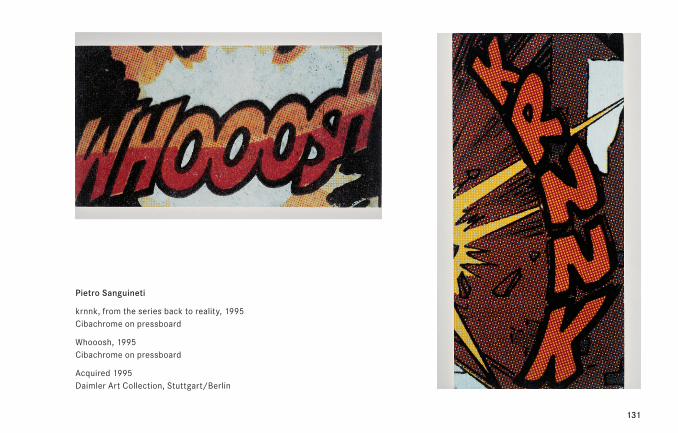
131
Pietro Sanguineti
krnnk, from the series back to reality, 1995 Cibachrome on pressboard
Whooosh, 1995 Cibachrome on pressboard
Acquired 1995 Daimler Art Collection, Stuttgart/Berlin
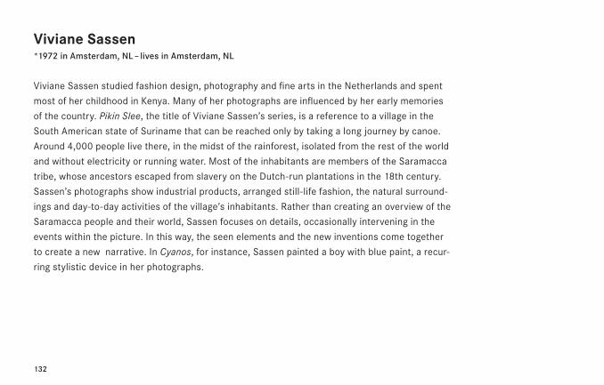
132
Viviane Sassen*1972 in Amsterdam, NL – lives in Amsterdam, NL
Viviane Sassen studied fashion design, photography and fine arts in the Netherlands and spent
most of her childhood in Kenya. Many of her photographs are influenced by her early memories
of the country. Pikin Slee, the title of Viviane Sassen’s series, is a reference to a village in the
South American state of Suriname that can be reached only by taking a long journey by canoe.
Around 4,000 people live there, in the midst of the rainforest, isolated from the rest of the world
and without electricity or running water. Most of the inhabitants are members of the Saramacca
tribe, whose ancestors escaped from slavery on the Dutch-run plantations in the 18th century.
Sassen’s photographs show industrial products, arranged still-life fashion, the natural surround-
ings and day-to-day activities of the village’s inhabitants. Rather than creating an overview of the
Saramacca people and their world, Sassen focuses on details, occasionally intervening in the
events within the picture. In this way, the seen elements and the new inventions come together
to create a new narrative. In Cyanos, for instance, Sassen painted a boy with blue paint, a recur-
ring stylistic device in her photographs.
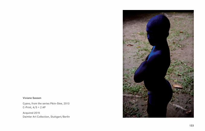
133
Viviane Sassen
Cyano, from the series Pikin-Slee, 2013 C-Print, 4/5 + 2 AP
Acquired 2015 Daimler Art Collection, Stuttgart/Berlin
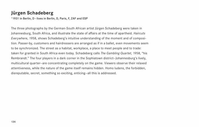
134
Jürgen Schadeberg*1931 in Berlin, D – lives in Berlin, D, Paris, F, ZAF and ESP
The three photographs by the German-South African artist Jürgen Schadeberg were taken in
Johannesburg, South Africa, and illustrate the state of affairs at the time of apartheid. Haircuts
Everywhere, 1958, shows Schadeberg’s intuitive understanding of the moment and of composi-
tion. Passer-by, customers and hairdressers are arranged as if in a ballet, even movements seem
to be synchronized. The street as a habitat, workplace, a place to meet people and to trade:
taken for granted in South Africa even today. Schadeberg calls The Gambling Quartet, 1958, “his
Rembrandt.” The four players in a dark corner in the Sophiatown district—Johannesburg’s lively,
multicultural quarter—are concentrating completely on the game. Viewers observe their relaxed
attentiveness, while the nature of the game itself remains hidden. Homo ludens, the forbidden,
disreputable, secret, something so exciting, enticing—all this is addressed.
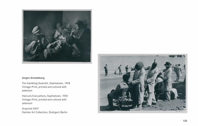
135
Jürgen Schadeberg
The Gambling Quartett, Sophiatown, 1958 Vintage-Print, printed and colored with selenium
Haircuts Everywhere, Sophiatown, 1958 Vintage-Print, printed and colored with selenium
Acquired 2007 Daimler Art Collection, Stuttgart/Berlin
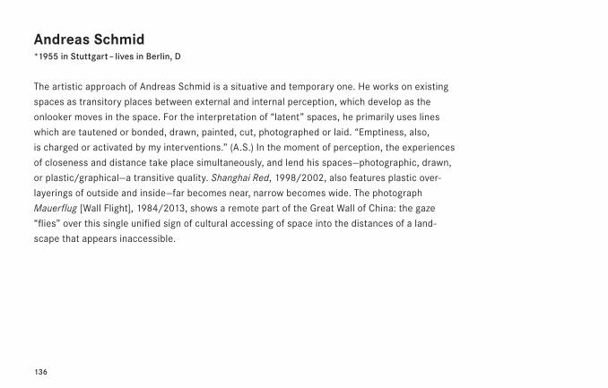
136
Andreas Schmid*1955 in Stuttgart – lives in Berlin, D
The artistic approach of Andreas Schmid is a situative and temporary one. He works on existing
spaces as transitory places between external and internal perception, which develop as the
onlooker moves in the space. For the interpretation of “latent” spaces, he primarily uses lines
which are tautened or bonded, drawn, painted, cut, photographed or laid. “Emptiness, also,
is charged or activated by my interventions.” (A.S.) In the moment of perception, the experiences
of closeness and distance take place simultaneously, and lend his spaces—photographic, drawn,
or plastic/graphical—a transitive quality. Shanghai Red, 1998/2002, also features plastic over-
layerings of outside and inside—far becomes near, narrow becomes wide. The photograph
Mauerflug [Wall Flight], 1984/2013, shows a remote part of the Great Wall of China: the gaze
“flies” over this single unified sign of cultural accessing of space into the distances of a land-
scape that appears inaccessible.
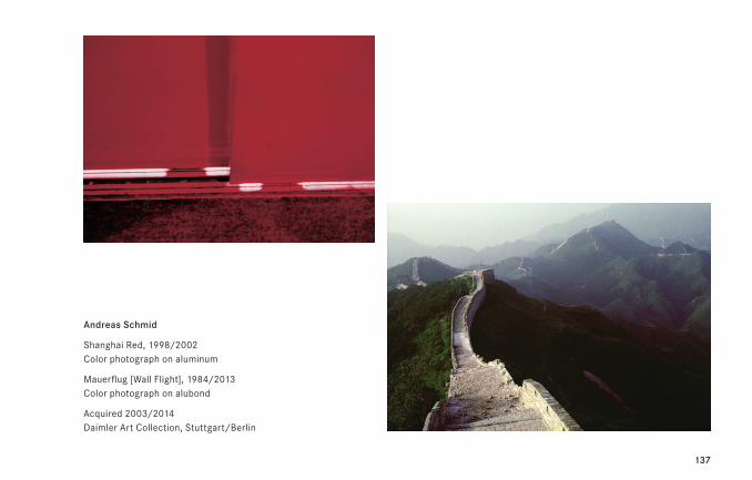
137
Andreas Schmid
Shanghai Red, 1998/2002 Color photograph on aluminum
Mauerflug [Wall Flight], 1984/2013 Color photograph on alubond
Acquired 2003/2014 Daimler Art Collection, Stuttgart/Berlin
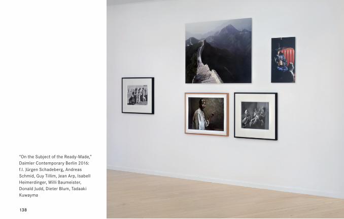
138
“On the Subject of the Ready-Made,” Daimler Contemporary Berlin 2016: f.l. Jürgen Schadeberg, Andreas Schmid, Guy Tillim, Jean Arp, Isabell Heimerdinger, Willi Baumeister, Donald Judd, Dieter Blum, Tadaaki Kuwayma
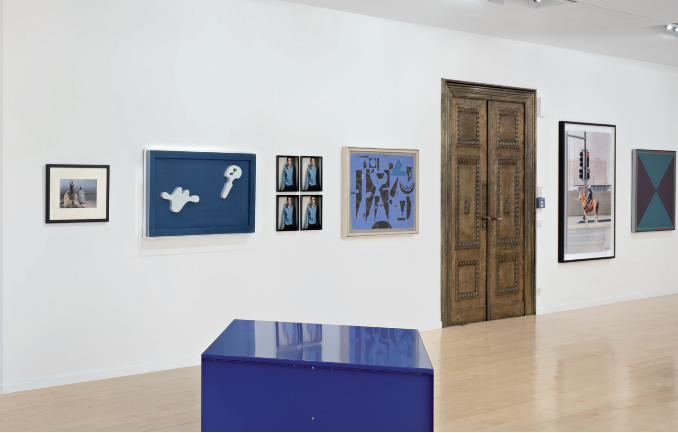
139
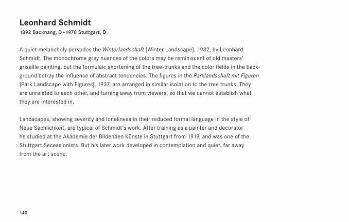
140
Leonhard Schmidt1892 Backnang, D – 1978 Stuttgart, D
A quiet melancholy pervades the Winterlandschaft [Winter Landscape], 1932, by Leonhard
Schmidt. The monochrome grey nuances of the colors may be reminiscent of old masters’
grisaille painting, but the formulaic shortening of the tree-trunks and the color fields in the back-
ground betray the influence of abstract tendencies. The figures in the Parklandschaft mit Figuren
[Park Landscape with Figures], 1937, are arranged in similar isolation to the tree trunks. They
are unrelated to each other, and turning away from viewers, so that we cannot establish what
they are interested in.
Landscapes, showing severity and loneliness in their reduced formal language in the style of
Neue Sachlichkeit, are typical of Schmidt’s work. After training as a painter and decorator
he studied at the Akademie der Bildenden Künste in Stuttgart from 1919, and was one of the
Stuttgart Secessionists. But his later work developed in contemplation and quiet, far away
from the art scene.
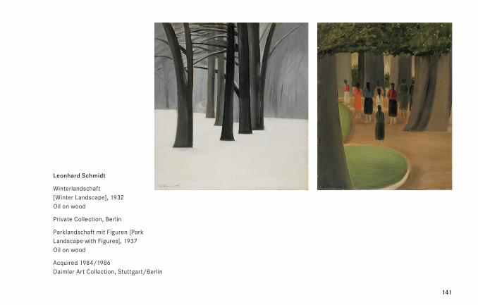
141
Leonhard Schmidt
Winterlandschaft [Winter Landscape], 1932 Oil on wood
Private Collection, Berlin
Parklandschaft mit Figuren [Park Landscape with Figures], 1937 Oil on wood
Acquired 1984/1986 Daimler Art Collection, Stuttgart/Berlin
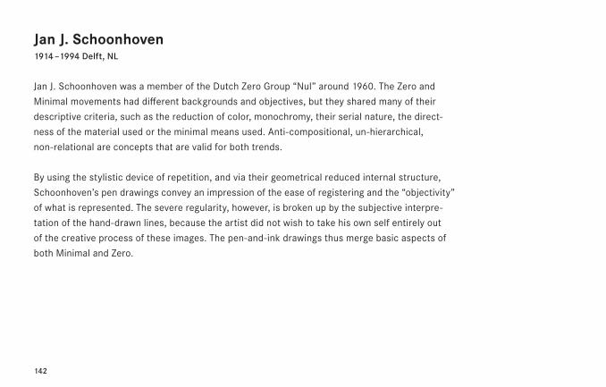
142
Jan J. Schoonhoven1914 – 1994 Delft, NL
Jan J. Schoonhoven was a member of the Dutch Zero Group “Nul” around 1960. The Zero and
Minimal movements had different backgrounds and objectives, but they shared many of their
descriptive criteria, such as the reduction of color, monochromy, their serial nature, the direct-
ness of the material used or the minimal means used. Anti-compositional, un-hierarchical,
non-relational are concepts that are valid for both trends.
By using the stylistic device of repetition, and via their geometrical reduced internal structure,
Schoonhoven’s pen drawings convey an impression of the ease of registering and the “objectivity”
of what is represented. The severe regularity, however, is broken up by the subjective interpre-
tation of the hand-drawn lines, because the artist did not wish to take his own self entirely out
of the creative process of these images. The pen-and-ink drawings thus merge basic aspects of
both Minimal and Zero.
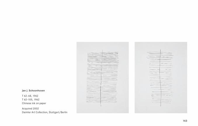
143
Jan J. Schoonhoven
T 62–68, 1962 T 62–105, 1962 Chinese ink on paper
Acquired 2002 Daimler Art Collection, Stuttgart/Berlin
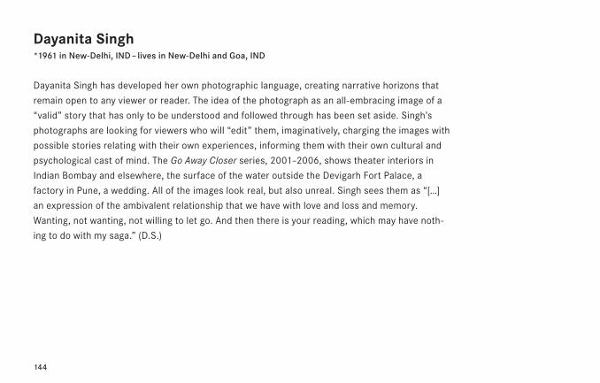
144
Dayanita Singh*1961 in New-Delhi, IND – lives in New-Delhi and Goa, IND
Dayanita Singh has developed her own photographic language, creating narrative horizons that
remain open to any viewer or reader. The idea of the photograph as an all-embracing image of a
“valid” story that has only to be understood and followed through has been set aside. Singh’s
photographs are looking for viewers who will “edit” them, imaginatively, charging the images with
possible stories relating with their own experiences, informing them with their own cultural and
psychological cast of mind. The Go Away Closer series, 2001–2006, shows theater interiors in
Indian Bombay and elsewhere, the surface of the water outside the Devigarh Fort Palace, a
factory in Pune, a wedding. All of the images look real, but also unreal. Singh sees them as “[…]
an expression of the ambivalent relationship that we have with love and loss and memory.
Wanting, not wanting, not willing to let go. And then there is your reading, which may have noth-
ing to do with my saga.” (D.S.)
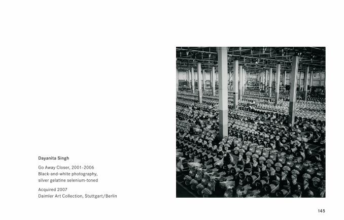
145
Dayanita Singh
Go Away Closer, 2001–2006 Black-and-white photography, silver gelatine selenium-toned
Acquired 2007 Daimler Art Collection, Stuttgart/Berlin
146
Anton Stankowski1906 Gelsenkirchen, D – 1998 Esslingen, D
Anton Stankowski worked as a painter and photographer, but also as a commercial artist. In his
work, we see applied and free art combined to the highest possible standard. He developed
“constructive graphics”—a new form of graphic design, concentrating on the union of typography
and image. Stankowski’s fundamental artistic concept presupposes the unity of photography,
commercial design and painting; his geometrical-abstract paintings bring a symbolic dynamic
to Constructivist Art. In his serial artworks, he investigates the links between color and form,
but also their impact on the recipient. In his profession as a designer he designed a number of
logos: visual profile images with a high recognition value, with original color schemes and with
associative qualities. Among the best-known of his designs is the classic logo for the Deutsche
Bank AG—the diagonal within a square.
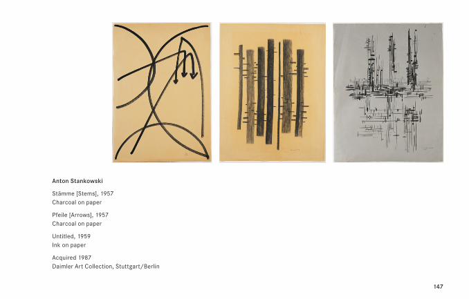
147
Anton Stankowski
Stämme [Stems], 1957 Charcoal on paper
Pfeile [Arrows], 1957 Charcoal on paper
Untitled, 1959 Ink on paper
Acquired 1987 Daimler Art Collection, Stuttgart/Berlin
148
Elaine Sturtevant1930 Lakewood, USA – 2014 Paris, F
In the 1960s, Elaine Sturtevant was one of the American Concept Artists who were questioning
the nature of art on a mental plane. Her principal interest was the “original as ready-made,”
and to arrive at this she undertook a processual reconstruction of specific works of art that were
already in existence. Treating art as a ready-made meant that artists did not have to create
something “original,” and made the emergence of art into a process that could be planned.
At this time, Sturtevant was looking for a way “by which [she] could talk about a level of art that
was more internal” (E.S.). Concentrating each time on an existing work of art of high visual
and intellectual expressiveness was intended to bring her as close as possible to its essence.
The lack of understanding and harsh criticism that her art attracted caused Sturtevant to
stop working as an artist for eleven years from 1974 onwards. It was not until 1985 that she
became highly regarded, parallel to the upcoming Appropriation Art movement.
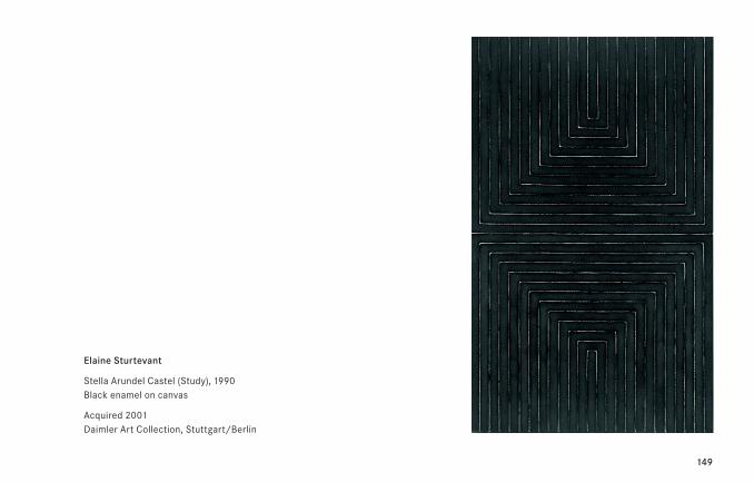
149
Elaine Sturtevant
Stella Arundel Castel (Study), 1990 Black enamel on canvas
Acquired 2001 Daimler Art Collection, Stuttgart/Berlin
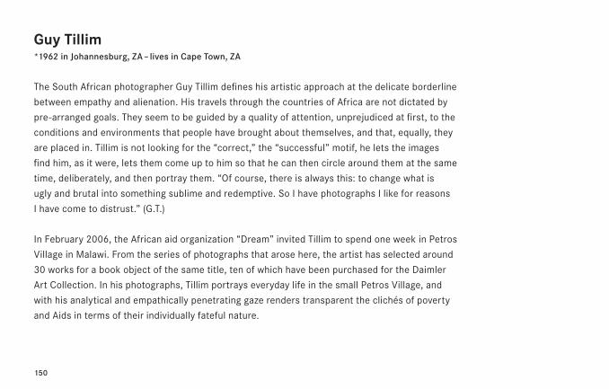
150
Guy Tillim*1962 in Johannesburg, ZA – lives in Cape Town, ZA
The South African photographer Guy Tillim defines his artistic approach at the delicate borderline
between empathy and alienation. His travels through the countries of Africa are not dictated by
pre-arranged goals. They seem to be guided by a quality of attention, unprejudiced at first, to the
conditions and environments that people have brought about themselves, and that, equally, they
are placed in. Tillim is not looking for the “correct,” the “successful” motif, he lets the images
find him, as it were, lets them come up to him so that he can then circle around them at the same
time, deliberately, and then portray them. “Of course, there is always this: to change what is
ugly and brutal into something sublime and redemptive. So I have photographs I like for reasons
I have come to distrust.” (G.T.)
In February 2006, the African aid organization “Dream” invited Tillim to spend one week in Petros
Village in Malawi. From the series of photographs that arose here, the artist has selected around
30 works for a book object of the same title, ten of which have been purchased for the Daimler
Art Collection. In his photographs, Tillim portrays everyday life in the small Petros Village, and
with his analytical and empathically penetrating gaze renders transparent the clichés of poverty
and Aids in terms of their individually fateful nature.
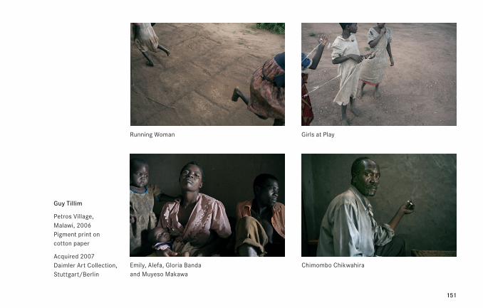
151
Guy Tillim
Petros Village, Malawi, 2006 Pigment print on cotton paper
Acquired 2007 Daimler Art Collection, Stuttgart/Berlin
Running Woman
Emily, Alefa, Gloria Banda and Muyeso Makawa
Girls at Play
Chimombo Chikwahira
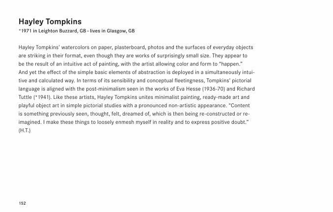
152
Hayley Tompkins*1971 in Leighton Buzzard, GB – lives in Glasgow, GB
Hayley Tompkins’ watercolors on paper, plasterboard, photos and the surfaces of everyday objects
are striking in their format, even though they are works of surprisingly small size. They appear to
be the result of an intuitive act of painting, with the artist allowing color and form to “happen.”
And yet the effect of the simple basic elements of abstraction is deployed in a simultaneously intui-
tive and calculated way. In terms of its sensibility and conceptual fleetingness, Tompkins’ pictorial
language is aligned with the post-minimalism seen in the works of Eva Hesse (1936-70) and Richard
Tuttle (*1941). Like these artists, Hayley Tompkins unites minimalist painting, ready-made art and
playful object art in simple pictorial studies with a pronounced non-artistic appearance. “Content
is something pre viously seen, thought, felt, dreamed of, which is then being re-constructed or re-
imagined. I make these things to loosely enmesh myself in reality and to express positive doubt.”
(H.T.)
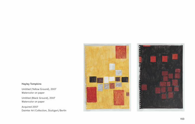
153
Hayley Tompkins
Untitled (Yellow Ground), 2007 Watercolor on paper
Untitled (Black Ground), 2007 Watercolor on paper
Acquired 2007 Daimler Art Collection, Stuttgart/Berlin
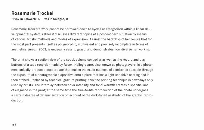
154
Rosemarie Trockel*1952 in Schwerte, D – lives in Cologne, D
Rosemarie Trockel’s work cannot be narrowed down to cycles or categorized within a linear de-
velopmental system; rather it discusses different topics of a post-modern situation by means
of various artistic methods and modes of expression. Against the backdrop of her œuvre that for
the most part presents itself as polymorphic, multivalent and precisely incomplete in terms of
aesthetics, Revox, 2003, is unusually easy to grasp, and demonstrates how diverse her work is.
The print shows a section view of the spool, volume controller as well as the record and play
buttons of a tape recorder made by Revox. Heliogravure, also known as photogravure, is a photo-
mechanically-produced copperplate that makes the exact nuances of semitones possible through
the exposure of a photographic diapositive onto a plate that has a light-sensitive coating and is
then etched. Replaced by technical gravure printing, this fine printing technique is nowadays only
used by artists. The interplay between color intensity and tonal warmth creates a specific kind
of elegance in the print; at the same time the true-to-life reproduction of the photo undergoes
a certain degree of defamiliarization on account of the dark-toned aesthetic of the graphic repro-
duction.
155
Rosemarie Trockel
Revox, 2003 Heliogravure-Technique, Ed. 111
Acquired 2003 Daimler Art Collection, Stuttgart/Berlin
156
Timm Ulrichs*1940 in Berlin, D – lives in Hannover, Münster and Berlin, D
Timm Ulrichs’ work fluctuates between Dada, Concrete Poetry and constructivist tendencies,
between Performance and Conceptual Art, between analytical linguistic humor, self-examination
and his desire to make art democratic. He undermines raising artworks to the level of fetishes
with ready-mades, multiples or objects produced in editions such as postcards, posters and
artists’ books. The 1966 piece Bild [Picture], 1966, in the Daimler Art Collection is an early con-
ceptual work. Here Ulrichs is following the 20th century tradition since Kazimir Malevich’s Black
Square on a White Ground, 1915, of questioning an art-historically determined picture concept.
By calling the picture “picture,” and thus making it into a “language picture,” material and term
are doubling up tautologically. This places Bild within a series of works, in which Ulrichs reflects
on the conditions imposed by art production and reception.
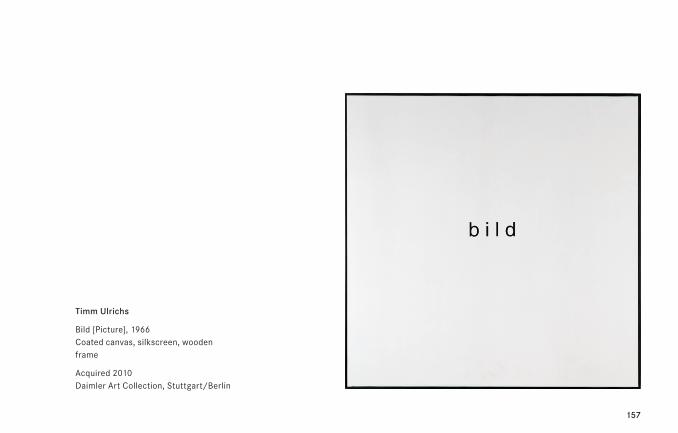
157
Timm Ulrichs
Bild [Picture], 1966 Coated canvas, silkscreen, wooden frame
Acquired 2010 Daimler Art Collection, Stuttgart/Berlin
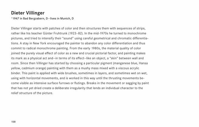
158
Dieter Villinger*1947 in Bad Bergzabern, D – lives in Munich, D
Dieter Villinger starts with patches of color and then structures them with sequences of strips,
rather like his teacher Günter Fruhtrunk (1923–82). In the mid-1970s he turned to monochrome
pictures, and tried to intensify their “sound” using careful geometrical and chromatic differentia-
tions. A stay in New York encouraged the painter to abandon any color differentiation and thus
commit to radical monochrome painting. From the early 1980s, the material quality of color
joined the purely visual effect of color as a new and crucial pictorial factor, and painting makes
its mark as a physical act and—in terms of its effect—like an object, a “skin” between wall and
room. Since then Villinger has started by choosing a particular pigment (manganese blue, Hansa
yellow, cadmium orange) painting with them as a mushy mass mixed with a viscous acrylic
binder. This paint is applied with wide brushes, sometimes in layers, and sometimes wet on wet,
using with horizontal movements, and is worked in this way until the thrusting movements be-
come visible as intensive surface furrows or flutings. Breaks in the movement or sagging by paint
that has not yet dried create a deliberate irregularity that lends an individual character to the
relief structure of the picture.
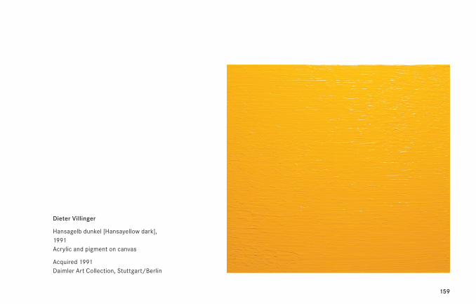
159
Dieter Villinger
Hansagelb dunkel [Hansayellow dark], 1991 Acrylic and pigment on canvas
Acquired 1991 Daimler Art Collection, Stuttgart/Berlin
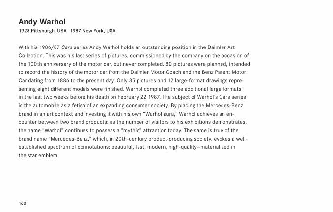
160
Andy Warhol1928 Pittsburgh, USA – 1987 New York, USA
With his 1986/87 Cars series Andy Warhol holds an outstanding position in the Daimler Art
Collection. This was his last series of pictures, commissioned by the company on the occasion of
the 100th anniversary of the motor car, but never completed. 80 pictures were planned, intended
to record the history of the motor car from the Daimler Motor Coach and the Benz Patent Motor
Car dating from 1886 to the present day. Only 35 pictures and 12 large-format drawings repre-
senting eight different models were finished. Warhol completed three additional large formats
in the last two weeks before his death on February 22 1987. The subject of Warhol’s Cars series
is the automobile as a fetish of an expanding consumer society. By placing the Mercedes-Benz
brand in an art context and investing it with his own “Warhol aura,” Warhol achieves an en-
counter between two brand products: as the number of visitors to his exhibitions demonstrates,
the name “Warhol” continues to possess a “mythic” attraction today. The same is true of the
brand name “Mercedes-Benz,” which, in 20th-century product-producing society, evokes a well-
established spectrum of connotations: beautiful, fast, modern, high-quality—materialized in
the star emblem.
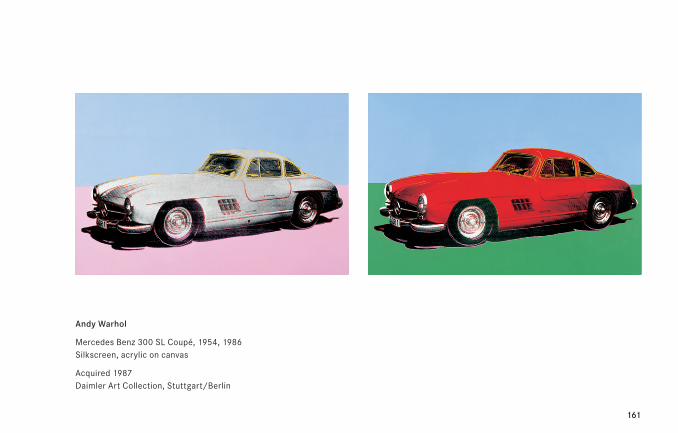
161
Andy Warhol
Mercedes Benz 300 SL Coupé, 1954, 1986 Silkscreen, acrylic on canvas
Acquired 1987 Daimler Art Collection, Stuttgart/Berlin
162
Franz West1947 – 2012 Vienna, A
Franz West’s works are intended for more than contemplation and reflection: the way they are
used is also a major factor in their reception. West’s objects also require direct physical content.
West’s so-called Passstücke für den menschlichen Körper [Adaptors for the human body] are
constructs that have been emerging since the early seventies in very individual, sometimes even
absurd forms; anyone can relate them to his or her own body as wished. The objects comple-
ment, extend, change the body as they are used, thus influencing physical feelings; this in its
turn affects the individual user’s physical and psychological state.
West’s furniture represents a logical further development of the Passstücke concept. In the early
eighties he started creating larger “adaptors”—or adaptor-like furniture—alongside the Passstücke
themselves, which are always manageable and portable. One of these was a chair with a back
that projected particularly strikingly, largely enclosing the body. Here experiences are not mod-
elled by an active state of mind. West subsequently developed the idea of a piece of furniture
that could create a state of mind, and in the course of time his chairs, tables, couches etc. took
on ever clearer forms and also became more comfortable. As well as the material qualities of
his furniture, West also uses positioning in certain specific localities to create further stimuli for
mental and physical states.
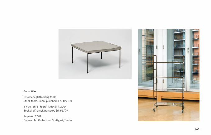
163
Franz West
Ottomane [Ottoman], 2005 Steel, foam, linen, punched, Ed. 42/100
2 x 20 Jahre [Years] PARKETT, 2004 Bookshelf, steel, perspex, Ed. 56/99
Acquired 2007 Daimler Art Collection, Stuttgart/Berlin
164
Christa Winter*1952 in Duisburg, D – lives in Stuttgart, D
For Christa Winter color, as a material and a chemical substance, plays as large a role as formal
composition and art historical references. Since 1999, the artist has taken research trips in order
to study new developments of technical colorants in industrial and scientific laboratories.
Her own experiments followed, always with the intention of bringing these highly engineered
products to life. The result of her work was “Floating Color,” which opens an intense color per-
ception. As soon as the observer changes position relative to the painting, the color itself
changes fluidly. Both, the viewing angle and the direction and intensity of light falling on the
picture influence the color tone. This allows the static character of visual art to be removed by
the interaction of the observer with the picture’s substance. Purchi, 1998, belongs to a work
group of pictorial objects, for which the artist likes to use forms which evoke organic, natural
association.
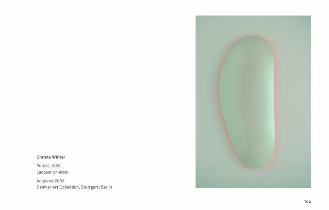
165
Christa Winter
Purchi, 1998 Lacquer on alder
Acquired 2006 Daimler Art Collection, Stuttgart/Berlin
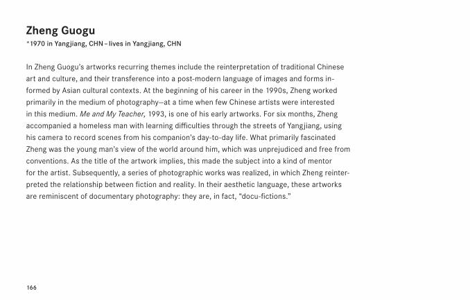
166
Zheng Guogu*1970 in Yangjiang, CHN – lives in Yangjiang, CHN
In Zheng Guogu’s artworks recurring themes include the reinterpretation of traditional Chinese
art and culture, and their transference into a post-modern language of images and forms in-
formed by Asian cultural contexts. At the beginning of his career in the 1990s, Zheng worked
primarily in the medium of photography—at a time when few Chinese artists were interested
in this medium. Me and My Teacher, 1993, is one of his early artworks. For six months, Zheng
accompanied a homeless man with learning difficulties through the streets of Yangjiang, using
his camera to record scenes from his companion’s day-to-day life. What primarily fascinated
Zheng was the young man’s view of the world around him, which was unprejudiced and free from
conventions. As the title of the artwork implies, this made the subject into a kind of mentor
for the artist. Subsequently, a series of photographic works was realized, in which Zheng reinter-
preted the relationship between fiction and reality. In their aesthetic language, these artworks
are reminiscent of documentary photography: they are, in fact, “docu-fictions.”
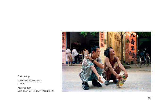
167
Zheng Guogu
Me and My Teacher, 1993 C-Print
Acquired 2014 Daimler Art Collection, Stuttgart/Berlin
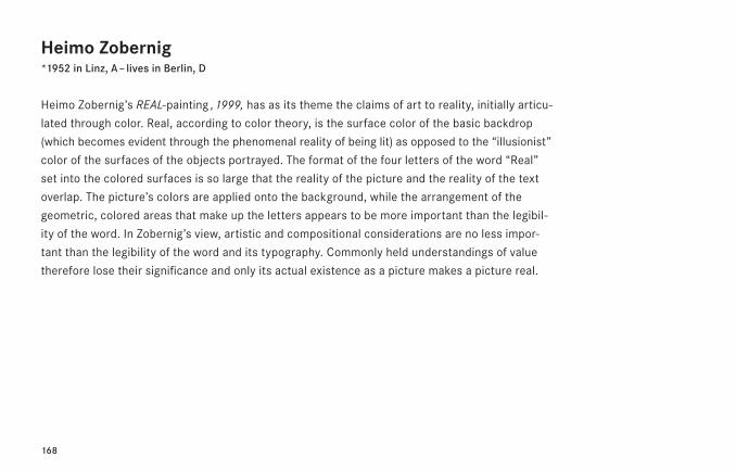
168
Heimo Zobernig*1952 in Linz, A – lives in Berlin, D
Heimo Zobernig’s REAL-painting , 1999, has as its theme the claims of art to reality, initially articu-
lated through color. Real, according to color theory, is the surface color of the basic backdrop
(which becomes evident through the phenomenal reality of being lit) as opposed to the “illusionist”
color of the surfaces of the objects portrayed. The format of the four letters of the word “Real”
set into the colored surfaces is so large that the reality of the picture and the reality of the text
overlap. The picture’s colors are applied onto the background, while the arrangement of the
geometric, colored areas that make up the letters appears to be more important than the legibil-
ity of the word. In Zobernig’s view, artistic and compositional considerations are no less impor-
tant than the legibility of the word and its typography. Commonly held understandings of value
therefore lose their significance and only its actual existence as a picture makes a picture real.
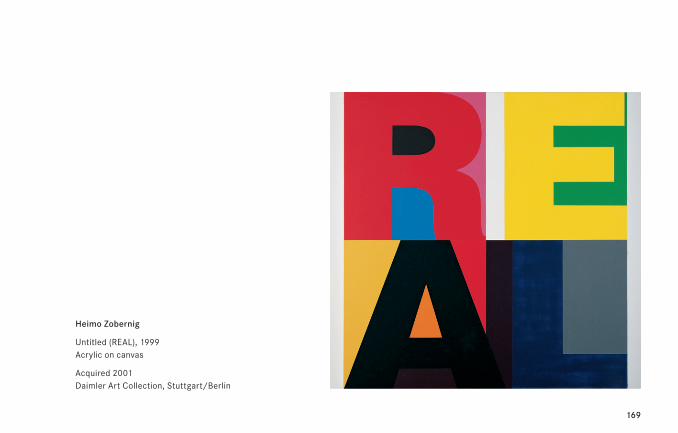
169
Heimo Zobernig
Untitled (REAL), 1999 Acrylic on canvas
Acquired 2001 Daimler Art Collection, Stuttgart/Berlin
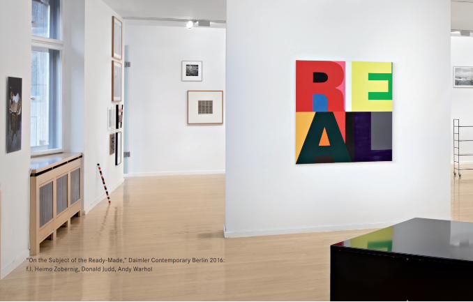
170
“On the Subject of the Ready-Made,” Daimler Contemporary Berlin 2016: f.l. Heimo Zobernig, Donald Judd, Andy Warhol
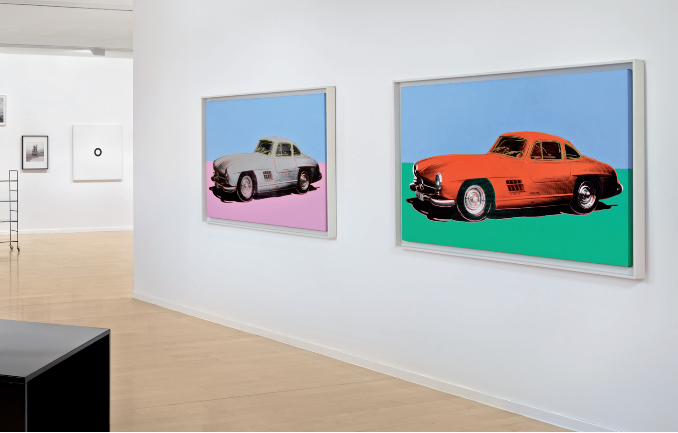
171

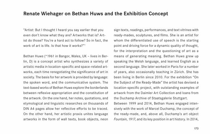
173
sign texts, readings, performances, and text vitrines with
ready-mades, sculptures, and films. She is an artist for
whom the differentiated use of speech is the starting
point and driving force for a dynamic quality of thought,
for the interpretation and the questioning of art as a
means of generating meaning. Bethan Huws grew up
speaking the Welsh language, and learned English as a
second language. She later worked in Paris for a number
of years, also occasionally teaching in Zürich. She has
been living in Berlin since 2010. For the exhibition “On
the Subject of the Ready-Made” the artist has devised a
location-specific project, with outstanding examples of
artwork from the Daimler Art Collection and loans from
the Duchamp Archive of Staatsgalerie Stuttgart.
Between 1999 and 2014, Bethan Huws engaged inten-
sively with the work of Marcel Duchamp, the concept of
the ready-made, and, above all, Duchamp’s art object
Fountain, 1917, and its key position in art history. In 2014,
“Artist: But I thought I heard you say earlier that you
even don’t know what they are? Artworks that is? Art-
ist do those? You’re a hard act to follow? So in fact, the
work of art is life. Is that how it works?”1
Bethan Huws (*1961 in Bangor, Wales, UK – lives in Ber-
lin, D) is a concept artist who synthesizes a variety of
artistic media in location-specific and space-related art-
works, each time renegotiating the significance of art in
society. The basis for her artwork is provided by language:
the spoken word, and the communicative system. The
text-based works of Bethan Huws explore the borderlands
between reflexive appropriation and the constitution of
the artwork. On the one hand, her notes, quotations, and
etymological and linguistic researches on thousands of
DIN A4 pages allow her reflective efforts to be traced.
On the other hand, her artistic praxis unites language
artworks in the form of wall texts, book objects, neon
Renate Wiehager on Bethan Huws and the Exhibition Concept
174
she published a selection of her Research Notes, 2007–
2014, which comprise several thousand pages, in the
form of a 523-page artist’s book.2 A fundamental and
comprehensive artistic appropriation of Duchamp’s art-
work, it must be the only analytical “re-reading” endeavor
of its kind in contemporary art. As a first step, Huws im-
mersed herself, in an act of precise retracing, in the art-
ist’s own statements and the reception of the artwork
as seen in Duchamp’s writings, and in the most significant
art-theory meta-texts. She then took this to a further
level by bringing the excerpts from artist texts, concepts,
pictorial material, historical facts, and interpretations
into the wider context of language philosophy, linguistics,
etymology, and psychoanalysis. Looking back, Bethan
Huws has, through a combination of intuitive understand-
ing and analytical penetration, asked questions that she
also applies to her own artwork development, relating
to subjective decisions and objective background condi-
tions. Looking forward, she poses the question of how
both the art concept and artistic praxis aspects of “ready-
made” status can be made individually credible and be
taken further in terms of transpersonal communication—
from the standpoint both of an artist and of a recipient.3
The exhibition “On the Subject of the Ready-Made”—with
works from the Daimler Art Collection and conceived in
collaboration with Bethan Huws—will run through late
2016 and early 2017, thereby corresponding to the “dou-
ble” birthday of the ready-made, both as a concept and
as an artistic praxis. In January 1916, Marcel Duchamp,
who had moved from Paris to New York the previous year,
wrote a letter to his sister Suzanne concerning the dis-
posal of his Paris apartment, in which he mentions the
concept of the ready-made for the first time. Marcel Du-
champ explains to his sister the status of the things that
he left behind: “Now, if you have been up to my place,
you will have seen, in the studio, a bicycle wheel and
175
a bottle rack. I bought this as a ready-made sculpture.
And I have a plan concerning this so-called bottle rack.
Listen to this: here, in N.Y., I have bought various objects
in the same taste and I treat them as ‘ready-mades’ [sic].
You know enough English to understand the meaning of
‘readymade’ that I give these objects. I sign them and I
think of an inscription for them in English. I’ll give you a
few examples. I have, for example, a large snow shovel
on which I have inscribed at the bottom: ‘In advance of
the broken arm’, French translation: ‘En avance du bras
casé’.—Don’t tear your hair out trying to understand this
in the Romantic or Impressionistic or Cubist sense—it
has nothing to do with all that; another ‘readymade’ is
called: ‘Emergency in favor of twice’, possible French
translation: ‘Danger \ Crise \ en faveur de 2 fois’. This
long preamble just to say: take the bottle rack for your-
self. I’m making it a readymade [sic], remotely. You are
to inscribe it at the bottom and on the inside of the bot-
tom circle, in small letters painted with a brush in oil,
silver white color, with an inscription which I will give you
herewith, and then sign it, in the same handwriting as
follows: ‘[after] Marcel Duchamp’.”4 Duchamp’s explicit
explanation failed to prevent both the bottle rack and
the bicycle wheel from being disposed of as rubbish.
In April 2016, the catalog for the group exhibition “Exhi-
bition of Modern Art” at New York’s Bourgeois Gallery
had listed the artworks contributed by Marcel Duchamp
as “Two Ready-mades.”5 A year later, in 1917, the jury of
the New York art event “Salon des artistes independents,”
which included Marcel Duchamp, decided not to admit
to the exhibition a urinal signed “R. Mutt 1917,” which
had been submitted as a sculpture. Duchamp’s contro-
versial object Fountain reappeared briefly at the Alfred
Stieglitz gallery, where it was photographed by the pro-
prietor, before vanishing for more than two decades. In
1965, Duchamp recalled the complete disinterest of the
176
contemporary public in his ready-made concept: “Until
just a few years ago, I did not even exhibit them, with the
exception of a single exhibit in the Bourgeois Gallery in
New York in 1916. I hung three of them on a clothes rack
at the entrance, and no-one noticed them … which was
a lot of fun.”6 In 1941, Duchamp disseminates his legend-
ary early ready-mades in the form of miniature reproduc-
tions in his Boîte-en-valise suitcase exhibit. Circa 1950,
Duchamp approved (there is a 1959 second version, 1953
unverified version and the third version in 1963) replicas-
ready-mades based on Stieglitz’ photo. In 1964, Milan
gallerist Arturo Schwarz marketed Fountain in the form
of an elaborately produced multiple.
On the genesis of Bethan Huws’ artworkThe early work of Bethan Huws, which was created in the
late 1980s in a Young British Artists context, began with
the formulation of questions concerning her own—intel-
lectual—position as an artist via institution-critical spatial
interventions involving the removal, exposure, transfer-
ence and duplication of flooring in the academy / gallery
/ museum context. This led to the creation of experience
and thought spaces, with the aim of opening up places
of perception and self-reflection for the viewer. Begin-
ning in 1991, and continuing for around ten years, Bethan
Huws translated her thorough researches on the relation-
ship of body, language, art, and society into pure text
artworks, materializing the artworks’ connection with
concrete spaces, locations, and cultural situations in
various different ways: handwritten texts on the wall,
DIN A 4 pages laid out on the walls, temporary text im-
ages for natural spaces, books, a theatre piece, readings,
performances, in-situ word sculptures, film, and language
objects.
For around 15 years now, Bethan Huws has been inves-
tigating the foundation of art provided by the indissoluble
177
connection of spirit and body, of intellectual penetration
and social interaction—through her engagement with the
tradition of the ready-made and the work of Marcel Du-
champ. She conducts her researches in parallel in differ-
ent areas of knowledge: philosophy and linguistics, poetry
and art history, film history, music, and spiritual / religious
traditions. In the work of Bethan Huws, analytical con-
structions and artistic praxis are used to open up the
widest imaginable horizon for the concept of the ready-
made: translation of a historical artwork (Duchamp‘s
painting Nu descendant un escalier) into a “ready-made”
language image, objects with various cultural functions
in the form of thought images, a Bulgarian women’s choir
as a “ready-made equivalent,” defining of a linguistics
textbook as a graphic print edition, and the reordering
of museum collections as ready-mades, as opposed to
art theory classifications—thereby creating new forms of
reading.
If one is to understand the theme of the ready-made in
Huws’ work, one must understand that her intention is
not to detach a prefabricated everyday object from its
environment and translate it into the context of art, as
was the case with the original understanding of the ready-
made. Rather, she is concerned with the transfer of con-
textual units, with a dislocation of cultural and historical
contexts in order to constantly provoke new readings of
the same sense items. The precondition for this kind of
translation is provided by the structural analysis of phe-
nomena from different contexts: for instance, by recog-
nizing the structure and the system that lies behind
Bottle Rack, and thereby behind Marcel Duchamp’s con-
cept of the ready-made, Bethan Huws can find this basic
structure in phenomena from other contexts. In 2015,
Bethan Huws created a construction that was highly rel-
evant in this sense for the Kunsthalle Karlsruhe: in the
emptiness of the great entrance area, the visitor is con-
178
fronted with Le porte-bouteilles, 2008, a Philippine shell
(Murex pecten also called venus comb murex) with rising
spiral-form pointed spines, the size of the palm of the
hand and placed on a mdf-medium pedestal. This piece
of nature served as a prelude, referencing the conclusion
of the exhibition: Huws’ large-scale installation Forest,
2008-09, consisting of 88 bottle racks.7 The title of the
artwork refers the store-bought objects back to the con-
text of nature, with every bottle rack metaphorically
readable as a tree. “All works of art are linguistic by na-
ture. Not one of them would exist on Earth without lan-
guage. All works of art are linguistic constructions.” 8
The artist reads the horizontally positioned urinal entitled
Fountain—Marcel Duchamp’s “ready-made masterpiece”
(B.H.)—as an act and as a language game: “Fountain is
definitely a nude: the man—or at least this small but im-
portant part of him—is, and what could be more popular
than a toilet? […] When I first encountered Fountain in
the flesh, so to speak, I didn’t recognize it as a work of
art; I simply recognized a urinal on a plinth, and so what?
It was only later, with some additional work on my own
behalf—when I finally put the word “fountain” (realization)
with the thing “urinal” (recognition)—that the big wheel
started to turn.” 9 Bethan Huws takes the title of the art-
work at its word. To her, Fountain is the source, the origin
and ever-new, inexhaustible starting point for contem-
plation of artistic practice and its ethical anchoring.
The basis of Bethan Huws’ exhibition “The Lake Writing”
at the Institute for Contemporary Art (ICA) London in
1991 was provided by the phenomenological description
of a rambling trip around a mountain lake, which was
spoken, unfiltered, into a dictation device, transferred
to a handwritten manuscript on DIN A 4 pages, and hung
in the otherwise empty museum spaces. “Unfiltered”, in
this case, refers to the fact that the artist converts her
observations into language in an exceptionally precise
179
and concrete manner, but without falling into an ana-
lytical or scientific meta-language.10 The moment of
heightened perception is expressed in an anti-subjective,
anti-impressionistic language image, which places itself
outside of time, history, and memory, thereby also sub-
tly expressing the unbridgeable alienation between self
and world / nature. Here, the verbalizing and noting down
in writing of a chain of visual impressions functions like
a ready-made, transferring, as it were, a sensory / intel-
lectual act out of the natural space and into the art space.
For her exhibition “Haus Esters,” 1993, Bethan Huws
proclaimed the whole architectonic structure of that
residence, built by Mies van der Rohe, to be a ready-
made: an “already completed” artwork. She merely added
an openly-structured text object that visitors could carry
with them as they walked through the empty rooms. In
the same year for an Artangel project, Bethan Huws in-
vited a Bulgarian women’s choir for the performance /
film project Singing to the Sea. On the coast of Northum-
berland, they sung traditional folk songs evoking forests
and mountains, shepherds and young maidens of their
Bulgarian homeland. Huws herself has described the
performance as a “ready-made equivalent”11 to her early
flooring artworks—if the factor of translation is of funda-
mental importance to artistic praxis in general, then one
could say that in this case she has translated a centuries-
old tradition of language and music, organically developed
through cultural processes, from one cultural space into
another.
The concept of quoting (in handwriting), collaging, mon-
taging, erasing, recomposing etc. expressions, quota-
tions, definitions and her own reflections provides the
basis for Bethan Huws’ textual work Origin and Source,
accumulated over three years, between 1993 and 1996.
She broke off the work, leaving it uncompleted, in order
to collate around 1,300 pages into six volumes. Within
180
these pages, arranged in a consistently anti-linear man-
ner, she describes the concepts fundamental to her
work—language / writing / material / medium / form /
difference / system / synthesis / origin / identity etc.—
which constantly lead us from objective recognition back
to the thought processes and language actions of a con-
crete person: “An artwork is made of one thing—a per-
son—it becomes the job of an artist to know what a per-
son is.”12 Here, the artist engages with the “system of
language”: she reflects the conditionality of artistic prac-
tice in the medium of language. In the text work Origin
and Source, similarly, Bethan Huws consistently takes
the thoughts behind Marcel Duchamp’s concept of the
ready-made as formulated in 1916 a step further: whereas
Duchamp shifts everyday objects into the concept of art
in order to reveal differences of meaning, Huws remains
within the context of art, taking artistic praxis itself—her
own, and those of artists who are kindred spirits—as the
starting point, and transferring the factor of self-refer-
entiality to the next level. In other words: artistic praxis
can be explicitly personal and individual, whilst simulta-
neously being capable of being communicated and read
trans-personal. “An artwork can be anything we want it
to be / our own vision—our own notion—our own dream—
our wish—what we want—desire—hope for the future /
as long as we can find others that have a similar wish.”13
According to Bethan Huws, serious artistic praxis always
incorporates ethical and social impulses.
Duchamp’s object, Fountain, which was first exhibited in
1917, has a central significance in Origin and Source, as
the source of a qualitatively new claim on the relation-
ship of art and ethics. Bethan Huws continues to devote
herself to new aspects of this today. She succinctly de-
scribes the context shifting and functional devaluing of
the urinal elevated to an artistic pedestal by Duchamp:
“2 Major Events / 1 Displacement / 2 Turning, (making)
181
reflection, Movement. The point of origin of an earthquake
within the crust of the Earth. Also known as the seismic
focus.”14 The act of thought, the disciplined, precise
thinking through of something as the substance of the
artwork expresses a correspondence of intellect and
world, of inside and outside. From 1999 to 2014, Bethan
Huws devoted herself increasingly to the work of Duch-
amp and the concept of the ready-made. Her efforts—an
artistic praxis simultaneously “applied” and “reflecting”—
resulted in a variety of different artwork groups: the lan-
guage objects on aluminum / rubber panels, temporary
language artworks for exhibition contexts, films, sculp-
tures involving everyday objects, puzzles, and the Re-
search Notes, 2007–2014, comprising several thousand
pages.
In its entirety, the œuvre of Bethan Huws is permeated
by antonymic paradigms: inside—outside / city—nature /
static—fluid / bounded—unbounded / art—landscape /
individual signature—normalised spaces. Her thinking is
dedicated to the dialectic of the subject / individual ver-
sus the cultural public, of the hermetic versus openness
to the world. Her processually conceived œuvre expresses
itself in constructions, “trying out a construction that
creates a single entity combining a real piece of the world,
the I, and the question as to the possibilities of art.”15
“Yes, the word reason, foundation, leads us all to reason,
to our final destination, all those fundamental facts on
ground level, on the flats, on Earth. The foundation is the
last and final step before we reach the ground or the rock
bottom of Ludwig Wittgenstein, the end. When there’s
nothing left to say but to think. And the ground: what
makes us depressed is the human. The way some, not
all of us, think or function. The ‘why’? or the ‘how come’?
When something doesn’t have a good solid ground or
base, that is, its foundation at its very beginning, the
182
whole dammed house (construction, architecture) is li-
able to collapse in the end. There’s a joke in ION ON this
time about the curators’ not the artists’ constructions:
‘Trouble is, their shacks are pretty shaky—a bit like jelly’.”16
Renate Wiehager
Head of Daimler Art Collection, Stuttgart/Berlin
183
Endnotes
1 “The Work of Art is Life,” quoted in: Bethan Huws: ION ON. A Critical Comedy, 45 Scenes, 2001–2003, Theater Piece and Film, Scene 2, see: Bethan Huws: Selected Textual Works 1991–2003, exhibition catalog Bethan Huws—Foyer, ed. by Dieter Association Paris and Kunsthalle Düsseldorf, Verlag der Buchhandlung Walther König, Cologne 2003, p. 156.
2 Bethan Huws: Research Notes, Artist’s Book with 523 Facsimile A4 Notes on Marcel Duchamp, ed. by Dieter Association Paris, Verlag der Buchhan-dlung Walther König, Cologne 2014.
3 See also the interview in Veit Görner, Kristin Schrader, Ariane Beyn (ed.), Bethan Huws: Il est comme un saint dans sa niche: il ne bouge pas, exhibi-tion catalog kestnergesellschaft Hannover, German Academic Exchange Service Berlin Artists-in-Residence Program, Dieter Association Paris, Verlag der Buchhandlung Walther König, Cologne 2010.
4 See Dieter Daniels, Duchamp und die anderen. Der Modellfall einer künstlerischen Wirkungsgeschichte in der Moderne, DuMont Buchverlag, Cologne, 1992, p. 168f. The letter was part of the estate of Alice Buckles-Brown and has been donated following an initiative by Francis Naumann to the Archives of American Art, Smithsonian Institution, Washington D.C., (Crotti Papers).
5 Cf. Daniels, 1992, as with note 4, p. 172f.
6 Serge Stauffer, Marcel Duchamp: Ready Made! 180 Aussprüche aus Interviews mit Marcel Duchamp, Regenbogen-Verlag, Zurich 1973, p. 52. Daniels 1992, as with note 4, S. 174.
7 Bethan Huws: Forest, exhibition catalog Staatliche Kunsthalle Karls ruhe, Dieter Association Paris, Verlag der Buchhandlung Walther König, Co-logne 2015.
8 Julian Heynen, “Odyssee: Auf dem Grund des Gehirns befindet sich ein Brunnen,” in: exhibition catalog Bethan Huws, Bonnefantenmuseum Maastricht, Kunstmuseum St. Gallen, Verlag der Buchhandlung Walther König, Cologne 2007, p. 98.
9 Huws 2010, as with note 3, p. 48, 45.
10 On this, cf.: Emma Dexter, “The Lake Piece. Alles zum ersten Mal sehen,” in: Huws 2003, as with note 1, p. 25.
11 Cf. Huws 2003, as with note 1, p. 6.
12 Huws 2003, as with note 1, p. 53. Cf. Hans-Rudolf Reust, “To Start by Writing—Denkakte im Gerundium [Acts of thinking in the Gerund]”, in Huws 2003, as with note 1, p. 66ff.
13 Huws 2003, as with note 1, p. 83. Quoted from the textual work Hiraeth.
14 Huws 2003, as with note 1, p. 73.
15 Julian Heynen, “Ich will versuchen, mich an die Zeichnungen zu erinnern,” in: exhibition catalog Bethan Huws—Watercolours, Kaiser Wilhelm Museum Krefeld, Plitt Druck and Verlag, Oberhausen 1998, p. 13.
16 Bethan Huws, in: Huws 2007, as with note 8, p. 100.
Imprint
On the Subject of the Ready-Madeor Using a Rembrandt as an Ironing Board Daimler Contemporary BerlinNovember 25, 2016 – May 14, 2017
EditorRenate Wiehager for Daimler AG
CuratorsBethan Huws, Renate Wiehager
TextsNadine Brüggebors, Christian Ganzenberg, Wiebke Hahn, Nadine Henrich, Irina Hiebert Grun, Friederike Horstmann, Julia M. Müller, Astrid Silvia Schönhagen, Renate Wiehager
Editing Wiebke Hahn, Irina Hiebert Grun
Text editing Wiebke Hahn, Irina Hiebert Grun, Astrid Silvia Schönhagen
TranslationEurolingo Ltd., Ireland
Exhibition organizationWiebke Hahn, Kathrin Hatesaul, Irina Hiebert Grun, Jennifer Meiser, Studio Bethan Huws, Carolina Zirn
Design hackenschuh communication design, Stuttgart
Printed by Elanders Germany GmbH, Waiblingen
© VG Bild-Kunst, Bonn 2016: Max Ackermann, Josef Albers, Hans/Jean Arp, Richard Artschwager, Willi Baumeister, Max Bill, Julius Heinrich Bissier, Hartmut Böhm, Monika Brandmeier, Max Burchartz, Daniel Buren, Marcel Duchamp, Sergio Fermariello, Roland Fischer, Günter Fruhtrunk, Hermann Glöckner, Camille Graeser, George Grosz, Johannes Itten, Donald Judd, Albert Mertz, Blinky Palermo, Lothar Quinte, Peter Roehr, Ulrike Rosenbach, Andreas Schmid, Jan J. Schoonhoven, Rosemarie Trockel, Timm Ulrichs, Dieter Villinger, Heimo Zobernig© The Josef and Anni Albers Foundation, Succession Marcel Duchamp, Camille Graeser Stiftung, Art Judd Foundation, Andy Warhol Foundation for the Visual Arts/Artists Right Society, New York© 2016 Daimler Contemporary, artists, authors and photographers
Daimler ContemporaryAlte Potsdamer Str. 510785 BerlinT +49-30-2594 142-0, F -9Open daily 11 a.m. – 6 p.m., free admission [email protected]
CoverStudio Bethan Huws, Photo: Hans-Georg Gaul, Berlin