Embed Size (px)
Citation preview

I was experimenting with different colour of the cross, I used blue because this was a colour we used for the background, the mist.
I placed the cross over the eye because I wanted to show that even though she is possessed she is not the victim and that was the reason why I mentioned to have a cross for the poster to show a link between our trailer and the poster.

Again as I was experimenting I moved the title above and the slogan at the bottom, on feedback a teacher preferred it this way. But I was not pleased with this as the writing seems to be all over the place and unprofessional.

In here I flipped the image to the other side and the left hand side was left empty to which I cut a strip from the hair and pasted over the edge and using the blue tool i blurred the lines but you could still see that there was a gap.
Having the image on this side meant that there was plenty space that was left over even after all the writting
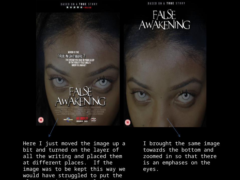
I brought the same image towards the bottom and zoomed in so that there is an emphases on the eyes.
Here I just moved the image up a bit and turned on the layer of all the writing and placed them at different places. If the image was to be kept this way we would have struggled to put the slogan as it does not look appealing on the forehead.

This just show how our flat plan changed over the process. As you can see the image is kept the in a similar way with the ‘reviews’ and the placing of title but we changed the place the blue banner is kept.

I just added a white box between the title I thought this was a good idea when I was experimenting with it.
On this I used the banner behind the title, this was questioned by the teacher of why is this behind the title and how does this link tot he trailer.
Here I added a different image of ‘Ishla’, this image was not liked by anyone because does not look nice enough.
The images above show that during our product time, whilst editing our trailer I experimented with different layouts for the poster and magazine. By using different images and moving the font around. My idea of having the cross was used on the poster and the use of the slogan but the positioning of the cross was moved after group discussion and feedback. The magazine was made after having a group discussion but I gave more time to edit as we lost one member of group therefore as a group we divided the work between us three.