Embed Size (px)
Citation preview

Daniel Curzon
MAGAZINE AND POSTER ANALYSIS

The poster for Sinister clearly shows conventions from the Horror genre. The colour scheme is red
and white/beige. The light colours show innocence and purity whereas the dark reds show
danger, blood and death.
• The image behind the girl is intimidating and indicates the films genre.
• The tagline “Once you see him nothing can save you” directly addresses the audience and indicates death, this is typical of many horror
movie taglines found on posters.
• The character is a young girl which is often used in a Horror film due to the fact that
adults feel more involved with a film if there is children involved..
• The font of the title looks as if blood is seeping out of it, this makes it obvious it is from the
horror genre.
SINISTER

DEAD SILENCE
This poster for Dead Silence, yet again shows how conventional posters are.
• Ventriloquist puppets are often seen as a scary image in Horror and are widely used.
• The colour scheme is again dark with accents of red and white, red indicating blood and danger, while white seems demonic and ghostly. This is a typical convention of horror movie posters.
• The tagline “You scream, You die” directly references death and addresses this audience. When doing poster research I have frequently noticed this when spotting horror movie posters.
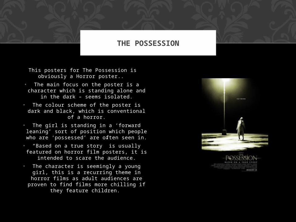
This posters for The Possession is obviously a Horror poster..
• The main focus on the poster is a character which is standing alone and in
the dark – seems isolated.
• The colour scheme of the poster is dark and black, which is conventional of a
horror.
• The girl is standing in a ‘forward leaning’ sort of position which people who are
‘possessed’ are often seen in.
• “Based on a true story” is usually featured on horror film posters, it is
intended to scare the audience.
• The character is seemingly a young girl, this is a recurring theme in horror films
as adult audiences are proven to find films more chilling if they feature
children.
THE POSSESSION

The first thing you notice on this cover, is the bold red background.
This connotes danger and sincerity, but also helps the main character image stand out. The other thing
you notice is how bold the writing is in the bottom corner ‘Scream
Returns’ will easily catch your eye when sitting in a row of magazines in a supermarket. It is a simplistic
but aesthetically pleasing design, as it looks like it could appeal to a
large audience.
ENTERTAINMENT WEEKLY

EMPIRE
This magazine cover also uses the classic black, red and white. This has a large cover line which says “The 500 Greatest Movies of all Time”. This is one of the largest things on the cover and will easily catch the eye of a passer by, especially as it is strategically placed at the top of the magazine. It doesn’t cover much on the cover, which I think it good, because then it means that the audience has to stop, and flick through the magazine seeing what it is all about.

Scream is one of the most iconic horror magazines on sale today. Not only does it feature the classic trio of
horror colours, but it also uses horror fonts which a lot of
magazines don’t. This makes the audience want to pick it up
and read more. I think that although sometimes the cover
looks abit messy, it looks one of the best horror magazines out there due to it’s special fonts,
creepy pictures and such.
SCREAM