Embed Size (px)
Citation preview

Seediscussions,stats,andauthorprofilesforthispublicationat:https://www.researchgate.net/publication/254833004
MappingmaizeyieldgapsinAfrica;Canaleopardchangeitsspots?
ARTICLE·JANUARY2012
READS
34
4AUTHORS,INCLUDING:
MichielvanDijk
WageningenUniversity
33PUBLICATIONS107CITATIONS
SEEPROFILE
GerdienW.Meijerink
CPBNetherlandsBureauforEc…
111PUBLICATIONS178CITATIONS
SEEPROFILE
Availablefrom:MichielvanDijk
Retrievedon:04February2016

Mapping maize yield gaps in AfricaCan a leopard change its spots?

Mapping maize yield gaps in Africa Can a leopard change its spots?
Michiel van Dijk
Gerdien W. Meijerink
Marie-Luise Rau
Karl Shutes
LEI report 2012-010
April 2012
Project code 2271000105
LEI, part of Wageningen UR, The Hague

2
Het LEI kent de werkvelden: [DEZE WORDEN DOOR BUREAUREDACTEUR INGEVOEGD] Dit rapport maakt deel uit van het werkveld << Titel werkveld>>.

3
Mapping maize yield gaps in Africa; Can a leopard change its spots? Dijk, M. van, G.W. Meijerink, M.-L. Rau and K. Shutes LEI report 2012-010 ISBN/EAN: 978-90-8615-575-0 Price € 19,25 (including 6% VAT) 80 p., fig., tab., app.

4
Project BO-10-009-112 and BO-10-011-007, ꞋResource scarcity and distribution in a changing world / Weather Index Based InsuranceꞋ This research project has been carried out within the Policy Supporting Research for the Ministry of Economic Affairs, Agriculture and Innovation, Theme: Scarcity and distribution.
Photo cover: Anthony Bannister/NHPA/Foto Natura Orders +31 70 3358330 [email protected] This publication is available at www.lei.wur.nl/uk. © LEI, part of Stichting Dienst Landbouwkundig Onderzoek (DLO foundation), 2012 Reproduction of the contents, either whole or in part, is permitted with due reference to the source. LEI is ISO 9001:2008 certified.

5
Contents
Preface 7
Summary 8 S.1 Key results 8 S.2 Complementary findings 8 S.3 Methodology 9
Samenvatting 11 S.1 Belangrijkste uitkomsten 11 S.2 Overige uitkomsten 11 S.3 Methode 12
1 Introduction 14
2 Theory: spatial data analysis 18 2.1 Introduction 18 2.2 Spatial characterisation: development domains 19 2.3 Exploratory spatial data analysis (ESDA) 20 2.4 Spatial cluster analysis 20 2.5 Spatial statistics 21
2.5.1 Spatial econometrics 21 2.5.2 Geostatistics 22 2.5.3 Spatial databases 22
3 The yield gap: definitions, measurement and determinants 24 3.1 Definitions 24 3.2 Yield gap studies using geospatial data 27 3.3 Explaining the yield gap 28 3.4 Yield gap estimate for Africa 30
4 Exploratory spatial data analysis of yield gap data 33 4.1 Spatial weight matrix 33 4.2 Global spatial autocorrelation 34 4.3 LISA statistics to identify yield gap hotspots and coldspots 36

6
5 Factors that influence the yield gap 40 5.1 Multivariate spatial analysis 40 5.2 Market access and the yield gap 41 5.3 Fertiliser use and the yield gap 44 5.4 Population density and the yield gap 47 5.5 Spatial regression model results 49
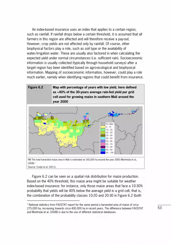
6 Mapping as a tool in weather index-based insurance: application for Mali 51
7 Conclusions and policy recommendations 58
8 References 60
Appendices 1 Spatial Regression Models 65 2 Databases (in alphabetical order) 70

7
Preface One of the most challenging tasks for the world in the coming decades is to meet the increasing demand for food, feed, fuel and fibre. According to United Nations, the world population will reach 9.3 billion by 2050. To feed all these people, overall food production needs to be increased by at least 70%. Special attention is being paid to Africa, where the potential to increase yields is high. Yields in Africa have been lagging behind the world average for decades. If Africa is to contribute to the challenge of feeding its people in 2050, yields must be increased substantially. The question how to increase yields in Africa is not new and there have been many studies on this topic. This report aims to address the question where in Africa efforts to increase yields should be targeted by identifying 'hotspots' (clusters of areas with a large yield-gap) and 'coldspots' (clusters of areas with a small yield-gap) of agricultural performance. In addition, it explores factors that determine local comparative advantage by integrating biophysical and socioeconomic spatial data. Not only does this approach produce new insights, it also opens up a new interdisciplinary research agenda, as combining large datasets from various disciplines is becoming increasingly feasible with developing computer power and open access data. This report shows that the methodology can also be used for a more specific application, such as the targeting and upscaling of weather index-based insurance, which is one of the tools that can be used to increase yields. The authors would like to acknowledge the contribution made by Thom Kuhlman and Arnoud Schouten to this report. L.C. van Staalduinen MSc Managing Director LEI

8
Summary
S.1 Key results The difference between the potential yield and the actual yield of maize (yield gap) shows great spatial differences in Africa. (See Paragraph 3.4) On average in Africa, a small yield-gap is correlated with good market access as well as a high use of fertiliser. (See Paragraphs 5.2 and 5.3) However, this result varies spatially when looking at more detailed spots. In many regions in Africa, large and small yield-gaps are correlated with good and deficient market access and/or high and low fertiliser use. The distinct regions are often demarcated by administrative boundaries, suggesting a political-institutional dimension with respect to the causes of yield gaps.
S.2 Complementary findings The methodology of interdisciplinary spatial mapping can be used to target specific development aid interventions. Better targeting of interventions can increase the effectiveness and efficiency of policy and donor interventions. (See Chapter 8) The methodology of interdisciplinary spatial mapping can also be used in specific applications, such as the targeting and upscaling of weather index-based insurance. Targeting and upscaling such insurance schemes can be costly, yet mapping can be an effective tool in generating information and reducing costs. (See Chapter 7) The relation between the yield gap and population density is not clear-cut. Our analysis shows that both high and low population density can be related to both large and small yield-gaps; no clear patterns emerge. This is consistent with the literature on this subject. (See Paragraph 5.4)
9
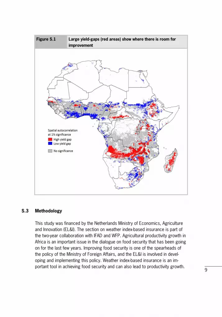
Figure S.1 Large yield-gaps (red areas) show where there is room for improvement
S.3 Methodology This study was financed by the Netherlands Ministry of Economics, Agriculture and Innovation (EL&I). The section on weather index-based insurance is part of the two-year collaboration with IFAD and WFP. Agricultural productivity growth in Africa is an important issue in the dialogue on food security that has been going on for the last few years. Improving food security is one of the spearheads of the policy of the Ministry of Foreign Affairs, and the EL&I is involved in devel-oping and implementing this policy. Weather index-based insurance is an im-portant tool in achieving food security and can also lead to productivity growth.

10
The study combines large, interdisciplinary datasets through exploratory spatial data analysis. This analysis is applied to: (1) identify hotspots and coldspots of yield gap correlation, (2) examine to what extent and how certain socioeconomic factors are related to these spots, and (3) show how mapping can help identify suitable areas for implementing weather index-based insurance in Mali, based on yield variability and socioeconomic factors.

11
Samenvatting
S.1 Belangrijkste uitkomsten Het verschil tussen de potentiële opbrengst en de werkelijke opbrengst van maïs (yield gap) toont grote ruimtelijke verschillen in Afrika. Over het algemeen is in Afrika een lage yield gap gecorreleerd met een goede markttoegang en een hoog gebruik van kunstmest. Dit resultaat varieert echter ruimtelijk als de analyse inzoomt op kleinere gebieden. In veel regio's in Afrika geldt dan de omgekeerde relatie: een hoge (lage) yield gap is gecorreleerd met goede (gebrekkige) markttoegang en/of een hoog (laag) kunstmestgebruik. De soms duidelijke ruimtelijke markering door administratieve grenzen geeft aan dat politiek-institutionele dimensies een rol spelen bij het verklaren van de yield gap.
S.2 Overige uitkomsten De interdisciplinaire en ruimtelijke afbeeldingstechniek kan worden gebruikt ter ondersteuning van specifieke interventies op het gebied van ontwikkelingssamen-werking. Beter ruimtelijk afgestemde interventies kunnen de effectiviteit en efficiëntie van beleid en donorinterventies vergroten. Deze methodologie kan ook worden gebruikt voor specifieke toepassingen zoals het afstemmen en opschalen van geïndexeerde weersverzekeringen. Het doelgericht inzetten en opschalen van dit soort verzekeringen kan kostbaar zijn en mapping kan een effectief instrument zijn om informatie te genereren over de situaties waarin een verzekering nuttig kan zijn en wat de effecten zijn van toe-passing van zo'n verzekering. Daarmee kunnen kosten worden verlaagd. De relatie tussen de yield gap en de bevolkingsdichtheid is niet eenduidig. Onze analyse laat zien dat een hoge (lage) bevolkingsdichtheid zowel gerela-teerd kan zijn aan een hoge als een lage yield gap; er is geen duidelijk patroon. Dit komt overeen met de literatuur over dit onderwerp.

12
Figuur S.1 Hoge yield gaps (rode gebieden) laten zien waar er ruimte voor verbetering is
S.3 Methode Deze studie is gefinancierd door het ministerie van Economie, Landbouw en Innovatie (EL&I). Het deel over geïndexeerde weersverzekering maakt deel uit van de tweejarige samenwerking met het IFAD en het WFP. Productiviteitsgroei in de landbouw is een belangrijk onderwerp in de dialoog over voedselzekerheid die de laatste paar jaar is ontstaan. Het verbeteren van de voedselzekerheid is een speerpunt in het beleid van het ministerie van Buitenlandse Zaken, waarbij EL&I nauw is betrokken bij het ontwikkelen en implementeren van dit beleid. Weersverzekeringen zijn een belangrijk instrument in voedselzekerheid en kunnen ook leiden tot productiviteitsgroei.

13
De studie combineert grote, interdisciplinaire databestanden via een verken-nende ruimtelijke data-analyse. Deze analyse wordt toegepast op: (1) het iden-tificeren van hot en cold spots van yield gap correlatie, (2) het bestuderen van de mate waarin en de zekerheid waarmee (socio-economische) factoren zijn gerelateerd aan deze hot en cold spots en (3) Mali om te laten zien hoe map-ping kan helpen bij het identificeren van geschikte gebieden om geïndexeerde weersverzekering te implementeren, gebaseerd op de variabiliteit in de op-brengst en socio-economische factoren.

14
1 Introduction One of the most challenging tasks for the world in the coming decades is to meet the increasing demand for food, feed, fuel and fibre. According to the United Nations, the world population will reach 9.3 billion by the middle of the century (United Nations, 2011). To feed all these people, the FAO (2009) has estimated that overall food production needs to be increased by at least 70%. There are two potential ways to achieve this: expand the area of cropland or increase the yield (production per hectare) of existing cropland. As most of the remaining land suitable for crop production consists of tropical rain forest and conservation areas, it has been argued that the latter strategy would lead to a severe loss of biodiversity and is therefore not a sustainable option (United Nations, 2011). Crop expansion is also likely to lead to more conflicts in countries with poor systems of land tenure because of competing claims on land (FAO, 2009). It is therefore not surprising that policymakers and researchers have prioritised the need to improve agricultural yields.1 Special attention is being paid to Africa, where the potential to increase yields is high. Yields in Africa have been lagging behind the world average for decades. If Africa is to contribute to the challenge of feeding its people in 2050, yields must be increased substantially. The aim of this study is to analyse the yield gap of cereals, and in particular maize, in Africa. A yield gap is defined as the difference between the yield potential2 and the actual yield of a given location. It builds on earlier work (Rau, Kuhlman and Meijerink 2011; J.G. (Sjaak) Conijn, Querner et al., 2011). Yield gap is therefore an adequate indicator of the potential to expand crop production. We focus specifically on maize because it is one of the most important food crops cultivated and consumed throughout Africa. The harvested area of maize is about 14% of the total arable land in Africa (FAOSTAT, 2012a). In addition, maize has also become an important source for the production of biofuels. Although at the moment it is hardly grown and used for this purpose in
1 It must be noted however, that increasing crop productivity also might have negative effects on the environment due to the more intensive use of pesticides, fertiliser and irrigation. It is vital that approaches to increase yield are accompanied by measures that also preserve biodiversity and natural resources. 2 The potential yield is the maximum achievable yield under the assumption of no bio-physical constraints and optimal management practices. The data for the yield gap is taken from Conijn et al. (2011) who combine data on global crop area and yields from Monfreda et al. (2008) with a geo-spatial crop model to estimate the yield gap for maize at 5 arc min resolution in Africa.

15
Africa, closing the maize yield gap might free up potential resources to replace fossil fuels in the future. There are at least three reasons why reducing the yield gap is important for Africa. First, according to the World Bank (2007) three of every four poor people in developing countries live in rural areas and most depend on agri-culture for their livelihoods. Agriculture also accounts for, on average, 34% of GDP in Africa. Hence, closing the yield gap will have positive effects on a large part of the population and will contribute considerably to income generation and poverty reduction. Second, Africa is the continent with the highest food insecurity: in nine African countries, over 34% of the population was undernourished in 2006-2008 (FAOSTAT, 2012b). Many small African countries depend on the import of food commodities, which makes them very vulnerable to international food price fluctuations. According to the FAO (2010), these countries were particularly affected by the recent food price crisis, which resulted in an 8% increase in the number of undernourished people between 2007 and 2008. Increasing the productivity of food crops will protect African countries against international market dynamics and keep domestic food prices at acceptable levels. Finally, the population of Africa is expected to increase by more than two billion by 2050, a growth rate that is considerably higher than that in other continents (United Nations, 2011). This implies a greater demand for food and probably also for feed, fibre and materials in the coming decades. This study addresses three specific research questions: 1. Is the yield gap of maize randomly distributed across Africa or is it spatially
clustered? Research on 'development domains' (Ehui and Pender, 2005; Kruseman, Ruben and Tesfay, 2006) has shown that agricultural production is strongly associated with the comparative advantage of a certain location or region vis-à-vis neighbouring areas. Key contributors to comparative advantage are agricultural potential, population density and market access, which are highly spatial in nature. Agricultural potential is a measure of absolute comparative advantage and mainly summarises the physical production environment, including rainfall, altitude, soil type and topography, which means there is a strong link with yield potential. Following the concept of development domains, we expect that the yield gap is conditional on location specific factors and therefore will be spatially clustered.
16
2. Can we identify 'hotspots' (clusters of areas with a large yield-gap) and 'coldspots' (clusters of areas with a small yield-gap) of agricultural performance? The existence of development domains indicates the need to develop context-specific policies that target locational constraints and exploit spatial opportunities. The identification of regions that are characterised by an exceptionally poor performance vis-à-vis neighbouring regions can be a first step in the formulation of local land use and development plans that guide the provision of public goods, such as infrastructure, extension services and property rights, to stimulate local agricultural development. Alternatively, the mapping of coldspots and the analysis of their features might provide important lessons for the design of rural development policies that can be applied to other regions.
3. Is there a spatial relationship between observed yield-gap patterns and
factors that determine local comparative advantage? In particular, we focus on market access, population density and fertiliser use, three key enabling factors for agricultural development. We use spatial analysis to map the link between market access (measured as the travel time to the nearest city or maritime port) and yield gap into four categories of large and small yield-gap and high and low market access, respectively. This information can help policy makers to guide the formulation of rural development strategies, as it identifies regions where it is not market access but other factors that are hampering the realisation of yield potential. Regression models can help establish causal relationships.
To tackle these questions we use exploratory spatial data analysis (ESDA). This is a collection of techniques to describe and visualise spatial distributions and identify atypical locations and discover patterns of spatial association, clusters or hotspots. ESDA has been used to analyse a variety of phenomena, including crime, mortality rates and regional growth (Luc Anselin, Sridharan and Gholston, 2006; Celebioglu and Dall'erba, 2009), but to the best of our knowledge, it has not yet been applied to examine yield-gap information. Although there is a large body of research that estimates and investigates the yield gap for a number of crops and regions (see Lobell, Cassman and Field, 2009 for an overview), the analysis of global yield-gap patterns is relatively new (Licker et al., 2010 and Neumann et al., 2010 are two recent studies). The rapid development of remote sensing and GIS has led to the emergence of new biophysical and socioeconomic datasets with information at very low levels of spatial aggregation. This has opened up new and interesting avenues for

17
research on agricultural performance, such as the yield gap and its deter-minants. This paper is a first step in that direction. It does not aim to develop a theoretical framework to explain the causal relationships between yield, socio-economic and biophysical factors and how they jointly evolve. Instead, it takes an empirical explorative approach. This report shows that the methodology can also be used for a more specific application, such as the targeting and upscaling of weather index-based insurance (WIBI). WIBI is seen as a promising tool that can be used to increase yields because it reduces farming risk. In the face of weather related risks, farm households have developed a number of coping strategies. Diversification is one, whereby farm households crop part of their area with subsistence crops that are, for instance, drought resistant. Although this strategy contributes to the food security of the household, making it less vulnerable to the vagaries of the weather, it usually does not increase its yields, as these crops typically trade off large yields against yield reliability. It also reduces their capacity to earn income from cash crops. The structure of this paper is as follows. After this introduction, we explain the different types of spatial data analysis (section 2). We explain the definitions and measurement of the yield gap in section 3 and how these data can be visualised in section 4. In section 5, we explore the correlations between yield gap, market access, population density and fertiliser use. In section 6, we take this analysis one step further by analysing spatial regression models for yield gap. Section 7 explains how such analysis can be useful in designing weather index-based insurance, focusing on Mali. Section 7 concludes.

18
2 Theory: spatial data analysis
2.1 Introduction Spatial data analysis has become a wide field, serving various purposes and using a range of techniques and methodologies. In this chapter, we give an overview of the main areas that are of interest. The focus of this report is on how biophysical and socioeconomic characteristics of an area interact. A better understanding of the complex interactions between these characteristics can help decision makers at various policy levels to design and implement regionally adapted policy interventions (Müller and Zeller, 2004; Omamo et al., 2006). Efficient decision-making in agricultural development usually requires considering many factors beyond the basic agroclimatic and edaphic conditions. Socioeconomic data, especially indicators of welfare or poverty, are often also major concerns. Data availability and quality in this thematic area can be problematic, although substantial progress is being made in both methodologies and coverage for mapping socioeconomic status (de Sherbinin et al., 2002). Spatial data are an important source of scientific information. The development of high capacity and fast desk and laptop computers and the concomitant creation of geographic information systems has made it possible to explore georeferenced or mapped data as never before (Fischer and Getis, 2010). Coupled with open access policies such as those of the World Bank, there is an increasing availability of data geo-coded data. Spatial data is often obtained by remote sensing, which is the acquisition and analysis of data about an object or area acquired from a device that is not in contact with the object or area. Most remote sensor devices are placed in earth-observing satellites and both high- and low-flying aircraft. Much of the spatial analysis that is carried out on the data must take into account the usually very large number of observations, sometimes in the billions, and the size of the fundamental observations (the pixels). Spatial statistics has increasingly become an integral part of the remote sensing process. The main issues facing research-ers are that results differ in spatial scale and that typical study regions (land-scapes) vary appreciably, even over short distances (Richards and Jia, 2006). Besides the disciplines represented in previous collections of papers, up-and-coming areas that are making more extensive use of spatial analytical tools include transport and land use analysis, political and economic geography, and the analysis of population and health issues (Páez et al., 2010). Spatial data

19
analysis provides valuable insights into processes of land use change and their underlying causes. The application of geospatial tools, data and methods is becoming increasingly important as a means to assist in understanding and characterising such diverse and complex systems and environments (Hodson and White, 2007). Several types of spatial data analyses can be distinguished. We discuss a few types in the following sections.
2.2 Spatial characterisation: development domains IFPRI has used spatial data as a specific tool to identify 'development domains' (Chamberlin, Pender and Yu, 2006; Omamo et al., 2006). By using geographic information systems methods, spatial similarities and differences are identified and depicted in the context of agriculture. Agricultural development domains are identified, representing particular realisations of agricultural potential, and access to markets and population density are used to help highlight differences and similarities in agricultural development priorities and options across the region. Development domains also combine the theory of comparative advantage and location theory. The biophysical production potential represents the absolute advantage for an agricultural production system in a certain location, while access to markets and population density translate these production advantages into the comparative advantages of a particular agricultural production system. For example, a grid cell with a high potential for perishable vegetable production may be less suitable from a market point of view if markets are remote. Similarly, labour-intensive production systems may be favoured in areas with high population densities. Improved agricultural performance will require investments that foster productivity growth, strengthen markets, improve rural linkages between the agricultural and non-agricultural sectors, and promote regional cooperation. Of particular interest is the identification of the most performance-enhancing commodity subsectors, in an economy-wide setting, and the agricultural development domain singled out as the most promising for targeted investment.
20
2.3 Exploratory spatial data analysis (ESDA) Exploratory spatial data analysis (ESDA) involves the identification and description of spatial patterns, such as outliers, clusters, hotspots, coldspots, trends and boundaries. It has two primary objectives (Jacquez, 2008): 1. Pattern recognition using visualisation, spatial statistics and geostatistics
to identify the locations, magnitudes and shapes of statistically significant pattern descriptors.
2. Hypothesis generation to specify realistic and testable explanations for the geographic patterns found under (1).
Thus, ESDA represents a preliminary process whereby data and research results are viewed from many vantage points, one of which is the display of data on maps. The power of computers to summarise and visualise large sets of georeferenced data has helped to stimulate the creation of amazingly evocative procedures for data manipulation. In a sense, ESDA represents a new wave of research methodology. The traditional six steps of hypothesis-guided inquiry (problem, hypothesis, sampling distribution, test, results, decision) have had a seventh step added to them: data exploration. However, instead of squeezing data exploration between two of the former steps, it is represented at nearly all stages of analysis.
2.4 Spatial cluster analysis Spatial cluster analysis is part of ESDA and plays an important role in quantifying geographic variation patterns. It is commonly used in disease surveillance, spatial epidemiology, population genetics, landscape ecology, crime analysis and many other fields, but the underlying principles are the same. A cluster can be defined as a spatial pattern that differs in important respects from the geographic variation expected in the absence of the spatial processes that are being investigated: 'clustering' is always measured relative to a null expectation. It is a probabilistic assessment of how unlikely an observed spatial pattern is under the null hypothesis (e.g. uniform distribution) (Jacquez, 2008).

21
There are numerous cluster statistics. Jacquez (2008) distinguishes global, local and focused tests: - Global cluster statistics are sensitive to spatial clustering, or departures
from the null hypothesis that occur anywhere in the study area. While global statistics can identify whether spatial structure exists, they do not identify where the clusters are, nor do they quantify how spatial dependency varies from one place to another.
- Local statistics quantify spatial autocorrelation and clustering within the
small areas that together comprise the study area. Many local statistics have global counterparts that are often calculated as functions of local statistics.
- Focused statistics quantify clustering around a specific location called a
focus. These tests are particularly useful for exploring possible clusters of disease near potential sources of environmental pollutants.
2.5 Spatial statistics Spatial statistics is part of ESDA, spatial econometrics, remote sensing analysis and, to a lesser extent, geostatistics. One might ask why we can model spatially varying phenomena without testing patterns on maps. The process of creating hypotheses and testing map patterns gives spatial statistics its raison d'être. As a field, spatial statistics is concerned with map-related problems. Geometrically, one can think of point, line and area patterns as well as mixtures of these three as the fundamental elements that are included in the use and study of spatial statistics. What is crucial, of course, is that these points, lines, and areas represent real world phenomena. How these phenomena pattern themselves and interact with one another has come to be an important element of scientific inquiry (Fischer and Getis, 2010).
2.5.1 Spatial econometrics An interesting and crucial overlap between spatial statistics and spatial econometrics is the need to apply spatial statistical tests in order to check the validity of the assumption of spatial randomness among the residuals of spatial, and non-spatial diagnostic, models (Fischer and Getis, 2010).

22
2.5.2 Geostatistics Evolving differently from the previous schools of thought is the field of geostatistics. Primarily as a way to describe and explain physical phenomena in a continuous spatial data environment, geostatistics is the principal methodology of analysis. From its roots in the 1950s as a way to predict gold ore quality to its current widespread use for the study of all manner of physical phenomena, including petroleum reserve locations, soil quality, and patterns of weather and climate, geostatistics has become a mainstay of most earth science departments in both the academic and the business world. The field includes both spatial data descriptive routines and sophisticated modelling (Fischer and Getis, 2010).
2.5.3 Spatial databases Large spatial databases are increasingly becoming publicly available, usually downloadable from the internet. We have compiled several of these (although we by no means assume them be complete) that may be useful in exploring questions such as those discussed in this report: 1. Biodiversity Hotspots 2. CODATA Catalog of Roads Data Sets, version 1 3. Global Map of Irrigation Areas 4. Global Economic Data (Yale G-Econ project) 5. GEO data Portal population density 6. Global Poverty Data
a. Global Subnational Infant Mortality Rates b. Global Subnational Prevalence of Child Malnutrition dataset
7. Infrastructure built-up data 8. Market access and influence data 9. Night-time lights 10. Travel time to major cities 11. Yield gap data 12. Fertiliser use data. The twelve datasets are described in appendix 1; maps and the download location are also provided. The only dataset that is not publicly available is the yield gap data, which belong to PRI, part of Wageningen UR. For this study, we have made use of datasets 5 (population density), 8 (market access), 11 (yield
23
gap data) and 12 (fertiliser use). The yield gap dataset incorporates information from dataset 3 (irrigation). The selection was based on the fact that market access, population density and fertiliser use are generally seen as important factors in explaining yields. See chapter 5 for a further discussion.
24
3 The yield gap: definitions, measurement and determinants In the literature, many definitions are used for yield gap, which sometimes makes it difficult to interpret and compare results. In particular, there is no consistent use of 'yield potential', one of the two key components that make up the yield gap. For clarification, this section reviews the concept of yield gap and yield potential. This will help in comparing the outcomes of this study with similar studies that might use a slightly different yield gap measure. This section also offers a brief discussion on the explanations that have been put forward to explain the yield gap.
3.1 Definitions The yield gap is defined as the difference between the potential yield and the actual observed farmer's yield measured over a specified spatial and temporal scale of interest (Lobell, Cassman and Field, 2009). It is mostly expressed in tonnes per hectare, but sometimes a fraction is also used. In this study, we define yield potential as 'the yield of a cultivar when grown in environments to which it is adapted with nutrients and water non-limiting and with pests, diseases, weeds, lodging, and other stresses effectively controlled' (Evans and Fisher, 1999). Hence, it is an idealised state in which the growth and production of a crop variety or a hybrid is not restrained by any biophysical limitations other than a set of factors that cannot be controlled through management, including solar radiation, temperature and plant characteristics. Van Ittersum and Rabbinge (1997) refer to these as growth-defining factors. They also distinguish two other sets of factors that can be controlled through management. Growth-limiting factors comprise water and nutrients, which are considered essential inputs for plant growth. If they are supplied in limited quantities, actual yield will decline from potential. Growth-reducing factors include pests, diseases, weeds, insects and pollutants. They will reduce crop growth and yield unless precautions are taken to prevent their impact (e.g. the use of pesticides, crop rotation and weed management). To achieve yield potential, perfect management of growth-limiting factors and growth-reducing factors is required. In reality, this level of perfection is impossible to attain under field conditions.
25
In the literature several measures have been proposed to quantify yield potential (de Bie, 2000; Lobell, Cassman and Field, 2009; R. Fischer, Byerlee and Edmeades, 2009). First, crop models simulate phonological development by a set of equations that combine information on photothermal time, net assimilation, resource allocation to different organs, transpiration, precipitation and soil moisture conditions in a daily or hourly time step. Most crop models are able to estimate yield potential under both rain-fed and irrigation conditions. Nutrients and growth-limiting factors such as weeds and pests are normally not taken into account by the models because it is assumed that these factors do not hamper crop development under optimal conditions. A weakness of most models is that they tend to overestimate yield potential. This is because they often do not account for short-term fluctuations in weather conditions (e.g. one- or two-day periods with very high or very low temperatures) that tend to negatively affect early crop growth. To date, most crop models have been applied to estimate the yield potential of a specific field, region or country. This study is one of the first attempts to use a crop model to simulate yield potential at a very low level of aggregation for the African continent on the basis of geospatial data. Apart from crop models that provide an indirect estimate of yield potential, one can also use data on yield that is directly observed in the field. The most common approach is to use information on yield potential that originates from field experiments and research stations. These offer a kind of laboratory setting in which growth-limiting factors are optimised (water and nutrients) and growth-reducing factors are prevented (pest, diseases and weeds). Another option is to draw on information from yield contests in which the chance of winning a prize (e.g. equipment, free seeds or money) motivates farmers to reach the technical maximum yield. In practice, it is nearly impossible to achieve perfect growth conditions in field stations or by means of yield contests. Particularly when the plot size increases from a few m2 to several hectares, the use of equipment (as opposed to intensive manual management) and the introduction of slight variations in soil properties means that yield potential from field experiments and contests is often lower than that estimated by crop models. Finally, yield potential can be approximated by collecting information on the maximum observed yield among a sizable group of farmers in a given region and over a certain period of time. For similar reasons as mentioned above, this best-practice measure will be lower than yield potential. It will also tend to be lower than the yield achieved at research stations or experimental farms because of the limitations on controlling the environment and the less intensive management. In addition, farmers tend to maximise profits (or minimise costs)

26
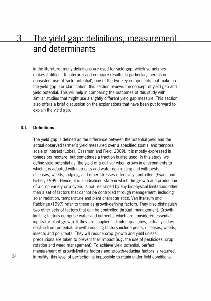
rather than not production, unless there are certain incentives such as winning a prize. In most situations, the market price of the crop and the costs of essential inputs such as fertiliser, irrigation, pesticides, machinery and labour are such that economic returns are highest at input levels that are below what is required to reach optimum production. This means that even if it is assumed that there are no constraints in the form of growth-limiting and growth-reducing factors, the economic maximum farm yield will be lower than the technical maximum farmer yield. Depending on market conditions, the motivation of farmers and environmental conditions, the maximum observed yield among a group of farmers will be close to the technical or economic maximum. The average observed farmer yield will usually be lower for a number of reasons, which will be discussed below. Figure 3.1 illustrates the various yield potential measures discussed above in comparison with the average observed farmer yield. Figure 3.1 Comparison of yield measures
Note: The height of the bars is indicative only.
Source: Based on Lobell et al. (2009) and de Bie (2000).
Modelled potentialyield
Experimentalmaximum research
station yield
Technicalmaximum farmer
yield
Economicmaximum farmer
yield
Average farmeryield
Cro
p yi
eld

27
3.2 Yield gap studies using geospatial data In this study we use geospatial information to estimate yield potential by means of a crop model for Africa. To our knowledge, there are only three other studies that report on the use of a spatial database to analyse the yield gap at the global or continental level. Hence, it is interesting to compare these researchers' approaches with the one taken in this study. Licker and colleagues (2010) present global estimates for the yield gap of 18 crops for project at a 5 arc min resolution. Similar to this study, their measure for crop yield and crop area is taken from Monfreda and colleagues (2008). Their main innovation lies in the estimation of the potential yield. Instead of using a crop model, they use an approach that is similar to the maximum observed farmer yield approach described above. Instead of equating potential yield with the farmer best-practice in a region, yield potential is defined as the highest observed yield in cells with similar climatic characteristics. Two parameters that are regarded as key determinants of plant growth are used to distinguish 100 climate combinations: growing degree days (GDD) and a crop soil measure index. GDD is a measure of the potential heat a plant can accumulate, and is normally calculated on a daily basis. It is defined as the num-ber of temperature degrees above a certain threshold base temperature below which the plant is unable to grow. The base temperature varies among crop species. Final GDDs are computed by aggregating daily values over one year. The crop soil moisture index is defined the annual average ratio of actual evapotranspiration to potential evapotranspiration. Evapotranspiration is the sum of evaporation (the movement to the air of water from sources such as the soil, canopy interception and water bodies) and plant transpiration (the move-ment to the air of water that vaporises from the leaves) from the Earth's land surface to the atmosphere. GGD and the soil moisture index are each divided into 10 equal bins and combined to construct a 10 x 10 matrix that represent 100 climate zones. For each of these zones, maximum potential yield is defined as the 90 percentile of yield value for each climate zone. The cut-off point is introduced to avoid the use of outliers, which reflect potential erroneous data and might bias the results. The yield gap is eventually computed as the difference between the maximum yield potential by climate zone and the yield data from Monfreda and colleagues (2008). The major difference between the yield gap measure of Licker and colleagues (2010) and this study is the estimation of the yield gap potential. Licker and colleagues adopt a best-practice methodology, while we use a
28
simulation approach. Analogous to Figure 3.1, the yield gap presented in this study will on average be higher than the yield gap based on maximum technical or economic farmer yields. Each approach has its advantages and disadvantages. A simulation model based yield-gap estimate is an absolute indicator of the extent to which crop yield can be improved, and can easily be compared across crops and regions. The question remains, however, whether this potential can ever be achieved as it is based on theoretical models that assume perfect management and do not take into account economic circumstances. In this regard, yield-gap estimates that are based on the maximum farmer yield approach are more appropriate, as they reflect the best practice that is currently being achieved by farmers under a range of climatic conditions. A drawback of the approach, as Licker and colleagues (2010) also point out, is that potential yields for some climate zones may be unrealistically low because farmers in certain climate zones suffer from limited access to high-quality inputs - such as tractors, fertiliser and high-yielding seeds - or lack the capacity to carry out best management practices. This might be particularly relevant in the context of Africa. Another potential problem is the inability of the method to distinguish between potential yield for irrigated and rain-fed systems. As the yield under irrigated systems is commonly higher than that under rain-fed conditions, the former will probably be selected as the best-practice reference for a given climate zone. This implies that, at least for some climate zones, the yield gap is computed as the difference between the potential yield under irrigated conditions and the actual yield under rain-fed conditions, which results in an overestimation of the yield gap. A final problem is that the number of observations for a certain climate zone can be low. In such cases, the observed maximum yield is probably an underestimate of the real maximum potential yield under these climate conditions, creating an upward bias in the yield gap. It would be interesting to compare both measures to examine where they align and where they arrive at different outcomes.
3.3 Explaining the yield gap The yield gap has two parts (Nin-Pratt et al., 2011). One part can never be closed because it represents the difference between a theoretical maximum (model simulation) or laboratory setting (research station and experimental fields) and the optimum that can be achieved in a non-perfect world. It is caused
29
by random and uncontrollable environmental conditions (for example, extreme weather events, unanticipated seasonal conditions or unexpected pests, as well as economic effects such as price volatility and crises) that occur in reality but are not captured by the models, and the impact of specialised technologies and intensive practices that can be found only at test facilities. In Figure 3.1 this is the difference between the modelled potential yield and the technical maximum farmer yield. According to the information in Lobell and colleagues (2009), who summarise the results of a large number of yield-gap studies for maize, wheat and rice throughout the world, average farmer yield can reach as much as 80% of potential. Although most studies use only one approach and therefore results are difficult to compare, they find no major differences between the model and the experimental approach to measure the yield gap. The second part of the gap arises when farmers use practices and amounts of inputs that differ from what is needed to achieve the technical maximum farmer yield. In most cases, it is the direct reflection of a number of biophysical constraints (Table 3.1) that are caused by differences in management practices. Examples are less intensive use of fertiliser, lower quality seeds and suboptimal planting. The gap is measured by the difference between the technical maximum farmer yield and the actual farmer yield in Figure 3.1. Differences in management practices, in turn, are the consequence of a lack of knowledge of the production technology or a result of economic constraints. For example, as mentioned, the profit maximisation behaviour of farmers might lead to lower level of inputs than what would be used to reach the technical maximum yield. At a deeper level, market conditions and the diffusion of agricultural technology are determined by the interplay of a large number of socioeconomic factors that are mostly specific to the nation or region. Among others, these system-wide constraints include income, governance, market institutions, infrastructure and education. Conijn and colleagues (2011) provide an overview of these issues. In this paper we will examine the link between yield gap and three socio-economic indicators for which spatial data are available: market access, population density and fertiliser use. The importance of these factors has also been pointed out by the literature on development domains (Pender, Place and Ehui, 2006). Market access and infrastructure are critical determinants of regional comparative advantage. Areas with high market accessibility have better access to inputs such as fertiliser, pesticides and equipment as well as important services, mainly extension services and finance. Equally, market access and a high-quality road network will help farmers to link to value chains, facilitate exports, and reduce storage and transport costs. As all of this will
30
contribute to higher yield, we expect a negative association between yield gap and market access. The relation between population density and yield (and hence the yield gap) is not clear (Pender, 1999). Population pressure can increase the supply of labour that is available for agriculture. This reduces the costs of labour as opposed to the costs of land, and lead to more labour-intensive and less land-intensive agricultural production. Population pressure might also induce more capital-intensive production methods (e.g. the use of draft animals) and stimulate the adoption of more advanced technologies (e.g. improved seeds). Both would result in more production per hectare. On the other hand, population pressure might also lead to land degradation as a result of the cultivation of fragile lands, increased tillage and other forms of agricultural intensification, leading to lower yields. Pender (1999) found a negative relation between maize yield and population density in Honduras. Table 3.1 Determinants of the yield gap
Biophysical constraints Socioeconomic constraints
Insufficient water Profit maximisation
Insufficient nutrients Lack of knowledge of best practice
management
Suboptimal planting (timing or density) Risk avoidance strategies
Soil problems (e.g. salinity) Inability to secure credit
Extreme weather events (e.g. floods,
frost, hail)
Unpredictable prices of key inputs
Weed pressures High transport costs
Pests and diseases Distorted markets for fertiliser
Insect damage Inefficiencies at harvest and storage problems Source: based on Lobell et al. (2009).
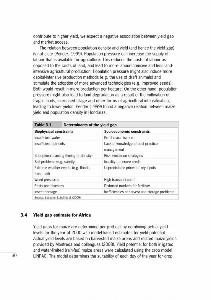
3.4 Yield gap estimate for Africa Yield gaps for maize are determined per grid cell by combining actual yield levels for the year of 2000 with model-based estimates for yield potential. Actual yield levels are based on harvested maize areas and related maize yields provided by Monfreda and colleagues (2008). Yield potential for both irrigated and water-limited (rain-fed) maize areas were calculated using the crop model LINPAC. The model determines the suitability of each day of the year for crop
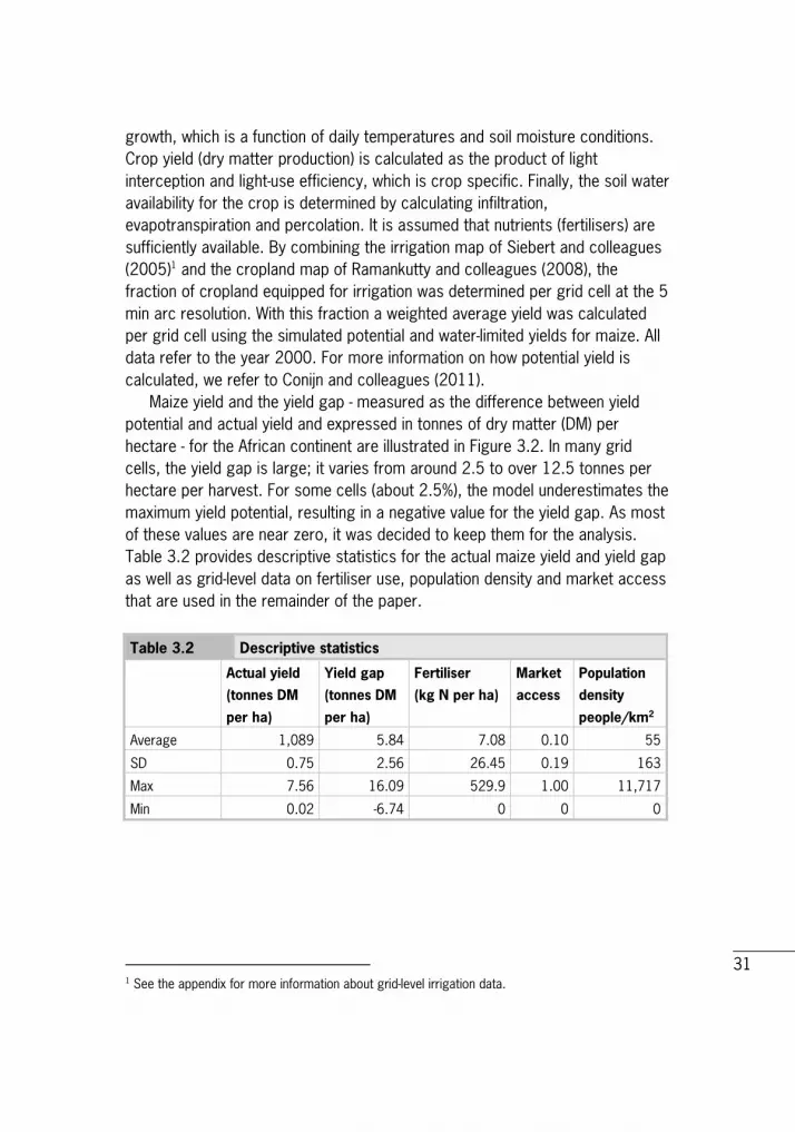
31
growth, which is a function of daily temperatures and soil moisture conditions. Crop yield (dry matter production) is calculated as the product of light interception and light-use efficiency, which is crop specific. Finally, the soil water availability for the crop is determined by calculating infiltration, evapotranspiration and percolation. It is assumed that nutrients (fertilisers) are sufficiently available. By combining the irrigation map of Siebert and colleagues (2005)1 and the cropland map of Ramankutty and colleagues (2008), the fraction of cropland equipped for irrigation was determined per grid cell at the 5 min arc resolution. With this fraction a weighted average yield was calculated per grid cell using the simulated potential and water-limited yields for maize. All data refer to the year 2000. For more information on how potential yield is calculated, we refer to Conijn and colleagues (2011). Maize yield and the yield gap - measured as the difference between yield potential and actual yield and expressed in tonnes of dry matter (DM) per hectare - for the African continent are illustrated in Figure 3.2. In many grid cells, the yield gap is large; it varies from around 2.5 to over 12.5 tonnes per hectare per harvest. For some cells (about 2.5%), the model underestimates the maximum yield potential, resulting in a negative value for the yield gap. As most of these values are near zero, it was decided to keep them for the analysis. Table 3.2 provides descriptive statistics for the actual maize yield and yield gap as well as grid-level data on fertiliser use, population density and market access that are used in the remainder of the paper. Table 3.2 Descriptive statistics
Actual yield
(tonnes DM
per ha)
Yield gap
(tonnes DM
per ha)
Fertiliser
(kg N per ha)
Market
access
Population
density
people/km2
Average 1,089 5.84 7.08 0.10 55
SD 0.75 2.56 26.45 0.19 163
Max 7.56 16.09 529.9 1.00 11,717
Min 0.02 -6.74 0 0 0
1 See the appendix for more information about grid-level irrigation data.
32
Figure 3.2 Average maize yield and (B) yield gap in tonnes of dry matter per hectare
A
B
Source: Average maize yield based on information from Monfreda et al. (2008). Yield gap is calculated using the
crop model LINPAC. See text for details.
33
4 Exploratory spatial data analysis of yield gap data Exploratory spatial data analysis (ESDA) consists of a number of techniques to explore spatial patterns in the data, including visualising spatial distribution, local indicators of spatial association and multivariate indicators of spatial association. Exploratory spatial data analysis (ESDA) consists of a number of techniques to explore spatial patterns in the data, including visualising spatial association, local indicators of spatial association and multivariate indicators of spatial association. Moran's I statistic, based on the spatial weighting matrix selected, was calculated and hot and cold spots or clusters were identified based upon significant levels of spatial autocorrelation. These clusters are more similar to the neighbouring points than one would expect if the data were spatially random. This section describes the use of ESDA to investigate the spatial distribution of the yield gap in Africa. In the following section we apply a similar approach in a bivariate setting to map the relationship between yield gap, market access and population density.
4.1 Spatial weight matrix An essential step in ESDA is defining the spatial structure of the data by means of a spatial weight matrix. It is a tool to summarise the spatial proximity of the observations; in other words, which observations can be considered 'neigh-bours'. In the matrix, neighbours are identified by a 1 and non-neighbours by a 0. There are two basic approaches for defining a neighbourhood structure: contiguity (shared borders) and distance. Within the contiguity-based weight matrices, a distinction is often made between 'queen' and 'rook' patterns. As in chess, all areas that share a common border as well as the areas with a corner point (vertices) are considered neighbours under the queen criterion. Under the rook criterion, the latter are excluded. Distance-based weight matrices use the Euclidian distance to identify neighbours. One option is to select a distance band so that all data points within the given distance are considered neighbours. Another option is to select the k nearest neighbours.

34
For our analysis, we only use the k nearest neighbour approach. As explained above, our data are organised by grid cells of X by X degrees. Due to the symmetrical shape of the spatial locations in our database (similar to a chessboard with the datapoint in the middle of the grid cell), the contiguity and distance measures are nearly identical. For example, using a four nearest neighbours method will results in the same spatial weight matrix as the rook pattern, while a nine nearest neighbour criterion is identical to the queen-based matrix. Only when grid cells that contain yield gap data are surrounded by cells with missing data might the two approaches generate slightly different results.
4.2 Global spatial autocorrelation A key element of ESDA is the analysis of spatial autocorrelation or spatial association, which is the correlation of a variable with itself in space. Positive values indicate the correlation of high values with high neighbouring values or the correlation of low values with low neighbouring values. Negative values refer to spatial outliers (high-low or low-high combinations). Global spatial autocorrelation is a measure of overall clustering in the data. A popular measure to examine this is Moran's I, which can be formalised as follows (Luc Anselin 1995):
𝑰 = � 𝒏∑ ∑ 𝒘𝒊𝒋𝒋𝒊
�∑ ∑ 𝑾𝒊𝒋𝒙𝒊𝒙𝒋𝒋𝒊
∑ 𝒙𝒊𝟐
𝒊 (1)
where 𝑊𝑖𝑗 is spatial weight matrix with information about the spatial relationship between observations 𝑥𝑖 and 𝑥𝑗, 𝑥𝑖 is the yield gap in region i measured as a deviation from the mean and 𝑛 is the number of observations. Moran's I is similar to a standard correlation measure but with the incorporation of 'space' by means of the spatial weight matrix. The expected value of I 𝐸(𝐼) =−1 (𝑛 − 1)⁄ is approximately zero in a dataset with a very large number of observations, such as ours. This is implies no spatial autocorrelation or spatial randomness. A value of -1 indicates perfect dispersion (comparable to a checkerboard pattern with dissimilar values), while a value of 1 is a sign of perfect correlation. The spatial structure of the data is assessed by using a test with a null hypothesis of random location. Rejection of this test indicates a spatial relationship in the data. Significance of the test is determined by a permutation approach to generate pseudo-significance levels. This is done by computing the I value for a large number of re-sampled datasets, which are

35
subsequently used to determine the empirical distribution function. This distribution is used as a basis to compare the observed Moran's I from the original database with the null hypothesis of no spatial autocorrelation. We use 999 permutations to generate the statistics, which is the minimum number to generate reliable results (Anselin, 2003). Table 4.1 Moran's I for the yield gap by type of weight matrix
Spatial weight matrix Moran's I p-value
Nearest neighbour (k=4) 0.8480 0.001*
Nearest neighbour (k=8) 0.8185 0.001* Note: number of permutations is 999; * significant at the 1% level.
Table 4.1 shows Moran's I and the test statistics for the null hypothesis of random spatial distribution for a spatial distance matrix based on k=4 and k=8 nearest neighbours. With I values of 0.85 and 0.82, respectively, the variants give very similar results. The result are significant at both the 1% level and near zero, indicating strong and positive global spatial autocorrelation. This means that the agricultural performance as measured by yield gap is not randomly distributed in Africa. Instead, yield gap values exhibit spatial clustering; that is, yield gap measured in an area is positively related to yield gap observation in neighbouring locations. To save space we will only show the results for the k=8 nearest neighbour matrix in the remainder of this paper. A useful way to examine the nature of spatial autocorrelation is the Moran scatterplot. This diagram plots the value of each observation against the weighted average value of the same variable in the neighbouring locations, which is also referred to as the spatial lag of a variable. Both measures are expressed as deviation from mean, so the average is re-scaled to zero. Figure 4.1 depicts the Moran scatterplot for the yield gap. To facilitate the analysis, four quadrants are added to identify the different types of spatial autocorrelation, corresponding to spatial clusters and spatial outliers. Observations in the lower left quadrant (low-low) and the upper right quadrant (high-high) represent values that are surrounded by neighbours with a similar value, and therefore reflect possible spatial clusters. On the other hand, observations in the upper left (low-high) and lower right (high-low) are values that are surrounded by dissimilar neighbours and suggest spatial outliers. The Moran's I statistic can be visualised as the slope in the Moran scatterplot of the spatially lagged variable on the observed variable yield gap (see also Luc Anselin, 1995).

36
The figure clearly confirms our finding of strong positive global spatial clustering as evidenced by the fact that most observations are located in the low-low and high-high quadrants and the line through the origin which has a slope of nearly 45 degrees (equal to a Moran's I of 1 and perfect autocorrelation). In our case, the low-low quadrant corresponds with clusters of areas with a small yield-gap (good performance), whereas the high-high quadrant reflect clusters of areas with a large yield-gap (poor performance). Figure 4.1 Moran Scatterplot for yield gap
4.3 LISA statistics to identify yield gap hotspots and coldspots The Moran scatterplot provides visual information about the presence of potential spatial clusters of areas with a small or a large yield-gap, but does not indicate where these clusters or outliers are located or whether they are significant. To address this issue, we make use of local indicators of spatial association (LISA), which allow the identification and assessment of 'local' spatial patterns in the data. LISA statistics fulfil two conditions: (1) for each observation they give an indication of the extent of spatial similarity/dissimilarity with surrounding observations, and (2) the sum of LISAs for all observations is proportional to a global indicator of spatial association (Luc Anselin, 1995).
-5 0 5 10 15 Yield gap
Low yield gap
High yield gap Moran I-statistic = 0.818
Spat
ially
lagg
ed y
ield
gap
15
10
5
0
-5

37
In line with the above analysis, we use the local Moran's I statistic to analyse local spatial patterns, which can be formalised as follows: 𝑰𝒊 = 𝒛𝒊 ∑ 𝑾𝒊𝒋𝒛𝒋𝒋 (2)
where 𝑊𝑖𝑗 is the spatial weight matrix, and 𝑧𝑖 and 𝑧𝑗 are standardised variables (with the mean subtracted and divided by the standard deviation) for the yield gap at location i. The average of the local Moran's I values is proportional to the global Moran's I value. Similar to the test for global spatial autocorrelation, the local Moran's I can be used as the basis for a test on the null hypothesis of no local spatial autocorrelation. Also here, the significance levels are calculated by means of a permutation approach with 999 permutations. The results are depicted in Figure 4.2, which shows the locations with significant local Moran statistics for p values of 5% and lower. This suggests there are a large number of areas in Africa, some of them very large, that exhibit highly significant (p<1%) local clustering of the yield gap. This finding is in line with the finding for the global Moran's I, which pointed towards strong positive global autocorrelation. Relevant clusters are found throughout all areas for which yield gap data are available (compare with Figure 4.2B). The local Moran statistics can be combined with the four types of spatial autocorrelation depicted in the Moran scatterplot to identify significant spatial clusters (high-high or low-low) and local spatial outliers (high-low and low-high). Figure 4.2 plots the clusters of areas with a small yield-gap (coldspots) and the clusters of areas with a large yield-gap (hotspots). Only observations with a p-value lower than 1% are selected. The figure therefore corresponds directly with the green area in Figure 4.2, except for a small number (# observations or % of the data) of datapoints that represent significant local spatial outliers (high-low or low-high). As these are barely visible on the map we decided not to include them in Figure 4.3.

38
Figure 4.2 Significance map of yield gap observations
Source: Own calculations.
Although hotspots and coldspots are scattered across the entire African continent (for the areas where data is available), five zones seem to stand out. First, there is relatively large cluster of small yield-gap areas in West Africa that runs from east to west along the coast of Nigeria, Benin, Togo and Ghana into Cote d'Ivoire. A second coldspot is located in the heart of Sudan and seems to overlap with the fertile zone in that area. A third area of interest is a very large hotspot in Southern Africa that covers major parts of Angola, Zambia and Zimbabwe. Fourth, a large cluster of large yield-gap areas covers almost the entire cropland for maize in Madagascar. Finally, the map shows a cluster of small yield-gap areas in South Africa. However, in contrast to clusters in the other regions, the hotspots are rather patchy and do not form one large area

39
where the yield gap is small. The observed pattern is probably also due to the nature of the yield gap data for South Africa, as the data themselves exhibit a patchy structure. In chapter 4 we discussed a range of factors that might influence the yield gap. One of the potential determinants of agricultural performance is national policies and institutions, such as subsidies for fertiliser, agricultural credit provision, national agricultural innovation systems and extension services. Although we lack the data to statistically test the effect of these factors on yield gap, we might learn something by visually inspecting Figure 4.3. If national policies and institutions are a crucial determinant of yield gap differences, we would expect the clusters to be located within and demarcated by national boundaries. Figure 4.3 Yield gap hotspots and coldspots
Source: Own calculations.

40
5 Factors that influence the yield gap
5.1 Multivariate spatial analysis To explore the relation between market access, population density and fertiliser use, we apply a multivariate version of the Moran statistic that was used in the previous section. Multivariate spatial autocorrelation investigates whether there exists a systematic spatial association between one variable (𝑧𝑘), observed at a given location, and another variable (𝑧𝑙) observed at neighbouring locations (Luc Anselin, Syabri and Smirnov, 2002). The multivariate global Moran I is defined as: 𝑰𝒌𝒍 = 𝒛𝒌𝑾𝒊𝒋𝒛𝒍
𝒏 (3)
where 𝑊𝑖𝑗 is the spatial weight matrix, and 𝑧𝑘 and 𝑧𝑙 are standardised variables with mean zero and standard deviation equal to one. Similarly, there also exists a multivariate counterpart of LISA. This multivariate local Moran statistic 'gives an indication of the degree of linear association (positive or negative) between the value for one variable at a given location i and the average of another variable at neighbouring locations' (Luc Anselin, Syabri and Smirnov, 2002: p. 7). Positive values suggest a spatial similar cluster in two variables, while negative values indicate a local negative relationship between two variables against the null hypothesis of spatial randomness. It is defined as: 𝑰𝒌𝒍𝒊 = 𝒛𝒌𝒊 𝑾𝒊𝒋𝒛𝒍
𝒋 (4)
where 𝑊𝑖𝑗 is the spatial weight matrix, and 𝑧𝑘𝑖 and 𝑧𝑘𝑖 are standardised variables for region i and j, respectively. Similar to LISA, four types of multivariate spatial autocorrelation can be distinguished: two measure positive spatial autocorrelation or spatial clusters (high-high and low-low), and two reflect negative spatial autocorrelation or spatial outliers (high-low and low-high). The significance of the multivariate spatial statistics can be assessed in the usual fashion by means of a permutation approach (with 999 permutations).

41
5.2 Market access and the yield gap In this section we explore the spatial relationship between the yield gap and market access. Figure 5.1 shows market access in Africa. To measure market access, we use a high spatial resolution dataset on market access that was recently constructed by Verburg and colleagues (2011).1 It presents a market access index (zero to one) at the 5 arc min resolution that combines the travel time to large international markets (cities with more than 750,000 inhabitants), large maritime ports and smaller markets (cities with more than 50,000 inhabitants) to proxy the access to national, international and local markets, respectively. Travel time is calculated using a uniform approach that accounts for differences in infrastructure (e.g. highways, tertiary roads, large rivers and off-road). All data refers to the period around 2000 and therefore is in line with our information on yield and the yield gap.
1 See the appendix for more information.

42
Figure 5.1 Market access in Africa
Source: Verburg et al. (2011).
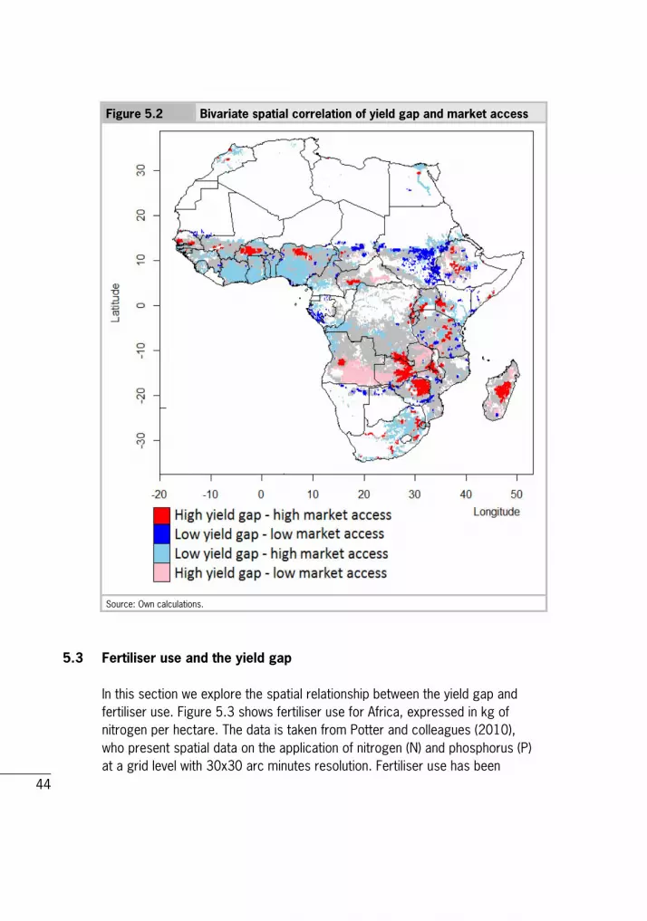
As elaborated upon above, we expect that overall market access is positively associated with agricultural performance and, thus, a small yield-gap. This implies a negative relationship between yield gap and market access. Our expectations are corroborated by the multivariate global Moran's I statistic of -0.1345 with a p-value of 1% (k nearest neighbour). This global measure, however, hides substantial variation in yield gap and market access at the local (grid) level. This is illustrated by Figure 5.2, which shows the spatial cluster map of yield gap and market access, highlighting the four types of spatial autocorrelation. Only figures that are significant at the 1% level are depicted. The map indicates that a large share of the regions with a small or relatively small yield-gap, including most of the coastal zone of West Africa and South Africa (compare with Figure 5.1), are characterised by high market access. This

43
corresponds with other research that found that access to markets has a positive effect on agricultural production and the adoption of high-yield technology (Dorosh et al., 2012). An exception is the wheat region in Sudan, which performs well (small yield-gap) despite low market-accessibility. This might be explained by the fact that yield potential is very low in this region and therefore, even with limited access to markets and inputs, yield is close to the potential maximum. Another interesting finding is the identification of areas that exhibit a large yield-gap and high market-access that are mainly located in Burkina Faso, the north of Nigeria and parts of Ethiopia, Zambia, Zimbabwe and Madagascar. These regions have a high potential to close the yield gap in the future because they can benefit from relatively good infrastructure and access to markets, which are important elements for agricultural development. Other factors, such as technological capacity, access to finance and institutional problems, might be responsible for the small yield-gap. Additional research that takes a more in-depth look at these issues in the specific regions is needed to provide further guidance. Finally, the figure shows the areas with a large yield-gap and low market-access. A major region is located in Angola; there are also some small areas in the Central African Republic, Zambia and Madagascar.
44
Figure 5.2 Bivariate spatial correlation of yield gap and market access
Source: Own calculations.
5.3 Fertiliser use and the yield gap In this section we explore the spatial relationship between the yield gap and fertiliser use. Figure 5.3 shows fertiliser use for Africa, expressed in kg of nitrogen per hectare. The data is taken from Potter and colleagues (2010), who present spatial data on the application of nitrogen (N) and phosphorus (P) at a grid level with 30x30 arc minutes resolution. Fertiliser use has been

45
recalculated and rescaled to a resolution of 5x5 arc minutes to match the data on yield and yield gap. As elaborated upon above, we expect that overall fertiliser use is positively associated with agricultural performance and, thus, a small yield-gap. This implies a negative relationship between yield gap and fertiliser use. Figure 5.3 Fertiliser use (kg N per ha) in Africa
Source: Potter et al. (2010).

46
Figure 5.4 Bivariate spatial correlation of yield gap and fertiliser use
Source: Own calculations.
Our expectations are corroborated by the multivariate global Moran's I statistic of -0.108 with a p-value of 1% (k nearest neighbour). This global measure, however, hides substantial variation in yield gap and fertiliser use at the local (grid) level. This is illustrated by Figure 5.4, which shows the spatial cluster map of yield gap and fertiliser use, highlighting the four types of spatial autocorrelation. Only figures that are significant at the 1% level are depicted (grey values refer to non-significant values). The map indicates that a large share of the regions with a small or relatively small yield-gap and a high fertiliser use (pale blue areas), including most of the coastal zone of West Africa and Southeast Africa (compare with Figure 5.3), are characterised by high fertiliser use. Some regions are characterised by the opposite situation, where a high yield-gap is linked to low fertiliser use (pink).
47
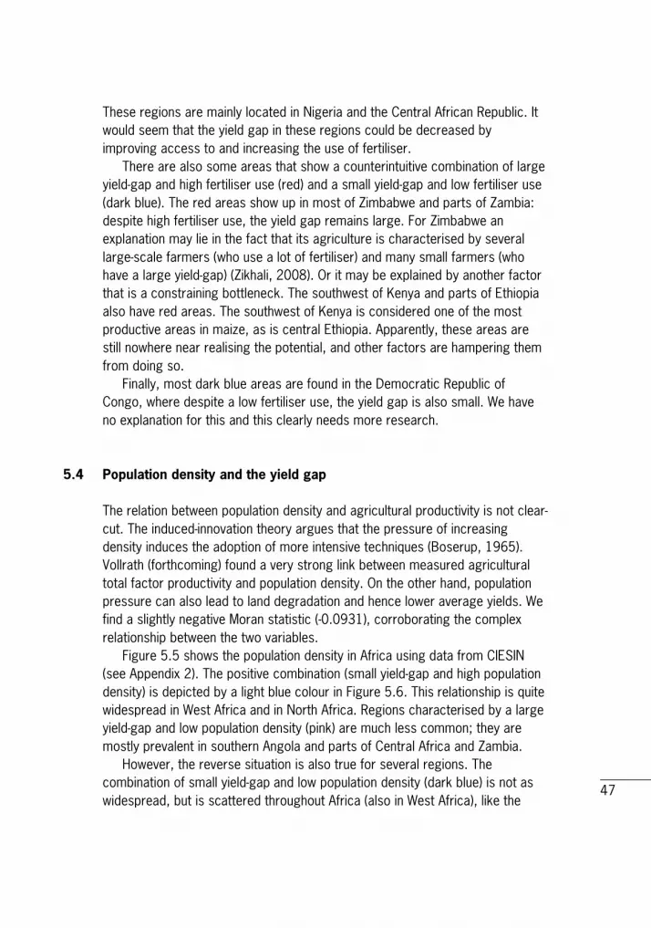
These regions are mainly located in Nigeria and the Central African Republic. It would seem that the yield gap in these regions could be decreased by improving access to and increasing the use of fertiliser. There are also some areas that show a counterintuitive combination of large yield-gap and high fertiliser use (red) and a small yield-gap and low fertiliser use (dark blue). The red areas show up in most of Zimbabwe and parts of Zambia: despite high fertiliser use, the yield gap remains large. For Zimbabwe an explanation may lie in the fact that its agriculture is characterised by several large-scale farmers (who use a lot of fertiliser) and many small farmers (who have a large yield-gap) (Zikhali, 2008). Or it may be explained by another factor that is a constraining bottleneck. The southwest of Kenya and parts of Ethiopia also have red areas. The southwest of Kenya is considered one of the most productive areas in maize, as is central Ethiopia. Apparently, these areas are still nowhere near realising the potential, and other factors are hampering them from doing so. Finally, most dark blue areas are found in the Democratic Republic of Congo, where despite a low fertiliser use, the yield gap is also small. We have no explanation for this and this clearly needs more research.
5.4 Population density and the yield gap The relation between population density and agricultural productivity is not clear-cut. The induced-innovation theory argues that the pressure of increasing density induces the adoption of more intensive techniques (Boserup, 1965). Vollrath (forthcoming) found a very strong link between measured agricultural total factor productivity and population density. On the other hand, population pressure can also lead to land degradation and hence lower average yields. We find a slightly negative Moran statistic (-0.0931), corroborating the complex relationship between the two variables. Figure 5.5 shows the population density in Africa using data from CIESIN (see Appendix 2). The positive combination (small yield-gap and high population density) is depicted by a light blue colour in Figure 5.6. This relationship is quite widespread in West Africa and in North Africa. Regions characterised by a large yield-gap and low population density (pink) are much less common; they are mostly prevalent in southern Angola and parts of Central Africa and Zambia. However, the reverse situation is also true for several regions. The combination of small yield-gap and low population density (dark blue) is not as widespread, but is scattered throughout Africa (also in West Africa), like the

48
combination large yield-gap and high population density (red) which shows up in West and North Africa, as well as scattered across East Africa. Ethiopia and Madagascar are especially notable in this respect. Vollrath (ibid.) found not only that population density explains part of agricultural productivity, but also that the variation in agricultural productivity across countries is actually widening over time. Thus varying rates of population densities may be one element of an explanation for increasing divergence across countries. Figure 5.5 Population density in Africa (persons per km2)
Source: CIESIN.

49
Figure 5.6 Yield gap and population density
Source: Own calculations.
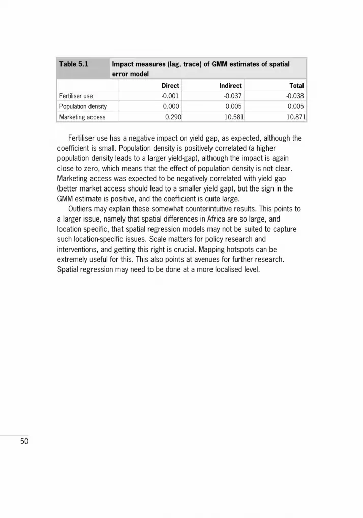
5.5 Spatial regression model results We estimated the overall impact of fertiliser use, population density and marketing access on yield gap using various spatial regression models. The details are given in Appendix 1 (Spatial Regression Models). The various models provide different results, which means that there are still several specification issues to be solved. We show only the final impact measures of the generalised method of moments (GMM) estimates of spatial error model here in Table 5.1.
Latit
ude
50
Table 5.1 Impact measures (lag, trace) of GMM estimates of spatial error model
Direct Indirect Total
Fertiliser use -0.001 -0.037 -0.038
Population density 0.000 0.005 0.005
Marketing access 0.290 10.581 10.871
Fertiliser use has a negative impact on yield gap, as expected, although the coefficient is small. Population density is positively correlated (a higher population density leads to a larger yield-gap), although the impact is again close to zero, which means that the effect of population density is not clear. Marketing access was expected to be negatively correlated with yield gap (better market access should lead to a smaller yield gap), but the sign in the GMM estimate is positive, and the coefficient is quite large. Outliers may explain these somewhat counterintuitive results. This points to a larger issue, namely that spatial differences in Africa are so large, and location specific, that spatial regression models may not be suited to capture such location-specific issues. Scale matters for policy research and interventions, and getting this right is crucial. Mapping hotspots can be extremely useful for this. This also points at avenues for further research. Spatial regression may need to be done at a more localised level.

51
6 Mapping as a tool in weather index-based insurance: application for Mali Extreme weather events and natural disasters can trap rural households in poverty, impede development and drain a country's critical financial resources. Smallholders in developing countries are particularly vulnerable to such natural disasters. The International Fund for Agricultural Development and the World Food Programme have joined forces in the Weather Risk Management Facility (WRMF) to improve the access of poor rural people to a range of financial services through the use of weather index-based insurance, a financial product based on local weather indices that are highly correlated with local crop yields. The WRMF focuses on four areas: - Building the capacity of local stakeholders for weather risk management by
strengthening partnerships, offering technical assistance, and promoting knowledge exchange in the development and use of risk mitigation mechanisms, including weather index-based insurance (WII).
- Improving weather services, infrastructure and data management for weather risk management, including the development of WII, national weather risk management, early warning systems and vulnerability analysis.
- Supporting the development of an enabling environment by engaging with gov-
ernment partners and advocating national risk management frameworks and appropriate financial and weather risk-management strategies and policies.
- Promoting inclusive financial systems for poor people in rural areas,
including innovative delivery channels and client education, which lead to better planning for and coping with weather shocks.
Based on the analysis undertaken in the appraisal missions, the IFAD-WFP team has chosen Mali for implementation, taking a staged approach to the com-mencement of activities. In order to prepare the ground for implementation, additional research was needed. Wageningen UR was involved in this research in 2010 and 2011. Specifically, Wageningen UR contributed by assessing

52
the feasibility for weather index-based insurance as a means of adaptation to climate change (Conijn et al., 2011; Meijerink and Shutes, 2011). In this report the difference between potential yield and actual yield was used to identify areas that were characterised by their yield gaps. Socioeconomic factors (market access, fertiliser use and population density) were then mapped to specify to what extent they could explain the yield gap. Such information can also be useful when targeting areas for insurance or upscaling pilot projects. This will be explained in this chapter. Figure 6.1 Map of Mali
Source: http://athaia.org/mali-map.html
53
An index-based insurance uses an index that applies to a certain region, such as rainfall. If rainfall drops below a certain threshold, it is assumed that all farmers in this region are affected and will therefore receive a pay-out. However, crop yields are not affected only by rainfall. Of course, other biophysical factors play a role, such as soil type or the availability of water/irrigation water. These are usually also factored in when calculating the expected yield under normal circumstances (i.e. sufficient rain). Socioeconomic information is usually collected (typically through household surveys) after a target region has been identified based on agro-ecological and biophysical information. Mapping of socioeconomic information, however, could play a role much earlier, namely when identifying regions that could benefit from insurance. Figure 6.2 Map with percentage of years with low yield, here defined
as <40% of the 30-years average rain-fed yield per grid cell used for growing maize in southern Mali around the year 2000
NB The total harvested maize area in Mali is estimated at 160,000 ha around the year 2000 (Monfreda et al.,
2008).1
Source: Conijn et al. (2011).
Figure 6.2 can be seen as a spatial risk distribution for maize production. Based on the 40% threshold, this maize area might be suitable for weather index-based insurance: for instance, only those maize areas that face a 10-30% probability that yields will be 40% below the average yield in a grid cell, that is, the combination of the probability classes 10-20 and 20-30 in Figure 6.2 (both 1 National statistics from FAOSTAT report for the same period a harvested area of maize of circa 275,000 ha, increasing towards circa 400,000 ha in recent years. The difference between FAOSTAT and Monfreda et al. (2008) is due to the use of different statistical databases.
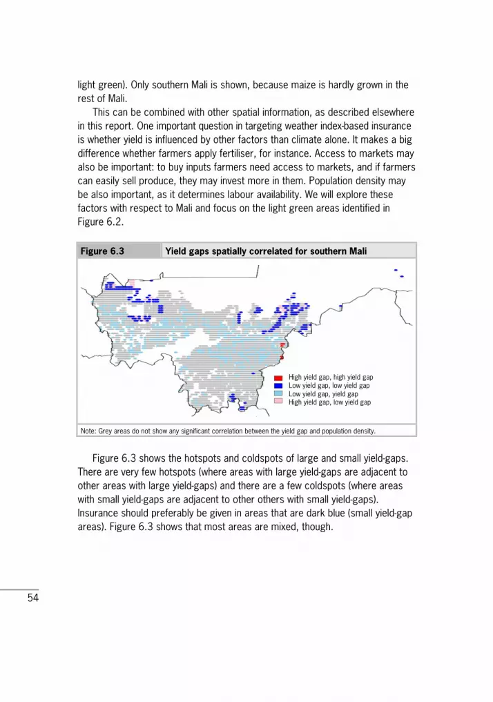
54
light green). Only southern Mali is shown, because maize is hardly grown in the rest of Mali. This can be combined with other spatial information, as described elsewhere in this report. One important question in targeting weather index-based insurance is whether yield is influenced by other factors than climate alone. It makes a big difference whether farmers apply fertiliser, for instance. Access to markets may also be important: to buy inputs farmers need access to markets, and if farmers can easily sell produce, they may invest more in them. Population density may be also important, as it determines labour availability. We will explore these factors with respect to Mali and focus on the light green areas identified in Figure 6.2. Figure 6.3 Yield gaps spatially correlated for southern Mali
Note: Grey areas do not show any significant correlation between the yield gap and population density.
Figure 6.3 shows the hotspots and coldspots of large and small yield-gaps. There are very few hotspots (where areas with large yield-gaps are adjacent to other areas with large yield-gaps) and there are a few coldspots (where areas with small yield-gaps are adjacent to other others with small yield-gaps). Insurance should preferably be given in areas that are dark blue (small yield-gap areas). Figure 6.3 shows that most areas are mixed, though.
High yield gap, high yield gap Low yield gap, low yield gap Low yield gap, yield gap High yield gap, low yield gap

55
Figure 6.4 Correlations between of yield gap and population density in southern Mali
Note: Grey areas do not show any significant correlation between the yield gap and population density.
Figure 6.4 shows the correlations between yield gap and population density in Mali. If we compare the two light green areas with Figure 6.4, we see that these mostly overlap with the grey areas that do not show any correlation. Population density does not play a role in explaining yield gap in these regions.1 Figure 6.5 shows the correlation between yield gap and fertiliser use. About half the area is not statistically significant (grey), but the other half is characterised by a small yield-gap and high fertiliser use (pale blue). The light green area in Figure 6.2 only partly overlaps the pale blue in East Kayes (see for location Figure 6.1).
1 One noticeable area is the one characterised by low yield-gap and low population density and 90-100% variability (dark blue in Figure 2). Figure 1 shows that this is in a hilly area, and this might explain the uniqueness of this relatively small area. The potential yield is probably low, as is the population density. Variability may be high because areas with steep slopes need just the right amount of rain to produce a high yield (too much rain will lead to erosion).
High yield gap, high population density Low yield gap, low population density Low yield gap, high population density High yield gap, low population density

56
Figure 6.5 Correlations between yield gap and fertiliser use in southern Mali
Note: Grey areas do not show any significant correlation between the yield gap and fertiliser use.
Not surprisingly, the pale blue in Figure 6.6 (small yield-gap and high market access) overlaps the pale blue in Figure 6.5 (small yield-gap and high fertiliser use): fertiliser use is partly determined by market access. There is again overlap with the light green area in Figure 6.2 (East Kayes). Figure 6.6 has a few patches that are characterised by a seemingly contradictory combination of large yield-gap and high market access. They lie around Bamako, the capital city of Mali, which may explain both: good market access, but land use may not be geared towards growing maize. Figure 6.6 Correlations between yield gap and market access in Mali
Note: Grey areas do not show any significant correlation between the yield gap and fertiliser use.
High yield gap, high fertiliser use Low yield gap, low fertiliser use Low yield gap, high fertiliser use High yield gap, low fertiliser use
High yield gap, high market access Low yield gap, low market access Low yield gap, high market access High yield gap, low market access
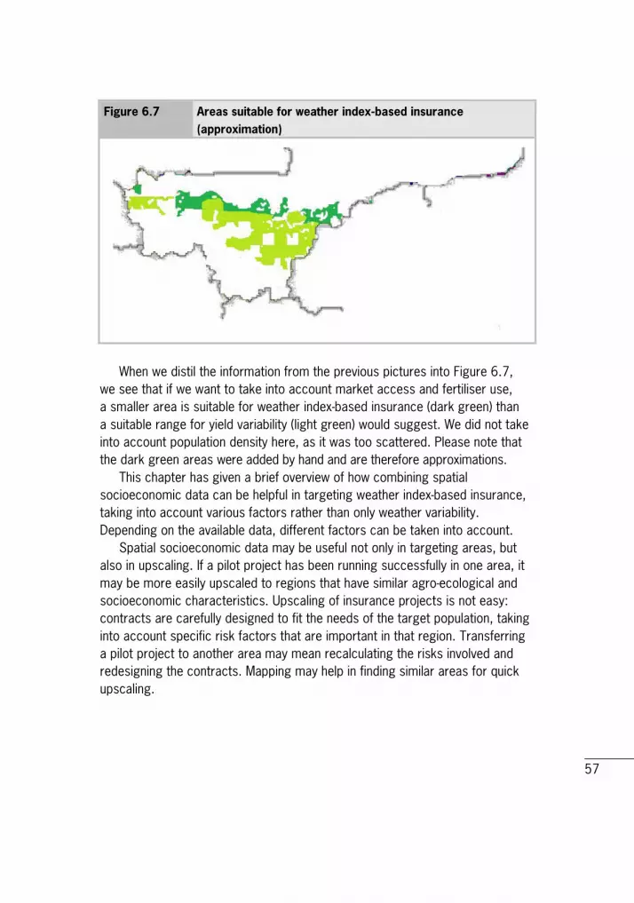
57
Figure 6.7 Areas suitable for weather index-based insurance (approximation)
When we distil the information from the previous pictures into Figure 6.7, we see that if we want to take into account market access and fertiliser use, a smaller area is suitable for weather index-based insurance (dark green) than a suitable range for yield variability (light green) would suggest. We did not take into account population density here, as it was too scattered. Please note that the dark green areas were added by hand and are therefore approximations. This chapter has given a brief overview of how combining spatial socioeconomic data can be helpful in targeting weather index-based insurance, taking into account various factors rather than only weather variability. Depending on the available data, different factors can be taken into account. Spatial socioeconomic data may be useful not only in targeting areas, but also in upscaling. If a pilot project has been running successfully in one area, it may be more easily upscaled to regions that have similar agro-ecological and socioeconomic characteristics. Upscaling of insurance projects is not easy: contracts are carefully designed to fit the needs of the target population, taking into account specific risk factors that are important in that region. Transferring a pilot project to another area may mean recalculating the risks involved and redesigning the contracts. Mapping may help in finding similar areas for quick upscaling.
58
7 Conclusions and policy recommendations Ever increasing computer speed and the availability of powerful (open access) software, in tandem with the spreading policy of open access databases, are increasingly enabling the field of analysing spatial disaggregated data. Although the availability of spatially disaggregated socioeconomic data is lagging behind spatially disaggregated biophysical and agro-ecological data, there are sufficient data to apply new methods to existing questions, opening up new research areas. This report is an example of this. In it, we have analysed the persistence of existing yield gaps in Africa by spatial methods, combing agro-ecological data with socioeconomic data, limited for now to market access, fertiliser use and population density. However, in the near future, as more socioeconomic data become available and computer power increases, more advanced and refined analyses may be done. Our study demonstrates that the difference between the potential yield and the actual yield of maize (yield gap) shows great differences in Africa. The yield gap, which is so persistently large in Africa, is by no means spread uniformly across the continent. Clear hotspots (with very large yield-gaps) and coldspots (with very small yield-gaps) have been identified. Our study found that, in general, a small yield-gap is correlated with good market access as well as a high use of fertiliser. Again, this result varies spatially. Other combinations also show up. In many regions in Africa, the reverse relation also applies: large and small yield-gaps are correlated with good and deficient market access and/or high and low fertiliser use. The distinct regions are often demarcated by administrative boundaries, suggesting a political-institutional dimension with respect to the causes of the yield gap. We found that the relation between the yield gap and population density is not clear-cut. For policy, this result informs that a general objective of increasing fertiliser use or building better infrastructure will not be effective or even necessary in some regions. Better targeting can increase effectiveness and efficiency. The methodology can therefore be used to target specific development aid interventions. Rural infrastructure, for instance, is high on the agenda of many donors. Combined mapping can select those areas where market access is hampering agricultural productivity. In a similar vein, the adoption of technology, such as fertiliser use, is high on the agenda. Again, combined mapping can

59
select areas where fertiliser use is correlated with a large yield-gap. We performed an overall analysis for Africa, but the methodology can easily be applied to countries and specific regions. This analysis would be greatly helped were the numerous household surveys that have been done by so many countries to become available in a spatially disaggregated format by adding georeferences. The study shows that combining agro-ecological and socioeconomic mapping is a useful instrument to analyse existing questions in a new manner. It is also useful in specific applications, such as the targeting and upscaling of weather index-based insurance. Implementing weather index-based insurance is often very costly, as the data needs (data on weather, yields, farming practices etc.) are high. Combining agro-ecological and socioeconomic mapping can economise substantially on these costs when it is used to target suitable regions or to upscale pilot projects, as our application to Mali suggests.

60
8 References Anselin, L., An introduction to spatial autocorrelation analysis with GeoDa. Spatial Analysis Laboratory, University of Illinois, Champagne-Urbana, Illinois, 2003. Anselin, L., 'Local indicators of spatial association - LISA.' In: Geographical Analysis 27 (1995) 2, pp. 93-115. doi:10.1111/j.1538-4632.1995.tb00338.x. Anselin, L., Sanjeev Sridharan and S. Gholston, 'Using exploratory spatial data analysis to leverage social indicator databases: The discovery of interesting patterns.' In: Social Indicators Research 82 (2006), pp. 287-309. doi: 10.1007/s11205-006-9034-x. Anselin, L., Ibnu Syabri and O. Smirnov, 'Visualising multivariate spatial correlation with dynamically linked window.' In: New Tools for Spatial Data Analysis: Proceedings of a Workshop, eds. Luc Anselin and S. Rey. Center for Spatially Integrated Social Science, Santa Barbara, 2002. De Bie, C.A.J.M., Comparative performance analysis of agro-ecosystems. ITC Dissertation, no. 75, 2000. Boserup, E., The conditions of agricultural growth: The economics of agrarian change under population pressure. Earthscan Publications, London, UK, 1965. Celebioglu, F. and S. Dall'erba, 'Spatial disparities across the regions of Turkey: An exploratory spatial data analysis.' In: The Annals of Regional Science 45 (2009) pp. 379-400. Chamberlin, J., J. Pender and B. Yu, Development domains for Ethiopia: Capturing the geographical context of smallholder development options. EPTD Discussion Paper. IFPRI, Washington DC, 2006. Conijn, J.G., E. Querner, M. Rau, H. Hengsdijk, T. Kuhlman, G.W. Meijerink, B. Rutgers and P.S. Bindraban, Agricultural resource scarcity and distribution. Research Report. PRI, part of Wageningen UR, the Netherlands, 2011.

61
Conijn, J.G., H. Hengsdijk, B. Rutgers and R.E.E. Jongschaap, Mapping maize yield variability in Mali. PRI, part of Wageningen UR, the Netherlands, 2011. De Sherbinin, A., D. Balk, K. Yager, M. Jaiteh, F. Pozzi, C. Giri and A. Wannebo, A CIESIN thematic guide to social science applications of remote sensing. Palisades, Center for International Earth Science Information Network (CIESIN). Columbia University, NY, USA, 2002. Dorosh, P., Hyoung Gun Wang, Liangzhi You and E. Schmidt, 'Road connectivity, population and crop production in sub‐Saharan Africa.' In: Agricultural Economics 43 (2012) January 1: pp. 89-103. doi: 10.1111/j.1574-0862.2011.00567.x. Ehui, S. and J. Pender, 'Resource degradation, low agricultural productivity and poverty in sub‐Saharan Africa: Pathways out of the spiral.' In: Agricultural Economics 32 (January 1 2005): 225-242. doi:10.1111/0169-5150.2004.00026.x. Evans, L.T. and R.A. Fisher, 'Yield potential: its definition, measurement and Significance.' In: Crop Science 39 (1999) 6: pp. 1544-1551. FAO, 'How to feed the World in 2050.' In: How to feed the world in 2050. FAO, Rome, 2009. http://www.fao.org/fileadmin/templates/wsfs/docs/ expert_paper/How_to_Feed_the_World_in_2050.pdf FAO, The state of food Insecurity in the world. Rome, 2010. http://www.fao.org/publications/sofi/en/ FAOSTAT, FAOSTAT Database. 2012a. http://faostat.fao.org/ FAOSTAT, World Hunger Map FAO. 2012b. http://faostat.fao.org/ Fischer, M.M. and A. Getis, Handbook of applied spatial analysis: Software tools, methods and applications. Springer, Berlin, Heidelberg, 2010. Fischer, R.A., D. Byerlee and G.O. Edmeades, 'Can technology deliver on the yield challenge to 2050.' In: Expert meeting on how to feed the world. Vol. 2050, 2009.

62
Hodson, D.P. and J.W. White, 'Use of spatial analyses for global characterization of wheat-based production systems.' In: Journal of Agricultural Science 145 (2007): pp. 115-125. Jacquez, G.M., 'Spatial cluster analysis.' In: The Handbook of Geographic Information Science, by S. Fotheringhan and J. Wilson, pp. 395-416. Blackwell Publishing, 2008. Kruseman, G., R. Ruben and G. Tesfay, 'Diversity and development domains in the Ethiopian highlands.' In: Agricultural Systems 88 (April 2006) 1: pp. 75-91. doi: 10.1016/j.agsy.2005.06.020. Licker, R., M. Johnston, J.A. Foley, C. Barford, C.J. Kucharik, C. Monfreda and N. Ramankutty, 'Mind the Gap: How do climate and agricultural management explain the 'yield Gap' of croplands around the World?' In: Global Ecology and Biogeography 19 (November 1 2010) 6: pp. 769-782. doi:10.1111/j.1466-8238.2010.00563.x. Lobell, D.B., K.G. Cassman and C.B. Field, 'Crop Yield Gaps: Their importance, magnitudes and causes.' In: Annual Review of Environment and Resources 34 (November 2009) 1: pp. 179-204. doi: 10.1146/annurev.environ.041008.093740. Meijerink, G. and K. Shutes, Mapping socio-economic factors in Mali. Nota. LEI, part of Wageningen UR, the Netherlands, 2011. Monfreda, C., N. Ramankutty and J.A. Foley, 'Farming the Planet: 2. Geographic distribution of crop areas, yields, physiological types and net primary production in the year 2000.' In: Global Biogeochemical Cycles 22 (March 1, 2008) 19 pp. doi: 200810.1029/2007GB002947. Müller, D. and M. Zeller, 'Agricultural intensification, population growth and forest cover change: Evidence from spatially explicit land use modelling in the Central Highlands of Vietnam.' In: Land Use, Nature Conservation and the Stability of Rainforest Margins in Southeast Asia. Springer-Verlag, Berlin, 2004.

63
Neumann, K., P.H. Verburg, E. Stehfest and C. Müller, 'The yield gap of global grain production: A spatial analysis.' In: Agricultural Systems 103 (June 2010) 5: pp. 316-326. doi:10.1016/j.agsy.2010.02.004. Nin-Pratt, A., M. Johnson, E. Magalhaes, You Liangzhi, Xinshen Diao and J. Chamberlin, Yield gaps and potential agricultural growth in West and Central Africa. International Food Policy Research Institute, Washington, DC, 2011. http://www.ifpri.org/publication/yield-gaps-and-potential-agricultural-growth-west-and-central-africa. Omamo, S.W., Xinshen Diao, S. Wood, J. Chamberlin, Liangzhi You, S. Benin, U. Wood-Sichra and A. Tatwangire, Strategic priorities for agricultural develop-ment in Eastern and Central Africa. IFPRI Research Report. Washington DC, 2006. Páez, A., J. Gallo, R.N. Buliung and S. Dall'erba, Progress in Spatial Analysis. Advances in Spatial Science. Springer, Berlin Heidelberg, 2010. Pender, J., F. Place and S. Ehui, Strategies for sustainable land management in the East African Highlands. International Food Policy Research Institute, 2006. Pender, J.L., 'Rural population growth, agricultural change and natural resource management in developing countries: A review of hypotheses and some evidence from Honduras.' In: EPTD Discussion Papers 1999. Potter, P., N. Ramankutty, E. Bennett and S.D. Donner, 'Characterizing the spatial patterns of global fertilizer application and manure production.' In: Earth Interactions 14 (2) (January 2010): pp. 1-22. doi:10.1175/2009EI288.1. Ramankutty, N., A.T. Evan, C. Monfreda and J.A. Foley, 'Farming the Planet: 1. Geographic distribution of global agricultural lands in the year 2000.' In: Global Biogeochemical Cycles 22 (2008): 19 pp. doi:200810.1029/2007GB002952. Rau, M., T. Kuhlman and G. Meijerink, 'Why can't Africa produce more food? Mapping socio-economic constraints'. Poster presentation Tropentag, 5-7 October 2011, University of Bonn, Bonn, Germany.

64
Richards, J.A. and Xiuping Jia, 2006. Remote sensing digital image analysis: An introduction. Springer. Berlin, Heidelberg, 2006. Siebert, S., P. Döll, J. Hoogeveen, J.M. Faures, K. Frenken and S. Feick, 'Development and validation of the global map of irrigation areas.' In: Hydrology and Earth System Sciences Discussions 2 (August 2005) pp. 1299-1327. United Nations, World population prospects: The 2010 Revision. 2011. http://esa.un.org/unpd/wpp/index.htm. Van Ittersum, M.K. and R. Rabbinge, 'Concepts in production ecology for analysis and quantification of agricultural input-output combinations.' In: Field Crops Research 52 (June 1997) 3: pp. 197-208. doi:10.1016/S0378-4290(97)00037-3. Verburg, P.H., E.C Ellis and A. Letourneau, 'A global assessment of market accessibility and market influence for global environmental change studies.' In: Environmental Research Letters 6 (2011) 3 (July 1). 034019. doi:10.1088/1748-9326/6/3/034019. Vollrath, D., 'A new look at agricultural productivity and economic growth.' Forthcoming in Journal of Macroeconomics. 2012. World Bank, World Development Report 2008: agriculture for development. World Bank, Washington DC, 2007. Zikhali, P., Fast track land reform and agricultural productivity in Zimbabwe. EfD discussion paper. Environment for Development, 2008.

65
Appendix 1 Spatial Regression Models There are a number of approaches to the regression problem when one faces the problems associated with spatial autocorrelation. Detection of this problem is relatively simple. The Moran tests for a number of spatial specifications are possible with versions that are robust to spatial autocorrelation also reported. The data used are the yield gap data presented above. Estimation was performed using spdep in R. Using an ordinary least squares (OLS) regression, residuals are retrieved and tested for spatial dependence. Thus the model is given by
𝑌𝐺𝑖 =∝ +𝛽1𝐹𝑒𝑟𝑡𝑖 + 𝛽2𝑃𝑜𝑝𝑖 + 𝛽3𝑀𝑎𝑟𝑘𝑖 + 𝜖𝑖 where the usual properties of the OLS regressions are assumed to hold. Using the regression residuals, a test is performed to assess the type of spatial dependence in the model. The possibilities are a simple error dependence model and a spatially lagged dependent model, or a combination of the two. The error dependence model assumes that the error term has a spatial structure, such that it can be written as
𝜖𝑖 = 𝜆𝑊𝜖 + 𝑢, where λ is the spatial error parameter and W the spatial weighting. The variance of the residual vector is given by:
𝑉𝑎𝑟(𝜖) = 𝜎2(𝐼 − 𝜆𝑊)−1(𝐼 − 𝜆𝑊)−1 From this the usual likelihood function can be derived; however, the logarithm of the determinant of the matrix |𝐼 − 𝜆𝑊| is not easy to compute and may outweigh the sum of squares element of the likelihood function. The alternative structure is that of an autoregressive lagged model of the form:
𝑌𝐺𝑖 =∝ +𝛽1𝐹𝑒𝑟𝑡𝑖 + 𝛽2𝑃𝑜𝑝𝑖 + 𝛽3𝑀𝑎𝑟𝑘𝑖 + 𝜌𝑊𝑌𝐺𝑖 + 𝜖𝑖

66
where ρ is the spatial lag parameter. This specification is complicated by the fact that the ρ parameter feeds back into the system, making the interpretation more complex.
Basic linear regression We use a basic linear regression to regress fertiliser use, population density and market access, with dependent variable yield gap. The results are presented in Table A1.1 Table A1.1 Basic linear regression for yield gap explained by fertiliser
use, population density and market access
Estimate S.E. t-value
Intercept 5.97 9.19*10-3 649.22
Fert 2.57*10-3 3.33*10-4 7.74
Pop -1.18*10-4 4.76*10-5 -2.48
Mark -1.36 4.44*10-2 -30.68
Note that all coefficients are significantly different from 0 at 5%. The sign for fertiliser use is positive, which is counterintuitive. One would expect that more fertiliser use would lead to a smaller yield gap. The sign for population density is negative, which means that in highly populated areas, the yield gap tends to be smaller, which corroborates the induced innovation theory. Market access has a negative coefficient. With better market access, the yield gap tends to be smaller, which is to be expected.
Specification test Using the forms of the models above, it is possible to test the restrictions that either ρ or λ is zero, or both are zero. Note that if both of the individual tests are significant, the robust forms should be used to select or guide model specification.

67
Table A1.2 Residuals of basic linear regression
Test Statistic Df
LM error 280.875 1
LM lag 280.705 1
RLM error 444.8 1
RLM lag 274.7 1
SARMA 28.1150 2
It is clear from these tests that the OLS approach is poorly specified; the error model or the SARMA model might be the best approach to the modelling problem. Both the error and the lagged model are run and their results reported.
The regression models Once the model is selected, the spatial correlation is estimated using an optimising algorithm with the regression following using a generalised least squares approach. One fundamental problem with spatial regressions is the size of the various matrices, especially the weighting matrix W. A direct approach is often not feasible. Therefore, either a LU or Monte Carlo is used on the matrix 𝐼 − 𝜆𝑊. A GMM model is possible in some cases.
Spatial models The results of the spatial models are as follows. The spatial error model assumes that the error carries the spatial dependence and thus estimates λ. Table A1.3 Spatial error model for yield gap explained by fertiliser use,
population density and market access
Estimate S.E. z-value
Intercept 5.66 4,7156*10-2 120.04
Fert 5.76*10-3 8.01*10-4 7.19
Pop 7.68*10-5 2.61*10-5 2.95
Mark 0.12 4.86*10-2 2.43
λ 0.92747
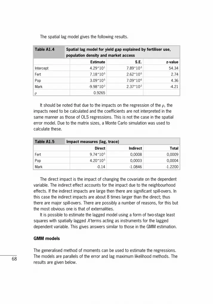
68
The spatial lag model gives the following results. Table A1.4 Spatial lag model for yield gap explained by fertiliser use,
population density and market access
Estimate S.E. z-value
Intercept 4.29*10-1 7.89*10-3 54.34
Fert 7.18*10-5 2.62*10-5 2.74
Pop 3.09*10-5 7.09*10-6 4.36
Mark -9.98*10-2 2.37*10-2 -4.21
ρ 0.9265
It should be noted that due to the impacts on the regression of the ρ, the impacts need to be calculated and the coefficients are not interpreted in the same manner as those of OLS regressions. This is not the case in the spatial error model. Due to the matrix sizes, a Monte Carlo simulation was used to calculate these. Table A1.5 Impact measures (lag, trace)
Direct Indirect Total
Fert 9.74*10-5 0,0008 0,0009
Pop 4.20*10-5 0,0003 0,0004
Mark -0.14 -1.0846 -1.2200
The direct impact is the impact of changing the covariate on the dependent variable. The indirect effect accounts for the impact due to the neighbourhood effects. If the indirect impacts are large then there are significant spill-overs. In this case the indirect impacts are about 8 times larger than the direct; thus there are major spill-overs. There are possibly a number of reasons, for this but the most obvious one is that of externalities. It is possible to estimate the lagged model using a form of two-stage least squares with spatially lagged X terms acting as instruments for the lagged dependent variable. This gives answers similar to those in the GMM estimation.
GMM models The generalised method of moments can be used to estimate the regressions. The models are parallels of the error and lag maximum likelihood methods. The results are given below.

69
Table A1.6 GMM estimates of spatial error model
Estimate S.E. z-value
Intercept 5.70 3.69*10-2 154.71
Fert 4.85*10-3 7.57*10-4 6.41
Pop 7.33*10-5 2.64*10-5 2.77
Mark 7.53*10-2 4.87*10-2 1.55
λ 0.90515
Table A1.7 GMM estimate of autoregressive model with spatially lagged
dependent variable
Estimate S.E. z-value
Intercept -4.57*10-1 9.02*10-2 -5.07
Fert -3.68*10-4 1.11*10-4 -3.33
Pop 5.21*10-5 1.68*10-5 3.09
Mark 1.05*10-1 2.58*10-2 4.07
ρ 1.0750 1.51*10-2
λ -0.399
As with the maximum likelihood estimation, the coefficients need careful interpretation. The calculations are given below. Table A1.8 Impact measures (lag, trace)
Direct Indirect Total
Fert -0.001 -0.037 -0.038
Pop 0.000 0.005 0.005
Mark 0.290 10.581 10.871

70
Appendix 2 Databases (in alphabetical order)
Map of Africa
Biodiversity hotspots This database is compiled by Conservation International. To qualify as a hotspot, a region must meet two strict criteria: it must contain at least 1500 species of vascular plants (> 0.5% of the world's total) as endemics, and it has to have lost at least 70% of its original habitat. It contains an ArcView shapefile and metadata for the biodiversity hotspots (11.7 Mb zip file). The database is downloadable from http://www.biodiversityhotspots.org/xp/hotspots/resources/Pages/maps.aspx

71
CODATA Catalog of Roads Data Sets, version 1 The CODATA Catalog (Committee on Data for Science and Technology) of Roads Data Sets, Version 1 contains 367 entries describing national-level road network data sets for 147 countries and four entries describing global data sets. It was produced by the Columbia University Center for International Earth Science Information Network (CIESIN) under the supervision of the CODATA Global Roads Data Development Working Group, and as a contribution to the development of the Global Roads Open Access Data Set (gROADS). This archive contains an Access database and a PDF with summary data from the Access database. The data is downloadable from www.groads.org
Global Map of Irrigation Areas1 The map shows the amount of area equipped for irrigation around the turn of the 20th century as a percentage of the total area on a raster with a resolution of 5 minutes. The area actually irrigated was smaller, but is unknown for most countries. A special note has to be made for Australia and India, where the map shows the total area actually irrigated. This is due to the fact that statistics collected in Australia and India refer to actually irrigated area as opposed to
1 'Stefan Siebert, Petra Döll, Sebastian Feick, Jippe Hoogeveen and Karen Frenken (2007) Global Map of Irrigation Areas version 4.0.1. Johann Wolfgang Goethe University, Frankfurt am Main, Germany/Food and Agriculture Organisation of the United Nations, Rome, Italy'.

72
statistics with area equipped for irrigation, which are collected in most other countries. For the GIS users, the map is distributed in two formats: as a zipped ASCII-grid that can be easily imported into most GIS software that support rasters or grids; and, to accommodate people who use GIS software that does not support rasters or grids, as a zipped ESRI shapefile. The data is downloadable from http://www.fao.org/nr/water/aquastat/irrigationmap/index10.stm
Global economic data (Yale G-Econ project) The Yale G-Econ project (G-Econ stands for geographically based economic data) has developed a geophysically based data set on economic activity. The G-Econ data set calculates gross value added at a 1-degree longitude by 1-degree latitude resolution at a global scale for all terrestrial cells. These data allow better integration of economic and environmental data to investigate environmental economics, the impact of global warming, and the role of geophysical factors in economic activity. Data can be downloaded from http://gecon.sites.yale.edu/data-and-documentation-g-econ-project.
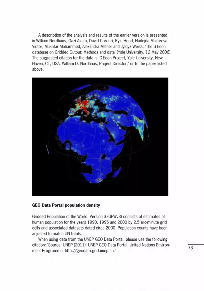
73
A description of the analysis and results of the earlier version is presented in William Nordhaus, Qazi Azam, David Corderi, Kyle Hood, Nadejda Makarova Victor, Mukhtar Mohammed, Alexandra Miltner and Jyldyz Weiss, 'The G-Econ database on Gridded Output: Methods and data' (Yale University, 12 May 2006). The suggested citation for the data is 'G-Econ Project, Yale University, New Haven, CT, USA, William D. Nordhaus, Project Director,' or to the paper listed above.
GEO Data Portal population density Gridded Population of the World, Version 3 (GPWv3) consists of estimates of human population for the years 1990, 1995 and 2000 by 2.5 arc-minute grid cells and associated datasets dated circa 2000. Population counts have been adjusted to match UN totals. When using data from the UNEP GEO Data Portal, please use the following citation: 'Source: UNEP (2011): UNEP GEO Data Portal. United Nations Environ-ment Programme. http://geodata.grid.unep.ch.'

74
The data can be downloaded from http://geodata.grid.unep.ch. (Choose Data Set Type: geospatial datasets). The data are also available from: Center for International Earth Science Information Network (CIESIN) of the Earth Institute at Columbia University, Socioeconomic Data and Applications Center (SEDAC). This has African countries, year 2000, with estimations for 2005, 2010 and 2015 (the latest available). The data can be downloaded from http://sedac.ciesin.columbia.edu/gpw/index.jsp
Global poverty data SEDAC, the Socioeconomic Data and Applications Center has collected spatially explicit poverty data sets at subnational levels. These are available for selected proxy measures of poverty on global and national scales. The global data are of varying resolution, but primarily coarse; the national data sets are of considerably higher resolution. Global data sets include two proxy poverty measurements: malnutrition (underweight children) and infant mortality rates and possible poverty determinants, all translated to a common quarter-degree grid. Global Subnational Infant Mortality Rates The Global Subnational Infant Mortality Rates consists of estimates of infant mortality rates for the year 2000. The infant mortality rate for a region or country is defined as the number of children who die before their first birthday for every 1000 live births. The data products include a shapefile (vector data) of rates, grids (raster data) of rates (per 10,000 live births in order to preserve precision in integer format), births (the rate denominator) and deaths (the rate numerator), and a tabular dataset of the same and associated data. Over 10,000 national and subnational units are represented in the tabular and grid datasets, while the shapefile uses approximately 1000 units in order to protect the intellectual property of source datasets for Brazil, China, and Mexico. This dataset is produced by the Columbia University Center for International Earth Science Information Network (CIESIN). Global Subnational Prevalence of Child Malnutrition dataset The Global Subnational Prevalence of Child Malnutrition dataset consists of estimates of the percentage of children with weight-for-age z-scores that are more than two standard deviations below the median of the NCHS/CDC/WHO

75
International Reference Population. Data are reported for the most recent year with subnational information available at the time of development. The data products include a shapefile (vector data) of percentage rates, grids (raster data), rates (per 1000 in order to preserve precision in integer format), number of children under five (the rate denominator), number of underweight children under five (the rate numerator) and a tabular dataset of the same and associated data. This dataset is produced by the Columbia University Center for International Earth Science Information Network (CIESIN). A quarter-degree grid cell is approximately 770 square kilometres (300 square miles) at the equator, and progressively less at higher latitudes. The global data sets include metadata files and data sets in the following formats: - Spatial data sets: available as a global shapefile for each variable. - Tabular data sets: available in MS Excel (xls) and comma separated value
(csv). - Metadata: included as read_me text or Excel files on each data set. The data are downloadable from http://sedac.ciesin.org/povmap/ds_global.jsp
Infrastructure built-up data This data set contains 6 layers: 5 land use layers and 1 layer on grazing suitability classes. The land use layers are represented by per cent-per-grid cell (the sum of all land use layers = 100%). The representation for grazing suitability classes is Boolean with classes ranging from 1 (best suitable class) to 4 (least suitable class). Data do not include Greenland or Antarctica. Data are in geographic projection 'Lat Long' (WGS84). Raster cell size: 5 arc minutes. Total # of grid cells (incl. no data): 9,331,200.

76
Market access and influence data Verburg and colleagues (2011) developed a high spatial resolution gridded dataset depicting market influence globally. The data indicate variations in both market strength and accessibility reflected by three market influence indices: (A) an index of access to national and international markets; (B) an index of market influence combining the national GDP data with the access to markets index, and (C) a market influence index that downscales national GDP using a measure of economic density. The data can be downloaded from: http://www.ivm.vu.nl/en/Organisation/departments/spatial-analysis-decision-support/Market_Influence_Data/index.asp

77

78
Night-time lights The files are cloud-free composites made using all the available archived DMSP-OLS smooth resolution data for calendar years. In addition to moonlit clouds, the OLS also detects lights from human settlements, fires, gas flares, heavily lit fishing boats, lightning and the aurora. By analysing the location, frequency, and appearance of lights observed in an image times series, it is possible to distinguish four primary types of lights present at the earth's surface: human settlements, fires, gas flares and fishing boats. In cases where two satellites were collecting data, two composites were produced. The products are 30 arc second grids, spanning -180 to 180 degrees longitude and -65 to 75 degrees latitude. A number of constraints are used to select the highest quality data for entry into the composites. Each composite set is labelled with the satellite and the year (F121995 is from DMSP satellite number F12 for the year 1995). Three image types are available as geotiffs for download from the version 4 composites: 1. F1?YYYY_v4b_cf_cvg.tif: Cloud-free coverages tally the total number of
observations that went into each 30 arc second grid cell. This image can be used to identify areas with low numbers of observations where the quality is reduced. In some years there are areas with zero cloud-free observations in certain locations.
2. F1?YYYY_v4b_avg_vis.tif: Raw avg_vis contains the average of the visible band digital number values with no further filtering. Data values range from 0-63. Areas with zero cloud-free observations are represented by the value 255.
3. F1?YYYY_v4b_stable_lights.avg_vis.tif: The cleaned-up avg_vis contains the
lights from cities, towns and other sites with persistent lighting, including gas flares. Ephemeral events, such as fires, have been discarded. Then the background noise was identified and replaced with values of zero. Data values range from 1-63. Areas with zero cloud-free observations are represented by the value 255.
The data for Africa are from 1994-1995. The data for World: 2002 latest version (but original link seems more up to date). The dataset is downloadable from http://www.ngdc.noaa.gov/dmsp/tar_zip.html

79
Whenever using or distributing DMSP data or derived images, use the following credit: 'Image and data processing by NOAA's National Geophysical Data Center. DMSP data collected by US Air Force Weather Agency.'
Travel time to major cities A global map of travel time to major cities (cities with 50,000 or more inhabitants in 2000). A new map of Travel Time to Major Cities - developed by the European Commission and the World Bank - captures connectivity and the concentration of economic activity and also highlights that there is little wilderness left. The map shows how accessible some parts of the world have become whilst other regions have remained isolated. The data are in geographic projection with a resolution of 30 arc seconds. The format is integer ESRI GRID format with pixel values representing minutes of land-based travel time to the nearest city with at least 50,000 inhabitants (in 2000). This map was made for the World Bank's World Development Report 2009 Reshaping Economic Geography. The map is described further in: Nelson, A., 2008. Accessibility Model and Population Estimates. Background paper for the World Bank's World Development Report 2009. Uchida, H. and Nelson, A. (accepted) Agglomeration Index: Towards a New Measure of Urban Concentration. In: Guha-Khasnobis, B. (ed.), Development in an Urban World, UNU-WIDER.
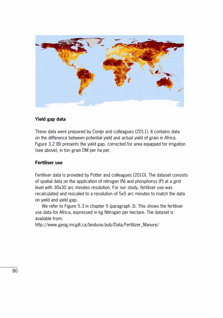
80
Yield gap data These data were prepared by Conijn and colleagues (2011). It contains data on the difference between potential yield and actual yield of grain in Africa. Figure 3.2 (B) presents the yield gap, corrected for area equipped for irrigation (see above), in ton grain DM per ha per.
Fertiliser use Fertiliser data is provided by Potter and colleagues (2010). The dataset consists of spatial data on the application of nitrogen (N) and phosphorus (P) at a grid level with 30x30 arc minutes resolution. For our study, fertiliser use was recalculated and rescaled to a resolution of 5x5 arc minutes to match the data on yield and yield gap. We refer to Figure 5.3 in chapter 5 (paragraph 3). This shows the fertiliser use data for Africa, expressed in kg Nitrogen per hectare. The dataset is available from: http://www.geog.mcgill.ca/landuse/pub/Data/Fertilizer_Manure/

LEI report 2012-010
LEI develops economic expertise for government bodies and industry in the field of food, agriculture and the natural environment. By means of independent research, LEI offers its customers a solid basis for socially and strategically justifiable policy choices.
LEI is part of Wageningen UR (University & Research centre), forming the Social Sciences Group with the department of Social Sciences and Wageningen UR Centre for Development Innovation.
More information: www.lei.wur.nl