Embed Size (px)
Citation preview

Olivia written and illustrated by Ian Falconer
2001 Caldecott Honors recipient
Published by: ANTHENUM BOOKS FOR YOUNG READERS
OLIVIA is a day-in-the-life story of a spunky little toddler who happens to be a pig. The artwork in this beautifully illustrated book emphasizes the main character’s centrality, while telling the story that the text alone does not, adding humor and connecting the reader to the darling Olivia.

Ian Falconer’s artistic style in this book is primarily naïve cartoon in conjunction with bits of realism and surrealism.
STYLE & MEDIA
Naïve Cartoon - The simple squiggly black and white sketch-like artwork evoke a child-like feeling of simplicity and reflect the messy, uncomplicated nature of the main character’s life, who is a piglet-toddler.

STYLE& MEDIA (cont’d)Realism is found as Falconer places actual famous works of art on these two pages wherein Olivia visits a museum. These pieces stand out, both in color and detail, in stark contrast to the naïve cartoon styling of most of the book’s art.

Surrealism is present in this picture, as it
shows Olivia envisioning herself on
a sort of stage as a ballerina or opera
singer, and answering the question posed on
the previous page: “What could she be
thinking?”. The background walls are
dream-like and otherworldly,
reinforcing the notion that this image
represents what is only dreamed or
imagined by Olivia.
STYLE& MEDIA (cont’d)

Falconer uses free-flowing lines to reinforce the message of Olivia’s wild and free, whimsical and childlike nature. This is contrasted against the razor sharp lines of the room’s wall and floor, which might suggest the rigid confines of the adult world.
RAZOR SHARP LINE
RAZOR SHARP LINE
SQUIGGLY, FREE-FLOWING LINES
LINE

The organic, supple lines Falconer uses to create Olivia and the other members of her pig family are complex and contrast starkly against the simple, rigid geometric shapes that makeup many of the inanimate objects in the book.
SHAPE
The rigid lines of the stairs add to the hard and cold feeling of this scene and magnify the message that this timeout is indeed a punishment.

The rigid geometric shape of this sandcastle and the exaggeration of its size amplifies the grandeur of Olivia’s accomplishment in making it.
SHAPE cont’d

COLOR Ian Falconer’s illustrations are achromatic in his use of simple black and gray scale drawings, and monochromatic in his choice of an occasional splash of a single, highly saturated hue, red, to illustrate this tale of the day-to-day happenings of a mischievous preschooler.
The color red is used to move the eye along on this two page spread.
Red draws the readers eye to what is important throughout the book, which is the main character, Olivia who is the star of the show (as most toddlers are).
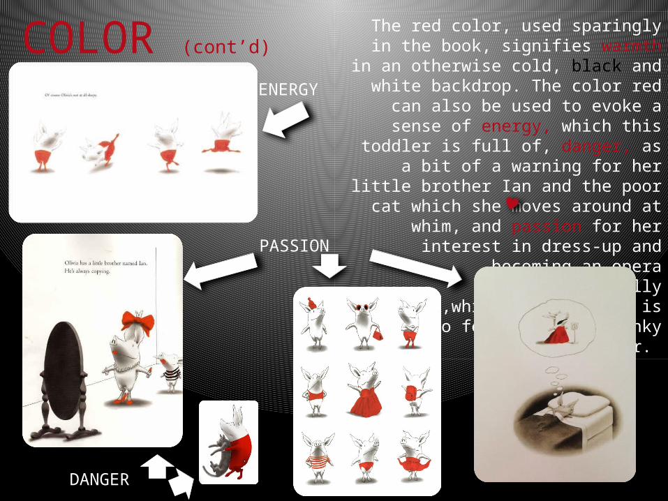
COLOR (cont’d)The red color, used sparingly in the
book, signifies warmth in an otherwise cold, black and white
backdrop. The color red can also be used to evoke a sense of energy,
which this toddler is full of, danger, as a bit of a warning for her little
brother Ian and the poor cat which she moves around at whim, and
passion for her interest in dress-up and becoming an opera
singer and finally love ,which the audience is meant to feel for this
spunky toddler.
PASSION
ENERGY
DANGER

Falconer uses a sketchy pencil line to outline the pigs ,which adds texture to his largely
smooth characters. He uses charcoal shading to give depth to the characters and create 3 dimensional shapes. Grainy ovals situate the characters in order to define a floor space on
an otherwise white “floor”.
TEXTURE
SHADOW
CHARCOAL SHADING MAKES BED 3D
SKETCHY PENCIL
LINE

The composition of each page of Olivia brings focus and attention to the main characters activities. Each illustration is balanced either symmetrically or asymmetrically moving the eye along with the story. The background is a dominate force as most pages have a completely white backdrop and bring Olivia and her shenanigans to the center stage. SYMETRICALLY BALANCED ASYMETRICALLY BALANCED
WHITE BACK-
GROUND
COMPOSITION