Embed Size (px)
Citation preview

Probability Theory
Instructor:
Assoc. Prof. Dr. Deshi Ye ( 叶德仕 )
College of Computer ScienceZhejiang University
Email: [email protected]
Course homepage: Http://www.cs.zju.edu.cn/people/yedeshi/prob12/

Outline Brief introduction to the course
Syllabus, course policies and contents
Introduction to probability and statistics History and importance
Treatment of data Graphs: Pareto Diagram, Dot Diagram, Box-plot Frequency distribution, Stem-and-leaf Displays

Course information What is for?
This course provides an elementary introduction to probability with applications.
Topics include: axioms of probability; basic probability concepts and models (counting
methods , conditional probability, Bayes theorem,et.);
random variables;independence; discrete and continuous probability distributions; calculate mathematical expectation and variance; limit theory

Course Goals Students at the end of course should
be able to do the following: 1) Understand the concepts and methods
of probability theory
2) Contrast, evaluate, and implement simulations or experiments
3) Utilize Minitab program for analyzing data and summarizing

Syllabus Prerequisite: one year course in calculus Textbooks (required):
Miller & Freund's Probability and Statistics for Engineers (Seventh Edition), Richard A. Johnson. Publishing House of Electronics Industry or Pearson Education Press.
Chapter 1-6 for “Probability Theory”, Chapter 7-13 for the second semester (“Mathematical Statistics”).
References: 1) A First course in Probability (6th Ed), Sheldon Ross. China Statistics Press. 2) Probability & Statistics for Engineers & Scientists (7th Ed), R.E. Walpole,R.H. Myers, S.L. Myers, K. Ye. Tshinghua or Pearson Education Press.

Grading
Grades for the course will be based on the following weighting1) Class attendance and Homework assignment: 36% 2) Unit quiz: 24% (12%, 12%)3) Final exam: 40%

Homework 1) You may collaborate on homework, but
you must write your submitted work in your own words. All steps are required, this includes showing calculations, derivations, and proofs. Solutions will be posted on the class web site.
2)Assignments are due in class as noted in the syllabus and web page.

Checking web page
I am highly recommend that each student check this web page at least once a week for new announcements and homework assignments.
http://www.cs.zju.edu.cn/people/yedeshi/software/MiniTAB14.iso

Probability in CS
Randomized algorithms
Querying Theory
Software testing
Computer simulation and modeling

Introduction Probability theory is devoted to the
study of uncertainty and variability Probability quantifies how uncertain
we are about future events
Statistics can be described as the study of how to make inference and decisions in the face of uncertainty and variability
Uncertainty Events
Say red Coin toss Matching games (Cards, Name) Traffic light The life of a light Lotteries?

Poker Lotteries http://www.zjlottery.com/news/showmes.as
p?newsid=9950
Heart, Spade, Club, Diamonds 1 ( A )、 2 、 3 、 4 、 5 、 6 、 7 、 8 、 9 、
10 、 11 ( J)、 12 ( Q )、 13 ( K )
Arbitrarily choose one piece cost 2 ¥, if win you are awarded 13 ¥
(win in 1/13)

Why measure uncertainty?
To make tradeoffs among uncertain events
Measure combined effect of several uncertain events
To communicate about uncertainty

Brief History Blaise Pascal and Pierre de Fermat:
the origins of probability are found. concerning a popular dice game fundamental principles of probability
theory Pierre de Laplace:
Before him, concern on the analysis of games of chance
Laplace applied probabilistic ideas to many scientific and practical problems

History cont. Mathematical statistics is one important
branch of applied probability; other applications occur in such widely different fields as genetics, psychology, economics, engineering, computer science.
Important workers: Chebyshev, Markov, von Mises, and Kolmogorov
One of the difficulties is the definition of probability. 20th century, it was solved by treating probability theory on an axiomatic basis (Kolmogorov).

Words for probability Chance: the falling out or happening of
events Stochastic: randomly determined Random: not sent or guided in a special
direction, having no definite aim or purpose
Aleatory: dependent on the throw of a die
Hazard: a chance or venture.

Importance of Prob. Theory Two major applications of Prob.
Risk assessment (new medical treatments) Reliability (weather prediction, earthquake, reduce
failure of consumer product)
Why statistics and probability in engineering? Quantify the uncertainty associated with engineer
model Evaluate the result of experiment Assess importance of measurement uncertainty Safeguard for persons, qualities of environment,
assets

A case study Visually inspecting data to improve product
quality Monitoring manufacturing data Ceramic part in coffee makers, which is made by filling the mixture of clay-water-oil. The depth of the slot is uncontrolled.
Slot depth was measured on three ceramic parts selected from production every half hour during the first 6 AM to 3 PM.

Time series plot
Stable: 217.5
Good quality:
[215, 220]

Ch2: Treatment of data
Outline Pareto diagrams, dot diagrams Histograms (Frequency distributions) Stem-and-leaf display Box-plot (Quartiles and Percentiles) The calculation of mean and standard
deviation sx

What it is –Descriptive statistics Descriptive statistics include the numbers, tables, charts,
and graphs used to describe, organize, summarize, and present raw data. central tendency (location) of data, i.e. where data tend to fall,
as measured by the mean, median, and mode. dispersion (variability) of data, i.e. how spread out data are, as
measured by the variance and its square root, the standard deviation.
skew (symmetry) of data, i.e. how concentrated data are at the low or high end of the scale, as measured by the skew index.
kurtosis (peakedness) of data, i.e. how concentrated data are around a single value, as measured by the kurtosis index.

Pareto Diagram Pareto Diagram display orders each type of
failure or defect according to its frequency.
For a computer-controlled lathe whose performance was below par, workers recorded the following
causes and their frequencies: power fluctuations 6 controller not stable 22 operator error 13 worn tool not replaced 2 other 5

Minitab14
1. Stat->Quality tools->Pareto chart 2. Choose chart defects table as
follows
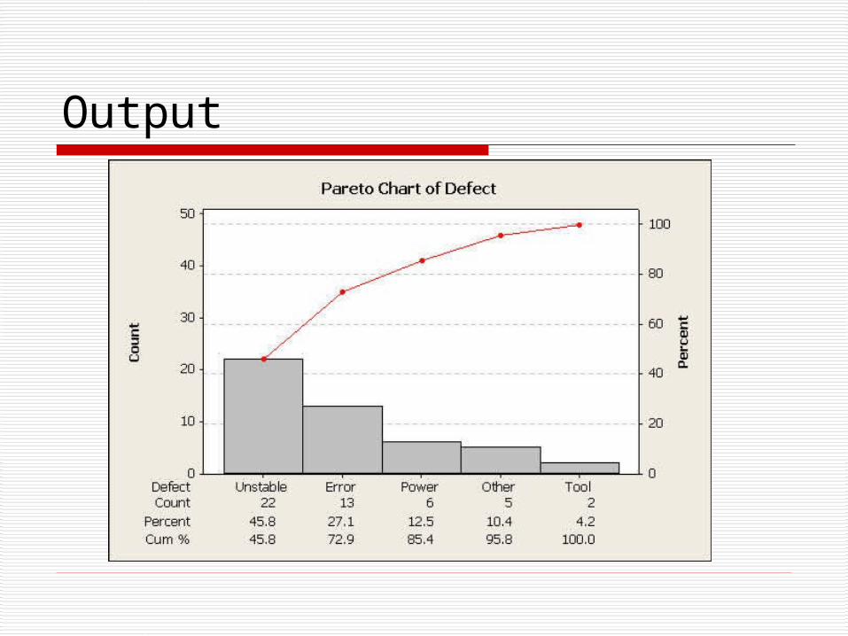
Output

Pareto diagram
Pareto diagram: depicts Pareto’s empirical law that any assortment of events consists of a few major and many minor elements.
Typically, two or three elements will account for more than half of the total frequency, i.e., it points out the main causes.

Pareto diagram--application
Software testing Software defect distribution
Code7%
Other10%
Requirements56%
Design27%
Count
Perc
ent
Soft-defectCount
7.0Cum % 56.0 83.0 93.0 100.0
0.56 0.27 0.10 0.07Percent 56.0 27.0 10.0
CodeotherdesignRequirement
1.0
0.8
0.6
0.4
0.2
0.0
100
80
60
40
20
0
Pareto Chart of Soft-defect

Dot diagram Second step to improve the quality of lathe, Data were collected from observation on the
deviations of cutting speed from the target value set by the controller.
EX. Cutting speed – target speed 3 6 –2 4 7 4 Dot diagram: A number line in which one dot is placed
above a value on the number line for each occurrence of that value. That is, one dot means the value occurred once, three dots mean the value occurred three times, etc.
In minitab: stat->dotplots->simple

Dot diagram
This diagram visually summarize the information that the lathe is generally running fast.

Multiple sample
C1: 0.27 0.35 0.37 C2: 0.23 0.15 0.25 0.24 0.30 0.33 0.26
Data0.360.330.300.270.240.210.180.15
VariableC1C2
Dotplot of C1, C2

Frequency distributions
A frequency distribution is a tabular arrangement of data whereby the data is grouped into different intervals, and then the number of observations that belong to each interval is determined.
Data that is presented in this manner are known as grouped data.

Data001. 80 data of emission (in ton)of sulfur oxides from an industry plant 15.8 26.4 17.3 11.2 23.9 24.8 18.7 13.9 9.0 13.2 22.7
9.8 6.2 14.7 17.5 26.1 12.8 28.6 17.6 23.7 26.8
22.7 18.0 20.5 11.0 20.9 15.5 19.4 16.7 10.7 19.1 15.2 22.9 26.6 20.4 21.4 19.2 21.6 16.9 19.0 18.5 23.0
24.6 20.1 16.2 18.0 7.7 13.5 23.5 14.5 14.4 29.6 19.4 17.0 20.8 24.3 22.5 24.6 18.4 18.1 8.3 21.9 12.3
22.3 13.3 11.8 19.3 20.0 25.7 31.8 25.9 10.5 15.9 27.5 18.1 17.9 9.4 24.1 20.1 28.5

Class limits & frequnecyClass limits Frequency
5.0 -- 8.99.0 – 12.913.0 – 16.917.0 – 20.921.0 – 24.925.0 – 28.929.0 – 32.9
31014251792
Total 80

Class limit and width lower class limit: The smallest value that
can belong to a given interval
upper class limit: The largest value that can belong to the interval.
Class width: The difference between the upper class limit and the lower class limit is defined to be the class width.

Guidelines for classes 1. There should be between 5 and 20 classes. 2.The class width should be an odd number. This will
guarantee that the class midpoints are integers instead of decimals.
3. The classes must be mutually exclusive. This means that no data value can fall into two different classes
4. The classes must be all inclusive or exhaustive. This means that all data values must be included.
5. The classes must be continuous. There are no gaps in a frequency distribution. Classes that have no values in them must be included (unless it's the first or last class which are dropped).
6.The classes must be equal in width. The exception here is the first or last class. It is possible to have an "below ..." or "... and above" class. This is often used with ages

Steps 1. Find the largest and smallest values 2. Compute the Range = Maximum -
Minimum 3. Select the number of classes desired.
This is usually between 5 and 20. 4. Find the class width by dividing the
range by the number of classes and rounding up. You must round up, not off.
Normally 3.2 would round to be 3, but in rounding up, it
becomes 4.

Class limits & frequnecyClass limits Frequency
[5.0, 9.0) [9.0, 13.0)[13.0, 17.0)[17.0, 21.0)[21.0, 25.0)[25.0, 29.0)[29.0, 33.0)
31014251792
Total 80

Variants of frequency distribution
The cumulative frequency distribution is obtained by computing the cumulative frequency, defined as the total frequency of all values less than the upper class limit of a particular interval, for all intervals.
Relative frequency: the ratio of the number of observations in the interval to the total number of observations
The percentage frequency distribution is arrived at by multiplying the relative frequencies of each interval by 100%.

Cumulative frequency
Class limits Frequency
Less than 5 Less than 9Less than 13Less than 17Less than 21Less than 25Less than 29Less than 33
03132752697880

Percentage distributionClass limits Perc. Dist. Frequency
[5.0, 9.0) [9.0, 13.0)[13.0, 17.0)[17.0, 21.0)[21.0, 25.0)[25.0, 29.0)[29.0, 33.0)
3.75%12.5%17.5%31.25%21.25%11.25%2.5%
31014251792
Total 100% 80

Histogram
The most common form of graphical presentation of a frequency distribution is the histogram.
Histogram: is constructed of adjacent rectangles; the height of the rectangles is the class frequencies and the bases of the rectangles extend between successive class boundaries.

Histogram in Minitab

1. Graph->histogram->simple
2. Graph variables: c4 (all data in a column)
3. Edit bars: Click the bars in the output figures, in Binning, Interval type select midpoint and interval definition select midpoint/cutpoint, and then input 7 11 15 19 23 27 31 as illustrated in the following
Histogram in Minitab

Density histogram When a histogram is constructed from a
frequency table having classes of unequal lengths, the height of each rectangle must be changed to
Height = relative frequency / width.
The area of the rectangle then represents the relative frequency for the class and the total area of the histogram is 1.

Density histogram

Density Histogram
Graph->histogram->simple Scale->Y-Scale Type->Density Edit Bars->Binning->Cut point-> 5 13 17 21 25 29 33

Cumulative histogram 1) Graph-
>histogram->simple
2) Dataview-> Datadisplay: check
“symbos” only Smoother: check
“lowess” and “0” in degree of smoothing and “1” in number of steps.

Stem-and-leaf Display Class limits and frequency, contain data in each class,
but the original data points have been lost.
Stem-and-leaf: A data plot which uses part of the data value as the stem and the rest of the data value (the leaf) to form groups or classes. This is very useful for sorting data quickly.
Stem-and-leaf: function the same as histogram but save the original data points.
Example: 11 numbers: 12, 13, 21, 27, 33, 34, 35, 37, 40, 40, 41

Frequency table Class limits Frequency 10 – 19 2 20 – 29 2 30 – 39 4 40 – 49 3

Stem-and-leaf
Stem-and-leaf: each row has a stem and each digit on a stem to the right of the vertical line is a life.
The "stem" is the left-hand column which contains the tens digits.
The "leaves" are the lists in the right-hand column, showing all the ones digits for each of the tens, twenties, thirties, and forties.
Key: “4|0” means 40

Stem-and-leaf Display Example in P23: 20 numbers: 29, 44, 12, 53, 21, 34, 39, 25, 48, 23 17, 24, 27, 32, 34, 15, 42, 21, 28, 27
Frequency table Class limits Frequency 10 – 19 3 20 – 29 9 30 – 39 4 40 – 49 3 50 – 59 1
Stem-and-leaf 1 | 2 5 7 2 | 1 1 3 4 5 7 7 8 9 3 | 2 4 4 9 4 | 2 4 8 5 | 3

Stem-and-leaf in Minitab The display has three columns:
The leaves (right) - Each value in the leaf column represents a digit from one observation.
The stem (middle) - The stem value represents the digit immediately to the left of the leaf digit.
Counts (left) - If the median value for the sample is included in a row, the count for that row is enclosed in parentheses. The values for rows above and below the median are cumulative.

Stem-and-leaf for DATA001 Stem-and-leaf of frequencies N = 80 Leaf Unit = 1.0
2 0 67 6 0 8999 11 1 00111 17 1 223333 24 1 4445555 32 1 66677777 (13) 1 8888888999999 35 2 0000000111 25 2 222223333 16 2 4444455 9 2 66667 4 2 889 1 3 1

Ch2.5: Descriptive measures Mean: the sum of the observation divided
by the sample size.
Median: the center, or location, of a set of data. If the observations are arranged in an ascending or descending order: If the number of observations is odd, the median
is the middle value. If the number of observations is even, the
median is the average of the two middle values.
n
xx
n
ii
1

Example 15 14 2 27 13 Mean:
Ordering the data from smallest to largest 2 13 14 15 27
The median is the third largest value 14
2.145
132721415
x

Other central tendency Midrange
The midrange is simply the midpoint between the highest and lowest values.
Mode The mode is the most frequent data
value. There may be no mode if no one value appears more than any other. There may also be two modes (bimodal), three modes (trimodal), or more than three modes (multi-modal).

Summary The Mean is used in computing other statistics (such
as the variance) and does not exist for open ended grouped frequency distributions. It is often not appropriate for skewed distributions such as salary information.
The Median is the center number and is good for skewed distributions because it is resistant to change.
The Mode is used to describe the most typical case. The mode can be used with nominal data whereas the others can't. The mode may or may not exist and there may be more than one value for the mode
The Midrange is not used very often. It is a very rough estimate of the average and is greatly affected by extreme values (even more so than the mean).

Summary cont.
Preporty Mean Median Mode Midrange
Always Exists
No Yes No Yes
Uses all data values
Yes No No No
Affected by extreme values
Yes No No Yes

Sample variance
Deviations from the mean:
Standard deviation s:
2
2 1
( )
1
n
ii
x xs
n
2
1
( )
1
n
ii
x xs
n
2 2
2 1 1
( )
( 1)
n n
i ii i
n x xs
n n

Quartiles and Percentiles Quartiles: are values in a given set of
observations that divide the data in 4 equal parts.
The first quartile, , is a value that has one fourth, or 25%, of the observation below its value.
The sample 100 p-th percentile is a value such that at least 100p% of the observation are at or below this value, and at least 100(1-p)% are at or above this value.
1Q

Example
Example in P34:
1
14.7 15.214.95
2Q
2
19.0 19.119.05
2Q
3
22.9 2322.95
2Q
N/4 is an integer, take the average;Or round up,
otherwise

Boxplots
A boxplot is a way of summarizing information contained in the quartiles (or on a interval)
Box length= interquartile range= 3 1Q Q

Quartile calculation in Minitab The first quartile (Q1) is the observation at position
(n+1) / 4, and the third quartile (Q3) is the observation at position 3(n+1) / 4, where n is the number of observations. If the position is not an integer, interpolation is used.
For example, suppose n=10. Then (10 + 1)/4 = 2.75, and Q1 is between the second and third observations (call them x2 and x3), three-fourths of the way up. Thus, Q1 = x2 + 0.75(x3 - x2). Since 3(10 + 1)/4 = 8.25, Q3 = x8 + 0.25(x9 - x8), where x8 and x9 are the eight and ninth observations.
Indeed, Choose “Hinges” in BoxEndpoints, will get Quartile as in Textbook.

Modified boxplot Outlier: too far from third
quartile. Largest observation
within 1.5(interquartile range) of third quartile.
Modified boxplot: identify outliers and reduce the effect on the shape of the boxplot.
Upper limit = Q3 + 1.5 (Q3 - Q1)
Lower limit = Q1- 1.5 (Q3 - Q1)

Homework 1
Problems in Textbook (2.62, 2.67,2.71, 2.72, 2.75) 4 points
Due date: next lecture.

Conclusion Graph the data as a dot diagram or
histogram or box plot to assess the overall pattern of data
Group the data by frequency distribution, Stem-and-leaf
Calculate the summary statistics-sample mean, standard deviation, and quartiles – to describe the data set.

TheThe ENDEND
ThankThanks !s !