Embed Size (px)
DESCRIPTION
Comparación entre dos métodos semióticos aplicados al mismo objeto: un anuncio publicitario (idioma inglés).
Citation preview

Semiotica 190–1/4 (2012), 57 – 79 0037–1998/12/0190–0057DOI 10.1515/sem-2012-0039 © Walter de Gruyter
A comparative analysis of print advertising applying the two main plastic semiotics
schools: Barthes’ and Greimas’
LUCA CiAN
Abstract
The aim of this paper is to analyze a specific printed advertisement from two different semiotic points of view. First, we apply the interpretative instruments provided by the Barthes’ school of thinking ( focused on the description of e xplicit signs taken in isolation). We then attempt to explore the same print employing the prospective of Greimas’ structural semiotics (where a sign has meaning only when it is interpreted as part of a system). Integrating differentsemiotics theories, we show how they can be used synergistically.
Keywords: Greimas; Barthes; planar semiotic; semi-symbolic semiotic; a dvertising; work of art
1. Barthes’schoolofthinking
1.1. Text
From a methodological point of view, drawing from the “textual semiotic” model (Eco and Fabbri 1978), the printed advertisement in Figure 1 should be understood as a semiotic text (a complex and multidimensional element, inter-woven with its social, cultural, and interpretative reality), and not just as a simple message.
1.1.1. Text description. The starting point of this analysis is a description, as objective as possible, of the advertisement at its manifest level (Joly 1994). The goal here is to trigger the estrangement process, in order to avoid uncon-scious automatisms that people tend to use when watching advertisements. Instead, we are going to analyze, step by step, what our mind actually per-ceives. The advertisement consists of a white frame containing the headline (i.e., the title) and strong impact visual (i.e., the figurative part). Two black

58 L. Cian
rectangles of similar color, shape, and position appear in the image; we can call them flashes, since they are elements introducing an image or a caption to mark its relevance (Codeluppi 1997). The visual includes the profile of a woman who is staring with her eyes half-closed. Her hairstyle looks original, because
Figure 1. The printed advertising and its page context

Analysis on Barthes’ and Greimas’ printed advertisement 59
it is in the shape of a car, more precisely, a PT Cruiser. The woman is wearing a strange metallic dress with several pleats. The color of the background is soft pink with pearly shades. Most of the headline “Chrysler PT Cruiser. Chi la guarda, non vede altro” [Chrysler PT Cruiser: who looks at it, sees nothing else] is contained within the white frame, though it ends in the black flash, which also shows the picture of the PT Cruiser, shot from a three-quarter point of view, pointing left. A second, smaller flash appears in the bottom right, with the logo (the name of the brand), the trademark (the brand symbol), and the payoff (“motion by emotion”). This second flash is totally contained in the white frame and does not interfere with the visual.
The following sections will focus on the analysis of the meaning of this s emiotic text (following the Barthes’ school of thinking), considering its plas-tic, iconic, and linguistic dimensions, which are intertwined through the use of complex effects.
1.2. The plastic dimension
The plastic plane is constructed through shapes, colors, spatial compositions, and texture; these elements cannot be considered as pure and simple expres-sions of figurative elements, but they have to be considered in their own a utonomy, as stand-alone signs. Therefore, plastic and figurative (iconic) signs are independent and yet intertwined and complementary (Barthes 1965, 1970; Joly 1994).
1.2.1. Format and pagination. Usually, printed advertisements are vertical and occupy a whole page; this advertisement has a horizontal format and onlycovers half a page. The visual occupies a small space, giving the picture a sense of preciousnessthat is not garish. It should be noted that the black line surrounding the printed advertising represents a line of demarcation, which marks the borders and iso-lates the semiotic text from the surrounding article. This black demarcation line and the adjacent white frame restrict the field, leading to a centripetal read-ing of the visual; a similar process is used in some painting techniques. We are not in front of a mere advertisement, but something far more precious.
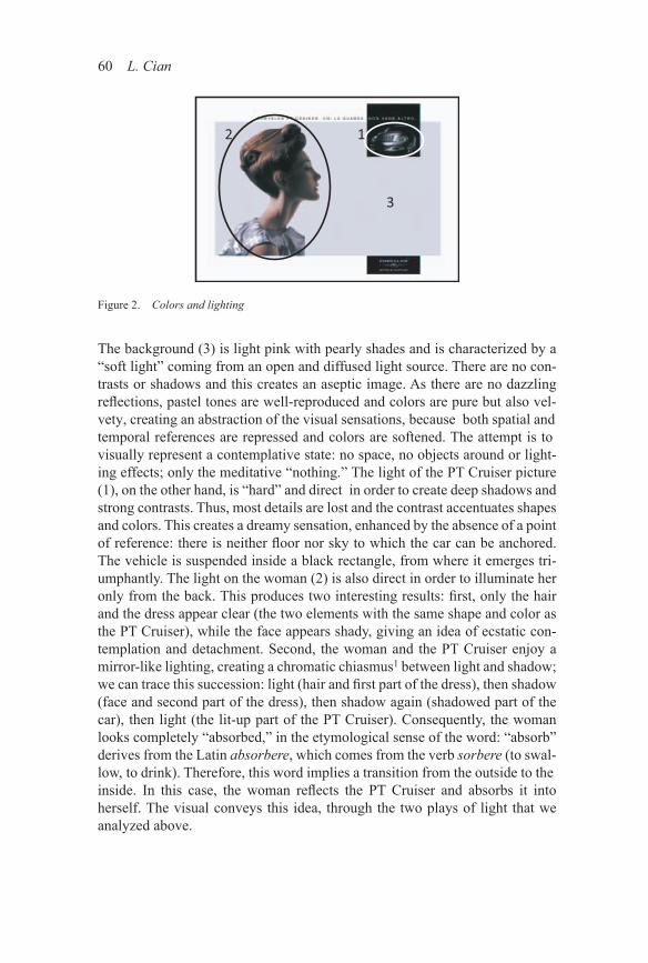
1.2.2. Colors and lighting. In this semiotic text, lighting and color play an important role because they emphasize those elements bearing particular sig-nificance. There are three different and separated lighting points: one for the picture of the PT Cruiser in the first flash, one for the image of the woman, and one for the background (Figure 2).
60 L. Cian
The background (3) is light pink with pearly shades and is characterized by a “soft light” coming from an open and diffused light source. There are no con-trasts or shadows and this creates an aseptic image. As there are no dazzling reflections, pastel tones are well-reproduced and colors are pure but also vel-vety, creating an abstraction of the visual sensations, because both spatial and temporal references are repressed and colors are softened. The attempt is to visually represent a contemplative state: no space, no objects around or light-ing effects; only the meditative “nothing.” The light of the PT Cruiser picture (1), on the other hand, is “hard” and direct in order to create deep shadows and strong contrasts. Thus, most details are lost and the contrast accentuates shapes and colors. This creates a dreamy sensation, enhanced by the absence of a point of reference: there is neither floor nor sky to which the car can be anchored. The vehicle is suspended inside a black rectangle, from where it emerges tri-umphantly. The light on the woman (2) is also direct in order to illuminate her only from the back. This produces two interesting results: first, only the hair and the dress appear clear (the two elements with the same shape and color as the PT Cruiser), while the face appears shady, giving an idea of ecstatic con-templation and detachment. Second, the woman and the PT Cruiser enjoy a mirror-like lighting, creating a chromatic chiasmus1 between light and shadow; we can trace this succession: light (hair and first part of the dress), then shadow (face and second part of the dress), then shadow again (shadowed part of the car), then light (the lit-up part of the PT Cruiser). Consequently, the woman looks completely “absorbed,” in the etymological sense of the word: “absorb” derives from the Latin absorbere, which comes from the verb sorbere (to swal-low, to drink). Therefore, this word implies a transition from the outside to the inside. In this case, the woman reflects the PT Cruiser and absorbs it into h erself. The visual conveys this idea, through the two plays of light that we analyzed above.
Figure 2. Colors and lighting

Analysis on Barthes’ and Greimas’ printed advertisement 61
Finally, there are some important remarks to be made with regard to the color. The white border (which creates an elegant frame, detached and pure) collides with some opposite chromatic elements: the saturated black flashes. The black flashes — evidently in contrast with other soft (not saturated) colors in the image — have the goal of highlighting the two most important objects of the advertisement: the picture of the PT Cruiser and the logo, the trademark and the payoff for Chrysler. Bright colors are only used for the car, the w oman’s dress, and her hair. This confirms the mirror-like effect of the image: the woman is so hypnotized by the PT Cruiser that she takes its shape, its colors, and its brightness. To conclude, the colors of the whole image are very elegant; matching metallic grey, black, and white undoubtedly corresponds to the post-modern minimalist style.
1.2.3. Shot. If colors and lighting stress the dialectical and deep connection between the woman and the car, the shot accentuates their role: the PT Cruiser is the object of contemplation and the woman is the subject contemplating it. The point of shooting for the woman is eye-level, making the scene very real-istic. Instead, the point of shooting for the car is “low” and it creates a sense of magnificence. In terms of the lens, the effect is similar. For the woman, a short telephoto lens was used. This results in a very natural image, avoiding the dis-tortion of the shapes, yet the perspective is flattened. For the car, a wide-angle lens has been used. This creates an 'exaggerated' perspective: the object in the forefront (the front of the car) looks more impressive, while the background seems to slip away, giving the image a sense of supremacy and power.
1.2.4. Shapes. In order to analyze the shapes of this advertisement, it is useful to break the visual into two parts with a vertical median (Figure 3).
Figure 3. Shapes

62 L. Cian
The left side is centered on the woman’s shape. She has a long and thin neck, a pure and thin face; she represents the prototype of a sophisticated woman. In order to soften the woman’s quasi-angular profile, the perspective and the depth of her face were taken away, and greater volume was given to her hair. These factors soften the tones and give harmony, but also give dynamism to the image. Her hair is voluminous and at the same time elegant. We can only imag-ine that the body of the woman is slim and thin and yet it explodes in a whirl of lines and curves due to the dress she is wearing.
The right side contains the picture of the PT Cruiser. The car appears soft and seductive, showing just parts of its shape, without revealing it completely. This perspective suggests the idea of the dream: charming but incomplete,and sinuous but powerful shapes. The PT Cruiser and the woman are looking at each other, as though they hadthe same shape. The two flashes and the two frames give a geometrically regular shape to theadvertising. As Kress and van Leeuwen (1996) note, in our society, squares andrectangles represent the element of technological order. This view fits perfectlywith the main subject of this advertisement: the promotion of a car symbolizingthe postmodern technological perfection.
1.2.5. Composition and layout. After analyzing the meaning added by shapes and colors, it is necessary to analyze the internal geography of the a dvertisement. When a hypothetical reader of the magazine sees this advertise-ment for the first time, he/she will quickly glance at the whole advertisement. The visual will be the first thing to capture his/ her attention, as it is impactful as well as indecipherable. The reader will become curious and will try to u nderstand what the printed advertising is all about. Thus, the advertisement achieves its main goal: to catch the reader’s attention.
Figure 4. Composition and layout

Analysis on Barthes’ and Greimas’ printed advertisement 63
After a first glance at the visual part of the advertisement, the reader, in the hope of understanding the enigmatic image, will first observe the headline, due also to its strategic position (Figure 4). At this point, his/ her eyes will move from left to right, following the reading order of the headline. After reading the headline, the reader will notice the saturated black flash, and, because of the strong chromatic contrast, his/ her attention will quickly shift to the picture of the PT Cruiser. At this point, due to the strong similarity in terms of shapes and brightness of the colors, the reader will look at the woman’s PT Cruiser-like hair. The brightness and the irregular shapes — clearly in contrast with the predominant soft shapes — will attract the reader to look at the woman’s dress. Finally, the reader’s glance, attracted by the saturated color, will stop on the second flash containing the logo, the trademark, and the payoff.
The shading of the woman’s face and the neutrality of the background help the eyes to move in indicated directions because they do not catch the reader’s attention. Thus, we can conclude that, despite the great dynamism of the image path, the PT Cruiser continuously “steals” the glance of the hypothetical reader; indeed, the reader saw the PT Cruiser in the headline, in the flash, in the woman’s hair and dress, and finally in the logo. This demonstrates how the predicament of the advertisement comes true: after seeing the PT Cruiser, the reader cannot see anything else, because he/she continues to see only the PT Cruiser.
1.2.6. Texture. In a painting, the texture is given by the canvas employed and by the reliefs obtained through the use of colors. In our advertisement, the “canvas” is represented by the thick and glossy paper of the magazine, indica-tive of a good quality magazine. In terms of the “color spreading,” the reader perceives a smooth and flat image, characterized by lack of granularity. Both elements highlight the feeling of postmodernist perfection that the visual aims to convey.
1.3. The iconic dimension
The iconic or figurative plane can be considered as the level through which it is possible to recognize representations of objects and people belonging to the natural world (Codeluppi 1997). We have already talked about these figurative themes in the description of the image (see Section 1.1.2), but since they are signs, they recall a further dimension, the connotative one.2 Following Barthes (1965), we should give full autonomy to the visual register and recognize inde-pendent rhetorical features in it. First of all, in this advertisement, it is possible

64 L. Cian
to see only some parts of the elements, which are there to designate the whole. Indeed, we see part of the PT Cruiser and part of the woman. Moreover, her intent stare determines the creation of an out-of-frame world (we have to imag-ine what she is staring at, since it is not represented). The use of this s ynecdoche3 stimulates the reader to reconstruct the missing fragments, using his/ her own cultural and personal background. Thanks to this mental reconstruction and interpretation, the reader is involved in the creation of the meaning, and “takes possession” of (i.e., memorizes) the advertising.
Not only does the picture of the PT Cruiser represent the car, it also becomes an ideal model and, therefore, a seductive desire. The woman “ravished” by this desire cannot see anything else; she is so in love with it that the rest of the world disappears (the empty surrounding in which the woman is located). The neck of the woman, long and oblique, indicates this tension towards the PT Cruiser, while her flat stare, which nearly dissolves into the soft and unreal background, symbolizes a hypnotic condition of blissful contemplation for the “divine car.” A tension toward perfection arises, which is resolved through the woman’s desire to become one with her “ideal.” That is why her hair is shaped like a PT Cruiser and her clothes explode in a sinuous rhythm and take shades of metallic grey.
The PT Cruiser picture has a metaphorical value and assumes an idealistic meaning of postmodern beauty and elegance. The car becomes a symbolic substitute for other experiences. This metaphor creates a fusion of values be-tween the substituted and its substitute, enriching the network of associations of our imagination. As we noticed above, this “contemplation” is enclosed by the white frame, which enhances the visual, transforming it into a painting (or, more precisely, a postmodern painting). And, just as most paintings show the signature of the artist, here the logo of Daimler Chrysler (enhanced by the black flash) appears on the bottom right.
If we are to observe the postures, the woman is reflected from profile, in ecstatic contemplation; she is completely indifferent to the spectator, but “ab-sorbed” by the PT Cruiser’s image. Therefore, the woman assumes the role of a spiritual medium between the spectator and the car. The other protagonist — the PT Cruiser — is in a three-quarter posture; the car looks at the woman with one “eye” and lets her contemplate it, and with the other “eye” looks at the readers. This way, the car seems animated, creating a prosopopoeia.4 By look-ing at the reader, the car is not avoiding him/ her as the woman does. At the same time, as it is not viewed from the front and it does not reveal itself com-pletely, the car underlines its dreamy connotation. It is a dream, yet not an impossible one.

Analysis on Barthes’ and Greimas’ printed advertisement 65
1.4. The linguistic dimension
There are three linguistic messages that can be recognized in this advertise-ment: the headline, the logo (the brand name), and the payoff. The body copy (the text besides the title) is missing; otherwise it would have made the image heavy, breaking the minimal register of the whole advertisement.
1.4.1. Shape, rhetoric, and contents. As for the disposition, both the head-line and the logo/payoff are inserted in the frame and not inside the visual. The reason for this is the need to avoid disturbing the woman’s contemplation, her pure and abstract connection with the ideal car. This fact amplifies and c onfirms the semantic transformation of the advertisement into a painting. As noted above, the headline is not just a caption, but also gives an explanation of the enigmatic visual. This is graphically represented through a wise use of the u pper flash; that flash not only highlights the headline through its saturated color, but also allows the creation of a link between the white frame and the visual.
As for the chromatic elements, the fact that all fonts are black or white fits the minimal register of the advertisement. The letters, since they contrast the background, gain momentum. Besides the chromatic contrast, had the font size been bigger, the headline and logo/payoff would have appeared excessively intrusive. Therefore, the choice of font — small size and sans serif 5 — appears more harmonious.
The headline — characterized by a font that can be defined as legible and spaced, slow and flowing — is the linguistic message in the biggest font size. The bigger dimension of the headline is due to its anchoring function,6 which helps to define the meaning of the image, which would otherwise be too vague.
It should be noted that between “Chrysler” and “PT Cruiser” there are some alliterations7 (Chrysler - PT Cruiser), and, in general, there is a sound con-sonance. This creates a strong correlation between the product and the corpo-rate brand, both on the psychological and the rhetorical levels, generating an unconscious association.
The logo has an anchoring function too. It guides the reader to interpret thisadvertisement as if it were a masterpiece — it represents the artist’s signature, precious and elegant.
The payoff, in smaller characters, is characterized by a “rectangular” but slim font, which gives the idea of a mechanical and fast order. The payoff has an interesting function as a relay 8, because it helps to add notions as “e motion” and “movement,” which are not emerging from a dreamy and

66 L. Cian
c ontemplative v isual. The idea of dynamism is expressed on a phonetic level by the alliteration[`mō-shən] [i´mō-shən], which creates a paronomasia.9 The choice to keep this play on words in English and not translate it into Ital-ian, was i ntended to give the advertisement an international flavor. Another thing worthy of noting is the graphic elegance given to the logo, the trademark, and the payoff, by making them of the same width.
The textual typology, to which the headline refers, belongs to the public and abstract genre, underlined by the use of the third person that keeps, as Kress et al. (1997) say, “far in time” and within the “ideal” world, without that onto-logical passage into the reality of the “here and now.” That is the reason for the absence of the body copy: the message to the reader consists of a different real-ity, rich in aesthetic values, more prestigious and rarefied. It is necessary to keep an abstract level, using only images, which are extremely symbolic, avoiding excessive explanations that would result in the use of too much text. There is an ellipsis: saying more by not saying anything.
1.5. Context
According to the 'School of Costanza,'10 in order to interpret a semiotic text, it is necessary to also examine the expectations under which the text was created. This means that the spectator never perceives a piece of work as absolutely new; on the contrary, any work will recall, in a more or less explicit way, a horizon of experiences and expectations both subjective and collective. In other words, if the target audience has a specific “horizon of expectations” — acompatible substratum of experiences and notions — only then a piece of work can be understood and interpreted. Clearly a text can be innovative and trans-form a reader’s set of conventions and expectations. However, in order to do so, it has to build upon previous notions; otherwise it risks being misunder-stood. Eco (1979) notes that the ad man, while generating its creation, has to conceive a strategy to predict the reader’s interpretative moves. The text, in order to be activated, needs cooperation on the part of the receiver, and the a dditional values given by his\her interpretative process. If the chain of signs and interpretations can be endless, as Peirce and Eco (1964, 1979) believe, then it becomes necessary to look for the interpretative path that the reader is going to follow. Interpretative trails are determined both by the meaning of the advertising structure (as analyzed so far) and by the socio-cultural context from which, to which, and for which the text has been produced. In this r espect, the text is designed for a specific reader, and not just a general one. If consump-tion is interpretation, then it is possible to analyze the practices through which readers take possession of the advertised object, making it their own. It is pos-sible to talk of a popular rationality that gives rise to a “theory of resistance” as

Analysis on Barthes’ and Greimas’ printed advertisement 67
opposed to passive consumerism: a resistance that is not destructive, but “cre-ative” of new meanings and values.
Consequently, this advertisement can be misunderstood by a reader who does not belong to the designed target audience and who refers to a different horizon of expectations and knowledge.Thus, what are the expectations and the cultural background of the target audience of this advertisement? How does the text and its audience interact and negotiate meanings?
This advertisement was published in June 2005 in Progress, an I talian monthly magazine about politics, economics, and social trends. The season is also rel-evant, because June is the time of the year when the International A dvertising Festival takes place in Cannes (France), and this magazine dedicates a special edition to the event. For these reasons, the reader might expect to see classy advertisements in this magazine. In order to deepen the contextual understand-ing, a short analysis of the genre to which our text belongs is fundamental. As Grandi (1994) points out, the “genre” is the communicative filter that offers the key to decode a certain text, contextualizing it within a certain and precise universe of meanings. Therefore, a certain genre has to be recognized both by the producer and the receiver, creating, in the latter, specific e xpectations and cognitive orientations. In our case, the target audience of the PT Cruiser is made of people between thirty and sixty years of age, mostly rich, hedonistic, with a good cultural background, on the “cutting edge.” Such an audience is particu-larly interested in contemporary art, and this is the reason why last year’s slo-gan was “Contemporary car presents contemporary art” and Chrysler o rganized the biggest hyper-realism exhibition in Italy.11 Therefore, the best way to com-municate with this target audience is to use a refined minimal register, which refers to the postmodern genre. Among the peculiarities of postmodernism, Jameson (1991) notes the lack of expressiveness, the absence of moods, and the refuge in aesthetic contemplation. And this corresponds to the text we analyzed, and in particular to the visual. The woman pictured seems completely i ndifferent and is ravished by the object of her contemplation. This creates a sense of de-tachment from the reader. In the postmodern genre, there is no persuasive in-tention, but, on the contrary, the reader has to aspire to enter the privileged world of the product. The reader is not requested to participate, but instead is almost pushed back. This impression is emphasized both on the visual level — through not putting the PT Cruiser in the foreground, in order to avoid an explicit per-suasive intention — and on a linguistic level, by using the impersonal “who” [chi] in the headline, to evoke impartiality. The minimal register, typical of the postmodern genre, characterizes both visual and linguistic messages.
The headline “Chrysler PT Cruiser: Who looks at it, sees nothing else” [Chrysler PT Cruiser. Chi la guarda, non vede altro] consists of two short segments. The syntactic connections are reduced to the minimum, not only between the two sentences but also within them. Explicit logic connections are

68 L. Cian
taken away, making sentences more expressive: the implicit structure takes the place of the analytical structure, giving flashes of images and emotions.
2. Changingthesemioticpointofview:Greimas’school
The analysis carried out in the first part of this article draws from Barthes’ theoretical school (1965, 1970), which has also been developed by more recent scholars like Joly (1994). This visual semiotics analysis is mainly focused on the description of explicit signs taken in isolation (for example: the woman, her neck, her hair, etc.). A connotative interpretation is subsequently offered, based on such signs (example: “the thin and long neck” represents a “sophisticated woman” and carries connotations such as “luxurious and elitist”). The analysis of the context is important in order to understand the meaning of the text.
Instead, Greimas’ (1960, 1966, 1970, 1983, 1989) structural semiotics takes a different approach. It moves beyond the meaning of each single sign, to ana-lyze it as a part of a holistic network organized by different levels of depth. From this perspective, the proper meaning of each element can only be found if that element is understood in relation or in opposition to the systems under-lying the semiotic text. According to Greimas, in order to analyze a visual text rather than a figurative reading too superficial and open to interpretation, a deep reading of the plastic structure is needed. Therefore, if the plastic analysis that we carried out was a list of interpretations of isolated plastic signs (this color, that shape, etc.), following Greimas (1960, 1989), we will apply a syntax of positions, orientations, shapes, borders, and colors. Exemplifying, abstract art has often been defined as “language without meaning,” because its units (each individual form in a painting) have no autonomous meaning (they are not related to objects in the real world). However, this is not a problem for G reimas’ semiotic approach that never considers signs per se, but rather analyzes the process, syntax, and the connection between signs. About the context, Greimas (1970, 1983) and Floch (1990) agree with the saying: “no salvation outside the text.” The scholars claim that meaning is all in the text and nothing has to be looked for outside of it. In Greimas’ semiotics, which is focused on the text, any extra-textual variable is excluded; for this reason,the analysis of the con-test has no meaning.
Therefore, from this starting point, we could analyze the same a dvertisement using Greimas’ theoretical point of view, also with reference to scholars like Floch (1990), Grandi (1994), Valenti and Corrain (1991), and Valenti (1993, 1996), who developed the visual structural semiotics founded by Greimas. The attempt of this part of the paper is to adapt this methodology — applied until now only to art works — to advertisements, given that Greimas actually e ncouraged the use of visual semiotics for all graphic expressions.
Analysis on Barthes’ and Greimas’ printed advertisement 69
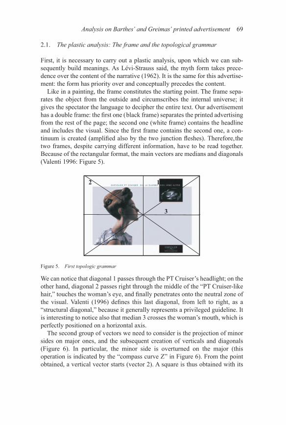
2.1. The plastic analysis: The frame and the topological grammar
First, it is necessary to carry out a plastic analysis, upon which we can sub-sequently build meanings. As Lévi-Strauss said, the myth form takes prece-dence over the content of the narrative (1962). It is the same for this advertise-ment: the form has priority over and conceptually precedes the content.
Like in a painting, the frame constitutes the starting point. The frame sepa-rates the object from the outside and circumscribes the internal universe; it gives the spectator the language to decipher the entire text. Our advertisement has a double frame: the first one ( black frame) separates the printed advertising from the rest of the page; the second one (white frame) contains the headline and includes the visual. Since the first frame contains the second one, a con-tinuum is created (amplified also by the two junction fleshes). Therefore,the two frames, despite carrying different information, have to be read together. Because of the rectangular format, the main vectors are medians and diagonals (Valenti 1996: Figure 5).
We can notice that diagonal 1 passes through the PT Cruiser’s headlight; on the other hand, diagonal 2 passes right through the middle of the “PT Cruiser-like hair,” touches the woman’s eye, and finally penetrates onto the neutral zone of the visual. Valenti (1996) defines this last diagonal, from left to right, as a “structural diagonal,” because it generally represents a privileged guideline. It is interesting to notice also that median 3 crosses the woman’s mouth, which is perfectly positioned on a horizontal axis.
The second group of vectors we need to consider is the projection of minor sides on major ones, and the subsequent creation of verticals and diagonals (Figure 6). In particular, the minor side is overturned on the major (this o peration is indicated by the “compass curve Z” in Figure 6). From the point obtained, a vertical vector starts (vector 2). A square is thus obtained with its
Figure 5. First topologic grammar

70 L. Cian
diagonals (1 and 3; Valenti 1996). This projection can be applied to both minor sides, but we will only consider the left minor side, which is the most important for this analysis.
Here (Figure 6), a sort of dynamism through the vectors can be observed: axis 1 crosses the neck and the woman’s eyes reaching the first flash where it joins vector 2, which, while descending, first touches on the word “non” [nothing], and then goes through the picture of the car, the logo, and the payoff. Here v ector 2 joins vector 3, which then proceeds upward to cut through the “PT Cruiser-like hairstyle.”
The third and last micro-system to be considered is the one made of the parallels to the various principal axes (rhymes). First, the two saturated black flashes leap out at the reader (also because they are inserted in a group of dominant soft shades). By connecting the two flashes, both similar in shape, color and position, we obtain vector A, which is parallel to median 4 (Figure 7 — Rhyme 1).
Figure 6. Second topologic grammar
Figure 7. Rhyme 1

Analysis on Barthes’ and Greimas’ printed advertisement 71
Turning on this vector (A), we observe that it nearly touches the comma of the headline (“Chi la guarda, non vedealtro” [who looks at it, sees nothing else]. Therefore, on vector A there is a linguistic caesura (given by the pause the comma implies) and a chromatic caesura as well (given by the clear contrast between two chromatic categories, soft and saturated). This enhances the v isual power of the axis.
Second (Figure 8 — Rhyme 2), the woman’s dress ends in quite an unusual way, as if it were cut off vertically. Extending this border, we obtain vector B — in rhyme with median 4. Vector B connects the woman’s dress with her eye and hair.
There is a third rhyme (Figure 9 — Rhyme 3) given by the axis that reproduces the inclination of the “PT Cruiser-like hairstyle” (C), which is perfectly paral-lel to diagonal 1.
Figure 8. Rhyme 2
Figure 9. Rhyme 3

72 L. Cian
Finally, by inserting the PT Cruiser’s picture into a rectangle (Figure 10), we will notice that it is positioned in a golden section, since the ratio between the longest and the shortest sides is 1.618. This proportion has always been consid-ered as the most pleasing to the human eye (Walser 2001) and underlies the clock cycle of brain waves (Weiss and Weiss 2003; Roopun et al. 2008).
2.2. First homologation connections between plastic and semantic categories
According to Jakobson (1968), composition is to painting what grammar is to poetry. So far,we have analyzed the topological order and the positioning of figures; in a word, we have analyzed the grammar. Now it is time to think about meanings.
First, it is important to notice that every single particular touched by a vector or highlighted by a saturated color (unnatural) automatically benefits from maximum visibility. Only through a clear surface are we able to read every-thing easily, like in a poem (Greimas 1989; Valenti and Corrain 1991; Valenti 1993, 1996).
Greimas, in an essay dedicated to proverbs and sayings (1960), stresses thatthe distinctive aspect of these texts is their binary rhythmic structure, which isshown by the syntactic contrast between two propositions of the hypotheticalsentence: the protasis⟨⟨if . . . ⟩⟩ and the apodosis⟨⟨then . . . ⟩⟩.
Our advertisement hides a similar structure:
Chrysler PT Cruiser: If you look at it /, / then you see nothing else[Chrysler PT Cruiser: Se la guardi / , / allora non vedi altro].
Logical links (if-then) are often omitted in proverbs. They are only suggested by succession, leaving it to the reader to fill in the right connections. With r egard to the expression plane, in the intonation of the proverb, we can discern a contrast between the ascending melodic curve (in the protasis) and the d escending melodic curve (in the apodosis). The protasis represents the “ten-sion” moment, while the apodosis interprets the “relaxation” moment. In this opposition, the comma represents a pause. From a semiotic point of view, these
Figure 10. The golden section

Analysis on Barthes’ and Greimas’ printed advertisement 73
suprasegmental units act quite often not just as simple units on the expression level, but more like proper signs; this fact permits a comparison with other codes, such as the plastic one. This proverbial scheme appears not only in the headline, but is also reflected in the visual (Section 2.2.1and 2.2.2).
2.2.1. The first fundamental segmentation of the binary rhythmic struc-ture. The first fundamental segmentation of the advertisement appears as in Figure 6.– “Chrysler PT Cruiser.”: the subject is well marked because it is inserted
in the first part of the headline, within the white frame, and is enclosed between two spatial parentheses ( before there is nothing and after there is a point)
– [Se la guardi] “If you look at it”: the ascending (in terms of intonation) vector 1 crosses both the woman’s neck — excessively long and slender, symbol of a “tension towards” — and her eye — symbol of “sight”
– [allora non vedialtro] “then you see nothing else”: vector 1 joins vector 2, which is descending and crosses the words “see nothing” [non vede]
– “pause”: vector 2 crosses a neutral area ( background).The proverbial form continues in the visual, offering an explanation to the verbal one:– “because you can only see the Chrysler PT Cruiser”: it is necessary to go
back: vector 2 touches on the logo-trademark “Chrysler” and joins vector 3 that crosses the PT Cruiser-like hairstyle. This explanation (“because you can only see the PT Cruiser”) is emphasized by Rhyme 2 (Figure 8).
The woman’s dress has something peculiar: it ends in an unexpected way. Its edges, perfectly vertical, if extended generate vector B — in rhyme with the median — which joins the eye (symbol of sight) with the dress and the hair, which, thanks to the similarities of color and shape, recalls the PT Cruiser (Vector B crosses the word “PT Cruiser” in the headline).
This game of references — from left to right and back (as seen in Figure 6) — is amplified by the fact that the woman is an anthropomorphic anaphora of the PT Cruiser, because:– Her hair is an eidetic anaphora: it has the same shape as the PT Cruiser,but
it is inserted in a different context (the eidetic categories define plastic configurations at the shape or edges level).
– Her dress is a chromatic anaphora: same color as the PT Cruiser, but it is inserted in a different context.
– Always on a chromatic level, there is an anaphora on the luminosity level: observing the clear/dark category between the woman and the car,we will

74 L. Cian
notice how the image displays the following succession: clear (hair and first part of the dress), then dark (face and second part of the dress), then dark again (the shadowed side of the PT Cruiser), and finally clear (the lit -up side of the PT Cruiser).Therefore, there is the same clear/dark contrast, but, once again, in different contexts.
2.2.2. The second fundamental segmentation of the binary rhythmic struc-ture. There is a second segmentation that recalls the proverbial structure, this time starting from a clear linguistic and structural opposition created through the crossing of diagonal 2 with vector A; these are two essential elements, as demonstrated by topological grammar (Figure 7 — Rhyme 1).
Joining these two vectors our text can be divided in P ( protasis) and R (apo-dosis) (Figure 11 — Rhyme 1, a reprocessing of Figure 7).
– The protasis (if, part P) is limited by the linguistic protasis of the headline “Chrysler PT Cruiser. Who looks at it” [Chrysler PT Cruiser. Chi la guarda]. (Same as “if you look at it.”) Parallel to this linguistic protasis is the figurative correspondent: the first part of diagonal 2, which, starting from the top left side, touches both on the hair — that recalls the PT Cruiser — and the eyes — symbols of sight.
– The apodosis (then, part R) is represented — on a linguistic level — by the part of the headline after vector A: “(then) sees nothing else” [non vedeal-tro]. It is marked also by an inverted use of colors (white characters on black background). Parallel to this linguistic apodosis is the figurative cor-respondent: the underlined last part of diagonal 2, which visually leads us towards a neutral empty area, or precisely, an area with “nothing else.”
Figure 11. Rhyme 1

Analysis on Barthes’ and Greimas’ printed advertisement 75
The woman cannot see anything else, in the sense that she sees nothing, be-cause in her thoughts, in her eyes, in her whole self there is only the PT Cruiser.
We shall conclude with some observations on the picture of the PT Cruiser. The car is highlighted, as we noticed above, by the passage of a topological axis and by the saturated color of the flash. Furthermore, there is a plastic con-trast (the presence, on the same surface, of opposite terms of the same plastic category). In other words, the curved and winding shape of the car is in clear contrast with the straight and rigid forms of the flash in which it is inserted. In order to inspire admiration, the PT Cruiser is inserted in a golden section. In short, the PT Cruiser’s picture gains a role of protagonist, although it occupies a marginal and restricted portion, thanks to the topological axis, the saturated color, the plastic contrast, and the golden section. Our eyes cannot do anything but look at the car repeatedly.
2.3. Inside the semi-semiotic analysis
In a purely symbolic system, the expression plane and the content plane are in total conformity: each expression element corresponds to only one content ele-ment (e.g., formal languages and the traffic lights). According to Greimas (1989), plastic semiotics represent a different system. He believes that plastic semiotics must identify a link between oppositions within the expression plane and oppositions within the content plane. Meaning is thus produced through accordance between categories within these planes rather than through accor-dance between isolated elements. This system, defined by Greimas as semi-symbolic, connects categories within the expression plane with categories of the content plane. In this sense, the clear separation that we have just explained — operated by vector A — leads to further considerations (Figure 12).
Figure 12. Horizontal and vertical plane

76 L. Cian
Indeed, an opposition between the horizontal plane (represented by the w oman’s sight, which is parallel to the main median) and the vertical plane (represented by the connection of the two flashes, which, as they are similar in shape and color, are strictly linked) can be perceived. This opposition between horizontal and vertical planes is transformed into an opposition between part P (which brings the eye of the spectator to a horizontal reading) and R (which forces the reader to make a strong vertical turn). This plastic opposition cor-responds to a semantic opposition between nature and culture.12 Nature is ob-viously represented by the woman, as a human being. Culture — intended as a product created by human beings (Valenti and Corrain 1991) — is represented by the picture of the PT Cruiser (a human creation) and by the saturated colors (unnatural) of the two flashes. The following model represents this kind of semi-symbolic link:
horizontality : verticality :: nature : culture13
If, through this analysis, opposites come out clearly (nature and horizontality versus culture and verticality), then it is possible to build a semiotic square upon them. As Greimas says (1966, 1970, 1983), the semiotic square is useful to place only minimal semantic units (as nature/culture) against each other, rather than portions of speech, themes, figures, etc. Besides opposites, h owever, it is also necessary to identify sub-opposites, which are elements that deny culture in the nature square and elements that deny nature in the culture square (Valenti and Corrain 1991). In order to do this, the starting point is, as always, the topological grammar. Figure 5 suggests that the fundamental medians touch on two symmetrical but opposite elements: the woman’s hair (diagonal 2 crosses the central part of her hair) and the car’s glance (diagonal 1 cuts through the headlight-eye of the PT Cruiser).
These clues are further highlighted by Figure 9 — Rhythm 3 (diagonal 1, which crosses the PT Cruiser’s headlight-eye, is perfectly parallel to the incli-nation of the hairstyle C).
These elements are the sub-opposites that were missing, since the hairstyle refers to a cultural category ( because it is like the PT Cruiser), but here culture is denied because hair is a natural element and is located in the nature square (P). The PT Cruiser’s glance belongs to a natural category (since it seems h uman and the car appears to be looking at the woman), but here nature is d enied because the PT Cruiser’s headlight is in fact a technological element and is situated in the culture square (R).
To reassert all of the above, the sub-opposites deny nature and culture, but they also deny horizontality (linked to nature) and verticality (linked to cul-ture). Indeed, both the PT Cruiser’s glance and the woman’s hairstyle are oblique (neither vertical nor horizontal).

Analysis on Barthes’ and Greimas’ printed advertisement 77
3. Afewfinalconsiderations
In both of our analyses, it is possible to see how the reader’s mind is invited to follow various directions and paths, giving considerable dynamism to this a dvertisement, which is apparently only static. Without giving any evaluative consideration, it was interesting to discover the potentialities and the d ifferences among these two different schools of thought, which are based on different axioms. In spite of the fact that Greimas’ work is very well-known, his consid-erations about the planar semiotic are not so well-known. This was the first attempt at applying them in an advertising text, hoping to create the basis for further analysis.
Finally, the creators of this advertisement were probably not aware of all these implications. Like most of the painters, they might not be able to analyze what they have created. This is because a good creation is the result of the manipulation work — often unconscious — of a certain language. The most trivial work is frequently one that is totally planned on a theoretical and con-scious level. Quoting Greimas:
When Claude Lévi-Strauss undertook his first examination of a mythical text — the Oedipus myth — he found himself in a situation comparable to that of the semiotician faced with a plastic text. The text, read on its surface, lends itself to a “figurative” read-ing that is at the same time both obvious and devoid of meaning, so great is the distance between the perennial nature of the myth and the insignificance of their apparent mean-ing. (Greimas 1989: 647– 648)
Figure 13. The semiotic square

78 L. Cian
Notes
1. Chiasmus (from the Greek chiázo 'to shape like the letter X') is the figure of speech in which there is a repetition of elements in inverted order (like A-B, B-A).
2. According to Hjelmslev (1943), the term denotation indicates the primary relationship be-tween the expression plane and content plane; this characteristic can help to identify the basic meaning of each word. Next to denotation is connotation, which is another content relation-ship linked to affective or expressive values (emotions, feelings, images, particular values). For instance, the phonic signifier of the word “dog” denotes the “domestic quadruped” and can connote other contents such as “fidelity,” “company,” “tenderness,” etc.
3. Synecdoche: a figure of speech in which (in this case) a part of something is used to refer to the whole thing.
4. Prosopopoeia: a figure of speech in which an object or an animal (or an imaginary, absent, or deceased person) is represented as speaking or acting.
5. Serifs are little appendixes of a letter that accompany ascendant or descendant lines “t owards” the following letter.
6. Barthes (1970) defined “anchorage” as the text that directs the reader through the signifieds of the image.
7. Alliteration: a figure of speech in which the same phonemes are repeated in two or more words next to one another.
8. Barthes' (1970) “relay” is the complementarity between text and image 9. Paronomasia: a figure of speech where two consecutive words display phonetic resem-
blances, but have different meanings. 10. The most famous scholar from the “School of Costanza” is Jauss (1972). 11. http://www.chrysler.it. 12. In Greimas’ opinion (1966), some categories, such as life/death or nature/culture, are so
general as to be considered universal. 13. This formula should to be read in the following way: “Horizontality is to verticality as nature
is to culture” (Greimas 1989; Valenti et al. 1991).
References
Barthes, Roland. 1965. Eléments de semiology [Elements of semiology]. Paris: Gonthier.Barthes, Roland. 1970. L’ancienne rhétorique: Aide mémoire [The old rhetoric: Checklist]. Com-
munications 16. 172–223.Codeluppi, Vanni. 1997. La pubblicità, guida alla lettura dei messaggi [Printed advertising: Guide
to read the messages]. Milan: FrancoAngeli.Eco, Umberto. 1964. La struttura assente [The absent structure]. Milan: Bompiani.Eco, Umberto. 1979. Lector in fabula [Reader in the tale]. Milan: Bompiani.Eco Umberto & Paolo Fabbri. 1978. Progetto di Ricerca sull’utilizzazione dell’Informazione
a mbientale [Research project on the usage of the environmental information]. Problemi dell’Informazione [Information problems] 4. 555–597.
Floch, Jean Marie. 1990. Sémiotique, marketing, et communication [Semiotics, marketing, and communication]. Paris: PUF.
Grandi, Roberto. 1994. I mass media fra testo e contesto. informazione, pubblicità, i ntrattenimento, consumo sotto analisi [Mass media between text and context. Information, printed advertising, entertainment, consumption under analysis]. Milan: Lupetti.

Analysis on Barthes’ and Greimas’ printed advertisement 79
Greimas, Algirdas Julien. 1960. Idiotismes, proverbes, dictons [Idioms, proverbs, sayings]. C ahiers de Lexicologie 2. 41– 61.
Greimas, Algirdas Julien. 1966. Sémantique structurale [Structural semantics]. Paris: Larousse.Greimas, Algirdas Julien. 1970. Du sens [Meaning]. Paris: Seuil.Greimas, Algirdas Julien. 1983. Du sens II [Meaning II]. Paris: Seuil.Greimas, Algirdas Julien. 1989. Figurative semiotics and the semiotics of the plastic arts. New
Literary History 20(3). 627– 649.Hjelmslev, Louis Trolle. 1943. Omkring sprogteoriens grundlæggelse [About language theory
foundation]. Copenhagen: Munksgaard.Jakobson, Roman. 1968. Poetry of grammar and grammar of poetry. Lingua 21. 597– 609.Jameson, Frederic. 1991. Postmodernism, or, the cultural logic of late capitalism. Durham: Duke
University Press.Jauss, Hans Robert. 1972. Towards an aesthetic of reception. New York: Springer-Verlag.Joly, Martine. 1994. Introduction a l’analyse de l’image [Introduction to analysis of the image].
Paris: Editions Nathan.Kress, Gunther & Theo Van Leeuwen. 1996. Reading images: The grammar of visual design.
London: Routledge.Kress, Gunther, Regina Leite-Garcìa, & Theo Van Leeuwen. 1997. Discourse semiotics. In T. van
Dijk (ed.), Discourse as structure and process, 257–291. London: Sage.Levi-Strauss, Claude. 1962. Le totemisme aujourd’hui [Totemism today]. Paris: PUF.Roopun, Anita K., Mark A. Kramer, Lucy M. Carracedo, Marcus Kaiser, Ceri H. Davies, Roger D.
Traub, Nancy J. Kopell & Miles A. Whittington. 2008. Temporal interactions between cortical rhythms. Frontiers in Neuroscience 2(2). 145–154.
Valenti, Mario. 1993. Bachtin e Greimas: Per una lettura dialogica dello spazio pittorico di bosch [Bakhtin and Greimas: For a dialogic reading of the Bosch’s pictorial space]. In Paolo Jachia & Augusto Ponzio (eds.), Bachtin &, 137–154. Bari: Laterza.
Valenti, Mario. 1996. La Metamorfosi dello Spazio nel Paesaggio con la Caduta di Icaro di Pieter Bruegel il Vecchio. [The metamorphosis of the space in the Pieter Bruegel the Elder’s Land-scape with the fall of Icarus]. Versus 73–74. 145–176.
Valenti, Mario & Lucia Corrain. 1991. Leggere l’opera d’arte, dal figurativoall’astratto [Read the work of art, from figurative to abstract]. Bologna: Esculapio.
Walser, Hans. 2001. The golden section. Washington, DC: Mathematical Association of America.Weiss, Volkmar & Harald Weiss. 2003. The golden mean as clock cycle of brain waves. Chaos,
Solitons, and Fractals 18(4). 643– 652.