Embed Size (px)
Citation preview

Build something.

Designing for conversion:Creating landing pages that produce sign-ups, leads, and salesBy Derek Nelson: Partner, Creative Director

Why designing for conversion matters

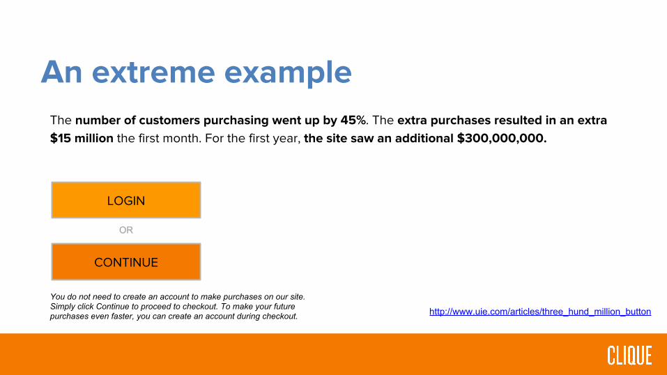
An extreme example
LOGIN
REGISTER
OR
A major, $25B retailer pre-empted their checkout process by asking their users a seemingly simple question:

An extreme example
LOGIN
REGISTER
OR
Users were confused, however. They encountered this page after they filled their shopping cart with products they wanted to purchase and pressed the Checkout button.

An extreme example
LOGIN
CONTINUE
OR
Designers made a quick change, changing “REGISTER” to “CONTINUE” with some explanatory text:
You do not need to create an account to make purchases on our site. Simply click Continue to proceed to checkout. To make your future purchases even faster, you can create an account during checkout.
An extreme example
LOGIN
CONTINUE
OR
The number of customers purchasing went up by 45%. The extra purchases resulted in an extra $15 million the first month. For the first year, the site saw an additional $300,000,000.
You do not need to create an account to make purchases on our site. Simply click Continue to proceed to checkout. To make your future purchases even faster, you can create an account during checkout. http://www.uie.com/articles/three_hund_million_button

Why it’s hard

Why it’s hard
Reason #1: What a user says they want is often different than what they actually want

Why it’s hard
In the abstract, if a user were to describe their ideal online classifieds site, it may look like this:

Why it’s hard
In reality, here’s the design of the site that gets 50 billion pageviews a month:

The difference
Stated preference vs. revealed preference
Examples:● Spirit Airlines● Door knocking during elections● Facebook’s design● Huffington Post / Drudge Report

Why it’s hard
Reason #2: To be successful, user objectives have to trump business objectives

Why it’s hardExpedia had an internal business requirement to have users list their company name. So they put it as an “optional” field in their checkout.
It wound up confusing people. After removing this single optional field, conversion jumped overnight, resulting in $12M more in profit. http://www.zdnet.com/expedia-on-how-one-extra-data-field-can-cost-12m-
3040153863/

Why it’s hard
Reason #3: Designing, testing, and iterating is harder work than designing once based off of assumptions

Case Study
The Melting Pot

Case Study: The Melting Pot
Task:● Redesign and development of new mobile site and
landing pages to increase engagement, promote loyalty and drive experience.
● Three-month deployment of multiple landing pages for A/B Testing.

Case Study: The Melting Pot

Case Study: The Melting Pot
Results:● Selected example (on left) decreased bounce rate by 79%● In three months after launch:
● 2.5 million new mobile visits● 1.9 million unique visitors● 11.7 million page views● 10,000 customers have played games● 616 customers have left reviews● 193,000 customers have been a part of the experience

Part II: Conversion-centered design

What is conversion-centered design?● CCD is a discipline targeted specifically at designing experiences that
achieve a single business goal. ● It seeks to guide the visitor towards completing that one specific action,
using persuasive design and psychological triggers as devices to increase conversions.
http://unbounce.com/docs/conversion-centered-design-guide.pdf

Why focus on landing pages?Homepages vs. landing pages:● A homepage has to convey multiple messages to multiple audiences● A landing page is telling a single story to a single audience, with the goal to convert
Landing pages are at the core of inbound marketing in 2015.● It’s a vital part of how startups, eCommerce sites and traditional businesses get leads.● They sit at the intersection of inbound marketing, design, ongoing engagement.● To be successful, they need somebody who understands all three.
http://unbounce.com/docs/conversion-centered-design-guide.pdf

Why simplifying messaging worksJam Example
● A real world example of the psychology of “less is more” comes from an experiment conducted in a supermarket in 2000.
● A jam tasting stall was erected to allow shoppers to sample the different flavors of jam available for purchase.
● The test compared the impact of varying the number of choices between 24 and 6.

What to remember when designing your landing page
1. Think like a user, not like the business2. Ruthlessly simplify3. Successfully demonstrate:
○ What they can get○ Why they should want it○ How they can get it○ What happens next
4. Be deserving of trust5. Design a page that is proportionate to the ask6. Align with overall marketing strategy7. Iterate, iterate, iterate

Part III: Practical applications

Practical Applications
1. Create a visual hierarchy

Practical Applications
2. Utilize color and white space
● Make sure your design passes the “squint test” to determine proper spacing and focus
● Learn color theory
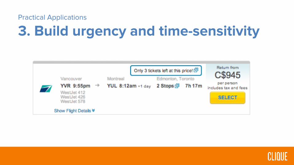
Practical Applications
3. Build urgency and time-sensitivity

Practical Applications
4. Use directional cues

Practical Applications
5. Add third-party validations
● Includes:○ Reviews, security seals,
and testimonials● WikiJob added specific
testimonials to their homepage and increased conversions by 34%.

Practical Applications
6. Consider a personal touch

Practical Applications
7. Simple, specific copy
● Clear headline that ties to
the CTA
● Make it all about the user
● Use “free” and “instantly”
where possible
● Convey what is going to
happen next
● Be very, very specific
throughout

The “ultimate” conversion form
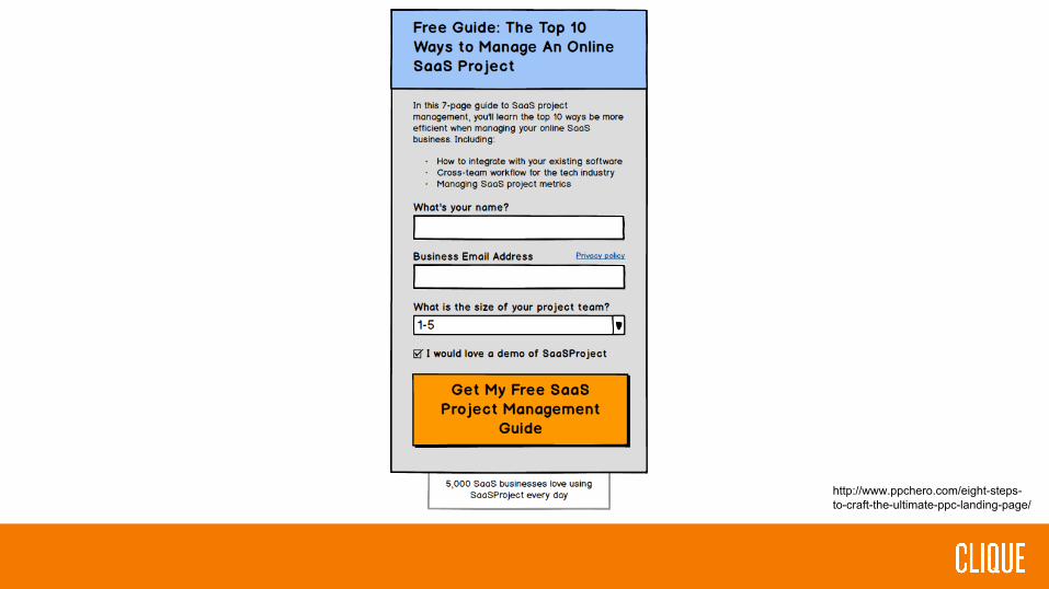
http://www.ppchero.com/eight-steps-to-craft-the-ultimate-ppc-landing-page/

Why will this form convert?
1. A headline to introduce the reason for the form
2. A description with bullets to highlight the benefit and
contents of what you’re giving away upon
completion
3. The form with descriptive form fields (original label
names and questions can capture attention)
4. A Call-To-Action
5. Trust statements or links
6. A closing urgency or context-enhancement
statement

The “ultimate” conversion page

http://www.ppchero.com/eight-steps-to-craft-the-ultimate-ppc-landing-page/

Why will this page convert?
1. Headline2. Subhead3. Introduction – pain4. Solution benefits – pain relief5. A hero shot that shows your giveaway6. Social proof – someone who has experienced
the pain relief7. Your form as designed from the earlier part8. A closing statement that caps off the story
and redirects them back to the form to convert

Other considerations(not necessarily for your lab, but good to know nonetheless)

Other considerations
1. Develop for mobile
● Fandango has a fluid mobile
checkout experience. One big
reason why is that it leverages
the advantages of the
medium, often relying on
touch controls, which a user is
much more likely to use than
typing.

Other considerations
2. Develop for performance
● Amazon increases revenue by 1% for every 100
milliseconds of improvement.
● Use tools.pingdom.com and Google PageSpeed to
test page load.

Other considerations
3. A/B Test Everything
VS
HawkHost tested their homepage. The padlock converted 2-3x better than the original.

Part V: Successful examples
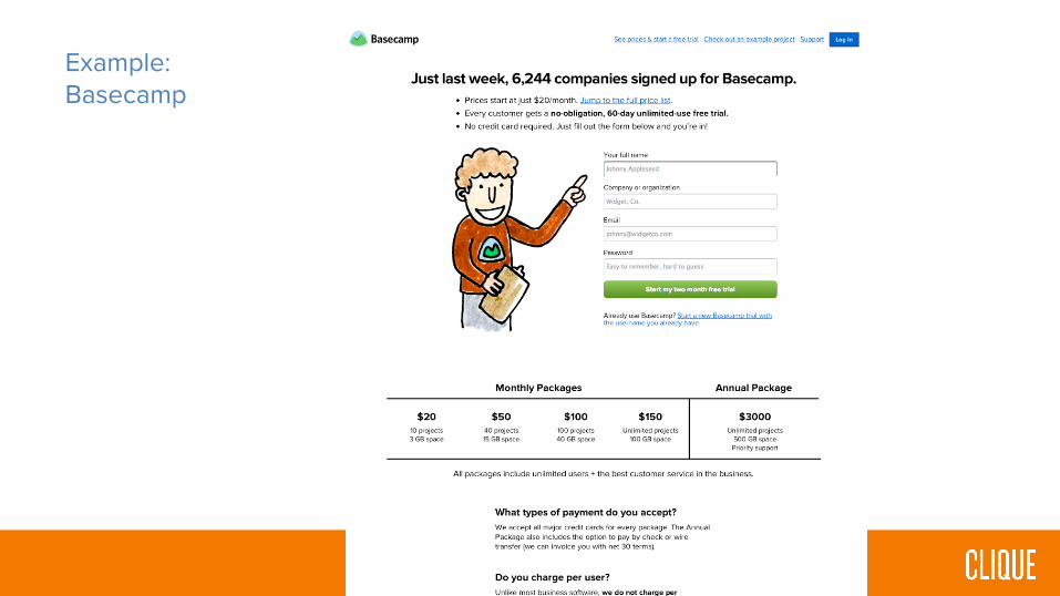
Example:Basecamp

Example:WebDAM

Example:Whitepaper Signup

Example:Email Signup

Example:Software Signup

Example:HBloom

Part VI: Final takeaways

Final takeaways1. Think like a user, not like the business2. Ruthlessly simplify3. Successfully demonstrate:
○ What they can get○ Why they should want it○ How they can get it○ What happens next
4. Be deserving of trust5. Design a page that is proportionate to the ask6. Align with overall marketing strategy7. Iterate, iterate, iterate

Resources1. Conversion-centered design:
○ http://offers.hubspot.com/conversion-centered-design2. 15 great examples:
○ http://blog.hubspot.com/marketing/landing-page-examples-list3. The ultimate PPC landing page:
○ http://www.ppchero.com/eight-steps-to-craft-the-ultimate-ppc-landing-page/4. My article on optimizing checkout:
○ http://www.smashingmagazine.com/2013/03/14/designing-a-better-mobile-checkout-process/
5. Good UI:○ https://goodui.org/
Contact
Derek Nelson: PartnerClique Studios: www.cliquestudios.comEmail: [email protected]: @derekcnelLinkedIn: Just search for me or whateverPersonal site: www.derekcnelson.com

Thank you.


![[Webinar] Multiply Your Landing Page Conversion Rates](https://img.dokumen.tips/doc/110x75/554cda42b4c905d1488b4d5c/webinar-multiply-your-landing-page-conversion-rates.jpg)
![[Webinar] 5 Steps to Designing Psychologically Powerful Landing Pages](https://img.dokumen.tips/doc/110x75/55a755591a28abb15d8b4705/webinar-5-steps-to-designing-psychologically-powerful-landing-pages.jpg)