Embed Size (px)
Citation preview

The future ain’t what it used to be - Yogi Berra
If we take care of the moments, the years will take care of themselves – Maria Edgeworth
Introduction to Rates of Change
Two and a half acres, or nearly the equivalent size of two football fields, of rain forest are consumed every second causing 137 plant and animal species to be lost every single day – source: RAN (Rainforest Action Network. In the U.S., the average motorist spends 46 hours per year in traffic jams and some 5.7 billion gallons of gas per year are wasted in those same traffic jams. Some 400 illegal aliens will walk across the 375 mile U.S. – Mexico border per day. (September 20th, 2004 issue of Time magazine). Nolan Ryan, who threw seven no-hitters, had a fast ball which traveled over 100 mph. 2003’s number one ranked tennis player, Andy Roddick’s serve was clocked over 150 mph. Wade Boggs batted over .400 for 162 games, but this spanned two seasons so the record books do not reflect it. In a college football game against BYU in 1968, UTEP quarterback Brooks Dawson threw for 304 yards in the final 10:21 of the fourth quarter. At this rate, he could have thrown for nearly 1800 yards in a single game. Teenagers are known for rapid growth spurts, but that ‘is nothing’ compared to a teen age Tyrannosaurus Rex, who gained 4.6 pounds per day during the tender ages of 14 to 18, their most rapid period of growth. (Time. Aug. 23rd,
2004). The number of calories consumed per average woman has increased 22% since 1971 in this country. (Time Feb, 16th, 2004). From slowest to largest, a comparison of rates of change for some geologic processes shows striking contrast, the average erosion of a continent is 0.03 mm per year while the cutting of the Grand Canyon is 0.7 mm per year; the postglacial rise of sea level is 5 mm per year while the advancing of the Tigris-Euphrates delta is nearly 25,000 mm per year. According to Willamette Industries, Inc., to produce Sunday newspapers in this country, the rate at which trees are consumed is currently at half-a-million trees per week. The Siberian pipeline leaks oil into the surrounding Soviet water table at a rate of nearly three million tons each year. A committee is assigned to predict Nike’s annual gain in profit, cost and revenue; a meteorologist follows the advance Hurricane Ivan; an engineer is assigned the duty of investigating the rate an oil spill is advancing toward shore. What do all these scenarios
Page 1 of 58
have in common? A rate of change. A measure of the change of one parameter when compared to another. We are driving 50 mph, so our position on a map is changing 50 miles every hour. And if we slow a car from 57 to 50 miles per hour, we will get much better gas mileage, and the average American driver would save about $200 per year.
Every 8 seconds a birth, every 13 seconds a death, every 25 seconds 1 new international migrant. According to the US Population Clock and the US Census Bureau, Population Division, the population of the United States on Sunday, September 19th, 2004, at 12:59:47 PM EDT was 294,311,858. The agencies estimated that in the United States, every 8 seconds there is a birth, every 13 seconds there is a death and every 25 seconds one more international immigrant. They tell us this amounts to a net gain in population for the United States of one person every 10 seconds. Updating the population count is done by adding births, subtracting deaths, and adding net migration. So, in 10 years, what will be the popualtion of the United States, if the present growth rate reamins the same?
Why should we care about this question, that is, why should we care about the rate of change of the population of the United States? The subtle question is crucial for politicians and policy makers, who race around like thouroughbreds chomping at their bits trying to move our society forward. This change reaches out, touches and infiltrates the very fabric of our society; we are all affected by our countires growth rate. On a national level, such predictions impacts policies on sustanibility issues, like hunger and famine, ecology and the environment, agriculture and food supply, petroleum and other energy sources. In the United States, the rate of growth is the best single measure of the burden humans place on the environment. Let’s follow a singular thread of cause and effect. Population growth causes greater individual consumption. Economic growth is then lead by this wave of individual consumption because the economy is consumption-driven. As the economy changes, the tentacles of such change cause policy makers and community leaders to focus on such impacted issues such as health care, welfare reform, retirement planning, educational funding, import and export laws, marketing strategies, agricultural demands, and community planning. But, the litany of changes does not end here. With their hands seemingly already full, politicians, policy leaders, community leaders must not be blind to how these societal changes would then in turn come full circle and impact the health of the nation’s forest and oceans, rivers and mountains. The fragile oceanic ecosystem where demand is outrunning sustainable stocks, or the fading forests where the shrinkage of forest cover means that capacity give us air or supplies of wood products is rapidly being shrunk in return. From over-fishing to urbanizing our farmland, from increases in carbon emissions to increases in grain productions, from over crowding to failure to re-cycle, such disregard will effect flood control, soil protection, water purification and quality of air. And all this will in turn affect the future rate of growth of our country’s population. Full circle. Taking this one step further, if we begin to also concern ourselves about the growth of the world’s 6.3 billion people, the significance of the impact of each of these issues is magnified greatly. How do we begin to attack the question, how to predict the future population of the United States? For if we can accomplice this, we may attack any question involving a
Page 2 of 58

rate of change. Rates of change are used to predict future earnings, predicted exports or imports, rates of cholesterol, heart rates, populations, cancer death rates, unemployment rates, rates of bird migration and on and on.
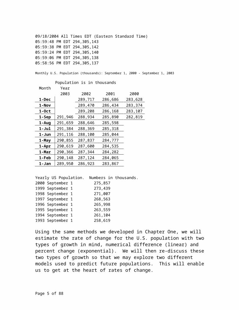
Luckily, the US Bureau of the Census and the US Population Clock can provide us with a tremendous amount of data so we may model this problem. Below, we summarized for you the population of the United States chronologically backwards. We borrowed, from the websites of the US Bureau of the Census and US Population Time Clock, the population for the US at different times. We started the recording of the U.S. population September 19th, 2004, 12:59:48 Eastern Time. The first set of population data was recorded mere seconds apart. Working backwards, the second branch of data was recorded monthly. The last set of data recorded yearly, stopping on September 1st, 2004.
09/19/2004 All Times EDT (Eastern Standard Time) 12:59:48 PM EDT 294,311,85812:59:38 PM EDT 294,311,85712:59:24 PM EDT 294,311,85612:59:16 PM EDT 294,311,85512:59:06 PM EDT 294,311,85412:58:56 PM EDT 294,311,85312:58:42 PM EDT 294,311,85212:58:28 PM EDT 294,311,850
09/18/2004 All Times EDT (Eastern Standard Time)05:59:48 PM EDT 294,305,14305:59:38 PM EDT 294,305,14205:59:24 PM EDT 294,305,14005:59:06 PM EDT 294,305,13805:58:56 PM EDT 294,305,137
Monthly U.S. Population (thousands): September 1, 2000 - September 1, 2003
Population is in thousandsMonth Year
2003 2002 2001 20001-Dec 289,717 286,686 283,6281-Nov 289,470 286,434 283,3741-Oct 289,208 286,168 283,1071-Sep 291,946 288,934 285,890 282,8191-Aug 291,659 288,646 285,5981-Jul 291,384 288,369 285,3181-Jun 291,116 288,100 285,0441-May 290,855 287,837 284,7771-Apr 290,619 287,600 284,5351-Mar 290,366 287,344 284,2821-Feb 290,148 287,124 284,0651-Jan 289,950 286,923 283,867
Yearly US Population. Numbers in thousands.2000 September 1 275,857 1999 September 1 273,439 1998 September 1 271,007
Page 3 of 58
1997 September 1 268,563 1996 September 1 265,998 1995 September 1 263,559 1994 September 1 261,104 1993 September 1 258,619 Using the same methods we developed in Chapter One, we will estimate the rate of change for the U.S. population with two types of growth in mind, numerical difference (linear) and percent change (exponential). We will then re-discuss these two types of growth so that we may explore two different models used to predict future populations. This will enable us to get at the heart of rates of change.
Let’s pore over the calculations carefully.
Numerical
Based on 7 year data estimates:Numerical from 1993 to 2000. 275,857,000 – 258,619,000 = 17,238,000Average Numerical Growth per year 17,238,000/7 = 2,462,571 people per yearPredicted population for September 1st, 2014: 2000 population + 2,462,571 people per year x 14 years = 310,332,993 people living in the United States of America.
Based on 1 year data estimates:Numerical growth from 1999 – 2000. 275,857,000 – 273,439,000 = 2,418,000Numerical Growth per year 2,418,000 people per yearPredicted population for September 1st, 2014: 2000 population + 2,418,000 people per year x 14 years = 309,709,000
Based on 1 month data estimates:Numerical growth from August 1st, 2003 – September 1st, 2003. 291,946,000 – 291,659,000 = 287,000Estimated Numerical Growth per year 287,000 people per month x 12 months per year = 3,444,000 per yearPredicted population for September 1st, 2014: 2003 population + 3,444,000 people per year x 11 years = 329,830,000
Based on 19 hour data estimates:Numerical growth from 9/18/04, 05:59:48 PM EDT – 9/19/04, 12:59:48 PM EDT.294,311,858 - 294,305,143 = 6715 Estimated Numerical Growth per year: 6715 people / 19 hours x 24 hours per day x 365 days per year = 3,095,968 per yearPredicted population for September 1st, 2014: 9 years, 11 ½ months is 9 years + 11.5/12 or 9.96 yearsSeptember 19, 2004 population + 3,095,143 people per year x 9.96 years = 294,311,858 + 3,095,143 people per year x 9.96 years = 325,139,482
Based on 10 second data estimates:
Page 4 of 58
Numerical growth from 09/19/2004, 12:59:48 PM EDT - 12:59:38 PM EDT, 294,311,858 - 294,311,857 = 1Estimated Numerical Growth per year: (1 person per 10 seconds) x (60 seconds per 1 minute) x (60 minutes / 1 hour) x (24 hours per day) x (365 days per year) = 3,153,600 per yearPredicted population for September 1st, 2014: 9 years, 11 ½ months is 9 years + 11.5/12 or 9.96 yearsSeptember 19, 2004 population + 3,153,600 people per year x 9.96 years = 294,311,858 + 3,153,600 people per year x 9.96 years = 325,721,714
Average Percent Growth
We will now employ the same data and use an alternative technique in analyzing the data.
Based on 7 year data estimates:Percent Change from 1993 to 2000. 275,857,000/258,619,000 = 1.0667 or 106.67 percent change over 7 years. Average Percent Change per year 0.0667/7 = 0.009522 or 0.9522 percent increase per yearPredicted population for September 1st, 2014: 2000 population(1.009522)^14 = 314,995,999
Based on 1 year data estimates:Percent Change from 1999 – 2000. 275,857,000/273,439,000 = 1.0088Estimated Percent Change per year 0.0088/1 = 0.0088 people per yearPredicted population for September 1st, 2014: 2000 population(1+0.0088)^14 = 311,856,671
Based on 1 month data estimates:Percent Change from August 1st, 2003 – September 1st, 2003. 291,946,000/ 291,659,000 = 1.0010 Estimated Percent Change per year 0.0010 per month x 12 months per year = 0.0118 per yearPredicted population for September 1st, 2014: 2003 population(1.0118)^11 = 291946000(1.0118)^11 = 332,157,417
Based on 19 hour data estimates:Percent Change from 9/18/04, 05:59:48 PM EDT – 9/19/04, 12:59:48 PM EDT.294,311,858/ 294,305,143 = 1.000023 Percent Change per year: 0.000023 / 19 hours x 24 hours per day x 365 days per year = 0.0105 per yearPredicted population for September 1st, 2014: 9 years, 11 ½ months is 9 years + 11.5/12 or 9.96 yearsSeptember 19, 2004 population(1.0105)^9.96 = 294,311,858 (1.0105)^9.96 = 326,579,926
Page 5 of 58

Based on 10 second data estimates:Percent Change from 09/19/2004, 12:59:48 PM EDT - 12:59:38 PM EDT, 294,311,858/ 294,311,857 = 1.000000003Percent Change per year: (0.000000003 person per 10 seconds) x (60 seconds per 1 minute) x (60 minutes / 1 hour) x (24 hours per day) x (365 days per year) = 0.0107 per yearPredicted population for September 1st, 2014: 9 years, 11 ½ months is 9 years + 11.5/12 or 9.96 yearsSeptember 19, 2004 population(1.0107)^9.96 = 294,311,858 (1.0107)^9.96 = 327,224,284
Let’s summarize our findings in a table, so we may discuss which predictions we like, and which we do not like.
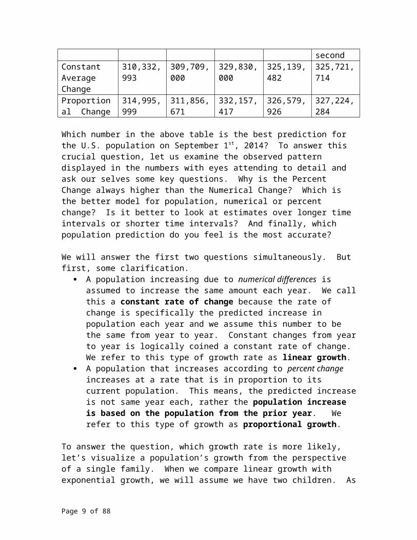
Table 1. Predicted September 1st, 2014 US Population, using Numerical Differences and Percent Change taken from data extracted during different time intervals.
7 year 1 year 1 month 19 hour 10 secondConstant Average Change
310,332,993 309,709,000 329,830,000 325,139,482 325,721,714
Proportional Change
314,995,999 311,856,671 332,157,417 326,579,926 327,224,284
Which number in the above table is the best prediction for the U.S. population on September 1st, 2014? To answer this crucial question, let us examine the observed pattern displayed in the numbers with eyes attending to detail and ask our selves some key questions. Why is the Percent Change always higher than the Numerical Change? Which is the better model for population, numerical or percent change? Is it better to look at estimates over longer time intervals or shorter time intervals? And finally, which population prediction do you feel is the most accurate?
We will answer the first two questions simultaneously. But first, some clarification. A population increasing due to numerical differences is assumed to increase the
same amount each year. We call this a constant rate of change because the rate of change is specifically the predicted increase in population each year and we assume this number to be the same from year to year. Constant changes from year to year is logically coined a constant rate of change. We refer to this type of growth rate as linear growth.
A population that increases according to percent change increases at a rate that is in proportion to its current population. This means, the predicted increase is not same year each, rather the population increase is based on the population from the prior year. We refer to this type of growth as proportional growth.
To answer the question, which growth rate is more likely, let’s visualize a population’s growth from the perspective of a single family. When we compare linear growth with exponential growth, we will assume we have two children. As we outline both growth
Page 6 of 58

rates, ask yourself which is more likely to occur, the linear scenario or the exponential scenario.
For linear growth, we first assume you have two children. For a constant rate of change, this means each successive generation will increase by two children. What would this look like? Your two children would have a total of two children from both their families combined. Maybe they each have one child. Maybe one has two children, the other has none. Either way, now you have two grand children. Those two grandchildren have between them a total of two children. You now have two great grand children. And pattern continues; 2 + 2 + 2 + ….
For exponential growth, again, you begin with two children. But, for exponential growth, the family’s size will depend upon it’s size from the prior generation. So, this means each of your two children have two children, giving you four grand children. Each grand child will have two children, giving you 8 great grand children. And so on; 2 + 4 + 8 + ….
For a single family, certainly either growth rate is possible. But, which growth rate is more likely? The latter, exponential growth. (Right?) Now, again for a single family, if we list the subsequent children, grand children and so on for each successive generation, for linear growth we have {2, 4, 6, 8, … } as compared to {2, 4, 8, 16 … } for exponential growth. Which growth rate exhibits the most rapid growth? Exponential. For both answers, we arrive at exponential growth as the logical growth pattern. This means, in ordinary English, that we expect the percent change to have larger predictions than the numerical change and we think these larger predictions are more likely going to be more accurate.
Now, let’s continue our scrutiny of Table 1. Basically, the gist of our discussion so far is that we need to concentrate on the bottom row of Table 1. These predictions are better than those from the top row. Next, we ask, is it better to use longer or shorter time intervals to make our predictions. In short, which cell on the second row of Table 1 is the best predicted population for September 1, 2014? What does your intuition tell you? The detail involved when using populations that are mere seconds apart should have less error that populations taken years apart. This intuition is the basic premise when science employs rate of change to make predictions. You can get rough approximations from populations that are 7 years apart, better approximations from populations that are a year apart, but the smaller you make the interval, the better the approximation should be because there is less margin for error. When you estimate population changes (rates of change) with smaller and smaller intervals, we are actually coming close to approximating the rate of change at a given instant. So, we expect the true population on September 1st, 2014 to be close to but certainly not exactly 327,224,284 because the best estimate will come from the percent change taken from populations according to the shortest time intervals, mere seconds apart. To summarize, the most efficient method to predict a future population is to use population differences from the smallest time interval feasible and assuming the
Page 7 of 58

percent change, that is exponential growth, is the best model. In another context, linear growth might be preferable and for other settings, exponential growth may be best. There are many types of growth models other than these two, but for now we will confine our comparison to use only these two growth rate models.
Exercise Set
1. Below are world population estimates. If the first three estimates taken in July, August and September of 2004 are accurate, use percent change model to determine if the rest of the populations quoted are accurate or a fabrication?
Monthly World population figures:07/01/04 6,377,641,642 08/01/04 6,383,805,814 09/01/04 6,389,969,987 10/01/04 6,395,935,316 11/01/04 6,402,099,489 12/01/04 6,408,064,817 01/01/05 6,414,228,990 02/01/05 6,420,393,163 03/01/05 6,425,960,803 04/01/05 6,432,124,976 05/01/05 6,438,090,304 06/01/05 6,444,254,477 07/01/05 6,450,219,806
2. The table below depicts predictions about the U.S. population. (Adapted from the US Census Bureau’s home Page.) Population in thousandsand race or Hispanic origin 2000 2020 2040 2050POPULATION
TOTAL 282,125 335,805 391,946 419,854White alone 228,548 260,629 289,690 302,626.Black alone 35,818 45,365 55,876 61,361.Asian Alone 10,684 17,988 27,992 33,430.All other races 7,075 11,822 18,388 22,437.Hispanic (of any race) 35,622 59,756 87,585 102,560.White alone not Hispanic 195,729 205,936 210,331 210,283
If these rates of change reflected in the table above come to fruition, what changes in society do you foresee for the year 2010? 2050? What should
politicians, policy makers and community leaders do now to prepare for then?
For questions 3 and 4, use the table below that displays the 20 largest countries in 2004: Source: U.S. Census Bureau, International Database. Taken from http://www.infoplease.com/ipa/A0004391.html
World’s population in 2004.
It is predicted that for 2004 to 2050, the fastest growing region will be Middle Africa, which is expected to increase at a population rate of 190 percent. The next fastest growing region is expected to be Western Africa, and Western Asia, which will increase at a rate of 140 percent. Next is Central America,
Page 8 of 58
Rank Country Population1 China 1,298,847,6242 India 1,065,070,6073 United States 293,027,5714 Indonesia 238,452,9525 Brazil 184,101,1096 Pakistan 159,196,3367 Russia 143,782,3388 Bangladesh 141,340,4769 Nigeria 137,253,13310 Japan 127,333,00211 Mexico 104,959,59412 Philippines 86,241,69713 Vietnam 82,689,51814 Germany 82,424,60915 Egypt 76,117,42116 Turkey 68,851,28117 Ethiopia 67,851,28118 Iran 67,503,20519 Thailand 64,865,52320 France 60,424,213
expected growth by 60 percent, the United States by 50 percent, South America by 42 percent, the Caribbean by 36 percent, Northern Europe by 6 percent, Eastern Asia by 5 percent, and the rest of the continent falls by 3 percent. Southern Africa, due to HIV/AIDS epidemic is expected to fall by 20 percent.
3. Re-rank the 20 largest countries, using the given growth rates for 2004 to 2050, to estimate the populations for the year 2050. 4. Politicians make policies. If you were a senator, what policies and changes would you suggest to prepare for tomorrow’s global community, given the changing global populations you found in problem 3?
For questions 5 to 10: World Population – online activity. Go to the US Census Bureau http://www.census.gov/5. Find the current world population6. How much did the population grow last year? in the last 10 years? 50 years? 7. What do you think influences population growth? 8. What do you think are some of the important consequence of population growth? 9. How many years did it take for the population to increase from 2 to 3 billion?
10. How many years will it take for the population to double its current level if you use the percent growth method with the current population and last year’s population?
For problems 11 to 13, the following data for Median Income was extracted from the US Census Bureau, http://www.census.gov/prod/2004pubs/p60-226.pdf Table 2. Yearly Median Income in dollars for a household by race, United StatesRace Median Income
White African American
Hispanic Asian
2003 45,572 29,689 32,997 55,6992002 45,994 29,845 33,103 53,8322001 45,225 29,939 34,099 54,4882000 45,860 30,980 34,636 58,2251999 45,673 30,118 33,178 54,9911998 45,077 27,932 31,214 51,3851997 43,544 27,989 29,752 50,5581996 42,407 26,797 28,422 49,386
11. Using percent change and only the data from 2002 and 2003, predict the median income for each of the four stated races for the presidential election year of 2008.12. Using average percent change and the data from 1996 and 2003, predict the median income for each of the four stated races for the presidential election year of 2008.13. State whether the data from 2002 & 2003 or 1996 & 2003 is a better predictor of median income. Why?
Page 9 of 58

Linear versus Exponential Growth.
Let’s consider the old problem of the little boy wanted to save money. He awakes one morning, pulls out an old dusty checkerboard from under his bed and carefully sets it up on the small antique nightstand next to his bed. He places two cents on the first square in the corner of the board and pledges to himself, a Boy Scout pledge, that he will place money on each square every week, double the amount of money he placed the week before. How long can he do this, how much money will he have placed on the last square alone? Well, first of all, the little boy knows he has 64 squares because he knows the board is 8 by 8. The realization then dawns that this task will require his due diligence for a little over a year.
Okay, lets figure this out. The rate here based on doubling the amount of money each week. So, for each successive week, he will place, in dollars, 0.02, 0.04, 0.08, 0.16, 0.32, 0.64, 1.28, and then $2.56 on the eighth week, finalizing the first row of the board. This type of growth is called exponential, and so far the little boy is thinking this isn’t so bad. But by the time the second row is being developed, this successive doubling is proving to be too much. Week nine, 5 dollars and 12 cents, Week ten, $10.24, then $20.48, $40.94, $81.92, $163.84, $327.68 and by the end of the 16th week, he places $655.36. He stops and thinks. He will need to save $655.36 on one week.
By the time this savings plan reaches the third row, over a thousand dollars will be placed on the first square and the dollar amount will continue to successively double. So, for this growth, we need to duplicate the pattern. The pattern created by this growth is 0.02, 0.02 x 2, 0.02 x 2 x 2, 0.02 x 2 x 2 x 2, … , 0.02 x 063. Notice each successive term on changing by the growth factor of 2. This tells us two vital things, first, successive doubling involves a base of two. Thus, successive tripling would involve a base of three, successive quadrupling a base of four and so forth. Secondly, the exponent represents the week we placed money on a square. To figure out how much we placed on the square in the fourth row, third column, it is week 24 + 3 or 27. So, we would place 0.02 x 2^26 or $1,342,177.28. We would have placed half that amount on week 26 and twice that on week 28. So, how much money would we need to place on the square representing week 64, the week of the last square on the board? Well, 0.02 x 2 ^ 63. Do you have a feel as to how large that number is? 18446744073709551616 or more clearly represented as $ 184,467,440,737,095,516.16 or loosely speaking, nearly two hundred million billion dollars.
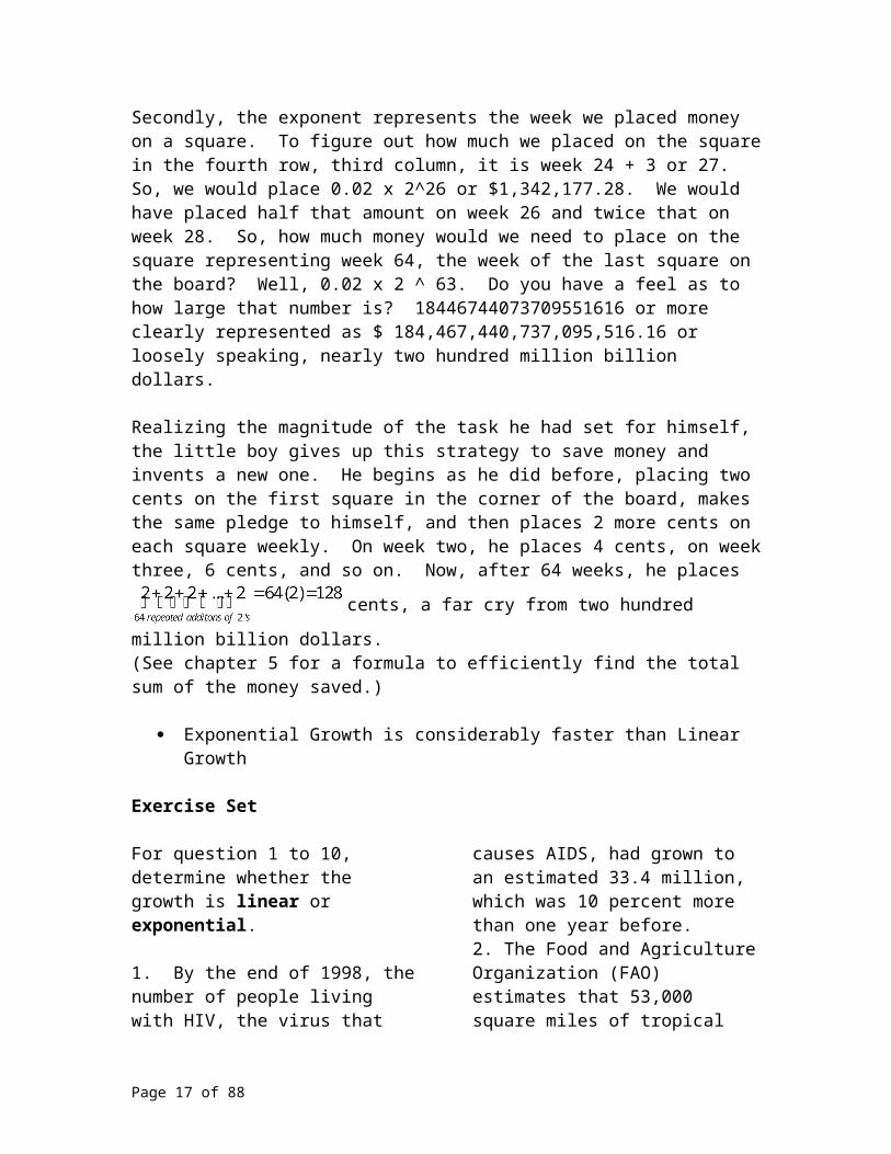
Realizing the magnitude of the task he had set for himself, the little boy gives up this strategy to save money and invents a new one. He begins as he did before, placing two cents on the first square in the corner of the board, makes the same pledge to himself, and then places 2 more cents on each square weekly. On week two, he places 4 cents, on week three, 6 cents, and so on. Now, after 64 weeks, he places
cents, a far cry from two hundred million billion dollars.
(See chapter 5 for a formula to efficiently find the total sum of the money saved.)
Page 10 of 58
Exponential Growth is considerably faster than Linear Growth
Exercise Set
For question 1 to 10, determine whether the growth is linear or exponential.
1. By the end of 1998, the number of people living with HIV, the virus that causes AIDS, had grown to an estimated 33.4 million, which was 10 percent more than one year before.2. The Food and Agriculture Organization (FAO) estimates that 53,000 square miles of tropical forests (rain forest and other) were destroyed each year during the 1980s. Of this, they estimate that 21,000 square miles were deforested annually in South America, most of this in the Amazon Basin.3. Some pond lilys double everyday in size. It may take them 40 days to completely cover a pond.4. According to FAO (FAO 1997), Mexican deforestation in the period 1990-1995 averaged 510,000 hectares annually.5. In 2004, according to the US Census Bureau, the global population was 6,377,641,642, and it had a growth rate of 1.13 %.
6. On September 16th, 2004, the southern US state of Alabama has been hit full-on byHurricane Ivan, with winds of up to 135mph battering the coastline, according to the BBC.7. The handheld multimedia player market is poised to grow rapidly over the next five years, according to a report from In-Stat/MDR. The report projects 700 percent growth in 2004, and a CAGR (compound annual growth rate) of 179 percent through 2008.8. It is said that a person’s heart rate increases 140% in the anticipation of the start of a race.9. Humidity in dry air causes an elevated heart rate because each 1 pound of body weight loss corresponds to 15 ounces (450 mL) of dehydration.10. Feelings of loves usually result in braycardia, which is a dropping a of the heart rate, to 90 percent of its original rate.
11. Add 10 two’s. Then multiply 10 two’s together. How much larger is the exponential sum than the linear sum?
Linear Models
The teen age tyrannosaurus was estimated to gain 4.6 pounds of weight per day during those tumultuous teen years from 14 to 18 years of age.
All linear models have a starting value and a constant rate of change.
This growth spurt can be viewed mathematically as a rate of change because it is a measure of the change of weight per one day. It is a linear growth because the change is itself is constant from day to day; the colossal dinosaur gained 4.6 pounds each day. So, the natural question arises, how much did the T. Rex weigh after these four 4 years passed, given that the pre-teen weigh about a ton before the gigantic growth spurt. Intuitively, you would add 4.6 pounds to itself for the number of days that would pass in
Page 11 of 58

those four years and add that amount to one ton. This repeated addition is the same as multiplication. This intuition is dead on accurate and is an example of a linear growth model. We will multiply the number of days of the growth spurt to 4.6 pounds per day.
We have 4.6 pounds per day x 4 years x 365 days per year = 5840 pounds. A ton is 2000 pounds and 5840 / 2000 is 2.92 or nearly 3 tons of weight gain. Thus, 1 ton plus 3 tons is 4 tons of T. Rex.
A linear model has the form y = b + mx
where the starting value is b the constant rate of change is m
We summarize our numerical calculation by writing y = 2000 + 4.6 x (4 x 365) lbs and we have the weight of T Rex on her 18th birthday. Mathematically speaking, the constant rate of change is referred to as the slope, and is traditionally denoted by the variable m. The variable b represents the initial condition and in this case, the starting weight of T Rex, ie, her weight on her 14th birthday.
Finally, note that linear models, because they have a constant rate of change, either always increase or decrease. This behavior in a model is coined monotonic, meaning the change is either increasing or decreasing. Linear models exhibit monotonic behavior. They will either always increase or always decrease. We often use a continuous linear model to represent the behavior of discrete data points.
Problem One
Initially, you have lost $20,000 in an investment and you continue to lose $350 per month. In how many months will it be before your losses total $26,300, thus your balance is – 26,300?
Solution
First, let’s define our variables. Let x be what we are looking for, which is the number of months since the initial loss of $20,000. Let y be the output; the output is always dependent on the value of x. In this example, the monthly balance is dependent on the number of months that pass. We let y represent the total amount of money lost in the investment. Thus, your balance is a loss, a negative number, right?
What is the starting point? In other words, what is the value of y when x = 0, that is, the time in months is 0? Well, initially, there is $20,000 lost in the stock market, so your balance, thus the starting point b, is - 20,000.
What is the constant rate of change? Remember, we are losing a constant amount of money each month, $350. So, in this scenario, the constant rate of change is the constant loss of $ 350 per month. And since we are losing money each month, this is a negative number. We say the slope is negative and we have m = - 350
Page 12 of 58

In ordinary English, we know our starting value is - $20,000 and the rate of change is –350. Our linear model looks like this, y = - $20,000 – 350x. Now, to answer our question, we need to solve for x when y is – 26,300? Substituting we have: - 26,300 = - 20,000 – 350x-6,300 = – 350x
. Our loss will reach $26,300 after 18 months.
Problem Two
It is noon, on September 22, 2004 and you decide to take a hike up Mount Everest. Create a linear equation from the table below, where x represents numbers of hours since noon, September 22, 2004 and y represents the elevation you are at on the mountain after you hiked x hours.
x 0 1 2 5y 20,000 20,225 20,450 21,125
Solution
We need to create a mathematical model, will a linear model fit the data in the table? As mentioned before:
All linear models have a starting value and a constant rate of change.
To find b, the starting elevation clearly occurs is 20,000 feet (at x = 0), thus b = 20,000
To identify m, the constant rate of change, we look for a common difference among the data. This means we glance at y values associated with consecutive values of x.20,000 20,225 20,450
225 225
So, m = 225 and our linear model has the form y =b+ mx or y = 20,000 + 225x.
When presented with a table of data: The starting point occurs whenever the input variable (often referred to as
the x variable) is zero. The constant rate of change is the difference in values of the out put variable
(often referred to as the y variable) that are constant for equal differences in the input.
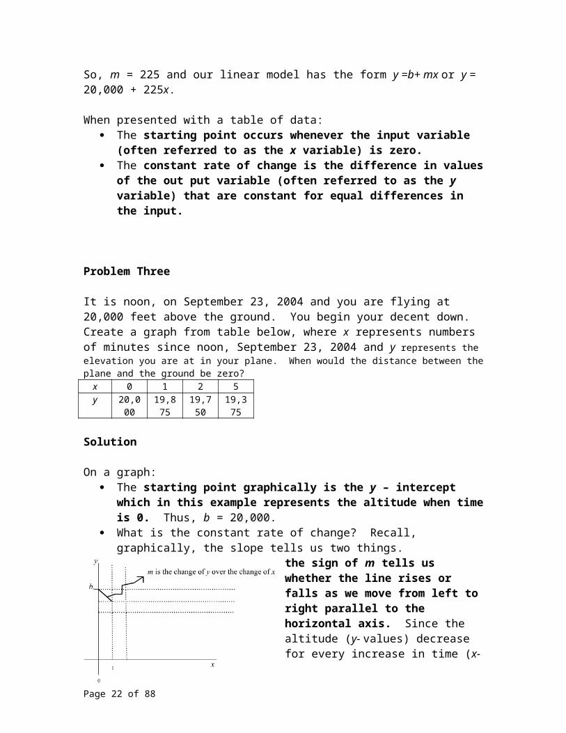
Problem Three
Page 13 of 58

It is noon, on September 23, 2004 and you are flying at 20,000 feet above the ground. You begin your decent down. Create a graph from table below, where x represents numbers of minutes since noon, September 23, 2004 and y represents the elevation you are at in your plane. When would the distance between the plane and the ground be zero?
x 0 1 2 5y 20,000 19,875 19,750 19,375
Solution
On a graph: The starting point graphically is the y – intercept which in this example
represents the altitude when time is 0. Thus, b = 20,000. What is the constant rate of change? Recall, graphically, the slope tells us two
things. the sign of m tells us whether the line rises or falls as we move from left to right parallel to the horizontal axis. Since the altitude (y- values) decrease for every increase in time (x-value), the sign is negative,
.
the absolute value of m gives us a sense of just how steep that line is and since, the common
difference is 125, we are descending 125 ft for every one unit of time, that is, for every minute; m = - 125.
So, we know, the y-intercept is 20,000 and for every one unit we move to the right, the line drops 125 units down. So, how long before you land the plane? Well, your plane has landed when the elevation above the ground is at zero. Graphically, we are asking, what is x when y = 0? What is the x – intercept?So, we graph the line and find the x – intercept.
Thus, in 160 minutes from noon, September 23rd, 2004, we land the plane. We have
o
r at 2:40 pm, September 23rd, 2004. It’s a slow decent down to the ground;
.
Problem Four
Page 14 of 58

Which of the following graphs most closely represents a man paying off a $20,000 debt by making equal payments of $ 250 per month, where x is the number of monthly payments since the debt was first assumed and y is the amount of money left on the debt?
a) b)
c) d)
Solution
What is the starting point? It occurs when x = 0, right? Graphically, the starting point is the y- intercept. Thus, the y-intercept is 20,000.
What is the constant rate of change? Graphically, the slope tells us two things. o the sign of m tells us whether the line rises or falls as we go from left
to right. o the absolute value of m gives us a sense of just how steep that line is.
Let’s visually explore this concept. Picture this:
For every payment, there is less on left on the loan. We are starting with $20,000 and for every payment, we remove $250 from the $20,000. Are you visualizing 20,000 marked on the y-axis, and the line representing the linear model going down $250 for every one month shift to the right. This reduces our choices above to either c) or d), because those lines have negative slopes.
Next: we need to determine how steep the line should be. Well, for every 1unit right (1 payment), we drop $250 (amount removed from the debt.)
Page 15 of 58
Only choice d) has this slope.
Problem Five
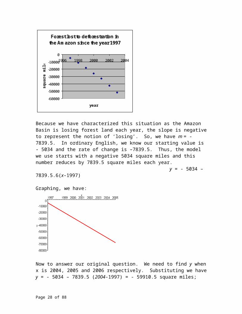
The Disappearing Amazon Rainforest. Below is a table representing the year and the square miles of forest lost to deforestation for the Amazon Basin for that given year. Assuming a linear growth model, predict how much of the forest would be lost in total since 1997 for the years 2004, 2005 and 2006.
Year square mi1997 - 50341998 - 65011999 - 66632000 - 76582001 - 70272002 - 98452003 - 9343
Solution
Initially for this problem represents the year 1997. Initially, in the year 1997, the Amazon Basin lost 5034 square miles ( - 5034).
If we plot the data on the horizontal axis the given Year and on the vertical axis the Square Miles of forest that was cut down that year, we note the points do not fall in a perfect line. Real world data rarely does. But, the points do seem to ‘roughly’ model linear growth, it is not difficult to see a constant rate of change by imagining a ‘best fit’ line drawn through the center of the mass of points.
Page 16 of 58
First, let’s define our variables. Let x be what we are looking for; we will let x represent the year. Let y be the output, and the output is always dependent on the x –value. In this problem, this means the year controls the amount of square miles removed from the forest in the Amazon Basin since 1997. We must be careful here. We are not directly given this information, we must find this information.
So, we construct a new table, where the independent variable x is the year and the dependent variable is what we are searching for, the total square miles lost to deforestation since 1997 in the Amazon Basin.
YearTotal square miles
lost since 19971997 - 50341998 - 115351999 - 181982000 - 258562001 - 328832002 - 427282003 - 52071
We let y be the amount of the forest lost to deforestation in square miles. Thus, the amount of land is lost, thus a negative number, right?
What is the starting point? In other words, what is y when x = 0? Well, initially, there is - 5034 square miles lost in the year 1997. Your starting point b, - 5034.
What is the constant rate of change? Remember, for linear growth, we must assume we are losing a constant amount of forest each year. So, in this problem, the constant rate of change is the constant loss of forest. If we subtract –5034 from - 52071 we get the difference in square miles lost for those 6 years. Completing this calculation, we obtain –47037 square miles lost. Next, we divide by 6, and find the average number of square miles lost per year is – 7839.5 square miles.
Page 17 of 58

Plotting the data from this new table, again allowing the horizontal axis to be the independent variable, the year, and the vertical axis to be the dependent variable, the total square miles of forest lost since 1997, we have a new graph which more closely resembles a linear collection of data.
Because we have characterized this situation as the Amazon Basin is losing forest land each year, the slope is negative to represent the notion of ‘losing’. So, we have m = - 7839.5. In ordinary English, we know our starting value is - 5034 and the rate of change is –7839.5. Thus, the model we use starts with a negative 5034 square miles and this number reduces by 7839.5 square miles each year. y = - 5034 – 7839.5.6(x-1997)
Graphing, we have:
Now to answer our original question. We need to find y when x is 2004, 2005 and 2006 respectively. Substituting we have y = - 5034 – 7839.5 (2004-1997) = - 59910.5 square miles;y = - 5034 – 7839.5 (2005-1997) = - 67,750 square miles;
Page 18 of 58

y = - 5034 – 7839.5 (2006-1997) = - 75,589.5 square miles.
Why is this question important, that is why we should care about deforestation of the rainforests? What difference does it make if a few plants and animals die? For most people, the forests are not all that pleasant to visit in the first place. Hot. Humid. Remote. Too many bugs. Too many snakes.
On a global scale, rainforests once covered 14 % of the earth’s surface. Now they cover 6 %. It is estimated that nearly half of the world’s species of plants, animals and microorganisms will be severely threatened or destroyed over the next 25 years due to deforestation. Tropical rain forest are home to over half of all plant and animal species. Their elimination due to tropical deforestation would greatly threaten the fine balance that is the carbon cycle. At least 75 percent of deforestation in these areas is due to burning, which releases about over 2,000,000,000 tons of Carbon Dioxide into the atmosphere each year. Rainforests are home to 70 % of the nearly 3000 plants that the U.S. National Cancer Institute identified as active against cancer cells. Vincristine is one of the world’s most powerful anticancer drugs and it is extracted from the Periwinkle, a rainforest plant. Finally, deforestation is the single largest reason for extinctions over the last 65 million years.
The Amazon Rainforest is the most diverse and biologically active wonder on this planet. If this timeless beauty were a country, it would be the ninth largest country in the world, representing 54 percent of the rainforests left on the earth. Over 10,000,000 Indians lived in the Amazonian Rainforest 500 years ago. Currently, this number is less than 200,000. More than half of the world’s 10,000,000 species of plants, animals and microorganisms as well as two-thirds of all the world’s fresh water supply is found in the Amazon Rainforest.
One sobering note. The Amazon Rainforest are the lungs of our plant. We risk our very survival by eliminating the natural mechanism nature has provided for us to breath. Our plant life creates the very air we inhale and exhale every moment of every day through photosynthesis by continuously recycling carbon dioxide into oxygen. Over 20 percent of the earth’s oxygen is produced in the Amazon Basin. If this largest of the rain forests were gone tomorrow, the world’s atmosphere would not have the necessary air for us to breath. We don’t breath, we don’t live, it is that simple.
For a final dark remark, independent research institutions have forecast if the government continues with its deforestation in the Amazon region, up to 40% of the total rainforest in the basin will be destroyed within 20 years. So, pause. Relax. Take a breath. And just realize, we may not be able to have this conversation in 2024.
Problem Six
Life Expectancy Life expectancy represents the average number of years people are projected to live. According to the “Universal Almanac 1990”, Edited by John W. Wright, “life expectancy has improved steadily over the years, largely due to a decline in
Page 19 of 58

deaths during childhood.” Often the word “steadily” is an indicator that the growth rate is linear. This is because if we examine the word ‘steadily’ in context, “improved steadily” can be often be reworded as “a steady rate of growth” and it is likely that the writer of the sentence may in fact mean a “constant rate of growth.” Below is a table for the Life Expectancy at Birth for selected years since 1940 for the United States, all races, both genders. Source: Adapted from the following publications: “Universal Almanac 1990”, Edited by John W. Wright; US life expectancy at all-time high, but infant deaths up – CDC, Agence France-Presse - February 11, 2004 http://www.aegis.com/news/afp/2004/AF040245.html;; “Life Expectancy Hits 76.9 in U.S.” By ROSIE MESTEL LA Times, September 13, 2002 http://www.globalaging.org/health/us/lifeexpectactions.htm
Table: Life Expectancy at Birth
Year 1940 1960 1970 1980 1986 1991 1996 2000 2001 2002
Life Expectancy
63.2 69.9 70.9 73.7 74.8 75.6 76.3 76.9 77.1 77.4
a. We want to predict life expectancy for a person in the United States if we know what year it is. What would be a good choice for input and out put for this model? b. For each time interval provided, calculate the change in life expectancy per year. c. State in a complete sentence the information you calculated in part b).d. Take the average of these constant ‘rates of growth’ you found in part b) and state a complete sentence for this information. e. Create a best fit linear model to fit this data. f. Use this model to predict what the life expectancy would be in the year 2010 and 2050 would be in the United States.
Solution
a. We want the life expectancy to depend upon the year as marked on a calendar. In other words, we will input the year as marked on a calendar into the model and the output will be the life expectancy.
b. For each time interval provided, to calculate the change in life expectancy per year, we divide the change in life expectancy by the number of years. Since we were asked to find the life expectancy per year, we can conclude the numerator is in the unit ‘life expectancy (years)’ and the denominator is in the unit ‘the year (as marked on a calendar)’. So, in this way, we will calculate the ratio of the change in output by the change in input.
So, for the first time interval, we have: .
For the second time interval, we would have: 70.9-69.9 = 1 and 1/10 = 0.1. Continuing as such, we can fill in a new table and you are free to verify the remaining calculations.
Time 1940 to
1960 to
1970 to
1980 to
1986 to
1991 to
1996 to
2000 to
2001 to
Page 20 of 58

Interval 1960 1970 1980 1986 1991 1996 2000 2001 2002
Change in Life Expectancy per year
0.335 0.1 0.28 0.183 0.16 0.14 0.15 0.2 0.3
c. In a complete sentence, we can say the life expectancy increased from the 1940 to 1960 at a rate of 0.355 years per year. In other words, So, from 1940 to 1960, the life expectancy for the people in the United States improved steadily at a growth rate of 0.335 or about 4 months per year.
d. The average of these constant ‘rates of growth’ from part b) is
. So,
from 1940 to 2002, the life expectancy for the people in the United States improved steadily at a growth rate of 0.21 or about 2 ½ months per year.
e. The best fit linear model has a starting point, b, and a constant rate of change, m. The slope, m, is 0.21. The starting point, b, may be considered to be the output, or y variable when we started gathering our data. In the year 1940, the output was 63.2. So, examining the formula y=b+mx, we have
y = 63.2 + 0.21x.The input would then need to be modified from our initial decision, the input is the number of years since 1940.
f. Using this model to predict the life expectancy in the United States in the years 2010 and 2050, we have the following calculations;For the year 2010, the life expectancy is expected to be y = 63.2 + 0.21(70) = 77.9For the year 2050, the life expectancy is expected to be y = 63.2 + 0.21(110) = 86.3
Page 21 of 58
Exercise Set
1. Which of the following graphs most closely depicts a man paying off a $1,000 loan at a rate of $25 per month?
a.
b.
c.
d.
2. Which of the following real world scenarios is most closely depicted by the
graph below, if the x variable represents monthly payments and the y variable represents your balance left on the loan?
a) A man pays off a $15,750 loan by making equal payments of $350 per month for 45 months.b) A man pays off a $15,750 loan by making equal payments of $45 per month for 350 monthsc) A man initially has a $15,750 debt and the debt increases by $350 per month for 45 monthsd) A man has $15,750 debt and the debt increases by $ 45 per month for 350 months
3. Find an equation that best represents the relationship between x and y?x 1 2 3 6 8 9y 2 5 8 17 23 26
4. Find an equation that best represents the relationship between x and y?x 1 2 3 5 8 10y 200 185 170 140 95 65
5. For the two graphs depicted below, where the horizontal axis represents
Page 22 of 58

miles and the vertical axis represents dollars,
which real world situation is represented?
a. Two competing rent-a-car companies have the following options: Co A costs 25 cents per mile, Co B costs 40 dollars a day. How many miles should one need to drive if they were to decide to rent from Co B?
b. Two competing rent-a-car companies have the following options: Co A costs 25 cents per mile, Co B costs 40 dollars a day and 20 cents per mile. How many miles should one need to drive if they were to decide to rent from Co B?
c. Two competing rent-a-car companies have the following options: Co A costs 25 cents per mile, Co B costs 40 dollars a day and 25 cents per mile. How many miles should one need to drive if they were to decide to rent from Co B?
d. Two competing rent-a-car companies have the following options: Co A costs 25 cents per mile, Co B costs 40 dollars a day and 10 cents per mile. How many miles should one need to drive if they were to decide to rent from Co B?
6. Match the four graphs with the 4 real world explanations that most closely depicts the graph.
a.
b.
c.
d.
i) An athlete pays off a $350,000 a year loan by paying $50,000 per year. ii) An athlete makes $150,000 per year and gets a $50,000 bonus.
Page 23 of 58

iii) An athlete signs a $100,000 bonus and makes gets a raise of $50,000 per year.iv) An athlete signs a $150,000 bonus and makes gets a raise of $50,000 per year.
7. For the depicted graph below, where the horizontal axis is time t and the vertical axis is distance, d.
which of the following scenarios would be most accurately described with the above graph? a. A man leaves home to drive to work,
speeding up with a constant acceleration for 4 minutes, hits a constant speed for the two minutes, speeds up with a constant acceleration for the next four minutes, then hits a constant speed for the last 12 minutes.
b. A man leaves work and drives home, fast, then slow, fast then slow.
c. A man leave his home to go to work. He drive for ½ hour, get a flat tire, pulls over, spends 15 minutes fixing the flat tire. He then speeds off to work, driving for another half an hour twice as fast as he did earlier. He then stays at work for 90 minutes.
d. A man leave his home to go to work. He drive for ½ hour, get a flat tire, coasts for 15 minutes, and then fixes the flat tire immediately. He then speeds off to work, driving for another half an hour twice as fast as
he did earlier. He then stays at work for 90 minutes.
8. Draw a Cartesian coordinate system (x and y axes that intersect.). How would you have to scale your axes if you were sketching a line and the rate of linear change you were modeling was 10? How about 100? 1000? 1,000,00? One Billion? One Trillion? Negative one trillion?
9. Draw 5 Cartesian coordinate systems, each time scaling the units from –100 to 100 on the x axis and –100 to 100 on the y axis. Count by 20’s. Draw five linear models, one where the rate of change is 0.01, one where the rate of change is 100, one where the rate of change is 1,000,000 and one where the rate of change is - 100, and one where the rate of change is - 1,000,000. 10. On one (the same set) of axes, sketch the four linear models.x y y Y Y0 5 5 5 101 10 2 ½ 2 103 2 ½
For problems 11 to 24, use the following information regarding Heart Disease, Table A and Table B: Though estimates vary slightly, nearly 1 million Americans die each year from heart and heart related diseases, accounting for approximately 40 percent of the deaths in the United States. It is estimated that close to 62 million Americans have some form of cardiovascular disease. In 1999, for instance, Cardiovascular disease accounted for almost 960,000
Page 24 of 58

deaths; cancer nearly 550,000 deaths, accidents nearly100,000; Alzheimer's disease 44,500 and HIV/AIDS close to 14,800. Thus it may be surprising to note that death rates from heart disease has dropped steadily since 1960. Below are two tables. The first table, table A, shows the Death Rates from Heart Disease for Males ages 45-54 in the United States for selected years, all races. Use this table for problems 11-17. The second table, Table B, shows the Death Rates from Heart Disease for both genders ages 45-54 in the United States for selected years, all races. Use this table for problems 18-24. Adapted from the following publications: “Universal Almanac 1990”, Edited by John W. Wright http://www.disastercenter.com/cdc/aheart.html ; Dr. Joseph Mercola, Author of the Total Health Program ; http://www.mercola.com/2002/jan/19/heart_disease.htm
Table A: Death Rates for Males age 45-54 from Heart Disease per 100,000 population in the United States Year 1960 1970 1980 1985Death Rates per 100,000
420.4 376.6 282.6 236.9
11. We want to predict the death rates per 100,000 for a male ages 45-54 in the United States if we know what year it is. What would be a good choice for input and out put for this model? 12. For each time interval provided, calculate the change in death rates per year. 13. State in a complete sentence the information you calculated in part b).14. Take the average of these constant ‘rates of decay’ you found in part b) and state a complete sentence for this information. 15. Create a best fit linear model to fit this data.
16. Use this model to predict what the death rate per 100,000 for males ages 45-54 in the year 2010 and 2050 would be in the United States. 17. Are there limitations to the usefulness of linear models?
Table B: Death Rates for both genders age 45-54 from Heart Disease per 100,000 population in the United States Year 1979 1995 1996Death Rates per 100,000
184.6 111 108.2
18. We want to predict death rate per 100,000 for ages 45-54 in the United States if we know what year it is. What would be a good choice for input and out put for this model? 19. For each time interval provided, calculate the change in death rate per 100,000 per year. 20. State in a complete sentence the information you calculated in part b).21. Take the average of these constant ‘rates of decay’ you found in part b) and state a complete sentence for this information. 22. Create a best fit linear model to fit this data. 23. Use this model to predict what the death rate per 100,000 for ages 45-54 would be in the year 2010 and 2050 would be in the United States. 24. Are there limitations to the usefulness of linear models?
25. On-line Project: Research the land area in square miles of the Amazon Basin’s Rainforest today. Use the linear growth model developed in Problem 5 from this section of the text to answer “assuming deforestation continues along this linear model
Page 25 of 58

derived in Problem 5, in what year would the Rain Forest in the Amazon Basin be gone?” 26. On-Line Project: Research polices and practices regarding Aging, Medicare, and Medicaid. Start with the United States Department of Health and Human Services http://www.cdc.gov/ and go from there. Then use the linear growth model found in Problem Six of this section of the text to predict the Life Expectancy for each year for the next ten years. Write a paragraph elaborating on changes you think could be instituted regarding how we care for our elderly. Discuss any relevant topics, such as aging policies and practices, Medicare, health insurance, pharmaceutical needs, nursing home providers, in home providers or catastrophic insurance policies.
For problems 27 to 32, match the starting value and rate of change with the graph. Assume the below graphs a through f are linear models. 27. b = 0, m = 10028. b = 0, m = - 10029. b = 100, m = 10030. b = 100, m = - 100 31. b = -100, m = 10032. b = -100, m = - 100
a.
b.
c.
d.
e.
f.
Page 26 of 58

Exponential Models
Rules of Exponents: Assume all bases are positive. To multiply identical bases, add the exponents. EX: x5x4 = x5+4 = x9
To divide identical bases, subtract the exponents. EX:
When an exponent is raised with an exponent, multiply the exponents. EX: (x5)4 = x20
Any base raised to the zero power is 1. EX:
Any base raised to a negative exponent can be rewritten as the reciprocal of the
base raised to the absolute value of the exponent. EX:
Radical notation: x is a real number, and n and m are integers:
Perhaps one of the most striking well known examples to visualize the power of exponential growth is to simply fold a sheet of paper. Take an 8 ½ by 11 inch piece of paper, and fold it in half. The result will be thicker than the original sheet of paper. How much thicker? Twice as thick. Now, the original sheet of paper was about 1/100 of a cm or 0.004 inches thick, and the folded paper is 0.004” + 0.004” = 2*0.004” = 0.008 inches thick. Fold the paper in half again; its been folded in half twice. The paper is 2 * 0.008 inches thick. Or more succinctly, using exponential notation, 0.004”*2*2 or 0.004*22
inches thick, or four times as thick as it was originally. You are thinking, big deal, it was awfully thin originally. Keep the attitude in check until we finish this example. So, fold it in half a third time, and after three folds, the folded paper is as thick as your finger nail, roughly 0.004*2*2*2 = 0.004*23 inches thick or 0.032 inches thick. If we fold again and again and again and again, you have now folded it in half seven times, and the folded paper is 27 or 128 times as thick as it once initially. Now, it is roughly 0.004*128 (0.004*27) = 0.512 inches thick, it is the same thickness as your cell phone. This may be your limit here in terms of actually folding the paper. But, if you could continue folding it in half, after 10 folds it would be 0.004*210 = 4.096 inches thick, a little over 4 inches thick. Now, the folded paper is as thick as your calculator is wide. Two more folds, it is 0.004*212 inches thick, or 16 inches thick, about 1 1/3 feet. The height of a stool. After 17 folds, it would be 0.004*217 inches thick, or 524 inches or about 524/12 = 43 ½ feet. Taller than a house. Five more folds and that sheet of paper is now 0.004*222 inches thick, about 16,777 inches thick or nearly 1400 feet. It is about as thick as the Empire State Building is high, thicker actually. Ten more folds, 0.004*232 = 17179869 inches or 1431656 feet or 1431656/5280 271 miles thick. The paper has left our atmosphere. Twenty more folds, 0.004*252 inches, 1.8 x 1013 inches, or 284,318,158 miles thick. The paper is burning up now because it has just touched the sun, punctured it, pierced through its middle and burst out the other side. At sixty folds, our paper, though awfully narrow by now, is the diameter of the solar system and at 100 folds it has the radius of the universe.
Page 27 of 58
And that is just 100 folds! Not a 1000. Not a million. One hundred. So, successively doubling is kinda quick, huh. If successive doubling is such a fast (powerful) growth rate, imagine what successive tripling would be like? This type of growth rate needs its proper reverence.
We will analyze exponential growth using the exact same lingo and jargon we used with linear growth rates. Recall:
All linear models have a starting value and a constant rate of change.
Exponential models possess the same traits as linear growth models. Each growth rate, linear or exponential, acts on an initial value with a growth or decay rate that is expected per unit increment. They have the same feelings and emotions as any other growth model. Their job is to model growth. But, an exponential growth model will model the growth in proportion to the original amount or quantity present.
All models for growth rates have a starting value and a rate of change that needs to be expressed.
An exponential model has the form y =a r x
where the starting value is a the rate of change r is based on
a proportion of its current value
In our example, y = 0.004 * 2x, where y is the thickness in inches of the folded piece of paper, a = 0.004 is the paper’s initial thickness in inches and the growth rate, the successive doubling is representing by 2x, where x is the number of times you fold the paper. So, r = 2 means the base of two is multiplied to each subsequent answer, giving you a new value that is in proportion (twice as large) to the current value.
All exponential models have a starting value and a rate of change based on a proportion of it’s current value.
Finally, note that exponential models, like linear models, either always increase or always decrease. Recall, this behavior in a model is called monotonic, meaning the change is either increasing or decreasing. Exponential models exhibit monotonic behavior. They will either always increase or always decrease.
Page 28 of 58

Lastly, exponential models that exhibit increasing behavior are said to exhibit exponential growth, while exponential models that exhibit decreasing behavior are said to exhibit exponential decay.
Problem One
Since 1999, the percentage of 8th-grade students who reported having five or more drinks in a row in the past 2 weeks has been decreasing. In 1999, 15.2 % reported to have drunk five or more drinks in a row for 2 weeks prior to the poll. The percentage dropped to 14.1 % in 2000, 13.2 % in 2001, 12.4 % in 2002 and 11.9 % in 2003. SOURCE: Johnston, L.D., O'Malley, P.M., and Bachman, J.G. (2003). Monitoring the Future national survey results on drug use, 1975-2002 Volume I: Secondary School Students (NIH Publication No. 03-5375). Bethesda, MD: National Institute on Drug Abuse Tables 2-2 and 5-3. Data for 2003 are from a press release of December 19, 2003, and demographic disaggregations are from unpublished tabulations
from Monitoring the Future, University of Michigan a) Assuming the growth rate is exponential, predict the percent of eighth graders who would drink those five drinks in 2004 and 2005. Use the time periods 2002-2003 to make the prediction. b) Assuming the growth rate is exponential, predict the percent of eighth graders who would drink those five drinks in 2003 using time period from 2001-2002. How accurate was the prediction? c) Why do you think we assumed an exponential growth rate to make the predictions?
Solution a) For 2002-2003, the percent decrease is measured by the 2003 percent divided by the 2002 percent, 11.9/12.4 = 0.9597. So, we have y =arx = 11.9(0.9597)x. For the 2004 prediction, we have have y =11.9(0.9597)1= 11.42. For the 2005 prediction, we have have y =11.9(0.9597)2 = 10.96. Great, the drop in percent of those eighth graders with a potential drinking problem continues. b) For 2001-2002, the percent decrease is measured by the 2002 percent divided by the 2001 percent, 12.4/13.2 = 0.9394. So, we have y =arx = 12.4(0.9394)x. For the 2003 prediction, we have y =12.4(0.9394)1= 11.64. The true percent was 11.9 the degree of accuracy was 0.03 out of 11.9 or within 0.0025. Not bad.c) We could have assumed various models for our prediction. If the data fluctuated up and down, meaning that the percent of 8th-graders who drank rose and fell over the years documented, then other models may have served to be better predictors. Since the percent of 8th-graders who ‘drank’ appeared to consistently fall from 15.2 % to 14.1 % to 13.2 % to 12.4 % and then to 11.9 %, this trend suggested that the rate of change was monotonic. So, in choosing between our two models, linear or exponential, one could argue exponential for several reasons. First, the change did not appear to be constant. Take any two successive years, and the differences between the two percents did not remain the same. For example, the difference between 15.2 % and 14.1 % was 1.1 %; while the difference between 14.1 % and 13.2 % was 0.9 %. Now, since we are dealing with real world data, the constant rate of change usually won’t be exact. So, there must be other reasons. So, secondly then, the problem is dealing with populations, who traditionally tend to behave exponentially. Population growth is usually exponential because you have two children who have two children and so on. Now, we are not
Page 29 of 58
dealing with births, we are dealing with a population’s behavior, so the natural question arises, would the same assumption hold, population’s behavior models exponential growth? Often, yes. If 15.2 % of the population were ‘drinkers’, the next year, a portion of the next generation, the 8th-graders, would behave as their peers did, but a segment of the population may choose not to follow the same ‘drinking’ behavior. Changes in a population’s behavior follow the pattern that one person changes, this person influences some one else, who influences some one else. And so on. By definition, exponential growth or decay is based on the proportion of the existing population changing. Exponential modeling is a reasonable choice for this prediction.
Problem Two
Below is a table of the world’s population taken from the US Census Bureau by year for the 21st century. To understand whether a linear or an exponential model is preferred, we compared the change of population from the previous year to the ratio of each year’s population to the previous year. a) Which model, linear or exponential is preferred?b) Predict the world’s population for the years 2005, 2010, and 2050.
Table 1. The population of the world.Year Population of the
worldRatio of each year’s populationby the previous year
Change in population from the previous year
2000 6,085,478,7782001 6,159,699,306 1.01 74,220,528
2002 6,232,702,169 1.01 73,002,8632003 6,305,144,680 1.01 72,442,511
2004 6,377,641,642 1.01 72,496,962
Solution For a linear model to be preferred, the rate of change must be constant. But, the difference in population between two successive years is not the same. For example, 6,377,641,642 – 6,305,144,680 = 72,496,962 while 6,305,144,680 – 6,232,702,169 = 72,442,511. For an exponential model to be preferred, the growth must be in proportion to its current population. So,
and
Both calculations give us a common base, called a common ratio of 1.01. This common ratio has remained the same throughout the early part of the 21st century. This constant
Page 30 of 58

growth factor for an exponential model allows us to find the population for the world in the future.b) If we assume the same growth factor, or common ratio, will hold until 2050, we can predict the world’s population for any year between 2004 and 2050. Let x represent the year for the world’s population since 2000.
When x = 5, the year is 2005 and the population of the world will be predicted to be 6,085,478,778(1.01)5 = 6,395,899,355.
When x = 10, the year is 2010 and the population of the world will be predicted to be 6,085,478,778(1.01)10 = 6,722,154,502.
When x = 50, the year is 2050 and the population of the world will be predicted to be 6,085,478,778(1.01)50 = 10,008,837,205 or a little over 10 billion people. How many people do you think this planet can sustain?
Exercise Set
For problems 1 to 5, use the following data. In the United States, the data below gives the number of live births to unmarried women per 1000 woman that are of ages 20-24 years old for the years 1980 to 2000. In 1980, 40.9 out of every 1000 live births were to unmarried women. The number rose to 46.5 in 1985, rose again to 65.1 in 1990, rose to 68.7 in 1995, rose again to 70.7 in 199 9 rose to 72.1 in 2000. Note, the difference in successive five year intervals are not constant. Therefore, we will not be prone to use a linear model. Also notice the number of live births per 1000 woman is increasing through out the 20 year period. So, for this problem, we will assume the growth rate is exponential. SOURCE: Johnston, L.D., O'Malley, P.M., and Bachman, J.G. (2003). Monitoring the Future national survey results on drug use, 1975-2002 Volume I: Secondary School Students (NIH Publication No. 03-5375). Bethesda, MD: National Institute on Drug Abuse Tables 2-2 and 5-3. Data for 2003 are from a press release of December 19, 2003, and demographic disaggregations are from unpublished tabulations from Monitoring the Future,
University of Michigan. 1. Use 1980 and 2000 data to predict the number of live births per 1000 unmarried women of ages 20-24 for 2005 and comment on the accuracy of the prediction. 2. Use 1990 and 2000 data to predict the number of live births per 1000
unmarried women of ages 20-24 for 2005 and comment on the accuracy of the prediction. 3. Use 1995 and 2000 data to predict the number of live births per 1000 unmarried women of ages 20-24 for 2005 and comment on the accuracy of the prediction. 4. Use 1999 and 2000 data to predict the number of live births per 1000 unmarried women of ages 20-24 for 2005 and comment on the accuracy of the prediction. 5. Which of the five predictions in problems 1 to 4 were the most accurate?
For problem 6 and 7, use table 1.6. Predict the world’s population for the year 2008.7. Predict the world’s population for the year 2060.
Use the following data for problems 8 to 10. The population of Mexico in the mid-1980’s was roughly 74,660,000 in 1984, 76,600,000 in 1985 and 78,590,000 in 1986.8. Find the difference in population from one year to another and then find the ratio of the year’s population to the previous year. Which growth model do
Page 31 of 58

you fell would more accurately predict the future population of Mexico, linear or exponential?9. Assuming the same pattern of growth for the next thirty years, predict the population of Mexico for the year’s 1990, 2000, 2004 and 2010.10. Go online, and find the true population of Mexico for the year’s 1990, 2000 and 2004. What does this evidence suggest as for the population you found for 2010 in the previous problem?
For problems 11 to 13, use the following data. The number of people estimated to be living with HIV/AIDS, Globally, from 1998-2002 was respectively, 33.4 million, 33.6 million, 36.1 million, 40 million and 42 million. 11. Is the behavior of the data monotonic? Why?12. Is an exponential model a good choice for this data? Why? 13. If you did use an exponential model and you used the data from 2001-2002, predict the number of people would be living with HIV/AIDS in 2006 and 2010.
14. In the United States, the number of people living with HIV/AIDS was estimated to be 850,000 in 1999 and 900.000 in 2001. Assuming an exponential model, predict the number of people in the United States that would be living with HIV/AIDS in the year 2006.
15. In the United States, the number of deaths due to HIV/AIDS was estimated to be 20,000 in 1999 and 15,000 in 2001. Assuming an exponential model, predict the number of deaths from HIV/AIDS in the United States in the year 2006.
16. Look at the data from problem 14 and 15. Categorize each model you found as either exponential growth or exponential decay. Discuss your findings. The annual rate of death in the United States for AIDS patients in 1987 was 59 per 100, and a little over a decade later in 1998 this number was estimated to be 4 per 100 patients, would this support or refute your findings.
17. On one set (the same set) of axes, sketch both linear models as well as both exponential models. The first column represents the value of the input (x-variable) and all other columns represent the value of the out put (y-variable). Be careful when scaling the units on the axes.
LinearModel
LinearModel
ExponentialModel
ExponentialModel
0 10 10 10 101 12 8 20 523
18. You are filling up a bottle with water. As you fill it up, you double the amount of water every minute. It takes you ten minutes to fill it up. a) Is this a linear model or exponential model?b) When is the bottle half way full?
Page 32 of 58

Page 33 of 58

Rates of change
Why do we need to study ‘rates of change’?
“The price of unleaded is $1.99 today, this seems high, so what can I expect to pay tomorrow or next week?” For the American consumer, the most frequently viewed energy statistic is the retail price of gasoline. And while this average consumer probably has a fair understanding that gasoline prices are related to many factors, he or she more often than not has little idea of how those factors are connected to create the ripple effect that finally results in the price per gallon at the pump. Moreover, sizeable gasoline price changes do occur. Natural questions abound. Does the price depend upon petroleum refiners, petroleum marketers, the relationship between wholesale and retail distributors? How is the price per gallon affected by Middle East politics, like the war in Iraq or the removal of a dictator from power? When the price per gallon races skyward, are allegations of impropriety, like price gouging, fair? The answers to these questions require us to understand intricacies in the petroleum business, intricacies that are both complex and fluid over time. Most of us are not in the petroleum business and certainly don’t have the time to investigate these questions. But, when the average consumer drives up to the pump, they would like to have an understanding of why they are paying these prices, and equally as important, what could the price of gasoline be expected to be next week? And though this book will in no way explore the intricacies of the petroleum business, it will give you the tools to attack the latter desire. We can show you how to reasonably predict the price of gasoline, despite its wave of rises and falls that seems to appear almost weekly.
According to the California Energy Commission. The table below reflects the State of California’s Average Weekly Retail Gasoline
Prices, per gallon, in 2004, and they are not adjusted for inflation.
Date Regular Mid-grade Premium Date Regular Mid-grade Premium
9/20/2004 $ 2.057 $ 2.161 $ 2.262 5/10/2004 $ 2.223 $ 2.333 $ 2.435 9/13/2004 $ 2.053 $ 2.156 $ 2.256 5/3/2004 $ 2.115 $ 2.222 $ 2.323 9/6/2004 $ 2.070 $ 2.178 $ 2.273 4/26/2004 $ 2.124 $ 2.231 $ 2.330 8/30/2004 $ 2.100 $ 2.208 $ 2.303 4/19/2004 $ 2.148 $ 2.251 $ 2.353 8/23/2004 $ 2.051 $ 2.157 $ 2.254 4/12/2004 $ 2.157 $ 2.265 $ 2.364 8/16/2004 $ 2.055 $ 2.160 $ 2.258 4/5/2004 $ 2.126 $ 2.234 $ 2.334 8/9/2004 $ 2.092 $ 2.200 $ 2.300 3/29/2004 $ 2.079 $ 2.189 $ 2.288 8/2/2004 $ 2.128 $ 2.231 $ 2.330 3/22/2004 $ 2.083 $ 2.195 $ 2.296 7/26/2004 $ 2.162 $ 2.266 $ 2.368 3/15/2004 $ 2.097 $ 2.207 $ 2.309 7/19/2004 $ 2.186 $ 2.295 $ 2.396 3/8/2004 $ 2.112 $ 2.222 $ 2.331 7/12/2004 $ 2.193 $ 2.304 $ 2.405 3/1/2004 $ 2.109 $ 2.219 $ 2.321 7/5/2004 $ 2.204 $ 2.309 $ 2.409 2/23/2004 $ 2.029 $ 2.137 $ 2.236 6/28/2004 $ 2.237 $ 2.337 $ 2.435 2/16/2004 $ 1.868 $ 1.973 $ 2.070 6/21/2004 $ 2.259 $ 2.367 $ 2.468 2/9/2004 $ 1.821 $ 1.928 $ 2.034 6/14/2004 $ 2.289 $ 2.400 $ 2.498 2/2/2004 $ 1.753 $ 1.861 $ 1.962
Page 34 of 58

6/7/2004 $ 2.316 $ 2.424 $ 2.524 1/26/2004 $ 1.726 $ 1.834 $ 1.937 5/31/2004 $ 2.327 $ 2.435 $ 2.535 1/19/2004 $ 1.690 $ 1.799 $ 1.899 5/24/2004 $ 2.324 $ 2.429 $ 2.526 1/12/2004 $ 1.667 $ 1.777 $ 1.876 5/17/2004 $ 2.269 $ 2.375 $ 2.477 1/5/2004 $ 1.617 $ 1.728 $ 1.825
The table above shows the weekly average gas prices, per gallon, in the State of California for 2004 over a four month period. Let’s restrict our attention to the price per gallon for regular gas. If we want to predict the price of regular next week, we will pick a day to begin. Let us assume today is September 21, 2004. To make this prediction,, we will use a concept called the average rate of change. We will find the average change in gas prices per gallon from the prior weeks, 9/20/04 and 9/13/04. So, the following calculation gives the average change in gas prices for these two weeks.
This tells us gas price per gallon for regular in the State of California rose on average 0.00057dollars or 0.057 of a cent each day. Note the units, $ per gallon of gas per day. We refer to this as the average rate of change for the price of one gallon of regular gas per day. So, we could say if the rate of change stays the same (linear) we could expect to pay 2.057 + 0.00057 = 2.05757 or still $2.06 per gallon of regular on the next day, September 21st, 2004. Next week, though, you could expect to pay 2.057 + 7(0.00057) = 2.06099 or still $2.06.
If we wanted to know the average rate of change in price per gallon per day of regular gas during the summer of 2004, we could use the same concept, and calculate the average rate of change from June 21st, 2004 to September 21st, 2004. We would have
Thus, for the summer, the average change in the price of regular gasoline, even though the true price did fluctuate up and down, was a drop of 0.2 cents per day.
Note that when we based on the average rate of change on the price of a gallon of gas from the week before, we predicted the price would rise. Yet, when we found the average price for a gallon of gas for the summer (we used the same type of calculation, average rate of change) and we found the price for a gallon of gas dropping. Why the discrepancy? Which is a better prediction? Both calculations were accurate, they just provided for us different information. The average price per gallon did drop for the summer, but in reality, it dropped and then began to rise again, so close to September 20th, 2004, we were in the rising mode. The closer the time intervals are to September 20th, the better the approximation is to predict the price of gas for the following week or following day. This prediction for change that is based on data closest to September 21st, 2004 provides the best information for what we can call a local rate of change. Meaning our technique for estimating change using the data we want to make a prediction for is really the most accurate in a local situation. Local here is taken to mean the instant we are calculating the change, September 21st, 2004.
Page 35 of 58

If we wanted to calculate the average change in gas from March 8th, 2004 to March 15th, 2004, we would have:
Thus, during this 7 day period, gas prices in California dropped at an average rate of 0.015 dollars or 1 ½ cents per gallon per day from march 8th to March 15th. So, if the trend continued, on March 16th, we would have hoped to pay as little as 2.097 – 0.015or $2.08 per gallon. On March 15th, we would have predicted that on March 22nd the price for a gallon of regular would be 2.097 – 7(0.015) or $ 1.99 per gallon of regular. In reality, the price was $ 2.08 per gallon. Gas prices do fluctuate, they rise and drop. But at least, on a given week, you could predict the price per gallon for the next day if the current trend in changing gas prices continued. Hence, the concept of using an average rate of change to make predictions is best reserved for “local” predictions; even a week’s period of time may be too global for an accurate prediction. The context from which data originates truly controls the limit of what can be considered a local or global prediction.
Interpreting Average Rate of Change: According to the CIA World Factbook, in the United States, Internet users grew from 148,000,000 in 2000 to 165,750,000 in 2002. How do we interpret this statement in terms of average rate of change? Well,
.
So, we say, in the United States, the average rate of change in internet users for the two year period from 2000 to 2002 was 8,875,000 per year. The actual change in internet users from 2000 to 2002 was 17,750,000.
Interpreting Local Rate of Change We cannot stop time. So it follows that we cannot explicitly measure a change at a given instant because at that given instant, no change occurred. At a given instant, we can not measure how fast our car is traveling because at that moment, the car is not moving. No change of distance is traveled when a moment is frozen time. We can not know how fast a pitcher’s fast ball is traveling at a exactly 10:22:00 EDT on Sept 20th, 2004 because at that exact moment in time the ball is not moving. Think about a picture of a ball being thrown. We can not know the change of price of a gallon of gas, the change of profits for Nike, the rate the oil spill is flowing toward shore, the calories being consumed by a woman or the weight being gained by a dinosaur at any given moment in time because no change occurs if that same moment is motionless in time. So, instead, to approximate the Local Rate of Change, we look to the average rate of change for the smallest possible increment of time near that moment. Note, much of the field of calculus is precisely this, the understanding of an instantaneous rate of change, how a model changes at a given instant and this is done by approximating an average change over smaller and smaller intervals of time. This approximation is as close as we can get to approximating how, at an exact moment, a quantity is changing. And with technology, we can measure changes over infinitesimally small time intervals, giving us amazingly wonderful and accurate approximations for the change in a given instant.
Page 36 of 58
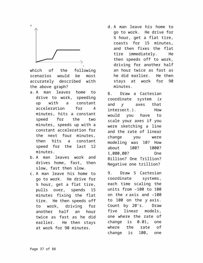
Problem One
Source: According to the Source book of Criminal Justice Statistics Online: The number of people who die each year in motor vehicle accidents in this country is given in the table below.Year Fatalities1990 44,599 1991 41,508 1992 39,250 1993 40,150 1994 40,716 1995 41,817 1996 42,065 1997 42,013 1998 41,501 1999 41,717 2000 41,945 2001 42,196 2002 42,815
a) Sketch a scatter plot for the data presented in the data.b) Find the actual change in fatalities for the years 1990 to 2002 and interpret.c) Use the data to find the average rate of change for the years 1990 to 2002 and interpret. d) Find the actual change in fatalities for the years 2000 to 2002 and interpret.e) Use the data to find the average rate of change for the years 2000 to 2002 and interpret f) Find the actual change in fatalities for the years 2001 to 2002 and interpret.g) Use this information you found to find the predicted number of traffic fatalities for the year 2005 and interpret.h) Interpret the data. When were the number of traffic fatalities increasing most rapidly? Least rapidly? When were the number of traffic fatalities decreasing most rapidly? Least rapidly?
Solution
Page 37 of 58

a)
b) The actual change from 1990 to 2002 was 42,815 – 44,599 = - 1784. This means that there were 1,784 less people who died in traffic accidents in 2002 compared to 1990.c) The average rate of change from 1990 to 2002 was (42,815 – 44,599)/12 = - 1784/12 = 148 2/3. This means that if there was a yearly trend to the loss of lives in the US from traffic accidents between 1990 to 2002, an average of 148 (or 149) less people were killed in traffic accidents from one year to the next during these years. d) The actual change from 2000 to 2002 was 42,815 – 41,945 = 870. This means that there were 870 more people who died in traffic accidents in 2002 compared to 2000.e) The average rate of change from 2000 to 2002 was (42,815 – 41,945)/2 = 870/2 = 435. This means that if there was a yearly trend to the loss of lives in the US from traffic accidents between 2000 to 2002, an average of 435 more people were killed in traffic accidents from one year to the next during those two years. f) The actual change from 2001 to 2002 was 42,815 – 42,196 = 619. This means that there were 619 more people who died in traffic accidents in 2002 compared to 2001.g) If we use the most recent data and the shortest time interval, we will assume there are 619 more people who will die each year in traffic accidents from 2002 to 2005. So, in 2002, there were 42,8145 people who died in traffic accidents in the U.S. So, 42,815 + 3(619) = 44,672 people. This means we means that if the current trend continues, if nothing is done to make the roads safer, there will be a predicted 44,672 people who will die in traffic accidents in 2005.h) First we notice the overall trend from the scatter plot. There appears to be a high in the number of fatalities recorded for year 1990, then the number of fatalities appeared to drop in the early 90’s and then slowly rise there after. More specifically, we create a table, showing a third column, the number of more (or less) traffic fatalities in a given
year compared to the previous year.
We can quickly see that the largest decrease in traffic fatalities in a given year compared to the previous year was in 1991. The smallest decrease was in traffic fatalities in a given year compared to the previous year was in 1997. Similarly, the largest increase occurred in 1995, the smallest increase occurred in 2000.
Page 38 of 58
Year Fatalities Difference 1990 44,599 1991 41,508 -30911992 39,250 -22581993 40,150 9001994 40,716 5661995 41,817 11011996 42,065 2481997 42,013 -521998 41,501 -5121999 41,717 2162000 41,945 2282001 42,196 2512002 42,815 619

The concept touched upon in part (h) previews a concept termed by mathematicians as a change of concavity. Here, we simply give you a brief preview of the notion of increasing at various rates, a concept we will later define in terms of concavity. In the next section, we will define what it means to increase the fastest and to increase the slowest.
Page 39 of 58

Exercise Set
For problems 1 – 5, use the table for the State of California’s Average Weekly Retail Gasoline Prices, per gallon, in 2004. Calculate the average rate of change in the price of a gallon of regular for the indicated dates. Write your answer in a complete sentence. For example, you would write “The price for a gallon of regular gas prices in the state of California increased at an average rate of 0.005 dollars per gallon per day from the 4th to the 19th day of June.”1. from June 21st to July 12th 2. from June 28th to July 12th 3. from July 5th to July 12th 4. what is the best approximation for the Local Rate of Change for a gallon of regular gas on July 12th
5. predict the price of a gallon of regular gas for July 19th based on the Locals Rate of Change from problem 4 and compare your answer to the true price of a gallon of gas on July 19th from the table.
6. Use the table for the State of California’s Average Weekly Retail Gasoline Prices, per gallon, in 2004. Calculate the average rate of change in the price of a gallon of regular from January 1st, 2004 to September 20th , 2004. Would this average rate of change be a good or bad predictor of the price of gas for September 27th, 2004?
7. Which of the following expressions correctly calculates the average rate of change in the company’s profit, in million’s, from the sale of 1,040 items to 2,005 items?
a) b)
c) d)
e)
8. According to the CIA World Factbook, theUnemployment Rate (%) in United States was 4.2 in 1999, 4.0 in 2000, 5.8 in 2002 and 6.2 in 2003. Which of the following correctly interpretation of this data. a) The Unemployment Rate dropped at an average rate of 0.5 (%) per year from 1999 to 2003. b) The Unemployment Rate increased at an average rate of 0.5 (%) per year from 1999 to 2003. c) The Unemployment Rate increased at an average rate of 2 (%) per year from 1999 to 2003. d) The Unemployment Rate increased at 2 (%) per year from 1999 to 2003. e) The Unemployment Rate dropped at 2 (%) per year from 1999 to 2003. 9. According to the CIA World Factbook, in the United States, there were 20,000 HIV/AIDS deaths in 1999 and 15,000 in 2001. Interpret this statement in terms of a) average rate of change b) actual change.
10. According to the CIA World Factbook, in the United States, there were 850,000 people living with HIV/AIDS in 1999. The number grew to 900,000 in 2001. Interpret this statement in terms of a) average rate of change b) actual change.
Page 40 of 58
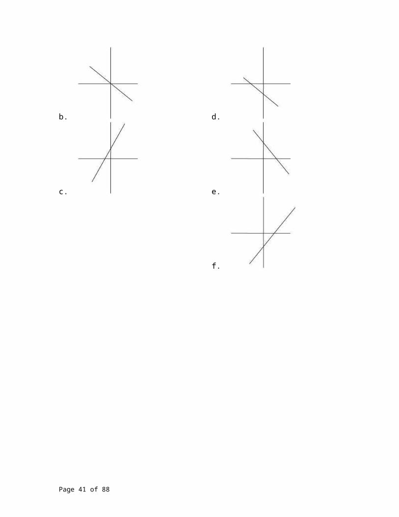
For problems 11 to 14, use the data: According to the CIA World Factbook, the Life Expectancy in the United States, at birth, in 2000 was 77.12 years, in 2001, was 77.26 years, in 2002 was 77.4 years, in 2003 was 77.14 years and in 2004 was 77.43 years. 11. Find the average rate of change of life expectancy from 2000 to 2004.12. Find the actual change of life expectancy from 2000 to 2004.13. Find the average rate of change of life expectancy from 2002 to 2003.14. Find the actual change of life expectancy from 2002 to 2003.
For problems 15 to 18, use the following information: They say people are smoking less these days. We hope so. Cigarette smoking is a major cause of cancers of the lungs, and other organs, such as the esophagus, larynx and oral cavity. It contributes to development of cancers of the pancreas, kidney and the bladder. Lung cancer risk increases steadily with the number of cigarettes smoked per day, case in point, those who smoke 2 or more packs a day have nearly 20 times the risk of developing cancer as nonsmokers. Below is estimated data for the percent of 8th graders in the United States who regularly smoke cigarettes. SOURCE: Johnston, L.D., O'Malley, P.M., and Bachman, J.G. (2003). Monitoring the Future national survey results on drug use, 1975-2002 Volume I: Secondary School Students (NIH Publication No. 03-5375). Bethesda, MD: National Institute on Drug Abuse Tables 2-2 and 5-3. Data for 2003 are from a press release of December 19, 2003, and demographic disaggregations are from unpublished tabulations from
Monitoring the Future, University of Michigan. The respondents were considered regular smokers if they reported smoking cigarettes daily in the previous 30 days of when the poll was taken, by selected years 1992-2003
1992 – 7.0 1993 – 8.3 1994 – 8.8 1995 – 9.3 1996 - 10.4 1997 – 9.0 1998 - 8.8 1999 – 8.1 2000 – 7.4 2001 - 5.5 2002 - 5.1 2003 - 4.5
15. Find the actual change for the percent of 8th graders who smoke regularly from 1992 to 2003 and interpret. 16. Find the average rate of change for the percent of 8th graders who smoke regularly from 1992 to 2003. Use this rate of change to predict the percent of 8th graders who would smoke in 2005 and interpret. 17. Find the average rate of change for the percent of 8th graders who smoke regularly from 2002 to 2003. Use this “short term” rate of change predict the percent of 8th graders who would smoke in 2005 and interpret. 18. Interpret the data. When were the percent of 8th graders in the United States who regularly smoke cigarettes increasing most rapidly? Least rapidly? When were the number of percent of 8th graders in the United States who regularly smoke cigarettes decreasing most rapidly? Least rapidly?
For problems 19 to 22, use the following information: Now, let’s re-ask the same question as we asked in the problem set above for the older teenagers, in other words, let’s see if the 12th graders smoking less too. Below is estimated data for the percent of 12th graders in the United States who regularly smoke cigarettes. SOURCE: Johnston, L.D., O'Malley, P.M., and Bachman, J.G. (2003). Monitoring the Future national survey results on drug use, 1975-2002 Volume I: Secondary School Students (NIH Publication No. 03-5375). Bethesda, MD: National Institute on Drug Abuse Tables 2-2 and 5-3. Data for 2003 are from a press release of December 19, 2003, and demographic disaggregations are from unpublished tabulations from Monitoring the Future, University of
Michigan. The respondents were considered
Page 41 of 58

regular smokers if they reported smoking cigarettes daily in the previous 30 days of when the poll was taken, by selected years 1992-20031992 – 17.2 1993 – 19.0 1994 – 19.4 1995 – 21.6 1996 – 22.2 1997 - 24.6 1998 – 22.4 1999 – 23.1 2000 – 20.6 2001 – 19.0 2002 – 16.9 2003 – 15.8
19. Find the actual change for the percent of 12th graders who smoke regularly from 1992 to 2003 and interpret. 20. Find the average rate of change for the percent of 12th graders who smoke regularly from 1992 to 2003. Use this rate of change to predict the percent of 8th graders who would smoke in 2005 and interpret. 21. Find the average rate of change for the percent of 12th graders who smoke regularly from 2002 to 2003. Use this “short term” rate of change predict the percent of 12th graders who would smoke in 2005 and interpret. 22. Interpret the data. When were the percent of 12th graders in the United States who regularly smoke cigarettes increasing most rapidly? Least rapidly? When were the number of percent of 12th
graders in the United States who regularly smoke cigarettes decreasing most rapidly? Least rapidly?
For problems 23 to 30, use the following data. Source: According to the Source book of Criminal
Justice Statistics Online: the total fatalities in alcohol related motor vehicle crashes per year in the United States.
Year alcohol related1990 22,587 1991 20,159 1992 18,290 1993 17,908 1994 17,308 1995 17,732 1996 17,749 1997 16,711 1998 16,673 1999 16,572 2000 17,380 2001 17,400 2002 17,419 23. Sketch a scatter plot for the data presented in the data.24. Find the actual change in alcohol related traffic fatalities for the years 1990 to 2002 and interpret.25. Use the data to find the average rate of change in alcohol related traffic fatalities for the years 1990 to 2002 and interpret. 26. Find the actual change alcohol in related traffic fatalities for the years 2000 to 2002 and interpret and interpret.27. Use the data to find the average rate of change in alcohol related traffic fatalities for the years 2000 to 2002 and interpret.28. Find the actual change in alcohol related traffic fatalities for the years 2001 to 2002 and interpret.29. Use this information you found to find the predicted number of alcohol related traffic fatalities for the year 2005 and interpret.30. Interpret the data. When were the number of alcohol related traffic fatalities increasing most rapidly? Least rapidly? When were the number of alcohol related traffic fatalities decreasing most rapidly? Least rapidly?
World Population and Sustainability
Page 42 of 58

And now we have come full circle in our conversation of growth rates and rates of change, back to population. The world population is growing exponentially. Below is a table showing the world’s population for a century, from 1950 to 2000 and projected until 2050. As we did earlier in the chapter, we can project the world’s population from 2010 onward using an growth rate with the common ratio or base of 1.01 (or more precisely, 1.013).
YearMid-Year Population
1950 2,555,360,9721960 3,039,669,3301970 3,708,067,1051980 4,454,389,5191990 5,284,679,1231990 5,284,679,1232000 6,085,478,7782010 6,812,248,2832020 7,510,699,9582030 8,111,883,7662040 8,623,136,5432050 9,050,494,208
If we graph the world’s population over this same 100 year span, we have a nice exponential model.
Obviously the earth cannot continue to endure population growth at the current rate without it letting up. How many people can our fragile planet support? Ecologists have often made use of the concept of carrying capacity in tackling the stress and strain that populations put on the environment. Carrying capacity is simply the largest number of any given species that a habitat can support indefinitely.
There are many factors that influence carrying capacity of the earth. Ecologists look at net primary productivity (NPP), which measure the amount of solar energy converted into other forms of energy by plant photosynthesis minus the energy needed by those
Page 43 of 58

plants. They say it serves as a representation of the total food resource on earth. By deforestation and destruction of vegetation, humans have destroyed about 12% of the terrestrial NPP, and now use an additional 27%.
Though estimates vary, all our efforts have already resulted in the erosion of 40-50 % of the Earth's land surface through agriculture and urbanization, we use more than half of the accessible fresh water and 8% of the ocean’s productivity, we have increased atmospheric CO2 concentration by 30% and we are responsible for the extinction of about 20% of bird species in the past 200 years as well as overexploited about 22% of marine fisheries.
Many ecologist and global organizations estimate the world’s population will rise to somewhere between 9 and 12 billion people by 2050 and then stabilize. But, this notion itself carries many problems. The prediction would make sense if the remainder of life on earth remained stable. But, in order to sustain a human population of 6 billion, it is estimated we are currently losing roughly 70,000 species a year. One could argue that we are in a era of mass extinction with the human population chiefly responsible. Common sense should prevail; a human population of just 6 billion is not even sustainable because the world’s wildlife cannot indefinitely sustain a loss of 70,000 species a year. And as our population increases, won’t the number of extinctions? Doesn’t our survival depend on the earth’s survival? Our population might become stable somewhere between 9 and 12 billion, but that does not mean the world’s ecosystem’s would be stable too.
Now, let’s re-examine the world’s population from a historical prospective. Below is a rough estimate of the world’ population from – 8000 BC to 2000 and then projected out until 2050.
YearMid-Year Population
- 8000 BC 5,000,000-2000 BC 27,000,000
1 AD 170,000,0001000 254,000,0001500 425,000,0001900 1,550,000,0002000 6,085,478,7782010 6,812,248,2832020 7,510,699,9582030 8,111,883,7662040 8,623,136,543
2050 9,050,494,208
Roughly speaking, the population of the world took 1,650 years (from Year 0 AD to year 1650 AD) to double from ¼ billion people to ½ billion people. It took only 200 years (from 1650 to 1850) to double again from ½ billion people to 1 billion. It took only 80 years (from 1850 to 1930) to double again from 1 to 2 billion and just 45 years (from 1930 to 1975) to double again from 2 to 4 billion.
Page 44 of 58

The graph to follow shows this phenomenon of growth with striking clarity. If we graph the historical estimates of the world population over a time line that spans – 8000 BC to 2050 AD, we find a glaring demonstration of the sheer power of exponential growth. In short, the graph appears rather steep in recent years. But, for populations, exponential growth is usually only good for ‘short term’ models. Populations cannot grow at an increasing rate forever.
Clearly, the implication of the graph is that population growth is seemingly unlimited and this phenomenon is associated with exponential functions. But, we know the environment is not unlimited in the resources it can provide. As we know, populations in actuality do not increase forever because eventually, a combination of factors will hold down population growth. Usually, this ‘hold’ comes in one of two ways, either the population stabilizes and approaches a natural limit or the population overgrows it environment and then collapses, spiraling toward extinction.
Logistic Curves
Typically, at the beginning, the growth of a population is usually exponential, increasing at an increasing rate, close to an exponential model based on a common ratio. At some point though, we would expect the rate of increase to begin to slow, and the population should plateau. Then the population will probably still increase, but this increase will be at a slower rate. In mathematical terms, the population will grow exponentially at an increasing rate, then continue to grow but at a decreasing rate. The point in time where the rate
Page 45 of 58
of change changes from an increasing rate to a decreasing rate is called the “point of inflection.” At that point, the population stabilizes. The graph itself takes on the appearance of an elongated S. Will this S-shaped model, called a logistic model, occur with our world’s population?
The S-shaped or logistic model differs from the exponential curve in two ways:1. It has an upper limit (asymptote) and this is where population stabilizes. 2. The population increases at an increasing rate at first, but then increases at a decreasing
rate until the stabilizing population is reached.
Population Collapse
Some populations, though, behave more catastrophically. A second possibility is that a population will continue to grow exponentially at an increasing rate, where upon it reaches a critical value. At this time the population cannot survive since it can not sustain itself, so its collapses. Could our world population be destined for such a collapse, and why would the world population possibly do this? Maybe we as humans have wreaked so much havoc on the environment, the global ecosystem can not support our growth. Famine. Lack of water. Lack of quality air. Food sources gone due to extinction. Water supplies saturated or polluted. Deforestation depletes the action of photosynthesis depleting breathable air. Energy supplies over exploited. You pick the reason. But, populations that collapse this way do so because their exponential growth occurs at an shocking rate and as a result, the population collapses. Quickly.
Page 46 of 58

DEER POPULATIONSource: Missouri Department of Conservation: ONLINE: http://www.conservation.state.mo.us/nathis/mammals/deer/populat.htm
The Missouri Department of Conservation approximated the number of deer in thousands for a twenty-two year span for a particular habitat. The table below gives the approximate cumulative deer population in thousands for two-year intervals. We in turn created a third column, with the calculated yearly rate of change for each two-year interval.
,
Note that the deer population increases throughout the twenty-two year span. This is indicated as one glances at the numbers in the second column, they increase steadily. The third column represents how fast the deer population is increasing. These numbers increase until year 12, at
which point the numbers in the third column then begin to decrease. This means, that while the deer population is increasing for all twenty-two years, the rate (how fast) the population increases has changed. The deer population increased at an increasing rate until year 12. At year 12, the rate of increase began to drop, or decrease. The habitat was seeing more deer but at a slower rate of increase. This is how most populations behave naturally, without outside influences greatly enhancing or diminishing their growth. No population will increase at an increasing rate indefinitely.
Page 47 of 58
Year Pop in thousands
Average Yearly Rate
of Change0 102 14 24 20 36 35 7.58 60 12.5
10 90 1512 110 2014 127 8.516 140 6.518 152 620 158 322 162 2

At some point, a population’s growth levels off, stabilizes. This is called the carrying capacity of the population. If the carrying capacity is exceeded, often populations drop drastically. Extinction sometimes follows.
Below is a scatter plot for the table above. The curve you see is called a logistic growth curve or S-shaped curve of growth. Actual populations do follow the basic logistic growth curve below, and so this curve can provide us with valuable guidance in managing populations.
Where the curve is increasing at an increasing rate, we call the curve concave up and where the curve is increasing at a decreasing rate, we call the curve concave down. This change in rate for a curve that is increasing (or decreasing) is called a change in concavity. The point on the graph where this change occurs is called the inflection point.
Let’s re-explore these terms with our deer population. From both the table and the graph above, we see the deer population is always increasing, from Year 0 to Year 22. From the table, we see the average rate of change increase from year 0 to Year 12 and on the graph, we observe the increasing population at an increasing rate (a steeper graph as one reads the graph from left to right). Over these first 12 years, we see the graph is concave up. At Year 12, the behavior of the graph changes. While the population continues to grow after year 12, it grows at a slower rate, on the table we see the average rate of change drop. It is increasing at a decreasing rate from Year 12 to Year 22 and on the graph we see a flattening of the curve for these years. This part of the curve is concave down. The 12th year, where this change occurred is where the point of inflection occurs.
You may ask, what happens after the inflection point. Many options could occur to explain this behavior on the graph. For our deer population, we could speculate that if the deer population in this Missouri habitat were to grow past the inflection point, the habitat would experience heavy grazing. That in turn could destroy the habitat. As a
Page 48 of 58

result, the physical condition of the deer would deteriorate and then a lower reproductive rate could follow. Ultimately, growth rates and deer numbers stabilize at some lower concentration. An associated impact is that when deer numbers exceed the inflection point, the habitat destruction affects other species. And a habitat’s recovery is notoriously slow. Sometimes hunters will make this argument to justify curtailing the deer population.
Many factors other than the scenario above certainly could cause the decreasing rate of change and thus the occurrence of the inflection point on the graph of a deer population. Some species will undergo a natural slowing down of their increasing population, call it Mother’s natures way of handling the growth rate. Still other species experience a slow down of their rate of increasing growth because of external forces. Contributors from pollution to pesticides to over hunting, as well as other forms of human impact can cause such a change. Introduction of new or perhaps just more predators into the habitat or introduction of a new or more species into the habitat that compete for the deer’s food supplies could change the deer population’s rate of growth. Environmental calamities like diseases, draught or famine do not always cause a population to decrease in size, often they simply contribute to the population’s slower growth rate. But, if the deer are lucky, the population will rise into the asymptotic or stabilizing behavior as seen earlier, as opposed to a catastrophic collapse.
Page 49 of 58
Exercise Set
Use this information for problems 1 – 3. Experts in population theory disagree as to what the largest sustainable population could be globally. The experts predictions range as low as 6 billion and as high as 12 billion. Generally, 9 to 10 billion tend to be the most agreed upon maximum sustainable population. 1. If we assume the largest world’s sustainable population to be 9 ½ billion, at the present grow rate, assume a logistic model and predict the global population every five years from 2005 to 2050, roughly the year the population will reach 9 ½ billion. Account for the fact that soon the population’s growth rate will have to increase at a decreasing rate.2. What factors may influence the world’s population if the collapse model takes into effect.3. Predict the world’s population for the year 3000. How do you process this in the light of the sustainability predictions stated above.
For problems 4 to 8, use the table below that was adopted from the NLREG Homepage: Source: NLREG Home Page:
http://www.nlreg.com/aids.htm The table below reveals the number of new cases of AIDS in the United States by year, starting 1981.
YearTotal NumberAids Cases
1981 5001982 7501983 15001984 35001985 70001986 12,5001987 20,5001988 31,5001989 34,0001990 42,000
1991 41,5001992 46,0001993 46,5001994 47,0001995 47,500
4. Create a third column and find the average rates of change for the number of cases of AIDS per year. 5. Sketch a scatter plot for the data. Label the horizontal axis the Year, starting with 1981 and the vertical axis the number of new AIDS cases.6. Find the years where the graph is concave up and write a sentence that pertains to the real world situation describing what is means to be concave up. 7. Find where years where the graph is concave down and write a sentence that pertains to the real world situation describing what is means to be concave down. 8. Approximate which year contains the inflection point. Write a sentence that pertains to the real world situation describing what is happening during this year. Specifically, why do you think the inflection point occurred during that year? What may have contributed in the United States that year that lead the data to change it rate of growth. One last note: By the end of 2003, an estimated 35.7 million adults and 2.1 million children younger than 15 years were living with this HIV/AIDS virus. Approximately two-thirds of these people live in the Sub-Saharan Africa. More than 20 million have died people with HIV/AIDS have died since 1981. Source: http://www.niaid.nih/.gov/factssheets/aidsstat.htm
Page 50 of 58

For problems 9 - 13, used the data from the table below. Source The Otter Project http://www.otterproject.org/atf/cf/{1032ABCB-19F9-4CB6-8364-2F74F73B3013}/PopulationAverage04.gif
California Sea Otter Population The first column gives the number of years since 1999, the second column gives the California Sea Otter’s population. Note: The actual population of the sea otter is given until 2003. The predicted population of the sea otter was made by the authors, based on a logistic model for population growth.
0 21501 21602 21903 22404 23005 25006 26007 26508 26809 2700
10 2705
9. Create a third column and find the average rates of change for the sea otter population. 10. Sketch a scatter plot for the data. Label the horizontal axis the Number of years since 1999 and the vertical axis the number of California Sea Otters. 11. Find the years where graph is concave up and write a sentence that pertains to the real world situation describing what is means to be concave up. 12. Find where years where the graph is concave down and write a sentence that pertains to the real world situation describing what is means to be concave down. 13. Approximate which year contains the inflection point. Write a sentence that pertains to the real world situation describing what is happening during this year.
The table below represents the population every three years for a gander of seagulls that inhabit an island. Year Population
1980 25001983 27001986 31001989 36001992 45001995 55001998 67002001 80002004 9500
14. Decide if the model is logistic or not. If is not, only answer the questions below that would apply.15. Sketch the scatter plot. If it has an inflection point, estimate the year pertaining to the point.16. Find the years where graph is concave up and write a sentence that pertains to the real world situation describing what is means to be concave up. 17. Find where years where the graph is concave down and write a sentence that pertains to the real world situation describing what is means to be concave down. 18. Approximate which year is at the inflection point. Write a sentence that pertains to the real world situation describing what is happening during this year.
The table below represents the population every three years for a gander of seagulls that inhabit an island. Year Population
1980 25001983 24801986 24501989 24101992 23001995 22001998 21502001 2120
Page 51 of 58

2004 210019. Decide if the model is logistic or not. If is not, only answer the questions below that would apply.20. Sketch the scatter plot. If it has an inflection point, estimate the year pertaining to the point.21. Find the years where graph is concave up and write a sentence that pertains to the real world situation describing what is means to be concave up. 22. Find where years where the graph is concave down and write a sentence that pertains to the real world situation describing what is means to be concave down. 23. Approximate which year is at the inflection point. Write a sentence that pertains to the real world situation describing what is happening during this year.
The table below represents the population every three years for a gander of seagulls that inhabit an island. Year Population
1980 25001983 26001986 28001989 35001992 45001995 48001998 49002001 49502004 4955
24. Decide if the data represents a logistic growth pattern. If not, only answer the questions below that would apply.25. Sketch the scatter plot. If it has an inflection point, estimate the year pertaining to the point.26. Find the years where graph is concave up and write a sentence that pertains to the real world situation
describing what is means to be concave up. 27. Find where years where the graph is concave down and write a sentence that pertains to the real world situation describing what is means to be concave down. 28. Approximate which year is at the inflection point. Write a sentence that pertains to the real world situation describing what is happening during this year.
For problems 29 to 34, write TRUE or FALSE, as it pertains. If it is false, correct the statement so that it is true.29. An exponential growth model’s graph never has an inflection point.30. A logistic growth model’s graph always has an inflection point.31. The average yearly rate of change for a population that is growing exponentially is always increasing from year to year.32. If a population grows according to a logistic model, it’s rate of growth will increase until it reaches the inflection point, at then it will decrease. 33. If a population declines according to a logistic model, it’s rate of growth will decrease until it reaches the inflection point, at then it will increase.34. You would prefer your salary to be linear adjustments to grow linearly, not exponentially. 35. Population A increases forever linearly at a constant rate of 1,000,000 new creatures per year and population B increases exponentially at a growth rate of 0.00001 % per year. If the two populations are the same size this year, Population A will always be larger than Population B from next year forward.
36. An economist writes “there is every indication that the world population is
Page 52 of 58

currently following a logistic model.” This economist is looking at the data we provided for you in this text. Argue the economist position, you pick pro or con.
37. Can any population grow exponentially forever? Why or why not?
Page 53 of 58

Concavity
Imagine an unusual shaped bottle as it is being filled with water. The water is being poured into the bottle at a constant rate. Below is a scatter plot representing the height of the bottle in cm versus the time in seconds.
Notice as time goes on, the water level rises, but it does so at a varying rate. From 0 seconds to 4 seconds, it seems that the water level height is increasing at a faster rate. This means the height of the water level from 0 to 4 seconds increases more with each passing second. Each second, the bottle’s increase in height of the water was greater than for the second before.
In other words, from 1 to 2 seconds, the water level height rises 10 cm, from 2 to3 seconds, the water level height rises 15 cm. At 4 seconds, though, this trend changes. Though the water level continues to rise, it does so at a slower rate. For each subsequent second, the water level still rises, but its increase is smaller than it was for the second before. So, from 4 to 5 seconds, it rose 10 cm, from 5 to 6 seconds, it rose just 4 cm.
We do not want you to infer all growth rates are either linear or exponential. In fact, not all growth rates are linear or exponential. We next view the same event from two mathematical perspectives. For this example, we will be filling a container with a steady stream of water. The two parameters we are observing are the increase in height over time and the increase in volume over time. In all cases, we will fill the containers at a constant rate. We will discuss a linear growth rate and see how the effect of this constant rate of change on one parameter will reflect on a non-linear growth rate for another parameter.
If we were to sketch the graph representing the increase in volume with respect to time, this graph represents linear growth. However the parameter of the height of the water level does not necessarily increase at constant rate. What would cause the rate of the water to increase at an increasing rate? Decreasing rate? Steady rate?
Let’s start with a cylinder. Imagine water being poured into the cylinder, like a soda can, at a constant rate. What does filling at a constant rate now mean? This tells us the same amount of water is going into the cylinder every second. The volume increases at a constant rate (Plot 1). Because all cross sections of the cylinder are identical, the rise in water level is also occurring at a constant rate. Therefore, if we were to sketch a graph representing the increase in height over time, this graph would also be linear in nature (Plot 2). Plot 1. Plot 2.
Page 54 of 58
Now let’s change the container to a child’s sand bucket. If you were to chart or measure the increase in volume versus time, this graph is again best described as being linear (Plot 3). When we focus our attention to the height with respect to time graph, this picture will not be linear. As we examine cross sections as we move up the bucket, each cross section is a circle whose radius is increasing. Now each cross section, given a little thickness will require more water to fill. If we were to chart this, this gives us a graph with the characteristic of increasing at a decreasing rate, concave down. Plot 3. Plot 4.
Next, consider a fish bowl. Round in shape, somewhat resembling a sphere. If we fill the fish bowl at a constant rate, the volume will increase at a constant rate. But imagine the rate at which the height of the water is increasing. Starting at the base of the fish bowl and moving up to the half way point, each cross section gets larger and larger, therefore, the height at which the water level is increasing is occurring at a decreasing rate. Once the water level reaches the mid point this characteristic changes. Each consecutive cross section of the fish bowl from the mid level to the top is a smaller circle. The graph representing the changing height over the second half of the filling process would be represented by a curve that is concave up. The rate of change for the height is described as increasing at an increasing rate.
Test yourself. Envision filling an hour glass completely with water. If you are filling this container with water at a constant rate, volume with respect to time will be a linear growth. The graph representing an increase in volume is simply a line. But, what about the graph of the height of the water level over time, can you do this?
Now, let us come full circle. If we are observing a linear growth rate, what is the concavity? When asking about concavity, we are basically asking is the rate of increase increasing or decreasing. Or is the rate of decrease increasing or decreasing? Well, for a
Page 55 of 58

linear growth rate, which is it? A linear growth rate has a constant rate of change, thus it is either increasing or decreasing at the same rate. What would its concavity be? Zero.
Exercise Set
For problems 1 to 7, imagine a unusual shaped bottle filled or drained of water. Below is a scatter plot the plots the height of the bottle in cm versus the time in seconds. For each scatter plot, discuss where the function (in terms of seconds) has a rate of change that is increasing at an increasing rate, a rate of change that is increasing at a decreasing rate of change, a rate of change that is decreasing at an increasing rate and a rate of change that is decreasing at a decreasing rate.
1.
2.
3.
4.
5.
6.
7.
Page 56 of 58

For problems 8 to 10, use the following scenario: a rocky road ice cream cone is filled up. So, imagine a cone and a semi-sphere for shapes. A child is eating it at a constant rate.8. Draw a graph plotting volume versus time. Label it “linear” or “non-linear” 9. Draw a graph plotting height versus time. Label it “linear” or “non-linear” 10. Discuss the change of concavity in a physical sense. Be precise. Where in the scenario is the graph changing concavity.
For problems 11 to 13, use the following scenario: a soda can is filled to the top. So, imagine a cylinder that is filled up. A child sucks soda through a straw at a constant rate and does not stop until the can is empty.11. Draw a graph plotting volume versus time. Label it “linear” or “non-linear” 12. Draw a graph plotting height versus time. Label it “linear” or “non-linear” 13. Discuss the change of concavity in a physical sense. Be precise. Where in the scenario is the graph changing concavity.
For problems 14 to 16, use the following scenario: an upside down pyramid is being filled with sand at a constant rate.14. Draw a graph plotting volume versus time. Label it “linear” or “non-linear” 15. Draw a graph plotting height versus time. Label it “linear” or “non-linear” 16. Discuss the change of concavity in a physical sense. Be precise. Where in the scenario is the graph changing concavity.
For problems 17 to 19, use the following scenario: a right side up pyramid being filled with sand at a constant rate.
17. Draw a graph plotting volume versus time. Label it “linear” or “non-linear” 18. Draw a graph plotting height versus time. Label it “linear” or “non-linear” 19. Discuss the change of concavity in a physical sense. Be precise. Where in the scenario is the graph changing concavity.
For problems 20 to 22, use the following scenario: an hourglass is being filled with sand that is poured at a constant rate.20. Draw a graph plotting volume versus time. Label it “linear” or “non-linear” 21. Draw a graph plotting height versus time. Label it “linear” or “non-linear” 22. Discuss the change of concavity in a physical sense. Be precise. Where in the scenario is the graph changing concavity.
For problems 23 to 25, use the following scenario: a wine glass is being filled with wine at a constant rate.23. Draw a graph plotting volume versus time. Label it “linear” or “non-linear” 24. Draw a graph plotting height versus time. Label it “linear” or “non-linear” 25. Discuss the change of concavity in a physical sense. Be precise. Where in the scenario is the graph changing concavity.
For problems 26 to 28, use the following scenario: a filled wine glass is drank with the aid of a straw at a constant rate.26. Draw a graph plotting volume versus time. Label it “linear” or “non-linear” 27. Draw a graph plotting height versus time. Label it “linear” or “non-linear”
Page 57 of 58
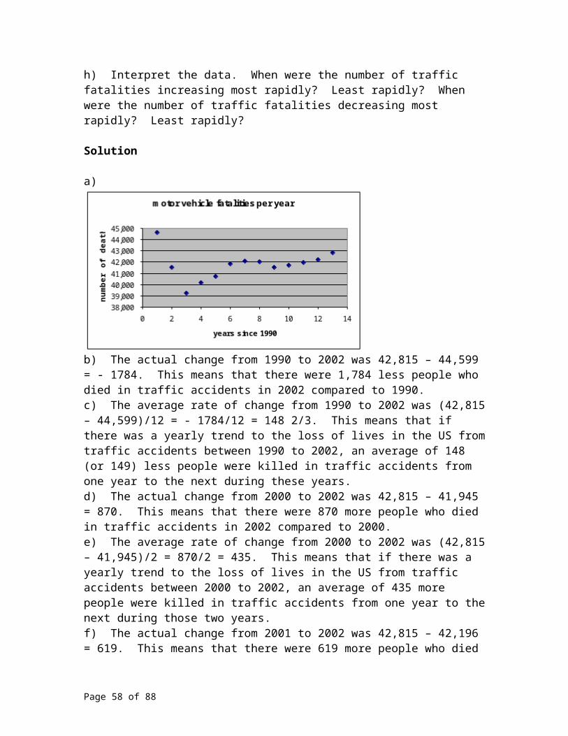
28. Discuss the change of concavity in a physical sense. Be precise. Where in the scenario is the graph changing concavity.
29. Earlier, we looked at the following data. In the United States, the data below gives the number of live births to unmarried women per 1000 woman that are of ages 20-24 years old for the years 1980 to 2000. In 1980, 40.9 out of every 1000 live births were to unmarried women. The number rose to 46.5 in 1985, rose again to 65.1 in 1990, rose to 68.7 in 1995, rose again to 70.7 in 199 9 rose to 72.1 in 2000. Note, the difference in successive five year intervals are not constant. Therefore, we will not be prone to use a linear model. Also notice the number of live births per 1000 woman is increasing through out the 20 year period Sketch a scatter plot of the data and then state reasons why
the logistic curve you see exists. These reasons should explain the perceived ‘glass ceiling’ you see in the scatter plot. These reasons we assume should be societal. SOURCE: Johnston, L.D., O'Malley, P.M., and Bachman, J.G. (2003). Monitoring the Future national survey results on drug use, 1975-2002 Volume I: Secondary School Students (NIH Publication No. 03-5375). Bethesda, MD: National Institute on Drug Abuse Tables 2-2 and 5-3. Data for 2003 are from a press release of December 19, 2003, and demographic disaggregations are from unpublished tabulations from Monitoring the Future, University of Michigan.
For problems 30 to 35, create a table with two columns, one for the dependent variable, one for the independent variable that when plotted, shows the indicated behavior.30. concave up31. concave down32. increasing at an increasing rate33. increasing at a decreasing rate34. decreasing at an increasing rate35. decreasing at a decreasing rate
Media
One last note on the topic of “changing rates of change”. When the newspaper headlines report such tales such as the Congress has cut the defense budget, often this smoke screen in the form of well selected words. The headlines may well just mean the rate at which the defense budget was increasing was cut. In other words, the budget was still increasing, just at a slower rate. Statements such as “the rate of the spread of AIDS is on the decline” or “the rate of growing casualties is now decreasing” need to be understood for what they are; they are statements referring to an increasing phenomena that is now increasing, but at a slower rate. Most situations have fluctuating ratios of change; it is normal for many different populations or parameters to increase at decreasing rates or decrease at an increasing rate.
Page 58 of 58