Embed Size (px)
DESCRIPTION
ITEC 715. Computer Foundations for Instructional Multimedia. Week 4. Recall from Last Week. Elements of Good Screen Design. Bad Screen Design #1. What’s Wrong With This Screen?. Wasted space at top Distracting background image Insufficient contrast between yellow text and white background - PowerPoint PPT Presentation
Citation preview
ITEC 715
Computer Foundations for Instructional Multimedia
Week 4
Elements ofGood Screen Design
Recall from Last Week
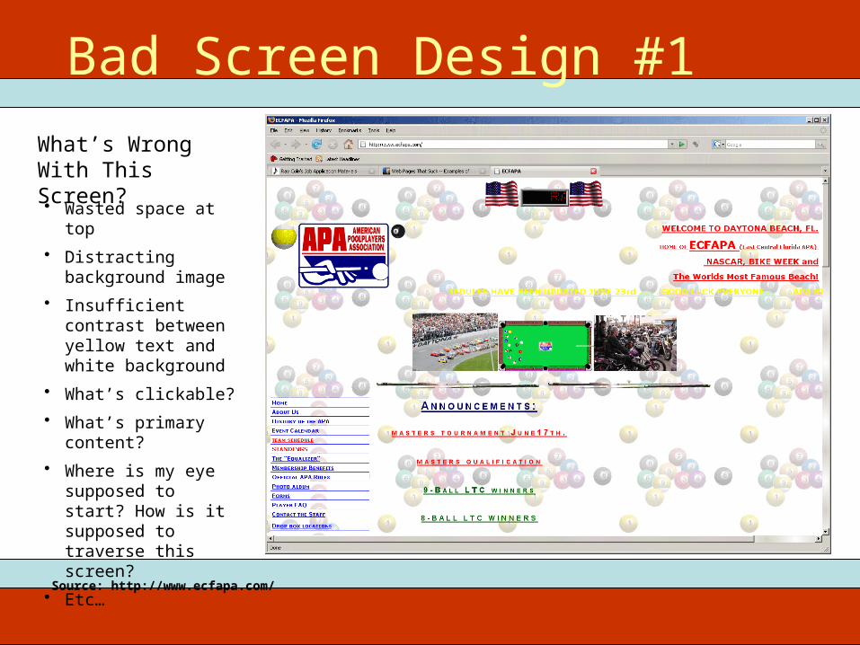
What’s Wrong With This Screen?
Bad Screen Design #1
• Wasted space at top• Distracting
background image• Insufficient contrast
between yellow text and white background
• What’s clickable?• What’s primary
content?• Where is my eye
supposed to start? How is it supposed to traverse this screen?
• Etc…
Source: http://www.ecfapa.com/
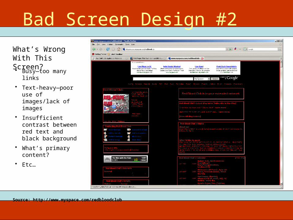
What’s Wrong With This Screen?
Bad Screen Design #2
• Busy—too many links• Text-heavy—poor use
of images/lack of images
• Insufficient contrast between red text and black background
• What’s primary content?
• Etc…
Source: http://www.myspace.com/redbloodclub
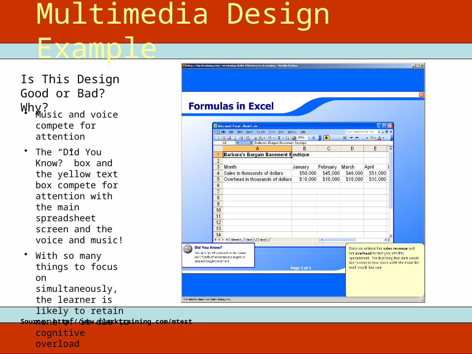
Is This Design Good or Bad? Why?
Multimedia Design Example
• Music and voice compete for attention
• The “Did You Know?” box and the yellow text box compete for attention with the main spreadsheet screen and the voice and music!
• With so many things to focus on simultaneously, the learner is likely to retain none of it due to cognitive overload
Source: http://www.clarktraining.com/mtest
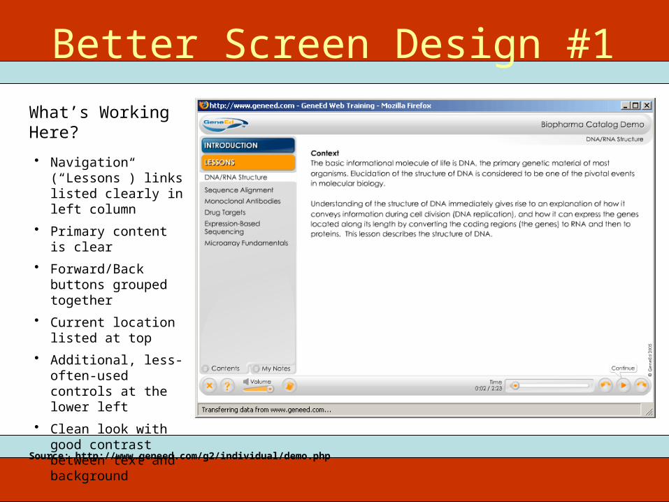
What’s Working Here?
Better Screen Design #1
• Navigation (“Lessons”) links listed clearly in left column
• Primary content is clear
• Forward/Back buttons grouped together
• Current location listed at top
• Additional, less-often-used controls at the lower left
• Clean look with good contrast between text and background
Source: http://www.geneed.com/g2/individual/demo.php
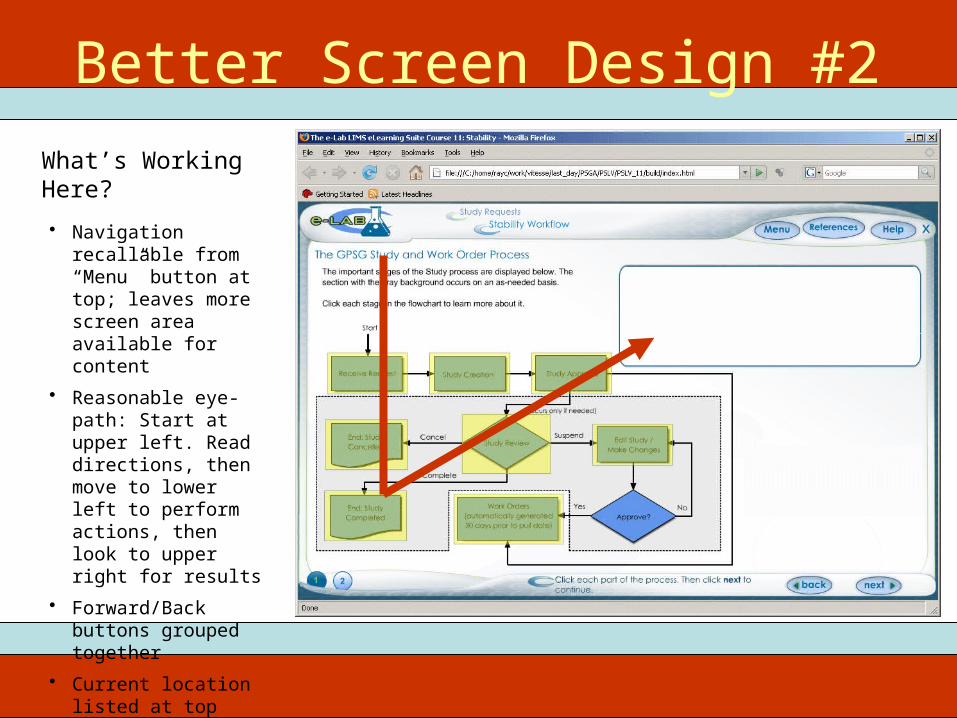
What’s Working Here?
Better Screen Design #2
• Navigation recallable from “Menu” button at top; leaves more screen area available for content
• Reasonable eye-path: Start at upper left. Read directions, then move to lower left to perform actions, then look to upper right for results
• Forward/Back buttons grouped together
• Current location listed at top
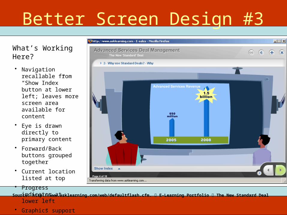
What’s Working Here?
Better Screen Design #3
• Navigation recallable from “Show Index” button at lower left; leaves more screen area available for content
• Eye is drawn directly to primary content
• Forward/Back buttons grouped together
• Current location listed at top
• Progress indicator at lower left
• Graphics support “story” context
Source: http://www.asklearning.com/web/defaultflash.cfm. E-Learning Portfolio The New Standard Deal
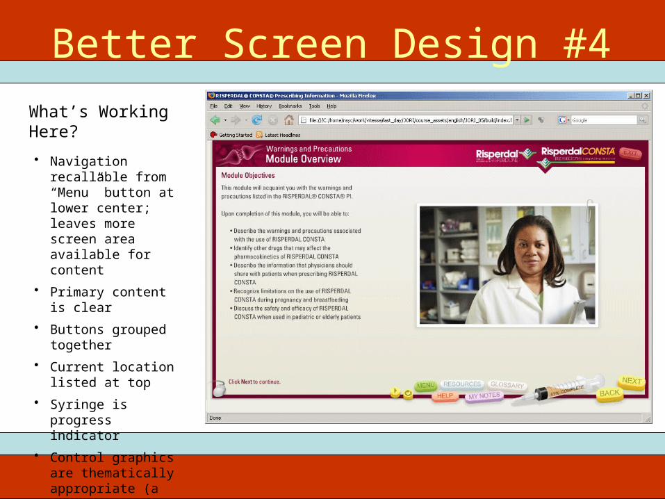
What’s Working Here?
Better Screen Design #4
• Navigation recallable from “Menu” button at lower center; leaves more screen area available for content
• Primary content is clear
• Buttons grouped together
• Current location listed at top
• Syringe is progress indicator
• Control graphics are thematically appropriate (a syringe and pills)
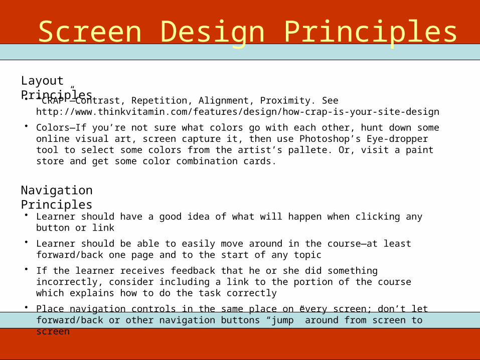
Layout Principles
Screen Design Principles
• “CRAP”—Contrast, Repetition, Alignment, Proximity. See http://www.thinkvitamin.com/features/design/how-crap-is-your-site-design
• Colors—If you’re not sure what colors go with each other, hunt down some online visual art, screen capture it, then use Photoshop’s Eye-dropper tool to select some colors from the artist’s pallete. Or, visit a paint store and get some color combination cards.
Navigation Principles
• Learner should have a good idea of what will happen when clicking any button or link• Learner should be able to easily move around in the course—at least forward/back one page and
to the start of any topic• If the learner receives feedback that he or she did something incorrectly, consider including a link
to the portion of the course which explains how to do the task correctly• Place navigation controls in the same place on every screen; don’t let forward/back or other
navigation buttons “jump” around from screen to screen
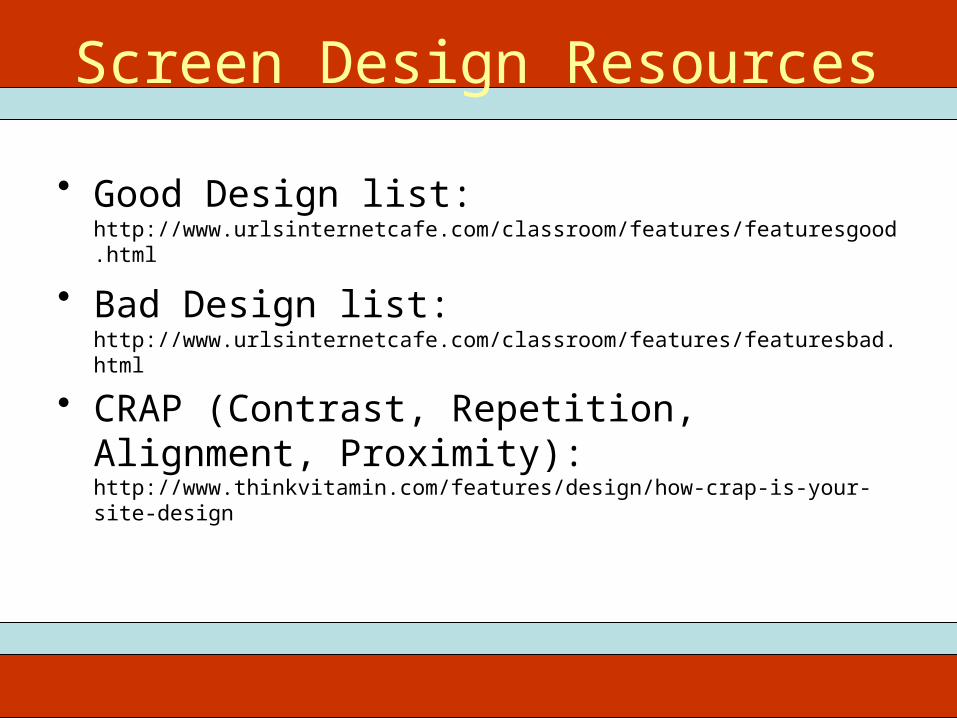
• Good Design list: http://www.urlsinternetcafe.com/classroom/features/featuresgood.html
• Bad Design list: http://www.urlsinternetcafe.com/classroom/features/featuresbad.html
• CRAP (Contrast, Repetition, Alignment, Proximity): http://www.thinkvitamin.com/features/design/how-crap-is-your-site-design
ITEC 715Screen Design Resources
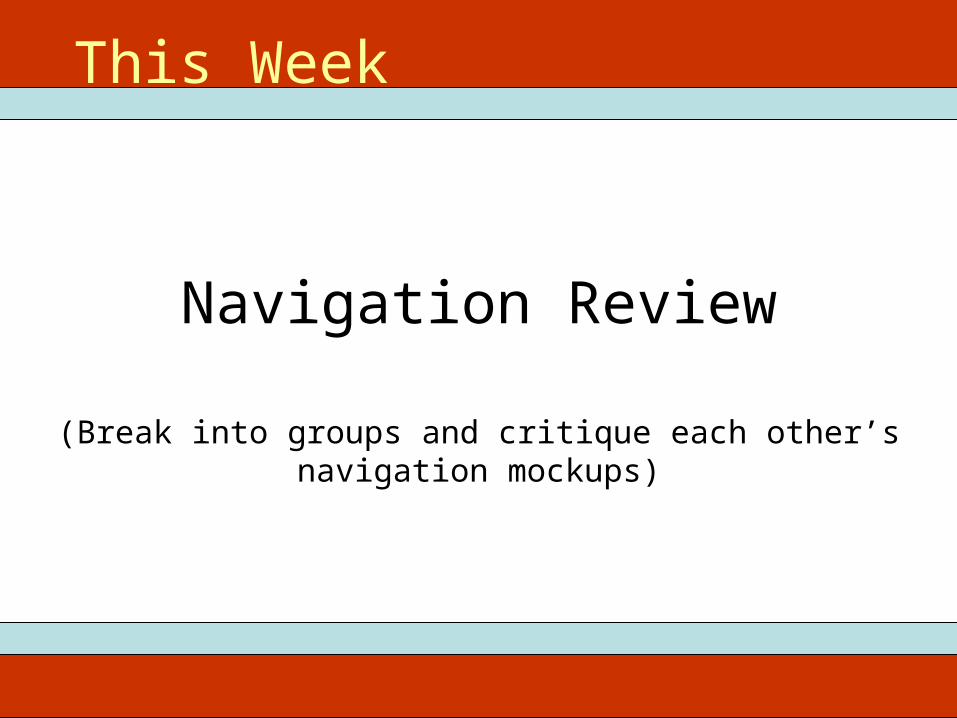
Navigation Review
(Break into groups and critique each other’s navigation mockups)
This Week

Image Sources
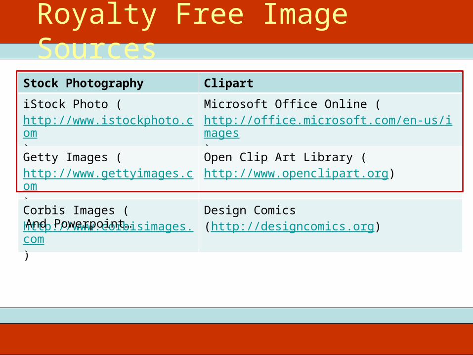
Stock Photography ClipartiStock Photo (http://www.istockphoto.com)
Microsoft Office Online (http://office.microsoft.com/en-us/images)
Getty Images (http://www.gettyimages.com)
Open Clip Art Library (http://www.openclipart.org)
Corbis Images (http://www.corbisimages.com)
Design Comics (http://designcomics.org)
Royalty Free Image Sources
And Powerpoint…
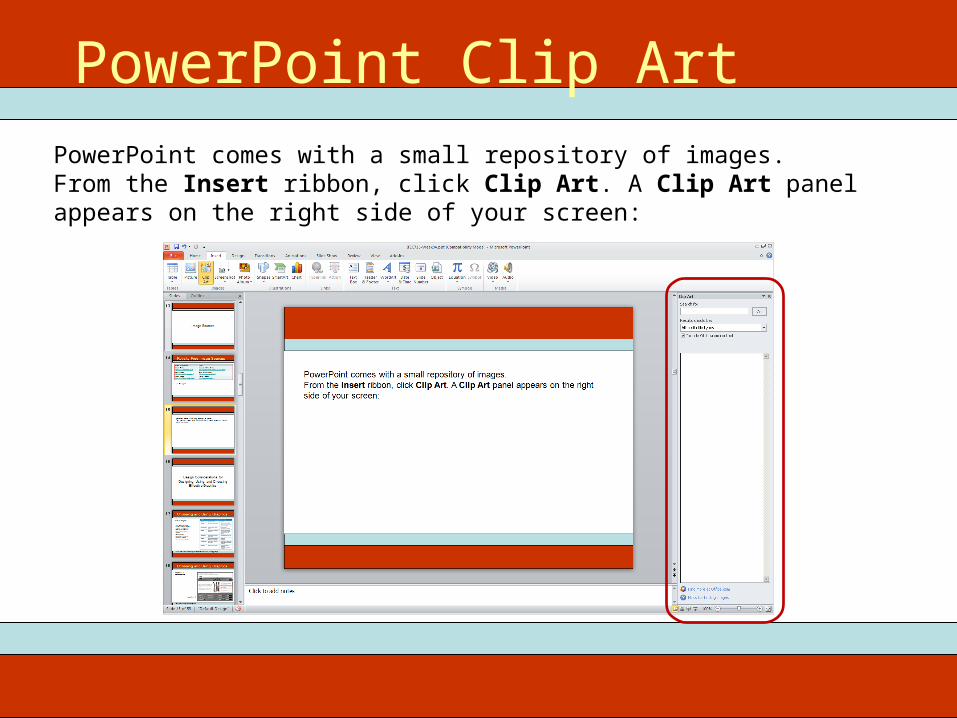
PowerPoint comes with a small repository of images.From the Insert ribbon, click Clip Art. A Clip Art panel appears on the right side of your screen:
PowerPoint Clip Art
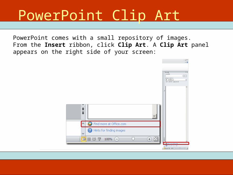
PowerPoint comes with a small repository of images.From the Insert ribbon, click Clip Art. A Clip Art panel appears on the right side of your screen:
PowerPoint Clip Art
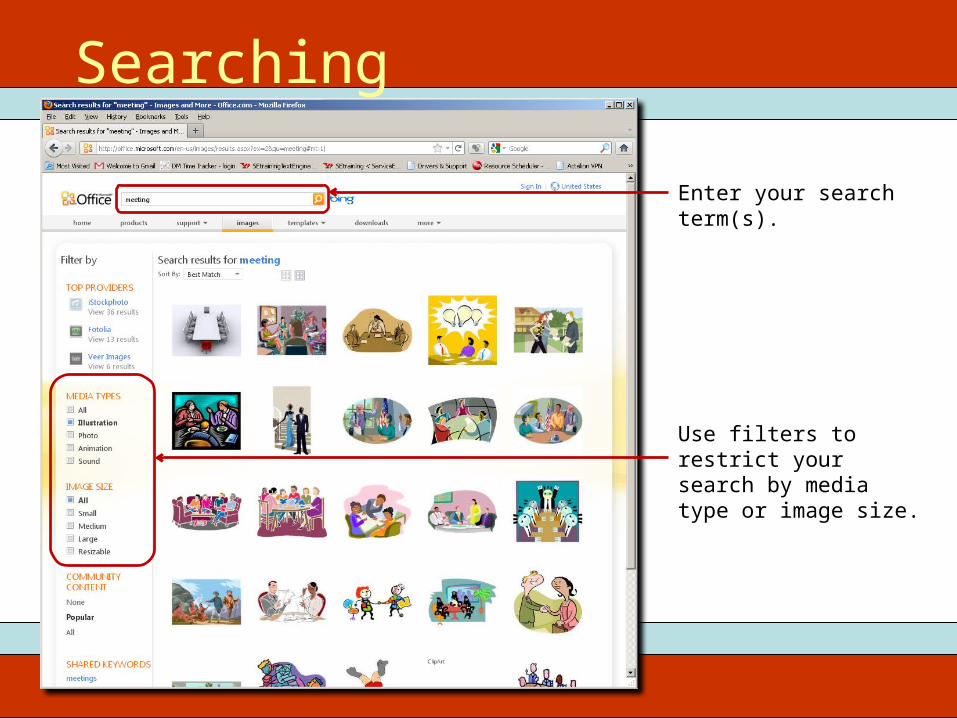
Enter your search term(s).
Use filters to restrict your search by media type or image size.
Searching
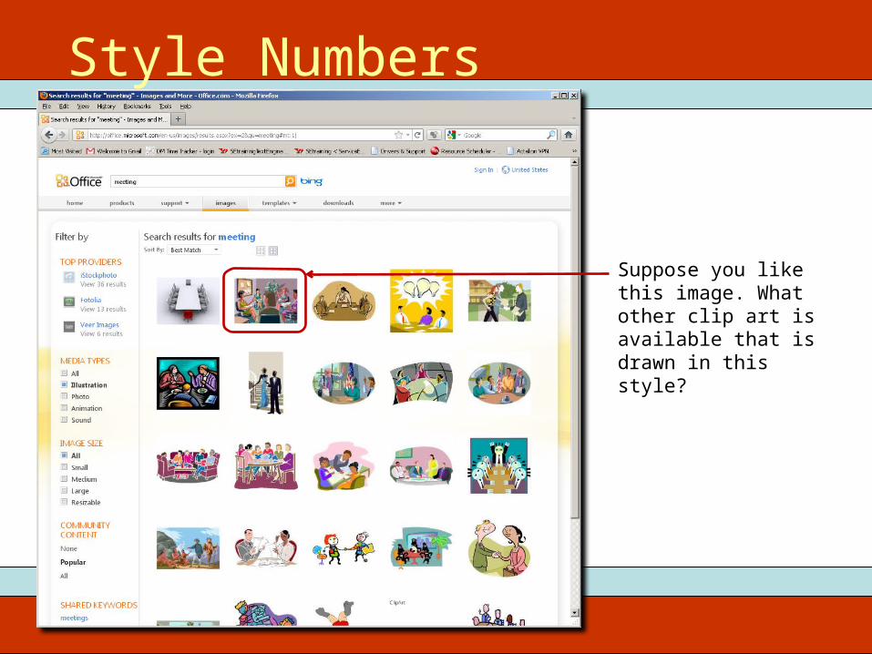
Suppose you like this image. What other clip art is available that is drawn in this style?
Style Numbers
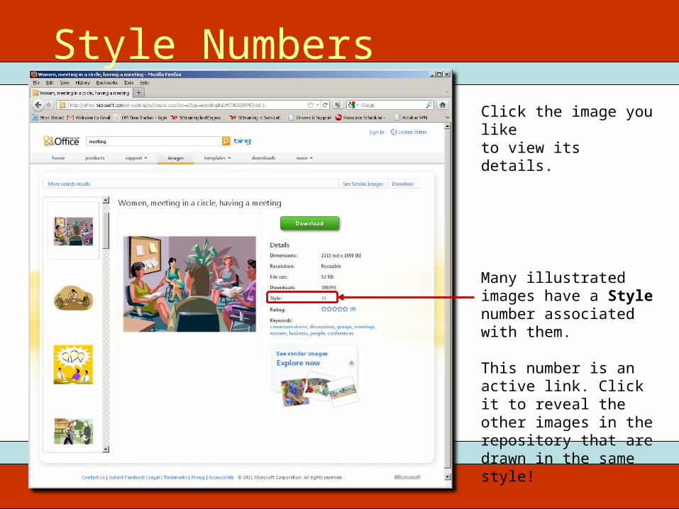
Click the image you like to view its details.
Many illustrated images have a Style number associated with them.
This number is an active link. Click it to reveal the other images in the repository that are drawn in the same style!
Style Numbers
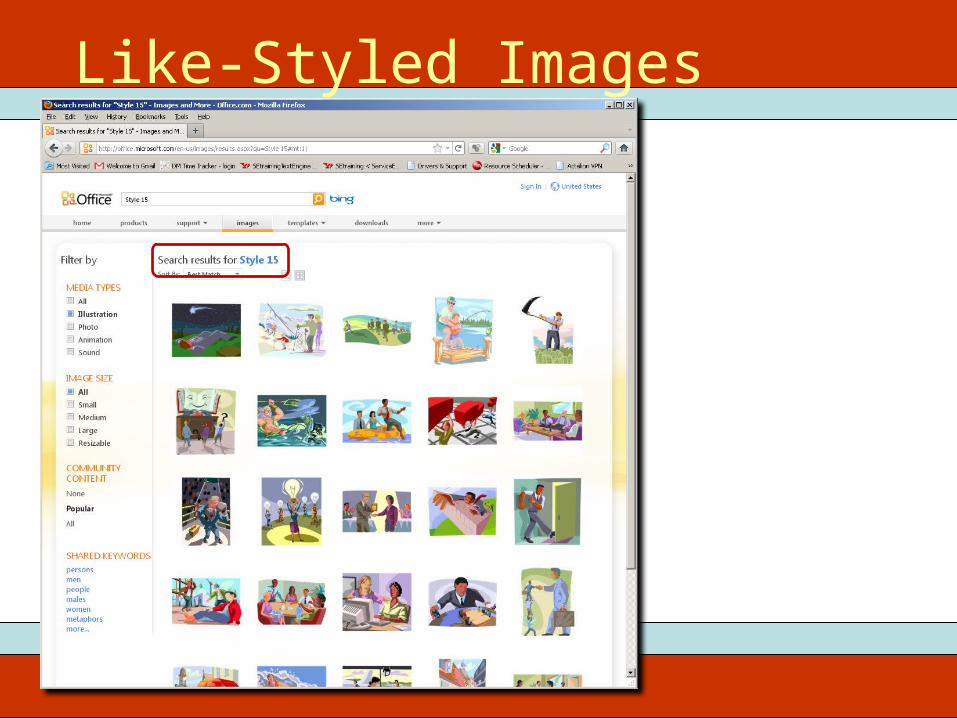
Like-Styled Images
Visual Unity

Hodge-Podge Look w/ PhotosSome images in colorSome images in B&WSome images sharpSome images blurred
VISUAL DISUNITY!
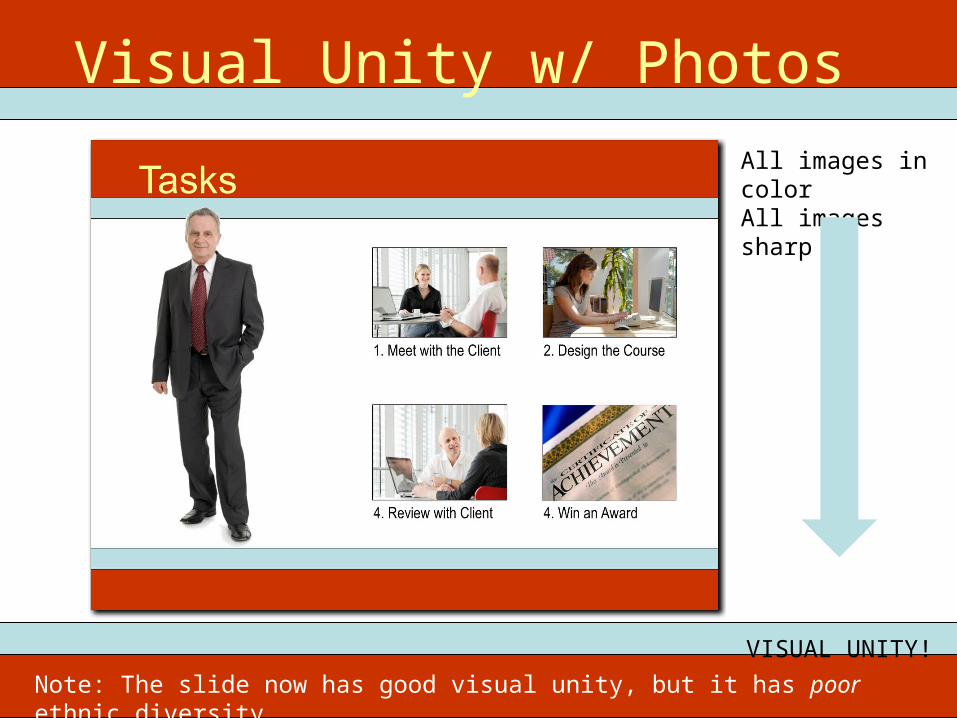
Visual Unity w/ PhotosAll images in colorAll images sharp
VISUAL UNITY!
Note: The slide now has good visual unity, but it has poor ethnic diversity.
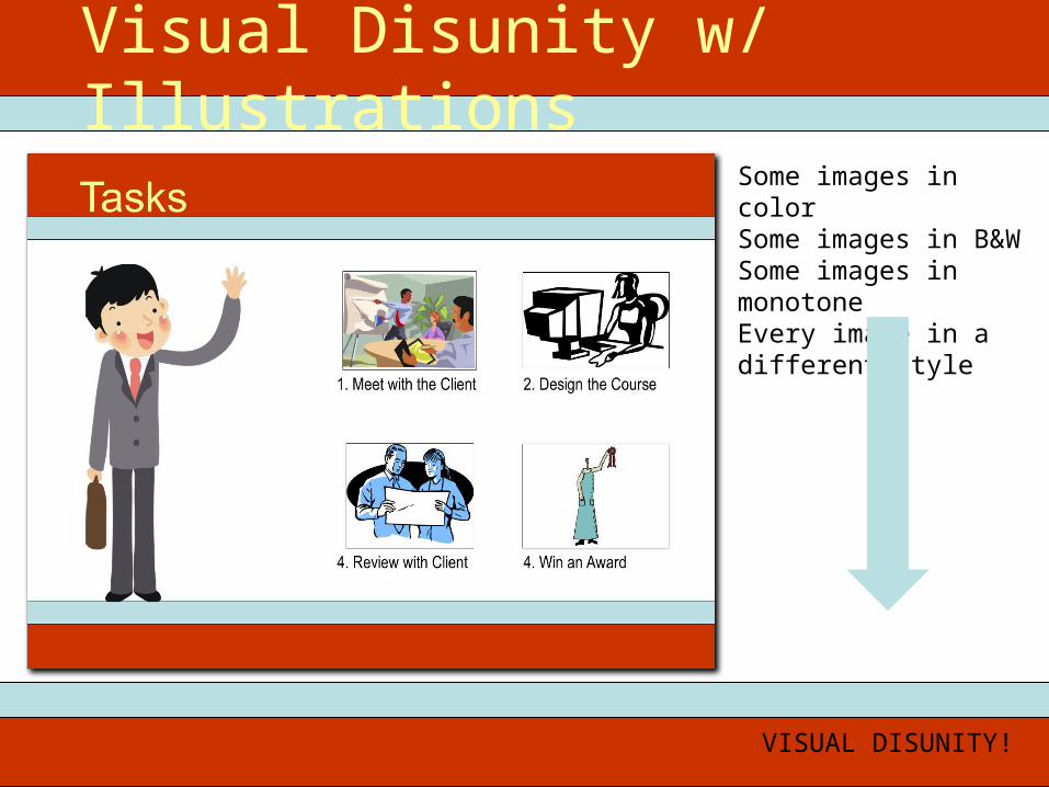
Visual Disunity w/ IllustrationsSome images in colorSome images in B&WSome images in monotoneEvery image in a different style
VISUAL DISUNITY!
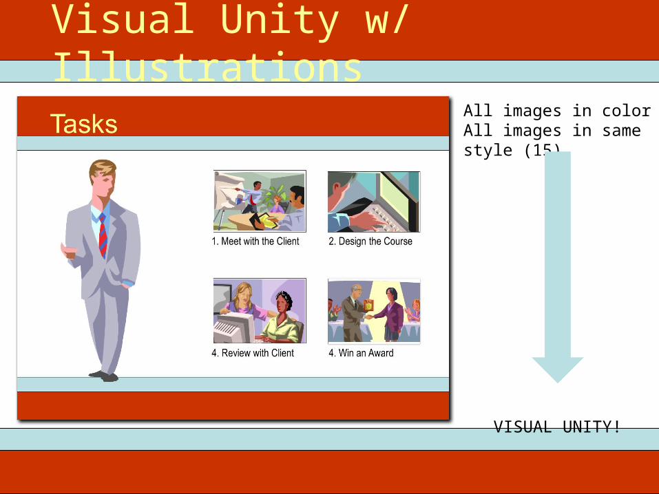
Visual Unity w/ IllustrationsAll images in colorAll images in same style (15)
VISUAL UNITY!
Working with Clip Art Illustrations
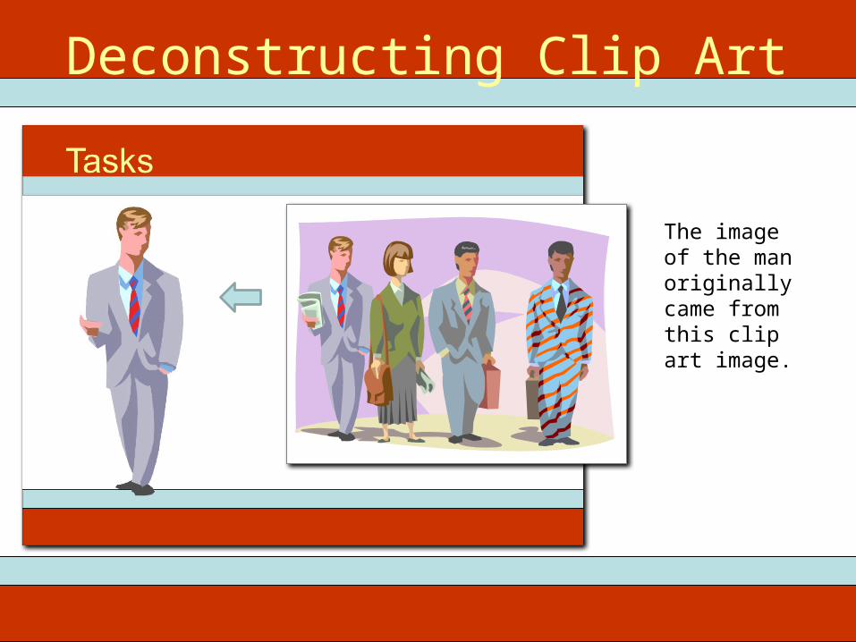
Deconstructing Clip Art
The image of the man originally came from this clip art image.
Deconstructing Clip Art
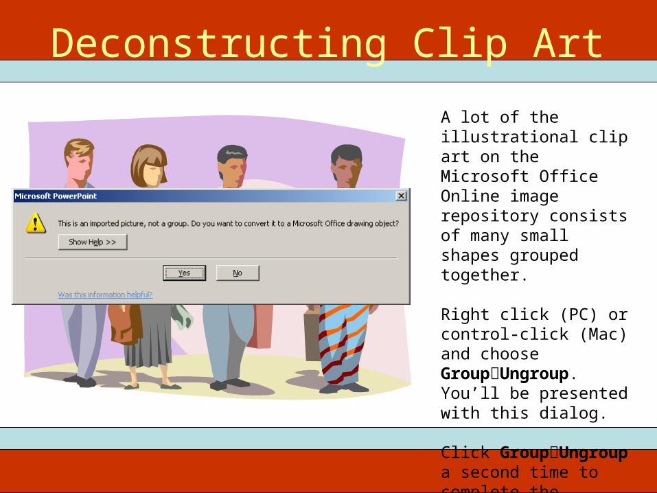
A lot of the illustrational clip art on the Microsoft Office Online image repository consists of many small shapes grouped together.
Right click (PC) or control-click (Mac) and choose GroupUngroup. You’ll be presented with this dialog.
Click GroupUngroup a second time to complete the ungrouping process.
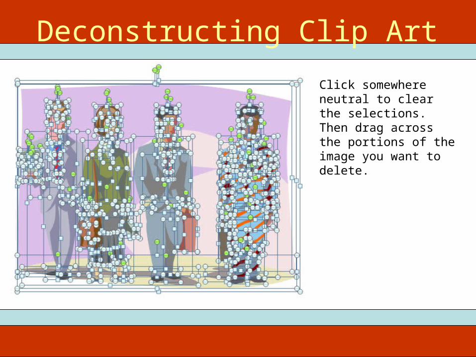
Deconstructing Clip Art
Click somewhere neutral to clear the selections. Then drag across the portions of the image you want to delete.
Deconstructing Clip Art
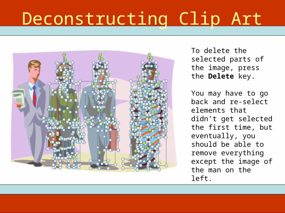
To delete the selected parts of the image, press the Delete key.
You may have to go back and re-select elements that didn’t get selected the first time, but eventually, you should be able to remove everything except the image of the man on the left.
Deconstructing Clip Art
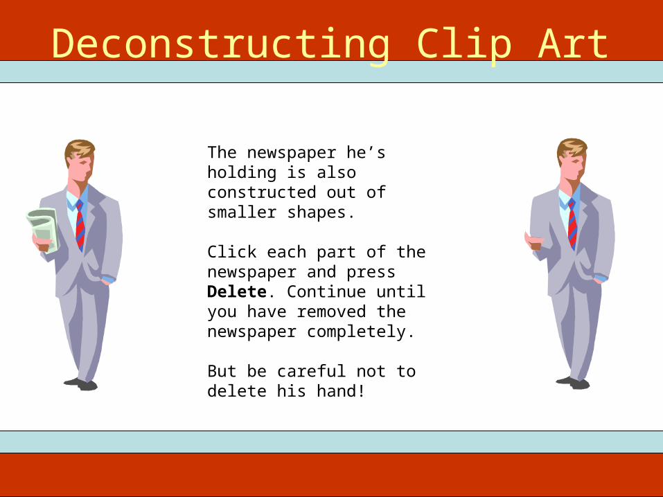
The newspaper he’s holding is also constructed out of smaller shapes.
Click each part of the newspaper and press Delete. Continue until you have removed the newspaper completely.
But be careful not to delete his hand!
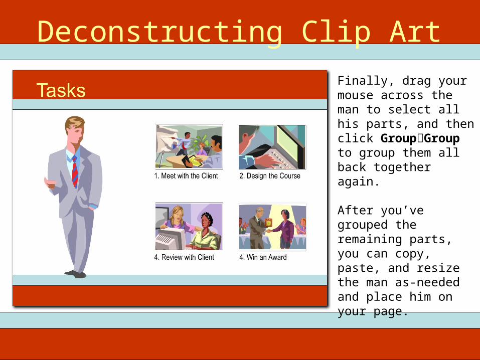
Deconstructing Clip ArtFinally, drag your mouse across the man to select all his parts, and then click GroupGroup to group them all back together again.
After you’ve grouped the remaining parts, you can copy, paste, and resize the man as-needed and place him on your page.
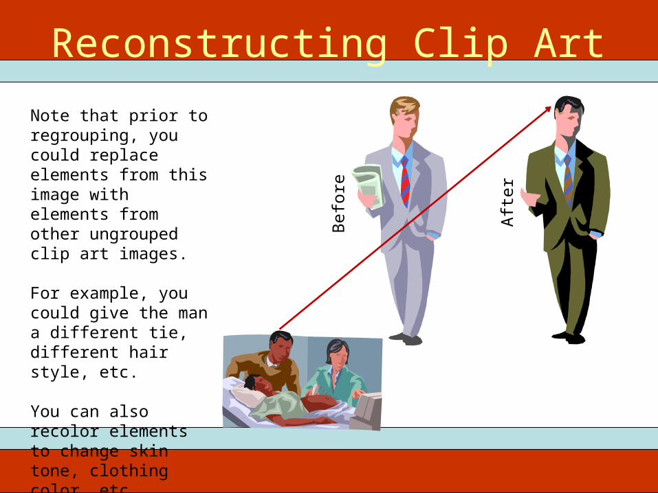
Reconstructing Clip ArtNote that prior to regrouping, you could replace elements from this image with elements from other ungrouped clip art images.
For example, you could give the man a different tie, different hair style, etc.
You can also recolor elements to change skin tone, clothing color, etc.
Bef
ore
Afte
r
Combining Photographs
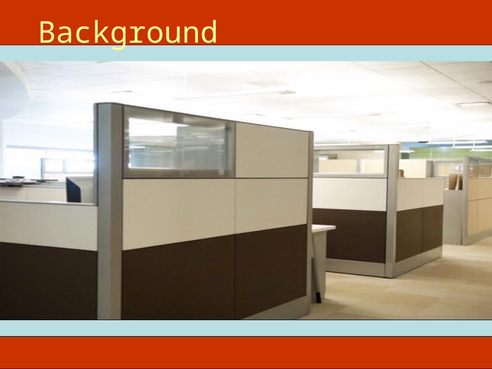
Background

Background + Foreground
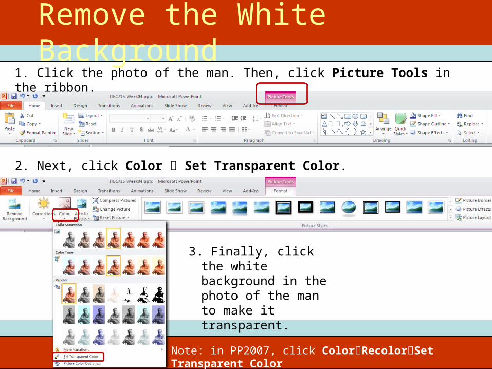
1. Click the photo of the man. Then, click Picture Tools in the ribbon.
2. Next, click Color Set Transparent Color.
3. Finally, click the white background in the photo of the man to make it transparent.
Remove the White Background
Note: in PP2007, click ColorRecolorSet Transparent Color
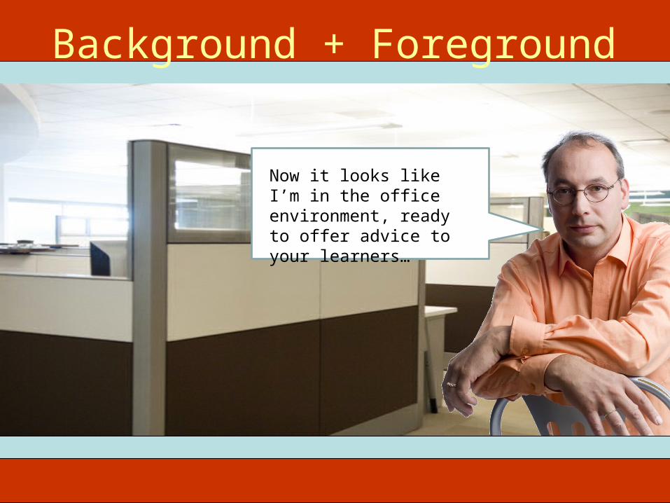
Background + Foreground
Now it looks like I’m in the office environment, ready to offer advice to your learners…
Design Considerations for Designing, Using, and Choosing
Effective Graphics
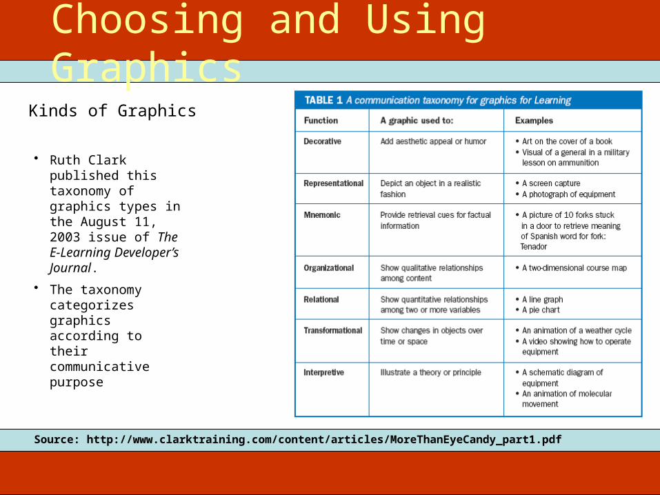
Kinds of Graphics
Choosing and Using Graphics
• Ruth Clark published this taxonomy of graphics types in the August 11, 2003 issue of The E-Learning Developer’s Journal.
• The taxonomy categorizes graphics according to their communicative purpose
Source: http://www.clarktraining.com/content/articles/MoreThanEyeCandy_part1.pdf
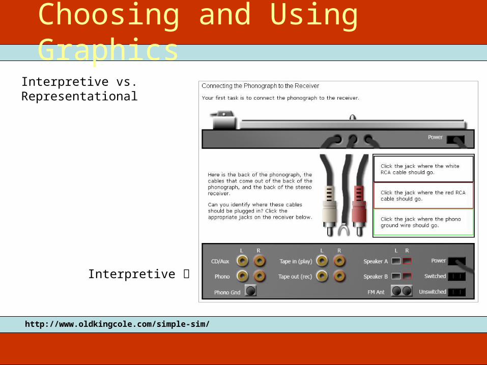
Interpretive vs. Representational
Choosing and Using Graphics
http://www.oldkingcole.com/simple-sim/
Interpretive
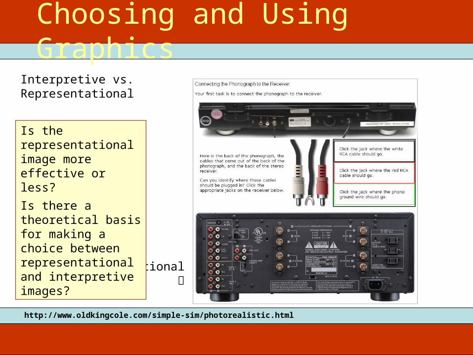
Interpretive vs. Representational
Choosing and Using Graphics
http://www.oldkingcole.com/simple-sim/photorealistic.html
Representational
Is the representational image more effective or less?Is there a theoretical basis for making a choice between representational and interpretive images?
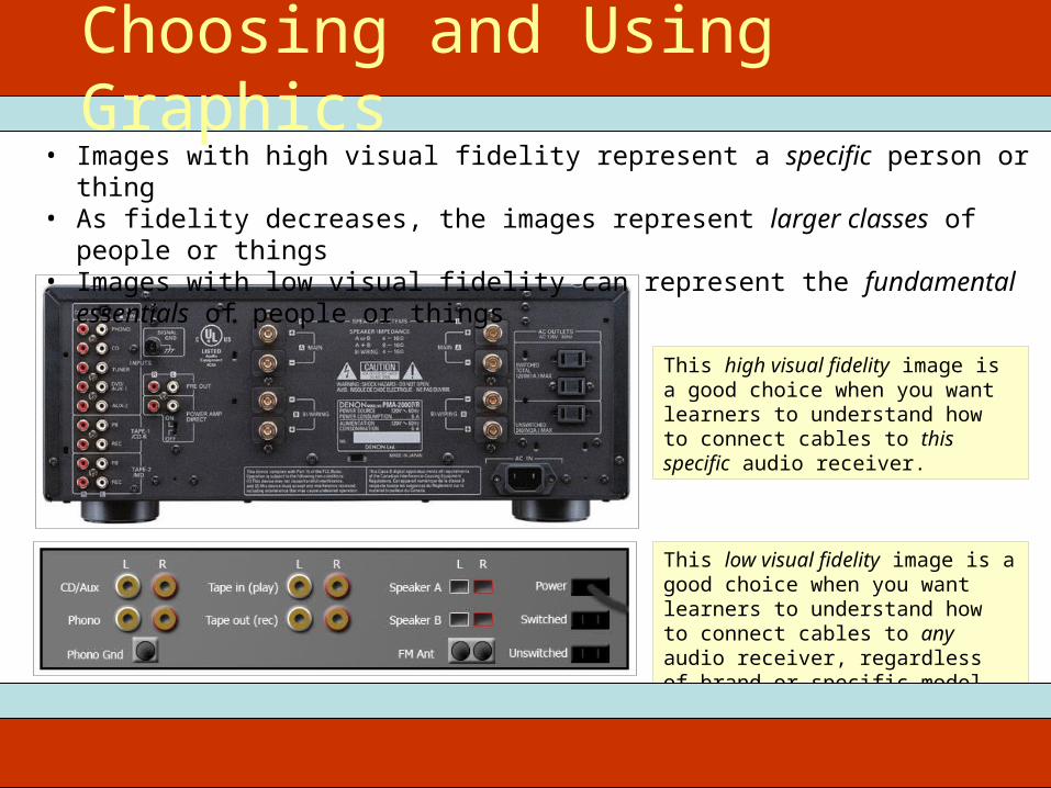
This low visual fidelity image is a good choice when you want learners to understand how to connect cables to any audio receiver, regardless of brand or specific model.
This high visual fidelity image is a good choice when you want learners to understand how to connect cables to this specific audio receiver.
• Images with high visual fidelity represent a specific person or thing• As fidelity decreases, the images represent larger classes of people or things• Images with low visual fidelity can represent the fundamental essentials of people
or things
Choosing and Using Graphics
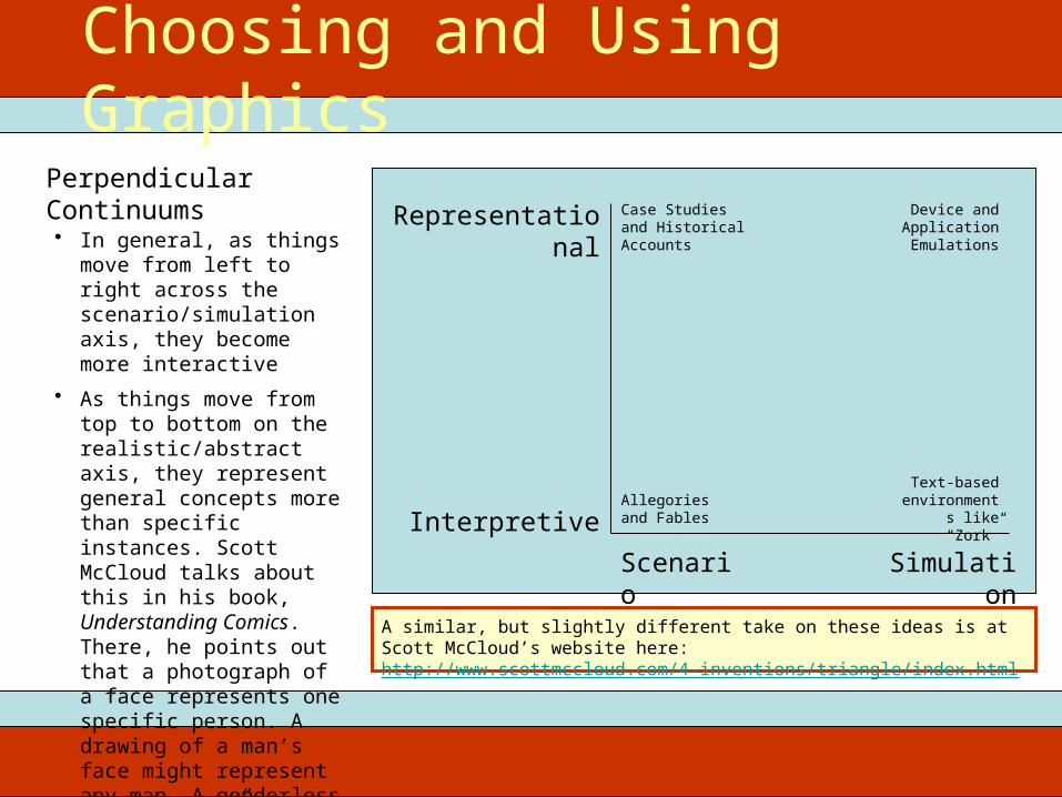
Perpendicular Continuums
Choosing and Using Graphics
• In general, as things move from left to right across the scenario/simulation axis, they become more interactive
• As things move from top to bottom on the realistic/abstract axis, they represent general concepts more than specific instances. Scott McCloud talks about this in his book, Understanding Comics. There, he points out that a photograph of a face represents one specific person. A drawing of a man’s face might represent any man. A genderless “smiley face” can represent any person, and so on
Scenario SimulationInterpretive
Representational Case Studies and Historical Accounts
Device and Application Emulations
Allegories and Fables
Text-based environments
like “Zork”
A similar, but slightly different take on these ideas is at Scott McCloud’s website here: http://www.scottmccloud.com/4-inventions/triangle/index.html
Images of People
Diversity, Attire, Setting, and Abstraction
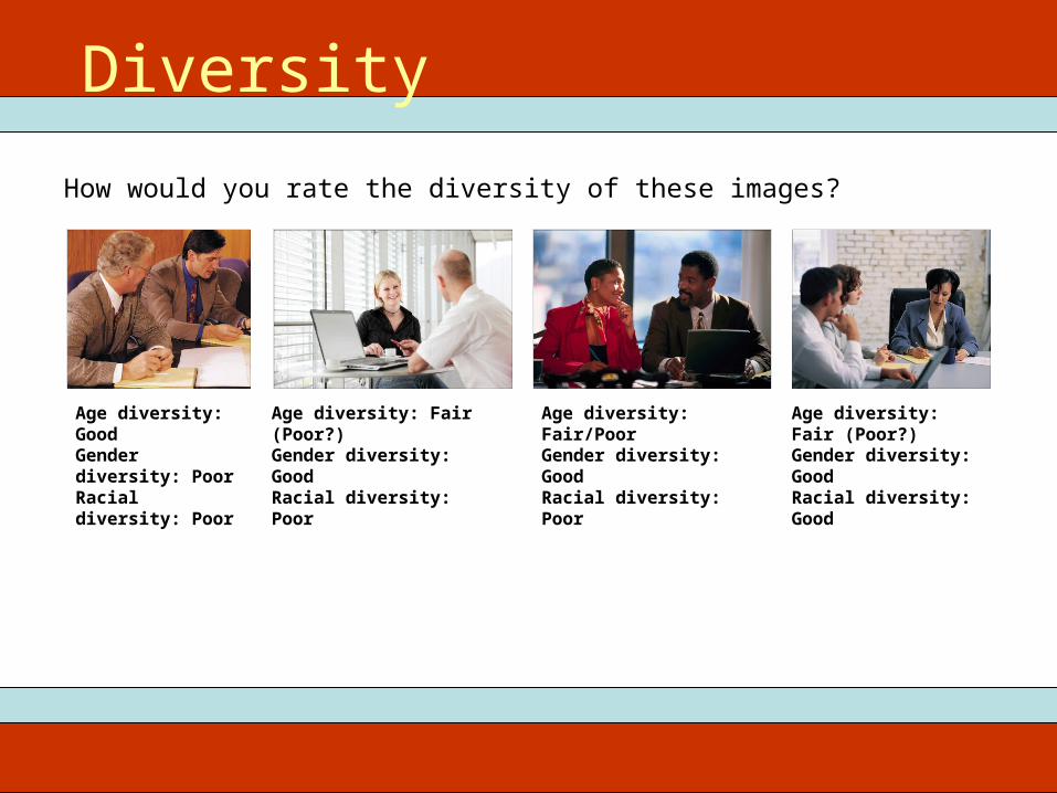
Age diversity: GoodGender diversity: PoorRacial diversity: Poor
Age diversity: Fair (Poor?)Gender diversity: GoodRacial diversity: Poor
Age diversity: Fair/PoorGender diversity: GoodRacial diversity: Poor
Age diversity: Fair (Poor?)Gender diversity: GoodRacial diversity: Good
Diversity
How would you rate the diversity of these images?
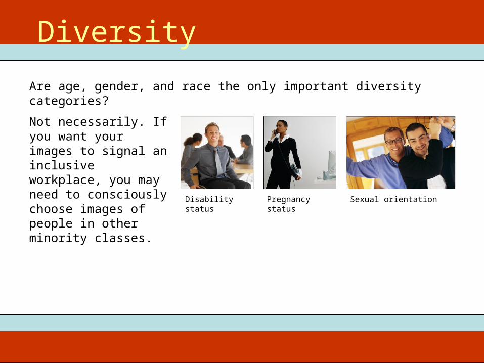
Disability status Pregnancy status Sexual orientation
Not necessarily. If you want your images to signal an inclusive workplace, you may need to consciously choose images of people in other minority classes.
Are age, gender, and race the only important diversity categories?
Diversity
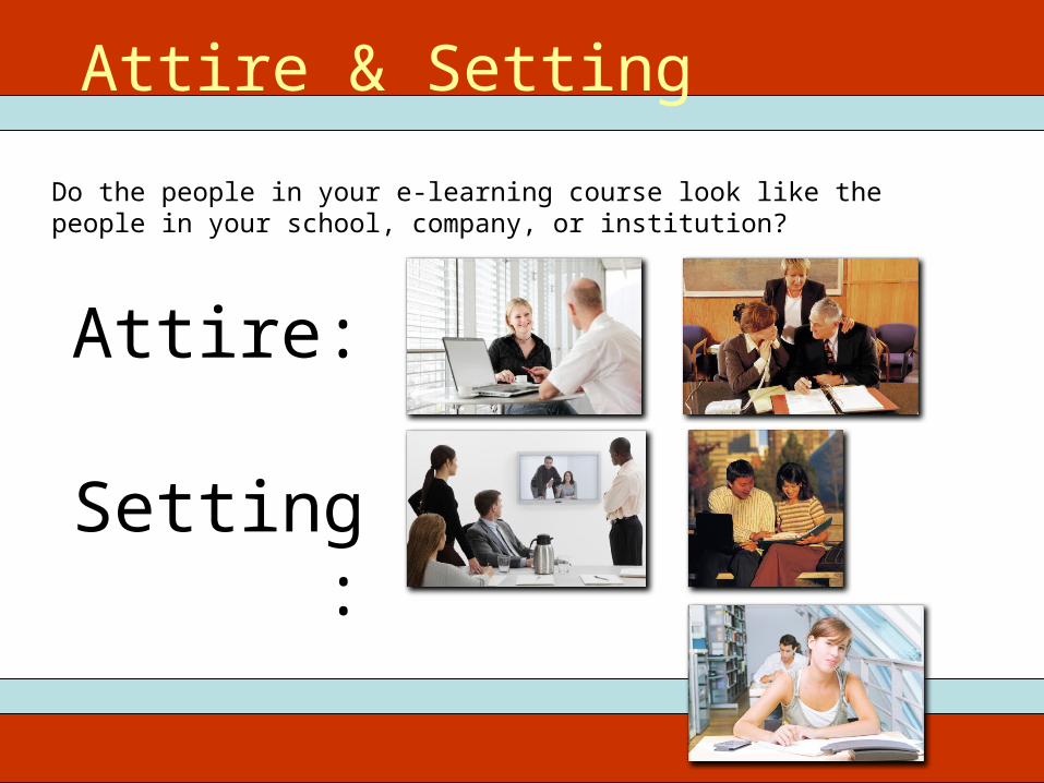
Attire & Setting
Do the people in your e-learning course look like the people in your school, company, or institution?
Attire:
Setting:
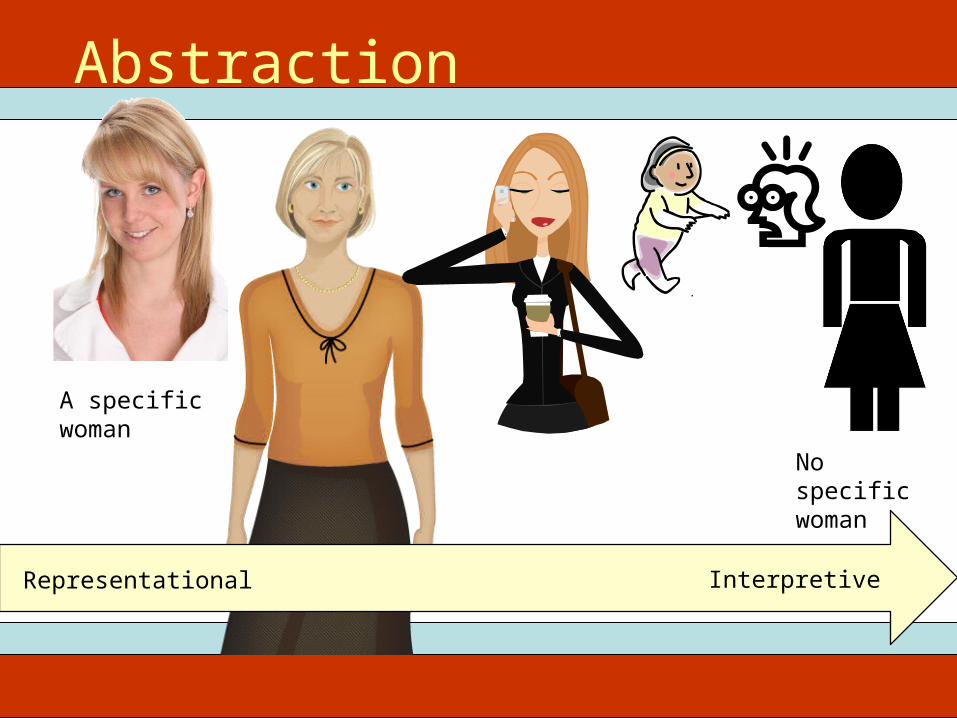
A specific woman
No specific woman
Representational Interpretive
Abstraction

• Nothing due next week
ITEC 715For Next Week