Embed Size (px)
Citation preview


Designing Great Maps:
How to Communicate and Inspire with Print and Digital Maps
Allen Carroll and Larry Orman

About Allen and Larry
Allen Carroll, Esri Online Content Mgr.: • Family cartographer and navigator since age 5 • 27 years at National Geographic, 12 of them as
Chief Cartographer • Believer in the power of maps to inform and inspire
Larry Orman, Exec. Dir. GreenInfo Network: • Magic marker map maker for years pre-GIS • 19 years NGO advocacy and 19 geotech world • Maps are a powerful lens for seeing the world

What motivates us
A Map Gallery encounter . . .

About this workshop series
#1: General Overview
#2: Print/image
#3: Web/mobile
Thursday, 10:15 Room 08
Thursday, 1:30 Room 08

What we’ll cover this session
Visual Perception The Page (or Screen) is a Stage Some CLUES to making great maps Design Process What to Remember
1 2 3 4 5

But first,a quiz for you
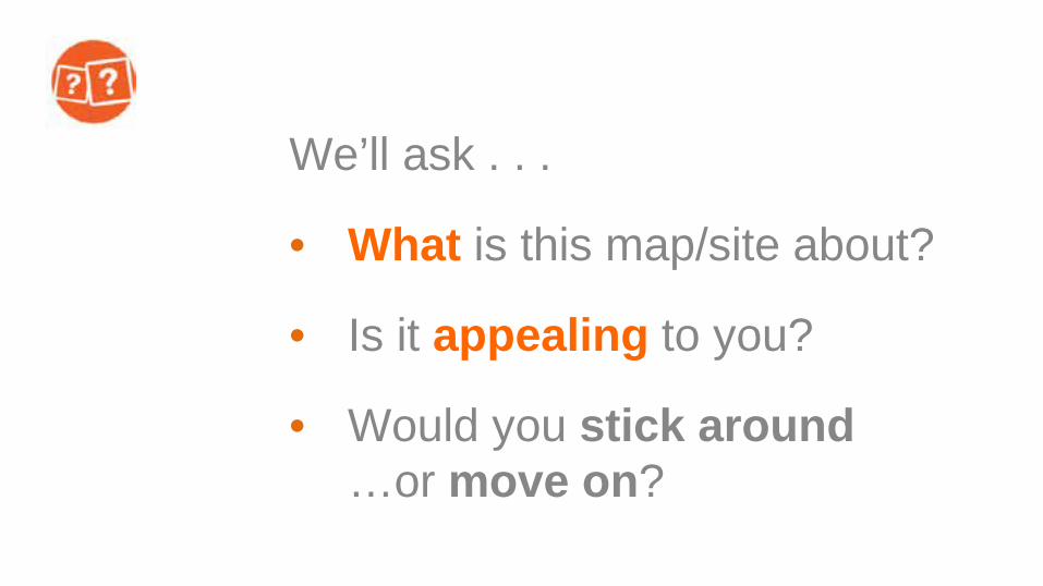
We’ll ask . . .
• What is this map/site about?
• Is it appealing to you?
• Would you stick around …or move on?


Lessons?
• First impressions matter!
• Attractive designs, accessible interfaces are key
• Simplicity is vital

How visual perception
works
1

2 6 6 9 3 8 7 2 1 4 8 0 9 5 6 7 9 1 1 5 4 7 8 2 6 0 9 1 2 7 8 9 1 3 4 5 0 4 1 9 8 7 2 4 5 1 3 9 0 1 6 2 9 2
2 6 6 9 3 8 7 2 1 4 8 0 9 5 6 7 9 1 1 5 4 7 8 2 6 0 9 1 2 7 8 9 1 3 4 5 0 4 1 9 8 7 2 4 5 1 3 9 0 1 6 2 9 2


How your brain perceives
<1 second
PRE-ATTENTION 1-3 seconds
RECOGNITION 3-20 seconds +
COGNITION

<1 second Color, shapes, contrast
1-2 seconds resolve objects
3+ seconds engage content
| | | | | | | | | | |||||||||||| |||||||||| Headline Words
Lorem ipsum dolor sit amet, vis vide latine debitis ne, cu eos numquam alienum apeirian, nec augue consul suavitate ne. Dolore philosophia pro eu. Eos te definiebas scribentur efficiantur. Solet putant mea in, ea nam lorem necessitatibus, illum facete cetero his ex. Falli dolorem vituperatoribus ne eum. Illud salutandi scribentur sed ne. Section Subtitle Mei odio assueverit id, omnium hendrerit an sit. Per te epicurei posidonium concludaturque, eu vel illum offendit voluptua, quo ei suscipit eleifend. An prompta definiebas vis, unum omittantur in usu, vix case dolores ex. Nibh everti vel ex, munere molestie deserunt pri no. Te per cetero deterruisset, nam ne tation imperdiet

IIIIIIIIIIIIIIIIIIII //////////
First glimpse is critical for engagement
<1 second 1-2 seconds 3+ seconds

Field of vision
20’
30’
3’
Page sized map Poster sized map

How our eyes move

Design for eye movement


The page (and screen) is a stage
2

The Page (and screen) is a Stage
A successful production combines many elements into a seamless whole

Put your star in the spotlight
Create visual hierarchies
Tenor in the spotlight…

Put your star in the spotlight
Create visual hierarchies
Beautiful map as centerpiece…

Put your star in the spotlight
Create visual hierarchies
Graph and number at center stage

Put your diva in a bright costume
Figure-ground: bright colors against neutral
Bright soprano, subdued chorus…

Put your diva in a bright costume
Figure-ground: bright colors against neutral Key groundwater basins in the spotlight…

Put your diva in a bright costume
Figure-ground: bright colors against neutral Major battles in brightest color

The power of color
HSV
• Hue
• Saturation
• Value

The power of color
HSV
• Hue
• Saturation
• Value

The power of color
HSV
• Hue
• Saturation
• Value
Our secret weapon!
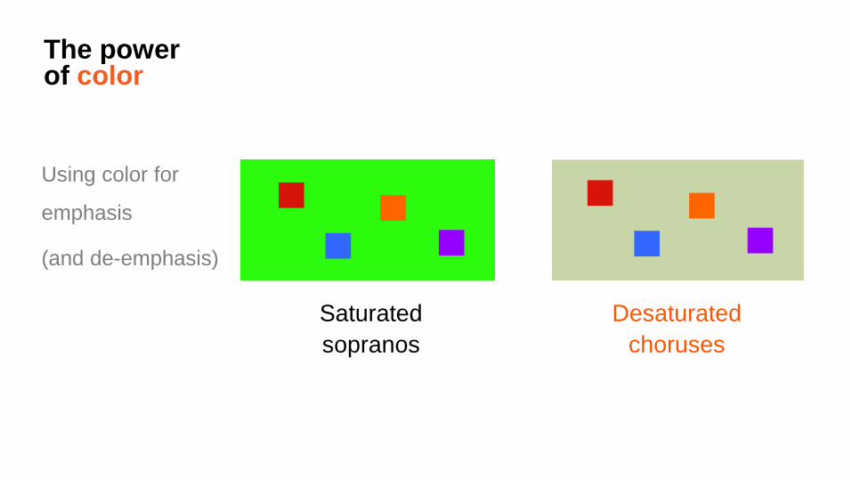
The power of color
Using color for
emphasis
(and de-emphasis)
Saturated sopranos
Desaturated choruses

The power of color
Saturated color
at center stage;
desaturated in
the background

The power of color
Saturated color at center stage; desaturated in the background

The power of color
Beware of
unintended
effects Merry
Christmas! Howard
Johnson’s Oh, say can you
see…
Danger! Joy!

A cast of thousands?
Best to reduce the number of performers

A cast of thousands?
Best to reduce the number of performers

Some CLUES to making great maps
for today’s world
3

C L U E S
A great map. . .
1. Connects with its audience
2. Limits user options
3. User experience supports the story
4. Easy-to-read maps
5. Strives for simplicity

C L U E S Connect with your audience
Think of your mom Step back and explain things Avoid being (too) technical Be informal but respectful

C L U E S Connect with your audience
Think about your primary audience
Lots of people may see your map, but who do you really want to convince?

C L U E S Limit user options
The best maps and apps do one thing really well
An all-purpose
map viewer may make
sense once in a while…
But a focused, single-purpose app will better serve a specific audience

C L U E S User experience supports the story
Think about the job your map is doing, and choose the means by which users will experience your story
Locate Navigate Compare Narrate Show change
There are lots of ways to interact with maps

C L U E S Easy-to-read maps
Base map as context—not competition A map for storytelling is very different from a map for analysis

C L U E S Easy-to-read maps
Strip off non-essential information
Use limited color palettes
Simple, accessible thematic maps

C L U E S Easy-to-read maps
Avoid visually complex symbols and icons

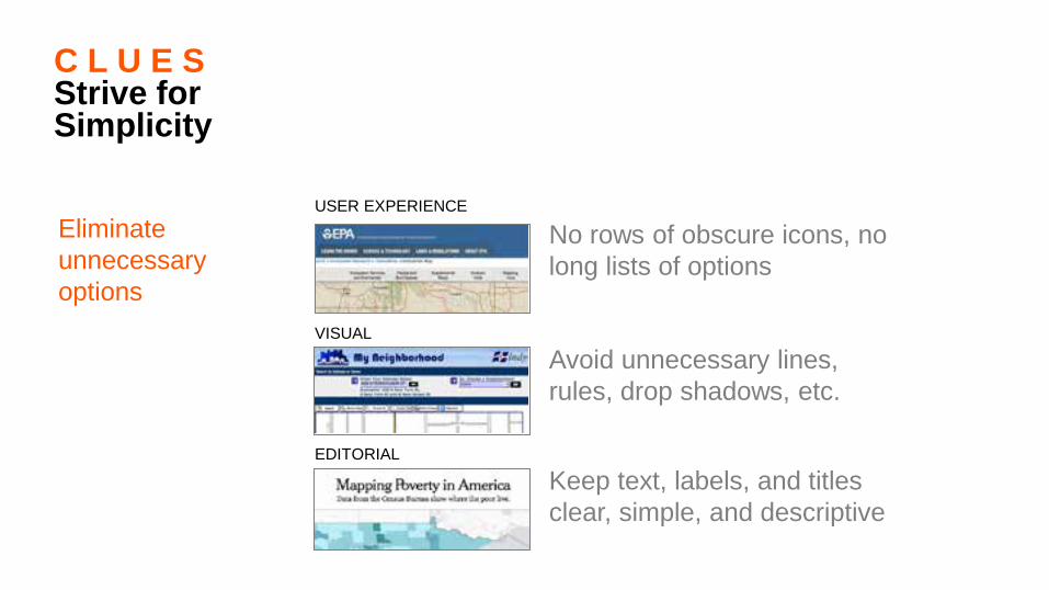
USER EXPERIENCE
C L U E S Strive for Simplicity
Avoid “GIS-y” functions: No arrays of little icons
Eliminate unnecessary options
C L U E S Strive for Simplicity
Eliminate unnecessary options
Avoid unnecessary lines, rules, drop shadows, etc.
VISUAL
No rows of obscure icons, no long lists of options
USER EXPERIENCE
Keep text, labels, and titles clear, simple, and descriptive
EDITORIAL

C L U E S Strive for Simplicity
Eliminate unnecessary options
awesome.good.is/features/011/Wanderlust/index.html
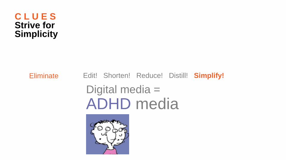
C L U E S Strive for Simplicity
Eliminate Edit! Shorten! Reduce! Distill! Simplify! Digital media = ADHD media

C L U E S
Connect with your audience
Limit user options
User experience supports your story
Easy-to-read maps
Strive for simplicity

4
Design Process
Design gives voice to our information
So HOW do we design great maps?

Designing a map (Assume story and audience)
1. Process
2. Concept
3. Branding
4. Composition
5. Layout
(+Cartography)

1. PROCESS of Design (depends on time/budget . . .) • Concept + data test
• Composition sketch
• Draft frame(s)
• Draft map content
• Full draft, test
• Refine, test
• Finalize

2. Concept Creative leap
Mimic
Copy
Sketch
Mockup

3. Branding
Look & feel:
Colors
Logo
Fonts
Graphics
Proposed Development
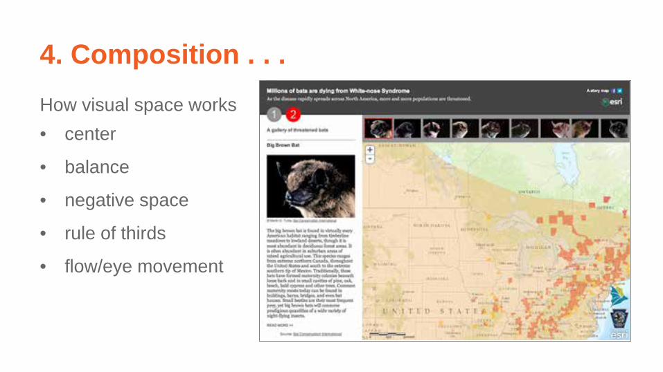
4. Composition . . . How visual space works • center
• balance
• negative space
• rule of thirds
• flow/eye movement

5. Layout
Grids
• Align
• Apportion
• Balance
Wireframe

How do you know a design is good?
• 1-3 second test
• Formal critiques
• Pay attention over time
• Compare yours to others’
• +Webstats
What to Remember
5

➔ Keep it simple; eliminate non-essentials
➔ Single-purpose to fit priority audience
➔ Map and context work together
➔ Cartography includes user experience
➔ Digital - screens small, but maps deep (it’s a new medium…take advantage of it!)


Thank you…
Please fill out the session survey:
ID: 1231 Online – www.esri.com/ucsessionsurveys Paper – pick up and put in drop box

Larry Orman [email protected] www.greeninfo.org
Allen Carroll
[email protected] www.esri.com/storymaps
Open Discussion


Colors
Colors