Embed Size (px)
Citation preview
Brand Guidelines Version 1,January 2016
iWALKFree Branding Guidelines 2016
Welcome!
This Style guide is designed to be a simple reference for everything you need to know about iWALKFree brand identity.
To keep our brand consistently awesome, follow these guidelines as you create marketing materials, internal and external communications.
Contents
IDENTITY
TYPOGRAPHY
GRAPHIC ELEMENTS
About CompanyCorporate LogoLogo Clear SpaceTag lineLogo TypesLogo Misuses
5678
1012
Brand Primary ColorsBrand Extended ColorsIconsProduct Photography
19202122
Print & Web TypefaceType Setting GuideEmail Campaign TypefaceEmail Text Hierarchy
14151617
Page 3
iWALKFree Branding Guidelines 2016
IDENTITY
About Company
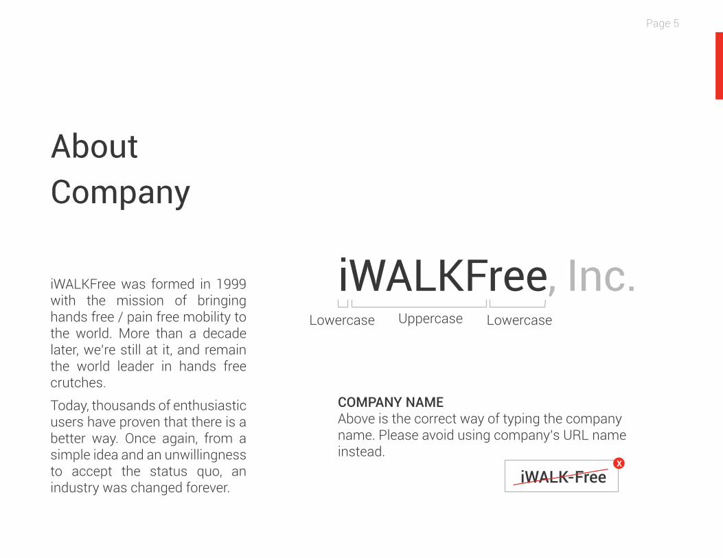
iWALKFree, Inc.iWALKFree was formed in 1999 with the mission of bringing hands free / pain free mobility to the world. More than a decade later, we’re still at it, and remain the world leader in hands free crutches.
Today, thousands of enthusiastic users have proven that there is a better way. Once again, from a simple idea and an unwillingness to accept the status quo, an industry was changed forever.
COMPANY NAMEAbove is the correct way of typing the company name. Please avoid using company’s URL name instead.
iWALK-Free
LowercaseLowercase Uppercase
Page 5
X
iWALKFree Branding Guidelines 2016
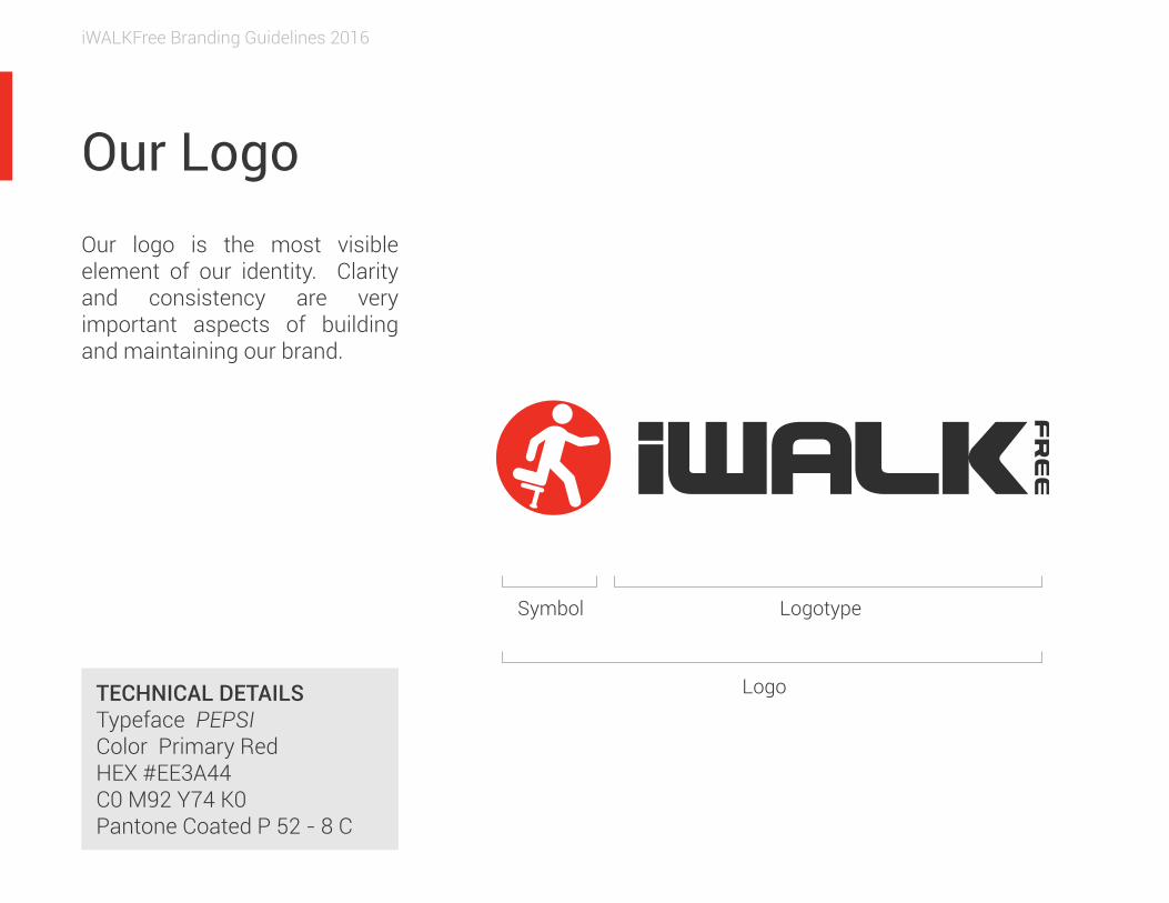
Our Logo Our logo is the most visible element of our identity. Clarity and consistency are very important aspects of building and maintaining our brand.
TECHNICAL DETAILSTypeface PEPSIColor Primary RedHEX #EE3A44C0 M92 Y74 K0Pantone Coated P 52 - 8 C
Logotype
Logo
Symbol
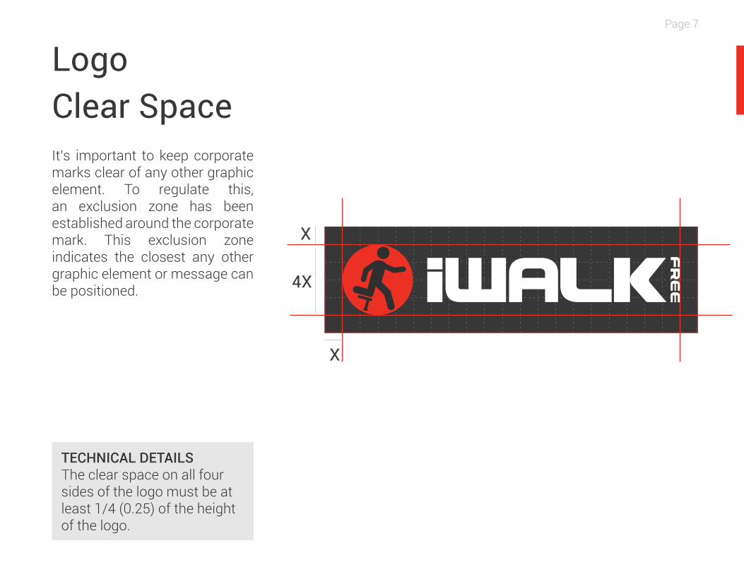
Logo Clear SpaceIt’s important to keep corporate marks clear of any other graphic element. To regulate this, an exclusion zone has been established around the corporate mark. This exclusion zone indicates the closest any other graphic element or message can be positioned.
X
X
4X
TECHNICAL DETAILSThe clear space on all four sides of the logo must be at least 1/4 (0.25) of the height of the logo.
Page 7
iWALKFree Branding Guidelines 2016
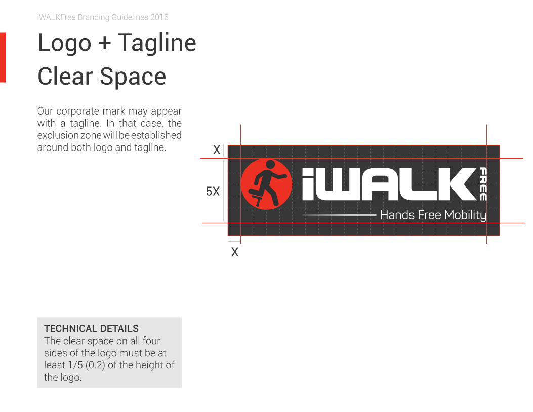
Logo + TaglineClear Space Our corporate mark may appear with a tagline. In that case, the exclusion zone will be established around both logo and tagline.
Hands Free Mobility
TECHNICAL DETAILSThe clear space on all four sides of the logo must be at least 1/5 (0.2) of the height of the logo.
X
X
5X
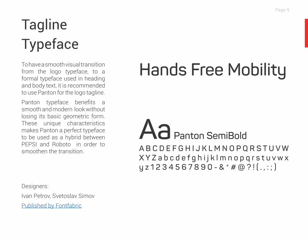
Tagline Typeface To have a smooth visual transition from the logo typeface, to a formal typeface used in heading and body text, it is recommended to use Panton for the logo tagline.
Panton typeface benefits a smooth and modern look without losing its basic geometric form. These unique characteristics makes Panton a perfect typeface to be used as a hybrid between PEPSI and Roboto in order to smoothen the transition.
Designers:
Ivan Petrov, Svetoslav Simov
Published by Fontfabric
Aa Panton SemiBoldA B C D E F G H I J K L M N O P Q R S T U V W X Y Z a b c d e f g h i j k l m n o p q r s t u v w x y z 1 2 3 4 5 6 7 8 9 0 - & * # @ ? ! ( . , : ; )
Hands Free Mobility
Page 9
iWALKFree Branding Guidelines 2016
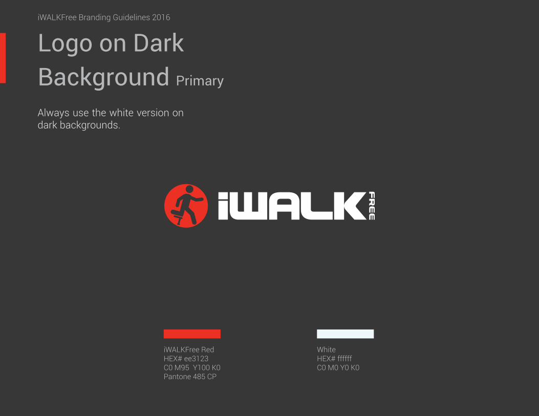
iWALKFree RedHEX# ee3123C0 M95 Y100 K0Pantone 485 CP
WhiteHEX# ffffffC0 M0 Y0 K0
Logo on Dark Background Primary
iWALKFree Branding Guidelines 2016
Always use the white version on dark backgrounds.
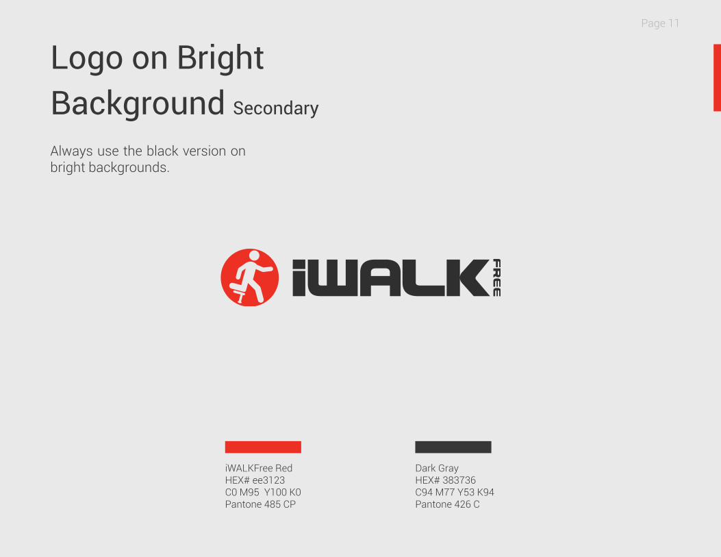
Dark GrayHEX# 383736C94 M77 Y53 K94Pantone 426 C
Logo on Bright Background Secondary
iWALKFree RedHEX# ee3123C0 M95 Y100 K0Pantone 485 CP
Page 11
Always use the black version on bright backgrounds.
iWALKFree Branding Guidelines 2016
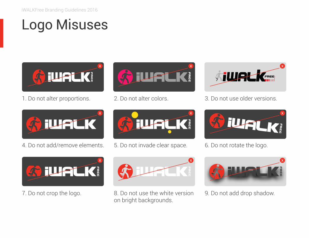
Logo Misuses
x x x
x x x
x x x
1. Do not alter proportions. 3. Do not use older versions.
7. Do not crop the logo.
2. Do not alter colors.
4. Do not add/remove elements. 5. Do not invade clear space. 6. Do not rotate the logo.
8. Do not use the white version on bright backgrounds.
9. Do not add drop shadow.
iWALKFree Branding Guidelines 2016
TYPOGRAPHY
iWALKFree Branding Guidelines 2016
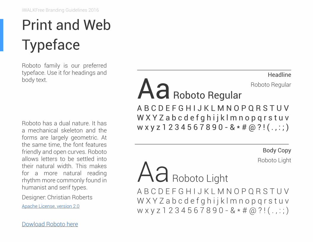
Print and WebTypeface Roboto family is our preferred typeface. Use it for headings and body text.
Roboto has a dual nature. It has a mechanical skeleton and the forms are largely geometric. At the same time, the font features friendly and open curves. Roboto allows letters to be settled into their natural width. This makes for a more natural reading rhythm more commonly found in humanist and serif types.
Designer: Christian RobertsApache License, version 2.0
Dowload Roboto here
Headline
Roboto Regular
Body Copy
Roboto Light
Aa Roboto LightA B C D E F G H I J K L M N O P Q R S T U V W X Y Z a b c d e f g h i j k l m n o p q r s t u v w x y z 1 2 3 4 5 6 7 8 9 0 - & * # @ ? ! ( . , : ; )
Aa Roboto RegularA B C D E F G H I J K L M N O P Q R S T U V W X Y Z a b c d e f g h i j k l m n o p q r s t u v w x y z 1 2 3 4 5 6 7 8 9 0 - & * # @ ? ! ( . , : ; )
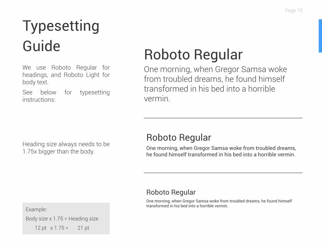
We use Roboto Regular for headings, and Roboto Light for body text.
See below for typesetting instructions:
TypesettingGuide
Heading size always needs to be 1.75x bigger than the body.
Roboto RegularOne morning, when Gregor Samsa woke from troubled dreams, he found himself transformed in his bed into a horrible vermin.
Roboto RegularOne morning, when Gregor Samsa woke from troubled dreams, he found himself transformed in his bed into a horrible vermin.
Roboto RegularOne morning, when Gregor Samsa woke from troubled dreams, he found himself transformed in his bed into a horrible vermin.
Example:
Body size x 1.75 = Heading size
12 pt x 1.75 = 21 pt
Page 15
iWALKFree Branding Guidelines 2016
Headline
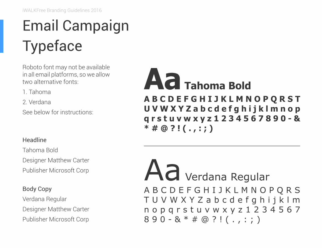
Tahoma Bold
Designer Matthew Carter
Publisher Microsoft Corp
Body Copy
Verdana Regular
Designer Matthew Carter
Publisher Microsoft Corp
Email Campaign Typeface
Aa Verdana RegularA B C D E F G H I J K L M N O P Q R S T U V W X Y Z a b c d e f g h i j k l m n o p q r s t u v w x y z 1 2 3 4 5 6 7 8 9 0 - & * # @ ? ! ( . , : ; )
Aa Tahoma BoldA B C D E F G H I J K L M N O P Q R S T U V W X Y Z a b c d e f g h i j k l m n o p q r s t u v w x y z 1 2 3 4 5 6 7 8 9 0 - & * # @ ? ! ( . , : ; )
Roboto font may not be available in all email platforms, so we allow two alternative fonts:
1. Tahoma
2. Verdana
See below for instructions:
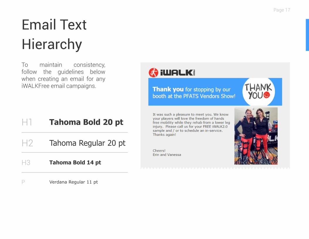
Email TextHierarchy
Tahoma Bold 20 pt
Tahoma Regular 20 pt
Tahoma Bold 14 pt
Verdana Regular 11 pt
H1
H2
H3
P
Page 17
To maintain consistency, follow the guidelines below when creating an email for any iWALKFree email campaigns.
iWALKFree Branding Guidelines 2016
GRAPHIC ELEMENTS
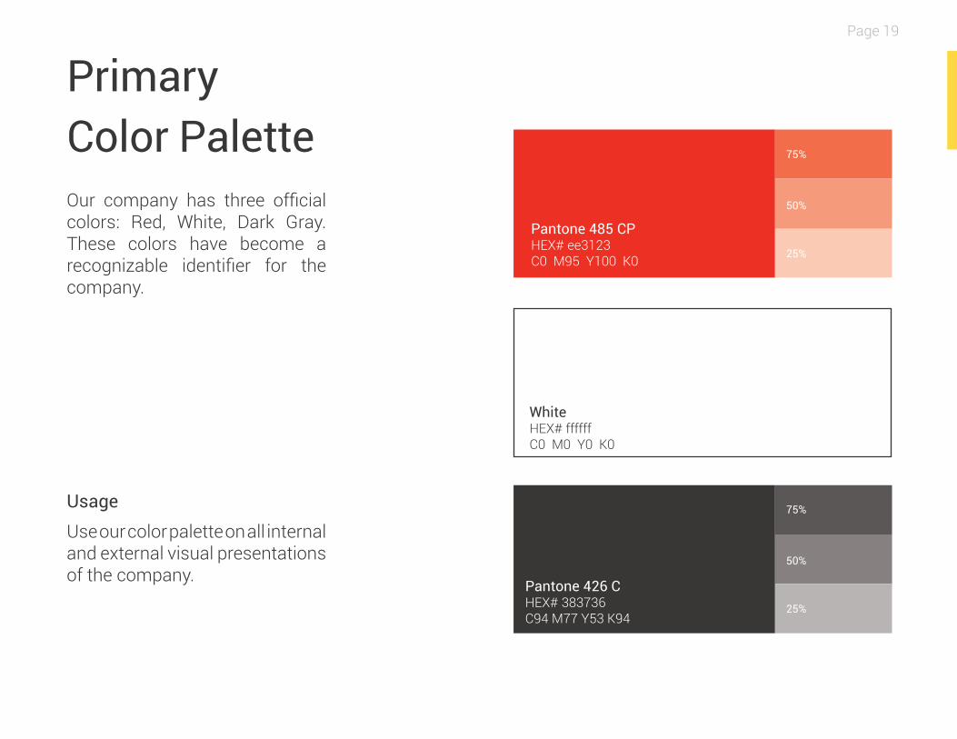
Primary Color Palette Our company has three official colors: Red, White, Dark Gray. These colors have become a recognizable identifier for the company.
Usage
Use our color palette on all internal and external visual presentations of the company.
Pantone 426 CHEX# 383736C94 M77 Y53 K94
WhiteHEX# ffffffC0 M0 Y0 K0
Pantone 485 CPHEX# ee3123C0 M95 Y100 K0
Page 19
25%
25%
50%
50%
75%
75%
iWALKFree Branding Guidelines 2016
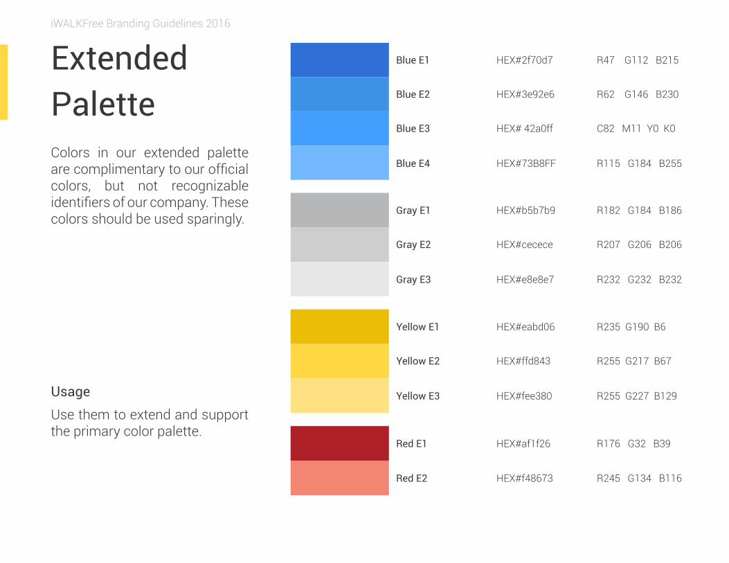
Extended Palette Colors in our extended palette are complimentary to our official colors, but not recognizable identifiers of our company. These colors should be used sparingly.
Yellow E1 HEX#eabd06 R235 G190 B6
Blue E2 HEX#3e92e6 R62 G146 B230
Blue E1 HEX#2f70d7 R47 G112 B215
Gray E1 HEX#b5b7b9 R182 G184 B186
Red E1 HEX#af1f26 R176 G32 B39
Yellow E2 HEX#ffd843 R255 G217 B67
Blue E3 HEX# 42a0ff C82 M11 Y0 K0
Gray E2 HEX#cecece R207 G206 B206
Yellow E3 HEX#fee380 R255 G227 B129
Blue E4 HEX#73B8FF R115 G184 B255
Gray E3 HEX#e8e8e7 R232 G232 B232
Red E2 HEX#f48673 R245 G134 B116
Usage
Use them to extend and support the primary color palette.
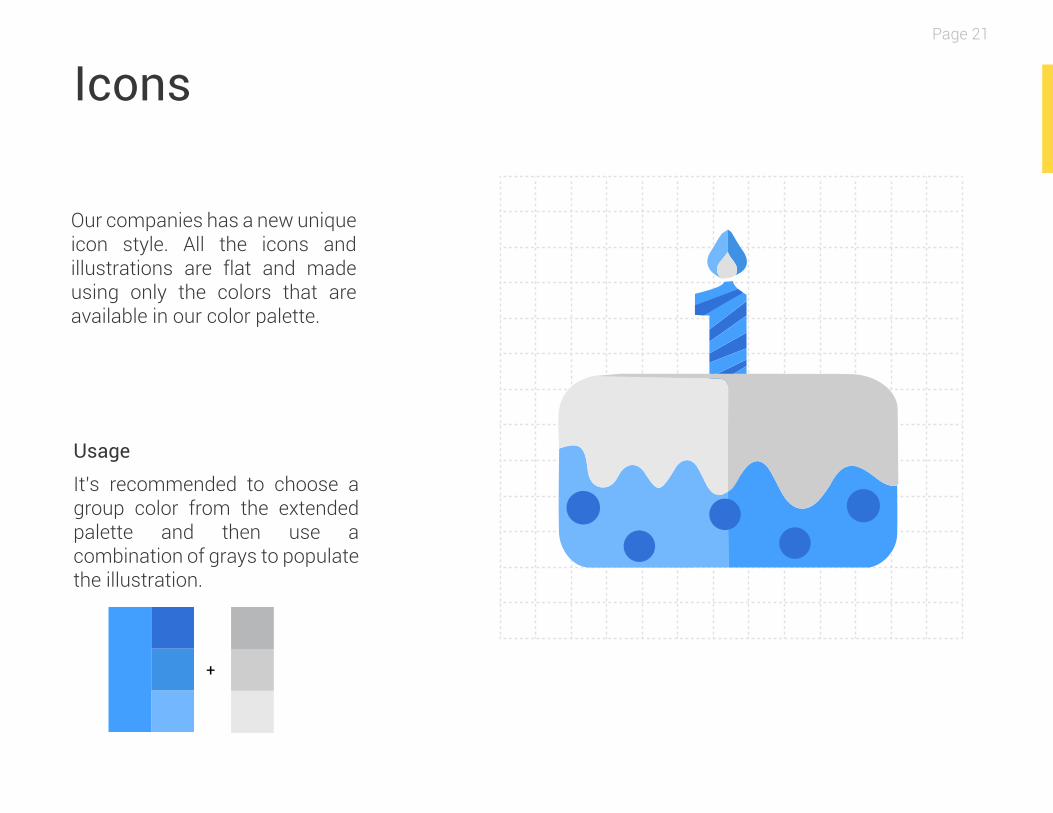
Icons
Our companies has a new unique icon style. All the icons and illustrations are flat and made using only the colors that are available in our color palette.
+
Usage
It’s recommended to choose a group color from the extended palette and then use a combination of grays to populate the illustration.
Page 21
iWALKFree Branding Guidelines 2016
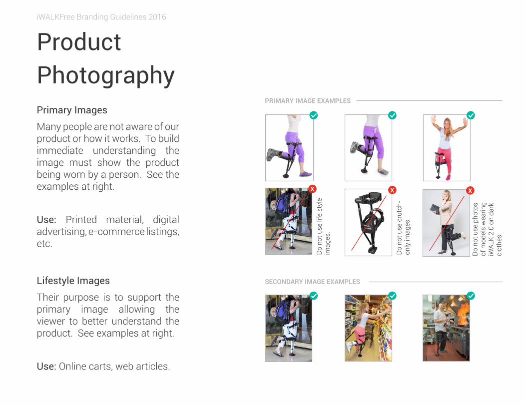
ProductPhotographyPrimary Images
Many people are not aware of our product or how it works. To build immediate understanding the image must show the product being worn by a person. See the examples at right.
Use: Printed material, digital advertising, e-commerce listings, etc.
PRIMARY IMAGE EXAMPLES
SECONDARY IMAGE EXAMPLESLifestyle Images
Their purpose is to support the primary image allowing the viewer to better understand the product. See examples at right.
Use: Online carts, web articles.
XX X
Do
not u
se c
rutc
h-on
ly im
ages
.
Do
not u
se li
fe s
tyle
im
ages
.
Do
not u
se p
hoto
s of
mod
els
wea
ring
iWAL
K 2.
0 on
dar
k cl
othe
s.
Design MattersThank you for taking the time to review our design guidelines. Consistent global branding will build brand continuity and clarity of messaging. We appreciate your cooperation in maintaining our
branding message.
If you have additional question about our visual identity and its application in design, don’t hesitate to contact
©2016 iWALKFree, Inc all rights reserved. www.iwalk-free.com