Embed Size (px)
Citation preview
EFFECTIVE DESIGN REVIEWSHow to give and receive meaningful, actionable design feedback
Everett McKayUX Design Edgeuxdesignedge.com
UX Scotland (June 2015)
Who is this guy?
Copyright 2015 UX Design Edge. All rights reserved.
Principal of UX Design Edge (from Vermont, USA)
Offer UI design classes, workshops, and consulting services, primarily to software teams that don’t have (sufficient) design talent and resources
Previously was a Windows PM at Microsoft, where I owned Windows Server security UI and wrote the Windows UX Guidelines (but not for Windows 8)
Before that, was a developer of Windows and Mac UIs
I’m really good at doing design reviews!
My new book is UI is Communication
Copyright 2015 UX Design Edge. All rights reserved.
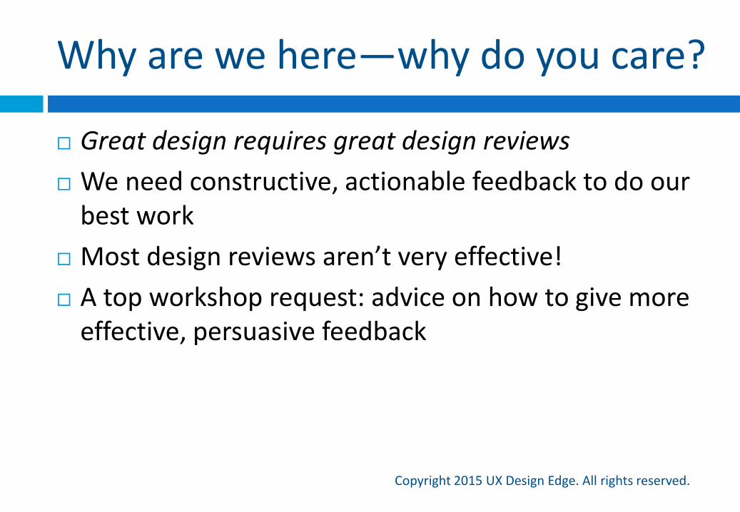
Why are we here—why do you care?
Copyright 2015 UX Design Edge. All rights reserved.
Great design requires great design reviews
We need constructive, actionable feedback to do our best work
Most design reviews aren’t very effective!
A top workshop request: advice on how to give more effective, persuasive feedback
My promise
Copyright 2015 UX Design Edge. All rights reserved.
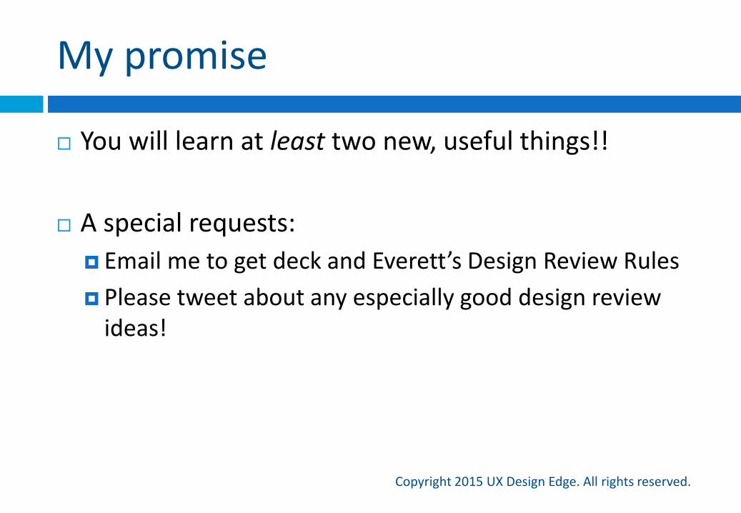
You will learn at least two new, useful things!!
A special requests:
Email me to get deck and Everett’s Design Review Rules
Please tweet about any especially good design review ideas!
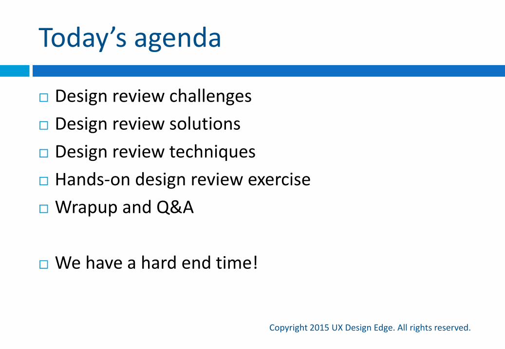
Today’s agenda
Copyright 2015 UX Design Edge. All rights reserved.
Design review challenges
Design review solutions
Design review techniques
Hands-on design review exercise
Wrapup and Q&A
We have a hard end time!
Let’s quickly review the essentials and their problems
Design review challenges
Copyright 2015 UX Design Edge. All rights reserved.
Design review facts of life
Copyright 2015 UX Design Edge. All rights reserved.
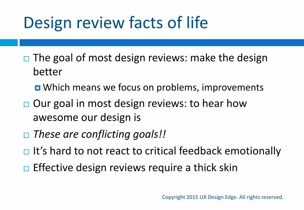
The goal of most design reviews: make the design better
Which means we focus on problems, improvements
Our goal in most design reviews: to hear how awesome our design is
These are conflicting goals!!
It’s hard to not react to critical feedback emotionally
Effective design reviews require a thick skin
Setting a (low) baseline
Copyright 2015 UX Design Edge. All rights reserved.
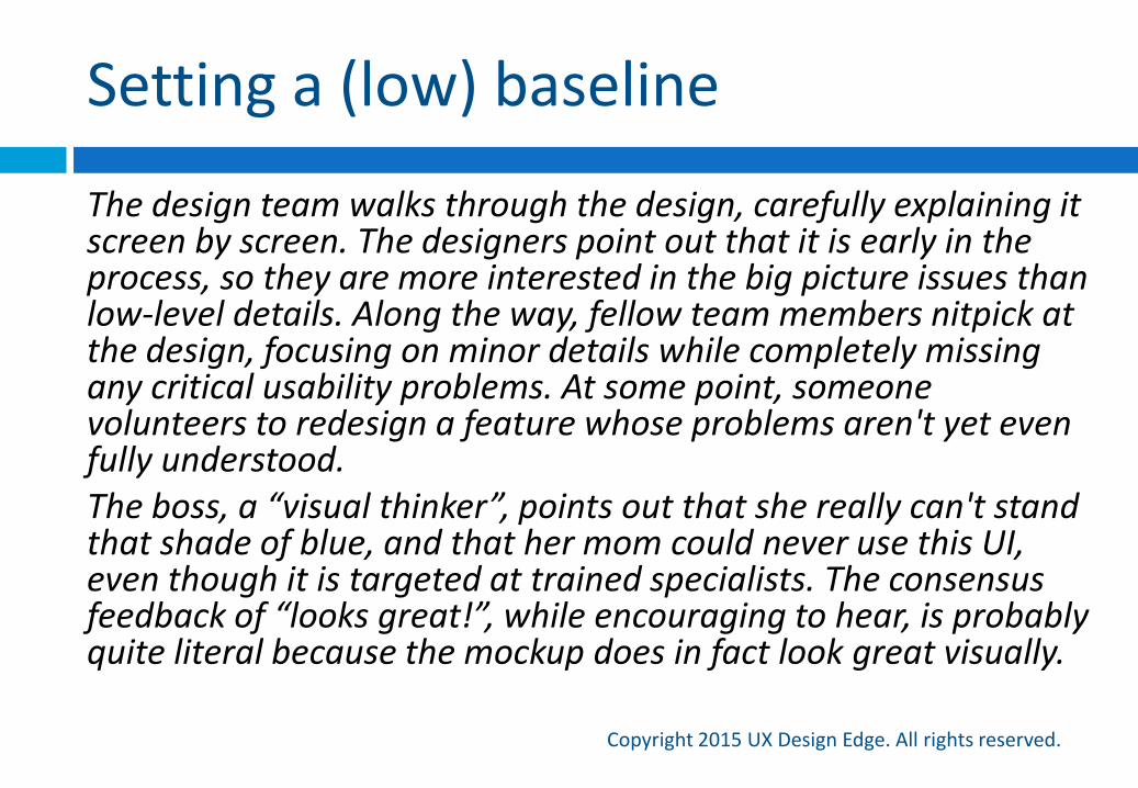
The design team walks through the design, carefully explaining it screen by screen. The designers point out that it is early in the process, so they are more interested in the big picture issues than low-level details. Along the way, fellow team members nitpick at the design, focusing on minor details while completely missing any critical usability problems. At some point, someone volunteers to redesign a feature whose problems aren't yet even fully understood. The boss, a “visual thinker”, points out that she really can't stand that shade of blue, and that her mom could never use this UI, even though it is targeted at trained specialists. The consensus feedback of “looks great!”, while encouraging to hear, is probably quite literal because the mockup does in fact look great visually.
Setting a (low) baseline
Copyright 2015 UX Design Edge. All rights reserved.
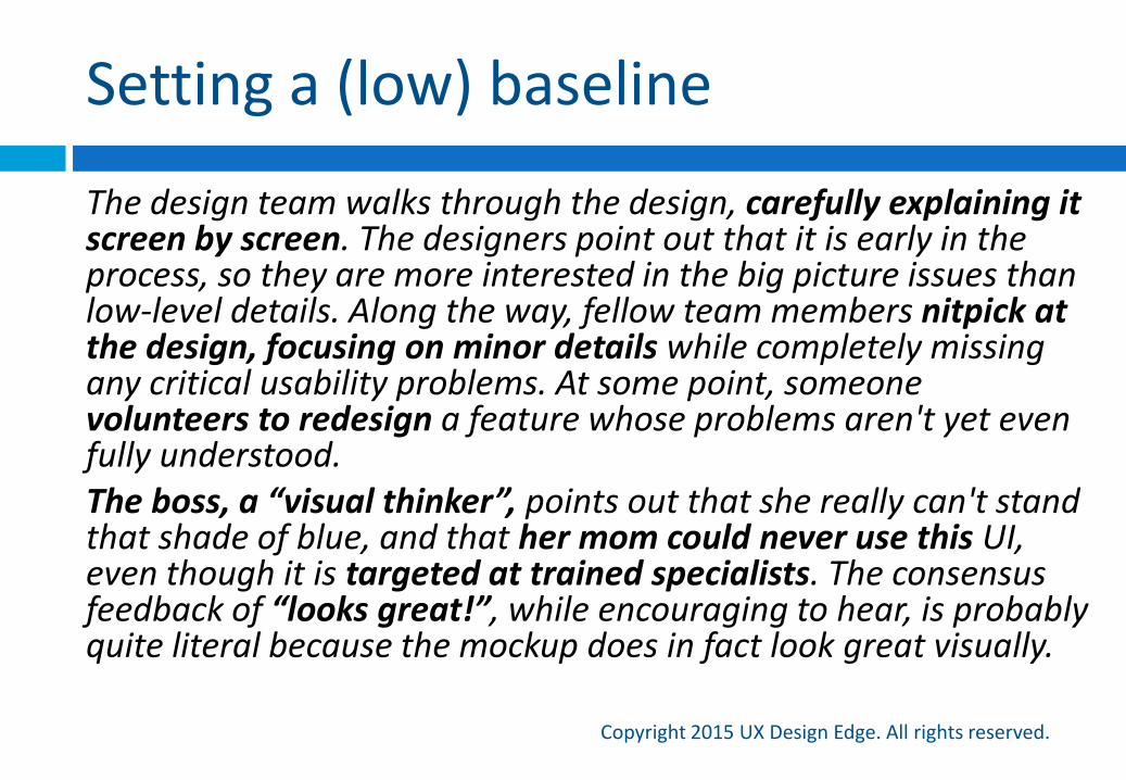
The design team walks through the design, carefully explaining it screen by screen. The designers point out that it is early in the process, so they are more interested in the big picture issues than low-level details. Along the way, fellow team members nitpick at the design, focusing on minor details while completely missing any critical usability problems. At some point, someone volunteers to redesign a feature whose problems aren't yet even fully understood. The boss, a “visual thinker”, points out that she really can't stand that shade of blue, and that her mom could never use this UI, even though it is targeted at trained specialists. The consensus feedback of “looks great!”, while encouraging to hear, is probably quite literal because the mockup does in fact look great visually.
#1 Own the design review
Copyright 2015 UX Design Edge. All rights reserved.
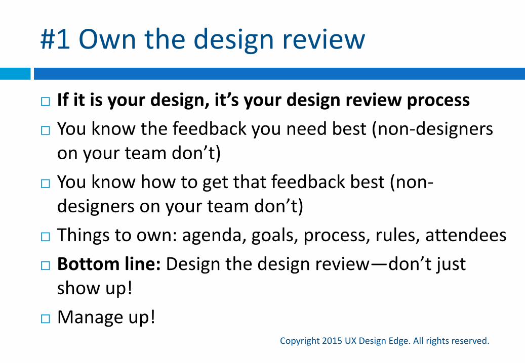
If it is your design, it’s your design review process
You know the feedback you need best (non-designers on your team don’t)
You know how to get that feedback best (non-designers on your team don’t)
Things to own: agenda, goals, process, rules, attendees
Bottom line: Design the design review—don’t just show up!
Manage up!
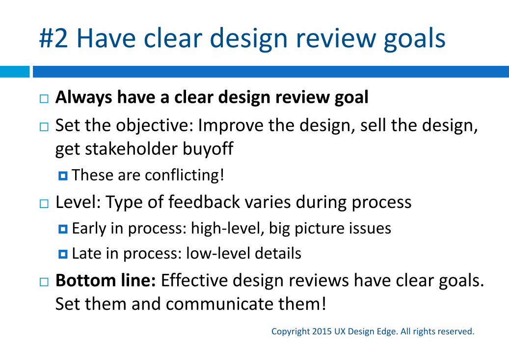
#2 Have clear design review goals
Copyright 2015 UX Design Edge. All rights reserved.
Always have a clear design review goal
Set the objective: Improve the design, sell the design, get stakeholder buyoff
These are conflicting!
Level: Type of feedback varies during process
Early in process: high-level, big picture issues
Late in process: low-level details
Bottom line: Effective design reviews have clear goals. Set them and communicate them!
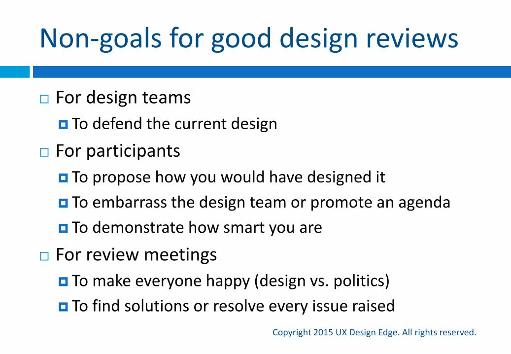
Non-goals for good design reviews
Copyright 2015 UX Design Edge. All rights reserved.
For design teams
To defend the current design
For participants
To propose how you would have designed it
To embarrass the design team or promote an agenda
To demonstrate how smart you are
For review meetings
To make everyone happy (design vs. politics)
To find solutions or resolve every issue raised
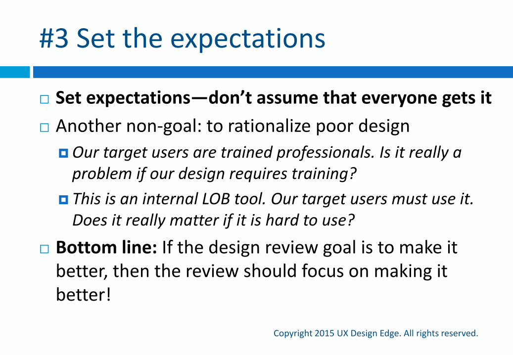
#3 Set the expectations
Copyright 2015 UX Design Edge. All rights reserved.
Set expectations—don’t assume that everyone gets it
Another non-goal: to rationalize poor design
Our target users are trained professionals. Is it really a problem if our design requires training?
This is an internal LOB tool. Our target users must use it. Does it really matter if it is hard to use?
Bottom line: If the design review goal is to make it better, then the review should focus on making it better!
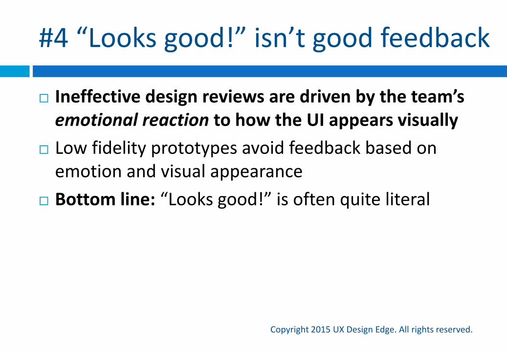
#4 “Looks good!” isn’t good feedback
Copyright 2015 UX Design Edge. All rights reserved.
Ineffective design reviews are driven by the team’s emotional reaction to how the UI appears visually
Low fidelity prototypes avoid feedback based on emotion and visual appearance
Bottom line: “Looks good!” is often quite literal
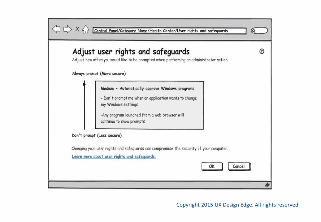
#5 Lower fidelity is better
Copyright 2015 UX Design Edge. All rights reserved.
Use the lowest fidelity prototyping that does the job reasonably well
Focuses on the high-level issues instead of details
Perceived as unfinished and easily changeable, so doesn’t discourage feedback
People react emotionally to beautiful things
Bottom line: Beauty hides flaws
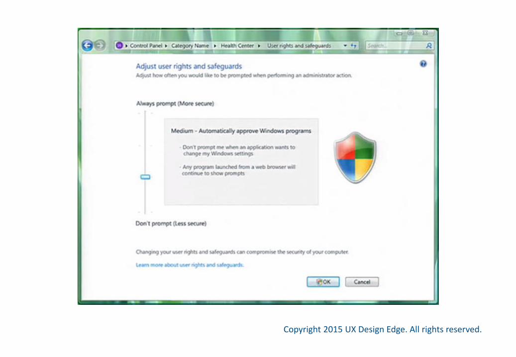
The Windows Vista story
Copyright 2015 UX Design Edge. All rights reserved.
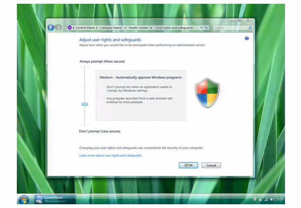
The Windows Vista design team used Photoshop-based task flows for design reviews
They were gorgeous! (Especially compared to XP)
Typical outcome
Design reviews “went well” with few problems found
The actual results were often disappointing (to me)
I wanted to figure out why
Copyright 2015 UX Design Edge. All rights reserved.
Copyright 2015 UX Design Edge. All rights reserved.
Copyright 2015 UX Design Edge. All rights reserved.

Copyright 2015 UX Design Edge. All rights reserved.
Copyright 2015 UX Design Edge. All rights reserved.

Copyright 2015 UX Design Edge. All rights reserved.
#6 Understand “visual thinkers”
Copyright 2015 UX Design Edge. All rights reserved.
Some managers are “visual thinkers”
“Visual thinkers” don’t understand interaction design, but they have strong ideas about visual design details
They can’t deal with sketches and wireframes, so the insist on high-fidelity, interactive prototypes
“I need to see it!”
Bottom line: “visual thinkers” dislike low fi prototypes
LinkedIn: Do wireframes even work?
Copyright 2015 UX Design Edge. All rights reserved.
A discussion on LinkedIn:
We have tried using wireframes, but we have found them to be a waste of time. Do wireframes even work?
Me: I bet the boss is a “visual thinker”
Later in the thread: My manager wants to give feedback on the shade of red, for example, but can’t because the wireframe doesn’t use the actual colors
Bazinga!
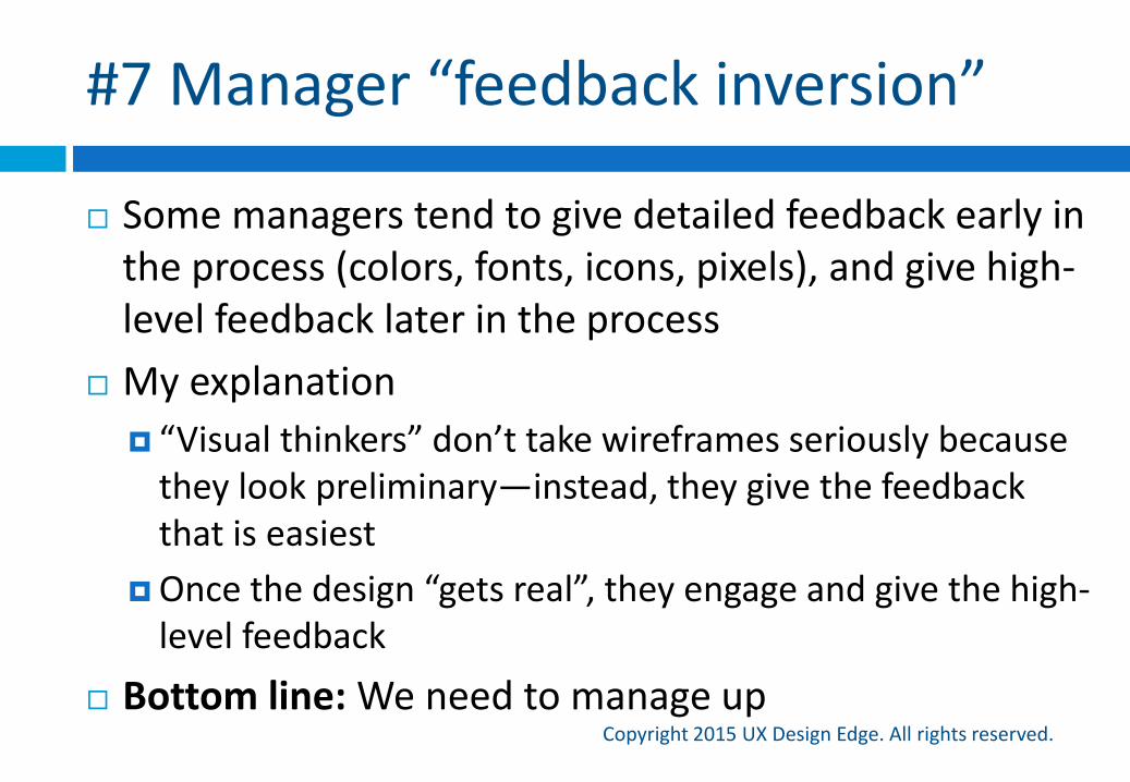
#7 Manager “feedback inversion”
Copyright 2015 UX Design Edge. All rights reserved.
Some managers tend to give detailed feedback early in the process (colors, fonts, icons, pixels), and give high-level feedback later in the process
My explanation
“Visual thinkers” don’t take wireframes seriously because they look preliminary—instead, they give the feedback that is easiest
Once the design “gets real”, they engage and give the high-level feedback
Bottom line: We need to manage up
Putting it all together
Copyright 2015 UX Design Edge. All rights reserved.
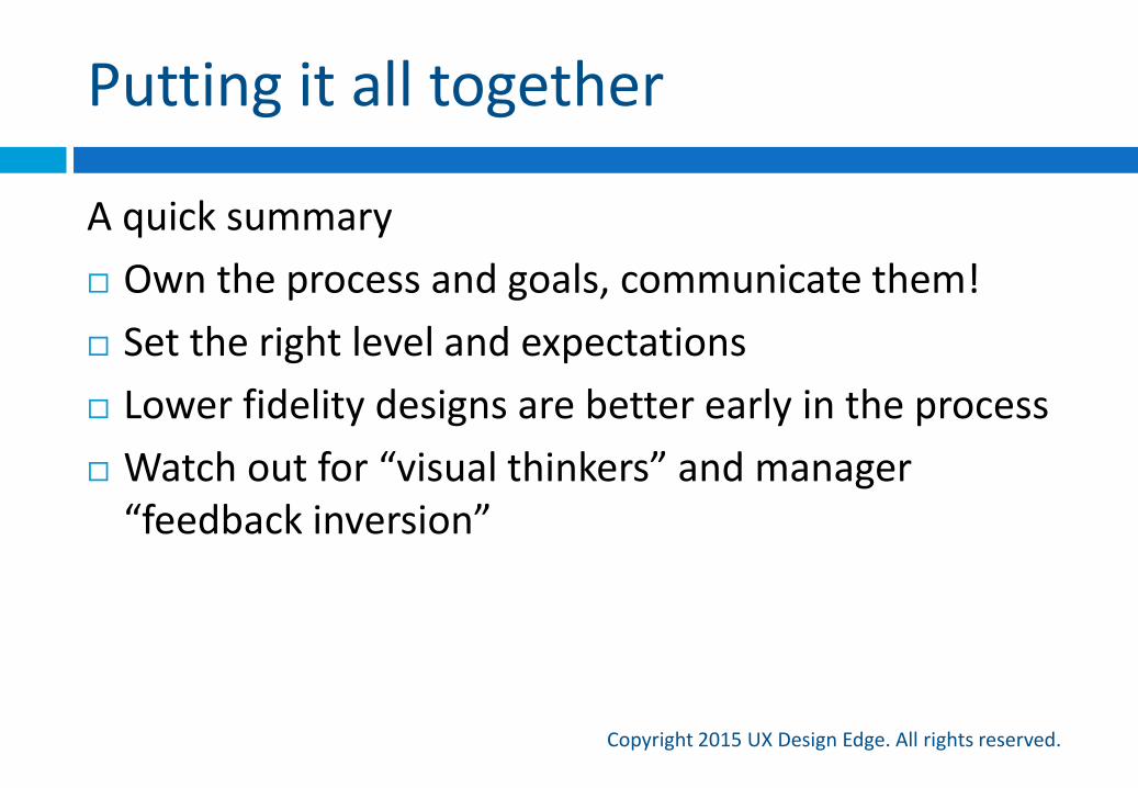
A quick summary
Own the process and goals, communicate them!
Set the right level and expectations
Lower fidelity designs are better early in the process
Watch out for “visual thinkers” and manager “feedback inversion”
My advice for solving common design review problems
Design review solutions
Copyright 2015 UX Design Edge. All rights reserved.
Dealing with personal opinion
Copyright 2015 UX Design Edge. All rights reserved.
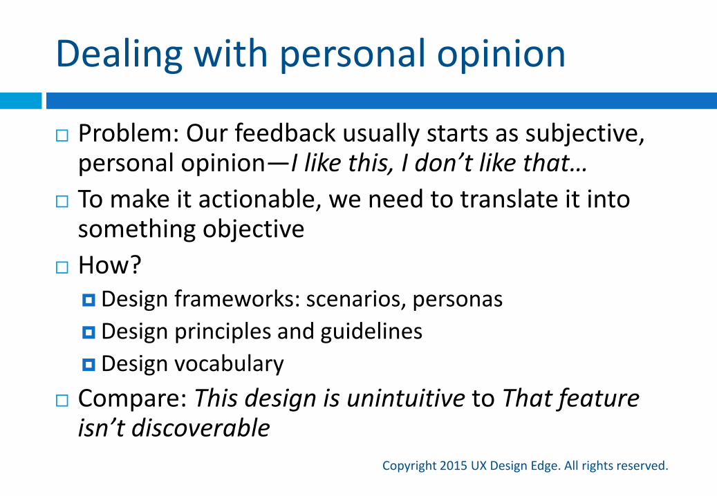
Problem: Our feedback usually starts as subjective, personal opinion—I like this, I don’t like that…
To make it actionable, we need to translate it into something objective
How?Design frameworks: scenarios, personas
Design principles and guidelines
Design vocabulary
Compare: This design is unintuitive to That feature isn’t discoverable

My mom would never fly this airplane
Dealing with non-designers
Copyright 2015 UX Design Edge. All rights reserved.
Problem: Most feedback is good, but often poorly expressed
Observation: Most poorly expressed feedback is in the form of a (poor) solution—Let’s just add an option to…
Solution:
Understand the problem first
OK, great! What problem will that solve?
Once you understand the problem, now you can discuss solutions
Dealing with developers
Copyright 2015 UX Design Edge. All rights reserved.
Problem: Developers hate our designs
Observation: Developers are focused on two things:How much work to implement
Finding problems (engineers are trained to find problems)
Solutions: Know the UI framework, propose realistic designs, require
custom code only when really worth it
Have and enforce design review rules
Understand that if you invite developers to give feedback on the feasibility of your design, they will give it to you!
Dealing with managers, clients, stakeholders
Copyright 2015 UX Design Edge. All rights reserved.
Problem: Managers, clients, and stakeholders who don’t get design process and design reviews
Observation: We have two choices:
Own the process and manage up
Deal with it
Solution:
Consider the goal of the review and your relationship
If goal is to sell a design, deal with it
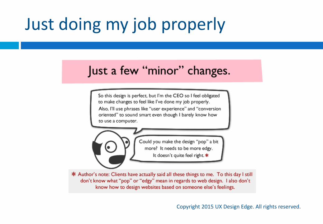
Just doing my job properly
Copyright 2015 UX Design Edge. All rights reserved.
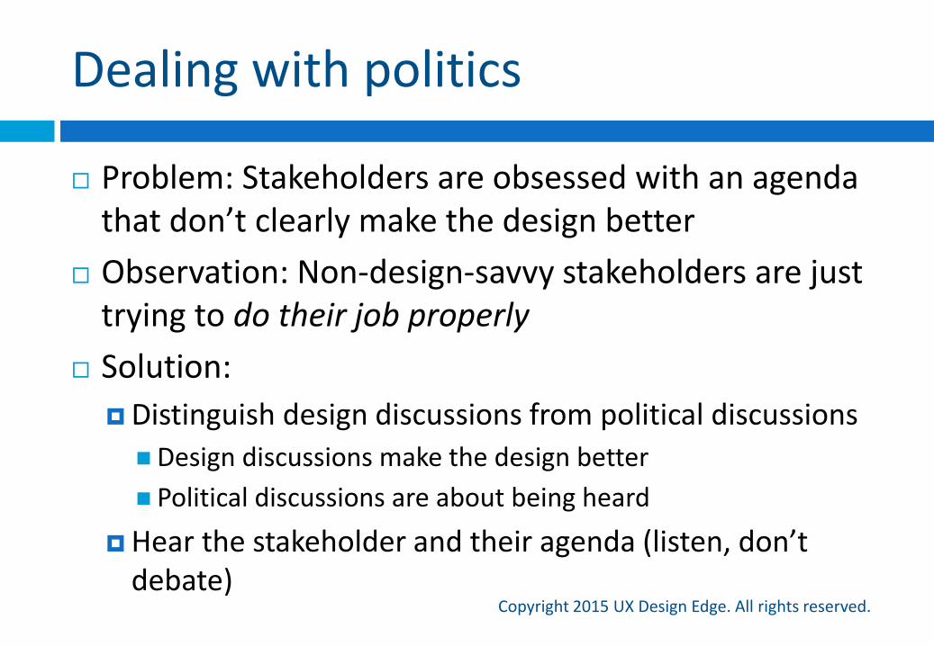
Dealing with politics
Copyright 2015 UX Design Edge. All rights reserved.
Problem: Stakeholders are obsessed with an agenda that don’t clearly make the design better
Observation: Non-design-savvy stakeholders are just trying to do their job properly
Solution:
Distinguish design discussions from political discussions
Design discussions make the design better
Political discussions are about being heard
Hear the stakeholder and their agenda (listen, don’t debate)
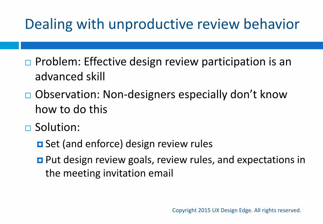
Dealing with unproductive review behavior
Copyright 2015 UX Design Edge. All rights reserved.
Problem: Effective design review participation is an advanced skill
Observation: Non-designers especially don’t know how to do this
Solution:
Set (and enforce) design review rules
Put design review goals, review rules, and expectations in the meeting invitation email
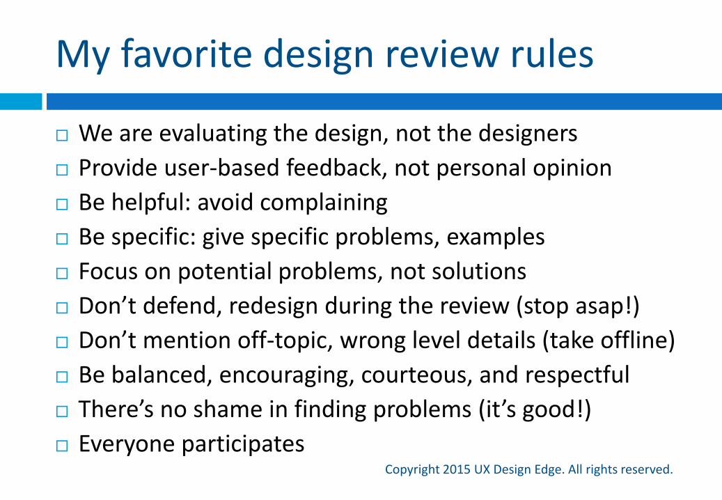
My favorite design review rules
Copyright 2015 UX Design Edge. All rights reserved.
We are evaluating the design, not the designers
Provide user-based feedback, not personal opinion
Be helpful: avoid complaining
Be specific: give specific problems, examples
Focus on potential problems, not solutions
Don’t defend, redesign during the review (stop asap!)
Don’t mention off-topic, wrong level details (take offline)
Be balanced, encouraging, courteous, and respectful
There’s no shame in finding problems (it’s good!)
Everyone participates
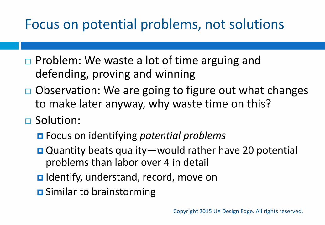
Focus on potential problems, not solutions
Copyright 2015 UX Design Edge. All rights reserved.
Problem: We waste a lot of time arguing and defending, proving and winning
Observation: We are going to figure out what changes to make later anyway, why waste time on this?
Solution: Focus on identifying potential problems
Quantity beats quality—would rather have 20 potential problems than labor over 4 in detail
Identify, understand, record, move on
Similar to brainstorming
Everyone participates
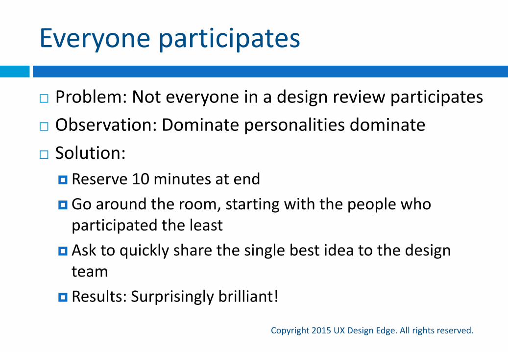
Copyright 2015 UX Design Edge. All rights reserved.
Problem: Not everyone in a design review participates
Observation: Dominate personalities dominate
Solution:
Reserve 10 minutes at end
Go around the room, starting with the people who participated the least
Ask to quickly share the single best idea to the design team
Results: Surprisingly brilliant!
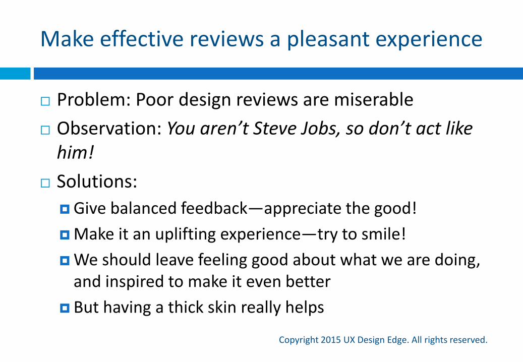
Make effective reviews a pleasant experience
Copyright 2015 UX Design Edge. All rights reserved.
Problem: Poor design reviews are miserable
Observation: You aren’t Steve Jobs, so don’t act like him!
Solutions:
Give balanced feedback—appreciate the good!
Make it an uplifting experience—try to smile!
We should leave feeling good about what we are doing, and inspired to make it even better
But having a thick skin really helps
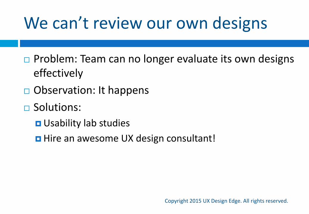
We can’t review our own designs
Copyright 2015 UX Design Edge. All rights reserved.
Problem: Team can no longer evaluate its own designs effectively
Observation: It happens
Solutions:
Usability lab studies
Hire an awesome UX design consultant!
So many design review goals, so many design review techniques
Design review techniques
Copyright 2015 UX Design Edge. All rights reserved.
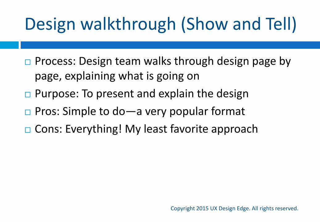
Design walkthrough (Show and Tell)
Copyright 2015 UX Design Edge. All rights reserved.
Process: Design team walks through design page by page, explaining what is going on
Purpose: To present and explain the design
Pros: Simple to do—a very popular format
Cons: Everything! My least favorite approach
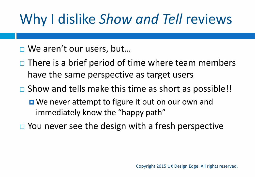
Why I dislike Show and Tell reviews
Copyright 2015 UX Design Edge. All rights reserved.
We aren’t our users, but…
There is a brief period of time where team members have the same perspective as target users
Show and tells make this time as short as possible!!
We never attempt to figure it out on our own and immediately know the “happy path”
You never see the design with a fresh perspective
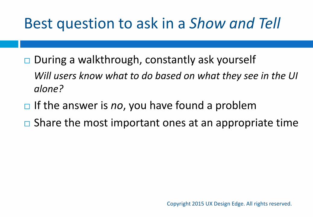
Best question to ask in a Show and Tell
Copyright 2015 UX Design Edge. All rights reserved.
During a walkthrough, constantly ask yourself
Will users know what to do based on what they see in the UI alone?
If the answer is no, you have found a problem
Share the most important ones at an appropriate time
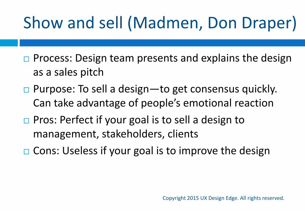
Show and sell (Madmen, Don Draper)
Copyright 2015 UX Design Edge. All rights reserved.
Process: Design team presents and explains the design as a sales pitch
Purpose: To sell a design—to get consensus quickly. Can take advantage of people’s emotional reaction
Pros: Perfect if your goal is to sell a design to management, stakeholders, clients
Cons: Useless if your goal is to improve the design
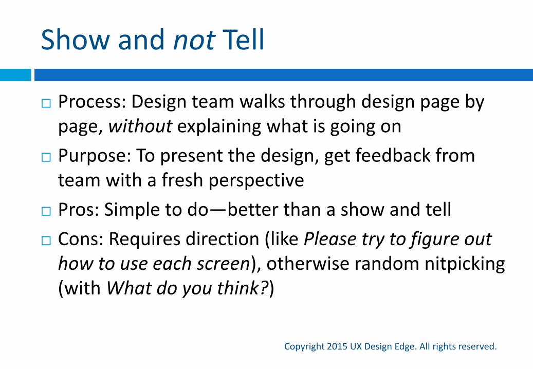
Show and not Tell
Copyright 2015 UX Design Edge. All rights reserved.
Process: Design team walks through design page by page, without explaining what is going on
Purpose: To present the design, get feedback from team with a fresh perspective
Pros: Simple to do—better than a show and tell
Cons: Requires direction (like Please try to figure out how to use each screen), otherwise random nitpicking (with What do you think?)
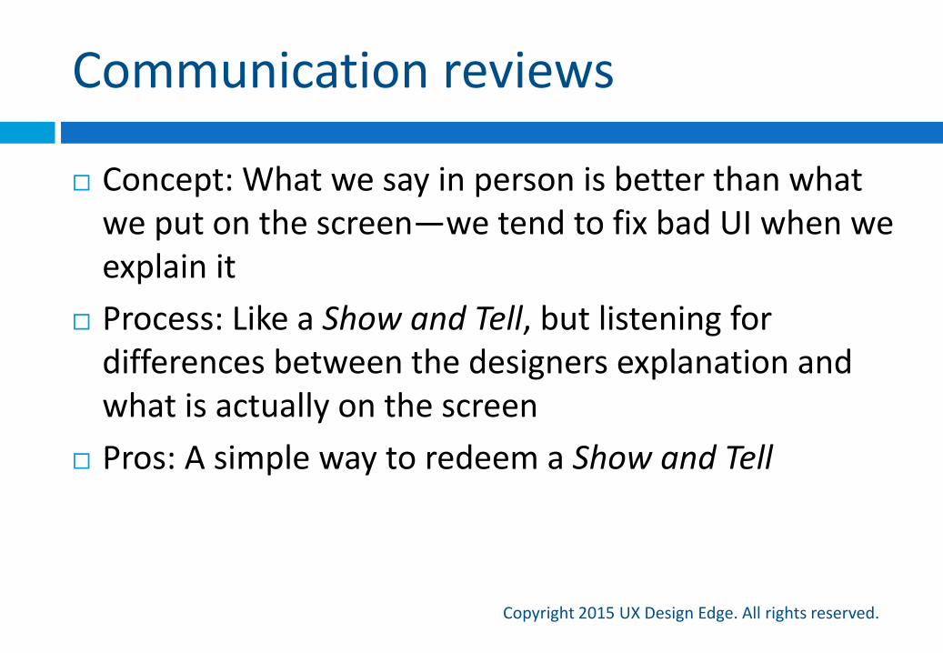
Communication reviews
Copyright 2015 UX Design Edge. All rights reserved.
Concept: What we say in person is better than what we put on the screen—we tend to fix bad UI when we explain it
Process: Like a Show and Tell, but listening for differences between the designers explanation and what is actually on the screen
Pros: A simple way to redeem a Show and Tell
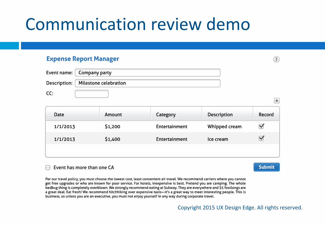
Communication review demo
Copyright 2015 UX Design Edge. All rights reserved.
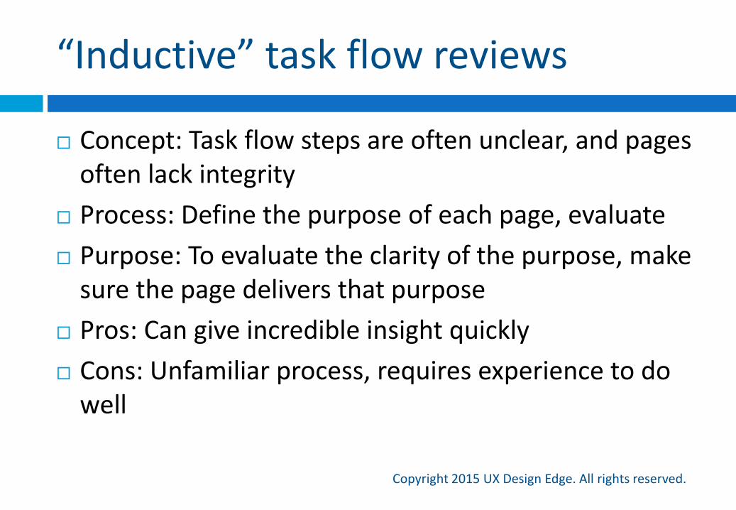
“Inductive” task flow reviews
Copyright 2015 UX Design Edge. All rights reserved.
Concept: Task flow steps are often unclear, and pages often lack integrity
Process: Define the purpose of each page, evaluate
Purpose: To evaluate the clarity of the purpose, make sure the page delivers that purpose
Pros: Can give incredible insight quickly
Cons: Unfamiliar process, requires experience to do well
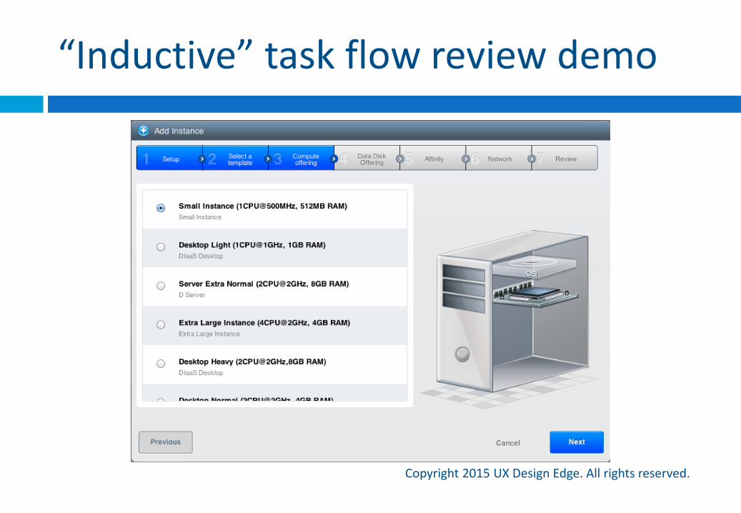
“Inductive” task flow review demo
Copyright 2015 UX Design Edge. All rights reserved.
Copyright 2015 UX Design Edge. All rights reserved.
Heuristic reviews
Copyright 2015 UX Design Edge. All rights reserved.
Process: As a team, evaluate your own design against a list of usability heuristics
Pros: Potentially much faster and more focused and comprehensive than a usability lab study
Cons: Usually not productive—inexperienced design teams just check everything off the list
Nielsen’s well-known usability heuristics are old and useless
Mine are awesome! Check out UIisC page 26
Streamlined cognitive walkthroughs
Copyright 2015 UX Design Edge. All rights reserved.
Process: Evaluate the intuitiveness of a design by walking through a task step-by-step and asking four questions: How will users know what to do at this step? If users do the right thing, how will they know? If users do the wrong thing, how will they know? If users do the wrong thing, how will they correct the
problem?
Pros: These can be amazing! Persuasive because people never argue with their own conclusions
Cons: Unfamiliar process, requires experience to do well
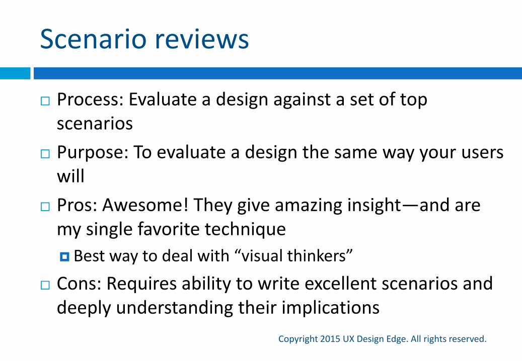
Scenario reviews
Copyright 2015 UX Design Edge. All rights reserved.
Process: Evaluate a design against a set of top scenarios
Purpose: To evaluate a design the same way your users will
Pros: Awesome! They give amazing insight—and are my single favorite technique
Best way to deal with “visual thinkers”
Cons: Requires ability to write excellent scenarios and deeply understanding their implications
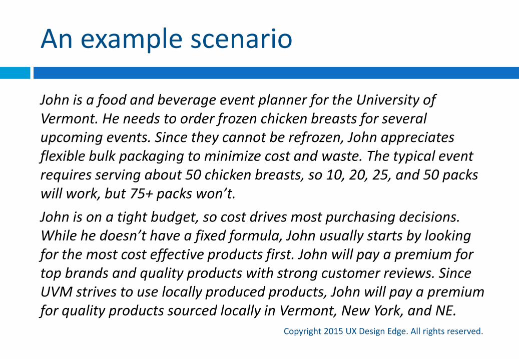
An example scenario
Copyright 2015 UX Design Edge. All rights reserved.
John is a food and beverage event planner for the University of Vermont. He needs to order frozen chicken breasts for several upcoming events. Since they cannot be refrozen, John appreciates flexible bulk packaging to minimize cost and waste. The typical event requires serving about 50 chicken breasts, so 10, 20, 25, and 50 packs will work, but 75+ packs won’t.
John is on a tight budget, so cost drives most purchasing decisions. While he doesn’t have a fixed formula, John usually starts by looking for the most cost effective products first. John will pay a premium for top brands and quality products with strong customer reviews. Since UVM strives to use locally produced products, John will pay a premium for quality products sourced locally in Vermont, New York, and NE.
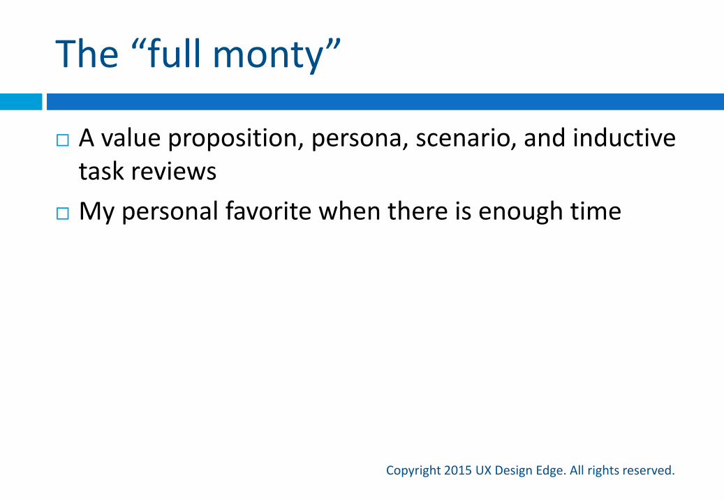
The “full monty”
Copyright 2015 UX Design Edge. All rights reserved.
A value proposition, persona, scenario, and inductive task reviews
My personal favorite when there is enough time
Let’s try it!
Hands-on design review exercise
Copyright 2015 UX Design Edge. All rights reserved.
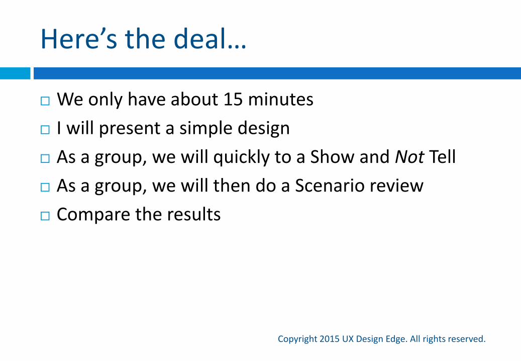
Here’s the deal…
Copyright 2015 UX Design Edge. All rights reserved.
We only have about 15 minutes
I will present a simple design
As a group, we will quickly to a Show and Not Tell
As a group, we will then do a Scenario review
Compare the results
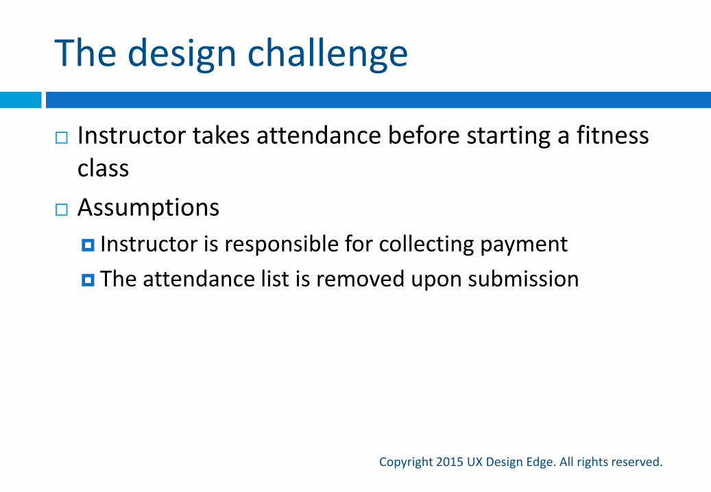
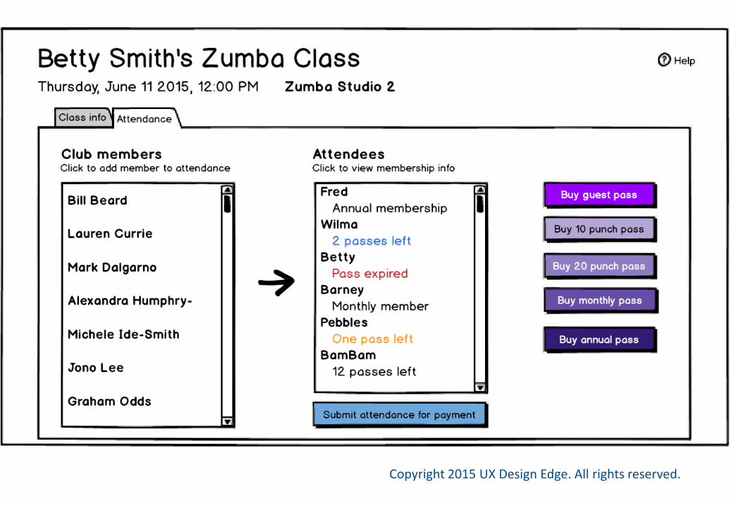
The design challenge
Copyright 2015 UX Design Edge. All rights reserved.
Instructor takes attendance before starting a fitness class
Assumptions
Instructor is responsible for collecting payment
The attendance list is removed upon submission
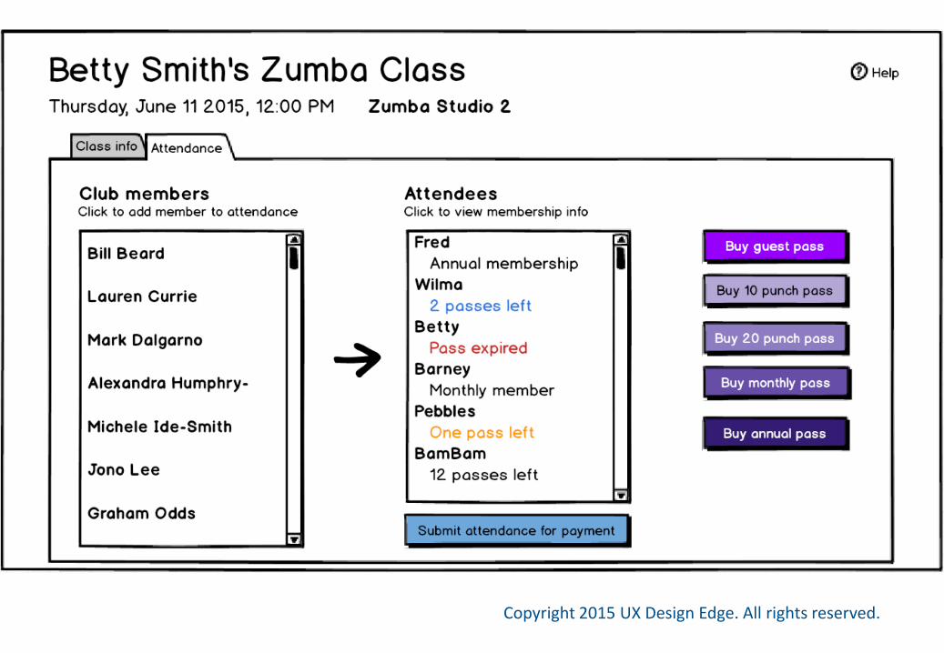
What do you think?
Copyright 2015 UX Design Edge. All rights reserved.
Let’s try a scenario-based review
Copyright 2015 UX Design Edge. All rights reserved.
Betty is a popular Zumba instructor at a large fitness center with 400 members. Her noon class gets strong attendance, usually around 30 members. While she encourages her students to reserve a spot, typically only a few do. Students pay in advance by purchasing a pass, but sometimes their passes are used up.
The previous class is also well attended and ends at 11:55. Betty needs to take accurate attendance on her iPad to get paid, but feels pressure to get the class started as quickly as possible. Typically she knows about 20 students by name or by face.
Now what do you think?
Copyright 2015 UX Design Edge. All rights reserved.
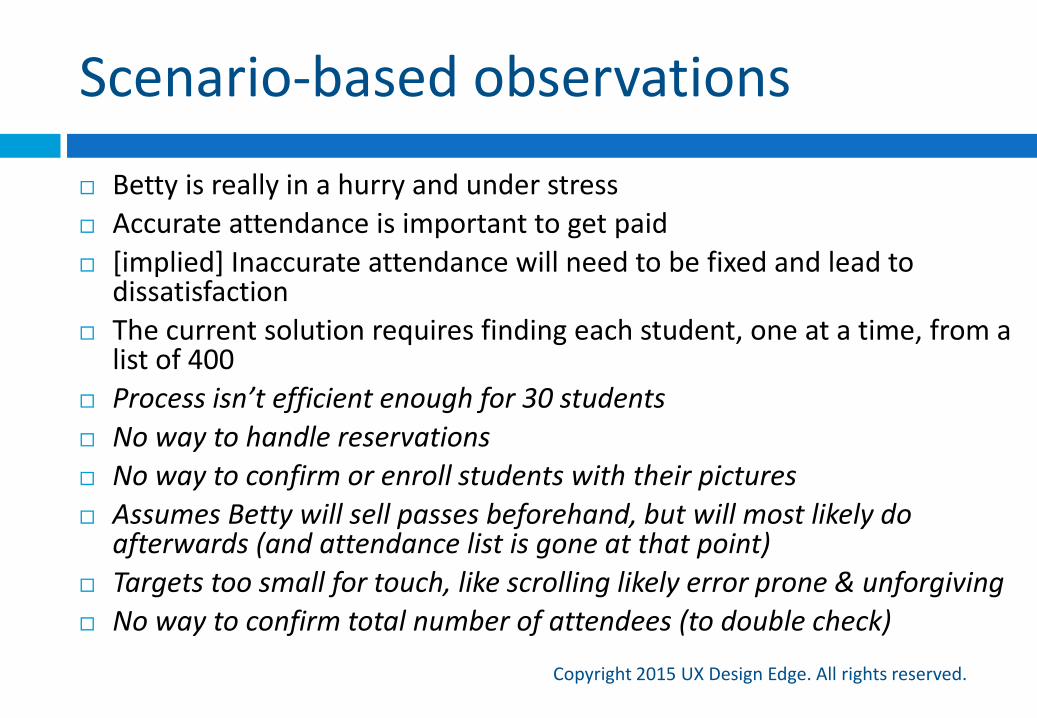
Scenario-based observations
Copyright 2015 UX Design Edge. All rights reserved.
Betty is really in a hurry and under stress
Accurate attendance is important to get paid
[implied] Inaccurate attendance will need to be fixed and lead to dissatisfaction
The current solution requires finding each student, one at a time, from a list of 400
Process isn’t efficient enough for 30 students
No way to handle reservations
No way to confirm or enroll students with their pictures
Assumes Betty will sell passes beforehand, but will most likely do afterwards (and attendance list is gone at that point)
Targets too small for touch, like scrolling likely error prone & unforgiving
No way to confirm total number of attendees (to double check)
What I’m expecting
Copyright 2015 UX Design Edge. All rights reserved.
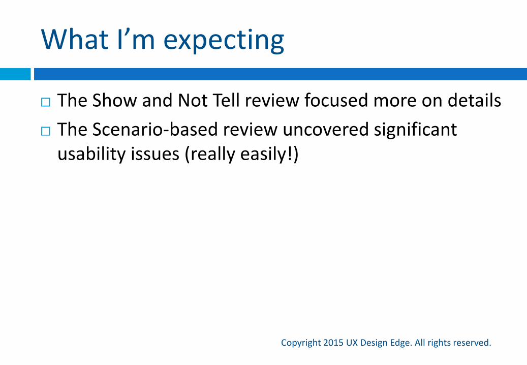
The Show and Not Tell review focused more on details
The Scenario-based review uncovered significant usability issues (really easily!)

Copyright 2015 UX Design Edge. All rights reserved.
Almost done!
But don’t leave…there’s a free book on the line!
Summary and wrapup
Copyright 2015 UX Design Edge. All rights reserved.
If you remember only 7 things…
Copyright 2015 UX Design Edge. All rights reserved.
1. Effective design reviews are hard to do well—there is plenty of room for improvement
2. You own the review goals & process; manage up as required
3. There are many design review problems, but they all have simple solutions
4. Different roles have different skills and goals, so learn how to handle them
5. Have design review rules and make it a positive experience
6. Scenario, Inductive task, and SCW reviews can be amazing!
7. Show and Tell reviews are not, but you can redeem them by turning them into Communication reviews
Got feedback?
Copyright 2015 UX Design Edge. All rights reserved.
Would love to hear it!
Please send it to [email protected]
Share your thoughts on Twitter (#greatDesignReviews)
Get a business card
Let’s connect on LinkedIn and Twitter (@uxdesignedge)
Book giveaway!
Questions
Copyright 2015 UX Design Edge. All rights reserved.
Copyright 2015 UX Design Edge. All rights reserved.
Brilliant!
Copyright 2015 UX Design Edge. All rights reserved.