Embed Size (px)
Citation preview

Initial ResearchWhat is a poster?
Internet findings
A poster is any piece of printed paper designed to be attached to a wall or vertical surface.[1] Typically posters include both textual and graphic elements, although a poster may be either wholly graphical or wholly text. Posters are designed to be both eye-catching and informative. Posters may be used for many purposes. They are a frequent tool of advertisers (particularly of events, musicians and films), propagandists, protestors and other groups trying to communicate a message. Posters are also used for reproductions of artwork, particularly famous works, and are generally low-cost compared to original artwork. Source - http://en.wikipedia.org/wiki/Poster
noun 1. a placard or bill posted or intended for posting in a public place, as for advertising.
Source - http://dictionary.reference.com/browse/poster
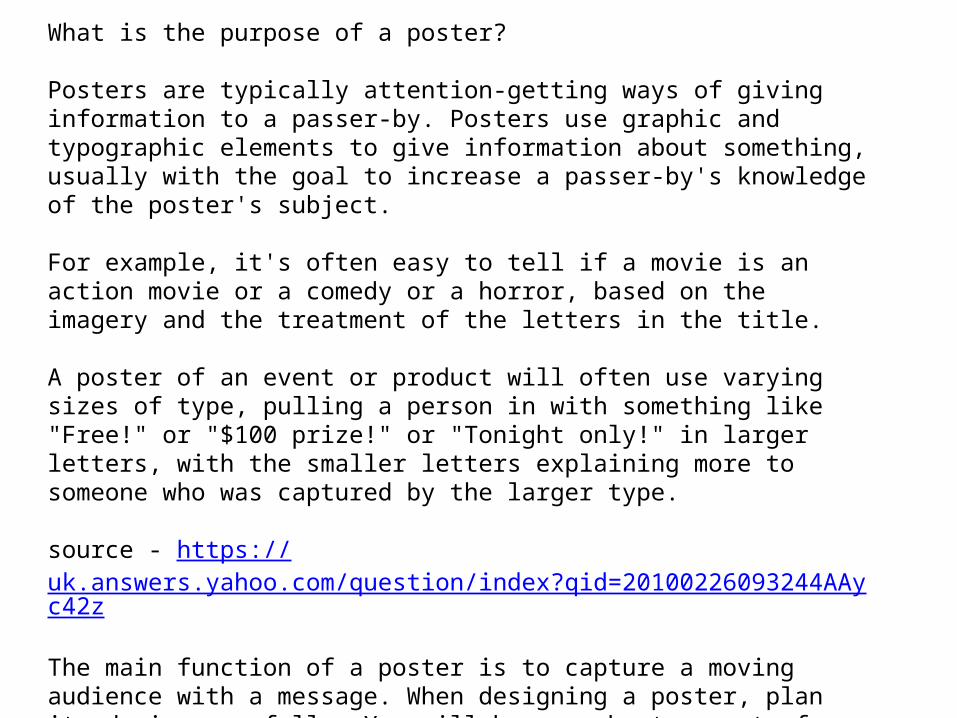
What is the purpose of a poster? Posters are typically attention-getting ways of giving information to a passer-by. Posters use graphic and typographic elements to give information about something, usually with the goal to increase a passer-by's knowledge of the poster's subject.
For example, it's often easy to tell if a movie is an action movie or a comedy or a horror, based on the imagery and the treatment of the letters in the title.
A poster of an event or product will often use varying sizes of type, pulling a person in with something like "Free!" or "$100 prize!" or "Tonight only!" in larger letters, with the smaller letters explaining more to someone who was captured by the larger type.
source - https://uk.answers.yahoo.com/question/index?qid=20100226093244AAyc42z
The main function of a poster is to capture a moving audience with a message. When designing a poster, plan its design carefully. You will have a short amount of time to attract and hold your readers attention. Think about the one aspect of the information that must convey the message and plan your design around that
http://www.cis.rit.edu/htbooks/dtp/projects/poster/poster1.html

What does a typical poster look like?
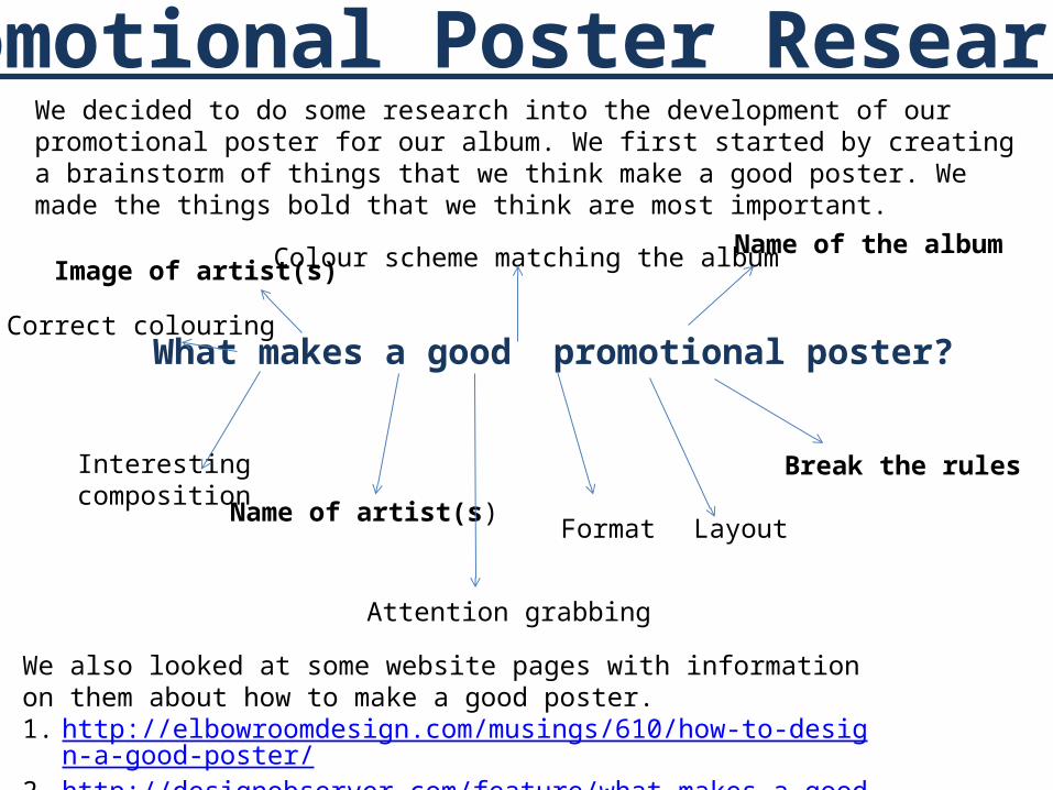
What makes a good promotional poster?
Image of artist(s)Name of the albumColour scheme matching the album
Name of artist(s)
Interesting composition
Layout Format
Attention grabbing
Correct colouring
Break the rules
Promotional Poster Research We decided to do some research into the development of our promotional poster for our album. We first started by creating a brainstorm of things that we think make a good poster. We made the things bold that we think are most important.
We also looked at some website pages with information on them about how to make a good poster. 1. http://elbowroomdesign.com/musings/610/how-to-design-a-good-poster/2. http://designobserver.com/feature/what-makes-a-good-poster/4917

The first poster that we looked at was the one to the right, ‘Lungs’ by Florence and The Machine. We started off with this poster due to the fact that this is the artist of the song that we chose to make our music video for. The first thing that we noticed about this was the fact that the title of the album is printed in large letters in order to get the audience’s attention. The name of the artist is clearly placed at the top of the page, this helps promote the album in the sense that the fans of the artist and their previous albums will be influenced to buy and listen to the album. We like the fact that even though the poster has interesting art on the front which keeps the eye entertained, it is very informative and gives clear information including the date of the albums release, some of the singles included, the website and the fact that the album can be downloaded/bought on many different forms of media.

We decided to look at this promo poster advertising the indie band Kasabian. We thought the fact that it is for an indie artist would help us get ideas for our own genre of music as there tends to be a general style for the overall genre. We particularly like the way that this poster breaks the general conventions of pop posters due to the fact that it does not have an image of the artist on the front, it has a simple illustration portraying what seems to be a partial face. We like the simple fact that the audience has difficulty figuring out what the graphic is due to the fact that this would keep peoples interest for longer and in turn make them look at the information on the poster, therefore resulting in more sales and downloads. Again, this poster has the name of the artist/album and portrays information about the album. What we didn’t like about this poster is the fact that there is no date of release shown. However we liked the block colours, black and white used as we think it creates an interesting effect on the eye.

The thing we found interesting about this poster is the composition. We like how the poster has been designed horizontally rather than vertically, defying the usual conventions of a promotional poster and breaking the boundaries. This is something that we hope to take on board
When creating our poster. Something else we liked was the way the poster has reviews of popular magazines on the front, both giving the album 5 stars. This is also something that we hope to take on board. Again, this poster has the date of release, album name and artist name in order to appel to the target audience and give the relevant information needed.

We found the layout of this poster interesting due to the fact that the human face has been mixed with the face of an owl, then split up into four sections. We thought that something along these lines would be interesting to try and recreate due to the fact that an owl is a trending theme in our video. We liked the ‘night vision’ style filter place on top of the image as it gives a nocturnal feel to the poster which ties into the theme of the owl. We also liked the neon typewriter text as it ads a pop of colour to the dark poster.

We chose to look at this poster as we thought it tied in with our woodland inspired theme because of the tree animation. We like the way that the image inside of the tree is hard to work out, but upon close observation you can see it is a rose. The rose also ties in with our theme as we used burning roses throughout our music video. We like the way that the poster is mainly all blue, apart from the white writing and the coloured tree. This puts across information easily without distracting the audience.