Embed Size (px)
Citation preview


Double Page Spread ChangesI changed the main image, with the different model, on the left hand side of the article to a location shot. With this change I had to remove the turquoise colour scheme and I used the same dark red for certain parts of text within the article. I also changed the additional images to images of the different model which I edited using the green/red/blue balance on Photoshop. Then I decided to make the artist's name spread across the two pages instead of just one to stand out more, so I increased the size of the font. I then decided that I wanted the image on the page to stand out more so I created a copy of the main image and mirrored it on the right hand side of the page underneath the text but I edited this mirror copy so that it had more grey-scale in it so the text was still visible and legible. I then added a filter to the original main image making it stand out more.

As I had changed the model for the main artist on the front cover, I also took new photos for the double page spread. I went for location shots, and I tried to make the mise-en-scene less fashion like and more like a photo shoot of a music artist.

I removed the previous photo with the old model. I then moved the new image to the same place on the double page spread.
I also removed the turquoise background colour as I thought that this was one of the components of the first draft that made the magazine look more like a fashion focused text.

Using the pipette tool I took the grey colour from the top of the main image and used this as the colour for the background underneath the text on the right side of the article.
I removed the additional images from this panel as they were of the previous model.

I took two additional photos for the additional images on the double page spread. One was on location and one was a medium close up. I edited the brightness and contrast of the location shot and the medium close up I edited the levels and added more blue levels to the image.

I then placed the two additional images in this white panel where the previous additional images had been.

As with the front cover I experimented with different colour fonts, I also tried the same purple font that I tried on the front cover.
With my first draft I used the shape tool to place a rectangle underneath the page number. I changed the colour of this to match the text: purple.
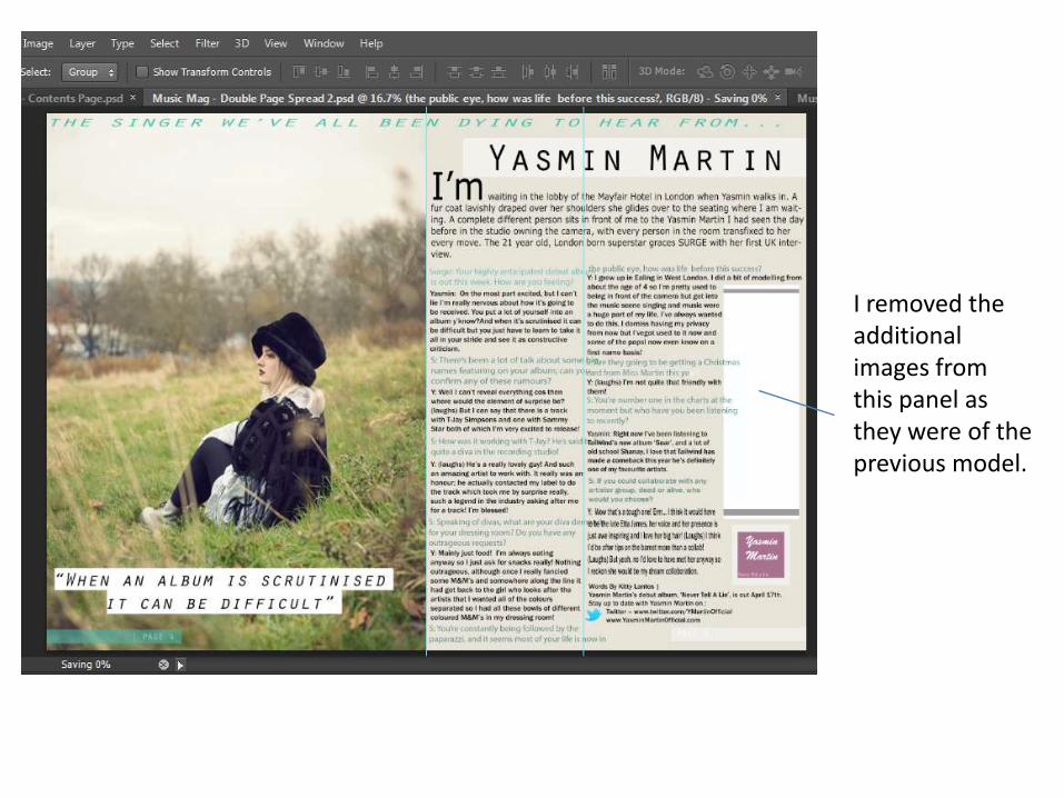
I decided on the same red colour that is used on the front cover and this is another additional way to maintain the consistency of the magazine.
I also changed the opaque shape underneath the page number to the same colour red.

I decided that the grey background didn’t make enough of an impact on the page, I then reversed the main image and edited it decreasing its hue so that the text on top of it was still legible.

I used the image editing filters on photoshop to edit the main image to make it more grainy. This gave the desired effect, and created an image that catches the eye much more.