Embed Size (px)
Citation preview

Double Page Spread
Initial Designs For First DraftThe first hand drawn design for the double page spread followed a U shape design. The image would be placed at the top of the middle with text surrounding. The left and bottom would be text for the article, whilst the right hand side would be a separate box to focus on a minor feature, potentially other artists who aren’t as key.

Double Page Spread First Draft• The first design for a double page
spread follows a very simple layout of the image in the centre and text surrounding. The font used varies between the two styles, with Headers in Agency FB and Calibri for the main body. The colours of Amber and Green are the two that looked the most appealing on the plain background. The manipulated image in the bottom right has been cut around to just leave Alvarez with no background so he can blend against the paper.
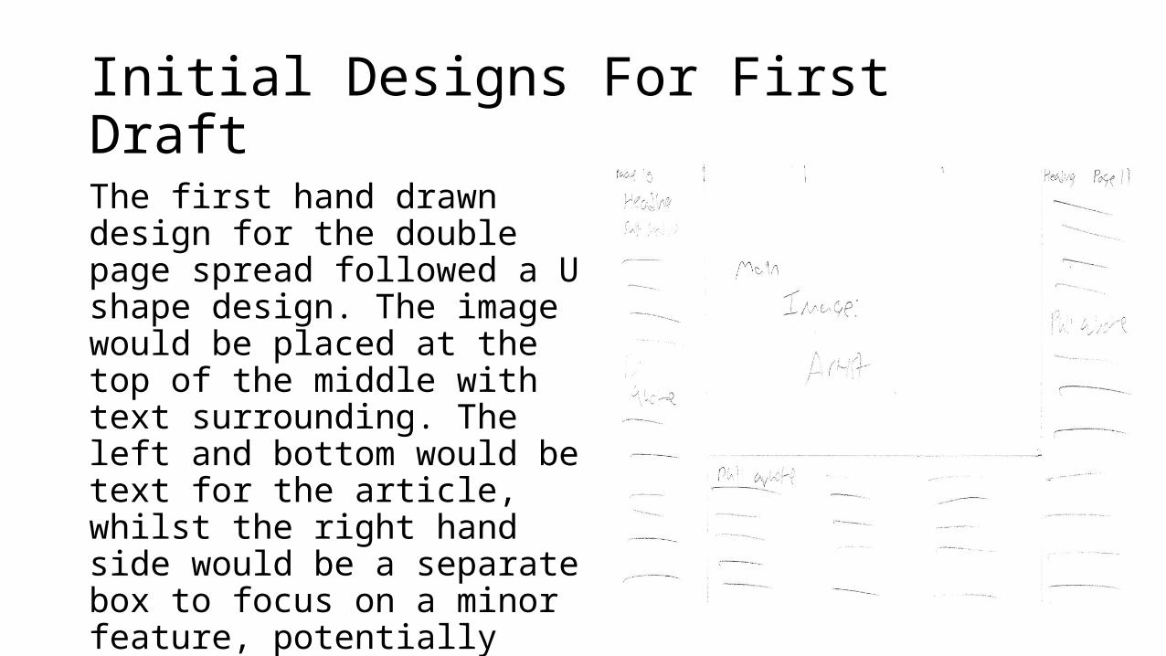
Comparison of initial designs and first draft
The differences between the two designs are very slim, due to the fact that the designs worked well. The only major change was the space the main article took up the entire page. The manipulated shot is there as an additional image, which is sort of a homage to my original design as they both had an image in that corner of an artist.

Manipulated ImageThe manipulated image was taken from one of the original images we had (As shown to the top left). After lowering the brightness, we closely cropped around the body of the model on Photoshop before putting it onto a white background. After that, the image fit quite easily into the background of the double page spread.

Peer Reviews• The main criticisms for the
DPS would be the plain background. It was suggested multiple times that using an alternative colour scheme, such as black background and white text, could look better and more appealing. Besides that, most of the peer reviews were incredibly positive and a lot of people seemed impressed with the first draft

Double Page Spread EditsDue to the success of the original design, there was little that needed changing to improve. Two main significant changes were the images and colour scheme. The change from white background to black background was an important one as it fell in line with the changes made to the rest of the magazine, as well as being similar to the general style of other acoustic magazines.The image was for numerous reasons. One of which is the other image was used on the front cover. Because of an issue with the transferral of the manipulated image, we now had a good photo that was going unused, so we transferred it to the central focus of the double page spread. Originally only using the bright circle in the middle of the image, we later decided to layer a darker toned image behind to give a different effect for the background.

Audience FeedbackThe large edit that the double page spread went through needed reanalysing because of its major differences. The feedback received was almost completely positive. There were only minor details missing, like author credits and certain grammatical errors. Looking at the two side by side there are very few differences whatsoever.

Alternative Design• After finishing the minor changes, we
decided to attempt a larger scale change. The main double page spread format was swapped so we could add a secondary article alongside the main focus on Alvarez. The style has been conventional in several other acoustic magazines, but considering the main focus of the double page spread was one artist, the idea was quickly scrapped.