Embed Size (px)
Citation preview

Graphic Design Elements In Board Games
Kelsie Nunnally
IDT 7060
11/17/13
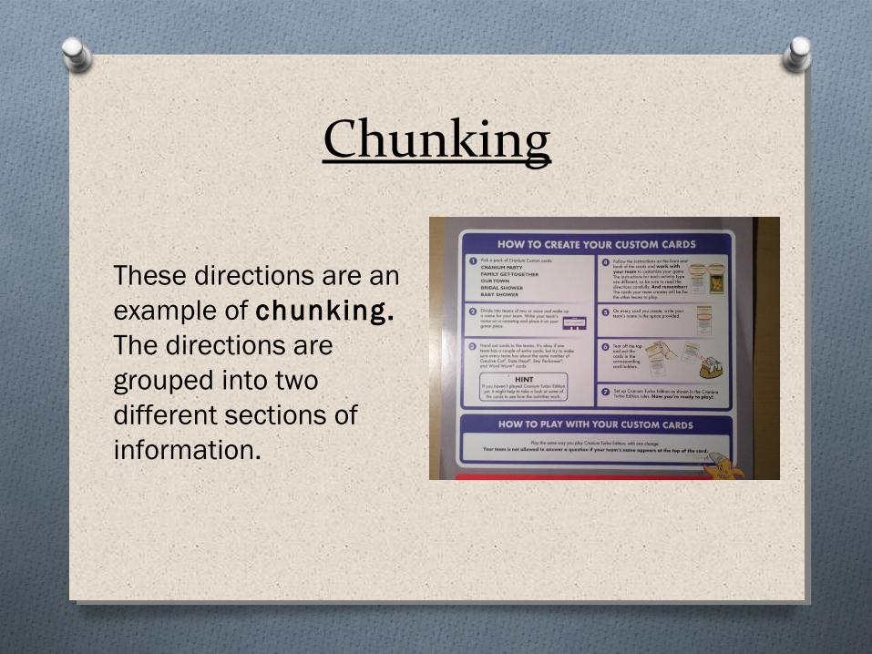
Chunking
These directions are an example of chunking. The directions are grouped into two different sections of information.

Chunk
This section of the instructions represents a chunk, or a unit of information.
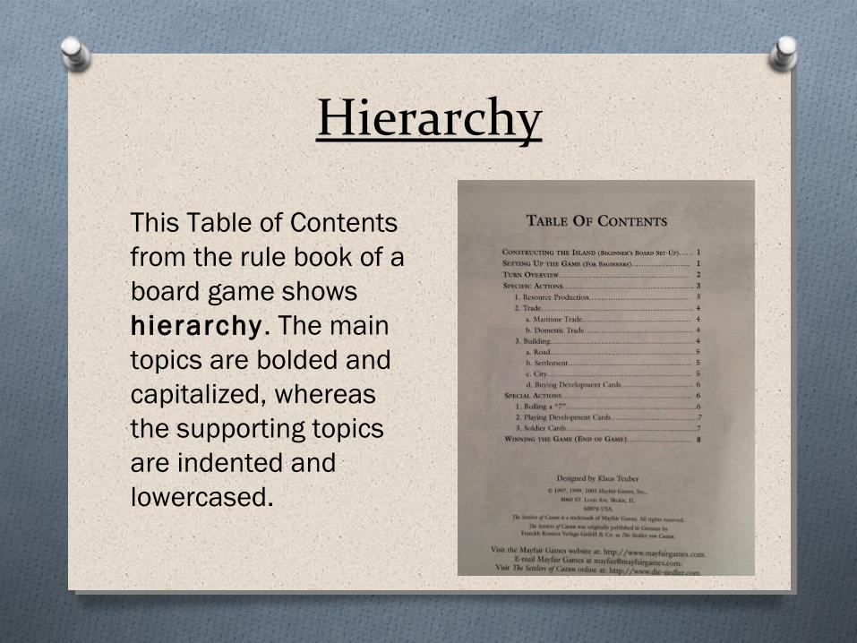
Hierarchy
This Table of Contents from the rule book of a board game shows hierarchy. The main topics are bolded and capitalized, whereas the supporting topics are indented and lowercased.

ClosureThis graphic demonstrates the element of closure. The graphic designer did not need to draw a complete person to communicate the action. Our knowledge tells us that the hand is representing a person.

Contiguity
This game board incorporates the element of contiguity . The board has strong, straight pathways through the middle of the board that players’ eyes will follow.

Golden Rectangle
These elements from a Monopoly game board demonstrate the concept of the golden rectangle. The proportions of these rectangles create a game board that is pleasing to the eye.

Similarity
These game cards are an example of similarity. Although the information may be different, all of the cards follow a similar layout grid and grouping.
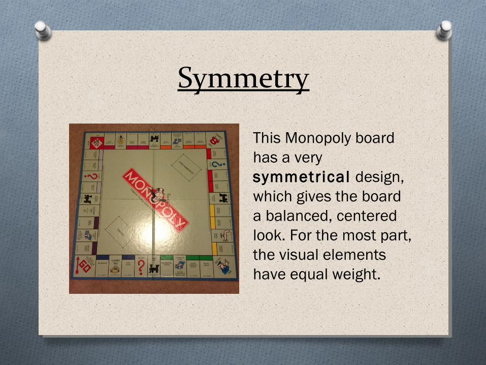
Symmetry
This Monopoly board has a very symmetrical design, which gives the board a balanced, centered look. For the most part, the visual elements have equal weight.
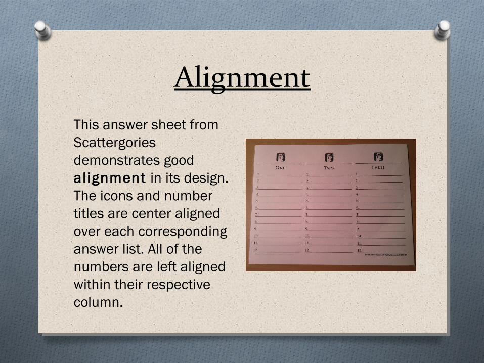
AlignmentThis answer sheet from Scattergories demonstrates good alignment in its design. The icons and number titles are center aligned over each corresponding answer list. All of the numbers are left aligned within their respective column.

ContrastThis Monopoly money shows contrasting elements to help the player identify the most important information. The “50” is in bold print and stands out from the rest of the bill to make it easier for the player to identify the value of the bill.

ProximityProximity is used in this trivia card to match the question with the appropriate category. Due to the close distance between the category icon and the corresponding question, a player can easily identify which question to ask.

Repetition
These game cards are great examples of repetit ion. The same font styles and sizes are used in each card. Also, the layout of each card remains the same.

ReferencesO Lohr, L.L. (2008). Creating Graphics for Learning and
Performance: Lessons in Visual Literacy (2nd ed.). Upper Saddle River, N.J.: Merrill Prentice Hall.