Embed Size (px)
DESCRIPTION
Citation preview

Technical Sciences Brassersplein 2 2612 CT Delft P.O. Box 5050 2600 GB Delft The Netherlands www.tno.nl T +31 88 866 70 00 F +31 88 866 70 57 [email protected]
TNO report 35510 | Final report
Visualization of Social Networks
Date 1 June 2011 Author(s) Erik Boertjes, Bas Kotterink, Edsger Jager
Copy no No. of copies Number of pages 44 (incl. appendices) Number of appendices 2 Sponsor Project name Netwerk-innovatie Project number 035.33920 All rights reserved. No part of this publication may be reproduced and/or published by print, photoprint, microfilm or any other means without the previous written consent of TNO. In case this report was drafted on instructions, the rights and obligations of contracting parties are subject to either the General Terms and Conditions for commissions to TNO, or the relevant agreement concluded between the contracting parties. Submitting the report for inspection to parties who have a direct interest is permitted. © 2011 TNO

TNO report | 35510 | Final report 2 / 44
Summary and Conclusions
• Current visualizations of social networks are mostly some form of node-link diagram. Depending on the type of social network, this can be some tree-visualization with a strict hierarchical structure (Figure 1) or a more generic network visualization (Figure 2).
Figure 1 Tree visualization
Figure 2 Network visualization
• In these visualizations, the characteristics of a social network are often
depicted by varying the size and colour of nodes.
• Most common social network characteristics used are betweenness, closeness, and degree. These are types of Social Network Analysis (SNA) metrics (see Chapter 2).
• The main problem of node-link diagrams is that they become easily
cluttered and unreadable when depicting large datasets. This is typically solved by:
o using layout algorithms that try to prevent clutter as much as possible. In node-link diagrams, force-directed layout algorithms are the most popular.

TNO report | 35510 | Final report 3 / 44
o offering possibilities for interaction with the visualization. Filtering (on both domain-specific attributes as well as SNA metrics) and zooming are examples of often used types of interaction.
o not visualizing the network structure itself, but by showing SNA metrics of nodes and edges instead, allowing to pinpoint anomalies: interesting nodes and/or edges. Hybrid approaches that allow the user to switch between multiple visualizations of the same network seem most promising.
• Showing dynamic aspects of networks is gaining importance, however
research on the topic is still in its infancy.
• Animation is often used in DNA (dynamic social analysis), showing the changes of a network over time by a series of consecutive snapshots. Such network movies are aesthetically pleasing but relatively hard to interpret.
• Instead of, or in addition to animation, line graphs can be used to show
development of a network over time. They typically show the value of one or more SNA metrics over time.
• More research is needed in: o Visualization of dynamic aspects. Besides network movies and line graphs
other types of visualization may be useful, such as sequence diagrams. o Hybrid approaches combining different types of visualizations in one tool.
What are good combinations of visualizations? o New ways of interaction. Interaction is key in visualization but current
visualizations offer not much more than zooming and filtering. o Visualizing uncertainty: many social networks are based on possibly
unreliable and incomplete data, especially in forensic analysis. Most tools are not able to visualize this uncertainty.
o Combining social networks and geographical data. Not one tool in this research is capable of incorporating maps in network visualizations, while geographical attributes often play a key role in an analysis.
o Visualizing communication patterns within a social network.
• We need a realistic case with dynamic data and possibly geographic aspects to evaluate promising visualization methods from this report.

TNO report | 35510 | Final report 4 / 44
Contents
Summary and Conclusions ........................... ......................................................... 2
1 Introduction ...................................... ........................................................................ 5
2 Social Networks and Social Network Analysis ....... .............................................. 6
3 Visualization of Social Networks .................. ....................................................... 10
3.1 (Social) network visualizations ................................................................................ 10
3.2 Visualizing SNA metrics .......................................................................................... 18
3.3 Non-topological visualizations ................................................................................. 21
3.4 Interaction ................................................................................................................ 27
4 Visualization of social network dynamics .......... ................................................ 30
4.1 Line graphs .............................................................................................................. 31
4.2 Network movies and animation ............................................................................... 33
4.3 Hybrid approaches................................................................................................... 34
5 References ........................................ ..................................................................... 35
Appendix A Research groups and people.............. ............................................................. 38
Appendix B Tools for Social Network Analysis and Vi sualization ................................... 40

TNO report | 35510 | Final report 5 / 44
1 Introduction
This report describes the state of the art in visualizing social networks: networks of people and the relations between them. It is part of a larger TNO Research effort into the principles and mechanisms of network innovation systems. We expect that insight in the structure and dynamics of large scale social networks may contribute to an understanding of innovation performance. Knowing how social network characteristics (such as structure and dynamics) are related to aspects of innovation processes (such as quality and performance) may guide approaches aimed at promoting innovation. Since social networks are highly dynamic both in structure and communication patterns, part of this investigation will focus on the analysis of dynamic aspects of social networks. Chapter 2 starts with explaining social networks and the research domain Social Network Analysis (SNA). The value of visualization and its relevance in social network analysis is discussed in Chapter 3. Chapter 4 concludes with describing ways to visualize dynamic aspects of social networks and the insights that can be gained from these visualizations. SNA as a research field is developing rapidly. Appendix A lists people, research groups and conferences that are leading the field. It is important to keep track of these groups, their research and the tools that they provide. Appendix B lists commonly used tools for analyzing and visualizing networks.

TNO report | 35510 | Final report 6 / 44
2 Social Networks and Social Network Analysis
A social network is a social structure made up of individuals (or organizations) called "nodes", which are tied (connected) by one or more specific types of interdependency, such as friendship, kinship, common interest, financial exchange, dislike, sexual relationships, or relationships of beliefs, knowledge or prestige [Wikipedia10]. Social Network Analysis (SNA) is the study of these networks, trying to derive and interpret characteristics of either a whole network (also known as complete networks) or personal networks (also known as egocentric or ‘ego’ networks). The distinction between those two stems from the fact that in some cases a complete network is known (e.g. all employees of an organization and their formal ties are known) but more often, only part of a network is known because the network is too large (e.g. Facebook) or information is simply not available or very uncertain (al Qaeda).
Figure 3 An ego network: only people that have direct links with a specific person (in this case: Amanda) are shown. Taken from [Heer05].
SNA uses metrics to quantify important characteristics of the network as a whole (e.g. diameter), or characteristics of individual nodes (e.g. centrality). Whether a characteristic is ‘important’ depends on the domain in which the analysis is

TNO report | 35510 | Final report 7 / 44
performed, which determines the type of nodes or subgroups that are considered to be of interest. There are a lot of metrics and characteristics available, assisting in:
• determining the social role (leader, gatekeeper, outlier) of an individual • determining anomalies: any individual or relation that differs significantly
from the others; a ‘special’ case that may need investigation. • finding subgroups • finding interaction patterns between individuals or between subgroups.
Some of these metrics apply to individual nodes, some of them to groups of nodes, and some of them to the network as a whole. Table 1 gives a list of metrics from [Wikipedia10]. The metrics and classifications most common in literature, and their translation to the domain of social networks are listed below: Centrality: A measure of ‘social power’; it is a collection of the following metrics:
• degree: accessibility of a node to other nodes or how active an individual is. This individual could be the leader or hub in his group or the network. Mohammed Atta had the highest degree and acted indeed as the leader of his subgroup in the Al Qaeda network.
• betweenness (high value can indicate a role as a gatekeeper) • closeness (how easily a member may connect to other members)
Connectedness: More connections often mean that individuals are exposed to more, and more diverse, information. Highly connected individuals may be more influential, and may be more influenced by others. Differences among whole populations in how connected they are can be quite consequential as well. Disease and rumors spread more quickly where there are high rates of connection. But, so too does useful information. Other populations may display sharp differences, with a small elite of central and highly connected persons, and larger masses of persons with fewer connections. Distance: Distance between actors (or, conversely how close they are to one another). Some actors may be able to reach most other members of the population with little effort: they tell their friends, who tell their friends, and "everyone" knows. Other actors may have difficulty being heard. They may tell people, but the people they tell are not well connected, and the message doesn't go far. Reachability: An actor is "reachable" by another if there exists any set of connections by which we can trace from the source to the target actor. Density: The density of a network may give us insights into such phenomena as the speed at which information diffuses among the nodes, and the extent to which actors have high levels of social capital and/or social constraint. Group balance: reciprocity, transitivity and imbalance of relations between the members of a group. Group stability: a dynamic aspect measuring the change in composition and structure of a group. Positional stability: a dynamic aspect measuring the change of an individual node’s metrics over time. See [Nakao93].

TNO report | 35510 | Final report 8 / 44
Topological similarity, or structural equivalence: indicates to what extend two nodes’ SNA metrics are equal. Component: Part of a network completely disconnected from the rest of the network. It represents a subgroup of people that are related to each other, but have no relations to other people in the network. Block: part of a network that would become disconnected if one node or one relation were removed. The node that, if removed, would cause part of a network to become disconnected is called the cut point. The corresponding individual is vital for the connection of the block with the rest of the social network. K-cores: parts of the network that form sub-groups such that each member of a sub-group is connected to N-K of the other members. A k-core is one definition of a 'group' or 'sub-culture' in a network. It is a set of nodes that are more closely connected to one another than they are to nodes in other k-cores. Clique: group (i.e. subset of the network) whose members are connected to all other members. Lambda sets: The Lambda set approach ranks each of the relationships in the network in terms of importance by evaluating how much of the flow (e.g. communication) among individuals in the network goes through each link. It then identifies sets of relationships which, if disconnected, would most greatly disrupt the flow among all of the individuals. These relationships are called bridges. They are the points at which the (social) network is most vulnerable to disruption.
Betweenness The extent to which a node lies between other nodes in the network. This measure takes into account the connectivity of the node's neighbours, giving a higher value for nodes which bridge clusters. The measure reflects the number of people who a person is connecting indirectly through their direct links.
Bridge An edge is said to be a bridge if deleting it would cause its endpoints to lie in different components of a graph.
Centrality This measure gives a rough indication of the social power of a node based on how well they "connect" the network. "Betweenness", "Closeness", and "Degree" are all measures of centrality.
Centralization The difference between the number of links for each node divided by maximum possible sum of differences. A centralized network will have many of its links dispersed around one or a few nodes, while a decentralized network is one in which there is little variation between the number of links each node possesses.
Closeness The degree an individual is near all other individuals in a network (directly or indirectly). It reflects the ability to access information through the "grapevine" of network members. Thus, closeness is the inverse of the sum of the shortest distances between each individual and every other person in the network. (See also: Proxemics) The shortest path may also be known as the "geodesic distance".
Clustering coefficient
A measure of the likelihood that two associates of a node are associates themselves. A higher clustering coefficient indicates a greater 'cliquishness'.

TNO report | 35510 | Final report 9 / 44
Cohesion The degree to which actors are connected directly to each other by cohesive bonds. Groups are identified as ‘cliques’ if every individual is directly tied to every other individual, ‘social circles’ if there is less stringency of direct contact, which is imprecise, or as structurally cohesive blocks if precision is wanted.
Degree The count of the number of ties to other actors in the network. See also degree (graph theory).
(Individual-level) Density
The degree a respondent's ties know one another/ proportion of ties among an individual's nominees. Network or global-level density is the proportion of ties in a network relative to the total number possible (sparse versus dense networks).
Flow betweenness centrality
The degree that a node contributes to sum of maximum flow between all pairs of nodes (not that node).
Eigenvector centrality
A measure of the importance of a node in a network. It assigns relative scores to all nodes in the network based on the principle that connections to nodes having a high score contribute more to the score of the node in question.
Local bridge An edge is a local bridge if its endpoints share no common neighbours. Unlike a bridge, a local bridge is contained in a cycle.
Path length The distances between pairs of nodes in the network. Average path-length is the average of these distances between all pairs of nodes.
Prestige In a directed graph prestige is the term used to describe a node's centrality. "Degree Prestige", "Proximity Prestige", and "Status Prestige" are all measures of Prestige. See also degree (graph theory).
Radiality Degree an individual’s network reaches out into the network and provides novel information and influence.
Reach The degree any member of a network can reach other members of the network.
Structural cohesion
The minimum number of members who, if removed from a group, would disconnect the group.
Structural equivalence
Refers to the extent to which nodes have a common set of linkages to other nodes in the system. The nodes don’t need to have any ties to each other to be structurally equivalent.
Structural hole Static holes that can be strategically filled by connecting one or more links to link together other points. Linked to ideas of social capital: if you link to two people who are not linked you can control their communication
Table 1 Overview of SNA metrics from [Wikipedia10]

TNO report | 35510 | Final report 10 / 44
3 Visualization of Social Networks
Visualization is the graphical display of data with the aim to give insight in that data [Ware04]. Visualization relies on the extremely powerful human visual system that enables us to see patterns, detect outliers, identify gaps, and make comparisons in the blink of an eye. Visualization is not limited to creating static images: a visualization becomes especially useful when it is interactive; allowing users to filter, zoom, correlate, aggregate, and compare the data, i.e. when it allows the user to “play with the data”. This chapter will discuss the approaches in visualization that are currently most common in the field of social network analysis and will show how visualization can be effective in giving insight in social networks, typically in combination with the SNA techniques discussed in the previous chapter. Such a combination answers questions like: are all the nodes connected? Are there many or few ties among the individuals? Are there sub-groups or local clusters of actors that are tied to one another, but not to other groups? Who are the influential individuals? What are the bridging individuals? Who are the individuals that are essential for the cohesion of the network? Etc. This chapter starts by listing common ways to visualize (social) networks. It then explains how SNA metrics can be incorporated into these visualizations.
3.1 (Social) network visualizations
Social network visualizations try to reveal the structure of a network: its individuals and the relations between them become visible, revealing for instance clusters of connected people and outliers. The algorithms behind these visualizations aim for optimum readability, minimizing ‘visual clutter’ by eliminating crossing edges, minimizing link lengths, minimizing link bends, and maximizing symmetry.
3.1.1 Node-link diagrams Node-link diagrams are the most common visualizations in (social) networks. Individuals are represented by nodes (graphically shown as circles, squares, small pictures, etc.) and relations between individuals are represented by edges (lines between nodes). There are many types of node-link diagrams, some of them specific to a certain type of network (e.g. trees), others more generic. Below are examples of both categories. Figures 4-7 show visualizations that are specific for trees: networks that are purely hierarchical and contain no cycles. Figures 8 and further show examples of network visualizations in general, not confined to one specific type of network. With minor modifications, tree-layouts can be used for non-tree networks as well: first determine the spanning tree of a network (i.e. a tree containing all nodes of the networks and a subset of its edges). Use any of the tree layout algorithms (e.g. radial layout of balloon tree) to position the nodes of the network. Then draw all edges between the nodes. The network at the right-hand side in Figure 6 is an example of a non-tree network, that is visualized using the radial tree layout following this approach.
TNO report | 35510 | Final report 11 / 44
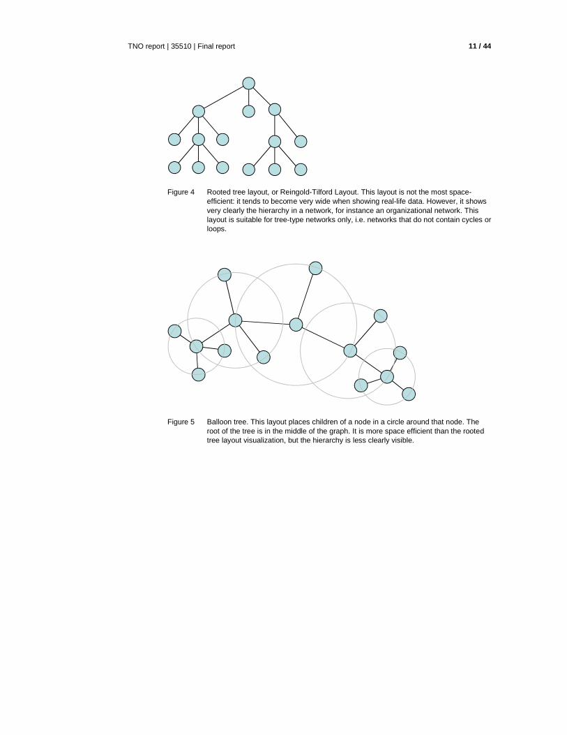
Figure 4 Rooted tree layout, or Reingold-Tilford Layout. This layout is not the most space-efficient: it tends to become very wide when showing real-life data. However, it shows very clearly the hierarchy in a network, for instance an organizational network. This layout is suitable for tree-type networks only, i.e. networks that do not contain cycles or loops.
Figure 5 Balloon tree. This layout places children of a node in a circle around that node. The root of the tree is in the middle of the graph. It is more space efficient than the rooted tree layout visualization, but the hierarchy is less clearly visible.

TNO report | 35510 | Final report 12 / 44
Figure 6 Radial layout (left). This algorithm places nodes on increasing larger radii, starting with the root node of the tree, and putting nodes on each lower level in the tree on a larger circle. The image at the right hand side shows a non-tree network visualized by having its spanning tree laid out using the radial layout algorithm. (Image taken from [Perer08]).
Figure 7 Hyperbolic tree layout (left: 2D created by the GraphViz tool, and right: 3D created by the Walrus tool, see Appendix B). This is a form of radial layout. The nodes in the middle of the circle (or sphere) are given more space than those on the edges. The user can interactively put other nodes in the middle. This allows to show a part of the graph clearly in detail while still showing the global context. These are especially suitable for tree-networks.

TNO report | 35510 | Final report 13 / 44
Figure 8 Force-based or force-directed or Spring-embedder layout. This is a class of algorithms that assign forces as if the edges were springs (Hooke's law) and the nodes were electrically charged particles (Coulomb's law). The entire graph is then simulated as if it were a physical system. This results in highly connected individuals migrating to the center, while less connected individuals are pushed to the outside. Most tools use the Fruchterman-Reingold algorithm in combination with the Kamada-Kawai algorithm. It often gives aestatically-pleasing layouts, but the algorithms have slow run time, it can take quite a while before the network ‘settles’, i.e. reaches equilibrium. Image from [Heer05].

TNO report | 35510 | Final report 14 / 44
Figure 9 Circle layout. All nodes are arranged on one circle, with regular space between the nodes. The nodes may be put on the circle in a certain order depending on a nodes characteristic. Edges may be clustered to increase visibility (see Figure 13: radial treemap layout). Image created with NodeXL, see Appendix B.
Figure 10 An arc diagram uses a one-dimensional layout of nodes, with circular arcs to represent links. While arc diagrams may not convey the overall structure of the graph as effectively as a two-dimensional layout, with a good ordering of nodes it is easy to identify cliques and bridges [Heer10].
Edge bundling techniques In geographically-based networks, the position of each node has a clearly defined meaning, for instance the location (e.g. home-town) of

TNO report | 35510 | Final report 15 / 44
an actor on a map. In that case it is not desirable to vary the positions of the nodes in order to reduce visual clutter. Force-directed algorithms may be applied locally to prevent that nodes overlap each other, but cannot be used globally because nodes have a predefined location on the map. A solution is to focus on the edges: [Holten09] describes a method of edge clustering, making node-link diagrams with predefined node positions more readable (see Figure 11). Edge-bundling algorithms are also used in circular graphs and radial treemaps.
Figure 11 Edge bundling in a US migration network (1715 nodes, 9780 edges) (a) not bundled and (b),(c),(d) using various techniques. The same migration flow is highlighted in each graph. Copied from [Holten09].
3.1.2 Treemaps Treemaps layouts are a type of containment or space-filling layout. This means that nodes are placed inside other nodes. In a traditional treemap, each node is represented by a rectangle; its children are drawn as rectangles placed inside the parent node’s rectangle. The size of each rectangle can be varied according to some numerical attribute of a node (e.g. number of employees in a department).

TNO report | 35510 | Final report 16 / 44
Figure 12 Rectangular treemap layout. Suitable for displaying trees (hierarchical networks) only, typically up to three layers at a time before the image becomes unreadable. The outer rectangle represents the root of the tree (‘TNO ICT’), which is divided into departments (‘IT’, ‘CT’, ‘IM’, ‘DIR’, ‘OPR’, ‘MKT’ and ‘kennis’). Each of these are divided into sub-departments (like ‘BIS’, ‘SEM’, and ‘SEC’). The area of each (sub-)department represents the number of people working in that (sub-)department. The color represents the percentage of women working in the sub-department: the more orange, the higher the percentage of women.

TNO report | 35510 | Final report 17 / 44
Figure 13 Radial treemap layout (also ‘circular bundle view’) of a compound graph showing two types of relations: 1) hierarchical relations, grouping actors into departments and departments into larger departments, visualized by the rings, and 2) relations between actors, e.g. ‘working together in a project’ visualized by the black lines.
3.1.3 Adjacency matrix In an adjacency matrix, all individuals are displayed alongside the two sides of a matrix. Each column represents an individual, and each row represents an individual. When there is a relation between two individuals, the cell that is on the crossing of the corresponding row and column is highlighted. Adjacency matrices tend to be less intuitive than node-link diagrams, but may solve some of the visual clutter that comes with node-link diagrams.

TNO report | 35510 | Final report 18 / 44
Figure 14 Les Misérables characters presented in an adjacency matrix. Each character is represented by a row and a column in the matrix. An entry in the matrix is colored if its row and column characters interact [Heer10].
3.2 Visualizing SNA metrics
In all given examples of network visualization above, there is some graphical freedom that allows to change the appearance of the visualization, while still preserving the visibility of the network structure. In node-link diagrams for instance, we can play with the color, size, and shape of each node, and with the thickness and color of each edge without altering the structural layout of the image. In treemaps, we can freely choose size and color of the rectangles, and in an adjacency matrix, there is room for changing the color of the cells, and the order of the actors along the sides of the matrix. This graphical freedom allows for displaying characteristics of individuals and relations, in addition to the network structure. These can be domain-dependent characteristics: in a network representing an organization, we can color the nodes according to the function of their corresponding actors. Line management = blue, staff = red, other = green. Their size may depend on the number of years working at the company: larger nodes represent actors that have been working for a long time at the company, smaller ones are actors relatively new in the organization.

TNO report | 35510 | Final report 19 / 44
Many papers propose to use this graphical freedom to show topological, domain-independent characteristics of nodes and edges, i.e. characteristics based on SNA metrics. This functionality is present in most SNA tools. Node size for instance may depend on degree, node colour may depend on centrality, etc. This makes nodes that are interesting from a SNA perspective pop out in the visualization. Figure 15 gives an example.
Figure 15 Node-link diagram in which the nodes are colored according to centrality, via red (low centrality) via yellow and green to blue (high centrality). The most central nodes are immediately visible. ([Wikipedia10]).
Figure 16 Screenshot of the SocialAction tool [Perer08] in which nodes are colored according to betweenness-centrality. Notice the dual approach of listing statistics on the left, and

TNO report | 35510 | Final report 20 / 44
visualization on the right. Clicking a value on the left will highlight the corresponding node on the right, and vice versa.
Figure 17 Node-link diagram created with the CytoScape tool (see Appendix B). Here both domain-specific as well as topological characteristics are visualized. Edge-thickness represents relation strength (domain-specific), node size represents degree (topological), node color represents expertise of an actor (domain-specific).

TNO report | 35510 | Final report 21 / 44
Figure 18 Node-link diagram created with NetDraw (see Appendix B). Node-size represents degree, nodes with the same color belong to the same k-core (some type of subgroup, see Chapter 2).
Figure 19 Node-link diagram, again created with NetDraw (see Appendix B). The location of the nodes is not determined by any of the algorithms listed above. Instead, it is based purely on SNA characteristics. A so called Multi-Dimensional Scaling algorithm is used to determine similarity between two nodes and putting nodes that are similar close together, while putting dissimilar nodes further apart. In this example, two nodes are "similar" to the extent that they have similar shortest paths (geodesic distances) to all other nodes. Color and shape represent some domain-specific characteristics.
3.3 Non-topological visualizations

TNO report | 35510 | Final report 22 / 44
Some networks are so large, that no matter how sophisticated the layout algorithm, the visualization contains too many nodes and relations and becomes cluttered. Some papers (e.g. [Hanneman05], [Viégas04]) propose to use in those cases visualizations that do not reveal the topology (i.e. structure) of a network, but visualizations that show SNA metrics only. Below are some examples. The goal of these visualizations is to identify interesting nodes (outliers, patterns, similarity) and use these nodes as a starting point in exploring the network. Some tools therefore use a combination of these non-topological visualizations (e.g. scatterplot) and topological visualizations (such as node-link diagrams)

TNO report | 35510 | Final report 23 / 44
Figure 20 Histogram . A histogram can be used to show the distribution of some SNA metric of the nodes in the network. On the horizontal axis the values of the specific SNA metric are plotted. The height of each bar (vertical axis) indicates how many nodes in the network have that specific value. The image is part of a screenshot of the NodeXL tool, showing histograms of in- and out-degree distribution. Many nodes have low in-degree, but a few (possibly interesting nodes) have relative high in-degrees. The same image shows that NodeXL gives overall information about the network as well, such as number of nodes, diameter, etc.

TNO report | 35510 | Final report 24 / 44
Figure 21 Scatterplot While histograms show some sort of an aggregation (they count the number of nodes for a specific SNA value), scatterplots show each individual node in a 2D (or sometimes 3D) space. Along the axis are SNA metrics; each node is positioned along the axis according to its values of those SNA metrics. In addition to its position, each node has a certain size and color which may be coupled to other SNA metrics, so that for each node 4 SNA metrics can be shown in one picture. Image from [Perer08]. In social networks, one can think about plotting degree against the age of a person, to see if any correlation exists, or to spot anomalies. One may expect younger people to have less connections (i.e. lower degree) than older people.

TNO report | 35510 | Final report 25 / 44
Figure 22 Dendogram or Cluster diagram of structural equivalence data. The dendogram can be particularly helpful in locating groupings of nodes that are sufficiently equivalent to be treated as classes. The diagram shows, from left to right, which nodes are most similar, and thus most suitable for grouping together based on their structural similarity (i.e. similar values for their SNA metrics). Going further to the right, the diagram shows how subgroups can be combined into larger groups until the whole network is one group.

TNO report | 35510 | Final report 26 / 44
Figure 23 Sphere plot . A sphere plot is, like the histogram, a form of aggregation. It can be seen as a 2-dimensional histogram. Along the axis are values for SNA metrics. Each of the axis is divided into intervals, so that the plot shows a set of cells. In each cell, the size of the circle represents the amount of nodes whose values for the SNA metrics fall into the corresponding intervals along the axis. Where the histogram shows the distribution of one SNA metric, the sphere plot shows the distribution of two SNA metrics simultaneously. Of course, instead of SNA metrics, domain-dependend attributes may be put along the axis, like ‘age’ or ‘function’. The image is taken from the Petamedia project, by TNO, showing degree on one axis, and the domein-specific attribute ‘authority’ on the other axis.
Some tools combine these non-topological visualizations with topological visualizations (i.e. visualizations that show the actual network). By allowing the user to easily switch back and forth between visualizations, or present different visualizations next to each other on the same screen, they can use one visualization to spot interesting nodes, and use another to see the ego-network of that node, and a third one to see details of interesting nodes. SocialAction (see Figure 24) is an example of a tool that adopts this approach. Others are NodeXL and NetDraw (see Appendix B).

TNO report | 35510 | Final report 27 / 44
Figure 24 SocialAction [Perer08] allows to switch between multiple types of visualization of a social network.
3.4 Interaction
Visualizations can become cluttered and unreadable since real-life data sets tend to be very large. One way to deal with this is to choose the best visualization type for the problem at hand. The other way is to allow the user to interact with the visualization. [Shneiderman96] states that a good visualization shows a complete overview, allows for zooming & filtering, and lets the user see details on demand. Below are examples of types of interaction present in today’s tools. When interacting with a graph, nodes may appear and disappear. It is difficult to keep track of nodes if their position changes (see [Brandes06] about the importance of mental map preservation). So the visualization should keep the position of nodes as fixed as possible during interaction with the user.

TNO report | 35510 | Final report 28 / 44
Figure 25 NodeXL allows to filter on various node properties, such as degree and closeness.
3.4.1 Filtering Many tools offer some way of filtering nodes or edges, based on either domain-specific characteristics (e.g. show me only the managers of this organization) or based on SNA-metrics. The image above, taken from NodeXL, is an example of the latter. Users can hide or show nodes that have a certain degree, betweenness, etc.
3.4.2 Zooming in/out Most tools allow to zoom in or out of the network visualization. A special case of zooming is ‘fisheye viewing’. This technique provides a movable virtual magnifying glass, enlarging part of the network, while keeping the rest of the network visible. This allows for so called exploring ‘detail-in-context’.

TNO report | 35510 | Final report 29 / 44
Figure 26 Silobreaker [Silobreaker10] shows details about a node when the user hovers over that node.
3.4.3 Details on demand. By hovering over a node, or clicking it, detailed information is shown. That information can be domain-specific, like in the example from Silobreaker (Figure 26), or may contain SNA metrics such as the degree of a node, or its centrality.
3.4.4 Incremental navigation or exploration, interactive network editing. Conventional layouts of large networks usually offer, at best, only an overview of global properties such as a size, density, diameter, etc. Identifying individual elements and relationships ( "detail-in-context") is usually quite difficult [North97]. Incremental navigation lets the user start with one or a few nodes, and browse the network from there, showing only nodes that are directly linked with the ones that are found interesting by the user. This interactive network editing allows for deletion of nodes as well, so that the user can construct a network that is a the most interesting subset of the complete network. Or one can begin with the whole network and see what happens as individuals ego networks are removed.

TNO report | 35510 | Final report 30 / 44
4 Visualization of social network dynamics
Social networks are not static. They evolve because of cultural, environmental, economic, or political trends, external interventions, or unexpected events. Members may leave or join the network, they may change roles, gain more power or lose power, relations may form among members or dissolve. Groups may merge or split, the overall network may evolve from a centralized, hierarchical structure to a decentralized, flat one or vise versa. Dynamic network analysis (DNA) is the field that focuses on these dynamic aspects. The main difference of DNA to SNA is that DNA takes the domain of time into account. Whereas nodes in a traditional SNA model are static, nodes in a DNA model have the ability to learn. Properties change over time; nodes can adapt: A company's employees can learn new skills and increase their value to the network. Or, capture one terrorist and three more are forced to improvise. Change propagates from one node to the next and so on. DNA adds the element of a network's evolution and considers the circumstances under which change is likely to occur [Wikipedia10b]. Few approaches address the problem of how to analyze the social dynamics of change over time visually [Plaisant10]. We can distinguish two types of dynamics in social networks:
1. changes over time in node and/or edge properties: e.g. relations may weaken or become stronger.
2. changes in the network topology: nodes may appear or disappear, edges may appear or disappear.
Visualizations of these dynamics show change from one period to another, and when a longer period is taken into account, patterns become visible: e.g. communication patterns between nodes or patterns in growth or decline of the network. The visualizations found in literature can be divided in two approaches:
1. User line graphs to plot characteristics of nodes (e.g. degree), edges (e.g. strength), or the whole network (e.g. diameter) over time. Sudden changes in these characteristics, or trends, become visible.
2. Examine separate snapshots of the node-link diagram of the network at each point in time.
We give examples of both approaches below. Some tools incorporate both approaches, allowing the user to switch from one to another. TempoVis [Plaisant10] for instance, allows for selection of one or more nodes from a node-link diagram, and switch to a line graph in which SNA metrics of each selected node is plotted over time.

TNO report | 35510 | Final report 31 / 44
4.1 Line graphs
Figure 27 Line graph showing the SNA metrics reciprocity, transitivity, and change through time in a social network [Moody05]. The same approach is followed by [McCulloh08]:plotting average betweenness, density and closeness of all nodes in the Al Qaeda network to spot significant changes in the network structure. Another example is [Xu04] where the user can select a node from a node-link diagram; it’s characteristics (betweenness, degree, closeness) over time are then plotted in a line graph.
Figure 28 Stacked line graph . Degree is plotted on the vertical axis, time is plotted on the horizontal axis. Each line represents a node, it’s thickness represents the node’s degree. Colors are used to distinghuish lines. A sudden change in the degree of some

TNO report | 35510 | Final report 32 / 44
nodes can be seen in the upper right part and the lower right part of the image. This is one of the many contributions for the Cell Phone network visualization Contest [] that use line graphs to visualize changes in communication between persons [Grinstein08].
Figure 29 Alluvial diagram (bottom). This diagram shows how clusters within the network change over time. Here the height of each block represents the volume of flow through the cluster, with significant subsets in darker colour. The orange module merges with the red module. The blue module splits, but the significant nodes in the blue and purple modules are clustered together. Taken from [Rosvall09].

TNO report | 35510 | Final report 33 / 44
4.2 Network movies and animation
Figure 30 Network movie: sequence of network snapshots over a period of time
These consist of many snapshots of the network placed in sequence (Figure 30) and played as an animation. Two types can be distinguished:
1. Node positions fixed (flipbook movie) 2. Nodes positions not fixed (dynamic movie)
[Brandes06] mentions the trade-off between layout quality (in each snapshot the nodes are positioned in such a way that there is the least clutter) and mental map preservation (the nodes stay in the same position through all snapshots). The advantage of dynamic movies over flipbook movies is that the nodes move freely during the movie. This makes each individual graph snapshot more readable (less overlapping edges). The advantage of flipbook movies over dynamic movies is that the nodes’ positions do not change, so nodes are more easily to keep track of, and changes in nodes' shape, degree, color are more easy to see. Many visualizations use network movies. Practically all submissions for the Visualizing Network Dynamics contest [NetSci07] use animation to show changes over time. [Robertson08] questions the use of animation: the famous talk of Hans Rossling [ ] seems very intuitive and understandable, but without him explaining in a voice-over pointing out the interesting parts of the movie, the impact may be less. The strength of Rossling’s Gapminder tool lays in the sheer number of possibilities for interaction (see Section 3.4).

TNO report | 35510 | Final report 34 / 44
4.3 Hybrid approaches
Figure 31 TempoVis uses both network movies and line charts to visualize network dynamics.
TempoVis [Plaisant10] is a tool that uses both network movies and line charts (Figure 31). It allows for navigating through time using a time-slider interface. The nodes and the edges mean users and their conversations respectively. The red edges indicate the conversations of a specific month (June 2010) set by using the slider below. The big low intensity cluster (centre below) was introduced earlier than the high intensity cluster (centre top) that was added recently. Blue coloured edges mean user selections. Node size is proportional to a specific SNA metric which is dynamically calculated in each time point. Intensity is used as an indication of aging. Old nodes and edges (aging) are displayed as fading grays. The nodes' positions are fixed, and based on the most recent network layout. The tool allows for selection of edges and nodes, and displays their SNA metrics on a timeline.

TNO report | 35510 | Final report 35 / 44
5 References
[Brandes06] Brandes, Ulrik, Fleischer, Daniel, and Thomas Puppe, Dynamic Spectral Layout of Small Worlds, in: Graph Drawing (2006), pp. 25-36. [Chen05] Chen, H. et al., Visualization in Law Enforcement, Int. Conf.on Human-Computer Interaction (CHI), 2005. [McCulloh08] McCulloh, I.A., and K.M.Carley, Social Network Change Detection, CASOS centre, Carnegie Mellon University, 2008. [Carley03] Carley, K.M., Dynamic Network Analysis, in: Dynamic Social Network Analysis: Workshop summary and papers, Wahsington DC, 2003. [GeorgiaTech08] Collegeslides Georgia Tech, http://stream.cc.gt.atl.ga.us/powerpoints/infoVis [Grinstein08] Grinstein, G. et al., VAST 2008 Challenge: Introducing Mini-Challenges, IEEE Symposium on Visual Analytics Science and Technology, Columbus, 2008. http://vac.nist.gov/2008/summaries/195_196_grinstei.pdf [Hanneman05] Hanneman, Robert A. and Mark Riddle. 2005. Introduction to social network methods. Riverside, CA: University of California, Riverside (published in digital form at http://faculty.ucr.edu/~hanneman/) [Hansen11] Hansen, Derek, Smith, Marc A., and Ben Shneiderman, EventGraphs: Charting Collections of Conference Connections, Accepted to the Social Networking and Communities Mini-Track of the Forty-Forth Annual Hawaii International Conference on System Sciences (HICSS), Jan 4-7, 2011. Kauai, Hawaii. [Heer05] Heer, Jeffrey, and danah boyd, Vizster: Visualizing Online Social Networks, IEEE Information Visualization (InfoVis), 32-39, 2005. [Heer10] Jeffrey Heer, Michael Bostock, and Vadim Ogievetsky, A Tour Through the Visualization Zoo, Stanford University, http://hci.stanford.edu/jheer/files/zoo/, visited December 2010. [Holten06] Holten, Danny, Hierarchical Edge Bundles: Visualization of Adjacency Relations in Hierarchical Data, IEEE Transactions on Visualization and Computer Graphics (TVCG; Proceedings of Vis/InfoVis 2006), Vol. 12, No. 5, Pages 741 - 748, 2006. [Holten09] Holten, Danny and Jarke J. van Wijk, 11th Eurographics/IEEE-VGTC Symposium on Visualization (Computer Graphics Forum; Proceedings of EuroVis 2009), Pages 983-990, 2009. [Liu07] Liu, Wei-chung et al., A network perspective on the topological importance of enzymes and their phylogenetic conservation, BMC Bioinformatics 2007.

TNO report | 35510 | Final report 36 / 44
[Moody05] Moody, James, McFarland, Daniel and Skye Bender-deMoll, Dynamic Network Visualization, American Journal of Sociology, Volume 100 Number 4, pp 1206-41, 2005. [Nakao93] Nakao, K. and A.K. Romney, Longitudinal approach to subgroup formation: Re-analysis of newcomb's fraternity data. Social Networks, 15, 109-131, 1993. [NetSci07] Competition on Visualizing Network Dynamics, NetSci, Queens, NY, 2007. [North97] Dynamic Graph Layout and Information Visualization , Stephen C. North, AT&T Laboratories, http://www.codata.org/archives/1997/1997Vis/sp12.htm [Perer08] Perer, Adam and Ben Shneiderman Integrating Statistics and Visualization: Case Studies of Gaining Clarity during Exploratory Data Analysis, Proceedings of ACM CHI 2008, pp.265-274. [Plaisant10] Plaisant, C. et al, Temporal Visualization of Social Network Dynamics: Prototypes for Nation of Neighbors, Tech Report HCIL-2010-28, University of Maryland, 2010. [Putte07] Putte, X. van de, Integration of Spatial Information and Time in Criminal Network Visualization [Robertson08] Robertson, G. et al, Effectiveness of Animation in Trend Visualization, [Rosvall09] Rosvall, M. and C.T. Bergstrom, Mapping change in large networks, http://octavia.zoology.washington.edu/publications/working/RosvallAndBergstrom09.pdf. [Shneiderman96] The Eyes Have It: A Task by Data Type Taxonomy for Information Visualizations, Proceedings of the IEEE Symposium on Visual Languages, 1996. [Silobreaker] http://www.silobreaker.com, visited December 2010. [Viégas04] Viégas, Fernanda B. and Judith Donath, Social network visualization: Can we go beyond the graph? Workshop on Social Networks, CSCW'04, November 6-10, 2004. Chicago, USA. [Voinea07] Voinea, S-L., Software Evolution Visualization, PhD thesis, TU Eindhoven, 2007. http://alexandria.tue.nl/extra2/200711345.pdf [Ware04] Ware, Colin, Information Visualization, Perception for Design, Elsevier, 2004. [Wikipedia10] http://en.wikipedia.org/wiki/Social_networks, visited December 2010. [Wikipedia10b] http://en.wikipedia.org/wiki/Dynamic_network_analysis, visited December 2010.

TNO report | 35510 | Final report 37 / 44
[Xu04] Xu, J. et al., Analyzing and Visualizing Criminal Network Dynamics: A Case Study, Intelligence and Security Informatics, Lecture Notes in Computer Science, Springer, 2004.

TNO report | 35510 | Final report 38 / 44
Appendix A Research groups and people
Research groups AT&T Labs research www.research.att.com/groups/infovis/ Creators of the GraphViz tool. CASOS http://www.casos.cs.cmu.edu/ Center for Computational Analysis of Social and Organizational Systems. CASOS brings together computer science, dynamic network analysis and the empirical study of complex socio-technical systems. Computational and social network techniques are combined to develop a better understanding of the fundamental principles of organizing, coordinating, managing and destabilizing systems of intelligent adaptive agents (human and artificial) engaged in real tasks at the team, organizational or social level. Whether the research involves the development of metrics, theories, computer simulations, toolkits, or new data analysis techniques advances in computer science are combined with a deep understanding of the underlying cognitive, social, political, business and policy issues. Eindhoven University - faculty Mathematics & Comput er Science - Visualization group http://w3.win.tue.nl/nl/onderzoek/onderzoek_informatica/visualization/ The mission of the Visualization group is the development of methods, techniques and tools that enable people to obtain insight in data via interactive computer graphics. Data Visualization exploits the unique capabilities of the human visual system to detect patterns and trends in imagery. Jarke van Wijk and Danny Holten both are part of this group. IBM Research - Visual Communication Lab http://thevcl.com/ Aims to develop visualizations that help people see and exchange information in novel ways. Their designs aim to transform visualization from a solitary activity into a collaborative one. INSNA http://www.insna.org International network of social network analysts. Microsoft Research - VIBE group http://research.microsoft.com/en-us/groups/vibe/ Visualization and Interaction for Business and Entertainment. The group explores new systems to support collaboration and utilizies novel visualization techniques to enrich collaobration. We focus on both co-located and distributed collaboration as well as real-time (e.g. instant messaging and teleconferencing) and offline (e.g. email) systems. Stanford Visualization Group http://vis.stanford.edu/ Creators of the ProtoVis visualization toolkit UC Berkeley Visualization lab http://vis.berkeley.edu/ Creators of the Prefuse and Flare visualization toolkits

TNO report | 35510 | Final report 39 / 44
University of Calgary – Innovis http://innovis.cpsc.ucalgary.ca/ The Innovations in Visualization Laboratory. We investigate innovations in the area of Information Visualization and Human Computer Interaction. Active research topics in Information Visualization include the exploration of effective use of display space, and navigation, exploration, and manipulation of information spaces. UC Davis – VIDI http://vidi.cs.ucdavis.edu/ Visualization and Interface Design Innovation. University of Maryland – HCIL – Visualization http://www.cs.umd.edu/hcil/research/visualization.shtml Creators of SocialAction and TempoVis visualization tools.
People Kathleen Carley Carnegie Mellon University Jean-Daniel Fekete INRIA Brian Fisher Simon Fraser University - Visual Analytics Danyel Fisher Microsoft Research Ben Fry Fathom Frank van Ham IBM Watson Marty Hearst UC Berkeley Jeff Heer Stanford visualization group (until recently: UC Berkeley) Daniel Keim University of Konstanz Kwan-Liu Ma UC Davis, Vidi group Jean Scholtz Pacific Northwest National Laboratory - Visual Analytics Ben Shneiderman HCI Laboratory - University of Maryland John Stasko Georgia Tech Fernanda B. Viégas IBM Research Martin Wattenberg IBM Research Jarke van Wijk Eindhoven University of Technology

TNO report | 35510 | Final report 40 / 44
Appendix B Tools for Social Network Analysis and Visualization
Automap http://www.casos.cs.cmu.edu/projects/automap/ AutoMap is a text mining tool that enables the extraction of network data from texts. AutoMap can extract content analytic data (words and frequencies), semantic networks, and meta-networks from unstructured texts developed by CASOS at Carnegie Mellon. AutoMap exports data in DyNetML and can be used interoperable with *ORA. AutoMap subsumes classical Content Analysis by analyzing the existence, frequencies, and covariance of terms and themes. AutoMap can operate in both a front end with gui, and backend mode.
CID-ABM http://www.elbirttechnologies.com/software/cid_abm.html This software allows a researcher to investigate the propagation of competing information ideas through a social network with controls for who starts with the idea seeds, leadership, adoption time (Solomon, 2000), and dynamic idea adoption floating decisions. JUNG (Java Universal Network/Graph Framework) is used for graphical output during simulation. Data outputs include time stamped calculations, adoptions and saturation percentages.
Commetrix http://www.commetrix.de/ Commetrix: Dynamic network visualization and analysis Commetrix is a Software Framework for Dynamic Network Visualization and Analysis that supports Community Moderators, Members, and Network Researchers. It provides easy exploratory yet comprehensive access to network data and allows for: � Extracting virtual communities in electronic communication networks � Analyzing dynamic network change, properties, lifecycles, and structures � Creating rich expert network maps or recommendation systems from
communication logs or other network data sources (including surveys) � Searching, filtering, navigating social corpora, like e-mail, discussions � Understanding and utilizing your social networks � Trace dissemination of topics or properties through the network � Extendable to all sources of network data (e.g. collaborative work on electronic
documents or contents, electronic project collaboration, VoIP telephony/Contact Centers, Instant Messaging, E-Mail, Discussion, ...)
Cytoscape http://www.cytoscape.org/ Cytoscape is an open source software platform for visualizing complex-networks and integrating these with any type of attribute data. A lot of plugins are available for various kinds of problem domains, including bioinformatics, social network analysis, and semantic web.
ET-V http://www.elbirttechnologies.com/software/etv.html Elbirt Technologies Visualizer (ET-V), formally Jacob’s Ladder, is software for the visualization, intonation and animation of multidimensional data in a multi-dimensional space. ET-V is targeted toward any research involving the use of multidimensional data. The software provides individuals with the ability to animate and/or overlay real-time multidimensional data of any type or size in an OpenGL space with maximum variability in dimensional representations including, but not

TNO report | 35510 | Final report 41 / 44
limited to, object size, spin, type, position, colour, audio note, velocity, channel and instrument (MIDI). Examples are provided for political and migration patterns.
Gephi http://gephi.org/ Gephi is an interactive visualization and exploration platform for all kinds of networks and complex systems, dynamic and hierarchical graphs.
Google - Visualization API http://code.google.com/apis/visualization The Google Visualization API lets you access multiple sources of structured data that you can display, choosing from a large selection of visualizations. Google Visualization API enables you to expose your own data, stored on any data-store that is connected to the web, as a Visualization compliant datasource. Thus you can create reports and dashboards as well as analyze and display your data through the wealth of available visualization applications. The Google Visualization API also provides a platform that can be used to create, share and reuse visualizations written by the developer community at large.
GraphViz http://www.graphviz.org Open source graph (network) visualization project from AT&T Research. Does not have built-in SNA metrics calculation.
JUNG http://jung.sourceforge.net/ Java Universal Network/Graph Framework. A software library that provides a common and extendible language for the modeling, analysis, and visualization of data that can be represented as a graph or network. Includes modules for SNA metrics calculation.
NetDraw http://www.analytictech.com/netdraw/netdraw.htm A free program for visualizing social network data and calculating many SNA-metrics. It can handle multiple relations at the same time, and can use node attributes to set colours, shapes, and sizes of nodes. Pictures can be saved in metafile, jpg, gif and bitmap formats.
NetMiner http://www.netminer.com/NetMiner/overview_01.jsp NetMiner is an innovative software tool for Exploratory Analysis and Visualization of Network Data. NetMiner allows you to explore your network data visually and interactively, and helps you to detect underlying patterns and structures of the network. It’s main features include: � comprehensive network measures and models (both social and general) � can handle large network data � both descriptive and statistical network analysis � plenty of graph-layout algorithms and visual decoration facilities � built-in multivariate statistical procedures and charts � visual interactive analysis and what-if simulations � expressive and flexible network data model � facilities for management of data and workflow � user-friendly and professional-looking user interface � full documentation (1,000+ pages of User's Manual) � What-if Network Analysis � Exploratory Network Analysis � Large Network Data Analysis � Expressive Network Data Model

TNO report | 35510 | Final report 42 / 44
Network Genie https://secure.networkgenie.com Network Genie is a data collection and online survey tool. It makes it easy and affordable to design and manage social network survey projects. � Design network surveys and survey questions. � Manage social network projects. � Collect social network data using online forms. � Download and export data to the social network analysis program of your
choice
NodeXL http://nodexl.codeplex.com/ NodeXL is a template for Excel 2007 and 2010 that lets you enter a network edge list, click a button, and see the network graph, all in Excel. Blanche http://blanche.northwestern.edu/ Blanche is a multi-agent based computational modeling environment to specify, simulate, and analyze the evolution and co-evolution of networks.
ORA http://www.casos.cs.cmu.edu/projects/ora ORA is a dynamic meta-network assessment and analysis tool. It contains hundreds of social network, dynamic network metrics, trail metrics, procedures for grouping nodes, identifying local patterns, comparing and contrasting networks, groups, and individuals from a dynamic meta-network perspective. ORA has been used to examine how networks change through space and time, contains procedures for moving back and forth between trail data (e.g. who was where when) and network data (who is connected to whom, who is connected to where …), and has a variety of geo-spatial network metrics, and change detection techniques. ORA can handle multi-mode, multi-plex, multi-level networks. It can identify key players, groups and vulnerabilities, model network changes over time, and perform COA analysis. It has been tested with large networks (106 nodes per 5 entity classes). Distance based, algorithmic, and statistical procedures for comparing and contrasting networks are part of this toolkit. Based on network theory, social psychology, operations research, and management theory a series of measures of “criticality” have been developed at CMU. Just as critical path algorithms can be used to locate those tasks that are critical from a project management perspective, the ORA algorithms can find those people, types of skills or knowledge and tasks that are critical from a performance and information security perspective.
Pajek http://pajek.imfm.si/ Pajek (Slovene word for Spider) is a program, for Windows, for analysis and visualization of large networks. It is freely available, for non-commercial use.
Palantir Government http://www.palantirtech.com/government Palantir Government is a platform for data acquisition and information analysis. Palantir was designed for environments where the fragments of data that an analyst combines to tell the larger story are spread across a vast set of starting material. Palantir provides flexible tools to import and model data, intuitive constructs to search against this data, and powerful techniques to iteratively define and test hypotheses. With Palantir, an analyst can go all the way from an initial tasking to a final product in hours or days, rather than weeks. Among it’s features are:

TNO report | 35510 | Final report 43 / 44
� Seamlessly integrates structured and unstructured data sources � Provides advanced search & discovery capabilities � Enables enterprise-wide knowledge management � Facilitates collaboration across users, groups, and agencies
R-project http://www.r-project.org/ R is a language and environment for statistical computing and graphics. It is a GNU project which is similar to the S language and environment which was developed at Bell Laboratories (formerly AT&T, now Lucent Technologies) by John Chambers and colleagues. R can be considered as a different implementation of S. There are some important differences, but much code written for S runs unaltered under R. R provides a wide variety of statistical (linear and nonlinear modelling, classical statistical tests, time-series analysis, classification, clustering, ...) and graphical techniques, and is highly extensible. The S language is often the vehicle of choice for research in statistical methodology, and R provides an Open Source route to participation in that activity. One of R's strengths is the ease with which well-designed publication-quality plots can be produced, including mathematical symbols and formulae where needed. Great care has been taken over the defaults for the minor design choices in graphics, but the user retains full control.
Siena http://www.stats.ox.ac.uk/~snijders/siena/ SIENA is a program for the statistical analysis of network data, with the focus on social networks. Networks here are understood as entire (complete) networks, not as personal (ego-centered) networks: it is assumed that a set of nodes (social actors) is given, and all ties (links) between these nodes are known - except perhaps for a moderate amount of missing data. SIENA is designed for analyzing various types of data as dependent variables: Longitudinal network data: This refers to repeated measures of networks on a given node set (although it is allowed that there are some changes in the node set). Models can be specified with actor-oriented as well as tie-oriented dynamics. Longitudinal data of networks and behaviour: This is like longitudinal network data, but in addition there are one or more changing nodal variables that are also treated as dependent variables, and referred to as behaviour. The network will influence the dynamics of the behaviour, and the behaviour will influence the dynamics of the network. In other words, this is about the co-evolution of networks and behaviour.
SocialAction Research prototype of University of Maryland, not (yet) publicly available. Integrates multiple visualizations of both SNA metrics and network structure.
TempoVis Research prototype of University of Maryland, not (yet) publicly available. One of the few tools that shows network dynamics, next to SNA metrics and ‘normal’ topology.
USNAA http://www.elbirttechnologies.com/software/usnaa.html Unicode Semantic Network Analysis Application (USNAA) is a Java application for performing analysis of multi-lingual text using a co-occurrence semantic text/content analysis, traditional frequency distributions and measures of centrality. Output

TNO report | 35510 | Final report 44 / 44
options include ET-V visualization files, MS XLSX statistic files, master files (for longitudinal data) and more.
Walrus http://www.caida.org/tools/visualization/walrus/ Walrus is a tool for interactively visualizing large directed graphs in three-dimensional space. By employing a fisheye-like distortion, it provides a display that simultaneously shows local detail and the global context.


![Information Visualization · 3 5 Example: Social Network Visualization Vizster: Visualizing Online Social Networks [Heer Infovis 05] Online social networks – millions of members](https://img.dokumen.tips/doc/110x75/6016a03e010c7418cb5d91a7/information-visualization-3-5-example-social-network-visualization-vizster-visualizing.jpg)