Embed Size (px)
Citation preview
LUND UNIVERSITY
PO Box 117221 00 Lund+46 46-222 00 00
Visualization of Guidelines on Computer Networks to Support Processes of Designand Quality Control
Blomé, Mikael
2004
Link to publication
Citation for published version (APA):Blomé, M. (2004). Visualization of Guidelines on Computer Networks to Support Processes of Design andQuality Control. Department of Design Sciences, Faculty of Engineering, Lund University.
Total number of authors:1
General rightsUnless other specific re-use rights are stated the following general rights apply:Copyright and moral rights for the publications made accessible in the public portal are retained by the authorsand/or other copyright owners and it is a condition of accessing publications that users recognise and abide by thelegal requirements associated with these rights. • Users may download and print one copy of any publication from the public portal for the purpose of private studyor research. • You may not further distribute the material or use it for any profit-making activity or commercial gain • You may freely distribute the URL identifying the publication in the public portal
Read more about Creative commons licenses: https://creativecommons.org/licenses/Take down policyIf you believe that this document breaches copyright please contact us providing details, and we will removeaccess to the work immediately and investigate your claim.
I
Visualization of Guidelines on Computer Networks to Support Processes of
Design and Quality Control
Mikael Blomé
Doctoral Thesis
Department of Design Sciences Lund University

II
Visualization of Guidelines on Computer Networks to Support Processes of Design and Quality Control Copyright © 2004 by Mikael Blomé Doctoral Thesis Division of Ergonomics and Aerosol Technology Department of Design Sciences Change@Work Lund University Sweden Publication 7 ISSN 1650-9773 ISRN LUTMDN/TMAT-1009-SE ISBN 91-628-5987-0 Printed in Sweden by KFS AB, Lund, Sweden

III
Abstract Industrial companies supply products intended to satisfy customers’ needs and requirements. To be competitive and to maintain good economic performance, efficient systems are needed to communicate information and exchange knowledge. Such systems are often referred to as quality systems as they intend to support development as well as standardized work regarding the quality of the product and increase satisfaction of the company’s customers and other stakeholders (employees, owners, sub-suppliers, society). Many companies try to structure and improve their quality systems by applying the international quality standard ISO 9000, which can result in extensive documentation. The guidelines and instructions of quality management systems are traditionally documented and presented as paper documents, alternatively on an intranet (a company’s internal computer network) suitable for printouts. These however, do not correspond to some company’s requirements for usability in daily work and as support to interest and engage the personnel in development work. An assumption was that visualizing guidelines using different kinds of multimedia technologies such as hyperlinked and animated pictorial illustrations might be relevant to support quality control and design processes in industrial companies. Two objectives were set up: The first was to explore how the usability1 of guidelines could be improved by changing the interface design of the guidelines; The second was to explore how the visualization process of guidelines could support participative2 design by applying evaluations and interpretations in a dialogue form between two individuals or among a group of individuals. The methodology that has been used to generate research questions as well as methods is based on theories of action research and
1 Defined as REAL: Relevance, Efficiency, Attitude and Learnability; and also considering pleasurable usage. See chapter 2 Frame of reference. 2 Defined according to Wilson and Haines, see chapter 2 Frame of reference.

IV
experiential learning. Various methods have been used and combined in order to collect information and to ensure the reliability of the findings based on it. Three industrial companies participated in a first case study. They had conventional quality systems, which they wanted to replace or improve. The companies set up design teams to establish principles for visualizations of their quality systems on their intranets. Cooperating with the author, the design teams created and evaluated computer supported prototypes. These prototypes were made available via the Internet and discussed within each design team. The teams exchanged ideas and comments to enhance their prototypes. The results showed that a quality system should be visualized by an overview of the physical production plant. Information about different processes and instructions are represented by hyperlinked symbols within or next to the plant layout. (Papers I & II). A second field study aimed to clarify how industrial companies with certified quality systems according to ISO 9001 visualized their guidelines and instructions of construction, production, and installation. The quality manager at each company evaluated the existing system and explained their needs of developing the system by means of computer supported visualization on their intranet. The information was collected through telephone interviews and on site visits. The results showed that the companies would like to improve the visualization of information by decreasing text and increasing pictorial descriptions, such as flowcharts and animations. They also experienced that a quality system on the companies’ intranets was or should be an enhancement in order to disseminate and update the information. (Paper III). A third case study performed in collaboration with Saab Automobile showed results that corresponded with the other studies. The company wanted to replace their conventional information system of ergonomic design guidelines for cars, and design a new system based on interactivity and multimedia. The results showed that a

V
pictorial overview of the car with different areas hyperlinked to further information was preferred. The specific information in the ergonomic guidelines was illustrated with icons, pictures, animations, and some text. In a comparison with the conventional system, subjects performed working tasks faster and with a more positive attitude in the new system. (Paper IV). A fourth case study was performed within the GM company group, which showed the need of a formalized working process throughout work with human simulation tools as well as possibilities to document the information generated. A human simulation system prototype was modeled in collaboration with the companies and was presented on an intranet. The results indicated a great potential to enhance the communication within and between the companies, increased accessibility to knowledge, and increased quality on performed work. (Papers V & VI). To summarize, the studies in this thesis show a need among industrial companies to visualize guidelines in information and quality systems by means of multimedia and an interactive design process. Such an approach supports knowledge acquisition and communication, and has a potential to ensure high quality in a company’s processes and products. Furthermore, the users’ attitudes tend to become more positive to the information presented compared to a conventional system.

VI
Sammanfattning Industriella företag erbjuder produkter som avser att tillfredsställa kunders behov och krav. I strävan att vara konkurrenskraftiga och ekonomiskt lönsamma krävs effektiva system för att kommunicera information och utbyta kunskap. Sådana informationssystem kallas även för kvalitetssystem då de avser att stödja såväl utvecklingsarbete som standardiserat arbete beträffande produktens kvalitet och ökad tillfredsställelse hos företagets kunder och andra intressenter (anställda, ägare, leverantörer, samhället). Många företag försöker strukturera och förbättra sina kvalitetssystem med hjälp av den internationella kvalitetsstandarden ISO 9000, vilket kan leda till en mycket omfattande dokumentation. Den samlade dokumentationen i ett företags kvalitetssystem utgörs ofta av textdokument som samlas i en eller flera pärmar eller på intranätet. Dokumentationen motsvarar sällan de krav som företag ställer på användbarhet i det dagliga arbetet och som stöd för att engagera personalen i utvecklingsarbete. Att visualisera riktlinjer med hjälp av olika slags tekniker inom multimedia, som t.ex. hyperlänkade och animerade bilder och illustrationer, antogs vara relevant för att stödja processer för kvalitetskontroll och design i industriella företag. Avhandlingen har haft två syften: Dels att utforska hur användbarhet av riktlinjer kan förbättras genom att förändra utformningen av riktlinjernas gränssnitt; dels att utforska hur visualiseringsprocessen kan stödja dialogen mellan användare som därmed görs delaktiga i utformningen av riktlinjer. Metodiken som använts för att ta fram såväl frågeställningar som metoder är baserad på teorier om aktionsforskning och erfarenhetsbaserat lärande. Metoderna för att samla in information har varierats och ofta kombinerats för att säkerställa riktigheten i de slutsatser som kan dras utifrån insamlad information. I en första fältstudie deltog tre industriella företag med konventionella kvalitetssystem, som de ville ersätta eller förbättra.
VII
Varje företag bildade en designgrupp för att ta fram förslag till förbättrad visualisering av kvalitetssystemet på deras respektive intranät. Varje grupp arbetade fram prototyper, vilka gjordes tillgängliga för övriga grupper via en hemsida på Internet. Grupperna kunde därigenom ta del av varandras idéer och synpunkter för att förbättra sina förslag. Resultaten visade att man föredrog ett system som presenterar informationen utifrån en översiktsbild av den fysiska produktionslokalen. Information om processer och instruktioner representerades av hyperlänkade symboler inom eller vid sidan av lokalen. (Papers I & II). En andra fältstudie syftade till att klargöra hur industriella företag med kvalitetssystem certifierade enligt ISO 9000 visualiserar riktlinjer och instruktioner för konstruktion, produktion och installation. Kvalitetschefen på respektive företag utvärderade det befintliga systemet och redogjorde för företagets behov av att vidareutveckla systemet med datorstödd visualisering på det interna nätverket. Information samlades in genom telefonintervjuer och företagsbesök. Resultaten visade att företagen skulle vilja visualisera informationen tydligare genom att minska omfattningen av text och istället använda mer bildmässiga beskrivningar, t.ex. flödesscheman och animeringar. Man upplevde även att ett kvalitetssystem på företagets interna datornätverk innebar eller skulle innebära en förbättring för att sprida och uppdatera informationen. (Paper III). En tredje fältstudie genomförd i samarbete med Saab Automobil visade överensstämmande resultat med tidigare studier. Företaget ville ersätta sitt konventionella informationssystem av ergonomiska designriktlinjer, och utforma ett nytt system baserat på interaktivitet och multimedia. Resultaten visade att man föredrog en översiktsbild av bilen där olika områden var länkade till vidare information. Den specifika informationen i riktlinjerna illustrerades med ikoner, bilder, animeringar och viss text. Vid jämförelse med det konventionella systemet visade det sig att försökspersonerna genomförde arbetsuppgifterna både snabbare och med en positivare attityd i det nya systemet. (Paper IV).
VIII
En fjärde fältstudie genomfördes med en grupp företag inom GM koncernen. Studien visade på behovet av en tydlig process vid simuleringsarbete samt möjlighet att kunna dokumentera genererad kunskap. En prototyp av ett system för simuleringar och analyser av förarmiljöer, modellerades i samverkan med företagen och presenterades på ett datornätverk. Resultaten visade på att det finns en hög potential för förbättring av kommunikationen både inom och mellan företagen, samt ökad kunskapsspridning och förbättrad kvalitet på utfört arbete. (Papers V & VI). Sammantaget visar studierna i avhandlingen på ett behov bland industriella företag av att visualisera riktlinjer i informations- och kvalitetssystem med hjälp av multimedia och en interaktiv designprocess. En sådan ansats underlättar lärande och kommunikation samt har en potential att säkerställa en hög kvalitet på företagets processer och produkter. Dessutom tenderar användarnas attityd att bli mer positiv till den information som presenteras jämfört med konventionella system.
IX
Publications Publications included in the thesis with a description of the authors’ contributions Paper I Blomé, M. and Odenrick, P., 2001. Computer supported visualization to support continuous improvements within quality systems. In: Proceedings of the Fourth International Conference on Stimulating Manufacturing Excellence in Small and Medium Enterprises (SMESME), Aahlborg, Denmark, 14-16 May 2001, pp. 135-143. Both authors formulated the objectives and methods of the study. Blomé performed the operative work in the form of experiments and field studies at companies, including design of visualizations and collection of data. Blomé wrote the article, the result of a process in which both authors analyzed and reflected on the collected data presented in drafts of the article. Blomé presented the article at the conference. Paper II Blomé, M., Johansson, C. R. and Odenrick, P., 2003. Computer supported visualisation of quality systems developed by network teams. Applied Ergonomics 34 (3), pp. 239-247. All three authors were involved in the formulation of the objectives and methods of the study. Blomé performed the operative work in the form of field studies at companies, including design of visualizations and collection of data. Blomé wrote the article, the result of a process in which all the authors analyzed and reflected on the collected data presented in drafts of the article. Paper III Blomé, M. and Johansson, C. R. Visualization of guidelines and instructions in quality systems. Submitted for publication in an international scientific journal.
X
Both authors formulated the objectives and methods of the study. Blomé performed the operative work in the form of telephone interviews and field studies at companies, including collection of data. Blomé wrote the article, the result of a process in which both authors analyzed and reflected on the collected data presented in drafts of the article. Paper IV Blomé, M., Johansson, C. R. and Odenrick, P. Visualization of ergonomic guidelines – A comparison of two computer aided systems to support vehicle design. Submitted for publication in an international scientific journal. Blomé and Odenrick formulated the objectives and methods of the study. Blomé performed the operative work in the form of field studies at companies, including design of visualizations and collection of data. Blomé wrote the article, the result of a process in which all the authors analyzed and reflected on the collected data presented in drafts of the article. Johansson carried out the statistical calculations in discussions with Blomé. Paper V Blomé, M., Dukic, T., Hanson, L., Högberg, D., 2003. Simulation of Human-Vehicle Interaction in Vehicle Design at Saab Automobile: Present and Future. In: Proceedings of the SAE International conference on Digital Human Modeling for Design and Engineering, Montreal, Canada, 16-20 June 2003. SAE Technical Paper Series 2003-01-2129. All four authors contributed to the formulation of the objectives and methods, and were operationally involved in the collection of data as well as in writing the article. Hanson organized the writing process and Dukic presented the article at the Conference. Paper VI Hanson, L., Blomé, M., Dukic, T., Högberg, D., 2003. Web-based human simulation system for improved process quality and documentation. Submitted for publication in an international scientific journal.

XI
All four authors were involved in the formulation of the objectives and methods of the study. Blomé and Hanson performed the operative work in the form of participatory design of the web based protocol, and collecting the data through evaluations with intended users and experts. Blomé and Hanson wrote the article, the result of a process in which all the authors analyzed and reflected on the collected data presented in drafts of the article. Other publications presented by Blomé at seminars and international conferences Blomé, M., 1998. A computer supported model for visualisation of production, communication and work contents. Change@Work, Lund University: Master’s thesis, ISSN 1104-1080, Publication 49. (In Swedish). Berling, C., Blomé, M., Johansson, C. R., Odenrick, P., Rassner, F., 1998. Methods for introducing improvements at work. In: Proceedings of the Sixth International Symposium on Human Factors in Organisational Design and Management, The Netherlands, 19-22 August 1998, pp. 555-565. (Partly presented by Blomé). Blomé, M., Odenrick, P., 1999. Visualisation methods to enhance communication in business networks. In: Proceedings of the International Conference on TQM and Human Factors, Linköping, Sweden, 15-17 June 1999, Vol. 2, pp. 380-382. Blomé, M., Odenrick, P., 1999. Visualisation methods for disseminating knowledge about production processes in business networks. In: Proceedings of the 15th International Conference On Production Research, Limerick, Ireland, 9-12 August 1999, Vol. 2, pp. 1305-1308. Blomé, M., Odenrick, P., 2000. Enhanced production processes through network groups. In: Proceedings of the International Ergonomics Association 2000/Human Factors and Ergonomics
XII
Society 2000 Congress, San Diego, California, USA, 29 July - 4 August 2000, Vol. 2, pp. 220-222. Blomé, M., Odenrick, P., Andersson, M., Svensson, S., 2002. Visualisation of ergonomic guidelines. In: Proceedings of the 34th Congress of the Nordic Ergonomics Society, Kolmården, Sweden, 1-3 October 2002, Vol. 1, pp. 109-114. Blomé, M., Odenrick, P., 2003. Computer supported visualization of ergonomic guidelines. In: Proceedings of the Society of Automotive Engineers International conference on Digital Human Modeling for Design and Engineering, Montreal, Canada, 16-20 June 2003. Technical Paper Series 2003-01-2181. Blomé, M. Odenrick, P., 2003. Visualization of ergonomic guidelines on intranet – development and evaluation of prototypes. In: Proceedings of XVth Triennial Congress of the International Ergonomics Association and The 7th Joint Conference of Ergonomics Society of Korea/Japan Ergonomics Society, Seoul, Korea, 24-29 August 2003, Vol. 2, pp. 255-258. Blomé, M., Dukic, T., Hanson, L., Högberg, D., 2003. Computer-based protocol for human simulation report. In: Proceedings of XVth Triennial Congress of the International Ergonomics Association and The 7th Joint Conference of Ergonomics Society of Korea/Japan Ergonomics Society, Seoul, Korea, 24-29 August 2003, Vol. 3, pp. 30-33. Blomé, M. Visualizing ergonomic guidelines in product design to increase interest and efficiency. To be published in: Proceedings of the International Conference on Human Factors in Design, Lund, Sweden, 29-31 October 2003.

XIII
Acknowledgements The research process has been both stimulating and challenging, and it has been a privilege to visit many places and attend international conferences to meet and discuss with colleagues from around the world. First of all I would like to thank my supervisors at Lund University Associate Professor Per Odenrick, Department of Design Sciences / Division of Ergonomics and Aerosol Technology, and Professor Curt R Johansson, Department of Psychology / Work Science Division for inspiring discussions and their guidance and support during this research. It has been a great pleasure to work with you. I would also like to thank the personnel at the companies studied for their friendly and collaborative attitude throughout the research. The research has been funded by The Swedish Council for Work Life Research (Change@Work), as well as Saab Automobile and the Program Board for Swedish Automotive Research, for which I am greatly appreciative. The everyday working environment has been a large contributor to the joy and inspiration of working that I felt during this research. I would like to express my appreciation to all my colleagues at the Department for stimulating discussions, the friendly atmosphere, and for always being close to laughter. Special thanks to Lars Hanson for great fun at work and in our sportive spare time. Finally I would like to thank my mother Sonja, my father Bengt and my brothers Åke, Christian and Anders for their support and for always being there. Last, but not least, I would like to thank Marianne for your love and support. Lund, February 10, 2004 Mikael Blomé

XIV
Contents ABSTRACT................................................................................... III SAMMANFATTNING..................................................................... VI PUBLICATIONS............................................................................ IX ACKNOWLEDGEMENTS..............................................................XIII CONTENTS ...............................................................................XIV 1 INTRODUCTION......................................................................... 1
1.1 Scope and organization of the thesis ...............................................1 1.2 Scientific approach and anticipated knowledge contribution ..........2 1.3 Objectives and research questions ...................................................6 1.4 Limitations .....................................................................................8
2 FRAME OF REFERENCE ................................................................ 9 2.1 Visualization of information ...........................................................9 2.2 Communication and learning.......................................................13
2.2.1 One way communication and individual learning .................14 2.2.2 Interactive communication and collective learning ................21
2.3 Quality improvements and participation ......................................24 2.4 Visualization to generate and document knowledge......................28
2.4.1 Flowcharts and diagrams .......................................................28 2.4.2 Pictures and animations ........................................................31 2.4.3 Systems to communicate information ...................................32
2.5 Summary......................................................................................35 3 METHODS ............................................................................... 37
3.1 Research approach ........................................................................37 3.2 Research process & connections between papers ...........................40 3.3 Relevance. ....................................................................................42 3.4 Validity and reliability ..................................................................42
4 SUMMARY OF PAPERS ............................................................... 45 5 DISCUSSION............................................................................. 52
5.1 The visualization process as method and objective ........................52 5.2 Visualization of guidelines on intranet ..........................................53
5.2.1 Visualization to support design processes...............................53 5.2.3 Support of quality control .....................................................55
XV
5.2.4 Software and skills to visualize guidelines ..............................55 5.2.5 Relevance and general applications........................................56
6 CONCLUSIONS AND FUTURE RESEARCH.....................................58 7 REFERENCES .............................................................................60 APPENDED PAPERS I. Computer supported visualization to support continuous
improvements within quality systems
II. Computer supported visualisation of quality systems developed by network teams
III. Visualization of guidelines and instructions in quality systems
IV. Visualization of ergonomic guidelines – A comparison of two computer aided systems to support vehicle design
V. Simulation of Human-Vehicle Interaction in Vehicle Design at Saab Automobile: Present and Future
VI. Web-based human simulation system for improved process quality and documentation

XVI

Introduction
1
1 Introduction
1.1 Scope and organization of the thesis In order to continuously communicate information and support processes of importance throughout the organization, many companies try to structure and improve their businesses by applying a quality management system. Such a system comprehends the organizational structure, procedures, processes and resources needed to manage the quality aspects of the company (ISO, 2000). In practice, this means that important design and quality control processes in a company must be well documented to make it possible to prevent or track down inappropriate actions, and support continuous improvements. However, the documentation of guidelines and instructions, supposed to communicate and support quality control and design processes throughout the organization, are often inappropriate. Guidelines and instructions of quality management systems are traditionally documented and presented as paper documents, alternatively on an intranet (a company’s internal computer network) suitable for printouts, e.g. paper documents converted to PDF-format (Blomé, et al., 2003; Edwards and Gibson, 1997; Huarng, et al., 1999). The extensive documentation of such conventional quality management systems can appear meaningless and time-consuming to the users (Chaudhuri and Acharya, 2000; Edwards and Gibson, 1997; Karltun, et al., 1998). However, approaches to visualize information by means of multimedia and graphical displays to support learning in education, have been explored within the research field of educational psychology and interface design (e.g. Mayer, 2003; Vekiri, 2002; Yeung, et al., 1997). The results of these studies are based on experiments with students, but would nevertheless be of great interest to industrial companies and their quality management systems. One explanation for the poor integration of these findings and the corresponding needs in industrial companies could be lack
Introduction
2
of knowledge about the interaction between visualization and learning, and also lack of commercial software with suitable visualization capabilities. However, as a result of the Internet and developments in information and communication technology, it should be possible to create effective visualizations of information and quality systems suitable to the users in industrial companies. The use of intranet/computer networks also has the potential to document and reuse knowledge by means of interactive guidelines. A challenge was discovered – why not visualize guidelines by means of multimedia instead of extensive text documents and thereby increase the usability of the information presented? The intention of this thesis has been to merge user requirements on guidelines in industrial companies with research findings about visualization of information to support learning, communication and participation. This first chapter provides the background to the research that has been carried out and continues with objectives, research questions, and the limitations of the thesis. Chapter 2 presents the theoretical framework and ends with a summary that relates the theoretical framework to objectives and research questions of the thesis. Chapter 3 presents methodological considerations and choice of methods throughout the research process and connections between papers. Chapter 4 presents a summary of results and findings throughout the research process. Chapter 5 discusses the work reported in the thesis. Finally the conclusions and further research proposals are presented in chapter 6.
1.2 Scientific approach and anticipated knowledge contribution This thesis focuses on visualization of guidelines on computer networks to support design and quality control processes. Such an approach is associated with several research areas. The approach is pragmatic, using a theoretical framework with its origins in different research areas to explore the research questions. Such an approach could be regarded as triangulated, which is supposed to create a
Introduction
3
Data exploration
Data
Data gathering
Preprocessing and transformation
Graphics engine
Data manipulation
Physical environment
Social environment
Human information
analystVisual and cognitive processing
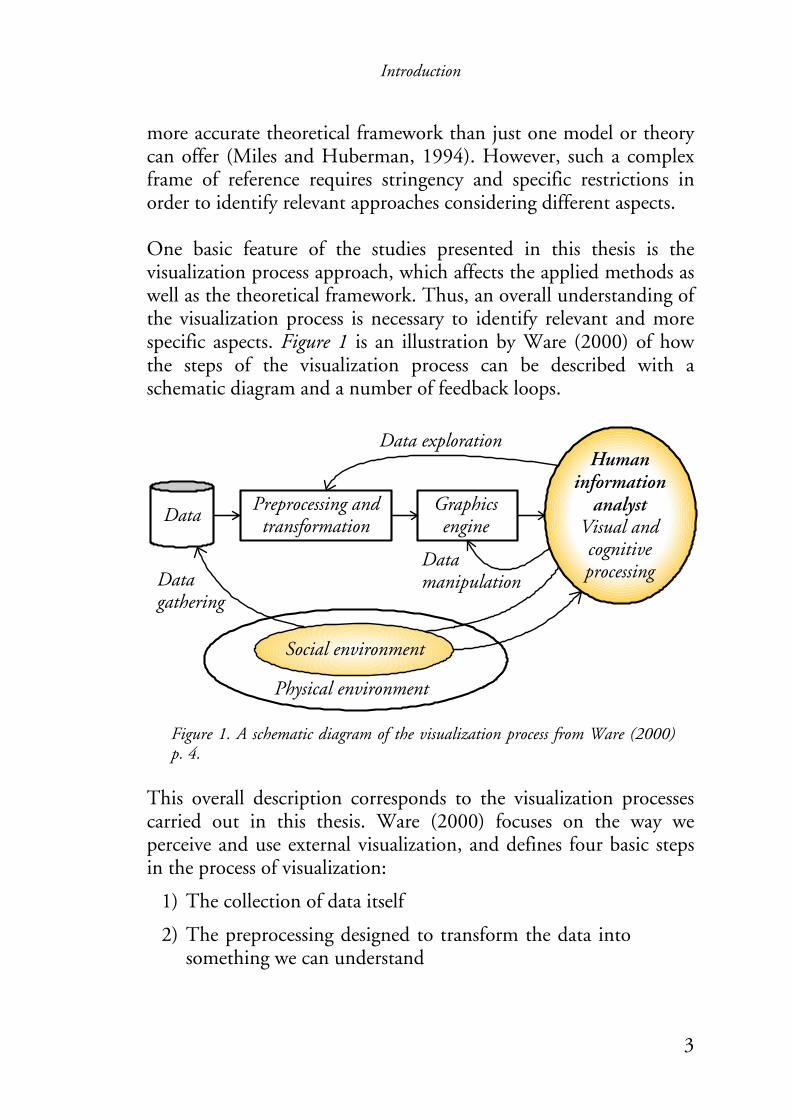
more accurate theoretical framework than just one model or theory can offer (Miles and Huberman, 1994). However, such a complex frame of reference requires stringency and specific restrictions in order to identify relevant approaches considering different aspects. One basic feature of the studies presented in this thesis is the visualization process approach, which affects the applied methods as well as the theoretical framework. Thus, an overall understanding of the visualization process is necessary to identify relevant and more specific aspects. Figure 1 is an illustration by Ware (2000) of how the steps of the visualization process can be described with a schematic diagram and a number of feedback loops.
Figure 1. A schematic diagram of the visualization process from Ware (2000) p. 4.
This overall description corresponds to the visualization processes carried out in this thesis. Ware (2000) focuses on the way we perceive and use external visualization, and defines four basic steps in the process of visualization:
1) The collection of data itself
2) The preprocessing designed to transform the data into something we can understand
Introduction
4
Accessible lessons
Co-ordering lessons setPrivate
lessons
Learner 1 Learner 2
Accessible lessons
Private lessons
3) The display hardware and the graphics algorithms that produce an image on the screen
4) The human perceptual and cognitive system (the perceiver)
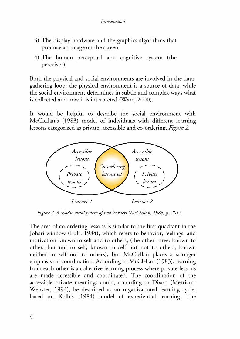
Both the physical and social environments are involved in the data-gathering loop: the physical environment is a source of data, while the social environment determines in subtle and complex ways what is collected and how it is interpreted (Ware, 2000). It would be helpful to describe the social environment with McClellan’s (1983) model of individuals with different learning lessons categorized as private, accessible and co-ordering, Figure 2.
Figure 2. A dyadic social system of two learners (McClellan, 1983, p. 201). The area of co-ordering lessons is similar to the first quadrant in the Johari window (Luft, 1984), which refers to behavior, feelings, and motivation known to self and to others, (the other three: known to others but not to self, known to self but not to others, known neither to self nor to others), but McClellan places a stronger emphasis on coordination. According to McClellan (1983), learning from each other is a collective learning process where private lessons are made accessible and coordinated. The coordination of the accessible private meanings could, according to Dixon (Merriam-Webster, 1994), be described as an organizational learning cycle, based on Kolb’s (1984) model of experiential learning. The

Introduction
5
experiential and organizational learning cycles also correspond to models focusing on quality improvements such as the PDSA cycle by Deming (1993). Important characteristics are the ability to interpret and communicate experiences and collected information. The use of visualization artifacts – corresponding to the data exploration and data manipulation loops in Figure 1 – has been shown to support communication among a group of participants as well as developing/improving business processes (Bengtsson and Johansson, 2002; Forssén and Haho, 2001; Garrigou, et al., 1995). These studies are mainly published within the fields of quality management, organizational learning and ergonomics, which are based on case studies in industrial companies. The design of the visualization artifacts – generated by the graphics engine in the visualization process in Figure 1 – is important to support the intended users’ cognitive processing of information. However, findings about visual and cognitive processing are mainly published within the fields of educational psychology and interface design without subjects from an industrial company context. Five research fields have been identified: quality management, ergonomics, organizational learning, educational psychology, and interface design. All have three main aspects in common with respect to the visualization process and the scope of this thesis: communication and learning, quality improvements and participation, and visualization of information and documentation of knowledge. Figure 3 illustrates them as part of the paradigm on which this thesis is based.

Introduction
6
Visualization of guidelines on computer networks to
support processes of design and quality control
Quality improvements and
participation
Visualization of information and documentation of
knowledge
Communication and learning
Figure 3. Illustration of the three main aspects that constitute the paradigm of the studies carried out in this thesis.
It was valuable to combine action research with a multidisciplinary approach since applied research in industrial companies is complex, and a network of a variety of scientific disciplines is likely to possess the required competence to handle complex problems. But without greater coordination, the research of visualization will continue to be diffuse and ephemeral according to (Ware, 2000). However, the studies in this thesis contribute some coordination between research areas as well as new findings about applied visualization in industrial companies.
1.3 Objectives and research questions Based on the line of reasoning above, an assumption was that visualizing guidelines using different kinds of multimedia technologies such as hyperlinked and animated pictorial illustrations might be relevant to support quality control and design processes in industrial companies. Two objectives were set up:

Introduction
7
The first objective was to explore how the usability3 of guidelines could be improved by changing the interface design of the guidelines. The second objective was to explore how the visualization process of guidelines could support participative4 design by applying evaluations and interpretations in a dialogue form between two individuals or among a group of individuals. Special focused research questions are:
• What are the preferable approaches for visualizing immaterial factors in an organization and quality systems? (Papers I & II).
• Is there any need to visualize guidelines and instructions in industrial companies? What is the existing knowledge? (Paper III).
• How can a system of ergonomic guidelines be visualized by means of interactive multimedia technology, considering cognitive theories and practical examples? How does the usage of such a system affect the efficiency and the attitudes compared with a conventional system in the form of a traditional report on scrollable web pages? (Paper IV).
• Is there a need, and if so, how should a system of guidelines be designed in order to support working task performance and documentation of experiences when using ergonomic human simulation tools? (Papers V & VI).
• How can a participative approach support the visualization process of guidelines? (Papers I – VI).
3 Defined as REAL: Relevance, Efficiency, Attitude and Learnability; and also considering pleasurable usage. See chapter 2 Frame of reference. 4 Defined according to Wilson and Haines, see chapter 2 Frame of reference.

Introduction
8
1.4 Limitations The field studies have been performed in Swedish industrial companies with rather advanced technology and well-educated personnel. Furthermore, tests and evaluations have been performed with subjects from university, students as well as experts/researchers. Thus, the studies have not focused on different cultural aspects such as technology level, nationality, language, and education. The field studies have been carried out with a restricted time limit. Thus long term effects concerning quality and business development have not been evaluated. Furthermore, most of the data collection (interviews and observations) in this thesis has been done by one single researcher at a time. The studies have concentrated on visualization of information via a computer or paper printouts. Thus, the studies have neither considered perception via other senses (e.g. hearing, touch) than vision, nor other displays (e.g. a white board or Virtual Reality) than computer screens or paper documents.
Frame of reference
9
2 Frame of reference
2.1 Visualization of information We receive information through our senses: smell, taste, touch, hearing and sight. Most of the information around us is registered by our eyes, which makes sight our primary sense (Proctor and Zandt, 1994). Visualization can be the creation of mental images as well as the act of creating an external visual artifact, which corresponds to a dictionary definition of visualization as “the act or process of interpreting in visual terms or of putting into visible form” (Merriam-Webster, 1994). Ware (2000) focuses on the way we perceive and use external visualization and defines four basic steps in the process of visualization, which are illustrated as a number of feedback loops in a schematic diagram, Figure 1. The critical question is how best to transform the data into something that people can understand for optimal decision making (Ware, 2000). The preprocessing and transformation of data could be described as sketching. Sketches are not the goal of the sketching act, but support creativity and give structure to ideas for further refinements (Birgerstam, 2000). The gathered data and the sketched transformations are then visualized via a graphics engine, and further refined by the perceiver acting according to the loops in Figure 1 until satisfied with the visualization. A sketch as well as a cave painting or a mathematical equation are some examples of visualizations, Figure 4.

Frame of reference
10
E=mc2
Figure 4. Three examples of visualization: a prehistoric cave painting (The Great Hall of Bulls in Lascaux), a sketch of a building, and the equation of the relation between energy and mass by Albert Einstein.
In order to interpret the visualization, the perceiver has to read the it, which means that he or she has to be familiar with how different animals are represented with lines and colors, or the meaning of the signs in mathematical equations. The study of symbols and how they convey meaning is called semiotics (Ware, 2000). Depending on the purpose or meaning of the visualization, different semiotic approaches are used. Bertin (1983) organizes rational imagery based on if the meaning to which we attribute signs is monosemic, polysemic, or pansemic. The elements of monosemic systems, such as diagrams and maps, have clear and unique meaning because their design relies on predefined conventions. Conversely, figurative imagery or ordinary photographs are polysemic because their interpretation is uncertain and involves subjectivity. The extreme form of polysemy is an image that does not signify anything precisely, such as an abstract painting, and thus becomes pansemic. However, an integration of figurative images or pictorial representations and text can present information clearly and guide readers to interpret information as intended, i.e. making a figurative imagery monosemic, see Figures 5 and 6. The technical possibilities and solutions for presenting and distributing information affect the semiotic approaches. The invention of the printing press enabled the mass production of books. But this process also separated pictures from text, since the
Frame of reference
11
Map
Photo Drawing
Text block
Connector
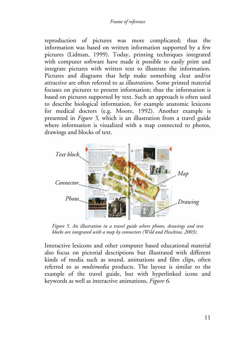
reproduction of pictures was more complicated; thus the information was based on written information supported by a few pictures (Lidman, 1999). Today, printing techniques integrated with computer software have made it possible to easily print and integrate pictures with written text to illustrate the information. Pictures and diagrams that help make something clear and/or attractive are often referred to as illustrations. Some printed material focuses on pictures to present information; thus the information is based on pictures supported by text. Such an approach is often used to describe biological information, for example anatomic lexicons for medical doctors (e.g. Moore, 1992). Another example is presented in Figure 5, which is an illustration from a travel guide where information is visualized with a map connected to photos, drawings and blocks of text.
Figure 5. An illustration in a travel guide where photos, drawings and text blocks are integrated with a map by connectors (Wild and Heseltine, 2003).
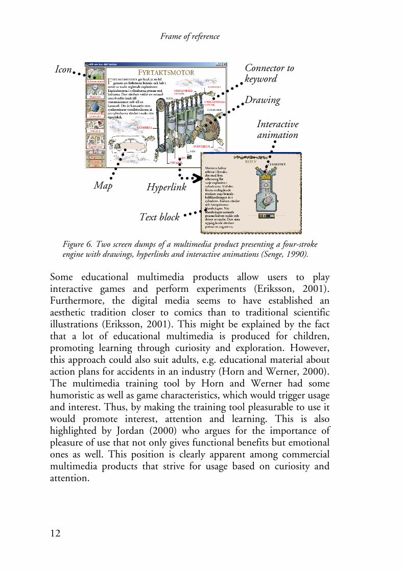
Interactive lexicons and other computer based educational material also focus on pictorial descriptions but illustrated with different kinds of media such as sound, animations and film clips, often referred to as multimedia products. The layout is similar to the example of the travel guide, but with hyperlinked icons and keywords as well as interactive animations, Figure 6.
Frame of reference
12
Drawing
Map
Connector to keyword
Icon
Hyperlink
Interactive animation
Text block
Figure 6. Two screen dumps of a multimedia product presenting a four-stroke engine with drawings, hyperlinks and interactive animations (Senge, 1990).
Some educational multimedia products allow users to play interactive games and perform experiments (Eriksson, 2001). Furthermore, the digital media seems to have established an aesthetic tradition closer to comics than to traditional scientific illustrations (Eriksson, 2001). This might be explained by the fact that a lot of educational multimedia is produced for children, promoting learning through curiosity and exploration. However, this approach could also suit adults, e.g. educational material about action plans for accidents in an industry (Horn and Werner, 2000). The multimedia training tool by Horn and Werner had some humoristic as well as game characteristics, which would trigger usage and interest. Thus, by making the training tool pleasurable to use it would promote interest, attention and learning. This is also highlighted by Jordan (2000) who argues for the importance of pleasure of use that not only gives functional benefits but emotional ones as well. This position is clearly apparent among commercial multimedia products that strive for usage based on curiosity and attention.

Frame of reference
13
Multimedia can be considered at three different levels: the technical level refers to the carriers of signs such as displays; the semiotic level refers to the representational format of these signs such as text, pictures, and sound; and finally the sensory level that refers to the sensory modality of sign reception such as visual or auditory (Schnotz and Lowe, 2003). The possibilities to visualize information with interactive multimedia illustrations, and to distribute information by using web technology and networks are greater than ever. However, this thesis is restricted to examining visualization of guidelines conventionally or with interactive multimedia. A conventional system is characterized by paper documents or web pages suitable for printouts, drawings and text, and visual perception representing its technical, semiotic, and sensory levels respectively. An interactive multimedia system is characterized by web pages, drawings and pictures with animations, and visual perception representing its technical, semiotic, and sensory levels respectively.
2.2 Communication and learning This thesis focuses on the communication and visualization related to guidelines and instructions, which basically depends on two different situations. One is when the guidelines are created or revised, which is a process where representatives of different users communicate different aspects of the guidelines. The other situation is when the guidelines are used to present relevant information for users to complete or support their working tasks. Thus, the visualization of information should preferably support the communication throughout the development and updating of the guidelines as well as the communication of information in the guidelines. Senge (1990) describes metaphorically the connection between our vision and present reality with a rubber band, representing the creative tension between the two, Figure 7. We can either narrow the vision or the present reality to decrease the tension. It is important to differentiate between undesirable tension and creative

Frame of reference
14
Development of new guidelines
Using the present guidelines
Vision
Present reality
Creative tension
Creative tension
tension to avoid solutions that lower our demands (Senge, 1990). The model is applicable to the situation with guidelines. The development of new guidelines corresponds to our vision and the usage of present guidelines corresponds to the present reality, Figure 7.
Figure 7. A creative tension emerges between our vision and the present reality according to Senge (1990) (left). The model is applicable to the development and usage of guidelines (right).
The usage of guidelines is characterized by individual search and interpretation of relevant information within the system, i.e. a one-way communication situation, whereas communication throughout the development of guidelines is characterized by instant feedback of information, i.e. an interaction by two or more individuals.
2.2.1 One way communication and individual learning Figure 8 presents three one-way communication models by Shannon and Weaver (1949), Jakobson (1960), and Schramm and Roberts (1971) respectively. Shannon and Weaver’s model (top of Figure 8) starts with the source that decides which message to send. The selected message is encoded by a transmitter into a signal, which is sent through a channel to a receiver that decodes the message. Noise is anything that is added to the signal and that is not intended by the source.

Frame of reference
15
Source
Signal
Field of Experience
Source Encoder Signal Decoder Destination
Field of Experience
AddresseeAddresser
ContextMessageContact
Code
Received signal
Decode
Destination
Encode
Noisesource
Message Message received
Transmitter Receiver
Figure 8. Three models of one-way communication: by Shannon and Weaver (1949) top, Jakobson (1960) middle, and Schramm and Roberts (1971) bottom.
Jakobson’s model (middle of Figure 8) starts with an addresser that sends a message to an addressee. The message refers to something other than itself and he calls this the context. The contact refers to the physical channel and psychological connections between the addresser and the addressee. The final factor is the code – a shared meaning system by which the message is structured. The communication model by Schramm and Roberts (bottom of Figure 8) suggests that only what is shared in the fields of experience of both the source and the destination is actually communicated, because only that portion of the signal is held in common by both source and destination. The studies in this thesis are carried out with a well-defined source or addresser and destination or addressee. The messages, which are ergonomic guidelines, are also well defined. Thus these aspects have
Frame of reference
16
AttentionResources
Long-termMemory
Working Memory
Cognition
SystemEnvironment(Feedback)
SensoryProcessing
STSSPerception
ResponseSelection
ResponseExecution
Selection
not been considered after been defined. Instead the focus is on the visualization of information, i.e. how the message is coded. The communication models place a great importance on the coding of messages and of doing so according to a shared meaning system or field of experience, see also McClellan’s model in Figure 2. A quotation by Fiske (1990) could summarize:
“The more we share the same codes, the more we use the same sign systems, the closer our two ‘meanings’ of the message will approximate to each other.” (Fiske, 1990, p. 39.)
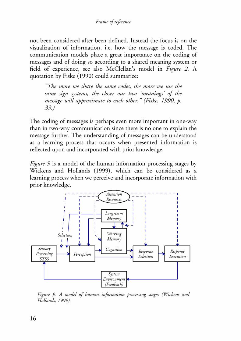
The coding of messages is perhaps even more important in one-way than in two-way communication since there is no one to explain the message further. The understanding of messages can be understood as a learning process that occurs when presented information is reflected upon and incorporated with prior knowledge. Figure 9 is a model of the human information processing stages by Wickens and Hollands (1999), which can be considered as a learning process when we perceive and incorporate information with prior knowledge.
Figure 9. A model of human information processing stages (Wickens and Hollands, 1999).

Frame of reference
17
Multimedia presentation
Words
Pictures
Ears
Eyes
Sensory memory
Selecting words
Selecting images
Sounds
Images
Organizing words
Organizing images
Verbal model
Pictorial model
Integrating
Long-term memory
Prior knowledge
Working memory
Wickens and Hollands (1999) state that our attention is a fundamental requirement throughout the information processing stages because it allocates the mental resources. According to the model, environmental information is processed by our sensory systems (e.g. vision) that have an associated short-term sensory store (STSS), which prolongs the stimulus from half a second (visual STSS) to 2-4 seconds (auditory STSS). Perception is partly determined by input from our sensory systems, and partly from our expectations based on past experience stored in long-term memory. Cognitive operations, such as rehearsal, reasoning or image transformation, generally require greater time and mental effort than perception, and are carried out by using the working memory. Perception and cognitive transformations often trigger a response; first a selection of a response and then the execution, which could be quite different from one’s intention. Finally Wickens and Hollands illustrate the responding information from the system environment to our actions with a feedback loop, which is delayed to various extents. The importance of suitable presentation or coding of information to support learning appears in all stages of the Wickens and Hollands’ model. The coding can be done differently depending on what senses should register the information, e.g. different shapes and surfaces could provide tactile information via our hands. However, the objectives of the studies carried out in this thesis focus on visualization of information on an intranet, which is a special case of the information-processing model in Figure 9. The processing of words and images can partly be described by Mayer’s (2003) model of multimedia learning, Figure 10.
Figure 10. A model of multimedia learning (Mayer, 2003).
Frame of reference
18
According to Mayer (2003) the benefits of learning from a multimedia presentation rely on a cognitive theory based on three assumptions proposed by cognitive research: active learning, dual coding, and limited capacity. The active learning assumption (Mayer, 2003) stresses the importance of paying attention to integrating the information with previous knowledge, just as in the Wickens and Hollands’ model in Figure 9. The process of learning with graphical representations is also influenced by individual differences such as prior subject matter knowledge, visuospatial ability, and learning strategies (Vekiri, 2002). The model of multimedia learning in Figure 10 focuses on our sight and hearing to register information, our two most common senses according to (Proctor and Zandt, 1994). These two senses register visual and verbal information that is processed in two distinct cognitive systems that could be understood with the dual coding theory presented by Clark and Paivio (1991). According to this theory we use two distinct and independent but interconnected cognitive systems for processing and storing information: a verbal and an imagery system. The systems are functionally distinct since they process verbal and visual information separately and independently of each other. They are also structurally distinct since the systems present information with different modalities, logogens and imagens. Logogens are word-like codes organized in a successive and sequential fashion processing limited information at a time. Imagens correspond to natural object properties with spatial and possible dynamic transformations, sometimes illustrated with animations. Also, imagens are organized in a synchronous fashion, which allows simultaneous processing. The limited capacity assumption implies that the cognitive systems only can deal with a limited amount of information, thus information should be presented in different modalities in order to let learners build connections without overloading their working memory, i.e. verbal information should preferably be presented as
Frame of reference
19
speech rather visually as text (Mayer and Moreno, 2002; Moreno and Mayer, 1999). However, pieces of information that could be understood in isolation should not be integrated since redundant information also may increase cognitive load, referred to as the redundancy effect (Leahy, et al., 2003; Yeung, et al., 1997). Thus verbal information should not be presented by both text and narration. Considering redundancy (Mayer and Moreno, 2002) argue that it is better to present animation and narration than to present animation, narration, and on-screen text. However, if auditory explanations are used concurrently with, for example, a diagram, which contains sufficient information to be understood alone, the dual-mode duplication of information is redundant and may hinder learning (Schnotz and Lowe, 2003). A visual argument perspective is another consideration to reduce cognitive load. It involves the application of a symbolic representation that can be processed more efficiently than text, function as a memory aid, and guide cognitive activity during problem solving (Vekiri, 2002). The contiguity principle also suggests that printed text and pictures are physically integrated or close to each other rather than separated, and that visual and spoken material are presented simultaneously rather than successively (Kolb, 1984). Verdi, et al. (1996) found that students would recall more facts and features when labeled pictures (exemplified with several diagrams of an animal cell and of a flower) were viewed prior to reading text, instead of the reverse order. This study is referred to when Vekiri (2002) explains the conjoint retention hypothesis. It suggests that maps should be presented with or before text or narration and when spatial encoding instructions have been given, as it is less demanding to maintain maps compared to text in working memory since text can only be processed serially. A multimedia approach uses both types of cognitive systems to present information and has a potential to adopt the presentation suitable to how we learn (Mayer, 2003). However, recent research
Frame of reference
20
Testing implications of concepts in new situations
Concrete experience
Observations and reflections
Formation of abstract concepts and generalizations
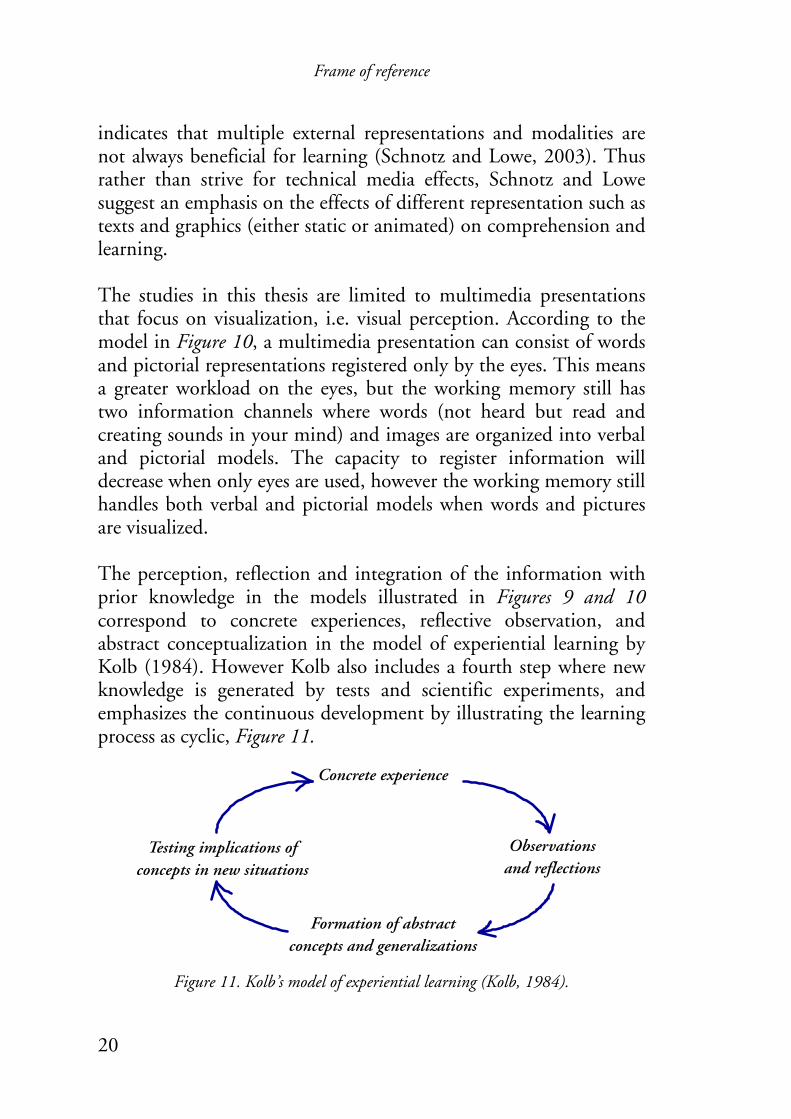
indicates that multiple external representations and modalities are not always beneficial for learning (Schnotz and Lowe, 2003). Thus rather than strive for technical media effects, Schnotz and Lowe suggest an emphasis on the effects of different representation such as texts and graphics (either static or animated) on comprehension and learning. The studies in this thesis are limited to multimedia presentations that focus on visualization, i.e. visual perception. According to the model in Figure 10, a multimedia presentation can consist of words and pictorial representations registered only by the eyes. This means a greater workload on the eyes, but the working memory still has two information channels where words (not heard but read and creating sounds in your mind) and images are organized into verbal and pictorial models. The capacity to register information will decrease when only eyes are used, however the working memory still handles both verbal and pictorial models when words and pictures are visualized. The perception, reflection and integration of the information with prior knowledge in the models illustrated in Figures 9 and 10 correspond to concrete experiences, reflective observation, and abstract conceptualization in the model of experiential learning by Kolb (1984). However Kolb also includes a fourth step where new knowledge is generated by tests and scientific experiments, and emphasizes the continuous development by illustrating the learning process as cyclic, Figure 11.
Figure 11. Kolb’s model of experiential learning (Kolb, 1984).
Frame of reference
21
Thus the model in Figure 11 includes the selection and execution of responses, as well as feedback, which corresponds to the model by Wickens and Hollands (1999) in Figure 9.
2.2.2 Interactive communication and collective learning The communication throughout the development of the guidelines in the studies included in this thesis has in accordance with action research and participatory ergonomics striven for participation of intended users. In participatory development work, active members communicate and exchange information in order to understand and affect the business processes they all take part in. Senge (1990) suggests that the communication should be in the form of a dialogue where team members enrich their awareness of others’ perspectives, instead of a discussion where the members argue for their own views. This corresponds to Isaacs (1993) and Schein’s (1993) proposal of interaction in dialogue form between different organizational units to support cross-functional learning. This is also an important characteristic for successful collective interpretation of information in order to learn collectively according to Dixon (1994). Thus it is essential to evaluate the mental models on which our actions are based. The problem with mental models is not if they are correct or not, but rather that we are not aware of them (Senge, 1990). If different members have different mental models without realizing it, the possibilities of solving problems or making effective decisions are markedly reduced (Schein, 1993). Our mental models keep us within our habitual thoughts and behavioral patterns that can counteract the collective work. The creation of learning organizations will hinge on our ability to evoke, evaluate and change our mental models (Senge, 1990). These mental models correspond to the individual learning lessons of McClellan (1983), which could be made accessible by visual artifacts according to the line of reasoning in chapter 1.
Frame of reference
22
The dialogue is based on peoples’ equality, which should be possible to attain despite hierarchal levels of an organization (Senge, 1990). This corresponds to Wilson and Haines’ (1997) definition of participation in the context of ergonomics management programs at work:
“The involvement of people in planning and controlling a significant amount of their own work activities, with sufficient knowledge and power to influence both processes and outcomes in order to achieve desirable goals.” (Wilson and Haines, 1997, p. 492)
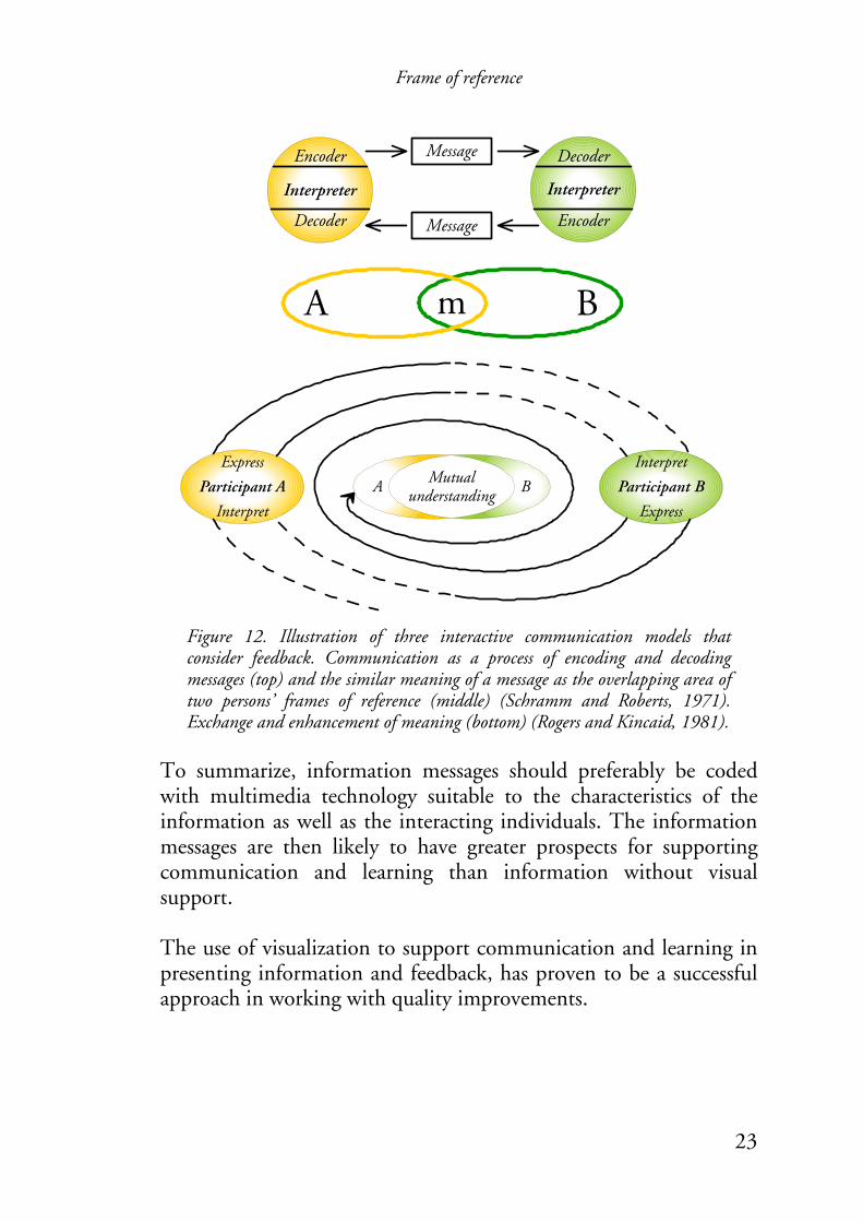
Thus, each participating member interacts as both sender and receiver in a dialogue. The communication in a dialogue could be understood with communication models that, apart from one-way communication, also consider feedback on presented/expressed information. Figure 12 presents three such interactive communication models: two by Schramm and Roberts (1971) and one by Rogers and Kincaid (1981). Communication can be described as a process of encoding and decoding messages (top of Figure 12). However, Schramm and Roberts stress the importance of similar meaning of a message and illustrate it as the overlapping area of two persons’ frames of reference (middle of Figure 12). The model by Rogers and Kincaid (bottom of Figure 12) are basically the result of a combination of the other two models, illustrated as a cyclic process of exchanging messages until there is an overlapping area of mutual understanding between the two participants’ opinions. This area corresponds to the coordination of private lessons in McClellan’s model, Figure 2. The models in Figure 12 show the importance of the coding of messages in order to reach mutual understanding. Fundamental to an efficient exchange of information and collective learning, is that the participants have sufficient knowledge about the business and are able to communicate the information among themselves (Dixon, 1994).
Frame of reference
23
Encoder
Decoder Encoder
Decoder
Interpreter Interpreter
Message
Message
Express
Interpret
Participant A Participant BMutual understandingA B
Express
Interpret
A Bm
Figure 12. Illustration of three interactive communication models that consider feedback. Communication as a process of encoding and decoding messages (top) and the similar meaning of a message as the overlapping area of two persons’ frames of reference (middle) (Schramm and Roberts, 1971). Exchange and enhancement of meaning (bottom) (Rogers and Kincaid, 1981).
To summarize, information messages should preferably be coded with multimedia technology suitable to the characteristics of the information as well as the interacting individuals. The information messages are then likely to have greater prospects for supporting communication and learning than information without visual support. The use of visualization to support communication and learning in presenting information and feedback, has proven to be a successful approach in working with quality improvements.

Frame of reference
24
2.3 Quality improvements and participation Popper (1959) explains science and the need for continuous refinement of knowledge with a metaphor wherein science is compared to a building erected on piles in a loose-bottomless swamp:
“The piles are driven down from above into the swamp, but not to any natural or ‘given’ base; and if we stop driving the piles deeper, it is not because we have reached firm ground. We simply stop when we are satisfied that the piles are firm enough to carry the structure, at least for the time being.” (Popper, 1959, p. 111)
The situation is similar to companies in a changing environment. Continuous improvements of processes by adoption of new products and working methods are fundamental to maintaining success for a company. Schewhart was critical to a linear perspective of the manufacturing process and suggested a dynamic feedback process as a cycle in three steps: Specification, Production, and Inspection (Shewhart and Deming, 1986). Success depended on guesswork, i.e. guessing what type and design of product would sell, and how much of it to produce. His thoughts were further developed by Deming, who introduced a fourth step, Test in service, that emphasizes the communication between customer and producer (Deming, 1993). Furthermore, Deming illustrated the cycle as a spiral in order to emphasize improvements, i.e. expanding precision, understanding, and knowledge. As support for a continuous improvement project, Deming introduced the PDSA cycle, Figure 13a (Axelsson, 2000; Deming and Kilian, 1992).
Frame of reference
25
4Act
1Plan
2Do
3Study
4
3
1
23
4 1
2
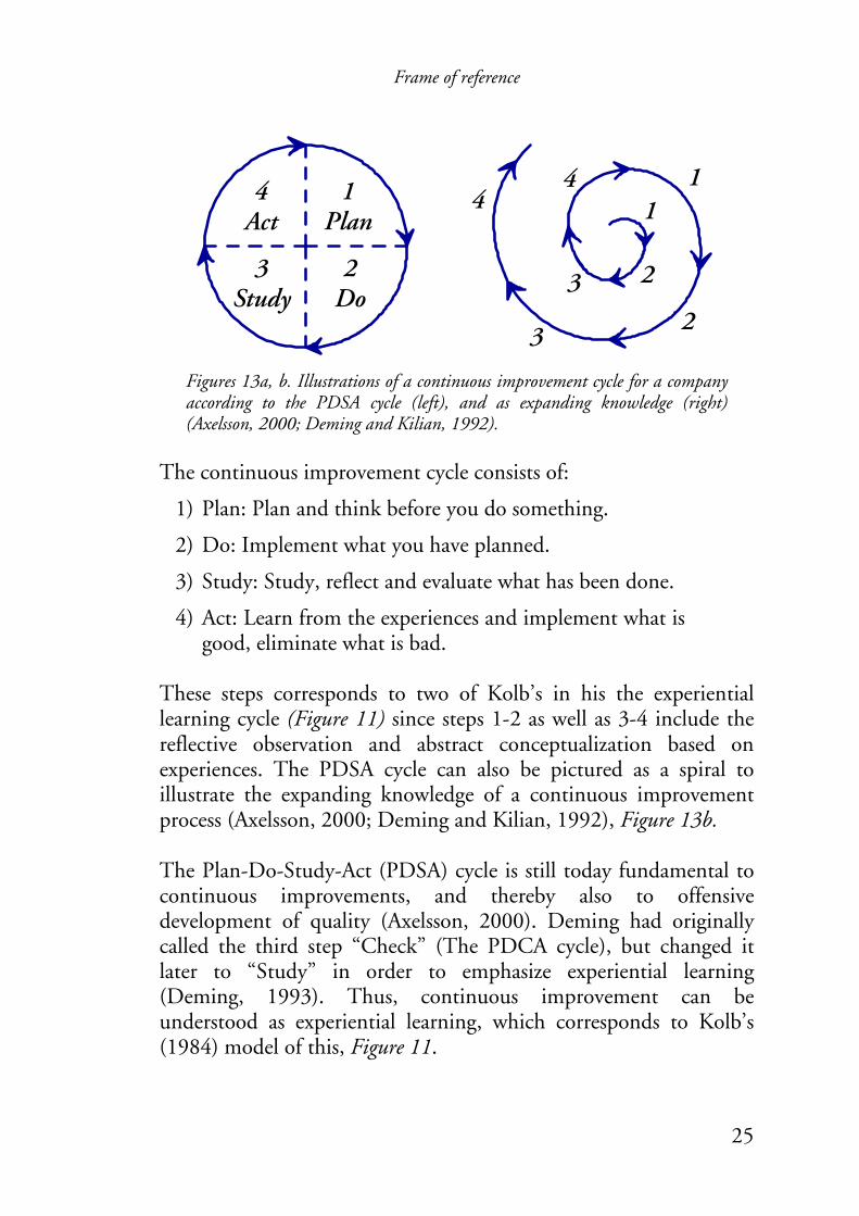
Figures 13a, b. Illustrations of a continuous improvement cycle for a company according to the PDSA cycle (left), and as expanding knowledge (right) (Axelsson, 2000; Deming and Kilian, 1992).
The continuous improvement cycle consists of:
1) Plan: Plan and think before you do something.
2) Do: Implement what you have planned.
3) Study: Study, reflect and evaluate what has been done.
4) Act: Learn from the experiences and implement what is good, eliminate what is bad.
These steps corresponds to two of Kolb’s in his the experiential learning cycle (Figure 11) since steps 1-2 as well as 3-4 include the reflective observation and abstract conceptualization based on experiences. The PDSA cycle can also be pictured as a spiral to illustrate the expanding knowledge of a continuous improvement process (Axelsson, 2000; Deming and Kilian, 1992), Figure 13b. The Plan-Do-Study-Act (PDSA) cycle is still today fundamental to continuous improvements, and thereby also to offensive development of quality (Axelsson, 2000). Deming had originally called the third step “Check” (The PDCA cycle), but changed it later to “Study” in order to emphasize experiential learning (Deming, 1993). Thus, continuous improvement can be understood as experiential learning, which corresponds to Kolb’s (1984) model of this, Figure 11.
Frame of reference
26
A company’s process to change and improve its business can be considered as an educational one where personnel learn about the process itself, how goals have been constructed, and what changes have been implemented (Rendahl, et al., 1996). Dixon (1994) describes the learning process in companies by applying Kolb’s model to a collective perspective of learning. The steps are the same as in Kolb’s cycle, but with demands for a collective perspective of learning. Information that is generated in the company has to be disseminated and interpreted by a number of individuals, who then can act upon this. Dixon concludes that different perspectives among the organization’s members are essential to the company’s learning process, otherwise learning does not occur. The learning process is often seen as a positively developing spiral, but there is also a risk for passiveness and learned helplessness (Ohlsson and Granberg, 1998). Negative learning is a result of an expected passive attitude, caused by disbelief in the employee’s capability to control or draw conclusions from a situation (Liew, 1996). According to McGregor’s (1960) Theory X, such an attitude confirms itself. Likewise, according to his Theory Y, a positive attitude confirms itself. Theory Y motivates personnel to responsibility-taking and reflective action, and is supported by the feedback of experiences and observations, i.e. characteristics of experiential learning (Kolb, 1984) and participatory ergonomics (Wilson and Haines, 1997). Thus, development work should be based on participation to consider all kinds of employee experiences in order to establish the best solutions from a broad perspective.
It is fundamental to a company’s development processes to have an overview perspective, or a system thinking as Senge (1990) puts it. This means an ability to see totalities, not separate parts, and to rely on feedback (Senge, 1990). Feedback can be understood as different kinds of information loops, Figure 14.
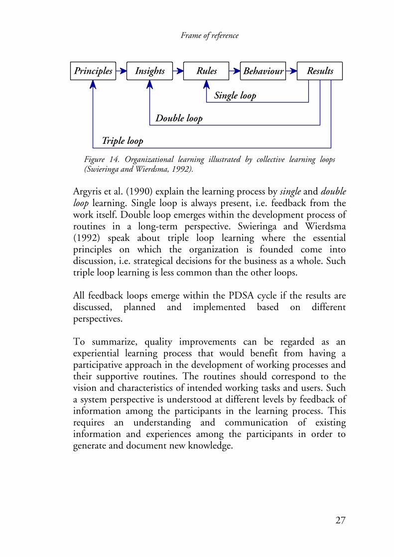
Frame of reference
27
Principles Insights Rules Behaviour Results
Single loop
Double loop
Triple loop
Figure 14. Organizational learning illustrated by collective learning loops (Swieringa and Wierdsma, 1992).
Argyris et al. (1990) explain the learning process by single and double loop learning. Single loop is always present, i.e. feedback from the work itself. Double loop emerges within the development process of routines in a long-term perspective. Swieringa and Wierdsma (1992) speak about triple loop learning where the essential principles on which the organization is founded come into discussion, i.e. strategical decisions for the business as a whole. Such triple loop learning is less common than the other loops. All feedback loops emerge within the PDSA cycle if the results are discussed, planned and implemented based on different perspectives. To summarize, quality improvements can be regarded as an experiential learning process that would benefit from having a participative approach in the development of working processes and their supportive routines. The routines should correspond to the vision and characteristics of intended working tasks and users. Such a system perspective is understood at different levels by feedback of information among the participants in the learning process. This requires an understanding and communication of existing information and experiences among the participants in order to generate and document new knowledge.
Frame of reference
28
A
A
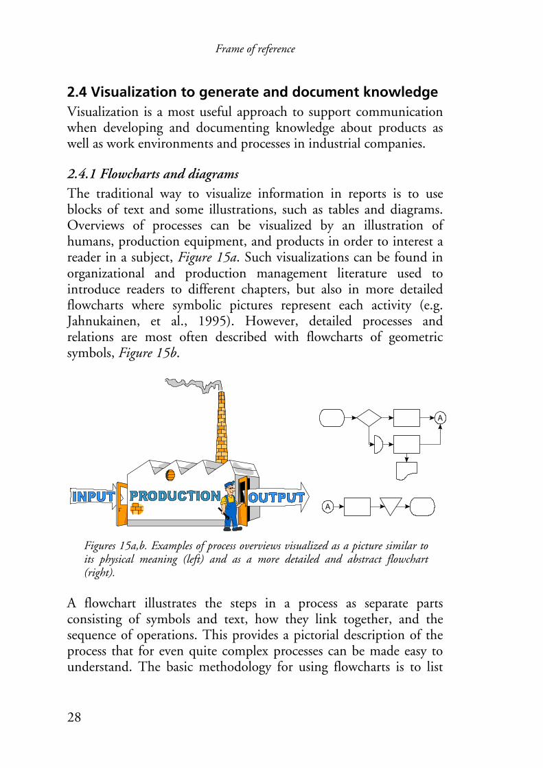
2.4 Visualization to generate and document knowledge Visualization is a most useful approach to support communication when developing and documenting knowledge about products as well as work environments and processes in industrial companies.
2.4.1 Flowcharts and diagrams The traditional way to visualize information in reports is to use blocks of text and some illustrations, such as tables and diagrams. Overviews of processes can be visualized by an illustration of humans, production equipment, and products in order to interest a reader in a subject, Figure 15a. Such visualizations can be found in organizational and production management literature used to introduce readers to different chapters, but also in more detailed flowcharts where symbolic pictures represent each activity (e.g. Jahnukainen, et al., 1995). However, detailed processes and relations are most often described with flowcharts of geometric symbols, Figure 15b.
Figures 15a,b. Examples of process overviews visualized as a picture similar to its physical meaning (left) and as a more detailed and abstract flowchart (right).
A flowchart illustrates the steps in a process as separate parts consisting of symbols and text, how they link together, and the sequence of operations. This provides a pictorial description of the process that for even quite complex processes can be made easy to understand. The basic methodology for using flowcharts is to list
Frame of reference
29
Pareto chart
Histogram
Scatter plot
Ishikawa chart
Stratification
Data collecting
Affinity diagram
Arrow diagram
Relation diagram
Tree diagram
Matrix data analysis
Matrix diagram
7 QC 7 QM
abcd
abcd
abcd 3
8
52
4
Process decision program chart
Control chart
the main activities, including decision points in the process, and arrange the activities in order, using arrows to show the direction of flow (TQM, 1994). The activities of a flowchart can be represented by geometrical symbols according to a standard, e.g. the ANSI standard (Harrington, 1991; TQM, 1994). Different methods of using visualization are suggested within the field of quality improvements in order to collect and generate knowledge among a group of participants.
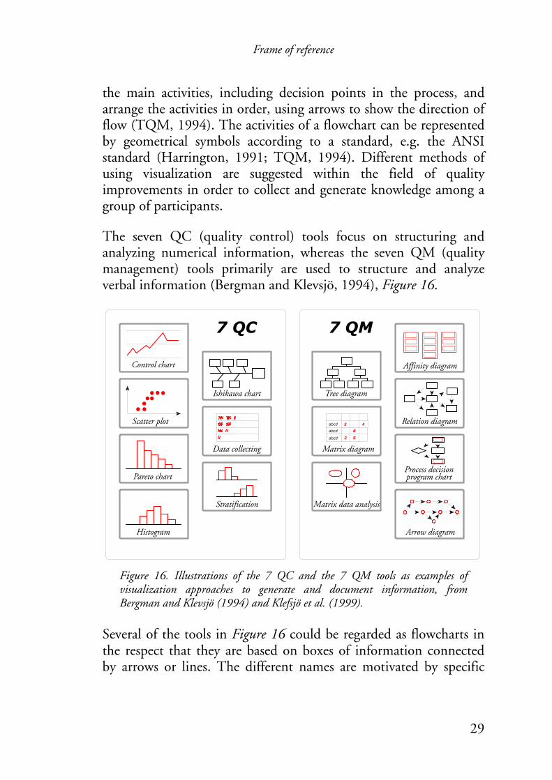
The seven QC (quality control) tools focus on structuring and analyzing numerical information, whereas the seven QM (quality management) tools primarily are used to structure and analyze verbal information (Bergman and Klevsjö, 1994), Figure 16.
Figure 16. Illustrations of the 7 QC and the 7 QM tools as examples of visualization approaches to generate and document information, from Bergman and Klevsjö (1994) and Klefsjö et al. (1999).
Several of the tools in Figure 16 could be regarded as flowcharts in the respect that they are based on boxes of information connected by arrows or lines. The different names are motivated by specific
Frame of reference
30
rules of what kind of information the boxes should contain and how they are arranged.
Furthermore, all the tools can be considered as models representing different aspects in a company. The principal characteristics of such models can be understood from the following definition:
“A model must resemble that which it represents, but also differ from it in certain aspects. It must be more easy to work with and more concentrated. It is always provisional; the development or the exchange is to produce knowledge.” (Sonesson, 1992, p. 65)
For instance, the design process of flowcharts provides the participants with an overview of a number of activities and their connections, and has proven to make the participants aware of problems, as well as enable significant improvements of industrial working processes (Denton, 1995; Loew and Hurley, 1995; Westra, et al., 1996). The participants can use large screens and walls to display characteristics of the company, which has proven to be useful when analyzing industrial companies’ business processes in participative development and training (e.g. Forssén and Haho, 2001; Garrigou, et al., 1995). However, there can be a problem when the generated knowledge is to be documented as briefly but also as sufficiently as possible into guidelines and instructions. A problem in visualizing models such as flowcharts is that these might be inadequate when the information is to be described in one picture. On one hand, a flowchart that tries to describe all activities and possible decisions is too complex and difficult to work with; on the other hand, a too general description does not provide the users any new knowledge but it might make the documentation more attractive. However, flowcharts can be organized in several hierarchical levels and provide both an overview of a process, as well as sufficient detail to identify key process variables. They thereby serve as the foundation for developing improved standard operating procedures (Symons and Jacobs, 1997).
Frame of reference
31
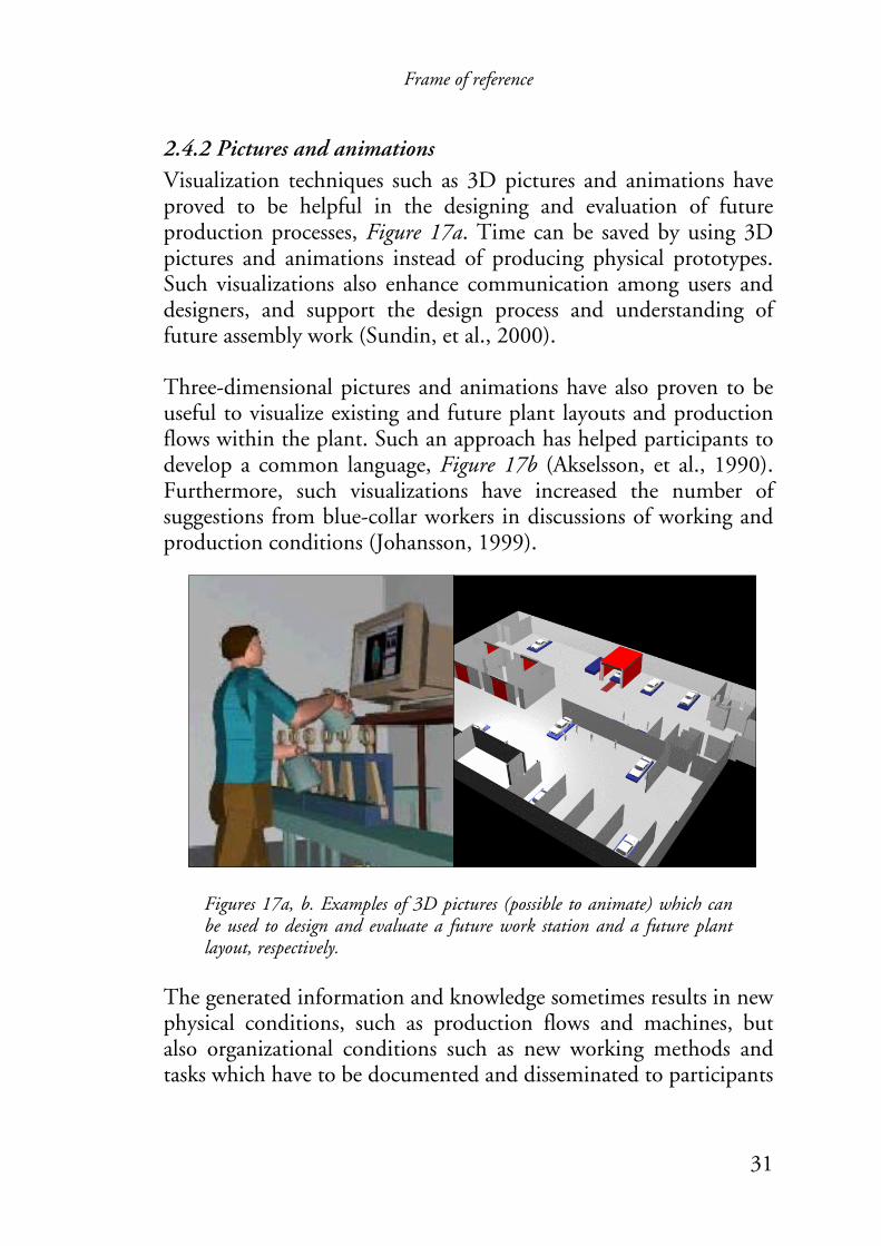
2.4.2 Pictures and animations Visualization techniques such as 3D pictures and animations have proved to be helpful in the designing and evaluation of future production processes, Figure 17a. Time can be saved by using 3D pictures and animations instead of producing physical prototypes. Such visualizations also enhance communication among users and designers, and support the design process and understanding of future assembly work (Sundin, et al., 2000). Three-dimensional pictures and animations have also proven to be useful to visualize existing and future plant layouts and production flows within the plant. Such an approach has helped participants to develop a common language, Figure 17b (Akselsson, et al., 1990). Furthermore, such visualizations have increased the number of suggestions from blue-collar workers in discussions of working and production conditions (Johansson, 1999).
Figures 17a, b. Examples of 3D pictures (possible to animate) which can be used to design and evaluate a future work station and a future plant layout, respectively.
The generated information and knowledge sometimes results in new physical conditions, such as production flows and machines, but also organizational conditions such as new working methods and tasks which have to be documented and disseminated to participants
Frame of reference
32
Customers Customers
Continual improvement of the quality
management system
Measurement, analysis and improvement
Management responsibility
Resource management
InputRequirements
Satisfaction
Product realization
Product
Output
Value-adding activities
Information flow
and other parties in such a way that they support learning and continuous improvements.
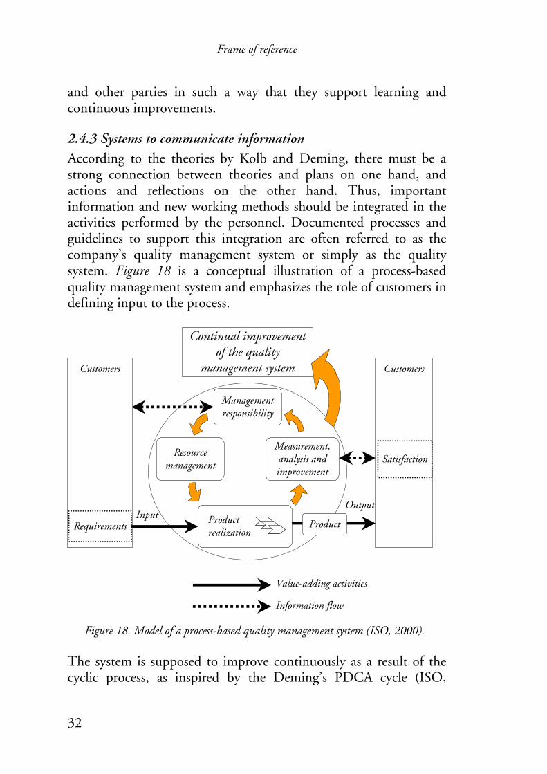
2.4.3 Systems to communicate information According to the theories by Kolb and Deming, there must be a strong connection between theories and plans on one hand, and actions and reflections on the other hand. Thus, important information and new working methods should be integrated in the activities performed by the personnel. Documented processes and guidelines to support this integration are often referred to as the company’s quality management system or simply as the quality system. Figure 18 is a conceptual illustration of a process-based quality management system and emphasizes the role of customers in defining input to the process.
Figure 18. Model of a process-based quality management system (ISO, 2000). The system is supposed to improve continuously as a result of the cyclic process, as inspired by the Deming’s PDCA cycle (ISO,

Frame of reference
33
2000). Karltun et al. (1998) identified an emerging change in some companies from a “criticizing” culture to an “improving” culture when implementing ISO 9000. One approach is to use paper documents and reports to present production process status and provide the personnel with template documents and guidelines. A computerization of an ISO 9000 quality system could support flexible and fast processing. However, it requires empowerment among employees to benefit from such effects, otherwise the result could be increased bureaucracy (Edwards and Gibson, 1997). Another approach to visualize a quality system in an industrial company is to use physical notice boards with information about the status of production processes as a result of actions taken (Greif, 1992). The example in Figure 19 is a more interactive approach in the form of an information central where the employees continuously receive and report working tasks by using template documents.
Figure 19. Example of an information central. Similar to the purpose of such an information central is the use of a collaborative desktop enabling users to exchange documents via a computer interface based on metaphors of physical objects on a computer network (Tollmar and Sundblad, 1995).

Frame of reference
34
A quality system should provide an instrument for quality control, which strives for no deviations from the agreed specifications. The ISO 9000 standard requires document control since it governs the way in which quality systems operate. Most organizations, according to Edwards and Gibson (1997), have tended to interpret this requirement as meaning that any document, which has an influence on the quality of the product or service, must be controlled by a centralized system. Thus the implementation of a quality system often seems to lead to a need for more approval, accountability and control mechanisms, i.e. increased bureaucracy (Edwards and Gibson, 1997). Such additional new tasks related to document control can appear meaningless and add more stress and more physically strenuous work according to Karltun et al. (1998). However, Karltun et al. also identified positive aspects such as work enrichment and a better understanding of employees’ roles and importance to production. Edwards and Gibson (1997) argue for usage of computer networks to implement modern quality management principles. Instead of document control being utilized to police and regulate the system, there should be an interactive mechanism based on input from those most closely involved with implementing any decision, hence a need for interaction and integration which are major strengths of modern computer networks. By using multimedia technology, an illustration, such as a flowchart or a plant layout, can be made both simple and complex regarding the amount of displayed information. Instead of using one illustration, the information can be visualized by several hyperlinked illustrations with more specific information. Furthermore, different kinds of visualization can be used, e.g. two and three-dimensional pictures, photos, animations and film clips. The potential with multimedia in ISO 9000 quality systems is according to a study by Edwards and Gibson (1997) particularly apparent in training exercises, which can include competency and assessment requirements, and be available quickly and conveniently at any location.
Frame of reference
35
Use of computer networks can be especially beneficial when working with computer software, such as human simulation tools. According to Sundin (2001) and Green (2000) the work with human simulation should follow a predefined structure in order to perform efficient and effective analysis of human interaction with future environments. Furthermore, the users of such tools have to understand the fundamental characteristics of the tools’ evaluation methods and the limitations of generated results (Rönnäng, et al., 2002). Such knowledge should according to Reason (1997) be saved physically, for instance, in guidelines accessible for all users. The importance of documentation in order to control misuse of human simulation tools is also highlighted by Ziolek and Nebel (2003). To summarize, different kinds of visualization tools can be used to support communication when developing knowledge about products as well as work environments and processes in industrial companies. The generated knowledge should be documented to communicate the information suitable for reuse and future development. Such documentation can be done in quality systems based on paper documents or in a format suitable for printouts. But there is a risk that documentation in such a format could appear meaningless to the users. However, a computerized system could visualize information with multimedia technology and also allow instant access and updating of information.
2.5 Summary. Information can be visualized in many ways, especially by means of multimedia. It is therefore important throughout the visualization process to consider characteristics of the information as well as intended usage. This thesis focuses on guidelines in companies to support communication and learning. The usage is twofold – development and usage of guidelines. Both situations require suitable coding or presentation of the information to support individual usage as well as interactive communication between two or a group of participants.
Frame of reference
36
Most research regarding the coding of information by means of visualization is based on experiments with students but not in real companies. It would therefore be interesting to see what importance visual coding would have in such contexts. It is likely that companies would find enhancement of the documentation to be relevant since studies have shown problems with conventional documentation within quality systems. However, in accordance with Löwgren’s (1993) REAL approach to evaluate usability, the Relevance of visualized information in companies is closely related to the Efficiency, Attitude and Learnability of the presented information, which therefore has to be further explored. Furthermore, the importance of pleasure of use, highlighted by Jordan (2000) and emphasized in multimedia products is worth considering. Industrial companies could choose among a variety of visualization approaches to structure and analyze quality issues. Furthermore, research as well as practical examples indicate successful experiences of enhanced communication between participants. Industrial companies in developed countries of today are also computerized to a large extent, i.e. they exchange information via networks and work with computers on a regular basis. Thus visualization of information is not a unique occurrence. In addition, the technical level should be sufficient to handle information visualized by means of multimedia. The intention of this thesis is to merge user requirements on guidelines in industrial companies with research findings on visualization of information to support learning, communication and participation. Based on the argumentation above, it seems most relevant to incorporate the research approach with the visualization process, thus collecting scientific data throughout the process of visualizing guidelines in industrial companies.

Methods
37
3 Methods This chapter presents general considerations throughout the research process. The practical implications are presented in the next chapter, Summary of papers, as well as in the attached full text versions.
3.1 Research approach The research carried out in this thesis has a triangulated approach in general, i.e. theories within different research disciplines are investigated, and each step taken in the research process contains several data collection methods such as observations, questionnaires, experiments, interviews and discussions. Qualitative and quantitative research strategies are not two separate scientific entities but rather context dependent choices where research strategies are combined (Westlander, 1999). The issue of choosing methods thus becomes one of finding tools to acquire the knowledge needed, rather than making a paradigmatic statement. The research questions are closely related to the visualization process of information in industrial companies. It was therefore found valuable to apply a research approach based on case studies. Frankfort-Nachmias and Nachmias (1996) speak about the one-shot case study, which involves an observation of a single group or event at a single point in time, usually subsequent to some alleged phenomenon. This approach is useful in exploratory research, however as the number of case studies on a certain topic grows, it is important to integrate the findings in order to make generalizations. That has also been the intention of the studies carried out in this thesis. Furthermore, the case studies have been inspired by Lewin and Argyris’ action science, focusing on participation and social action. Action science involves sharing control with those who have competence and who participate in designing or implementing the action (Argyris, et al., 1990). This description also corresponds to
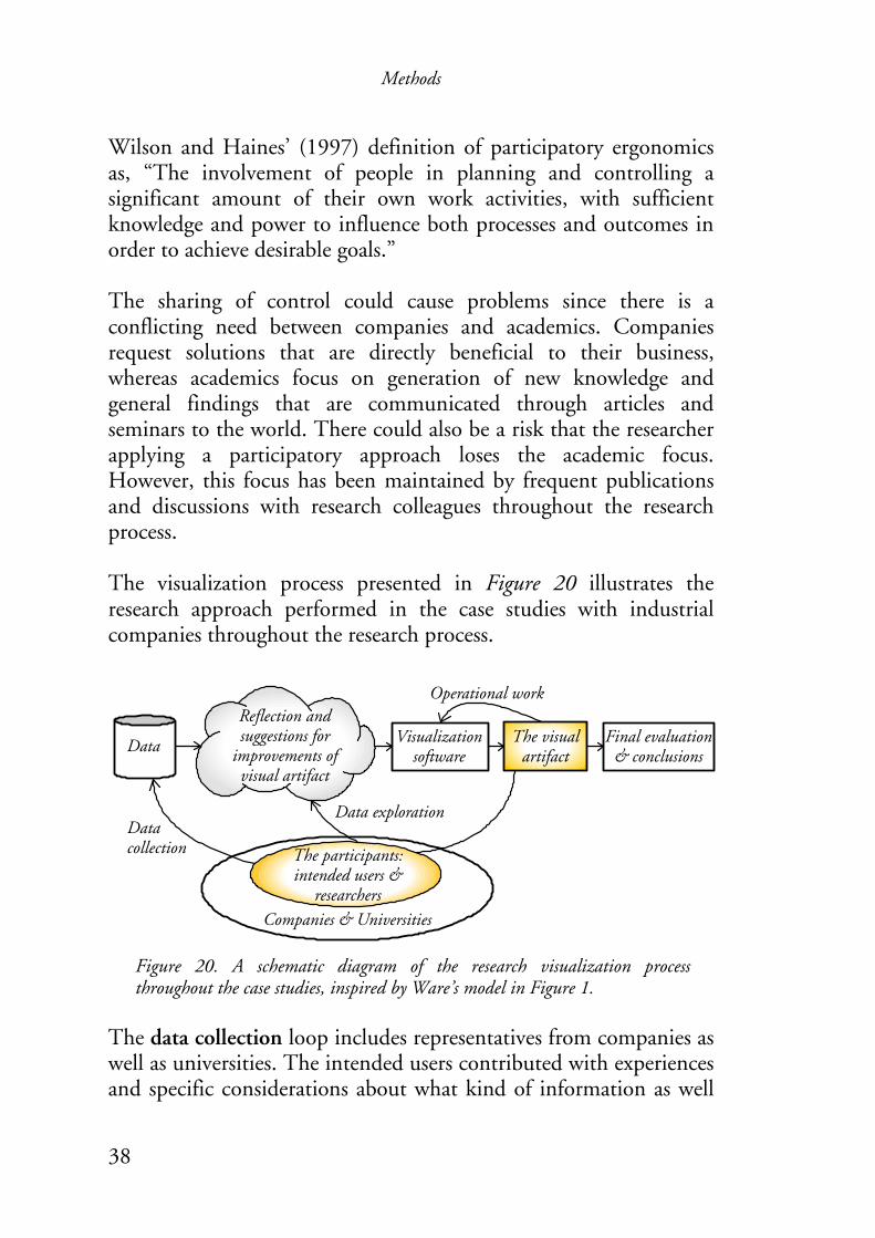
Methods
38
Final evaluation & conclusions
Data exploration
Data
Data collection
Reflection and suggestions for
improvements of visual artifact
Visualization software
Operational work
Companies & Universities
The participants: intended users &
researchers
The visual artifact
Wilson and Haines’ (1997) definition of participatory ergonomics as, “The involvement of people in planning and controlling a significant amount of their own work activities, with sufficient knowledge and power to influence both processes and outcomes in order to achieve desirable goals.” The sharing of control could cause problems since there is a conflicting need between companies and academics. Companies request solutions that are directly beneficial to their business, whereas academics focus on generation of new knowledge and general findings that are communicated through articles and seminars to the world. There could also be a risk that the researcher applying a participatory approach loses the academic focus. However, this focus has been maintained by frequent publications and discussions with research colleagues throughout the research process. The visualization process presented in Figure 20 illustrates the research approach performed in the case studies with industrial companies throughout the research process.
Figure 20. A schematic diagram of the research visualization process throughout the case studies, inspired by Ware’s model in Figure 1.
The data collection loop includes representatives from companies as well as universities. The intended users contributed with experiences and specific considerations about what kind of information as well

Methods
39
as intended usage of it within a company. Whereas participating researchers contributed with scientific knowledge from studies carried out in the framework of this thesis as well as other studies about how to visualize information. A visualization software, mainly Flash (Macromedia, 2003), was used to transform and generate the visualizations according to suggestions based on gathered data and the usage/exploration of the visual artifact. The software was chosen because of its flexibility to visualize information by means of multimedia as well as its suitability to present the visualizations on the Internet and on the companies’ intranets. These software features made it possible to let participants from the industrial companies have instant access to the visualized artifacts via the Internet or their intranets throughout the visualization process. The data exploration loop as well as the data collection loop included frequent communication among the participants about gathered data supported by visual artifacts, which corresponds to how visual tools within quality improvements and planning have been used. Thus, the visualization process throughout the studies was also a learning process for all participants (including researchers) since it contained characteristic elements of learning models such as reflection upon experiences and experiments. Furthermore, the process also had a system approach with considerations about purpose, methods and tools – similar to the triple, double, and single feedback loops in Figure 14. The author of this thesis did the operational work with the visualization software (in Paper VI with Hanson), which resulted in visual artifacts. The design and evaluation of different visualization artifacts corresponds to the steps and feedback loops of data gathering, exploration, and manipulation in Ware’s model (Figure 1) until satisfied with the visualization. However, each case study ended up in final evaluation and conclusions, Figure 20.
Methods
40
The somewhat extensive evaluations and data collection have not been contradictory from either the company or the academic point of view but instead have been considered necessary by all parties in order to achieve well-founded outcomes such as supportive systems and methodologies in accordance with the philosophy of participatory ergonomics. The case studies with evaluations, interviews and observations have been the fundamental method, but other methods such as experimental set-ups, telephone interviews, and company visits have been applied to collect information related to the research questions. The results of the collected data supported the formulation of research questions and methods throughout the research process, Figure 21.
3.2 Research process & connections between papers The main steps taken in the research process of this thesis are illustrated in Figure 21. The research process started with a vague research proposal based on a master’s thesis (Blomé, 1998) and discussions about how visualization might be useful to create and disseminate knowledge among companies in a supply chain. The research questions and methods were further developed in discussions with company representatives as well as research colleagues, and the ideas were also presented and discussed at conferences (early publications and Paper I). The formulation of research questions and methods was defined in discussions with key persons from three companies suggesting a focus on the documentation of guidelines and instructions in quality systems according to the ISO 9000 standard.

Methods
41
Paper III
Paper IV
Paper V
Paper VI
Early conference publications
Vauge research proposal
Research questions Methods Results
Paper I
Paper II
How can immaterialaspects be visualized?
How can quality systems be visualized?
How are guidelines currently visualized in
quality systems?
How should guidelines be visualized with
multimedia?
How should an interactive guideline be visualized to
support usage and documentation?
Literature reviews
Case studies and evaluations
Telephone interviews and company visits
Design of a multimedia system and comparison
with a conventional system
Design and evaluation of an interactive procedure
Experiment
PhDThesis
A case study and experimental evaluations
A case study and experimental evaluations
Identifiaction of research field
Visualization approaches of immaterial aspects
Visualization approaches for quality systems
Experiences and needs about visualization in
quality systems
Figure 21. Illustration of the research process. An intention among the companies was to replace the written text of the standard with pictorial visualizations as much as possible. Prototypes were designed and evaluated in collaboration with three companies (Papers I & II), and this was followed up by interviews and visits to companies in order to reveal how implemented guidelines and instructions are visualized in quality systems (Paper III). The results showed an interest in using pictorial visualizations to a greater extent but none of the companies hade evaluated their usage of visualizations or changes of systems. Furthermore, bigger

Methods
42
technical companies were in the frontline of this field. Therefore, it was suitable to compare a conventional system with a system visualized by means of interactive multimedia in a company working with technical design and virtual prototyping. Thus, the studies continued with Saab Automobile where there was considerable interest in developing their virtual ergonomics design process, supported by ergonomic guidelines (Paper IV) and standardized procedures (Papers V & VI).
3.3 Relevance. The ideas for research questions and methodologies have been presented and discussed at seminars and conferences in accordance with the strategies of action science. Furthermore, the objectives and methodologies have been re-defined on several occasions during the research process in accordance with experiential learning theory (Kolb, 1984) and participatory ergonomics (Wilson and Haines, 1997) in order to identify relevant objectives, methods, and solutions, which will be of interest to both industrial companies and the research community. Thus the relevance of the studies was approved from an academic as well as an industrial point of view, which is fundamental in field studies where companies actively participate.
3.4 Validity and reliability According to Frankfort-Nachmias and Nachmias (1996), validity is concerned with the question, “Am I measuring what I intend to measure?” whereas reliability refers to the extent to which a measuring instrument contains variable errors, that is, errors that appear to be inconsistent from observation to observation or that vary each time a given unit is measured by the same instrument. In order to attain validity and reliability in the studies, the methods have been triangulated. Triangulation is according to Miles and Huberman (1994) supposed to support findings by showing that independent measures of them agree or, at least, are not
Methods
43
contradictory. Furthermore, the aim is to pick triangulation sources that have different strengths so that they can complement each other. Frankfort-Nachmias and Nachmias (1996) speak about three kinds of validity: content validity, empirical validity, and construct validity. There are two common varieties of content validity: face validity and sampling validity. Face validity concerns the extent to which the researcher believes that the instrument is appropriate. In the studies included in this thesis the instruments, or the general approach as well as specific questions and methods, have been given face validity by the tradition of action research and participatory ergonomics and frequent discussions with colleges as well as supervisors. The research process throughout has followed a path from a vague research proposal on to successive research questions and studies with clear restrictions. This process of successive studies has indicated adequate populations (companies and individuals) for further studies, which corresponds to the primary concern of sampling validity. The companies were first selected from those that were ISO certified (Papers I-III), then those in the frontline of visualization (the company visits in Paper III), and finally a company that also had resources to implement advanced visualization (Papers IV-VI). The individuals were adequate considering both potential future users as well as individuals with expertise in the research field. Empirical validity is concerned with the relationship between a measuring instrument and the measurement outcomes. If a measuring instrument is valid there should be a strong relationship between the measurement results and the real relationships existing among the variables measured. In the studies performed in this thesis, it was most often the relationship between an existing system and a prototype or a new system. Empirical validity can, according to Frankfort-Nachmias and Nachmias (1996), be supported by comparisons with measurements made by other instruments. Thus, the measuring strove for triangulation as much as possible. In Papers I, II, III, and VI most of the results measured are related to the individuals’ subjective opinions that generally show a positive
Methods
44
attitude towards the prototype or the new system. Furthermore, the efficiency of different kinds of visualizations was also measured and compared with observations, time, and correct answers in Paper IV. Construct validity is established by relating the measuring instruments to a general theoretical framework in order to determine whether the instruments are tied to the concepts and theoretical assumptions they are employing. In the studies carried out in this thesis, the measuring instruments as well as the measured prototypes and systems have been developed within the established theoretical framework of visualization based on the results that frequently have been compared and found to correspond to as well as complement the theoretical framework. Reliability indicates the extent to which a measure contains variable errors. The data collection processes have been designed in order to minimize the errors of measured data. All the questionnaires in the studies have been carefully explained to each of the subjects, who also discussed the formulations with an experiment leader (Papers I, II, IV, & VI). The semi-structured interviews were summarized and sent back to the responding subjects with an opportunity to complement the answers given (Paper V).
Summary of papers
45
4 Summary of papers Based on literature reviews and discussions with research colleagues and representatives of industrial companies, an experiment was set up in order to explore how immaterial aspects could be visualized. A group of 18 students from Lund Institute of Technology were asked to draw pictures to visualize/illustrate immaterial aspects such as communication and information, responsibility and authority, and knowledge and experience. The students came up with three approaches: flowcharts, symbolic pictures, or a combination of these two (Paper I). Based on results of the pilot study and a previous case study (Blomé, 1998), the author produced a number of visualization examples of process information. The examples consisted of linked web pages with flowcharts, two-dimensional pictures of plant layouts, and animations of production processes. These examples were presented to key persons from three industrial companies who suggested a focus on quality systems based on the ISO 9000 standard. The research question was re-defined and the methodology for all case studies according to the visualization process in Figure 20 was agreed upon in a dialogue with the companies.
A case study followed made up of the three companies which had formed teams specifically for designing prototypes to visualize their quality systems and exchanging ideas for visualization approaches via a website. The final prototypes of the study were presented to and evaluated by the personnel in each company. The study results showed that companies preferred descriptions of the physical plant layout and flowcharts containing symbols that connected to further information by hyperlinks, Figure 22. Furthermore, some animations were used to view production flow and enliven the information. The companies’ representatives considered such a visualized quality system would present the information faster, easier, and more interesting to the personnel than systems with only paper documents (Paper II). However, none of the companies were
Summary of papers
46
going to implement the findings in the near future. Company A and C wanted to wait and see if a commercial software product suitable to their business system but also corresponding to their prototype would turn up. Company B had intended to implement the findings, but was shutting down for good a few months after the evaluation of their prototype. In order to explore how companies visualize their quality systems and also evaluate their experiences, a field study among a group of thirty ISO 9001 certified companies took place (Paper III). The quality managers of the companies were interviewed via telephone according to a questionnaire about if pictures were presented in quality systems, what kind and how. The subjects were also asked about the reasons for using pictures and if they worked as intended. In order to explore the need and interest of using pictures, the subjects were asked if they wanted to use them to a greater extent. Furthermore, they were asked about how this should be done, in order to receive some ideas concerning visualization approaches. Quality managers in five of the companies taking part in the telephone interviews were selected to demonstrate their quality systems and answer questions about reasons and effects of the visualization approaches they used. The selection criteria were that they already had pictorial visualizations in their quality systems to support quality control and design processes. The studies showed a positive attitude among the quality managers towards pictorial visualization and also how beneficial they were in supporting instructions and participation among employees, which corresponds to findings about visual support by means of multimedia (e.g. Mayer, 2003; Vekiri, 2002) and participatory ergonomics (e.g. Akselsson, et al., 1990).

Summary of papers
47
Entrance page Copmany A
Entrance page Copmany B
Entrance page Copmany C
Overview of sub-processes
Work instructions
Sub-process
Work instructions
Work instructions
Overview of sub-processes
Logotype Logotype
Logotype
Logotype
Figure 22. The three prototypes by the design teams of Companies A, B and C.
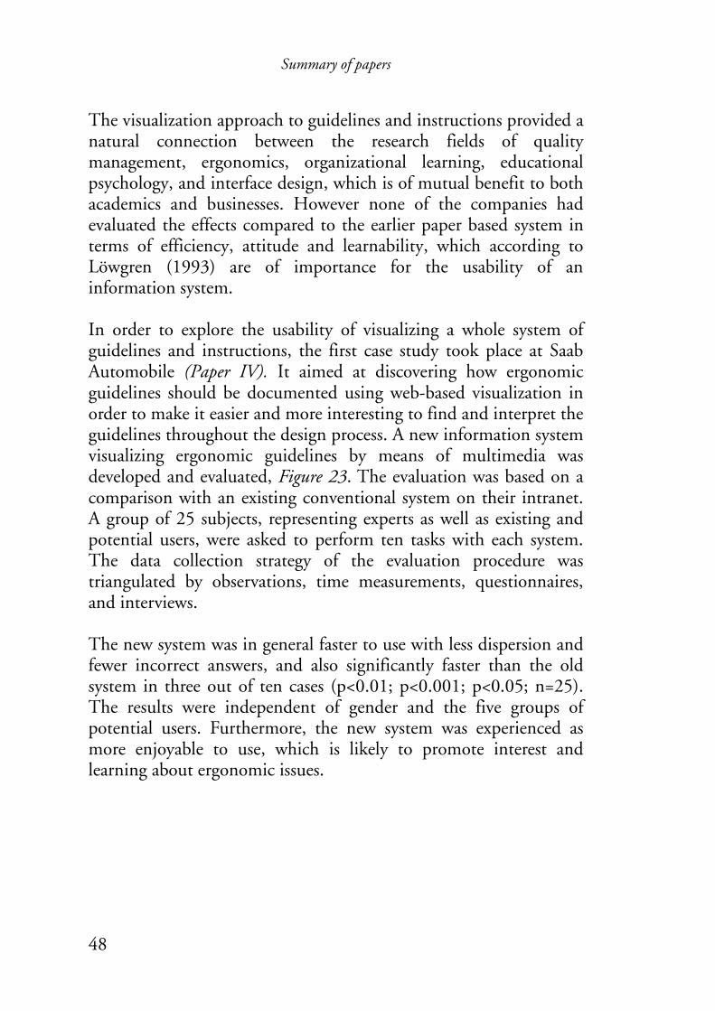
Summary of papers
48
The visualization approach to guidelines and instructions provided a natural connection between the research fields of quality management, ergonomics, organizational learning, educational psychology, and interface design, which is of mutual benefit to both academics and businesses. However none of the companies had evaluated the effects compared to the earlier paper based system in terms of efficiency, attitude and learnability, which according to Löwgren (1993) are of importance for the usability of an information system. In order to explore the usability of visualizing a whole system of guidelines and instructions, the first case study took place at Saab Automobile (Paper IV). It aimed at discovering how ergonomic guidelines should be documented using web-based visualization in order to make it easier and more interesting to find and interpret the guidelines throughout the design process. A new information system visualizing ergonomic guidelines by means of multimedia was developed and evaluated, Figure 23. The evaluation was based on a comparison with an existing conventional system on their intranet. A group of 25 subjects, representing experts as well as existing and potential users, were asked to perform ten tasks with each system. The data collection strategy of the evaluation procedure was triangulated by observations, time measurements, questionnaires, and interviews. The new system was in general faster to use with less dispersion and fewer incorrect answers, and also significantly faster than the old system in three out of ten cases (p<0.01; p<0.001; p<0.05; n=25). The results were independent of gender and the five groups of potential users. Furthermore, the new system was experienced as more enjoyable to use, which is likely to promote interest and learning about ergonomic issues.
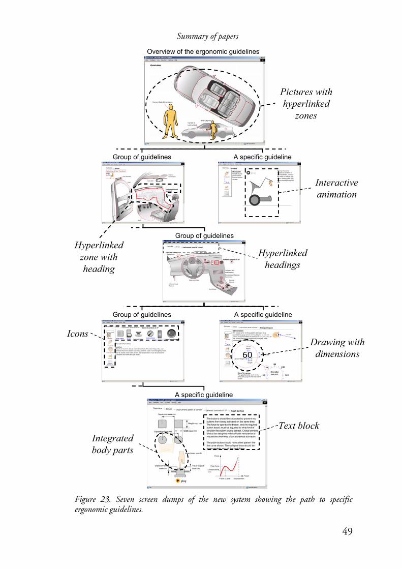
Summary of papers
49
Overview of the ergonomic guidelines
Group of guidelines
A specific guideline
Text block
Icons
Integratedbody parts
Hyperlinkedzone with heading
Pictures with hyperlinked
zones
Hyperlinkedheadings
Drawing with dimensions
Interactiveanimation
Group of guidelines A specific guideline
Group of guidelines A specific guideline
Figure 23. Seven screen dumps of the new system showing the path to specific ergonomic guidelines.

Summary of papers
50
In order to explore the importance of interactive guidelines to support design and evaluation, a second case study was performed within the same company group (Paper V & VI). The case study aimed to explore the need for a standardized process and present and evaluate a web-based system to order, perform, and document human simulation analyses. A prototype of a system was developed and evaluated in collaboration with representatives of the company group as well as people with experience of using human simulation tools, Figure 24. The users appreciated the formalized working process and, in particular, the database for storing human simulation work. The process was perceived as being especially useful for guidance in large analyses, whereas for smaller ones the subjects felt the formalized process was too lengthy and time consuming. The prototype of a web-based human simulation system consisting of a formalized process description connected to a database, was considered relevant by industry and university subjects. The use of the formalized process is likely to reduce differences in results, within and between tool users, and to deliver well-founded and consistent results. The use of such a system will document, store and keep track of ongoing and previous analyses and facilitate the reuse of studies. Thus support the design process to make products meet established requirements, therefore reducing total development time. However, attitudes are likely to become more positive through the removal of redundant information and improved graphical layout, as recommended by interface experts evaluating the system. An increased use of pictorial visualizations can improve the interface design (bottom of Figure 24). Furthermore, the methodology was not evaluated as fully implemented.
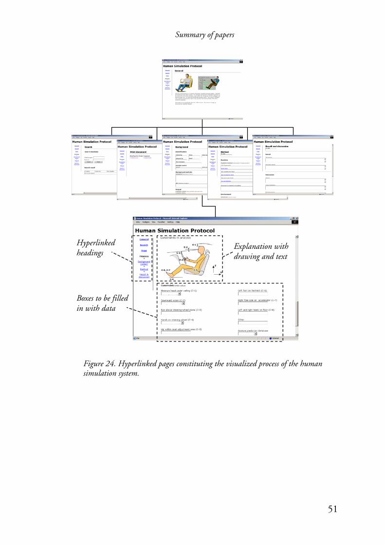
Summary of papers
51
Figure 24. Hyperlinked pages constituting the visualized process of the human simulation system.
Hyperlinked headings
Boxes to be filled in with data
Explanation with drawing and text

Discussion
52
5 Discussion
5.1 The visualization process as method and objective Research about visualization can be associated with a variety of research fields. In a review of visualization research, Orford et al. (1999) concluded that it is uncoordinated, dominated by areas with close links to the natural sciences and that work within a tradition of graphical output. Furthermore, Orford et al. concluded that without greater coordination the research of visualization will continue to be diffuse and ephemeral. This thesis can be regarded as an attempt to coordinate visualization research focusing on guidelines. However, such coordination requires stringency and specific restrictions. It has therefore been essential to triangulate the theoretical framework as well as the methods used to collect data, and the data itself. The theoretical framework is based on Figure 3 and presented with references and discussions in this thesis. The methods (e.g. case study) of collecting data as well as the type of data (e.g. time) have varied depending on the research question, Figure 21. However, the research can be considered as triangulated with respect to theory, methods and data considering the whole research process carried out in this thesis. The theoretical frame of reference relies on three main aspects which all are closely associated with visualization – communication and learning; quality improvements and participation; and visualizing of information and documentation of knowledge. Furthermore, the objectives were twofold:
• To explore how the usability5 of guidelines could be improved by the interface design of the guidelines;
5 Defined as REAL: Relevance, Efficiency, Attitude and Learnability; and also considering pleasurable usage. See chapter 2 Frame of reference.
Discussion
53
• To explore how the visualization process of new guidelines could support participatory design applying evaluations and interpretations in a dialogue form between two individuals or among a group of individuals.
Thus, the first objective is associated with the outcome of the visualization process in the form of guidelines. Whereas the second objective is associated with the visualization process itself. These objectives motivated an action research approach emphasizing participatory involvement and continuous feedback of information throughout the case studies inspired by Ware’s visualization process, Figure 20. The evolvement of the visualization process in accordance with the action research approach, made it possible to collect different kinds of data (e.g. attitude, time, and behavior) by using different methods (observations, questionnaires, and interviews). Thus, the research process benefited from using a visualization process approach.
5.2 Visualization of guidelines on intranet
5.2.1 Visualization to support design processes The visualized guideline (the visual artifact in Figure 20) can be considered as an interface for one-way communication where the user receives or has access to information by interacting with the guideline. The interaction of the guidelines – corresponding to the processing of information according to Wickens and Hollands (Figure 9) and Mayer (Figure 10) – are represented by the data exploration loop in Figure 20. This interaction could have been evaluated more cognitively, in order to verify principles of designing the visual interface. Instead, such findings were applied throughout the visualization process of guidelines as suggestions from participating researchers, and the studies focused on a comparison of a well-designed visualization by means of multimedia technology with conventional visualizations.
Discussion
54
Thus, the studies were not questioning findings about interface design with multimedia, but instead exploring the possibilities of using these findings in guidelines in industrial companies’ information and quality systems. The studies have demonstrated that guidelines and instructions visualized by means of multimedia technology on an intranet increase the usability for different users in terms of increased efficiency in performing tasks fast and accurately, as well as a more positive attitude. The explanation is likely to be a mixture of different visualization aspects. However, the main characteristic of the visualization approach is that it strives to improve usability by increasing the concreteness of and interaction with the information. If an information system is easy to learn, fast, and attractive to use it will result in a positive attitude towards the system. This in turn is likely to increase the users’ attention and establish contact between the individual and the information message (Jakobson, 1960), which is also crucial for learning (Mayer, 2003). Furthermore, the attention to concrete information, visualized as a verbal and pictorial mix, would support a mental integration of the information with earlier knowledge (Mayer, 2003); this also corresponds to the importance of reflection upon experiences (Deming, 1993; Kolb, 1984). Thus pictorial visualization approaches provide better conditions for enabling the users to gain a positive attitude towards learning about instructions and guidelines. Furthermore, communication as well as dissemination of information and knowledge throughout an organization is crucial for attaining organizational learning (Dixon, 1994). Thus, the visualized guidelines can also be considered as an interface in order to support two-way communication where two or more users exchange information by interacting with the guideline. McClellan (1983), Schramm and Roberts (1971), and Rogers and Kincaid (1981) emphasize in their models the importance of overlapping fields of lessons, experience, and mutual understanding, Figure 2, 8 and 12. This is a communication process that can benefit from

Discussion
55
visualizations according to the frame of reference in chapter 2. Thus the purpose of pictorial visualizations has been to maximize the area/field of mutual understanding. Since computer aided visualization tools have been useful in supporting participative development work, (e.g. Bengtsson and Johansson, 2002), it is likely that the new visualization of guidelines and instructions would have greater potential to support participative work with improvements than a conventional system of guidelines and instructions. Furthermore, improvements would benefit from an early formalization and data collection (Bisgaard, 2000; Wartenberg, et al., 2002). One such approach is to design the guidelines as interactive documentation tools, corresponding to the database in the second case study (Paper V).
5.2.3 Support of quality control In order to guarantee the quality of design processes it is important to ensure that the employees use and understand the guidelines and instructions. The studies show some successful approaches to visualizing information based on drawings and increased interactivity with hyperlinked information. Furthermore, to guarantee the quality and to collect process data, it might be necessary to formalize the working tasks by interactive documentation. However, these should preferably have well suited, clarifying visualizations to make clarifications.
5.2.4 Software and skills to visualize guidelines Considering the visualizations of quality systems and ergonomic design guidelines (Papers I – IV), one person (the first author) used commercial software, Flash (Macromedia, 2003), to create the visualized artifacts. The software does not require programming skills, such as Java, in order to produce the interactive visualizations without connection to a database. Furthermore, the software allows high flexibility and development speed throughout the visualization process and can fulfill the requirements on the visual presentation from participating subjects. However, the operational work requires

Discussion
56
some artistic skills since there are no templates; all visualizations have to be made from scratch. The visualization prototype of a human simulation system (Paper VI) prioritized the use of a database function and did not fulfill requirements on the visual interface from participating subjects, i.e. the prototype did not look professional. This might have affected the attitude negatively, as was the case with the conventional system in Paper IV.
5.2.5 Relevance and general applications This thesis has shown that cross-disciplinary research can coordinate knowledge about visualization concerning communication and learning, quality improvements and participation, and visualization of information and documentation of knowledge. The pictorial visualization approach has provided a natural connection between theoretical frames for learning and understanding with applications in industry, which is of mutual benefit to both academics and businesses. The representatives of the companies studied were enthusiastic about the possibility to improve their quality systems by computer-supported visualization. Such a system could provide an instant update of the information within the quality system, and also provide a more understandable and suitable approach for presenting the production process and the contents of the quality system. The company quality managers had not seen any commercial products fulfilling their requirements for an intranet based quality system. Thus they considered the visualization approach most interesting. The study was also of scientific interest since the approach was unique according to the literature search and discussions at academic seminars and conferences. The use of intranet and hyperlinks has been established to communicate the quality system and its instructions and guidelines, but the visualization is often restricted to scrollable pages with some pictures and hyperlinked text. However, most companies want to
Discussion
57
use visualization to a greater extent. Thus, the findings about visualization of guidelines presented in this thesis would likely be applicable to industrial companies of different sizes. The visualization of guidelines by means of multimedia technology was considered to be useful in introducing newcomers and training the employees in the industrial context, which corresponds to recommendations by Edwards and Gibson (1997) and Horn and Werner (2000). A researcher has been responsible for the operational work and for organizing the visualization process throughout these studies. However, those functions could probably be carried out by an employee at the specific company, following the recommendations given here and becoming familiar with participatory ergonomics as well as working with visualization software. Other aspects of future usage are considerations about cross-cultural aspects when transferring knowledge in global product development, which is significant among a group of individuals from different countries (Smeds, et al., 2001). This is an increasingly important aspect since information technology makes it possible to receive information globally. Another future aspect is the need for companies to document their knowledge in order to handle movement of personnel. Such systems should have high usability and easy updating routines. Dissemination of existing and the generation of new knowledge about visualization of guidelines could contribute to such issues.

Conclusions and future research
58
6 Conclusions and future research The studies have shown that guidelines visualized by means of multimedia technology on an intranet, increase the usability for a variety of users in terms of increased efficiency in performing tasks quickly and correctly, as well as a more positive attitude. A positive attitude and concreteness of information is of great importance to individual usage and learning according to the frame of reference in chapter 2, as well as the results of the studies carried out in this thesis. Furthermore, the visualization process of guidelines supported the participatory approach of generating and documenting knowledge by means of multimedia technology. The visualization process is therefore recommended in order to support improvements as well as learning on an individual and organizational level. It is also likely that interactive guidelines connected to a database and displayed on a computer network would support design processes and quality control of the usage of human simulation tools. The pictorial visualization approach to guidelines provided a natural connection between the research fields of quality management, ergonomics, organizational learning, educational psychology, and interface design, which is of mutual benefit to both academics and businesses. However, there is a need for further research concerning the updating process of multimedia visualized guidelines, with respect to participative development of guidelines and the corresponding operational updating of the system with these. It would also be of interest to evaluate quality effects in industrial companies concerning education, production and products as a consequence of the visualized guidelines and how they are used. Furthermore, it would be worthwhile to explore the possibilities of presenting guidelines by means of multimedia at other technical, semiotic, and sensory levels than those considered in this thesis.

Conclusions and future research
59
Examples of the first would be handheld computers; the second, use of pictures in other cultural contexts; and the third, auditory reception of speech and sound.
References
60
7 References Akselsson, K. R., Bengtsson, P., Johansson, C. R. and Klercker, J. a., 1990.
Computer aided participatory planning. Ergonomics of Hybrid Automated Systems, II pp. 69-76.
Argyris, C., Putnam, R. and McLain-Smith, D., 1990. Action Science. Jossey-Bass Publishers, San Francisco, California, ISBN 0-87589-665-0.
Axelsson, J. R. C., 2000. Quality and ergonomics – towards successful integration. Linköping University, Sweden, Doctoral thesis, ISBN 91-7219-652-1.
Bengtsson, P. and Johansson, C. R., 2002. Significance of the dimensional view for visualizing relevant aspects of a production system in a co-operative planning process. Ergonomics, 45 (13), pp. 910-921.
Bergman, B. and Klevsjö, B., 1994. Quality from customer needs to customer satisfaction. Studentlitteratur, Lund, ISBN 91-44-46331-6.
Bertin, J., 1983. Semiology of graphics: diagrams, networks, maps. University of Wisconsin Press, London; Madison Wisconsin, ISBN 0-299-09060-4.
Birgerstam, P., 2000. Skapande handling: om idéernas födelse. Studentlitteratur, Lund, ISBN 91-44-01399-X.
Bisgaard, S., 2000. The role of scientific method in quality management. Total Quality Management, 11 (3), pp. 295-306.
Blomé, M., 1998. A computer supported model for visualisation of production, communication and work contents (In Swedish). Change@Work, Lund University, Sweden, Master’s thesis, ISSN 1104-1080.
Blomé, M., Johansson, C. R. and Odenrick, P., 2003. Computer supported visualisation of quality systems developed by network teams. Applied Ergonomics, 34 (3), pp. 239-247.
Chaudhuri, A. K. and Acharya, U. H., 2000. Measuring effectiveness and suitability of a quality system. Total Quality Management, 11 (2), pp. 149-153.
Clark, J. M. and Paivio, A., 1991. Dual coding theory and education. Educational Psychology Review, 3 (3), pp. 149-210.
Deming, W. E., 1993. The new economics: for industry, government and education. Massachusetts Institute of Technology, Center for Advanced Engineering Study, Cambridge, Massachusetts, ISBN 0-911379-03-7.
Deming, W. E. and Kilian, C. S., 1992. The world of W. Edwards Deming. SPC Press, Knoxville, Tennessee, ISBN 0-945320-29-9.
Denton, D. K., 1995. Process mapping trims cycle time. HRMagazine, 40 (2), pp. 56-61.
Dixon, N., 1994. The organizational learning cycle: how we can learn collectively. McGraw-Hill, London, ISBN 0-07-707937-X.
Edwards, J. and Gibson, P. R., 1997. Integrated multi-media computers in the execution of ISO 9000 quality system requirements for document control and training. Computers and Industrial Engineering, 32 (3), pp. 529-538.
References
61
Eriksson, Y., 2001. Bilden som roar och klargör – en jämförande studie mellan tidiga illustrerade läroböcker och dagens pedagogiska cd-rom. Teldok, Vinnova, Stockholm, ISBN 91-89588-07-X.
Fiske, J., 1990. Introduction to communication studies. Routledge, London and New York, ISBN 0-415-04672-6.
Forssén, M. and Haho, P., 2001. Participative development and training for business processes in industry: review of 88 simulation games. International Journal of technology management, 22 (1-3), pp. 233-262.
Frankfort-Nachmias, C. and Nachmias, D., 1996. Research methods in the social sciences. St. Martin’s Press, New York, ISBN 0-312-10159-7.
Garrigou, A., Daniellou, F., Carballeda, G. and Ruaud, S., 1995. Activity analysis in participatory design and analysis of participatory design activity. International Journal of Industrial Ergonomics, 15 (5), pp. 311-327.
Green, R., 2000. A generic process for human model analysis. Warrendale, USA, SAE Technical Paper Series 2000-01-2167.
Greif, M., 1992. Det visuella företaget – visuell kommunikation och företagsledning. TQM produktionsskolan, Åre, ISBN 91-88408-01-9.
Harrington, H. J., 1991. Business process improvement – the breakthrough strategy for total quality, productivity, and competitiveness. McGraw-Hill, New York, ISBN 0-07-026768-5.
Horn, G. and Werner, H., 2000. Protection of the environment by emergency managers in the Frankfurt Höchst Industrial Park, Germany. In: Proceedings of ESREL 2000 and SRA-Europe Annual Conference, Edinburgh, Scotland, UK, 14-17 May 2000, pp. 559 - 562.
Huarng, F., Horng, C. and Chen, C., 1999. A study of ISO 9000 process, motivation and performance. Total Quality Management, 10 (7), pp. 1009-1025.
Isaacs, W. N., 1993. Dialogue, collective thinking and organizational learning. Organizational dynamics, 22 (2), pp. 24-40.
ISO, 2000. Quality management systems – Requirements (ISO 9001:2000). European committee for standardization, Brussels, EN ISO 9001:2000.
Jahnukainen, J., Lahti, M. and Huhtala, M., 1995. LOGIPRO: towards world class make-to-order supply chains. Helsinki University of Technology, Espoo, ISBN 951-22-2767-3.
Jakobson, R., 1960. Closing statement: linguistics and poetics. In: Sebeok, T. (ed.), 1960. Style and Language, Cambridge, Mass., MIT Press. Reference via: J. Fiske, 1990. Introduction to communication studies. Routledge, London and New York, ISBN 0-415-04672-6.
Johansson, C. R., 1999. Visualisering som förbättringsverktyg. In: T. Nilsson, Ständig förbättring – om utveckling av arbete och kvalitet. Arbetslivsinstitutet, Solna, pp. 227-266, ISBN 91-7045-517-1.
Jordan, P. W., 2000. Designing pleasurable products: an introduction to the new human factors. Taylor and Francis, London and New York, ISBN 0-748-40844-4.
References
62
Karltun, J., Axelsson, J. and Eklund, J., 1998. Working conditions and effects of ISO 9000 in six furniture-making companies: implementation and processes. Applied Ergonomics, 29 (4), pp. 225-232.
Klefsjö, B., Eliasson, H., Kennerfalk, L., Lundbäck, A. and Sandström, M., 1999. De sju ledningsverktygen: för effektivare planering av förbättringsarbetet. Studentlitteratur, Lund, ISBN 91-44-00607-1.
Kolb, D. A., 1984. Experiential learning: experience as the source of learning and development. Prentice-Hall, Englewood Cliffs, New Jersey, ISBN 0-13-295261-0.
Leahy, W., Chandler, P. and Sweller, J., 2003. When auditory presentations should and should not be a component of multimedia instruction. Applied Cognitive Psychology, 17 (4), pp. 401-418.
Lidman, S., 1999. Vad Gutenberg åtskilde. Tecknaren, (3), pp. 9-12. Liew, M., 1996. Lärande organisation – för effektivare produktion.
Arbetslivsinstitutet, Solna, ISBN 91-7045-356-X. Loew, C. and Hurley, H., 1995. Faster product/process development through cross
functional process mapping. Production, 107 (12), pp. 56-61. Luft, J., 1984. Group processes: an introduction to group dynamics. Mayfield,
Mountain View, ISBN 0-87484-542-4. Löwgren, J., 1993. Human-computer interaction: what every system developer should
know. Studentlitteratur, Lund, ISBN 91-44-39651-1. Macromedia, 2003. Flash (computer program). Macromedia Inc, San Francisco. Mayer, R. E., 2003. The promise of multimedia learning: using the same
instructional design methods across different media. Learning and Instruction, 13 (2), pp. 125-139.
Mayer, R. E. and Moreno, R., 2002. Aids to computer-based multimedia learning. Learning and Instruction, 12 (1), pp. 107-119.
McClellan, J., 1983. Toward a general model of collective learning: a critique of existing models of specific social systems and a sketch of a model for social systems in general. Dissertation, University of Massachusetts, USA.
McGregor, D., 1960. The human side of enterprise. McGraw-Hill, New York, ISBN 0-07-045092-7.
Merriam-Webster, 1994. Merriam-Webster’s collegiate dictionary. Britannica Online, Chicago, Illinois, ISSN 1085-9721.
Miles, M. B. and Huberman, A. M., 1994. Qualitative data analysis: an expanded sourcebook. Sage, Thousand Oaks, California, ISBN 0-8039-5540-5.
Moore, K. L., 1992. Clinically oriented anatomy. Williams & Wilkins, Baltimore, ISBN 0-683-09485-8.
Moreno, R. and Mayer, R. E., 1999. Cognitive principles of multimedia learning: the role of modality and contiguity. Journal of Educational Psychology, 91 (2), pp. 358-368.
Ohlsson, J. and Granberg, O., 1998. Från lärandets loopar till lärande organisationer. Pedagogiska institutionen, Stockholm, ISSN 1104-1625.

References
63
Orford, S., Harris, R. and Dorling, D., 1999. Geography: information visualization in the social sciences – a state-of-the-art review. Social Science Computer Review, 17 (3), pp. 289-304.
Popper, K. R., 1959. The logic of scientific discovery. Hutchinson, London, ISBN 0-09-111721-6.
Proctor, R. W. and Zandt, T. v., 1994. Human factors in simple and complex systems. Allyn and Bacon, Boston, ISBN 0-205-13999-X.
Reason, J., 1997. Managing the risks of organizational accidents. Ashgate, Aldershot, Hants; Brookfield, Vt., ISBN 1-84014-105-0.
Rendahl, J. E., Hart, H., Lawler, E. E., Ledford, G. E. and Norrgren, F., 1996. Att förändra och leda morgondagens arbete. VIS Strategi, Stockholm, ISBN 91-630-4553-2.
Rogers, E. M. and Kincaid, D. L., 1981. Communication networks: toward a paradigm for research. New York, Free press. Reference via: J. Windahl, B. Signitzer, J. T. Olson, 1992. Using communication theory – an introduction to planned communication. Sage publications, London, ISBN 0-8039-8431-6.
Rönnäng, M., Dukic, T., Christmansson, M. and Örtengren, R., 2002. The ergonomist in a virtual production planning process. In: Proceedings of the 34th Annual Congress of the Nordic Ergonomics Society, Kolmården, Sweden, 1-3 October 2002, pp. 677-682.
Schein, E. H., 1993. On dialogue, culture and organizational learning. Organizational Dynamics, 22 (2), pp. 40-52.
Schnotz, W. and Lowe, R., 2003. External and internal representations in multimedia learning – introduction. Learning and Instruction, 13 (2), pp. 117-123.
Schramm, W. and Roberts, D. F., 1971. The process and effects of mass communication. University of Illinois Press, Urbana, ISBN 0-252-00197-4.
Senge, P. M., 1990. The fifth discipline: the art and practice of the learning organization. Doubleday, New York, ISBN 0-385-26094-6.
Shannon, C. and Weaver, W., 1949. The mathematical theory of communication. Reference via: Fiske, J., 1990. Introduction to communication studies. Routledge, London and New York, ISBN 0-415-04672-6.
Shewhart, W. A. and Deming, W. E., 1986. Statistical method – from the viewpoint of quality control. Dover publications, New York, ISBN 0-486-65-232-7.
Smeds, R., Olivari, P. and Corso, M., 2001. Continuous learning in global product development: a cross-cultural comparison. International Journal of technology management, 22 (4), pp. 373-394.
Sonesson, G., 1992. Bildbetydelser – inledning till bildsemiotiken som vetenskap. Studentlitteratur, Lund, ISBN 91-44-31661-5.
Sundin, A., 2001. Participatory ergonomics in product development and workplace design: supported by computerised visualisation and human modelling.
References
64
Chalmers University of Technology, Gothenburg, Sweden, Doctoral thesis, ISBN 91-7291-046-1.
Sundin, A., Christmansson, M. and Örtengren, R., 2000. Use of a computer manikin in participatory design of assembly workstations. In: K. Landau, Ergonomic software tools in product and workplace design. Ergon, Stuttgart, pp. 204-213, ISBN 3-932160-11-8.
Swieringa, J. and Wierdsma, A., 1992. Becoming a learning organization: beyond the learning curve. Addison-Wesley, Workingham, ISBN 0-201-62753-1.
Symons, R. T. and Jacobs, R. A., 1997. Multi-level process mapping: a tool for cross-functional quality analysis. Production and Inventory Management Journal, 38 (4), pp. 71-76.
Tollmar, K. and Sundblad, Y., 1995. The design and building of the graphic user interface for the collaborative desktop. Computers and Graphics, 19 (2), pp. 179-188.
TQM, I., 1994. Business process improvement: an approach to implementation. TQM International, Frodsham, ISBN 1-899566-55-4.
Vekiri, I., 2002. What is the value of graphical displays in learning? Educational Psychology Review, 14 (3), pp. 261-312.
Verdi, M. P., Kulhavy, R. W., Stock, W. A., Rittschof, K. A. and Johnson, J. T., 1996. Text learning using scientific diagrams: implications for classroom use. Contemporary Educational Psychology, 21 (4), pp. 487-499.
Ware, C., 2000. Information visualization: perception for design. Morgan Kaufman, San Francisco, ISBN 1-55860-511-8.
Wartenberg, C., Frid, J. and Törner, M., 2002. Relational database as a tool in industrial design. Experience from a human factors engineering analysis of a module for manned space-flight. International Journal of Industrial Ergonomics, 30 (6), pp. 371-385.
Westlander, G., 1999. Det kvalitativas relation till det kvantitativa: en tillbakablick på arbetslivsforskning. In: J. Lindén, G. Westlander and G. Karlsson, Kvalitativa metoder i arbetslivsforskning: 24 forskare visar hur och varför. Rådet för arbetslivsforskning, Stockholm, pp. 8-20, ISBN 91-88530-82-5.
Westra, D., Srikanth, M. L. and Kane, M., 1996. Measuring operational performance in a throughput world. Management Accounting, 77 (10), pp. 41-48.
Wickens, C. D. and Hollands, J. G., 1999. Engineering psychology and human performance. Prentice Hall, Upper Saddler River, New Jersey, ISBN 0-321-04711-7.
Wild, F. and Heseltine, J., M. K. Salminen. 2003. Rom: arkitektur, restauranger, historia, kyrkor, turer. Streiffert, Stockholm, ISBN 91-7886-267-1.
Wilson, J. R. and Haines, H. M., 1997. Participatory ergonomics. In: G. Salvendy, Handbook of human factors and ergonomics. Chichester: Wiley, New York, pp. 490-513, ISBN 0-471-11690-4.

References
65
Yeung, A. S., Jin, P. and Sweller, J., 1997. Cognitive load and learner expertise: split-attention and redundancy effects in reading with explanatory notes. Contemporary Educational Psychology, 23 (1), pp. 1-21.
Ziolek, S. and Nebel, K., 2003. Human modeling: controlling misuse and misinterpretation. SAE Technical Paper 2003-01-2178.