Embed Size (px)
Citation preview

OCR Media Studies – AS Level
Unit G321: Foundation Portfolio in Media
Evaluation
Name: Toni Hopkins
Candidate Number: 6660Center Name: St. Paul’s Catholic CollegeCenter Number: 64770

In what ways does your Media product use, develop or challenge forms and conventions of real media products?
The magazine, across the 4-pages, ‘repeats’ (Steve Neale) codes and conventions from magazines such as ‘Billboard magazine’ which I chose as my magazine of inspiration. I chose ‘Billboard’ as my magazine of inspiration because I really like the way that they style their magazine to different cover stars and the fact that the magazine is suitable for all genres of music as it is based on the charts. I focused on ‘repeating’ the way that the colour scheme is used to fit the star and the use of the bold text for the masthead so I used this in my own work which you can see on all of my 4 pages.I also ‘repeated’ the use of just one, main image on my front cover as I found that it makes the image stand out more as some magazine covers may appear busy when there are many images on them.
To complete my front cover I followed the codes and convention that I found on ‘Billboard’ magazine and included them in my own work, these included: Masthead Bar Code Main Image Date/issue/price Convergence Headline
I also ‘repeated’ the codes and conventions of ‘Billboard’ magazine for my contents page, such as: Main story Page numbers Convergence Sections of the contents Sublines
My double spread also featured codes and convention like those in ‘billboard’ such as the use of key quotes from the interview, a drop capital at the start and the use of more than on image of the artist as I felt it would attract the attention of the target audience further.
There are examples of some ‘difference’, however, in terms of the forms and conventions in my own media product for example I decided to present cover lines on my front cover, ‘Billboard’ usually do not include any cover story and the front cover usually only contains information about the cover star. My contents page also shows a lot of ‘difference’ as I chose to include more than one image so that more than one of the stories featured in the magazine. I also chose to include my editorial on the contents rather than on a separate page by itself. My contents page also includes an image of the most recent cover of the magazine with the date and issue no. My double page spread also includes a lot of ‘difference’ than that of Billboard as I chose to show differentiation between the artist the interviewer so it follows the theme of an interview more. My double page spread also includes puff/promotion as well, I included a competition and advertisement of the artists latest release as I felt it was a key feature of a music magazine. I did this as it would create unique selling points for my magazine, I have found that the target audience would prefer ‘difference’ in multi-genre music magazines as it offers them a wider range of information and knowledge enabling people such as ‘social climbers’ would gain from this extra information according to Maslow’s hierarchy of needs.

How does your media product represent particular social groups?
The denotation of representation is the action of speaking or acting on behalf of someone or the state of being so represented. The magazine, across the 4-pages, helps to represent both female and male stars in a positive way, mainly the female gender. Especially on my front cover I have chosen to portray my cover star as confident and powerful. I think the way that the image has been captured gives the reader the impression that I wanted them to. I have used Photoshop to edit the front cover image so that she appears to be wearing bright and colourful clothing making her come across as a cheerful person. I also made the lighting look brighter and more like a star would look on a warm summers day, once again making the star look like a positive role model for the audience. I think that my magazine could be a form of ‘diversion’ (Katz) for audience members that are workers as reading my magazine will act as a way to escape the reality of their lives. The inclusion of male stars on the cover and on the contents also represents them as a good role model as the brief descriptions tell the audience of their success. The use of these cover stars will attract a particular audience due to ‘Star Appeal’ (dyer) as many people would buy a magazine for the stars they see on the cover. My intentions for my magazine was to attract a wide audience with the use of multi-genres just like my magazine of inspiration Billboard, which is why I included cover stories involving stars from genres other than pop. However my magazine does not represent all audiences/social groups; such as ‘goths’ ‘hippies’ ‘punks’ and those into classical music. In order to attract these audiences I would have to change the appearance of my magazine and make the colour scheme darker and change the types of stars I include on the cover and in my contents page so that it will meet the expectations of a wider audience including the previously mentioned social groups.
What kind of media institution (Publisher) might distribute your media product and why?
From the research that was completed pre-production, I would think that Billboard publications would publish my magazine ‘Shuffle’ because I found that they ‘inform’ and
‘educate’ (Katz’) their audience with the latest music news and gossip and provide the audience with the breakdown of the charts containing all of the viewers favourite music stars.
The similarities of my magazine to ‘Shuffle’ also ‘sgnifies’ (De Saussure) that Billboard Productions may decide to distribute my magazine due to the fact that my magazine follows
similar codes and conventions that I ‘repeated’ (Steve Neal) from my magazine of inspirational magazine Billboard, as they fit best with the genre I have chosen to base my magazine on, this
will create interest for Billboard Publications causing them to distribute my magazine.During my planning I also looked at other magazines such as ‘Q’ and ‘NME’ for inspiration. The publisher for ‘Q’ is Bauer. There’s also a possibility for my magazine to be distributed by Bauer because as some of the codes and conventions featured on ‘Q’ are featured on my magazine and as y magazine contains multiple genres, this publishing company would be appropriate
for my magazine ‘Shuffle’.

Who would be the audience for your media product and why?
According to Hartley’s seven subjectivities the target audience if my magazine ‘Shuffle’ would be for both genders but mainly female aged between 15-25 years old. It would appeal to thus audience due the bright colour scheme followed throughout and a very modern appearance, the stars that I have chosen for the cover will also attract this audience because the stars will act as role models for the audience as they may aspire to be as successful and powerful as the mainly female stars of my magazine.
According to Katz’ Uses & Gratifications theory, my audience would be able to build a ‘personal relationship’ with the stars of the magazine and also in some ways be able to ‘personally identify’ with the stories told by their role models on the interview pages. This is a key aspect of attracting an audience as it encourages the audience to read my magazine and will encourage them to build anticipation for future issues. In future issues male over stars will be included which will build elements of ‘female gaze’ (Laura Mulvey) whilst in the issue I just produced ‘male gaze’ is clear as the star Selena Gomez is objectified by the male audience.
According to Maslow’s hierarchy of needs, my magazine would be aimed at ‘social climbers’ as they will seek as much information as possible to gain their status in society. The information that they gain from my magazine will give them this information, as the double page interview includes a lot of information about the audiences role model meaning they can find out the latest from their favourite stars.
How did you attract/address your audience?
In order to attract the intended target audience of mainly females aged between 16-24, I decided to use the appropriate language. The language I have chosen to use will fit my target audience as they will be able to understand everything clearly. By using words such as ‘win’ or ‘exclusive’ will attract my target audience because they will be able to gain something from ‘Shuffle’ and these words will entice them so that they can build ‘esteem’ according to Maslow’s Hierarchy of needs. ‘Star Appeal’ will also help my attracting my audience because the first thing you see on a magazine is the main image and if the image is of a star that interests the target audience they will buy the magazine. The inclusion of codes & conventions such as my editorial will help to appeal to the target audience because it allowed my target audience to ‘Identify’ (Katz’) with as I included the use of words such as ‘I’ and ‘You’ this is effective in attracting the audience as the audience of ‘Shuffle’ will feel as if I am communicating directly with them.

What have you learnt about technologies from the process of constructing this product?
The denotation of the software used to construct the media product entitled ‘Shuffle’ was Adobe Photoshop CS4. I chose to use this product because I had previous knowledge of the software from
various other projects and it allowed me to successfully create my magazine. This software enabled me to edit my images appropriately so that they fit to the genre if my product, it also allowed me to change
the backgrounds and arrange all of the appropriate codes and conventions neatly on each page. My ability to complete actions like this was due to the wide variety of tools available on the software. From this project I learnt how to manipulate colours on images allowing me to brighten up all images across all four pages, including my main cover image which will attract the audiences attention. I also learnt how to use the pen tool, this tool allowed me to write around images and shapes across my pages, I
mainly used this tool to create the columns of text on my double page spread. For originality, I used all of my own images which I took on my camera and also found an appropriate font to fit my genre on a
website called, dafont.com. I then changed the colour of the text to meet the colour scheme of my magazine, this created some ‘difference’ (Steve Neele) from my inspirational magazine ‘Billboard’ to my
original magazine ‘Shuffle’.

Photography Planning – Front CoverI took a variety of different images for my Main front cover image. I got the idea for my image from my magazine of inspiration ‘Billboard’ as I found that they typically use a medium close up of the cover star which is then presented in the centre of the front cover. I chose the mage where my cover star as I felt that it was appropriate for my magazine and I like the way that the female is seen as quite powerful, this will give a good impression on my audience as they will aspire to be powerful like the star on the cover, this will also allow my target audience to be able to build a ‘personal relationship’ (Katz) with the star Selena Gomez as she appears like a positive female role model and quite an approachable person. After choosing the top left image as my final image I decided to edit it to make it more colourful and aesthetically pleasing for my audience. I cropped out the white background making the image background transparent so I was able to place it onto my front cover, I also changed the colours of her clothing to match the pale pink background I chose for my magazine. I also made my cover star look like shewas wearing lipstick, I did this because I felt the image was quite plain and she didn’t really look like a cover star. As I chose to appeal to both genders, however mainly female, this image willalso bring in a male audience due to ‘male gaze’(Mulvey), providing me with a wider audience for the whole of my magazine.
Final image After Photoshop

Photography Planning - ContentsFor my contents page I decided to include a few images of the stars from the front cover. I chose to add images of Taylor Swift and Passenger. During the process of producing my magazine I went to see passenger in concert so I
decided to use an image from the concert, I chose to use an image from the concert as it would be beneficial to the audience to see one of their favourite stars on stage. However, this image is very low quality so if I was to take this shoot again I will find a model and set it up on backdrop in a higher quality. For the Taylor Swift shoot I decided to dress her in stereotypical clothes so that my audience will instantly be able to recognise her. I also included an
image of my cover star, Selena Gomez, I did this a little preview for the main article featured in ‘Shuffle’. I think that these images will allow my target
audience to ‘personally identify’ (Katz) with my magazine and it will increase their anticipation for further issues. When placing these images onto my
content page I decided to shape them and place them like thumbnails, I did this because it gave the page more of a professional look. By including more than one image on my contents page I am ‘repeating’ (Neale) the codes and
conventions featured on ‘Billboard’ magazine.

Photography Planning - Interview
Final image
Final image
After Photoshop
After Photoshop
I took the most images for my double page spread. I experimented with different environments, angles and lighting for these images. After my research of billboard magazine I decided to do my own layout for the DPS as I felt that it would produce some difference (Neale). I chose my final image as I it seemed to fit well with the image I was trying to create for my magazine and I decided to use it s that it would take up a whole side of my DPS. By having my cover star in a natural environment made my star more relatable for the audience. After choosing this image as my final one I decided to edit it to make it more colourful and aesthetically pleasing for my audience. I decided to keep the background, so I was able to place it onto the page and fit it on appropriately. I also changed vibrancy of the colours of her clothing to match the bright colours seen on the front cover. I also made my star look like she was wearing lipstick so that I have ‘repeated’ (Neale) her look from the cover. I also decided that I wanted to make the natural background a bit more vibrant to math the feeling the star is giving the audience, I did this by enhancing the green of the grass and changing the colour of the dead brown flowers in the background to pink to making them look more pretty like flowers should be. Once again this image will also bring in a male audience due to ‘male gaze’ (Mulvey), providing me with a wider audience.

Analysing my Front CoverMasthead
Tagline
Main central image
Cover lines
Barcode/Date/issue no. /Price
Puff/Promotion
Main Headline
Social Networking/Convergence

Analysing my Contents PageMasthead
Editorial
Front cover
Stories with brief
introduction paragraph
Editor information
Puff/Promotion
Main Story
Social Networking/Convergence
Cover Story images
Page Number
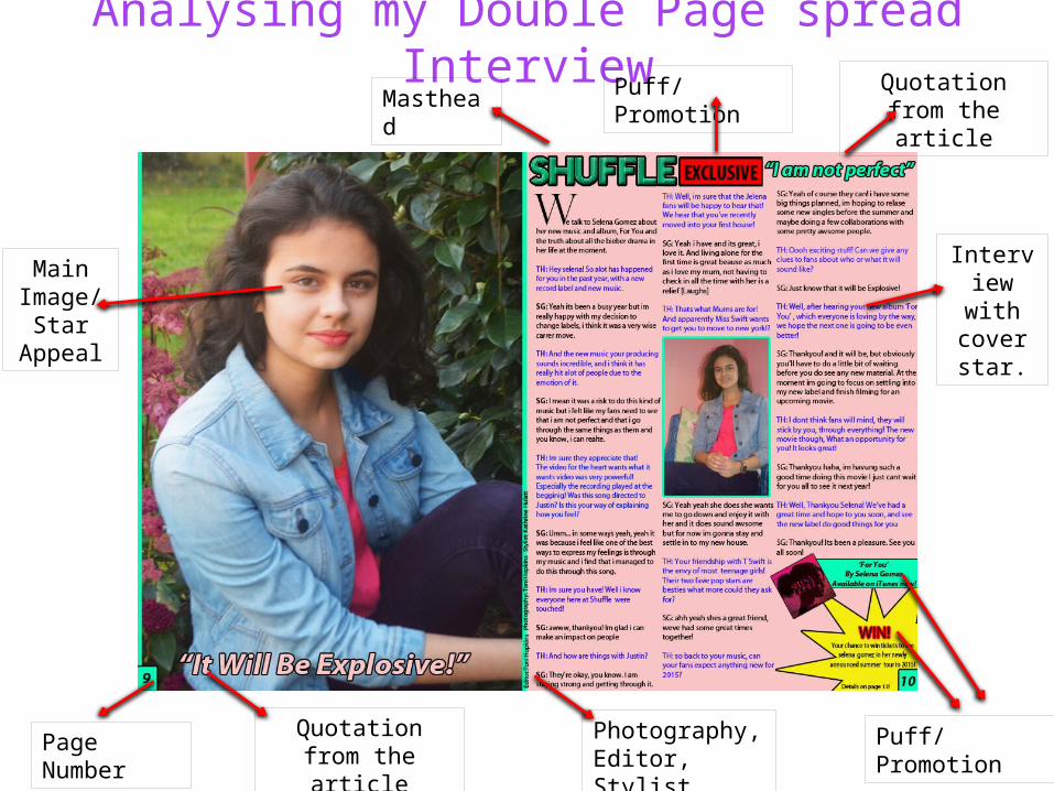
Analysing my Double Page spread InterviewMasthead
Puff/PromotionQuotation from the article
Main Image/
Star Appeal
Page Number
Quotation from the article
Interview with cover star.
Photography, Editor, Stylist
Puff/Promotion
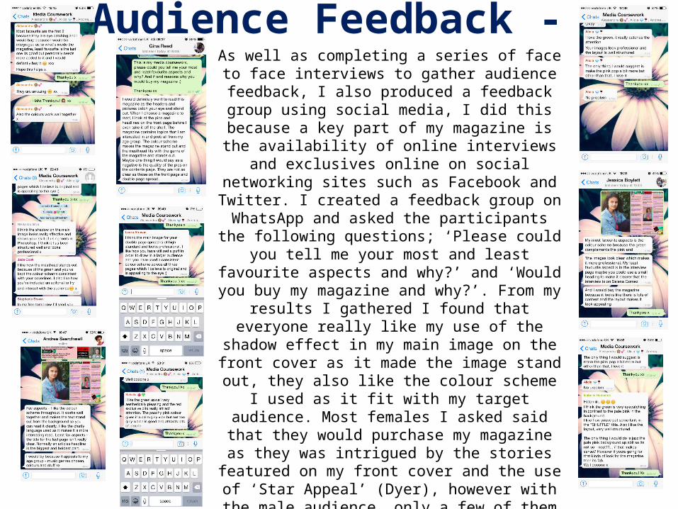
Audience Feedback - As well as completing a series of face to face interviews to gather audience feedback, I also produced a feedback group using social media, I did this because a key part of my magazine is the availability of online interviews and
exclusives online on social networking sites such as Facebook and Twitter. I created a feedback group on WhatsApp and asked the participants the following
questions; ‘Please could you tell me your most and least favourite aspects and why?’ and ‘Would you buy my
magazine and why?’. From my results I gathered I found that everyone really like my use of the shadow effect in my main image on the front cover as it made the image
stand out, they also like the colour scheme I used as it fit with my target audience. Most females I asked said that they would purchase my magazine as they was intrigued by the stories featured on my front cover and the use of ‘Star Appeal’ (Dyer), however with the male audience, only a few of them said that they would purchase the magazine. To improve they suggested that I find some clearer images for my contents page as the quality of
those images did not meet the standard of some of my other images featured in the magazine. They also
suggested making the title of my double page spread more clear as there is no evidence that it is on Selena
Gomez for those who will not recognise her image.
Looking back at your Preliminary task, what do you feel you have learnt in the progression from it to the
full product?
I feel that, having completed the preliminary task and learning about the demands of this production process I was able to complete my main task to the best of my ability. I have learnt that
by doing a preliminary task it allows you to improve on your skills and make your media product look more professional. Doing my preliminary task allowed me to brush up on my Photoshop skills
that I learnt during my GCSE media coursework and a chance learn some new ones. During this process I learnt how to use the pen tool, this tool has helped throughout the whole of my
magazine. There is evidence of progression that I feel particularly demonstrates how I met the demands of the production process, for example the quality of my main image on my preliminary
front cover is a lot lower than the image on my main production work. I also feel like all of my work is of a more professional standard after my preliminary task. This will be beneficial in attracting my
target audience as they will aim toward a magazine that looks professional and also meets their needs.