Embed Size (px)
Citation preview

3rd Submission of Final ProductEliza Chapman-Smith
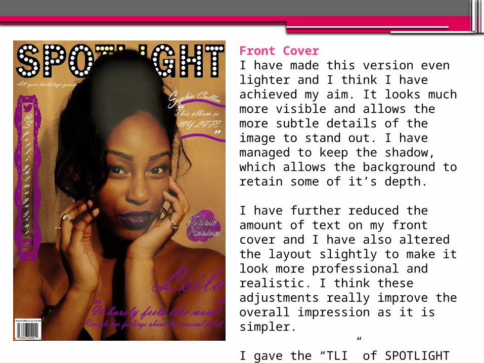
Front CoverI have made this version even lighter and I think I have achieved my aim. It looks much more visible and allows the more subtle details of the image to stand out. I have managed to keep the shadow, which allows the background to retain some of it’s depth.
I have further reduced the amount of text on my front cover and I have also altered the layout slightly to make it look more professional and realistic. I think these adjustments really improve the overall impression as it is simpler.
I gave the “TLI” of SPOTLIGHT a slight yellow-ish tinge to give the impression of a spotlight shining on her. This ties in the effect I put on the model where it looks as if there is a light shining down.

Contents Page
In this version I have made the background even lighter to really make the individual elements stand out more and it is easier to read the text. I have also added a subtle gradient to the corners so it doesn’t look too flat.
I have used the mirrors to add more interest to the page and make the link within the sections more visible. I think this makes it look more professional due to the continued motif.
I removed the ‘social media’ section as it is on the front page and this allowed me a lot more freedom to de-clutter this page. Overall this page now looks much cleaner and more legible.

Double Page Spread
The lightening of the background really comes into effect with this version, it allows all the other features to take the forefront and makes it much easier to read the text.
I reduced the amount of text in this version and I think it really pays of as it looks less cluttered and therefore more professional. I have retained enough text so that it doesn’t look to sparse.
Due to reducing the text I had a bit more space to work with, so I introduced some new elements to fill this out. I made the mask shot larger to make it look less text heavy, and I added a new quote at the bottom of the left page which brings in some colour and variety.