Embed Size (px)
Citation preview

2nd Submission of Final ProductEliza Chapman-Smith

Front Cover
In this version of my front cover I reduced the text dramatically, getting rid of a lot of the unnecessary information and quotes. This has the effect of making it look more professional and clearer. Despite this I still think I need to get rid of more text, to really do this to the fullest effect.
I have also been able to lighten the background, but once again I think I need to do this even more to really achieve the desired effect.
I chose to add a strap line to make it look more like a real music magazine. I did this in a very small light font so that it doesn’t intrude on the main image.

Contents PageI have cut down some of the text and rearranged it into ‘Features’ and ‘Regulars’. This makes it look more like a real magazine as it is split into sections and therefore easier to navigate throughout the magazine. I have also made them different colours to separate the sections, using the purple from the front cover.
My audience gave me feedback and said that the text is still to busy so I think I will deal with this by making the font size a bit smaller, so it will take up less space and be less prominent.
To add some variety I have introduced frames around the text and while I like this idea I think the style and colour of it is wrong so I might change it and introduce the mirror as a stronger motif.
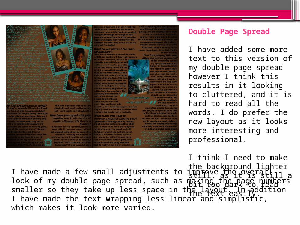
Double Page Spread
I have added some more text to this version of my double page spread however I think this results in it looking to cluttered, and it is hard to read all the words. I do prefer the new layout as it looks more interesting and professional.
I think I need to make the background lighter still, as it is still a bit too dark to read the text easily.I have made a few small adjustments to improve the overall look of my
double page spread, such as making the page numbers smaller so they take up less space in the layout. In addition I have made the text wrapping less linear and simplistic, which makes it look more varied.