Embed Size (px)
Citation preview

MATH& 146
Lesson 10
Section 1.6
Graphing Numerical Data
1

Graphs of Numerical Data
One major reason for constructing a graph of
numerical data is to display its distribution, or the
pattern of variability displayed by the data of a
variable.
Three popular methods for displaying distributions
of numerical data are the dotplot, the histogram,
and the box plot.
2

Dotplots
The dotplot displays the data of a sample by
representing each data value with a dot positioned
along a scale, either horizontally or vertically.
The frequency of the dotplot is represented along the
other scale.
3

Example 1
Create a dotplot of the following exam scores.
4

Histograms
For much of the work you do in this course, you
will use a histogram to display the data. One
advantage of a histogram is that it can readily
display large data sets.
5

Histograms
Unlike dotplots, histograms use ranges of values
instead of individual values. These ranges of values
are represented by bars (called classes), with the
heights equal to the frequency of each class.
6

Constructing histograms
The basic steps to construct a histogram are as
follows:
1) Find the minimum and maximum values of the
data.
2) Create classes by slicing data into intervals of
equal width (choose "nice" numbers).
3) Make a table (called a frequency table) to count
the number of values in each class.
4) Make a bar for each class, using the heights to
determine the height of each bar.
7

Example 2
The following are the scores on a measure of
sensitivity to smell taken by 13 chefs attending a
national conference:
96, 83, 59, 64, 73, 74, 80, 68, 87, 67, 64, 92, 76
Make a histogram of the data.
8

Shape of a Distribution
When describing the shape of a distribution (the
outline of a histogram), you should answer the
following three questions:
1) Does it have a single, central peak or several
separated peaks, or none at all?
2) Is it symmetric or is it skewed one way or the
other?
3) Do any unusual features (e.g. outliers) stick out?
9

Peaks
1) Does the distribution have a single, central
peak or several separated peaks, or none at
all?
A distribution with one main peak is dubbed
unimodal.
10

Peaks
A distribution with two peaks is bimodal.
A distribution with no peaks and shaped more or
less like a rectangle is called uniform.
11

Bimodal Distributions
Bimodal distributions usually occur when the data
of two separate groups are combined.
Diastolic Blood Pressure12

Uniform Distributions
A distribution that doesn't appear to have any
mode and in which all the bars are approximately
the same height (in the "real world," the bars will
never be exactly the same) is called uniform:
Proportion of Wins 13

Symmetry
2) Is the distribution symmetric?
Essentially, a distribution is symmetric if you can fold
the distribution along a vertical line through the middle
and have the edges match pretty closely.
14

Skewness
The (usually) thinner ends of a distribution are called the tails. If one tail stretches out farther than the other, the histogram is said to be skewed to the side of the longer tail.
15
skewed left skewed right

Skewness
Symmetric graphs are ideal for inferential statistics, though skewed graphs can also work, provided the sample size is large enough. Generally, the more skewed the graph, the larger the sample size is needed to be.
16
skewed left skewed right

Outliers
3) Do any unusual features stick out?
Sometimes it's the unusual features that tell us something interesting or exciting about the data.
You should always mention any stragglers, or outliers, that stand off away from the body of the distribution.
17

Outliers
Often, not always, outliers are due to mistakes
(such as writing 5,000 instead of 50). Other
outliers may indicate that something unusual is
happening. If you see an outlier, proceed carefully.
18

Example 3
What can be said about the following histogram?
19
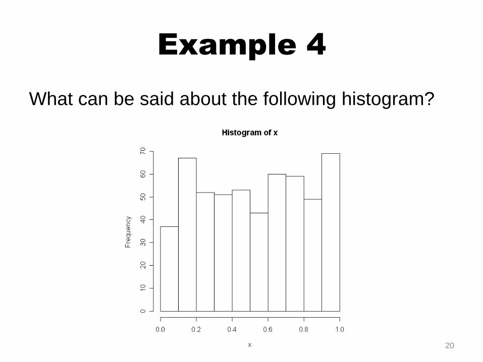
Example 4
What can be said about the following histogram?
20
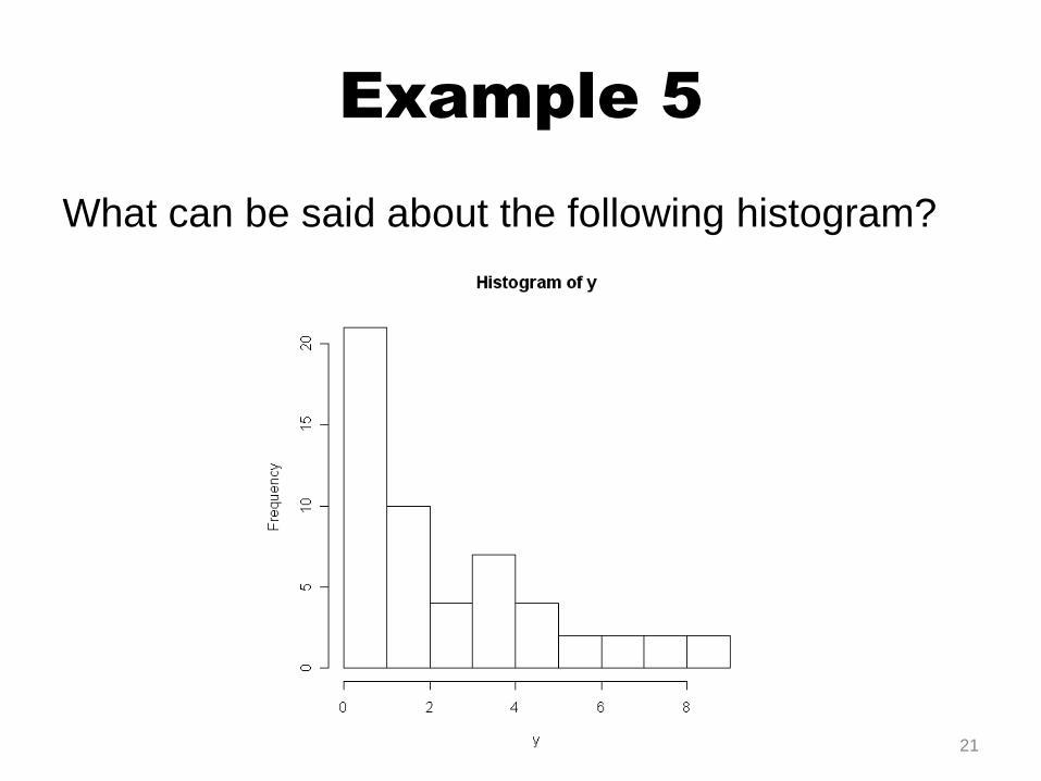
Example 5
What can be said about the following histogram?
21

Example 6
What can be said about the following histogram?
22

Box Plots
Box plots, or box-and-whisker plots, give a
graphical image of the concentration of the data.
The box plot is constructed from five values, called
the five-number summary:
23

The Five-Number Summary
The five-number summary includes:
• The minimum
• The lower quartile, Q1
• The median
• The upper quartile, Q3
• The maximum
These numbers divide the data into four more or less
equal pieces.
24
Min Q1 MaxMed Q3
25% 25%25%25%

The Interquartile Range
The middle fifty percent of all data is represented by
the box. The length of this box is the Interquartile
Range. In other words:
The length of the entire boxplot is the Range.
3 1IQR Q Q
25
Range Max Min
Range
IQR

Construct the Box Plot
To construct a box plot, use a number line and mark
each of the five numbers: minimum, first quartile,
median, third quartile, and maximum (use a dotted tick
mark for the median). Draw a top and bottom around
the middle three numbers to make a box, and then
draw lines connecting the box to the minimum and
maximum.
26

Example 7
Construct a box plot and find the range and
interquartile range.
91, 96, 84, 100, 92, 23, 84
27

Comparing Groups
Boxplots are ideal when it comes to comparing two or more groups or categories.
28

Outliers
Box Plots can be used to show extreme values by using dots or asterisks (• or *) to represent potential outliers.
Any potential outlier should be examined carefully in your data analysis.
29

Example 8
The boxplots below show the number of millionaires by
state per 1000 households, as reported by
Netscape.com in 2006.
30

Example 8 continued
a) List the regions from lowest to highest in terms of
the median rate of millionaires in that region.
b) Which region has the smallest interquartile range?
c) Which region has potential outliers?
31

Example 9
The following box plot shows the U.S. population for
1990.
a) Are there fewer or more children (age 17 and
under) than senior citizens (age 65 and over)?
b) 12.6% are age 65 and over. Approximately what
percent of the population are of working age adults
(above age 17 to age 65)?
32

Example 10
Match each histogram with
its boxplot.
33
X
Y
Z