
Retail electricity price history and projections - Public
AEMO
Retail price series development
1.2
23rd May 2016
Retail price series development
AEM O
Retail price series development
i
Retail electricity price history and projections - Public
Project No: RO038700
Document Title: Retail price series development
Document No.:
Revision: 1.2
Date: 23rd May 2016
Client Name: AEMO
Client No: Client Reference
Project Manager: Paul Nidras
Author: Liisa Parisot and Paul Nidras
File Name: C:\Users\pnidras\Documents\Jacobs\Projects\RO038700\RO038700 Jacobs Retail
electricity price history and projections_Final Public Report_23May2016.docx
Jacobs Australia Pty Limited
Floor 11, 452 Flinders Street
Melbourne VIC 3000
PO Box 312, Flinders Lane
Melbourne VIC 8009 Australia
T +61 3 8668 3000
F +61 3 8668 3001
www.jacobs.com
© Copyright 2016 Jacobs Australia Pty Limited. The concepts and information contained in this document are the property of Jacobs. Use or
copying of this document in whole or in part without the written permission of Jacobs constitutes an infringement of copyright.
Limitation: This report has been prepared on behalf of, and for the exclusive use of Jacobs’ Client, and is subject to, and issued in accordance with, the
provisions of the contract between Jacobs and the Client. Jacobs accepts no liability or responsibility whatsoever for, or in respect of, any use of, or reliance
upon, this report by any third party.
Document history and status
Revision Date Description By Review Approved
1.0 7/3/2016 Initial draft report LP PN WG
1.1 8/4/2016 Incorporated AEMO feedback LP PN PN
1.2 23/5/2016 Final report PN WG WG
Retail price series development
ii
Contents
Executive Summary ............................................................................................................................................... 5
1. Introduction ................................................................................................................................................ 9
2. NEM wholesale electricity market modelling ....................................................................................... 10
2.1 Scenario descriptions ................................................................................................................................ 10
2.2 Key high level assumptions ....................................................................................................................... 10
2.3 Key modelling outcomes ........................................................................................................................... 11
2.3.1 Neutral scenario ........................................................................................................................................ 11
2.3.2 Strong scenario ......................................................................................................................................... 16
2.3.3 Weak scenario ........................................................................................................................................... 19
2.3.4 Summary ................................................................................................................................................... 22
3. Projected retail electricity prices ........................................................................................................... 24
3.1 Approach ................................................................................................................................................... 24
3.1.1 Historical data ............................................................................................................................................ 24
3.2 Wholesale market costs ............................................................................................................................ 24
3.2.1 Wholesale contract portfolio mix ............................................................................................................... 25
3.3 Network prices ........................................................................................................................................... 25
3.4 Cost of environmental schemes ................................................................................................................ 28
3.4.1 Carbon schemes ....................................................................................................................................... 28
3.4.2 Renewable energy schemes ..................................................................................................................... 28
3.4.3 State and territory policies ......................................................................................................................... 30
3.4.3.1 Feed in tariffs ............................................................................................................................................. 30
3.4.3.2 Renewable energy policies ....................................................................................................................... 33
3.4.3.3 Energy efficiency policies .......................................................................................................................... 34
3.5 Market fees ................................................................................................................................................ 37
3.6 Retailer costs and margins ........................................................................................................................ 38
3.6.1 Gross retail margin .................................................................................................................................... 38
3.6.2 Net retail margin and retail costs ............................................................................................................... 39
3.6.3 Approach to cost allocation of retail costs and margins ............................................................................ 40
3.7 Electricity retail prices ................................................................................................................................ 41
3.7.1 Summary – neutral scenario ..................................................................................................................... 41
3.7.2 Summary – weak scenario ........................................................................................................................ 42
3.7.3 Summary – strong scenario ...................................................................................................................... 42
3.7.4 Contribution of cost components ............................................................................................................... 43
3.7.5 Queensland ............................................................................................................................................... 47
3.7.6 New South Wales ...................................................................................................................................... 47
3.7.7 Victoria ....................................................................................................................................................... 48
3.7.8 South Australia .......................................................................................................................................... 49
3.7.9 Tasmania ................................................................................................................................................... 50
3.8 Electricity retail price comparison with other studies ................................................................................. 51
Retail price series development
iii
Appendix A. Assumptions underlying NEM wholesale market model
A.1 Price and revenue factors
A.2 Demand
A.2.1 Demand forecast and embedded generation
A.2.2 Demand side participation
A.3 Generator cost of supply
A.3.1 Marginal costs
A.3.2 Plant performance and production costs
A.3.3 Coal Prices
A.3.4 Gas prices
A.4 Transmission losses
A.4.1 Inter-regional losses
A.4.2 Apportioning Inter-Regional Losses to Regions
A.4.3 Intra-regional losses
A.5 Hydro modelling
A.5.1 Queensland hydro
A.5.2 Snowy Mountains Scheme
A.5.3 Victorian hydro
A.5.4 Hydro Tasmania
A.5.5 Other hydro systems
A.6 Modelling other renewable energy technologies
A.6.1 Wind
A.6.2 Biomass, bagasse, wood waste
A.6.3 New hydro
A.6.4 PV and solar thermal generation profiles
A.7 Constraints
A.7.1 Conditions
A.7.2 User Defined Constraints and Adjustments
A.7.3 CCGT modelling
A.8 Participant behaviour
A.8.1 Market structure
A.8.2 Contract position and bidding
A.9 Optimal new entry – LT Plan
A.9.1 New generation technologies
A.9.2 Existing and new renewable generation
A.9.3 Retirements
A.9.4 Network augmentations
A.9.5 Constraints
A.10 Reserve requirements
A.11 New generation entry
A.12 Solar PV projections

Retail price series development
iv
Appendix B. Description of PLEXOS
Appendix C. Costs and performance of thermal plants
Retail price series development
PAGE 5
Executive Summary
This report presents retail electricity price forecasts under three market scenarios that were prepared by Jacobs
for the Australian Energy Market Operator (AEMO). These forecasts will feed into the electricity demand
modelling that will be used to produce the 2016 National Electricity Forecasting Report (NEFR).
The three scenarios that were explored as part of this modelling exercise are the “Neutral”, “Strong” and “Weak”
scenarios. This year AEMO has changed its basic approach in formulating the market scenario. They no longer
attempt to capture the full range of what may eventuate in the electricity market, but rather they reflect the most
likely future development path of the market and its sensitivity to economic conditions, which encompass factors
such as population growth, the state of the economy and consumer confidence. Thus the neutral scenario
reflects a neutral economy with medium population growth and average consumer confidence. Likewise the
strong scenario reflects a strong economy with high population growth and strong consumer confidence and the
weak scenario a weak economy with low population growth and weak consumer confidence. The key
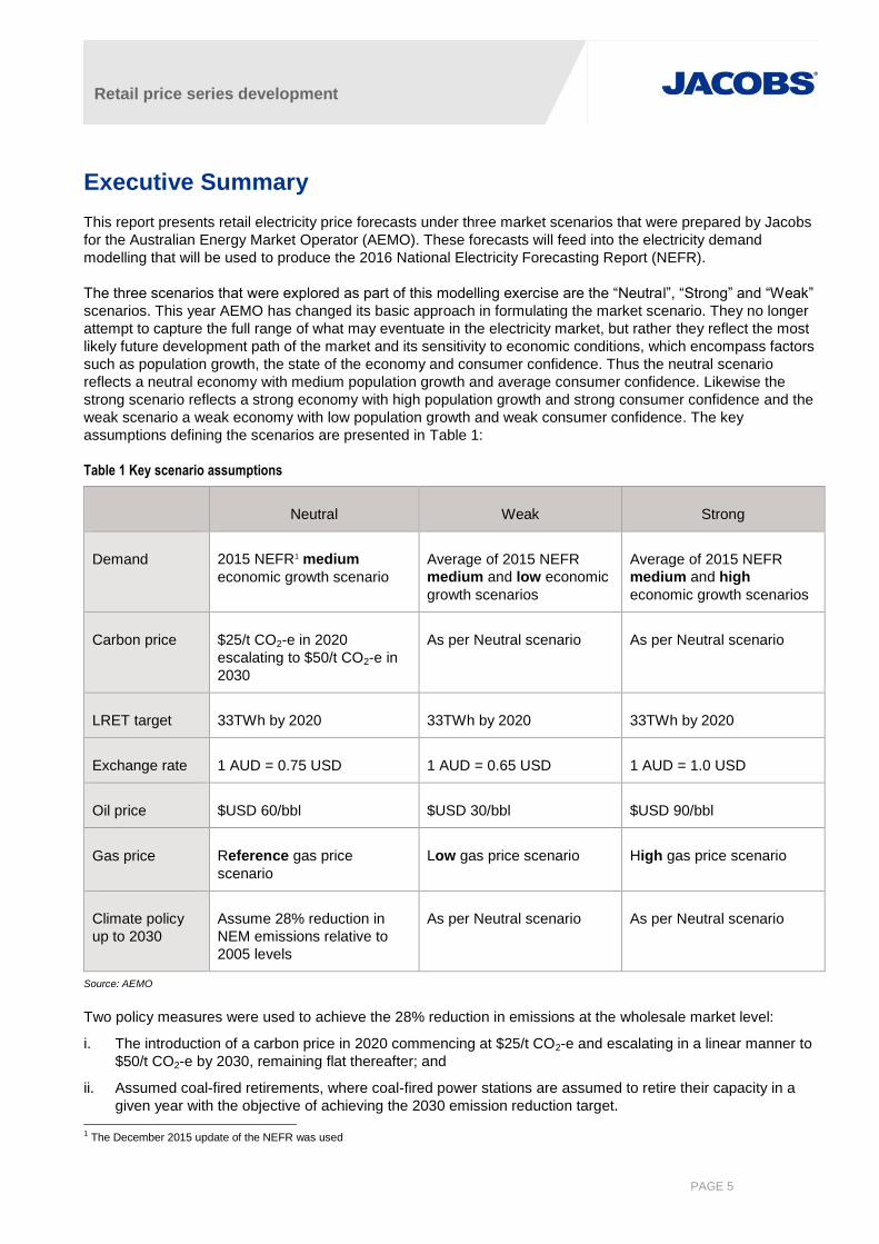
assumptions defining the scenarios are presented in Table 1:
Table 1 Key scenario assumptions
Neutral Weak Strong
Demand 2015 NEFR1 medium
economic growth scenario
Average of 2015 NEFR
medium and low economic
growth scenarios
Average of 2015 NEFR
medium and high
economic growth scenarios
Carbon price $25/t CO2-e in 2020
escalating to $50/t CO2-e in
2030
As per Neutral scenario As per Neutral scenario
LRET target 33TWh by 2020 33TWh by 2020 33TWh by 2020
Exchange rate 1 AUD = 0.75 USD 1 AUD = 0.65 USD 1 AUD = 1.0 USD
Oil price $USD 60/bbl $USD 30/bbl $USD 90/bbl
Gas price Reference gas price
scenario
Low gas price scenario High gas price scenario
Climate policy
up to 2030
Assume 28% reduction in
NEM emissions relative to
2005 levels
As per Neutral scenario As per Neutral scenario
Source: AEMO
Two policy measures were used to achieve the 28% reduction in emissions at the wholesale market level:
i. The introduction of a carbon price in 2020 commencing at $25/t CO2-e and escalating in a linear manner to
$50/t CO2-e by 2030, remaining flat thereafter; and
ii. Assumed coal-fired retirements, where coal-fired power stations are assumed to retire their capacity in a
given year with the objective of achieving the 2030 emission reduction target. 1 The December 2015 update of the NEFR was used
Retail price series development
PAGE 6
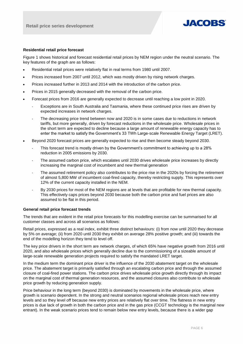
Residential retail price forecast
Figure 1 shows historical and forecast residential retail prices by NEM region under the neutral scenario. The
key features of the graph are as follows:
Residential retail prices were relatively flat in real terms from 1980 until 2007.
Prices increased from 2007 until 2012, which was mostly driven by rising network charges.
Prices increased further in 2013 and 2014 with the introduction of the carbon price.
Prices in 2015 generally decreased with the removal of the carbon price.
Forecast prices from 2016 are generally expected to decrease until reaching a low point in 2020.
- Exceptions are in South Australia and Tasmania, where these continued price rises are driven by
expected increases in network charges.
- The decreasing price trend between now and 2020 is in some cases due to reductions in network
tariffs, but more generally, driven by forecast reductions in the wholesale price. Wholesale prices in
the short term are expected to decline because a large amount of renewable energy capacity has to
enter the market to satisfy the Government’s 33 TWh Large-scale Renewable Energy Target (LRET).
Beyond 2020 forecast prices are generally expected to rise and then become steady beyond 2030.
- This forecast trend is mostly driven by the Government’s commitment to achieving up to a 28%
reduction in 2005 emissions by 2030.
- The assumed carbon price, which escalates until 2030 drives wholesale price increases by directly
increasing the marginal cost of incumbent and new thermal generation
- The assumed retirement policy also contributes to the price rise in the 2020s by forcing the retirement
of almost 5,800 MW of incumbent coal-fired capacity, thereby restricting supply. This represents over
12% of the current capacity installed in the NEM.
- By 2030 prices for most of the NEM regions are at levels that are profitable for new thermal capacity.
This effectively caps prices beyond 2030 because both the carbon price and fuel prices are also
assumed to be flat in this period.
General retail price forecast trends
The trends that are evident in the retail price forecasts for this modelling exercise can be summarised for all
customer classes and across all scenarios as follows:
Retail prices, expressed as a real index, exhibit three distinct behaviours: (i) from now until 2020 they decrease
by 5% on average; (ii) from 2020 until 2030 they exhibit on average 28% positive growth; and (iii) towards the
end of the modelling horizon they tend to level off.
The key price drivers in the short term are network charges, of which 65% have negative growth from 2016 until
2020, and also wholesale prices which generally decline due to the commissioning of a sizeable amount of
large-scale renewable generation projects required to satisfy the mandated LRET target.
In the medium term the dominant price driver is the influence of the 2030 abatement target on the wholesale
price. The abatement target is primarily satisfied through an escalating carbon price and through the assumed
closure of coal-fired power stations. The carbon price drives wholesale price growth directly through its impact
on the marginal cost of thermal generation resources, and the assumed closures also contribute to wholesale
price growth by reducing generation supply.
Price behaviour in the long term (beyond 2030) is dominated by movements in the wholesale price, where
growth is scenario dependent. In the strong and neutral scenarios regional wholesale prices reach new entry
levels and so they level off because new entry prices are relatively flat over time. The flatness in new entry
prices is due lack of growth in both the carbon price and in the gas price (CCGT technology is the marginal new
entrant). In the weak scenario prices tend to remain below new entry levels, because there is a wider gap

Retail price series development
PAGE 7
between supply and demand, and generally continue to grow throughout the modelling horizon. This occurs
because less coal-fired capacity is required to close under this scenario to achieve the 2030 abatement target
due to lower demand, and as a result the additional supply supresses prices relative to the two other scenarios.
Figure 1 Real indexed residential retail prices – historical and forecast, neutral scenario (2016 = 1.00)
Source: Jacobs’ analysis

Retail price series development
PAGE 8
Disclaimer
The purpose of this report is to describe the approach and outcome of research undertaken to develop a
historical electricity retail price series as well as forward projections of retail prices over the next twenty years to
2036.
Jacobs has relied upon and presumed accurate information supplied by AEMO in preparing this report. In
addition, Jacobs has relied upon and presumed accurate information sourced from the public domain and
referenced such information as appropriate. Should any of the collected information prove to be inaccurate then
some elements of this report may require re-evaluation.
This report has been prepared exclusively for use by AEMO and Jacobs does not provide any warranty or
guarantee to the data, observations and findings in this report to the extent permitted by law. No liability is
accepted for any use or reliance on the report by third parties.
The report must be read in full with no excerpts to be representative of the findings.

Retail price series development
PAGE 9
1. Introduction
The Australian Energy Market Operator (AEMO) has engaged Jacobs to provide retail electricity price forecasts,
under three market scenarios, which will feed into the 2016 National Electricity Forecasting Report (NEFR). This
report presents the retail electricity price projections, including all underlying assumptions used to develop each
component of the retail price. The report also sets out the key assumptions underlying the wholesale price
forecasting model for each of the three scenarios. Jacobs’ wholesale price forecasting model is based on the
PLEXOS electricity market modelling package, which is also described here.
Note that all modelling for this assignment was conducted in real December 2015 dollars and all retail prices
have been indexed using 2015/16 as the base year (2015/16 = 1.00). All years reported here, unless stated
otherwise, refer to financial years ending in June: for example, 2017 refers to the period of 1 July 2016 to 30
June 2017.
Retail price series development
PAGE 10
2. NEM wholesale electricity market modelling
Electricity wholesale prices are a key building block of electricity retail prices, and they have been modelled in
detail for this study for every region of the NEM under three market scenarios crafted by AEMO. Jacobs used its
PLEXOS simulation model of the NEM to forecast wholesale prices under the three scenarios. The analysis was
conducted in the period from 2016 to 2037.
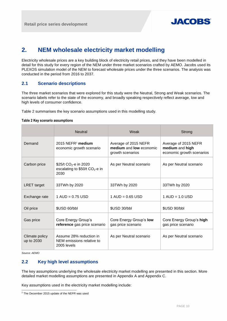
2.1 Scenario descriptions
The three market scenarios that were explored for this study were the Neutral, Strong and Weak scenarios. The
scenario labels refer to the state of the economy, and broadly speaking respectively reflect average, low and
high levels of consumer confidence.
Table 2 summarises the key scenario assumptions used in this modelling study.
Table 2 Key scenario assumptions
Neutral Weak Strong
Demand 2015 NEFR2 medium
economic growth scenario
Average of 2015 NEFR
medium and low economic
growth scenarios
Average of 2015 NEFR
medium and high
economic growth scenarios
Carbon price $25/t CO2-e in 2020
escalating to $50/t CO2-e in
2030
As per Neutral scenario As per Neutral scenario
LRET target 33TWh by 2020 33TWh by 2020 33TWh by 2020
Exchange rate 1 AUD = 0.75 USD 1 AUD = 0.65 USD 1 AUD = 1.0 USD
Oil price $USD 60/bbl $USD 30/bbl $USD 90/bbl
Gas price Core Energy Group’s
reference gas price scenario
Core Energy Group’s low
gas price scenario
Core Energy Group’s high
gas price scenario
Climate policy
up to 2030
Assume 28% reduction in
NEM emissions relative to
2005 levels
As per Neutral scenario As per Neutral scenario
Source: AEMO
2.2 Key high level assumptions
The key assumptions underlying the wholesale electricity market modelling are presented in this section. More
detailed market modelling assumptions are presented in Appendix A and Appendix C.
Key assumptions used in the electricity market modelling include:
2 The December 2015 update of the NEFR was used

Retail price series development
PAGE 11
The various demand growth projections with annual demand shapes consistent with the median growth in
summer and winter peak demand as projected by AEMO. The load shape was based on 2010/11 load
profile for the NEM regions.
Wind power in the NEM is based on the chronological profile of wind generation for each generator from the
2010/11 financial year, and is therefore accurately correlated to the demand profile.
Capacity is installed to meet the target reserve margin for the NEM in each region. Some of this peaking
capacity may represent demand side response rather than physical generation assets.
Infrequently used peaking resources are bid near Market Price Cap (MPC) or removed from the simulation
to represent strategic bidding of these resources when demand is moderate or low.
Generators behave rationally, with uneconomic capacity withdrawn from the market and bidding strategies
limited by the cost of new entry. This is a conservative assumption as there have been periods when prices
have exceeded new entry costs when averaged over 12 months.
Implementation of the LRET and Small-scale Renewable Energy Scheme (SRES) schemes. The LRET
target is for 33,000GWh of renewable generation by 2020.
Additional renewable energy is included for expected Greenpower and desalination purposes.
The assessed demand side management (DSM) for emissions abatement or otherwise economic
responses throughout the NEM is assumed to be included in the NEM demand forecast.
2.3 Key modelling outcomes
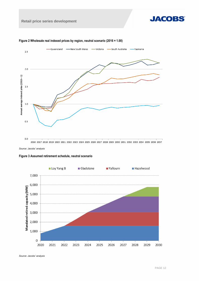
2.3.1 Neutral scenario
Figure 2 shows the average wholesale price outcomes by region for the neutral scenario. The initial dip in prices
commencing in 2018 and continuing in 2019 is due to the commissioning of about 3,000 MW of large scale
renewable generation capacity in that time frame, which is required to satisfy the 33,000 GWh LRET target.
LRET driven investment occurs predominantly from 2018 through to 2020 because of a hiatus in investment
that occurred in 2014, which was sparked by the uncertainty surrounding the 2014 RET review. Demand growth
across the NEM is limited to about 3,000 GWh over that time frame, whereas the new renewable capacity build
introduces close to 10,000 GWh of additional low marginal cost renewable generation energy. The additional
supply has the effect of suppressing prices.
Prices bounce back in 2020, despite the further commissioning of renewable energy capacity, because of the
introduction of a $25/t CO2-e carbon price in that year. Prices continue to climb at a fairly rapid rate until about
2027, and they generally continue growing beyond 2027, although at a lower rate. Three factors contribute to
rapid price growth in the early to mid 2020s:
The carbon price escalates from $25/t CO2e in 2020 to $50/t CO2e in 2030. This overall linear trend is
reflected in wholesale prices.
The requirement to achieve a 28% reduction in NEM emissions relative to 2005 levels is realised by the
assumed retirement of coal-fired capacity in the NEM. The retirement sequence is shown in Figure 3,
which shows a total almost 5,800 MW coal-fired capacity shut down by 2030.
Demand grows at a compound annual growth rate of 1.1% per annum throughout the 2020s, although
this factor carries less weight than the above two factors.
Retail price series development
PAGE 12
Figure 2 Wholesale real indexed prices by region, neutral scenario (2016 = 1.00)
Source: Jacobs’ analysis
Figure 3 Assumed retirement schedule, neutral scenario
Source: Jacobs’ analysis

Retail price series development
PAGE 13
Queensland
The wholesale price in Queensland in 2017 falls relative to the 2016 price, where the latter is based on 9
months of historical prices. This difference is due to the differences in average third quarter prices (ie. January
to March) when comparing modelled outcomes with historical outcomes. The third quarter 2016 Queensland
price was driven by hot weather conditions, whereas the modelled outcome reflects median weather conditions,
hence the price difference. The Queensland price is forecast to rise in 2018 and 2019, which runs against the
price trend of all of the other NEM regions where prices are forecast to fall over these two years. This occurs
because the model predicts very little uptake of new renewable generation projects in Queensland over these
two years. Most of the renewable energy projects required to satisfy the LRET mandate are built in the other
four NEM regions. Demand growth and some growth in the gas price are therefore the drivers of the increase in
the Queensland price over those two years.
In 2020 with the introduction of the carbon price Queensland rises by 31% and is projected to briefly have the
highest annual price in the NEM, even exceeding the South Australian price. This again reflects the expected
distribution of new renewable generation assets in the NEM. Queensland’s price then grows in linear manner
from 2020 until 2025, which reflects the linear growth in the carbon price over this time frame. By 2024
Queensland has the lowest annual price in the NEM, and this continues to be the case for the rest of the
modelling horizon, with the exception of 2027. This outcome is consistent with Queensland having the lowest
cost carbon-adjusted thermal generation resources in the NEM over this time frame.
In 2026 the growth in the Queensland price accelerates and this coincides with the assumed retirement of the
third and fourth Gladstone generation units. The first two Gladstone units retire in 2025, but this does not have
the same impact on the price indicating that there is still a small amount of supply overhang in Queensland at
this point in time. In 2027 the last two Gladstone units retire, but the price growth slows down considerably due
to the entry of the second new CCGT unit in Queensland. The price growth in 2026 would have been higher but
the price level triggered the entry of the first new CCGT plant in Queensland in that year.
After 2027 the Queensland price grows at a much lower rate despite the increase in the carbon price, which
continues until 2030. Over this time frame one CCGT enters the Queensland market each year (in 2028, 2029
and 2030) and prices track just below the new entry level. Post 2030 prices increase as supply and demand
remain in balance, and in 2034 the sixth new CCGT enters the Queensland market.
New South Wales
The 2017 New South Wales price decreases relative to the 2016 price, and the downtrend in price continues
until 2019. Additional renewable energy supply in NSW over this time period comes from the 56 MW Moree
solar farm, which is commissioned in 2017, and over 500 MW of wind capacity projected to be commissioned in
2018. No new capacity enters the New South Wales market in 2019 and as a result there is only a small
downward price movement, which reflects the lower cost of supply from Victoria, which is where most of the
new renewable generation is commissioned in that year.
In 2020 with the introduction of the carbon price the New South Wales price increases by 38%. The price
increases thereafter at a linear rate, which reflects the linear increase of the carbon price over this time period.
Liddell power station retires in March 2022, and this has a noticeable impact on the price, which kinks upwards
in both 2022 and in 2023. A smoother linear trend in the price resumes from 2024 until 2027, which is when the
New South Wales price reaches the new entry level. From this point onwards the price hovers at a similar level,
with new CCGTs entering the NSW market in 2028, 2031 and 2035. The entry of each of these new plants is
characterised by a distinct dip in the price path, which then tracks back to the new entry price.
Victoria
The Victorian price exhibits a clear downtrend from the years 2016 until 2019, with the price decreasing by at
least 4% in each of these years, and as much as 11% in 2019. This market behaviour is driven by new
Retail price series development
PAGE 14
renewable generation supply which is built to satisfy the LRET mandate. The predicted least-cost solution that
satisfies the LRET target according to the model is to build over 2,000 MW of wind capacity in Victoria, and it is
this significant block of low marginal cost supply that drives prices down, not only in Victoria but in its
neighbouring regions, namely, Tasmania, South Australia and New South Wales.
The build-up of wind capacity in Victoria over this time frame is as follows: in 2018 240 MW of the Ararat wind
farm is committed to come online in Victoria, and the model also builds 980 MW of additional wind capacity in
the same year. Another 540 MW of wind is built in 2019, and this is followed by an additional 690 MW that is
built in 2020.
The Victorian price increases by 49% in 2020 with the introduction of the carbon price. The increase would have
been greater were it not for the large amount of Victorian wind capacity commissioned in that year. In the five
years post 2020 the Victorian price rises the most in relative terms compared with the other NEM regions. The
key driver behind this result is the assumed retirement of the Hazelwood power station from 2020 until 2022,
followed by the assumed retirement of the Yallourn power station, which lasts from 2023 until 2024.
This loss of supply is partly compensated by the commissioning of more wind farms in Victoria in 2025 and
2026, which are built by the model because they are profitable in their own right and are not required for the
LRET target. The model in this instance is therefore freely choosing to build wind generation rather than thermal
generation. The key driver underlying this decision is the carbon price. The introduction of these wind farms is
evident in the price path, which has a distinct dip in 2026. In 2028 and 2029 the Victorian price rises
considerably again and this is caused by the retirement of Loy Yang B power station.
The Victorian price reaches the new entry level in 2029 and remains at a similar level throughout the remainder
of the modelling horizon, as the entry of new CCGTs serve to cap the price at this level. Two new CCGTs are
required in Victoria under the neutral scenario: the first in 2030 and the second in 2036. A characteristic dip in
the Victorian price path is evident on both occasions of CCGT new entry.
South Australia
The South Australian price is initially the highest amongst the mainland regions, which reflects the higher
marginal cost of its generation resources relative to the rest of the mainland. South Australian thermal
generation is predominantly gas-fired, and with the retirement in March 2016 of South Australia’s last coal-fired
generator, Northern Power Station, it is now exclusively gas-fired or liquid-fired. The material rise of contract gas
prices that has now passed through into the generation sector (see section A.3.4) has had the greatest impact
on South Australia since gas-fired plant tends to be marginal there for more hours of the day than any other
NEM region. This is reflected throughout the modelling horizon since the South Australian price is usually the
highest or second-highest amongst the NEM regions.
From 2016 until 2019 the South Australian price has a similar trend to the Victorian price in that it decreases
each year due to the commissioning on new renewable generation assets. The first 102 MW stage of Hornsdale
wind farm, which is now under construction in assumed to commence operating in 2017, By 2018 a further 900
MW of wind is built, which has the effect of reducing that wholesale price by 15%. No additional wind capacity is
built in South Australia in these years, so the 2% price reduction that occurs in 2019 can be attributed to the
11% price reduction that occurs in Victoria in that year.
The South Australian price rises by 31% in 2020 with the introduction of the carbon price. It continues to
increase in a manner that is approximately linear until 2025, at which point the rate of price growth declines
markedly. The rate of price growth in South Australia over this time frame is slightly lower than that of Victoria,
but considerably higher than the growth rate of Queensland. This implies that the growth in the Victorian price is
also driving price growth in South Australia for two reasons: (i) unlike Victoria, there is no retiring plant in the
South Australian market over this time frame; and (ii) the only other potential sources of price growth in South
Australia are the carbon price and demand growth, both of which cannot explain the relatively rapid price growth
over this time frame.

Retail price series development
PAGE 15
Post 2025 the South Australian price climbs in an approximately linear manner until the end of the modelling
horizon and from 2028 onwards is the highest priced region in the NEM. Average price growth over this time
period is noticeably lower than the rapid growth projected to occur between 2020 and 2025. In 2026 there is
almost no growth in the South Australian price, which is being influenced by the negative growth in the Victorian
price in this year. In 2027 the South Australian price declines due to the construction of 225MW of new wind
capacity, which is profitable in its own right, and is not required for the LRET. A further 60 MW of wind is built in
2029 on a merchant basis.
The South Australian price tends to follow the Victorian price from 2025 onwards and has very similar, although
not identical, price movements. The entry of new thermal plant in Victoria exerts a downward influence on the
South Australian price, and this is just enough to prevent the entry of new CCGT capacity in South Australia
within the modelling horizon.
Tasmania
Tasmania is currently experiencing high prices due to a combination of low hydro storage levels and an
extended outage on the Basslink interconnector, which has forced Hydro Tasmania to install and run high cost
diesel generating units. As a result the projected 2016 Tasmanian price is substantially elevated relative to the
rest of the NEM at above 2.5 times its 2015 price, due to this islanding event. This explains why the projected
indexed Tasmanian price is substantially lower than the rest of the NEM regions. The Basslink interconnector is
expected to be repaired in mid-June 2016, and we have assumed that the impact of this event into 2017 will be
relatively small having assumed that average rainfall levels will prevail in Tasmania3.
The Tasmanian price is elevated in 2017 relative to the Victorian price, and this is the result of decreasing the
initial level of hydro storage in Tasmania to match the reported levels at the time. From 2018 onwards we
assumed no additional impact on the Tasmanian price as a result of the Basslink outage. The Tasmanian price
tracks the Victorian price in 2018 and 2019. In 2018 the model forecasts 240 MW of new wind capacity being
built in Tasmania to satisfy the LRET target, and this contributes to the downward price movement. The
decrease in the 2019 Tasmanian price is driven solely by the downward movement in the Victorian price.
From 2020 until 2025 the Tasmanian price follows a very similar trend to the Victorian price, but remains on
average 6% higher than the Victorian price. The influence of the Victorian price on the Tasmanian price over
this time period occurs because of the way water in storage is valued in the model. Its value is equivalent to the
potential saving of thermal costs from the next unit of water in storage. Over this time frame Tasmania tends to
import energy from Victoria, and as such the water value of the hydro storages tends to be determined by the
loss-adjusted marginal cost of Victorian thermal generation.
In 2026 the Tasmanian price is influenced by the downward movement of the Victorian price, and also
decreases. In 2027 the Tasmanian price continues to decrease, whereas the Victorian price increases slightly.
This is caused by the commissioning of a new Tasmanian CCGT, and in 2029 a second Tasmanian CCGT is
also commissioned. The model chose to build these thermal plants in Tasmania even though the price is
considerably below the new entry price level. However, both of these new plants are operated in a low
intermediate role, and as such on average they receive a substantial premium to the time weighted Tasmanian
price. From 2028 onwards the Tasmanian price trades at a discount to the Victorian price. With the
commissioning of the new thermal plant Tasmania exports more energy into Victoria, whereas previously
imports from and exports to Victoria were more balanced. The switch to exporting energy into Victoria reduces
the Tasmanian price relative to the Victorian price, although it still does follow the Victorian price trends.
3 It is possible that the Tasmanian price in 2017 will be substantially higher than indicated in the modelling, We did not conduct any detailed short-
term modelling of the Tasmanian hydro system to try to capture the possible impacts of this event because the extent of the event was still unfolding as the modelling was being conducted. Furthermore this event was not a key focus of the modelling because even though its effect on the Tasmanian price may persist for a period of time (the length of which is difficult to ascertain without more detailed study), its impact will ultimately be transient.
Retail price series development
PAGE 16
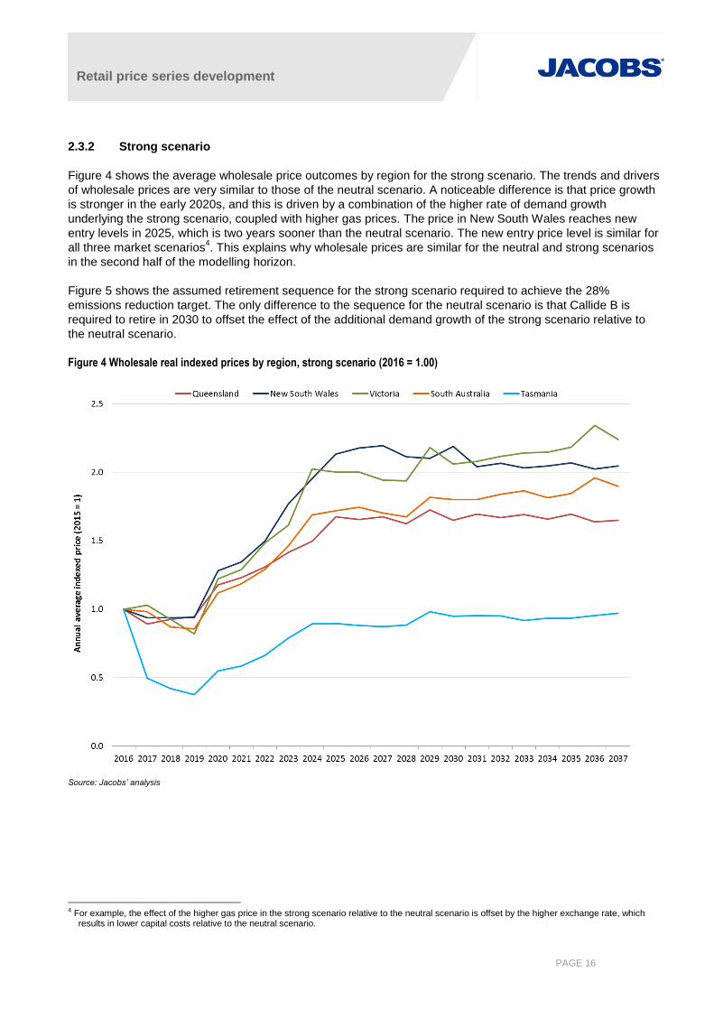
2.3.2 Strong scenario
Figure 4 shows the average wholesale price outcomes by region for the strong scenario. The trends and drivers
of wholesale prices are very similar to those of the neutral scenario. A noticeable difference is that price growth
is stronger in the early 2020s, and this is driven by a combination of the higher rate of demand growth
underlying the strong scenario, coupled with higher gas prices. The price in New South Wales reaches new
entry levels in 2025, which is two years sooner than the neutral scenario. The new entry price level is similar for
all three market scenarios4. This explains why wholesale prices are similar for the neutral and strong scenarios
in the second half of the modelling horizon.
Figure 5 shows the assumed retirement sequence for the strong scenario required to achieve the 28%
emissions reduction target. The only difference to the sequence for the neutral scenario is that Callide B is
required to retire in 2030 to offset the effect of the additional demand growth of the strong scenario relative to
the neutral scenario.
Figure 4 Wholesale real indexed prices by region, strong scenario (2016 = 1.00)
Source: Jacobs’ analysis
4 For example, the effect of the higher gas price in the strong scenario relative to the neutral scenario is offset by the higher exchange rate, which
results in lower capital costs relative to the neutral scenario.
Retail price series development
PAGE 17
Figure 5 Assumed retirement schedule, strong scenario
Source: Jacobs’ analysis
Queensland
The movements in the Queensland price under the strong scenario are very similar to those of the neutral
scenario. Prices are generally higher until about 2027, and this is due to a combination of higher demand
growth in Queensland and higher gas prices. One difference in Queensland under the strong scenario is that a
total of ten new CCGTs are required over the modelling horizon, compared with six under the neutral scenario.
The timing of the first thermal new entrant is identical, being 2026, however under the strong scenario two new
CCGTs are required in 2026, compared with one for the neutral scenario.
Another difference under the strong scenario is that Callide B is also required to retire in 2030 for the purpose of
meeting the 28% emission reduction target in that year. This additional reduction in Queensland supply relative
to the neutral scenario partially explains why four additional new CCGTs are required under the strong scenario.
The additional load growth of the strong scenario also partially accounts for the requirement of additional new
plant.
New South Wales
As with Queensland, the movements in the New South Wales price under the strong scenario are very similar to
those of the neutral scenario. Prices are only marginally higher from 2017 until about 2022, when compared
with the neutral scenario. Prices are definitively higher from 2023 until about 2027, when they reach new entry
levels, and then they track at similar levels.
More thermal new entry is required in New South Wales under the strong scenario relative to the neutral
scenario. The new entry schedule is brought forward under the strong scenario, with the first thermal plant,
which is an OCGT, being built in 2026. The timing for the first new CCGT plant remains the same as the neutral
scenario, being 2028. The other new CCGTs are constructed in 2029, 2030, 2033 and 2036. The 500 MW of
Retail price series development
PAGE 18
wind is still constructed in 2018 under the strong scenario, but an additional 460 MW of wind is also built in
2031, which is after the LRET scheme ends.
Victoria
The movements of the Victorian price under the strong scenario are very similar to those of the neutral scenario,
although prices do track higher from 2016 until 2027. Prices are similar from 2028 onwards, where they track
just below the new entry level for the remainder of the modelling horizon.
There are some slight differences in the construction schedule of renewable energy plant built to satisfy the
LRET target under the strong scenario relative to the neutral scenario. In 2019, 460 MW of wind is built
compared with 540 MW under the neutral scenario. In 2020, 470 MW of wind is built compared with 690 MW
under the neutral scenario. The slightly lower build of wind capacity in these years partially explains the higher
price of the strong scenario relative to the neutral scenario. However, from 2021 onwards the model forecasts
considerable more wind capacity being built in Victoria, with 410 MW of additional capacity built in 2021, and
then 1,780 MW built throughout the remainder of the 2020s.
Slightly more thermal capacity is built under the strong scenario in Victoria relative to the neutral scenario, and
the schedule is also brought forward by a couple of years. The first new CCGT plant is built in 2028, which is
two years earlier than in the neutral scenario, and the second plant is built in 2030. An OCGT is also built in
2030.
The assumed retirement schedule of coal-fired capacity in Victoria under the strong scenario is identical to that
of the neutral scenario. Thus Hazelwood is fully retired by 2022 and Yallourn in 2024. As with the neutral
scenario, the model is clearly choosing to replace this capacity with wind generation rather than thermal
generation in Victoria. In the strong scenario additional capacity is required in the mid to late 2020s to also cater
for the additional demand growth relative to the neutral scenario. Wind generation is also being favoured to fulfil
this role, and the underlying driver for this decision is the carbon price.
South Australia
The movements of the South Australian price under the strong scenario are very similar to those of the neutral
scenario, although prices do track higher from 2016 until 2028. Prices are similar from 2028 onwards, where
they generally track below the new entry level for the remainder of the modelling horizon.
The wind construction schedule to satisfy the LRET under the strong scenario is the same as that of the neutral
scenario, with 900 MW of wind built in 2018. An additional 200 MW of wind capacity is built in South Australia in
the late 2020s and early 2030s under the strong scenario relative to the neutral scenario. In addition, new
thermal capacity is required in South Australia under the strong scenario in 2034 in the form of a CCGT plant,
whereas none was required within the modelling horizon under the neutral scenario.
Tasmania
The movements of the Tasmanian price under the strong scenario are similar to those of the neutral scenario,
although prices are higher from 2018 until 2033. Prices are similar between the two scenarios from 2034
onwards, where they generally track below the Victorian price.
The wind construction schedule to satisfy the LRET under the strong scenario is the same as that of the neutral
scenario, with 240 MW of wind built in 2018. However, one key difference under the strong scenario is that a
180MW hydro upgrade project is built in 2020, whereas the same project is never built under the neutral
scenario. This new build has a knock on effect on the thermal build schedule under the strong scenario, in that
the construction of the second new Tasmanian CCGT is delayed until 2033, whereas the same project
proceeds in 2029 under the neutral scenario.
Retail price series development
PAGE 19
Another difference in the Tasmanian price under the strong scenario relative to the neutral scenario is where it
sits in relation to the Victorian price. Under the strong scenario the Tasmanian price tracks above the Victorian
price until 2032, and then switches to tracking below the Victorian price from 2033 onwards, when Tasmania
tends to export more to Victoria. Under the neutral scenario, this crossover occurs in 2028. The reason for the
difference is the additional demand growth under the strong scenario in Tasmania. Local generation is directed
to satisfying this additional demand, and it is only later on, with the build of the second CCGT in 2033 when
there is enough spare energy in Tasmania to enable it to export to Victoria.
2.3.3 Weak scenario
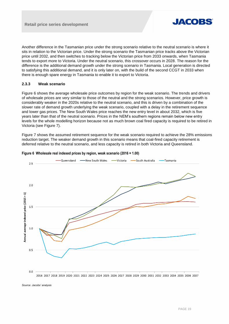
Figure 6 shows the average wholesale price outcomes by region for the weak scenario. The trends and drivers
of wholesale prices are very similar to those of the neutral and the strong scenarios. However, price growth is
considerably weaker in the 2020s relative to the neutral scenario, and this is driven by a combination of the
slower rate of demand growth underlying the weak scenario, coupled with a delay in the retirement sequence
and lower gas prices. The New South Wales price reaches the new entry level in about 2032, which is five
years later than that of the neutral scenario. Prices in the NEM’s southern regions remain below new entry
levels for the whole modelling horizon because not as much brown coal fired capacity is required to be retired in
Victoria (see Figure 7).
Figure 7 shows the assumed retirement sequence for the weak scenario required to achieve the 28% emissions
reduction target. The weaker demand growth in this scenario means that coal-fired capacity retirement is
deferred relative to the neutral scenario, and less capacity is retired in both Victoria and Queensland.
Figure 6 Wholesale real indexed prices by region, weak scenario (2016 = 1.00)
Source: Jacobs’ analysis
Retail price series development
PAGE 20
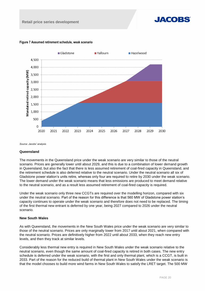
Figure 7 Assumed retirement schedule, weak scenario
Source: Jacobs’ analysis
Queensland
The movements in the Queensland price under the weak scenario are very similar to those of the neutral
scenario. Prices are generally lower until about 2029, and this is due to a combination of lower demand growth
in Queensland, but also the fact that there is less assumed retirement of coal-fired capacity in Queensland, and
the retirement schedule is also deferred relative to the neutral scenario. Under the neutral scenario all six of
Gladstone power station’s units retire, whereas only four are required to retire by 2030 under the weak scenario.
The lower demand under the weak scenario means that less emissions are produced to meet demand relative
to the neutral scenario, and as a result less assumed retirement of coal-fired capacity is required.
Under the weak scenario only three new CCGTs are required over the modelling horizon, compared with six
under the neutral scenario. Part of the reason for this difference is that 560 MW of Gladstone power station’s
capacity continues to operate under the weak scenario and therefore does not need to be replaced. The timing
of the first thermal new entrant is deferred by one year, being 2027 compared to 2026 under the neutral
scenario.
New South Wales
As with Queensland, the movements in the New South Wales price under the weak scenario are very similar to
those of the neutral scenario. Prices are only marginally lower from 2017 until about 2021, when compared with
the neutral scenario. Prices are definitively higher from 2022 until about 2033, when they reach new entry
levels, and then they track at similar levels.
Considerably less thermal new entry is required in New South Wales under the weak scenario relative to the
neutral scenario, even though the same amount of coal-fired capacity is retired in both cases. The new entry
schedule is deferred under the weak scenario, with the first and only thermal plant, which is a CCGT, is built in
2033. Part of the reason for the reduced build of thermal plant in New South Wales under the weak scenario is
that the model chooses to build more wind farms in New South Wales to satisfy the LRET target. The 500 MW
Retail price series development
PAGE 21
of wind is still constructed in 2018 under the weak scenario, but in addition, another 285 MW is also built in
2018.
Victoria
The movements of the Victorian price under the weak scenario are very similar to those of the neutral scenario,
although prices do generally track lower from 2023 until 2035. One difference between the two scenarios is that
prices under the weak scenario are actually slightly higher than those of the neutral scenario in 2020 and 2021.
The reason is that under the weak scenario the model chooses to build less wind capacity in Victoria in the early
years, and instead builds it in New South Wales and South Australia.
In 2018 only 600 MW of wind is built in Victoria compared to 980 MW under the neutral scenario. In 2019 the
wind build is unchanged, but in 2020 only 450 MW is built compared with 690 MW in the neutral scenario. In
2021 340 MW of wind is built, which is the same as for the neutral scenario. The model forecasts less wind
capacity being built in Victoria in the 2020s, with 450 MW of additional capacity being built in 2021 to 2029.
Less thermal capacity is built under the weak scenario in Victoria relative to the neutral scenario, although the
schedule for the first build remains the same. The first new CCGT plant is built in 2030 and no further thermal
plant is required. The key reason for the lower new thermal build is that Loy Yang B does not retire by 2030,
and therefore there is no need to replace this block of capacity.
One of the reasons for lower prices under the weak scenario in Victoria throughout the 2020s is because the
retirement schedule of Hazelwood and Yallourn are both deferred. Hazelwood is fully retired in 2023 under the
weak scenario, compared with 2022 under the neutral scenario. Furthermore, the retirement schedule of
Yallourn is delayed by three years under the weak scenario (2027 compared with 2024 under the neutral
scenario).
South Australia
The movements of the South Australian price under the weak scenario are very similar to those of the neutral
scenario, although prices do track lower across the whole modelling horizon, never reaching the new entry
level.
The wind build to satisfy the LRET under the weak scenario is greater than that of the neutral scenario, with
1,110 MW of wind built in 2018, compared to 900 MW under the neutral scenario. This additional supply, along
with the lower level of demand explains the lower South Australian price.
Tasmania
There are a number of differences in the movements of the Tasmanian price under the weak scenario
compared with the neutral scenario, although prices are lower across the whole modelling horizon. From 2016
to 2019 the price differences can be explained by a moderately lower level of demand. However, the Tasmanian
price tracks below the Victorian price for the first time in 2018 under the weak scenario and is never greater
than the Victorian price for the rest of the modelling horizon. This implies that Tasmania predominantly exports
to Victoria from 2018 onwards, whereas this did not occur in the neutral scenario until 2028.
Two factors explain this difference between the scenarios. Firstly, local Tasmanian demand is lower in the weak
scenario, whereas the hydro supply is identical for both cases. Thus under the weak scenario some of the
excess hydro energy has to be exported to Victoria, thereby increasing exports out of Tasmania. The second
factor is that less wind capacity is built in Victoria under the weak scenario in 2018, and again in 2020, meaning
that Victoria has less energy to export to Tasmania. This decreases Tasmanian imports relative to exports, and
as a result Tasmania predominately exports to Victoria from 2018 onwards.

Retail price series development
PAGE 22
The wind construction schedule to satisfy the LRET under the weak scenario is the same as that of the neutral
scenario, with 240 MW of wind built in 2018.
In the 2020s, the Tasmanian price continues to track the Victorian price closely from below until 2025. However,
in 2026 the Tasmanian price steps down considerably, whereas the Victorian price continues to rise along with
the carbon price. This large change in the Tasmanian price, which also runs against the carbon price trend, is
caused by the exit of a large load from the Tasmanian electricity system. The loss of this load means that a lot
more hydro energy needs to be exported into Victoria, which constrains Basslink and therefore causes price
separation between Tasmania and Victoria. The value of water in storage in Tasmania under this scenario is
eroded because of its plentiful supply. An increase in the transfer limit between Tasmania and the mainland
would increase the value of water in storage. This possibility was specifically explored for the weak scenario, as
Hydro Tasmania would be incentivised to explore such an option in this circumstance, but the model chose not
to build additional transmission capacity.
The exit of the large Tasmanian load is a disincentive for the construction of any additional thermal generation
in Tasmania, and as expected the model did not build any additional capacity, even though it was free to do so.
2.3.4 Summary
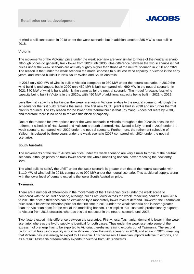
Wholesale price outcomes across the three market scenarios are fairly similar, and are not as separated as one
may have expected. This is illustrated in Figure 8, which shows a simple average of the indexed regional NEM
prices by scenario. Figure 8 also shows a larger difference in price outcomes between the weak and neutral
scenarios when compared with the neutral and strong scenarios.
The key assumptions leading to this modelling outcome is the requirement to achieve the 28% emission
reduction target in the NEM by 2030 and also the common carbon price path shared by the three market
scenarios. The emission reduction requirement was achieved by mandatory retirement of incumbent coal-fired
capacity. This led to the retirement of 5,800 MW, 6,500 MW and 4,200 MW of capacity in the neutral, strong and
weak scenarios respectively. This is in addition to the retirement of the 2,000 MW Liddell plant in New South
Wales that has been fixed to occur in 2022, as per AGL’s announcement. Therefore broadly similar levels of
coal fired capacity were retired for all three market scenarios5 and this had the same broad impact on wholesale
market prices.
5 Total retirement of coal-fired capacity for the weak scenario was 20% less than that of the neutral scenario, and for the strong scenario total
retirement was 10% more.
Retail price series development
PAGE 23
Figure 8 Average NEM real indexed price by scenario (2016 = 1.00)
Source: Jacobs’ analysis

Retail price series development
PAGE 24
3. Projected retail electricity prices
3.1 Approach
Retail electricity prices are built up using a building block approach incorporating each of the following retailer
cost components:
Wholesale electricity market costs
Network service provider costs
Cost of green schemes (i.e. Large Scale Renewable Energy Target – LRET - and Small Scale Renewable
Energy Scheme – SRES)
Cost of state and territory energy efficiency schemes, if any
Cost of state and territory feed-in tariff schemes
Market system operator charges
Retailer costs and margins
GST
The next sections describe how each component is derived.
3.1.1 Historical data
Australian Bureau of Statistics’ (ABS) Consumer Price Index (CPI) data was used to determine the real change
in electricity prices prior to 2015/16. Percentage change data was applied to estimated retail prices in 2015/16
to determine historical values.
3.2 Wholesale market costs
The wholesale market costs faced by retailers include:
Spot energy cost as paid to AEMO adjusted by the applicable transmission and distribution loss factors
Hedging costs around the spot energy price consisting of swaps, caps and floor contracts
Section 2 of this report covers in detail how predictions of spot energy cost were developed. This is the only
source of price variation across the three scenarios.
Spot energy exposure is minimised by retailers but cannot be completely avoided due to the variability of the
retail load supplied. Retailers must formulate a contracting strategy that enables them to manage trading risk
according to their own risk profile. Generally, contracts are available at a premium to spot market prices, and
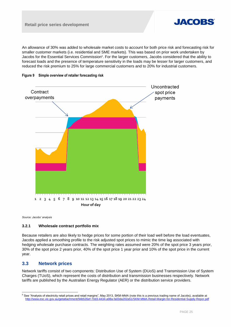
this represents trading or price risk. Figure 9 illustrates a simplified view of a load (in orange) that must have a
contracting strategy defined. The retailer may arrange for a long term hedging contract to manage the price risk
(the green area on the chart), and perhaps a shorter term contract closer to the time the load is to eventuate as
the retailer better understands how much load may be required. The chart reveals how the uncertainty around
future loads can lead to purchases of portions of load that have no corresponding revenue associated with them
(i.e. the blue zone in the chart). Furthermore, these purchases of peaky load can often be at prices significantly
above contract (e.g. peak pricing in high demand conditions – the uncovered orange region of the chart). To
complicate matters further, demand and spot prices are generally correlated, so large portions of uncovered
load will normally lead to large amounts of price related risk associated with very high spot prices in high
demand periods.
Retail price series development
PAGE 25
An allowance of 30% was added to wholesale market costs to account for both price risk and forecasting risk for
smaller customer markets (i.e. residential and SME markets). This was based on prior work undertaken by
Jacobs for the Essential Services Commission6. For the larger customers, Jacobs considered that the ability to
forecast loads and the presence of temperature sensitivity in the loads may be lesser for larger customers, and
reduced the risk premium to 25% for large commercial customers and to 20% for industrial customers.
Figure 9 Simple overview of retailer forecasting risk
Source: Jacobs’ analysis
3.2.1 Wholesale contract portfolio mix
Because retailers are also likely to hedge prices for some portion of their load well before the load eventuates,
Jacobs applied a smoothing profile to the risk adjusted spot prices to mimic the time lag associated with
hedging wholesale purchase contracts. The weighting rates assumed were 20% of the spot price 3 years prior,
30% of the spot price 2 years prior, 40% of the spot price 1 year prior and 10% of the spot price in the current
year.
3.3 Network prices
Network tariffs consist of two components: Distribution Use of System (DUoS) and Transmission Use of System
Charges (TUoS), which represent the costs of distribution and transmission businesses respectively. Network
tariffs are published by the Australian Energy Regulator (AER) or the distribution service providers.
6 See “Analysis of electricity retail prices and retail margins”, May 2013, SKM-MMA (note this is a previous trading name of Jacobs), available at
http://www.esc.vic.gov.au/getattachment/94b535ef-70d3-4434-a98a-fa03da202a51/SKM-MMA-Retail-Margin-for-Residential-Supply-Repor.pdf

Retail price series development
PAGE 26
The distribution networks consist of different levels of voltage supply serving different end users (eg,
Residential, Commercial and Industrial). Given that costs allocated to customers are based on connection to,
and use of, the transmission system at different voltage levels, the charges to different groups will vary
depending on the number of voltage levels accessed. That is, different charging rates will be applied to different
user groups in a cost-reflective manner.
The individual network tariff is made up of different cost components. Fixed charges such as standing charges
and prescribed metering service charges are the charges applying to all the connected retailers in the
distribution zone irrespective of their network usage. There are also variable charge components in the network
tariff in which the charges are differentiated by usage. In the tariff, the usage is categorised by block definitions
with different charging rates applying to different blocks of usage.
Estimates of network costs include GST but do not require application of loss factors as network charges are
applied at the customer connection point.
Representative7 network charges were converted to average cost rates assuming the average usage levels
shown in Table 3. Jacobs has assumed a load factor of 0.85 for industrial (large business) and 0.65 for
commercial (medium business) categories to estimate maximum capacity and determine the impact of capacity
charges for medium and large business customers. Most charges for residential and small business do not
include a demand component, but where one is required a load factor of 0.3 is assumed. Where business tariffs
consisted of a triple rate time of use charge, Jacobs has assumed that 42% of load is consumed in peak hours,
27% in shoulder hours and 31% in off-peak hours.
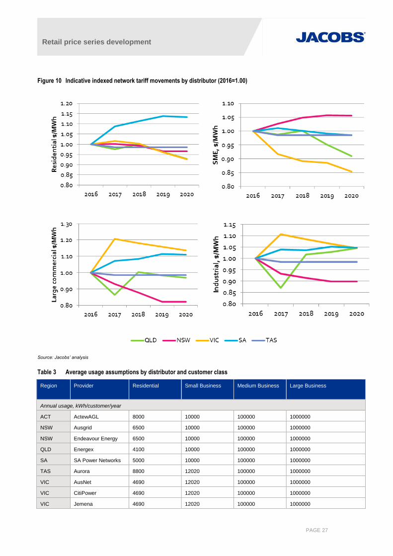
Published indicative tariffs have been used where available to determine tariff impacts between now and 2020.
Beyond 2020, we assume zero growth. Results for each distributor were averaged across the state using
customer numbers as weighting factors. The resulting average tariffs are shown in Figure 10.
In many states volume based charges have transitioned downward while fixed and demand charges have
transitioned upward, so apparent declines in average tariffs may occur for average consumption, while at the
same time increasing average costs for smaller consumers and reducing average costs for larger consumers.
For demand forecasting, it is possible that the change in tariff structure could result in lower price sensitivity than
has been evident in the past.
Differences in average energy consumption between states will also mean that fixed charges and demand
charges will make up a higher proportion of customer bills. This is especially evident in Queensland where lower
average energy use results in a higher average cost of electricity for these consumers.
7 A representative tariff is a generalised tariff published by a given network. Some customers in the given customer class may be on alternative tariff
arrangements. The representative tariff is intended to be indicative of likely network charges applying to the given customer class.
Retail price series development
PAGE 27
Figure 10 Indicative indexed network tariff movements by distributor (2016=1.00)
Source: Jacobs’ analysis
Table 3 Average usage assumptions by distributor and customer class
Region Provider Residential
Small Business Medium Business Large Business
Annual usage, kWh/customer/year
ACT ActewAGL 8000 10000 100000 1000000
NSW Ausgrid 6500 10000 100000 1000000
NSW Endeavour Energy 6500 10000 100000 1000000
QLD Energex 4100 10000 100000 1000000
SA SA Power Networks 5000 10000 100000 1000000
TAS Aurora 8800 12020 100000 1000000
VIC AusNet 4690 12020 100000 1000000
VIC CitiPower 4690 12020 100000 1000000
VIC Jemena 4690 12020 100000 1000000
Retail price series development
PAGE 28
Region Provider Residential
Small Business Medium Business Large Business
VIC Powercor 4690 12020 100000 1000000
VIC United Energy 4690 12020 100000 1000000
Representative tariff
ACT ActewAGL Residential basic
network
General network Low voltage TOU
demand
High voltage TOU demand
NSW Ausgrid Inclining block tariff
EA010
Inclining block tariff
EA050
Time of Use tariff
EA305
High voltage Time of Use
capacity tariff EA370
NSW Endeavour Energy Domestic inclining
block tariff N70
General supply
non time of use
N90
Low voltage
demand time of
use N19
High voltage demand time of
use N29
QLD Energex SAC non demand,
code 8400
SAC non demand,
code 8400
SAC small
demand, code
8300
SAC large demand, code
8100
SA SA Power Networks Low voltage
residential single
rate
Low voltage
business 2 rate
Low voltage
agreed demand
kVA
High voltage agreed demand
kVA
TAS Aurora (Tas
networks)
Residential LV
general (TAS31)
Business LV
General (TAS22)
Large LV (TAS82) HV (TAS15)
VIC AusNet Small residential
single rate, NEE11
Small business
single rate, NEE12
Medium demand
multi rate, NSP56
Critical peak demand multi-
rate, NSP75
VIC CitiPower Residential single
rate, C!R
Non-residential
single rate, C1G
Large low voltage
demand, C2DL
High voltage demand, C2DH
VIC Jemena Single rate,
A100/F100a/T100b
general purpose
Small business
A200/F200a/T200b
Large business LV
A300/F300a/T300b
Large business HV A400 HV
VIC Powercor Residential
interval, D5
Non-residential
interval, ND5
Large low voltage
demand, DL
High voltage demand, DH
VIC United Energy Low voltage small
1 rate, LVS1R
Low voltage
medium 1 rate,
LVM1R
Low voltage large
kVA time of use,
LVkVATOU
High voltage kVA time of use,
HVkVATOU
Source: Jacobs’ assumptions on review of tariff determinations. Note that analysis of Ergon Energy and Essential Energy was not undertaken because resulting
prices would eventually be compared to metropolitan based average AER prices.
3.4 Cost of environmental schemes
3.4.1 Carbon schemes
The Commonwealth Government introduced a carbon pricing mechanism on 1 July 2012. This was repealed in
July 2014 following a change in government. For the purpose of modelling, it is assumed that a carbon scheme
returns from 2020 at $25/t CO2-e and escalates linearly, reaching $50/t CO2-e by 2030.
3.4.2 Renewable energy schemes
The Renewable Energy Target (RET) is a legislated requirement on electricity retailers to source a given
proportion of specified electricity sales from renewable generation sources, ultimately creating material change
in the Australian technology mix towards lower carbon alternatives.
Retail price series development
PAGE 29
Since January 2011 the RET scheme has operated in two parts—the Small-scale Renewable Energy Scheme
(SRES) and the Large-scale Renewable Energy Target.
The target mandates that 33 TWh of generation must be derived from renewable sources by 2020, maintaining
this level to 2030. Emissions Intensive Trade Exposed (EITE) industry are exempt from the RET.
Large-scale renewable energy target
The LRET provides a financial incentive to establish or expand renewable energy power stations by legislating
demand for large-scale generation certificates (LGCs), where one LGC is equivalent to one MWh of eligible
renewable electricity produced by an accredited power station. LGCs are sold to liable entities who must
surrender them annually to the Clean Energy Regulator (CER). Revenue earned by renewable power stations is
supplementary to revenue received for generated power. The number of LGCs to be surrendered to the CER
will ramp up to a final target of 33 TWh in 2020.
Small-scale renewable energy scheme
The SRES provides a financial incentive for households, small businesses and community groups to install
eligible small-scale renewable energy systems. Systems include solar water heaters, heat pumps, solar
photovoltaic (PV) systems, or small-scale hydro systems. The SRES facilitates demand for Small Scale
Technology Certificates (STCs), which are created at the time of system installation based on the expected
future production of electricity.
Retailer costs
The SRES and LRET impose obligations on retailers. In order to meet the obligations under these schemes,
retailers must acquire and surrender renewable energy certificates (LGCs/STCs) each year. The average cost
of these retailer obligations can be determined by calculating the following:
Average cost of SRES and LRET = (RPP * LGC + STP * STC) * DLF
where
RPP = Renewable Power Percentage, a mandated value which reflects the proportion of energy sales
which must be met by renewable generation under the schemes. Historical RPP values can be obtained
from the clean energy regulator website8, but these are not available for future years. Instead Jacobs has
estimated the RPP using current AEMO projections and assuming a straight line target until 2020.
STP = small scale technology percentage,
LGC = Large generation certificate price
STC = Small technology certificate price
DLF = Distribution loss factor
For this study, we approximate the value of LGCs and STCs, which are estimated using Jacobs’ REMMA model
which incorporates both large and small scale technology. Note that the STP is non-binding, and is based on
modelling undertaken each year estimating likely uptake of small scale technology. If the target is not met the
shortfall can be met in the following year, and the RPP would be adjusted accordingly so that overall a 33 TWh
target is applicable by 2020. Therefore for all intents and purposes the impact of renewable energy schemes on
price can be estimated going forward as follows:
8 http://ret.cleanenergyregulator.gov.au/For-Industry/Liable-Entities/Renewable-Power-Percentage/rpp provides the renewable power percentage.
Retail price series development
PAGE 30
Average cost of SRES and LRET = RPP * LGC * DLF
Charges for LGCs are priced at the volume at the transmission bulk supply point, so DLFs are applied to define
the LGC share required.
Table 4 Components of renewable energy costs that must be recovered by retailers
Year RPP LGC (indexed, 2016=1.00)
2015 11.11% 1.000
2016 12.47% 1.000
2017 15.26% 0.948
2018 16.84% 1.043
2019 18.41% 0.844
2020 20.00% 0.844
2021 20.00% 0.816
2022 20.00% 0.745
2023 20.00% 0.621
2024 20.00% 0.515
2025 20.00% 0.436
2026 20.00% 0.431
2027 20.00% 0.415
2028 20.00% 0.382
2029 20.00% 0.314
2030 20.00% 0.356
Source: Jacobs’ analysis
3.4.3 State and territory policies
3.4.3.1 Feed in tariffs
Feed-in tariffs are equivalent to payments for exported electricity. Feed-in tariff schemes have been scaled back
in most jurisdictions so that the value of exported energy does not provide a significant incentive to increase
uptake of solar PV systems.
Between 2008 and 2012, state governments in most states mandated feed-in tariff payments to be made by
distributors to owners of generation systems (usually solar PV). A list of such schemes is provided in Table 5.
Following a commitment by the Council of Australian Governments in 2012 to phase out feed-in tariffs that are
in excess of the fair and reasonable value of exported electricity, most of these schemes are now discontinued
and have been replaced with feed-in tariff schemes with much lower rates.
However, the costs of paying feed-in tariffs from those schemes to customers must still be recouped as eligible
systems continue to receive payments over a period that could be as long as twenty years. Network service
providers provide credits to customers who are eligible to receive feed-in payments, and recover the cost
through a jurisdictional scheme component of network tariffs. Networks are able to estimate the required
payments each year and include these amounts in their tariff determinations adjusting estimated future tariffs for
over and underpayments annually as needed. Where this has occurred, it would be reasonable to assume that
cost recovery components are included in the distribution tariffs under ‘jurisdictional’ charges, so no additional
amounts are included in the Jacobs’ estimates of retail price. In all cases where distributors are responsible for
Retail price series development
PAGE 31
providing feed-in tariff payments, the distributors would have been aware of the feed-in tariffs prior to the latest
tariff determination, so it is reasonably safe to assume inclusion.
Retailers may also offer market feed-in tariffs, and the amount is set and paid by retailers. Where such an
amount has been mandated, the value has been set to represent the benefit the retailer receives from avoided
wholesale costs including losses, so theoretically no subsidy is required from government or other electricity
customers. In a voluntary feed-in tariff situation, no subsidy should be required from government or other
electricity customers. Nevertheless, Jacobs’ wholesale price projections are based on a post-scheme
generation profile which incorporates new solar PV, and therefore may understate the cost compared to what
may have been the case had the schemes not been implemented. Therefore we suggest that retailer feed-in
tariffs be added back to wholesale prices by adding back the following quantity to the wholesale price:
Retailer feed-in tariff x % share of solar PV generation
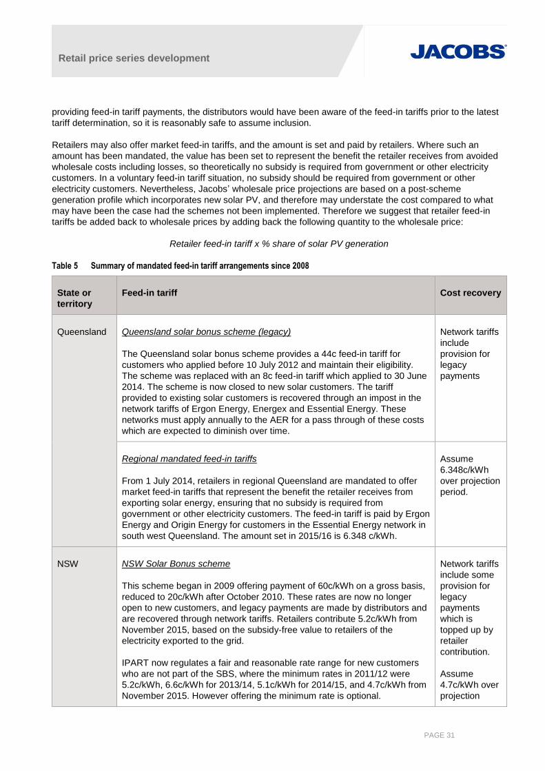
Table 5 Summary of mandated feed-in tariff arrangements since 2008
State or
territory
Feed-in tariff Cost recovery
Queensland Queensland solar bonus scheme (legacy)
The Queensland solar bonus scheme provides a 44c feed-in tariff for
customers who applied before 10 July 2012 and maintain their eligibility.
The scheme was replaced with an 8c feed-in tariff which applied to 30 June
2014. The scheme is now closed to new solar customers. The tariff
provided to existing solar customers is recovered through an impost in the
network tariffs of Ergon Energy, Energex and Essential Energy. These
networks must apply annually to the AER for a pass through of these costs
which are expected to diminish over time.
Network tariffs
include
provision for
legacy
payments
Regional mandated feed-in tariffs
From 1 July 2014, retailers in regional Queensland are mandated to offer
market feed-in tariffs that represent the benefit the retailer receives from
exporting solar energy, ensuring that no subsidy is required from
government or other electricity customers. The feed-in tariff is paid by Ergon
Energy and Origin Energy for customers in the Essential Energy network in
south west Queensland. The amount set in 2015/16 is 6.348 c/kWh.
Assume
6.348c/kWh
over projection
period.
NSW NSW Solar Bonus scheme
This scheme began in 2009 offering payment of 60c/kWh on a gross basis,
reduced to 20c/kWh after October 2010. These rates are now no longer
open to new customers, and legacy payments are made by distributors and
are recovered through network tariffs. Retailers contribute 5.2c/kWh from
November 2015, based on the subsidy-free value to retailers of the
electricity exported to the grid.
IPART now regulates a fair and reasonable rate range for new customers
who are not part of the SBS, where the minimum rates in 2011/12 were
5.2c/kWh, 6.6c/kWh for 2013/14, 5.1c/kWh for 2014/15, and 4.7c/kWh from
November 2015. However offering the minimum rate is optional.
Network tariffs
include some
provision for
legacy
payments
which is
topped up by
retailer
contribution.
Assume
4.7c/kWh over
projection
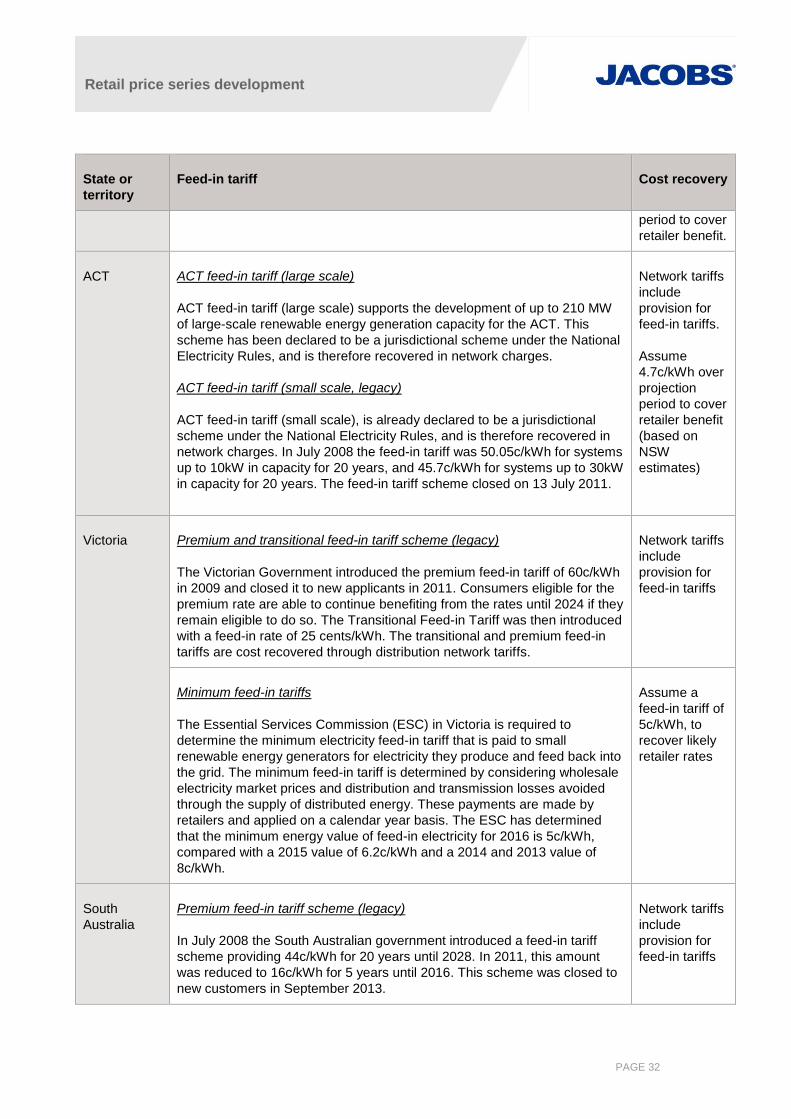
Retail price series development
PAGE 32
State or
territory
Feed-in tariff Cost recovery
period to cover
retailer benefit.
ACT ACT feed-in tariff (large scale)
ACT feed-in tariff (large scale) supports the development of up to 210 MW
of large-scale renewable energy generation capacity for the ACT. This
scheme has been declared to be a jurisdictional scheme under the National
Electricity Rules, and is therefore recovered in network charges.
ACT feed-in tariff (small scale, legacy)
ACT feed-in tariff (small scale), is already declared to be a jurisdictional
scheme under the National Electricity Rules, and is therefore recovered in
network charges. In July 2008 the feed-in tariff was 50.05c/kWh for systems
up to 10kW in capacity for 20 years, and 45.7c/kWh for systems up to 30kW
in capacity for 20 years. The feed-in tariff scheme closed on 13 July 2011.
Network tariffs
include
provision for
feed-in tariffs.
Assume
4.7c/kWh over
projection
period to cover
retailer benefit
(based on
NSW
estimates)
Victoria Premium and transitional feed-in tariff scheme (legacy)
The Victorian Government introduced the premium feed-in tariff of 60c/kWh
in 2009 and closed it to new applicants in 2011. Consumers eligible for the
premium rate are able to continue benefiting from the rates until 2024 if they
remain eligible to do so. The Transitional Feed-in Tariff was then introduced
with a feed-in rate of 25 cents/kWh. The transitional and premium feed-in
tariffs are cost recovered through distribution network tariffs.
Network tariffs
include
provision for
feed-in tariffs
Minimum feed-in tariffs
The Essential Services Commission (ESC) in Victoria is required to
determine the minimum electricity feed-in tariff that is paid to small
renewable energy generators for electricity they produce and feed back into
the grid. The minimum feed-in tariff is determined by considering wholesale
electricity market prices and distribution and transmission losses avoided
through the supply of distributed energy. These payments are made by
retailers and applied on a calendar year basis. The ESC has determined
that the minimum energy value of feed-in electricity for 2016 is 5c/kWh,
compared with a 2015 value of 6.2c/kWh and a 2014 and 2013 value of
8c/kWh.
Assume a
feed-in tariff of
5c/kWh, to
recover likely
retailer rates
South
Australia
Premium feed-in tariff scheme (legacy)
In July 2008 the South Australian government introduced a feed-in tariff
scheme providing 44c/kWh for 20 years until 2028. In 2011, this amount
was reduced to 16c/kWh for 5 years until 2016. This scheme was closed to
new customers in September 2013.
Network tariffs
include
provision for
feed-in tariffs

Retail price series development
PAGE 33
State or
territory
Feed-in tariff Cost recovery
Premium feed-in tariff bonus
A retailer contribution is also available, as set by the SA regulator (Essential
Service Commission of South Australia or ESCOSA), where the minimum
tariff is set to 6.8 c/kWh in 2016.
Assume a
feed-in tariff of
6.8c/kWh over
the projection
period
Tasmania Metering buyback scheme (legacy)
In Tasmania, Aurora offered a feed-in tariff which offered customers a one
for one fit at the regulated light and power tariff for residential customers or
general supply tariff for small business customers for their net exported
electricity. This program was closed to new customers in August 2013 and
replaced with a transitional feed-in tariff of c20/kWh for residential
customers and a similar blocked feed-in tariff for commercial customers.
Network tariffs
include
provision for
feed-in tariffs
Post reform
The Tasmanian regulator has now stipulated smaller rates which are now
5.5c/kWh for 2015/16, compared with 5.551c/kWh in 2014/15 and
8.282c/kWh for the first half of 2014. These rates are now a component of
standing offer tariffs provided by retailers.
Assume a
retailer tariff of
5.5c/kWh to
recover retailer
costs
3.4.3.2 Renewable energy policies
ACT renewable target
The ACT recently announced that it would extend its existing target of renewable energy target from 90% to
100%. The target is achieved through large scale solar and wind auctions which enable the territory to
economically undertake power purchase contracts with renewable energy generators in the ACT and other
states to produce an equivalent amount of power to what is used within the ACT. This is modelled by Jacobs as
a small increase to the RET and no additional charges are applied to ACT customers.
Victorian renewable target
The Victorian government recently announced a target for 100 MW of wind to offset energy use in the state.
However, this target is not additional to the RET and preliminary modelling undertaken by Jacobs considers that
Victoria is likely to achieve in excess of 1,300 MW in the next five years under business as usual
considerations, over an existing baseline of 1,634 MW. No additional charges are applied to Victorian
customers.
Queensland renewable target
The Queensland government has announced support for 100 MW of solar PV and wind through Ergon Energy.
This is treated as a Queensland specific increase to the RET in Jacobs modelling and no additional charges are
applied to Queensland customers.

Retail price series development
PAGE 34
3.4.3.3 Energy efficiency policies
Some states and territories in Australia have implemented energy efficiency policies. Schemes that require
retailers to surrender certificates to meet a given energy efficiency target are referred to in this document as
white certificates. Energy efficiency scheme impacts require adjustment for the distribution loss factor.
Residential Energy Efficiency Scheme and Retailer Energy Efficiency Scheme (South Australia)
The Residential Energy Efficiency Scheme9 operated from 2009 to 2014, and has been rebadged as the
Retailer Energy Efficiency Scheme (REES) from 1 January 2015 and was expanded to include the small
business sector and converted from an emissions savings target to an energy savings target. The scheme
requires that larger energy retailers help households and businesses save energy, and provides a separate
target for low income households in particular, as well as a target for annual energy audits. According to a
review10 of the scheme, it saved 4.1 PJ of energy between 2009 and 2014, though it is not clear how much of
this saving is attributed to gas and electricity, and this value could also be applicable to anticipated savings in
future years as the target ramps up. The scheme is administered by the Essential Services Commission of
South Australia (ESCOSA). Targets for 2015, 2016 and 2017 are 1.2 PJ, 1.7 PJ and 2.3 PJ respectively11, with
19.2% of these savings to be made in low income households. Retailers must also undertake 5,667 energy
efficiency audits annually. The scheme has been extended to 2020, although targets have not yet been
announced. We assume a 2.3 PJ target for 2018 to 2020.
The REES is not a certificate-based scheme, so there is no price transparency for REES activities and audits so
that contracting parties do not know whether terms reflect supply and demand and regulation may be
cumbersome12. This also means that the method to estimate retail price impacts is not immediately apparent
and some further consideration is needed.
For the purpose of understanding the price impact of the REES, each retailer’s target is determined by
multiplying the annual target by each retailer’s share of South Australian electricity purchases amongst all
obliged retailers. The regulations include fixed and variable penalties for shortfall of the target overall, the
priority group target and audits. The penalty for shortfall of either the overall target or the priority group target is
$17.40/GJ13, which is equivalent to $62.64 dollars per MWh. The cost of the scheme is effectively capped at this
rate for shortfalls in either the overall target or the priority group target. Retailers have the choice of activities
and can choose the most cost effective approach to meeting the target. There are also penalties for not taking
out enough audits at $500 per audit (i.e. a maximum payment of $2.8 million per year). As these are a cost of
doing business they must be considered in the South Australian retail price. We assume that each GJ of
electricity saved will occur at the described fixed and variable penalty rates, ignoring the penalty rate for the
priority group. We note that this is a conservative position as the penalty rates are higher than in other states, so
have assumed a factor of 50% brings the cost back to a level that is broadly reflective of what happens in other
states and therefore more realistic.
Jacobs’ assessment of the likely impact of REES on retail prices under these assumptions is shown in Table 6.
Table 6 Jacobs’ assessment of the impact of REES on retail prices, (2016=1.00)
Unit 2015 2016 2017 2018 2019 2020
Scheme target GJ 1.2 1.7 2.3 2.3 2.3 2.3
Estimated share % 16% 22% 30% 30% 30% 30%
9 http://www.sa.gov.au/topics/water-energy-and-environment/energy/saving-energy-at-home/assistance-for-organisations-that-work-with-
households/further-energy-information-to-help-households/rebates-concessions-and-incentives/retailer-energy-efficiency-scheme-rees 10 http://www.sa.gov.au/__data/assets/pdf_file/0004/36319/REES-Review-Report.pdf, p 10 11 http://www.sa.gov.au/topics/water-energy-and-environment/energy/saving-energy-at-home/assistance-for-organisations-that-work-with-
households/further-energy-information-to-help-households/rebates-concessions-and-incentives/retailer-energy-efficiency-scheme-rees 12 http://www.sa.gov.au/__data/assets/pdf_file/0006/12786/REES20Independent20Evaluation20Report.pdf 13 https://www.legislation.sa.gov.au/LZ/C/R/ELECTRICITY%20(GENERAL)%20REGULATIONS%202012/CURRENT/2012.199.UN.PDF
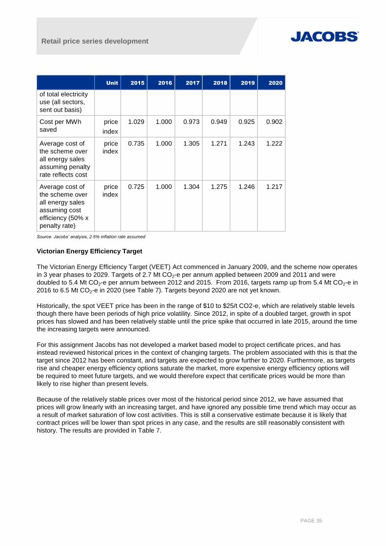
Retail price series development
PAGE 35
Unit 2015 2016 2017 2018 2019 2020
of total electricity
use (all sectors,
sent out basis)
Cost per MWh
saved
price
index
1.029 1.000 0.973 0.949 0.925 0.902
Average cost of
the scheme over
all energy sales
assuming penalty
rate reflects cost
price
index
0.735 1.000 1.305 1.271 1.243 1.222
Average cost of
the scheme over
all energy sales
assuming cost
efficiency (50% x
penalty rate)
price
index
0.725 1.000 1.304 1.275 1.246 1.217
Source: Jacobs’ analysis, 2.5% inflation rate assumed
Victorian Energy Efficiency Target
The Victorian Energy Efficiency Target (VEET) Act commenced in January 2009, and the scheme now operates
in 3 year phases to 2029. Targets of 2.7 Mt CO2-e per annum applied between 2009 and 2011 and were
doubled to 5.4 Mt CO2-e per annum between 2012 and 2015. From 2016, targets ramp up from 5.4 Mt CO2-e in
2016 to 6.5 Mt CO2-e in 2020 (see Table 7). Targets beyond 2020 are not yet known.
Historically, the spot VEET price has been in the range of $10 to $25/t CO2-e, which are relatively stable levels
though there have been periods of high price volatility. Since 2012, in spite of a doubled target, growth in spot
prices has slowed and has been relatively stable until the price spike that occurred in late 2015, around the time
the increasing targets were announced.
For this assignment Jacobs has not developed a market based model to project certificate prices, and has
instead reviewed historical prices in the context of changing targets. The problem associated with this is that the
target since 2012 has been constant, and targets are expected to grow further to 2020. Furthermore, as targets
rise and cheaper energy efficiency options saturate the market, more expensive energy efficiency options will
be required to meet future targets, and we would therefore expect that certificate prices would be more than
likely to rise higher than present levels.
Because of the relatively stable prices over most of the historical period since 2012, we have assumed that
prices will grow linearly with an increasing target, and have ignored any possible time trend which may occur as
a result of market saturation of low cost activities. This is still a conservative estimate because it is likely that
contract prices will be lower than spot prices in any case, and the results are still reasonably consistent with
history. The results are provided in Table 7.
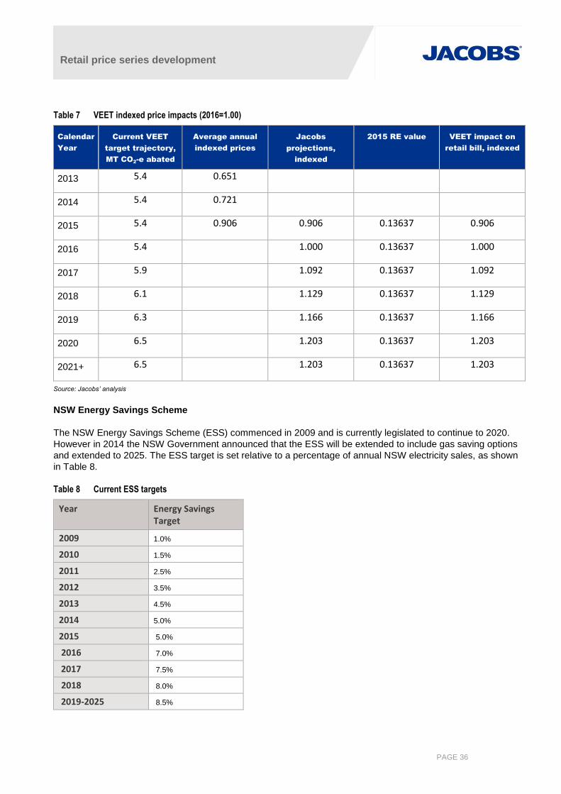
Retail price series development
PAGE 36
Table 7 VEET indexed price impacts (2016=1.00)
Calendar
Year
Current VEET
target trajectory,
MT CO2-e abated
Average annual
indexed prices
Jacobs
projections,
indexed
2015 RE value VEET impact on
retail bill, indexed
2013 5.4 0.651
2014 5.4 0.721
2015 5.4 0.906 0.906 0.13637 0.906
2016 5.4 1.000 0.13637 1.000
2017 5.9 1.092 0.13637 1.092
2018 6.1 1.129 0.13637 1.129
2019 6.3 1.166 0.13637 1.166
2020 6.5 1.203 0.13637 1.203
2021+ 6.5 1.203 0.13637 1.203
Source: Jacobs’ analysis
NSW Energy Savings Scheme
The NSW Energy Savings Scheme (ESS) commenced in 2009 and is currently legislated to continue to 2020.
However in 2014 the NSW Government announced that the ESS will be extended to include gas saving options
and extended to 2025. The ESS target is set relative to a percentage of annual NSW electricity sales, as shown
in Table 8.
Table 8 Current ESS targets
Year Energy Savings Target
2009 1.0%
2010 1.5%
2011 2.5%
2012 3.5%
2013 4.5%
2014 5.0%
2015 5.0%
2016 7.0%
2017 7.5%
2018 8.0%
2019-2025 8.5%
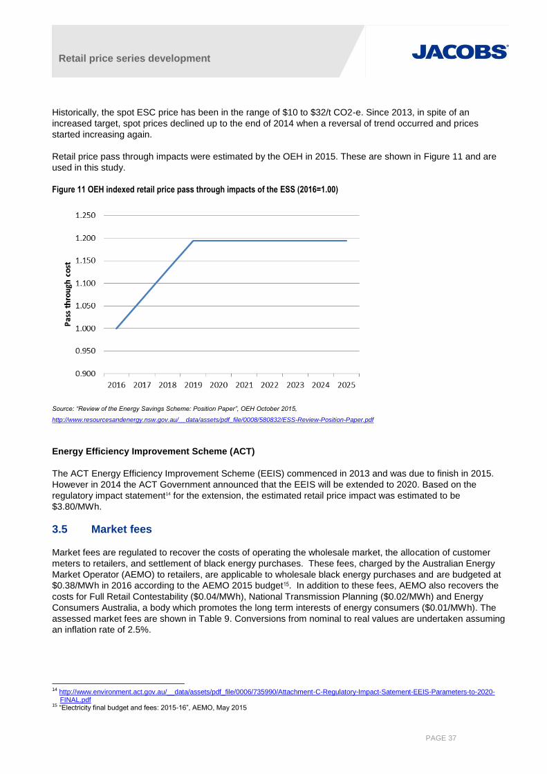
Retail price series development
PAGE 37
Historically, the spot ESC price has been in the range of $10 to $32/t CO2-e. Since 2013, in spite of an
increased target, spot prices declined up to the end of 2014 when a reversal of trend occurred and prices
started increasing again.
Retail price pass through impacts were estimated by the OEH in 2015. These are shown in Figure 11 and are
used in this study.
Figure 11 OEH indexed retail price pass through impacts of the ESS (2016=1.00)
Source: “Review of the Energy Savings Scheme: Position Paper”, OEH October 2015,
http://www.resourcesandenergy.nsw.gov.au/__data/assets/pdf_file/0008/580832/ESS-Review-Position-Paper.pdf
Energy Efficiency Improvement Scheme (ACT)
The ACT Energy Efficiency Improvement Scheme (EEIS) commenced in 2013 and was due to finish in 2015.
However in 2014 the ACT Government announced that the EEIS will be extended to 2020. Based on the
regulatory impact statement14 for the extension, the estimated retail price impact was estimated to be
$3.80/MWh.
3.5 Market fees
Market fees are regulated to recover the costs of operating the wholesale market, the allocation of customer
meters to retailers, and settlement of black energy purchases. These fees, charged by the Australian Energy
Market Operator (AEMO) to retailers, are applicable to wholesale black energy purchases and are budgeted at
$0.38/MWh in 2016 according to the AEMO 2015 budget15. In addition to these fees, AEMO also recovers the
costs for Full Retail Contestability ($0.04/MWh), National Transmission Planning ($0.02/MWh) and Energy
Consumers Australia, a body which promotes the long term interests of energy consumers ($0.01/MWh). The
assessed market fees are shown in Table 9. Conversions from nominal to real values are undertaken assuming
an inflation rate of 2.5%.
14 http://www.environment.act.gov.au/__data/assets/pdf_file/0006/735990/Attachment-C-Regulatory-Impact-Satement-EEIS-Parameters-to-2020-
FINAL.pdf 15 “Electricity final budget and fees: 2015-16”, AEMO, May 2015
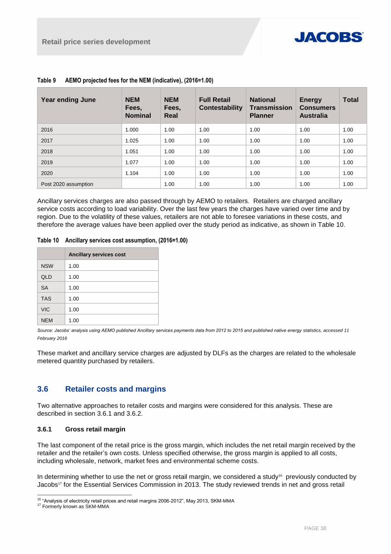
Retail price series development
PAGE 38
Table 9 AEMO projected fees for the NEM (indicative), (2016=1.00)
Year ending June NEM
Fees,
Nominal
NEM
Fees,
Real
Full Retail
Contestability
National
Transmission
Planner
Energy
Consumers
Australia
Total
2016 1.000 1.00 1.00 1.00 1.00 1.00
2017 1.025 1.00 1.00 1.00 1.00 1.00
2018 1.051 1.00 1.00 1.00 1.00 1.00
2019 1.077 1.00 1.00 1.00 1.00 1.00
2020 1.104 1.00 1.00 1.00 1.00 1.00
Post 2020 assumption 1.00 1.00 1.00 1.00 1.00
Ancillary services charges are also passed through by AEMO to retailers. Retailers are charged ancillary
service costs according to load variability. Over the last few years the charges have varied over time and by
region. Due to the volatility of these values, retailers are not able to foresee variations in these costs, and
therefore the average values have been applied over the study period as indicative, as shown in Table 10.
Table 10 Ancillary services cost assumption, (2016=1.00)
Ancillary services cost
NSW 1.00
QLD 1.00
SA 1.00
TAS 1.00
VIC 1.00
NEM 1.00
Source: Jacobs’ analysis using AEMO published Ancillary services payments data from 2012 to 2015 and published native energy statistics, accessed 11
February 2016
These market and ancillary service charges are adjusted by DLFs as the charges are related to the wholesale
metered quantity purchased by retailers.
3.6 Retailer costs and margins
Two alternative approaches to retailer costs and margins were considered for this analysis. These are
described in section 3.6.1 and 3.6.2.
3.6.1 Gross retail margin
The last component of the retail price is the gross margin, which includes the net retail margin received by the
retailer and the retailer’s own costs. Unless specified otherwise, the gross margin is applied to all costs,
including wholesale, network, market fees and environmental scheme costs.
In determining whether to use the net or gross retail margin, we considered a study16 previously conducted by
Jacobs17 for the Essential Services Commission in 2013. The study reviewed trends in net and gross retail
16 “Analysis of electricity retail prices and retail margins 2006-2012”, May 2013, SKM-MMA 17 Formerly known as SKM-MMA
Retail price series development
PAGE 39
margins for residential customers in Victoria, NSW, Brisbane and South Australia between 2006 and 2012. Our
interpretation of the report includes the following:
Gross margins for standing offer contracts were around 30% for much of the evaluation period across all
states examined; it is not possible to tell whether this was due to some type of lagging effect associated
with wholesale market price reductions in combination with timing of contracting and purchasing.
Gross margins were higher than for market offer contracts, by around 13%
There is variation in gross margins for market offer contracts, with host retailers likely to take larger gross
margins than non-incumbent retailers, and larger gross margins applicable to single rate tariffs than for
alternative tariff structures such as dual and time of use tariffs
Gross retail margins for standing offer contracts are highest in Victoria; however this is also the state with
the highest proportion of consumers on competitive market contracts so this may not imply a material
difference across states
Gross margins appeared to increase across the board in 2012 by 5-10% compared to other years, implying
that market conditions in some way altered during this year.
Further to the above, AGL18 reported gross margins of $219.14 in 2012/13, up 0.2% from the previous year. This
amount is around 14% of the AER reported retail bill for an average NSW customer. This amount would
presumably be averaged across standing offer contracts and market offer contracts and across the NEM. The
gross margin for smaller retailers is likely to be higher.
3.6.2 Net retail margin and retail costs
As an alternative to using the gross retail margin directly, it may be preferable to apply a retail cost and net retail
margin.
Retail costs
Retailer costs include the cost of serving and maintaining existing customers, as well as the costs of marketing,
signing and transferring new customers. For this study, applying a fixed cost per customer would be appropriate
for retailer operating costs, and fixed costs per MWh would be appropriate for customer acquisition and
retention costs.
For standing/default tariffs, retailer operating costs are regulated. Factors considered in the regulation of retailer
operating costs include recoverability of costs as annual energy demand declines, administration requirements
in a given jurisdiction (based on existence of state and territory schemes as well as other rules and
requirements associated with managing retailer obligations and requirements), and benchmarked levels of
operating costs as determined from review of costs and charges in other jurisdictions.
IPART’s review of regulated retail prices (undertaken in 2013) for electricity (covering 1/7/2013 to 30/6/2016)
reported that $116.90/customer19 appropriately covered the cost of serving and maintaining existing customers,
and that customer acquisition and retention costs of $2.47/MWh were only required for the regional zone
covered by Essential Energy (with remaining zones not requiring regulated cost allowances to promote
competition). The QCA also undertook a determination20 of allowable retail operating costs for 2014/15, and
determined a total of $120.18 per customer, excluding customer acquisition and retention costs21 and including
regulatory fees, so the IPART amount is probably an appropriate benchmark for customers on standing offers.
For customers above 100 MWh, the retail operating cost was set to $738.56 and for customers above 4 GWh
18
https://www.agl.com.au/~/media/AGL/About%20AGL/Documents/Media%20Center/Investor%20Center/2013/August/FY13%20Full%20Year%20Results%20Presentation.pdf
19 After adjustment from $Dec2012 to $Dec2015 20 “Regulated retail electricity prices 2014-15”, May 2014, QCA. 21 We have excluded customer acquisition and retention costs more generally because this is only likely to affect customers in regional areas and this
study focuses on calibrating retail costs to urban AER estimates.

Retail price series development
PAGE 40
annually, the benchmark retail operating cost was set to $2,107.71/customer. Jacobs has assumed that around
20% of these costs include customer acquisition and retention (which we are not including in our totals) and
have reduced these values by this amount accordingly.
For small customers on market offers, AGL reported that their cost of serving each customer account was $69
in FY201522, up 8.1% from the previous year because of lower sales volume and increased costs to serve
resulting from the acquisition of another retailer. This is roughly 4% of the AER reported retail bill for an average
NSW customer. Again, this amount would presumably be averaged across standing offer contracts and market
offer contracts and across the NEM. The retail cost for smaller retailers is likely to be higher as a result of lesser
economies of scale.
The actual cost to serve smaller customers is probably somewhere between the AGL reported values and the
regulated value. Jacobs has assumed that an average rate of $90 per customer is appropriate.
Higher customer costs and lower net retail margins are applicable for customers consuming larger volumes of
energy; the lack of supporting data around this means that some assumptions may need to be made to support
development of retail prices for these markets. We have assumed that a retail cost for commercial and industrial
customers is around the level of $500 and $1,500 per customer respectively, loosely based on the QCA data.
Net retail margin
NERA23 undertook an analysis of retail margins for small customers in NSW between 2002 and 2013. This study
determined implied net retail margins of 5-10% under a medium wholesale cost outcome, with some mild
variation between two time periods assessed – 2002-2007 compared with 2008-2013. However no clear
evidence of any change in margin over time was presented.
Regulated net retail margin allowances over the same period across the NEM varied by state and territory, but
typically were of the order of 5 to 5.4% in most states and slightly less in Tasmania where the regulated net
margin was 3.7%. Given that market offer contracts will provide smaller net margins than standing offer
contracts, it would seem reasonable that net retail margins would be around 5% for most small customers
3.6.3 Approach to cost allocation of retail costs and margins
The preceding discussion has identified that there has thus far been no conclusive evidence of changing trends
in retailer costs, net or gross retail margins over time or across states and territories. Therefore it is appropriate
to adopt a consistent approach across the NEM for all projection years. This approach is consistent with our
purpose to develop a consistent set of price projections to be used for demand forecasting, so the actual level of
prices obtained is less important than the overall trends in the price series that will feed into a demand
forecasting model.
The preceding discussion also identified that a fairly wide range of gross margins is probable, and that these
could be influenced by the level of competition in markets as well as the size of the cost base that these gross
margins will be applied to. Jacobs therefore believes that a safer option will be to use a net retail margin
estimate and an estimate of retail cost, which itself will remain largely fixed over time in real terms. The net retail
margin (approximately 5% in most cases) and retail costs ($90/customer) as discussed are appropriate for
smaller markets such as the residential and small business markets.
Information about average network charges and wholesale market costs by market is not readily available, and
estimates of these are described in the following sections. As a check that the derived retail prices are
consistent with available market estimates, a calibration process was undertaken for the smaller markets (i.e.
residential and SME markets), where some estimates of current values are available.
22 “AGL Sustainability report 2014: Economic performance”, value adjusted from $Dec2014 to $Dec2015. 23 “Prices and profit margin analysis for the NSW Retail Competition Review, A report to the Australian Energy Market Commission”, NERA, March
2013
Retail price series development
PAGE 41
Derived retail price series were calibrated to estimated retail prices in 2015/16 by adjusting the retail margin.
The estimated average retail prices were derived from published AER estimates of average standing and
market offer prices in the 2015 AER State of the market report. The derived retail margins (net) are as shown in
Table 11. It is not possible to determine whether differences from the above suggested ranges in net retail
margin arise from wholesale market risk or an inadequate choice or application of network market charges. In
general, values for the larger states (NSW and Vic) are quite plausible, ranging from 4.1 to 7%. The net retail
margin for Queensland residential customers is also plausibly within the same range, but the SME net retail
margin is higher at 19%. This occurs even though the same network charges apply to both groups, because the
network tariffs average out to lower unit costs with a higher assumption of annual energy use. The SA
residential and SME net retail margins are also higher at 18.8% and 22.7% respectively. However, the final
price series should still provide a reasonable projection of retail prices given that the values are effectively
scaled to expected levels and given that the trends in the final price series are more important than the division
of the individual components.
Table 11 Resulting net retail margins from calibration of retail prices to 2015/16 values
State Average
residential
standing
offer price
Average
residential
market
offer price
% customers
on a standing
offer
Average
residential
price
Residential net
retail margin
Estimated
SME
AER
price24
SME net
retail
margin
Queensland 314 308 47% 310 4.2% 298 19.4%
NSW and
ACT
177-339 166-304 69% 258 6.3% 262 7.0%
Victoria 299-385 246-319 88% 293 4.1% 244 5.2%
SA 381 339 84% 346 18.8% 333 22.7%
Tasmania 28925 0.9% 31326 12.8%
Source: Jacobs’ analysis of AER 2015 state of the market reported retail prices and AER retail prices provided by AEMO
3.7 Electricity retail prices
Electricity retail prices are summarised in Figure 16 and Figure 17 shown in the next few pages. The next
sections describe average growth rates under each scenario.
3.7.1 Summary – neutral scenario
Average growth rates over the projection period for each market and region are presented in Figure 12.
Average growth rates vary between 0.3% pa to 1.6% pa.
Across most states the highest rate of growth occurs for the Industrial market; in Victoria and South Australia
the large commercial market has slightly higher growth rates again. This is largely because growth is coming off
the lowest base, since wholesale prices increase their share over time relative to network and other charges,
while at the same time wholesale prices are projected to grow fastest over each of the other cost components
making up the industrial retail price charge.
After the industrial sector, the market that experiences the next highest growth in prices across all states other
than NSW is the large commercial market. Again, there is increasing dominance of wholesale prices in this
market. However, in NSW the residential and SME markets show higher growth rates than the large commercial
24 Based on AER data provided through AEMO 25 Based on current Aurora tariffs for 2015/16 26 Based on current Aurora tariffs for 2015/16
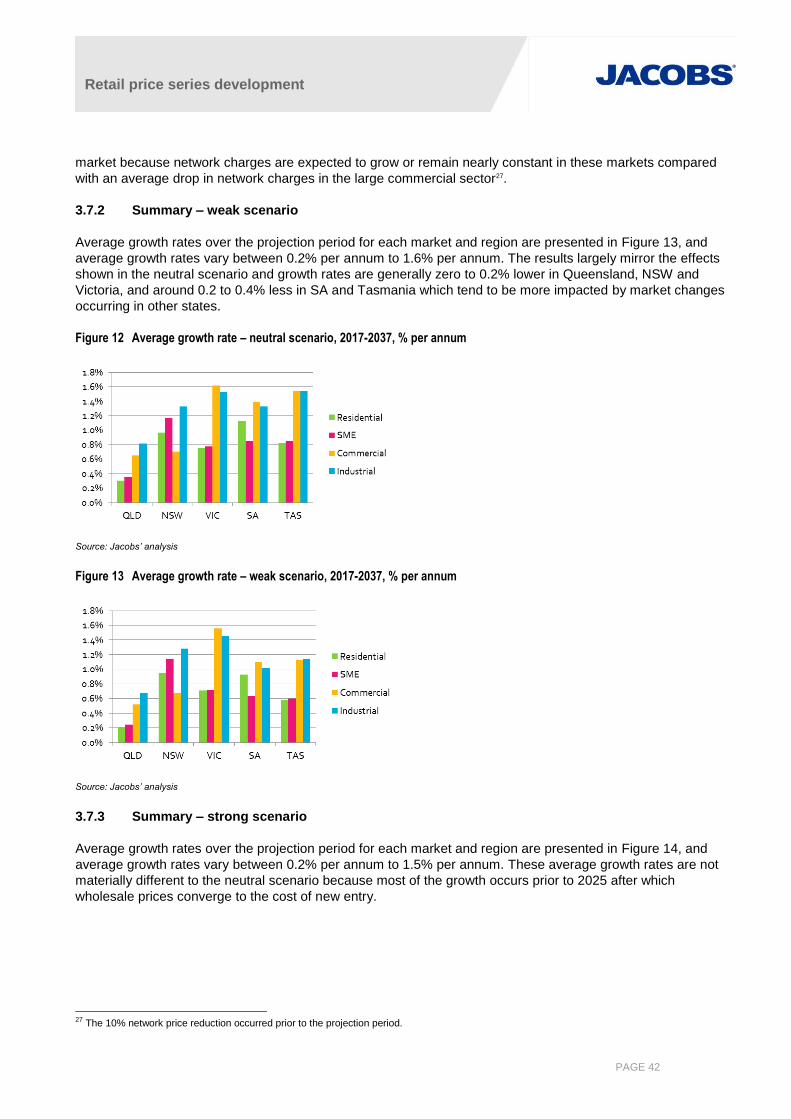
Retail price series development
PAGE 42
market because network charges are expected to grow or remain nearly constant in these markets compared
with an average drop in network charges in the large commercial sector27.
3.7.2 Summary – weak scenario
Average growth rates over the projection period for each market and region are presented in Figure 13, and
average growth rates vary between 0.2% per annum to 1.6% per annum. The results largely mirror the effects
shown in the neutral scenario and growth rates are generally zero to 0.2% lower in Queensland, NSW and
Victoria, and around 0.2 to 0.4% less in SA and Tasmania which tend to be more impacted by market changes
occurring in other states.
Figure 12 Average growth rate – neutral scenario, 2017-2037, % per annum
Source: Jacobs’ analysis
Figure 13 Average growth rate – weak scenario, 2017-2037, % per annum
Source: Jacobs’ analysis
3.7.3 Summary – strong scenario
Average growth rates over the projection period for each market and region are presented in Figure 14, and
average growth rates vary between 0.2% per annum to 1.5% per annum. These average growth rates are not
materially different to the neutral scenario because most of the growth occurs prior to 2025 after which
wholesale prices converge to the cost of new entry.
27 The 10% network price reduction occurred prior to the projection period.
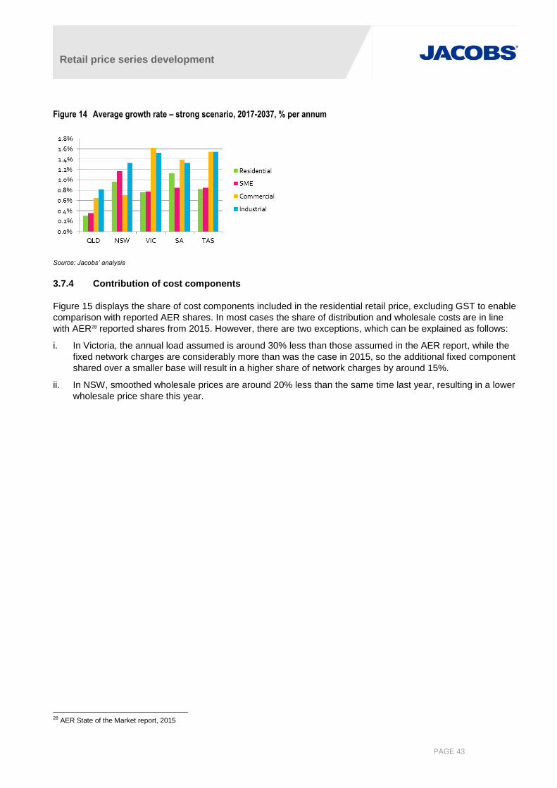
Retail price series development
PAGE 43
Figure 14 Average growth rate – strong scenario, 2017-2037, % per annum
Source: Jacobs’ analysis
3.7.4 Contribution of cost components
Figure 15 displays the share of cost components included in the residential retail price, excluding GST to enable
comparison with reported AER shares. In most cases the share of distribution and wholesale costs are in line
with AER28 reported shares from 2015. However, there are two exceptions, which can be explained as follows:
i. In Victoria, the annual load assumed is around 30% less than those assumed in the AER report, while the
fixed network charges are considerably more than was the case in 2015, so the additional fixed component
shared over a smaller base will result in a higher share of network charges by around 15%.
ii. In NSW, smoothed wholesale prices are around 20% less than the same time last year, resulting in a lower
wholesale price share this year.
28 AER State of the Market report, 2015

Retail price series development
PAGE 44
Figure 15 Share of costs included in residential retail price, 2016
Queensland NSW
Victoria SA Tasmania
Source: Jacobs’ analysis
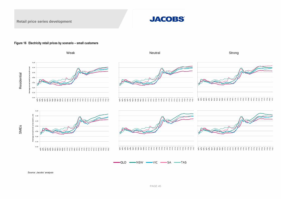
Retail price series development
PAGE 45
Figure 16 Electricity retail prices by scenario – small customers
Weak Neutral Strong
Resid
ential
SM
Es
Source: Jacobs’ analysis
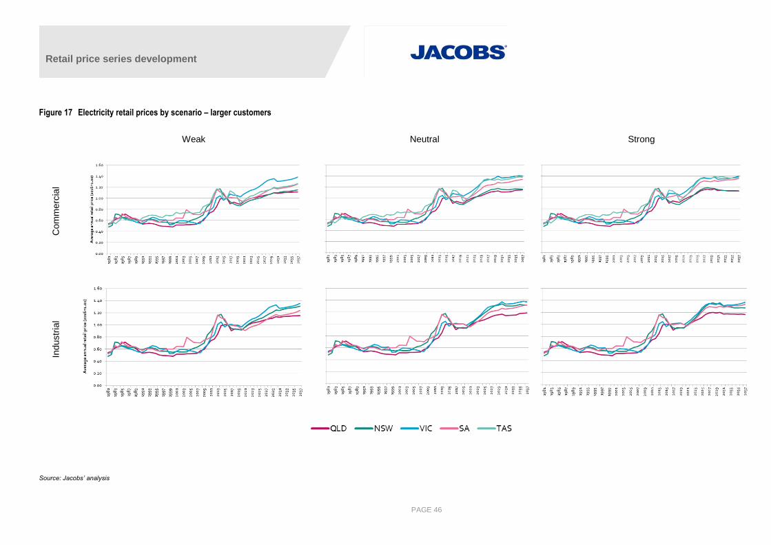
Retail price series development
PAGE 46
Figure 17 Electricity retail prices by scenario – larger customers
Weak Neutral Strong
Com
merc
ial
Industr
ial
Source: Jacobs’ analysis
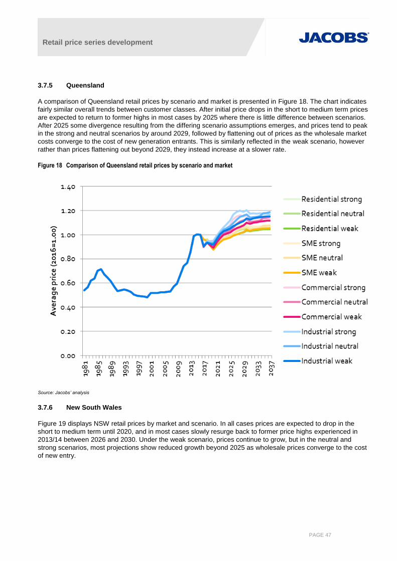
Retail price series development
PAGE 47
3.7.5 Queensland
A comparison of Queensland retail prices by scenario and market is presented in Figure 18. The chart indicates
fairly similar overall trends between customer classes. After initial price drops in the short to medium term prices
are expected to return to former highs in most cases by 2025 where there is little difference between scenarios.
After 2025 some divergence resulting from the differing scenario assumptions emerges, and prices tend to peak
in the strong and neutral scenarios by around 2029, followed by flattening out of prices as the wholesale market
costs converge to the cost of new generation entrants. This is similarly reflected in the weak scenario, however
rather than prices flattening out beyond 2029, they instead increase at a slower rate.
Figure 18 Comparison of Queensland retail prices by scenario and market
Source: Jacobs’ analysis
3.7.6 New South Wales
Figure 19 displays NSW retail prices by market and scenario. In all cases prices are expected to drop in the
short to medium term until 2020, and in most cases slowly resurge back to former price highs experienced in
2013/14 between 2026 and 2030. Under the weak scenario, prices continue to grow, but in the neutral and
strong scenarios, most projections show reduced growth beyond 2025 as wholesale prices converge to the cost
of new entry.
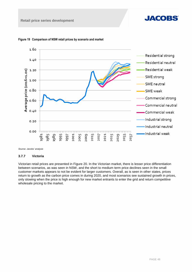
Retail price series development
PAGE 48
Figure 19 Comparison of NSW retail prices by scenario and market
Source: Jacobs’ analysis
3.7.7 Victoria
Victorian retail prices are presented in Figure 20. In the Victorian market, there is lesser price differentiation
between scenarios, as was seen in NSW, and the short to medium term price declines seen in the small
customer markets appears to not be evident for larger customers. Overall, as is seen in other states, prices
return to growth as the carbon price comes in during 2020, and most scenarios see sustained growth in prices,
only slowing when the price is high enough for new market entrants to enter the grid and return competitive
wholesale pricing to the market.
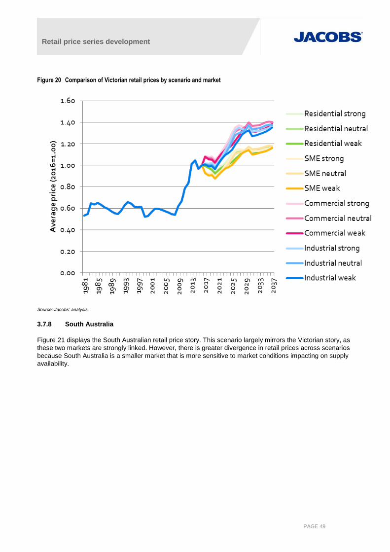
Retail price series development
PAGE 49
Figure 20 Comparison of Victorian retail prices by scenario and market
Source: Jacobs’ analysis
3.7.8 South Australia
Figure 21 displays the South Australian retail price story. This scenario largely mirrors the Victorian story, as
these two markets are strongly linked. However, there is greater divergence in retail prices across scenarios
because South Australia is a smaller market that is more sensitive to market conditions impacting on supply
availability.
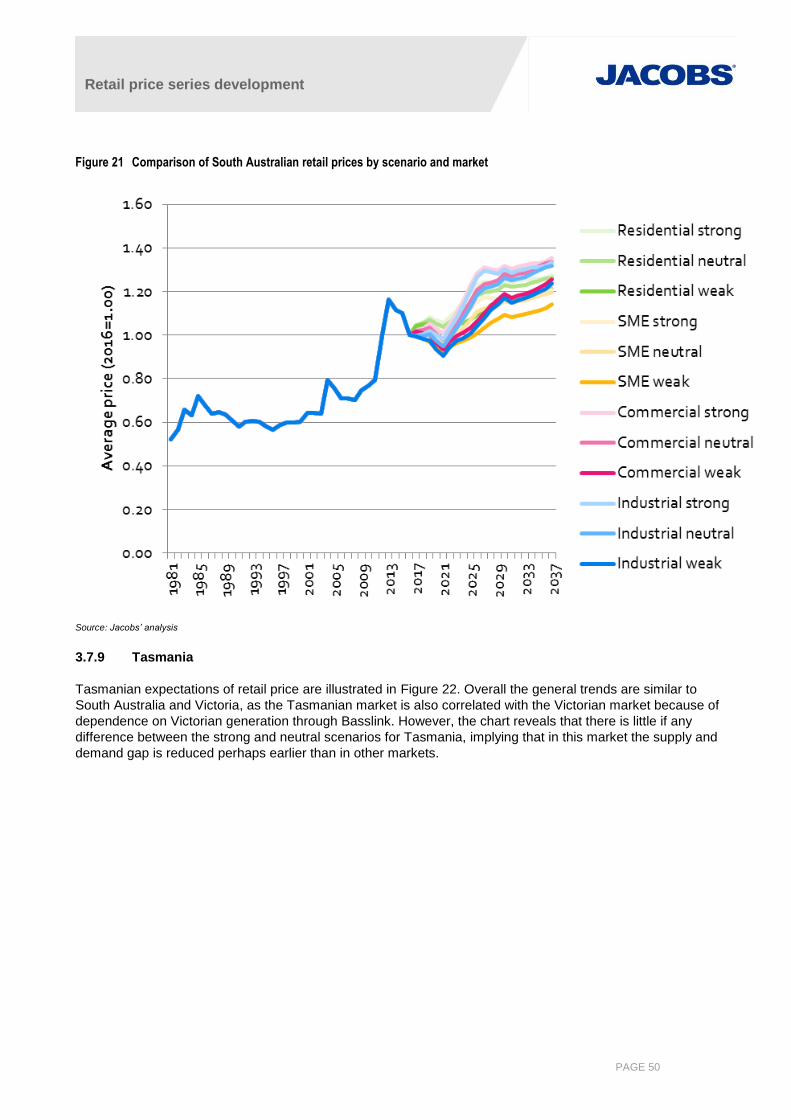
Retail price series development
PAGE 50
Figure 21 Comparison of South Australian retail prices by scenario and market
Source: Jacobs’ analysis
3.7.9 Tasmania
Tasmanian expectations of retail price are illustrated in Figure 22. Overall the general trends are similar to
South Australia and Victoria, as the Tasmanian market is also correlated with the Victorian market because of
dependence on Victorian generation through Basslink. However, the chart reveals that there is little if any
difference between the strong and neutral scenarios for Tasmania, implying that in this market the supply and
demand gap is reduced perhaps earlier than in other markets.
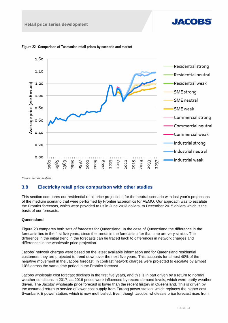
Retail price series development
PAGE 51
Figure 22 Comparison of Tasmanian retail prices by scenario and market
Source: Jacobs’ analysis
3.8 Electricity retail price comparison with other studies
This section compares our residential retail price projections for the neutral scenario with last year’s projections
of the medium scenario that were performed by Frontier Economics for AEMO. Our approach was to escalate
the Frontier forecasts, which were provided to us in June 2013 dollars, to December 2015 dollars which is the
basis of our forecasts.
Queensland
Figure 23 compares both sets of forecasts for Queensland. In the case of Queensland the difference in the
forecasts lies in the first five years, since the trends in the forecasts after that time are very similar. The
difference in the initial trend in the forecasts can be traced back to differences in network charges and
differences in the wholesale price projection.
Jacobs’ network charges were based on the latest available information and for Queensland residential
customers they are projected to trend down over the next five years. This accounts for almost 40% of the
negative movement in the Jacobs forecast. In contrast network charges were projected to escalate by almost
10% across the same time period in the Frontier forecast.
Jacobs wholesale cost forecast declines in the first five years, and this is in part driven by a return to normal
weather conditions in 2017, as 2016 prices were influenced by record demand levels, which were partly weather
driven. The Jacobs’ wholesale price forecast is lower than the recent history in Queensland. This is driven by
the assumed return to service of lower cost supply from Tarong power station, which replaces the higher cost
Swanbank E power station, which is now mothballed. Even though Jacobs’ wholesale price forecast rises from
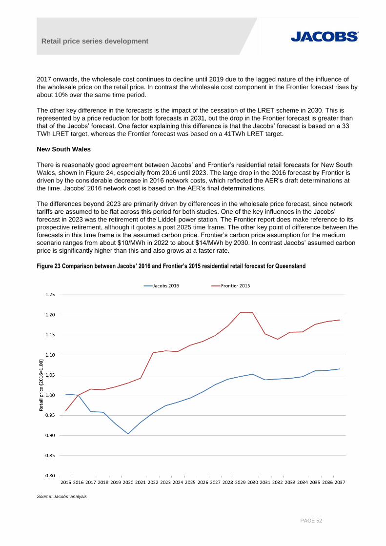
Retail price series development
PAGE 52
2017 onwards, the wholesale cost continues to decline until 2019 due to the lagged nature of the influence of
the wholesale price on the retail price. In contrast the wholesale cost component in the Frontier forecast rises by
about 10% over the same time period.
The other key difference in the forecasts is the impact of the cessation of the LRET scheme in 2030. This is
represented by a price reduction for both forecasts in 2031, but the drop in the Frontier forecast is greater than
that of the Jacobs’ forecast. One factor explaining this difference is that the Jacobs’ forecast is based on a 33
TWh LRET target, whereas the Frontier forecast was based on a 41TWh LRET target.
New South Wales
There is reasonably good agreement between Jacobs’ and Frontier’s residential retail forecasts for New South
Wales, shown in Figure 24, especially from 2016 until 2023. The large drop in the 2016 forecast by Frontier is
driven by the considerable decrease in 2016 network costs, which reflected the AER’s draft determinations at
the time. Jacobs’ 2016 network cost is based on the AER’s final determinations.
The differences beyond 2023 are primarily driven by differences in the wholesale price forecast, since network
tariffs are assumed to be flat across this period for both studies. One of the key influences in the Jacobs’
forecast in 2023 was the retirement of the Liddell power station. The Frontier report does make reference to its
prospective retirement, although it quotes a post 2025 time frame. The other key point of difference between the
forecasts in this time frame is the assumed carbon price. Frontier’s carbon price assumption for the medium
scenario ranges from about $10/MWh in 2022 to about $14/MWh by 2030. In contrast Jacobs’ assumed carbon
price is significantly higher than this and also grows at a faster rate.
Figure 23 Comparison between Jacobs’ 2016 and Frontier’s 2015 residential retail forecast for Queensland
Source: Jacobs’ analysis

Retail price series development
PAGE 53
Figure 24 Comparison between Jacobs’ 2016 and Frontier’s 2015 residential retail forecast for New South Wales
Source: Jacobs’ analysis
Victoria
Figure 25 shows the differences between the two sets of forecasts for Victoria. They key differences lie in the
price behaviour prior to 2020. Post 2020 there is reasonable agreement between the forecasts, apart from the
magnitude of the price fall due to the cessation of the LRET.
The difference in the price trends pre 2020 can be traced back to network charges and wholesale prices.
Network charges are trending down in the Jacobs’ forecast, and account for about half of the retail price fall
from 2016 to 2020. In contrast, Frontier’s assumed network charges were virtually flat over this time period.
Similarly, Jacobs’ Victorian wholesale prices decrease from 2016 to 2020 primarily due to the influence of the
33TWh LRET target. Jacobs’ model forecasts that Victoria will have the largest share of renewable energy
investment over this time frame, and this additional supply exerts downward pressure on the Victorian
wholesale price. In contrast Frontier’s wholesale price forecast increases over this time frame, despite meeting
a larger (41TWh) LRET target, although the increase is very mild.
Post 2020 Jacobs’ forecast grows faster than Frontier’s forecast. This is expected and reflects both a higher
carbon price assumption as well as reduction in Victorian supply in the Jacobs’ forecast (Hazelwood, Yallourn
and Loy Yang B retirements in the 2020s).

Retail price series development
PAGE 54
Figure 25 Comparison between Jacobs’ 2016 and Frontier’s 2015 residential retail forecast for Victoria
Source: Jacobs’ analysis
South Australia
There is good agreement between Jacobs’ and Frontier’s residential retail forecasts for South Australia, shown
in Figure 26, after the Jacobs’ forecast is benchmarked to the Frontier forecast.
Price trends are similar in the first five years. There is a difference occurring in 2021 when the Jacobs’ forecast
declines and the Frontier forecast continues to increase. The Jacobs’ price decline is caused by the cessation of
the REES scheme (see section 3.4.3.3) in 2020, which removes almost $9/MWh from the retail cost.
Post 2020 Jacobs’ forecast grows faster than Frontier’s forecast. This is expected and mainly reflects Jacobs’
higher carbon price assumption.
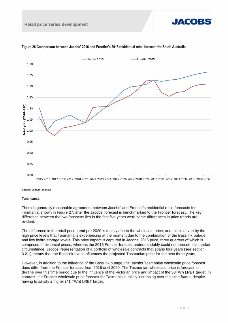
Retail price series development
PAGE 55
Figure 26 Comparison between Jacobs’ 2016 and Frontier’s 2015 residential retail forecast for South Australia
Source: Jacobs’ analysis
Tasmania
There is generally reasonable agreement between Jacobs’ and Frontier’s residential retail forecasts for
Tasmania, shown in Figure 27, after the Jacobs’ forecast is benchmarked to the Frontier forecast. The key
difference between the two forecasts lies in the first five years were some differences in price trends are
evident.
The difference in the retail price trend pre 2020 is mainly due to the wholesale price, and this is driven by the
high price levels that Tasmania is experiencing at the moment due to the combination of the Basslink outage
and low hydro storage levels. This price impact is captured in Jacobs’ 2016 price, three quarters of which is
comprised of historical prices, whereas the 2015 Frontier forecast understandably could not foresee this market
circumstance. Jacobs’ representation of a portfolio of wholesale contracts that spans four years (see section
3.2.1) means that the Basslink event influences the projected Tasmanian price for the next three years.
However, in addition to the influence of the Basslink outage, the Jacobs Tasmanian wholesale price forecast
does differ from the Frontier forecast from 2016 until 2020. The Tasmanian wholesale price is forecast to
decline over this time period due to the influence of the Victorian price and impact of the 33TWh LRET target. In
contrast, the Frontier wholesale price forecast for Tasmania is mildly increasing over this time frame, despite
having to satisfy a higher (41 TWh) LRET target.
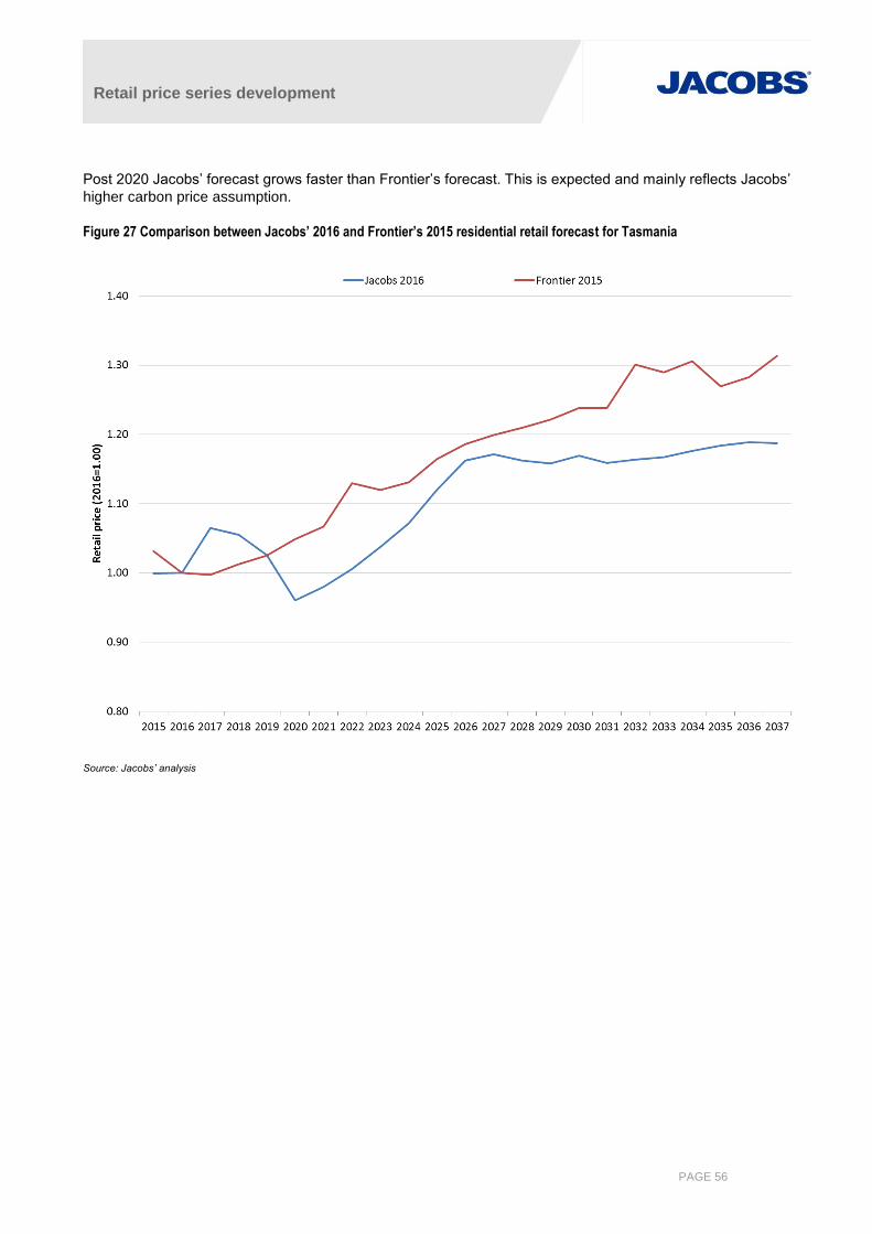
Retail price series development
PAGE 56
Post 2020 Jacobs’ forecast grows faster than Frontier’s forecast. This is expected and mainly reflects Jacobs’
higher carbon price assumption.
Figure 27 Comparison between Jacobs’ 2016 and Frontier’s 2015 residential retail forecast for Tasmania
Source: Jacobs’ analysis
Retail price series development
PAGE 57
Appendix A. Assumptions underlying NEM wholesale market model
Key assumptions used in the wholesale electricity market modelling include:
The various demand growth projections, with annual demand shapes consistent with the median growth in
summer and winter peak demand as projected by AEMO. The load shape was based on 2010/11 load
profile for the NEM regions.
Wind power in the NEM is based on the chronological profile of wind generation for each generator from the
2010/11 financial year, and is therefore accurately correlated to the demand profile.
Capacity is installed to meet the target reserve margin for the NEM in each region. Some of this peaking
capacity may represent demand side response rather than physical generation assets.
Infrequently used peaking resources are bid near Market Price Cap (MPC) or removed from the simulation
to represent strategic bidding of these resources when demand is moderate or low.
Generators behave rationally, with uneconomic capacity withdrawn from the market and bidding strategies
limited by the cost of new entry. This is a conservative assumption as there have been periods when prices
have exceeded new entry costs when averaged over 12 months.
Implementation of the LRET and Small-scale Renewable Energy Scheme (SRES) schemes. The LRET
target is for 33,000GWh of renewable generation by 2020.
Additional renewable energy is included for expected Greenpower and desalination purposes.
The assessed demand side management (DSM) for emissions abatement or otherwise economic
responses throughout the NEM is assumed to be included in the NEM demand forecast.
A.1 Price and revenue factors
Future wholesale electricity prices and related market outcomes are essentially driven by the supply and
demand balance, with long-term prices being effectively capped near the cost of new entry on the assumption
that prices above this level provide economic signals for new generation to enter the market. Consequently,
assumptions on the fuel costs, unit efficiencies, costs of new plant and carbon prices will have a noticeable
impact on long-term price forecasts. Year-to-year prices will deviate from the new entry cost level based on the
timing of new entry. In periods when new entry is not required, the market prices reflect the cost of generation to
meet regional loads, and the bidding behaviour of the market participants as affected by market power.
The market forecasts take into account the following parameters:
Regional and temporal demand forecasts;
Generating plant performance;
Timing of new generation including embedded generation;
Existing interconnection limits; and
Potential for interconnection development
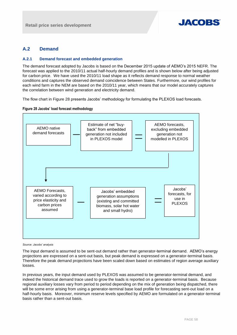
Retail price series development
PAGE 58
A.2 Demand
A.2.1 Demand forecast and embedded generation
The demand forecast adopted by Jacobs is based on the December 2015 update of AEMO’s 2015 NEFR. The
forecast was applied to the 2010/11 actual half-hourly demand profiles and is shown below after being adjusted
for carbon price. We have used the 2010/11 load shape as it reflects demand response to normal weather
conditions and captures the observed demand coincidence between States. Furthermore, our wind profiles for
each wind farm in the NEM are based on the 2010/11 year, which means that our model accurately captures
the correlation between wind generation and electricity demand.
The flow chart in Figure 28 presents Jacobs’ methodology for formulating the PLEXOS load forecasts.
Figure 28 Jacobs’ load forecast methodology
Source: Jacobs’ analysis
The input demand is assumed to be sent-out demand rather than generator-terminal demand. AEMO’s energy
projections are expressed on a sent-out basis, but peak demand is expressed on a generator-terminal basis.
Therefore the peak demand projections have been scaled down based on estimates of region average auxiliary
losses.
In previous years, the input demand used by PLEXOS was assumed to be generator-terminal demand, and
indeed the historical demand trace used to grow the loads is reported on a generator-terminal basis. Because
regional auxiliary losses vary from period to period depending on the mix of generation being dispatched, there
will be some error arising from using a generator-terminal base load profile for forecasting sent-out load on a
half-hourly basis. Moreover, minimum reserve levels specified by AEMO are formulated on a generator-terminal
basis rather than a sent-out basis.
AEMO native
demand forecasts
Estimate of net “buy-
back” from embedded
generation not included
in PLEXOS model
AEMO forecasts,
excluding embedded
generation not
modelled in PLEXOS
AEMO Forecasts,
varied according to
price elasticity and
carbon prices
assumed
Jacobs’ embedded
generation assumptions
(existing and committed
biomass, solar hot water
and small hydro)
Jacobs’
forecasts, for
use in
PLEXOS
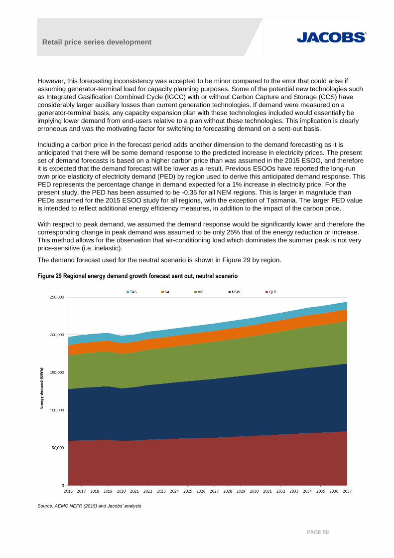
Retail price series development
PAGE 59
However, this forecasting inconsistency was accepted to be minor compared to the error that could arise if
assuming generator-terminal load for capacity planning purposes. Some of the potential new technologies such
as Integrated Gasification Combined Cycle (IGCC) with or without Carbon Capture and Storage (CCS) have
considerably larger auxiliary losses than current generation technologies. If demand were measured on a
generator-terminal basis, any capacity expansion plan with these technologies included would essentially be
implying lower demand from end-users relative to a plan without these technologies. This implication is clearly
erroneous and was the motivating factor for switching to forecasting demand on a sent-out basis.
Including a carbon price in the forecast period adds another dimension to the demand forecasting as it is
anticipated that there will be some demand response to the predicted increase in electricity prices. The present
set of demand forecasts is based on a higher carbon price than was assumed in the 2015 ESOO, and therefore
it is expected that the demand forecast will be lower as a result. Previous ESOOs have reported the long-run
own price elasticity of electricity demand (PED) by region used to derive this anticipated demand response. This
PED represents the percentage change in demand expected for a 1% increase in electricity price. For the
present study, the PED has been assumed to be -0.35 for all NEM regions. This is larger in magnitude than
PEDs assumed for the 2015 ESOO study for all regions, with the exception of Tasmania. The larger PED value
is intended to reflect additional energy efficiency measures, in addition to the impact of the carbon price.
With respect to peak demand, we assumed the demand response would be significantly lower and therefore the
corresponding change in peak demand was assumed to be only 25% that of the energy reduction or increase.
This method allows for the observation that air-conditioning load which dominates the summer peak is not very
price-sensitive (i.e. inelastic).
The demand forecast used for the neutral scenario is shown in Figure 29 by region.
Figure 29 Regional energy demand growth forecast sent out, neutral scenario
Source: AEMO NEFR (2015) and Jacobs’ analysis
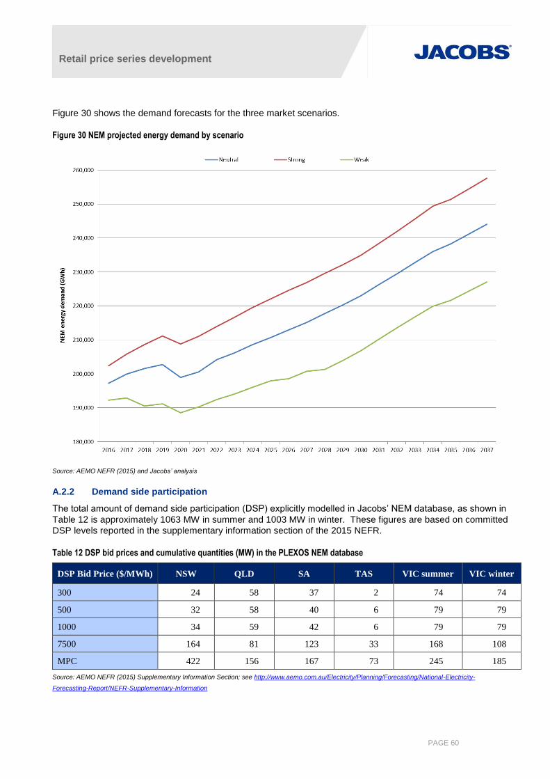
Retail price series development
PAGE 60
Figure 30 shows the demand forecasts for the three market scenarios.
Figure 30 NEM projected energy demand by scenario
Source: AEMO NEFR (2015) and Jacobs’ analysis
A.2.2 Demand side participation
The total amount of demand side participation (DSP) explicitly modelled in Jacobs’ NEM database, as shown in
Table 12 is approximately 1063 MW in summer and 1003 MW in winter. These figures are based on committed
DSP levels reported in the supplementary information section of the 2015 NEFR.
Table 12 DSP bid prices and cumulative quantities (MW) in the PLEXOS NEM database
DSP Bid Price ($/MWh) NSW QLD SA TAS VIC summer VIC winter
300 24 58 37 2 74 74
500 32 58 40 6 79 79
1000 34 59 42 6 79 79
7500 164 81 123 33 168 108
MPC 422 156 167 73 245 185
Source: AEMO NEFR (2015) Supplementary Information Section; see http://www.aemo.com.au/Electricity/Planning/Forecasting/National-Electricity-
Forecasting-Report/NEFR-Supplementary-Information
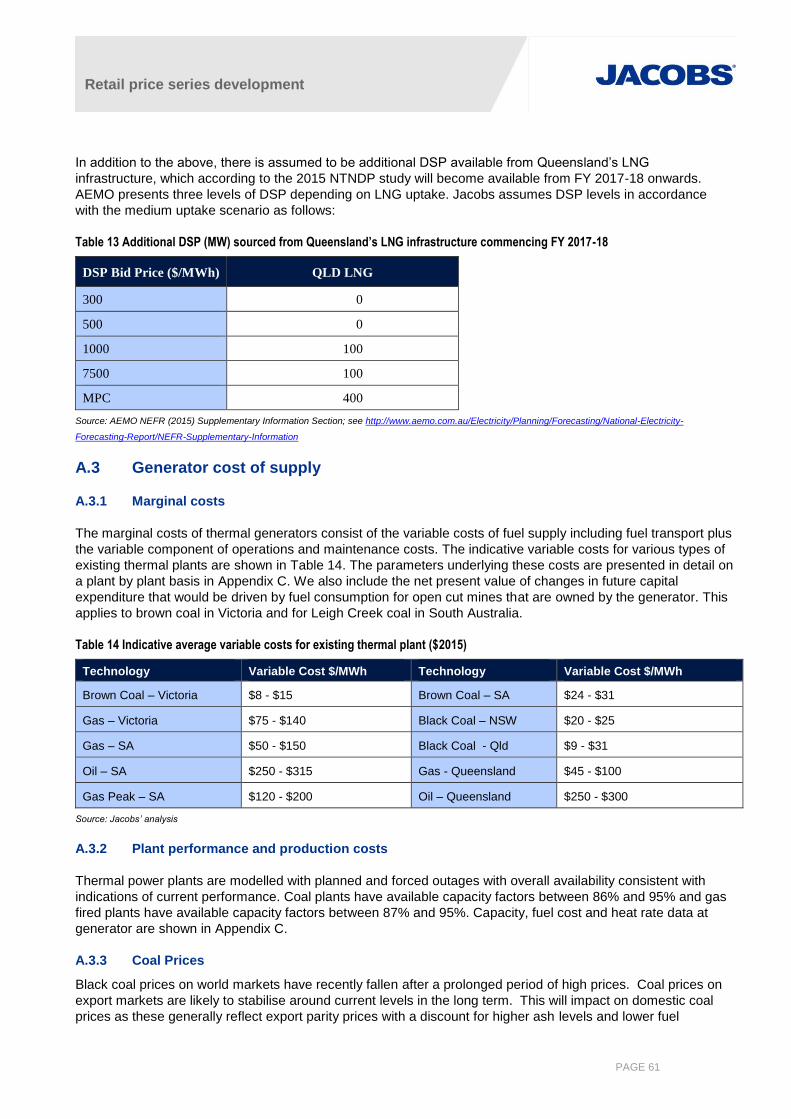
Retail price series development
PAGE 61
In addition to the above, there is assumed to be additional DSP available from Queensland’s LNG
infrastructure, which according to the 2015 NTNDP study will become available from FY 2017-18 onwards.
AEMO presents three levels of DSP depending on LNG uptake. Jacobs assumes DSP levels in accordance
with the medium uptake scenario as follows:
Table 13 Additional DSP (MW) sourced from Queensland’s LNG infrastructure commencing FY 2017-18
DSP Bid Price ($/MWh) QLD LNG
300 0
500 0
1000 100
7500 100
MPC 400
Source: AEMO NEFR (2015) Supplementary Information Section; see http://www.aemo.com.au/Electricity/Planning/Forecasting/National-Electricity-
Forecasting-Report/NEFR-Supplementary-Information
A.3 Generator cost of supply
A.3.1 Marginal costs
The marginal costs of thermal generators consist of the variable costs of fuel supply including fuel transport plus
the variable component of operations and maintenance costs. The indicative variable costs for various types of
existing thermal plants are shown in Table 14. The parameters underlying these costs are presented in detail on
a plant by plant basis in Appendix C. We also include the net present value of changes in future capital
expenditure that would be driven by fuel consumption for open cut mines that are owned by the generator. This
applies to brown coal in Victoria and for Leigh Creek coal in South Australia.
Table 14 Indicative average variable costs for existing thermal plant ($2015)
Technology Variable Cost $/MWh Technology Variable Cost $/MWh
Brown Coal – Victoria $8 - $15 Brown Coal – SA $24 - $31
Gas – Victoria $75 - $140 Black Coal – NSW $20 - $25
Gas – SA $50 - $150 Black Coal - Qld $9 - $31
Oil – SA $250 - $315 Gas - Queensland $45 - $100
Gas Peak – SA $120 - $200 Oil – Queensland $250 - $300
Source: Jacobs’ analysis
A.3.2 Plant performance and production costs
Thermal power plants are modelled with planned and forced outages with overall availability consistent with
indications of current performance. Coal plants have available capacity factors between 86% and 95% and gas
fired plants have available capacity factors between 87% and 95%. Capacity, fuel cost and heat rate data at
generator are shown in Appendix C.
A.3.3 Coal Prices
Black coal prices on world markets have recently fallen after a prolonged period of high prices. Coal prices on
export markets are likely to stabilise around current levels in the long term. This will impact on domestic coal
prices as these generally reflect export parity prices with a discount for higher ash levels and lower fuel
Retail price series development
PAGE 62
contents. Coal prices will generally impact on the power stations not at mine-mouth (NSW coal plant and
central Queensland coal plant), or those associated with a mine that also exports coal.
Brown coal prices are insensitive to movements in global coal markets because brown coal is not exported.
Brown coal prices are assumed to remain flat in real terms over the forecast period.
A.3.4 Gas prices
AEMO provided Jacobs with forecast gas prices by scenario for this study that were consistent with the market
scenario definitions. A bottom up approach was used to derive the gas price forecasts, with the key components
being the wholesale contract price, the transmission cost and the cost of peak supply. Wholesale contract prices
were the maximum of local production costs and netback prices. Prices for the Weak scenario tend to be set by
local production costs, whereas prices for the Neutral and Strong scenarios are typically set by the netback
price. The result of this is that Weak scenario prices are closer to Neutral scenario prices than would otherwise
have been the case. Figure 31 to Figure 33 shows gas price assumptions by incumbent power station for the
neutral, strong and weak market scenarios respectively.
A.4 Transmission losses
A.4.1 Inter-regional losses
Inter-regional losses are modelled in PLEXOS directly through the use of the Loss Factor equations which are
periodically published by AEMO. The latest set produced by AEMO29 is incorporated in the current database.
The Basslink loss factor equations were optimised to match flows against losses (in both transfer directions) in a
separate Jacobs analysis. Jacobs treats Basslink’s losses in this way in order to model all losses between the
Georgetown reference node and the Thomastown reference node. AEMO’s published equations for Basslink
losses are not sufficient to input into PLEXOS as they are only applicable between Georgetown and the Loy
Yang node, which is Basslink’s connection point to the mainland.
A.4.2 Apportioning Inter-Regional Losses to Regions
PLEXOS emulates AEMO’s dispatch engine (NEMDE) in that it allocates the inter-regional losses arising from
the loss factor equations to the two regions associated with the relevant interconnector. The apportioning
factors used are those published by AEMO in its periodic publication on Marginal Loss Factors. The latest
apportioning factors are presented in Table 15.
Table 15 Interconnector loss apportioning factors
Interconnector Apportioning factor Region applied to
NSW1-QLD1 0.55 NSW
Terranora 0.60 NSW
VIC1-NSW1 0.39 Victoria
V-SA 0.77 Victoria
Murraylink 0.82 Victoria
Source: AEMO, “Regions and Marginal Loss Factors: FY 2015-16”, published 5 June 2015.
A.4.3 Intra-regional losses
Intra-regional loss factors refer each generating unit to the regional reference node and are entered into
PLEXOS directly. These factors are also sourced from AEMO’s periodic publication on Marginal Loss Factors.
29 “Regions and Marginal Loss Factors: FY 2015-16”, published 5 June 2015.
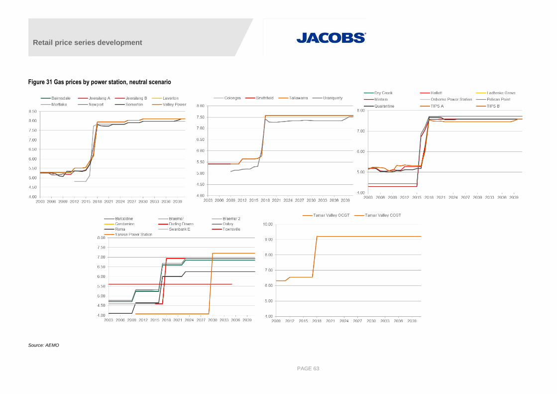
Retail price series development
PAGE 63
Figure 31 Gas prices by power station, neutral scenario
Source: AEMO
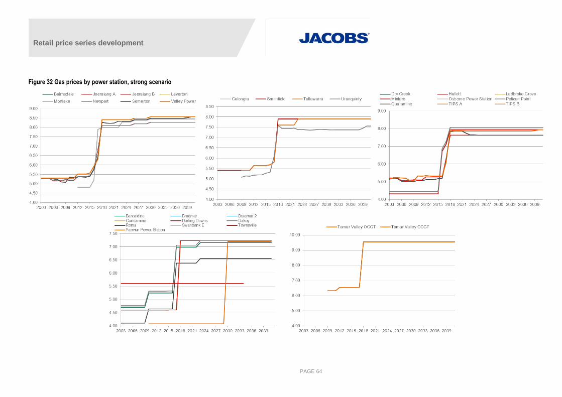
Retail price series development
PAGE 64
Figure 32 Gas prices by power station, strong scenario
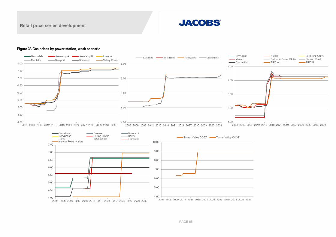
Retail price series development
PAGE 65
Figure 33 Gas prices by power station, weak scenario
Retail price series development
PAGE 66
A.5 Hydro modelling
Small hydro systems such as those owned by Southern Hydro are modelled using annual energy limits. For
larger hydro systems such as the Snowy hydro generation system (excluding Blowering), a more complex
cascading network has been set up in the database to emulate physical water flows and levels in the storages.
This follows a similar modelling structure to that used by AEMO. Details of AEMO’s methodology can be found
in the 2008 ANTS Consultation: Final Report.
The inflow data in the 2015 NTNDP was provided for the Eucumbene storage rather than for Tumut and Murray
separately. Accordingly, we have now included this storage in the Snowy representation. Furthermore, in order
to allow PLEXOS to appropriately allocate hydro from this large storage to Tumut and Murray, volumes in
storage are now measured in cumec days (CMD) rather than GWh, and efficiencies (MW/cumec) are input for
each of the generators on the river chain. This required changing the storage model used in the database from
“potential energy” to “metric volume”.
The ANTS storage volumes are expressed in ML and can be simply converted to CMD given that 1 CMD is
equivalent to 86.4 ML. Similarly, we have converted storage inflows from GL to cumecs. The efficiency increase
(MW/cumec) property values for generators drawing water from storage are summarised in Table 16 and have
been calculated using the following formula:
MW/cumec = head [in meters] * efficiency * 9.80665 /1000
where an efficiency of 83% is assumed for all generators.
All hydro systems within the same database need to use the same units. Therefore, all storages are measured
in CMD and inflows are measured in cumecs. One CMD is equivalent to 24 cumecs. For most of the storages
outside the Snowy hydro scheme, rather than convert inflows from MW to cumecs, we have converted the
storage initial and end volumes assuming that 1 CMD = 24 MWh. This ensures internal consistency when
calculating hydro energy potential.
Table 16 Calculation of MW/cumec efficiency factors for hydro generators attached to storages
Station head [m] efficiency MW/cumec
Kareeya 420 0.83 3.42
Murray Inflow 855 0.83 6.96
Murray1 517 0.83 4.21
Murray2 285 0.83 2.32
Tumut Inflow 811 0.83 1.83
Tumut1 330 0.83 2.69
Tumut2 275 0.83 2.24
Tumut3 160 0.83 1.30
Source: AEMO, ANTS Consultation: Final Report (2008)
The storages in PLEXOS cycle back to their initial volumes at the end of every year which means all inflows
must either be released from the system via generation or waterways. Inflow inputs are based on those of the
2015 NTNDP. Since storages are assumed to recycle within a year, the inflows (less spill) determine the
generation levels on an annual basis30.
30 Distribution of generation within the year is based on the water value (an endogenous variable) which accounts for the opportunity cost of thermal
resources displaced by the hydro generation in future periods.
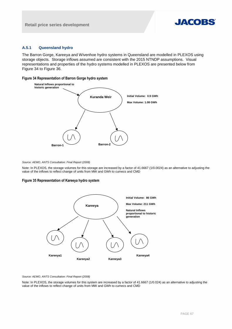
Retail price series development
PAGE 67
A.5.1 Queensland hydro
The Barron Gorge, Kareeya and Wivenhoe hydro systems in Queensland are modelled in PLEXOS using
storage objects. Storage inflows assumed are consistent with the 2015 NTNDP assumptions. Visual
representations and properties of the hydro systems modelled in PLEXOS are presented below from
Figure 34 to Figure 36.
Figure 34 Representation of Barron Gorge hydro system
Source: AEMO, ANTS Consultation: Final Report (2008)
Note: In PLEXOS, the storage volumes for this storage are increased by a factor of 41.6667 (1/0.0024) as an alternative to adjusting the value of the inflows to reflect change of units from MW and GWh to cumecs and CMD
Figure 35 Representation of Kareeya hydro system
Source: AEMO, ANTS Consultation: Final Report (2008)
Note: In PLEXOS, the storage volumes for this system are increased by a factor of 41.6667 (1/0.024) as an alternative to adjusting the value of the inflows to reflect change of units from MW and GWh to cumecs and CMD
Kuranda Weir Initial Volume: 0.9 GWh Max Volume: 1.08 GWh
Barron-1 Barron-2
Natural Inflows proportional to historic generation
Kareeya
Initial Volume: 86 GWh Max Volume: 211 GWh Natural Inflows proportional to historic generation
Kareeya1
Kareeya3 Kareeya2
Kareeya4

Retail price series development
PAGE 68
Figure 36 Representation of Wivenhoe pump storage system
Source: AEMO, ANTS Consultation: Final Report (2008)
NOTE: In PLEXOS, the storage volumes for this system are increased by a factor of 41.6667 (1/0.024) as an alternative to adjusting the value of the inflows to reflect change of units from MW and GWh to cumecs and CMD
A.5.2 Snowy Mountains Scheme
There are seven power stations in the Snowy Mountains Scheme: Guthega, Blowering, Tumut 1, Tumut 2,
Tumut 3, Murray 1 and Murray 2. According to the 2015 NTNDP the combined average annual production from
the scheme has been 5,000 GWh, excluding additional generation obtained from pumping. Lake Eucumbene is
the main storage for the scheme, with inflows from the storage feeding both the Tumut and Murray hydro
systems. There are also three pump storage units at Tumut 3, allowing water to be pumped back up to the
Talbingo dam if economic to do so. In PLEXOS we have assumed a pump efficiency of 70% for these three
units, meaning that for every MW of pump load, 0.7 MW of potential energy is returned to the Talbingo dam.
The Guthega power station is modelled as a separate hydro system with natural inflows equivalent to the
inflows assumed in the 2015 NTNDP.
In PLEXOS the Blowering power station is not connected to any storage, but instead we use monthly energy
constraints to limit its generation potential. These constraints are summarised in Table 17 below.
Table 17 Monthly energy constraints for Blowering (GWh)
Jan Feb Mar Apr May Jun Jul Aug Sep Oct Nov Dec
0 0 0 0 0 0 0 0 6 25 31 34
Source: AEMO 2015 NTNDP dataset
Visual representations and properties of the Snowy Mountains hydro storage systems modelled in PLEXOS are
presented below from Figure 37 to Figure 39.
Wivenhoe 2
Storage
Wivenhoe 1
Storage
Initial Volume: 3.3 GWh Max Volume: 3.3 GWh
No natural inflows
Initial Volume: 124.3 GWh Max Volume: 384.1GWh No natural inflows
W/hoe#2
Capacity: 250MW
W/hoe#1
Capacity: 250MW

Retail price series development
PAGE 69
Figure 37 Representation of Guthega hydro system
Source: AEMO, ANTS Consultation: Final Report (2008)
Figure 38 Representation of Murray hydro system
Source: AEMO, ANTS Consultation: Final Report (2008)
Guthega
Initial Volume: 0.8 GWh Max Volume: 1.51 GWh Natural Inflows proportional to historic generation
Guthega
Murray 3
Murray 2
Initial Volume: 136.5 CMD Max Volume: 151.6CMD No natural inflows
Initial Volume: 15.6 CMD Max Volume: 17.36 CMD No natural inflows
Murray 2
Murray 1
Capacity: 950MW
Eucumbene
Tumut system
Initial Volume: 10982 CMD Max Volume: 57799 CMD Natural inflows
Daily flow limit of 96 CMD
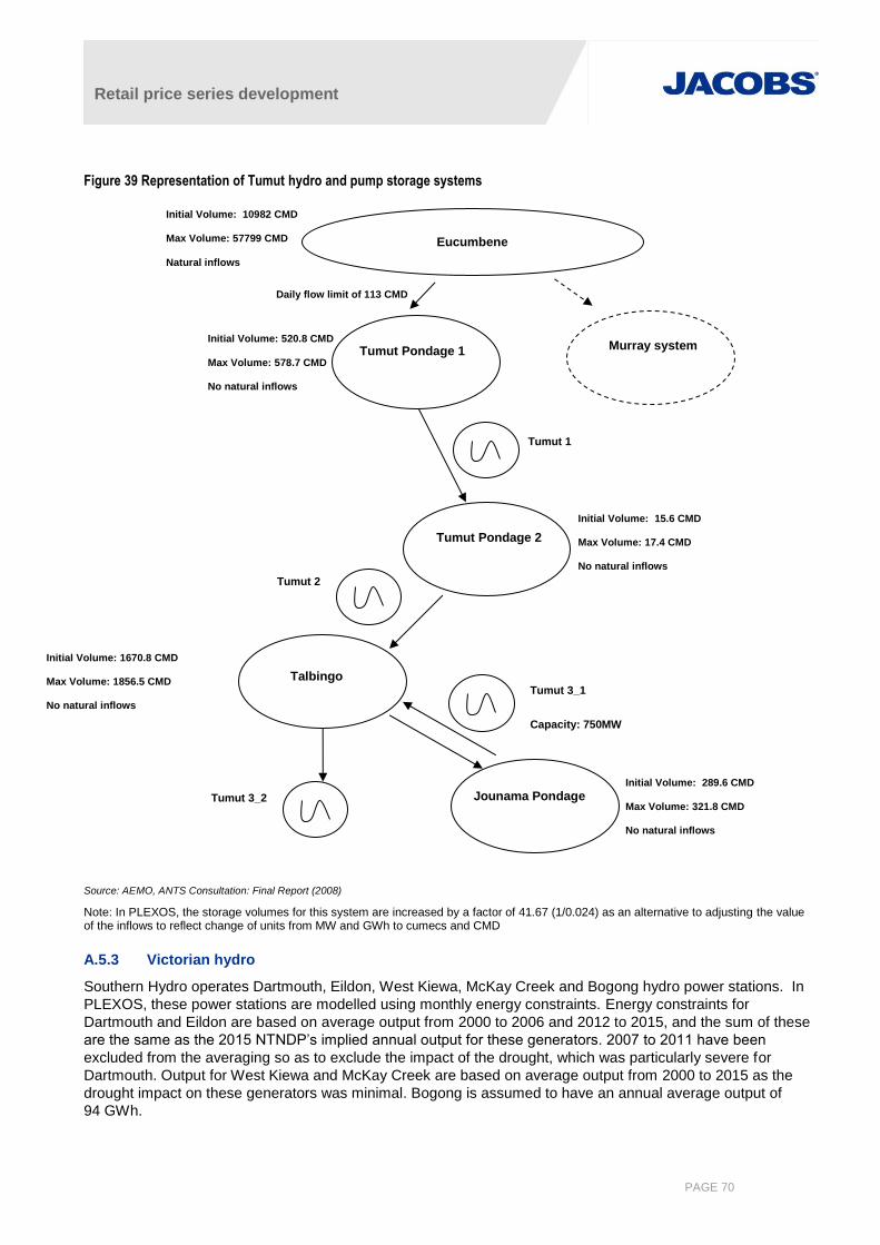
Retail price series development
PAGE 70
Figure 39 Representation of Tumut hydro and pump storage systems
Source: AEMO, ANTS Consultation: Final Report (2008)
Note: In PLEXOS, the storage volumes for this system are increased by a factor of 41.67 (1/0.024) as an alternative to adjusting the value of the inflows to reflect change of units from MW and GWh to cumecs and CMD
A.5.3 Victorian hydro
Southern Hydro operates Dartmouth, Eildon, West Kiewa, McKay Creek and Bogong hydro power stations. In
PLEXOS, these power stations are modelled using monthly energy constraints. Energy constraints for
Dartmouth and Eildon are based on average output from 2000 to 2006 and 2012 to 2015, and the sum of these
are the same as the 2015 NTNDP’s implied annual output for these generators. 2007 to 2011 have been
excluded from the averaging so as to exclude the impact of the drought, which was particularly severe for
Dartmouth. Output for West Kiewa and McKay Creek are based on average output from 2000 to 2015 as the
drought impact on these generators was minimal. Bogong is assumed to have an annual average output of
94 GWh.
Talbingo
Tumut Pondage 1 Initial Volume: 520.8 CMD Max Volume: 578.7 CMD No natural inflows
Initial Volume: 289.6 CMD Max Volume: 321.8 CMD No natural inflows
Tumut 3_1
Capacity: 750MW
Tumut 1
Tumut 3_2
Initial Volume: 15.6 CMD Max Volume: 17.4 CMD No natural inflows Tumut 2
Tumut Pondage 2
Jounama Pondage
Eucumbene
Murray system
Initial Volume: 10982 CMD Max Volume: 57799 CMD
Natural inflows
Daily flow limit of 113 CMD
Initial Volume: 1670.8 CMD Max Volume: 1856.5 CMD No natural inflows
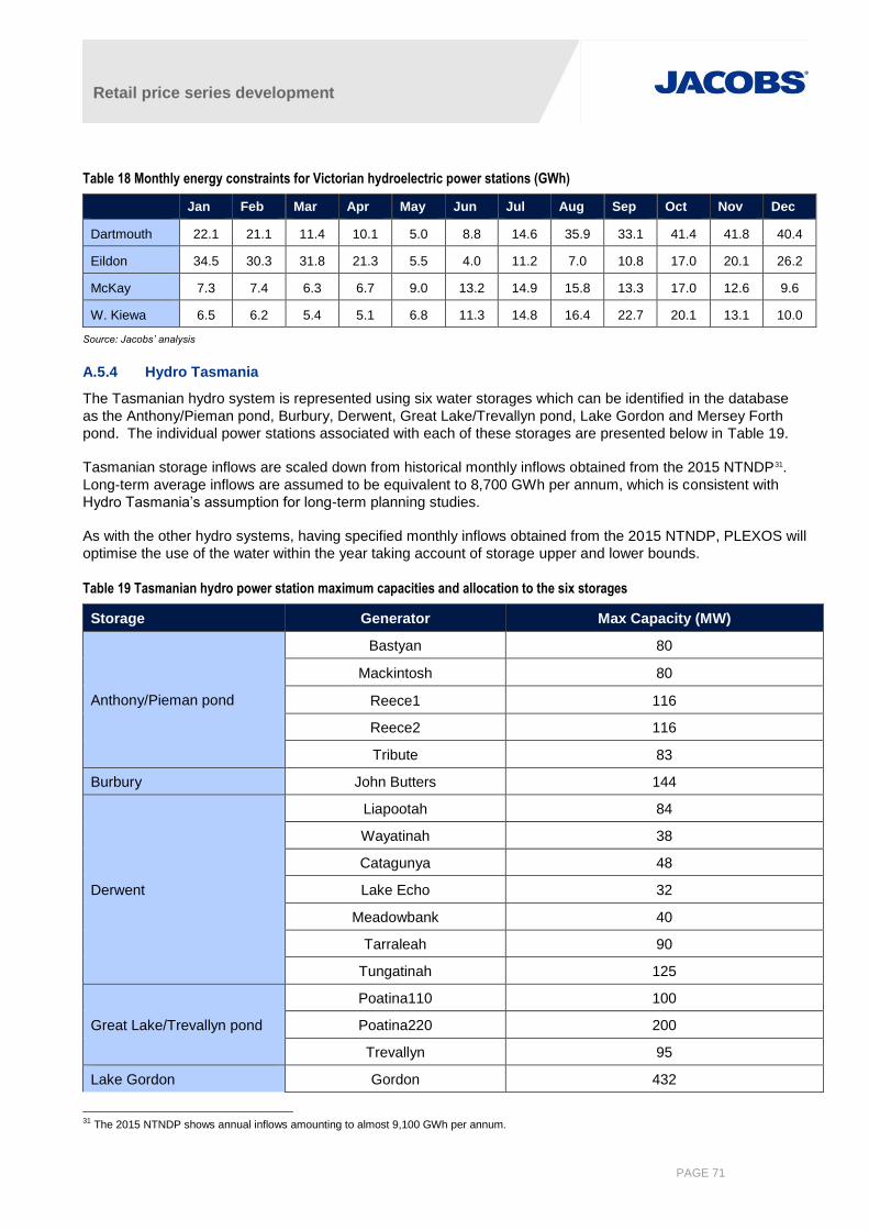
Retail price series development
PAGE 71
Table 18 Monthly energy constraints for Victorian hydroelectric power stations (GWh)
Jan Feb Mar Apr May Jun Jul Aug Sep Oct Nov Dec
Dartmouth 22.1 21.1 11.4 10.1 5.0 8.8 14.6 35.9 33.1 41.4 41.8 40.4
Eildon 34.5 30.3 31.8 21.3 5.5 4.0 11.2 7.0 10.8 17.0 20.1 26.2
McKay 7.3 7.4 6.3 6.7 9.0 13.2 14.9 15.8 13.3 17.0 12.6 9.6
W. Kiewa 6.5 6.2 5.4 5.1 6.8 11.3 14.8 16.4 22.7 20.1 13.1 10.0
Source: Jacobs’ analysis
A.5.4 Hydro Tasmania
The Tasmanian hydro system is represented using six water storages which can be identified in the database
as the Anthony/Pieman pond, Burbury, Derwent, Great Lake/Trevallyn pond, Lake Gordon and Mersey Forth
pond. The individual power stations associated with each of these storages are presented below in Table 19.
Tasmanian storage inflows are scaled down from historical monthly inflows obtained from the 2015 NTNDP31.
Long-term average inflows are assumed to be equivalent to 8,700 GWh per annum, which is consistent with
Hydro Tasmania’s assumption for long-term planning studies.
As with the other hydro systems, having specified monthly inflows obtained from the 2015 NTNDP, PLEXOS will
optimise the use of the water within the year taking account of storage upper and lower bounds.
Table 19 Tasmanian hydro power station maximum capacities and allocation to the six storages
Storage Generator Max Capacity (MW)
Anthony/Pieman pond
Bastyan 80
Mackintosh 80
Reece1 116
Reece2 116
Tribute 83
Burbury John Butters 144
Derwent
Liapootah 84
Wayatinah 38
Catagunya 48
Lake Echo 32
Meadowbank 40
Tarraleah 90
Tungatinah 125
Great Lake/Trevallyn pond
Poatina110 100
Poatina220 200
Trevallyn 95
Lake Gordon Gordon 432
31 The 2015 NTNDP shows annual inflows amounting to almost 9,100 GWh per annum.
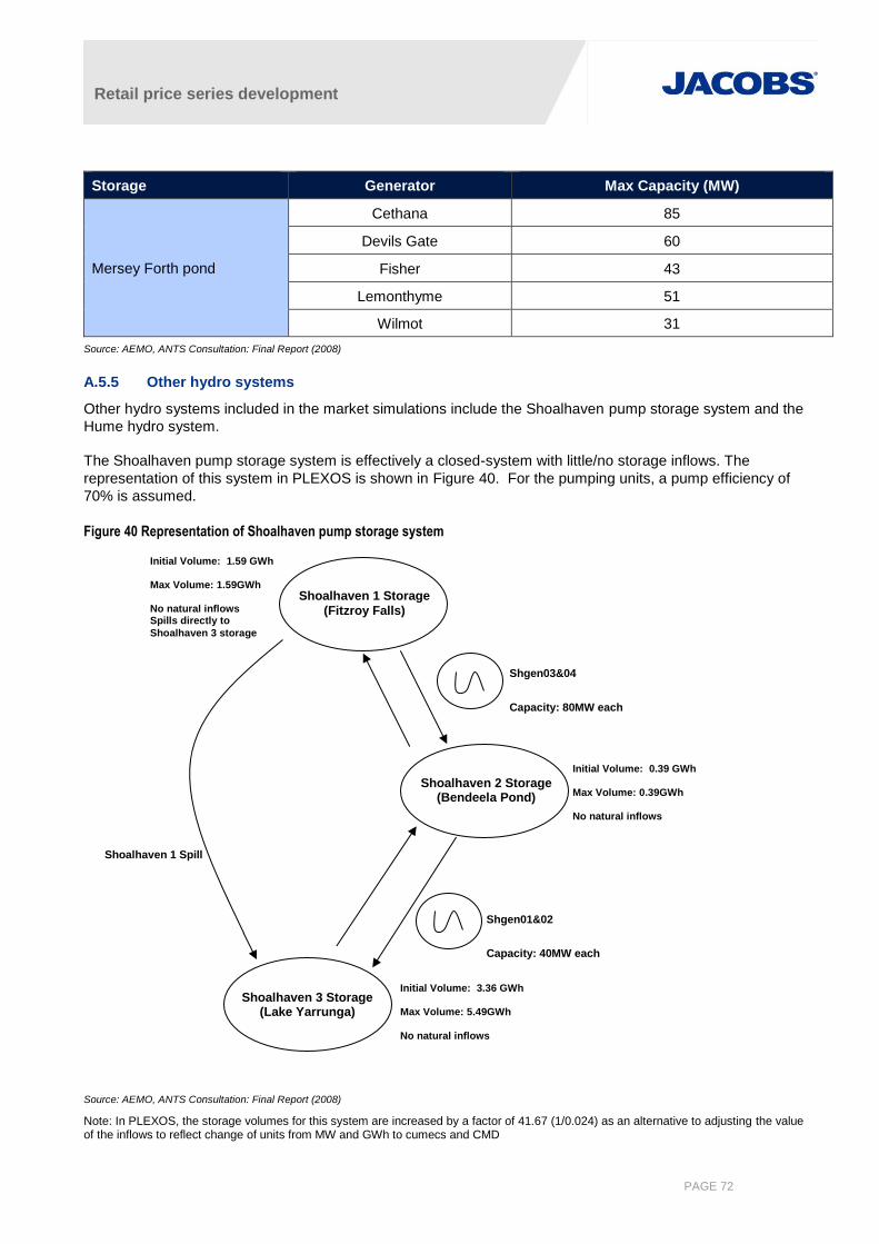
Retail price series development
PAGE 72
Storage Generator Max Capacity (MW)
Mersey Forth pond
Cethana 85
Devils Gate 60
Fisher 43
Lemonthyme 51
Wilmot 31
Source: AEMO, ANTS Consultation: Final Report (2008)
A.5.5 Other hydro systems
Other hydro systems included in the market simulations include the Shoalhaven pump storage system and the
Hume hydro system.
The Shoalhaven pump storage system is effectively a closed-system with little/no storage inflows. The
representation of this system in PLEXOS is shown in Figure 40. For the pumping units, a pump efficiency of
70% is assumed.
Figure 40 Representation of Shoalhaven pump storage system
Source: AEMO, ANTS Consultation: Final Report (2008)
Note: In PLEXOS, the storage volumes for this system are increased by a factor of 41.67 (1/0.024) as an alternative to adjusting the value of the inflows to reflect change of units from MW and GWh to cumecs and CMD
Shgen01&02
Capacity: 40MW each
Pump Capacity: 40MW each
Shgen03&04
Capacity: 80MW each
Pump Capacity: 80MW each
Initial Volume: 0.39 GWh Max Volume: 0.39GWh No natural inflows
Shoalhaven 3 Storage (Lake Yarrunga)
Shoalhaven 2 Storage (Bendeela Pond)
Shoalhaven 1 Storage (Fitzroy Falls)
Initial Volume: 1.59 GWh Max Volume: 1.59GWh No natural inflows Spills directly to
Shoalhaven 3 storage
Initial Volume: 3.36 GWh Max Volume: 5.49GWh No natural inflows
Shoalhaven 1 Spill
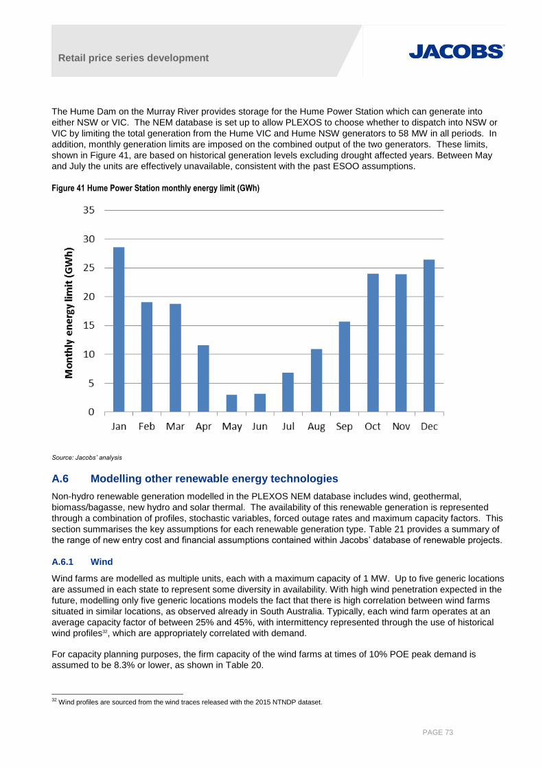
Retail price series development
PAGE 73
The Hume Dam on the Murray River provides storage for the Hume Power Station which can generate into
either NSW or VIC. The NEM database is set up to allow PLEXOS to choose whether to dispatch into NSW or
VIC by limiting the total generation from the Hume VIC and Hume NSW generators to 58 MW in all periods. In
addition, monthly generation limits are imposed on the combined output of the two generators. These limits,
shown in Figure 41, are based on historical generation levels excluding drought affected years. Between May
and July the units are effectively unavailable, consistent with the past ESOO assumptions.
Figure 41 Hume Power Station monthly energy limit (GWh)
Source: Jacobs’ analysis
A.6 Modelling other renewable energy technologies
Non-hydro renewable generation modelled in the PLEXOS NEM database includes wind, geothermal,
biomass/bagasse, new hydro and solar thermal. The availability of this renewable generation is represented
through a combination of profiles, stochastic variables, forced outage rates and maximum capacity factors. This
section summarises the key assumptions for each renewable generation type. Table 21 provides a summary of
the range of new entry cost and financial assumptions contained within Jacobs’ database of renewable projects.
A.6.1 Wind
Wind farms are modelled as multiple units, each with a maximum capacity of 1 MW. Up to five generic locations
are assumed in each state to represent some diversity in availability. With high wind penetration expected in the
future, modelling only five generic locations models the fact that there is high correlation between wind farms
situated in similar locations, as observed already in South Australia. Typically, each wind farm operates at an
average capacity factor of between 25% and 45%, with intermittency represented through the use of historical
wind profiles32, which are appropriately correlated with demand.
For capacity planning purposes, the firm capacity of the wind farms at times of 10% POE peak demand is
assumed to be 8.3% or lower, as shown in Table 20.
32 Wind profiles are sourced from the wind traces released with the 2015 NTNDP dataset.

Retail price series development
PAGE 74
Table 20 Firm capacity assumed for wind farms, by state
QLD NSW VIC SA TAS
Firm capacity 0% 2.2% 6.5% 8.3% 2.9%
Source: AEMO (2012) Wind contribution to peak demand, see http://www.aemo.com.au/Electricity/Planning/Related-Information/Wind-Contribution-to--Peak-Demand
A.6.2 Biomass, bagasse, wood waste
In PLEXOS, “biomass” encompasses wet waste, wheat/ethanol, agricultural waste, bagasse, black liquor,
landfill gas, municipal solid waste, sewage, and wood/wood waste. Jacobs maintains a renewable database of
prospective renewable projects in Australia, detailing costs and generation potential for a large number of these
types of projects. However it is unrealistic to model all of these projects explicitly in PLEXOS. Hence, in each
state, technologies with similar cost structures have been grouped together to form up to 5 “biomass”
generation projects.
The expected capacity factor varies greatly between each generation project depending on the type of projects
included within the group. Project specific monthly capacity factors are therefore input for each generation
project modelled. To represent the possibility of non-firm fuel supply, biomass projects are assumed to be 80%
firm for capacity planning purposes.
A.6.3 New hydro
In Queensland, New South Wales and Tasmania, the main new hydro developments eligible for renewable
energy certificates are likely to be upgrades to the existing hydro schemes. Therefore, in these states, the new
hydro projects are modelled as energy constrained units, with annual maximum capacity factors. In Victoria, the
new hydro opportunities identified in our renewable database are smaller run-of-river schemes with little or no
ability to store the water. Consequently, the renewable hydro projects in Victoria have been modelled with high
forced outage rates to reflect a degree of randomness in availability. For capacity planning purposes, this run-
of-river hydro is assumed to be 40% firm.
A.6.4 PV and solar thermal generation profiles
Photovoltaic and solar thermal generation are modelled as multiple units of 1 MW, using generic profiles to
represent the solar radiation potential throughout a day and across a year. The PV/solar generation profile for a
given NEM regional does not assume any locational diversity within the region, although this would be easy
enough to model for projects with specific locations. Figure 42 shows the Queensland profile applied for
January, assuming no storage potential. In winter, the historical profile is 40% lower than in this figure. The
profiles used have been derived by averaging hourly data for a given month, and are not based on a historical
trace of solar exposure data. Therefore, they include the average effect cloud cover for a given hour of a given
month, and as a result are smoother than what a historical trace may yield.
For capacity planning purposes, PV/solar thermal is assumed to be 28% firm, with the exception of winter-
peaking Tasmania where it is assumed to be 0% firm33. In its PV study, AEMO found that summer maximum
demand in the mainland regions usually occurs in the late afternoon, when PV generation operates from 28% to
38% capacity. Jacobs has assumed a conservative contribution of 28% for each mainland region.
33 AEMO (2012) Rooftop PV Information Paper, p iii.
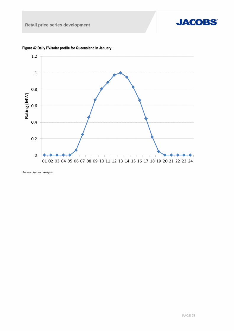
Retail price series development
PAGE 75
Figure 42 Daily PV/solar profile for Queensland in January
Source: Jacobs’ analysis
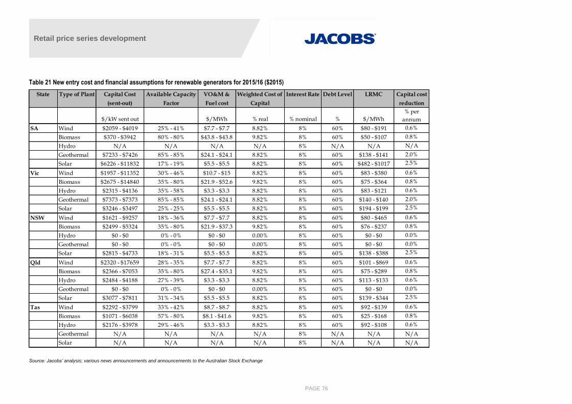
Retail price series development
PAGE 76
Table 21 New entry cost and financial assumptions for renewable generators for 2015/16 ($2015)
Source: Jacobs’ analysis; various news announcements and announcements to the Australian Stock Exchange
State Type of Plant Capital Cost
(sent-out)
Available Capacity
Factor
VO&M &
Fuel cost
Weighted Cost of
Capital
Interest Rate Debt Level LRMC Capital cost
reduction
$/kW sent out $/MWh % real % nominal % $/MWh
% per
annum
SA Wind $2059 - $4019 25% - 41% $7.7 - $7.7 8.82% 8% 60% $80 - $191 0.6%
Biomass $370 - $3942 80% - 80% $43.8 - $43.8 9.82% 8% 60% $50 - $107 0.8%
Hydro N/A N/A N/A N/A 8% N/A N/A N/A
Geothermal $7233 - $7426 85% - 85% $24.1 - $24.1 8.82% 8% 60% $138 - $141 2.0%
Solar $6226 - $11832 17% - 19% $5.5 - $5.5 8.82% 8% 60% $482 - $1017 2.5%
Vic Wind $1957 - $11352 30% - 46% $10.7 - $15 8.82% 8% 60% $83 - $380 0.6%
Biomass $2675 - $14840 35% - 80% $21.9 - $52.6 9.82% 8% 60% $75 - $364 0.8%
Hydro $2315 - $4136 35% - 58% $3.3 - $3.3 8.82% 8% 60% $83 - $121 0.6%
Geothermal $7373 - $7373 85% - 85% $24.1 - $24.1 8.82% 8% 60% $140 - $140 2.0%
Solar $3246 - $3497 25% - 25% $5.5 - $5.5 8.82% 8% 60% $194 - $199 2.5%
NSW Wind $1621 - $9257 18% - 36% $7.7 - $7.7 8.82% 8% 60% $80 - $465 0.6%
Biomass $2499 - $5324 35% - 80% $21.9 - $37.3 9.82% 8% 60% $76 - $237 0.8%
Hydro $0 - $0 0% - 0% $0 - $0 0.00% 8% 60% $0 - $0 0.0%
Geothermal $0 - $0 0% - 0% $0 - $0 0.00% 8% 60% $0 - $0 0.0%
Solar $2815 - $4733 18% - 31% $5.5 - $5.5 8.82% 8% 60% $138 - $388 2.5%
Qld Wind $2320 - $17659 28% - 35% $7.7 - $7.7 8.82% 8% 60% $101 - $869 0.6%
Biomass $2366 - $7053 35% - 80% $27.4 - $35.1 9.82% 8% 60% $75 - $289 0.8%
Hydro $2484 - $4188 27% - 39% $3.3 - $3.3 8.82% 8% 60% $113 - $133 0.6%
Geothermal $0 - $0 0% - 0% $0 - $0 0.00% 8% 60% $0 - $0 0.0%
Solar $3077 - $7811 31% - 34% $5.5 - $5.5 8.82% 8% 60% $139 - $344 2.5%
Tas Wind $2292 - $3799 33% - 42% $8.7 - $8.7 8.82% 8% 60% $92 - $139 0.6%
Biomass $1071 - $6038 57% - 80% $8.1 - $41.6 9.82% 8% 60% $25 - $168 0.8%
Hydro $2176 - $3978 29% - 46% $3.3 - $3.3 8.82% 8% 60% $92 - $108 0.6%
Geothermal N/A N/A N/A N/A 8% N/A N/A N/A
Solar N/A N/A N/A N/A 8% N/A N/A N/A
Retail price series development
A.7 Constraints
PLEXOS provides modelling flexibility through user-defined constraints. Constraints take the form of equations,
consisting of a constant on the right hand side of the equation, variables and coefficients on the left hand side
and an operator such as less than or greater than sign.
The Jacobs database contains the major constraints reflected in the physical NEM, although FCAS related
constraints are not currently represented.
The majority of constraints in the database reflect network limits that AEMO enforces to manage the security of
the power system. These constraints are categorised by their respective zone. They are sourced from AEMO’s
annual NTNDP publication, where they are provided separately.
A.7.1 Conditions
Conditions are specified in the database to define certain events which are used in activating/deactivating
market elements in the simulation. All of the conditions in Jacobs’ NEM database are used to activate
constraints, or properties within constraints. For example, the limits on some of the NTNDP transmission
constraints are conditional on the number of units generating at certain power stations, and the conditions are
used to determine the appropriate limit to be applied in any particular trading period.
A.7.2 User Defined Constraints and Adjustments
Constraints are also used to model certain aspects of the market which would otherwise not be reflected from
pure economic dispatch. FCAS requirements, commercial or strategic objectives and/or industrial load
obligations may also influence dispatch but are not explicitly modelled in the Jacobs database. To approximate
these market influences, Jacobs has specified its own NEM-specific constraints and adjustments which are
summarised below.
Torrens B: PLEXOS dispatch of the Torrens Island B does not produce outcomes observed in the NEM due
to frequency control considerations that effectively keep at least two units generating in the weekend and
three units generating during the weekday. This is evident in Figure 43, which shows a typical monthly
profile of Torrens Island B’s historical dispatch. We model this through a constraint that forces generation
from the Torrens Island B to be at least 80MW during weekends and 120MW during weekdays on a trading
period basis.
Macquarie mothballing: Macquarie Generation has in the past operated only seven of its eight base load
units (Bayswater and Liddell) at any one time. Macquarie therefore typically holds back one Liddell unit,
which only operate at high prices or during outages of other Macquarie units. This behaviour is modelled by
a constraint with an appropriate penalty price.
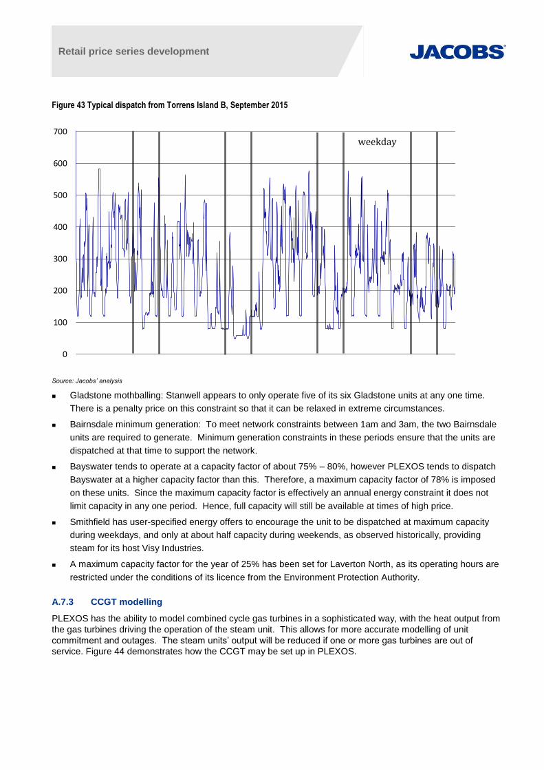
Retail price series development
Figure 43 Typical dispatch from Torrens Island B, September 2015
Source: Jacobs’ analysis
Gladstone mothballing: Stanwell appears to only operate five of its six Gladstone units at any one time.
There is a penalty price on this constraint so that it can be relaxed in extreme circumstances.
Bairnsdale minimum generation: To meet network constraints between 1am and 3am, the two Bairnsdale
units are required to generate. Minimum generation constraints in these periods ensure that the units are
dispatched at that time to support the network.
Bayswater tends to operate at a capacity factor of about 75% – 80%, however PLEXOS tends to dispatch
Bayswater at a higher capacity factor than this. Therefore, a maximum capacity factor of 78% is imposed
on these units. Since the maximum capacity factor is effectively an annual energy constraint it does not
limit capacity in any one period. Hence, full capacity will still be available at times of high price.
Smithfield has user-specified energy offers to encourage the unit to be dispatched at maximum capacity
during weekdays, and only at about half capacity during weekends, as observed historically, providing
steam for its host Visy Industries.
A maximum capacity factor for the year of 25% has been set for Laverton North, as its operating hours are
restricted under the conditions of its licence from the Environment Protection Authority.
A.7.3 CCGT modelling
PLEXOS has the ability to model combined cycle gas turbines in a sophisticated way, with the heat output from
the gas turbines driving the operation of the steam unit. This allows for more accurate modelling of unit
commitment and outages. The steam units’ output will be reduced if one or more gas turbines are out of
service. Figure 44 demonstrates how the CCGT may be set up in PLEXOS.
0
100
200
300
400
500
600
700weekday

Retail price series development
Figure 44 Example of explicit CCGT representation
Source: Energy Exemplar, PLEXOS wiki
We have modelled existing and committed CCGTs with known gas turbine/steam configurations utilising this
PLEXOS functionality (i.e. Pelican Point, Condamine, Darling Downs and Yabulu). Typically, a boiler efficiency
of between 80% and 90% is assumed.
A.8 Participant behaviour
A.8.1 Market structure
We assume the current market structure continues under the following arrangements:
Victorian and NSW generators are not further aggregated
The generators’ ownership structure in Queensland remains as public ownership
The SA assets continue under the current portfolio groupings
The mothballing of Swanbank E power station in 2015, the mothballing of both Wallerawang units in 2014, and
the shutdown of Torrens Island A units in 2017 have also been included in the modelling. Northern Power
Station in South Australia is modelled as operating only from October to March over the spring and summer
period34, and closed permanently from 2016 onward35.
AGL’s announced retirement of its NSW Liddell power station in 2022 has also been assumed to proceed as
scheduled.
A.8.2 Contract position and bidding
Bidding of capacity depends on the contracting position of the generator. Capacity under two-way contracts will
either be self-committed36
for operational reasons or bid at its marginal cost to ensure that the plant is earning
pool revenue whenever the pool price exceeds the marginal cost. Capacity which backs one-way hedges will be
bid at the higher of marginal cost and the contract strike price, again to ensure that pool revenue is available to
cover the contract pay out. This strategy maximises profit in the short-term, excluding any long-term flow on
effects into the contract market.
34 http://www.adelaidenow.com.au/news/south-australia/power-plant-shut-down-for-winter/story-e6frea83-1226432212608 provides announcement in
the Adelaide Advertiser 22 July 2012. 35 https://alintaenergy.com.au/about-us/news/flinders-operations-announcement: announcement of Northern closure; last accessed 2/7/2015 36 “Self-committed” means that the generator specifies the timing and level of dispatch with a zero bid price. If generators wish to limit off-loading
below the self-commitment level, a negative bid price down to -$1,000/MWh may be offered. This may result in a negative pool price for generators and customers.
GT1
GT2
GTn
Boiler ST:
:
:
Fuel
Retail price series development
A.9 Optimal new entry – LT Plan
The long-term capacity expansion model in PLEXOS is called "LT Plan". The purpose of the LT Plan model is
to find the optimal combination of generation new builds and retirements and transmission upgrades that
minimises the net present value of the total costs of the system over a long-term planning horizon. That is, to
simultaneously solve a generation and transmission capacity expansion problem and a dispatch problem from a
central planning, long-term perspective. Planning horizons for the LT Plan model are user-defined and are
typically expected to be in the range of 20 to 30 years.
LT Plan can be run either separately or integrated with PASA/MT Schedule/ST Schedule in a single simulation.
In the latter role, the long-term build/retirement decisions made by LT Plan will be automatically passed to the
more detailed simulation phases, providing a seamless solution.
For this study, the LT Plan will be used to develop a NEM capacity expansion plan, accounting for expected
carbon prices by scenario and the expanded RET. This section summarises the key assumptions.
A.9.1 New generation technologies
Only generic new entrant technologies are included as possible new entrants in the LT Plan in order to limit the
size of the computational problem to make it manageable. These technologies include:
Combined cycle gas turbines (CCGT) with and without carbon capture and storage (CCS)
Generic open cycle gas turbines (OCGT)
Integrated gasification combined cycle generators (IGCC), with and without CCS.
Supercritical and ultra-supercritical coal units are considered highly unlikely in the current market and policy
environment, especially in the wake of Australia’s stated emission abatement commitments. These options will
therefore not be considered as expansion options on the basis that their introduction to the market runs contrary
to Australia’s emission abatement goals.
The key input parameters assumed for each of the thermal new entrants considered in the current LT Plan are
summarised in Table 22. The capital costs have been annualised assuming an economic life of 30 years. The
pre-tax real equity return was 13% and the CPI applied to the nominal interest rate was 2.5%.
A.9.2 Existing and new renewable generation
Jacobs has developed an extensive renewable energy database that contains key costs and operating
characteristics for existing, committed, and proposed renewable energy projects in Australia. Jacobs’
renewable energy model (REMMA) uses this database to determine the least cost combination of renewable
energy projects to meet the expanded RET in each year. Renewable generators across all states in Australia
are eligible to contribute towards the expanded RET scheme.
In the LT Plan it is not plausible to include every potential renewable energy project identified in our database.
However, it is important to co-optimise renewable and thermal generation within the expansion plan to ensure
that the impact of expanded RET is being adequately represented. We have therefore used the information in
our renewable energy database to develop time-dependent supply cost curves by state for four key renewable
sources: wind, geothermal, hydro, and biomass.
By fitting a step-function to these cost-curves, up to five generic renewable projects where identified for each
technology by state, with various cost structures. These projects were included as options within the LT Plan
and were co-optimised with thermal generation taking account of the:
assumed firm contribution to peak load,
renewable generation volumes required to meet the expanded RET (ignoring banking)
impact of large volumes of renewable generation on the operating regime of thermal generators.

Retail price series development
Table 22 Cost parameter for thermal new entrant generators
Source: Jacobs’ analysis
Max
capacity
(MW)
Capital cost
($/kW) IDC factor
CPI factor,
Medium
term
CPI factor,
Long term
Auxiliary
load (%)
Max units
built
First year
available
VO&M
($/MWh) MLF
Fixed
O&M
($/kW/yr)
Heat rate at
max
(GJ/MWh)
Emissions
intensity
Victorian new entry options
Generic-VIC-GT 284 855 1.04 0.0% 0.0% 1% 20 2018 7.1 1.014 12 10.3 0.635
Generic-VIC-CCGT 588 1,237 1.05 0.0% 0.0% 2% 10 2019 3.4 0.971 33 6.8 0.417
Generic-VIC-CCGT-CS 549 2,584 1.05 -3.0% -1.0% 8% 10 2030 4.0 0.971 54 7.2 0.067
Generic-VIC-IGCC-drying 500 6,621 1.08 -3.0% -1.0% 9% 10 2021 3.8 0.971 150 8.7 0.539
Generic-VIC-IDGCC-CS 470 7,842 1.08 -3.0% -1.0% 19% 10 2030 3.8 0.963 174 10.1 0.094
New South Wales new entry options
Generic-NSW-GT 284 855 1.04 0.0% 0.0% 1% 20 2018 7.0 0.992 12 10.3 0.635
Generic-NSW-CCGT 588 1,237 1.05 0.0% 0.0% 2% 10 2019 3.4 0.986 33 6.8 0.417
Generic-NSW-CCGT-CS 549 2,584 1.05 -3.0% -1.0% 8% 10 2030 4.0 0.963 54 7.2 0.067
Generic-NSW-IGCC 510 4,867 1.07 -3.0% -1.0% 10% 10 2021 3.8 0.963 116 7.8 0.481
Generic-NSW-IGCC-CS 480 5,264 1.08 -3.0% -1.0% 18% 10 2030 3.8 0.986 125 8.8 0.081
South Australian new entry options
Generic-SA-GT 167 1,059 1.04 0.0% 0.0% 1% 20 2018 7.1 0.999 17 11.3 0.698
Generic-SA-CCGT 245 1,315 1.05 0.0% 0.0% 2% 10 2019 3.5 0.999 34 7.4 0.458
Generic-SA-CCGT-CS 549 2,584 1.05 -3.0% -1.0% 8% 10 2030 4.1 0.999 54 7.2 0.067
Queensland new entry options
Generic-QLDSth-GT 167 1,052 1.04 0.0% 0.0% 1% 10 2018 7.0 0.996 17 11.2 0.694
Generic-QLDSth-CCGT 588 1,237 1.05 0.0% 0.0% 2% 5 2019 3.5 0.996 33 6.8 0.417
Braemar exp 284 855 1.04 0.0% 0.0% 1% 20 2018 6.8 0.983 12 10.3 0.635
Generic-QLDTar-CCGT 588 1,237 1.05 0.0% 0.0% 2% 10 2019 3.4 0.983 33 6.8 0.417
Generic-QLDTar-CCGT-CS 549 2,584 1.05 -3.0% -1.0% 8% 10 2030 4.0 0.983 54 7.2 0.067
Generic-QLDTar-IGCC 510 4,867 1.07 -3.0% -1.0% 10% 10 2021 3.9 1.000 116 7.8 0.481
Generic-QLDTar-IGCC-CS 480 5,264 1.07 -3.0% -1.0% 18% 10 2030 3.8 0.983 125 8.8 0.081
Generic-QLDCen-CCGT 588 1,237 1.05 0.0% 0.0% 2% 10 2019 3.3 0.952 33 6.8 0.417
Generic-QLDCen-IGCC 510 4,867 1.08 -3.0% -1.0% 10% 10 2021 3.9 0.997 116 7.8 0.481
Generic-QLDCen-IGCC-CS 480 5,264 1.08 -3.0% -1.0% 18% 10 2030 3.9 0.997 125 8.8 0.081
Generic-QLDNth-GT 167 1,052 1.04 0.0% 0.0% 1% 20 2018 7.0 1.000 17 11.2 0.694
Generic-QLDNth-CCGT 245 1,315 1.05 0.0% 0.0% 2% 10 2019 3.5 1.000 34 7.4 0.458
Generic-QLDNth-CCGT-CS 549 2,584 1.05 -3.0% -1.0% 8% 10 2030 4.1 1.000 54 7.2 0.067
Tasmanian new entry options
Generic-Tas-GT 167 1,052 1.04 0.0% 0.0% 1% 20 2018 7.1 1.014 17 11.2 0.694
Generic-Tas-CCGT 200 1,315 1.05 0.0% 0.0% 2% 10 2019 3.5 0.999 33 7.1 0.438
Generic-Tas-CCGT-CS 549 2,584 1.05 -3.0% -1.0% 8% 10 2030 4.1 0.999 54 7.2 0.067
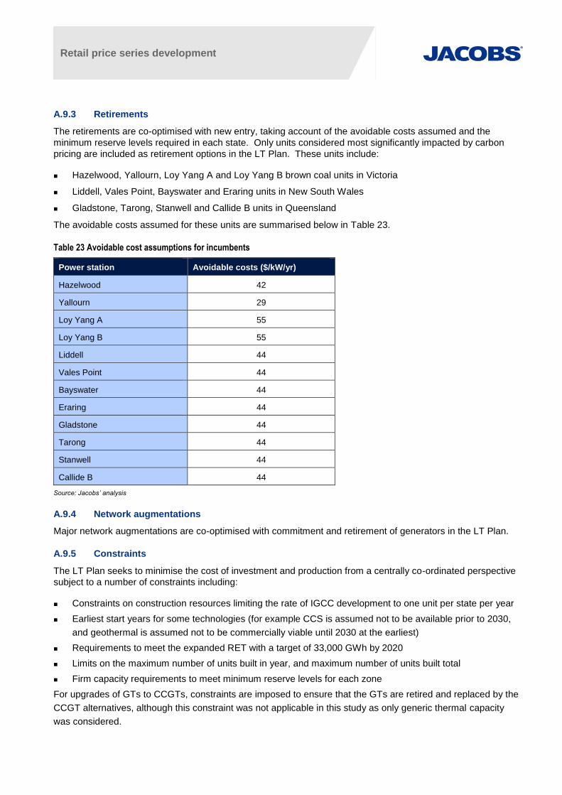
Retail price series development
A.9.3 Retirements
The retirements are co-optimised with new entry, taking account of the avoidable costs assumed and the
minimum reserve levels required in each state. Only units considered most significantly impacted by carbon
pricing are included as retirement options in the LT Plan. These units include:
Hazelwood, Yallourn, Loy Yang A and Loy Yang B brown coal units in Victoria
Liddell, Vales Point, Bayswater and Eraring units in New South Wales
Gladstone, Tarong, Stanwell and Callide B units in Queensland
The avoidable costs assumed for these units are summarised below in Table 23.
Table 23 Avoidable cost assumptions for incumbents
Power station Avoidable costs ($/kW/yr)
Hazelwood 42
Yallourn 29
Loy Yang A 55
Loy Yang B 55
Liddell 44
Vales Point 44
Bayswater 44
Eraring 44
Gladstone 44
Tarong 44
Stanwell 44
Callide B 44
Source: Jacobs’ analysis
A.9.4 Network augmentations
Major network augmentations are co-optimised with commitment and retirement of generators in the LT Plan.
A.9.5 Constraints
The LT Plan seeks to minimise the cost of investment and production from a centrally co-ordinated perspective
subject to a number of constraints including:
Constraints on construction resources limiting the rate of IGCC development to one unit per state per year
Earliest start years for some technologies (for example CCS is assumed not to be available prior to 2030,
and geothermal is assumed not to be commercially viable until 2030 at the earliest)
Requirements to meet the expanded RET with a target of 33,000 GWh by 2020
Limits on the maximum number of units built in year, and maximum number of units built total
Firm capacity requirements to meet minimum reserve levels for each zone
For upgrades of GTs to CCGTs, constraints are imposed to ensure that the GTs are retired and replaced by the
CCGT alternatives, although this constraint was not applicable in this study as only generic thermal capacity
was considered.
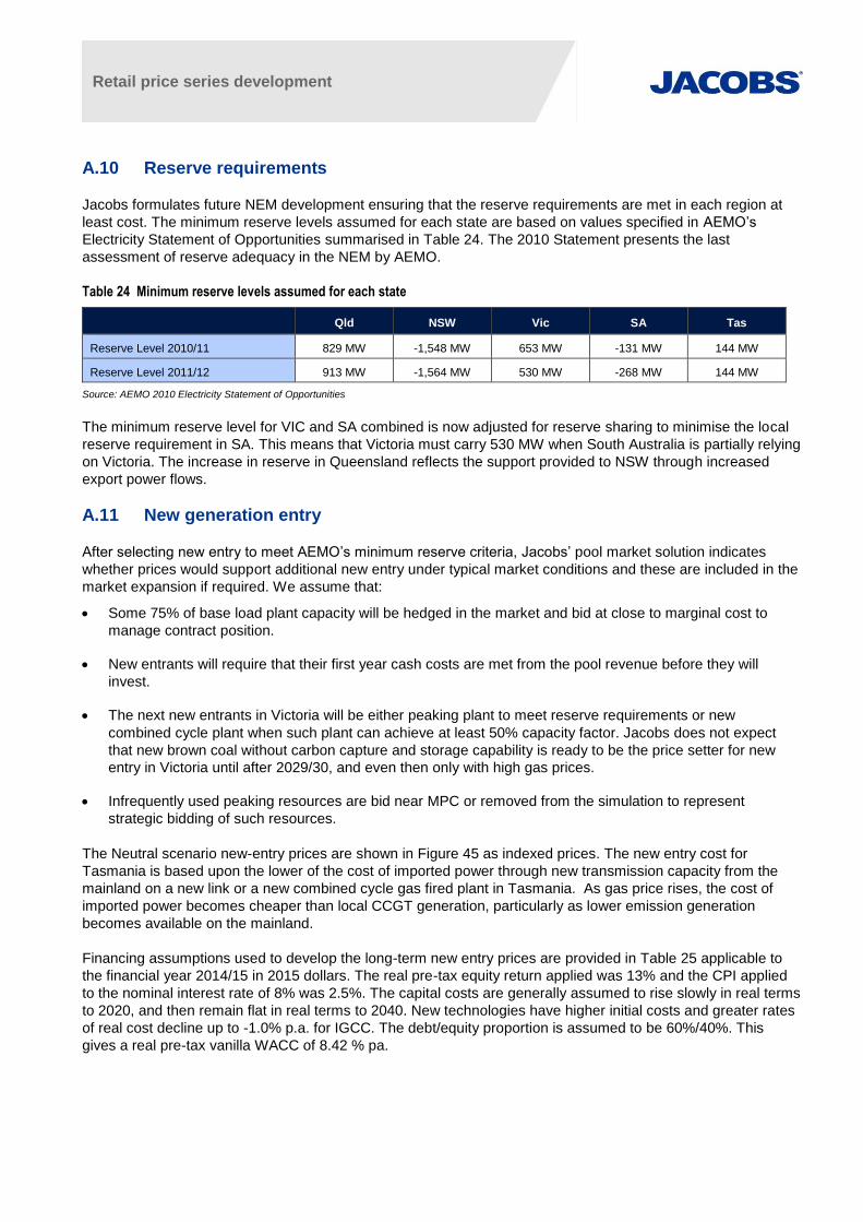
Retail price series development
A.10 Reserve requirements
Jacobs formulates future NEM development ensuring that the reserve requirements are met in each region at
least cost. The minimum reserve levels assumed for each state are based on values specified in AEMO’s
Electricity Statement of Opportunities summarised in Table 24. The 2010 Statement presents the last
assessment of reserve adequacy in the NEM by AEMO.
Table 24 Minimum reserve levels assumed for each state
Qld NSW Vic SA Tas
Reserve Level 2010/11 829 MW -1,548 MW 653 MW -131 MW 144 MW
Reserve Level 2011/12 913 MW -1,564 MW 530 MW -268 MW 144 MW
Source: AEMO 2010 Electricity Statement of Opportunities
The minimum reserve level for VIC and SA combined is now adjusted for reserve sharing to minimise the local
reserve requirement in SA. This means that Victoria must carry 530 MW when South Australia is partially relying
on Victoria. The increase in reserve in Queensland reflects the support provided to NSW through increased
export power flows.
A.11 New generation entry
After selecting new entry to meet AEMO’s minimum reserve criteria, Jacobs’ pool market solution indicates
whether prices would support additional new entry under typical market conditions and these are included in the
market expansion if required. We assume that:
Some 75% of base load plant capacity will be hedged in the market and bid at close to marginal cost to
manage contract position.
New entrants will require that their first year cash costs are met from the pool revenue before they will
invest.
The next new entrants in Victoria will be either peaking plant to meet reserve requirements or new
combined cycle plant when such plant can achieve at least 50% capacity factor. Jacobs does not expect
that new brown coal without carbon capture and storage capability is ready to be the price setter for new
entry in Victoria until after 2029/30, and even then only with high gas prices.
Infrequently used peaking resources are bid near MPC or removed from the simulation to represent
strategic bidding of such resources.
The Neutral scenario new-entry prices are shown in Figure 45 as indexed prices. The new entry cost for
Tasmania is based upon the lower of the cost of imported power through new transmission capacity from the
mainland on a new link or a new combined cycle gas fired plant in Tasmania. As gas price rises, the cost of
imported power becomes cheaper than local CCGT generation, particularly as lower emission generation
becomes available on the mainland.
Financing assumptions used to develop the long-term new entry prices are provided in Table 25 applicable to
the financial year 2014/15 in 2015 dollars. The real pre-tax equity return applied was 13% and the CPI applied
to the nominal interest rate of 8% was 2.5%. The capital costs are generally assumed to rise slowly in real terms
to 2020, and then remain flat in real terms to 2040. New technologies have higher initial costs and greater rates
of real cost decline up to -1.0% p.a. for IGCC. The debt/equity proportion is assumed to be 60%/40%. This
gives a real pre-tax vanilla WACC of 8.42 % pa.
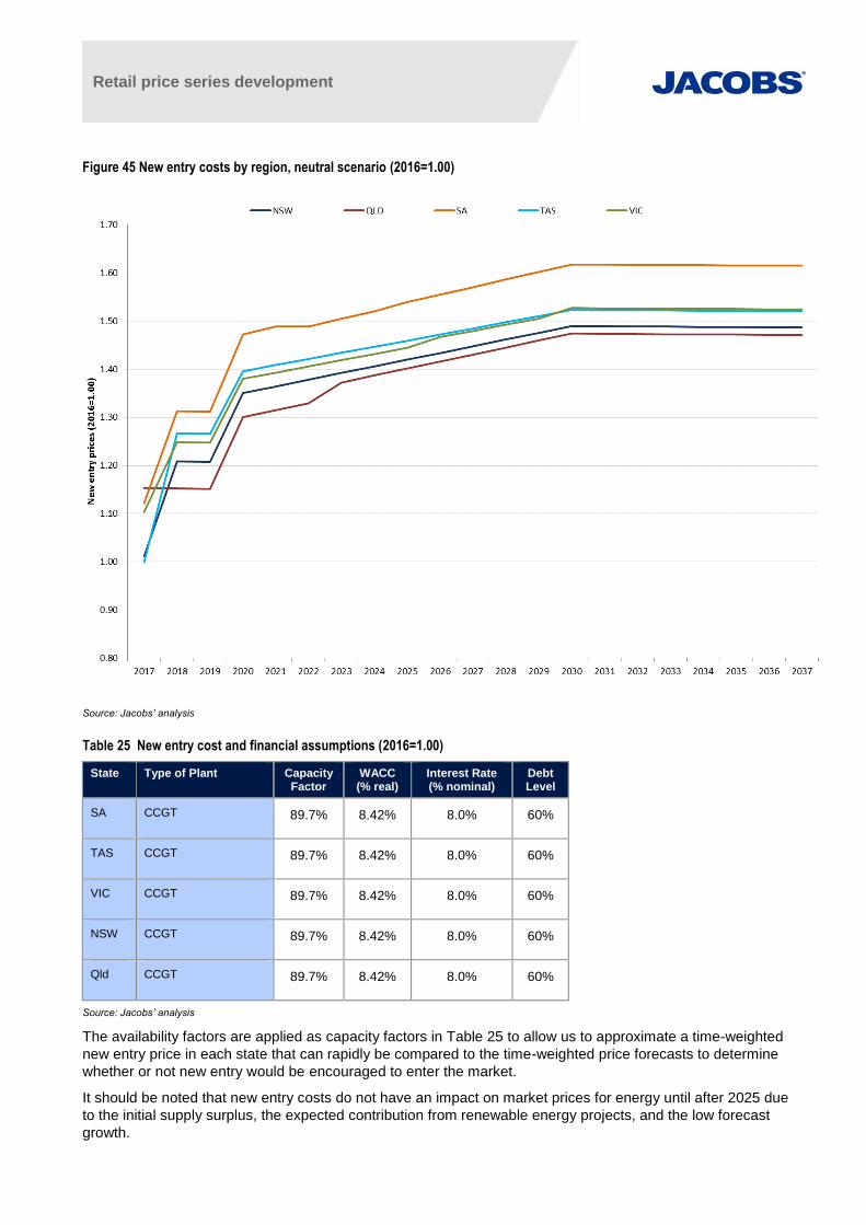
Retail price series development
Figure 45 New entry costs by region, neutral scenario (2016=1.00)
Source: Jacobs’ analysis
Table 25 New entry cost and financial assumptions (2016=1.00)
State Type of Plant Capacity Factor
WACC (% real)
Interest Rate (% nominal)
Debt Level
SA CCGT 89.7% 8.42% 8.0% 60%
TAS CCGT 89.7% 8.42% 8.0% 60%
VIC CCGT 89.7% 8.42% 8.0% 60%
NSW CCGT 89.7% 8.42% 8.0% 60%
Qld CCGT 89.7% 8.42% 8.0% 60%
Source: Jacobs’ analysis
The availability factors are applied as capacity factors in Table 25 to allow us to approximate a time-weighted
new entry price in each state that can rapidly be compared to the time-weighted price forecasts to determine
whether or not new entry would be encouraged to enter the market.
It should be noted that new entry costs do not have an impact on market prices for energy until after 2025 due
to the initial supply surplus, the expected contribution from renewable energy projects, and the low forecast
growth.
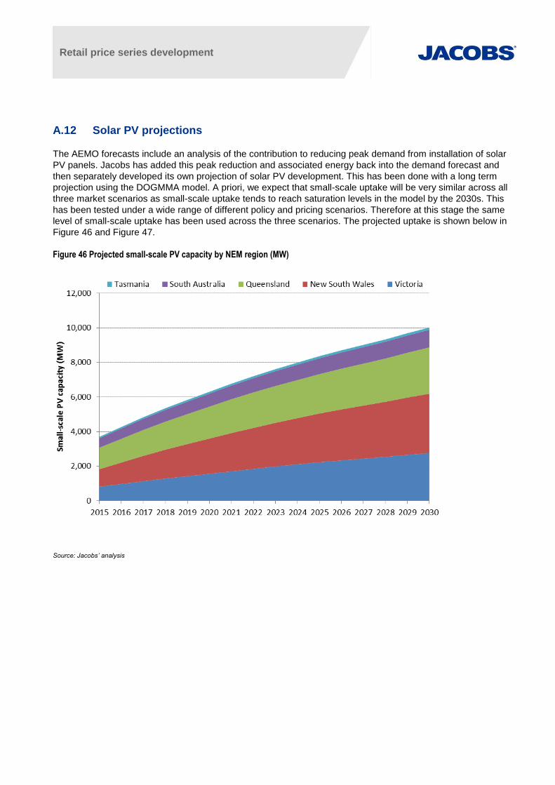
Retail price series development
A.12 Solar PV projections
The AEMO forecasts include an analysis of the contribution to reducing peak demand from installation of solar
PV panels. Jacobs has added this peak reduction and associated energy back into the demand forecast and
then separately developed its own projection of solar PV development. This has been done with a long term
projection using the DOGMMA model. A priori, we expect that small-scale uptake will be very similar across all
three market scenarios as small-scale uptake tends to reach saturation levels in the model by the 2030s. This
has been tested under a wide range of different policy and pricing scenarios. Therefore at this stage the same
level of small-scale uptake has been used across the three scenarios. The projected uptake is shown below in
Figure 46 and Figure 47.
Figure 46 Projected small-scale PV capacity by NEM region (MW)
Source: Jacobs’ analysis
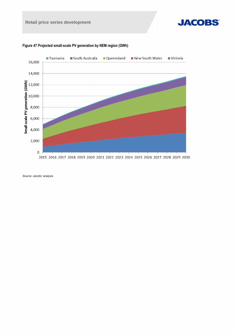
Retail price series development
Figure 47 Projected small-scale PV generation by NEM region (GWh)
Source: Jacobs’ analysis
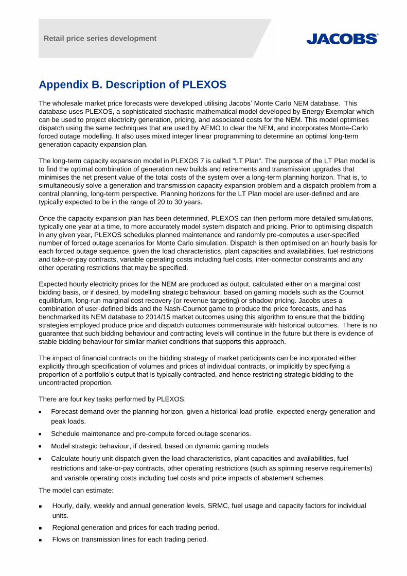
Retail price series development
Appendix B. Description of PLEXOS
The wholesale market price forecasts were developed utilising Jacobs’ Monte Carlo NEM database. This
database uses PLEXOS, a sophisticated stochastic mathematical model developed by Energy Exemplar which
can be used to project electricity generation, pricing, and associated costs for the NEM. This model optimises
dispatch using the same techniques that are used by AEMO to clear the NEM, and incorporates Monte-Carlo
forced outage modelling. It also uses mixed integer linear programming to determine an optimal long-term
generation capacity expansion plan.
The long-term capacity expansion model in PLEXOS 7 is called "LT Plan". The purpose of the LT Plan model is
to find the optimal combination of generation new builds and retirements and transmission upgrades that
minimises the net present value of the total costs of the system over a long-term planning horizon. That is, to
simultaneously solve a generation and transmission capacity expansion problem and a dispatch problem from a
central planning, long-term perspective. Planning horizons for the LT Plan model are user-defined and are
typically expected to be in the range of 20 to 30 years.
Once the capacity expansion plan has been determined, PLEXOS can then perform more detailed simulations,
typically one year at a time, to more accurately model system dispatch and pricing. Prior to optimising dispatch
in any given year, PLEXOS schedules planned maintenance and randomly pre-computes a user-specified
number of forced outage scenarios for Monte Carlo simulation. Dispatch is then optimised on an hourly basis for
each forced outage sequence, given the load characteristics, plant capacities and availabilities, fuel restrictions
and take-or-pay contracts, variable operating costs including fuel costs, inter-connector constraints and any
other operating restrictions that may be specified.
Expected hourly electricity prices for the NEM are produced as output, calculated either on a marginal cost
bidding basis, or if desired, by modelling strategic behaviour, based on gaming models such as the Cournot
equilibrium, long-run marginal cost recovery (or revenue targeting) or shadow pricing. Jacobs uses a
combination of user-defined bids and the Nash-Cournot game to produce the price forecasts, and has
benchmarked its NEM database to 2014/15 market outcomes using this algorithm to ensure that the bidding
strategies employed produce price and dispatch outcomes commensurate with historical outcomes. There is no
guarantee that such bidding behaviour and contracting levels will continue in the future but there is evidence of
stable bidding behaviour for similar market conditions that supports this approach.
The impact of financial contracts on the bidding strategy of market participants can be incorporated either
explicitly through specification of volumes and prices of individual contracts, or implicitly by specifying a
proportion of a portfolio’s output that is typically contracted, and hence restricting strategic bidding to the
uncontracted proportion.
There are four key tasks performed by PLEXOS:
Forecast demand over the planning horizon, given a historical load profile, expected energy generation and
peak loads.
Schedule maintenance and pre-compute forced outage scenarios.
Model strategic behaviour, if desired, based on dynamic gaming models
Calculate hourly unit dispatch given the load characteristics, plant capacities and availabilities, fuel
restrictions and take-or-pay contracts, other operating restrictions (such as spinning reserve requirements)
and variable operating costs including fuel costs and price impacts of abatement schemes.
The model can estimate:
Hourly, daily, weekly and annual generation levels, SRMC, fuel usage and capacity factors for individual
units.
Regional generation and prices for each trading period.
Flows on transmission lines for each trading period.

Retail price series development
Total costs of generation and supply in the NEM including capital costs of generation, fixed and variable
fuel costs, and fixed and variable non-fuel operating costs. This can be done for the system as a whole, for
generation companies operating in the system and for each generating plant.
Reliability, which can be measured in terms of expected energy not served and expected hours of load
shedding.
Company and generator costs and operating profits.
Emissions of greenhouse gases. Emissions for each fuel type are modelled to get total system emissions.
One of the key advantages of this model is the detail in which the transmission constraints of electricity grids
can be modelled. The PLEXOS model includes 5 regions: Tasmania, South Australia, Victoria, New South
Wales, and Queensland. Inter-regional transmission constraints and the dispatch impacts of intra-regional
transmission constraints are modelled using the constraint set provided by AEMO as used in the 2014
NTNDP37
. These constraints are dynamic with the limits typically being a function of regional demand, flows on
other lines, inertia, number of units generating, and generation levels of relevant units. AEMO currently provides
parameters for these constraints to 2050.
37 See http://www.aemo.com.au/Electricity/Planning/Archive-of-previous-Planning-reports/2014-Electricity-Statement-of-Opportunities

Retail price series development
Appendix C. Costs and performance of thermal plants
The following table shows the parameters for power plants used in the model. Costs are reported in 2015
dollars.
Plant Full Load Heat Rate SO
(GJ/MWh)
Total Sent Out Capacity
(MW)
Available Capacity factor (%)
Variable O&M
($/MWh)
Fixed O&M ($/MW/year)
AUX LOSSES
%
Tasmania
Bellbay Three 13.5 119.4 93.90% $4.41 $14,555 0.50%
Tamar Valley CCGT 7.8 201.8 93.00% $2.94 $14,555 3.00%
Tamar Valley GT 11.5 57.7 93.90% $4.41 $14,555 0.50%
Victoria
Somerton 13.5 161.7 83.90% $2.94 $14,555 0.50%
Bairnsdale 11.5 83.6 93.30% $4.41 $14,555 0.50%
Hazelwood 13.3 1472 84.00% $0.68 $156,415 8.00%
Jeeralang A 13.75 230.8 95.00% $8.83 $14,555 0.50%
Jeeralang B 12.85 253.7 95.00% $8.83 $14,555 0.50%
Laverton North 11.55 338.3 93.90% $4.41 $14,555 0.50%
Loy Yang A 11.58 2043 91.90% $1.18 $145,243 10.00%
Loy Yang B 11.7 966 92.30% $1.18 $114,800 8.00%
Valley Power 13.75 334.3 95.00% $8.83 $14,555 0.50%
Yallourn 12.91 1361.6 88.60% $3.52 $150,880 8.00%
Newport 10.33 484.5 93.00% $2.94 $44,690 5.00%
Mortlake 10.78 550.2 93.00% $3.74 $14,555 8.00%
Qenos Cogeneration 11 21 93.30% $2.12 $10,250 2.40%
South Australia
Angaston 9 49.8 99.40% $12.62 $14,555 0.50%
Dry Creek 17 147.3 86.10% $8.83 $14,555 0.50%
Hallett 15 220 88.30% $10.08 $14,555 0.50%
Ladbroke Grove 11.5 83.6 92.10% $7.35 $14,555 0.50%
Mintaro 16 89.6 88.10% $8.83 $14,555 0.50%
Northern 11.5 505.1 97.90% $2.86 $61,500 7.50%
Osborne 8.0 185.4 93.90% $2.86 $10,250 2.40%
Pelican Point 7.71 462.6 91.40% $2.94 $10,250 2.40%
Port Lincoln 11.67 72.6 91.40% $8.83 $14,555 0.50%
Quarantine 11.5 217.9 89.10% $9.38 $14,555 0.50%
Snuggery 15 65.7 88.10% $8.83 $14,555 0.50%
Torrens Island A 10.8 456 87.70% $8.83 $43,563 5.00%
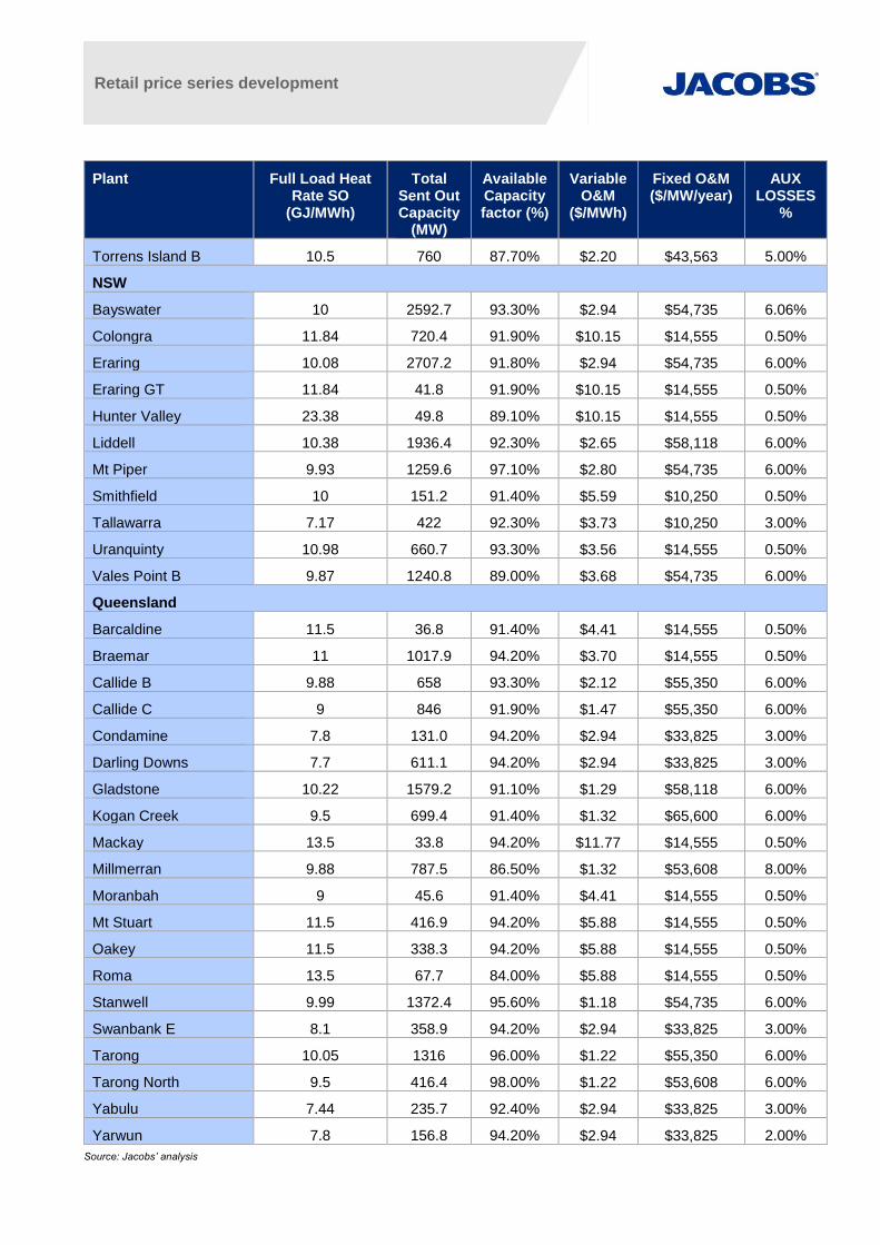
Retail price series development
Plant Full Load Heat Rate SO
(GJ/MWh)
Total Sent Out Capacity
(MW)
Available Capacity factor (%)
Variable O&M
($/MWh)
Fixed O&M ($/MW/year)
AUX LOSSES
%
Torrens Island B 10.5 760 87.70% $2.20 $43,563 5.00%
NSW
Bayswater 10 2592.7 93.30% $2.94 $54,735 6.06%
Colongra 11.84 720.4 91.90% $10.15 $14,555 0.50%
Eraring 10.08 2707.2 91.80% $2.94 $54,735 6.00%
Eraring GT 11.84 41.8 91.90% $10.15 $14,555 0.50%
Hunter Valley 23.38 49.8 89.10% $10.15 $14,555 0.50%
Liddell 10.38 1936.4 92.30% $2.65 $58,118 6.00%
Mt Piper 9.93 1259.6 97.10% $2.80 $54,735 6.00%
Smithfield 10 151.2 91.40% $5.59 $10,250 0.50%
Tallawarra 7.17 422 92.30% $3.73 $10,250 3.00%
Uranquinty 10.98 660.7 93.30% $3.56 $14,555 0.50%
Vales Point B 9.87 1240.8 89.00% $3.68 $54,735 6.00%
Queensland
Barcaldine 11.5 36.8 91.40% $4.41 $14,555 0.50%
Braemar 11 1017.9 94.20% $3.70 $14,555 0.50%
Callide B 9.88 658 93.30% $2.12 $55,350 6.00%
Callide C 9 846 91.90% $1.47 $55,350 6.00%
Condamine 7.8 131.0 94.20% $2.94 $33,825 3.00%
Darling Downs 7.7 611.1 94.20% $2.94 $33,825 3.00%
Gladstone 10.22 1579.2 91.10% $1.29 $58,118 6.00%
Kogan Creek 9.5 699.4 91.40% $1.32 $65,600 6.00%
Mackay 13.5 33.8 94.20% $11.77 $14,555 0.50%
Millmerran 9.88 787.5 86.50% $1.32 $53,608 8.00%
Moranbah 9 45.6 91.40% $4.41 $14,555 0.50%
Mt Stuart 11.5 416.9 94.20% $5.88 $14,555 0.50%
Oakey 11.5 338.3 94.20% $5.88 $14,555 0.50%
Roma 13.5 67.7 84.00% $5.88 $14,555 0.50%
Stanwell 9.99 1372.4 95.60% $1.18 $54,735 6.00%
Swanbank E 8.1 358.9 94.20% $2.94 $33,825 3.00%
Tarong 10.05 1316 96.00% $1.22 $55,350 6.00%
Tarong North 9.5 416.4 98.00% $1.22 $53,608 6.00%
Yabulu 7.44 235.7 92.40% $2.94 $33,825 3.00%
Yarwun 7.8 156.8 94.20% $2.94 $33,825 2.00%
Source: Jacobs’ analysis
Recommended