Embed Size (px)
Citation preview

Tufte’s Design Principles
CS 7450 - Information VisualizationSept. 5, 2000

Fall 2000 CS 7450 2
Graphical Displays Should
Show the data Induce the viewer to think about substance rather than about
methodology, graphic design the technology of graphic production, or something else
Avoid distorting what the data have to say Present many numbers in a small space Make large data sets coherent Encourage the eye to compare different pieces of data
Reveal the data at several levels of detail, from a broad overview to the fine structure
Serve a reasonably clear purpose: description, exploration, tabulation, or decoration
Be closely integrated with statistical and verbal descriptions of a data set

Fall 2000 CS 7450 3
Graphical Excellence
Principles Graphical excellence is the well-
designed presentation of interesting data---a matter of substance, of statistics, and of design.
Graphical excellence consists of complex ideas communicated with clarity, precision and efficiency.

Fall 2000 CS 7450 4
Graphical Excellence
Principles Graphical excellence is that which gives
to the viewer the greatest number of ideas in the shortest time with the least ink in the smallest space
Graphical excellence is nearly always multivariate.
And graphical excellence requires telling the truth about the data.
Fall 2000 CS 7450 5
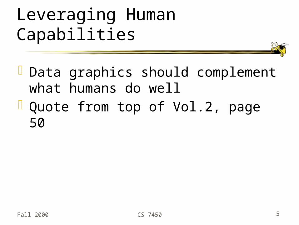
Leveraging Human Capabilities
Data graphics should complement what humans do well
Quote from top of Vol.2, page 50

Fall 2000 CS 7450 6
Design Principles
Maximize data-ink ratio
Data ink ratio =Data ink
Total ink used in graphic
Examples: Vol.1, page 94 (good and bad) Vol.1, page 30 (NYC weather, 2220 numbers)
= proportion of graphic’s ink devoted to the non-redundant display of data-information

Fall 2000 CS 7450 7
More...
Above all else, show the dataMaximize the data-ink ratioErase non-data-inkErase redundant data-inkRevise and edit

Fall 2000 CS 7450 8
More...
Maximize data density
data density of graphic =number of entries in data matrix
area of data graphic
Quote from bottom of Vol. 1, page 168

Fall 2000 CS 7450 9
Redesign charts
Bar chart, scatter plot, box plot(See drawings)

Fall 2000 CS 7450 10
Design Principles
Avoid chartjunk Extraneous visual elements that detract
from message Great narrative: Vol.2, bottom page 33-
34
Examples: Vol.1, page 108 (shimmering display) Vol.2, page 34 (diamonds are a girls…)

Fall 2000 CS 7450 11
Design Principles
Utilize multifunctioning graphical elements (macro/micro readings) Graphical elements that convey data
information and a design function
Examples: Vol. 1, page 140-1 (bar charts) Vol.2, pages 36-7 (city maps) Vol. 2, page 42-44 (Viet Nam Memorial)

Fall 2000 CS 7450 12
Design Principles
Use small multiples Repeat visually similar graphical
elements nearby rather than spreading far apart
Examples: Vol. 1, pages 170- 174 Consumer Reports Vol.2, pages 68-69 (trolley cars & calligraphy)

Fall 2000 CS 7450 13
Design Principles
Show mechanism, process, dynamics, and causality Cause and effect are key Make graphic exhibit causality
Examples: Vol.3, pages 38-53 (space shuttle) Vol.3, page 144 (fall in river)

Fall 2000 CS 7450 14
Design Principles
Escape flatland Data is multivariate Doesn’t necessarily mean 3D projection
Examples: Vol.2, page 12 (Japan guide) Vol.2, page 24 (Java railroad) Vol.3, pages 90-91 (history of music)

Fall 2000 CS 7450 15
Design Principles
Utilize layering and separation 1+1 = 3 or more Good or bad
Examples: Vol.2, page 54 (copier assembly) Vol.2, pages 61-2 (1+1 = 3)

Fall 2000 CS 7450 16
Design Principles
Utilize narratives of space and time Tell a story of position and chronology
through visual elements
Examples: Vol.1, page 43 & Vol.2, page 110 (life of beetle) Vol.2, pages 102-103 (air flight schedules)

Fall 2000 CS 7450 17
Design Principles
Content is king Quality, relevance and integrity of the
content is fundamental What’s the analysis task? Make the
visual design reflect that Integrate text, chart, graphic, map into
a coherent narrative

Fall 2000 CS 7450 18
Graph and Chart Tips
Avoid separate legends and keys -- Just have that information in the graphic
Make grids, labeling, etc., very faint so that they recede into background
Examples: Vol. 2, page 54, 63 Vol. 3, page 74

Fall 2000 CS 7450 19
Using Color Effectively
“The often scant benefits derived from coloring data indicate that even putting a good color in a good place is a complex matter. Indeed, so difficult and subtle that avoiding catastrophe becomes the first principle in bringing color to information: Above all, do no harm.”
Fall 2000 CS 7450 20
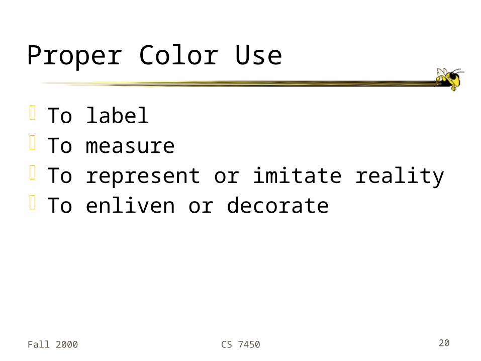
Proper Color Use
To labelTo measureTo represent or imitate realityTo enliven or decorate

Fall 2000 CS 7450 21
Color Examples
Good Vol.2, page 80
Swiss mtn map Vol.2, page 91 or
Vol.3, page 76Japan sea map(Bad on Vol.3, page 77)
Bad Vol.1, page 153
US rate mapGreat description
Vol.2, page 82US rate map
Vol.2, page 88Computer screensGreat quote

Fall 2000 CS 7450 22
Guides for Enhancing Visual Quality
Attractive displays of statistical info have a properly chosen format and design use words, numbers and drawing together reflect a balance, a proportion, a sense of
relevant scale display an accessible complexity of detail often have a narrative quality, a story to tell
about the data are drawn in a professional manner, with the
technical details of production done with care avoid content-free decoration, including
chartjunk

Fall 2000 CS 7450 23
Information Overload
Text from top of Vol.2, page 51Clutter and confusion are failures of
visual design, not attributes of information.
Fall 2000 CS 7450 24
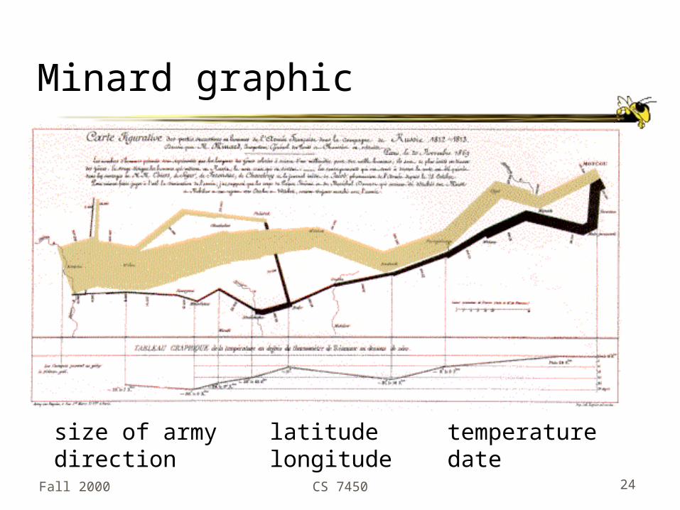
Minard graphic
size of armydirection
latitudelongitude
temperaturedate

Fall 2000 CS 7450 25
Sources Used
E. Tufte, The Visual Display of Quantitative InformationE. Tufte, Envisioning InformationE. Tufte, Visual Explanations

Fall 2000 CS 7450 26
Assignment 1
Commercial tool demos Spotfire Pro Eureka (Table Lens) from Inxight SeeIt from Visual Insights Advizor from Visual Insights