Embed Size (px)
Citation preview

The metaphysical quality that gives the BP Helios visual identity mark its sway
The metaphysical quality that gives the BP Helios visual identity mark its sway.
Jacqueline Hill
Masters of Design (Research)
2012
University ofTechnology,Sydney

The metaphysical quality that gives the BP Helios visual identity mark its sway
I certify that the work in this thesis has not previously been submitted for a degree nor has it been
submitted as part of requirements for a degree except as fully acknowledged within the text.
I also certify that the thesis has been written by me. Any help that I have received in my research
work and the preparation of the thesis itself has been acknowledged. In addition, I certify that all
information sources and literature used are indicated in the thesis.
Signature of Student

The metaphysical quality that gives the BP Helios visual identity mark its sway
I would like to thank the University of Technology Sydney and the faculty of DAB for extending me
this opportunity. I have learnt a great deal.
Associate Professor Louise McWhinnie for her support.
through his editing skills. And finally to Mike Staniford, Landor Associates for his ongoing support.
Thank you to all my supporters for all their encouraging words and actions, and their faith in me.
Acknowledgments

The metaphysical quality that gives the BP Helios visual identity mark its sway
List of Figures i
Abstract iii
Chapter One : Introduction 1
Chapter Two : BP Time Line 7
2.1 The Early 20th Century 7
2.2 The Mid 20th Century 9
2.3 The Late 20th Century 10
2.4 The end of the 20th Century 12
Chapter Three : The invention of the BP Helios 13
3.1 The Strategy and Equity of BP’s visual identity 13
3.2 The Brief 15
3.3 Building the Helios colours 16
3.3.I Yellow 17
3.3.II Green 17
3.4 Being ‘Green’ 18
3.5 The New BP VIM, the Helios 20
3.6 The Performance Formation 21
3.7 The Helios 22
3.8 Statistics of the Helios’s success 23
3.9 Conclusion 23
Chapter Four : The Archetypal Helios 25
4.1 The Emergence of Symbols 25
4.2 Numinosity 28
4.3 The Solar Cross 29
4.4 The Energy within the Solar Cross 31
4.5 The Helios Aspect 32
4.6 32
4.7 The Arrow/ Fulgur 33
4.8 Rites and Rituals 34
4.9 Conclusion 36
Chapter Five : Engaging the viewer / user 38
5.1 Group Identity - an explanation 39
5.2 Development of the BP brand promise and brand image 39
5.3 The Formula of the Helios Brand Identity Program
and “beyond petroleum” 41
5.4 The Communication Strategy of the Helios 44
5.5 The Viewer / User 46
5.6 Conclusion 49
Chapter Six : Conclusion 51
Appendix 1 : 54
Appendix 2: Image Sources 61
Bibilography 65
Contents

The metaphysical quality that gives the BP Helios visual identity mark its sway
Figure 1 BP Helios VIM 2000 1
Figure 2 The Solar Cross 1
Figure 3 The BP VIM 1920 8
Figure 4 The BP VIM of the 1920s in a Union Jack 8
Figure 5 The BP Shield VIM 1946 9
Figure 6 The BP Shield VIM 1952 9
Figure 7 9
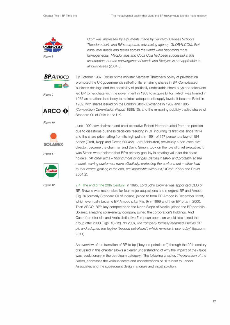
Figure 8 Amoco VIM 1998 12
Figure 9 BP/Amoco VIM 1999 12
Figure 10 Arco VIM 12
Figure 11 Solarex VIM 12
Figure 12 Castrol Oils VIM 12
Figure 13 BP/Amoco VIM 1999 13
Figure 14 Arco VIM 13
Figure 15 Solarex VIM 13
Figure 16 BP Shield VIM and BP Helios VIM 14
Figure 17 The evolution of Shell VIM 1900-1999 14
Figure 18 Mercedes Benz VIM 14
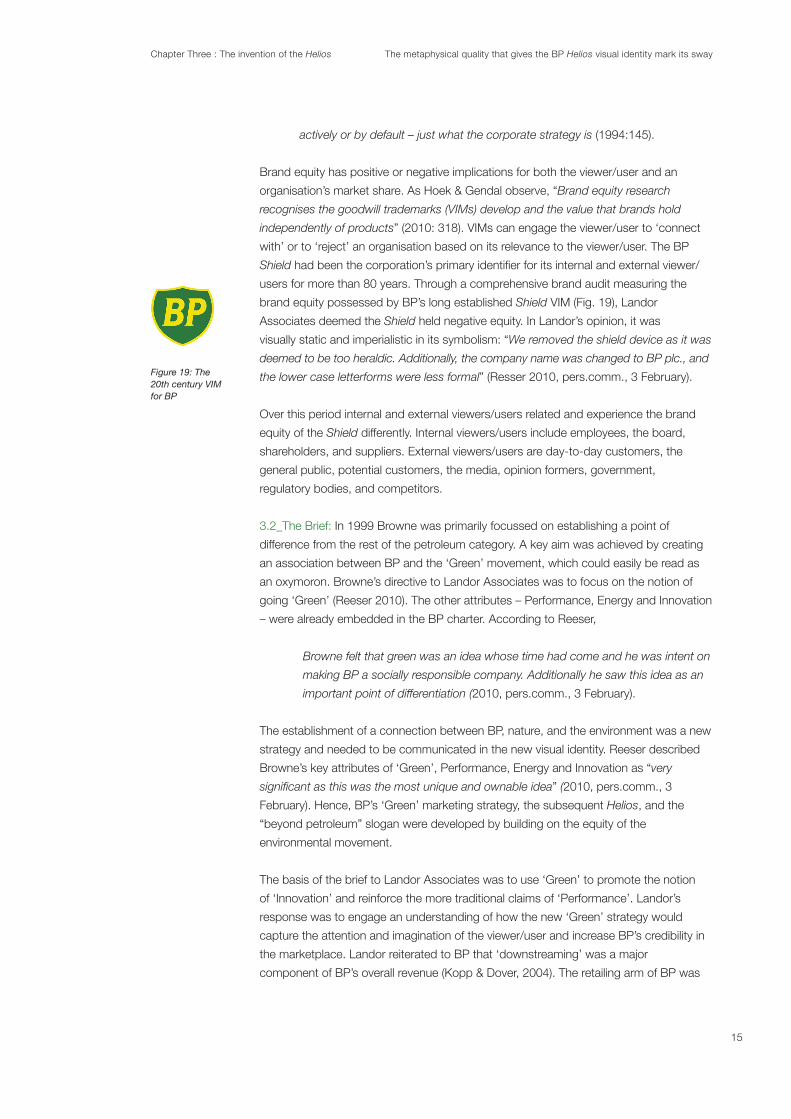
Figure 19 BP Shield VIM 15
Figure 20 The colour equity of the BP brand 16
Figure 21 Colour and Form by Karl Gerstner 16
Figure 22 18
Figure 23 Example of ‘Greenwashing’ advertising by Coca Cola 19
Figure 24 The Performance Formation VIM 20
Figure 25 The Helios VIM 20
Figure 26 Nike VIM 1985 21
Figure 27 McDonalds VIM 21
Figure 28 Apple Mac VIM 1999 21
Figure 29 The Performance Formation VIM 21
Figure 30 The Helios VIM 22
Figure 31 BP’s Brand Equity Results 23
Figure 32 The visual evolution of BP’s VIMs 24
Figure 33 The Solar Cross 25
Figure 34 The Performance Formation VIM 25
Figure 35 The Helios VIM 25
Figure 36 The visual link between the Solar Cross and the Helios VIM 28
Figure 37 The primordial dot in the Solar Cross 29
Figure 38 The Wheel of the Year (Solar Cross) 30
Figure 39 The Swastika (Solar Cross) 30
Figure 40 Bayer VIM 30
Figure 41 BMW VIM 30
Figure 42 The Wheel of the Year (Solar Cross) 30
Figure 43 Vitruvian Man by Leonardo de Vinci 30
Figure 44 Examples of Solar Cross variations 31
Figure 45 The San Francisco Opera VIM 2005 31
Figure 46 Chrysler Corporation VIM 1962 31
List of Figures
i

The metaphysical quality that gives the BP Helios visual identity mark its sway
Figure 47 Seed Media Group VIM 2005 31
Figure 48 The Labarum symbol (Chi Rho) 4th century CE 31
Figure 49 Coin from Constantine’s Rome with the Labarum 32
Figure 50 The Golden Ratio 33
Figure 51 The Performance Formation VIM 33
Figure 52 Daricus 1 coin (Archeameadian coin) 33
Figure 53 Citroen Cars VIM 1985 - 2009 34
Figure 54 FedEx VIM 1994 34
Figure 55 Dunlop Sport VIM 34
Figure 56 Archetypal symbols adorn initiates of a passage of rites. 34
Figure 57 Bronze Age Oil Burner with Solar Cross decoration 35
Figure 58 Solar Cross decoration of Bronze Age pottery bowl 35
Figure 59 Bronze Age Assyrian solar deity Ashur VIM 36
Figure 60 Aligning brand actions and expressions of BP 38
Figure 61 Contrast in visual encoding of BP’s Shield and Helios VIMs 40
Figure 62 Landor Brand Driver Platform for BP 42
Figure 63 Poster for USSR space race with the Hammer and Sickle VIM 43
Figure 64 Seed impregnated substrate used for BP printed collateral 45
Figure 65 Helios House (a concept petrol station) in LA, US 45
Figure 66 Environmental graphics for ‘Connect’ bp stations 46
Figure 67 BP tankers with the Helios applied 46
Figure 68 BP Helios uniform for customer service employees 46
Figure 69 BP brand matrixes ‘In employee measure’ 48
Figure 70 BP Brand Identity Program results 48
Figure 71 BP Market Share Price increases 49
Figure 72 BP Helios VIM 51
ii

The metaphysical quality that gives the BP Helios visual identity mark its sway
The Metaphysical quality that gives the BP Helios visual identity marks its sway.
This thesis analyses the reasons why BP’s visual identity mark (VIM), known as the
Helios, was immediately accepted into the global marketplace following its launch in
2000. At the end of the millennium the merger between BP (UK) and Amoco (US) gave
BP the opportunity to reposition itself in the petroleum category.
The work is constructed by explicating the objectives of BP’s rebranding, through
discussions with the Helios’s design team leader, Courtney Reeser (from brand
strategists, Landor Associates), addressing both client’s and designer’s criteria through
analysing the aesthetic and branding strategies aimed at the internal and external
audiences (viewers/users). BP undertook a new direction towards environmental
consciousness and the resulting Helios reinforced the new ‘Green’ ideology of BP with
an authentic declaration for change.
In parallel with the above, another aspect of this thesis examines the connections
between elemental nature-inspired archetypal symbols and contemporary VIMs, in
particular the BP Helios
upon the viewer/user and further advances the understanding for the BP Helios’s
success. Engaging areas of expertise not traditionally utilized within visual
communication, such as sociology, archaeology, theology, and folklore assist in building
an appreciation of the continuity and effectiveness of the use of elemental nature-
inspired archetypal symbols within a contemporary context is gained. The Helios
possesses similar visual qualities to the Solar Cross, an elemental nature-inspired
archetypal symbol. Within these archetypal symbols lies a metaphysical quality Jung
referred to as numinosity. This metaphysical quality within a symbol enables that symbol
act as a galvanizing and motivating force.
The BP Helios was rapidly and readily accepted into the global market indicating that
the relationship between an elemental nature-inspired archetypal symbol and the VIM
generated an immediate a sense of trust and reassurance within the viewer/user. This
no matter what level of sophistication their society has attained. It aims to offer visual
communicators and graphic designers in particular, a more complete understanding of
the BP Helios.
iii

Chapter One : Introduction The metaphysical quality that gives the BP Helios visual identity mark its sway
Chapter 1Introduction:
Figure 1
Figure 2
This thesis seeks to explore and explain the success of the BP (beyond petroleum)
Helios visual identity mark (VIM) (Fig. 1). The argument proposes that because the
Helios is based on the Solar Cross (Fig. 2), an elemental, nature-inspired archetypal
symbol, the BP Helios had immediate impact in the marketplace upon its launch in
2000. Furthermore the BP rebranding is built on communicating a connection with
nature and the environment. The use of the Solar Cross as the basis for the Helios
demonstrates the equity possessed by elemental nature-inspired archetypal symbols
and the subsequent effect the use of these symbols has on the viewer/user.
Helios – the Greek word for the sun – was the name given to BP’s new VIM. The new
visual and corporate identity of BP encompassed four key attributes: ‘Green’,
Browne, in 1999. The Helios
energy corporation using a ‘Green’ approach, reconnecting the consumer to nature.
‘Green’, Performance, Energy and Innovation were the main drivers for the design brief
(Reeser 2010, pers. comm., 3 February). BP briefed leading international brand
aligning BP with nature and the environment.
The elemental nature-inspired archetypal symbol, the Solar Cross, represented the sun
and was the vehicle by which early societal groups made a connection with the forces
of nature. The Solar Cross has a numinous quality due to its ongoing use as a sacred
symbol employed to communicate with nature deities. Numinosity gives an object or
a mark a spiritual or emotional force that can be perceived by an individual or a group
because it creates a sense of trust, reassurance and continuity. Consequently I will thus
propose that the appropriation of the Solar Cross as the design base for the Helios
gave the VIM its sway. The argument that the Helios possesses a numinous quality is
Solar Cross.
process of the Helios’ design and its subsequent application is analysed. Both theorists
have well-established views on archetypal symbolism, numinosity and group identity,
without numinosity the observer experiences no emotional connection to the observed.
For him, numinosity (as exhibited in the Solar Cross) was an alteration of
The Elementary Forms of the Religious Life (1964), he
economic activity as ‘social fact’ which includes the values, cultural norms, and social
structures that are external to the individual: “Sacred realities thus represent real
1

Chapter One : Introduction The metaphysical quality that gives the BP Helios visual identity mark its sway
existence while profane or mundane realities are in some ultimate non-existence”
(1964).
The implementation of VIMs in societal contexts has occurred since ancient times.
emergence of VIMs in the guise of elemental nature-inspired archetypal symbols. This
thesis contends that there has been a continuity in the application of VIMs based on
the elemental nature-inspired archetypal symbol, the Solar Cross in visual
communication.
The communicative effectiveness of the Helios simultaneously draws upon the
historical symbolic equity of the Solar Cross as well as the immediate contemporary
relevance to the environmental ‘Green’ movement. Both factors connect the viewer/
user to nature. The argument, that the effectiveness of the BP Helios translated to
commercial success, will be supported by an exploration of how VIMs have been
Gaur wrote:
The present connects the past with the future – knowing about the past
provides a basis from which we can plan. Signs, symbols and icons have been
part of the collective subconscious of the human race since earliest times
This research is not a semiotic discussion of symbols as proposed by de Saussure and
their sway.
The term ‘visual identity mark’ (VIM) is used in this research in place of the range of
contemporary descriptors for brand identity symbols – logos, logotypes, trade marks,
and brand marks. The term VIM describes ancient marks without relying on
contemporary terminology. ‘Viewer/user’ will refer to the diverse audiences that have
contact with or are engaged in some way with the Helios and VIMs in general. ‘Viewer’
and groups who directly engage and invest in the organisation that the VIM represents.
These terms have been used because they best describe commercial and non-
commercial discussions in the thesis. ‘Viewer/user’ will also apply to ancient visual
communication strategies, where terms such as consumer and customer do not apply.
This thesis has two main objectives:
Objective 1: To examine the use and value of the Helios by:
(i) offering a time line of BP’s history to contextualise the implementation of
the Helios,
2

Chapter One : Introduction The metaphysical quality that gives the BP Helios visual identity mark its sway
vision,
(iii) analysing the design elements and aesthetics of the Helios,
(iv) examining the brand equity in the BP identity and the shift from the earlier
Shield VIM and the change to the Helios, and
(v) discussing the development and rollout of BP’s visual identity program to
both internal and external viewers/users.
Objective 2: To gain an understanding of the numinous quality in the Helios by:
theosophists in relation to individual and group identity and dynamics,
(ii) identifying the numinous quality underpinning the Helios by analysing the
underlying archetypal symbol: the Solar Cross,
(iii) developing an effective argument as a means to prove its contemporary
relevance, and
The thesis is developed over six chapters, which are interlaced with discussion and
analysis of the Helios working as the foundation of the overall work.
Chapter Two presents an overview of BP’s history and its origins. In the 1920s BP
Shield. In over eighty years BP has
become a major corporation in the petroleum and energy markets.
Chapter Three investigates the change of BP from being purely a British company
known as BP (British Petroleum) to an organisation with a global outlook and
recognised as a global corporation known as BP (beyond petroleum) in 2000. This
chapter analyses the invention of the Helios by examining the development of the
The Helios was invented
in response to BP’s recognition of the demands at the close of the millennium and a
desire for success in the energy category. The Helios represents all forms of energy”
goes to support the engagement of ‘Green’ by BP as a key attribute and represented
by the Helios. The ‘Green’ philosophy became a unique point of difference for BP
within the petroleum category. ‘Green’ is also discussed as a marketing tool through
the practice of ‘greenwashing’. Consequently a sentiment of cynicism was levelled at
BP on the launch of the Helios, questioning whether a petroleum company could ever
The chapter provides a detailed breakdown of the design elements and aesthetics
employed in the Helios through a dissection of shape, colour and typography. The
Helios possessed a dynamic visual quality that was more meaningful to the
contemporary market than the Shield VIM.
3

Chapter One : Introduction The metaphysical quality that gives the BP Helios visual identity mark its sway
Helios design director Courtney
exchanged via email. Questions focussed primarily on the design issues concerned
with the aesthetic/design considerations and details of the strategy of the BP
rebranding.
Helios
had on growth in BP’s market share as a direct result of the rebranding. Staniford
provided unpublished internal documentation measuring marketplace effectiveness of
the BP Helios Brand Driver Platform. The platform is a tool
corporation and how the VIM and its visual identity program will be rolled out to its
viewer/user.
Chapter Four examines the elemental nature-inspired archetypal symbol, the Solar
Cross to establish a contextual relevance and relationship to the Helios. The
investigation aims to build an understanding of the metaphysical quality referred to by
and in particular the Solar Cross in burgeoning visual communication, the chapter
considers how these symbols contributed to a sense of individual and group identity
through a connection with nature deities. The practice of using archetypal symbols as
VIMs in relation to ancient rites and rituals invest in the VIM a sense of the numinous,
fundamental part of human interaction within a society, associated with its customs,
This chapter goes beyond simply an investigation and analysis of ancient archetypal
symbols, which has been addressed by design historians such as Sassons and Gaur
devices used by societal groups and will assist in establishing a contextual relevance of
the Solar Cross to the Helios.
“that archetypes are pieces of life itself – images that are integrally connected to
the living individual by the bridge of the emotion. That is why it is impossible to
give an arbitrary (or universal) explained in the manner indicated by the whole
life-situation of the particular individual to whom it relates”
qualities in Man and his Symbols
became symbolic “when it implies something more than its obvious and immediate
meaning
4

Chapter One : Introduction The metaphysical quality that gives the BP Helios visual identity mark its sway
purpose of galvanising group coherence. “
great works of graphic design often become memorable cultural icons representing the
times and places of their origins” (Heller, 2004:34).
marks their persuasive effect within the global marketplace.
Chapter Five explores group identity and group dynamics, recognising that groups are
the viewers/users of VIMs. Organisations and corporations capitalise on group
use of VIMs. BP wished to reach groups that were the established internal and
external viewer/users, future investors and future users, the media and opinion formers.
VIM at its heart, is referred to as a ‘brand identity program’ (Wheeler and Olins). It
exposes and informs the viewers/users of the philosophy of an organisation that a VIM
represents. For BP the brand identity program used a branding strategy technique
in a VIM becoming a cultural symbol, where the meaning of the VIM is created through
its exposure to the viewer/user. The Helios’s visual base design was informed by an
archetypal (‘natural’) symbol branded onto the multinational corporation BP, and
subsequently became a cultural symbol, through repetitive application of the Helios.
With the brand identity program of the Helios, its multifarious touch points, a consistent
and convincing communication of reassurance and validation is delivered to the viewer/
user. This strategy is reinforced by Wheeler when commenting on the power of a
comprehensive brand identity program: “A memorable message grows with repetition,
taking on a life of its own” (Wheeler, 2009:26).
The brand identity program for BP had to reassure the corporation’s traditional internal
and external viewer/user that the already-established core attributes of Performance,
Innovation and Energy still existed. The addition of the new ‘Green’ attribute was
intended to reassure BP of a future in the ‘new economy’ and extend BP’s market
share globally.
techniques were remarkably similar to contemporary visual communication strategies in
extensive empire and beyond (Holland, 2006). Fourth-century Roman emperor
The chapter analyses BP’s marketing strategies and the follow-up statistics to
demonstrate the success of the Helios VIM to both BP’s internal and external groups.
5

Chapter One : Introduction The metaphysical quality that gives the BP Helios visual identity mark its sway
The advantage of having a memorable logo is obvious. Memorability breeds
familiarity, which in turn establishes a comfort level, building a sense of trust.
In cases where money is involved, increased sales are a by-product of strong
branding, and a memorable logo is a key factor in a strong brand presence
Chapter Six, the conclusion, draws the various aspects of the argument together and
consolidates it in relation to the metaphysical quality that gives the BP Helios its sway.
By focussing on the Helios an understanding of the continuity and effective use of the
Solar Cross, an elemental nature-inspired archetypal symbol within a contemporary
context is constructed. There is an analysis and discussion concerning the Helios
program implementation into the marketplace.
Helios and other
VIMs based on the Solar Cross.
6
Chapter Two : BP Time line The metaphysical quality that gives the BP Helios visual identity mark its sway
Chapter 2:BP Time line
petroleum, and motoring markets. It aims to assist in building an understanding of why
BP’s Helios VIM was successful upon its launch in 2000.
2.1 The Early 20th Century: The original founder of BP was William Knox D’Arcy, who
had a background in Australia as an explorer of wealth in the late 19th-century Victorian
the Persian (modern-day Iran) government to explore for oil. In May 1908, after years of
Soleiman in the Asmari Mountains of Southern Persia (Kopp and Dover 2004:1). The
discovery led to a sequence of business dealings that would see D’Arcy needing to sell
from 1913.
to bankruptcy.
potentiality of the burgeoning oil business and formed a connection with a
Admiralty, who delivering an impressive speech in the British parliament championing a
parliament of the need to secure a dedicated oil supply for Britain. As a consequence
investing two million pounds in the company (news.bbc.uk., 2012). The British
until 1987.
7
Chapter Two : BP Time line The metaphysical quality that gives the BP Helios visual identity mark its sway
absolutely
self-contained
particularly in Europe (Kopp & Dover, 2004:2).
the stations dispensed petrol to motorists via a simple mechanical device using skinny,
single-handled pumps, usually found in the front of general stores or automotive repair
garages. More formal, purpose-built petrol stations were introduced in 1912 by
-
smiths, and pharmacies, since service stations did not exist at this time in Britain:
But the sheer number of new cars on the streets meant that approach had become
unworkable” (bp.com, 2010).
was, and still is, the development of a memorable and effective VIM. In
1920, it was through a competition among BP employees that the design
winner was an A.R. Saunders, who worked in the purchasing department,
with a design based on the bold boxy-shaped capitals B and P letters
wings on their edges”. The capital letters were framed by inverted commas.
There was no set colour for the original BP VIM usage, so it would be seen against
various background colours. The eventual unique colour-combination of green and
by the Swiss shortly after (bp.com, 2012).
petrol to the fast-growing pool of motorists prompted another vital step in BP’s
development, with the creation of a prominent visual identity for increased visibility in the
market place.
The 1930s brought a marked increase in the purchase and use of motor
vehicles and competition become increasingly visible as oil companies
Figure 3: The 1920 BP VIM designed by A.R.Saunders
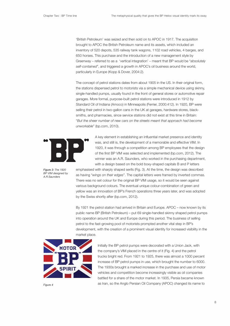
Figure 4
8

Chapter Two : BP Time line The metaphysical quality that gives the BP Helios visual identity mark its sway
publicly as British Petroleum, and to make matters more
BP exclusively in the remainder of this chapter.
2.2 Mid 20th Century: In 1939 Britain entered the Second World
Brands were suspended.
All petrol was ‘pooled’. Churchill called on the Anglo Iranian Oil
Company, who made and supplied BP fuels to give every thing they could to the war
cause…”
consisting of the original boxy-shaped capitals B and P letters emphasised with sharply
Shield VIM experienced an evolutionary change: the shield became a solid green with
an outline in a solid yellow. The inverted commas were removed.
economic upheavals that resulted from the Middle East crisis.
nationalised, and the tumultuous Iranian politics during this period
found angry mobs attacking the BP operations, causing workers
change dramatically” (Kopp and Dover, 2004:2). Iranian oil production
focussed on upgrading the quality and range of petroleum
products and services available in constantly improving
when BP unveiled the
pre-fabricated sections and opens for business 6 days later” (bp.
com, 2009). Thirdly, BP took the initiative of becoming involved
studying the air pollution
” (bp.com, 2009).
Figure 5: The BP Shield VIM had evolved by the end of World War II.
Figure 6: The BP Shield VIM 1952
name change forBritish Petroleum 1954
9

Chapter Two : BP Time line The metaphysical quality that gives the BP Helios visual identity mark its sway
The 1970s saw BP build the Trans Alaska Pipeline, which was the largest engineering
both companies.
countries took control of their domestic petroleum industries and set the pricing of
On two occasions, oil prices rose steeply in a volatile
market, triggered by the Arab oil embargo in 1973 and the outbreak of the Iranian
Revolution in 1979” (opec.org, 2012). These events saw BP maintain a strong focus on
relationship with Iran came to an end. BP responded to the industry’s uncertainty by
redirecting its attention to new avenues of business, which were referred to within BP as
products derivative from petroleum such as chemicals, plastics, detergents, minerals
and even cosmetics and cold meats. There was also an increasing emphasis on
retailing at the consumer end of the market at the petrol station.
strategy of BP in the 1980s (Kopp and Dover, 2004). As a result, the BP subsidiary BP
which encapsulated product selection and development, branding, advertising, sales
promotion, customer service, and retail merchandising. The new direction indicated a
shift from regarding the viewer/user as a faceless customer to an entity with whom BP
sought to build an ongoing and a lasting one-to-one relationship.
2.3 The late 20th Century:
necessary. In 1983, BP Shipping transported a mere half a million tonnes of crude oil
from the middle-east, as compared to 140 million tonnes less than 10 years before
alternative energy sources, including gas and, interestingly, solar power. The direction
directive that the future of BP lay in alternative, environmentally friendly energy sources
as a smart long-term business decision.
10

Chapter Two : BP Time line The metaphysical quality that gives the BP Helios visual identity mark its sway
No Logo
(2000). There was a concrete effort to study and develop a solid understanding of
improved retail margin, which nearly doubled, even though pump prices were falling.
respectively (Kopp & Dover, 2004:3).
After reaching record levels early in the 1980s, prices began to weaken, before
crashing in 1986, responding to a big oil glut and consumer shift away from this
petroleum revenue dropped below a third of earlier peaks...towards the end of
(opec.org, 2012).
of the Helios
We (Landor) convinced them
(BP) that they should create a ‘go to market’ brand as most of the brand visibility was at
the retail level” (Reeser interview 2010).
Using advertising to build and exploit a strong corporate image, he stated:
… it is fair to conclude that advertising can be extremely effective in building a
strong corporate image, and that given consistency and continuity over time,
the image can be exploited to great effect in marketing activities, even though
a national stage (Croft, quoted by Kopp & Dover, 2004:3).
Croft’s recommendations for considering global branding and communications in his
felt that a strong brand image might urge consumers to buy petrol because of
attributes other than price and/or location that until this new direction had been the
primary criteria driving purchasing habits and choices. Croft had evidence of the
increasing brand power developed by BP demonstrated through the experience of
repainted to the yellow and green of BP and the rebranding was applied, there was a
11
Chapter Two : BP Time line The metaphysical quality that gives the BP Helios visual identity mark its sway
Figure 8
Figure 9
Figure 10
Figure 11
Figure 12
Croft was impressed by arguments made by Harvard Business School’s
Theodore Levin and BP’s corporate advertising agency, GLOBALCOM, that
consumer needs and tastes across the world were becoming more
homogeneous. MacDonalds and Coca Cola had been successful in this
assumption, but the convergence of needs and lifestyles is not applicable to
all businesses
business dealings and the possibility of politically undesirable share buys and takeovers
led BP to negotiate with the government in 1988 to acquire Britoil, which was formed in
(Competition Commission Report 1988:10), and the remaining publicly traded shares of
director, became the chairman and David Simon, took on the role of chief executive. It
was Simon who declared that BP’s primary goal lay in creating value for the share-
holders:
market, serving customers more effectively, protecting the environment – either lead
to that central goal or, in the end, are impossible without it,” (Croft, Kopp and Dover
2004:2).
2.4 The end of the 20th Century:
“In 2001, the company formally renamed itself as BP
plc and adopted the tagline “beyond petroleum”, which remains in use today” (bp.com,
2011).
discussed in this chapter allows a clearer understanding of why the impact of the Helios
was revolutionary in the petroleum category. The following chapter, The invention of the
Helios
Associates and the subsequent design rationale and visual solution.
12

Chapter Three : The invention of the Helios The metaphysical quality that gives the BP Helios visual identity mark its sway
Chapter 3 :The invention of the Helios
Figure 13
Figure 14
Figure 15
In the 1990s, the impending new millennium triggered a desire by several global oil
companies to change their visual identity. Shell, ExxonMobile, and BP all addressed the
look of their VIMs in 1999. The merger between British Petroleum and the US
company Amoco gave BP the opportunity to reposition itself in the petroleum category.
The existing BP Shield VIM and Amoco’s VIM each had brand equity in their individual
markets; however, BP needed a VIM better suited to its global outlook and to the new
BP philosophy encompassing ‘Green’, Performance, Energy and Innovation. The result,
in 2000, was the Helios VIM.
Until 1999 “BP” had been an acronym for British Petroleum. The merger with Amoco
identities. Subsequent concerns surfaced about potential resistance among US
consumers with the introduction of a combined identity (Fig. 13). Furthermore, BP’s
other mergers and acquisitions during the 1980s and 1990s – which included the
absorption of Arco (Fig. 14) and solar energy company Solarex (Fig.1 5) – were creating
a splintered identity. Concerns about consumer confusion had been a recurring issue
within BP’s management for the past several decades. Anthony Leeche, a member of
the BP marketing team in the 1990s and 2000s stated that “We needed to come up
with a vision for BP that was global“ (Solman, 2008:1). Browne was concerned that
BP would always be seen as a British rather than a global brand because of its existing
visual identity and the brand equity of the Shield. A genuine global brand is more than a
ubiquitous presence. It is commonly understood and can cut through cultures and
geographies. A global brand and the effectiveness of its visual identity mark was
generate loyality within the marketplace :
A logo that is well designed becomes a visual shortcut for the meanings
brand message with its emotional effects, bringing about extreme loyalty to the
brand. They attribute emotion to not only the company, but to the consumers as
well
The task of addressing the amalgamation of BP and Amoco into a single brand was
realised by the marketing department of BP, led by Lee Edwards and Courtney Reeser
The
initial object was to create a corporate brand for the BP/Amoco brand ... We convinced
them to only use BP as the brand as it was a more believable global brand.” Keller
developed the following list, which indicates the competitive edge organisations can
gain by becoming a global brand: “Economies of scale in production and distribution;
lower marketing costs; power and scope; consistency in brand image; ability to
” (2003).
3.1 The Strategy and Equity of BP’s visual identity: A piece of visual communication,
the measurable value in the associations a viewer/user makes with an organisation or
corporation. A VIM is a conduit of the brand equity that triggers an emotional response
13

Chapter Three : The invention of the Helios The metaphysical quality that gives the BP Helios visual identity mark its sway
Figure 16
Figure 17: Shows the steady evolution of the Shell VIM from 1900 to Loewry’s 1999 version
Figure 18
experiences as well as the message communicated by the organisation through its
advertising and marketing. Indeed, VIMs are the trigger belief in brand equity. Their
presence on all the visual material associated with the organisation is a continual
wrote:
The logo must exist by itself and trigger, in the consumers’ minds, the
whole host of emotions and images that the company represents – emotions
and images that the company may have taken years to ascertain as the basis
of its corporate identity (2011:23).
In graphic design, when a client moves radically from their existing VIM and engages a
completely new visual aesthetic – such as BP‘s move from the Shield to the Helios, (Fig.
16) – the redesign is referred to as a ‘revolutionary design’. The term ‘revolutionary’ is
appropriate to describe this practice, since it means “involving or causing a complete or
dramatic change” (Collins English Dictionary, 1986). Conversely, an evolutionary design
solution refers to an existing VIM having only minor amendments applied in the aim to
contemporise it, as was undertaken in the 1999 redesign of the Shell VIM by Raymond
Loewry (Fig. 17). “VIM improvement [can] take a long time and is “evolutionary” in nature “
reassurance and trust for a viewer/user. The sway VIMs have to connect a viewer/user
to an organisation gives VIMs a capacity to build a sense of personal identity in an
(Fig. 18) have brand belief or brand faith in the prestige, quality and excellence that the
company has built as brand equity over the 20th century (Olins, 2008).
Due to the increasing pressures and the plethora of consumer choices in the
contemporary world, and the sense of constant change, viewers/users are searching
for continuity and a belief in an institution and therefore trust. The corporate VIM, Cowin
“is a means of building trust with the customer”
201:23). According to Alina Wheeler, a recognised brand design practitioner and
theorist, “Brands are messengers of trust...Durability is achieved through a
commitment to the equity of a central idea over time, and the capacity to transcend
change” (2009:26). Viewers/users understand that VIMs supply them with this sense
brand equity exerts on the viewer/user that affects the choices made in the marketplace
strength. Olins thus argues that:
Corporate strategy is the best that most corporations can do to harmonize their
long-term goals with all the more immediate issues – whether large or small –
that keep on cropping up in their day-to-day lives… It affects every action the
company takes. It makes an affect not only what products the company makes
customer feel about the company. Corporate identity tells the world – whether
14
Chapter Three : The invention of the Helios The metaphysical quality that gives the BP Helios visual identity mark its sway
Figure 19: The 20th century VIM for BP
actively or by default – just what the corporate strategy is (1994:145).
Brand equity has positive or negative implications for both the viewer/user and an
organisation’s market share. As Hoek & Gendal observe, “Brand equity research
independently of products” (2010: 318). VIMs can engage the viewer/user to ‘connect
with’ or to ‘reject’ an organisation based on its relevance to the viewer/user. The BP
Shield
users for more than 80 years. Through a comprehensive brand audit measuring the
brand equity possessed by BP’s long established Shield VIM (Fig. 19), Landor
Associates deemed the Shield held negative equity. In Landor’s opinion, it was
visually static and imperialistic in its symbolism: “We removed the shield device as it was
deemed to be too heraldic. Additionally, the company name was changed to BP plc., and
the lower case letterforms were less formal” (Resser 2010, pers.comm., 3 February).
Over this period internal and external viewers/users related and experience the brand
equity of the Shield differently. Internal viewers/users include employees, the board,
shareholders, and suppliers. External viewers/users are day-to-day customers, the
general public, potential customers, the media, opinion formers, government,
regulatory bodies, and competitors.
3.2_The Brief: In 1999 Browne was primarily focussed on establishing a point of
difference from the rest of the petroleum category. A key aim was achieved by creating
an association between BP and the ‘Green’ movement, which could easily be read as
an oxymoron. Browne’s directive to Landor Associates was to focus on the notion of
going ‘Green’ (Reeser 2010). The other attributes – Performance, Energy and Innovation
– were already embedded in the BP charter. According to Reeser,
Browne felt that green was an idea whose time had come and he was intent on
making BP a socially responsible company. Additionally he saw this idea as an
2010, pers.comm., 3 February).
The establishment of a connection between BP, nature, and the environment was a new
strategy and needed to be communicated in the new visual identity. Reeser described
Browne’s key attributes of ‘Green’, Performance, Energy and Innovation as “very
” 2010, pers.comm., 3
February). Hence, BP’s ‘Green’ marketing strategy, the subsequent Helios, and the
“beyond petroleum” slogan were developed by building on the equity of the
environmental movement.
The basis of the brief to Landor Associates was to use ‘Green’ to promote the notion
of ‘Innovation’ and reinforce the more traditional claims of ‘Performance’. Landor’s
response was to engage an understanding of how the new ‘Green’ strategy would
capture the attention and imagination of the viewer/user and increase BP’s credibility in
the marketplace. Landor reiterated to BP that ‘downstreaming’ was a major
component of BP’s overall revenue (Kopp & Dover, 2004). The retailing arm of BP was
15

Chapter Three : The invention of the Helios The metaphysical quality that gives the BP Helios visual identity mark its sway
commented on the initial stage of the project, noting that
them [BP] that they should create a ‘go to market’ brand as most of the brand visibility
was at the retail level” 2010, pers.comm., 3 February).
How can a long-established petrol company present itself as an eco warrior? An
understanding of BP’s unexpected marketing strategy can be attained through the
observations of Christensen (1999) and reinforced by Olins: “In a society characterised
by an absence of traditional forms of community organisations are important sources
”
(1989: 297).
3.3 Building the Helios colours: According to Johannes Itten “Colors are forces,
radiant energies that affect us positively and negatively whether we are aware of it or
not” (1973:16). The BP brand had built a presence in the marketplace using green and
yellow as a memorable colour combination. Green and yellow have been maintained as
French operations in 1923 (bp.com, 2012). The original strategic intent for the selection
and implementation of the colours was to evoke a sense of Spring (bp.com, 2011). A
demonstration of the colour combination assisting in building an association between
nature and the burgeoning BP can be seen with the painting of the early BP trucks and
petrol pumps the colour green to blend into the countryside (bp.com, 2012). Therefore,
From information supplied through interviewing Reeser in 2010, it appears that both BP
and Landor regarded the original colours of green and yellow, as holding positive brand
equity and that these colours were consistent with the new philosophy of the
corporation. “Colour becomes a mnemonic device” (2009:52) was noted by
branding designer and authority on branding and its practice, Alina Wheeler,
The direct response from Reeser when questioned concerning BPs
corporate colours was that “our recommendation was to leverage the
existing equities of the BP green and yellow. This was a unique color palette
in a category dominated by red and blue” (Reeser 2010, pers.comm., 3
February). The identity of Amoco, with its red and blue VIM, was not relevant
to the new BP. There was more brand equity and therefore brand value
invested in the unique colour combination of green and yellow. As Riley
commented: “Colours arrive charged with so much emotional and symbolic
weight that they tend to overburden the thin barrier of demarcation between
the viewer/user and the projected image” (1995:317).
When engaging the theories of colour psychology and graphic symbolism, the relevance
of the relationship the new BP VIM, both its shape and its colours, and BP’s ‘Green’
global philosophy and marketing strategy becomes apparent (Gage, 2100; Gerstner,
1986; Riley, 1995). “Each individual color has its own character which distinguishes
Figure 20: The Shield VIM evolutionary design maintaining continuity in the use of the unique colour combination of green and yellow.
Figure 21; Yellow equates the triangle, blue equates the circle. A theory of Kandinsky and developed by Gerstner
16

Chapter Three : The invention of the Helios The metaphysical quality that gives the BP Helios visual identity mark its sway
it from every other colour ...The same applies, with other parameters, to forms. The
form is the body of the colour, the colour is the soul of the form.”
2001:186-187) (Fig. 21).
Colours play an important role in the viewer/user’s emotional and psychological
response or decoding, and trigger an emotional response and evoke a brand
association within the viewer/user. As Hoek & Gendall noted: “Over the last decade,
several companies have registered colours as trademarks [VIMs] after demonstrating
has acquired secondary meaning” (2010: 317). Companies such as Cadbury’s purple
(NZ), Tiffany’s turquoise (US) and BP’s green (UK) have been successful in
registering their brand colour. To register a colour as a part of a corporation’s visual
identity, evidence must be produced concerning the length of time the colour has been
used by the corporation, the extent of the corporation’s visual communication that has
engaged the colour, and if there is use of the particular colour by competitors (Hoek &
Gendal, 2010: 317). Distinctive colours are chosen carefully to build brand awareness
was acknowledged by Kandinsky when he commented on his research concerning
colour that “ ”
(Kandinsky in Riley, 1995:142).
3.3.I Yellow: Yellow is often termed by many authorities as the ‘mind colour’, and is
thought by some to simulate the intellect. Jung’s writings on color symbolism cover a
broad range of topics,...”to the near-universal sovereignty of the color gold, sunlight,
value, ...[gold] expresses the apex of spirituality, and intuition’” (Riley, 1995: 307). The
association with the Sun and therefore divinity is ever-present regardless of experience.
humanity can experience. It is associated with cheer, gaiety and fun (Sharpe, 1974).
Shades of golden yellow carry the promise of a positive future. In antiquity, golden
yellow was attributed to Mithras in Persia and Apollo in Greece. It is the colour of the
ancient gods (Cumont, 1911). Yellow affects us physically by stimulating mental
processes, stimulating the nervous system, activating memory and encouraging
communication. Yellow has been shown to promote the assimilation of new ideas
related to intellectual (Kandinsky in Riley, 1995) and expressive pursuits (Oliver, 2007).
Yellow is a stimulant which engender expansive and forceful behavior (Elliot & Maier,
2007). Chang and Lin found that “in a branding context, participants equated yellow in
a brand with joy, brightness, and warmth
Gerstner, 1986; Gage, 2011; Smith, 2012).
3.3.II Green: Green has been used to symbolise nature and its embodied attributes
since ancient times. Adjectives associated with the colour are: secure, comfortable,
calm, peaceful (Murray & Deabler, 1957), and young and fresh (Hofstatter & Lubbert,
1958). Green denotes adaptability (Besant & Leadbeater 1901, in Gage, 2011). As
green appears throughout the natural world, it is perceived as pervasive (Kandinsky in
17

Chapter Three : The invention of the Helios The metaphysical quality that gives the BP Helios visual identity mark its sway
Figure 22
Riley, 1995). Ecological supporters adopted green to represent their movement.
Absolute green is the most restful color, lacking any undertone of joy, grief,
a time it becomes tedious (Kandinsky in Smith, 2012).
The observation that bright yellow-green creates the impression of the contemporary,
and the whimsical is drawn from the work of Leatrice Eiseman, a recognised colour
specialist and consultant to Pantone Inc. (Smith, 2012). Green is the colour of hope, of
strength, of longevity. Green is the colour of the awakening of life (c.f. Itten, 1963;
Gerstner, 1986; Cage, 2011; Smith, 2012). Lewandowski (2009) stated that McDonalds
changed its traditional background colour of red to hunter green in Europe in its initiative
3.4 Being ‘Green’: Currently the term ‘Green’ implies an association with the lifestyle
and political agendas that promote a responsibility and concern towards the
environment. The ‘Green’ movement and its ‘environmentally responsible’ message,
although not universally embraced, was acknowledged by Browne in a 1997 speech
he delivered to Stanford University, in which he suggested that “in all likelihood climate
change was caused by the burning of fossil fuels” (Browne, in Lucas 2007:4).
Consequently, an appreciation by Browne that there needed to be a shift in energy
consumption indicated to the global market place BP’s recognition for change through
“growth, opportunity, volatility and challenge...That view of the world in which we’re
operating sets the context for our strategy” (Browne 1997). Therefore it is essential
to review the growth of the ‘Green’ movement and how association with the ‘Green’
movement became a part of marketing strategists’ palette of promotional tools.
In 1949 the publishing of A Sandy County Almanac by Aldo Leopold brought the notion
of moral respect for the environment into the mainstream. Issues concerning water and
air pollution were reinforced with the formation of socially conscience groups such as
the Sierra Club, whose members included David Brower, Ansel Adams, and Nancy
Newhall, some of the greatest landscape photographers of the 20th century. Their
imagery brought a conscious awareness of the environment to popular culture in the
1950s and 60s. The environmental movement began to build momentum in the 1960s.
Rachel Carson’s 1962 publication Silent Spring
Environmental Protection Authority (EPA) in the US in 1970. The subsequent building of
public interest in the environment during this period saw the inaugural ‘Earth Day’ (Fig.
22) held on the 22 April 1970 (thegreenlifeonline.org, 2009), which was the initiative of
It has grown to be observed annually on 22 April by more than 500 million people and
national governments in 175 countries. Greenpeace and Friends of the Earth were both
established in 1972, and James Lovelock’s book A new look at life on Earth (1979)
proposed that all life on Earth could be seen as a single living organism. These were all
manifestations of a general increase in cultural awareness of the environment.
The growing popularity of the ‘Green’ movement during this period motivated a diverse
18

Chapter Three : The invention of the Helios The metaphysical quality that gives the BP Helios visual identity mark its sway
Figure 23: An example of ‘greenwashing’ advertising with a press advertisement for Coca Cola promoting its famous bottle as a part of the ‘age of ecology’.
range of companies in the US to create a new ‘Green’ image
promoted through advertising. However, and from a decidedly
negative perspective, this new advertising ‘eco’ trend was
eventually referred to with a degree of cynicism as
‘greenwashing’. The term ‘greenwashing’ and the link between
the environment and marketing strategy was brought to the
public’s attention through Jay Westervelt’s (1986) essay
focussing on the irony of money or time being spent advertising
an organisation’s perceived environmental conscience, rather
than the actual improving or implementing of sound
environmental practices within the company. “The meaning has
been usurped, and it’s not really about making the planet greener
anymore,” he said. Westerveld says that greenwashing has only
gotten worse since he coined the phrase.” (Westervelt in
Motavalli:2011).
This trend was engaged by the placing of a ‘Green’ spin on the
products and services of multinationals, and can be seen in
Figure 23 in the promotion by Coca Cola of their famous bottle
as ‘eco’ friendly. When consumers felt they were a part of the ‘Green’ movement it gave
advertisers an avenue to create a point of difference from their competitors, regardless
of whether their claims were true. In 1972 a former Madison Ave advertising executive,
Jerry Mander, christened this promotional tool ‘ecopornography’. An article written by
Mander entitled
Advertising Owns Ecology addressed the comprehensive application of greenwashing
to a plethora of companies, products, and services. The article documented “How the
oil, chemical, automobile and other industries are co-opting environmental imagery and
messages through expensive marketing campaigns” (Mander in Black, 2008:147).
Dupont announced a change in the design and structure of their tankers, which would
hopefully prevent oil spills and engage imagery in television commercials showing
applauding seals with uplifting classical music as the sound track. (Motavalli:2011). In
1985 another major US oil company, Chevron Corporation, launched its own
‘greenwashing’ advertising campaign known as Chevron’s ‘People Do’:
The longest-running, most infamous greenwash campaign in history [Chevron’s
‘People Do’]. Print and television ads, portraying Chevron and its employees
saving endangered species and engaging in other eco-friendly acts
(thegreenlifeonline.org, 2009).
Chevron’s greenwashing strategy resulted in a 10% sales spike among the established
customers of the company who had been exposed to the print and electronic
advertising campaign. As Berger and Corbin found in their 1992 study of consumer
attitudes and purchasing behaviour “
environment” (Berger & Corbin in Bui, 2005: 21). There was also a measurable
19

Chapter Three : The invention of the Helios The metaphysical quality that gives the BP Helios visual identity mark its sway
Figure 24
Figure 25
perception amongst customers that Chevron was “the oil company consumers trust
most to protect the environment” (thegreenlifeonline.org, 2009). This ‘greenwashing’
strategy of Chevron’s distracted the general consumer population from its other
activities such as “the company’s oil drilling, links to hundreds of Superfund sites, and
” (Motavalli:2011).
A range of studies in the 1990s revealed that certain demographics were more open to
purchasing environmentally responsible products, and were willing to be associated with
corporations that were seen as environmentally responsible and empathetic (Arbuthnot
studies also found that the majority of consumers were concerned with the expense
associated with environmentally responsible products and furthermore, there existed
a cynicism towards the authenticity of the manufactures’ claims: “So far, many studies
have shown a considerable difference between intention and actual behavior “(Laroche,
Toffoli, and Muller 1996 in Bui, 2005: 25). This
published in the Journal of Public Policy and Marketing (American Marketing
Association) which found that 58% of environmental advertisements had at least one
deceptive claim (Peattie & Crane, 2005: 357-370).
Greenwashing become a standard part of the marketer’s palette of persuasive tools. In
Notwithstanding the above discussion concerning cynicism of greenwashing, BP’s brief
to create a ‘Green’ future for the corporation in the marketplace was believed to be
genuine by many of the strategists associated with BP at the time. It was cited by Olins
as a corporate rebranding that set a standard and style that was brave at the time and
that others have copied (2004). “
company to change” (Lucas, 2007:4). It was a polarising issue amongst environmental
and anti corporate groups such as CorpWatch, which grudgingly admitted “that BP had
become a world leader in solar energy production … through the acquisition of Solarex”
(Solman, 2008:1).
3.5 The New BP VIM, the Helios: During 2000, BP’s marketing team, led by Lee
Edwards, worked with Landor to develop a focussed range of VIM design options.
“arrived at quickly and explored in more detail” (2010, pers.comm., 3 February). One
was known as the Performance Formation (Fig. 24) and the other the Helios (Fig. 25).
The two solutions each capitalised on different aspects of the four key attributes:
Performance, Energy, Innovation and Green. Innovation and Performance were
addressed in the Performance Formation VIM by using arrow-based forms, and ‘Green’
and Energy were addressed in the Helios with its symbol drawing a direct reference
from the sun. The Performance Formation was a creative response by Landor and a
departure from the core of the ‘Green’ brief as proposed by Brown.
20

Chapter Three : The invention of the Helios The metaphysical quality that gives the BP Helios visual identity mark its sway
Figure 26
Figure 27
Figure 28
Figure 29
BP’s public name also needed to be changed because there was negative brand equity
in the name ‘British Petroleum’. A new name “beyond petroleum” was devised in 2000
by David Fowler, creative director at Ogilvy and Mather, to generate a more accessible
sense of BP’s new philosophy in the marketplace and a vision of BP’s future as a global
corporation.
Landor’s creative response concerning VIM recognition was focussed on a primary
designs. Landor made the conscious decision to move the focus away from the
traditional letterforms of the uppercase B and P and towards the Helios symbol itself. As
Reeser noted, when developing the VIM, “We felt, at Landor, there was an opportunity
to have a symbol dominant program because of the immense scale of global exposure
that the BP brand has” 2010, pers.comm., 3 February). When engaging lower-case
letters, the message can be decoded by the viewer/user as informal and more
egalitarian. As Reeser explains, “the lowercase letterforms were less formal” 2010,
pers.comm., 3 February). The selection of Univers, a roman weight mono stroke san
serif typeface, set up a notion of an organisation, he said, that wanted to speak one-to-
one with the viewer/user as opposed to having a patronising visual intent.
Beginning in the 21st century, a trend surfaced where the role of letterforms has
become secondary to the primary symbol (shape) in a VIM. As discussed by Wheeler in
relation to the brain’s capacity to respond and retain shapes before written words:
Through repeated exposure, symbols become so recognisable that companies
such as Nike, Apple and Target have actually dropped the logotype from their
corporate signatures in national advertising. ID designers are in the business of
managing and distinctive visual form. Understanding the sequence of visual
perception and cognition provides valuable insight into what will work best
(Wheeler, 2009: 52).
VIMs are increasingly relying on a primary symbol for their communication. Leading and
ubiquitous corporations such as Nike (Fig. 26), McDonalds (Fig. 27), and Apple (Fig. 28)
VIMs demonstrate the way letterforms are disappearing from the contemporary VIM’s
construction and language.
The de-emphasising of letterforms can also be understood in the context of corporate
globalisation, where the use of Roman character letterforms appear in non-English
literate cultures and therefore are not effective or relevant communication tools. Due to
the ubiquitous application and exposure of VIMs, it has become unnecessary to have
letterforms in a constant relationship to a primary symbol. A viewer/user sees the
primary symbol of a VIM and they subconsciously decode the name. “A good
abstraction captures the essence of a company’s qualities in the most simple,
concentrated aesthetic form” (Lippincott & Margulies, 2004:12).
3.6 The Performance Formation:
of the two design concepts presented by Landor to the BP marketing team. The main
21
Chapter Three : The invention of the Helios The metaphysical quality that gives the BP Helios visual identity mark its sway
Figure 30
Innovation. This design supported BP’s culture of progressive thinking and innovation.
The Performance Formation VIM consisted of the new pared down lowercase BP
letterforms and a cluster of graphic arrow-inspired shapes. The design focussed on
performance and speed. The use of an arrow symbol, which has been engaged by
visual communicators since the early part of the 20th century in the marketplace,
generated a sense of the streamlined and dynamic. It emphasisied a forward
movement.
The arrow symbol used in the Performance Formation VIM is an elemental nature-
inspired archetypal visual device echoing the lightning bolt, which has a symbolic link
to the sun’s rays. Landor drew directly from literal links to performance and direction.
Based on information supplied from focus-group research conducted by Landor, six out
of ten consumers preferred Performance Formation to the Helios (Landor, 2009). They
felt that the Performance Formation VIM strongly communicated the Innovation
However, the Performance Formation VIM failed to address Browne’s focus on ‘Green’,
suggesting the need for considerable information, advertising, and promotional material
to strengthen communication about BP and its ‘Green’ philosophy. Not withstanding
the results of this market research, as Reeser commented, that while the Performance
Formation VIM had been favoured by the focus groups because “it looked like a
petroleum company, it was a design concept outcome that Browne wanted most
” (Reeser 2010, pers.comm., 3 February).
3.7 The Helios: The Helios
attributes of ‘Green’ and Energy. The visual messages conveyed by the Helios VIM
were ‘Green’, solar, nature and innovation. As Reeser commented on Landor’s design
motivation:
Green’ was seen as the most differentiated idea and allowed us to create a
to embody as many of the BP brand attributes as possible. We felt the biggest
opportunity was to leverage imagery that suggested ‘Green’ and Energy (2010).
The Helios is a stylised vector graphic, easily interpreted as a yellow sun conveying the
language engaged in the Helios is linked to the elemental nature-inspired archetypal
symbols, the circle and the Solar Cross. The Helios exhibits radiant energy that is
generated by centripetal and centrifugal energies found within the solar cross. (Chevalier
& Gheerbrant, 1996:174)
In the same focus-group market research supplied by Landor, four out of ten
consumers preferred the Helios to the Performance Formation (Landor, 2009). They felt
that the Helios strongly communicated environmental messages, that it was distinct,
and that the symbol itself allowed for a broad range of interpretations with such
Helios failed to communicate
22
Chapter Three : The invention of the Helios The metaphysical quality that gives the BP Helios visual identity mark its sway
Figure 31: A brand equity chart indicating BP’s Brand Strength and Brand Stature within the petroleum category between 2001 and 2004, Landor Associates
the other established attributes, with considerable advertising and information
material being required to communicate BP commitment to Innovation and
Ultimately,
Browne had the courage to stand behind his beliefs and select the Helios… In the end,
he was true to his word. He really didn’t want to look like the [rest of the petroleum]
category” 2010, pers.comm., 3 February).
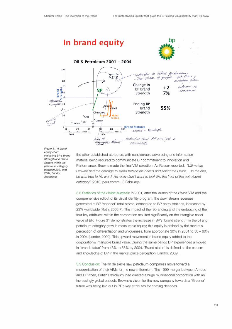
3.8 Statistics of the Helios success: In 2001, after the launch of the Helios VIM and the
comprehensive rollout of its visual identity program, the downstream revenues
generated at BP ‘connect’ retail stores, connected to BP petrol stations, increased by
23% worldwide (Roth, 2008:7). The impact of the rebranding and the embracing of the
value of BP. Figure 31 demonstrates the increase in BP’s ‘brand strength’ in the oil and
perception of differentiation and uniqueness, from appropriate 30% in 2001 to 50 – 60%
in 2004 (Landor, 2009). This upward movement in brand equity added to the
corporation’s intangible brand value. During the same period BP experienced a moved
and knowledge of BP in the market place perception (Landor, 2009).
3.9 Conclusion:
modernisation of their VIMs for the new millennium. The 1999 merger between Amoco
and BP (then, British Petroleum) had created a huge multinational corporation with an
increasingly global outlook. Browne’s vision for the new company towards a ‘Greener’
future was being laid out in BP’s key attributes for coming decades.
23

Chapter Three : The invention of the Helios The metaphysical quality that gives the BP Helios visual identity mark its sway
The design brief for the Helios had a simple undertone to promote BP as ‘Green’. What
came out of Browne’s brief was a consolidation of BP brands, building on the equity the
BP brand had developed throughout the 20th century. BP moved from being known as
BP (British Petroleum) to bp (“beyond petroleum”) to align with its global outlook and
of maintaining relevance to its established viewer/users while encouraging and engaging
new viewer/users on a global scale.
A true brand represents a consistent set of associations and attributes that
sustain a viable, growing business. A global brand must do this on a marco
scale, delivering a reliable core promise while remaining relevant to diverse
audiences. (Roth, 2008:2)
Throughout the design process, strategic consideration for the new VIM was
concepts were rooted in elemental nature-inspired archetypal symbols: a lighting bolt,
2000, the Helios VIM sat immediately and comfortably into the psyche of the
marketplace. The Helios capitalised on a viewer’s/user’s recognition due to its
resemblance to an elemental nature-inspired archetypal symbol, the Solar Cross.
The Helios, had and has its own value in terms of pre-established equity. This value was
generated from a combination of the unique long-standing colour combination of green
and yellow and the shape of the Helios (Fig. 32), which was based on the Solar Cross
and its variations. Thus the Helios, from its inception, was invested with the notion of
trust and reassurance for the viewer/user.
Helios design development and
the visual strategy behind it foregrounds the vital chapter 4, The Archetypal Helios. This
inspired archetypal symbols, and secondly, the Helios and other contemporary VIMs
that are informed visually by natural symbols such as the Solar Cross.
Figure 32
24

Chapter Four : The Archetypal Helios The metaphysical quality that gives the BP Helios visual identity mark its sway
Chapter 4 :The Archetypal Helios
Figure 33
Figure 34
Figure 35
The focus of this chapter will be an examination of the elemental nature-inspired
archetypal symbol, the Solar Cross (Fig. 33), to establish a contextual relevance and
relationship to the Helios. This investigation will assist in understanding the
metaphysical or numinous quality, found within the Helios as well as other well-
the metaphysical quality he referred to as numinosity, this chapter aims to assist in
within the global marketplace.
four key attributes that inspired a creative strategy resulting in the inventive Helios. The
Helios (Fig.
35), presented to BP, were based on elemental nature-inspired archetypal symbols.
a recurrent symbol or motif in literature, art, or mythology”
(Random House Dictionary, 2012). The thesis seeks to demonstrate that the use of
Archetypal symbols transmit a numinous quality and ultimately a sense of the sacred
and the institutional within a mutable world.
The Helios
are ‘natural’ and ‘cultural’ (Jung 1978:83). The ‘natural’ (archetypal) symbol is the
representation of the ‘external truth’ and is actively created by and for use by an
organisation or corporation:
Such cultural symbols nevertheless retain much of their original numinosity or
‘spell’. One is aware that they can evoke a deep emotional response in some
individuals, and this psychic charge makes them function in much the same
way as prejudices (Clark, 2008).
The Helios is informed by a ‘natural’ symbol, the Solar Cross, which represents the
radiance of the sun and the cosmology of the heavens. The Helios became a ‘cultural’
symbol through its role as BP’s VIM relating the corporation to environmental
consciousness. In both respects the Helios conveys a deep spiritual quality tapping
into a deeper symbolic language in the human species relating back to nature.
A further contention proposed in this chapter is that the longevity and purpose of
ancient VIMs, such as the Solar Cross, evolved out of a ritualised need for group
identity and were the vehicle to promote primary belief systems. As David Fontana
suggests:
The deities and their associated symbols actually emerge from, and are given
form within, our own psychological lives, but they address the unconscious at
such profound level that they appear to come from some spiritual source
outside ourselves. They are, according to Jung, embodiment of mankind’s
‘natural religious function’, an aspect of the psyche that must be developed to
ensure psychic health and stability (1993: 26).
25

Chapter Four : The Archetypal Helios The metaphysical quality that gives the BP Helios visual identity mark its sway
The Helios VIM capitalised on the equity generated by elemental nature-inspired
already had to the Solar Cross.
Max Muller, the German philologist and one of the
founders of studies in comparative religion, expressed the view that when human
Moon and stars, or semi-tangible phenomena, such as mountains, rivers, seas and
trees, a dialogue between individuals, elemental deities and other individuals in a group
was established (Muller, 1863).
Bronze Age (3,000 -1,500 ) Aryan cultures inhabited the Anatolian region, the
areas of modern Northern Turkey, Iran, Iraq and Syria. It is in this region that the
Archaeological evidence suggests families and households in the Anatolian Region
were primarily economically independent during the Neolithic period, (6,000-3,000
have revealed the building of monumental structures and sophisticated
constructions such as causeway enclosures, burial mounds and stonehenges (bbc.
co.uk, 2012). These enterprises required time and a considerable amount of organised
labour to build, indicating societies became increasingly stable and geographically
established. The attempt to organise and placate the mutable societies during this
period contributed to a developing sense of institution, signalling the beginnings of a
basic hierarchical social system larger and more complex than was previously required
in earlier societies (Smedley,1998).
Originally, symbols were an individual’s expression of an experience in the natural world
(Dallett, 1998). With the development of social organisation in human groups, a
formalised language of symbols emerged. The early roots of the practice of VIM
application emerged through the repeated engagement of symbols on ancient
symbols occurred in all cultures and at all times and as Jung wrote: “They held
(1978: 88). Although uncomplicated in
their visual construction, archetypal symbols contained a complexity of meaning
sacred quality.
As societies grew more stable and trade and commerce evolved, examples of visual
identity in the form of individual’s VIMs began to be engaged. VIMs were used for the
branding of livestock by nomadic herdsmen and settled cattle breeders alike, and on
manufactured goods such as pottery. The ownership of livestock was established
with the use of a simple VIM branded onto the animal and a manufacturer’s VIM (seal)
used on pottery established the identity of the maker and the quality and guarantee of
the product. Societies with an economy depending on slave labour often used similar
branding (VIM) devices. In The History of Graphic Design, design historian Phillip B.
26

Chapter Four : The Archetypal Helios The metaphysical quality that gives the BP Helios visual identity mark its sway
Meggs addressed several aspects of this ancient tradition, noting in respect of
that “two natural by-products of the rise of village
culture were the ownership of property and the specialization of trades or crafts. Both
(2005: 9).
In a similar vein, Sasson and Gaur note that “Iconic marks can also establish the value,
or the authorship, of a particular product i.e. examples are the pottery marks from
Archetypal symbols had multiple functions within a society, including by bonding a
group, as well as creating the symbolic visualisation of nature and elemental
nature-inspired deities. Ancient societies had a great desire to identify a cosmology
world inhabited by their gods. Consequently, a VIM and the sense of collective
belonging it triggers is:
Filled with a sense of the presence of divinity (holy); appealing to the higher
emotions or the aesthetic sense (spiritual) ...Therefore, after an object or mark
has acquired, or been given an emotional or spiritual force, it has gained
numinous qualities, sublimely perceived by the individual or group
(Fontana & Firim, 2003: 83).
to communicate that there is a common bond between members of the group. VIMs
allow groups to differentiate themselves from other groups. Building on the
observations of Meggs (2005), historian Albertine Gaur (1997) deliberated on the
ancient purpose of symbols as VIMs: “This branding or marking (tattooing) can also be
voluntary whenever an individual wishes to demonstrate his or her complete
(Sasson & Gaur, 1997: 22).
of a number of elemental nature-inspired archetypal symbols, the Solar Cross was
employed as a vehicle that facilitated the union between the individual, the societies
in which they lived, and the elemental deities that were worshipped (Davidson, 1969).
From its pre Bronze Age roots the meaning and use of the Solar Cross changed as
societal groups became more organised. A genuine belief existed that there was an
ability for humans to negotiate directly with elemental deities (Clark, 2008).
Subsequently the dialogue between humans and omnipresent unseen forces had the
power to affect and assist in alleviating the ongoing fearful concerns the future of the
group. These concerns included invasion, famine, and defeat in war.
by the hierarchy of chieftains and or shamans, to manipulate the societies in which
the symbol was employed. The use of the symbol empowered a chieftain or shaman
with a degree of authority due to its perceived connections with the sacred world. The
27

Chapter Four : The Archetypal Helios The metaphysical quality that gives the BP Helios visual identity mark its sway
application of the Solar Cross was as much to do with political gain as the attainment
of spiritual ideals. The following quote by A.H.Armstrong reinforces the ancient social
strategy:
And even those who did not believe in this sort of divine visitation would inherit
from the more skeptical side of the early thought of Greece and Rome, a
conviction that proper religious observance, whatever that was thought to be,
was central and essential to the maintenance of the whole fabric of culture and
society
The cosmos-inspired Solar Cross (the circle, and the cross) is, as Jung asserted, a
result of the unconscious contents within the human psyche and its archetypal
energies (1978: 83). Therefore a constant thread of sun worship and solar deities ran
through most religions and cults of the ancient world. The worship of the Sun
dominated the great civilizations of antiquity in the guise of gods and heroes: Atum and
“embodying the powers of creation and the sources of light and life represented by the
(Chevalier & Gheerbrant, 1996:950). The term ‘My Sun’ was used as an address
to the earthly version of the gods in the form of royalty throughout the ancient world.
The Sun embodied the powers of creation and because it was the source of light for
humanity, it was believed to be the source of life. The Helios has a direct relationship to
the Solar Cross (Fig. 36) and it’s meaning. It is the intention of both the Helios and the
Solar Cross to establish a connection to nature via the sun and its radiance.
In primitive societies a sense of separation from the cosmos simply
natural world upon the human psyche or behaviour were key to the work of Rudolf
Otto, the German theologian, philosopher, and historian of religion, in his The Idea of
the Holy (1917) which discussed the existence of a metaphysical quality he referred
through morality, the beautiful and the sublime, but through a sense of “the holy and
(1917). As a result, this theory proposed that a layering of phenomena that
places.
The noun ‘Numinous’, originally coined by Otto, has a different meaning from its root
word. The 17th century derivation of the term is from the Latin word ‘Numen’ which is
phenomenon or object. The term may also be based on the Indo-European
root neu-, from which the similar Greek term, neuma, arose. ‘Numen’ is further
derived from the verbs ‘adnuere’ (agree with a nod of the head) and ‘abnuere’
(refuse with a nod of the head)’. The term, therefore, has encoded within its
linguistic past, a duality of meaning
Figure 36
28

Chapter Four : The Archetypal Helios The metaphysical quality that gives the BP Helios visual identity mark its sway
Figure 37: The primordial dot found at the junction of the horizontal and vertical lines of the Solar Cross
In concurrence with Otto, Jung believed the numinous was non-physical and celestial
in nature, a fundamentally religious experience. Carl Jung’s examination of the human
psyche and the effects the natural world exerted on it was addressed in his theory of
the ‘archetype’. According to Jung, archetypal symbols are the embodiment of
mankind’s ‘natural religious function’, an aspect of the psyche that must be
developed to ensure psychic health and stability (Fontana, 1993: 26). Jung saw
archetypal symbolism as innate human imagery that existed in the psyche and wrote
on the involvement of the numinous within archetypes. As Morriessy observed:
fascinating, compelling, thrilling mysterious, horrifying, gripping, tremendous,
terrifying, dreadful, or awesome. Think about the things with which you are
preoccupied in spite of yourself (2002).
is exposed to through repetition which contributed to building a sense of familiarity
archetypal symbols were representing. Durkheim also acknowledged through his
writing the existence of the sacred and the profane within symbolism and VIMs:
“Thus...the sacred and the profane is parallel to the social dichotomy between the
(Durhkeim in
Cosman & Cladis, 2001: xxii).
Without a sense of the numinous, Jung claimed, the observer experiences no
emotional connection to the observed. For him, numinosity (as exhibited in the Solar
Cross) was an alteration of consciousness involving an experience of spiritual power.
metaphysical quality of the numinous becomes apparent when its intangible effects
inspired archetypal symbols in the ancient world, and subsequently VIMs in the
contemporary world. Numinosity is the metaphysical quality in a VIM that enables
nature-inspired archetypal symbols, such as the Solar Cross and the Helios, as the
basis for a VIM design facilitates the VIM’s immediate recognition and acceptance
Helios its
sway.
The Solar Cross (Fig. 37) represents the four elements. As a world
centre and a cosmic axis, with its four cardinal points it can be mapped to fourfold
The centre of the Solar Cross is seen as a coordinate. The primordial dot (Fig. 37) is
found at the intersection of its horizontal and vertical lines and these directional lines
are interpreted as representing the male and the female energies, the celestial and
29

Chapter Four : The Archetypal Helios The metaphysical quality that gives the BP Helios visual identity mark its sway
Figure 38: The Wheel of the Year
Figure 39: Swastika
Figure 40
Figure 41
Figure 42
Figure 43
the terrestrial, the centrifugal and the centripedal among many other sets of polarities
The Dictionary of Symbols:
“The dot and the circle are the only geometric shapes without division and alike at all
(Chetwynd, 1993: 195). There is a persistent reference to the circle
circumference is nowhere.
As a radiant symbol, the Solar Cross and its subsequent variations - ‘the wheel of the
year’ and the ‘swastika’ (Fig. 38 - 39) possess a centre point where opposites meet.
Therefore the connotation of the sacred and the profane, the group and the
Helios,
based on a Solar Cross, possesses these energies that coexist and energies
allows a duality of the qualities of innovation and reliability to be communicated
simultaneously.
been associated with the sun and the forces of nature and is a result of humanity’s
of life. H.P. Blavatasky (1977) believed that it was the empty circle that encapsulated
the ultimate essence of existence and in the chapter entitled The Process of
Individuation found within Jung’s Man and his Symbols, Von Franz explains that “the
(1978: 266).
“The turning wheel, as I see it, became a kind
(Davidson & Gelling, 1969).
Jung (1978) himself wrote in relation to this visual theme that “The wheel may lead our
thoughts towards the concept of the ‘divine’ sun, but at this point reason must submit
(1978: 266).
Paul Diel, writing on the theme of the circle [as the boundary of the cross],
suggest that “the sun and its rays, which were once symbols of
(1980:36-37). During
the Renaissance a circle was considered the perfect shape as the
perception that the image of humanity could be found within the symbol of
the circle was reinforced through da Vinci’s Vitruvian Man
based on human geometry. Chetwynd observed that “Because all symbols
are a product of the psyche, very often the results in pattern symbolism
(1993: 320). He continues by
suggesting that the meaning of harmony, protection and homogeneity are
found within the circle, as the circle represents the idea that the “symbol
. Furthermore he credits the circle’s symbolism, noting
30

Chapter Four : The Archetypal Helios The metaphysical quality that gives the BP Helios visual identity mark its sway
Figure 44.1
Figure 44.3
Figure 44.4
Figure 44.5
Figure 45
Figure 46
Figure 47
Figure 48: The Labarum symbolwhich was relevant to both pagans and Christians of 4 C.E.
that it is “the principle and force for harmony between the different parts of the psyche,
(1993: 320).
pictorial images to appear at the start of the Bronze Age. In the Scandinavian and
Wheel. It represented the chief god of the Norse pantheon, who was the god of art,
culture, warfare and the dead. It also appeared in the religious art of Asia, North
forms of the Solar Cross are:
1. With the arms of the cross asymmetrically extended beyond the perimeter of
the circle. Christians, extended the lower arm in the manner of the Latin Cross,
and adopted this variation. This version is became known as the Celtic Cross
2. With a solid disk.
5. With the circle broken on one side of each arm. This form most resembles a
Swastika and is sometimes called a ‘Sun Wheel Swastika’. Like an original
swastika, this symbol can be either Sunwise, right facing or Widdershins, left
(de Champeaux & Dom Sterckx in Chevalier & Gheerbrant, 1996:956-957).
VIMs such as the Helios, which are based on
the Solar Cross, capitalise on the radiant energy that is generated by the centripetal
and centrifugal energies found within the symbol. Centrifugal energies move or tend
to move away from a center. Conversely centripedal energies move or tend to move
toward a center. The centre of these VIMs is where the energy of its message is most
concentrated (Chetwyn, 1993:72). The nature-based symbolism and the use of the
Solar Cross in the Helios can also be seen in VIMs for established and recognised
The radiating energies of the Solar Cross can also be found in the ancient Labarum
VIM used during his reign (Lane Fox, 1988). Standardisation was one of the main
concerns and aims of Constantine’s reign and the utilisation of a singular symbol (a
VIM) galvanise and unify Constantine’s army which was composed of both of pagan
and Christian troops. The Labarum possessed positive association for both sects
within the Roman army (Lane Fox, 1988).
The Labarum symbol had been associated with the ancient pagan deities, Chronos
and Mithras, therefore the pagan soldiers of Constantine’s army would have felt an
immediate connection to the numinous qualities held within the symbol. So too the
31

Chapter Four : The Archetypal Helios The metaphysical quality that gives the BP Helios visual identity mark its sway
Figure 49
Christian soldiers of the army would have been drawn to the numinous
association of the Labarum, as the symbol was associated with the new
deity known as Christ. The numinous qualities of the symbol would have
within Constantine’s army.
The Labarum was used in numerous visual variations on coins struck
(Lane Fox, 1988).
the conclusion that the Labarum was intended as a Christian symbol exclusively, but
Constantine was using both pagan and Christian symbolism to create a connection
with the populous (Barnes, 1981).
Helios Aspect: The expression ‘to make one’s mark’ implies a statement of
presence. In Resser’s own words, when asked whether a conscious decision was
made to have the BP’s brand awareness driven primarily by a symbol, he explained
“We felt there was an opportunity to have a symbol dominant program because of the
(2010, pers.comm., 3 February). Furthermore when
Resser (2010, pers.comm., 3 February) was asked whether the arrow device in the
Performance Formation [and the circle and Solar Cross for the Helios] had a
no”.
The idea to engage the environment, for the company’s branding was a powerfully
of establishing a clear connection between the natural world and BP via a VIM,
promoted a short response from Resser:
(2010, pers.comm., 3 February). While he claims that no
investigation of any archetypal symbols and their relationship to nature was engaged in
during the development of the Helios look
at a variety of ways” to represent the VIM design concept, including exploring the word
‘helios’ and for the Helios design concept engaging a circular motif as the basis for the
visual design direction. Reeser (2010, pers.comm., 3 February) suggested that there
the sky. The creative driver was the use of the radiant solar-based symbol as the key
visual device.
of the day they follow the sun from east to west, while at night they return to an
eastward orientation. Heliotropism is a combination of two Greek words: Helio for sun
and the tropo for turn (Random House Dictionary, 2012).
32
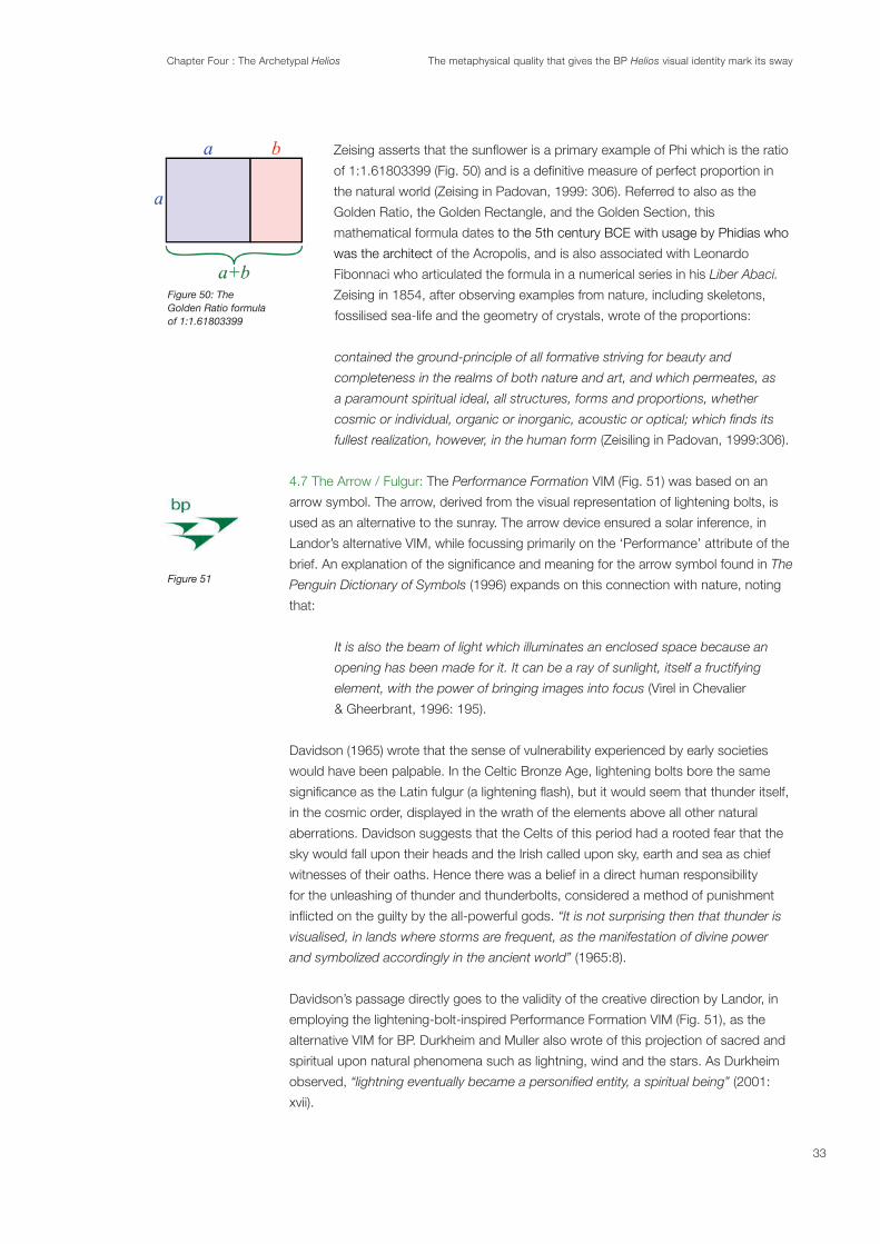
Chapter Four : The Archetypal Helios The metaphysical quality that gives the BP Helios visual identity mark its sway
Figure 50: The Golden Ratio formulaof 1:1.61803399
Figure 51
the natural world (Zeising in Padovan, 1999: 306). Referred to also as the
Golden Ratio, the Golden Rectangle, and the Golden Section, this
mathematical formula dates
was the architect of the Acropolis, and is also associated with Leonardo
Fibonnaci who articulated the formula in a numerical series in his Liber Abaci.
fossilised sea-life and the geometry of crystals, wrote of the proportions:
contained the ground-principle of all formative striving for beauty and
completeness in the realms of both nature and art, and which permeates, as
a paramount spiritual ideal, all structures, forms and proportions, whether
fullest realization, however, in the human form (Zeisiling in Padovan, 1999:306).
The Performance Formation VIM (Fig. 51) was based on an
arrow symbol. The arrow, derived from the visual representation of lightening bolts, is
used as an alternative to the sunray. The arrow device ensured a solar inference, in
Landor’s alternative VIM, while focussing primarily on the ‘Performance’ attribute of the
The
Penguin Dictionary of Symbols (1996) expands on this connection with nature, noting
that:
It is also the beam of light which illuminates an enclosed space because an
opening has been made for it. It can be a ray of sunlight, itself a fructifying
element, with the power of bringing images into focus (Virel in Chevalier
& Gheerbrant, 1996: 195).
Davidson (1965) wrote that the sense of vulnerability experienced by early societies
would have been palpable. In the Celtic Bronze Age, lightening bolts bore the same
in the cosmic order, displayed in the wrath of the elements above all other natural
aberrations. Davidson suggests that the Celts of this period had a rooted fear that the
sky would fall upon their heads and the Irish called upon sky, earth and sea as chief
witnesses of their oaths. Hence there was a belief in a direct human responsibility
for the unleashing of thunder and thunderbolts, considered a method of punishment
“It is not surprising then that thunder is
visualised, in lands where storms are frequent, as the manifestation of divine power
(1965:8).
Davidson’s passage directly goes to the validity of the creative direction by Landor, in
employing the lightening-bolt-inspired Performance Formation VIM (Fig. 51), as the
spiritual upon natural phenomena such as lightning, wind and the stars. As Durkheim
observed, (2001:
xvii).
33

Chapter Four : The Archetypal Helios The metaphysical quality that gives the BP Helios visual identity mark its sway
Figure 52
Figure 53
Figure 54
Figure 55
Figure 56:Archetypal symbols adorn initates of a passage of rites. Image taken by Victor Turner in Zambia with the Ndembu tribe.
The use of the arrow as a symbol for VIMs has had continuous employment
throughout the practice of visual identity. It was skillfully utilised by of the Bronze Age
was imprinted onto his prototypical coinage. The coinage with his self-image as ‘the
dominion:
The king himself is represented with a bow in his hand symbolising not just his
central to the ideal of kingship as framed by Darius. And as if to deploy this
symbol as a political logo, Darius had the image of himself as an archer
time, ever, a leader was represented upon a coin. Small, portable, and
distinctive, this medium for self-promotion reached parts of his empire as no
other method could
(Fig. 55) whose brand image and promise is based on a sense of speed and
performance. “Broadly speaking, the arrow is the universal symbol of outrunning
Rites and rituals included the usage of elemental nature-inspired
ruptures that occurred within the life of the group or individual. Ritual practices ranged
dancing, singing and music making.
Rituals marked the agricultural cycle and the movements of heavenly bodies in the
night sky and consequently, this connection to the sacred and the ‘other worldly’,
ultimately provided a basis for the politics of empire.
[Arnold] Van Gennep relates the rites of passage, all the
transitions that humans go through in their lives, to the tangible
world around us. Specially to the natural world that surrounds
us. In conclusion he links them to the celestial bodies and the
great rhythm of the universe (Westerveld, 2010:10).
inspired archetypal symbols . Through the application of elemental nature-inspired
archetypal symbols, such as the Solar Cross and the circle, which were often used
as symbols of liminality giving them a numinous quality. A photograph taken by Victor
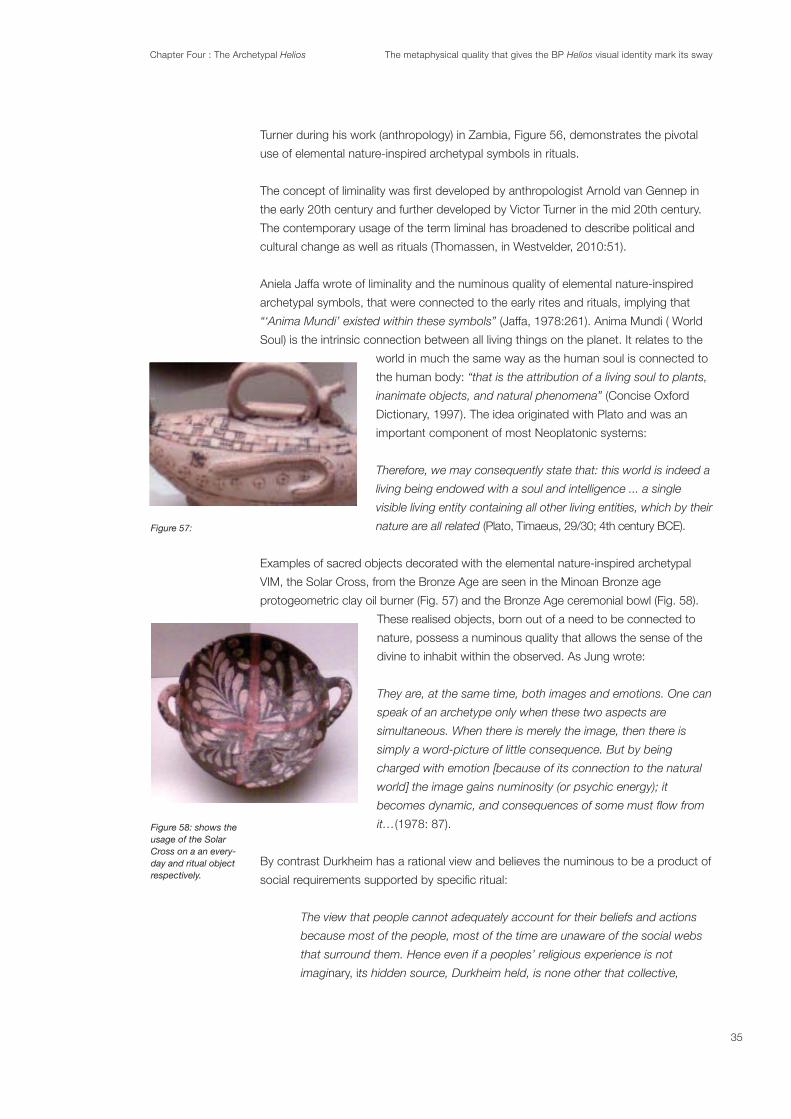
Chapter Four : The Archetypal Helios The metaphysical quality that gives the BP Helios visual identity mark its sway
Figure 57:
Figure 58: shows the usage of the Solar Cross on a an every-day and ritual object respectively.
Turner during his work (anthropology) in Zambia, Figure 56, demonstrates the pivotal
use of elemental nature-inspired archetypal symbols in rituals.
the early 20th century and further developed by Victor Turner in the mid 20th century.
The contemporary usage of the term liminal has broadened to describe political and
cultural change as well as rituals (Thomassen, in Westvelder, 2010:51).
Aniela Jaffa wrote of liminality and the numinous quality of elemental nature-inspired
archetypal symbols, that were connected to the early rites and rituals, implying that
(Jaffa, 1978:261). Anima Mundi ( World
Soul) is the intrinsic connection between all living things on the planet. It relates to the
world in much the same way as the human soul is connected to
the human body: “that is the attribution of a living soul to plants,
(Concise Oxford
Dictionary, 1997). The idea originated with Plato and was an
important component of most Neoplatonic systems:
Therefore, we may consequently state that: this world is indeed a
living being endowed with a soul and intelligence ... a single
visible living entity containing all other living entities, which by their
nature are all related
VIM, the Solar Cross, from the Bronze Age are seen in the Minoan Bronze age
protogeometric clay oil burner (Fig. 57) and the Bronze Age ceremonial bowl (Fig. 58).
nature, possess a numinous quality that allows the sense of the
divine to inhabit within the observed. As Jung wrote:
They are, at the same time, both images and emotions. One can
speak of an archetype only when these two aspects are
simultaneous. When there is merely the image, then there is
simply a word-picture of little consequence. But by being
charged with emotion [because of its connection to the natural
world] the image gains numinosity (or psychic energy); it
(1978: 87).
By contrast Durkheim has a rational view and believes the numinous to be a product of
The view that people cannot adequately account for their beliefs and actions
because most of the people, most of the time are unaware of the social webs
that surround them. Hence even if a peoples’ religious experience is not
imaginary, its hidden source, Durkheim held, is none other that collective,
35

Chapter Four : The Archetypal Helios The metaphysical quality that gives the BP Helios visual identity mark its sway
human forces of which believers are unaware (Durhkeim in Cosman, Cladis,
2001: xxii).
The statement that: “...symbols are concerned with the interrelationship of mind and
(Chetwynd, 1993: 322) could explain why there exists a deeply ingrained
unconscious connection between humanity and graphic style symbols. And
consequently, why the use of these symbols are closely linked to assisting in the
generation of a sense of identity for both the individual and the group, in context of the
ancient and contemporary periods (Davidson, 1969).
The Helios integrated effectively into the global marketplace due to its
strong visual resemblance to the Solar Cross, an elemental nature-inspired archetypal
identity. Archetypal symbols emerged in burgeoning societies as a visual articulation of
the elements and the astral bodies, resulting in a dialogue between the forces of nature
(often realised as deities), the individual and the members of a group.
VIMs based on the Solar Cross have existed since before the Bronze Age, as seen in
the Bronze Age Assyrian deity Ashur’s VIM (Fig. 59), and like contemporary VIMs
conveyed a numinous quality driven from their origins inspired in nature. The repeated
cycles of nature.
The users of symbols were afforded a certain status within a group. The use of
symbols by a chieftain or shaman became a way in which their authority could be
well as sustain group coherency for cultural survival. Symbol employment and VIM
creation was a vehicle through which a direct connection was made between the
group and nature deities.
Obviously, every mark has symbolic overtones as it evokes an instantaneous
As we use the term here, however, a symbol is characterised by its ability to
qualities in the most simple, concentrated aesthetic form...
The equity found in sun symbolism conveys a sense of trust and reassurance and
consequently provided a springboard for BP’s Helios to gain an acceptance in the
global marketplace, and also an acceptance of BP’s new ‘Green’ philosophy. This
chapter addressed the power of the ‘natural’ symbol, the following chapter, Engaging
36
Figure 59

Chapter Four : The Archetypal Helios The metaphysical quality that gives the BP Helios visual identity mark its sway
the viewer/user
37

Chapter Five : Engaging the viewer/user The metaphysical quality that gives the BP Helios visual identity mark its sway
The numinous Helios provided BP and its visual communication strategy, which
included a brand identity program, a spring board for the viewer/user to comfortably
embrace the notion that a petrol corporation could become an ‘eco warrior’. The Helios
possessed an equity that the viewer/user could immediately recognise and relate to.
Engaging the viewer/user of a VIM and building a sense of both individual and group
loyalty is at the heart of a brand identity program. Landor Associates and Ogilvy and
Mather, in considering the broad range of
viewers/users for the Helios and the new
globally-oriented BP, developed what for
them was considered the most appropriate
visual and verbal language to engage the
viewer/user. Therefore the brand identity
program developed by Landor Associates
and seen in Figure 60 and the “beyond
petroleum” advertising campaign created by
David Fowler at Ogilvy and Mather,
capitalised on and reinforced the new
‘Green’ ideology of bp with an authentic
declaration for change. “The strong
collaboration among Ogilvy and Mather, Landor and BP helped create communications
that were direct extensions of the BP brand” (Roth, 2008: 18).
needed to develop a more effective visual communication strategy that would guarantee
a strong presence in the marketplace. The strategy needed to address three
(Croft, Kopp, & Dover, revised 09.12.2004).
BP’s visual communication strategy had to directly resonate with each sub-group that
existed within the internal and external viewer/user groups of BP in order “to build
awareness and extend customer loyalty”
recognition of groups creates a means by which a contemporary visual communication
strategy of a major rebranding can reassure existing markets while establishing new
markets (cf. Lippincott & Margulies, 2004, Olins, 2004, Wheeler, 2009). Many of the
aspects concerning group identity discussed in this chapter are directly relevant to the
Helios brand identity program.
Jung and Durkheim agreed, that when a group adopted a symbol/emblem, the symbol
acquired ‘spell binding powers’ and possessed an ability to trigger a sense of identity
within group members. “without the totem the clan could not exist, because the totem
provides members of the clan with their name, that is, their identity and hence unity”
(Durkheim in Cosman & Cladis, 2001: xviii). Similarly to the cohesive quality of Jung’s
Chapter 5 :Engaging the viewer/user.
Figure 60
38

Chapter Five : Engaging the viewer/user The metaphysical quality that gives the BP Helios visual identity mark its sway
allegorist symbol or Durkheim’s totem, a contemporary VIM often serves the purpose of
galvanising and reinforcing group coherence.
5.1 Group Identity _ an explanation: A true group exhibits some degree of social
cohesion and is more than a simple collection or aggregate of individuals, such as a
group of people waiting in a queue (DeBoard, 1990). Characteristics shared by
members of a group may include interests, values, ethnic or social background and
kinship ties. DeBoard (1990) thus proposes that a group is recognised as such when a
group’s particular sense of identity are therefore “purpose, belonging and fundamental
survival” (DeBoard, 1990:14).
By contrast Cartwright and Zander suggest that other aspects besides purpose,
belonging and survival are necessary to group identity. Group members identify with one
another as a result of having set up the same model-object or ideal in a common moral
and behavioural code, thus having a collective perception of their identity. If these
activities do not occur within the basic function of the group, Cartwright and Zander
claim that the group will cease to exist (Cartwright and Zander in Turniansky and Hare,
thus social interaction and social change.
works of Tarde (1890 & 1898), le Bon (1897), and Durkheim (1893 & 1895), and in the
early 20th century by Sigmund Freud and Carl Jung. Observations relating to groups
have circulated since ancient times but it was not until the mid 20th century, with the
emergence of theories concerning ‘group dynamics’, that what motivates ‘group
Psychologist Kurt Lewin, one of the modern pioneers of social, organisational and
applied psychology, coined the term ‘group dynamics’ in 1947 Frontier in Group
Dynamics to describe the way groups and individuals act and react to changing
circumstances. The concept of group dynamics is the fundamental understanding of
the skills and division of labour of the members of a group used effectively to achieve
an end goal. Therefore, a group is more than a simple or random group of individuals
gathered in one place for any number of disparate reasons.
‘Collective unconscious’ is a term of analytical psychology, coined by Jung in his The
Psychology of the Unconscious (1912).
that which collects and organises the personal experiences of an individual in a similar
is a reservoir of experiences, unique to each individual (1912). Conversely, Durkheim’s
theory of ‘collective conscience’ (1893 ) “refers to the shared beliefs and moral
attitudes that operate as a unifying force within society” (Jary & Jary, 2005: 93). His
theory describes a group as a collection of individual members whose personal identity
39

Chapter Five : Engaging the viewer/user The metaphysical quality that gives the BP Helios visual identity mark its sway
Figure 61: The Shield Vim and the Helios VIM encoded visually with differentmessages about BP and its sense of identity
merges with the other members. The theoretical underpinning of group dynamics
and brand loyalty is reinforced through the work of contemporary author and social
commentator, Naomi Klein in No Logo (2000). Her political analyses and critique of
corporate globalisation, observations of branding and its effect and contribution to the
contemporary individual’s identity, is summed up in her claim that the ‘brand’,
‘branding’ and ‘brand equity’ have become increasingly important components of
culture and the economy, now being described as “cultural accessories and personal
philosophies” (Klein, 2000: 9).
viewer/user: brands, he suggests, ”represent clarity, reassurance, consistency, status
Brand represent identity” (2003: 27). It is feasible that qualities described by Olins in
relation to a viewer’s/user’s use of a brand could be seen in the needs or desires of a
group member looking for consistency, status and reassurance in an uncertain world.
5.2 Development of the BP brand promise and brand image: The brand image and
brand promise of an organisation is encoded within the brand identity program. The
program aims to announce, inform and motivate the viewer/user about a new
organisation or the rebranding of an established organisation. When embarking upon
the exacting task of replacing an established corporation’s VIM, its brand identity and
its resulting long-standing brand equity within the market place, aspects such as brand
image, brand promise (a statement of relevant differentiation) and brand beliefs, must be
addressed within its aesthetic encoding (Olins, 2004: 172).
The brand beliefs of BP were represented in four key attributes, three of which had
existed as a part of BP’s personality since 1987 with the development of a brand
image program by BP’s American advertising agency, W.B. Doner (Kopp & Dover,
Helios brand
image program as:
(Roth, 2002:5).
Figure 61 showing the Shield and the Helios, clearly demonstrates the differences in
BP’s past and future brand image. The two VIMs communicate the contrast between
the past brand image and brand promise and the future brand image and brand
promise, not only from an aesthetic point of view but also from the perception of the
Helios driven by the strategic key attributes of ‘Green’, Performance, Progressive and
Innovation. BP’s brand promise evolved from the stable reliance on empire to “A new
approach from a new company. We will be a magnet for people who want to change
the world. With new ideas, delivering a performance standard that challenges the
(Roth, 2008:3).
40

Chapter Five : Engaging the viewer/user The metaphysical quality that gives the BP Helios visual identity mark its sway
The Helios was the most public visual manifestation of Browne’s vision and thus drove
the brand image. It was required to embody the ‘core idea’ appropriate to the
organisation’s personality (Landor, 2002 & Lippincott & Margulies, 2004: 11). “At the
Landor thus noted, “was a commitment to human
progress”. The brand promise is the emotional connection a viewer/user has to a VIM.
brand and branding that “Brands use distinctive imagery, languages, and associations
to encourage customers to identify with the brand” (Wheeler 2009: 2). The brand image
and brand promise, embodied by the Helios VIM and the “beyond petroleum” slogan,
thus became “a mantra that championed both a vision and a promise for its future”
(Roth, 2008: 4).
The brand identity program needed to make the new brand image and brand promise
accessible to both the internal and external viewer/user groups. An effective brand
identity program aims to ‘cut through’ the crowded visual communication landscape
who will become the organisation’s viewer/user. Internal viewers/users include
employees, the executive board, shareholders and suppliers. External viewers/users
are day-to-day customers, the general public, potential customers, potential investors,
government bodies, the media, opinion formers, regulatory bodies and competitors (cf.
Wheeler, 2009 & Olins, 1989, 2004).
The change to BP’s VIM, had the potential to be an assault on established viewer/user
loyalty. The meaningfulness of a VIM and its ability to trigger an emotional response from
the viewer/user becomes apparent in vocal responses from the public after BP changed
from the Shield to the Helios:
company which encompasses all that is good and great about our country, a
conservative and bold forthright company with perhaps one of the most
British Business world go and do? Remove everything that it stands for by
Danny Sherwood, Economics Student, University of Birmingham
( www.brandchannel.com October 5, 2002)
5.3 The Formula of the Helios Brand Identity Program and “beyond petroleum’: Landor
Associates developed a valuable analytical tool that they refer to as a Brand Driver
platform (Fig. 62). It was used to assist in formulating and realising an effective brand
identity program for BP and the Helios
41

Chapter Five : Engaging the viewer/user The metaphysical quality that gives the BP Helios visual identity mark its sway
present brand identity and its future brand image. It consists of a core idea, articulated
a visual brand driver, which is a metaphorical set of images, developed by the client ,
and the creative team of Landor, to create a visual bridge between the brand core idea
and the brand identity. (Roth, 2008:5).
Promise referred to as a Statement of Relevant Differentiation. It involves an analysis of
to the corporation’s viewer/user. The brand promise of BP, developed by Landor, was
consistent and cohesive and aimed to respond to what the market needed. Lord Brown
Figure 62: Landor’s Brand Driver Platform
42
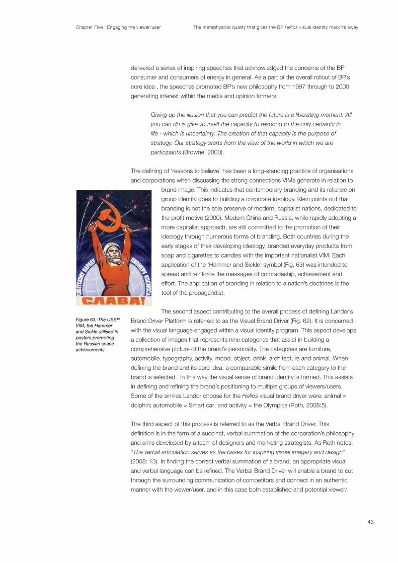
Chapter Five : Engaging the viewer/user The metaphysical quality that gives the BP Helios visual identity mark its sway
delivered a series of inspiring speeches that acknowledged the concerns of the BP
consumer and consumers of energy in general. As a part of the overall rollout of BP’s
core idea , the speeches promoted BP’s new philosophy from 1997 through to 2000,
generating interest within the media and opinion formers:
Giving up the illusion that you can predict the future is a liberating moment. All
you can do is give yourself the capacity to respond to the only certainty in
life - which is uncertainty. The creation of that capacity is the purpose of
strategy. Our strategy starts from the view of the world in which we are
participants (Browne, 2000).
and corporations when discussing the strong connections VIMs generate in relation to
brand image. This indicates that contemporary branding and its reliance on
group identity goes to building a corporate ideology. Klein points out that
branding is not the sole preserve of modern, capitalist nations, dedicated to
more capitalist approach, are still committed to the promotion of their
ideology through numerous forms of branding. Both countries during the
early stages of their developing ideology, branded everyday products from
soap and cigarettes to candles with the important nationalist VIM. Each
application of the ‘Hammer and Sickle’ symbol (Fig. 63) was intended to
spread and reinforce the messages of comradeship, achievement and
effort. The application of branding in relation to a nation’s doctrines is the
tool of the propagandist.
Brand Driver Platform is referred to as the Visual Brand Driver (Fig. 62). It is concerned
with the visual language engaged within a visual identity program. This aspect develops
a collection of images that represents nine categories that assist in building a
comprehensive picture of the brand’s personality. The categories are furniture,
automobile, typography, activity, mood, object, drink, architecture and animal. When
brand is selected. In this way the visual sense of brand identity is formed. This assists
Some of the similes Landor choose for the Helios visual brand driver were: animal =
The third aspect of this process is referred to as the Verbal Brand Driver. This
and aims developed by a team of designers and marketing strategists. As Roth notes,
“The verbal articulation serves as the bases for inspiring visual imagery and design”
through the surrounding communication of competitors and connect in an authentic
manner with the viewer/user, and in this case both established and potential viewer/
Figure 63; The USSR VIM, the Hammer and Sickle utilised in posters promoting the Russian space achievements
43

Chapter Five : Engaging the viewer/user The metaphysical quality that gives the BP Helios visual identity mark its sway
Helios was
Transparency, Flexible, and Inclusive (Landor, 2009). A visual demonstration of this
aspect in action is seen in the shift from the use of capital letterforms for the iconic BP
to the use of the lower case letterforms of b and p and the associated implications of a
less imperialistic and more accessible corporation.
corporation would subsequently rollout into the market place and to its viewers/
(Roth 2008). For the BP brief Landor assembled the four key attributes that drove the
program: ‘Green’, Performance, Innovation, and Progressive. The brand promise of BP,
developed by Landor, was thus consistent and cohesive.
The last area of application of the brand promise via the brand identity program was the
advertising campaign “beyond petroleum” developed by David Fowler, Creative Director
of the BP account at Ogilvy & Mather in 2000. An understanding of the viewer/user is
implicated in the Brand Belief aspect such that the beliefs “should resonate with
employees and guide interactions with customers” (Roth 2008:4). The usage of the
“a
single canvas against which social actors constructed a sense of self” (1997:395). The
BP viewer/user had to be intrigued and engaged by the new ‘Green’ philosophy of BP
and “beyond petroleum”. The brand promise of “beyond petroleum” and the connection
to nature via the Helios was designed to resonate in the viewers’/users’ daily lives. As
Browne was quoted in the Chicago Business Journal (3.04.2000) in relation to his
commitment to the brand promise:
values that underpin everything that you do and every relationship that you have”
(Browne, 2000).
A demonstration of how brand belief is projected effectively and persuasively in the
marketplace can be seen through Nike Sports Wear. In the 21st century to be seen
wearing the VIM of Nike increases or establishes a sense of credibility directly linked to
the company. The brand belief of Nike allows an individual to feel as if they belong to a
group, sharing desirable attributes while wearing a piece of Nike apparel with its
“A young athlete in
better and because they are a fashion statement. Their purpose is both functional and
symbolic” (2007:17).
5.4 The Communication Strategy of the Helios: The implementation (rollout) of the brand
identity program for BP drew heavily from the propaganda techniques ‘Association’,
‘Ad Nauseam’ and ‘Slogan’. Edward Bernays, who cofounded the Institute of
publication Propaganda. The ‘Association’ strategy projects the positive or
negative qualities (praise or blame) of a person, entity, object or value (an individual,
44

Chapter Five : Engaging the viewer/user The metaphysical quality that gives the BP Helios visual identity mark its sway
group, organization, nation, patriotism) to another to make the second more acceptable
or to discredit it. It attempts to evoke an emotional response in the target audience and
highly visual in its communication strategy, employing ‘cultural symbols’ (VIMs) which
are superimposed or placed in close proximity to appropriate visual imagery or
collateral (Bernays, 1928). Consequently VIMs become associated with the brand
promise of the organisation or corporation. Thus the imagery engaged by BP and
branded with the Helios VIM, evoked the brand promise of an alternative approach
in the petroleum category by diversifying into sustainable energy. ‘Ad Nauseam’ is a
technique which engages an idea, especially a simple slogan, “beyond petroleum” or a
strong visual in the form of a ‘cultural symbol’, the Helios, repeated enough times, so it
may be taken as the truth (Bernays, 1928).
The combination of ‘Association’, ‘Ad Nauseam’ and ‘Slogan’ techniques were the base
for the communication strategy of the BP brand identity program rollout. The rollout
utilised a multi-sensorial approach, with a wide range of communication ‘touch points’
that aimed to generate information, excitement and enthusiasm for the Helios VIM and
when a viewer/user is exposed to an organisation’s brand image and brand promise. It
can be in the form of either a visual or an audio message (Wheeler, 2009). Touch points
are either ‘experiential’ or ‘sensory’ in nature (Lippincott & Margules, 2004:60) and
‘experiential’ impressions can be the result of ‘sensory’ touch
points.
BP’s brand identity program was a collection of ‘sensory’ touch
advertisements (for the external viewer/user), brochures (Fig 64)
and newsletters (for the internal viewer/user), stationary
electronic media: television commercials, cinema commercials,
environmental design (Fig. 64 - 65), packaging, livery of vehicles and uniforms (Fig 66 -
67). All aspects of the brand identity program and the advertising campaign were
effectively encoded with the brand promise and brand image. “Corporate strategy
affects corporate structure and corporate culture, and inevitably corporate
identity” (Olins, 1994:145).
communications. In turn, a viewer’s/user’s reaction to the brand’s
Olins claims that the VIM of a corporation, such as the Helios, is a pivotal
touch point of the brand identity program and consequently when viewed
has the capacity to trigger the same emotive response for the viewer as a
collective sense of belonging and purpose” (1994:145).
Figure 64: Information brochure printed on a substrate impregnated with seeds.
Figure 65: Concept petrol station called Helios House in LA complete with recycled materials.
45

Chapter Five : Engaging the viewer/user The metaphysical quality that gives the BP Helios visual identity mark its sway
The delivery of BP’s new ‘Green’ philosophy and brand
identity program began with a ‘brand loyalty rollout’ to the
internal viewer/user. BP’s strategy to launch the brand identity
program to the internal viewer/user prior to the external viewer /
user was to ensure that the brand promise “beyond petroleum”,
and the brand beliefs, would be delivered authentically into the
marketplace via the important ‘touch point’, the employee/
customer personnel. Commenting on this strategy, Staniford
suggested that
importance of brand loyalty rollout” (2010).
5.5 The Viewer/user: With the invention of the Helios, its brand
identity program, and the advertising campaign promoting
“beyond petroleum”, the BP marketing division created a
position within the organisation referred to as a Brand Champion. It was the role of the
Brand Champion to generate ownership of the new identity, the brand promise and the
brand beliefs. More than 1400 Brand Champions were trained in 19 countries over
the initial two months following the launch in July 2000
(Landor, 2010:30). The Brand Champions implemented the
brand loyalty rollout through presentations to
demonstrate how the brand promise and brand belief,
“beyond petroleum”, would be engaged within all aspects
of the brand identity program for the internal viewer/user.
As Roth explained,
embraced by the employees” (2008: 6). The brand loyalty rollout for BP internal viewers/
Future Box (10 minutes)
which was screened during the brand loyalty rollout road show which was held in BP
‘Brand spaces’ (Landor, 2009).
The ‘Brand spaces’ were mobile vehicles, designed to display all
aspects of the brand identity program. These included the new
petrol station, now called ‘connect’, and the comprehensive
livery, which included transportation vehicles seen in Figure 67 and
uniforms in Figure 68.
The Brand Champion program was designed so that the internal
viewers/users were galvanised into a group that would live the BP
brand promise and adopt the BP brand beliefs. There was a
conscious strategy to inform and mold the customer personnel of
BP so as to become ‘experiential’ touch points generating
‘experiential’ impressions for the external viewer/users. ‘Experiential’ impressions are
formed from personal experience with an organisation and are the most powerful and
‘customer personnel’ of the organisation or company and/or a product or service of the
organisation or company. ‘Experiential’ impressions are also formed by second or third-
and environmental graphics utilising the Helios in petrol stations
with the Helios
Figure 68: BP customer personnel dressed in uniforms that reinforce the brand promise utilising the Helios VIM and effectively
46

Chapter Five : Engaging the viewer/user The metaphysical quality that gives the BP Helios visual identity mark its sway
hand experiences of another person in the form of ‘word of mouth’ communication and
are as equally as powerful in effecting a viewer/user’s attitude towards an organisation
or company (Lippincott & Margulies, 2004: 60).
BP emphasised individual accountability through “performance” contracts signed by
each employee outlining to supervisors what will be accomplished during any given
year. “Performance contracts then cascade up the management chain...generally to
The internal viewer/user, at all levels within the corporation, could access a two hundred
page reputation manual which outlined a series of “
leveraging tactics”
scholarships, community meetings, exhibition booths, publications, websites, and
The overall brand loyalty rollout guaranteed that employees, suppliers and shareholders,
wherever they lived and worked, whatever their social, cultural or religious background,
could identify with the whole enterprise. As Olins explains, the strategy “addresses
(1994:9). Prior to the 2000
rebranding program and introduction of the Helios, BP did not measure employee
engagement with the existing Shield (Landor, 2009). After the implementation of the
Helios brand identity program, however, the increase in the internal viewer’s/user’s
awareness and appreciation of BP’s new ‘Green’ philosophy allowed, effectively and
persuasively, one-on-one communication to occur with BP’s external viewer/user, the
customer. The brand promise and brand belief would be applied to the internal viewer’s/
user’s daily jobs, wherever that might be around the world and when they served the
terms of the heritage (BP was recently formed from a combination of British
Petroleum, ARCO, Amoco, Castrol) and more in terms of the new company
(2004: 5).
The brand loyalty rollout was considered to have been highly effective within Landor
Associates (Staniford, 2009). By April 2001, BP measured the effectiveness of the brand
promise and brand engagement within its internal viewers/users, and found that 97%
of all BP internal viewers/users were aware of the new identity and its brand beliefs
(Landor, 2009).
Consequently, after BP’s brand loyalty rollout and a follow-up brand engagement
program conducted by Landor Associates (from November 2001 through to June
2002), there was an increase of 41% in the internal viewer’s/user’s understanding of
how to apply the brand promise and brand beliefs to their job responsibilities which is
seen in Figure 69 (Landor, 2009). The new internal viewer’s/user’s behaviour resulted in
47

Chapter Five : Engaging the viewer/user The metaphysical quality that gives the BP Helios visual identity mark its sway
a correlated drop during the same period
in request for guidance on applying brand
to the job, from November 2001 through
to June 2002 by 13% (Landor, 2009).
There was a discernible slow down in staff
turnover that could be attributed to brand
engagement with the internal viewers/
users. The post launch period of the Helios
saw an overall rapid and impressive brand
engagement by approximately 80% of
internal viewers/users worldwide which at
the time was approximately 150,000 by
2002 (Landor 2009). As Roth further
explains,
initiatives to drive its business” (2008: 7).
Addressing the external viewers/users, the brand promise combined with the brand
belief of “beyond petroleum” and the Helios brand identity program would place a focus
on the forward thinking, unique and distinctive aspects of the corporation. In addition
to the communication collateral of ‘sensory touch points’ to the external viewer/user,
the communication strategy integrated the core idea of ‘Green’ through the innovative
advertising campaign of Ogilvy and Mather, the personal appearances of Lord Browne
After the launch of the Helios VIM and the
comprehensive brand identity program,
the downstream revenues generated at BP
‘connect’ retail stores, which are a part of
BP petrol stations, increased by 23% world
wide in 2001 ( , July
2002). The impact of the rebranding and
the embracing of the four key attributes
on the intangible asset value of BP. Fortune
Magazine consistently ranked BP a ‘Most
Admired Company’ and one of the ten most
Helios brand identity program rollout, awareness amongst opinion formers increased
cleaner fuels, was an environmental leader, was reinventing the energy business, was a
good company to invest in and a growing company with high value (Reputation Survey
BP’s brand assets, including its intangible assets such as the Helios brand and “beyond
petroleum”, were found to have increased by more than $7 billion between 2001 and
48
Figure 69
Figure 70

Chapter Five : Engaging the viewer/user The metaphysical quality that gives the BP Helios visual identity mark its sway
49
2005 by utilising Stern Stewart’s Economic
Value Added (EVA) analysis (Fortune
Magazine, 2005) (Fig. 71). EVA analysis
performance based on the residual wealth
calculated by deducting cost of capital
on a cash basis) (Tebogo, 2011).
5.VI Conclusion: BP’s new global outlook
aimed to reach potential customers well in
excess of the 11 million existing customers
they had in 2000. “Driven largely by its
Roth, 2008: 4). The brand image was to communicate the
collective consciousness of the ‘Green’ philosophy that existed at the end of the
millennium. As Davidson (1968) suggests, nature triggers a degree of fear within the
groups and the elements of nature since ancient times when groups feared the
capriciousness of the elements. Ironically it was a reversed fear of what humanity was
doing to nature that triggered the ‘Green’ movement.
honest with consumers than other oil companies and one that tries to reconcile
their need for fuel with their fear of polluting (Solman, 2008:1).
For a visual communication strategy and brand identity program to be effective, group
identity and its dynamics and motivators must be understood, as Roth suggests it
“shapes a brand through communications and the interaction with customers” (2008:
20). The drivers of group membership are linked to motivators such as purpose,
belonging and survival and these provide stable elements for human cohesion that bind
individuals together (DeBoard, 1990). The use of VIMs when representing an institution,
creates a sense of trust and reassurance. The work of Jung and Durkheim address the
contemporary branding strategists such as Wheeler (2009) and Olins (2004).
It was essential for BP to create a strong association with both of its internal and
external audiences, ensuring that the brand belief of “beyond petroleum” would be
embraced as an ideology. It was also essential that the Helios was acknowledged as
the signature of BP.
Paul Rand commented on the importance of the VIM’s role in the marketplace,
advocating that
essential characteristics of the institution being advertised...it serves to glorify the
merchandise” (Rand, 2008: 154).
Figure 71: Indicates the above category performance of BP

Chapter Five : Engaging the viewer/user The metaphysical quality that gives the BP Helios visual identity mark its sway
Due to BP’s visual communication strategy a duality of numinosity within the Helios
resulted. The repeated and consistent implementation of the Helios throughout the
brand identity program enhanced of the existing numinosity of the ‘natural symbol’ and
generated a second aspect of the numinous with the Helios becoming a ‘cultural’
symbol. As Landor indicated in their
“The Helios became an external representation of the brand idea and a powerful internal
symbol” (McGraw, 2010:33)
50

Chapter Six Conclusion The metaphysical quality that give the Helios visual identity marks its sway
Chapter 6:Conclusion
BP’s Helios broke the accepted trend for a VIM in the petroleum category. The visual
cues that viewers/users had come to expect from VIMs in this category did not exist in
the Helios. Landor Associates, a global brand strategists designed the Helios and its
brand identity program in 2000.
This thesis demonstrates that the BP Helios has a metaphysical quality. The
metaphysical quality transmitted to the viewer/user by the VIM is referred to as
The Idea of Holy (1917). Jung and
Durkheim further developed the concept of numinosity, asserting that when a symbol
(archetypal) holds a natural (sacred) and a cultural (profane) value simultaneously, it
becomes numinous. Therefore the Helios, which has an archetypal symbol as its base,
transmits a duality in its subliminal meaning to the viewer/user.
The viewer/user relates to a natural symbol (archetypal symbols) in a manner that
reveals the VIM to have a deeper spiritual and/or sacred value. Cultural symbols
(contemporary VIMs) gain a numinous quality through their repeated and ubiquitous
recurring cycles of nature. This thesis goes to explain the way the natural symbolism in
the Helios is based on the Solar Cross, an elemental nature-inspired archetypal symbol.
The BP Helios, while a natural symbol, is employed as a cultural symbol to represent a
corporation that moved from operating solely in the petroleum category towards
representing other forms of energy in the energy sector.
Early natural symbols emerged as an individual’s visual expression of the natural world
identity by entire groups. Cultural VIMs based on the Solar Cross have existed since
before the Bronze Age and the reoccurring engagement of the Solar Cross by ancient
VIMs as both a natural and a cultural symbol simultaneously. Early groups used these
symbols in everyday and sacred situations. The continual employment of VIMs using
the Solar Cross has been engaged since the development of early societal groups with
as it goes to demonstrate the ongoing usage of the Solar Cross in VIM design. For BP,
the Solar Cross supplied the Helios with an established equity.
BP, which initially stood for ‘British Petroleum’, was a provider of fuels in the form of oil
and petroleum, for the British Navy in 1914. The company grew into a brand supplying
petrol to a global market, in particular, to British and European motorists. The turbulent
politics of the Middle East in 1970s and 1980s, including the Iranian revolution and the
-
John Browne’s vision for the future of BP that went “beyond petroleum” resulted in the
invention of BP’s Helios VIM. The Helios represented the strategic redirection of a newly
formed corporation that came out of a series of acquisitions and mergers by BP in the
51

Chapter Six Conclusion The metaphysical quality that give the Helios visual identity marks its sway
perception in the market of a fragmented organisation was a result of the mergers and
acquisitions, as the two dominant companies (BP and Amoco) each had established
identities within the petroleum category. BP’s new global outlook and ‘Green’ philoso-
encompassed the brand beliefs of Performance, Energy, Innovation, and ‘Green’.
The growth of the burgeoning environmental movement gained momentum in the
was the main driver for the design brief. The key strategic consideration for the
rebranding was to establish an immediate association between BP and nature.
Although environmentalism was a valid movement with far reaching economic effects
‘Green’ had roots in the practice of ‘greenwashing’. The strategic shift towards ‘Green’
of BP on all accounts appears to have been genuine.
The resulting Helios became an emblematic representation of an evolving awareness
amongst the collective consciousness of viewers/users. Durkheim asserted that
collective consciousness is when a shared belief operates as a unifying force in society
and for BP the unifying force was the innate fear triggered by nature in humans
(environmentalism). The equity found in sun symbolism conveyed a sense of trust and
reassurance. This equity provided a springboard for BP’s Helios gaining acceptance in
the global marketplace for the corporation’s new ‘Green’ philosophy. Jung and
Durkheim contended that when a group adopted an natural symbol as a cultural symbol
(VIM), it triggers a sense of identity with ‘spellbinding powers’. For BP the Helios as a
cultural symbol, represented the corporation as a champion for environmental
consciousness and alternative energies.
Effective contemporary visual communication strategies are developed by
groups of viewers/users within the marketplace. Visual and corporate identity rollouts,
rebranding programs and advertising campaigns are designed to reassure existing
markets while aiming to establish new markets. Landor Associates considered the
broad range of viewers/users within the global marketplace when developing the
revolutionary Helios
developed the BP brand by creating the motivating brand belief “beyond petroleum” in
2000. The BP rebranding communication strategy relied upon principles of
communication and persuasion, which evolved out of propaganda techniques
‘Association’, ‘Ad Nauseam’ and ‘Slogan’. The visual communication strategy for the
Helios
cycles of nature, while the brand belief “beyond petroleum” reinforced BP’s new ‘Green’
philosophy. The rebranding had a measurable effect upon the tangible and intangible
brand value of BP. Within three years of launch there was an increase in brand strength
52

Chapter Six Conclusion The metaphysical quality that give the Helios visual identity marks its sway
engagement of the brand by internal viewers/users and how to apply the brand promise
Numinosity gives the Helios ‘spiritual qualities’. The Helios as a natural (archetypal)
symbol has a sacred quality built on nature and resonates immediately with a viewer/
user. The Helios became a cultural symbol through the visual identity rollout designed by
Landor Associates. The Helios transmits a duality in meaning by conveying the ‘Green’
message as a cultural symbol and its metaphysical numinous quality as a natural
symbol. Although operating from two distinct perspectives, archetypal symbolism and
contemporary ‘Greenness’ both relate to nature.
53

Appendix 1: Glossary The metaphysical quality that gives the BP Helios visual identity mark its sway
Abstract: An ideal, a term, or visual rendering that is a result of analysing, distilling and articulating the essence of
a situation, a philosophy or a material object in a non-representational visual form.
* Separated from matter, practice, or particular examples; not concrete ; -noun (denoting quality or state); the
abstract, ideal or theoretical way of regarding things. 2. Idealistic, not practical: abstruse; (Art etc) free from
representational qualities (- expressionism, ACTION painting). 1.
* Having an intellectual and affective artistic content that depends solely on intrinsic form rather than on narrative
content or pictorial representation: abstract painting and sculpture. 2.
* To withdraw by expression, distillation, or other mechanical or chemical process; as, to extract an essence. Cf.
Abstract, v.t., 6. 3.
1. Concise Oxford Dictionary of current English, 1997, Clarendon Press, Oxford, UK
2. The American Heritage Dictionary of the English language, fourth edition, 2006, Houghton
3. Webster’s Revised Unabridged Dictionary,1996, 1998, MICRA, Inc.
Ad Nauseam: An idea, especially a simple slogan or a strong visual in the form of a symbol or other imagery,
repeated enough times, so it may be taken as the truth.
Anima: Jung’s term for the feminine part of a man’s personality. Often contrasted with animus.
The part of the psyche that is directed inward, and is in touch with the subconscious. Often contrasted with
animus. ORIGIN 1920s: from Latin, literally ‘mind, soul.’
Animus: Psychology Jung’s term for the masculine part of a woman’s personality. Often contrasted with anima.
ORIGIN early 19th cent.: from Latin, ‘spirit, mind.’
Archetype: A pattern of thought, or symbolic and pervasive imagery that is inherited from the past collective
experience of a culture and is present in the individual unconscious.
* Original model, prototype; typical specimen; (Psych.) primordial mental image inherited by all; recurrent symbol
or motif; so –AL, archety’pical. 1.
* the original pattern or model from which all things of the same kind are copied or on which they are based: a
2.
* In Jungian psychology, an inherited pattern of thought or symbolic imagery derived from the past collective
experience and present in the individual unconscious. 3.
1. Concise Oxford Dictionary of current English, 1997, Clarendon Press, Oxford, UK
2. Random House Unabridged Dictionary, 2006, Random House, Inc.
3. The American Heritage Dictionary of the English language, fourth edition, 2006, Houghton
The ‘Association’ strategy projects the positive qualities of a person,
entity, object or value (an individual, group, organization, nation) . It attempts to evoke an emotional response
Often highly visual in its communication strategy, with the employment of ‘cultural symbols’ (VIMs) which are
superimposed over other associated visual imagery. Consequently these ‘cultural symbols’ become recognised
as the marks of particular brand identities.
Brand Belief: rogram of the corporation
Brand Belief
this aspect.
Appendix 1:
Glossary
54

Appendix 1: Glossary The metaphysical quality that gives the BP Helios visual identity mark its sway
Brand Equity: The power of a brand – through successful creation of a positive image – to shift demand and
change customer behaviour.
Brand Identity: The visible elements that can be used to identify a brand ( name, logotype, symbol, product
Brand Image:The complete bundle of thoughts a customer has in their mind about a company, product, or
service developed through communications and experience, including the distinguishing “human characteristics
of a brand personality (e.g. warm and friendly,or strong and reliable).
Brand Promise:
product, service or company.
Brand Statue: The esteem and knowledge of a company in the market place perception (Landor Associates
2009).
Brand Strategy: Long term plan for the brand including a determination of key audiences and a understanding of
what those audiences need to know about the brand and experience.
Chi Rho:
the name CHRIST: CH = X and the RHO = P.
Collective unconscious: is a term of analytical psychology, coined by Carl Jung. Jung distinguished the
collective unconscious from the personal unconscious, in that the personal unconscious is a personal reservoir
of experience unique to each individual, while the collective unconscious collects and organizes those personal
experiences in a similar way with each member of a particular species.
Communication Audit: A formal examination of an organization’s visual and verbal communications practices.
Communications Plan: A company’s communication goals and objectives, and the messages and vehicles that
wil be used to meet them.
Complex: An intricate or complicated association or assemblage of related things, parts, units, etc.
* Complete whole; (Psych) related to the group. Repressed ideas etc. causing abnormal behaviour or mental
state; Consisting of parts, compositive; complicated; (Gram., of sentence) 1.
* Psychology: a system of interrelated, emotion-charged ideas, feelings, memories, and impulses that is
usually repressed and that gives rise to abnormal or pathological behavior; composed of many interconnected
parts; compound; composite: a complex highway system; Characterized by a very complicated or involved
arrangement of parts, units, etc.: complex machinery; So complicated or intricate as to be hard to understand
or deal with: a complex problem; An intricate or complicated association or assemblage of related things, parts,
units, etc.: the entire complex of our educational system; an apartment complex; A collection of simplexes having
2..
1. Concise Oxford Dictionary of current English, 1997, Clarendon Press, Oxford, UK
2. Random House Unabridged Dictionary, 2009, Random House, Inc.
55

Appendix 1: Glossary The metaphysical quality that gives the BP Helios visual identity mark its sway
Corporate Identity: nd buildings, both
administrative and manufacturing, advertising, livery, packaging, stationary system) which can be used to identify
a company.
Corporate Identity Program: A complete system of visual communication designed and executed to deliver a
perceived philosophy of a corporation or institution to both internal and external audiences. The visible elements
to consider in the mix, can be a name, a visual identity mark in the form of a logotype, and or symbol, signage,
retail outlets, administrative and manufacturing buildings, advertising in multiple medium, livery, packaging, and
stationary system.
trucks, packaging,
letterhead, business cards, etc.) which can be used to identify a company.1.
1. Lippincott, G & Margulies, W 2004, SENSE, Rockport Publishers Inc, Massachusetts
Corporate Image: The perception that people have of a company, based on a combination of various
communications and personal experiences.
Corporate Mission:
organisational behaviour.
.
Cosmology: The branch of philosophy dealing with the origin and general structure of the universe, with its parts,
elements, and laws, and esp. with such of its characteristics as space, time, causality, and freedom.
* The branch of astronomy that deals with the general structure and evolution of the universe. 1.
* The study of the physical universe considered as a totality of phenomena in time and space; The astrophysical
structure and these dynamics. 2.
1.Random House Unabridged Dictionary, 2006, Random House, Inc.
2.The American Heritage® Dictionary of the English Language, fourth edition, 2006, H
Decoding = Viewing= Reading: to translate (data or a message) from a code into the original language or form;
to extract meaning from (spoken or written symbols).1.
1.Dictionary.com Unabridged Based on the Random House Dictionary, 2009, © Random House, Inc.
Economic Value Added (EVA):
- (Capital * Cost of Capital).
Encoding = Creating = Writing: verb (used with object), to convert (a message, information, etc.) into code.
Image Attributes:
between similar products and services.
Image Criteria: The desired “personality” attributes of a company, product, or service that guide name and
design development.
56

Appendix 1: Glossary The metaphysical quality that gives the BP Helios visual identity mark its sway
Institution: A long time established and fundamental part of human interaction within a society associated with its
* Instituting; establishment (of person) in cure of souls. 2. Established law, custom, or practice; (colloq., of person
etc.) familiar object. 1.
* An organization, establishment, foundation, society, or the like, devoted to the promotion of a particular cause
or program, esp. one of a public, educational, or charitable character. 2.
1. Concise Oxford Dictionary of current English, 1997, Clarendon Press, Oxford, UK
2. Random House Unabridged Dictionary, 2006, Random House, Inc.
Liber Abaci (Book of Calculation): Written by Leonardo Pisano (who was also known as Leonardo Fibonacci) in
1202, introduced the Hindu numerals 0, 1, 2, 3, 4, 5, 6, 7, 8, and 9 to Europe.
Liminal: Of or relating to a transitional or initial stage of a process. It is the quality of ambiguity or disorientation
that occurs in the middle stage of rituals, when participants no longer hold their pre-ritual or pre-liminal status
but have not yet begun the transition to the status they will hold when the ritual is complete. During a ritual’s
liminal stage, participants “stand at the threshold” between their previous way of structuring their identity, time,
or community, and a new way, which the ritual establishes.
* another term for threshold See also liminal 1.
1. Collins English Dictionary - Complete & Unabridged 10th Edition 2009, William Collins Sons & Co. Ltd.
HarperCollins Publishers, UK
Logotype: A unique grouping of letterforms that represents a brand. IBM, and Coca Cola feature logotypes as
the primary element of their visual identity mark.
* A unique group of letterforms that represent the corporate brand. IBM, Nuveen, and GAP feature logotypes as
their primary form of identity. 1.
1. Lippincott, G & Margulies, W 2004, SENSE, Rockport Publishers Inc, Massachusetts
Manifest: Clear, evident, and tangible visuals of an idea or concept, which are free from ambiguity, and are
obvious for the viewer to understand.
* Show plainly to eye or mind; be evidence of, prove; display, evince, (quality, feeling) by one’s acts etc.; (of thing)
reveal itself; record in a manifest. 1.
* Clear, obvious, to eye or mind; hence –ly2 adv. (ME, f. OF manifeste or f.L manifestus (manus hand, *festus
struck). 2.
1. Concise Oxford Dictionary of current English, 1997, Clarendon Press, Oxford, UK
2. Random House Unabridged Dictionary, 2006, Random House, Inc.
Message: The information (facts, strengths, culture/style, and future direction) that is most relevant to priority
audiences and serve as major content points for all communications.
Numinosity: Also understood as the ‘wholly other’, arousing feelings of loyalty, duty and honour. In its original
meaning it spoke of belief in deities, the sacred, the holy and the transcendent, as ‘the intense feeling of
unknowingly knowing that there is something that cannot be seen’. The concept of the numinous is central to the
work of the German theologian Rudolf Otto in 1917, and subsequently Carl Gustav Ju
word ‘NUMINOUS’ derived from the Latin word ‘numen’ which is associated with the meanings ‘command’ and
‘divine majesty’.
*Associated with the concept of spiritual elevation, the sublime, and otherworldly. In more contemporary times it
57

Appendix 1: Glossary The metaphysical quality that gives the BP Helios visual identity mark its sway
is not necessarily an exclusively religious idea as it is important to separate the numinous from the supernatural.
(Christopher Hitchens) 1.
* Of a numen; spiritual; indicating presence of divinity; awe-inspiring. ( f. L numen + -ous) 2.
* Of, pertaining to, or like a numen; spiritual or supernatural. 2. Surpassing comprehension or understanding;
mysterious; that element in artistic expression that remains numinous. 3. Arousing one’s elevated feelings of duty,
honour, loyalty, etc. : a benevolent and numinous paternity. 3.
* Spiritually elevated; sublime. 4.
1. The Four Horseman. Discussions with Richard Dawkins: Episode One 30.07.2007
2. Concise Oxford Dictionary of current English, 1997, Clarendon Press, Oxford, UK
3. Random House Unabridged Dictionary, 2006, Random House, Inc.
4. The American Heritage Dictionary of the English language, Fourth Edition, 2006, Houghton
Positioning Statement:
value proposition.
Profane: Could be considered of a coarse or vulgar nature. Due to its lack of a connection to the sacred, it is
associated with the temporal, and that which is of this life and this world.
* Not belonging to what is sacred or biblical (profane history, literature, writer); not initiated into religious rites or
any esoteric knowledge; (of rites etc.) heathen. 2. Irreverent, blasphernous 1.
* Common or vulgar 2.
eligious; irreverent; ungodly; wicked;
godless; impious. 3.
1. Concise Oxford Dictionary of current English, 1997, Clarendon Press, Oxford, UK
2. Random House Unabridged Dictionary, 2006, Random House, Inc.
3. Webster’s Revised Unabridged Dictionary, 1996, 1998 MICRA, Inc.
Propaganda: Information, ideas, and rumours sown into a society’s psyche via visual and verbal formats to
advance the vested interest of particular group, movement, institution or nation.
* Association or organised scheme for propagation of a doctrine or practice; (usu. Derog.) doctrines, information,
etc., thus propagated. 1.
1. The Oxford Concise Dictionary New Edition sixth edition, 1979
Sensory:
image it has. This is the area of sensory impressions – 85% of a person’s awareness of things around them
comes to them through their eyes. People tend to put stock in things they can see. 1.
1. Lippincott, G & Margulies, W 2004, SENSE, Rockport Publishers Inc, Massachusetts
Statement of Relevant Differentiation itten and
responding to what the market needs.
Symbol: Non typographic element of an abstract or representational nature. Apple, Nike, BP feature graphic
symbols as an important element/form of their identity.
58

Appendix 1: Glossary The metaphysical quality that gives the BP Helios visual identity mark its sway
Sacred: Set apart from the profane and the common and reserved for exclusive use in association with and
dedication to divinity, and thus believed to be holy.
* Consecrated or held especially acceptable to a deity, dedicated or reserved or appropriated to some person
or purpose; made holy by religious association, hallowed; - book, writings, (embodying laws etc. of a religion);
Sacred COLLEGE; Sacred Heart, the heart of Jesus as object of devotion; - number (associated with religious
required by religion or reverence or tradition, indefeasible, inviolable, sacrosanct 1.
* entitled to veneration or religious respect by association with divinity or divine things; holy 2.
1. Concise Oxford Dictionary of current English, 1997, Clarendon Press, Oxford, UK
2. Random House Unabridged Dictionary, Random House, Inc. 2006
Slogan: A brief, striking phrase that may include labelling and stereotyping. Although slogans may be enlisted to
support reasoned ideas, in practice they tend to act only as emotional appeal. Opponents of the United State’s
invasion and occupation of Iraq use the slogan ‘blood for oil’ to suggest that the invasion and its human losses
Symbol: Non-typographic element of an abstract or representational nature. Apple, Nike, and BP feature graphic
symbols as an important, if not the primary element of their visual identity mark.
* Things regraded by general consent as naturally typifying or representing or recalling something (esp. an idea or
quality) by possession of analogous qualities or by association in fact or thought (white, thunderbolt, the cross,
are symbols of purity, courage, Zeus, Christianity) * Mark or character taken as the conventional sign of some
object or idea or process e.g. the astronomical signs for the planets, the letters standing for chemical elements,
, the asterisk. 1.
* A non-typographic elements of an abstract or representational nature. Texaco, Apple, and Continental Airlines
feature graphic symbols as an important form of their identity. 2.
1. Concise Oxford Dictionary of current English, 1997, Clarendon Press, Oxford, UK
2. Lippincott, G & Margulies, W 2004, SENSE, Rockport Publishers Inc, Massachusetts
Touch Point: The subsequent visual identity rollout program consists of the touch points that are engaged to
include all aspects of print: press advertisements, brochures and newsletters, stationary system, posters (both
billboards and bus shelters); electronic media: TVC, cinema, web, social media; as well as signage, location
design, packaging, livery of vehicles, transportation, and uniforms.
Verbal Brand Driver: e corporation’s philosophy
and aims developed by a team of designers and marketing strategists. The verbal articulation serves as the
bases for inspiring visual imagery and design (Roth, 2008).
Visual Brand Driver: It is concerned with the visual language engaged within a visual identity program. This
aspect develops a collection of images that represents nine different areas relevant and necessary to building
brand’s
positioning to multiple audiences.’
Visual Communications System: ny’s name,
logotype, colour palette, and secondary typography; a company’s graphic ‘look and feel’, applied to a wide cross
section of media to create a cohesive brand presence.
59

Appendix 1: Glossary The metaphysical quality that gives the BP Helios visual identity mark its sway
Visual Identity Mark:
or a symbol.
Visual Identity Program: ny’s name, logotype,
colour palette, and secondary typography; a company’s graphic ‘look and feel’, applied to a wide cross section
of media to create a cohesive brand presence.
60

Appendix 2: Image Sources The metaphysical quality that gives the BP Helios visual identity mark its sway
Figure 1: BP Helios VIM 2000, (Courtesy Landor Associates, 2002) 1
Figure 2: The Solar Cross, Hill, J (sketch, 2009) 1
Figure 3: The BP VIM 1920, ( bp.com, 2011) 8
<hhttp://www.bp.com/multipleimagesection.do?categoryId=2010123&contentId=7059226>
Figure 4: The BP VIM of the 1920s in a Union Jack, (bp.com, 2011) 8
<hhttp://www.bp.com/multipleimagesection.do?categoryId=2010123&contentId=7059226>
Figure 5: The BP Shield VIM 1946, (Brief History of BP Advertising, 26.09.2006:1) 9
<http://BP/Files/BP_Advertising/BriefHistory/of/BP/Advertising/26:09:06,BP/Archive.webarchive>
Figure 6: The BP Shield VIM 1952, (Brief History of BP Advertising, 26.09.2006:2) 9
<http://BP/Files/BP_Advertising/BriefHistory/of/BP/Advertising/26:09:06,BP/Archive.webarchive>
(bp.com, 2011) 9
<hhttp://www.bp.com/multipleimagesection.do?categoryId=2010123&contentId=7059226>
Figure 8: Amoco VIM 1998, (Amoco logo.svg The 1970–2000 logo en.wikipedia.org, 2012) 12
<http://en.wikipedia.org/wiki/Amoco>
Figure 9: BP/Amoco VIM 1999, (seeklogo.com, 2012) 12
<http://www.seeklogo.com/search.html?q=BP>
Figure 10: Arco VIM, (cartype.com, 2012) 12
<http://www.cartype.com/pages/384/arco>
Figure 11: Solarex VIM, (toboaenergy.com, 2012) 12
<http://www.toboaenergy.com/store/Solarex_Controllers.html>
Figure 12: Castrol Oils VIM (topnews.in, 2012) 12
<http://www.topnews.in/companies/castrol>
Figure 13: BP/Amoco VIM 1999 (seeklogo.com, 2012) 13
<http://www.seeklogo.com/search.html?q=BP>
Figure 14: Arco VIM, (cartype.com, 2012) 13
<http://www.cartype.com/pages/384/arco>
Figure 15: Solarex VIM, (toboaenergy.com, 2012) 13
<http://www.toboaenergy.com/store/Solarex_Controllers.html>
Figure 16: BP Shield VIM and BP Helios VIM (designreviver.com, 2012) 14
<http://designreviver.com/inspiration/20-great-and-20-not-so-great-logo-redesigns/>
61
Appendix 2:
Image Sources

Appendix 2: Image Sources The metaphysical quality that gives the BP Helios visual identity mark its sway
Figure 17: The evolution of Shell VIM 1900-1999, Olins, W. 14
(Wally Olins: The Brand Hand Book, 2008:57)
Figure 18: Mercedes Benz VIM, Gernsheimer, J 14
(Designing Logos. The process of creating symbols that endure, 2008:101)
Figure 19: BP Shield VIM, (designreviver.com) 15
<http://designreviver.com/inspiration/20-great-and-20-not-so-great-logo-redesigns/>
Figure 20: The colour equity of the BP brand, (Google image, 2012) 16
<http://en.wikipedia.org/wiki/File:BP_old_logo.svg>
Figure 21: Colour and Form by Karl Gerstner, Gerstner, K 16
(Karl Gerstner The Forms of Colour, 1986: 117)
18
<http://earthweek.us/wp-content/uploads/2010/04/Earth-Week-70-logo-426x500.jpg>
Figure 23: Example of ‘Greenwashing’ advertising by Coca Cola (Google image, 2012) 19
<http://en.wikipedia.org/wiki/Greenwashing>
Figure 24: The Performance Formation VIM, (Courtesy Landor Associates, 2002) 20
Figure 25: The Helios VIM, (Courtesy Landor Associates, 2002) 20
Figure 26: Nike VIM 1985, Evamy, M (Logo, 2007: 203) 21
Figure 27: McDonalds VIM, Evamy, M (Logo, 2007:119) 21
Figure 28: Apple Mac VIM 1999, Evamy, M (Logo, 2007:259) 21
Figure 29: The Performance Formation VIM, (Courtesy Landor Associates, 2002) 21
Figure 30: The Helios VIM, (Courtesy Landor Associates, 2002) 22
Figure 31: BP’s Brand Equity Results, (Courtesy Landor Associates, 2002) 23
Figure 32: The visual evolution of BP’s VIMs, (bp.com, 2012) 24
<http://www.bp.com/sectiongenericarticle.do?categoryId=9014508&contentId=7027677>
Figure 33: The Solar Cross, Hill, J (sketch 1, 2009) 25
Figure 34: The Performance Formation VIM, (Courtesy Landor Associates, 2002) 25
Figure 35: The Helios VIM, (Courtesy Landor Associates, 2002) 25
62

Appendix 2: Image Sources The metaphysical quality that gives the BP Helios visual identity mark its sway
Figure 36: The visual link between the Solar Cross and the Helios VIM, 28
Hill, J (sketch 1, 2009) and (Courtesy Landor Associates, 2002)
Figure 37: The primordial dot in the Solar Cross, Hill, J (sketch 1, 2009) 29
Figure 38: The Wheel of the Year (Solar Cross), Hill, J ( sketch 2, 2009) 30
Figure 39: The Swastika (Solar Cross), Hill, J ( sketch 3, 2009) 30
Figure 40: Bayer VIM 2002, Evamy, M (Logo, 2007: 212) 30
Figure 41: BMW VIM 1917, Gernsheimer, J 30
(Designing Logos. The process of creating symbols that endure, 2008:102)
Figure 42: The Wheel of the Year (Solar Cross), Hill, J ( sketch 2, 2009) 30
Figure 43: Vitruvian Man by Leonardo de Vinci, (Google Image) 30
<http://en.wikipedia.org/wiki/File:Da_Vinci_Vitruve_Luc_Viatour.jpg>
Figure 44: Examples of Solar Cross variations, Hill, J (sketches 4-8, 2009) 31
Figure 45: The San Francisco Opera VIM 2005, Evamy, M (Logo, 2007: 183) 31
Figure 46: Chrysler Corporation VIM 1962, Gernsheimer, J 31
(Designing Logos. The process of creating symbols that endure, 2008:109)
Figure 47: Seed Media Group VIM 2005, Evamy, M (Logo, 2007: 192) 31
Figure 48: The Labarum symbol (Chi Rho) 4th century CE, Hill, J ( sketch 9, 2009) 31
Figure 49: Coin from Constantine’s Rome with the Labarum (Google image, 2012) 32
<http://en.wikipedia.org/wiki/File:As-Constantine-XR_RIC_vII_019.jpg>
Figure 50: The Golden Ratio (Google image) 33
<http://en.wikipedia.org/wiki/Golden_ratio>
Figure 51: The Performance Formation VIM (Courtesy Landor Associates, 2002) 33
Figure 52: Darius 1 Achaemenid Coin: Gold Daric, circa 490BC, (Goggle image) 34
<http://en.wikipedia.org/wiki/File:Achaemenid_coin_daric_420BC_front.jpg>
Figure 53: Citroen Cars VIM 1985 - 2009, Cantz, H (Karl Gersyner!, 2001:166) 34
Figure 54: FedEx VIM 1994, Evamy, M (Logo, 2007: 217) 34
Figure 55: Dunlop Sport VIM, Evamy, M (Logo, 2007: 217) 34
63

Appendix 2: Image Sources The metaphysical quality that gives the BP Helios visual identity mark its sway
Figure 56: Archetypal symbols adorn initates of a passage of rites, Turner, 1957 34
<http://judithwesterveld.nl/text/FINAL%20VERSION%20THESIS.pdf>
Figure 57: Bronze Age Oil Burner with Solar Cross decoration, Hill, J 2010, 35
Object photographed at Irakelion Museum, Ikralelion, Crete, Greece
Figure 58: Solar Cross decoration of Bronze Age pottery bowl, Hill, 2010 35
Object photographed at Irakelion Museum, Ikralelion, Crete, Greece
Figure 59: Bronze Age Assyrian solar deity Ashur VIM, Hill, J (sketch 10, 2009) 36
Figure 60: Aligning brand actions and expressions of BP, (Courtesy Landor Associates, 2002) 37
Figure 61: Contrast in visual encoding of BP’s Shield and Helios VIMs, Olins, W 39
(Wally Olins. On brand., 2007: 97)
Figure 62: Landor Brand Driver Platform for BP, Roth, H (Courtesy Landor Associates) 41
(The challenge of the global brand, 2008: 5)
Figure 63: Poster for USSR space race with the Hammer and Sickle VIM, Stampler, L 2012 42
<http://www.businessinsider.com/here-are-the-soviets-extremely-intense-space-race-
propaganda-posters-from-1958-1963-2012-4?op=1>
Figure 64: Seed impregnated substrate used for BP printed collateral, Olins, W 44
(Wally Olins:The Branding Hand Book, 2008:15)
Figure 65: Helios House (a concept petrol station) in LA, US, Olins, W 44
(Wally Olins:The Branding Hand Book, 2008:14)
Figure 66: Environmental graphics for ‘Connect’ bp stations, Mcgraw Hill, (Courtesy Landor 45
Associates) (The Essential Branding from the big Book of Marketing, 2010:32)
Figure 67: BP tankers with the Helios applied, Mcgraw Hill, (Courtesy Landor Associates, 45
The Essential Branding from the big Book of Marketing, 2010:31)
Figure 68: BP Helios uniform for customer service employees, Olins, W 45
(Wally Olins:The Branding Hand Book, 2008:15)
Figure 69: BP brand metrics ‘In employee measure’, (Courtesy Landor Associates, 2002) 47
Figure 70: BP Brand Identity Program results, (Courtesy Landor Associates, 2002) 47
Figure 71: BP Market Share Price increases, (Courtesy Landor Associates, 2002) 48
Figure 72: BP Helios VIM, Olins, W (Wally Olins. On brand., 2007: 97) 50
64

Bibliography The metaphysical quality that gives the BP Helios visual identity mark its sway
Armstrong, A.H 1984, An introduction to Ancient Philosophy, 1st edition 1947, Rowman & Allanheld, N.J, US
Balchin, W G V 1944, ‘The Swastika’, Folklore, Folklore Enterprises, Ltd., Pasadena, California, Vol. 55, No. 4,
(Dec.), pp.167-168
Bamberg, J H 2009, The History of the British Petroleum Company, Cambridge University Press, Cambridge, UK
Barnard, M 2001, Approaches to understanding Visual Culture, Palgrave, Hampshire
Barnes, J A 1996, ‘Durkheim’s Division of Labor in Society’, Man, New Series, Vol.1, No.2, (June) pp.158-175
Barnes, T D 1981, Constantine and Eusebius, Harvard University Press, Cambridge, Massachusetts
bbc.co.uk, From Anglo-Persian Oil to BP Amoco, 11.08.1998, accessed 05.05.2012,
<http://news.bbc.co.uk/2/hi/business/149259.stm>
Beaujeu, J & Defadas, J & Le Bonnice, H 1967, Les Gres et Les Romains, Paris
Bellizzi, J A & Hasty, R W & Biedermann, H & Hulbert, J (Translator) 1996, The Wordsworth Dictionary of
Symbolism, Wordsworth Editions Ltd.
Bernays, E 1928, Propaganda, Horace Liveright, New York
Black, B 2008, Lybecker, D (editor), Great debates in American environmental history, Greenwood Press, Westport
Blavatsky, H P 1964, ‘The Chaldean Legend’, Theosophy Magazine, Vol.52, No.6 (April), pp.175-182
Blavatsky, H P 1977, Secret Doctrines, original publication 1888, Theosophical University Press, Pasadena,
California
Bonnell, V E 1988, ‘The Representation of Politics and the Politics of Representation’,The Russian Review, Vol.47
pp. 315-322
bp.com, 2012, BP timeline, accessed 19.06.2012,
<hhttp://www.bp.com/multipleimagesection.do?categoryId=2010123&contentId=7059226>
Bui, M H 2005, Environmental marketing: a model of consumer behavior, Loyola University, New Orleans
Cage, J 2011, Colour and Meaning, Thames & Hudson, London
Cantz, H 2001, Karl Gersyner!
Cerulo, K A 1997, Identity Construction: New Issues, New Directions, Department of Sociology,
Rutges University, New Brunswick, New Jersey, pp. 389-405
Champeaux, G.de.& Sterckse, S 1972, Introduction to the World of Symbols, 2nd edition, Zodiaque,
La Piere qui Vire, Paris
65
Bibliography

Bibliography The metaphysical quality that gives the BP Helios visual identity mark its sway
Charpentier, J 1925, The Date of Zoroaster, Bulletin of the School of Oriental Studies, University of London, Vol.3,
No. 4, accessed 02.07.2010, <http://journals.cambridge.org/abstract_S0041977X0000046X>
Chetwynd, T 1993, Dictionary of Symbols, The Aquarian Press, HarperCollins Publishers, London
Chevalier, J & Gheerbrant, A Buchanan-Brown J (Translated) 1969, The Penguin Dictionary of Symbols’,
Penguin Books Ltd., London, G.B.
Christensen, L T & Askegaard, S 1999, ‘Corporate identity and corporate image revisited: A semiotic
perspective’, European Journal of Marketing, MCB University Press, Vol.35, No.3/4, pp. 292-315,
accessed 21.05.2012, <http://www.emerald-library.com/ft>
Clark, M W 2008, Ego, archetype and self: C.G.Jung and modernity, earthpages.org, accessed 16.08.2012,
<http://epages.wordpress.com/tag/freuc/>
Cohn, R G 1974, ‘Symbolism’, The Journal of Aesthetics and Art Criticism, The American Society for Aesthetics,
Wiley-Blackwell, Oxford, UK, Vol.33, No.2 (Winter, 1974), pp.181-192
accessed 19.04.2010, <http://www.jstor.org/stable/429086
Collins English Dictionary, 2009, Complete & Unabridged 10th Edition, William Collins Sons & Co. Ltd. UK
Concise Oxford Dictionary of current English, 1997, Clarendon Press, Oxford, UK
Cowin, E & Matusitz, J 2011, ‘The Ongoing Transformation of the McDonald’s Logo: A Semiotic Perspective’,
Journal of Visual Literacy, University of Central Florida, Florida, Vol. 30, No. 2, pp.20-39
Croft, R, Kopp, R J & Dover, P A, 2004, BP Oil International (C): Brand Image Program Adapting to Change,
Babson College, Harvard Business School Publishing, Boston, Ma
Cumont, F V M 1980, The Oriental Religions in Roman Paganism, 1st edition 1911, BiblioLife, UK
Dallett J, 1998, The not yet transformed God: Depth psychology & the individual religious experience,
Samuel Weiser, York Beach
Dalley, S 1991, Myths from Mesopotamia, Oxford University Press, New York
Davidson, H R E 1965, ‘Thors’s Hammer’, Folklore, Folklore Society, London, Vol.76, No.1, pp.1-15
Davidson, H R E & Geling, P 1969, The Chariot of the Sun and Other Rites and Symbols of the Northern Bronze
Age, Frederick A. Praeger Publishers, New York
De Board, R 1990, Psychoanalysis of Orangisations : A psychoanalyytic approach to behaviour in groups and
organisations, Routledge, US
Design Week, 2002, Please look deeper before criticising the BP identity, Brand Channel, accessed 07.08.2012,
<http://www.brandchannel.com/view_comments.asp?dc_id=21#5>
66

Bibliography The metaphysical quality that gives the BP Helios visual identity mark its sway
Diel, P 1980, Le Symbolisme dans La Mythologic Grecque, Shambhala/Random House, Boulder/New York
Durkheim, E Lukes, S (Editor), Halls W D (Translator), 1982, The Rules of the Sociological Method, Free Press,
New York
Durkheim, E Cladis, M S (Translator) 2001,The Elementary Forms of the Religious Life, Oxford University Press,
London
brands and made them much, much better’, Fortune Magazine, 31 October 2005, p.153
Eliade, M Sheed, R (Translator) 1958, Patterns in Comparative Religion, Macmillian Pub.Co, London & New York
Eliade, M 1987, Encyclopaedia of Religion, Macmillian Pub.Co, New York, Vol.11
Ellul, J 1973, Propaganda: The Formation of Men’s attitudes, Village Books, New York.
Encarta® World English Dictionary, 1999, Microsoft Corporation, Bloomsbury Publishing Plc., UK
Evamy, M 2007, Logo, Laurence King Publishing, London, UK
Faulkner, N 2006, Propaganda, accessed 12.09.09, <http://www.bbc.co.uk/history/ancient/romans>
Ferrier, R W 2000, The History of the British Petroleum Company: Volume 1, the developing years, Cambridge
University Press, Cambridge, UK
Fontana, D & Firmin, H 2003, The Secret Language of Symbols: A Visual key to Symbols and their meaning,
Chronicle Books, Great Britain
Fowler, D D 1987, ‘Users of the Past: Archeology in the service of the State’, American Antiquity Vol.52, No.2,
pp.229-248
Fox, R L 1988, Pagans and Christians, Penguin Books published by Penguin Group, London
Geertz, C 2001, Approaches to understanding Visual Culture, Palgrave, Hampshire
Gernsheimer, J 2008, Designing logos. The process of creating symbols that endure, Allworth Press, New York,
NY
Gerstner, K 1986, Karl Gerstner The Form of Colour, The MIT Press, Cambridge, Massachusetts & London,
England
Gosling, A 1986, ‘Octavian, Brutus, and Apollo: a note for Opportunist Propaganda’, American Journal of
Philology, John Hopkins University Press, New York, Vol.107, No.4, (Winter), pp.586-589
Hannestad, N 1986, ‘Art and Propaganda’, Jutland Archaeological Society Publication, Aarhus University Press,
Denmark, p.485
67

Bibliography The metaphysical quality that gives the BP Helios visual identity mark its sway
Hannestad, N 1986, ‘Roman Art and Imperial Policy’, Jutland Archaeological Society Publication,
Aarhus University Press, Denmark, pp.370-372
Public Relations
Quarterly, 00333700, Winter 2004, University of Technology Sydney, Sydney, Vol.49, Issue 4, pp.1-16
Heller, S 1999, Paul Rand, Phaidon Press Limited, London.
Heller, S 2004, Design Literacy, Allworth Press, Allworth Communications, Inc., New York, NY.
Hesiod 700BCE, Evelyn-White, H G (translator) 1914, The Theogony of Hesiod, accessed 09.08.2012,
<http://www.sacred-texts.com/cla/hesiod/theogony.htm>
Hobsbawn, E & Ranger, T 1983, The Invention of Tradition, Cambridge University Press, London
Hoek, J & Gendall, P 2010, ‘Colour, Brands, and Trademarks’, Journal of Advertising, September 2010,
pp.316-322
Holland, T 2006, , Abacius, Great Britain
Itten, J 1973, The Art of Color, Van Nostrand Reinhold Company, New York, London, Melbourne
Jaffa, A 1978, Part 4 ‘Symbolism in the Visual Arts’, in Jung, Jung, C G (conceived and edited), Man and his
Symbols, by Picador by Pan Books Ltd, London
Jowett, G S & O’Donnell, V 2006, Propaganda and Persuasion, 40th Edition, Sage Publication, Newbury Park,
CA,
Jung, C G McGuire, W (editor), Hull, R.F.C (translator), 1954 - 1979, Psychology and Religion: West and East
in the Selected Works of C.G.Jung, Bollingen Princeton University Press, Princeton, New Jersey, Series XX,
Vol.11,7,
Jung, C G 1978, Man and his Symbols, Pan Books Ltd, Cavaye Place, London
Jung, C G 1981, The Archetypes and the Collective Unconscious, Bollingen, Princeton New Jersey,
2nd edition, Collected Works Vol.9
Jung, C G Jaffe, A (Editor) 1989, , , Fifth impression Jan. 1989, Fontana
Paperbacks, London
Kelly, L R 26.10.96, Delivered as a paper The Roots of Rudolf Otto’s theory of Numinosity in Immannuel Kant,
Jakob Fries, and Leonard Nelson to the Philosophy of Religion section of the Southern California Philosophy
Conference at UCA, 26.10.96
Keller, K L 2003, Strategic Brand Management: building, Measuring, and Managing Brand Equity, Pearson
Education, Upper Saddle River, New Jersey
68

Bibliography The metaphysical quality that gives the BP Helios visual identity mark its sway
Kelly, L R 2004, The Kant-Friesian Theory of Religion and Religious Values, Department of Philosophy,
Los Angeles Valley California, accessed 20.05.2009 <http://www.friesian.com/numinous.html>
Klein, N 2001, No Logo, Flamingo An imprint of Harper Collins Publishers, London
Kopp, R J & Dover, P A 1995, BP Oil International: Brand Image Program (A), Babson College, Harvard Business
School Publishing, Boston, Ma
Larson, M A 1977, The Story of Christian Origins, First published 1959 ‘The Religion of the Occident’, JJ Binns,
Washington, US
Linder, M 2010,
and a Set of Likely Inconsistencies, Centre for Business Innovation, Chalmers University of Technology, Goteborg,
Sweden, accessed 13.05.2013 <http://www.cbi.chalmers.se/attachments/013_The%20Two>
Lippmann, W 1922, Public Opinion, MacMillian, New York
Lippincott, G & Margulies, W 2004, SENSE, Rockport Publishers Inc, Massachusetts
Lucas, G 2007, Promising the Earth, accessed 16.04.2012,
<http://Creative Review.co.uk/back-issue/creative-review/2007/april-2007/promising-the-earth>
Lury, C 2004, Brands: the Logos of the Global Economy, Routledge, London and New York
Lupton, E 2011, Graphic Design Thinking: Beyond brainstorming, Princeton Architecture Press, NY, NY
McClung, L A 1945, ‘The Analysis of Propaganda: A Clinical Summary’, The American Journal of Sociology,
The University of Chicago Press, Chicago, Ill, Vol. 51, No. 2 (September 1945), pp.126-135
McGraw Hill, 2010, The Essential Branding from the big Book of Marketing, Landor Associates, San Francisco
Meggs, P.B 2005, Meggs History of Graphic Design, 3rd edition, John Wiley & Sons, UK
Merriam-Webster’s Collegicate Dictionary- {computer program}, 2010, accessed 12.05.2006,
<http://www.themystical.com/mystical/articles/n/numinous:NUMINOSITY>
Mertz, G. & Miller Leber, C 2001, ‘What is Propaganda?’, Excerpted from
local to Global security, Educators for Social Responsibility
Morrissey, S 1998, review of Janet O.Dallett’s ‘the not-yet-transformed god’, the C.G.Jung society of Montreal
newsletter, Nicolas-Nays inc
Motavalli, J 2011, A History of Greenwashing: How dirty towels impacted the green movement, Daily Finance,
accessed 08.05.2013,
69

Bibliography The metaphysical quality that gives the BP Helios visual identity mark its sway
Muller, F M 1863, Lectures on the Science of Language, delivered at the Royal Institution of Great Britain,
accessed 25.04.2012, <http://www.jstor.org/stable/462185>
Munro, T 1963, Evolution in the Arts and Other Theories of Culture and History, Museum of Art & H. N. Abrams,
Cleveland, US
Nelson, R A 1996, A Chronology and Glossary of Propaganda in the United States, Greenwood Press, Westport,
Connecticut
Noble, I & Bestley, R 2005, Visual Research, AVA Publishing, Lausanne, Switzerland
Olins, W 1978, The Corporate Personality
Olins, W 1994, Corporate Identity, Thames and Hudson, London, UK
Olins, W 2007, Wally Olins. On Brand, Thames and Hudson, London, UK
Olins, W 2008, Wally Olins:The Branding HandBook, Thames and Hudson, London, UK
Oliver, D 2007, Paint & Paper, Conran Octopus Ltd, London E144JP.
opec.org, 2012, accessed 06.2012, <http:www.opec.org>
Otto, R 1977, The Ideas of the Holy, Oxford University Press, London, UK
Otto R 1996, The Roots of Rudolf Otto’s Theory of Numinosity in Immanuel Kant, Jakob Fries, and Leonard
Nelson, the Philosophy of Religion section of The Southern California Philosophy, Conference at the University of
California, Irvine, on 26.10.1996
Otto on the Numinous, accessed 07.02.2010,
<http://www.academic.brooklyn.cunny.edu/English/melani/gothic/numinous.html>
Ouspensky, P D 1971, A New Model of the Universe, Vintage Books, New York
Oxford English Dictionary, Simpson, J A & Weiner, E S C (editors) 1989, Clarendon Press, 2nd Edition, Oxford, UK
Packard, V 1980, The Hidden Persuaders, NY Pocket Books, New York
Padovan, R 1999, Proportion: science, philosophy, architecture, Taylor & Francis, London and New York
Peattie & Crane, 2005, ‘Green marketing: legend, myth, farce or prophesy?’, Qualitative Market Research: An
International Journal, Vol. 8 Iss: 4, accessed 20.03.2012,
<http://www.emeraldinsight.com/journals.htm?articleid=1519938>
Pipes, A 2008, Fountains of art and design, Laurence King Publishing Ltd, London, UK
Random House Dictionary, 2012, accessed 04.2012,
70

Bibliography The metaphysical quality that gives the BP Helios visual identity mark its sway
<http://randomhouse.com/book/138400/random-house-websters-unabridge-dictionary-by-random-house>
Reeser, C 2009, interview
Riley, C A. 1995, Color Codes: Modern Theories of Color in Philosophy, Painting and Architecture, Literature,
Music, and Psychology, University Press of New England, Hanover
Roberts, K 2005, Lovemarks, powerHouse Books, New York, NY
Ross, K L 2004, The Kant Friesian Theory of Religion and Religious Values, Philosophy Conference at UCA,
Department of Philosophy, Los Angeles Valley California. Excersts from a paper The Roots of Rudolf Otto’s theory
of Numinosity in Immannuel Kant, Jakob Fries, and Leonard Nelson to the Philosophy of Religion section of the
Southern California, 26.10.96
Roth, H 2008, The challenge of the global brand, Columbia Business School, New York, NY
Sassons, R & Gaur, A 1997, Signs, Symbols and Icons, Intellect Books, Exeter, UK
Smart, N 1983, Worldviews : Cross-cultural Explorations of Human Beliefs, Charles Scribner’s Sons, New York
Smedley, A 1998, Race and the Construction of Human Identity, American Anthropologist , Vol.100, No.3
(September), pp.690-702
Solman, G 2008, ‘BP: Colouring Public Opinion’, Adweek, (14.01.2008), accessed 18.04.2012,
<http//:www.BP:%20Coloring%20Public%20Opinion%3F.webarchive>
Stenudd S, 2009, Mystical Experience Registry, accessed 12.02.09,
Spivey, N 2005, Art and Power, BBC Books Worldwide Limited, Woodlands, London W12OTT,
Tadano, S 2008, ‘BP’s Rebranding: Green Public Relations’, A senior seminar, Faculty of the
Economics, Accounting, and Business Department, Muskingum College, New Concord, OH, US
Tarde, J de 1890, Parsons, E C (Translator) 1903, Laws of Imitation, France
Thegreenlifeonline.org, 2012, [email protected], accessed 10.06.2012,
<http://thegreenlifeonline.org/greenwash101/ Greenwashing 101>
Turner, V 1969, The Forest of Symbols: Aspects of Ndembu Ritual, Cornell University, Ithaca, NY
Turner, V 1982, ‘Images of Anti-Temporality: An Essay in the Anthropology of Experience’, The Harvard
Theological Review, Vol.75 No.2 (April), pp.246-248
Turniasky, B & Hare, A P 1968, Individuals in Groups and Organisations, Sage Publication, Newbury Park,CA,
Von Franz, M.L. in Jung C G, Jung C G (editor) 1964, Man and his Symbols, Pan Books Ltd, London, UK
71

Bibliography The metaphysical quality that gives the BP Helios visual identity mark its sway
accessed 26.07.2012, <http://judithwesterveld.nl/text/FINAL%20VERSION%20THESIS.pdf>
Wheeler, A 2009, Designing Brand Identity, John Wiley &sons Inc, Hoboken, New Jersey
72