Embed Size (px)
Citation preview
25
ch
ap
ter
chapter 2 the advanCe of people
the advance of people
Thinking clearly about the future requires looking critically at the past. In this chapter and the next we assess the evolution of the dimensions of development in-cluded in the Human Development Index (HDI; health, education and income) and identify advances and setbacks. We find substantial progress but also consider-able variability across countries and time. Progress has been extensive for education, somewhat less so for health and much more variable for income. Despite advances, serious inequalities remain. The gulf separating developed and developing countries is still huge, and some key aspects show no sign of closing.
As stressed in chapter 1, human development encompasses more than health, education and income. The chance to lead a meaningful life depends on the conditions people face, including the distribution of advantages in their society, the possibilities for participating in decision- making and the way choices affect the well-being of future generations. These dimensions merit their own exploration—and receive it in chapter 4.
Trends since publication of the first Human Development Report (HDR) reflect longer run processes, so this chapter extends the period of the review. We investigate a specially created dataset covering HDI trends for 135 countries since 1970. We summarize the broad patterns and then discuss progress in each of the three HDI dimensions.
Recent trends in human development: through the lens of the human development index
The HDI is a central contribution of the HDR. Intended as a simple measure of development and as an alternative to gross domestic product (GDP), it captures progress in three basic capa-bilities: to live a long and healthy life, to be edu-cated and knowledgeable and to enjoy a decent standard of living. In the words of the HDR’s founder, Mahbub ul Haq, it shares many of the flaws of GDP but is more relevant to people’s lives.1
The HDI helps answer some basic ques-tions about the progress of societies, such as which countries have progressed faster and whether poor countries are catching up with
rich ones. Such questions are often addressed using income. However, a much clearer picture of development comes from measures that con-sider progress more broadly.
Since its inception, the HDI has been revised several times to address major criticisms.2 This 20th anniversary is an opportunity to reinforce the HDI’s credibility and ensure its continuing relevance, building on key strengths and learn-ing from major recent initiatives that are similar in spirit. Among them are the Global Project on Measuring the Progress of Societies, hosted by the Organisation for Economic Co- operation Development, and the Stiglitz-Sen-Fitoussi
2
26 human development report 2010
Commission. In this Report, we introduce sev-eral improvements to the indicators and the con-struction of the HDI (see box 1.2 in chapter 1 and Technical note 1 for details).3
As described in chapter 1, this Report introduces new indicators into the HDI to exploit the greater availability of data, espe-cially as some indicators—such as the literacy rate—have become less useful precisely because of the progress observed. However, this chap-ter and the next are about measuring the past, not just the present. For such a historical assess-ment, data for the original indicators (life expectancy, literacy rate, gross enrolment and per capita GDP) are more broadly available and remain meaningful. Therefore, this chap-ter and the next use a combination of the origi-nal HDI and the new—the original indicators and the new functional form—in what we call a hybrid HDI.4 (Box 2.1 defines the HDI, the hybrid HDI and other basic terms used in this Report.) For simplicity, we refer to this as the HDI in these two chapters.
overall patterns
For the first time since 1990, this Report pro-vides a systematic review of patterns and trends in human development; previous efforts were hampered by sparse data.5 The analysis is based on a new dataset of human development trends since 1970, covering 135 countries that account for 92 percent of the world’s population.6
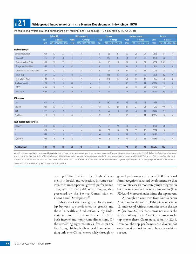
Measured in terms of the HDI, progress around the world has been impressive (figure 2.1). The world average HDI rose to 0.68 in 2010 from 0.57 in 1990, continuing the upward trend from 1970, when it stood at 0.48 (table 2.1).7 This increase reflects aggregate expansions of about a fourth in the health and education indi-cators and a doubling of income per capita.8
The aggregate global measures are strongly influenced by the most populous countries—China and India. Even so, global figures unweighted by population (and thus reflect-ing average country performance) show similar progress.9
BO
X 2.1 Basic terms used in this Report
Convergence. A narrowing over time of the gap between countries for a particular indicator.
Country. A shorthand term used to refer to countries or territories, including provinces and special administrative regions that directly re-port data to international statistical agencies.
Developed/developing. Countries in the very high HDI category (see below) are referred to as developed, and countries not in this group are referred to as developing. The terms are used for convenience only, to distinguish countries that have attained the highest HDI levels.
Deviation from fit. A measure of progress that captures changes in a country’s indicators relative to the average change for countries start-ing from the same point.
Gender Inequality Index (GII). A measure that captures the loss in achievements due to gender disparities in the dimensions of reproduc-tive health, empowerment and labour force participation. Values range from 0 (perfect equality) to 1 (total inequality).
Human Development Index (HDI). A composite measure of achieve-ments in three basic dimensions of human development—a long and healthy life, access to education and a decent standard of living. For ease of comparability, the average value of achievements in these three di-mensions is put on a scale of 0 to 1, where greater is better, and these in-dicators are aggregated using geometric means (see box 1.2 in chapter 1).
Hybrid HDI. HDI calculated using the new functional form described in chapter 1 and the indicators used up through the 2009 Human
Development Report (HDR): life expectancy, literacy rate, gross enrol-ment and per capita GDP. For reasons that include greater data avail-ability, this method is more suitable to the exploration of long-term trends presented in chapters 2 and 3.
Inequality-adjusted HDI (IHDI). A measure of the average level of hu-man development of people in a society once inequality is taken into account. It captures the HDI of the average person in society, which is less than the aggregate HDI when there is inequality in the distribution of health, education and income. Under perfect equality, the HDI and IHDI are equal; the greater the difference between the two, the greater the inequality.
Multidimensional Poverty Index (MPI). A measure of serious depriva-tions in the dimensions of health, education and living standards that combines the number of deprived and the intensity of their deprivation.
Top/bottom movers. The countries that have made the greatest or least progress in improving their HDI, as measured by the deviation from fit criterion.
Very high, high, medium, low HDI groups. Country classifications based on HDI quartiles. A country is in the very high group if its HDI is in the top quartile, in the high group if its HDI is in percentiles 51–75, in the medium group if its HDI is in percentiles 26–50 and in the low group if its HDI is in the bottom quartile. Earlier HDRs used absolute rather than relative thresholds.
Note: See chapter 5 and Technical notes 1–4 for details on the new indices.
27chapter 2 the advanCe of people
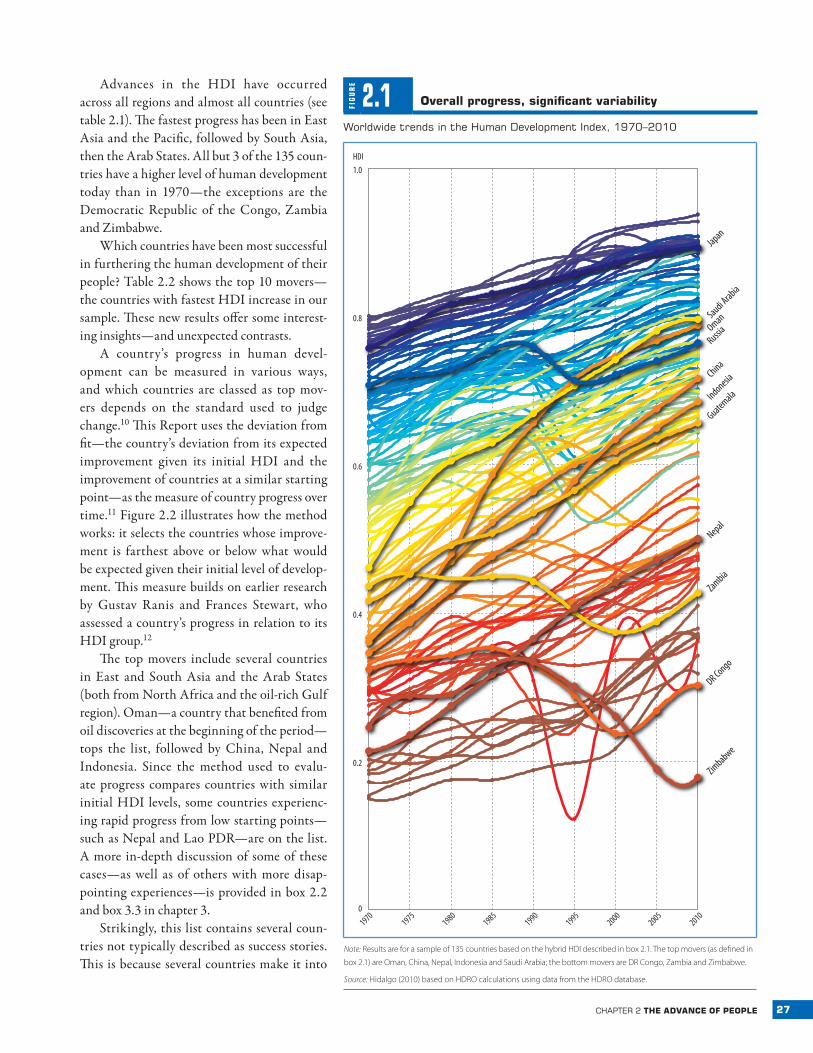
Advances in the HDI have occurred across all regions and almost all countries (see table 2.1). The fastest progress has been in East Asia and the Pacific, followed by South Asia, then the Arab States. All but 3 of the 135 coun-tries have a higher level of human development today than in 1970—the exceptions are the Democratic Republic of the Congo, Zambia and Zimbabwe.
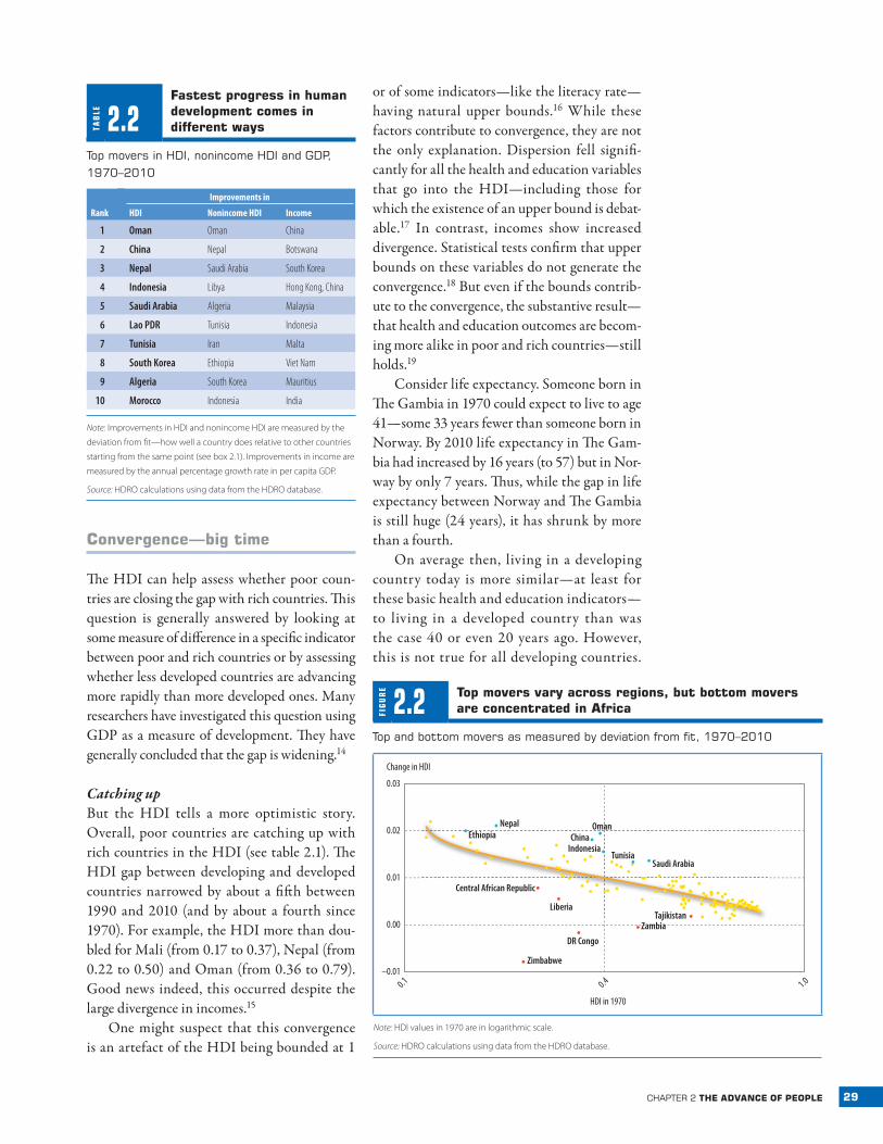
Which countries have been most successful in furthering the human development of their people? Table 2.2 shows the top 10 movers—the countries with fastest HDI increase in our sample. These new results offer some interest-ing insights—and unexpected contrasts.
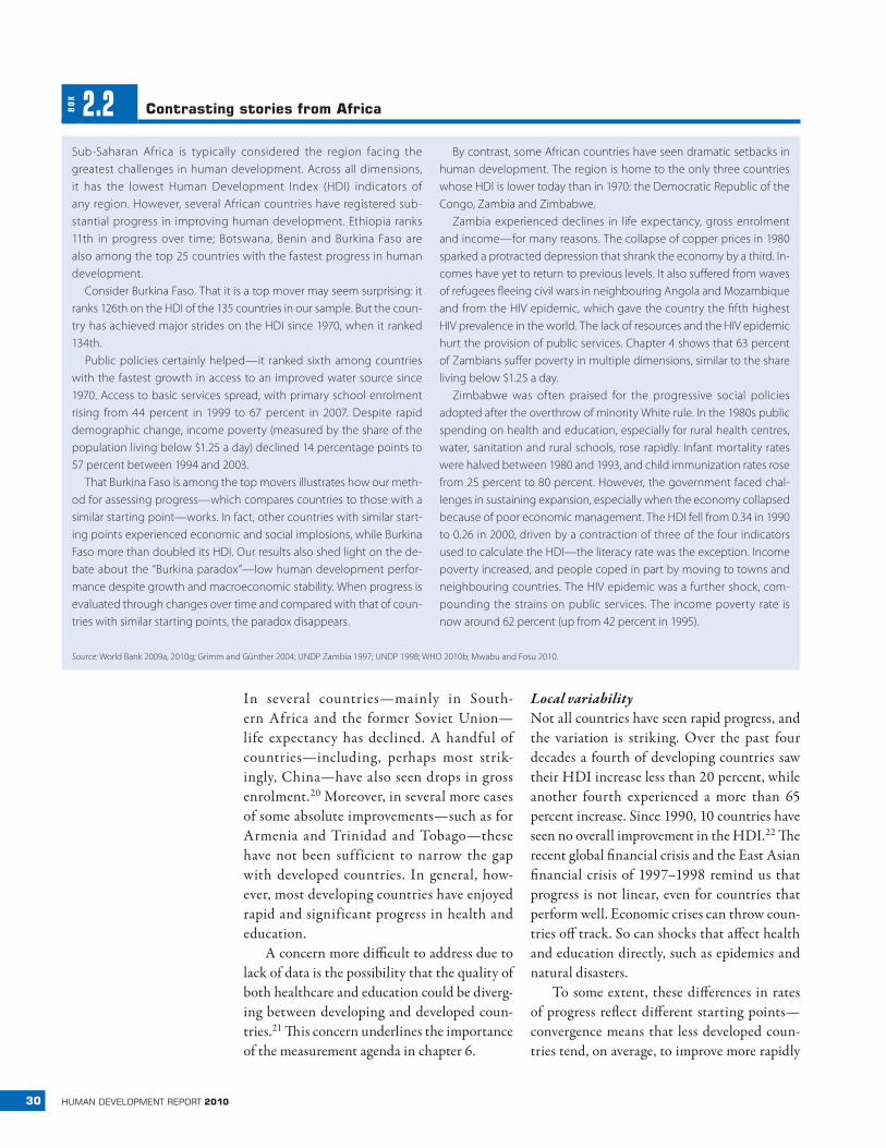
A country’s progress in human devel-opment can be measured in various ways, and which countries are classed as top mov-ers depends on the standard used to judge change.10 This Report uses the deviation from fit—the country’s deviation from its expected improvement given its initial HDI and the improvement of countries at a similar starting point—as the measure of country progress over time.11 Figure 2.2 illustrates how the method works: it selects the countries whose improve-ment is farthest above or below what would be expected given their initial level of develop-ment. This measure builds on earlier research by Gustav Ranis and Frances Stewart, who assessed a country’s progress in relation to its HDI group.12
The top movers include several countries in East and South Asia and the Arab States (both from North Africa and the oil-rich Gulf region). Oman—a country that benefited from oil discoveries at the beginning of the period—tops the list, followed by China, Nepal and Indonesia. Since the method used to evalu-ate progress compares countries with similar initial HDI levels, some countries experienc-ing rapid progress from low starting points—such as Nepal and Lao PDR—are on the list. A more in-depth discussion of some of these cases—as well as of others with more disap-pointing experiences —is provided in box 2.2 and box 3.3 in chapter 3.
Strikingly, this list contains several coun-tries not typically described as success stories. This is because several countries make it into
FIG
UR
E
2.1 overall progress, significant variability
Worldwide trends in the human development Index, 1970–2010
Zimbabwe
DR Congo
Zambia
Nepal
Oman
Russia
China
Indonesia
Guatemala
Saudi Arabia
Japan
1.0
HDI
0.8
0.6
0.4
0.2
0
19701975
19801985
19901995
20002005
2010
Note: Results are for a sample of 135 countries based on the hybrid HDI described in box 2.1. The top movers (as defined in
box 2.1) are Oman, China, Nepal, Indonesia and Saudi Arabia; the bottom movers are DR Congo, Zambia and Zimbabwe.
Source: Hidalgo (2010) based on HDRO calculations using data from the HDRO database.
28 human development report 2010
our top 10 list thanks to their high achieve-ments in health and education, in some cases even with unexceptional growth performance. Thus, our list is very different from, say, that presented by the Spence Commission on Growth and Development.13
Also remarkable is the general lack of over-lap between top performers in growth and those in health and education. Only Indo-nesia and South Korea are in the top 10 for both income and nonincome dimensions. Of the remaining eight countries, five enter the list through higher levels of health and educa-tion; only one (China) enters solely through its
growth performance. The new HDI functional form recognizes balanced development, so that two countries with moderately high progress on both income and nonincome dimensions (Lao PDR and Morocco) make it into the top movers.
Although no countries from Sub-Saharan Africa are in the top 10, Ethiopia comes in at 11, and several African countries are in the top 25 (see box 2.2). Perhaps most notable is the absence of any Latin American country—the top mover there, Guatemala, comes in 22nd. Even so, the top performers are diverse not only in regional origin but in how they achieve success.
TAB
LE 2.1 Widespread improvements in the human development index since 1970
trends in the hybrid hdI and components by regional and hdI groups, 135 countries, 1970–2010
Hybrid HDI Life expectancy Literacy Gross enrolment Income
Value % change Value % change Value % change Value % change Value % change
2010 1970 – 2010 1990– 2010 2010 1970 – 2010 1990– 2010 2010 1970 – 2010 1990– 2010 2010 1970 – 2010 1990– 2010 2010 1970 – 2010 1990– 2010
Regional groups
Developing countries 0.64 57 23 68 21 8 81 61 21 66 28 24 5,873 184 89
Arab States 0.66 65 20 70 37 10 74 149 41 64 89 22 8,603 66 44
East Asia and the Pacific 0.71 96 35 73 23 9 94 76 18 69 7 31 6,504 1,183 352
Europe and Central Asia 0.75 13 4 69 3 2 97 7 2 82 17 7 11,866 120 20
Latin America and the Caribbean 0.77 32 12 74 24 9 92 27 10 83 59 16 11,092 88 42
South Asia 0.57 72 31 65 33 12 66 113 46 59 64 29 3,398 162 119
Sub-Saharan Africa 0.43 53 21 52 19 7 65 183 43 54 109 42 1,466 20 28
Developed countries 0.89 18 7 80 13 6 99 2 1 92 33 14 37,185 126 38
OECD 0.89 18 7 80 13 6 99 2 1 93 33 14 37,105 125 38
Non-OECD 0.86 24 9 80 14 7 96 13 6 79 29 10 40,043 263 58
HDI groups
Low 0.44 61 27 55 27 11 63 180 48 52 98 43 1,434 33 44
Medium 0.65 83 31 69 25 9 82 79 24 65 21 28 5,010 606 237
High 0.77 24 9 73 15 7 93 20 8 82 38 13 12,610 94 35
Very high 0.89 18 7 80 13 6 99 2 1 92 33 14 37,185 126 38
1970 hybrid HDI quartiles
1 (lowest) 0.60 82 32 66 22 8 76 96 29 61 23 33 4,323 560 250
2 0.69 51 16 71 34 11 88 53 15 74 55 16 7,334 110 53
3 0.79 24 9 75 15 6 96 11 4 85 36 16 14,486 152 54
4 (highest) 0.88 16 6 79 11 5 99 1 0 91 29 11 34,585 122 36
World average 0.68 41 18 70 18 7 83 39 15 70 26 20 10,645 107 47
Note: All values are population weighted. Life expectancy is in years, literacy and gross enrolment are in percentages and income is in purchasing power parity 2008 US dollars. See Definitions of statistical
terms for more detailed descriptions. The sample covers 135 countries, and thus the group aggregates may differ from those presented in statistical tables 1–17. The hybrid HDI is distinct from the 2010
HDI reported in statistical tables 1 and 2: it uses the same functional form but a different set of indicators that are available over a longer time period (see box 2.1). HDI groups are based on the 2010 HDI.
Source: HDRO calculations using data from the HDRO database.
29chapter 2 the advanCe of people
Convergence—big time
The HDI can help assess whether poor coun-tries are closing the gap with rich countries. This question is generally answered by looking at some measure of difference in a specific indicator between poor and rich countries or by assessing whether less developed countries are advancing more rapidly than more developed ones. Many researchers have investigated this question using GDP as a measure of development. They have generally concluded that the gap is widening.14
Catching upBut the HDI tells a more optimistic story. Overall, poor countries are catching up with rich countries in the HDI (see table 2.1). The HDI gap between developing and developed countries narrowed by about a fifth between 1990 and 2010 (and by about a fourth since 1970). For example, the HDI more than dou-bled for Mali (from 0.17 to 0.37), Nepal (from 0.22 to 0.50) and Oman (from 0.36 to 0.79). Good news indeed, this occurred despite the large divergence in incomes.15
One might suspect that this convergence is an artefact of the HDI being bounded at 1
or of some indicators—like the literacy rate— having natural upper bounds.16 While these factors contribute to convergence, they are not the only explanation. Dispersion fell signifi-cantly for all the health and education variables that go into the HDI—including those for which the existence of an upper bound is debat-able.17 In contrast, incomes show increased divergence. Statistical tests confirm that upper bounds on these variables do not generate the convergence.18 But even if the bounds contrib-ute to the convergence, the substantive result—that health and education outcomes are becom-ing more alike in poor and rich countries—still holds.19
Consider life expectancy. Someone born in The Gambia in 1970 could expect to live to age 41—some 33 years fewer than someone born in Norway. By 2010 life expectancy in The Gam-bia had increased by 16 years (to 57) but in Nor-way by only 7 years. Thus, while the gap in life expectancy between Norway and The Gambia is still huge (24 years), it has shrunk by more than a fourth.
On average then, living in a developing country today is more similar—at least for these basic health and education indicators—to living in a developed country than was the case 40 or even 20 years ago. However, this is not true for all developing countries.
TAB
LE 2.2fastest progress in human development comes in different ways
top movers in hdI, nonincome hdI and Gdp, 1970–2010
Improvements in
Rank HDI Nonincome HDI Income
1 Oman Oman China
2 China Nepal Botswana
3 Nepal Saudi Arabia South Korea
4 Indonesia Libya Hong Kong, China
5 Saudi Arabia Algeria Malaysia
6 Lao PDR Tunisia Indonesia
7 Tunisia Iran Malta
8 South Korea Ethiopia Viet Nam
9 Algeria South Korea Mauritius
10 Morocco Indonesia India
Note: Improvements in HDI and nonincome HDI are measured by the
deviation from fit—how well a country does relative to other countries
starting from the same point (see box 2.1). Improvements in income are
measured by the annual percentage growth rate in per capita GDP.
Source: HDRO calculations using data from the HDRO database.
FIG
UR
E
2.2 top movers vary across regions, but bottom movers are concentrated in africa
top and bottom movers as measured by deviation from fit, 1970–2010
Change in HDI
Central African Republic
Liberia
Zimbabwe
DR Congo
ZambiaTajikistan
Saudi ArabiaTunisia
Indonesia
OmanChina
NepalEthiopia
HDI in 1970
0.03
0.02
0.00
0.01
0.1 0.4 1.0–0.01
Note: HDI values in 1970 are in logarithmic scale.
Source: HDRO calculations using data from the HDRO database.
30 human development report 2010
In several countries—mainly in South-ern Africa and the former Soviet Union—life expectancy has declined. A handful of countries —including, perhaps most strik-ingly, China—have also seen drops in gross enrolment.20 Moreover, in several more cases of some absolute improvements —such as for Armenia and Trinidad and Tobago—these have not been sufficient to narrow the gap with developed countries. In general, how-ever, most developing countries have enjoyed rapid and significant progress in health and education.
A concern more difficult to address due to lack of data is the possibility that the quality of both healthcare and education could be diverg-ing between developing and developed coun-tries.21 This concern underlines the importance of the measurement agenda in chapter 6.
Local variabilityNot all countries have seen rapid progress, and the variation is striking. Over the past four decades a fourth of developing countries saw their HDI increase less than 20 percent, while another fourth experienced a more than 65 percent increase. Since 1990, 10 countries have seen no overall improvement in the HDI.22 The recent global financial crisis and the East Asian financial crisis of 1997–1998 remind us that progress is not linear, even for countries that perform well. Economic crises can throw coun-tries off track. So can shocks that affect health and education directly, such as epidemics and natural disasters.
To some extent, these differences in rates of progress reflect different starting points— convergence means that less developed coun-tries tend, on average, to improve more rapidly
BO
X 2.2 Contrasting stories from africa
Sub-Saharan Africa is typically considered the region facing the greatest challenges in human development. Across all dimensions, it has the lowest Human Development Index (HDI) indicators of any region. However, several African countries have registered sub-stantial progress in improving human development. Ethiopia ranks 11th in progress over time; Botswana, Benin and Burkina Faso are also among the top 25 countries with the fastest progress in human development.
Consider Burkina Faso. That it is a top mover may seem surprising: it ranks 126th on the HDI of the 135 countries in our sample. But the coun-try has achieved major strides on the HDI since 1970, when it ranked 134th.
Public policies certainly helped—it ranked sixth among countries with the fastest growth in access to an improved water source since 1970. Access to basic services spread, with primary school enrolment rising from 44 percent in 1999 to 67 percent in 2007. Despite rapid demographic change, income poverty (measured by the share of the population living below $1.25 a day) declined 14 percentage points to 57 percent between 1994 and 2003.
That Burkina Faso is among the top movers illustrates how our meth-od for assessing progress—which compares countries to those with a similar starting point—works. In fact, other countries with similar start-ing points experienced economic and social implosions, while Burkina Faso more than doubled its HDI. Our results also shed light on the de-bate about the “Burkina paradox”—low human development perfor-mance despite growth and macroeconomic stability. When progress is evaluated through changes over time and compared with that of coun-tries with similar starting points, the paradox disappears.
By contrast, some African countries have seen dramatic setbacks in human development. The region is home to the only three countries whose HDI is lower today than in 1970: the Democratic Republic of the Congo, Zambia and Zimbabwe.
Zambia experienced declines in life expectancy, gross enrolment and income—for many reasons. The collapse of copper prices in 1980 sparked a protracted depression that shrank the economy by a third. In-comes have yet to return to previous levels. It also suffered from waves of refugees fleeing civil wars in neighbouring Angola and Mozambique and from the HIV epidemic, which gave the country the fifth highest HIV prevalence in the world. The lack of resources and the HIV epidemic hurt the provision of public services. Chapter 4 shows that 63 percent of Zambians suffer poverty in multiple dimensions, similar to the share living below $1.25 a day.
Zimbabwe was often praised for the progressive social policies adopted after the overthrow of minority White rule. In the 1980s public spending on health and education, especially for rural health centres, water, sanitation and rural schools, rose rapidly. Infant mortality rates were halved between 1980 and 1993, and child immunization rates rose from 25 percent to 80 percent. However, the government faced chal-lenges in sustaining expansion, especially when the economy collapsed because of poor economic management. The HDI fell from 0.34 in 1990 to 0.26 in 2000, driven by a contraction of three of the four indicators used to calculate the HDI—the literacy rate was the exception. Income poverty increased, and people coped in part by moving to towns and neighbouring countries. The HIV epidemic was a further shock, com-pounding the strains on public services. The income poverty rate is now around 62 percent (up from 42 percent in 1995).
Source: World Bank 2009a, 2010g; Grimm and Günther 2004; UNDP Zambia 1997; UNDP 1998; WHO 2010b; Mwabu and Fosu 2010.
31chapter 2 the advanCe of people
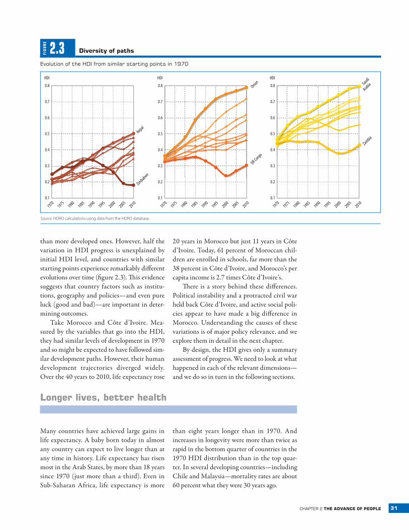
than more developed ones. However, half the variation in HDI progress is unexplained by initial HDI level, and countries with similar starting points experience remarkably different evolutions over time (figure 2.3). This evidence suggests that country factors such as institu-tions, geography and policies—and even pure luck (good and bad)—are important in deter-mining outcomes.
Take Morocco and Côte d’Ivoire. Mea-sured by the variables that go into the HDI, they had similar levels of development in 1970 and so might be expected to have followed sim-ilar development paths. However, their human development trajectories diverged widely. Over the 40 years to 2010, life expectancy rose
20 years in Morocco but just 11 years in Côte d’Ivoire. Today, 61 percent of Moroccan chil-dren are enrolled in schools, far more than the 38 percent in Côte d’Ivoire, and Morocco’s per capita income is 2.7 times Côte d’Ivoire’s.
There is a story behind these differences. Political instability and a protracted civil war held back Côte d’Ivoire, and active social poli-cies appear to have made a big difference in Morocco. Understanding the causes of these variations is of major policy relevance, and we explore them in detail in the next chapter.
By design, the HDI gives only a summary assessment of progress. We need to look at what happened in each of the relevant dimensions—and we do so in turn in the following sections.
longer lives, better health
Many countries have achieved large gains in life expectancy. A baby born today in almost any country can expect to live longer than at any time in history. Life expectancy has risen most in the Arab States, by more than 18 years since 1970 (just more than a third). Even in Sub-Saharan Africa, life expectancy is more
than eight years longer than in 1970. And increases in longevity were more than twice as rapid in the bottom quarter of countries in the 1970 HDI distribution than in the top quar-ter. In several developing countries—including Chile and Malaysia—mortality rates are about 60 percent what they were 30 years ago.
FIG
UR
E
2.3 diversity of paths
evolution of the hdI from similar starting points in 1970
HDI
0.8
0.6
0.7
0.4
0.2
0.5
0.3
19701975
19801985
19901995
20002005
2010
Nepal
Zimbabwe
HDI
0.8
0.6
0.7
0.4
0.2
0.5
0.3
19701975
19801985
19901995
20002005
2010
DR Congo
Oman
Saudi
Arabia
Zambia
HDI
0.8
0.6
0.7
0.4
0.2
0.5
0.3
19701975
19801985
19901995
20002005
20100.1 0.1 0.1
Source: HDRO calculations using data from the HDRO database.
32 human development report 2010
If children were still
dying at the higher rates
prevalent in the late
1970s, 6.7 million more
children would die each
year
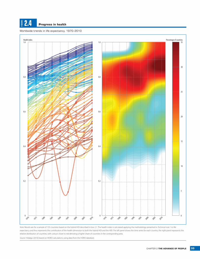
Figure 2.4 illustrates the extent and breadth of this progress. Alongside the country values of life expectancy represented in the left panel, we introduce a “thermal image” graph in the right panel that helps us see where countries are clustering in the distribution of health achieve-ments. The “hotter” areas—those shaded red and yellow—show that many countries cluster at high life expectancy levels, with very few still at the lower levels (green and blue). This pat-tern of clustering at high levels is striking for health and education but not, as we will see below, for income (see figures 2.7 and 2.10 later in the chapter).23 But while life expectancy increased in most countries, some saw pre-cipitous declines. This is also well captured by the thermal graph, which shows some areas of “heat” (shaded yellow) towards the bottom of the right panel.
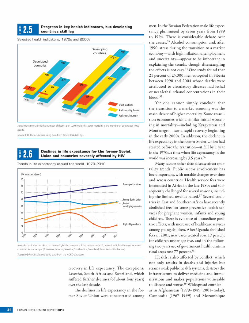
What accounts for this progress? Mortality rates have fallen faster in infants and children than in adults. If children were still dying at the higher rates prevalent in the late 1970s, 6.7 mil-lion more children would die each year.24 Absolute progress has been fastest in devel-oping countries from the 1970s to the 2000s (figure 2.5). From 1970 to 2005, for example, infant mortality declined by 59 per 1,000 live births in developing countries, almost four times the decline of 16 per 1,000 in developed countries. However, the percentage decline continues to be faster in developed countries (77 percent) than in developing countries (59 percent).25 And huge health gaps remain, with eight times more infant deaths per 1,000 live births in developing countries than in devel-oped countries. Less than 1 percent of child deaths occur in developed countries.26
Maternal mortality ratios have also fallen, though by how much is uncertain. UN esti-mates show a modest 5 percent decline since 1990—from 430 deaths per 100,000 live births to 400.27 A recent study using vital registration data, censuses, surveys and ver-bal autopsy studies found lower levels of maternal mortality and a somewhat faster decline of 22 percent (from 320 per 100,000 to 251) in the same period.28 These data indi-cate that even the bottom five countries— Mauritania, Eritrea, Angola, Sierra Leone and
Guinea-Bissau —reduced maternal mortality (from 1,159 per 100,000 live births to 711). Alternative estimates coincide in one basic assessment: progress is far slower than needed to reach the Millennium Development Goal target of reducing maternal deaths by three-fourths between 1990 and 2015.29
progress has slowed
Health progress has slowed since 1990. Aver-age life spans rose about six years between the 1970s and 1990s, but only four years in the subsequent two decades.30 Adult mortal-ity since the 1990s has fallen 23 percent for women and 6 percent for men, much slower than the declines of 27 percent and 26 percent in the previous two decades. Infant mortality rates also fell more slowly.
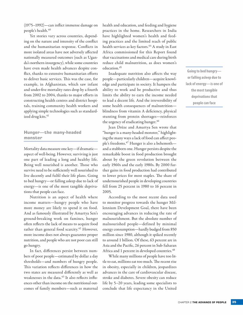
This slowdown in aggregate progress is due largely to dramatic reversals in 19 coun-tries (home to about 6 percent of the world’s people) that experienced declines in life expec-tancy in the past two decades. In nine coun-tries life expectancy fell below 1970 levels: six in Africa (the Democratic Republic of the Congo, Lesotho, South Africa, Swaziland, Zambia and Zimbabwe) and three in the for-mer Soviet Union (Belarus, the Russian Fed-eration and Ukraine). Driving these declines are the HIV epidemic and the mortality rever-sal in transition economies. These phenom-ena have partially offset the convergence in health outcomes observed since 1990, though some convergence —albeit slow—is observed between the rest of developing countries and developed ones (figure 2.6).31
The decline in several Sub-Saharan African countries can be clearly linked to the HIV epi-demic. Since the 1980s AIDS has slashed life expectancy in Southern Africa, where adult HIV prevalence rates still exceed 15 percent.32 In the most affected countries life expectancy is now below 51 years; in Lesotho it stands at 46—similar to that in England before the Industrial Revolution. Since 2000 HIV prev-alence rates appear to have been stabilizing (though in some cases at very high levels), and most of Southern Africa has seen some recent
33chapter 2 the advanCe of people
FIG
UR
E
2.4 progress in health
Worldwide trends in life expectancy, 1970–2010
Percentage of countries
19701975
19801985
19901995
20002005
2010
1.0
0.8
0.6
0.4
0.2
0
1.0
0.8
0.6
0.4
0.2
0
Health index
19701975
19801985
19901995
20002005
20100
5
10
15
20
25
30
35
Note: Results are for a sample of 135 countries based on the hybrid HDI described in box 2.1. The health index is calculated applying the methodology presented in Technical note 1 to life
expectancy and thus represents the contribution of the health dimension to both the hybrid HDI and the HDI. The left panel shows the time series for each country; the right panel represents the
relative distribution of countries, with colours closer to red denoting a higher share of countries in the corresponding area.
Source: Hidalgo (2010) based on HDRO calculations using data from the HDRO database.
34 human development report 2010
recovery in life expectancy. The exceptions: Lesotho, South Africa and Swaziland, which suffered further declines (of about four years) over the last decade.
The declines in life expectancy in the for-mer Soviet Union were concentrated among
men. In the Russian Federation male life expec-tancy plummeted by seven years from 1989 to 1994. There is considerable debate over the causes.33 Alcohol consumption and, after 1990, stress during the transition to a market economy —with high inflation, unemployment and uncertainty —appear to be important in explaining the trends, though disentangling the effects is not easy.34 One study found that 21 percent of 25,000 men autopsied in Siberia between 1990 and 2004 whose deaths were attributed to circulatory diseases had lethal or near-lethal ethanol concentrations in their blood.35
Yet one cannot simply conclude that the transition to a market economy was the main driver of higher mortality. Some transi-tion economies with a similar initial worsen-ing in mortality—including Kyrgyzstan and Montenegro —saw a rapid recovery beginning in the early 2000s. In addition, the decline in life expectancy in the former Soviet Union had started before the transition—it fell by 1 year in the 1970s, a time when life expectancy in the world was increasing by 3.5 years.36
Many factors other than disease affect mor-tality trends. Public sector involvement has been important, with notable changes over time and across countries. Health service fees were introduced in Africa in the late 1980s and sub-sequently challenged for several reasons, includ-ing the limited revenue raised.37 Several coun-tries in East and Southern Africa have recently abolished fees for some preventive health ser-vices for pregnant women, infants and young children. There is evidence of immediate posi-tive effects, with more use of healthcare services among young children. After Uganda abolished fees in 2001, new cases treated rose 19 percent for children under age five, and in the follow-ing two years use of government health units in rural areas rose 77 percent.38
Health is also affected by conflict, which not only results in deaths and injuries but strains weak public health systems, destroys the infrastructure to deliver medicine and immu-nizations and makes populations vulnerable to disease and worse.39 Widespread conflict —as in Afghanistan (1979–1989; 2001–today), Cambodia (1967–1999) and Mozambique
FIG
UR
E
2.5 progress in key health indicators, but developing countries still lag
Selected health indicators, 1970s and 2000s
Infant mortality
Adult mortality, female
Adult mortality, male
1970s2000s
1970s2000s
Developedcountries
Developingcountries
17
108
196
564
12389
45
164
237
257
308
Note: Infant mortality is the number of deaths per 1,000 live births; adult mortality is the number of deaths per 1,000
adults.
Source: HDRO calculations using data from World Bank (2010g).
FIG
UR
E
2.6 declines in life expectancy for the former Soviet union and countries severely affected by hiv
trends in life expectancy around the world, 1970–2010
Life expectancy (years)
85
75
80
65
55
70
60
50
19701975
19801985
19901995
20002005
201045
High HIV prevalence
Rest of developing countries
Former Soviet Union
Developed countries
Note: A country is considered to have a high HIV prevalence if the rate exceeds 15 percent, which is the case for seven
countries in our sample (Botswana, Lesotho, Namibia, South Africa, Swaziland, Zambia and Zimbabwe).
Source: HDRO calculations using data from the HDRO database.
35chapter 2 the advanCe of people
Going to bed hungry—
or falling asleep due to
lack of energy—is one of
the most tangible
deprivations that
people can face
(1975–1992)—can inflict immense damage on people’s health.40
Yet stories vary across countries, depend-ing on the nature and intensity of the conflict and the humanitarian response. Conflicts in more isolated areas have not adversely affected nationally measured outcomes (such as Ugan-da’s northern insurgency), while some countries have even made health advances despite con-flict, thanks to extensive humanitarian efforts to deliver basic services. This was the case, for example, in Afghanistan, which saw infant and under-five mortality rates drop by a fourth from 2002 to 2004, thanks to major efforts in constructing health centres and district hospi-tals, training community health workers and applying simple technologies such as standard-ized drug kits.41
hunger—the many‑headed monster
Mortality data measure one key—if dramatic —aspect of well-being. However, surviving is just one part of leading a long and healthy life. Being well nourished is another. Those who survive need to be sufficiently well nourished to live decently and fulfil their life plans. Going to bed hungry—or falling asleep due to lack of energy—is one of the most tangible depriva-tions that people can face.
Nutrition is an aspect of health where income matters—hungry people who have more money are likely to spend it on food. And as famously illustrated by Amartya Sen’s ground-breaking work on famines, hunger often reflects the lack of means to acquire food rather than general food scarcity.42 However, more income does not always guarantee proper nutrition, and people who are not poor can still go hungry.
In fact, differences persist between num-bers of poor people—estimated by dollar a day thresholds—and numbers of hungry people. This variation reflects differences in how the two states are measured differently as well as weaknesses in the data.43 It also reflects influ-ences other than income on the nutritional out-comes of family members—such as maternal
health and education, and feeding and hygiene practices in the home. Researchers in India have highlighted women’s health and feed-ing practices and the limited reach of public health services as key factors.44 A study in East Africa commissioned for this Report found that vaccinations and medical care during birth reduce child malnutrition, as does women’s education.45
Inadequate nutrition also affects the way people—particularly children—acquire knowl-edge and participate in society. It hampers the ability to work and be productive and thus limits the ability to earn the income needed to lead a decent life. And the irreversibility of some health consequences of malnutrition — blindness from vitamin A deficiency, physical stunting from protein shortages —reinforces the urgency of eradicating hunger.46
Jean Drèze and Amartya Sen wrote that “hunger is a many-headed monster,” highlight-ing the many ways a lack of food can affect peo-ple’s freedoms.47 Hunger is also a behemoth—and a stubborn one. Hunger persists despite the remarkable boost in food production brought about by the green revolution between the early 1960s and the early 1980s. By 2000 fur-ther gains in food production had contributed to lower prices for most staples. The share of undernourished people in developing countries fell from 25 percent in 1980 to 16 percent in 2005.
According to the most recent data used to monitor progress towards the hunger Mil-lennium Development Goal, there have been encouraging advances in reducing the rate of malnourishment. But the absolute number of malnourished people—defined by minimal energy consumption —hardly budged from 850 million since 1980, although it spiked recently to around 1 billion. Of these, 63 percent are in Asia and the Pacific, 26 percent in Sub-Saharan Africa and 1 percent in developed countries.48
While many millions of people have too lit-tle to eat, millions eat too much. The recent rise in obesity, especially in children, jeopardizes advances in the care of cardiovascular disease, stroke and diabetes. Severe obesity can reduce life by 5–20 years, leading some specialists to conclude that life expectancy in the United
36 human development report 2010
No country has seen
declines in literacy or
years of schooling
since 1970
States is likely to level off and may even fall by 2050.49 These risks are the result not just of higher income but also of cultural influences that can be transmitted across borders. Mexico,
where people’s incomes average only a fifth those of the United States, has shares of obese and overweight people similar to those in the United States.50
Knowledge expands possibilities
Knowledge expands people’s possibilities. It promotes creativity and imagination.51 In addition to its intrinsic value, it has substan-tial instrumental value in expanding other freedoms. Being educated empowers people to advance their interests and resist exploita-tion.52 Educated people are more aware of how to avoid health risks and to live longer and more comfortable lives.53 They also tend to earn higher wages and have better jobs. Many uneducated parents value schooling because they believe education will enable their sons and daughters to overcome the indignities their families face.
Progress in education has been substantial and widespread, reflecting improvements in the quantity of schooling and in equity of access for girls and boys. To a large extent, this reflects greater state involvement, though many devel-oping countries have proven more capable of putting children in school than of giving them a high quality education.
education levels higher than ever
People around the world today have much higher levels of education than ever before—a result that holds across many different mea-sures of education. Take years of schooling: an average person age 15 or older in 1960 had fewer than 4 years of schooling—by 2010 this number had doubled globally and more than tripled in developing countries (from 1.9 years to 6.4). Since the first HDR in 1990 aver-age years of schooling have risen by two years and gross enrolment ratios by 12 percentage points—while literacy rates have risen from 73 percent to 84 percent.
Progress has been widespread. No coun-try has seen declines in literacy or years of
schooling since 1970. And education has been extended to many more people: since 1960 the proportion of people who attended school has risen from 57 percent to 85 percent. This means that many countries have achieved success in education, at least as measured by the conven-tional HDI indicator—one of our key motiva-tions for the refinements discussed in box 1.2 in chapter 1.
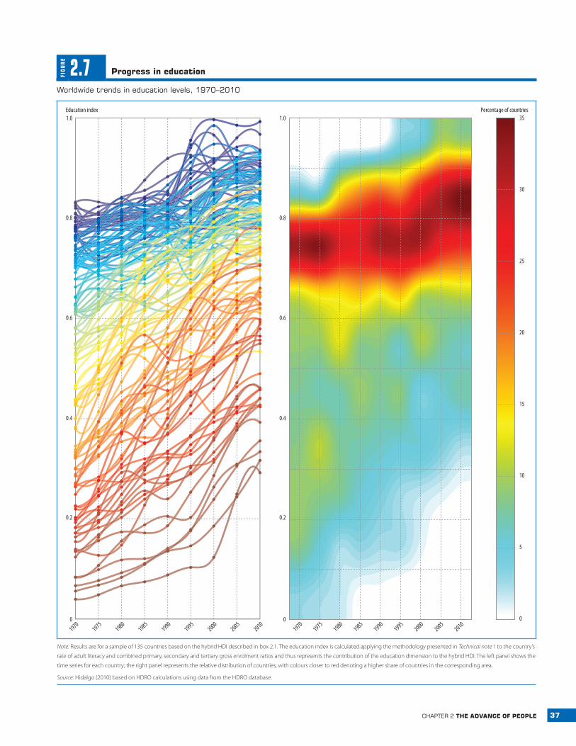
The average education index used in the HDI, which combines information on enrol-ment and literacy, captures this general pic-ture of widespread progress (figure 2.7). As in health, the thermal graph in the right hand panel signals a strong concentration at the top of the distribution.
Even these increases may underesti-mate progress. Literacy and years of school-ing reflect past access to education (or lack of it) by people who are adults today; thus, measured progress may not ref lect recent advances in schooling for the young popula-tion. People who have not been in school tend to be older: in developing countries almost 36 percent of people ages 65–74 never attended school compared with only 7 percent of those ages 15–24. The youth literacy rate now exceeds 95 percent in 63 of the 104 countries with data and is 99 percent in 35 (including such medium HDI countries as Moldova and Samoa). This suggests that lack of basic writ-ing skills will cease to be a major constraint on access to knowledge.
Enrolment ratios and expected years of schooling—the number of years of schooling that today’s children can expect to have once they grow up, given current enrolment ratios—give a better picture of children’s current access to education. Average world enrolment ratios are now 100 percent or higher for primary education in both developed and developing
37chapter 2 the advanCe of people
FIG
UR
E
2.7 progress in education
Worldwide trends in education levels, 1970–2010
19701975
19801985
19901995
20002005
20101970
19751980
19851990
19952000
20052010
5
10
15
20
25
30
35Percentage of countriesEducation index
0
0.2
0.4
0.6
0.8
1.0
0
0.2
0.4
0.6
0.8
1.0
0
Note: Results are for a sample of 135 countries based on the hybrid HDI described in box 2.1. The education index is calculated applying the methodology presented in Technical note 1 to the country’s
rate of adult literacy and combined primary, secondary and tertiary gross enrolment ratios and thus represents the contribution of the education dimension to the hybrid HDI. The left panel shows the
time series for each country; the right panel represents the relative distribution of countries, with colours closer to red denoting a higher share of countries in the corresponding area.
Source: Hidalgo (2010) based on HDRO calculations using data from the HDRO database.
38 human development report 2010
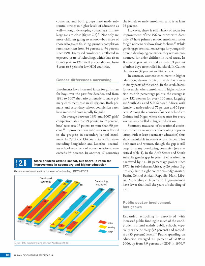
countries, and both groups have made sub-stantial strides in higher levels of education as well—though developing countries still have large gaps to close (figure 2.8).54 Not only are more children going to school—but more of those who go are finishing: primary completion rates have risen from 84 percent to 94 percent since 1991. Increased enrolment is reflected in expected years of schooling, which has risen from 9 years in 1980 to 11 years today and from 5 years to 8 years for low HDI countries.
gender differences narrowing
Enrolments have increased faster for girls than for boys over the past few decades, and from 1991 to 2007 the ratio of female to male pri-mary enrolment rose in all regions. Both pri-mary and secondary school completion rates have improved more rapidly for girls.
On average between 1991 and 2007, girls’ completion rates rose 29 points, to 87 percent; boys’ rates rose 17 points, to more than 90 per-cent.55 Improvements in girls’ rates are reflected in the progress in secondary school enrol-ment. In 79 of the 134 countries with data— including Bangladesh and Lesotho—second-ary school enrolment of women relative to men exceeds 98 percent. In another 17 countries
the female to male enrolment ratio is at least 95 percent.
However, there is still plenty of room for improvement: of the 156 countries with data, only 87 have primary school enrolment ratios for girls close to or above those for boys.56 While gender gaps are small on average for young chil-dren in developing countries, they remain pro-nounced for older children in rural areas. In Bolivia 35 percent of rural girls and 71 percent of urban boys are enrolled in school. In Guinea the rates are 37 percent and 84 percent.
In contrast, women’s enrolment in higher education, also on the rise, exceeds that of men in many parts of the world. In the Arab States, for example, where enrolment in higher educa-tion rose 45 percentage points, the average is now 132 women for every 100 men. Lagging are South Asia and Sub-Saharan Africa, with female to male ratios of 75 percent and 51 per-cent. Among the countries farthest behind are Guinea and Niger, where three men for every woman are enrolled in higher education.
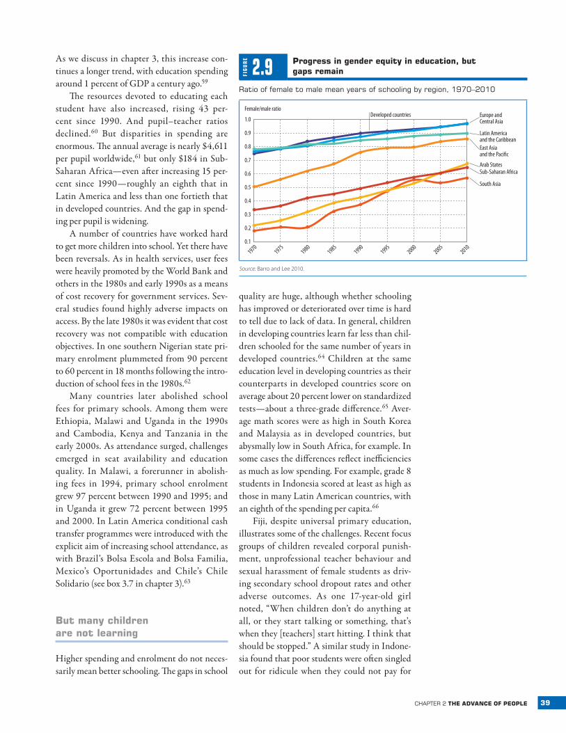
Summary measures of educational attain-ment (such as mean years of schooling or popu-lation with at least secondary education) thus show remarkable increases across the board for both men and women, though the gap is still large in many developing countries (see sta-tistical table 4). In the Arab States and South Asia the gender gap in years of education has narrowed by 33–40 percentage points since 1970; in Sub-Saharan Africa, by 26 points (fig-ure 2.9). But in eight countries—Afghanistan, Benin, Central African Republic, Haiti, Libe-ria, Mozambique, Niger and Togo—women have fewer than half the years of schooling of men.
public sector involvement has grown
Expanded schooling is associated with increased public funding in much of the world. Students attend mainly public schools, espe-cially at the primary (92 percent) and second-ary (85 percent) levels.57 Public spending on education averaged 5.1 percent of GDP in 2006, up from 3.9 percent of GDP in 1970.58
FIG
UR
E
2.8 more children attend school, but there is room for improvement in secondary and higher education
Gross enrolment ratios by level of schooling,1970–2007
Tertiary
Secondary
Primary
19701990
2007
19701990
2007
100
81
23
43
64
186
2
103
103 109
102
75
25
93
46
101
71
Developedcountries Developing
countries
Source: HDRO calculations using data from World Bank (2010g).
39chapter 2 the advanCe of people
As we discuss in chapter 3, this increase con-tinues a longer trend, with education spending around 1 percent of GDP a century ago.59
The resources devoted to educating each student have also increased, rising 43 per-cent since 1990. And pupil–teacher ratios declined.60 But disparities in spending are enormous. The annual average is nearly $4,611 per pupil worldwide,61 but only $184 in Sub-Saharan Africa—even after increasing 15 per-cent since 1990—roughly an eighth that in Latin America and less than one fortieth that in developed countries. And the gap in spend-ing per pupil is widening.
A number of countries have worked hard to get more children into school. Yet there have been reversals. As in health services, user fees were heavily promoted by the World Bank and others in the 1980s and early 1990s as a means of cost recovery for government services. Sev-eral studies found highly adverse impacts on access. By the late 1980s it was evident that cost recovery was not compatible with education objectives. In one southern Nigerian state pri-mary enrolment plummeted from 90 percent to 60 percent in 18 months following the intro-duction of school fees in the 1980s.62
Many countries later abolished school fees for primary schools. Among them were Ethiopia, Malawi and Uganda in the 1990s and Cambodia, Kenya and Tanzania in the early 2000s. As attendance surged, challenges emerged in seat availability and education quality. In Malawi, a forerunner in abolish-ing fees in 1994, primary school enrolment grew 97 percent between 1990 and 1995; and in Uganda it grew 72 percent between 1995 and 2000. In Latin America conditional cash transfer programmes were introduced with the explicit aim of increasing school attendance, as with Brazil’s Bolsa Escola and Bolsa Familia, Mexico’s Oportunidades and Chile’s Chile Solidario (see box 3.7 in chapter 3).63
But many children are not learning
Higher spending and enrolment do not neces-sarily mean better schooling. The gaps in school
quality are huge, although whether schooling has improved or deteriorated over time is hard to tell due to lack of data. In general, children in developing countries learn far less than chil-dren schooled for the same number of years in developed countries.64 Children at the same education level in developing countries as their counterparts in developed countries score on average about 20 percent lower on standardized tests—about a three-grade difference.65 Aver-age math scores were as high in South Korea and Malaysia as in developed countries, but abysmally low in South Africa, for example. In some cases the differences reflect inefficiencies as much as low spending. For example, grade 8 students in Indonesia scored at least as high as those in many Latin American countries, with an eighth of the spending per capita.66
Fiji, despite universal primary education, illustrates some of the challenges. Recent focus groups of children revealed corporal punish-ment, unprofessional teacher behaviour and sexual harassment of female students as driv-ing secondary school dropout rates and other adverse outcomes. As one 17-year-old girl noted, “When children don’t do anything at all, or they start talking or something, that’s when they [teachers] start hitting. I think that should be stopped.” A similar study in Indone-sia found that poor students were often singled out for ridicule when they could not pay for
FIG
UR
E
2.9 progress in gender equity in education, but gaps remain
ratio of female to male mean years of schooling by region, 1970–2010
Female/male ratio
1.0
0.7
0.9
0.8
0.5
0.3
0.6
0.4
0.2
19701975
19801985
19901995
20002005
20100.1
East Asia and the Pacific
Europe and Central Asia
Arab States
Developed countries
Sub-Saharan Africa
South Asia
Latin America and the Caribbean
Source: Barro and Lee 2010.
40 human development report 2010
while the advances of
the past decades are
substantial, there is still
a long way to go towards
equity in access to
knowledge
uniforms or school supplies, often leading to their exclusion. Asked why he dropped out of school, an 11-year-old boy responded: “I often feel embarrassed. When I didn’t wear shoes, the teacher pointed to my feet, and said, ‘This is not the way to come to school.’”67
Case studies in poorer developing coun-tries paint an even bleaker picture. Sixth grad-ers in Ghana had an average score of 25 percent on a multiple-choice test—no different from what they would score by choosing answers randomly. More than half of 11-year-olds in Bangladesh could not write basic letters or numerals.68 In Timor-Leste more than 70 per-cent of students at the end of grade 1 could not read even one word when shown a simple text passage.69
The difficulties in improving education quality illustrate the varying effectiveness of state involvement—at least as traditionally conceived. Decisions to expand schools usually come from the top down, supported by politi-cally aligned teachers unions and contractors. It is much harder to get motivated teachers to impart real learning skills. Solving incentive problems for managers and workers, always difficult, is especially challenging when the state is embedded in patronage-based mecha-nisms of channelling goods and services to core
supporters, creating new entrenched groups along the way.70 Almost a decade after De and Drèze’s Public Report on Basic Education in India exposed teacher absenteeism of 48 per-cent, high rates have persisted, despite major budget and management reforms and infra-structure improvements in the interim.71
Low quality education in developing coun-tries does not necessarily imply that deterio-ration has occurred. Data are inadequate for reaching firm conclusions about long- or even medium-term trends in quality. Moreover, test scores depend on many factors, particularly students’ socioeconomic background. Chil-dren from well-off families are likely to be better nourished and healthier and have more access to materials than poorer children, and their parents can do more to help them.72 So as school expansions bring in more disadvantaged students, average test scores will tend to drop even if education quality does not change.73
The picture is thus of poor countries rap-idly catching up on aggregate educational attainment and gender equity but not necessar-ily on quality. There are also major disparities between groups within countries, as explored in chapter 4. Thus, while the advances of the past decades are substantial, there is still a long way to go towards equity in access to knowledge.
Rising standards of living
Income has many shortcomings as a summary measure of development—a central message of HDRs for the past 20 years. Among its flaws is the neglect of inequality in distribution and of the unsustainability of current produc-tion. However, money is an important means of expanding choice, especially poor people’s choices, and average income does proxy for a society’s overall command of resources. The evolution of income is thus of great interest.
However, the story is not just one of overall increases—it is also one of widening dispari-ties and a persistent divide between developed countries and the rest of the world. Since 1970, 155 countries—home to 95 percent of the world’s people—have experienced increases in
real per capita income (figure 2.10). The annual average today is $10,760, almost 1.5 times its level 20 years ago and twice its level 40 years ago. People in all regions have seen substantial increases in average income, though patterns vary.74 And the range, amount and quality of goods and services available to people today is unprecedented.
The thermal graph on the right panel of figure 2.10 shows that the world distribution of income is far more dispersed than that of health and education. The corresponding fig-ures for health (see figure 2.4) and education (see figure 2.7) showed a “hot” red area towards the top where many countries were converg-ing. This is not the case for income, which
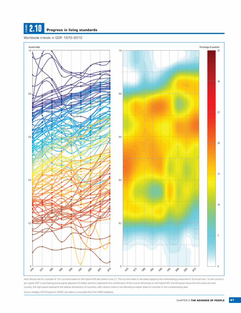
41chapter 2 the advanCe of people
FIG
UR
E
2.10 progress in living standards
Worldwide trends in Gdp, 1970–2010
5
10
15
20
25
30
35Percentage of countries
19701975
19801985
19901995
20002005
20101970
19751980
19851990
19952000
20052010
0
0.2
0.4
0.6
0.8
1.0Income index
0
0.2
0.4
0.6
0.8
1.0
0
Note: Results are for a sample of 135 countries based on the hybrid HDI described in box 2.1. The income index is calculated applying the methodology presented in Technical note 1 to the country’s
per capita GDP in purchasing power parity adjusted US dollars and thus represents the contribution of the income dimension to the hybrid HDI. The left panel shows the time series for each
country; the right panel represents the relative distribution of countries, with colours closer to red denoting a higher share of countries in the corresponding area.
Source: Hidalgo (2010) based on HDRO calculations using data from the HDRO database.
42 human development report 2010
The gap in incomes
between developed and
developing countries has
continued to widen
illustrates the fact that the world distribution of income is much more unequal than that of health and education.
divergent progress
Unlike in health and education, there has been substantial divergence in income across coun-tries. From 1970 to 2010 per capita income in developed countries increased 2.3 percent a year on average, compared with 1.5 percent for developing countries.75 In 1970 the average income of a country in the top quarter of the world income distribution was 23 times that of a country in the bottom quarter. By 2010 it approached 29 times. Divergence among devel-oping countries has become more marked as well. Some developing countries—including Botswana, China, Malaysia and Thailand—have grown faster since the 1970s than any rich country.76 At the same time, the income of sev-eral other countries—including Comoros, Iran and Senegal—has stagnated. Still other coun-tries, such as Côte d’Ivoire, Madagascar and Zimbabwe, have suffered economic collapses.
Developing countries’ growth performance has improved over time, both in absolute levels and relative to developed countries. This was particularly evident during the global finan-cial crisis, when many developing countries were able to maintain strong growth. Nev-ertheless, even over the past 20 years, the gap between developed and developing countries has continued to widen. One important ques-tion is whether developing countries will be able to grow at the relatively faster average rates attained over the past five years.77
The distance between the richest and poor-est countries has widened to a gulf. The rich-est country today (Liechtenstein) is three times richer than the richest country in 1970.78 The poorest country today (Zimbabwe) is about 25 percent poorer than the poorest country in 1970 (also Zimbabwe). It is sobering to see, amid enormous material prosperity in devel-oped countries, that the real average income of people in 13 countries in the bottom quarter of today’s world income distribution is lower than in 1970.79
few countries cross the threshold
Economic growth has been spectacular in some developing countries. Between 1970 and 2010, China’s per capita income rose twenty-one-fold, Botswana’s more than ninefold and Malaysia’s and Thailand’s more than fivefold.80 But these countries have far to go before they cross the divide: China’s per capita income is only a fifth the average for developed countries. Botswana, Malaysia and Thailand are also far from this mark.
Will these countries continue to grow until they cross the threshold to developed countries? History suggests that growth can-not be taken for granted. Many countries grew impressively over long periods only to stagnate. For example, between 1950 and 1980 Bra-zil’s per capita economic growth was almost 5 percent a year—similar to recent growth in Botswana, Singapore and Thailand—but its economy collapsed in the 1980s and has only recently started to recover. Argentina’s col-lapse was even more dramatic, from a per cap-ita GDP in 1913 that exceeded the European average,81 to one in 2007 that was just a fifth of Western Europe’s.
These cases illustrate how hard it is to cross the great income divide. Of the 108 countries with incomes below $7,000 per capita in 1970, only 4 moved up to the World Bank’s high-income classification in 2010. Three are small island economies (Antigua and Barbuda, Equa-torial Guinea and Malta), one with abundant oil. The fourth—South Korea—remains an important exception. Estonia and Slovakia did not exist as independent countries in 1970, but both achieved growth that moved them up into the high-income group.
* * *
In important respects, the world is a better place today than it was in 1990. Many people live longer, children spend more time in school and people have access to many more goods—including food, housing, clothing and other necessities for a decent life—than at any time in history. The major convergence of countries
43chapter 2 the advanCe of people
in the HDI, documented systematically for the first time in this Report, has been a huge achievement. As we discuss in chapter 4, these advances extend to other dimensions of human development, notably to political freedoms.
Yet the assessment of the past few decades is by no means wholly positive. Some countries have suffered grave setbacks—particularly in health—sometimes erasing in a few years the gains of several decades. Patterns of economic growth have been extremely unequal—both in the countries experiencing fast growth and, as we explore in chapter 4, in the groups benefit-ing from national progress.
And despite convergent trends in health and education, gaps in human development are huge. A person born in Niger can expect to live 26 fewer years, to have 9 fewer years of educa-tion and to consume 53 times fewer goods than a person born in Denmark. While the Danes have elected their parliament in free and open elections since 1849, Niger’s president dissolved parliament and Supreme Court in 2009—and was then ousted in a military coup. More than 7 of 10 people surveyed in Niger say there were times in the past year when they did not have enough money to buy food for their families. Very few Danes would be in such straits.