Embed Size (px)
Citation preview
7/10/13 2:02 PMPutting Landsat 8’s Bands to Work | MapBox
Page 1 of 12http://www.mapbox.com/blog/putting-landsat-8-bands-to-work/
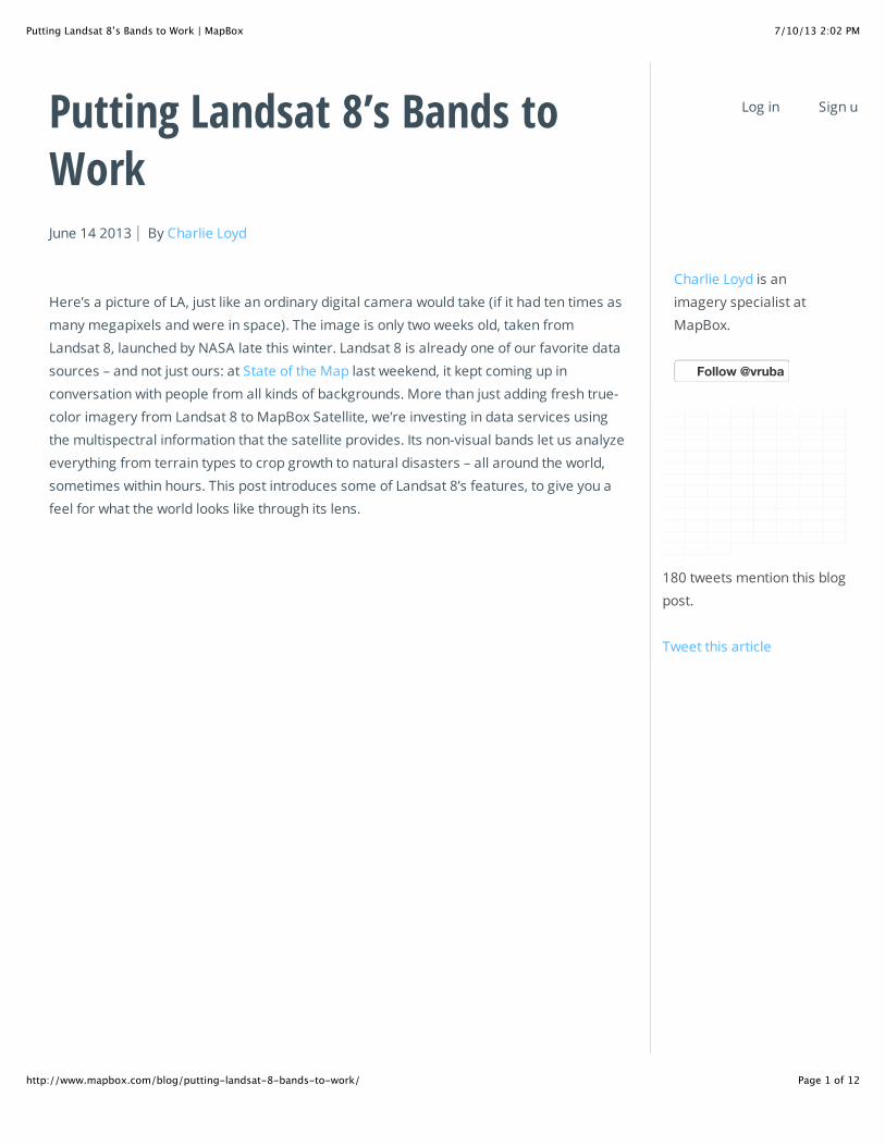
Putting Landsat 8’s Bands toWorkJune 14 2013 By Charlie Loyd
Here’s a picture of LA, just like an ordinary digital camera would take (if it had ten times as
many megapixels and were in space). The image is only two weeks old, taken from
Landsat 8, launched by NASA late this winter. Landsat 8 is already one of our favorite data
sources – and not just ours: at State of the Map last weekend, it kept coming up in
conversation with people from all kinds of backgrounds. More than just adding fresh true-
color imagery from Landsat 8 to MapBox Satellite, we’re investing in data services using
the multispectral information that the satellite provides. Its non-visual bands let us analyze
everything from terrain types to crop growth to natural disasters – all around the world,
sometimes within hours. This post introduces some of Landsat 8’s features, to give you a
feel for what the world looks like through its lens.
Charlie Loyd is an
imagery specialist at
MapBox.
Follow Follow @vruba@vruba
180 tweets mention this blog
post.
Tweet this article
Help Log in Sign up
7/10/13 2:02 PMPutting Landsat 8’s Bands to Work | MapBox
Page 2 of 12http://www.mapbox.com/blog/putting-landsat-8-bands-to-work/
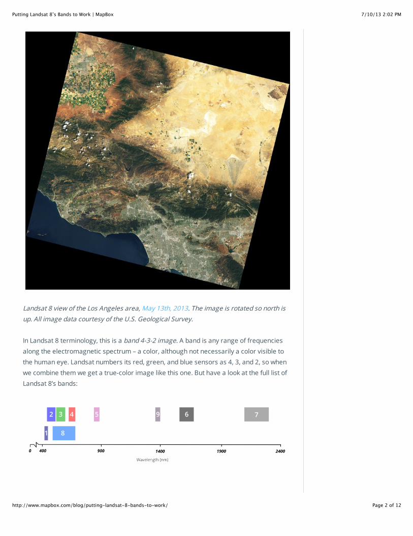
Landsat 8 view of the Los Angeles area, May 13th, 2013. The image is rotated so north is
up. All image data courtesy of the U.S. Geological Survey.
In Landsat 8 terminology, this is a band 4-3-2 image. A band is any range of frequencies
along the electromagnetic spectrum – a color, although not necessarily a color visible to
the human eye. Landsat numbers its red, green, and blue sensors as 4, 3, and 2, so when
we combine them we get a true-color image like this one. But have a look at the full list of
Landsat 8’s bands:
7/10/13 2:02 PMPutting Landsat 8’s Bands to Work | MapBox
Page 3 of 12http://www.mapbox.com/blog/putting-landsat-8-bands-to-work/
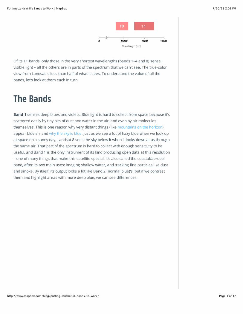
Of its 11 bands, only those in the very shortest wavelengths (bands 1–4 and 8) sense
visible light – all the others are in parts of the spectrum that we can’t see. The true-color
view from Landsat is less than half of what it sees. To understand the value of all the
bands, let’s look at them each in turn:
The Bands
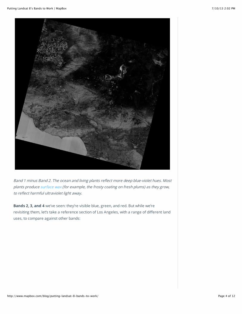
Band 1 senses deep blues and violets. Blue light is hard to collect from space because it’s
scattered easily by tiny bits of dust and water in the air, and even by air molecules
themselves. This is one reason why very distant things (like mountains on the horizon)
appear blueish, and why the sky is blue. Just as we see a lot of hazy blue when we look up
at space on a sunny day, Landsat 8 sees the sky below it when it looks down at us through
the same air. That part of the spectrum is hard to collect with enough sensitivity to be
useful, and Band 1 is the only instrument of its kind producing open data at this resolution
– one of many things that make this satellite special. It’s also called the coastal/aerosol
band, after its two main uses: imaging shallow water, and tracking fine particles like dust
and smoke. By itself, its output looks a lot like Band 2 (normal blue)’s, but if we contrast
them and highlight areas with more deep blue, we can see differences:
7/10/13 2:02 PMPutting Landsat 8’s Bands to Work | MapBox
Page 4 of 12http://www.mapbox.com/blog/putting-landsat-8-bands-to-work/
Band 1 minus Band 2. The ocean and living plants reflect more deep blue-violet hues. Most
plants produce surface wax (for example, the frosty coating on fresh plums) as they grow,
to reflect harmful ultraviolet light away.
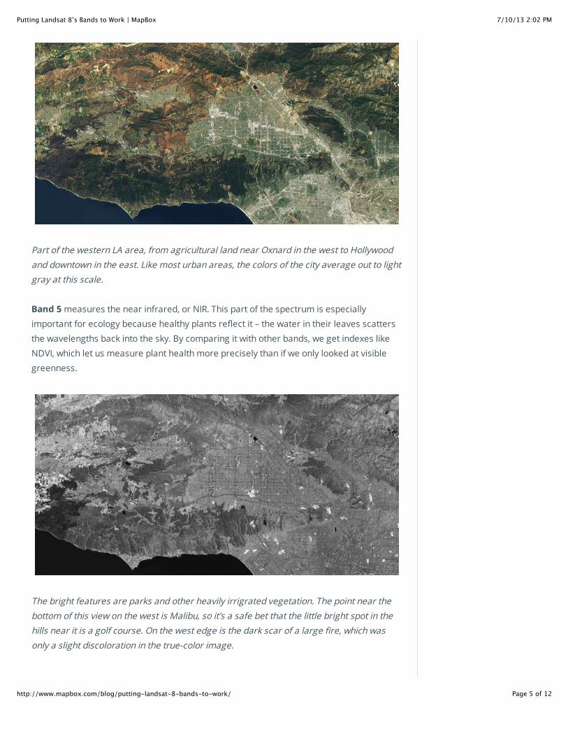
Bands 2, 3, and 4 we’ve seen: they’re visible blue, green, and red. But while we’re
revisiting them, let’s take a reference section of Los Angeles, with a range of different land
uses, to compare against other bands:
7/10/13 2:02 PMPutting Landsat 8’s Bands to Work | MapBox
Page 5 of 12http://www.mapbox.com/blog/putting-landsat-8-bands-to-work/
Part of the western LA area, from agricultural land near Oxnard in the west to Hollywood
and downtown in the east. Like most urban areas, the colors of the city average out to light
gray at this scale.
Band 5 measures the near infrared, or NIR. This part of the spectrum is especially
important for ecology because healthy plants reflect it – the water in their leaves scatters
the wavelengths back into the sky. By comparing it with other bands, we get indexes like
NDVI, which let us measure plant health more precisely than if we only looked at visible
greenness.
The bright features are parks and other heavily irrigrated vegetation. The point near the
bottom of this view on the west is Malibu, so it’s a safe bet that the little bright spot in the
hills near it is a golf course. On the west edge is the dark scar of a large fire, which was
only a slight discoloration in the true-color image.
7/10/13 2:02 PMPutting Landsat 8’s Bands to Work | MapBox
Page 6 of 12http://www.mapbox.com/blog/putting-landsat-8-bands-to-work/
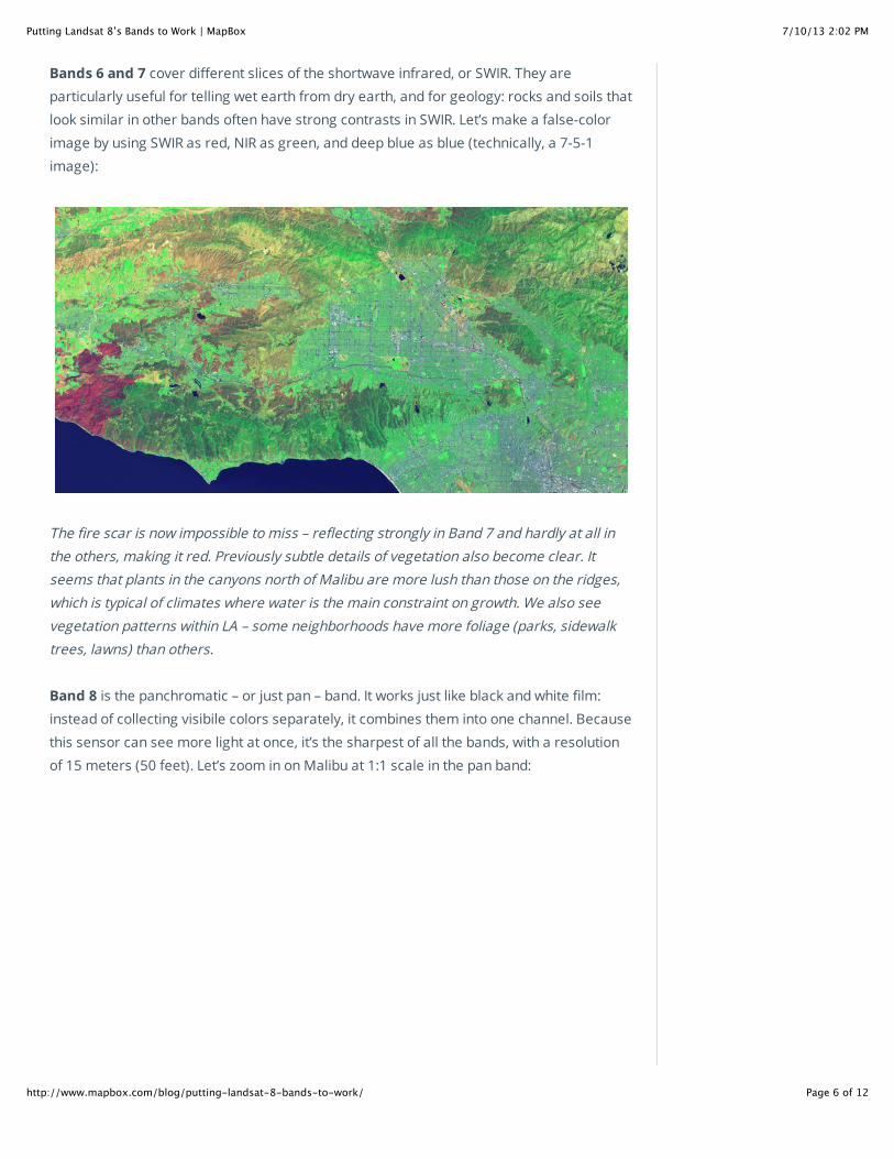
Bands 6 and 7 cover different slices of the shortwave infrared, or SWIR. They are
particularly useful for telling wet earth from dry earth, and for geology: rocks and soils that
look similar in other bands often have strong contrasts in SWIR. Let’s make a false-color
image by using SWIR as red, NIR as green, and deep blue as blue (technically, a 7-5-1
image):
The fire scar is now impossible to miss – reflecting strongly in Band 7 and hardly at all in
the others, making it red. Previously subtle details of vegetation also become clear. It
seems that plants in the canyons north of Malibu are more lush than those on the ridges,
which is typical of climates where water is the main constraint on growth. We also see
vegetation patterns within LA – some neighborhoods have more foliage (parks, sidewalk
trees, lawns) than others.
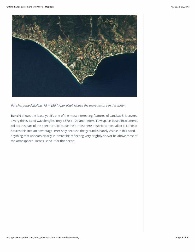
Band 8 is the panchromatic – or just pan – band. It works just like black and white film:
instead of collecting visibile colors separately, it combines them into one channel. Because
this sensor can see more light at once, it’s the sharpest of all the bands, with a resolution
of 15 meters (50 feet). Let’s zoom in on Malibu at 1:1 scale in the pan band:

7/10/13 2:02 PMPutting Landsat 8’s Bands to Work | MapBox
Page 7 of 12http://www.mapbox.com/blog/putting-landsat-8-bands-to-work/
And in true color, stretched to cover the same area:
The color version looks out of focus because those sensors can’t see details of this size.
But if we combine the color information that they provide with the detail from the pan band
– a process called pan sharpening – we get something that’s both colorful and crisp:
7/10/13 2:02 PMPutting Landsat 8’s Bands to Work | MapBox
Page 8 of 12http://www.mapbox.com/blog/putting-landsat-8-bands-to-work/
Pansharpened Malibu, 15 m (50 ft) per pixel. Notice the wave texture in the water.
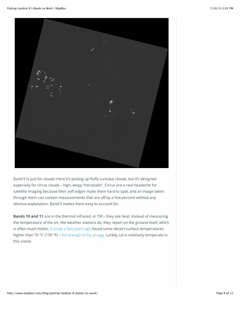
Band 9 shows the least, yet it’s one of the most interesting features of Landsat 8. It covers
a very thin slice of wavelengths: only 1370 ± 10 nanometers. Few space-based instruments
collect this part of the spectrum, because the atmosphere absorbs almost all of it. Landsat
8 turns this into an advantage. Precisely because the ground is barely visible in this band,
anything that appears clearly in it must be reflecting very brightly and/or be above most of
the atmosphere. Here’s Band 9 for this scene:
7/10/13 2:02 PMPutting Landsat 8’s Bands to Work | MapBox
Page 9 of 12http://www.mapbox.com/blog/putting-landsat-8-bands-to-work/
Band 9 is just for clouds! Here it’s picking up fluffy cumulus clouds, but it’s designed
especially for cirrus clouds – high, wispy “horsetails”. Cirrus are a real headache for
satellite imaging because their soft edges make them hard to spot, and an image taken
through them can contain measurements that are off by a few percent without any
obvious explanation. Band 9 makes them easy to account for.
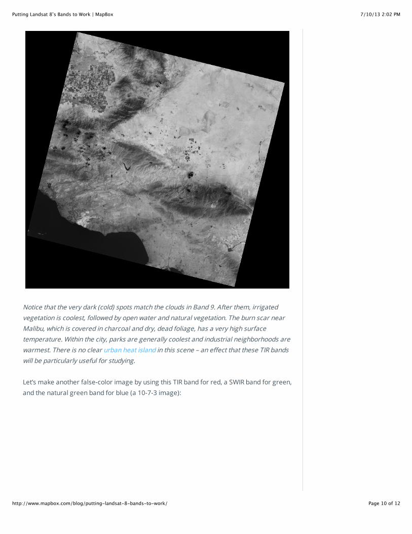
Bands 10 and 11 are in the thermal infrared, or TIR – they see heat. Instead of measuring
the temperature of the air, like weather stations do, they report on the ground itself, which
is often much hotter. A study a few years ago found some desert surface temperatures
higher than 70 °C (159 °F) – hot enough to fry an egg. Luckily, LA is relatively temperate in
this scene:
7/10/13 2:02 PMPutting Landsat 8’s Bands to Work | MapBox
Page 10 of 12http://www.mapbox.com/blog/putting-landsat-8-bands-to-work/
Notice that the very dark (cold) spots match the clouds in Band 9. After them, irrigated
vegetation is coolest, followed by open water and natural vegetation. The burn scar near
Malibu, which is covered in charcoal and dry, dead foliage, has a very high surface
temperature. Within the city, parks are generally coolest and industrial neighborhoods are
warmest. There is no clear urban heat island in this scene – an effect that these TIR bands
will be particularly useful for studying.
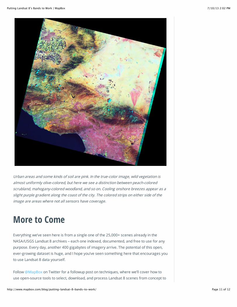
Let’s make another false-color image by using this TIR band for red, a SWIR band for green,
and the natural green band for blue (a 10-7-3 image):
7/10/13 2:02 PMPutting Landsat 8’s Bands to Work | MapBox
Page 11 of 12http://www.mapbox.com/blog/putting-landsat-8-bands-to-work/
Urban areas and some kinds of soil are pink. In the true-color image, wild vegetation is
almost uniformly olive-colored, but here we see a distinction between peach-colored
scrubland, mahogany-colored woodland, and so on. Cooling onshore breezes appear as a
slight purple gradient along the coast of the city. The colored strips on either side of the
image are areas where not all sensors have coverage.
More to Come
Everything we’ve seen here is from a single one of the 25,000+ scenes already in the
NASA/USGS Landsat 8 archives – each one indexed, documented, and free to use for any
purpose. Every day, another 400 gigabytes of imagery arrive. The potential of this open,
ever-growing dataset is huge, and I hope you’ve seen something here that encourages you
to use Landsat 8 data yourself.
Follow @MapBox on Twitter for a followup post on techniques, where we’ll cover how to
use open-source tools to select, download, and process Landsat 8 scenes from concept to

7/10/13 2:02 PMPutting Landsat 8’s Bands to Work | MapBox
Page 12 of 12http://www.mapbox.com/blog/putting-landsat-8-bands-to-work/
+ © MapBox
final product. As always, hit up Chris (@hrwgc) or myself (@vruba) with any specific
questions.
Previous All Posts Next


![USING LANDSAT-8 DATA TO EXPLORE THE CORRELATION … · [8]. Starting in 2013, thermal data became available through bands 10 and 11 of the Landsat 8 Thermal Infrared Sensor (TIRS)](https://img.dokumen.tips/doc/110x75/5cc78cda88c993a6188c06fc/using-landsat-8-data-to-explore-the-correlation-8-starting-in-2013-thermal.jpg)