Embed Size (px)
Citation preview

8/6/2019 Presenting, Analysing and Charting Data
http://slidepdf.com/reader/full/presenting-analysing-and-charting-data 1/54
Learning Development UnitTraining and Skills Development Programme
Course Code: XL0705 Excel 2007: Presenting, Analysing andCharting Research Data
www.istraining.bham.ac.uk

8/6/2019 Presenting, Analysing and Charting Data
http://slidepdf.com/reader/full/presenting-analysing-and-charting-data 2/54

8/6/2019 Presenting, Analysing and Charting Data
http://slidepdf.com/reader/full/presenting-analysing-and-charting-data 3/54
Excel 2007: Presenting, Analysing and Charting Research Data
Excel 2007: Presenting, Analysing and Charting
Research Data (XL0705)
Author: Sonia Lee Cooke
(The course is substantially based on a previous course
developed and presented by Duncan Greenhill, Barbara Hallam
and Dr Graham Hendry).
Version: 1.0, October 2009
© 2009 The University of Birmingham
All rights reserved; no part of this publication may be photocopied,
recorded or otherwise reproduced, stored in a retrieval system ortransmitted in any form by any electrical or mechanical meanswithout permission of the copyright holder.
Trademarks: Microsoft Windows is a registered trademark ofMicrosoft Corporation. All brand names and product names used inthis handbook are trademarks, registered trademarks, or tradenames of their respective holders.

8/6/2019 Presenting, Analysing and Charting Data
http://slidepdf.com/reader/full/presenting-analysing-and-charting-data 4/54

8/6/2019 Presenting, Analysing and Charting Data
http://slidepdf.com/reader/full/presenting-analysing-and-charting-data 5/54
Excel 2007: Presenting, Analysing and Charting Research Data Page i
Contents
ABOUT THE WORKBOOK ...................................................................................................................... 1
HOW TO DO SOMETHING .................................................................................................................... 1
ABOUT EXCEL ............................................................................................................................................. 2
FORMATTING CELLS ............................................................................................................................. 2
CUSTOM FORMATS ...................................................................................................................................... 2
Cells with text or symbols ................................................................................................................... 4
Number formats ................................................................................................................................. 4
Leaving space ..................................................................................................................................... 4
Conditions in Custom Formats ............................................................................................................ 5
COPYING FORMATS ...................................................................................................................................... 5
Format Painter ................................................................................................................................... 5
Styles .................................................................................................................................................. 6
ARRAY FORMULAE ............................................................................................................................... 8
Array constants .................................................................................................................................. 9
CHARTS .............................................................................................................................................. 10
CREATING A CHART .................................................................................................................................... 10
The elements of a chart .................................................................................................................... 10
CHART LOCATION ...................................................................................................................................... 11
SAVE THE CHART FORMATTING AND LAYOUT AS A TEMPLATE............................................................................. 12
APPLYING A CHART TEMPLATE TO AN EXISTING CHART ...................................................................................... 12
REMOVING OR DELETING A CHART TEMPLATE................................................................................................. 13
ADDING ERROR BARS TO A CHART ................................................................................................................. 13
ADDING MORE SERIES TO A CHART................................................................................................................ 15
Missing data points .......................................................................................................................... 15
ADDING A SECOND Y AXIS ........................................................................................................................... 16
ADDING A SECOND X AXIS ............................................................................................................................ 17
COMBINATION CHARTS ............................................................................................................................... 18
X-Y SCATTER CHARTS ................................................................................................................................. 18
ADD A TRENDLINE TO A CHART .................................................................................................................... 18
WORKING WITH COMMENTS ....................................................................................................................... 19
PRINTING COMMENTS................................................................................................................................ 20
FORM CONTROLS ............................................................................................................................... 22
STATISTICS WITH EXCEL ..................................................................................................................... 24
DESCRIPTIVE STATISTICS.............................................................................................................................. 24
Conditional formatting for extreme values ...................................................................................... 25
EXCEL ADD-INS.......................................................................................................................................... 30
PRODUCING HISTOGRAMS .......................................................................................................................... 31
Dynamic histograms ......................................................................................................................... 33
LEAST SQUARES REGRESSION ............................................................................................................ 33
Calculating linear regression coefficients ......................................................................................... 34
Calculating best fit values ................................................................................................................. 36
Calculating r 2
.................................................................................................................................... 36
Reduced Major Axis regression ........................................................................................................ 36
MULTIPLE REGRESSION ............................................................................................................................... 36
Calculating polynomial regression coefficients ................................................................................ 37 CONFIDENCE INTERVALS.............................................................................................................................. 37

8/6/2019 Presenting, Analysing and Charting Data
http://slidepdf.com/reader/full/presenting-analysing-and-charting-data 6/54
Page ii Excel 2007: Presenting, Analysing and Graphing Research Data
FORMULAE REFERENCES .................................................................................................................... 38
REFERRING TO CELLS .................................................................................................................................. 38
Relative references ........................................................................................................................... 38
Absolute references .......................................................................................................................... 38
FORMULAE ACROSS WORKSHEETS ................................................................................................................. 39
NAMED RANGES........................................................................................................................................ 40
EXCEL RESOURCES ............................................................................................................................. 41
WEBSITES ................................................................................................................................................ 41
NEWSGROUPS .......................................................................................................................................... 41
SEARCH ENGINES ....................................................................................................................................... 42
APPENDIX A – CUSTOM FORMATTING CODES ................................................................................... 43
NUMBER CODES........................................................................................................................................ 43
TEXT CODES.............................................................................................................................................. 43
DATE CODES............................................................................................................................................. 43
TIME CODES ............................................................................................................................................. 44
APPENDIX B –
EXCEL FUNCTIONS ....................................................................................................... 45
STATISTICAL FUNCTIONS.............................................................................................................................. 45
CURVE FITTING FUNCTIONS.......................................................................................................................... 46
DISTRIBUTION FUNCTIONS........................................................................................................................... 47
SIGNIFICANCE TEST FUNCTIONS .................................................................................................................... 48

8/6/2019 Presenting, Analysing and Charting Data
http://slidepdf.com/reader/full/presenting-analysing-and-charting-data 7/54
Excel 2007: Presenting, Analysing and Charting Research Data Page 1
About the workbookThe workbook is designed as a reference for you to use after the coursehas finished. The workbook is yours to take away with you so feel freeto make any notes you need in the workbook itself.
The workbook is divided into sections with each section explainingabout a particular feature of Excel or how to do a particular task.Sections that take you through a particular procedure step-by-step look like this:
How to do something
Do this first.
Then do this.
Then do this to finish.
There are also a number of text boxes to watch out for throughout theworkbook. These will help you to get the most out of Excel.
Tip
The thumbs-up symbol in the margin indicates a tip. These tips will help you
work more effectively.
Danger!
The skull and crossbones picture in the margin indicates common mistakes
or pitfalls to be avoided.

8/6/2019 Presenting, Analysing and Charting Data
http://slidepdf.com/reader/full/presenting-analysing-and-charting-data 8/54
Page 2 Excel 2007: Presenting, Analysing and Charting Research Data
About Excel
The handbook introduces some of the analytical and presentationalfeatures of Excel 2007, as well as looking at some of the more powerfulformatting features.
Excel 2007 is powerful enough to be used for the analysis of data frommany research projects. There are a number of add-ins, both fromMicrosoft and other companies, which can extend its capabilities. Manyof the dedicated statistical and graphing packages can read the Excelfiles if features are required that aren‟t provided in Excel.
Formatting cells
Custom formatsFormatting of numbers for statistical data can sometimes be critical.Suppose we have some data from analysing the concentration of copperin sediment samples. Half of the results might be accurate to twodecimal places, but the other half might have been produced using adifferent analysis technique and might only be accurate to one decimal
place. When the cells are displayed the decimal points won‟t line up.We can‟t simply format all the cells to one decimal place since wewould lose precision in half the data. Neither can we format all the datato two decimal places since that would imply half of the data is more
accurate than it actually is. So how do we make the cells line up? Theanswer is to use custom formats.
When a number is typed into a cell, Excel initially stores it with theGeneral format, unless it recognises it as a date, currency, or as apercentage.
The General number format shows numbers with more than elevendigits in scientific format, such as 1.23E+11.
The custom format can contain three sections for numbers and anadditional section for text. The sections are separated by semicolons.
Positive; negative; zero; textAn example is shown below.
##0.00 ; [RED](##0.00) ; 0.00 ; “format for text”
If we miss out any sections we still need to add in the semicolons. Forexample, if we wanted to enter a format for positive and zero numbersbut not for negative numbers we would have two semicolons. Excelwould recognise that the negative section was empty and that the secondset of formatting codes applied to zeros.
To create a custom format:
Select a cell or range of cells.

8/6/2019 Presenting, Analysing and Charting Data
http://slidepdf.com/reader/full/presenting-analysing-and-charting-data 9/54
Excel 2007: Presenting, Analysing and Charting Research Data Page 3
Click on the Home tab, in the Cells group, click on Format button.
and select Format Cells… Alternatively, press Ctrl 1,the Format Cells dialogue box appears:
The Number tab is selected by default, under Category: click on
Custom in the list of categories.
Delete the word General from the Type: text box and enter the
codes for the format you want. E.g. lets say we want to create a
custom format to display degree census (oC).
Enter the format code, then type quotes before the degree sign and
after the C. It should now look like this (0 “oC”)
Confirm that the sample is showing the data in the correct format.
Click on the OK button.
The codes that we can enter to create a custom format can be found inthe Excel help system.

8/6/2019 Presenting, Analysing and Charting Data
http://slidepdf.com/reader/full/presenting-analysing-and-charting-data 10/54
Page 4 Excel 2007: Presenting, Analysing and Charting Research Data
Why have I got all these formats?
Every time we modify an existing custom format, the original format stays in
the list. Make sure you delete any that you don‟t need.
If you accidentally delete a custom format you need, all the cells that use the
format will lose the custom formatting. For example, if we have a customformat to show 21 as 21
oC and we delete the custom format then the cell will
revert to displaying 21.
Cells with text or symbols
If we are recording some temperature data we might want to include theunits. For example, we might want a temperature to be displayed as21oC or 294K. If we just type 294K into a cell, Excel will interpret it astext and we won‟t be able to do any calculations with the value. Theway we would solve the problem is by creating a custom format
consisting of the number codes and any other text we need. To displaytext in a cell (with or without numbers) we enclose the text in quotes.Single characters can also be „escaped‟ i.e. treated literally by putting abackslash \ before the character. Some characters display withoutneeding a backslash. These are: $ - + / ( ) { }: ! ^ & ~ = < > „ and thespace character. If the cell is going to contain text, we use a code of @to represent the cell content, e.g. “My name is ”@.
Number formats
When we create custom formats for numbers we put in placeholders tocontain the digits. A # displays only significant digits and will not
display zeros that are not significant. A 0 will display zeros that are notsignificant if the number has fewer digits than the format.
If we want to have the thousands separated by commas we can includethe commas in the format.
Leaving space
The Excel help system tells us that we can use a ? in the format to leavespace. However, that method works best if we are using a monospacedfont, i.e. each character is the same width, and most fonts installed oncomputers do not have equal width characters. We can get around the
problem by using the underscore character. The underscore characterleaves space equal to the width of the character that follows it. Forexample, _m will leave blank space that is the width of an m, while _iwill leave space the width of an i. Neither code will put an m or i onscreen.
I’m adding up time. Can I show a total more than 24 hours?
If we are using any of the standard time formats and add up times we can
run into problems if the total is more than 24 hours. For example, a
timesheet would add up to 35 hours for a normal working week, but the
standard time formats would display this as 11:00 i.e. the whole day hasbeen discarded. We can get around the problem with a custom format of
[hh]:mm which will display elapsed hours.

8/6/2019 Presenting, Analysing and Charting Data
http://slidepdf.com/reader/full/presenting-analysing-and-charting-data 11/54
Excel 2007: Presenting, Analysing and Charting Research Data Page 5
I’ve lost my data
If we don‟t put in the number or text codes then Excel will only display the
text entered in quotes, for example,oC instead of 21
oC
So what does my cell contain?
It contains the value you typed in. Think of it like typing in a number and then
using the formatting to make it display with a pound sign. The cell still only
contains the number, but the formatting is making it display differently.
Conditions in Custom Formats
If we want the custom formats to be conditional on some value then wecan include conditions in the format. For each of the number sectionsthe order would be:
[condition][colour]codes
Examples would be:
[Green][>100]###.00;[<0][Red]###.00;0.00
This would give numbers larger than 100 in green, negative numbers inred and zeros as 0.00.
Caution!
The conditions can override the „logic‟ of the sections, which are positive;negative; zero; text. For example:
[Green][<-20]###.00 ; [>100][Red]###.00;0.00
would mean a value of -20 would be green, any number above 100 would be
red, while –10 would have no formatting applied to it.
What colours can I use?
The help system tells us we can have any one of eight colours. These are
black, blue, cyan, green, magenta, red, white and yellow. However, we can
get more. If we look at the patterns tab in the Format Cells dialogue box we
see a grid of colours. Imagine them numbered from 1 2 3 … across the first
row and 9 10 11 … across the second down to 56 in the bottom right-hand
corner. If we type [color n] Excel will use that colour for that section. We
need to use the American spelling for Excel to understand what we want.
Copying formats
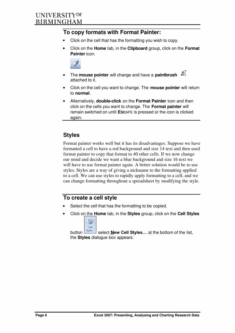
Format Painter
Setting up formatting can be time consuming, but Format painter allowsus to copy formats from one cell to another.
8/6/2019 Presenting, Analysing and Charting Data
http://slidepdf.com/reader/full/presenting-analysing-and-charting-data 12/54
Page 6 Excel 2007: Presenting, Analysing and Charting Research Data
To copy formats with Format Painter:
Click on the cell that has the formatting you wish to copy.
Click on the Home tab, in the Clipboard group, click on the Format
Painter icon.
The mouse pointer will change and have a paintbrush attached to it.
Click on the cell you want to change. The mouse pointer will return
to normal.
Alternatively, double-click on the Format Painter icon and then
click on the cells you want to change. The Format painter will
remain switched on until ESCAPE is pressed or the icon is clicked
again.
Styles
Format painter works well but it has its disadvantages. Suppose we haveformatted a cell to have a red background and size 14 text and then usedformat painter to copy that format to 40 other cells. If we now changeour mind and decide we want a blue background and size 16 text wewill have to use format painter again. A better solution would be to usestyles. Styles are a way of giving a nickname to the formatting applied
to a cell. We can use styles to rapidly apply formatting to a cell, and wecan change formatting throughout a spreadsheet by modifying the style.
To create a cell style
Select the cell that has the formatting to be copied.
Click on the Home tab, in the Styles group, click on the Cell Styles
button select New Cell Styles… at the bottom of the list,the Styles dialogue box appears:

8/6/2019 Presenting, Analysing and Charting Data
http://slidepdf.com/reader/full/presenting-analysing-and-charting-data 13/54
Excel 2007: Presenting, Analysing and Charting Research Data Page 7
Type the name of the style in the Style name: box.
Click on the Format... button and select the required format from
the Format Cells dialogue box and click on the OK button to return
to the Styles dialogue box.
Click on the OK button on the Styles dialogue box
To apply a cell style:
Select the cells you want to apply the style to.
Click on the Cell Styles button, the style is displayed underCustom at the top of the list, select it. Alternatively you can right-click on the style and select
To remove a cell style
Select the cells where the style has been applied.
Click on the Cell Styles button.
Under Good, Bad, and Neutral, click Normal, or right-click on the
style and select Delete to delete it from the list.
To modify a cell style
Click on the Home tab, in the Styles group, click on Cell Styles
and right-click the Cell Style name and select Modify…

8/6/2019 Presenting, Analysing and Charting Data
http://slidepdf.com/reader/full/presenting-analysing-and-charting-data 14/54
Page 8 Excel 2007: Presenting, Analysing and Charting Research Data
Array formulaeArray formulae are one of the most powerful and least understoodfeatures of Excel. An array formula can give us back a single result ormultiple results from complex calculations, without us having to enter
the intermediate steps into the worksheet. We can also use arrays insidea normal formula. These are called array constants. Some of thefunctions in Excel require us to use an array formula because thefunction either uses an array or produces an array as a result. Anexample would be the matrix functions.
What’s an array?
Think of an array as being like a grid. An array formula uses groups of cells
instead of single cells as the source data for its calculation.
Suppose we have the following worksheet:
We can select cells C1 to C4 and type a formula =A1:A4+B1:B4. If we press enter we‟ll get the answer 6 in C1 only. If we pressCTRL SHIFT ENTER then we will enter three formulas at the same timeand we‟ll have the answers 2, 9, 6 and 8 in C1, C2, C3 and C4respectively. Using an array formula has allowed us to create acalculation that gives us more than one answer. Excel has done this by„looping‟ through the array, i.e. Excel first adds A1 and B1 and puts theanswer in C1, then Excel adds A2 and B2 and puts the answer into C2,then Excel adds A3 and B3 and puts the answer into C3 and finally addsA4 and B4 and puts the answer in C4.
To create an array formula for a single result:
Click in a single cell.
Type the formula as normal.
Press and hold down both the Ctrl and the Shift keys, and then
press the ENTER key.
To create an array formula for a multiple result:
Select a range of cells.
Type the formula as normal.

8/6/2019 Presenting, Analysing and Charting Data
http://slidepdf.com/reader/full/presenting-analysing-and-charting-data 15/54
Excel 2007: Presenting, Analysing and Charting Research Data Page 9
Press and hold down both the Ctrl and the Shift keys, and then
press the ENTER key.
Editing arrays
When we have created an array formula with results in multiple cells we
can‟t edit a single cell of the array. We have to select the whole range, edit
the formula, and then press Ctrl Shift ENTER to re-create the array formula.
Where did the { } brackets come from?
Excel has placed the { } brackets around the formula when we pressed
Ctrl Shift ENTER. We can‟t type them normally as part of the formula and
then press ENTER, we have to press Ctrl Shift ENTER.
Array constants
An array constant takes the place of a constant in a normal formula. Forexample, the „Large‟ function in Excel returns the nth largest number
from a range. The syntax is where k is the place thatwe want i.e. 1 for the largest, 2 for the second largest and so on. Theformula:
=LARGE(A1:C20,1)
would give us the largest number within the block of cells from A1 to
C20.An array constant lets us find more than one number. For example, wemight want the three largest numbers, or the 1 st, 3rd and 5th numbers inthe list. We can do this by entering a formula such as:
=LARGE(A1:C20,{1,2,3}) or
=LARGE(A1:C20,{1;3;5})
To enter a formula with an array constant
Select a range of cells. The number of cells selected should be thesame as the number of answers required. The selection can be
vertical or horizontal.
Type the formula and type the { } brackets around the array
constant part. If the range selected is horizontal separate the array
constants with commas. If the range selected is vertical separate
the array constants with semi-colons.
Press Ctrl Shift ENTER.

8/6/2019 Presenting, Analysing and Charting Data
http://slidepdf.com/reader/full/presenting-analysing-and-charting-data 16/54
Page 10 Excel 2007: Presenting, Analysing and Charting Research Data
My answers are identical
If we have entered a formula with an array constant to give us multiple
answers we can sometimes find all the answers are the same when we can
see quite clearly from the data that they shouldn‟t be. An array constantvaries according to whether we want a horizontal or vertical result. If we
want results horizontally the array constants need to be separated with
commas, e.g. {1,2,3}, but if we want results displayed vertically then we need
to separate the array constants with semi-colons e.g. {1;3;5}.
ChartsExcel lets us create charts very easily. We can create a variety of different types of charts such as bar charts, pie charts, x-y scatter charts
and many others. Once the chart has been created we can select variouselements within them and modify or format them to suit the needs of that particular chart.
Creating a chart
To create a chart:
Select the data in the worksheet.
Click on the Insert tab, choose the chart type from the Chart group.
You can format different elements of the chart by clicking on theFormat tab and select a required option from Current Selection and Shape Styles group.
The elements of a chart
A chart will consist of various elements and it can be useful to knowwhat Excel calls them, for example, the help system might tell us toselect a certain part of a chart.

8/6/2019 Presenting, Analysing and Charting Data
http://slidepdf.com/reader/full/presenting-analysing-and-charting-data 17/54
Excel 2007: Presenting, Analysing and Charting Research Data Page 11
Chart location
When you create a chart, by default the chart is placed within thecurrent worksheet. When the chart is within the worksheet it issometimes called an embedded chart, you can click on it and drag it to adifferent location on the worksheet. You can also choose a differentlocation on a completely separate worksheet. If you have a chart on a
completely separate worksheet it can sometimes be more useful becauseit gives you more room to work.
I have an embedded chart. Can I print it on a separate page?
Yes. If the chart is not selected then when you print you get what you can
see on screen – the data and the chart together. If you click on the chart to
select it you will see small dots in each corner and the middle of each side,
within double-borders around the chart. If you print with the chart selected
the chart will be printed on a separate page by itself, scaled up to fit the size
of the paper.
To change chart location:
Click on the chart to select it.
Click on the Design tab, in the Location group, click on the MoveChart button.

8/6/2019 Presenting, Analysing and Charting Data
http://slidepdf.com/reader/full/presenting-analysing-and-charting-data 18/54
Page 12 Excel 2007: Presenting, Analysing and Charting Research Data
The Move Chart dialogue box appears:
Choose the location and click on the OK button.
Save the Chart Formatting and Layout as a
Template
There are a number of standard formats to pick from when creating achart. We can change to a different format later, but quite often we findthe standard formats are not quite what we want. If we are creating aseries of charts then it can be quite long-winded to modify them all byhand. What we could do instead is to create our own custom format,store it and then apply it to all the other charts as well.
To save the chart as a template:Create a chart and select areas of the chart and format as
necessary.
Click on the chart to select it.
Under Chart Tools, click on the Design tab, in the Type group,
click on Save as Template, the Save Chart Template dialogue
box appears, make sure the Chart folder is selected, and in the
File name: text box, enter a name for the Chart Template.
Click on the OK button.
Applying a Chart Template to an existing chart
To apply a chart template to an existing chart:
Click on the chart to select it
Click on the Insert tab, in the Chart group, click on chart dialoguebox launcher

8/6/2019 Presenting, Analysing and Charting Data
http://slidepdf.com/reader/full/presenting-analysing-and-charting-data 19/54
Excel 2007: Presenting, Analysing and Charting Research Data Page 13
The Change Chart Template dialogue box appears.
Click on Template in the left pane
Pick the required chart template from the list on the right
Click on the OK button.
Removing or Deleting a Chart Template
To remove or delete a chart from the chart templatefolder:
Click on the Insert tab, in the Chart group, click on chart dialogue
box launcher, and the Change Chart Type dialogue box appears.
Click on the Manage Template button at the bottom of the Change
Chart Type dialogue box.
To remove the chart template from the Charts folder, to another
folder, drag it to the folder where you want to store it.
To delete the chart template from your computer, right-click it,
and then click Delete.
Adding error bars to a chart
You can create a chart with a number of data series and then add errorbars to the data. You have the choice of making the error bars show avariation of a fixed amount, a percentage, and one or more standarddeviations, standard error or by a custom amount. The data for thecustom variation is normally typed into a range of cells on theworksheet. Standard error is calculated by dividing the standarddeviation by √n, where n is the number of data points. Additionally, wecan choose to show error bars above the data point, below the data pointor both.
To apply error bars:Click on the data series; make sure they are all selected.
Under Chart Tools, click on the Layout tab, in the Type group
Click on the arrowhead to the right of Error Barsand select More Error Bars Options…the Format Error Bars dialogue box appears:

8/6/2019 Presenting, Analysing and Charting Data
http://slidepdf.com/reader/full/presenting-analysing-and-charting-data 20/54
Page 14 Excel 2007: Presenting, Analysing and Charting Research Data
Under Display you can choose plus, minus, both or none.
Under Error Amount select the type of error bar required. Ifcustom is chosen, either type the references in or click on theSpecify Value button the Custom Error Bars dialogue boxappears:
Click on the button with the red arrow and drag on the worksheet toselect a range.
Click on the OK button on the Custom Error Bars dialogue boxand click on the Close button on Format Error Bars dialogue box.

8/6/2019 Presenting, Analysing and Charting Data
http://slidepdf.com/reader/full/presenting-analysing-and-charting-data 21/54
Excel 2007: Presenting, Analysing and Charting Research Data Page 15
I can’t enter my custom error bars
If you type in the range for the error bars manually you may get an error
when you try and press Enter. This is because Excel needs the exact
reference, including any worksheet names. The full reference should be
something like Sheet2!b3:b19, with an exclamation mark after the worksheetname. Alternatively, you can select from the worksheet directly as shown
above.
Adding more series to a Chart
Each column or line is called a data series, since it is constructed from aseries of data points. We can create a chart using a number of series byselecting the data before we create the chart. We might also be in thesituation where we have an existing chart and we want to add another
data series to it.
To add another series:
Select the cells containing the new values.
Copy using the Copy icon, in the Clipboard group, on the Home
tab or press Ctrl C.
Click on the chart to select it.
Click on the Home tab, in the Clipboard group, click on Paste and
select Paste Special… the Paste Special dialogue box appears:
Ensure New series is selected and click on the OK button to insert
the new series onto the chart.
Missing data points
Suppose we have a series of data points plotted as a line. If there is avalue missing, i.e. a blank cell in the range, then Excel will leave a gap
between and our data series will show as two lines instead of one,although both line fragments will have the same formatting. We cantrick Excel into including the unknown value as part of the series whenplotting the data.

8/6/2019 Presenting, Analysing and Charting Data
http://slidepdf.com/reader/full/presenting-analysing-and-charting-data 22/54
Page 16 Excel 2007: Presenting, Analysing and Charting Research Data
To include missing data points:
Click on the blank cell where the value should be.
Type in #N/A.
Hiding the #N/A
Typing in the #N/A code will make Excel treat the data as a continuous
series for plotting, but doesn‟t look particularly good when printing the
worksheet. We can work around this problem by formatting the cell so that
the text is the same colour as the background.
Adding a second Y axis
We may have two data series that are difficult to plot on the same chart.We might have one data series with values that vary between 1 and 50,while a second series has values up to 4500. If we plot them togetherthen we won‟t be able to see the detail on the first series because it willbe very close to the x-axis.
We could do two different charts but that makes it awkward to comparethe two series. An alternative solution would be to plot one of the dataseries on a second y-axis.

8/6/2019 Presenting, Analysing and Charting Data
http://slidepdf.com/reader/full/presenting-analysing-and-charting-data 23/54
Excel 2007: Presenting, Analysing and Charting Research Data Page 17
To add a second y axis to a chart
Right-click on one of the data points in a data series.
Select Format Data Series… the Format Data Series dialogue boxappears:
Click on Series Options and select Secondary Axis.
Click on the Close button.
I can’t add a secondary axis
We can‟t add a secondary axis, either x or y, unless we have at least two
data series on the chart. Another common problem is that we can‟t access
the secondary axis area on the Format Data Series dialogue box. We need
to set one of our data series to have a secondary axis first, before we can
access that area on the Format Data Series dialogue box.
Adding a second x axis
Although rarer, there is sometimes a need to have two x axes as part of the same graph, it may be useful in an xy (scatter) chart or bubble chart.
To add a second x axis
Click a chart that displays a secondary vertical axis.
The Chart Tools appears at the top right of the screen adding the
Design, Layout, and Format tabs.
Click on the Layout tab, in the Axes group, click Axes.Point to Secondary Horizontal Axis and select the required
option. If you select More Secondary Horizontal Axis Options…

8/6/2019 Presenting, Analysing and Charting Data
http://slidepdf.com/reader/full/presenting-analysing-and-charting-data 24/54
Page 18 Excel 2007: Presenting, Analysing and Charting Research Data
the Format Axis dialogue box will open and you can select the
display option that you want.
Click on the Close button.
Combination charts
If we have more than one data series on a chart then we can includemore than one chart type. For example, we could have one series plottedas a set of columns and one plotted as a line.
To create a combination chart:
Create or select a chart with more than one data series.
Select one of the series. (We are going to apply a line chart to our existing chart)
Click on the Insert tab, in the Charts group, click Line and choose
the style you want.
I can’t pick the series
If there are a lot of elements on a graph it can be difficult to select the onethat we want, particularly if there are a number of series and regressionlines. We can select the chart and then use the left, right, up and down
arrows on the keyboard to cycle through all the elements on the chart
Alternatively, select the chart, click on the Layout tab, in the Current Selection group, click on the Chart Elements arrowhead and pick a series.
X-Y Scatter charts
Many types of experimental data involve sets of numbers plotted againsteach other. Depending on what options we pick, Excel can join the
points with jagged or smooth lines, or leave them as separate points.We can then choose to add a trendline which will be a best-fit to thedata. A trendline is more normally called a regression line. We can tellExcel to try and fit the regression line using a linear, polynomial,logarithmic, power or exponential relationship.
Add a Trendline to a Chart
To insert a trendline:
Click on the data series in the chart to select them.

8/6/2019 Presenting, Analysing and Charting Data
http://slidepdf.com/reader/full/presenting-analysing-and-charting-data 25/54
Excel 2007: Presenting, Analysing and Charting Research Data Page 19
Click on the Layout tab, in the .Analysis group, click on Trendline
and select More Trendline Options… alternatively, right-click on
the data series and select Add Trendline…, the FormatTrendline dialogue appears:
Choose the type, and click on the Close button
What do the options in the Format Trendline dialogue box do?
The options can be used to name the trendline by using the Trendline Name
area, extend the line forwards or backwards by using the Forecast area, and
also to display the equation and R2
value. More detailed instructions are on
page 34 in the section on linear regression.
Working with CommentsComments are notes that you attach to cells. You can attach commentsin a worksheet you share with others or if your worksheet containscomplex formulas that are difficult to work out, inserting comments in acell can add clarity to the data.
To add a Comment to a cell
Select the cell in which you want to add the comment.

8/6/2019 Presenting, Analysing and Charting Data
http://slidepdf.com/reader/full/presenting-analysing-and-charting-data 26/54
Page 20 Excel 2007: Presenting, Analysing and Charting Research Data
Click on the Review tab, in the Comment group, click on New
Comment alternatively, press Shift F2.
A text box appears in the cell, enter your comment, you can
change the size of the box by clicking dragging the sizing handles
(small white squares around the text box)
Click outside of the text box after you have entered your
comment. A small red triangle appears in the top right corner ofthe cell.
To read the comment hover the mouse over the cell that contains
the comment.
To edit a comment in the cell:
Select the cell that contains the comment you want to edit.
Click on the Review tab, in the Comment group, (notice that the
New Comment changes to Edit Comment) click on Edit comment.
Click outside of the comment box to save the changes.
To Delete a Comment from a cell:
Select the cell that contains the comment you want to delete.
Click on the Review tab, in the Comment group, click on Delete
to delete the comment.
Printing Comments
Comments are visible on screen, when you print your worksheet thecomments will not be printed.
To print comments:
Click on the Page Layout tab, in the Page Setup group, click on
the dialogue box launcher, the Page
setup dialogue box appears:

8/6/2019 Presenting, Analysing and Charting Data
http://slidepdf.com/reader/full/presenting-analysing-and-charting-data 27/54
Excel 2007: Presenting, Analysing and Charting Research Data Page 21
Click on the Sheet Tab.
Under Print click on the arrowhead to the right of Comments: and select one of the options.
You can print all the comments at the end of a worksheet or as
displayed on the worksheet.
Click the Print button, the Print dialogue box appears, click OK
to print the worksheet and comments.
The example below shows a worksheet with comments in three
cells A2:A4 the option selected from the above drop down menu
is At end of sheet

8/6/2019 Presenting, Analysing and Charting Data
http://slidepdf.com/reader/full/presenting-analysing-and-charting-data 28/54
Page 22 Excel 2007: Presenting, Analysing and Charting Research Data
Form controlsExcel allows us to add form controls to a worksheet. By form controls,we mean elements such as tick boxes, buttons to click on, spinners,scroll bars, and lists to pick from. We can have elements on theworksheet that we are more used to seeing as part of a dialogue box. Tocreate the form controls we need to have the forms toolbar displayed onscreen.
To display the Developer tab, if it’s not on theRibbon:
Click on the Office button at the top left of the screen, click on the
Excel Options button, the Excel Options dialogue box appears:
Ensure Popular is selected.
Under Top options for working with Excel, select ShowDeveloper tab in the Ribbon.
Click on the OK button to add the Developer tab to the Ribbon.

8/6/2019 Presenting, Analysing and Charting Data
http://slidepdf.com/reader/full/presenting-analysing-and-charting-data 29/54
Excel 2007: Presenting, Analysing and Charting Research Data Page 23
Once the Developer tab is on the Ribbon we can choose which controlswe want to add to the worksheet by clicking on Insert in the Controls group.
We can also connect the control to a cell on the spreadsheet so that wecan use the control to enter a range of data.
To create a form control
Click on the Developer tab, in the Controls group, click on Insert.
Click on the control required.
Click and drag on the worksheet to create the control.
Right-click on the control and select Format Control… the
Format Control dialogue box appears:
Click on the Control tab.
Button
Option Group
Check box
Combo Drop-Down- Edit
Spin button
Label
Combo List
List boxCombo Box
Option button
Scroll bar Text Field
8/6/2019 Presenting, Analysing and Charting Data
http://slidepdf.com/reader/full/presenting-analysing-and-charting-data 30/54
Page 24 Excel 2007: Presenting, Analysing and Charting Research Data
Set any properties required. This screenshot shows the options for
a spin button control.
My option buttons don’t work properly
To create option buttons successfully, we first need to create an option
group. Then we create the option buttons within the option group. If we just
create the buttons on the worksheet without an option group (or outside its
border) then Excel doesn‟t know which set of options the button is supposed
to relate to.
Statistics with ExcelExcel has many built-in functions, from simple mathematical
calculations like average and sum, trigonometric functions like tan andcos, to complex financial and engineering functions. A partial list of Excel functions is provided in Appendix B. It is advisable to check theformulae used internally by the functions to ensure that they will givecorrect answers for the data used. The Excel help system will sometimesgive the formula used for the statistic functions and the knowledge baseat the Microsoft web site can be searched for known issues withparticular functions.
Descriptive statistics
Descriptive statistics are those that describe the characteristics of thedata. We will be looking at mean, trimmed mean, standard deviation,median, maximum, minimum, skew and kurtosis.
MeanThe mean calculates the average of the data.
Trimmed meanThe mean may be distorted by values that are untypical or wrong. Atrimmed mean calculates the average by excluding the most extreme
data in pairs. For example, we can calculate the average with the highestand lowest values removed, or with the two highest and two lowestvalues removed. The trimmed mean always removes the data values inpairs.
Standard deviationThe standard deviation is a measure of how much the data is dispersedfrom the mean. For a normal distribution, 68% of the values should liewithin 1 standard deviation from the mean, 95% of the values will liewithin 2 standard deviations from the mean, and 99.7% of the valueswould lie within 3 standard deviations from the mean.
MedianThe median is the middle value in an ordered set of data points, or theaverage of the two middle values if there is an even number of datapoints.

8/6/2019 Presenting, Analysing and Charting Data
http://slidepdf.com/reader/full/presenting-analysing-and-charting-data 31/54
Excel 2007: Presenting, Analysing and Charting Research Data Page 25
Maximum and minimumThe largest and smallest values in a data set.
SkewA measure of how asymmetric the distribution is. If the chart extends
further to the left of the mean than it does to the right, then thedistribution of the data has negative skewness. If the chart extendsfurther to the right of the mean than it does to the left then thedistribution has positive skewness.
KurtosisKurtosis is a measure of how „peaked‟ a distribution is. The normaldistribution has a kurtosis value of zero, and is sometimes referred to asbeing mesokurtic. A negative number indicates the data is less peakedthan the normal distribution, which is sometimes called a platykurtic. Apositive number indicates the data is more peaked than the normaldistribution. The term leptokurtic is sometimes used in thiscircumstance.
There are different ways of calculating the kurtosis statistic. If you arecomparing your calculations to published values, try to ensure that thesame statistical formula is being used for both data sets.
Conditional formatting for extreme values
We can use conditional formatting to „flag up‟ when particular datavalues are outside certain limits. There are two types of conditional
formatting – the conditional formatting we apply when we set up acustom format, and the conditional formatting we apply to cells throughConditional Formatting in the Styles group on the Home tab. It is thissecond option we use to highlight extreme data points, and we can enterconditions.
The conditions in custom formats only change how the data isdisplayed. It may cause it to have a certain number of digits or displayin a certain colour, but it can‟t, for example, change the backgroundcolour of the cell, or put a border around it. Conditional formatting forcells allows us to do just that. When we create conditional formats forcells we can include a subset of the formatting available from theFormat Cells window. In conditional formatting we can choose fromborder, pattern and some options from font.
We can set up to sixty-four different conditions each with its ownformatting. This means that including the unchanged look we can haveone or more sets of formatting applied to a particular cell.
The conditions can be set based on the cell value or on the result of aformula. The formula must reduce to a yes (true) or false (no) answer.For example, we can‟t use =SUM(b3:b7) since that would simply addup the cells, but we could use =SUM(b3:b7)>=0 i.e. is the sum biggerthan zero?

8/6/2019 Presenting, Analysing and Charting Data
http://slidepdf.com/reader/full/presenting-analysing-and-charting-data 32/54
Page 26 Excel 2007: Presenting, Analysing and Charting Research Data
To create conditional formatting:
Click on the Home tab, in the Styles group, click on ConditionalFormatting. You can select an option from the drop-down list,New Rules or Manage Rules.
Select Manage Rules…, the Conditional Formatting Rules
Manager dialogue box appears, click on the New Rule… button
the New Formatting Rule dialogue box appears.
Set a condition based on the cell value or on the result of a formula.
Click on the Format… button, choose a format and click on the OK
button to close the New Formatting Rule dialogue box and return
to the Conditional Formatting rules Manager dialogue box.
Click on the New Rule… button to add another condition and
format.

8/6/2019 Presenting, Analysing and Charting Data
http://slidepdf.com/reader/full/presenting-analysing-and-charting-data 33/54
Excel 2007: Presenting, Analysing and Charting Research Data Page 27
Click on OK.
To use formulae within conditional formatting:
Highlight the data range you want to apply the conditionalformatting to.
Click on the Home tab, in the Styles group, click on Conditional
Formatting.
Or if you select New Rule… the New Formatting Rule dialoguebox appears:
Select a Rule type from the list – e.g. if you choose Use a formula
to determine which cell to format, you could enter a formula that
will evaluate to either a true or false result.
Choose the format to be applied, by clicking on the Format...
button, the Format Cells dialogue box appears.
Select the format you want and click on the OK button.
Click on the OK button.
An example will help to make this clearer:
Suppose we have selected cells B4 to B24 and enter this formula:
=ABS(B4-AVERAGE(B4:B24))>=STDEV(B4:B24)*3
The B4-AVERAGE(B4:C24) part takes the data value and subtracts
the average to give us a number. The number shows how far the
data point is from the mean. If B4 is smaller than the mean the
number will be negative, so the ABS function converts it to a
positive number.

8/6/2019 Presenting, Analysing and Charting Data
http://slidepdf.com/reader/full/presenting-analysing-and-charting-data 34/54
Page 28 Excel 2007: Presenting, Analysing and Charting Research Data
The left hand side of the formula is calculating a positive number
indicating how the data point is away from the mean. This number
is then compared to three times the standard deviation. In plain
language, the formula is asking: is the data point more than three
times the standard deviation away from the mean? The answer is
either yes (true) or no (false). If the answer is true the format will beapplied. (As shown in the New Formatting Rule dialogue box
below)
You could also use the option – Format only values that are
above or below average and select the appropriate amount of
standard deviation below or above the mean.
Ensure you select the range of cells you want to apply the condition
to.
Let‟s say we want to see data point(s) that are two standarddeviation below the mean for the selected range.
On the New Formatting Rule dialogue box, under Format valuesthat are: click on the arrowhead and select 2 std dev below
Click on the Format… button and select a format – e.g. you couldselect a fill colour to highlight all the cells that are 2 std dev belowthe mean.

8/6/2019 Presenting, Analysing and Charting Data
http://slidepdf.com/reader/full/presenting-analysing-and-charting-data 35/54
Excel 2007: Presenting, Analysing and Charting Research Data Page 29
Click on the OK button to apply the formatting rule to the datarange.
To manage the rules:
Click on the Home tab, in the Styles group, click on Conditional
Formatting.
Select Manage Rules… the Conditional Formatting Rules Manager dialogue box appears:
The Conditional Formatting Rules Manager allows you to create,
edit, delete and view all your conditional formatting rules.

8/6/2019 Presenting, Analysing and Charting Data
http://slidepdf.com/reader/full/presenting-analysing-and-charting-data 36/54
Page 30 Excel 2007: Presenting, Analysing and Charting Research Data
To delete or edit conditional formatting:
Click on the Home tab, in the Styles group, click on Conditional
Formatting.
Select Manage Rules…, the Conditional Formatting Rules
Manager dialogue box appears.
Tick the boxes for the condition or conditions you want to delete or
edit and click on the Delete Rule button.
Click on the OK button.
Formula order!
The order in which we enter the formulae for the conditions can be very
important. The conditional formatting works in reverse order.
For example, we can set three conditions that test if the data is one, two orthree standard deviations away from the mean. For this to work, we first
need to test for data that is more than three standard deviations away, then
two, and then one. If the conditions are not in reverse order Excel will
automatically change it for you.
Suppose the data point is between two and three standard deviations away
from the mean. If we test for three standard deviations first the answer will
be false, the format won‟t be applied and condition two (more than two
standard deviations) will be tested. This time the answer is true and the
format is applied.
If we do the formulae in the opposite order and test for one standard
deviation first the formula will calculate to true, and the format will be applied
even though the data point is more than two standard deviations away .
Condition two to test for more than two standard deviations away will never
be reached.
Excel add-ins
The standard capabilities of Excel can be extended by using add-ins.
Some of the add-ins are produced by Microsoft, but there are also manyother add-ins produced by other companies and individuals, for examplethe Chart Tools add-in mentioned in the section on resizing charts.
To activate or deactivate add-ins:
Click on the Office button, top left of the screen, click on Excel
Options button, and the Excel Options window opens.
Select Add-Ins and click on the Go… button, to the right ofManage: Excel Add-ins

8/6/2019 Presenting, Analysing and Charting Data
http://slidepdf.com/reader/full/presenting-analysing-and-charting-data 37/54
Excel 2007: Presenting, Analysing and Charting Research Data Page 31
The Add-Ins dialogue box appears:
Click to add ticks to activate an Add-in, or remove the ticks to
deactivate the Add-in.
Click on the OK button, notice a new Analysis group is added tothe right of the Data tab, displaying Data Analysis and Solver.
Producing Histograms
A histogram is not the same as a column graph. If we create a columngraph then the individual data points will be plotted. What we wantwith the histogram is to plot a summary of our data, for example thefrequency with which a particular value or range of values occurs. Thecategories into which we summarise the data are called bins.
To create a histogram:
Click on the Data tab, in the Analysis group, (if the Analysis group
is not on the Data tab, you will need to add it to the Ribbon in order
to access the histogram, see the section above on Add-ins.
Enter the bins values into some cells.
Click on the Data tab, in the Analysis group, click on Data
Analysis, the Data Analysis dialogue box appears:

8/6/2019 Presenting, Analysing and Charting Data
http://slidepdf.com/reader/full/presenting-analysing-and-charting-data 38/54
Page 32 Excel 2007: Presenting, Analysing and Charting Research Data
Under Analysis Tools, scroll down and click on Histogram and
click on the OK button, the Histogram dialogue box appears:
Click in the Input Range: box and either type the cell references orselect them from the worksheet by clicking on the
Collapse/Expand button to the right of the box.
Click in the Bin Range: box and either type the cell references orselect them from the worksheet.
The default location for the results is on a new worksheet. Click in
the New Worksheet Ply: box and type the name for the new
worksheet. Alternatively, click on the Output Range: option, click
in the white box to the right and either type a cell reference or click
on a single cell on the worksheet. This single cell is the top left-
hand corner of the output.
Tick Chart Output and click on the OK button to generate the
histogram on the worksheet.
The disadvantage with the histogram produced by the Data Analysisoption is that the graph won‟t change if the data it was based onsubsequently changes; the graph is not dynamic.

8/6/2019 Presenting, Analysing and Charting Data
http://slidepdf.com/reader/full/presenting-analysing-and-charting-data 39/54
Excel 2007: Presenting, Analysing and Charting Research Data Page 33
What bin ranges can I use?
We can use whatever bin ranges we need to use, with the advantage that
they don‟t have to be equal sizes. We could leave the bin range blank and
Excel will choose equal-sized bins for us, but there is no guarantee of gettingsensibly-sized bins.
I don’t have Data Analysis on my Ribbon
In order to use the „Data Analysis…‟ functions on the Ribbon, we need to
have the Analysis Toolpak add-in installed. See the section on Excel Add-ins
on page 33 for instructions on how to do this.
Dynamic histograms
We can use one of Excel‟s built-in functions to create a dynamichistogram. The function is the „Frequency‟ function, which is an arrayfunction.
To create a dynamic histogram:
In a blank area of the worksheet enter the values for the bins.
Select a range of cells for the output to go into. The number of cells
selected should be one more than the number of bins.
Type the formula „=Frequency(data_range,bin_range)‟. Press CTRL SHIFT ENTER.
Plot the bins and frequency results as a column chart.
Least squares regressionLeast squares regression is a way of fitting a best-fit line to a set of datapoints and deriving an equation that describes the line. The line isdescribed by the equation:
y = mx + c
Where m is the slope of the line and c is the intercept with the y-axis.
The data points consist of an independent variable (our known data,plotted on the x-axis) and an dependent variable (our measured data,plotted on the y-axis). Least squares regression has a number of assumptions. Firstly, we assume that there are no errors in our knowndata (x values) and that all the errors are in our measured data(y values). Secondly, we assume that there is a linear relationshipbetween the known values and the measured values. We also assume
that the residuals are normally distributed with a mean of zero and thatthe variance of the errors is constant for all values of X. By residuals orerrors, we mean the vertical distance between the best fit line and thedata point.

8/6/2019 Presenting, Analysing and Charting Data
http://slidepdf.com/reader/full/presenting-analysing-and-charting-data 40/54
Page 34 Excel 2007: Presenting, Analysing and Charting Research Data
As with all statistical methods, we would need to test that theassumptions are met before we can draw any valid conclusions from thedata.
To add a regression line to a data series:Right click on one of the data points in the series.
Click Add Trendline…
Under Trend/Regression Type, select Linear and click on.
Click to tick Display equation on chart and Display R-squared
value on chart.
Click on the Close button.
Should I set an intercept?
You should be very careful about specifying an intercept through zero, since
that forces the line through that point, and may result in a much poorer fit.
Calculating linear regression coefficients
We can also calculate the line parameters directly by using the formula„Linest‟. The LINEST function has the syntax:
=LINEST(y values,x values,const,stats)
The x and y values are the known values. Const can be set to either trueor false. If it is set to true Linest will calculate an intercept. If it is set to

8/6/2019 Presenting, Analysing and Charting Data
http://slidepdf.com/reader/full/presenting-analysing-and-charting-data 41/54
Excel 2007: Presenting, Analysing and Charting Research Data Page 35
false, no constant will be produced and the line will be forced throughzero. The stats option controls whether we only get the slope andintercept or whether we get some additional statistics.
The Linest function is an array function and we need to select multiple
cells and use CTRL SHIFT ENTER to enter the formula. An examplewould be:
=LINEST(B4:B20,B4:B20,true,true)
To calculate linear regression coefficients:
Select two cells in a row or ten cells (two columns, five rows) if the
extra statistics are required.
Type in:
Select or type the cell references for the known y values and theknown x values.
Enter True to calculate a constant
Type True to generate extra statistics or false to just produce theslope and constant.
Close the brackets and press CTRL-SHIFT-ENTER.
Without the additional statistics we get two numbers, which are:
slope (m) 0.040138 14.30746 constant (c)
With the additional statistics we get ten numbers:
slope (m) 0.040138 14.30746 constant (c)
standard error of m 0.003231 0.579939 standard error of c
r-squared 0.900797 1.144838 standard error of yF statistic 154.3656 17 degrees freedom
regression sum of
squares 202.3199 22.28112residual sum of
squares
The function only produces numbers. The descriptions in italics
have been added for clarity.
Linest warning
There are known problems with Linest. It can produce meaningless or
incorrect statistics, and it may have problems with some datasets or those
containing large numbers. Adding a trendline to a chart will produce a better
result.

8/6/2019 Presenting, Analysing and Charting Data
http://slidepdf.com/reader/full/presenting-analysing-and-charting-data 42/54
Page 36 Excel 2007: Presenting, Analysing and Charting Research Data
Calculating best fit values
The Trend function can be used to generate a set of y values using theknown x values and the best fit line. The syntax of the trend function is:
=Trend(y values, known x, new x, const)The x and y values are the known values, and the new x values areadditional values for which we want to generate more y values. Const,as in linest, will force the best fit line through zero if set to false.
Calculating r2
The r2 statistic gives a measure of how well the fitted line would fit thedata. The equation ranges from 1.0 for a perfect correlation, to 0 for aset of data with no correlation between the values.
Reduced Major Axis regression
Suppose we are looking at the relationship between the weight andlength of a particular organism. Both weight and height are measuredquantities and there will be errors when we take the measurements, butleast squares regression assumes that the errors are only in the y(dependent) variable. This means that if we use least squares we mayfind that our results are not valid. The solution is use reduced major axisregression, which takes into account errors in both variables. We cancalculate the equation of a straight line y = mx + c with RMA by using:
c = sy / sx, where sy and sx are the standard deviations of the x and yvariables, and
m = y – cx where y and x are the means of the x and y data.
If there is a power relationship between the variables, as there often iswith biological growth data, then a linear equation can be produced bytaking logs.
Multiple regression
If we are trying to predict a child‟s height from their age and weightthen we have two sets of x values (age and weight) and one set of yvalues (height). This type of situation is called multiple regression.
Because we have extra sets of values we would need to select extra cellswhen we are creating array formulae such as Linest or trend. Forexample, for the age, weight and height example we would select threecells in a row rather than two and the result would be:
Slope (m) for x2 Slope (m) for x1 Intercept (c)
-6.91524 2.795071 11.62541
Likewise, if we wanted the additional statistics we would select threecolumns and five rows.

8/6/2019 Presenting, Analysing and Charting Data
http://slidepdf.com/reader/full/presenting-analysing-and-charting-data 43/54
Excel 2007: Presenting, Analysing and Charting Research Data Page 37
Slope (m)
for x2
Slope (m)
for x1
Constant
(c)
-6.9152 2.7951 11.6254
standard error of m 38.0062 2.4435 24.8179 standard error of c
r-squared 0.9501 2.7634 #N/Astandard
error of y
F statistic 9.5107 1.0000 #N/Adegrees
freedom
regression
sum of
squares 145.2513 7.6362 #N/Aresidual sum
of squares
The headings shown in italics have been added for clarity.
Calculating polynomial regression coefficients
We can add a polynomial trendline to a chart but quite often we don‟tget a very good fit because we can only go up to order six, i.e. we havean expression starting with an x6 term.
We can use Trend to generate fitted Y values using a polynomial of anorder greater than six, and then using Linest to calculate the coefficients
We do this by entering formulae in columns to generate the x values tothe power we require. So the first column would contain x, the secondx2, the third x3 and so on. The Trend function would then be used withour known y values and our new x value columns as the known xvalues. This would calculate the new, fitted y values.
We can then use Linest to calculate the coefficients with our known yvalues, and the new x value columns.
Linest accuracy
Linest can deviate from accurate least squares from polynomials with an
order of 3, i.e. anything containing a x3
or higher power. Linest can be very
inaccurate for higher order polynomials. If we want accurate answers rather
than just initially exploring the data, then a dedicated statistical package
should be used.
Confidence intervals
We can calculate a confidence interval for the mean of a set of datausing a student‟s t-test. To calculate the confidence interval we need toknow the number of observations, the average, and the standard
deviation. The first step is to calculate the t statistic.In order to work out the t statistic we need to know the probability of the result occurring by chance and the degrees of freedom. If we want a95% confidence level then the probability of a chance result is 5%. The

8/6/2019 Presenting, Analysing and Charting Data
http://slidepdf.com/reader/full/presenting-analysing-and-charting-data 44/54
Page 38 Excel 2007: Presenting, Analysing and Charting Research Data
degrees of freedom is one less than the number of observations. The tstatistic is calculated using the TINV function. This function has thesyntax:
=TINV(probability, degrees of freedom)
We then calculate the half-width by multiplying the t statistic with thestandard error. This gives us the distance either higher or lower than themean where the mean is likely to be, within the confidence level chosen.
To find the upper confidence interval we add the half width to the meanand to find the lower confidence level we subtract the half width fromthe mean.
Formulae references
Referring to cellsRelative references
Suppose we enter a formula in C1:
=A1+B1
The formula is not looking specifically for A1 and B1, the formula isactually looking at the two cells immediately to the left of C1. So if wecopy this formula to D4, click on the cell and look in the formula bar wefind that the formula now says
=B4+C4
i.e. the two cells immediately to the left of where we are now. Theformula works relative to its current location.
Absolute references
Sometimes we want a formula to always use a value from a particularcell and for that part of the formula to be fixed when we copy theformula to another cell. For example, we could have a cell at the top of the column that holds a value used by all the other formulae in the
column. We don‟t really want to enter the other formulae one-by-one, itwould be much better to enter one formula and copy it down.
We can fix one part of a formula by putting, or getting Excel to put, $signs in front of the cell reference, so A4 would become $A$4. This iscalled absolute addressing.

8/6/2019 Presenting, Analysing and Charting Data
http://slidepdf.com/reader/full/presenting-analysing-and-charting-data 45/54
Excel 2007: Presenting, Analysing and Charting Research Data Page 39
What do the $ signs mean?
The $ signs mean that that part of the reference is fixed and won‟t change
when we copy the formula around the worksheet. We can fix the row,
column or whole cell. For example, $A$4 always refers to cell A4 wherever
we copy the formula. $A4 means that the column is fixed and the formula will
always look in column A but the row number is still relative and will change
as we copy the formula around. A$4 means that the row is fixed and the
formula will always look in row 4, although the column letter can still change
as we copy the formula around.
To create a formula using absolute addressing:
Start typing the formula.
Type the cell reference and press the F4 key.
Keep pressing the F4 key until the $ signs are in front of the part of
the reference to be fixed.
Type the rest of the formula and press ENTER.
To edit an existing formula to use absoluteaddressing:
Click on the cell and the formula is displayed in the formula bar.
Click on the cell reference in the formula to be changed.
Press F4 until the $ signs are in front of the part of the reference to
be fixed.
Press ENTER.
Formulae across worksheets
Sometimes we may need to enter a formula that refers to a cell onanother worksheet, or even a separate workbook (Excel file).
When we enter a formula to refer to a separate worksheet the worksheetname is typed in with a ! between the sheet name and the cell reference.For example, the following reference refers to cell C9 on the Arraysworksheet:
=Arrays!C9
When we want a formula to refer to a separate workbook we need totype the workbook name (including the .xlsx extension) in squarebrackets and surround the workbook and worksheet names with single
quotes. For example to refer to cell C3 on the Arrays worksheet in theStats workbook we would use:
=‟[Stats.xlsx]Arrays‟!C3

8/6/2019 Presenting, Analysing and Charting Data
http://slidepdf.com/reader/full/presenting-analysing-and-charting-data 46/54
Page 40 Excel 2007: Presenting, Analysing and Charting Research Data
Named ranges
We can use named ranges to refer to a particular group of cells. We canthen use the name inside a formula instead of typing or picking the cellreferences. For example, if cells A5:A20 contain nitrate concentrations
we could name that group of cells Nitrate_Conc and enter a formula=AVERAGE(Nitrate_Conc) and Excel will calculate the correct answerfor us.
To create a named range:
Select a group of cells on screen.
Click on the Formulas tab, in the Defined Names group, click on
Defined name, the New Name dialogue box appears:
Type the name and click on the OK button.
To select a named range:
Click on the triangle to the right of the Name box to the left of the
formula bar.
Click on the name from the list.
Excel will move to that part of the worksheet and select it.
To delete a named range:
Click on the Formulas tab, in the Defined Names group, and clickon Name Manager, the Name Manager dialogue box appears:

8/6/2019 Presenting, Analysing and Charting Data
http://slidepdf.com/reader/full/presenting-analysing-and-charting-data 47/54
Excel 2007: Presenting, Analysing and Charting Research Data Page 41
Select the name from the list and click on Delete.
Excel ResourcesThere are a number of online resources available to help.
Websites
www.j-walk.com John Walkenbach‟s site, useful for links, tips and example worksheets.
www.bmsltd.ie Stephen Bullen‟s site, with manyexamples of programming andcharting techniques.
www.cpearson.com Chip Pearson‟s site.
Microsoft has a support site at http://support.microsoft.com, which hassection dedicated to Microsoft Office and the different versions of Excel.
Newsgroups
Newsgroups can also be a useful source of information. Microsoft hostsa number of newsgroups about Excel on its own server. For this towork, our newsgroup reader needs to be set to usemsnews.microsoft.com. Useful newsgroups include:
Microsoft.public.excel
Microsoft.public.excel.worksheetfunctions
Microsoft.public.excel.programming
Microsoft.public.excel.charting

8/6/2019 Presenting, Analysing and Charting Data
http://slidepdf.com/reader/full/presenting-analysing-and-charting-data 48/54
Page 42 Excel 2007: Presenting, Analysing and Charting Research Data
Search engines
Searching using some keywords related to the problem is oftenproductive. For example, typing in “Excel” and a function name into asearch engine can often produce useful help or identify known
problems.

8/6/2019 Presenting, Analysing and Charting Data
http://slidepdf.com/reader/full/presenting-analysing-and-charting-data 49/54
Excel 2007: Presenting, Analysing and Charting Research Data Page 43
Appendix A – Custom formatting codes
Number codes
0 Digit placeholder. This code adds zeros to fillthe format.
# Digit placeholder. This code does not displayextra zeros.
? Digit placeholder. This code leaves a spacefor insignificant zeros but doesn‟t displaythem.
. (full stop) Inserts a decimal point.% Percentage., (comma) Thousands separator.E+ E- e+ e- Scientific notation.
Text codes
$ - + / ( ) Literal characters displayed in the number.For any other characters enclose them inquotes or place a backslash before them.
\ This code displays the following character.“text” This code displays the quoted text.* This character repeats the next character to
fill the column width.
_ (underscore) This code leaves space equal to the width of the next character.
@ This code is the text placeholder.
Date codes
m Month as a number without a leading zero (1 – 12).
mm Month as a number with a leading zero (01 – 12).
mmm Month as an abbreviation (Jan – Dec).mmmm Full month (January, February, etc).d Day without a leading zero (1 – 31 ).dd Day with a leading zero (01 – 31).ddd Weekday as an abbreviation (Sun, Mon, etc).dddd Full day (Monday, Tuesday, etc).yy Year as a two digit number.yyyy Year as a four digit number.

8/6/2019 Presenting, Analysing and Charting Data
http://slidepdf.com/reader/full/presenting-analysing-and-charting-data 50/54
Page 44 Excel 2007: Presenting, Analysing and Charting Research Data
Time codes
h Hours as a number without a leading zero (0 – 23).
hh Hours as a number with a leading zero (0 – 23).
m Minutes as a number without a leading zero(0 – 59).
mm Minutes as a number with a leading zero (00 – 59).
s Seconds as a number without a leading zero(0 – 59).
ss Seconds as a number with a leading zero (00 – 59).
AM/PM am/pm Time based on the twelve-hour clock.[code] Elapsed time.

8/6/2019 Presenting, Analysing and Charting Data
http://slidepdf.com/reader/full/presenting-analysing-and-charting-data 51/54
Excel 2007: Presenting, Analysing and Charting Research Data Page 45
Appendix B – Excel functionsSome of the Excel functions that can be used for analysing data arelisted in this appendix. Further help can be found by starting the Excel
help system and searching by typing the function name in the keywordbox on the index page.
Statistical functions
Avedev The function works out the deviations of the data from the mean of thedata and then calculates the average of the deviations.
Average This function calculates the average of a group of cells.
Confidence This function calculates a confidence interval based on the standarddeviation and size of the sample.
Correl The Correl function calculates the correlation coefficient between twosets of data.
Count Counts the number of number values in a group of cells. The functionignores text and logical values.
Counta Counts the number of values in a group of cells. This function includesany text or logical values in the count.
Fisher The Fisher transformation produces a normally distributed result fromskewed data. It is typically used to transform correlation coefficientsbefore testing for significance.
Fisherinv This function produces the inverse of the Fisher transformation.
Frequency This function is an array function and produces the frequencydistribution of a list of values.
Kurt The function calculates the kurtosis of a set of data which indicates howpeaked or flat the distribution is compared to the normal distribution.
Large This function produces the nth largest number from a data set.
Max The result of this function is the largest number within a set of data.

8/6/2019 Presenting, Analysing and Charting Data
http://slidepdf.com/reader/full/presenting-analysing-and-charting-data 52/54
Page 46 Excel 2007: Presenting, Analysing and Charting Research Data
Median The result of this function is the middle value of a data set, or theaverage of the middle two values if there is an even number of datapoints.
Min This function produces the smallest number within a set of data.
Mode The result of this function is the most common data value within thedata set.
Rank This function produces a number. The number would be the position of the number if the list were sorted in ascending or descending order.
Small This function produces the nth smallest value from a data set.
Standardize This function produces a normalised number from a distribution with aparticular mean and standard deviation.
Stdev The function calculates the standard deviation of the sample of thepopulation.
StdevP The function calculates the standard deviation of the entire population.
Trimmean This function calculates the mean of a data set after excluding apercentage of the most extreme data points.
Var The function calculates an estimate of the variance of the sample.
VarP This function calculates an estimate of the variance of the wholepopulation.
Curve fitting functions
Forecast This function calculates a value from existing values. It is used toextrapolate from data with a linear fit.
Growth This function calculates a value from existing values. It is used toextrapolate from data with an exponential fit.
Intercept The function calculates where on the y axis the intercept would be usinga linear fit to the data.

8/6/2019 Presenting, Analysing and Charting Data
http://slidepdf.com/reader/full/presenting-analysing-and-charting-data 53/54
Excel 2007: Presenting, Analysing and Charting Research Data Page 47
Linest This function is used in an array formula to calculate the slope andintercept using a linear fit to the data. Additional statistical informationcan also be produced.
Logest This function is used in an array formula to calculate the slope andintercept using a logarithmic fit to the data. Additional statisticalinformation can also be produced.
Rsq The Rsq function calculates the goodness of fit statistic (r2) betweenseries of data.
Slope This function calculates the slope of a best fit line.
Trend This function produces values for a best fit line, assuming a linearrelationship for the data.
Distribution functions
Binomdist This function produces the individual term within the Binomialdistribution of probability. Options allow us to calculate the cumulativeprobability.
Chidist The answer from this function is the one-tailed probability of the chi-squared distribution. This function is often used in hypothesis testing.
Chiinv This function returns the inverse of the chi-squared distribution.
Fdist The function produces the F probability distribution.
Finv The function produces the inverse of the F probability distribution.
Negbinomdist The function produces the negative binomial distribution.
Normdist This function produces the normal distribution using a specified meanand standard deviation. Optional parts to the formula allow us toproduce a cumulative distribution if needed.
Norminv This function produces the inverse of the normal distribution.
Normsdist
The result from this function is the standard normal distribution, i.e. anormal distribution with a mean of zero and a standard deviation of one.

8/6/2019 Presenting, Analysing and Charting Data
http://slidepdf.com/reader/full/presenting-analysing-and-charting-data 54/54
Normsinv The function is the inverse of the standard normal distribution.
Poisson The function produces the Poisson distribution.
Tdist The function produces a probability using the student‟s t-distribution.
Tinv This function produces t-value using the probability and the degrees of function.
Weibull The function produces the Weibull distribution.
Significance test functions
Chitest The function returns the value from the chi-squared distribution with theappropriate degrees of freedom. It is often used to compare resultsagainst a null hypothesis using discontinuous data.
Ftest The F test is designed to test if the variances of two populations areequal. The function produces a number, the F-statistic..
Ttest The function returns the probability associated with a student‟s t-test.
Ztest The z test generates a standard value for a data point compared to thedata set.