Embed Size (px)
Citation preview

On the Way to a Science Intelligence:Visualizing TEL Tweets for Trend Detection
Peter Kraker1, Claudia Wagner2, Fleur Jeanquartier1, and Stefanie Lindstaedt1
1Know-Center, Inffeldgasse 21a, 8010 Graz, Austria{pkraker,fjean,slind}@know-center.at
2Joanneum Research, Steyrergasse 17, 8010 Graz, [email protected]
Abstract. This paper presents an adaptable system for detecting trendsbased on the micro-blogging service Twitter, and sets out to exploreto what extent such a tool can support researchers. Twitter has highuptake in the scientific community, but there is a need for a means ofextracting the most important topics from a Twitter stream. There aretoo many tweets to read them all, and there is no organized way ofkeeping up with the backlog. Following the cues of visual analytics, weuse visualizations to show both the temporal evolution of topics, andthe relations between different topics. The Twitter Trend Detection wasevaluated in the domain of Technology Enhanced Learning (TEL). Theevaluation results indicate that our prototype supports trend detectionbut reveals the need for refined preprocessing, and further zooming andfiltering facilities.
Keywords: science 2.0, trend detection, social media, qualitative anal-ysis
1 Introduction
Twitter has high uptake in the scientific community. According to a recently pub-lished survey, personal email, Twitter, Skype, and project mailing lists are themost popular applications used for disseminating information by Semantic Webresearchers [14]. The main motivations for publishing and sharing content onTwitter named by survey participants were: (1) to share knowledge about theirfield of expertise, (2) to communicate research results, and (3) to expand theirnetwork. The fact that the two main reasons for researchers to use microbloggingservices are communicating their research results and sharing information abouttheir field of expertise makes Twitter a rich source of information, which can beexploited to detect research trends. It seems to be a reasonable assumption thatthe results of this study can be transformed to other technology-rich researchfields such as Technology Enhanced Learning.
This paper presents an adaptable system for detecting trends based on themicro-blogging service Twitter, and sets out to explore to what extent such atool can support researchers. In the context of this work we define a ”trend” as
2 Peter Kraker, Claudia Wagner, Fleur Jeanquartier and Stefanie Lindstaedt
a term belonging to a topic which gains considerable interest during a certainperiod of time. Similar to the TF/IDF measure from Information Retrieval, theinterestingness of an item can be defined as the number of occurrences of thatitem in time interval i out of a larger interval j [6].
Our research revealed that there is a need to have a means of extracting themost important topics from a Twitter stream. According to our evaluation (seeSection 3), there are too many tweets to read them all, and there is no organizedway of keeping up with the backlog. Finding something interesting is more ofa coincidence than the result of a structured search, even with tools that allowfor various lists of users and hashtags. What makes it even worse is the largeamount of noise generated by superfluous postings. Twitter’s trending topics donot help with that as they are not related to research.
Following the cues of visual analytics, we use visualizations to show eitherthe temporal evolution of topics, or the relations between different topics. Wedeveloped a focused Twitter Crawler which uses the Twitter Streaming API [20].The crawler can be adapted to any domain, by either (a) specifying a taxonomyof keywords, (b) specifying a list of users, or (c) a combination of both. Onthe client-side, our system provides two explorative visualization components:a streamgraph for analyzing trends over time and a co-occurrence network foranalyzing semantic networks of terms which may for example reveal which topicsare popular at the moment or which topics are strongly correlated.
The Twitter Trend Detection was evaluated in the domain of TechnologyEnhanced Learning (TEL). The system was adapted to the domain using ataxonomy of 30 hashtags, and a list of 450 expert users from TEL. First, weconducted semi-structured interviews involving the use of the system with re-searchers from the domains of TEL and knowledge management. The outcomesfrom these interviews were used to further improve the system. It was then eval-uated a second time at the 2nd STELLARnet Alpine Rendez-Vous, where thevisualizations were used as a means of support. The evaluation results indicatethat our prototype supports trend detection but reveals the need for refinedpreprocessing, and further zooming and filtering facilities.
1.1 Related Work
Past research, such as ThemeRiver [9], was exploring solutions for automaticallydetecting emerging trends from collections of documents. With the rise of usergenerated content, researchers started exploring to what extent social mediacan be used to detect and monitor emerging trends. Fukuhara [7], for example,presents a system which generates a daily trend graph of weblog articles con-taining any given keyword. Glance et al. [8] introduce a tool called BlogPulsewhich allows monitoring trends in weblogs. They show a correlation between”blog and real world temporal data” such as temperature and news articles.Hotho [11] presents an approach for discovering topic-specific trends within folk-sonomies, by adapting PageRank algorithm to the triadic hypeWeighted Graphstructure of a folksonomy.
On the Way to a Science Intelligence 3
Cheong et al. [5] describe an approach of analyzing trend patterns on Twitter.They explore the properties and features of a trending topic and the propertiesof the users (or ’trend setters’) that contribute ’tweets’ to a trending topic,which makes them a part of the trend. For analyzing trending topics versusnon-trending topics, they used only the last 1500 tweets which one obtains fromthe Twitter search API when conducting a keyword search. Mathioudakis [15]introduces TwitterMonitor, a system that discovers ”bursty” keywords1 in Twit-ter streams and uses them as ’entry points’ for trend detection. Finally, Ben-hardus [2] also presents a trend detection system based on Twitter. He uses termfrequency-inverse document frequency analysis and relative normalized term fre-quency analysis to identify the trending topics.
Our work differs from previous work by focusing on supporting researchersduring their daily work with domain-specific information. Most existing workdeals with general trends on Twitter which are largely irrelevant to researchers.To the best of our knowledge, this is the first system that can be adapted to acertain domain. The prototype’s UI is a web-based one that relies on web stan-dards. Therefore the visualization can be displayed in a standard web browser,but also be easily integrated with any system that allows for widgets adheringto the W3C standard. This design is far more adjustable compared to existingsolutions.
2 System
2.1 Twitter Stream Analysis
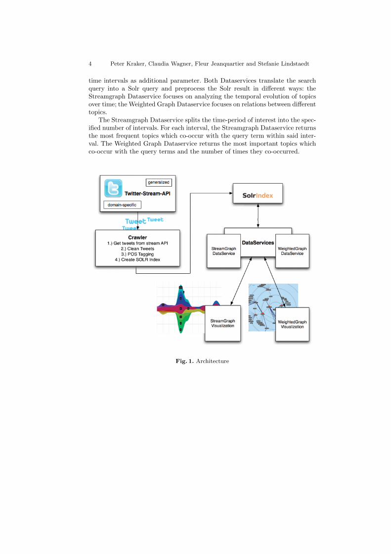
We developed a focused Twitter Crawler which uses the Twitter Streaming API[20]. The crawler can be adapted to any domain, by either (a) specifying a tax-onomy of keywords, (b) specifying a list of users, or (c) a combination of both.The Twitter Crawler then logs only tweets which were either authored by acertain user or which contain at least one keyword of the taxonomy. Next, welexically preprocess the logged tweets in order to extract ”informative” tokens(mainly nouns and hashtags) from it, using a part-of-speech tagger (POS Tag-ger), namely TreeTagger [16]. Finally we store the tweets, their metadata, andtheir associated informative tokens in a Solr index [18] which is used by ourVisualization Dataservices. Fig. 1 illustrates this architecture.
The Visualization Dataservices are REST-ful Webservices which enable cli-ent-side, lightweight visualizations to fetch and reload the data on demand.Since we provide two different types of visualizations, streamgraphs and weightedgraphs, we also implemented two different types of Visualization Dataservices.
Both Visualization Dataservices take the following parameters as input: (1)a query consisting of one or several search terms (e.g., ”conferences”) (2) a timeperiod of interest (e.g., 10.4.2010 - 15.5.2010), (3) the maximum number of co-occurring terms, and (4) the type of co-occurring terms (either nouns, hashtags,or users). Besides, the Streamgraph Dataservice optionally takes the number of
1 Keywords which are frequently used within a short period of time.
4 Peter Kraker, Claudia Wagner, Fleur Jeanquartier and Stefanie Lindstaedt
time intervals as additional parameter. Both Dataservices translate the searchquery into a Solr query and preprocess the Solr result in different ways: theStreamgraph Dataservice focuses on analyzing the temporal evolution of topicsover time; the Weighted Graph Dataservice focuses on relations between differenttopics.
The Streamgraph Dataservice splits the time-period of interest into the spec-ified number of intervals. For each interval, the Streamgraph Dataservice returnsthe most frequent topics which co-occur with the query term within said inter-val. The Weighted Graph Dataservice returns the most important topics whichco-occur with the query terms and the number of times they co-occurred.
Fig. 1. Architecture
On the Way to a Science Intelligence 5
2.2 Visualizations
Following the cues of visual analytics [12], we use visualizations to show both thetemporal evolution of topics, and the relations between different topics. First,we studied existing visualization techniques to identify those that are suitablefor our purpose.
Heer et al. [10] describe a stacked graph as a classic method for visualizingchange in a set of items, where the sum of the values is as important as theindividual items. While such charts have proven popular in recent years, theydo have some limitations such as the fact, that stacking may make it difficultto accurately interpret trends that lie atop other curves. The authors in [9]describe a more enhanced visualization technique that is suitable for visuallydescribing thematic variations over time within a large collection of documents.This technique makes use of a river metaphor for revealing patterns and trends.One of the major advantages of this technique is little dependence on the numberof documents; furthermore, the stacked areas are suitable for observation andcomparisons. Inspired from the visualization technique mentioned before, Byronand Wattenberg further describe the Streamgraph design, a unified approach tostacked graph geometry and algorithms [4]. We therefore identified this specialstacked graph design technique called ”streamgraph” as one suitable approachto visualize Twitter-data over time. Lamping et al. [13] describe a focus+contextvisualization technique that is intended for displaying hierarchies, which is thebasis for our second visualization approach: visualizing the relations betweentopics.
We further extended our visualization study to comparing existing web scriptlibraries for the two visualization techniques described above that could be usedin our prototype. The Streamgraph Visualization builds on top of the Graficojavascript library [22] while the Weighted Graph Visualization is based on theJavascript InfoVis Toolkit [1]. An HTML-based frontend offers the possibilityto type in one or several search terms, furthermore specifying a facet such as”hashtags that occurred with the term above”. Furthermore, the UI provides adate selection to narrow the search to a specific date range, and a field to specifythe maximum number of co-occurring terms.
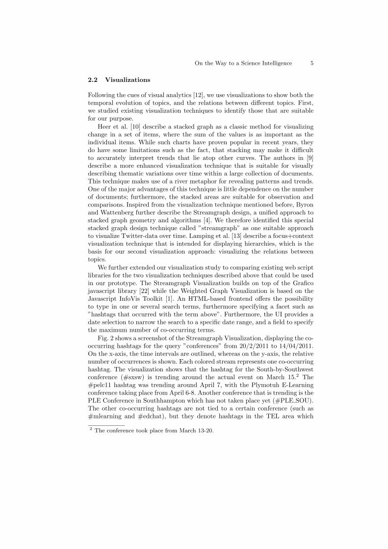
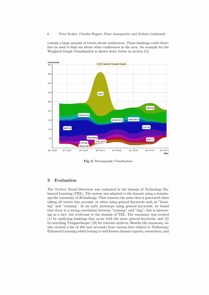
Fig. 2 shows a screenshot of the Streamgraph Visualization, displaying the co-occurring hashtags for the query ”conferences” from 20/2/2011 to 14/04/2011.On the x-axis, the time intervals are outlined, whereas on the y-axis, the relativenumber of occurrences is shown. Each colored stream represents one co-occurringhashtag. The visualization shows that the hashtag for the South-by-Southwestconference (#sxsw) is trending around the actual event on March 15.2 The#pelc11 hashtag was trending around April 7, with the Plymotuh E-Learningconference taking place from April 6-8. Another conference that is trending is thePLE Conference in Southhampton which has not taken place yet (#PLE SOU).The other co-occurring hashtags are not tied to a certain conference (such as#mlearning and #edchat), but they denote hashtags in the TEL area which
2 The conference took place from March 13-20.
6 Peter Kraker, Claudia Wagner, Fleur Jeanquartier and Stefanie Lindstaedt
contain a large amount of tweets about conferences. These hashtags could there-fore be used to find out about other conferences in the area. An example for theWeighted Graph Visualization is shown down below in section 3.2.
Fig. 2. Streamgraph Visualization
3 Evaluation
The Twitter Trend Detection was evaluated in the domain of Technology En-hanced Learning (TEL). The system was adapted to the domain using a domain-specific taxonomy of 30 hashtags. That removes the noise that is generated whentaking all tweets into account, or when using general keywords such as ”learn-ing” and ”training”. In an early prototype using general keywords, we foundthat there is a strong correlation between ”training” and ”dog”; this is interest-ing as a fact, but irrelevant to the domain of TEL. The taxonomy was created(1) by analyzing hashtags that occur with the more general keywords, and (2)by searching Twapperkeeper [19] for relevant archives. Besides the taxonomy, wealso created a list of 450 user accounts from various lists related to TechnologyEnhanced Learning which belong to well-known domain experts, researchers, and

On the Way to a Science Intelligence 7
students. The system is part of the STELLAR Science 2.0 infrastructure [21].The visualizations are also integrated as early-stage widgets on the TELeuropeplatform [17].
The evaluation of the Twitter Trend Detection is based on the creative think-ing method PMI [3]. PMI stands for Plus, Minus, and Interesting. Instead ofasking participants to take an objective stance in the evaluation, their attentionis guided to think separately about (a) the positive aspects of the system (Plus),(b) the negative aspects of the system (Minus), and (c) the neutral but note-worthy aspects of the system (Interesting). This terminology was not only usedin the instruments, but also later in the analysis, guiding the qualitative codingscheme.
The Twitter Trend Detection was evaluated in two settings: first, we heldsemi-structured interviews involving the use of the system with five researchersfrom the domains of Technology Enhanced Learning and knowledge manage-ment. The new system was then further evaluated at the 2nd STELLAR AlpineRendez-vous where the visualization was used as a means of support. We utilizedthem in a reflection session in one of the workshops; this was accompanied bythree in-depth interviews with conference participants.
3.1 Evaluation 1
In the first evaluation, we held semi-structured interviews involving the use of thesystem with five researchers from the domains of Technology Enhanced Learn-ing and knowledge management based in Austria. Among the participants wereone professor, three senior researchers, and one PhD student. Two had a back-ground in computer science, two in psychology, and one in business administra-tion. Participants were interviewed about their use of Twitter in research, andspecifically in relation to trend detection. Afterwards, they were introduced tothe visualizations. Following a short tutorial, we asked participants to search fortrends in their area of interest. The interviews were recorded on tape, and latertranscribed. We qualitatively analyzed the transcripts using a reducing and in-terpreting approach. Codes were divided into three sections, following the PMIterminology: Plus, Minus, and Interesting. Each of these sections was subdividedinto the codes ”General”, ”Weighted Graph”, and ”Streamgraph”. To capturethe general remarks on Twitter, we added ”Usage of Twitter”, ”Advantagesof Twitter”, and ”Disadvantages of Twitter” to the scheme. Initially, the tran-scripts were coded with these general codes. In a second iteration, we refinedthese codes to paraphrase the content of marked statements. In the last step, wemerged similar paraphrases to remove redundancy in the scheme.
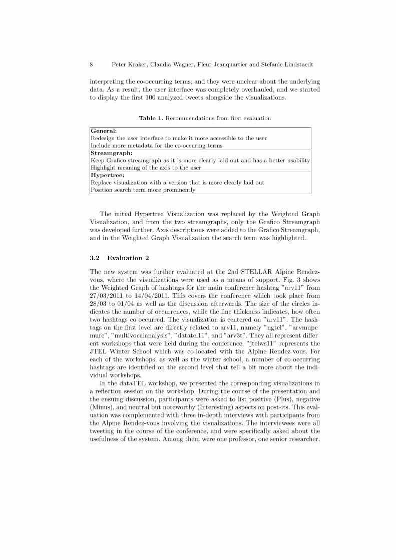
The goal of the first evaluation was to collect feedback on the usability andthe general applicability of the system to trend detection. In this phase, thesystem contained three different visualizations: two competing streamgraph vi-sualizations, and one Hypertree Visualization. Table 1 shows the top two recom-mendations that resulted from this first evaluation. The evaluation showed thatusers were struggling with the interface. It proved to contain too many parame-ters that were labeled with technical terms. Furthermore, users had a hard time
8 Peter Kraker, Claudia Wagner, Fleur Jeanquartier and Stefanie Lindstaedt
interpreting the co-occurring terms, and they were unclear about the underlyingdata. As a result, the user interface was completely overhauled, and we startedto display the first 100 analyzed tweets alongside the visualizations.
Table 1. Recommendations from first evaluation
General:Redesign the user interface to make it more accessible to the userInclude more metadata for the co-occuring terms
Streamgraph:Keep Grafico streamgraph as it is more clearly laid out and has a better usabilityHighlight meaning of the axis to the user
Hypertree:Replace visualization with a version that is more clearly laid outPosition search term more prominently
The initial Hypertree Visualization was replaced by the Weighted GraphVisualization, and from the two streamgraphs, only the Grafico Streamgraphwas developed further. Axis descriptions were added to the Grafico Streamgraph,and in the Weighted Graph Visualization the search term was highlighted.
3.2 Evaluation 2
The new system was further evaluated at the 2nd STELLAR Alpine Rendez-vous, where the visualizations were used as a means of support. Fig. 3 showsthe Weighted Graph of hashtags for the main conference hashtag ”arv11” from27/03/2011 to 14/04/2011. This covers the conference which took place from28/03 to 01/04 as well as the discussion afterwards. The size of the circles in-dicates the number of occurrences, while the line thickness indicates, how oftentwo hashtags co-occurred. The visualization is centered on ”arv11”. The hash-tags on the first level are directly related to arv11, namely ”ngtel”, ”arvmupe-mure”, ”multivocalanalysis”, ”datatel11”, and ”arv3t”. They all represent differ-ent workshops that were held during the conference. ”jtelws11” represents theJTEL Winter School which was co-located with the Alpine Rendez-vous. Foreach of the workshops, as well as the winter school, a number of co-occurringhashtags are identified on the second level that tell a bit more about the indi-vidual workshops.
In the dataTEL workshop, we presented the corresponding visualizations ina reflection session on the workshop. During the course of the presentation andthe ensuing discussion, participants were asked to list positive (Plus), negative(Minus), and neutral but noteworthy (Interesting) aspects on post-its. This eval-uation was complemented with three in-depth interviews with participants fromthe Alpine Rendez-vous involving the visualizations. The interviewees were alltweeting in the course of the conference, and were specifically asked about theusefulness of the system. Among them were one professor, one senior researcher,

On the Way to a Science Intelligence 9
Fig. 3. Weighted Graph Visualization
and one PhD student. Two had a background in education, and one in computerscience. Participants came from Europe, the United States, and Canada. The re-sults were recorded, transcribed, and analyzed in the same manner as describedin the first part of the evaluation above.
The evaluation showed that Twitter is regarded as an important means ofcommunication among the participating TEL researchers. Interviewees found itinteresting (a) to follow and to contribute to the backchannel discussion in theirown workshop, thus enriching their experience, and (b) to follow what is going onin other workshop. They also used Twitter to document parts of the workshop,and to keep their teams at home up-to-date, sometimes even using designatedhashtags for that.3 Among the uses outside of conferences were (1) to use it asa source of information, (2) to ask for feedback on one’s own work, and (3) todirectly communicate with other researchers.
What had already surfaced in the first evaluation, was also repeatedly notedin the second evaluation: there is a need to have a means of extracting the mostimportant topics in a Twitter stream. According to the participants, there are toomany tweets to read them all, and there is no organized way of keeping up with
3 One of these hashtags ”#yam”, can be seen in Fig. 3 as a co-occurring hashtag of”#dataTEL11”.

10 Peter Kraker, Claudia Wagner, Fleur Jeanquartier and Stefanie Lindstaedt
the backlog. As one of the interviewees put it so aptly, ”If I get up to get coffee,I could have already missed something important.” For the interviewees, findingsomething interesting is more of a coincidence than the result of a structuredsearch, even with tools that allow for various lists of users and hashtags. Whatmakes it even worse in the eyes of the participants is the large amount of noisegenerated by superfluous postings (”I am having breakfast now”). Twitter’strending topics do not help with that as they are not related to research.
3.3 Discussion
Participants liked the looks of the visualizations, and the idea behind them. Inboth evaluations, they noted that the interface is visually appealing. They alsonoted on several occasions that the system might be a useful way to deal with thebacklog in their Twitter streams. The two visualizations are complementing eachother very well; participants were interested in the connections between topics aswell as the temporal evolution. Participants noted that both of them condensea lot of information in one view. They enjoyed the fact that the visualizationsoperate on live data with the ability to go back in time. Another feature thatwas well received was the consistency between the two visualizations, as thevisualizations always operate on the same set of tweets for a given search termand a given time range.
As for the Weighted Graph, people were easily able to understand the basicvisual metaphor, albeit it’s sometimes crowded nature, and the fact that theweighted Graph is not always centered on the initial search term. Most inter-viewees could instantly interpret the size of the nodes and the thickness of theedges correctly. It was only the different levels that were hard to grasp in somecases. Participants noted that edges between topics are useful to determine theconnection between the two, and the kind of clustering that is provided by theWeighted Graph in that way. They recognized topics from the discussions intheir workshops, as well as users which participated in the backchannel discus-sion. An additional use that they saw was to get a quick overview of a field thatthey were not familiar with.
In the case of the Streamgraph, participants that were not accustomed to thevisual metaphor needed a bit more time to understand the concept. Especiallythe alignment and the color-coding were often mis-interpreted. After a shortintroduction though, they liked that topics are shown in such a way that onecan clearly see the bursty terms. They were able to reconstruct the time wiseevolution of certain discussions from their workshops. One participant said itwould be interesting to have such a visualization running on several screensat a conference to keep everyone updated about the current sessions. Anotherpossible use that was mentioned is the detection of pivotal moments in onlinediscussions.
Despite all the positive feedback, the evaluation also pointed out severalshortcomings of the visualizations. First and foremost, users would like to beable to zoom into the results. They would like to be able to click on a co-occurring term to see its metadata, and they want to be able to not only see a

On the Way to a Science Intelligence 11
full list of tweets but rather a filtered one. This revealed the need to implementzooming and filtering and the need to provide more details on demand. Thisshould be complemented by a short help page on either visualization to makethe metaphor crystal clear. In addition, users demanded more meaningful terms.They found the co-occurring terms to be too broad and generic. In addition, weneed to get better at filtering out hashtags and mentions, and ignoring the casein the output. This revealed the need for refined preprocessing.
On a meta-level, participants sometimes criticized Twitter as a data base, asthey trust only certain experts with trends. To address those concerns, we needto find a way to include only certain user accounts in the search. Finally, userswould like to be able to integrate the visualizations with their existing Twitterapplications.
4 Outlook
The evaluation results indicate that our prototype supports trend detection, butwe still need to address several issues. First and foremost, we will provide moreinsight into the data in connection with further filtering mechanisms to allowusers to view only a portion of that data. We will also improve the data qualityby changing our crawler so that it does not count users and hashtags as nouns,and by applying lowercase to all output terms. To weed out the generic terms,we will look into applying the TF-IDF measure, and/or blacklists of commonand broad terms.
Moreover, we will look into ways of integrating the visualizations with ex-isting platforms emerged. We already took a first step into that direction bycreating a W3C compliant widget, which can be included into any system thatallows for such widgets; a first version has already been deployed to the socialnetwork TELeurope. Furthermore, it would be interesting to have a kind of self-evolving taxonomy of hashtags and users which semi-automatically adds newpieces of information to the taxonomy. On the front-end side, we are constantlylooking into new meaningful visualizations, which can be adapted for system.
With the ever increasing amount of tweets, scalability becomes an issue; ina little over three months, we have collected over 500.000 tweets. Nevertheless,Solr has proven to be able to go way beyond that number of documents. Thesystem is currently tailored towards Technology Enhanced Learning, but it couldeasily be adapted to other fields of research. The only precondition is to producea list of hashtags and/or users from the field. If such a taxonomy does not exist,the system itself can help by detecting co-occurrent hashtags starting even froma single high-frequency hashtag.
12 Peter Kraker, Claudia Wagner, Fleur Jeanquartier and Stefanie Lindstaedt
Acknowledgements
We would like to thank all participants in the evaluation. This work was car-ried out as part of the STELLAR Network of Excellence, which is funded bythe European Commission (grant agreement no. 231913). The Know-Center isfunded within the Austrian COMET program - Competence Centers for Ex-cellent Technologies - under the auspices of the Austrian Federal Ministry ofTransport, Innovation and Technology, the Austrian Federal Ministry of Econ-omy, Family and Youth, and the State of Styria. COMET is managed by theAustrian Research Promotion Agency FFG. Claudia Wagner is a recipient of aDOC-fForte fellowship of the Austrian Academy of Science.
References
1. Belmonte, N.G.: JavaScript InfoVis Toolkit, http://thejit.org/2. Benhardus, J.: Streaming Trend Detection in Twitter. Tech. rep., University of
Colorado at Colorado Springs (2010)3. Bono, E.D.: De Bono’s thinking course. Pearson Education (2006)4. Byron, L., Wattenberg, M.: Stacked graphs–geometry & aesthetics. IEEE transac-
tions on visualization and computer graphics 14(6), 1245–52 (Jan 2008)5. Cheong, M., Lee, V.: Integrating web-based intelligence retrieval and decision-
making from the twitter trends knowledge base. In: Proceeding of the 2nd ACMworkshop on Social web search and mining - SWSM ’09. pp. 1–8. ACM Press, NewYork, New York, USA (2009)
6. Dubinko, M., Kumar, R., Magnani, J., Novak, J., Raghavan, P., Tomkins, A.:Visualizing tags over time. ACM Transactions on the Web 1(2) (Aug 2007)
7. Fukuhara, T.: Analyzing concerns of people using Weblog articles and real worldtemporal data. In: Proceedings of the 14th International Conference on WorldWide Web - WWW 2005 (2005)
8. Glance, N., Hurst, M., Tomokiyo, T.: Blogpulse: Automated trend discovery forweblogs. In: WWW 2004 Workshop on the Weblogging Ecosystem: Aggregation,Analysis and Dynamics. vol. 2004. Citeseer (2004)
9. Havre, S., Hetzler, E., Whitney, P., Nowell, L.: ThemeRiver: visualizing thematicchanges in large document collections. IEEE Transactions on Visualization andComputer Graphics 8(1), 9–20 (2002)
10. Heer, J., Bostock, M., Ogievetsky, V.: A tour through the visualization zoo. Com-munications of the ACM 53(6), 59 (Jun 2010)
11. Hotho, A., Jaschke, R., Schmitz, C., Stumme, G.: Trend detection in folksonomies.In: Avrithis, Y.S., Kompatsiaris, Y., Staab, S., O’Connor, N.E. (eds.) First In-ternational Conference on Semantics And Digital Media Technology (SAMT). pp.56–70. Springer (2006)
12. Keim, D., Kohlhammer, J., Santucci, G., Mansmann, F., Wanner, F., Schafer, M.:Visual Analytics Challenges. In: eChallenges 2009. Istanbul, Turkey (2009)
13. Lamping, J., Rao, R., Pirolli, P.: A focus+context technique based on hyperbolicgeometry for visualizing large hierarchies. In: Proceedings of the SIGCHI Confer-ence on Human Factors in Computing Systems - CHI ’95. pp. 401–408. ACM Press,New York, New York, USA (May 1995)
14. Letierce, J., Passant, A., Breslin, J., Decker, S.: Understanding how Twitter is usedto spread scientific messages. In: Web Science Conference. Raleigh, NC (2010)

On the Way to a Science Intelligence 13
15. Mathioudakis, M.: TwitterMonitor: Trend Detection over the Twitter Stream. In:Proceedings of the 2010 International Conference on Management of Data. pp.1155–1157 (2010)
16. Schmid, H.: Probabilistic part-of-speech tagging using decision trees. In: Proceed-ings of the International Conference on New Methods in Language Processing.Manchester, UK (1994)
17. STELLAR Network of Excellence: TELeurope.eu, http://www.teleurope.eu/18. The Apache Software Foundation: Apache Solr, http://lucene.apache.org/
solr/
19. Twapperkeeper.com: Twapper Keeper, http://twapperkeeper.com/20. Twitter Inc.: Twitter Streaming API, http://dev.twitter.com/pages/
streaming_api
21. Ullmann, T.D., Wild, F., Scott, P., Duval, E., Parra, G., Reinhardt, W., Heinze,N., Kraker, P., Fessl, A., Lindstaedt, S., Nagel, T., Gillet, D.: A Science 2.0 In-frastructure for Technology-Enhanced Learning. In: Wolpers, M., Kirschner, P.,Scheffel, M., Lindstaedt, S., Dimitrova, V. (eds.) Sustaining TEL: From Innovationto Practice. Proceedings of the 5th Conference on Technology Enhanced Learning.pp. 590–595. Springer, Barcelona, Spain (2010)
22. Valkhof, K.: Grafico javascript charting library, http://grafico.kilianvalkhof.com/