Embed Size (px)
Citation preview
Noticeable or Distractive? A DesignSpace for Gaze-Contingent UserInterface Notifications
Michaela KlauckSaarland UniversitySaarland Informatics CampusSaarbrücken, [email protected]
Yusuke SuganoGraduate School of InformationScience and TechnologyOsaka UniversityOsaka, [email protected]
Andreas BullingMax Planck Institute forInformaticsSaarland Informatics CampusSaarbrücken, [email protected]
Permission to make digital or hard copies of part or all of this work for personal orclassroom use is granted without fee provided that copies are not made or distributedfor profit or commercial advantage and that copies bear this notice and the full citationon the first page. Copyrights for third-party components of this work must be honored.For all other uses, contact the Owner/Author. Copyright is held by the owner/author(s).CHI’17 Extended Abstracts, May 06-11, 2017, Denver, CO, USA.ACM 978-1-4503-4656-6/17/05.http://dx.doi.org/10.1145/3027063.3053085
AbstractUsers are interrupted by an ever-increasing number of no-tifications, ranging from error messages, over new email orchat alerts, to advertisement pop-ups. We explore gaze-contingent user interfaces notifications that are shown de-pending on users’ current gaze location. Specifically, weevaluate how different design properties influence notifica-tion noticeability and distractiveness. We measure notice-ability quantitatively by analyzing participants’ performancein confirming notifications and distractiveness using a ques-tionnaire. Based on a 12-participant user study on a publicdisplay, we show that each of these properties affects no-ticeability and distractiveness differently and that the prop-erties, in turn, allow for fine-grained optimization of notifi-cation display. These findings inform the design of futureattentive user interfaces that could optimize the trade-offbetween, for example, the notification importance and thecost of interruption.
Author KeywordsInterruptions; Attentive User Interfaces; Eye Tracking; PublicDisplay; Peripheral Display
ACM Classification KeywordsH.5.m. [Information Interfaces and Presentation (e.g. HCI)]:Miscellaneous
Distractiveness
Noticeability
Gaze distanceSize
Blink
Opacity
Movement
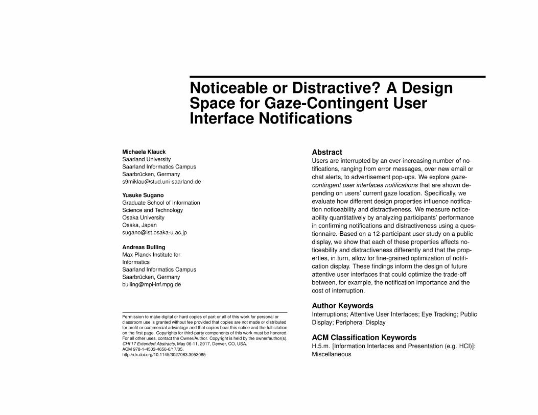
Figure 1: We explore gaze-contingent user interfaces notificationsthat are shown at a certain distance away from users’ current gazelocation (red cross) and evaluate their key properties in the2-dimensional noticeability/distractiveness space.
IntroductionWith digital communication having become a dominantpart of our everyday life, we are overloaded by an ever-increasing number of notifications from different sources,such as mail user agents, chat clients, or social network-ing apps [7, 11]. Unimportant notifications interrupt users,thereby reducing user experience [16], while important orurgent information can be missed [14]. The development ofattentive user interfaces that actively manage notificationdisplay to reduce interruptions has therefore emerged as animportant research challenge in HCI [3, 9, 20].
Peripheral displays were proposed as a potential solution tothis problem. The key idea is to take the users’ visual fieldof view into account and selectively display information inthe foveal area or the periphery [12, 13]. These displayscan be generalized to gaze-contingent displays in which in-formation is shown at different distances away from users’current on-screen gaze position [6]. By adaptively control-ling this gaze distance as a function of, for example, the im-portance of the information to be delivered or current userengagement, unnecessary interruptions of the user couldbe avoided. Previous works also investigated gaze-aware
interfaces, such as to indicate display changes [5] or to im-plement gaze-aware user interface components [8].
Some prior work on peripheral displays such as [2] dis-cussed appearance properties of notifications in additionto the gaze distance reflecting the fact that appearanceplays an at least equally important role in human visualperception. While foveal vision is particularly sensitiveto color [22], peripheral vision is sensitive to motion [17].Changing the appearance of notifications in addition to thegaze distance therefore promises further possibilities to ex-ploit perceptual properties for notification management.
In terms of user experience, there are two closely relatedyet complementary concepts in notification perception: no-ticeability and distractiveness. While noticeability describeshow easily a notification can be noticed by the user, distrac-tiveness describes how much the notification keep the useraway from his primary task. The goal of this work is to in-vestigate a design space for gaze-contingent user interfacenotifications based on these definitions of noticeability anddistractiveness (see Figure 1). The goal of notification is notalways as simple as maximizing the noticeability. While ur-gent notifications can have larger distractivenesses, minorinformation should be displayed with the lowest possibledistractiveness and the minimally required noticeability. Byunderstanding how different visual properties affect users’perception in the 2-dimensional noticeability/distractivenessspace, designers can have more control on notificationmanagement.
In this work, we provide an analysis on how different ap-pearance properties impact noticeability and distractivenessof notifications, and how these properties interplay with thedistance between the current on-screen gaze location andthe notification. We measure noticeability quantitatively byanalyzing participants’ performance in confirming notifi-
cations and distractiveness using a questionnaire. A keydifference to prior work is that we propose and study thisdesign space in a principled manner and jointly with gazedistance, and that we treat gaze distance as a continuousfree parameter. Based on a 12-participant user study ona public display, we show that each of these properties af-fects noticeability and distractiveness differently and thatthe properties, in turn, allow for fine-grained optimization ofnotification display. These findings demonstrate the signifi-cant potential of gaze-contingent notifications, and promisenew attentive user interfaces.
Gaze-Contingent Interface Notifications
(c) Blink Frequency
(d) Movement Speed
Gaz
e dist
ance
(a) Size
(b) Opacity
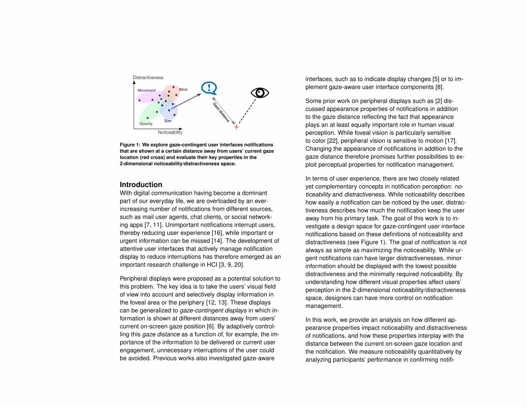
Figure 2: Design properties used inour study. In addition to the gazedistance from the user’s gazeposition (red cross), we consider (a)size, (b) opacity, (c) blink frequencyand (d) movement speed of thenotifications.
To study the concept of gaze-contingent user interface no-tifications, we implemented a prototype notification systemthat exploits different characteristics of the human visualsystem. For better coverage of these characteristics and togain flexibility in notification design, we opted to study noti-fication designs that leverage variable gaze distances anddifferent appearance properties.
Previously used visual designs exploit both stationary anddynamic notification properties [15]. While dynamic de-signs can increase noticeability, it has been also reportedthat dynamic notifications are perceived to be more distrac-tive than stationary ones [23]. Another study reported thatsmooth motion can be perceived as less distractive [1]. Ithas been also pointed out that humans easily identify ex-ceptions in color, shape and size in the peripheral view [21],and subtle animations such as fading have lower noticeabil-ity [12]. It is also important to note that notification percep-tion depends on the task performed by the user [4, 18].
Appearance PropertiesIn our study we evaluated four commonly-used propertiescontrolling notification appearance (see Figure 2): size,
opacity, blink frequency and moving speed. Each of theseproperties was combined with the gaze distance, whichis defined as the angular distance (d degrees) from theuser’s current on-screen gaze position. Three discrete val-ues were used for the gaze distance (d=10, 25, 40) so thateach can represent foveal (d=10) and peripheral (40) viewsfrom the user and the middle point (25) between them. Inaddition, three levels were considered for each appearanceproperties as discussed below.
Size One straightforward approach to change notificationappearance is by their size (s=0.5, 1.0, 2.0 degrees) [21].Size was defined in degrees with respect to the user’s vi-sual field. In the following, the medium size (s = 1.0) wasused as the base size for other properties.
Opacity Opacity is another important property to controlnotification appearance [23]. We used an opacity of (o =90%, 50%, 0%) ranging from near-transparent (90%) tofully visible (0%).
Blink Frequency Blinking is one of the most commondynamic appearance properties [2, 16]. We used a blinkfrequency of (b=1, 7, 12 Hz).
Movement Speed We finally used movement speed ofnotifications [23, 18, 4, 12]. Notifications started movingfrom a location 30 cm horizontally away with a constantspeed (m = 2.25, 4.5, 36 cm per second).
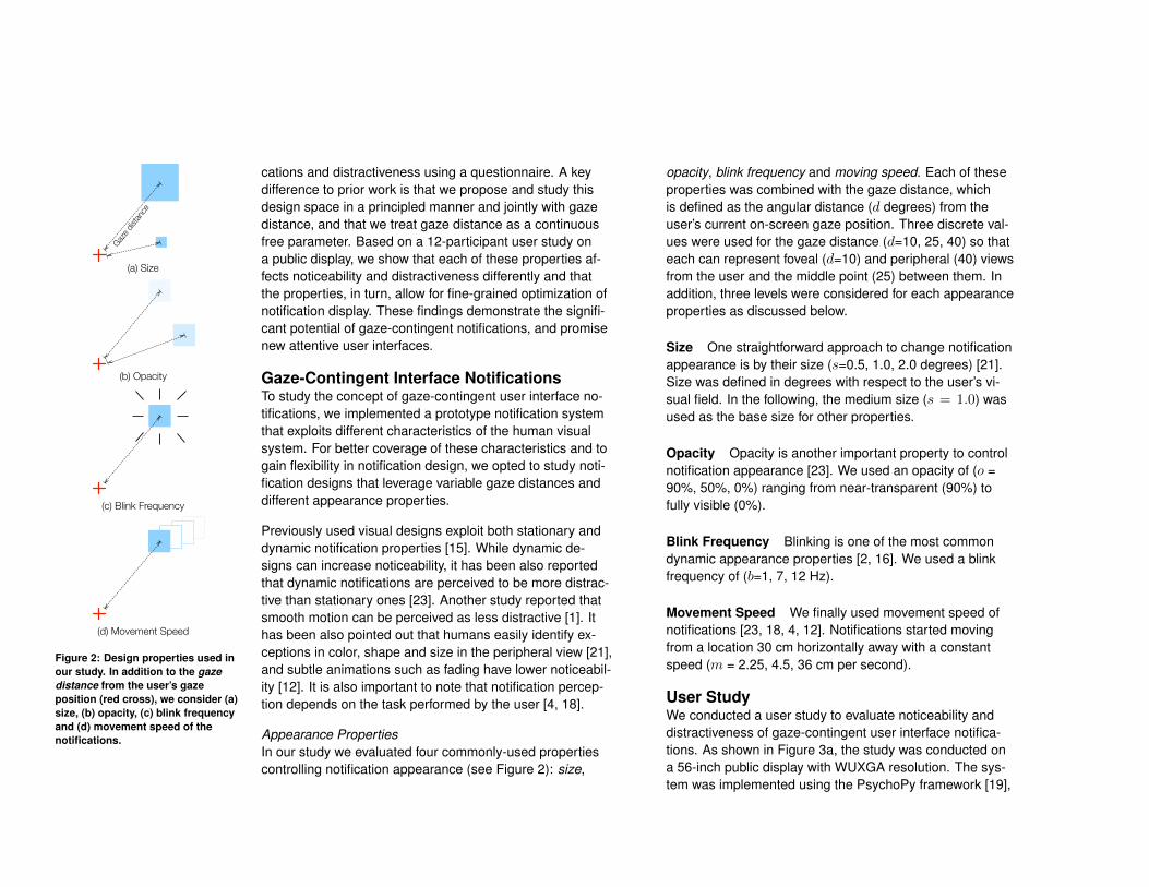
User StudyWe conducted a user study to evaluate noticeability anddistractiveness of gaze-contingent user interface notifica-tions. As shown in Figure 3a, the study was conducted ona 56-inch public display with WUXGA resolution. The sys-tem was implemented using the PsychoPy framework [19],
and we used a state-of-the-art Pupil Pro head-mounted eyetracker [10] for obtaining real-time gaze positions. Twelveuniversity students (four female) aged between 21 and 26years participated in the study. Most participants had previ-ous experience with eye tracking studies; none was color-blind and all had normal or corrected-to-normal vision. Toevaluate noticeability and distractiveness under a realisticcognitive load, we asked participants to perform a dummyprimary task on the public display. The task involved follow-ing a dot randomly moving at different speeds and colors ina primary task window with a mouse pointer (see Figure 3b,primary task window marked in red).
(a)
(b)
(c)
Figure 3: The study was conductedon a public display with participantswearing a head-mounted eye tracker(a). The primary task window wasshown at the center of the display(marked in red), and gaze-contingentnotifications were shown in thebackground (b), with randombackground images (c).
ProcedureUpon arrival in the lab, participants were first informedabout the study and asked to sign a consent form. After-wards the eye tracker was calibrated for each participantusing a standard 9-point calibration routine. Participantswere standing 60cm away from the display, and the primarytask window (the small white window shown at the center ofFigure 3b) was shown at the center of the display to coverthe foveal area (∼ 15◦) of the participants. Gaze-contingentnotifications were shown in the background of the primarytask window. The participants were instructed to focus onthe primary task, and to press a button of a wireless pre-senter every time they recognize a notification. To removefalse positive reactions, we counted button presses onlyin a small time span after a notification appeared. The no-ticeability was measured as the percentage of displayednotifications recognized by the participants.
As discussed above, each of the four appearance proper-ties had three levels and all of them were combined withthree different gaze distances. During the study, each of the4 × 3 × 3 design combinations was shown six times. Thenotifications were always light blue squares as illustrated in
Figure 2, and did not contain any textual information. Thesenotifications were shown in randomized order, for 2.5 sec-onds with a random interval of 2 ± 1.5 seconds. There wasalso a break every 15 minutes for participants to relax andto re-calibrate the eye tracker.
Since noticeability of the notifications highly depends onthe background, random background images were shownbehind the primary task window. The background imagesconsisted of four real screenshots of ordinary desktop envi-ronments and two colorful photos (see Figure 3c for someexamples). We ensured that each notification design wasshown on all of the background images. Finally, we againshowed all design combinations to the participants one byone and asked them to provide distractiveness ratings foreach of them using a five-point Likert scale.
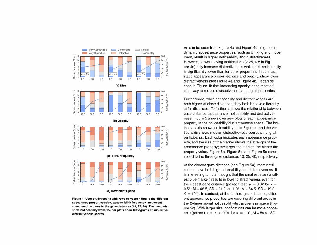
Results and DiscussionFigure 4 summarizes the results of the user study, illus-trating the influence of the different appearance propertieson noticeability and subjective distractiveness. Each of the12 graphs in the figure corresponds to one combination ofan appearance property and gaze distance. From top tobottom, each row corresponds to one of four appearanceproperties (size, opacity, blink frequency, and movementspeed, respectively), while the three columns correspondto different gaze distances (10, 25, 40◦ from left to right). Ineach graph, the line plot shows noticeability (the percent-age of notifications confirmed by participants) with respectto appearance properties. Three bar plots show histogramsof subjective distractiveness score, where red and blueregions correspond to higher and lower distractiveness,respectively. Three levels of property values are orderedfrom the weakest (smallest, slowest, . . . ) to the strongest(largest, fastest, . . . ).
0.5 1.0 2.002468
1012
Dis
tract
iven
ess
Cou
ntd = 10
Very ComfortableVery Distractive
ComfortableDistractive
Neutral
0.5 1.0 2.0
d = 25
0.5 1.0 2.0
d = 40020406080100
Not
icea
bilit
y [%
]
Noticeability
(a) Size
90.0 50.0 0.002468
1012
Dis
tract
iven
ess
Cou
nt
90.0 50.0 0.0 90.0 50.0 0.0020406080100
Not
icea
bilit
y [%
]
(b) Opacity
1.0 7.0 12.002468
1012
Dis
tract
iven
ess
Cou
nt
1.0 7.0 12.0 1.0 7.0 12.0020406080100
Not
icea
bilit
y [%
]
(c) Blink Frequency
2.25 4.5 36.002468
1012
Dis
tract
iven
ess
Cou
nt
2.25 4.5 36.0 2.25 4.5 36.0020406080100
Not
icea
bilit
y [%
]
(d) Movement Speed
Figure 4: User study results with rows corresponding to the differentappearance properties (size, opacity, blink frequency, movementspeed) and columns to the gaze distances (10, 25, 40). The line plotsshow noticeability while the bar plots show histograms of subjectivedistractiveness scores.
As can be seen from Figure 4c and Figure 4d, in general,dynamic appearance properties, such as blinking and move-ment, result in higher noticeability and distractiveness.However, slower moving notifications (2.25, 4.5 in Fig-ure 4d) only increase distractiveness while their noticeabilityis significantly lower than for other properties. In contrast,static appearance properties, size and opacity, show lowerdistractiveness (see Figure 4a and Figure 4b). It can beseen in Figure 4b that increasing opacity is the most effi-cient way to reduce distractiveness among all properties.
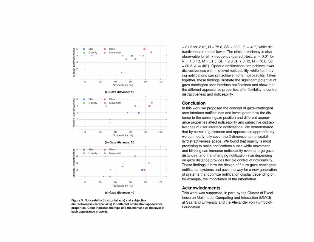
Furthermore, while noticeability and distractiveness areboth higher at close distances, they both behave differentlyat far distances. To further analyze the relationship betweengaze distance, appearance, noticeability and distractive-ness, Figure 5 shows overview plots of each appearanceproperty in the noticeability/distractiveness space. The hor-izontal axis shows noticeability as in Figure 4, and the ver-tical axis shows median distractiveness scores among allparticipants. Each color indicates each appearance prop-erty, and the size of the marker shows the strength of theappearance property; the larger the marker, the higher theproperty value. Figure 5a, Figure 5b, and Figure 5c corre-spond to the three gaze distances 10, 25, 40, respectively.
At the closest gaze distance (see Figure 5a), most notifi-cations have both high noticeability and distractiveness. Itis interesting to note, though, that the smallest size (small-est blue marker) results in lower distractiveness even forthe closest gaze distance (paired t-test: p = 0.02 for s =0.5◦, M = 48.5, SD = 21.9 vs. 1.0◦, M = 54.5, SD = 19.2,d = 10◦). In contrast, at the furthest gaze distance, differ-ent appearance properties are covering different areas inthe 2-dimensional noticeability/distractiveness space (Fig-ure 5c). With larger size, notifications can be more notice-able (paired t-test: p < 0.01 for s = 1.0◦, M = 50.0 , SD
0 20 40 60 80 100Noticeability [%]
1
2
3
4
5
Med
ian
Dis
tract
iven
ess Size
OpacityBlinkMovement
(a) Gaze distance: 10
0 20 40 60 80 100Noticeability [%]
1
2
3
4
5
Med
ian
Dis
tract
iven
ess Size
OpacityBlinkMovement
(b) Gaze distance: 25
0 20 40 60 80 100Noticeability [%]
1
2
3
4
5
Med
ian
Dis
tract
iven
ess Size
OpacityBlinkMovement
(c) Gaze distance: 40
Figure 5: Noticeability (horizontal axis) and subjectivedistractiveness (vertical axis) for different notification appearanceproperties. Color indicates the type and the marker size the level ofeach appearance property.
= 21.3 vs. 2.0◦, M = 75.8, SD = 28.3, d = 40◦) while dis-tractiveness remains lower. The similar tendency is alsoobservable for blink frequency (paired t-test: p = 0.01 forb = 1.0 Hz, M = 51.5, SD = 9.8 vs. 7.0 Hz, M = 78.8, SD= 20.3, d = 40◦). Opaque notifications can achieve lowerdistractiveness with mid-level noticeability, while fast mov-ing notifications can still achieve higher noticeability. Takentogether, these findings illustrate the significant potential ofgaze-contingent user interface notifications and show thatthe different appearance properties offer flexibility to controldistractiveness and noticeability.
ConclusionIn this work we proposed the concept of gaze-contingentuser interface notifications and investigated how the dis-tance to the current gaze position and different appear-ance properties affect noticeability and subjective distrac-tiveness of user interface notifications. We demonstratedthat by combining distance and appearance appropriatelywe can nearly fully cover the 2-dimensional noticeabil-ity/distractiveness space. We found that opacity is mostpromising to make notifications subtle while movementand blinking can increase noticeability even at large gazedistances, and that changing notification size dependingon gaze distance provides flexible control of noticeability.These findings inform the design of future gaze-contingentnotification systems and pave the way for a new generationof systems that optimize notification display depending on,for example, the importance of the information.
AcknowledgmentsThis work was supported, in part, by the Cluster of Excel-lence on Multimodal Computing and Interaction (MMCI)at Saarland University and the Alexander von Humboldt-Foundation.
References[1] Lyn Bartram, Colin Ware, and Tom Calvert. 2003.
Moticons:: detection, distraction and task. InternationalJournal of Human-Computer Studies 58, 5 (2003),515–545. DOI:http://dx.doi.org/10.1016/S1071-5819(03)00021-1
[2] Jeremy Birnholtz, Lindsay Reynolds, Eli Luxenberg,Carl Gutwin, and Maryam Mustafa. 2010. Awarenessbeyond the desktop: exploring attention and distrac-tion with a projected peripheral-vision display. In Proc.Graphics Interface. 55–62.
[3] Andreas Bulling. 2016. Pervasive Attentive User In-terfaces. IEEE Computer 49, 1 (2016), 94–98. DOI:http://dx.doi.org/10.1109/MC.2016.32
[4] Moira Burke, Anthony Hornof, Erik Nilsen, andNicholas Gorman. 2005. High-cost banner blind-ness: Ads increase perceived workload, hinder vi-sual search, and are forgotten. ACM Transactionson Computer-Human Interaction (TOCHI) 12, 4 (2005),423–445. DOI:http://dx.doi.org/10.1145/1121112.1121116
[5] Jakub Dostal, Per Ola Kristensson, and Aaron Quigley.2013. Subtle gaze-dependent techniques for visual-ising display changes in multi-display environments.In Proc. IUI. 137–148. DOI:http://dx.doi.org/10.1145/2449396.2449416
[6] Andrew T. Duchowski, Nathan Cournia, and HunterMurphy. 2004. Gaze-contingent displays: A review.CyberPsychology & Behavior 7, 6 (2004), 621–634.DOI:http://dx.doi.org/10.1089/cpb.2004.7.621
[7] Thomas Friedman. 2006. The age of interruption. NewYork Times (July 2006).
[8] Juan E. Garrido, Victor M. R. Penichet, Maria D.Lozano, Aaron Quigley, and Per Ola Kristensson.2014. AwToolkit: attention-aware user interface wid-gets. In Proc. AVI. 9–16. DOI:http://dx.doi.org/10.1145/
2598153.2598160[9] Joyce Ho and Stephen S. Intille. 2005. Using context-
aware computing to reduce the perceived burden ofinterruptions from mobile devices. In Proc. CHI. 909–918. DOI:http://dx.doi.org/10.1145/1054972.1055100
[10] Moritz Kassner, William Patera, and Andreas Bulling.2014. Pupil: An Open Source Platform for PervasiveEye Tracking and Mobile Gaze-based Interaction. InAdj. Proc. UbiComp. 1151–1160. DOI:http://dx.doi.org/10.1145/2638728.2641695
[11] Daniel J. Levitin. 2015. Why the modern world is badfor your brain. The Guardian (January 2015).
[12] Tara Matthews, Anind K. Dey, Jennifer Mankoff, ScottCarter, and Tye Rattenbury. 2004. A toolkit for manag-ing user attention in peripheral displays. In Proc. UIST.247–256. DOI:http://dx.doi.org/10.1145/1029632.1029676
[13] Joseph F. McCarthy, Tony J. Costa, and Edy S. Lion-gosari. 2001. Unicast, outcast & groupcast: Threesteps toward ubiquitous, peripheral displays. In Proc.UbiComp. 332–345. DOI:http://dx.doi.org/10.1007/3-540-45427-6_28
[14] D. Scott McCrickard and Christa M. Chewar. 2003. At-tuning Notification Design to User Goals and AttentionCosts. Commun. ACM 46, 3 (2003), 67–72. DOI:http://dx.doi.org/10.1145/636772.636800
[15] D. Scott McCrickard, Christa M. Chewar, Jacob P.Somervell, and Ali Ndiwalana. 2003a. A model for no-tification systems evaluation – assessing user goals formultitasking activity. ACM Transactions on Computer-Human Interaction (TOCHI) 10, 4 (2003), 312–338.DOI:http://dx.doi.org/10.1145/966930.966933
[16] D. Scott McCrickard, Mary Czerwinski, and Lyn Bar-tram. 2003b. Introduction: design and evaluationof notification user interfaces. International Journalof Human-Computer Studies 58, 5 (2003), 509–514.DOI:http://dx.doi.org/10.1016/S1071-5819(03)00025-9
[17] Suzanne P McKee and Ken Nakayama. 1984. Thedetection of motion in the peripheral visual field. VisionResearch 24, 1 (1984), 25–32.
[18] Justin W. Owens, Barbara S. Chaparro, and Evan M.Palmer. 2011. Text advertising blindness: the newbanner blindness? Journal of Usability Studies 6, 3(2011), 172–197.
[19] Jonathan W. Peirce. 2007. PsychoPy - psychophysicssoftware in Python. Journal of Neuroscience Methods162, 1 (2007), 8–13. DOI:http://dx.doi.org/10.1016/j.jneumeth.2006.11.017
[20] Claudia Roda and Julie Thomas. 2006. Attentionaware systems: Theories, applications, and research
agenda. Computers in Human Behavior 22, 4 (2006),557–587. DOI:http://dx.doi.org/10.1016/j.chb.2005.12.005
[21] Ben Shneiderman and Benjamin B Bederson. 2005.Maintaining concentration to achieve task completion.In Proc. Conference on Designing for User eXperi-ence. 9.
[22] W. S. Stiles. 1959. Color vision: the approach throughincrement-threshold sensitivity. Proceedings of theNational Academy of Sciences 45, 1 (1959), 100–114.
[23] Dan Tasse, Anupriya Ankolekar, and Joshua Hailpern.2016. Getting Users’ Attention in Web Apps in Likable,Minimally Annoying Ways. In Proc. CHI. 3324–3334.DOI:http://dx.doi.org/10.1145/2858036.2858174