Embed Size (px)
Citation preview

Non-designer’sdesign principles
Dr. Shuyan Wang

2
One… Learn the Principles.Two… Recognize when you are not using them.Three… Apply the principles.
Chapter 1: Design PrinciplesGood Design Easy As… 1, 2, 3

3
C – CONTRASTAvoid using elements that are similar.
R – REPETITIONRepeat elements to establish continuity and organization.
A – ALIGNMENTEvery element has a place, and should be connected with other elements on the page.
P – PROXIMITYRelated items should be grouped together. When in close proximity, seen as one unit rather than several.
Ch. 1 - Four Basic PrinciplesC. R. A. P. Yes, this is for real

4
• Grouping related items together.• Physical closeness implies a relationship.• When several items are in close proximity to each
other, they become one visual unit rather than several separate units.
• Helps organize information, reduces clutter, and gives the reader a clear structure.
Ch. 2 – ProximityGrouping Related Items

5
Ch. 2 – ProximityExamples
Last four flowers are separated. The reader understand this instantly without even being conscious of it.
You know the last four flowers are somehow different because they are physically separated from the rest of the list.
In this list, all the flowers are listed together. None are separated.

6
• Squint your eyes slightly and count the number of visual elements on the page by counting the number of times your eye stops.
• If there are more than three to five items on the page , of course it depends on the piece, determine which can be grouped together into closer proximity to become one visual unit.
Ch. 2 – ProximityHow to get it?

7
• Avoid putting things in the corners or in middle just because the space is empty.
• Avoid too many separate elements on a page. • Avoid confusion over whether a headline, subhead, caption,
graphic, etc., belongs with its related material. • Avoid creating relationships with elements that don't belong
together. If they are not related, move them apart from each other.
Ch. 2 – ProximityWhat to avoid?

• Should phone number be top right?• Should name be top left?• Should the address be separated?
Ch. 2 – ProximityWhat is wrong with this card?
GOOD? BETTER?

Ch. 2 – Proximity What makes this card the best?
• With correct proximity, this card is now organized both intellectually and visually.
• And thus it communicates more clearly.

Ch. 2 – Proximity What makes the difference?

Ch. 2 – Proximity What is better?
By using the principle of proximity:Organize the types of dances.Communicate immediately who, what, when, and where.Customers do not have to search through the crazy slanted text..

Ch. 2 – Proximity What is better?
Move the headlines closer to related paragraphs of text:
Clearer organization.
More room on the page.
Group phone and address so they stand out as important information.
Changed centered alignment to flush left.
This created more room so the graphic could be larger.

http://desktoppub.about.com/od/designprinciples/a/alignment.htm
Good Example: ProximityAfter: Related items groupedtogether. Creates visual cues.
Become an organized group.
Organize information, easier to read and to remember.
*May be better to group address and phone.

14
Ch. 3 – Alignment
Nothing should be placed on the page arbitrarily

15
Alignment text is either flush left, flush right, centered, or justified.
Ch. 3 - AlignmentPrinciples of Alignment

16
• Alignment forces the page to have more unity through invisible lines connecting what your eyes and mind see.
• Tells the audience that items belong together even when the items are not close in proximity.
Ch. 3 - AlignmentWhy Alignment

17
• Be conscious of where you place elements.• Always find something else on the page to align
with, even if the two objects are physically far away from each other. • Align photos or illustrations with edges and/or
baseline.
Ch. 3 - AlignmentHow to get the alignment

18
• Avoid using more than one text alignment on the page
• Avoid a centered alignment unless you have to • Choose a centered alignment consciously, not
by default
Ch. 3 - AlignmentThings to avoid

19
Find a strong alignment and stick to it. Ragged edges should be made as smooth as possible.
Ch. 3 - AlignmentGood Alignment
The strong line on the right side of the text and the strong line on the left side of the image are next to each other, making each other stronger.
The white space now is floating free off the left edge. The caption has also been set against the same strong line of the edge of the image.
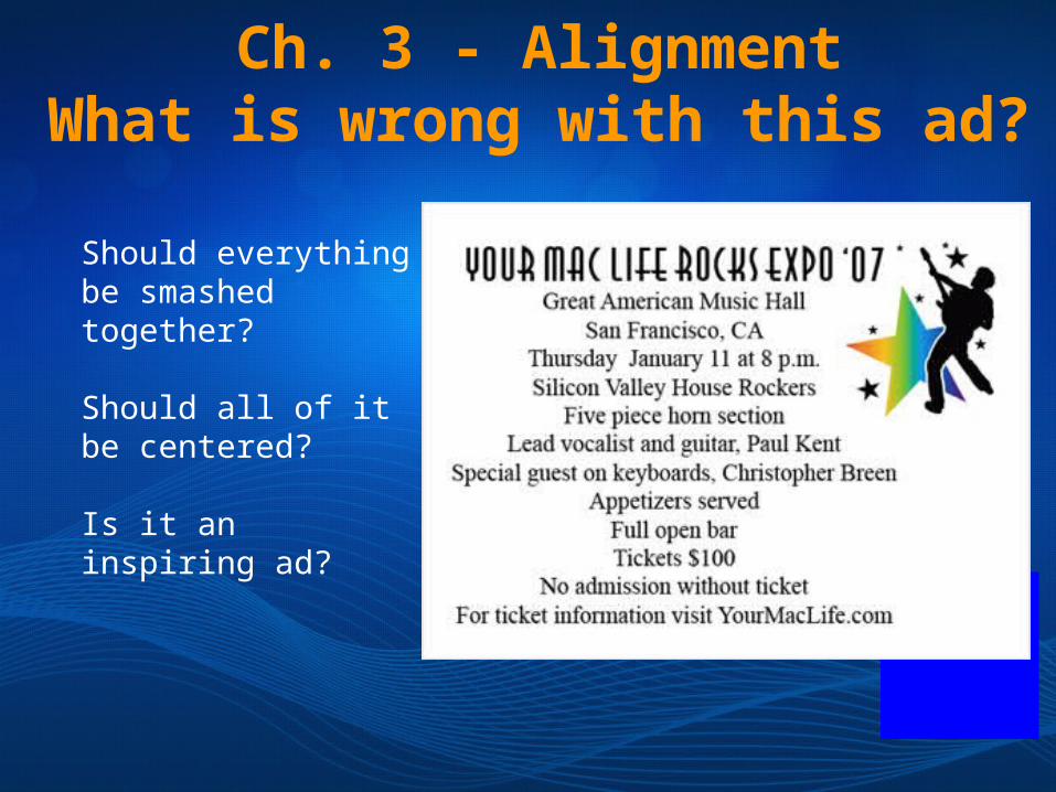
Ch. 3 - AlignmentWhat is wrong with this ad?
Should everything be smashed together?
Should all of it be centered?
Is it an inspiring ad?

Ch. 3 - AlignmentWhat is right with this ad?
Apply rules of Proximity*text is close together
Apply rules of Alignment*text is left aligned

Alignment and Proximity

23
Ch. 4 – Repetition
Repeat some aspect of the design throughout the entire
piece

24
• Repeating the visual elements throughout the design.
• Repetition unifies and strengthens a design by tying together otherwise separate parts.
Ch. 4 – RepetitionWhat is Repetition?

25
• Unify.• Add visual interest.
• The purpose of repetition is to unify and to add visual interest. Don't underestimate the power of the visual interest of a page - if a piece looks interesting, it is more likely to be read.
Ch. 4 – RepetitionWhy Repetition?
26
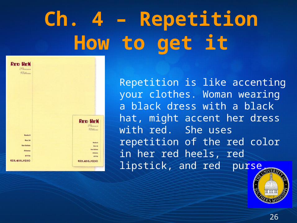
Repetition is like accenting your clothes. Woman wearing a black dress with a black hat, might accent her dress with red. She uses repetition of the red color in her red heels, red lipstick, and red purse.
Ch. 4 – RepetitionHow to get it

27
• Avoid repeating the element so much that it becomes annoying or overwhelming.
• Be conscious of the value of contrast.
Ch. 4 – RepetitionWhat to avoid

28
Repetition is useful on one-page pieces, and critical in multi-page documents , where we often just call it being consistent.
Ch. 4 – RepetitionExample
Repetition doesn't mean you have to repeat exactly the some thing.
Headlines are same typeface, but different colors.
Illustrations are all different styles, but funky and fifties.
Make sure you have enough repetitive elements so the differences are clear, not a jumbled mess.

Repetition Examples

30
Ch. 5 – Contrast
If two items are not exactly the same, make them really
different.

31
• It is easy to find ways to add contrast, and it’s possible the most fun and satisfying way to add visual interest.
• The important thing is to be strong.• Line Thickness• Colors• Shapes• Size• Space
Ch. 5 – ContrastHow to make contrast?

32
• Avoid contrasting a sort-of heavy line with a sort-of heavier line.
• Avoid contrasting brown text and black headlines.• Avoid using two or more typefaces that are similar.• If the items are not exactly the same, make them
very different!
Ch. 5 – ContrastWhat to avoid?

Ch. 5 – ContrastHow do you improve this flyer?
Before:
Lines are too long.
Too much text.
No visual contrasts attract the eye.
After:
Created headline to catch someone's eye.
Created contrast in the text, eyes will be attracted to certain parts of it as they skim through it.
Enhanced the layout with strong alignments and use of proximity.

Ch. 5 – Contrast

Contrast Example

Ch. 5 – Contrast

How to improve this design?
What is good?
Contrast – headline, use of bold text
Repetition – not sure there is any
Alignment – left alignment
Proximity – grouped text using borders and shading
What could be better?
More white space around text
Allow more space between Header and text
Possibly not indent first paragraph

38
• Robin, W. (2008). The non-designer’s design book. Peachpit press.
• Images are from: http://www.graphicreporter.com/tutorials/design_basics.html
Resources