Embed Size (px)
Citation preview

The influence of logos on the consumer’s perception of the brand personality
By:
Jessie Dai, Ermelinda Nici & Felicia Norman-Sylvendahl

The influence of logos on the consumer’s perception of the brand personality
Jessie Dai, Ermelinda Naci & Felicia Norman-Sylvendahl
Abstract Purpose – The purpose of this study is to research the consumers’ perception towards dressed-down brands, focussing on, if dressed-down logos influence the brand’s desired personality from a consumer perspective Design/methodology/approach – This study is of exploratory nature with a qualitative approach, including a review of the appropriate literature. Based on this, an operationalization is made, as a preparation for the two conducted focus groups. The first focus group was shown a logo without any brand logo text and the second group was shown the same (original) one with logo text. The brand logo used for the study is Barista. In particular, factors such as only being present in the Swedish market and having mostly limited national brand awareness, qualified the brand as an appropriate case example Findings – A brand’s personality is best conveyed when the logo includes the brand text. Furthermore, consumers perceive rounded shapes to be softer and more harmonious than angular shapes, and therefore it is important for dressed down brands to carefully choose logo-features. Additionally, findings indicate that dressed down logos are not perceived as more innovative, and non-dressed down logos are not perceived as more trustworthy, which contradicts previous researches. Ultimately findings point towards that the cognitive activity is increased for dressed down brands, resulting in increased positive emotions Research limitations/implications – This study was done with the Barista brand logo as a case example. In order to generalize and confirm the findings, more studies with different brands have to be conducted. Further, due to the time limit, the two focus groups only consisted of two small sample groups Practical implications – The findings of this paper suggest that the dressing-down of logos influence the consumer's perception of a brand's personality and thus should be considered, when updating a company's logo. Although a trend in dressing-down logos as reaction to internationalization and digitization can be observed, particularly for brands that have not yet established wide brand awareness, it is beneficial to use brand logos that combine pictorial- and word-marks, instead of only pictorial logo marks, in order to communicate desired attributes of their brand personality. In general, companies ought to consider the shape and the colour for a brand logo, as these features influence a consumer's perception and favourability Originality/value – This study offers a useful insight to the new concept of brand dressing-down their logos and what happens to the perception of the brand when this is made, something that has not been researched in the past Keywords – Branding, Brand personality, Jennifer Aaker, Logo, Dressing-down, Barista, Brand-as-a-friend Paper type – Research paper
1. Introduction Branding is an old phenomena dating back to
more than 4000 years when owners marked
their belongings to distinguish theirs from
others (Moller up, 2002). Making use of, what
today is called branding, is a form of
indicating the product/service’s origin,
securing its value and differentiating it from
competitors through its name, sign, symbols
and design (Kotler, 1991), working as a seal of
guarantee, risk reducer and image creator

The influence of logos on the consumer’s perception of the brand personality
Dai, J., Nici, E. & Norman-Sylvendahl, F.
The SBM Master Papers
Volume 2 – 2016
(Mollerup, 2002; Kapferer, 2012). Klink
(2003) explain that usually companies come
up with a suiting brand name before they start
to focus on the symbols and graphic parts of
the logo. This because the brand name has to
ensure that the relevant information is
provided and that it conveys the benefits and
features of the brand (Pavia & Costa, 1993;
Keller et al., 1998) Furthermore,
DeChernatony (1999) and Vazquez et al.,
(2002) enhance that a brand can meet both
symbolic and functional needs and values.
Branding has however gone through an
evolution, from being a sign, symbol or initials
to help mark belongings in form of a logo,
slogan, packaging etc. to continuously
differentiate one brand from another
(Kapferer, 2012). A lot has happened during
these 4000 years of branding and one
development is the dressing-down of brands.
Companies today spend a lot of time and
resources to create a good brand logo, which is
why it is highly important to research what
influences the consumer’s perception of a
brand. Many iconic brands, such as Coca-
Cola, Nike and Starbucks have started to
dress down their brands in order to be
perceived as more personal and less corporate
(Pisarkiewicz, 2013; Oskari Mattila, 2016).
However, this is not the only reason; the trend
to dress-down logos is also a reaction to
digitization; in order to fit the increased use of
mobile apps that demand a simple and easily
understandable logo (Rhodes, 2015; Beirut &
Hayman, 2016).
Dressing-down a brand logo to make it less
intrusive has also been described to be a way
to let the consumer make up its own mind of
what the company should stand for (Il Post,
2016). It is explained that using only visual
elements in a logo allows more mental
thinking from the consumer, and therefore
increases the consumer’s attention needed to
make a more personal understanding of what
the brand logo represents (Allen 2016; Il Post,
2016; Rowe, 2016; Perez, 2016). Due to the
simplicity to adapt to other cultures, textless
brand logos have an advantages to go global; a
step often considered by companies that aspire
to increase business (Ghauri & Cateora, 2014).
A simple logo also increases the flexibility for
companies to tap into multiple industries at
once, as the logo without text can travel across
borders without communication hinders
(Oskari Mattila, 2016).
However, larger brands such as Coca-Cola and
Nutella are able to modify or dress-down their
brand logos since the brand recognition is
already high enough to only have the logo
without the text (Sääksjärvi, van den Hende &
Mugge, 2015) and hence, they do not only
have an advantage over the increased
adaptability to mobile-devices, but are also
being perceived as more personal and less
intrusive (Pisarkiewicz, 2013). This relatively
new trend has not been researched yet, and
therefore presents a gap in the literature of
how the dressing-down of brands is actually
perceived by the consumers. Klink (2003)
suggests to look into what influences
incomplete typeface logos and what effect
perceptual ambiguity has on the perceived
brand personality. Furthermore, Hagvedt
(2011) suggests to research consumers’
interaction and perception on incomplete
typeface logos on existing firm’s logos.
Therefore, the purpose of this paper is to
research if a dressed-down logo influences the
brand’s desired personality, by evaluating the
differences between the consumers’
perception of a brand logo with text and the
same brand logo, but without text. In order to
explore this topic, two focus groups are
conducted and analysed based on Aaker’s
(1997) five dimensions of brand personality
model, with the brand Barista as a foundation.

The influence of logos on the consumer’s perception of the brand personality
Dai, J., Nici, E. & Norman-Sylvendahl, F.
The SBM Master Papers
Volume 2 – 2016
2. Literature Review 2.1 Brand Personality
Brand personality is defined by “the set of
human characteristics that can be associated
with a brand” (Keller, 1993, cited in Aaker,
1997, p. 347). To give a brand a personality
will, according to Azoulay and Kapferer
(2003), contribute to building a brand and
managing it, since brand personality helps
building the foundation that influences the
consumer’s product choice. Furthermore it can
be used as an effective brand positioning tool
(Padgett & Mulvey, 2009), especially since
people have a tendency to chose brands in a
similar way to how they chose friends in real
life (King, 1970). The metaphor of brand-as-a-
friend is argued by Rosenbaum-Elliott, Percy
and Pervan (2011) to contribute to the
emotional relationship between a consumer
and a specific brand, which is eventually
established over time and can also help
building the brand. Since creating a brand’s
personality is a time consuming process
companies sometimes tend to engage
celebrities as brand ambassadors, as they give
the brand instant associations (Kapferer,
2012).
A model that clearly explains brand
personality is Aaker’s five dimensions of
brand personality. This model was developed
in 1997 and uses human traits, which has lead
to an easy understanding. Within this model
there are five core dimensions; sincerity,
excitement, competence, sophistication and
ruggedness (Aaker, 1997). Every dimension
consists of a number of traits. In order to
measure into what dimensions one should
place a specific brand, Aaker (1997) suggests
that the traits are measured through a likert-
scale, from 1 (strongly disagree) to 5 (strongly
agree).
Figure 1 - The 5 Dimensions of Brand Personality, inspired by Aaker (1997)
The influence of logos on the consumer’s perception of the brand personality
Dai, J., Nici, E. & Norman-Sylvendahl, F.
The SBM Master Papers
Volume 2 – 2016
2.2 Perception of image-driven logos
The choice of a brand logo plays an essential
role in the creation of brand identity, as logos
are graphic or typeface communication clues
that help the consumers to understand a
brand’s intangible service attributes (Pittard,
Ewing & Jevons, 2007; Devlin & McKechnie,
2008; Machado et al., 2012). A logo
represents a brand identity sign that
communications visual summaries of
information about the brand’s meaning and
marketing efforts (MacInnis, Shapiro & Mani,
1999). As it can be applied on several brand
displays, from packaging, merchandising and
promotional material, to CRM material, such
as business cards and letterheads, a logo if
found to be a brand’s most salient visual
illustration (Walsh, Page-Winterich & Mittal,
2010). Brand identity signs can be divided into
two categories: word-driven logos and image-
driven logos (Wheeler, 2003). Companies can
decide whether to use only stylized letter
marks, only pictorial signs or a combination of
both.
Companies today have realized the importance
of brand logos, which is why they spend
financial means and resources, in order to find
and constantly rejuvenate a suitable logo.
However, there are still just a few researches
on the influence of certain logotypes on the
consumer’s perception of the brand and its
personality (Machado et al., 2012). The
existing researches until today mainly focus
on image-driven logos; Henderson and Cote
(1998) for instance, found a fundamental
linkage between a logo’s design attributes and
its influence on cognitive and affective
consumer reactions i.e. consumers make up
their mind about a brand purely by looking at
the logo attributes, even before any marketing
activity has been implemented. In particular,
affective reactions are the most important
ones, as they transfer associations to the
product or brand with little or no processing
(Henderson & Cote, 1998). Therefore, in order
for the companies to simplify and support the
transmission of a desired message, it is crucial
for them to know that brand logos ought to be
recognizable, positively appealing and well-
designed (Henderson et al., 2003). The greater
the aesthetic appeal of a brand logo, the higher
the chance to form emotional bonds between
the brand and its customers (Gaut & Lopes,
2013). Moreover, according to Pham et al.
(2001), emotions evoked by aesthetic qualities
of a brand sign and experienced through brand
communication, navigate brand evaluation and
judgement. Consequently, logos can be one of
the most powerful brand elements, as they
facilitate brand knowledge by creating brand
awareness and recognition, influence the
formation of a brand’s image and differentiate
the brand by triggering consumers’ emotional
reactions (Kapferer, 1997; Pittard, Ewing &
Jevons, 2007; Müller, Kocher & Crettaz,
2013).
Particularly figurative pictorial or natural
marks are most beneficial to a brand, as
consumers can easier interpret recognizable
objects that represent familiar meanings, than
abstract logos with no conditioned meaning
(Seifert, 1992; Schlechter, 1993; Henderson &
Cote, 1998). Due to the organic, inanimate
nature of figurative forms which are
commonly experienced (i.e. places, characters,
fruits, animals, other objects or living
organisms), they demand less learning efforts
from consumers and support brand
association, as well as brand memorization
(Henderson & Cote, 1998). In addition the
shape of a logo also drives consumers’
perceptions and is said to be an important
factor in conveying the right personality of the
brand to the consumer. Roundedness, for
instance, is connoted with harmony and
naturalness (Henderson et al., 2003), whereas
angular or sharp shapes activate hardness.
Furthermore, soft shapes were perceived with
attributes such as sympathetic, affectionate,
gentle, caring, kind, warm and responsive
(Jiang et al., 2016).

The influence of logos on the consumer’s perception of the brand personality
Dai, J., Nici, E. & Norman-Sylvendahl, F.
The SBM Master Papers
Volume 2 – 2016
The role of logo colors in brand personality
building is also not to be underestimated, as
color is an important cue that communicates
different information and triggers specific
connotations that are shaped through
associative learning (Takahashi, 2012). For
instance, blue was found to be linked to
competence, whereas red is connected to
excitement and arousement (Labrecque &
Milne, 2012). Brand colors serve as search
indicator and identification attribute for
consumers; therefore brand recognition can be
promoted by a rightfully chosen color
(Amsteus et al., 2015).
However, the extent to what brand logos affect
consumer varies with regard to the consumer’s
brand commitment. The visual cues convey
different meanings to consumers who are
more committed to a brand than to consumers,
who are only moderately or not at all
committed, as brand logos provoke
associations and thoughts about to the brand
related to the consumer’s memory (Keller,
2005).
2.3 Dressing-down logos
Dressed down logos were found to support
internationalization, as they are perceived as
more personal and less corporate. By giving
consumers the chance to freely form
associations to the logo and by adapting the
design to the increasing demand of mobile-
applications, dressed down logos are
perceived as less intrusive (Ghauri & Cateora,
2014; Il Post, 2016; Oskari Mattila, 2016).
Furthermore, getting rid of the name in a logo
shields the company from miss-spellings and
multiple-perceived meanings when operating
in many different cultures, which makes the
brand truly global (Nurton, 2013). Moreover,
it is argued that if a brand is trying to be
perceived as innovative, it might be favourable
to not include the brand name in the logo,
since the lack of a text mark opens up for
interpretation and hence increases the
interestingness of the brand logo (Hagvedt,
2011). Thus, it is important for companies to
keep in mind that taking away the brand name
in a logo might benefit brands, which are
promotional-focused, e.g. entertainment
brands (Hagvedt, 2011). Miller and Kahn
(2005) agree that if a message is left
ambiguous, it will leave room for the
consumer to fill in the blanks and therefore the
involvement with the brand and the perception
of a positive, personalised message is
increased. Further, Miller and Kahn (2005)
explain that this evokes interest and positive
feelings, which has been confirmed by their
study on consumers about ambiguous colors
and flavours.
On the contrary, due to the lack of
clarification, dressing down a logo by taking
away the brand name risks affecting the
perceived trustworthiness of a brand,
(Hagvedt, 2011), which is often considered as
the strongest marketing tool for a company
(Berry, 1996; Sirdeshmukh, Singh & Sabol,
2002). However, the influence of dressed
down logos on consumers’ perceptions is
conditional to the industry that a company is
operating in. Thereby an industry that requires
a lot of trust, such as an insurance company, is
strongly recommended to keep the logo as
clear and unambiguous as possible (Hagtvedt,
2011). According to Keller (1993), a clearly
conveyed message leaves no room for
misinterpretation and helps brands
consistently convey who they are.

The influence of logos on the consumer’s perception of the brand personality
Dai, J., Nici, E. & Norman-Sylvendahl, F.
The SBM Master Papers
Volume 2 – 2016
3. Operationalization Table 1 - Operationalization
Theory Author Definition Measurement
Five Dimensions of brand personality
Brand personality Aaker, J. (1997);
Keller (1993).
“The set of human characteristics that
can be associated with a
brand”: sincerity, excitement,
competence, sophistication and
ruggedness
- If Barista was a person,
how would you describe it?
Perception of image-driven logos
Image-drive logos
on affective
response
Henderson &
Cote (1998)
Henderson &
Cote (1998);
Schlechter
(1993); Seifert
(1992)
Consumers make up their mind about a
brand just by looking at the logo
attributes: Cognitive & affective
consumer reaction.
Consumers can easier interpret
recognizable objects that represent
familiar meanings.
- What do you see in the
picture?
- What do you associate it
with?
Shape of logos Henderson et al.
(2003); Jiang et
al. (2016).
Shapes drive consumer perception and
affect perceived personality.
Roundedness, for instance, is connoted
with harmony and naturalness,
sympathetic, affectionate, gentle,
caring, kind, warm and responsive.
Angular or sharp shapes activate
hardness.
- What do you see in the
picture?
- What do you associate it
with?
Colour Takahashi,
(2012);
Labrecque &
Milne (2012);
Amsteus et al.
(2015)
Colour trigger connections &
information that is shaped through
associative learning.
- What do you see in the
picture?
- What do you associate it
with?
Dressing-down of logo
Innovative vs.
trustworthy
Hagvedt (2011) Brand name in logo is perceived as
more trustworthy but less innovative.
Brands without brand name are
perceived more innovative and less
trustworthy.
- From 1-5 how
innovative/trustworthy do
you perceive this logo to
be?
Positive/negative
evoked emotions
Miller and Kahn
(2005)
Ambiguous brand logos are perceived
more positive and personalised because
of increased cognitive engagement from
consumer.
- What do you like/dislike
with this logo?

The influence of logos on the consumer’s perception of the brand personality
Dai, J., Nici, E. & Norman-Sylvendahl, F.
The SBM Master Papers
Volume 2 – 2016
4. Case Description Barista’s personality touches upon three of
Aaker’s five dimensions of brand personality
(see appendix E). First of all Barista is a
sincere brand, which can be seen in their
honest way of doing business, where they are
clear with where their money goes, and how
their products are made. Barista is also a
friendly brand, as they donate one school meal
to a child in Ethiopia per customer purchase
(Barista, 2016a). Furthermore, they have a
loyalty club in form of a pre-paid card that the
customer can load off, and for every 100th
time of use, a child is sent to school for one
semester (Barista, 2016b). In addition, Barista
encourages their customers to take a bag of
fertiliser made from coffee grounds, as they
found a way to recycle their waste for
gardening, which shows their friendly and
wholesome character (Almér, 2016). Being a
fair trade company, Barista is both honest and
friendly in the approach to their suppliers
(Barista, 2016a). They are family-oriented due
to the fact that they send children to school
and help their parents to work under fair
conditions (Barista, 2016b).
Barista is also a competent company, in the
sense that it is intelligent and hardworking. An
example of this is that they were the first
coffee chain in Scandinavia to use 100%
recyclable fibre napkins and instead of plastic
cups, cups that are made from corn (Almér,
2016). Apart from that, Barista show that they
are a hardworking brand, as they never give
up, in spite of the economic losses that they
have faced in the last years. Still today, they
are determined to fight for what they believe
in, e.g. to make the world a better place
(Almér, 2016).
Last but not least, according to Times
Magazine, the rise of ethical consumption is a
current trend (Almér, 2016). Thus Barista can
be seen as a trendy brand with an exciting
brand personality.
5. Methodology
In this study multiple-methods had to be
implemented in order to aim towards the
purpose of the study. The literature review
findings were applied on the case study of the
Swedish coffee brand, Barista, which
represents the foundation to the interview and
focus groups.
5.1 Literature review
Executing a literature review was the natural,
initial step to take in this study. The literature
review helps understanding the most important
aspects of the phenomena of dressing-down a
brand logo. Furthermore the finding of
Aaker’s, five dimensions of brand personality,
has been found to be an important basis for the
interpretation of this study’s results and has
become the theoretical approach in order to
analyse the impact of dressed-down logos on
the consumer’s perception of brand
personality. This method also undoubtedly
indicates that there is a lack of academic
research done within this area.
5.2 Case Study
The aim of this research is to create an
understanding about, whether a brand logo
with or without text has the strongest ability to
be perceived with the brand personality that
the company desires to convey to the
consumers. In order to do this, it was crucial to
find a brand logo that evoked as little bias as
possible and thus minimized result
falsification. Furthermore, to ensure the
qualitative analysis of the influence of
dressed-down logos on brand personality
according to Aaker’s model, it is important to
find an existing brand logo that is presented on
a brand platform to verify its aimed brand
personality (Hagvedt, 2011). Concluding all
requirements, the brand logo used for the

The influence of logos on the consumer’s perception of the brand personality
Dai, J., Nici, E. & Norman-Sylvendahl, F.
The SBM Master Papers
Volume 2 – 2016
study is the one of Barista (Fair Trade Coffee).
In particular, factors such as only being
present in the Swedish market and having
mostly limited national brand awareness,
qualified the brand as case example.
5.3 Focus Group
Since this study is of exploratory nature and
taps into a research gap with little previous
knowledge, exploratory data-collection
methods have to be applied. Therefore making
use of focus groups is a good way to
understand the why in consumer perception,
attitude and behaviour (Greenbaum, 2000),
allowing a more in-depth insight of consumer
perception (Malhotra, 2010; Krueger & Casey,
2009). In order to minimize falsification and
to ensure the quality of our focus group
results, the participants were carefully chosen
based on their (non-existing) knowledge about
the brand and logo of Barista.
Therefore, a minor-questionnaire with two
question was conducted beforehand, which
eliminated potential participants that knew, or
even only heard of the brand, and were
familiar to the brand logo. First the potential
participants were shown 12 random logos,
where the text was removed (see appendix
A1). Then they were shown a second paper
with 12 Swedish brand names (see appendix
A2). The potential participants for the two
focus groups were asked to cross the logos and
names they recognized. In the end the authors
found 14 participants with no previous
knowledge of either the logo or name of
Barista, these participants were split in two
focus groups. In addition, the brand’s logo
personality was analysed according to Aaker’s
brand personality dimension model and the
existing researches about brand logo
perception, before the focus groups were
conducted.
Two separate focus groups were conducted
with seven participants each. The questions
asked in the focus groups were based on the
theoretical finding in the literature review. In
the first focus group a modified Barista brand
logo was used excluding their brand name and
text, whereby the participants of the second
focus group were asked the same questions
facing the original Barista logo (see appendix
B). In both cases one moderator lead the
discussion, while two assistant moderators
were responsible for the projection of the
presentation, audio recordings and notes. Each
participant received a paper that was prepared
with two questions. In accordance with Aakers
study from 1997, a likert scale from 1
(strongly disagree) to 5 (strongly agree) was
implemented to find out how trustworthy and
innovative Barista was perceived. Afterwards,
the participants were asked to write down
every personality trait that was found suitable
for the projected brand logo out of an
overview of all the personality attributes of
Aaker’s model. By doing so, it was ensured
that the results of both groups had same
preconditions in order to analyse the
differences.
In the following, the results of both focus
groups will be evaluated with regard to the
literature insights and theories. The data will
be organised and clustered using a
comparative method, whereby the most
relevant and repeating statements are for one
listed and the questionnaires are evaluated.
6. Case Analysis When comparing the results of both focus
groups (see appendix C), it is noticeable that
in general the brand logo without text was
similarly perceived as the logo with text (see
appendix D). Thereby, the first focus group
elaborated more intensively on the pictorial
logo attributes, i.e. associations with the shape
and color, whereas the second focus group
focused on associations derived from the logo
text Barista - Fair Trade Coffee. In the second
group, the perceived pictorial attributes were
closely linked to the information identified
from the logo text.

The influence of logos on the consumer’s perception of the brand personality
Dai, J., Nici, E. & Norman-Sylvendahl, F.
The SBM Master Papers
Volume 2 – 2016
With regard to the literature, the findings of
the first focus group that saw a nameless logo,
are in line with Henderson and Cote’s (1998)
and Miller and Kahn’s (2005) research results,
who highlighted that consumers usually make
up their mind of what a logo stands for, before
they have been even exposed to any marketing
activities. In addition, the fact that the first
group elaborated more on the pictorial mark
than the second one, underlines that ambiguity
triggered by an image-driven logo, requires
more cognitive ability, which also generate a
more positive overall perception of a brand
logo (Miller and Kahn, 2005). Apart from that,
the second group straightforwardly reacted to
the logo text, which indicates that, when there
is text supporting an image perception,
consumer do not have to make use of their
cognitive ability as much.
Moreover, both focus groups associated the
pictorial mark of the logo with coffee art,
explaining that the white coloured pattern with
the brown coloured background resembled a
café latte, furthermore the perception of the
first focus group of the logo’s sphere shape
reminding one of a recycling cycle. This goes
hand in hand with Henderson and Cote (1998);
Schlechter (1993); Seifert (1992) theory about
consumers interpreting objects as representing
familiar meanings. This also underlines the
findings of Takahashi, (2012); Labrecque and
Milne (2012) and Amsteus et al. (2015)
referring to colors triggering connections for
human beings based on associative learnings,
seeing as brown meant coffee for both the
focus groups.
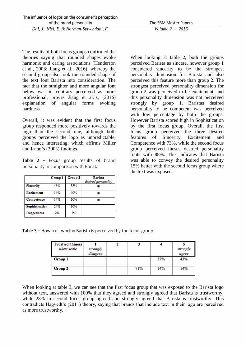
The results of both focus groups confirmed the
theories saying that rounded shapes evoke
harmonic and caring associations (Henderson
et al., 2003; Jiang et al., 2016), whereby the
second group also took the rounded shape of
the text font Barista into consideration. The
fact that the straighter and more angular font
below was in contrary perceived as more
professional, proves Jiang et al.’s, (2016)
explanation of angular forms evoking
hardness.
Overall, it was evident that the first focus
group responded more positively towards the
logo than the second one, although both
groups perceived the logo as unpredictable,
and hence interesting, which affirms Miller
and Kahn’s (2005) findings.
With regard to the literature, the findings of
the first focus group that saw a nameless logo,
are in line with Henderson and Cote’s (1998)
and Miller and Kahn’s (2005) research results,
who highlighted that consumers usually make
up their mind of what a logo stands for, before
they have been even exposed to any marketing
activities. In addition, the fact that the first
group elaborated more on the pictorial mark
than the second one, underlines that ambiguity
triggered by an image-driven logo, requires
more cognitive ability, which also generate a
more positive overall perception of a brand
logo (Miller and Kahn, 2005). Apart from that,
the second group straightforwardly reacted to
the logo text, which indicates that, when there
is text supporting an image perception,
consumer do not have to make use of their
cognitive ability as much.
Moreover, both focus groups associated the
pictorial mark of the logo with coffee art,
explaining that the white coloured pattern with
the brown coloured background resembled a
café latte, furthermore the perception of the
first focus group of the logo’s sphere shape
reminding one of a recycling cycle. This goes
hand in hand with Henderson and Cote (1998);
Schlechter (1993); Seifert (1992) theory about
consumers interpreting objects as representing
familiar meanings. This also underlines the
findings of Takahashi, (2012); Labrecque and
Milne (2012) and Amsteus et al. (2015)
referring to colors triggering connections for
human beings based on associative learnings,
seeing as brown meant coffee for both the
focus groups.
The influence of logos on the consumer’s perception of the brand personality
Dai, J., Nici, E. & Norman-Sylvendahl, F.
The SBM Master Papers
Volume 2 – 2016
The results of both focus groups confirmed the
theories saying that rounded shapes evoke
harmonic and caring associations (Henderson
et al., 2003; Jiang et al., 2016), whereby the
second group also took the rounded shape of
the text font Barista into consideration. The
fact that the straighter and more angular font
below was in contrary perceived as more
professional, proves Jiang et al.’s, (2016)
explanation of angular forms evoking
hardness.
Overall, it was evident that the first focus
group responded more positively towards the
logo than the second one, although both
groups perceived the logo as unpredictable,
and hence interesting, which affirms Miller
and Kahn’s (2005) findings.
Table 2 – Focus group results of brand personality in comparison with Barista
When looking at table 2, both the groups
perceived Barista as sincere, however group 1
considered sincerity to be the strongest
personality dimension for Barista and also
perceived this feature more than group 2. The
strongest perceived personality dimension for
group 2 was perceived to be excitement, and
this personality dimension was not perceived
strongly by group 1. Baristas desired
personality to be competent was perceived
with low percentage by both the groups.
However Barista scored high in Sophistication
by the first focus group. Overall, the first
focus group perceived the three desired
features of Sincerity, Excitement and
Competence with 73%, while the second focus
group perceived theses desired personality
traits with 88%. This indicates that Barista
was able to convey the desired personality
15% better with the second focus group where
the text was exposed.
Table 3 – How trustworthy Barista is perceived by the focus group
When looking at table 3, we can see that the first focus group that was exposed to the Barista logo
without text, answered with 100% that they agreed and strongly agreed that Barista is trustworthy,
while 28% in second focus group agreed and strongly agreed that Barista is trustworthy. This
contradicts Hagvedt’s (2011) theory, saying that brands that include text in their logo are perceived
as more trustworthy.

The influence of logos on the consumer’s perception of the brand personality
Dai, J., Nici, E. & Norman-Sylvendahl, F.
The SBM Master Papers
Volume 2 – 2016
Table 4 – How innovative Barista is perceived by the focus group
Furthermore, Hagvedt’s (2011) theory found
that brands without text are perceived to be
more innovative than brands with text.
Looking at table 4, in this study it was found
that 14% of the participants of the focus group
without text perceived the logo to strongly
disagree with innovativeness, whilst 14% of
the focus group exposed to the logo with text
perceived the logo to agree with
innovativeness. This once again contradicts
Hagved’t (2011) theory of brand logos without
text being more innovative.
7. Conclusion & Managerial implications Using Barista as a case study to explore the
differences in consumers’ perception of a
brand personality when including or excluding
the logo text has generated the following
findings:
Barista was 15% better at conveying its
desired personality when including the brand
text, which indicates that a text can help the
brand to express who they are in a better way.
Furthermore, this shows that brands that have
chosen to dress down their brands might leap
the risk that their personality will not be
perceived in the desired way. Additionally,
findings imply that dressed down brands
should chose the logo-features wisely and
carefully in order to convey the desired
meaning, seeing as the findings pointing
towards consumers retrieving past associations
to colors and shapes, when perceiving a brand.
It was for example highlighted in this study
that consumer find rounded shapes to be more
soft and harmonical than angular shapes.
This study has contradicted previous findings
from Hagvedt (2011) and have found that
including text in a brand logo does not
necessarily increase the trustworthiness of a
brand, and excluding the text in the brand logo
does not necessarily increase the perception of
a brand being innovative.
Ultimately, the findings from this study has
corroborated the theory from Miller and Kahn
(2005), confirming that dressed down logos
evoke stronger positive emotions than logos
with text, due to the increased cognitive
activity.
8. Limitation and further recommendations The findings in this study were based on two
conducted focus groups, in order for
corroboration, further studies should be done
but with other brands. It would be of interest
to investigate if the same results were
achieved regarding the perception of a brand’s
personality with or without a dressed-down
logo. Furthermore, to increase the validity of
this study, it could be of interest to conduct the
same study but with more people involved, i.e.
having more focus groups in order to see if the
participants perception of barista were
corresponding to this study’s finding.

The influence of logos on the consumer’s perception of the brand personality
Dai, J., Nici, E. & Norman-Sylvendahl, F.
The SBM Master Papers
Volume 2 – 2016
References Aaker, J., L. (1997). Dimensions of Brand
Personality. Journal of Marketing Research,
vol. 34, no. 3, pp. 347-356.
Allen, K. (2016). The ‘Debranding’
Movement: What Managers Should Know.
Available Online:
http://www.prdaily.com/Main/Articles/The_de
branding_movement_What_managers_should
_know_21436.aspx [Accessed 15 October
2016].
Almér, B. (2016). It Is NOT The Thought That
Counts, Guest Lecture, Lund University
School of Economics and Management,
Sweden, 19 September 2016.
Amsteus, M., Al-Shaaban, S., Wallin, E. &
Sjöqvist, S. (2015). Colors in Marketing: A
Study of Color Associations and Contet (in)
Dependence. International Journal of Business
and Social Science, vol.6, no. 3, pp. 32-45.
Azoulay, A., & Kapferer, J., N. (2003) Do
Brand Personality Scales Really Measure
Brand Personality? Brand Management, vol.
11, no. 2, pp. 143-155.
Barista. (2016a). Varför. Avaliable Online:
http://barista.se/varfor/ [Accessed 18 October
2016].
Barista. (2016b). Stammis. Avaliable Online:
http://barista.se/stammiskort/ [Accessed 18
October 2016].
Beirut, M., & Hayman, L. (2016).
MasterCard: An Evolution of the Brand
Emphasises Simplicity, Connectivity and
Seamlessness. Available Online:
http://www.pentagram.com/#/blog/132700
[Accessed 2 October 2016].
Berry, L. (1996). Retailers with a Future.
Marketing Management, Vol. 5, no. Spring,
pp. 39–46.
Devlin, J., F., & McKechnie, S. (2008).
Consumer Perceptions of Brand Architecture
in Services. European Journal of Marketing,
vol. 42, no. 5/6, pp. 654-66.
Gaut, B., & Lopes, D., M. (2013). The
Routledge Companion to Aesthetics. 5th
Edition. Routledge; New York.
Ghauri, P., N., & Cateora, P. (2014).
International Marketing. 4th Edition. London,
McGraw Hill.
Gripsrud, J. (2010). Understanding Media
Culture. Bloomsbury Academic.
Hagtvedt, H. (2011). The Impact of
Incomplete Typeface Logos on Perceptions of
the Firm, Journal of Marketing, vol. 75, no. 7,
pp. 86-93.
Henderson, P., W., & Cote, J., A. (1998).
Guidelines for Selecting or Modifying Logos.
Journal of Marketing, vol.62, no. 4, pp. 14–30.
Henderson, P., W., Cote, J., A., Leong, S., M.
& Schmitt, B. (2003). Building Strong Brands
in Asia: Selecting the Visual Components of
Image to Maximize Brand Strength.
International
Journal of Marketing Research, vol. 20, no. 4,
pp. 297-313.
Il Post. (2016). Perché ci sono sempre più
loghi senza nome? C’entrano vari fattori, fra
cui una certa praticità per le aziende e l’idea
che in questo modo siano meno invasivi.
Available Online:
http://www.ilpost.it/2016/09/11/loghi-senza-
nomi/ [Accessed 30 September 2016].
Jiang, Y., M., Gorn, G., Galli, M., &
Chattopadhyay, A. (2016). Does Your
Company Have the Right Logo? How and
Why Circular- and Angular-Logo Shapes
Influence Brand Attribute Judgements, Journal

The influence of logos on the consumer’s perception of the brand personality
Dai, J., Nici, E. & Norman-Sylvendahl, F.
The SBM Master Papers
Volume 2 – 2016
of Consumer Research, vol. 42, no. 2, pp. 709-
726.
Kapferer, J., N. (2012). Strategic Brand
Management. 5th Edition. London: Kogan
Page.
Kapferer, J., N. (2012). The New Strategic
Brand Management: Creating and Sustaining
Brand Equity Long Term. 5th Edition,
London: MPG Books Ltd.
Kauppinen-Räisänen, H., & Luomala, T., H.
(2010). Exploring Consumers' Product-
Specific Colour Meanings. Qualitative Market
Research: An International Journal, vol. 13,
no. 3, pp. 287-308.
Keller, K.L. (1993). Conceptualizing,
Measuring, and Managing Customer-Based
Brand Equity, Journal of Marketing, vol. 57,
no. 1, pp. 1–22.
Keller, K., L. (2005). Branding Shortcuts.
Marketing Management, vol. 14, no. 5, pp. 18-
23.
King, S. (1970). What is a Brand? J. Walter
Thompson Company Limited: London.
Labrecque, L., & Milne, G. (2012). Exciting
red and competent blue: the importance of
color in marketing. Journal of the Academy of
Marketing Science, 40(5), 711-727.
Machado, J., C., Vacas-de-Carvalho, L.,
Costa, P., & Lencastre, P. (2012). Brand
Mergers: Examining Consumers' Responses to
Name and Logo Design. Journal of Product &
Brand Management, vol. 21, no. 6, pp. 418 –
427.
MacInnis, D., J., Shapiro, S., & Mani, G.
(1999). Enhancing Brand Awareness Through
Brand Symbols. Advances in Consumer
Research, vol. 26, pp. 601-608.
Miller, E.G., & Kahn, B. (2005). Shades of
Meaning: The Effect of Color and Flavor
Names on Consumer Choice, Journal of
Consumer Research, vol. 32, no. 6, pp. 86–92.
Müller, B., Kocher, B., & Crettaz, A. (2013).
The Effects of Visual Rejuvenation Through
Brand Logos. Journal of Business Research,
vol. 66, no. 1, pp. 82–88.
Nurton, J. (2013). Trade marks that are
famous but nameless, Managing Intellectual
Property, vol. 4, pp. 4.
Oskari Mattila, K. (2016). The Age of the
Wordless Logo. Available Online:
https://www.theatlantic.com/business/archive/
2016/09/the-age-of-the-wordless-
logo/499166/?utm_source=atltw [Accessed 3
October 2016].
Padgett, D., & Mulvey, M., S.(2009).
Experiential Positioning: Strategic
Differentiation of Customer-Brand
Relationships. Innovative Marketing, vol. 5,
pp. 87–95.
Perez, J. (2016). What’s in a Name (The Trend
of De-branding. Available Online:
http://www.paragonpr.com/whats-in-a-name-
de-branding/ [Accessed 14 October 2016].
Pham, M., T., Cohen, J., B., Pracejus, J., W. &
Hughes G., D. (2001). Affect Monitoring and
the Primacy of Feelings in Judgement. Journal
of Consumer Research, vol. 28, no. 2, pp. 167-
188.
Pisarkiewicz. (2013). Branding Your
Company and Products Took Time? So Now
it’s Time to Rebrand Them! Available Online:
http://www.designpm.com/branding-
debranding/ [Access 23 September 2016].
Pittard, N., Ewing, M., & Jevons, C. (2007).
Aesthetic Theory and Logo Design:
Examining Consumer Response to Proportion

The influence of logos on the consumer’s perception of the brand personality
Dai, J., Nici, E. & Norman-Sylvendahl, F.
The SBM Master Papers
Volume 2 – 2016
Across Culture. International Marketing
Review, vol. 24, no. 4, pp. 457–73.
Rhodes, M. (2015). Strip Down Your Logo
and Make Your Brand a Classic- Now!
Available Online:
https://www.wired.com/2015/09/strip-logo-
make-brand-classic-now/ [Accessed 3 October
2016].
Rosenbaum-Elliot, R., Percy, L., & Pervan, S.
(2011). Strategic Brand Management. 2nd
Edition. Oxford University Press: New York.
Rowe, A. (2016). Why Your Company Logo
Should Be Wordless. Available Online:
http://tech.co/company-logo-wordless-2016-
09 [Accessed 10 October 2016].
Seifert, L.S. (1992). Pictures as Means of
Conveying Information. Journal of General
Psychology, vol. 119, no. 3, pp. 279-87.
Sirdeshmukh, D., Singh, J., & Sabol , B.
(2002) Consumer Trust, Value, and Loyalty in
Relational Exchanges, Journal of Marketing,
vol. 66, no. January, pp. 15–37.
Takahashi, S. (2012). Effect of Red vs Black
Clothing on the Impression of Persons
Engaged in a Dialogue. Journal of the
International Colour Association, vol.7, pp. 4-
12.
Walsh, M., F., Page-Winterich, K., & Mittal,
V. (2010). Do Logo Redesigns Help or Hurt
Your Brand? The Role of Brand Commitment.
Journal of Product & Brand Management, vol.
19, no. 2, pp. 76–84.
Wheeler, A. (2003). Designing Brand Identity:
A Complete Guide to Creating, Building and
Maintaining Strong Brands. Wiley, Hoboken;
NJ.

Appendix A.1 Dress-down brand logos
A.2 Swedish brand names
B.1 Barista without text / B.2 Barista with text

The influence of logos on the consumer’s perception of the brand personality
Dai, J., Nici, E. & Norman-Sylvendahl, F.
The SBM Master Papers
Volume 2 – 2016
C. Focus group results 1. What do you see in the picture?
The first group discussed what was there in an abstract way. They saw flowers, leaves;
environmental and coffee art. They noticed the colour (light) brown giving an earthy feeling. They
saw a heart, not symmetric, no hard edges and round.
The second group saw the text that said barista and fair trade. They saw a heart, latte art, brown.
2. What do you associate with what you see?
The first group associated the logo with environmental friendly (friendly?) products. They saw the
round shape as a symbol of the recycling cycle (competence?). They also thought that it might be a
flower coming up from the ground (wholesome?). One participant stated that it looked like two
hands holding and supporting the heart (Friendly/caring?). Some others thought it looked like latte
art in a coffee cup.
The second group associated the look of the letters with leafs, and rainforest, because of its bubbly
shape. They associated the word barista together with the color nuance of brown with coffee. Since
the shape is not symmetrical they describe it as interesting. The flowing shape with non-sharp edges
gave them a calm and relaxed feeling. In general they describe the shape as being inviting. The
second group associated the logo with being environmental. The participant that was familiar with
the fair-trade concept pointed out that they give education. They saw the heart as a way to show that
they want to take care everyone.
3. What do you like /dislike?
The first group found the logo unpredictable, which they liked because it’s interesting. They also like
how the roundness and soft brown colour gave them a relaxing feeling. The first group found the
heart slightly cheesy. While some participants liked the unpredictability, some others disliked that
the heart was not symmetric. In general they found the colour brown boring. They lacked the
innovativeness and thought it was way too similar to Starbucks logo, with the mermaid.
Second group liked the colour and found the letters to be relaxing and rich because of it’s rounder
shape. That is says Barista in bubbly letters provides a cosy and down-to-earth feeling, which they
like. They also saw the text fair-trade as being professional seeing as its shape is more angular and
hard, and giving the whole logotype a professional look. One participant in particular was involved
in fair-trade, therefore when she saw that she became positive to brand as a whole. She was familiar
with the concept of fair-trade and knew that this brand’s product will provide high quality. They
disliked the heart because it gave an insincere feeling. They thought they were trying to hard to look
similar to other coffee chains like (Starbucks, etc.), therefore they found it cheesy. The participants
that were not familiar with the concept of fair-trade, did not see the point of including that in the
logo.

D. Focus Group Analysis
Question Attribute Association/Feelings (Group 1) Association/Feelings (Group 2)
1. What do you see in the picture?
2. What do you associate?
Soft/light brown Earthy, environment Coffee, Café latte
Not symmetric, no hard edges;
round; bubbly
Recycling cycle (competent),
wholesome,
Rainforest, interesting, relaxing,
calm, inviting
Leafs / flower Environmental friendly,
supportive, competent (recycling)
Environmental responsible
Heart Harmonic, friendly, caring Caring
Text “Barista, Fair Trade” - Educating
Latte Art Similar Recognizable
3. What do you like/dislike? Pictorial mark
Not symmetric
Unpredictable, liked; interesting;
however.. (see heart)
Roundness Relaxing, similar to “Starbucks-
logo”
Rich, similar to “Starbucks”
Soft/light brown Harmonic, disliked, boring, non-
innovative
Liked, relaxing, suitable,
Heart Cheesy, disliked not symmetric
shape
Disliked; insincere, cheesy, too-
hard trying
Round text mark “Barista” - Cosy, down-to-earth
Angular, hard text font “Fair Trade
Coffee”
- Familiar with fair trade concept:
professional, favourable, high
quality
- Unfamiliar with fair trade concept:
meaningless, no bias

E. Barista Brand Personality