Embed Size (px)
Citation preview

Martti Huttunen
Beneath the Surface of
Third supplemented edition

© Martti Huttunen, 2018
Publisher: Books on Demand GmbH, Helsinki, Finlandi
Manufacturer: Books on Demand GmbH, Norderstedt, Germany
Layout and typography: Paul LaaneCover: Martti HuttunenPhotographs, picture collages and drawings: Martti Huttunen except the following:p. 20 (center) CORBIS/SKOY, p. 66 Matti Jäntti, p. 107 (center) Embassy of Finland p. 108 (right) Sampsa Huttunen, p. 109 (bottom and right) Sampsa Huttunen, p. 111 (center) Tiina Tuukkanen, p. 114 Lehtikuva/Soile Kallio, p. 152 CORBIS/SKOY, p. 154 (bottom) Eero Jussila, p. 156 (top) Kevin Schafer/CORBIS/SKOY, p. 157 Väinö Palokoski
Digital copy or modification of a work or part thereof is strictly forbidden.
ISBN 978-952-800-731-9

4
For the Reader 8
Why ’Beneath the Surface’ 10
What is Colour? 16 From Substance to Brain-Centered Approach to Colour 16
The Weimar Region and a Physicalistic Approach to Colour 18Did Ancient Cave Painters Have a PhysicalisticApproach to Colours? 19Colours Reside Only in the Soul 21
Words in Front and Behind Colours 22How to Name a Colour? 24Do Colours Exist Without Words? 25
Colour Perception 26Colours Are Visual Adjectives 26Environment as Primary Factor of Colour 30Colour Vision Disorders 31
Levels of Effect and Meaning in Colour From Universal to Particular 34
1. Archaic Level 1 352. Archaic Level 2 (Neuropsychological level) 393. Culturohistorical Level 414. Social Level 415. Cognitive Level 426. Emotional Level 43
Colour Research: A Multidisciplinary Science 46Colour Theories Through the Ages 47Methods Develop and Research Continues 55
Contents

5
Interpreting Theories and Understanding Colour Phenomena 56
Colours and Their Mixtures 57Additive Primary Colours 58Subtractive Primary Colours 59Optical Colour Formation 60The Pointillist’s Problem: How to Interpret the Theory 60 Reddish Greens Exist 61Additive or Subtractive? 62Structural Colours 64Metallic Colours 64Why is the Sky Blue and What Creates an Afterglow? 65Aerial Perspective 66
Maintaining the Appearance of Colour 68The Fastness of Colour 68Colour Constancy 68Metamerism 69Needs May Differ 70Fluorescent Substances Increase Brightness 74Are Meters Lying? 74
Blueshift 76The Blueshift is an Archaic Automaton 77Why Blue Makes Yellow Turn Green? 78Why Yellow Becomes Greenish When Darkened? 79Yellow Glasses Brighten the World 81
There is No Colour Illusion 82Shadow Phenomenon 83The Real Illusion 89The Disappearing Colours 90Blind Spot is Not Blind 91Inverted Colours and Coloured Afterimages 92What Causes Coloured Shadows? 94Can a Colour Be Registered? 96

6
Aesthetics of Showing and Concealing 98Valuable Items and Value of Items 99Beauty is in Eye of the Beholder 99
History of Colour Symbols 104Colour as Merchandise 105The Blue of Babylon 107The Colours of Pompeii 110Virgin Blue 111Poison Green 112Purple 113Saffron Yellow 115The Red Blood of the Blue Bloods 115
Interior Colours 118From Naked Ape to House Human 118Lighting and Colouring Interiors Naturally 119Light-Coloured Interiors Save Electricity 120Function Guides Colour Choices 121Ergonomic Aesthetics Economico-Ecologically 122Colours in Working Environment 123Red Light in Workspace 123The Green Oases 124
Colours and Cultural Landscape 126Public Facades 127Tar, Lime, and Red Ochre 127Yellow Replaces Red 130Colours Get Lighter 131Colours of Buildings Become Established 132New Technology – Familiar Colours 134What Tradition Has to Offer 134Colours in the Collective Consciousness 136

7
Colours in Communication 138Colour Charts Deceive 139Simultaneous Contrast 141Colour Combinations: What Do They Express? 141Elements of Colour Contrast 143Demanding Display Screens 144Heraldic Colour Rules 144Road Safety and Colour 145Views to Invisible: Infrared Radiation 146Dark Surfaces Consume Light 146Protective Colours for Autumn Deer Hunting 149
Colours of Animal Kingdom 150How Do Animals See Colours? 150Advantages of Colourfulness and Colourlessness 153Camouflage Colours 154Not Only Colour Communication 155The Unknown Ultraviolet 156How Would Ultraviolet Look Do a Bird? 157Animal and Plant Coexistence 159
Inverted Colour Theory 162
Theories to Explain Universal Phenomena in the World 162Towards Usable Colour Theory 163Complementary Colours Belong to Colour Theory History 164Inverted Colour Phenomenon in Visual Image 170 Principles of Colour Perception 173
Colour Glossary 174
Further Reading 199
Attachments 202Appendix 1: The NCS Colour System 202Appendix 2: Ecclesiastical or Liturgical colours 204

8
For the Reader
•Whatcoloursreallyare?•Whytheenvironmentseemstoaltercolours?•Weretherecoloursbeforetherewereeyes?•Howdoanimalsseecolours?•Whycolourmapscannotalwaysbetrusted?•WhatkindofcolourwasAcidgreen?•Whycoloursonacomputerscreenandonprintneverseemtomatch?•WhatistheessentialdifferencebetweenCMYKandRGBcolours?•Whydoesyellowturngreenishwhenitisdarkened?•Whatdometamerismandcolourconstancymean?•Isthebloodofthearistocracy(theblueblood)reallyblue?•WhydoChristianbishopswearpurplesilkshirts?•Howdocoloursaffectus,andwheredocolour symbolsderivefrom?
This book will provide answers to the above and many other excit-ingquestionsaboutcolours.Atthesametime,thereaderhasanopportunity to see and experience colours and colour phenomena in a new and interesting way beneath the surface.
In this book I will examine the rich world of colours from as many viewpoints as possible. I will also outline some theoretical models
Weusuallytakeforgrantedthattheworldaroundusisfullofcol-ours, but we focus our conscious attention to them only when they appear surprising or unusual. In everyday life, encountering colour phenomena and pondering the essence of colour may have brought to mind, for example, some of the following questions:

9
thathavebeendevelopedtounderstandcolourphenomena.Aqualified theory can remove the discrepancy between the theoreti-cal and the observable and, thus, explain colour phenomena in an understandable way. This can benefit all colour education when both students and teachers can have a scientifically credible base to build their colour studies on.
For their encouraging support to my theoretical views, I would like to thank Professor Göte Nyman from the University of Hel-sinki Department of Psychology and art specialist Professor AnttiHassi.IwouldalsoliketothankmygoodfriendProfessorPaavo Castrén and my long-time associate Doctor Matti Jäntti for the many interesting discussions we have had and for verify-ing some of the facts in this book. I also thank warmly my close friends Päivikki Kumpulainen, Pertti Nummi and Harri Lahi-kainen for their assistance, and Jaap Hollenberg for his help in verifying the historical facts of colour use.
My thanks for expert help in aspects related to light and colour measurements go to Leif Riipinen and, for identifying certain rock types, to Geology Professor Martti Lehtinen. I would also like to thank the helpful staff of Suomen Gallup Ltd. for process-ing some of my research data.
My biggest thanks go to my sons Sampsa and Kaapo, and es-pecially to my wife Marja. This book would not have been written without their criticism and encouraging support.
I dedicate this second edition of my book to my grandchil-dren Inari, Otto and Leo, and wish them a fruitful and colour-ful future.
Martti Huttunen
(FirstFinnishedition:WSOY2005)

10
It is easy to hold true something based on concrete evidence and reject beliefs based on unproven claims.
WhenInteraction in Color, a textbook by painter Josef Albers for teaching colour perception to painters, was published in 1963, it was welcomed en-thusiastically by painters and other people interested in colours. Especially, from the point of view of colour education, the book provided a great deal of visually ambitious content. It contained beautiful colour tablets, and dif-ferent types of exercises helped to illustrate, how the environment changed theappearanceofcolours.Inhisbook,Albersdrewconclusionsabouttherelativity of colour and called the phenomena ’colour illusions’.
Why ’Beneath the Surface’?

11
This can be seen, for example, in his comments about individual colours: ”Why does colour deceive? Why does colour look different than it actually (physically) is?’”(Albers1963,page30).Andtothe-ses questions, he offered a multitude of answers. The visual examples in his book helped to bolster the false claim that we somehow see colours incorrectly. This false idea can be found in many books deal-ing with colours and colour vision – even in sources that should have, by now, excluded the claim as unscientific.
Althoughmodernperceptualpsychologyhasalreadyforalongtimeheld colours only as visual sensations, as interpretations of the hu-man brain, there are still textbooks that use this classic example (see the pictures below.) to prove that we do not see colours accurately. Colour images in Josef Albers’ books have also been used as evidence for the unreliability of human visual perception.
When a pencil is placed on top of the circle, the grey halves of the circle no longer look alike. This exam-ple has been used to give us the impression that our visual percep-tion is somehow unreliable.

12
Nevertheless, when encountering this sort of evidence, the reader should stopandaskfurtherquestions:Whichgreysideofthefiguredoweseeinaccurately?Theonewithadarkerorlighterbackground?Andiftheside with a darker background (the one in ‘shade’) appears inaccurate, is it because we have been taught to think that a white background does not affecttheappearanceofcoloursatall?
Whatthesekindsofexampleshavebeenusedtoproveasillusory,actu-ally shows, how accurate and advanced the human visual perception is. It also gives us an example of a phenomenon that I call shadow effect, which is one of the fundamental principles of our colour vision. In this book, these examples will be used to explain a variety of colour phenomena.
Harsh living conditions have always eliminated nonviable in-dividuals. Natural selection has also guided the evolution of vision: An individual with a distorted colour vision wouldhardly have survived and passed on his/her genes to future gen-erations. For this reason, the human visual perception and col-our vision can be regarded very advanced and functional.
Throughout the years, various theories and opinions have been used to explain colour phenomena. The best-known and most widely used (apart fromJosefAlbers’theories)hasbeenthecoloursystemcreatedbyJohannesItten (Kunst der Farbe, 1961; The Elements of Color, 1970). Many people have felt that Itten’s views about colours are clear, simple, easy to under-standand,atafirstreading,evenlogical.Withacloserlook,however,onecan see that the so-called theoretical laws about colour phenomena and ‘colour harmony’ presented in the book are not based on any scientific framework. There is simply no empirical evidence to support them.
Amodern,educatedreader,whoobservestheworldaroundherwithacritical eye, is no longer happy with explanations, such as “[t]he rule of complementaries is the basis of harmonious design because its observance establishes a precise equilibrium in the eye.” (p. 49) or “[t]he eye demands thecomplementtoagivenhue.”(p.62).Whatdoestheruleofcomple-mentariesdictate?Whatisthepreciseequilibriumintheeye?Whatdoesitmeanthattheeyedemandscomplementhues?Surely,theremustbemoreplausible explanations to colour phenomena.

13
Workingasalecturerofcolourtheoryformorethan20yearsaftermy revered teacher, painter Onni Oja, at the University of Industrial ArtsHelsinkigavemeanopportunitytofamiliarisemyselfwiththeprevailing views about colours and the content and methods used to teach them. My growing curiosity over the mechanisms of colour phe-nomena very soon made me realise that much of our so-called knowl-edge about colours seemed to be based on mere beliefs and contained visible discrepancy between the theory and the observable reality. For this reason, I saw it appropriate to examine one of the problem areas in more detail, and decided to conduct a study on people’s assumptions about colour harmony (”Testing Johannes Itten’s hypothesis of a colour contrast theory in a spontaneous choice situation” / ”Johannes Ittenin väriharmoniaopin hypoteesin testaus spontaanissa valintatilanteessa”, author’s unpublished research material). The results proved to be in-teresting.AccordingtoItten’stheory,the397subjectsinvolvedinmystudy should have experienced certain colour combinations as har-monic and rated them positively (+). Nevertheless, the vast majority of subjects gave these combinations negative ratings (-) and, moreover, the subjects’ answers did not provide any support to Itten’s theoretical arguments about colour harmony.
Most of the people who participated in my study were art students oriented towards visual arts, and almost all of them had been intro-duced to colour theories already in elementary or high school.
So, based on my research, Itten’s colour harmony model seemed com-pletely inaccurate – at least in a situation of spontaneous selection. I also quite soon began to suspect that other colour theories based on a ’physicalist’ idea of colour were standing on a fairly shaky ground too.
Getting to know Edwin Land’s Retinex Theory, also supported my own critical standpoint towards the various ’theories’ applied in colour education at that time: Those theories were not to be taken seriously and, to my mind, they were merely pseudo-scientific non-sense. The final thing that convinced me of the legitimacy of my sus-picions was an article written by Professor Veijo Virsu in the Univer-sity of Helsinki’s journal ’Yliopisto’ (13/92). Virsu’s article was titled
14
”Goethe’s colour theory is unscientific nonsense” and in it the author stated for example that ”in the history of science, Goethe’s approach isacautionaryexample.”Andthat“asscience,[Goethe’s]researchislike a counterfeit coin among genuine ones.”
Afterall this, I finditnecessarytoaskthefollowingquestion:How many of us would really like to practice self-deception or, as a teacher or lecturer, deliberately deceive others by turning a blind eye to clearly ob-servablefacts?
In this book I handle colour pigments and their evolution very little, apart from some examples in chapters dealing with colour symbol-ism.Althoughthesubjectisveryinteresting,thereisalreadyalotofinformation available about them. Neither does the book contain a psychological colour key, a verbal definition of different colours and their meaning, which probably is familiar to most readers from other colour literature. This is because I am certain that a verbal definition of a colour tone without a colour sample and an example of its use (i.e. its context) is bound to produce only vague mental images in the reader’s mind and, therefore, lead to misinterpretations.
Ahue,whichinsuchalistiscalled,forexample,skyblue,rosered,brick red or olive green, is, regardless of its very accurate-sounding verbal definition, still completely undefined visually. No two people will get the same mental representation of a hue based on just its name. Verbally defined colour is always dependent on individual experiences and interpretations.
Surely, colours can be said to have many expressive features and func-tions. Nevertheless, it is totally impossible to say, for example, that a certain purple colour sample represents great ’honesty’, ’distance’ or ’reli-ability’, unless, at the same time, the colour is presented in such a social, historical and cultural context, where the claim can be evaluated.

15
It’s not a visual illusion that, in this image, we see the grey circles as truly different colours, although, from a physical-istic viewpoint, the circles have been printed similar and their CMYK values are exactly the same.

16
From Substance to Brain-Centered Approach to Colour
Colours are such an obvious and mundane part of our environment that we don’t begin to think about their essence before somebody asks us what they actually are. The most common answers define colour as light, a reflection of light or a wavelength. Sometimes, colour may be defined as a feature of light. These responses show that the person has faced the question before or that the answers have been adopted during some degree of colour education. The answers of people with experience in painting or dyeing almost without exception reflect a view that colour
What is Colour?

17
is something material. This material nature of colour in our language can be seen in how we usually mean the same thing with words colour and paint.Thesewordsareveryoftenusedinterchangeably.Whenwelook at the history of colour theories, we can see that the approach to the essence of colour has mainly been guided by a substance-centred (materialistic, physicalistic) approach. Even though, over time, ever more systematic and accurate definitions and classifications of colours, and various colour systems, have been devised. (See Colour Research: A Multidisciplinary Science, p. 46, as well as Colour Glossary: Colour systems.) In the smost advanced systems, the colours are placed in the system’s internal colour space, the so-called colour atlas, based on the traditional colour characteristics, such as, hue, darkness (or lightness) and saturation.
Contemporary notions about colour indicate that a physicalistic ap-proach, that sees colours as something material, still prevails (see Col-our Glossary: Paradigm). This notion can be seen underlying many colour systems and theories based on them. Now that colour research has progressed from studying substances and wavelengths to the study of human visual system, the notions about colour can be divided into two main groups:
• Physicalistic, materialistic or substance-centred ap-proach, a paradigm in which the different manifestations of colour are objects belonging to the physical world and residingoutsidetheperceiver.As’objectivefacts’,theycan be measured using various measuring devices.
• Humanistic, perception or brain-centred approach, a paradigm in which colours are not objects outside the perceiver, but signals produced by the human visual system and interpreted by the brain. This is how, for example, the Greek philosopher Democritus saw the essence of colours.

18
The Weimar Region and a Physicalistic Approach to ColourGermany,andinparticularitsWeimarregion,hasbeeninaninteres-tingandimportantroleinthedevelopmentofWesterncoloursystemsand classifications. Probably the most important founding father of thephysicalisticschoolofthoughtwasJohannWolfgangvonGoethe(1749–1832) with his colour ‘theories’ (Die Farbenlehre, 1810, and Geschichte der Farbenlehre,1812).TheWeimartraditioncanclearlybefoundonthebackgroundoftheWesterncoloureducation.
OneoftheartschoolsoperatinginWeimarduringthe1920swasBauhaus, where the approach to colour resonated Goethe’s views. The Goethean tradition within the Bauhaus school was further developedbypaintersandteachersJohannesIttenandJosefAl-bers, and, in his own and peculiar way, the Russian-born painter WassilyKandinsky.
AlsoRudolfSteiner(1861–1925),amysticinspiredbyGoethe’sviews and Eastern religions, developed his own Anthroposophi-cal colour theory.AccordingtoSteiner,colours,justlikecelestialbodies, had supernatural and even cosmic powers.
Goethe´s views appear to have influenced also some serious German colour research. One of the most influential German scientists study-ing human vision was physiologist Herman Helmholtz (1821–1894), who continued and completed the theory of human colour vision by Thomas Young (1773–1829), known today as the Young–Helmholtz theory.AlsotheGermanpsychologistandphysiologistEwaldHer-ing (1834–1918) has influenced the development of so-called Oppo-nent-Process theories, as well as, Johannes Itten’s materialistic and substance-centred approach and its theoretical justification.
JosephAlbers, an artistwho fled toUnitedStates fromNaziGermany in 1933, also based his views on Goethe’s physicalis-tic approach, when he taught colour interaction phenomena to painters.AlthoughAlbersemphasisesinInteraction of Color, his excellent book for painters, that colour is not so much a
19
physical, but rather a psychological phenomenon, his physical-istic approach is revealed in the way he presents and analyses colour phenomena as colour illusions.Accordingtohim, thehuman vision deceives and only produces illusions of reality, and there is a big difference between physical facts and psychological perceptions.ThismeansthatAlbers,too,sawcoloursasphysicalobjects whose appearance is always distorted by the presence of surrounding colours.
Whenwelookatcoloursinourenvironment,theyveryeasilyseemto belong to the physical world and its objects. For this reason, it is tempting to think that also colours are material and, therefore, somehow physically objective. This is the view of many physicists, for example.
For a painter, paint is a concrete substance, which, when trans-ferred from a palette to a canvas, begins to interact with other colour surfaces in the painting and, at the same time, its ap-pearance can change significantly. The change in appearance, however, is not an optical illusion, although some people tend to think that way. One of the aims of this book is to explain these colour interaction phenomena as clearly as possible
One interesting set of beliefs are the stone and colour therapies based on oriental understanding of colour. These beliefs hold that certain coloured substances emit ’colour radiation’ with magical forces. Gullible people can, for example, buy coloured ‘therapy stones’ to be place under the pillow to emit healing powers – or, atleast,peaceandrelaxation–duringthenight.Withoutanylightin complete darkness, that is.
Naturally in this case, autosuggestion is the only power that can help the superstitious, not some colour radiation. People believing in the spiritual and therapeutic magic powers of stones and dyes could as easily believe that they caused cancer – just like holding a piece of uranium under their pillow.

20
Did Ancient Cave Painters Have a Physicalistic Ap-proach to Colours?
ProbablyalreadyintheStoneAge,some35000–10000yearsagoin placeslikeAltamira,Lascaux,Chauvet,andCosquer,earlycavepaint-ers pondered the material nature of colours, as they looked for suit-able materials for painting. The material properties of pigments, such as hue and durability, must have become familiar to these people in practice. Some pigments did not keep their colour, while others lasted from generation to generation.
The Astuvansalmi rock paintings in Ris-tiina, Finland date back 5000–6000 years.
The Altamira cave paint-ings in Spain are 14 000–9500 years old.
The paints used during the prehistoric period, the so-called earth pigments, were made from minerals that were easy to find from the ground. Of these, the most common were yellow and red ochre, dark brown manganese oxide, carbon black, and white powdered bone. It took thousands of years before the painters gained access to other durable pigments, such as, blue lapis lazuli and azurite and green malachite minerals.

21
The brain is completely indifferent to how the energy of light coming from a visual object is distributed.
The critical analysis of colour phenomena produces a lot of questions, which cannot be answered using current theories.
Whydoesaddingblacktoyellowturnitgreen?Whydoesmixingredandgreenresultin’dirtybrown’or‘off-green’andnotneutralgrey?Whydo yellow glasses brighten the view in daylight, even though they filter offsomeofthelight?Do yellow, red and blue, often held as primary colours, really meet the conditions modern-day science and engineering set for primary colours?
Interpreting Theories and Understanding Colour Phenomena
56
22
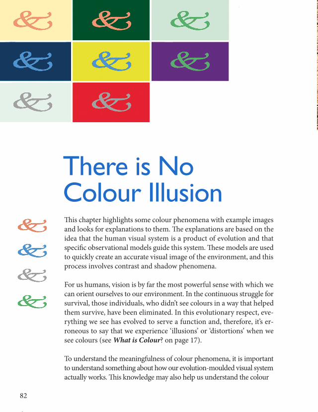
This chapter highlights some colour phenomena with example images and looks for explanations to them. The explanations are based on the idea that the human visual system is a product of evolution and that specific observational models guide this system. These models are used to quickly create an accurate visual image of the environment, and this process involves contrast and shadow phenomena.
For us humans, vision is by far the most powerful sense with which we can orient ourselves to our environment. In the continuous struggle for survival, those individuals, who didn’t see colours in a way that helped them survive, have been eliminated. In this evolutionary respect, eve-rything we see has evolved to serve a function and, therefore, it’s er-roneous to say that we experience ‘illusions’ or ‘distortions’ when we see colours (see What is Colour?onpage17).
To understand the meaningfulness of colour phenomena, it is important to understand something about how our evolution-moulded visual system actually works. This knowledge may also help us understand the colour
There is No Colour Illusion
82
23
82
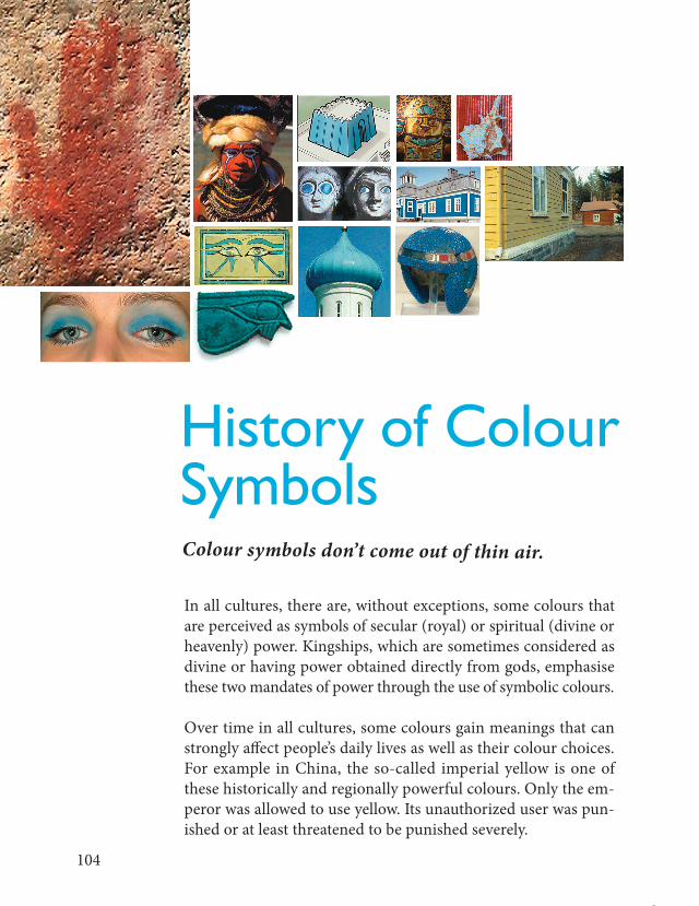
In all cultures, there are, without exceptions, some colours that are perceived as symbols of secular (royal) or spiritual (divine or heavenly) power. Kingships, which are sometimes considered as divine or having power obtained directly from gods, emphasise these two mandates of power through the use of symbolic colours.
Over time in all cultures, some colours gain meanings that can strongly affect people’s daily lives as well as their colour choices. For example in China, the so-called imperial yellow is one of these historically and regionally powerful colours. Only the em-peror was allowed to use yellow. Its unauthorized user was pun-ished or at least threatened to be punished severely.
History of Colour SymbolsColour symbols don’t come out of thin air.
104

24
Our built environment usually includes buildings from dif-ferent ages, which give the scenery cultural depth. One sig-nificant part of this environment is colour, and its effect on the environment is usually larger than we think.
Public FacadesWhenwethinkaboutthecultural values of our environment and the colours of buildings in it, we may well ask such ques-tions as, why doesn’t bright sky blue sit well as the colour of acountryhouse?Orwhydoesn’tgrassgreenseemrightonanoldwoodenchurch?Orwhywouldadetachedhousewithanintenselypurpleplinthjustlookabitgoofy?Theanswer
Colours and Cultural Landscape
126
25
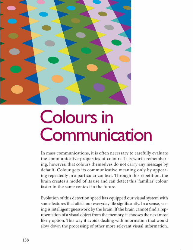
In mass communications, it is often necessary to carefully evaluate the communicative properties of colours. It is worth remember-ing, however, that colours themselves do not carry any message by default. Colour gets its communicative meaning only by appear-ing repeatedly in a particular context. Through this repetition, the brain creates a model of its use and can detect this ‘familiar’ colour faster in the same context in the future.
Evolution of this detection speed has equipped our visual system with some features that affect our everyday life significantly. In a sense, see-ing is intelligent guesswork by the brain. If the brain cannot find a rep-resentation of a visual object from the memory, it chooses the next most likely option. This way it avoids dealing with information that would slow down the processing of other more relevant visual information.
Colours in Communication
138

26
A)H D S = Hues are identical, but their darkness and satu-ration are different.
B) H D S = Hues and darkness are different, but saturation is identical.C) H D S = Hues and saturation are identical, but density is different.D) H D S = Hues and saturation are different, but darkness is identical.E) H D S = Hues and darkness are identical, but saturation is different.F) H D S = Hues are different, but their darkness and satu-
ration are identical.
Defining a colour’s purity visually is, of course, very difficult – especially in option F. The problem is that yellow turns towards green when it is darkened on a computer screen or using black pigment. Again, thisshows that theory and practice will be in coflict, if we try to define colours as physi-cal entities: yellow doesn’t seem to have any dark (subsaturated) forms at all. (See chap-ter Blueshift.)
Colour combinations: A) light and cold B) dark and cold C) dark and warm D) light and warm.
The colours in this printed example image can only be indicative.
148
27
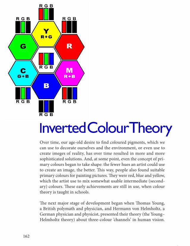
Over time, our age-old desire to find coloured pigments, which we can use to decorate ourselves and the environment, or even use to create imeges of reality, has over time resulted in more and more sophisticatedsolutions.And,atsomepoint,eventheconceptofpri-mary colours began to take shape: the fewer hues an artist could use to create an image, the better. This way, people also found suitable primary colours for painting pictures. They were red, blue and yellow, which the artist use to mix somewhat usable intermediate (second-ary) colours. These early achievements are still in use, when colour theory is taught in schools.
The next major stage of development began when Thomas Young, a British polymath and physician, and Hermann von Helmholtz, a German physician and physicist, presented their theory (the Young–Helmholtz theory) about three-colour ’channels’ in human vision.
Inverted Colour Theory
162

28
Theoretical conditions were favourable also for communication tech-nology innovations, when James Clerk Maxwell, a Scottish scientist, did further experiments with colour negatives in 1870s. His innova-tions eventually lead to the development of colour separation tech-nology for printing, and we can now admire colourful four-colour prints and enjoy lifelike colour images on television and computer displays (see pages 58 and 59).
Today, technology is already so advanced that we know how to pro-duce a digital image with nearly monochromatic LED lights (LED, light-emitting diode). This begs the inevitable question: how is it, in turn, possible that the human visual system can produce a full-colour visual image from an image that has been created only with narrow-spectrumRGBlights(seepage182)?
In a way, creating RGB images with monochromatic LED lights is an inversion of how our own three-colour-channel visual system works. From this perspective, we will inevitably come to a conclusion that the overlapping operation of different types of retinal cone cells is, of course, a physiological fact (see page 28), but that this overlapping is by no means necessary for seeing colours (see page 77).
Towards Usable Colour Theory
This chapter summarizes some factors, that have been presented in this book and that form a basis for a useful colour theory.
In colour education, it is often a habit (some would say necessary) to teach as many different colour theories as possible. On the back-ground of this practice is apparently a belief that the more theories students know, the better they are able to use colours correctly and somehow ‘scientifically more competently’ explain colour phenom-ena.Butdoesthispracticehavearationaljustification?Wouldn’titbe better to embrace just one theory that explains colour phenom-ena as broadly as possible and does it so that anyone can test how welltheorymeetsreality?
163

29