Embed Size (px)
Citation preview
Immersive Insights: A Hybrid Analytics System forCollaborative Exploratory Data Analysis
Marco CavalloIBM Research
Mishal DholakiaIBM Research
Matous HavlenaIBM Research
Kenneth OcheltreeIBM Research
Mark PodlaseckIBM Research
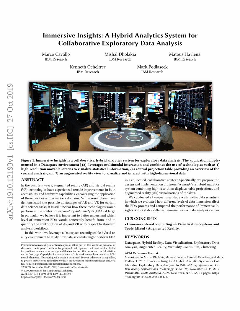
Figure 1: Immersive Insights is a collaborative, hybrid analytics system for exploratory data analysis. The application, imple-mented in a Dataspace environment [18], leverages multimodal interaction and combines the use of technologies such as 1)high-resolution movable screens to visualize statistical information, 2) a central projection table providing an overview of thecurrent analysis, and 3) an augmented reality view to visualize and interact with high-dimensional data.
ABSTRACTIn the past few years, augmented reality (AR) and virtual reality(VR) technologies have experienced terrific improvements in bothaccessibility and hardware capabilities, encouraging the applicationof these devices across various domains. While researchers havedemonstrated the possible advantages of AR and VR for certaindata science tasks, it is still unclear how these technologies wouldperform in the context of exploratory data analysis (EDA) at large.In particular, we believe it is important to better understand whichlevel of immersion EDA would concretely benefit from, and toquantify the contribution of AR and VR with respect to standardanalysis workflows.
In this work, we leverage a Dataspace reconfigurable hybrid re-ality environment to study how data scientists might perform EDA
Permission to make digital or hard copies of all or part of this work for personal orclassroom use is granted without fee provided that copies are not made or distributedfor profit or commercial advantage and that copies bear this notice and the full citationon the first page. Copyrights for components of this work owned by others than ACMmust be honored. Abstracting with credit is permitted. To copy otherwise, or republish,to post on servers or to redistribute to lists, requires prior specific permission and/or afee. Request permissions from [email protected] ’19, November 12–15, 2019, Parramatta, NSW, Australia© 2019 Association for Computing Machinery.ACM ISBN 978-1-4503-7001-1/19/11. . . $15.00https://doi.org/10.1145/3359996.3364242
in a co-located, collaborative context. Specifically, we propose thedesign and implementation of Immersive Insights, a hybrid analyticssystem combining high-resolution displays, table projections, andaugmented reality (AR) visualizations of the data.
We conducted a two-part user study with twelve data scientists,in which we evaluated how different levels of data immersion affectthe EDA process and compared the performance of Immersive In-sights with a state-of-the-art, non-immersive data analysis system.
CCS CONCEPTS•Human-centered computing→ Visualization Systems andTools;Mixed / Augmented Reality.
KEYWORDSDataspace, Hybrid Reality, Data Visualization, Exploratory DataAnalysis, Augmented Reality, Virtuality Continuum, Clustering
ACM Reference Format:Marco Cavallo,Mishal Dholakia,MatousHavlena, KennethOcheltree, andMarkPodlaseck. 2019. Immersive Insights: A Hybrid Analytics System for Col-laborative Exploratory Data Analysis. In 25th ACM Symposium on Vir-tual Reality Software and Technology (VRST ’19), November 12–15, 2019,Parramatta, NSW, Australia. ACM, New York, NY, USA, 12 pages. https://doi.org/10.1145/3359996.3364242
arX
iv:1
910.
1219
3v1
[cs
.HC
] 2
7 O
ct 2
019
VRST ’19, November 12–15, 2019, Parramatta, NSW, Australia Cavallo, et al.
1 INTRODUCTIONExploratory Data Analysis (EDA) is the process of performing ini-tial inquiries on a dataset, with the goal of discovering interestingpatterns, spotting anomalies, testing hypotheses and checking as-sumptions [74]. In order to make sense of data, data scientists com-bine many graphical and numerical techniques, drawing elementsfrom statistical inference, clustering analysis, dimensionality re-duction, and sensitivity analysis. In this sense, there is no standardworkflow for performing EDA, which, in its current form, vastlyvaries based on the type of data and on the assumptions that ananalyst wants to assess. Scripting frameworks (e.g. R, Matlab) anddata visualization tools have been developed to assist data scien-tists during the EDA process, but are mostly desktop-based anddo not provide support for collaborative analysis. Over time, re-searchers have repeatedly tried to propose immersive technologies(such as CAVE systems [23–25, 51], powerwalls [52, 53], and virtualand augmented reality headsets) as a possible solution for specificdata science tasks, defining a research area known as ImmersiveAnalytics [19, 54]. The technological improvements and hardwarecommoditization of head-mounted-displays (HMDs) of the past fewyears have reignited interest in applying these devices to domainssuch as EDA, and a few companies have even proposed some firstVR-based commercial solutions [1, 5]. Despite many successful re-search demos and various marketing campaigns showcasing theadvantages of full immersion and natural interaction with 3D data,no standalone AR/VR software tool—to the best of the authors’knowledge—has been able to contend with the complexity of collab-orative EDA at large and therefore compare favorably with existingdesktop-based software tools.
In this work, we take a step back and ask ourselves which level ofimmersion a fully-fledged exploratory data analysis session wouldactually benefit from. To delve into this, we leveraged a Dataspace[18] hybrid reality system, a reconfigurable room-scale environ-ment that builds on the legacy of CAVE2 and other smart workspaceconcepts [29, 39, 47, 65, 66], and is characterized by unique flexibledata immersion capabilities. In particular, we introduce ImmersiveInsights, a hybrid analytics Dataspace application for collaborativeexploratory data analysis. Immersive Insights attempts to cover abroad range of EDA tasks (including statistical analysis, dimension-ality reduction and clustering) in the context of tabular data analysis,freely taking inspiration from the state-of-the-art, desktop-basedclustering tool Clustrophile 2 [17].
We evaluated Immersive Insights through a two-part user studyinvolving twelve data scientists. In the first part, participants per-formed a set of EDA tasks using Immersive Insights in differentmodalities (the Dataspace environment only, AR integration, ARstandalone, VR standalone), allowing us to time their performanceat different levels of immersion. The second part of the study com-pares Immersive Insights with its desktop-based counterpart Clus-trophile 2, attempting to quantify the eventual performance im-provement achieved through immersive technologies during a morecomplex EDA session.
In the following, we first review the literature on data visual-ization for EDA, from standard desktop-based tools to immersiveenvironments and AR/VR headsets. Then we briefly describe theDataspace environment, and articulate the rationale underlying
our Immersive Insights implementation. We then describe our userstudy and its results, concluding with a few considerations regard-ing the integration of new technologies into EDA and the future ofcollaborative data analysis.
2 RELATEDWORKWe have built our work upon existing software, and the extantliterature on EDA, specifically those tools and texts concerningdimensionality reduction and clustering analysis with statisticalsupport. We first consider how state-of-the-art desktop-based toolsare currently being used for EDA, and then discuss how researchershave previously attempted to employ immersive environments suchas CAVEs, tiled-display walls and head mounted displays (HMDs)for visual data exploration and analysis.
2.1 Tools for Exploratory Data Analysis2.1.1 Visualizing High-dimensional Data. Dimensionality reduc-tion (DR) is the process of reducing total features (variables, dimen-sions) in the data, for purposes of preprocessing or visualization. Forexample, algorithms such as PCA [73] are often used to reduce totaldimensions to two, so as to visualize high-dimensional data on a 2Dplane (e.g. in the form of a scatterplot) and therefore interpret simi-larities among data points and possible structures. Due to the lackof a clear mapping between the axes generated by DR techniquesand the original data dimensions, earlier work in data analysis hasproposed various tools and techniques to guide users in explor-ing low-dimensional projections of data [28, 48]. Methods such asrotation and isolation [33] enable the user to interactively rotatemultivariate data, and statistical information can be used to struc-ture possible visualizations of the data [6, 17, 27, 70, 76, 79, 80]. Sincelow-dimensional projections are generally lossy representationsof high-dimensional data relations, researchers have introducedvisual methods to convey and correct dimensionality reduction er-rors [7, 20, 45, 71]. Similarly, enhanced biplots [22, 34] and prolines[16, 30] have been introduced to visualize the contribution of datafeatures to the DR plane. Researchers have also used direct ma-nipulation to interactively modify data through DR visualizations[38, 60] and out-of-sample extrapolation [11, 75]. A recent what-if-analysis example is represented by the forward and backwardprojection interaction introduced by Praxis [16].
2.1.2 Identifying Structures in the Data. Clustering is the task ofgrouping sets of objects so that members of the same group (“clus-ter”) are more similar to each other than to those in other groups,according to some specific distance measure. Combined with sta-tistical analysis, clustering is often used in EDA to discover andcharacterize salient structures in a dataset [37, 81]. To improveuser understanding of clustering results across domains, early in-teractive systems introduced the use of coordinated visualizationswith drill-down/up capabilities [69] and the visual comparison ofdifferent clustering results [15, 46, 50, 63, 69]. To contextualize thevarious assignments generated by clustering algorithms, tools suchas ClustVis [56], Clustrophile [26] and ClusterVision [44] coordi-nate visualizations of discrete clusterings with scatterplot visualiza-tions of dimensionality reductions. Correlation and ANOVA-basedsignificance analyses are seamlessly integrated in the clusteringprocess in Clustrophile 2 [17].
Immersive Insights VRST ’19, November 12–15, 2019, Parramatta, NSW, Australia
Immersive Insights takes inspiration from Clustrophile 2’s com-bination of data projections, clustering results, distributional in-formation and significance testing, and complements them withaggregate views to facilitate collaborative analysis.
2.2 Immersive Data Visualization2.2.1 Virtual Reality Theaters and Tiled Display Walls. Due to thecontinuous growth in size and complexity of data digitally collectedand stored, researchers have tried to find ways to make sense ofthese datasets through the development of new visualization in-struments. While desktop-based applications can provide overviewinformation through summarization, abstraction, and focus-plus-context techniques, the necessity of fitting vast quantities of dataon a single display is often detrimental to multi-scale data explo-ration [59]. By surrounding users with visuals through “immersion,”physical data visualization systems have been effective in allowingusers to explore 3D spatial data (such as molecules, astrophysicalphenomena, and geoscience datasets) and high-dimensional datain general [55]. CAVE (CAVE Automatic Virtual Environment), in-troduced in 1992, was a cube measuring 10 feet on each side, andutilized a set of projectors to allow a small number of researchers toexperience stereoscopic 3D graphics on five of its sides. Leveragingimprovements in LCD technologies made in the early 2000s, tileddisplay walls (also known as “powerwalls”) gradually arose as aviable alternative to CAVE systems, offering superior image qualityand resolutionwith relatively lowmaintenance. Despite renouncingstereoscopic 3D rendering, display walls still enabled the visualiza-tion of large datasets, and provided both detail and context. Thisshift opened up new possibilities for collaborative data analysis, asdemonstrated by the use of SAGE [67] (and later SAGE2 [53]) inthe EVL Cybercommons room [43, 52]. In recent years, researchershave explored a number of ways to further improve on these twotechnologies [25, 51], by sensibly increasing resolution [62], pro-viding more flexibility in screen configuration [64], integratingmobile devices [36, 42], and exploring interaction with artificialagents [29, 77]. CAVE2 [32], a system composed of 72 cylindrically-positioned displays, aimed at combining the effectiveness of CAVEsystems in visualizing 3D datasets with the capabilities of morerecent ultra-high-resolution environments, which were a better fitfor 2D data visualization. By combining the SAGE [67] tiled displaysystem and OmegaLib [31] virtual reality middleware, CAVE2 en-abled researchers to seamlessly interact with large collections of2D and 3D data, providing the first full implementation of a HybridReality Environment (HRE) [32].
2.2.2 HMD-based Immersive Analytics. While CAVE was originallyintroduced as an alternative to existing bulky desk-based head-mounted displays (HMDs) [72], recent technological advances havedrastically improved the resolution, field of view, form factor andavailability of virtual and augmented reality headsets, which haveonce again become tractable tools for data visualization [19, 54]. Infact, HMD-based Immersive Analytics [21] provide an effective so-lution to the high cost, complex maintenance, and scalability limitsof immersive environments [61]. Millais et al. [58] demonstrate theadvantages of using immersion for data exploration in virtual real-ity, while Butscher et al. [14] examine how immersive technologiescan facilitate collaborative analysis to better detect clusters, trends
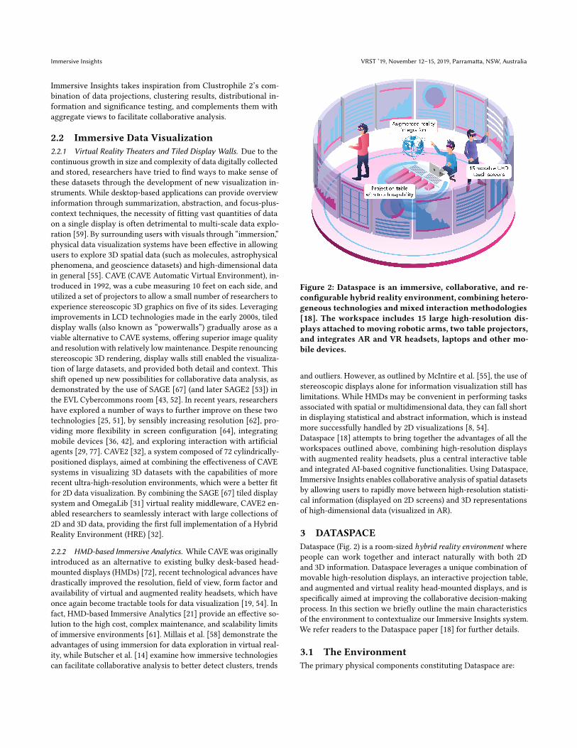
Figure 2: Dataspace is an immersive, collaborative, and re-configurable hybrid reality environment, combining hetero-geneous technologies and mixed interaction methodologies[18]. The workspace includes 15 large high-resolution dis-plays attached to moving robotic arms, two table projectors,and integrates AR and VR headsets, laptops and other mo-bile devices.
and outliers. However, as outlined by McIntire et al. [55], the use ofstereoscopic displays alone for information visualization still haslimitations. While HMDs may be convenient in performing tasksassociated with spatial or multidimensional data, they can fall shortin displaying statistical and abstract information, which is insteadmore successfully handled by 2D visualizations [8, 54].Dataspace [18] attempts to bring together the advantages of all theworkspaces outlined above, combining high-resolution displayswith augmented reality headsets, plus a central interactive tableand integrated AI-based cognitive functionalities. Using Dataspace,Immersive Insights enables collaborative analysis of spatial datasetsby allowing users to rapidly move between high-resolution statisti-cal information (displayed on 2D screens) and 3D representationsof high-dimensional data (visualized in AR).
3 DATASPACEDataspace (Fig. 2) is a room-sized hybrid reality environment wherepeople can work together and interact naturally with both 2Dand 3D information. Dataspace leverages a unique combination ofmovable high-resolution displays, an interactive projection table,and augmented and virtual reality head-mounted displays, and isspecifically aimed at improving the collaborative decision-makingprocess. In this section we briefly outline the main characteristicsof the environment to contextualize our Immersive Insights system.We refer readers to the Dataspace paper [18] for further details.
3.1 The EnvironmentThe primary physical components constituting Dataspace are:
VRST ’19, November 12–15, 2019, Parramatta, NSW, Australia Cavallo, et al.
• 15 UHD displays with touch capability, which can be moved androtated in space via robotic arms mounted to the ceiling.
• A central table onto which visual content can be displayedthrough two HD projectors. Touch and gestures performed onthe table are detected through a set of eight Kinect v2 sensors.
• A spatial audio system consisting of 20+2 speakers, and an arrayof four directional microphones that can be used to detect voicecommands and their sources.
• A set of augmented reality headsets (currentlyMicrosoft Hololensand Magic Leap One devices) to interact with spatial or high-dimensional data, often visualized atop the central table.
• A set of virtual reality headsets (Samsung Odyssey) to remotelyaccess the environment and its functionalities, providing a vir-tual replica of Dataspace and its content.
Dataspace implements a modular software architecture for 1)safely coordinating robotic arms, 2) detecting and tracking peopleand objects in the environment, 3) controlling screen content and ta-ble projections, 4) interpreting speech and generating audio output.The environment adopts web-based rendering through Electron [2],promoting high flexibility for application development (e.g. HTML,WebGL) and support for external devices with browsing capabil-ities (e.g. laptops and smartphones). Thanks to the combinationof UHD screens and AR headsets, Dataspace can simultaneouslyrender high-resolution 2D content and 3D information, and may thusbe referred to as a hybrid reality environment [32]. Dataspace canprovide flexible data immersion through its capability to dynami-cally reconfigure screens in space and through seamless integrationwith AR and VR devices. Thanks to its spatial awareness systemfeature, Dataspace can leverage the relative positioning of differentenvironmental elements, enabling a wide set of context-aware in-teractions. Examples include automatically performing actions onthe screen(s) closest to a specific user, orienting table content andlighting towards the person who is currently speaking, physicallymoving information closer to the user who just performed a gesture,and moving content to different screens through gaze or AR/VRcontrollers.
4 IMMERSIVE INSIGHTSImmersive Insights is a web-based system specifically developedfor Dataspace, and aimed at enhancing the EDA experience of agroup of data scientists who want to make sense of pre-existing,often unlabeled, datasets. The current version of Immersive Insightsfocuses on statistical analysis, clustering, dimensionality reduction,and feature sensitivity analysis. In this section we first outline thedesign challenges characteristic to EDA, and then describe the dataflow, visualizations and interactions associated with the Dataspacescreens, table, and augmented reality extension.
System architecture. Immersive Insights’ front end has been im-plemented with React.js [4] in combination with D3.js [12], andcommunicates through websockets with a back end implementedin Python. The back end takes care of computational tasks by lever-aging standard libraries such as numpy, scikit-learn and pandas,and forwards the results to associated views. Immersive Insightscan be run in development mode on a normal laptop and tested inDataspace, or be directly deployed to the environment as Docker
container. We note that our system does not necessarily requireDataspace to work, and can be accessed from any web browser.
4.1 Design Considerations4.1.1 Getting lost in EDA. Identifying relevant structures in andhaving insights about unlabeled data is a non-trivial process inwhich data scientists iteratively apply a varying set of algorithmsand statistical methods. There is, by definition, no standard wayof performing EDA, and steps such as data preprocessing, dimen-sionality reduction, clustering, and formulation and validation ofhypotheses about the data are continuously and variously used byeach analyst. The absence of a standardized workflow, combinedwith the wide variety of data analysis tasks and algorithms, posesan initial design challenge involving the reproducibility of EDA ses-sions. This problem is exacerbated by the multiscale nature of dataexploration [17]: identifying relevant insights often depends uponthe exploration of many different subsets of the original dataset.Techniques such as filtering, isolation, and sub-clustering are com-monly used to identify and better understand smaller structures inthe data. Similarly, feature selection involves considering subsetsnot of data samples, but of data dimensions (features), in order tostudy their statistical significance. When building software toolsto support EDA, it is inherently difficult to keep track of all theseiterative data transformations, drill-down operations, and the waysdifferent techniques affect various subsets of the data. This is alsothe reason why most general-purpose EDA tools do not supportcollaborative workflows.A second significant challenge is providing a contextualized under-standing of how algorithms apply differently to the data and itsvarious substructures [74]. This generally involves making statis-tical information available to describe the data subset currentlyunder consideration, and the ability to visually and quantitativelycompare that data subset with other subsets, or the original dataset.Standard data visualization techniques such as linked views, focus-and-context, and modal windows are generally used in EDA toolsto provide contextualization and comparison capabilities. However,screen size and resolution can limit the amount of contextual infor-mation that can be simultaneously displayed, often requiring usersto navigate too many tabs or click too many buttons.
4.1.2 The promise of hybrid reality. We propose Immersive Insightsas a possible solution to the aforementioned limitations of EDA:workflow reproducibility, contextualization, comparison, and col-laboration. To keep track of the analysis workflow, we have basedthe design of Immersive Insights on the concept of a “data instance”(also referred to as a “solution”): any unique combination of datasamples and dimensions that originates from the same, originaldataset - and onto which parametric algorithms can be indepen-dently applied. Our definition of a “data instance” is analogous tothe concept of the “clustering view” proposed in [17], where theauthors mention screen size as a limiting factor to the number ofdata instances that can be concurrently analyzed. By redefiningclassic EDA workflows within the virtuality spectrum, and by lever-aging a hybrid reality system with about 20 times the resolutionand 100 times the screen surface of a laptop, we attempt to providea tool with better contextualization and comparison capabilities,supporting simultaneous independent analyses on multiple data

Immersive Insights VRST ’19, November 12–15, 2019, Parramatta, NSW, Australia
instances. To keep track of data instances and foster collaborativeanalysis, we further combine Dataspace screens with AR devicesand the central table, which offers a summary view of the entiresession.
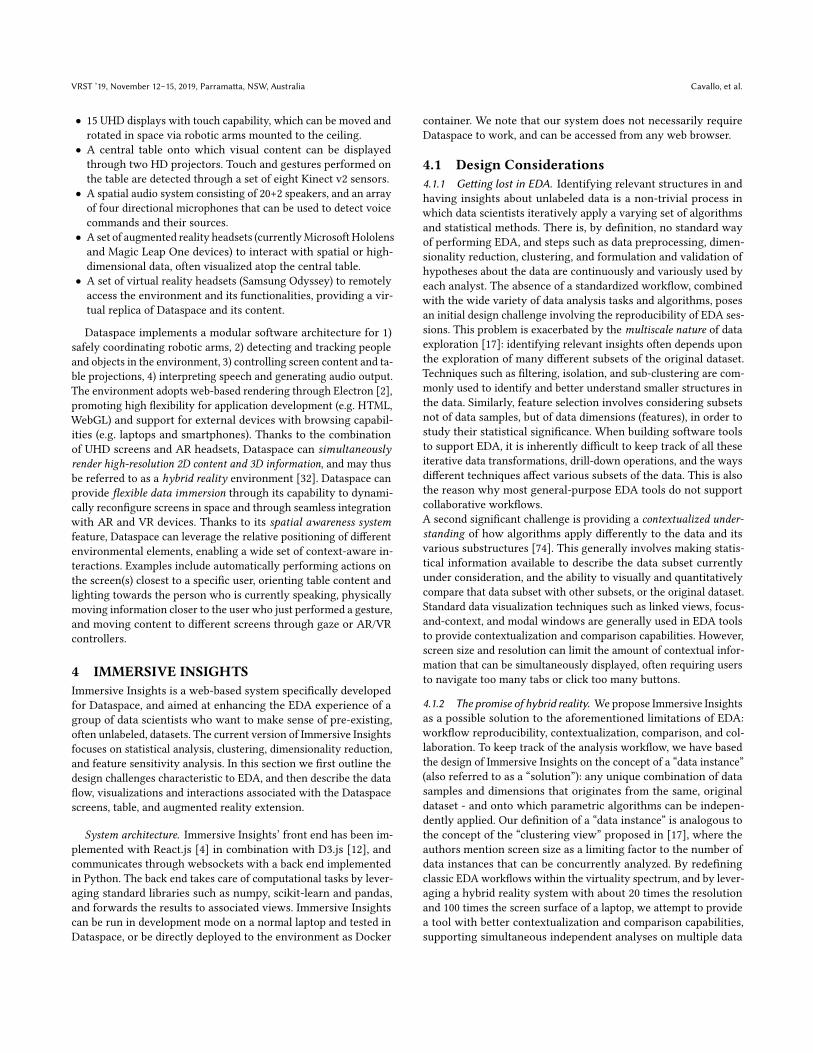
4.2 Data ViewsVisualizations, statistical information, clustering and projectionassociated with a specific data instance are grouped into dedicatedgraphical layouts, called “data views”. Data views can be loadedonto Dataspace screens through voice interaction (e.g. by saying“Show projection view on that screen / on screen number 13”);from the AR headsets; or from a touch menu that can be openedon the table. Whenever a data view is loaded, the robotic armassociated with the screen moves down to bring the screen closer tothe user. By default, each view spans one Dataspace screen, but canbe arbitrarily extended to occupy multiple screens to accommodatelarger amounts of information (e.g. by saying things like “Load Xview on screens Y and Z” or “Extend X to N screens”). Each dataview is bound to a specific data instance (solution), each of whichcan be identified by the frame color of the screen. Thanks to thisfunctionality, the same type of data view can be independently usedon different screens and bound to different data instances. Despitethat the data views implemented in our system largely make use ofexisting visualizations and interaction types [10, 13, 78], we still findit useful to discuss the rationale behind their design in the contextof a hybrid reality environment and as a base for understandingthe user study proposed in Section 4.
4.2.1 Data table (Fig. 3a). It is important to provide users with asimple way to access and form initial intuitions about raw data—down to the scale of a single data sample. The Data Table viewaugments the visualization of data samples with a simple formof outlier detection, and uses color to encode eventual clusteringassignments. Touch and voice interactions can be used to selectand sort data samples, and to “enable or disable” data features (i.e.consider them or not in the analysis). The Data table also plays animportant role in the process of forward and backward projection,explained in Section 3.4. We note that, despite that this view canbe easily extended to multiple screens to show more data features,it still does not scale to high-dimensional datasets [35]—and thisis the reason why we included an option to show only the mostrelevant dimensions identified in the feature selection view.
4.2.2 Projection (Fig. 3b). Dimensionality reduction algorithmsare a convenient way data scientists visualize high-dimensionaldata. Dataspace’s Projection view enables users to specify a dimen-sionality reduction algorithm and a varying number of parameters(e.g. distance metric) and visualize the algorithmâĂŹs output as a2D scatterplot, where each data point is colored according to itsclustering assignment. While a very powerful means to identifystructures and outliers in the data, scatterplots of dimensionallyreduced data generally lack interpretability as to the contribution ofspecific data features to the projection. To mitigate this, we comple-ment the scatterplot visualization with prolines [16], a generalizedversion of biplot [34] that introduces axes representative of theoriginal data dimensions. Each proline axis indicates the relevance
and directionality of increase for a feature, and provides statisti-cal information about that featureâĂŹs distribution. In order toallow further debugging of dimensionality reduction algorithmsand, more specifically, of their distance metrics, the Projection viewincludes a heatmap indicating per-point distances, where rows andcolumns are sorted by clustering assignments. In the case of goodcluster compactness and separation, the heatmap clearly visualizesdifferent “square color patches” along its diagonal. Uniform colorsacross the distance matrix may indicate instead points that are toofar apart from each other in multi-dimensional space (“curse ofdimensionality”), requiring a re-definition of the adopted distancemetric. Scatterplot points and matrix cells in the Projection vieware linked to all other data views associated with the same datainstance, enabling the visualization of contextual information afterperforming a selection on any view.
4.2.3 Clustering (Fig. 3c). Clustering algorithms are generally usedby data scientists to identify groups of data points that have simi-lar features, dividing the dataset into a number of clusters (oftenuser-defined). Each clustering algorithm depends on a varying setof parameters (such as distance metric and number of clusters toapply), and outputs a per-point cluster assignment (“label”) or aprobability of belonging to a certain cluster. In Immersive Insights,these algorithmic choices can be expressed through touch fromthe Clustering view or voice (e.g. by saying, “Apply agglomerativeclustering with 4 clusters to solution 1”), and clustering resultsare broadcasted to all views associated with the current data in-stance. To facilitate the interpretation of clustering assignmentswith respect to cluster sizes and statistical properties of each cluster,Immersive Insights’ Clustering view includes a heatmap visualiza-tion where columns represent clusters and rows represent datafeatures. The color of each matrix cell encodes the average featurevalue for a particular cluster, with red being very high and blue verylow. By looking at a column vertically, users can quickly spot keyfeatures characterizing a cluster; by looking at a specific row, userscan compare the values of multiple clusters based on that feature.A fundamental step in clustering analysis involves evaluating the“goodness” of a clustering result, which is generally quantified interms of cluster compactness and isolation [49]. The Clustering viewdisplays silhouette score [68] as a validation metric, and includes asilhouette plot to help scientists understand which data points willlikely change a clustering assignment when clustering parametersare changed. A line chart with precomputed silhouette scores fur-ther enables users to intuit how cluster separation and compactnessvary based on the choice of number of clusters to consider.
4.2.4 Distribution (Fig. 3d). Statistical information plays a funda-mental role in EDA, and visualizing the distribution of each featurehelps data scientists understand the properties of their data, aswell as debug the outcomes of applying various algorithms (e.g.normalization, skewness of data). Therefore, our distribution viewincludes distributional information on features, in the form of sum-mary statistics, histograms and box plots. In particular, we usecolored overlays and side-to-side summaries to enable statisticalcomparison of identified structures (selections, clusters) with re-spect to the full-dataset distribution. This allows users to intuit thesize of each cluster, its differentiating features, and its impact ondetermining the global data distribution.
VRST ’19, November 12–15, 2019, Parramatta, NSW, Australia Cavallo, et al.
Figure 3: Sample data views. Detailed statistical information on data instances is visualized in “data views,” graphical layoutsthat can be dynamically loaded onto theDataspace screens. Each data view is associatedwith a specific data instance or solution,and can be extended to multiple screens. The figure above shows a) a data table view, b) a projection view, c) a clustering view,and d) a distribution view. Please refer to the supplemental video for a more complete picture of available data views.
4.2.5 Correlation. Identifying relevant correlations among datadimensions is another process fundamental to EDA. On top ofindicating possible predictive relationships among features, cor-relations are also used to generate initial hypotheses about thedata, and for feature selection. In the presence of multiple variablesthat are highly correlated, for instance, data scientists may workto remove noise by electing to keep only one such variable, or bysubstituting in a new feature synthesized from the original ones.Our correlation view displays a bar chart with top pairwise correla-tions, and a scatterplot matrix of pairwise correlations where eachdata point is colored based on its clustering assignment.
4.2.6 Feature selection. Feature selection is the process of decidingwhich of the original data dimensions should be included in ananalysis, or fed into an algorithm. This process aims at improv-ing computational performance during analysis, removing noisedata, or improving estimators’ accuracy scores on high-dimensionaldatasets. We consider two types of feature selection: algorithmsthat can be applied to fully unsupervised data (e.g. PCA, variance,feature agglomeration) and algorithms that rely on labels gener-ated during the clustering process (e.g. univariate selection withchi squared or ANOVA). In the former case, features are rankedbased on variation in their distributional information; in the lat-ter, features are ranked based on their relevance (p-value, effectsize) in determining a specific clustering outcome. Users can man-ually decide to enable or disable features or allow the system toautomatically select the most n relevant ones.
4.2.7 Feature filtering and engineering. Successful EDA requiresthe ability to consider meaningful selections from the original data,and alternatively focus analysis on these subsets. For this reason,we include a filtering feature that allows users to select data samplesbased on AND/OR combinations of different equality and inequalityconstraints. These constraints are defined through touch, voice, orkeyboard input. Once a selection is made or a filter applied, the
chosen points are highlighted in all views associated with thisdata instance. The user may also perform isolation and reprojection,which, respectively, hide all non-selected points from all views, andupdate scatterplots of dimensionally reduced data by recomputingtheir projections only on the selected samples. Immersive Insightsfurther allows users to add new features to the dataset that aregenerated as combinations of existing features, a process oftenreferred to as “feature engineering”.
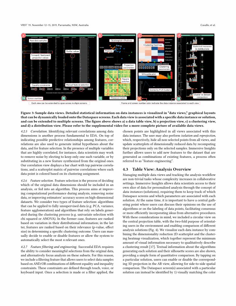
4.3 Table View: Analysis OverviewManaging multiple data views and tracking the analysis workfloware non-trivial tasks whose complexity increases in collaborativesettings. Immersive Insights allows data scientists access to theirown slice of data for personalized analysis through the concept ofdata instances (solutions), requiring them to keep track of whichDataspace screens and which parameters are associated with eachsolution. At the same time, it is important to have a central gath-ering point where users can discuss their opinions on the use ofalgorithms or on the labeling of data points, facilitating consensusor more efficiently incorporating ideas from alternative procedures.With these considerations in mind, we included a circular view onthe central projection table, with the two-fold purpose of orientat-ing users in the environment and enabling comparison of differentanalysis solutions (Fig. 4). We visualize each data instance by com-bining the dimensionality reduction 2D scatterplot and the cluster-ing heatmap visualization, which together represent the minimumamount of visual information necessary to qualitatively describea clustering result [17]. Textual information about the algorithmsgenerating each solution and their silhouette scores are also shown,providing a simple form of quantitative comparison. By tapping ona particular solution, users can enable or disable the correspond-ing 3D projection in the AR view, allowing for side-to-side spatialcomparison. The Dataspace screen(s) associated with a particularsolution can instead be identified by 1) visually matching the color
Immersive Insights VRST ’19, November 12–15, 2019, Parramatta, NSW, Australia
Figure 4: Table view. Visual content is projected onto the cen-tral table, providing an overview of the current state of theanalysis and a list of solutions identified by data scientists.To help users locate content in the environment, an outerring displays which data views have been loaded onto Datas-pace screens. Touch interaction can be used to rotate tablecontent towards a particular user through the “orientationring” and to manage data views.
of the solution on the table with the color of the frame of particularDataspace screen(s), 2) by double-tapping a solution on the table, anaction that highlights associated data views and physically bringstheir screens closer to the table, and 3) by referring to the colorsdisplayed in the outer ring of the Table view. In fact, we have in-cluded two interactive rings on the table. The outer ring is dividedinto small sections of variable radius, each representing a data viewand its associated Dataspace screen(s). A user studying the dataview on the table in front of him/her can simply look up and findthat same view on the screen(s) ahead. When comparing resultsat the table and preparing for the next steps in the analysis, it isoften necessary to reorganize data views. The outer ring supportsdrag-and-drop interactions, allowing users to move a view to adifferent screen, extend it to multiple screens, or clear that view.The inner “orientation” ring, on the other hand, is used to rotatethe central content of the Table view towards a particular user [41].
4.4 Augmented Reality IntegrationImmersive Insights supports the optional use of augmented realityheadsets (Microsoft Hololens and Magic Leap One) to complementthe data analysis experience. AR devices are used to visualize dataatop the central table, but also to provide guidance and informa-tion on-demand when interacting with specific Dataspace views.Thanks to the environment’s spatial awareness system, AR-specificinteraction such as the use of gaze and airtap (Hololens) and 3D con-trollers (Magic Leap One) are transformed through raycasting into
touch-equivalent events, enabling AR users to perform standardoperations on Dataspace screens from a distance.
Enhanced exploration of high-dimensional data. Thanks to theirability to visually summarize a data instance immediately uponbeing looked at, projection views of dimensionally reduced data(Section 3.2.2) are arguably the most used type of view in ImmersiveInsights. While they provide users with quick, qualitative intuitionsregarding the effects of any algorithm applied to the data, they alsogenerally require the user to turn back and forth in order to lookat other complementary views (e.g. clustering, distribution) andquantify the results. Hence, in Immersive Insights we propose atridimensional, AR version of the Dataspace projection view, to bevisualized atop the central table. This makes the view simultane-ously visible to all AR users from any location, and allows a seamlesstransition from AR content to detailed statistical information on theenvironment’s screens. The ability to visualize an extra dimensionin the dimensionality reduction, and the larger surface (volume)available for the projection, together represent an opportunity toimprove the interpretability of projection axes, reduce visual clutter,and introduce direct manipulation of data samples. To support sen-sitivity and what-if analysis, we have introduced a tridimensionalgeneralization of the forward and backward projection interactionsoriginally proposed by Cavallo in [16]. Through forward projection,the user can specify through voice (or manually from the Data tableview) a perturbation in the feature values of a selected data sample(e.g. “Try increasing the <feature> value of this data point by 5”),and observe how the position of the point changes via an animationdisplayed in the AR projection view. Conversely, a data scientist canuse backward projection by manually dragging a data point aroundin the projection space, and observing how its feature values wouldhave to change to accommodate the introduced modification. Forexample, a user might consider an outlier data point, questioninghow that point’s feature values would have to change in order forit to belong to the neighboring cluster. Simply dragging the pointcloser to that cluster helps quantify how much each feature hasdetermined the point’s distance from the cluster. We refer readersto the original paper [16] for more details on prolines and forwardand backward projections.
Providing guidance during the EDA workflow. On top of using itfor a dedicated central projection view, we leverage AR to providefurther visual assistance to users during interactions with stan-dard Dataspace views. When the wearer of an AR headset looks at(Hololens) or orients their controller towards (Magic Leap One) adata view, an AR overlay frame is created around the view and acursor is rendered on the physical screen through raycasting, clari-fying which UI elements the user is interacting with. This feature isparticularly useful for managing tracking or alignment issues asso-ciated with the relationship between the AR view and the physicalenvironment. Similarly, when an action is performed on the data,all views affected by this change are momentarily highlighted in theAR view and virtual arrows are used to indicate updates in viewssituated behind the user. Similarly, speech transcription in AR al-lows for real-time feedback when using voice commands, providinga way to debug unsuccessful commands and minimizing the timeit takes to correct them (e.g. in the case of incorrectly spelling analgorithm’s name). Finally, AR can be used to provide on-demand
VRST ’19, November 12–15, 2019, Parramatta, NSW, Australia Cavallo, et al.
information specific to each data view. Due to screen space andreadability limitations, it is unreasonable to permanently add moreinformation (such as suggestions or feedback on the choice of algo-rithms) to existing data views. However, augmented reality allowsus to dynamically display additional information without modify-ing the layout of existing views, and personalize that informationfor the user who currently needs it. Current implementations ofthis feature, activated by user proximity to a screen, include bubbleoverlays with statistical information (e.g. area distribution chartsin the Feature selection view, ANOVA p-values in the Clusteringview) and simple virtual UIs to facilitate certain tasks (e.g. a sliderto modify the number of clusters in the Clustering view).
5 EVALUATIONWe illustrate here the procedure and results of an initial, two-partuser study conducted on 12 data scientists using Immersive In-sights. The goal of the first part of the study was to evaluate thecontributions and limitations of immersive technologies in EDA atvarious levels of the virtuality continuum [57], leveraging the flexi-ble data immersion capability of Dataspace and its virtual model[18]. Specifically, we had participants perform very specific dataanalysis tasks with Immersive Insights in four different Dataspacemodalities (Fig. 5): 1) without AR integration, 2) with AR integra-tion, 3) using a virtual representation of Dataspace in AR (i.e. usingvirtual screens in place of the physical ones), and 4) fully immersedin VR. In the second part of the study, our goal was to evaluate theeffectiveness of Immersive Insights in allowing data scientists tocollaboratively generate insights, comparing our system with therecent desktop-based tool Clustrophile 2. As opposed to the firstpart of the study, here we focused on the data analysis session asa whole, allowing participants complete freedom while collabo-ratively solving a single, complex task. We compared ImmersiveInsights with Clustrophile 2 for two main reasons: 1) Clustrophile2 is a fully-implemented system that extends beyond the scope ofa simple research prototype, allowing for an end-to-end analysissession; and 2) despite differences among technologies employed,the two systems share a similar design and present almost equiv-alent functionality. Finally, we conclude by analyzing our resultsand provide some considerations regarding the use of immersivetechnologies for collaborative data analysis.
Participants. We recruited a total of twelve data scientists, fourfor each of the three data analyst archetypes (hacker, scripter, andapplication user) identified by Kendel et al. [40]. In addition toensuring full coverage of different types of users, this choice ofparticipants made it easier to compare the performance of oursystem to the results obtained in the Clustrophile 2 user study.Participants were selected from among 20 candidates who hadat least a masters degree in science or engineering and at leasttwo years of work in data science. Selections were made so as tomaintain gender parity, with ages ranging from 25 to 43 years old.
Procedure. Participants were shown a 10-minute video on userinteractions in Dataspace, then individually introduced to the phys-ical environment. Assisted by one of our collaborators, participantswere then invited to freely analyze a toy dataset focused on indicesof wellness for 34 OECD countries [3]. Initially, each participant
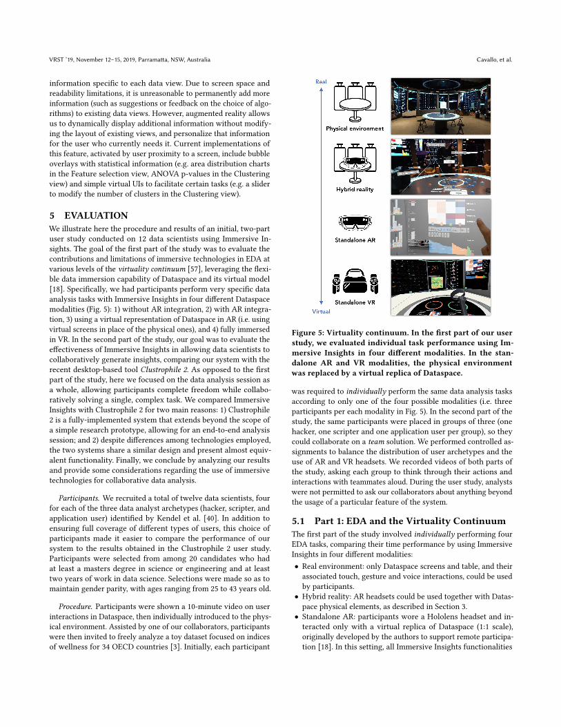
Figure 5: Virtuality continuum. In the first part of our userstudy, we evaluated individual task performance using Im-mersive Insights in four different modalities. In the stan-dalone AR and VR modalities, the physical environmentwas replaced by a virtual replica of Dataspace.
was required to individually perform the same data analysis tasksaccording to only one of the four possible modalities (i.e. threeparticipants per each modality in Fig. 5). In the second part of thestudy, the same participants were placed in groups of three (onehacker, one scripter and one application user per group), so theycould collaborate on a team solution. We performed controlled as-signments to balance the distribution of user archetypes and theuse of AR and VR headsets. We recorded videos of both parts ofthe study, asking each group to think through their actions andinteractions with teammates aloud. During the user study, analystswere not permitted to ask our collaborators about anything beyondthe usage of a particular feature of the system.
5.1 Part 1: EDA and the Virtuality ContinuumThe first part of the study involved individually performing fourEDA tasks, comparing their time performance by using ImmersiveInsights in four different modalities:• Real environment: only Dataspace screens and table, and theirassociated touch, gesture and voice interactions, could be usedby participants.
• Hybrid reality: AR headsets could be used together with Datas-pace physical elements, as described in Section 3.
• Standalone AR: participants wore a Hololens headset and in-teracted only with a virtual replica of Dataspace (1:1 scale),originally developed by the authors to support remote participa-tion [18]. In this setting, all Immersive Insights functionalities
Immersive Insights VRST ’19, November 12–15, 2019, Parramatta, NSW, Australia
were preserved, but physical screens and table were replacedby digital counterparts, and touch interactions were taken overby raycasting and airtap gestures. Voice commands were stillenabled thanks to the device’s microphone.
• Standalone VR: similar to the AR standalone setting, participantsused a virtual replica of the Dataspace environment, but werecompletely immersed in VR through a Samsung Odyssey head-set. The usual touch interactions were replaced by raycastingthrough the Samsung Odyssey controllers, who could also beused to move around the virtual environment using the standardteleportation feature.
The dataset used for the experiment consisted of 200 samples ran-domly chosen from a larger database of Fitbit activity recordings.Each row was associated with the activity levels of single subjectover a period of three months, and was characterized by 19 datadimensions, including average number of steps during weekdaysand weekends, gender and age information, and other indices suchas stress and wellness score. Each participant performed tasks in-dependently, and, with the exclusion of the first modality, wasrequired to wear the headset (Hololens or Samsung Odyssey) fromthe beginning until the end of the experiment. In all four modalities,participants started each task with the same initial Dataspace con-figuration, composed of a total of 10 Dataspace screens displayingeach of Immersive Insights’ data views. The tasks, selected to benon-trivial and to involve the use of multiple data views, were thefollowing:• T1: Identify the personwith the highest participation rate amongthe cluster of subjects who are mostly active on weekdays. Com-pare that person’s stress and wellness scores with those of theother members of the cluster.
• T2: Explain how age and gender affect preferences regardingdays on which to engage in physical activity among the clusterof less active subjects.
• T3: Find out whether, among the group of most active partici-pants, people who engage in activity on weekdays do so moreregularly than those who prefer to go running on weekends.
• T4: Considering that the subject with ID 1036 cannot currentlychange his workout schedule, suggest and quantify what thisparticipant should do to improve his overall wellness score with-out increasing his stress level.
5.2 Part 2: Hybrid Reality vs Desktop-basedWe compared Immersive Insights to Clustrophile 2 by using thesame dataset and task proposed by Cavallo and Demiralp in theiruser study [17]. Their study design specifically aims at evaluatinga real-world, unconstrained EDA session, where participants areasked to answer a single, open-ended research question. Since nounivocal solution exists, participants can decide when they havereached a satisfiable result, ending the session. The adopted datasethas 8652 rows and 37 features, and is generated by preprocessingpatient data made publicly available by the Parkinson’s ProgressionMarkers Initiative (PPMI). Specifically, this dataset contains UPDRS(Unified Parkinson’s Disease Rating Scale) scores, which consist ofa set of clinical measures describing the severity of each individual’smotor condition. We assigned to each of the four groups of datascientists the task of identifying plausible Parkinson’s phenotypes
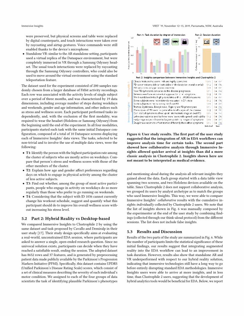
Figure 6: User study results. The first part of the user studysuggested that the integration of AR in EDA workflows canimprove analysis time for certain tasks. The second partshowed how collaborative analysis through Immersive In-sights allowed quicker arrival at insights than did a moreclassic analysis in Clustrophile 2. Insights shown here arenot meant to be interpreted as medical evidence.
and mentioning aloud during the analysis all relevant insights theygained about the data. Each group started with a data table viewspanning two screens, and two Hololens devices available on thetable. Since Clustrophile 2 does not support collaborative analysis,we grouped its users by analyst archetype as to match the groupswho used Immersive Insights. This way, we were able to compareImmersive Insights’ collaborative results with the cumulative in-sights individually collected by Clustrophile 2 users. We note thatthe list of insights shown in Fig. 6 was manually composed bythe experimenter at the end of the user study by combining find-ings (collected through our think-aloud protocol) from the differentsessions. The list does not include false insights.
5.3 Results and DiscussionResults of the two parts of the study are summarized in Fig. 6. Whilethe number of participants limits the statistical significance of theseinitial findings, our results suggest that integrating augmentedreality into the EDA workflow can lead to an improvement intask duration. However, results also show that standalone AR andVR underperformed with respect to our hybrid reality solution,indicating that immersive technologies still have a long way to gobefore entirely disrupting standard EDA methodologies. ImmersiveInsights users were able to arrive at more insights, and in lesstime, than Clustrophile 2 users, suggesting that the development ofhybrid analytics tools would be beneficial for EDA. Below, we report
VRST ’19, November 12–15, 2019, Parramatta, NSW, Australia Cavallo, et al.
some considerations and statistics based on direct observation ofthe participants and post-experiment verbal feedback.
5.3.1 (Confirmed) Limitations and Challenges. While various ex-amples from the literature show that AR and VR headsets can beeffectively used to perform specific data analysis tasks [14, 54, 58],durations recorded in the first part of our study indicate that recenttechnological advances in interaction, resolution, and field of viewof HMD devices are still limiting factors in the application of thesetechnologies to EDA. In the case of standalone AR, the ImmersiveInsights modality that scored the lowest performance, task durationwas considerably affected by interaction with data views throughthe Hololens airtap gesture and the gaze-based pointing technique.In particular, airtap proved to involve a steep learning curve and,despite the enlarged size of UI affordances, gaze tracking was impre-cise when interacting with views from the middle-to-long distance(57% successful airtap attempts overall). We expect this accuracyto improve with the use of the Hololens clicker device, which wasnot available in this study. Limited field of view, a known issuewith Microsoft Hololens, played a crucial role in the standaloneAR modality, forcing users to frequently rotate their heads andtherefore completely lose the advantages of peripheral vision incombining contextual information from multiple (virtual) views.In most cases, participants were required to move very close tovarious views in order to see tables and statistical information,which were otherwise difficult to interpret due to the device’s reso-lution. Standalone VR overall had a better performance than AR,mostly due to the use of hand controllers, the higher resolutionand field of view of the Samsung Odyssey, and to the possibility ofteleporting in the virtual room (e.g. to next to the virtual screens ofinterest). Fine-grained UI control through raycasting, however, stillproved unreliable with respect to touch interaction, and the HMD’spixel-density could not match the high resolution statistical infodisplayed by physical Dataspace screens.The second part of the study, which involved a more prolonged useof these devices, further confirmed discomfort in wearing headsets(group average of 8.1 minutes of intermittent use, about one fourthof the average session duration), gesture interpretation issues (e.g.an involuntary bloom gesture shut down the Immersive Insightsapplication on two headsets), and difficulties with text input (e.g.users fell back to using the Dataspace mechanical keyboard forfiltering operations). Though their use is tempting, we should notyet conclude that modern HMDs and virtual replicas are ready torender more expensive technologies such as physical collaborativeenvironments obsolete.
5.3.2 Collaborative Hybrid Analytics. Immersive technologies promiseto enrich EDA through spatial data analysis, on-demand statisti-cal information, more flexible management of contextual content,and (remote) collaboration. While our user study reported unclearadvantages in utilizing depth information while visualizing highdimensional data [9], the comparison of Immersive Insights withClustrophile 2 demonstrated the potential contributions of a hy-brid reality approach to collaborative data analysis. By summingthe number of parameters applied by each group during a session(e.g. the number of changes in algorithm, metrics, cluster number,and projection), we noted that Immersive Insights users attemptedless parameter changes than Clustrophile 2 users (19.7 vs 27.74
average changes), and performed more simultaneous independentanalyses (2.7 vs 1.83 average data instances), with an overall 21.6%improvement in total time spent. We believe these results are con-nected with 1) the intrinsically collaborative setting of Dataspace(e.g. group discussion limited the trial-and-error approaches seenwith Clustrophile 2), 2) the Table view (e.g. comparing and keepingtrack of data instances), and 3) the enhanced ability to contextualizeprovided by the larger total screen surface and seamless integra-tion with AR augmentations. An average of 1.4 devices were usedby each team during the analysis session, with men wearing theheadset 2.2 times longer than female participants. We also notedan interesting tendency to pass a device to another member of theteam, rather than picking up new devices from the table. To fur-ther our understanding of team dynamics in collaborative hybridanalytics, we plan on conducting a more extensive future study,which will also include an evaluation of how remote collaborationthrough AR and VR may impact the EDA process.
5.3.3 The Need for Flexible Data Immersion. The new wave of ARand VR devices has undoubtedly generated excitement about theirapplicability to many domains, including EDA, and their use hasthe potential to benefit various aspects of data analysis. However,our study confirmed that hardware and comfort limitations stillinhibit the use of Hololens for extended periods of time during theanalysis. We also observed that standalone AR/VR experiences arenot suited for a fully-fledged EDA, as many design and interactionchallenges still need to be addressed. In fact, while voice commands,wand-based selections, and 3D manipulations can be useful forcertain visual analytic tasks, a 2Dmonitor with touch or mechanicalkeyboard input remains significantly more efficient for other tasks.While our community continues researching appropriate ways toapply these technologies to data science, we believe AR and VRshould be cautiously used to complement existing visual analyticsmethodologies, rather than imagined as a possible replacement.In particular, we encourage the development of systems that offermultimodal interaction and a flexible level of data immersion, sothat users are free to decide at any moment which technology andinteractions makes sense to use when performing specific EDAtasks.
6 CONCLUSIONIn this work, we presented Immersive Insights, a hybrid analyt-ics system for exploratory data analysis (EDA) implemented in aDataspace collaborative environment. Leveraging the flexible de-gree of immersion provided by Dataspace through its integrationwith AR and VR devices, we were able to study how these risingtechnologies can contribute to EDA workflows at different levelsof the virtuality spectrum. We also evaluated Immersive Insights bycomparing its performance with a similar desktop-based tool dur-ing a collaborative analysis session. While we acknowledged thatimmersive technologies can contribute to reduced analysis time andmay facilitate the generation of additional insights, we also demon-strated that AR and VR cannot yet entirely replace non-immersiveEDA methodologies. Ultimately, we encourage the developmentof hybrid systems in which immersive technologies do not aim totake over existing EDA workflows, but try to complement theminstead.
Immersive Insights VRST ’19, November 12–15, 2019, Parramatta, NSW, Australia
REFERENCES[1] 3Data: AI + AR + Visual Analytics. https:// 3data.io. Accessed: 2019-07-17.[2] Electron: Build cross platform desktop apps with JavaScript, HTML, and CSS.
https://electronjs.org. Accessed: 2019-07-17.[3] OECD Better Life Index. http://www.oecdbetterlifeindex.org/. Accessed: 2019-
07-17.[4] React.js. https://facebook.github.io/react/. Accessed: 2019-07-17.[5] Virtualitics: Get faster insights through AI+VR. https://virtualitics.com. Accessed:
2019-07-17.[6] Daniel Asimov. 1985. The grand tour: a tool for viewing multidimensional data.
SIAM journal on scientific and statistical computing 6, 1 (1985), 128–143.[7] Michaël Aupetit. 2007. Visualizing distortions and recovering topology in con-
tinuous projection techniques. Neurocomputing 70, 7-9 (2007), 1304–1330.[8] Benjamin Bach, Raimund Dachselt, Sheelagh Carpendale, Tim Dwyer, Christo-
pher Collins, and Bongshin Lee. 2016. Immersive analytics: Exploring futureinteraction and visualization technologies for data analytics. In Proceedings ofthe 2016 ACM on Interactive Surfaces and Spaces. ACM, 529–533.
[9] Benjamin Bach, Ronell Sicat, Johanna Beyer, Maxime Cordeil, and HanspeterPfister. 2017. The hologram in my hand: How effective is interactive explorationof 3D visualizations in immersive tangible augmented reality? IEEE transactionson visualization and computer graphics 24, 1 (2017), 457–467.
[10] Richard A Becker and William S Cleveland. 1987. Brushing scatterplots. Techno-metrics 29, 2 (1987), 127–142.
[11] Yoshua Bengio, Jean-françcois Paiement, Pascal Vincent, Olivier Delalleau, Nico-las L Roux, and Marie Ouimet. 2004. Out-of-sample extensions for lle, isomap,mds, eigenmaps, and spectral clustering. In Advances in neural information pro-cessing systems. 177–184.
[12] Michael Bostock, Vadim Ogievetsky, and Jeffrey Heer. 2011. D3: Data-DrivenDocuments. IEEE TVCG (Proc. InfoVis) 17, 12 (2011), 2301–2309.
[13] Andreas Buja, John Alan McDonald, John Michalak, and Werner Stuetzle. 1991.Interactive data visualization using focusing and linking. In Proceeding Visualiza-tion’91. IEEE, 156–163.
[14] Simon Butscher, SebastianHubenschmid, JensMüller, Johannes Fuchs, andHaraldReiterer. 2018. Clusters, trends, and outliers: How immersive technologies canfacilitate the collaborative analysis of multidimensional data. In Proceedings ofthe 2018 CHI Conference on Human Factors in Computing Systems. ACM, 90.
[15] N. Cao, D. Gotz, J. Sun, and H. Qu. 2011. DICON: Interactive Visual Analysisof Multidimensional Clusters. IEEE Transactions on Visualization and ComputerGraphics 17, 12 (Dec 2011), 2581–2590.
[16] Marco Cavallo and Çağatay Demiralp. 2018. A Visual Interaction Framework forDimensionality Reduction Based Data Exploration. In Proceedings of the 2018 CHIConference on Human Factors in Computing Systems. ACM, 635.
[17] Marco Cavallo and Çağatay Demiralp. 2019. Clustrophile 2: Guided VisualClustering Analysis. IEEE transactions on visualization and computer graphics 25,1 (2019), 267–276.
[18] Marco Cavallo, Mishal Dholakia, Matous Havlena, Ken Ocheltree, and MarkPodlaseck. 2019. Dataspace: A Reconfigurable Hybrid Reality Environment forCollaborative Information Analysis. In 2019 IEEE Conference on Virtual Realityand 3D User Interfaces (VR). IEEE.
[19] Tom Chandler, Maxime Cordeil, Tobias Czauderna, Tim Dwyer, JaroslawGlowacki, Cagatay Goncu, Matthias Klapperstueck, Karsten Klein, Kim Mar-riott, Falk Schreiber, et al. 2015. Immersive analytics. In 2015 Big Data VisualAnalytics (BDVA). IEEE, 1–8.
[20] Jason Chuang, Daniel Ramage, Christopher Manning, and Jeffrey Heer. 2012.Interpretation and trust: Designing model-driven visualizations for text analysis.In Proceedings of the SIGCHI Conference on Human Factors in Computing Systems.ACM, 443–452.
[21] Grégoire Cliquet, Matthieu Perreira, Fabien Picarougne, Yannick Prié, and ToinonVigier. 2017. Towards hmd-based immersive analytics. In Immersive analyticsWorkshop, IEEE VIS 2017.
[22] Danilo B Coimbra, Rafael M Martins, Tácito TAT Neves, Alexandru C Telea,and Fernando V Paulovich. 2016. Explaining three-dimensional dimensionalityreduction plots. Information Visualization 15, 2 (2016), 154–172.
[23] Carolina Cruz-Neira, Daniel J Sandin, and Thomas A DeFanti. 1993. Surround-screen projection-based virtual reality: the design and implementation of theCAVE. In Proceedings of the 20th annual conference on Computer graphics andinteractive techniques. ACM, 135–142.
[24] Carolina Cruz-Neira, Daniel J Sandin, Thomas A DeFanti, Robert V Kenyon,and John C Hart. 1992. The CAVE: audio visual experience automatic virtualenvironment. Commun. ACM 35, 6 (1992), 64–73.
[25] Thomas A DeFanti, Daniel Acevedo, Richard A Ainsworth, Maxine D Brown,Steven Cutchin, Gregory Dawe, Kai-Uwe Doerr, Andrew Johnson, Chris Knox,Robert Kooima, et al. 2011. The future of the CAVE. Central European Journal ofEngineering 1, 1 (2011), 16–37.
[26] Çağatay Demiralp. 2016. Clustrophile: A tool for visual clustering analysis. InKDD IDEA.
[27] Çağatay Demiralp, Peter J. Haas, Srinivasan Parthasarathy, and Tejaswini Pedap-ati. 2017. Foresight: Recommending Visual Insights. Proc. VLDB Endow. 10, 12(2017), 1937–1940.
[28] Daniel Engel, Lars Hüttenberger, and Bernd Hamann. 2012. A survey of dimen-sion reduction methods for high-dimensional data analysis and visualization.In Visualization of Large and Unstructured Data Sets: Applications in GeospatialPlanning, Modeling and Engineering-Proceedings of IRTG 1131 Workshop 2011.Schloss Dagstuhl-Leibniz-Zentrum fuer Informatik.
[29] Robert G Farrell, Jonathan Lenchner, Jeffrey O Kephjart, Alan M Webb, MIchael JMuller, Thomas D Erikson, David OMelville, Rachel KE Bellamy, Daniel M Gruen,Jonathan H Connell, et al. 2016. Symbiotic cognitive computing. AI Magazine 37,3 (2016), 81–93.
[30] Rebecca Faust, David Glickenstein, and Carlos Scheidegger. 2019. DimReader:Axis lines that explain non-linear projections. IEEE transactions on visualizationand computer graphics 25, 1 (2019), 481–490.
[31] Alessandro Febretti, Arthur Nishimoto, Victor Mateevitsi, Luc Renambot, AndrewJohnson, and Jason Leigh. 2014. Omegalib: A multi-view application frameworkfor hybrid reality display environments. In Virtual Reality (VR), 2014 iEEE. IEEE,9–14.
[32] Alessandro Febretti, Arthur Nishimoto, Terrance Thigpen, Jonas Talandis, LanceLong, JD Pirtle, Tom Peterka, Alan Verlo, Maxine Brown, Dana Plepys, et al. 2013.CAVE2: a hybrid reality environment for immersive simulation and informationanalysis. In The Engineering Reality of Virtual Reality 2013, Vol. 8649. InternationalSociety for Optics and Photonics, 864903.
[33] Mary Anne Fisherkeller, Jerome H. Friedman, and John W. Tukey. 1974. PRIM-9:An interactive multidimensional data display and analysis system. In Proc. FourthInternational Congress for Stereology.
[34] Karl Ruben Gabriel. 1971. The biplot graphic display of matrices with applicationto principal component analysis. Biometrika 58, 3 (1971), 453–467.
[35] Samuel Gratzl, Alexander Lex, Nils Gehlenborg, Hanspeter Pfister, and MarcStreit. 2013. Lineup: Visual analysis of multi-attribute rankings. IEEE transactionson visualization and computer graphics 19, 12 (2013), 2277–2286.
[36] Tom Horak, Sriram Karthik Badam, Niklas Elmqvist, and Raimund Dachselt. 2018.When David Meets Goliath: Combining Smartwatches with a Large VerticalDisplay for Visual Data Exploration. In Proceedings of the 2018 CHI Conference onHuman Factors in Computing Systems. ACM, 19.
[37] Anil K Jain, M Narasimha Murty, and Patrick J Flynn. 1999. Data clustering: areview. ACM computing surveys (CSUR) 31, 3 (1999), 264–323.
[38] Dong Hyun Jeong, Caroline Ziemkiewicz, Brian Fisher, William Ribarsky, andRemco Chang. 2009. iPCA: An Interactive System for PCA-based Visual Analytics.In Computer Graphics Forum, Vol. 28. Wiley Online Library, 767–774.
[39] Brett Jones, Rajinder Sodhi, Michael Murdock, Ravish Mehra, Hrvoje Benko, An-drew Wilson, Eyal Ofek, Blair MacIntyre, Nikunj Raghuvanshi, and Lior Shapira.2014. RoomAlive: Magical Experiences Enabled by Scalable, Adaptive Projector-camera Units. In Proceedings of the 27th Annual ACM Symposium on User Inter-face Software and Technology (UIST ’14). ACM, New York, NY, USA, 637–644.https://doi.org/10.1145/2642918.2647383
[40] Sean Kandel, Andreas Paepcke, Joseph M Hellerstein, and Jeffrey Heer. 2012.Enterprise data analysis and visualization: An interview study. IEEE TVCG 18,12 (2012), 2917–2926.
[41] Russell Kruger, Sheelagh Carpendale, Stacey D. Scott, and Saul Greenberg. 2004.Roles of Orientation in Tabletop Collaboration: Comprehension, Coordinationand Communication. Comput. Supported Coop. Work 13, 5-6 (Dec. 2004), 501–537.https://doi.org/10.1007/s10606-004-5062-8
[42] David M Krum, Thai Phan, Lauren Cairco Dukes, Peter Wang, and Mark Bolas.2014. Tablet-based interaction panels for immersive environments. In VirtualReality (VR), 2014 iEEE. IEEE, 91–92.
[43] Cole Krumbholz, Jason Leigh, Andrew Johnson, Luc Renambot, and RobertKooima. 2005. Lambda table: high resolution tiled display table for interactingwith large visualizations. In Proceedings of 5th Workshop on Advanced Collabora-tive Environments, Redmond, Washington. Citeseer.
[44] Bum Chul Kwon, Ben Eysenbach, Janu Verma, Kenney Ng, Christopher De Filippi,Walter F Stewart, and Adam Perer. 2018. Clustervision: Visual Supervision ofUnsupervised Clustering. IEEE TVCG 24, 1 (2018), 142–151.
[45] Sylvain Lespinats and Michaël Aupetit. 2011. CheckViz: Sanity Check and Topo-logical Clues for Linear and Non-Linear Mappings. In Computer Graphics Forum,Vol. 30. Wiley Online Library, 113–125.
[46] A Lex, M Streit, C Partl, Karl Kashofer, and Dieter Schmalstieg. 2010. ComparativeAnalysis of Multidimensional, Quantitative Data. IEEE Trans. Visual. Comput.Graphics 16, 6 (nov 2010), 1027–1035. https://doi.org/10.1109/tvcg.2010.138
[47] Lars Lischke. 2018. Interacting with large high-resolution display workplaces.(2018).
[48] Shusen Liu, Dan Maljovec, Bei Wang, Peer-Timo Bremer, and Valerio Pascucci.2017. Visualizing high-dimensional data: Advances in the past decade. IEEEtransactions on visualization and computer graphics 23, 3 (2017), 1249–1268.
[49] Yanchi Liu, Zhongmou Li, Hui Xiong, Xuedong Gao, and Junjie Wu. 2010. Un-derstanding of internal clustering validation measures. In Data Mining (ICDM),2010 IEEE 10th International Conference on. IEEE, 911–916.
VRST ’19, November 12–15, 2019, Parramatta, NSW, Australia Cavallo, et al.
[50] Sehi L’Yi, Bongkyung Ko, DongHwa Shin, Young-Joon Cho, Jaeyong Lee, Bo-hyoung Kim, and Jinwook Seo. 2015. XCluSim: a visual analytics tool for in-teractively comparing multiple clustering results of bioinformatics data. BMCBioinformatics 16, 11 (2015), 1–15.
[51] Siddhesh Manjrekar, Shubhrika Sandilya, Deesha Bhosale, Sravanthi Kanchi,Adwait Pitkar, and Mayur Gondhalekar. 2014. CAVE: An Emerging ImmersiveTechnology–A Review. In Computer Modelling and Simulation (UKSim), 2014UKSim-AMSS 16th International Conference on. IEEE, 131–136.
[52] G Elisabeta Marai, Angus G Forbes, and Andrew Johnson. 2016. Interdisciplinaryimmersive analytics at the electronic visualization laboratory: Lessons learnedand upcoming challenges. In Immersive Analytics (IA), 2016 Workshop on. IEEE,54–59.
[53] ThomasMarrinan, Jillian Aurisano, Arthur Nishimoto, Krishna Bharadwaj, VictorMateevitsi, Luc Renambot, Lance Long, Andrew Johnson, and Jason Leigh. 2014.SAGE2: A new approach for data intensive collaboration using Scalable Resolu-tion Shared Displays. In Collaborative Computing: Networking, Applications andWorksharing (CollaborateCom), 2014 International Conference on. IEEE, 177–186.
[54] Kim Marriott, Falk Schreiber, Tim DwyerKarsten, Nathalie Klein, Henry Riche,Takayuki Itoh, Wolfgang Stuerzlinger, and Bruce H. Thomas. 2018. ImmersiveAnalytics. Springer, Cham.
[55] John P McIntire and Kristen K Liggett. 2014. The (possible) utility of stereoscopic3D displays for information visualization: The good, the bad, and the ugly. In3DVis (3DVis), 2014 IEEE VIS International Workshop on. IEEE, 1–9.
[56] Tauno Metsalu and Jaak Vilo. 2015. ClustVis: a web tool for visualizing clusteringof multivariate data using Principal Component Analysis and heatmap. Nucleicacids research 43, W1 (2015), W566–W570.
[57] Paul Milgram and Fumio Kishino. 1994. A taxonomy of mixed reality visualdisplays. IEICE TRANSACTIONS on Information and Systems 77, 12 (1994), 1321–1329.
[58] Patrick Millais, Simon L Jones, and Ryan Kelly. 2018. Exploring Data in VirtualReality: Comparisons with 2D Data Visualizations. In Extended Abstracts of the2018 CHI Conference on Human Factors in Computing Systems. ACM, LBW007.
[59] Tao Ni, Doug A Bowman, and Jian Chen. 2006. Increased display size andresolution improve task performance in information-rich virtual environments. InProceedings of Graphics Interface 2006. Canadian Information Processing Society,139–146.
[60] Daniel Orban, Daniel F Keefe, Ayan Biswas, James Ahrens, and David Rogers.2019. Drag and Track: A Direct Manipulation Interface for Contextualizing DataInstances within a Continuous Parameter Space. IEEE transactions on visualizationand computer graphics 25, 1 (2019), 256–266.
[61] Charilaos Papadopoulos, Seyedkoosha Mirhosseini, Ievgeniia Gutenko, KaloianPetkov, Arie E Kaufman, and Bireswar Laha. 2015. Scalability limits of largeimmersive high-resolution displays. In Virtual Reality (VR), 2015 IEEE. IEEE,11–18.
[62] Charilaos Papadopoulos, Kaloian Petkov, Arie E Kaufman, and Klaus Mueller.2015. The Reality Deck–an Immersive Gigapixel Display. IEEE computer graphicsand applications 1 (2015), 33–45.
[63] Alexander Pilhofer, Alexander Gribov, and Antony Unwin. 2012. ComparingClusterings Using Bertin’s Idea. IEEE Trans. Visual. Comput. Graphics 18, 12 (dec2012), 2506–2515.
[64] Kevin Ponto, Joe Kohlmann, and Ross Tredinnick. 2015. DSCVR: designing acommodity hybrid virtual reality system. Virtual Reality 19, 1 (2015), 57–70.
[65] Thorsten Prante, Norbert Streitz, and Peter Tandler. 2004. Roomware: ComputersDisappear and Interaction Evolves. Computer 37, 12 (Dec. 2004), 47–54. https://doi.org/10.1109/MC.2004.255
[66] Ramesh Raskar, GregWelch, Matt Cutts, Adam Lake, Lev Stesin, and Henry Fuchs.1998. The Office of the Future: A Unified Approach to Image-based Modelingand Spatially Immersive Displays. In Proceedings of the 25th Annual Conferenceon Computer Graphics and Interactive Techniques (SIGGRAPH ’98). ACM, NewYork, NY, USA, 179–188. https://doi.org/10.1145/280814.280861
[67] Luc Renambot, Arun Rao, Rajvikram Singh, Byungil Jeong, Naveen Krish-naprasad, Venkatram Vishwanath, Vaidya Chandrasekhar, Nicholas Schwarz,Allan Spale, Charles Zhang, et al. 2004. Sage: the scalable adaptive graphicsenvironment. In Proceedings of WACE, Vol. 9. Citeseer, 2004–09.
[68] Peter J Rousseeuw. 1987. Silhouettes: a graphical aid to the interpretation andvalidation of cluster analysis. Journal of computational and applied mathematics20 (1987), 53–65.
[69] Jinwook Seo and B. Shneiderman. 2002. Interactively exploring hierarchicalclustering results [gene identification]. Computer 35, 7 (jul 2002), 80–86.
[70] Jinwook Seo and Ben Shneiderman. 2004. A Rank-by-Feature Framework forUnsupervised Multidimensional Data Exploration Using Low Dimensional Pro-jections. In Procs. InfoVis. 65–72.
[71] Julian Stahnke, Marian Dörk, Boris Müller, and Andreas Thom. 2016. Probingprojections: Interaction techniques for interpreting arrangements and errorsof dimensionality reductions. IEEE transactions on visualization and computergraphics 22, 1 (2016), 629–638.
[72] Ivan E Sutherland. 1965. The ultimate display. Multimedia: From Wagner tovirtual reality (1965), 506–508.
[73] Michael E Tipping and Christopher M Bishop. 1999. Probabilistic principalcomponent analysis. Journal of the Royal Statistical Society: Series B (StatisticalMethodology) 61, 3 (1999), 611–622.
[74] John W Tukey. 1977. Exploratory data analysis. Vol. 2. Reading, Mass.[75] Laurens Van Der Maaten, Eric Postma, and Jaap Van den Herik. 2009. Dimen-
sionality reduction: a comparative review. J Mach Learn Res 10 (2009), 66–71.[76] Manasi Vartak, Sajjadur Rahman, Samuel Madden, Aditya Parameswaran, and
Neoklis Polyzotis. 2015. SeeDB: Efficient Data-driven Visualization Recommenda-tions to Support Visual Analytics. Proc. VLDB Endow. 8, 13 (Sept. 2015), 2182–2193.https://doi.org/10.14778/2831360.2831371
[77] Vinay Venkataraman, Jonathan Lenchner, Shari Trewin, Maryam Ashoori, ShangGuo, Mishal Dholakia, and Pavan K Turaga. 2016. Ceding Control: EmpoweringRemote Participants in Meetings involving Smart Conference Rooms.. In AAAIWorkshop: Symbiotic Cognitive Systems.
[78] Graham Wills. 2008. Linked data views. In Handbook of data visualization.Springer, 217–241.
[79] Graham Wills and Leland Wilkinson. 2008. AutoVis: Automatic visualization.Info. Visual. 9, 1 (2008), 47–69.
[80] Kanit Wongsuphasawat, Dominik Moritz, Anushka Anand, Jock Mackinlay, BillHowe, and Jeffrey Heer. 2016. Voyager: Exploratory Analysis via Faceted Brows-ing of Visualization Recommendations. IEEE Trans. Visualization & Comp. Graph-ics (Proc. InfoVis) (2016).
[81] Dongkuan Xu and Yingjie Tian. 2015. A comprehensive survey of clusteringalgorithms. Annals of Data Science 2, 2 (2015), 165–193.