Embed Size (px)
Citation preview

Excel Proficiency Exercises
With suggested solutions
EXCEL REVIEW 2001-2002

The best way to learn Excel is to use it. The best way to use Excel is on the job
to solve a problem you need solving or by devising your own problems and
finding solutions to them. This document includes practice exercises that
illustrate features of the Excel software that are useful for modeling problems.
Thanks to Decision Science Professor Laura Kornish for suggesting the exercises in this document.
Try solving each problem on your own. If you need help, notes and suggested solutions are included. You may come up with solutions
that use different techniques and that look a bit different from the ones here; your solutions may be completely
valid! Excel offers many ways to accomplish the same thing.
Paula Ecklund Spring 2001

Contents
Page 1. Multiplication Table Problem........................................................................1
Relative, Absolute, & Mixed Addressing 2. Olive Oil Pricing Problem.............................................................................6
IF Statements, SUMPRODUCT Function, MIN Function 3. Web Service Problem..................................................................................13
Forecasting & Charting 4. Pro Forma Problem.....................................................................................19
Forecasting, Data Table, Goal Seek 5. Data Relationship Problem ..........................................................................28
Scatter or XY Plot

THIS PAGE INTENTIONALLY BLANK.

1
1. Multiplication Table Problem Relative, Absolute, and Mixed Addressing The Exercise Create a 10x10 multiplication table in a spreadsheet, as shown below. The cells inside the table (i.e., within the black border) should contain only formulas, not numbers. You should find it unnecessary to enter more than a single formula, which can be drag-copied to fill the rest of the table.
1 2 3 4 5 6 7 8 9 10 1 1 2 3 4 5 6 7 8 9 10 2 2 4 6 8 10 12 14 16 18 20 3 3 6 9 12 15 18 21 24 27 30 4 4 8 12 16 20 24 28 32 36 40 5 5 10 15 20 25 30 35 40 45 50 6 6 12 18 24 30 36 42 48 54 60 7 7 14 21 28 35 42 49 56 63 70 8 8 16 24 32 40 48 56 64 72 80 9 9 18 27 36 45 54 63 72 81 90
10 10 20 30 40 50 60 70 80 90 100 Notes The principle behind completing this multiplication table is simple. You want a formula in each cell of the table matrix that multiplies the value in that cell’s column header by that cell’s row header. The trick is to write a single formula (a “master formula”) that can be copied into all the matrix cells and is valid for each one. Solving this problem by writing a single formula requires that you understand Excel’s mixed addressing feature. Note that mixed addressing comes into play only when a formula is copied, as we’re doing here. So that’s the only time you need to concern yourself with it. Before you tackle mixed addressing, you should first understand Excel’s related addressing options: relative and absolute. Excel’s default is relative addressing. That is, cell references contained within a formula that’s copied are adjusted in the copy relative to their position in the spreadsheet. Fixed addressing is the opposite. As its name implies, a fixed reference, when copied as part of a formula, does not change. Excel uses a dollar sign ($) to indicate that a reference is fixed. For example, the cell reference A1 (without dollar signs) is relative, whereas $A$1 (with dollar signs) is fixed. Mixed addressing occurs when either the column reference or the row reference is fixed, but not both. For example, $A1 is a mixed reference where the column A is fixed but not the row and A$1 is a mixed reference where the row 1 is fixed but not the column. For our multiplication table problem, it will satisfy the requirements of the upper-left-hand cell of the matrix if we write a formula that multiplies the value in the column

2
header by the value in the row header. So, for example, our initial formula might look like this:
=B1*A2 and the result in the matrix would be:
A B C D E F G H I J K 1 1 2 3 4 5 6 7 8 9 10 2 1 1 3 2 4 3 5 4 6 5 7 6 8 7 9 8 10 9 11 10
Using Relative Addressing If we copy that formula to the rest of the matrix, however, the results are not what we intended, as shown in the partial view below:
A B C D E F 1 1 2 3 4 5 2 1 1 2 6 24 120 3 2 2 4 24 576 69120 4 3 6 24 576 331776 2.29E+10 5 4 24 576 331776 1.1E+11 2.52E+21 6 5 120 69120 2.29E+10 2.52E+21 6.37E+42 7 6 720 49766400 1.14E+18 2.88E+39 1.84E+82 8 7 5040 2.51E+11 2.86E+29 8.25E+68 1.5E+151 9 8 40320 1.01E+16 2.89E+45 2.4E+114 3.6E+265
10 9 362880 3.67E+21 1.06E+67 2.5E+181 #NUM! 11 10 3628800 1.33E+28 1.41E+95 3.6E+276 #NUM!
Where we’ve gone astray is in copying the original formula with no thought to the impact of relative addressing on the copies of the original formula. By default, Excel has used relative addressing in all the copies, adjusting cell references in the formula for each new formula location. So reading down the first column, the formulas are:
=B1*A2 =B2*A3 =B3*A4 =B4*A5
and so on
3
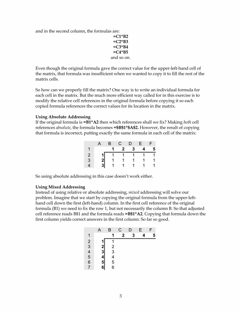
and in the second column, the formulas are: =C1*B2 =C2*B3 =C3*B4 =C4*B5
and so on. Even though the original formula gave the correct value for the upper-left-hand cell of the matrix, that formula was insufficient when we wanted to copy it to fill the rest of the matrix cells. So how can we properly fill the matrix? One way is to write an individual formula for each cell in the matrix. But the much more efficient way called for in this exercise is to modify the relative cell references in the original formula before copying it so each copied formula references the correct values for its location in the matrix. Using Absolute Addressing If the original formula is =B1*A2 then which references shall we fix? Making both cell references absolute, the formula becomes =$B$1*$A$2. However, the result of copying that formula is incorrect, putting exactly the same formula in each cell of the matrix:
A B C D E F 1 1 2 3 4 52 1 1 1 1 1 13 2 1 1 1 1 14 3 1 1 1 1 1
So using absolute addressing in this case doesn’t work either. Using Mixed Addressing Instead of using relative or absolute addressing, mixed addressing will solve our problem. Imagine that we start by copying the original formula from the upper-left-hand cell down the first (left-hand) column. In the first cell reference of the original formula (B1) we need to fix the row 1, but not necessarily the column B. So that adjusted cell reference reads B$1 and the formula reads =B$1*A2. Copying that formula down the first column yields correct answers in the first column. So far so good.
A B C D E F 1 1 2 3 4 52 1 13 2 24 3 35 4 46 5 57 6 6

4
The next step is to copy the formulas in the first column to the columns to their right. When we do so the values in the second column (column C) look OK, but the subsequent columns contain incorrect values.
A B C D E F 1 1 2 3 4 52 1 1 2 6 24 1203 2 2 4 12 48 2404 3 3 6 18 72 3605 4 4 8 24 96 4806 5 5 10 30 120 6007 6 6 12 36 144 720
Again, our downfall is relative addressing, this time in the second cell reference of the formula. Looking in column F, for example, the copied formulas read:
=F$1*E2 =F$1*E3 =F$1*E4
and so on. Using Mixed Addressing Correctly To correct this error, we go back to the original formula. In that formula, the second cell reference must be fixed as to column. So the formula =B$1*A2 must be adjusted to read =B$1*$A2. Copying this corrected formula from the upper-left-hand cell to the rest of the cells in the matrix results in correct values in all the columns:
1 2 3 4 5 6 7 8 9 10 1 1 2 3 4 5 6 7 8 9 10 2 2 4 6 8 10 12 14 16 18 20 3 3 6 9 12 15 18 21 24 27 30 4 4 8 12 16 20 24 28 32 36 40 5 5 10 15 20 25 30 35 40 45 50 6 6 12 18 24 30 36 42 48 54 60 7 7 14 21 28 35 42 49 56 63 70 8 8 16 24 32 40 48 56 64 72 80 9 9 18 27 36 45 54 63 72 81 90
10 10 20 30 40 50 60 70 80 90 100 For more information on relative, fixed, and mixed addressing see Excel’s online help on the topic Move or copy a formula.

5
The “Multiplication” tab from the Solutions.xls workbook.

6
2. Olive Oil Pricing Problem IF Statements, SUMPRODUCT Function, MIN Function The Exercise Olive oil can be purchased according to this price schedule:
For the first 500 gallons $23 per gallon For any of the next 500 gallons $20 per gallon For any oil beyond 1,000 gallons $15 per gallon
Create a spreadsheet that will calculate the total price of buying x gallons of oil, where x is a number to be entered into a cell on the spreadsheet. Notes Creating this spreadsheet requires the use of Excel’s powerful IF statement. The syntax of the IF statement is a three-part “if-then-else” format. If the test condition (the first parameter) evaluates to true, the value-if-condition-true (the second parameter) is returned. But if the test condition evaluates to false, the value-if-condition-false (the third parameter) is returned.
=IF(condition-to-test, value-if-condition-true, value-if-condition-false) A simple example:
=IF(Sky-is-blue, sunny-day, cloudy-day) IF statements can be nested, although to retain clarity in your work it’s generally not a good idea to nest them to very many levels. A nested IF statement (where the nested IF takes the place of the value-if-condition-false in the original IF statement) might look like this:
=IF(condition-to-test, value-if-condition-true, IF(condition-to-test, value-if-condition-true, value-if-condition-false))
Continuing our weather example, a nested IF statement might read like this:
=IF(Sky-is-blue, sunny-day, IF(Temp<32, Maybe-snow, Maybe-rain)) The olive oil pricing exercise specifies three oil prices based on quantity ($23/gallon for up to 500 gallons, $20/gallon for 501-1,000 gallons, and $15/gallon for 1,001 or more gallons) and has as its variable x gallons of oil to buy. An Initial, Simple Scenario The Solutions.xls spreadsheet begins by presenting a solution to a simpler version of the exercise that requires only a single IF statement. This version supposes 3 values for x that account for three quantity possibilities (1,600, 483, and 2001 gallons). But instead of three pricing levels, the simpler version has only two: first 500 gallons and any amount over 500. Because there are only two pricing levels in this version, a simple IF statement can be used to calculate the cost at these three levels.

7
If the price schedule were:first 500 gallons at 23.00$ additional gallons at 20.00$
Cost of 1600 gallons is 33,500.00$ Cost of 483 gallons is 11,109.00$ Cost of 2001 gallons is 41,520.00$
Assigning names to key variables makes it easier to read the IF formula. I’ll assign these names:
Quantity1 to the cell for gallons that holds 1,600 Price_for_500 to the cell for price that holds $23.00 First500 to the cell for quantity that holds 500 Price_for_Over500 to the cell for price that holds $20.00
Then we can write an IF statement that reads like this:
=IF(Quantity1<=First500,Price_for_500*Quantity1, First500*Price_for_500 + (Quantity1-First500)*Price_for_Over500)
Below is the same formula but formatted and with then and else added to better see the IF logic:
=IF(Quantity1<=First500, then Price_for_500*Quantity1,
else First500*Price_for_500 + (Quantity1- First500)*Price_for_Over500)
The result of the IF statement for 1,600 gallons is $33,500.00. If you insert absolute (or mixed) addressing in the first formula where needed, you can copy the first IF statement down the column to also solve for the given quantities of 483 and 2,001 gallons. The Actual Problem Scenario The second scenario on the “Oil prices” tab of the Solutions.xls spreadsheet is more complex and reflects the actual problem. In this scenario, there are three price levels (not two) with any amount over 1,000 gallons priced at $15.00/gallon. Again, the challenge is
If the price schedule were:first 500 gallons at 23.00$ additional gallons at 20.00$
Cost of 1600 gallons is 33,500.00$ Cost of 483 gallons is 11,109.00$ Cost of 2001 gallons is 41,520.00$

8
For the price schedule in the problem:first 500 gallons at 23.00$ next 500 gallons at 20.00$ any additional gallons at 15.00$
Cost of 1600 gallons is 30,500.00$ Cost of 483 gallons is 11,109.00$ Cost of 2001 gallons is 36,515.00$
to construct a single formula that can handle the three-tier pricing structure for any quantity. For this more complex variation, we use a nested IF statement along with Excel’s built-in SUMPRODUCT function. For example, the formula to calculate the cost of 1,600 gallons makes use of the cell values marked by rectangles in the illustration below: Again, naming cells to make our formula easier to follow:
Quantity1 is the name of the cell for gallons that holds 1,600 Price_for_500 names the cell for price that holds $23.00 Price_for>_500 names the cell for price that holds $20.00 Price_for>_1K names the cell for price that holds $15.00 First500 names the cell for quantity that holds 500 Next500 names the cell for quantity that holds the 2nd 500
Then to solve for cost we write a nested IF formula that reads like this: =IF(Quantity1<=First500,
Price_for_500 * Quantity1, IF(Quantity1<=SUM(First500, Next500),
First500*Price_for_500 + (Quantity1-First500)*Price_for>_500, SUMPRODUCT (First500:Next500, Price_for_500:Price_for>_500) +(Quantity1 - SUM(First500,Next500)*Price_for>_1K))
We can then copy this formula to solve for the two other quantities given: 483 gallons and 2,001 gallons.

9
A Closer Look at the SUMPRODUCT Part of the Formula Along with using a nested IF statement, our formula also makes use of the powerful Excel built-in function named SUMPRODUCT. The syntax for the SUMPRODUCT function is:
=SUMPRODUCT(array1,array2,array3,…) The SUMPRODUCT part of our formula reads like this:
SUMPRODUCT(First500:Next500, Price_for_500:Price_for>_500) and means:
•= Multiply First500 by Price_for_500 (or 500*$23.00) to get value1. •= Multiply Next500 by Price_for>_500 (or 500*$20.00) to get value2. •= Add together value1 and value2.
As you can see, the SUMPRODUCT function takes two or more arrays as its parameters. It multiples the first value in the first array by the first value in the second array, the second value in the first array by the second value in the second array, and so on. When all the multiplication operations across arrays are complete, the results are added together. An Alternative Calculation Method As is generally always the case with Excel, there’s more than one good way to model this problem. The Solutions.xls worksheet shows an alternative method that again makes use of nested IF statements and SUMPRODUCT as well as the MIN function.

10
Alternately 1600 483 2001gallons gallons gallons
For the price schedule in the problem: gals/price level gals/price level gals/price levelfirst 500 gallons at 23.00$ 500 483 500
1600 483 2001gallons gallons gallons
gals/price level gals/price level gals/price level500 483 500500 0 500600 0 1,001
Alternately 1600 483 2001gallons gallons gallons
For the price schedule in the problem: gals/price level gals/price level gals/price levelfirst 500 gallons at 23.00$ 500 483 500next 500 gallons at 20.00$ 500 0 500any additional gallons at 15.00$ 0 0 0
Cost 21,500.00$ 11,109.00$ 21,500.00$
How does this alternative scenario work? Again, we have all the information in the problem about quantity and price levels entered into the spreadsheet. Again, we want to find the cost for three different quantities: 1,600 gallons, 483 gallons, and 2,001 gallons. However, in this alternative scenario, the first thing we do is determine for each quantity (1,600, 483, 2,001) how many gallons are involved compared to the first quantity/price level (500 gallons at $23.00/gallon). That calculation uses the MIN function and is located in the layout as follows:
Using values for quantity instead of cell references (just for clarity here) our three formulas are:
=MIN(1600,First500) which yields 500 =MIN(483,First500) which yields 483 =MIN(2001,First500) which yields 500
The next stage of processing is handled with IF statements that have the logic described below. The IF statement here handles the 2nd row for the quantity of 1,600 gallons (Quantity1). That is, the case of quantities up to 1,000 gallons. =IF(Quantity1<=(first500), expressed as SUM(first500:first500)
0, IF(Quantity1>=SUM(first500, next500),
next500, Quantity1-first500) expressed as sum(first500:first500)
Examine the formula on the “Olive Oil” tab in the Solutions.xls spreadsheet to see exactly how the formula is written.

11
1600gallons
gals/price level23.00$ 50020.00$ 50015.00$ 600
Cost 30,500.00$
Note that if you write the 2nd row formula for with care, you can copy it down one row to handle the 3rd row formula. The third-row formula reads like this: =IF(Quantity1<=(SUM(first500, next500),
0, IF(Quantity1>=SUM(first500, next500, any additional),
any additional, Quantity1-SUM(first500:first500)
The final step of this version is to calculate the total cost for each quantity. We can make use of the SUMPRODUCT function to simplify this processing. For example, for the 1,600 gallon quantity we use SUMPRODUCT with the three gals/price level values and the three price levels:
=SUMPRODUCT(Level1:Level3, Price1:Price3)
For the case of 1,600 gallons, this yields the $30,500.00 cost we see in the sample matrix. For 483 gallons it yields a cost of $11,109.00, and for 2,001 gallons it yields a cost of $36,515.00. For more information on the IF function see Excel’s online help on the topic the IF worksheet function. For more information on the SUMPRODUCT function see the topic the SUMPRODUCT worksheet function.
Levels Prices

12
The “Olive O
il” tab from the Solutions.xls w
orkbook.

13
3. Web Service Problem Forecasting and Charting The Exercise You have an idea for a new web service that offers customized workouts for subscribers. Build a spreadsheet to calculate:
1) the number of new customers each month, and 2) the total customer base (cumulative number of customers signed up) each
month. Model projections for 60 months using these two scenarios:
1) Total market potential is 1,000,000 customers. Each month you sign up 2% of customers in the market that have not yet signed up.
2) Total market potential is initially 1,000,000 customers but grows at 1% per month. Each month you sign up 2% of customers in the market that have not yet signed up.
Use Excel’s Chart Wizard to make a graph comparing the total customer base under each of the two scenarios. What type of graph is appropriate? Notes The First Scenario The first scenario can be laid out as follows:
Note that at the top of the scenario we enter the two key values (total market potential and % remaining captured/period), with labels. We’ll use these values in the formulas to calculate the number of new customers and it’s important to use cell references (and not the actual values) in those formulas. By using cell references in the formulas, we can easily change the two key values and have the change reflected automatically in all calculations that depend on them.
Scenario ATotal market potential 1,000,000% remaining captured/period 2%
Period New customers Total custom0 - - 1 20,000 20,000 2 19,600 39,600 3 19,208 58,808 4 18,824 77,632 5 18,447 96,079 6 18,078 114,158 7 17,717 131,874 8 17,363 149,237 9 17,015 166,252

14
At the start (Period 0) we have, of course, no new customers and no total customers. But starting with the first month (Period 1) our calculations are as follows: The New Customers calculation:
(Total_Market_Potential – Total_Customers_in_Previous_Period) * Percentage And the Total Customers calculation:
Total_Customers_in_Previous_Period + New_Customers_This_Period Since we want to forecast for 60 periods, we can copy these two formulas down the New Customers and Total Customers columns. Remember that when copying formulas, it’s important to pay attention to addressing requirements. Here, a combination of absolute and relative addressing in the formula is required. For example, no matter what period our New Customers formula is copied to, we’ll always want it to reference the “Total market potential” value of 1,000,000 and the “% remaining captured/period” value of 2%. So both these references must be absolute. On the other hand, a reference in a copied formula to a cell in “the previous period” must be relative since it must change for each period. The Second Scenario The second scenario can be laid out as follows:
This scenario goes beyond the previous scenario in taking into account a growth in the market potential of 1%/month. Again, at the top of the scenario we enter the three key values (initial total market, market size growth/period, and % remaining captured/period), with labels. We’ll use these values in the formulas to calculate the number of new customers. Again, it’s important to use cell references (and not the actual values) in those formulas. By using
Scenario BInitial total market 1,000,000Market size growth/period 1%% remaining captured/period 2%
Period Total market New customers Total custome0 0 01 1,000,000 20,000 20,000 2 1,010,000 19,800 39,800 3 1,020,100 19,606 59,406 4 1,030,301 19,418 78,824 5 1,040,604 19,236 98,060 6 1,051,010 19,059 117,119 7 1,061,520 18,888 136,007 8 1,072,135 18,723 154,729 9 1,082,857 18,563 173,292

15
-
200,000
400,000
600,000
800,000
1,000,000
1 5 9 13 17 21 25 29 33 37 41 45 49 53 57
Constant marketGrowing marketCustomer Base Comparison
Period
cell references in the formulas, we can easily change the key values if necessary and have the change reflected automatically in all calculations that depend on them. At the start (Period 0) we have, of course, no new customers and no total customers. In the first month (Period 1), the Total Market formula is a reference to the cell at the top of the scenario that holds the “initial total market”, or 1,000,000. Then, calculations are as follows. The New Customers calculation:
= (Total_Market_This_Period – Total_Customers_Previous_Period) * Percent_remaining_captured/period
The Total Customers calculation:
=Total_Customers_Previous_Period + New_Customers_This_Period The Total Market calculation (beginning with Period 2):
=Total_Market_Previous_Period * (1+Market_size_growth/period) Again, we can copy the initial “master” formulas down the columns to complete the calculations for all 60 periods, taking care to use absolute addressing in the master formulas where required. The Graph The final part of this problem is to create a graph to compare the total customer base for the two scenarios. Because Excel has so many graph types, you might wonder which type is most appropriate for this data. The line graph shown below is especially effective for plotting data over time.
16
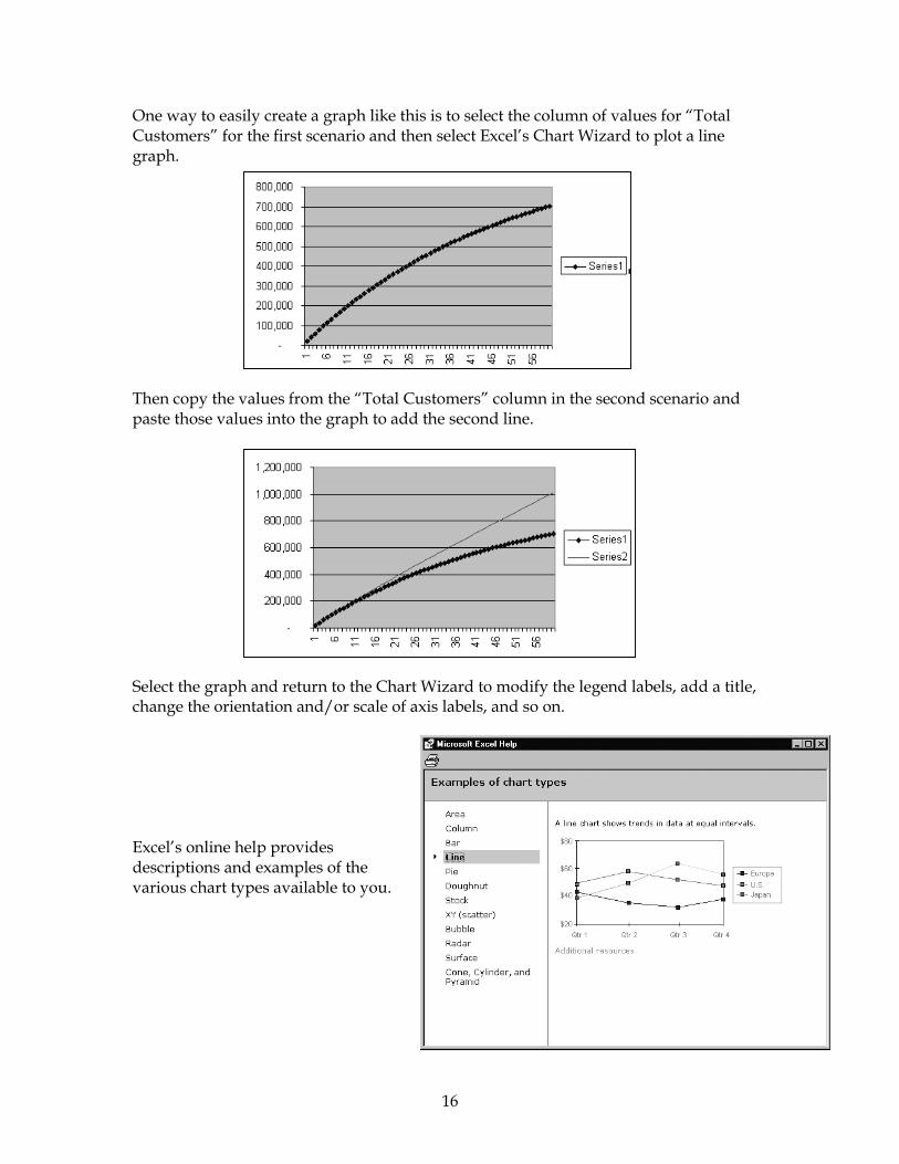
One way to easily create a graph like this is to select the column of values for “Total Customers” for the first scenario and then select Excel’s Chart Wizard to plot a line graph.
Then copy the values from the “Total Customers” column in the second scenario and paste those values into the graph to add the second line.
Select the graph and return to the Chart Wizard to modify the legend labels, add a title, change the orientation and/or scale of axis labels, and so on. Excel’s online help provides descriptions and examples of the various chart types available to you.
17
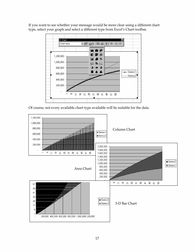
If you want to see whether your message would be more clear using a different chart type, select your graph and select a different type from Excel’s Chart toolbar. Of course, not every available chart type available will be suitable for the data.
Column Chart
Area Chart
3-D Bar Chart

18
To get started with charts see Excel’s online help on the topic Create a chart. More advanced online help chart topics that may be helpful include Select a different chart type, Troubleshoot charts, and About formatting charts. A partial view of the “Web Service” tab from the Solutions.xls workbook.

19
Assumptions: RegularUnit sales, first year 1,600Unit price, first year $1,800
Unit manufacturing cost $1,000Yearly sales growth 100%
Yearly price fall 15%Yearly decline in manufacturing costs 6%
Marketing expense as % of revenue 14%Yearly fixed cost $1,000,000
Discount rate 15%
4. Pro Forma Problem Forecasting, Data Table, Goal Seek The Exercise You have founded a company to sell thin client computers to the food processing industry for Internet transaction processing. Before investing in your new company, a venture capitalist has asked for a five year pro-forma income statement showing unit sales, revenue, total variable cost, marketing expense, fixed cost, and profit before tax. You expect to sell 1,600 units of the thin client computers in the first year for $1,800 each. Swept along by Internet growth, you expect to double unit sales each year for the next five years. However, competition will force a 15% decline in price each year. Fortunately, technical progress allows initial variable manufacturing costs of $1,000 for each unit to decline by 6% per year. Fixed costs are estimated to be $1,000,000 per year. Marketing expense is projected to be 14% of annual revenue. When it becomes profitable to do so, you will lease an automated assembly machine that reduces variable manufacturing costs by 20% but doubles the annual fixed cost; the new variable manufacturing cost will also decline by 6% per year. Net present value (NPV) will be used to aggregate the stream of annual profits, discounted at 15% per year.1
a) Ignoring tax considerations, build a spreadsheet for the venture capitalist. b) How many units do you need to sell in the first year to break even in the first
year? c) How many units do you need to sell in the first year to break even in the second
year? Notes One of the biggest challenge in a problem of this sort is to organize the quantity of information, not to mention also establishing the correct relationships between values and presenting the information in a meaningful way. You’ll probably find that it’s most useful to start by entering into a spreadsheet everything you know about the problem. Don’t worry too much at first about the spreadsheet’s layout. First just get the data entered, since you can always change the layout later as needed. Start by entering the problem’s initial assumptions into the spreadsheet: 1 Problem 2-5 from Introductory Management Science, 5th edition (1998), Eppen, Gould, et al.

20
Note that none of the initial assumption values are calculated. All the values are entered directly into cells of the spreadsheet. The venture capitalist has asked you to include in the pro forma statement unit sales, revenue, total variable cost (“Unit manufacturing cost”), marketing expense, fixed cost , and profit before tax. (Some of these values are also already entered into the assumptions area.) Eventually your statement will show five years’ worth of data, but start by entering values and calculations for the first year.
From the top: Unit sales – One of the stated assumptions is that you expect to sell 1,600 units. In fact,
you’ve already entered that figure in the assumptions area of the worksheet. So instead of re-entering the value here, use a formula to refer to the assumptions area cell.
Unit Price – You already have unit price entered in the assumptions area. Use a formula
here that refers to the assumptions area cell for unit price. Revenue – Derived by the calculation Unit Sales * Unit price. Total variable cost (or Unit manufacturing cost (regular)) – The assumptions state that
the initial variable manufacturing cost is $1,000 per unit in the first year. “Regular” refers to the absence of a special lease for automated machinery. (After Year 1 we’ll take into account a 6% per year decline in cost.) As before, this value is already entered in the assumptions area. Again, write a formula for this value that refers to the assumptions area cell.
Unit manufacturing cost (lease) – We’ll use this later. Total manufacturing cost – For Year 1 you can enter a formula that reads like this:
Yearly Fixed Cost + Unit Sales * Unit manufacturing cost (regular). Later, when considering lease vs. no lease, we’ll modify this formula to make it more precise.
Lease? – We consider the lease of automated assembly machine after the first year.
Year 1Unit sales 1,600Unit price $1,800.00Revenue $2,880,000.00
Unit manufacturing cost (regular) $1,000.00Unit manufacturing cost (lease) $800.00
Total manufacturing cost $2,600,000.00Lease? no
Marketing expense $403,200.00Profit before tax ($123,200.00)
21
($123,200.00)1300135014001450150015501600165017001750180018501900
Marketing expense – This is derived by the calculation Revenue * 14%. (Of course, in the formula you enter into the spreadsheet, use cell references and not actual values.)
Profit before tax – This calculation is Revenue – Unit manufacturing cost – Marketing
expense. (Again, in the formula you enter into the spreadsheet, use cell references. Or, if you assign names, use names.)
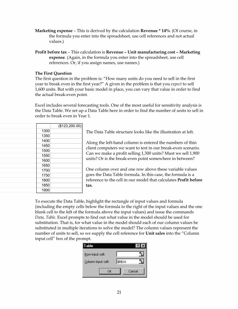
The First Question The first question in the problem is: “How many units do you need to sell in the first year to break even in the first year?” A given in the problem is that you expect to sell 1,600 units. But with your basic model in place, you can vary that value in order to find the actual break-even point. Excel includes several forecasting tools. One of the most useful for sensitivity analysis is the Data Table. We set up a Data Table here in order to find the number of units to sell in order to break even in Year 1.
The Data Table structure looks like the illustration at left. Along the left-hand column is entered the numbers of thin client computers we want to test in our break-even scenario. Can we make a profit selling 1,300 units? Must we sell 1,900 units? Or is the break-even point somewhere in between? One column over and one row above these variable values goes the Data Table formula. In this case, the formula is a reference to the cell in our model that calculates Profit before tax.
To execute the Data Table, highlight the rectangle of input values and formula (including the empty cells below the formula to the right of the input values and the one blank cell to the left of the formula above the input values) and issue the commands Data, Table. Excel prompts to find out what value in the model should be used for substitution. That is, for what value in the model should each of our column values be substituted in multiple iterations to solve the model? The column values represent the number of units to sell, so we supply the cell reference for Unit sales into the “Column input cell” box of the prompt.

22
($123,200.00)1300 -2876001350 -2602001400 -2328001450 -2054001500 -1780001550 -1506001600 -1232001650 -958001700 -684001750 -410001800 -136001850 138001900 41200
Excel executes the Data Table, “solving” for Profit before tax by substituting into the model for Unit sales each value in the left-hand column of the Data Table. The results of each substitution are recorded in the cells to the right of the input values. Reading down the list of results, we can see that the break-even point in Year 1 is roughly 1,850 units sold. If we sell only 1,800 units, our Profit before tax is -$13,600. But selling 1,850 units gives us a profit of $13,800.
The Other Four Years Our pro forma statement is intended to cover five years. We have some special considerations to take into account in Years 2 through 5. At this point, you might proceed by:
•= Adding the header labels for Years 2 through 5 to the statement. •= Building in any special, additional considerations we must take into account for
line items in Years 2 through 5. •= Completing the line items in the statement that use the same calculations or
values as in Year 1. Unit manufacturing cost (regular) That is, without a lease. Our problem states that “technical progress allows initial variable manufacturing costs of $1,000 per unit to decline by 6% per year”. The Unit manufacturing cost for Year 1 is $1,000. But for Years 2 through 5, we calculate the value for Unit manufacturing cost by referring to the previous year’s figure as well as to the 6% figure for Yearly decline in manufacturing costs (located in the assumptions area). The formula reads like this: =(1-6%)*Previous year’s unit manufacturing cost. If in your formula for Year 2 you make the reference to the cell holding 6% absolute, then you can copy the formula for Year 2 across to Years 3, 4, and 5. Your results should look like this:
Unit sales The problem states that “Swept along by Internet growth, you expect to double unit sales each year for the next five years.” Remember that your Year 1 Unit sales figure references the cell in the assumptions area that holds the Unit sales value. And the assumptions area also already holds a value of

23
100% with the label Yearly sales growth. The formula you need for Unit sales for Years 2 through 5 is =Previous year’s unit sales * (1+Yearly sales growth). If you make the reference to the Yearly sales growth cell in the formula for Year 2 an absolute reference, you can copy that formula across to Years 3, 4, and 5. The result should look like this:
Unit price The problem states that “competition will force a 15% decline in price each year”. In the assumptions area, we have the figure $1,800 entered for Unit price, first year. Our Unit price under Year 1 references that figure. Also in the assumptions area, we have the figure 15% entered for Yearly price fall. Our formula for Unit price for Year 2 must then be =(1-Yearly price fall) * Previous year’s unit price. If we reference the Yearly price fall cell in our Year 2 formula using absolute addressing, we can copy that formula across for Years 3, 4, and 5. The result should look like this:
Unit manufacturing cost (lease) The problem states: “When it becomes profitable to do so, you will lease an automated assembly machine that reduces variable manufacturing costs by 20% but doubles the annual fixed cost”. You might add this information to the assumptions area in this way:
Notice that in the new “Lease automated machinery” column, Unit manufacturing cost is listed at $800 and Yearly fixed cost is listed at $2,000. For the Year 1 Unit manufacturing cost (lease) you can refer to the cell in the “Lease” column that holds $800. For this item for Years 2 through 5, your formula would be =(1-Yearly decline in manufacturing costs)*Previous year’s unit manufacturing cost with lease. For Year 2, for example (using values for clarity), the formula would read =(1-6%)*800. Write the formula using cell references and extend it across to Years 3 to 5.
Assumptions: Regular Lease automated machineryUnit sales, first year 1,600Unit price, first year $1,800
Unit manufacturing cost $1,000 $800 reduces by 20%Yearly sales growth 100%
Yearly price fall 15%Yearly decline in manufacturing costs 6% 6%
Marketing expense as % of revenue 14%Yearly fixed cost $1,000,000 $2,000,000 increases by 100%
Discount rate 15%

24
The results should look like this:
Total manufacturing cost and Lease? Each year, you must determine whether it’s cost effective to lease automated machinery. You can use Excel’s built-in MIN function to compare manufacturing costs without a lease vs. manufacturing costs with a lease. Then, use whichever option is less expensive. The formula to find the least expensive (e.g., lease vs. no lease) Total manufacturing cost in Year 1 is: =MIN(Yearly fixed cost (regular) + Unit sales * Unit manufacturing cost (regular),
Yearly fixed cost (lease) + Unit sales * Unit manufacturing cost (lease)) The MIN functions for the other years work the same way. Use an IF formula to record whether to lease or not lease, filling in the Lease? row with “yes” or “no”. For example, the formula for Year 1 is: =IF(Yearly fixed cost (regular) +Unit sales * Unit manufacturing cost (regular) <
Yearly fixed cost (lease) + Unit sales * Unit manufacturing cost (lease), “no”, “yes”)
The IF formula for Years 2 through 5 works the same way. The results for the IF formulas will look like this:
The following line items are calculated in Years 2 through 5 in the same way they’re calculated in Year 1. Add them to complete the statement.
•= Revenue: Unit sales * Unit price
•= Marketing expense: Marketing expense as % of revenue (14%) * Revenue
•= Profit before tax: Revenue – Total manufacturing cost – Marketing expense

25
First year profit Second year pro($123,200.00) $202,560.00
1300 -287600 -229201350 -260200 146601400 -232800 522401450 -205400 898201500 -178000 1274001550 -150600 1649801600 -123200 2025601650 -95800 2401401700 -68400 2777201750 -41000 3153001800 -13600 3528801850 13800 3904601900 41200 428040
Net Present Value After completing the above calculations, the final value to calculate is the Net Present Value (NPV). NPV is a built-in Excel function that takes two parameters: Rate and a value or values.
In our case, rate is the given Discount rate of 15% and value is the range of values in the row Profit before tax for Years 1 through 5. The NPV function resolves to a value of $2,754,623.43. The Final Question The final question associated with this pro forma statement is “How many units do you need to sell in the first year to break even in the second year?” We can again use Excel’s Data Table tool to answer that question.
The Data Table we construct to answer this second question looks like our previous one, except that we’ve added an additional formula, for Profit before tax for Year 2. Again, Excel executes the Data Table, “solving” for Profit before tax by substituting each value in the left-hand column in the model for Unit sales and recording the result in the cells at right. It appears that we need to sell approximately 1,350 units in the first year to break even in the second year.
Goal Seek For simple what-if problems, Excel’s Goal Seek feature is a handy tool, and one that can also be applied to answer the break-even question. For example, the first one-input Data Table we constructed was intended to find the Year 1 break-even point and looked (in
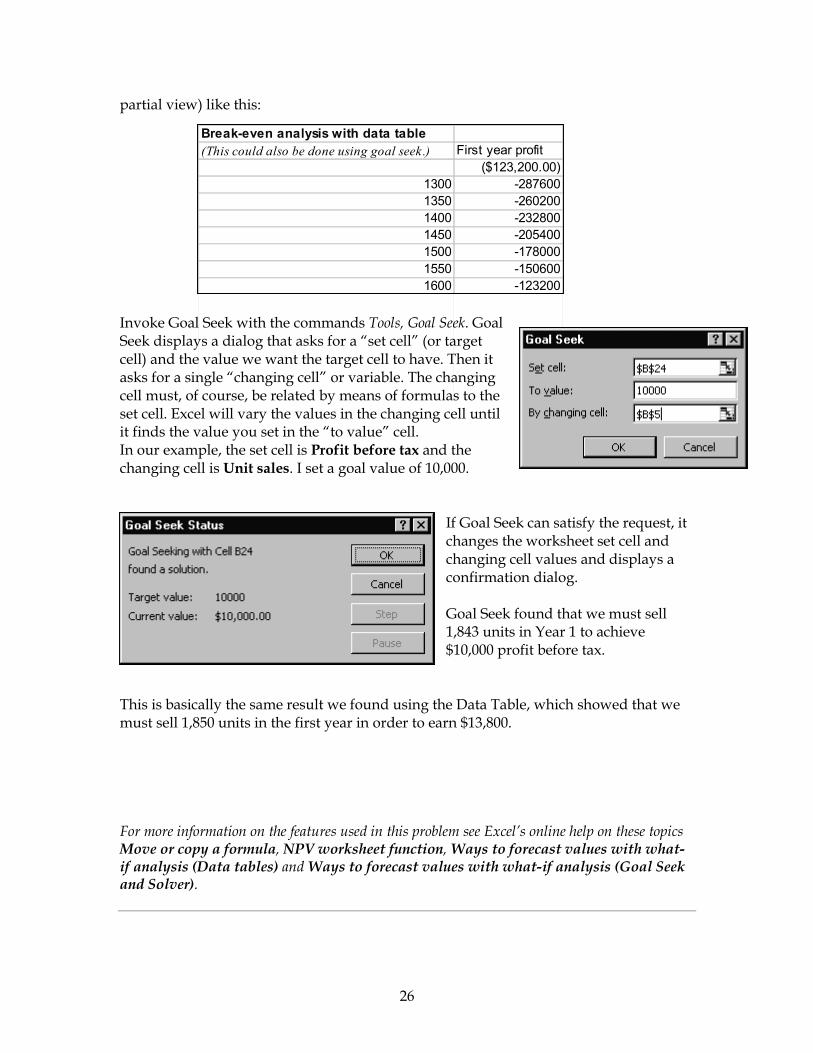
26
Break-even analysis with data table(This could also be done using goal seek.) First year profit
($123,200.00)1300 -2876001350 -2602001400 -2328001450 -2054001500 -1780001550 -1506001600 -123200
partial view) like this: Invoke Goal Seek with the commands Tools, Goal Seek. Goal Seek displays a dialog that asks for a “set cell” (or target cell) and the value we want the target cell to have. Then it asks for a single “changing cell” or variable. The changing cell must, of course, be related by means of formulas to the set cell. Excel will vary the values in the changing cell until it finds the value you set in the “to value” cell. In our example, the set cell is Profit before tax and the changing cell is Unit sales. I set a goal value of 10,000.
If Goal Seek can satisfy the request, it changes the worksheet set cell and changing cell values and displays a confirmation dialog. Goal Seek found that we must sell 1,843 units in Year 1 to achieve $10,000 profit before tax.
This is basically the same result we found using the Data Table, which showed that we must sell 1,850 units in the first year in order to earn $13,800. For more information on the features used in this problem see Excel’s online help on these topics Move or copy a formula, NPV worksheet function, Ways to forecast values with what-if analysis (Data tables) and Ways to forecast values with what-if analysis (Goal Seek and Solver).

27
The “Pro-forma” tab from
the Solutions.xls workbook.

28
5. Data Relationship Problem Scatter or XY Plot The Exercise You want to examine the relationship between the number of machines working and the number of processing minutes achieved. You conduct 18 spot checks every half hour and record the following data. Use Excel’s Chart Wizard to make an x-y scatter plot of the data.
# Machines Minutes 7 97 6 86 5 78 1 10 5 75 4 62 7 101 3 39 4 53 2 33 8 118 5 65 2 25 5 71 7 105 1 17 4 49 5 68
Notes The scatter plot, or XY plot, is an often-neglected plot type in Excel. It either shows the relationships among the numeric values in several data series or plots two groups of numbers as single series of XY coordinates. It can show uneven intervals or clusters of data. To create an XY or scatter plot, highlight the data and its labels, invoke the Chart Wizard, and choose the Scatter Plot chart type.

29
Follow the Chart Wizard to construct the XY chart from the data. The plot should look like this: When you select the XY chart type, Excel puts the values for the number of machines (1 to 7) along the X axis (scaled here from 0 to 10). Excel puts the values for the number of processing minutes (10 to 118) along the Y axis (scaled here from 0 to 140). Then it plots each pair of data values relative to the two axes. So, for example, the first pair of data values (7 machines, 97 minutes) is plotted as a single point. You can see by glancing at this XY plot that the more machines we have working the higher the number of processing minutes achieved. What would happen if you plotted this data using a different chart type? Say, a line chart?
0
20
40
60
80
100
120
140
1 2 3 4 5 6 7 8 9 10 11 12 13 14 15 16 17 18
MachinesMinutes
Line Plot
A line chart would be unsuitable for this data and wouldn’t easily convey its meaning.
Minutes
0
20
40
60
80
100
120
140
0 2 4 6 8 10
Machines
XY Plot
Point representing7 machines, 97
minutes

Notice in this chart that Excel chooses a scale of 1 to 18 for the X axis, because there are 18 rows of data. For the Y axis, it chooses a scale that can accommodate the largest number in the data set. Then it plots machines and minutes separately, each as a distinct line. It’s very hard to tell what this format of chart is meant to convey. More Notes on the Use of the XY (Scatter) Plot The data and plot below are an example of an using an XY or scatter plot to show relationships between data series. This example shows the relationship between time and two temperature values. Time is the X value on the horizontal axis. There are two data series for the Y values: Actual temperatures and predicted temperatures.
Time Temp Predicted Temp
8:01 23 21 8:25 23 22 9:01 24 22 9:25 26 23
10:01 28 25 10:25 28.5 26 11:01 29 27 11:25 29.3 27 12:01 32 28.5 12:25 32 29.13:01 35 3013:25 35.5 31
What Happens If You SeleThe XY plot is a unique typchart type other than the XYexample, the plots below shproduce a chart that looks mdata happens to include tim
When you arrange the data for a scatter plot, place x values in one row or column and then enter corresponding y values in the adjacent rows or columns. Here, “Time” values are the x-axis values. The “Temp” and “Predicted Temp” values are the Y values. The XY plot looks like this:
2
30
ct the Wrong Chart Type for Your Data e of plot because of the way it treats data. You might select a scatter plot for the time and temperature data above. For ow this data plotted as line and column chart types. Both eaningful for the time and temperature data because this
e in regular intervals as the X axis.
Time & Temperature
0
10
20
30
40
7:10 9:34 11:58 14:22
Time
Act
ual &
Pre
dict
ed
Tem
pera
ture
s
TempPredicted Temp

31
Time and Temperature
05
10152025303540
8:01
8:25
9:01
9:25
10:01
10:25
11:01
11:25
12:01
12:25
13:01
13:25
Temp
Predicted Temp
Time & Temperature
05
10152025303540
8:01
8:25
9:01
9:25
10:01
10:25
11:01
11:25
12:01
12:25
13:01
13:25
TempPredicted Temp
However, there are many data sets where choosing any chart type will not produce a meaningful chart. For example, the next data set we’ll consider is one of this type. Let’s view the data set and see how not to plot the data with a line or column chart type. Then we’ll see how to make a meaningful plot of the data with an XY scatter plot. Below is data from five retail stores. For each store, we have information about how long the store has been open and its average monthly sales. The task is to create a chart that shows the relationship between length of time open and sales.
Months Open
Sales ($ thousands)
10 100 40 150 50 200 70 250 120 300

32
0
50
100
150
200
250
300
350
10 40 50 70 120
Months Open
Sale
s
0
50
100
150
200
250
300
350
120 70 50 40 10
Months Open
Sale
s
0
50
100
150
200
250
300
350
0 50 100 150
Months Open
Sale
s
At right is a column chart of the data. You can see that the scale on the X axis doesn't make sense; the intervals aren’t equal nor should they be. They represent an irregular progression of months open. Just glancing at the column chart, you do, at least, get the idea that the relationship is positive, which makes sense. That is, the longer a store has been open the greater that store’s sales. But if you happen to reverse the order of the data so that the longest-open store is listed first and so on, then you get a graph where at first glance it looks like the relationship is negative. That arrangement would look like the data and chart below. Months Open
Sales ($ thousands)
120 300 70 250 50 200 40 150 10 100
Data in reverse order.
Reverse data order column chart. To get a meaningful graphical view of this data, use the XY plot, as shown at left. Notice that with the XY plot the Chart Wizard automatically scales the X and Y axes appropriately. And the order of the data (longest open store listed first or listed last) doesn’t matter.

33
In summary, data suitable for chart types other than the XY scatter plot include: •= Data that changes over time and that compares items. For example, sales by year
or by quarter. For data like this you might use a column or a line chart. •= Comparisons among items, with less emphasis on time. For example, sales by
region. Try a bar chart for this kind of data. •= A comparison of each item to the whole. For example, which bicycle brands
contribute to total sales. Use a pie chart for this kind of data. But consider using an XY scatter plot when you have:
•= Data that you want to plot as one series of XY coordinates. •= Data for which you want to see the relationships among numeric values in
several data series. •= Data that’s in uneven intervals, or clusters.
For more information on the XY plot type see Excel’s online help on the topics Examples of chart types.

34
The “XY Scatter” tab from the Solutions.xls w
orkbook.