Embed Size (px)
Citation preview

GRAPHICS AND VISUALISATION WITH MATLAB
Part 1
UNIVERSITY OF SHEFFIELD
CiCS DEPARTMENT
Deniz Savas & Mike Griffiths
February 2012
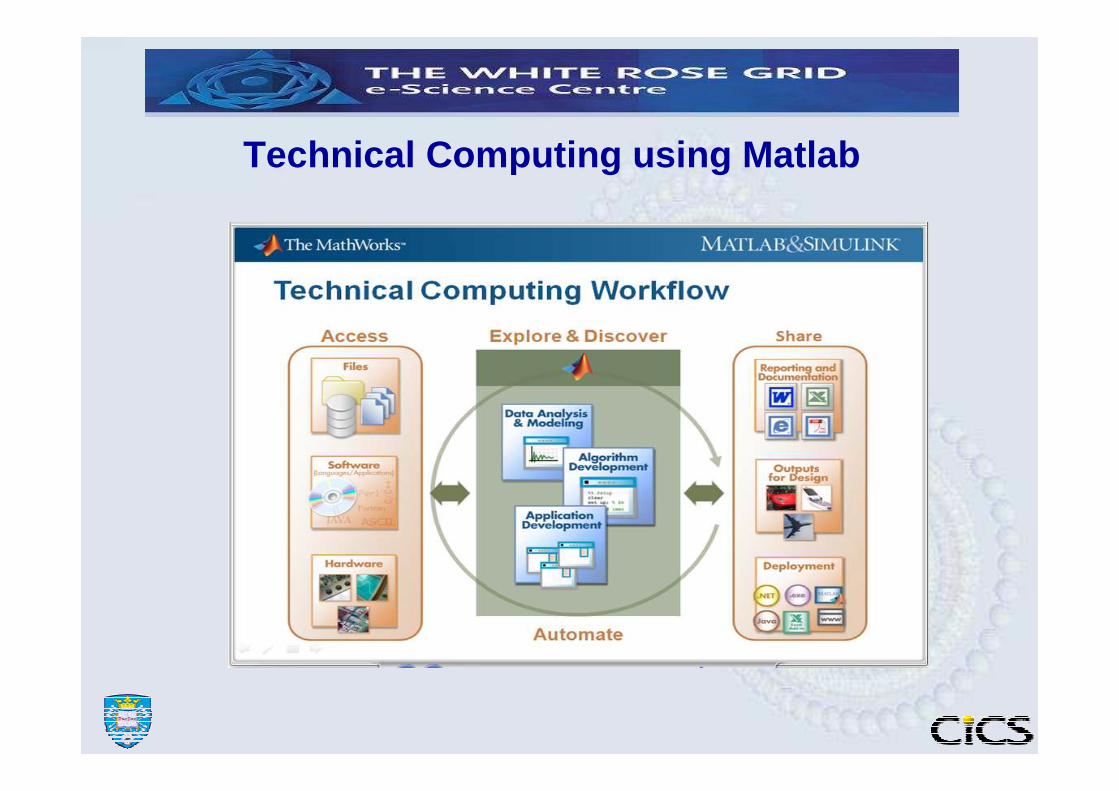
Technical Computing using Matlab
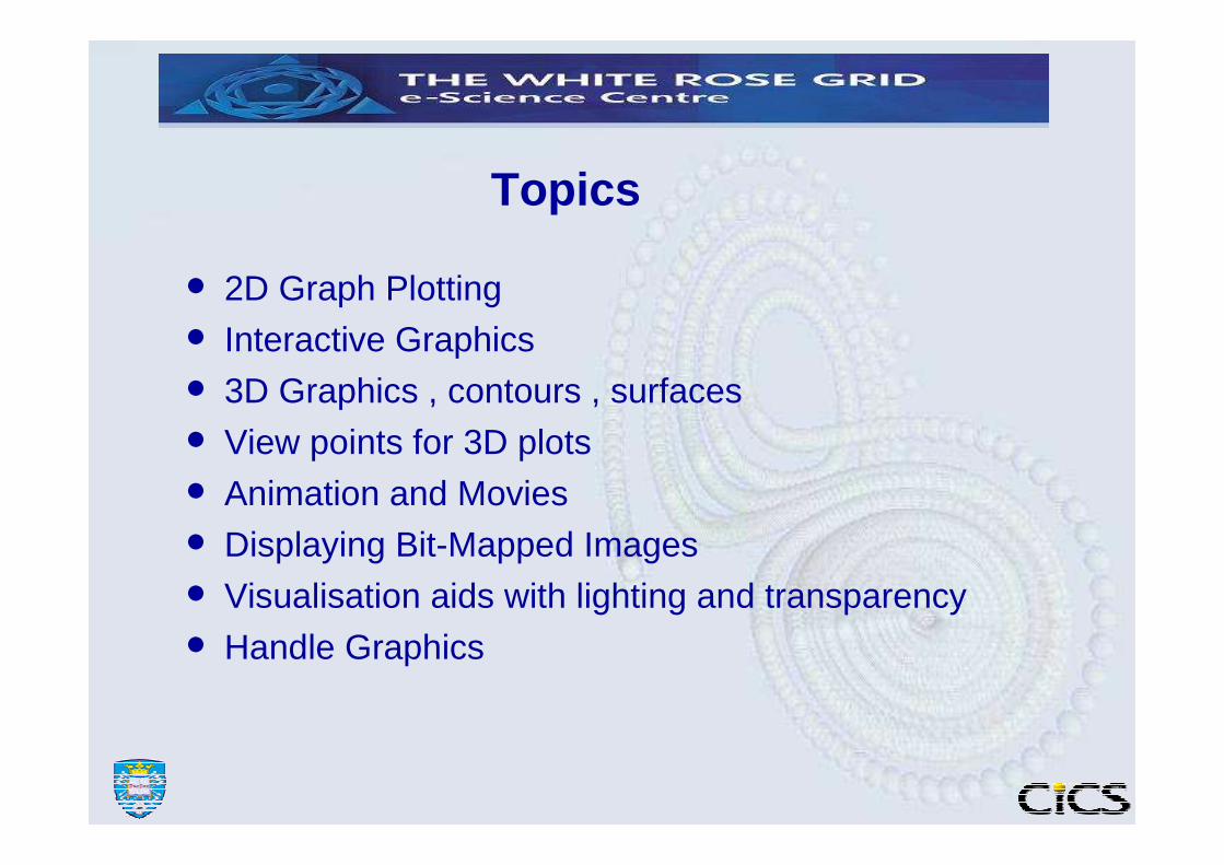
• 2D Graph Plotting
• Interactive Graphics
• 3D Graphics , contours , surfaces
• View points for 3D plots
• Animation and Movies
• Displaying Bit-Mapped Images
• Visualisation aids with lighting and transparency
• Handle Graphics
Topics

Graphics with Matlab
• Powerful 2D and 3D graphics features are available.
• Graphics is built upon a collection of objects whose properties can be altered to change the appearance of graphs.
• Graphs may be drawn by using the low-level graphics primitives alone but there are usually higher level functions available for most of the common graphics needs.
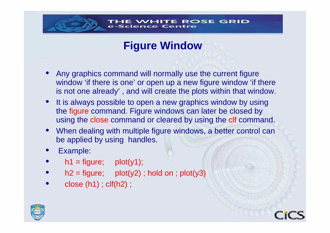
Figure Window
• Any graphics command will normally use the current figure window ‘if there is one’ or open up a new figure window ‘if there is not one already’ , and will create the plots within that window.
• It is always possible to open a new graphics window by using the figure command. Figure windows can later be closed by using the close command or cleared by using the clf command.
• When dealing with multiple figure windows, a better control can be applied by using handles.
• Example:• h1 = figure; plot(y1);• h2 = figure; plot(y2) ; hold on ; plot(y3) • close (h1) ; clf(h2) ;

Plot control commands
•Figure : This command creates a new graphics window. Multiple figure windows will happily coexist. Only one of the figures will have the focus for drawing.•Hold : Each graph is usually drawn into a clean window, by deleting the current display area. The hold command will over-ride this behaviour and draw the new graph over the existing one.•Subplot : This command will divide the current graphics figure into multiple panels and allow you to draw a different graphs in each panel.• Example: subplot(2,2,1) ; plot(y1)
subplot(2,2,2) ; plot(y2)
subplot(2,2,3) ; plot(y3)

2D Plotting Functions
• plot ( x/y) plotting. loglog , semilogx and semilogy are variations of the plot command.
• title : adds title to a plot• xlabel , ylabel : add x and y axis labels
• text , gtext : to add arbitrary text on a graph.• grid : adds grid-lines

x/y line plotting examples
• Let x and y be vectors of equal length
• plot(x) -----> plots x versus its index. If x is a matrix plots each column as a different series on the same axis.
• plot(x,y) -----> plots x versus y
• plot(x,y,’string’) ---> as above but also specify the line colour and/or style. Where the string is one or more characters which indicate the line_colour and optionally the line_type to use.
the line_colour indicator can be one of c,m,y,r,g,b or w .the line_type can be one of o,+,* -,: ,-. or -- .
• plot (x,y1,x,y2,x,y3) → plot y1,y2 and y3 using the same x axis and with same scaling.
• plotyy(x,y1,x,y2) → plot y1 and y2 against x on same plot but use different scales for each graph.
plot example
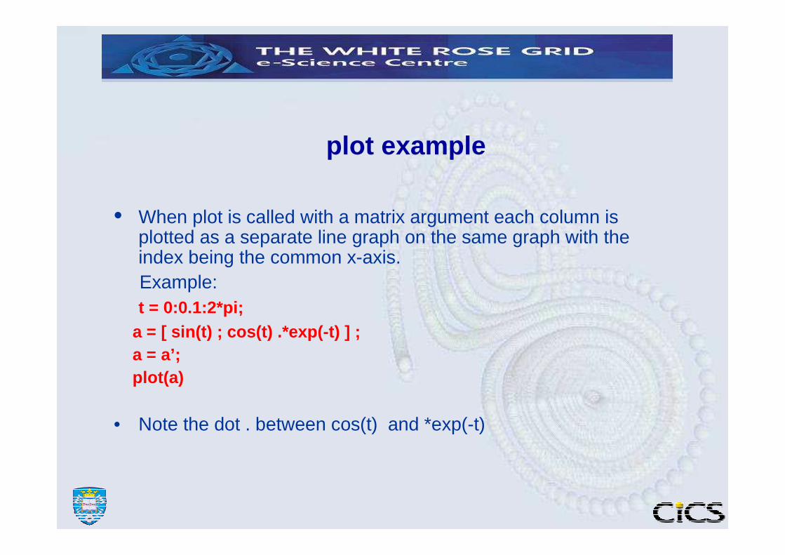
• When plot is called with a matrix argument each column is plotted as a separate line graph on the same graph with the index being the common x-axis. Example:t = 0:0.1:2*pi;
a = [ sin(t) ; cos(t) .*exp(-t) ] ;a = a’;plot(a)
• Note the dot . between cos(t) and *exp(-t)
Other useful plotting commands
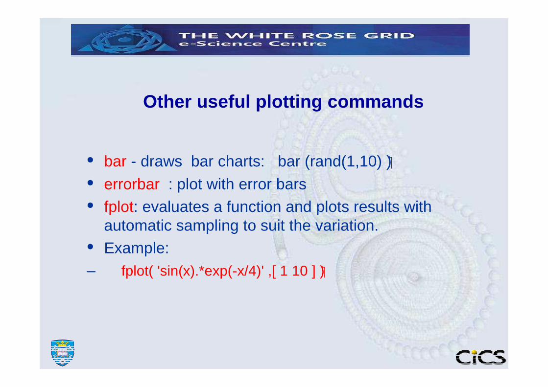
• bar - draws bar charts: bar (rand(1,10) )�
• errorbar : plot with error bars• fplot: evaluates a function and plots results with
automatic sampling to suit the variation.
• Example:– fplot( 'sin(x).*exp(-x/4)' ,[ 1 10 ] ) �

Practice Session 1
• Plot the function (0.5-x)^3 + (0.2 –x )^2 for x ranging from 0.0 to 1.0 in steps of 0.01.
• Plot the same curve using the fplot function.• Draw grid lines on the plot. Hint: help grid• Plot the function (0.2-x)/(1.1-x) over the previous plot.• Try different colours and line styles for these plots.• Try using the title, xlabel, ylabel and gtext commands
for the current plot

Plot commands that are suitable for statistics presentations
• Bar and area graphs ▬ bar, barh▬ bar3 , bar3h▬ area
• Pie charts▬ pie
• Histograms▬ hist , histc

x/y plot and statistics
• Read three columns of data stored in field.dat file in the examples directory.
• Plot any one of the columns as an x-y plot.
• Click Tools-> Basic Fitting
• Experiment with the plot-type, display-residuals and the equation.
• Click Tools-> Basic Statistics– Save the statistics to the workspace and access
them
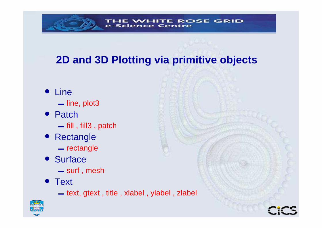
2D and 3D Plotting via primitive objects
• Line ▬ line, plot3
• Patch▬ fill , fill3 , patch
• Rectangle▬ rectangle
• Surface▬ surf , mesh
• Text▬ text, gtext , title , xlabel , ylabel , zlabel
Practice Session -2 Example use of graphics primitives
• Investigate the script grprim.m by editing it and run it to see if you get what you expect.
• Investigate the valentine.m script as above to see how 3D primitives work.

Interactive Graphics using ginput
FORMAT [x y] = ginputor [x y button ] = ginput( n )
Gets coordinates of the point when the mouse is clicked in terms of current axes coordinates.When working with 2D plots Matlab allows reading of co-ordinate points on the graphics window by a mouse-click action.
• Exercise: View the Matlab script inplot.m• Other interactions related commands are;
▬ gtext : for mouse positioning text objects▬ waitfor & waitforbuttonpress : stop execution and wait for an
event ( mouse-press event)�▬ uiwait & uiresume : suspend execution and wait until the
current figure is destroyed or uiresume called. This enables locking the focus only on the current figure window of Matlab.
▬ dragrec , rbbox : drag/rubberband rectanglesworks on pixel coordinates only.

Practice Session -3• Data Cursor Exercise: Type the following command to read data from a
file named field.dat.
load field.datplot( field)� Click on the data-cursor icon to select data-cursor mode.
� Left-Click on one of the curves to create a data-tip.
� Drag the newly created data tip.
� Right-Click on a curve and investigate the following options� Selection-style ( experiment afterward with dragging a data tip )
� Create and delete data-tips
� Export cursor-data to workspace
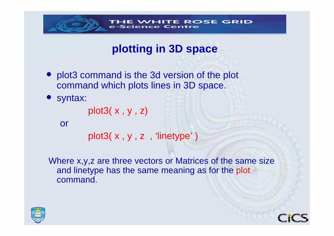
plotting in 3D space
• plot3 command is the 3d version of the plot command which plots lines in 3D space.• syntax:
plot3( x , y , z)or
plot3( x , y , z , ‘linetype’ )
Where x,y,z are three vectors or Matrices of the same size and linetype has the same meaning as for the plotcommand.

Practice Session-4Plotting in 3D space
t = 0:0.2:10*pi;x = sin(t).*exp(-t/30) �
y =cos(t).*exp(-t/30) �
plot3( x , y , t ) ;
% compare with : plot( x , y );
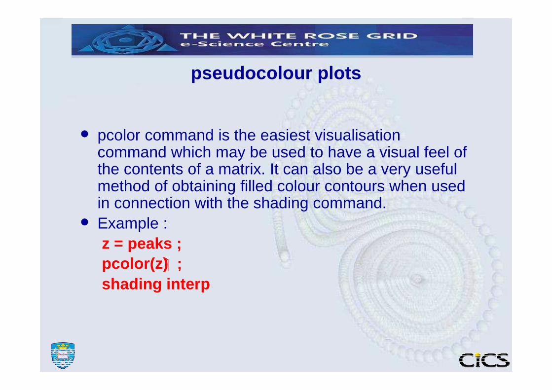
pseudocolour plots
• pcolor command is the easiest visualisationcommand which may be used to have a visual feel of the contents of a matrix. It can also be a very useful method of obtaining filled colour contours when used in connection with the shading command.• Example :
z = peaks ;pcolor(z) � ;shading interp
mesh and surface plots
• The functions mesh and surf display surfaces in three dimensions. If Z is a matrix whose elements define the heights of a surface over an underlying grid then
• mesh(Z) displays a coloured wire-mesh view of that surface.
• surf(Z) also displays the coloured surface but without the mesh lines superimposed on the surface.
shading command
• This command sets the colour shading properties of the surface and patch objects. • it can be one of;
• shading flat : The object has uniform color.• shading faceted : Same as flat + with mesh/border
lines drawn.• shading interp : Color varies on the surface by
interpolating from color of each vertex.
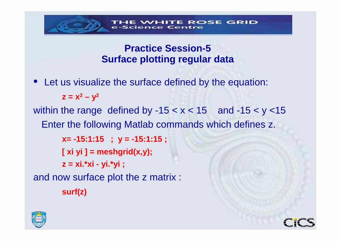
Practice Session-5 Surface plotting regular data
• Let us visualize the surface defined by the equation:z = x2 – y2
within the range defined by -15 < x < 15 and -15 < y <15
Enter the following Matlab commands which defines z.x= -15:1:15 ; y = -15:1:15 ;
[ xi yi ] = meshgrid(x,y);
z = xi.*xi - yi.*yi ;
and now surface plot the z matrix :
surf(z)

Data requirements for contouring and surface plotting
• Matlab expects data for its contouring and surface plotting routines to be in the form of regular rectangular matrices. These matrices represent the spatial distribution of a field variable in a rectangular region taken at regularly spaced set of grid-points.
• However it is not always possible to obtain data by sampling at regular intervals. We therefore will have to deal with non-regularly sampled data points. Following Matlab commands allow us to deal with these situations:
meshgrid , TriScatteredInterp , griddata , interp2
These commands will help can be used to interpolate to a regular grid of data from a random sample of points.
• meshgrid can be use to generate the mesh node coordinates for a regular rectangular region.
• griddata and interp2 can be used to interpolate irregularly sampled data into a regular grid of sampling points as defined by an earlier meshgrid command.
• TriScatteredInterp command interpolates scattered data into a suitable regular grid ( performing meshgrid automatically )

meshgrid
• meshgrid generates x and y grid coordinates of a rectangular mesh.
• Example: x = 1:1:5; y= 10:1:16[xi yi] = meshgrid(x,y) ;this will produce two 5 by 6 matrices xi and yiwhich contain the x and y coords, respectively, of a 5 by 6 rectangular grid. xi and yi can now be used as templates when interpolating randomly scattered data into a uniform grid for contour and surface plotting routines as shown by the next slide.
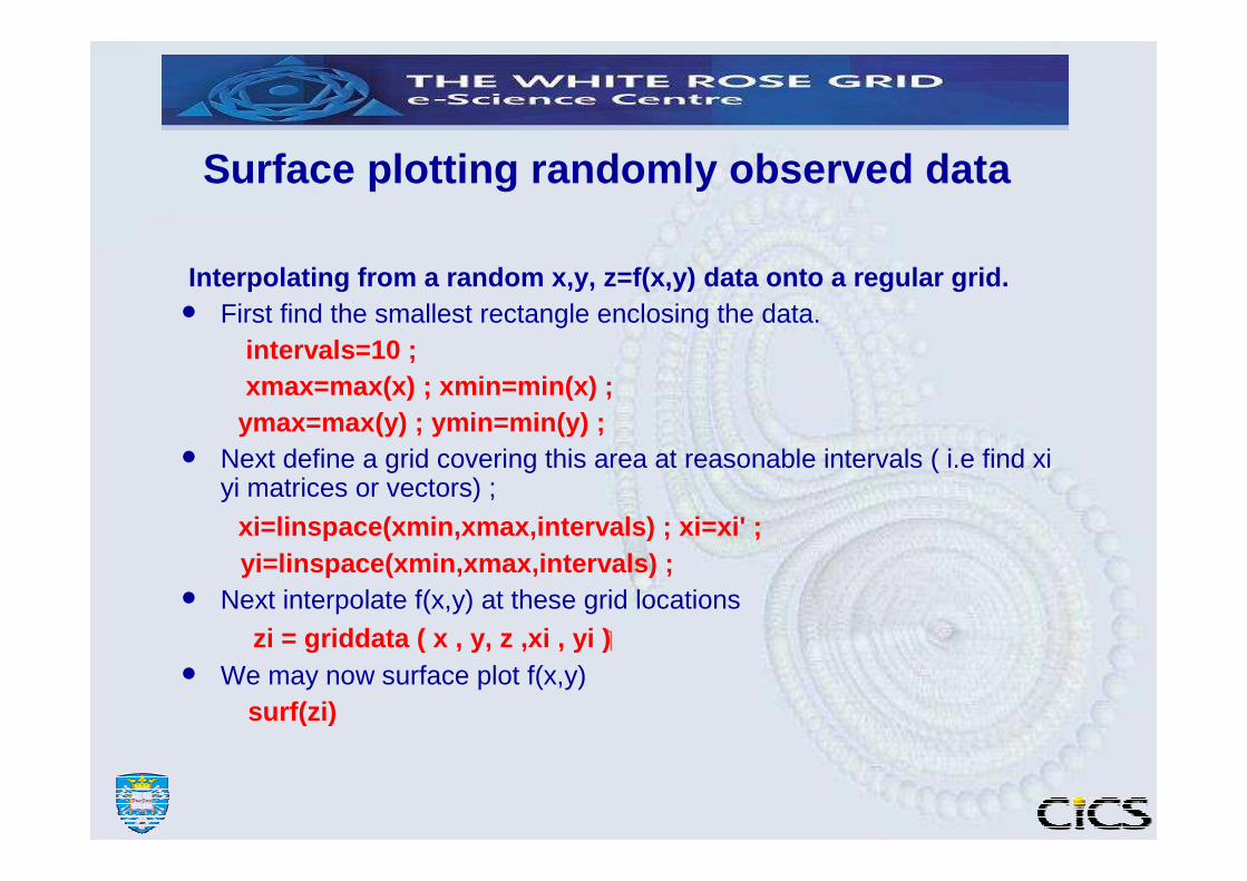
Surface plotting randomly observed data
Interpolating from a random x,y, z=f(x,y) data onto a regular grid.• First find the smallest rectangle enclosing the data.
intervals=10 ;xmax=max(x) ; xmin=min(x) ;
ymax=max(y) ; ymin=min(y) ;• Next define a grid covering this area at reasonable intervals ( i.e find xi
yi matrices or vectors) ;
xi=linspace(xmin,xmax,intervals) ; xi=xi' ;yi=linspace(xmin,xmax,intervals) ;
• Next interpolate f(x,y) at these grid locations
zi = griddata ( x , y, z ,xi , yi ) �
• We may now surface plot f(x,y)surf(zi)

contour and contourf commands
Syntax: contour(Z) contourf(Z)contour(Z,n) contourf(Z,n) contour(Z,v) contourf(Z,v)
where Z is a matrix n is an integer and vis a vector.If n is specified (n) number of contour lines are drawn. If v is specified each element of v indicates the position of the contour level.
contour and contourf are identical except that contourfdraws filled contours.
contour3 command
• same as contour command but will draw in 3-dimension with the heights of contours spanning the z direction. It may be preferable to the surf command with complex surfaces.
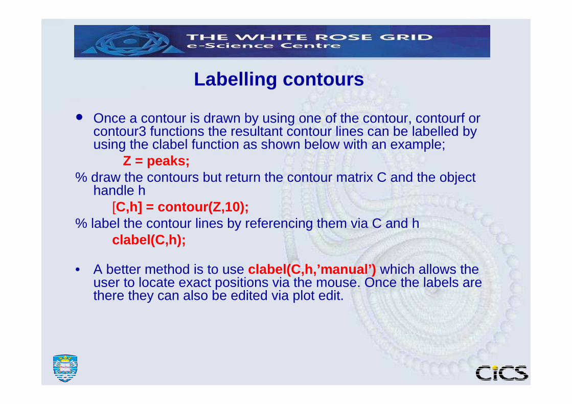
Labelling contours
• Once a contour is drawn by using one of the contour, contourf or contour3 functions the resultant contour lines can be labelled by using the clabel function as shown below with an example;
Z = peaks;% draw the contours but return the contour matrix C and the object
handle h[C,h] = contour(Z,10);
% label the contour lines by referencing them via C and hclabel(C,h);
• A better method is to use clabel(C,h,’manual’) which allows the user to locate exact positions via the mouse. Once the labels are there they can also be edited via plot edit.

Practice Session-6Contour Plotting
x= -15:1:15 ; y = -15:1:15 ;
[ X Y ] = meshgrid(x,y);
Z = X.*X - Y.*Y ;
contourf( Z )
now plot these contours on 3D;[ C , h ] = contour3( Z ) ;
label these contours using the mouse;
clabel( C,h,’manual’ )
Surface plot the same data ;surf( Z ) �
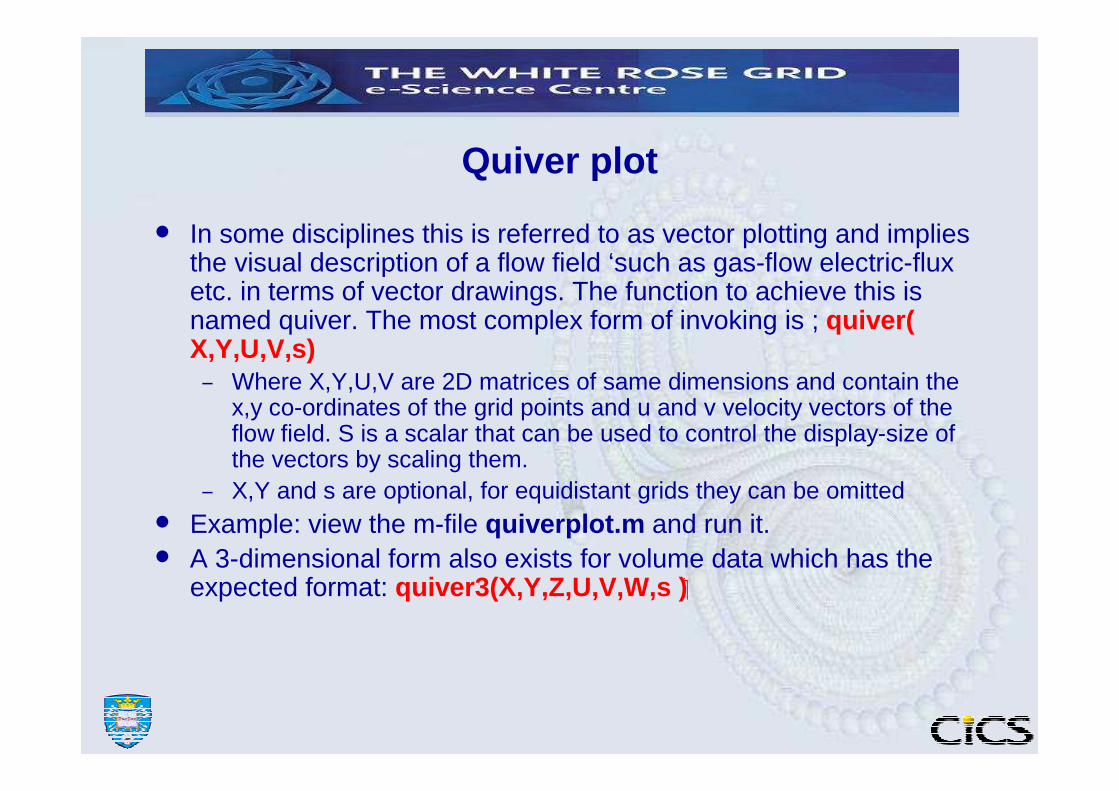
Quiver plot
• In some disciplines this is referred to as vector plotting and implies the visual description of a flow field ‘such as gas-flow electric-flux etc. in terms of vector drawings. The function to achieve this is named quiver. The most complex form of invoking is ; quiver( X,Y,U,V,s) – Where X,Y,U,V are 2D matrices of same dimensions and contain the
x,y co-ordinates of the grid points and u and v velocity vectors of theflow field. S is a scalar that can be used to control the display-size of the vectors by scaling them.
– X,Y and s are optional, for equidistant grids they can be omitted• Example: view the m-file quiverplot.m and run it. • A 3-dimensional form also exists for volume data which has the
expected format: quiver3(X,Y,Z,U,V,W,s ) �

Colors and colormaps• A Matlab figure will have a color-map ( i.e. palette ) associated with it that determines the
range of colors available for surface, patch and image colouring.• The default colormap is normally a 64-by-3 array of RGB values from blue to red.• The colormap command can be used to define/refine this colour palette in following
different ways; • colormap(name) where name is any one of the following predefined palette
names: default, hsv, hot , pink , copper,gray,jet, summer , spring, winter ,bone …• mymap = colormap save the current colormap matrix in mymap• or mymap = get(gcf , ‘Colormap’ ) ;
• colormap( mymap) redefine the colormap by using mymap array.
• While a figure is active its color map can be viewed and modified by using the command colormapeditor

caxis command
• Whilst colormap determines the colour-palette to use , such as ‘rainbow’ , grey-scale’ etc. caxis command determines how the data values gets mapped onto this colour-scale.
• By default the minimum data value min maps onto the first colour in the colour palette and the maximum data value maxmaps onto the last colour in the colourmap.
• Values between min and max are mapped linearly to the corresponding intermediate colours in the colourmap.
• The colour mapping can be redefined by calling caxis with new minimum and maximum values for the first and last colours. E.g.
caxis ([ xmin xmax] )

Practice session 7
(1) Try: z=peaks; h=surf(z); shading interp ; axis off;colormapeditor and see the effects of changing the color palette.
(2) Try: [cmin cmax] = caxis ; ic1 = linspace(cmax-eps*10, cmin+eps*10 , 30 ) ;for ii = ic1 caxis( [ ii cmax ] ) ;pause(0.2);
end(3) Try: z(20:30,30:40)=NaN; set(h,’ZData’,z ) ; and see the
effects.
(4) Experiment with the view command on this plot.
gplot command
• Graph theory related plotting ( nodes and connections)�• let v be matrix of order m by 2 or m by 3• containing the (x,y,z ) coordinates of m number of points (
nodes) respectively.• Let A be the m by m connection matrix which defines the
connections between these nodes. A(i,j) will be 1 if there is a direct connection between nodes i and j or else it will contain a zero.
gplot continued
• Given A and v as above the command ;
• gplot(A,v)�• will plot the connectivity graph
• The bucky-ball ( buckminster-fuller ring ) is a good example;
• [B,v] = bucky;
• gplot(B,v)�
• axis equal

THE END