Embed Size (px)
Citation preview

By Najmi Zesdyzar
Design Concept:At its core, IKEA is about accommodating the celebration of people. Hence, this design depicts liveliness happening 'inside' Ikea; a frame for which Life takes place.

By Hazeeq Syahme bin Mohd Afzan
Design Concept: When thinking about the design, there were two points that I wanted to tackle. The first one is (1) What is undoubtedly Malaysian and (2) How do I incorporate animals into this? (for my love of animals). So, I was thinking of what do every Malaysian share/know of? I'm sure every Malaysian knows the story of how Parameswara saw a Mousedeer/Pelanduk near the riverbank when he founded Melaka. That's it! For many, this scene in a way is a start of the formation of Malaysia and the story has an animal in it. The piece is titled "Out of the Woods". I went with a cartoony/sketchy style to capture the cuteness of the mousedeer and to appeal to younger audiences. I also like the use of bold, unrealistic colours with it to compliment the art style.

By Paul Ching
Design Concept: The design is combined Malaysia popular landmark, our national flower, hornbill, and Malaysia flag to show Malaysia is truly Asia. For wording Y, I would like to introduce our culture, our spoken languages, food, traditional game and our festival.

By Selina
Design Concept: It's about races in Malaysia, which shows the unity in our nation which we're proud of it.

By Nik Amila binti Baszelan
Design Concept:MALAYSIA is so unique, representing by so many details that made us, Malaysians. There is batik and Borneo motives representing the local traditional crafts, Nasi Lemak as we all know is Malaysia sole food no other countries can claim, and of course, we all proud for this land to be rich with Durian and mangosteen. A hint of Malaysia Ringgit note as our currency, the exotic hornbills giving the state of Sarawak to be called "Bumi Kenyalang", our Petronas Twin Towers, proudly be the tallest twin towers in the world since 1996, and never forget our very own national car, Proton. If you ask any Malaysia citizens, everyone knows about Langkawi island as one of the top local tourist spot, hence the iconic eagle (Lang) statue. Red and white stripesrepresenting bits of Malaysia flag, supported by 3 racial ethniques as the symbol of Malaysians unity. Last but not least, Bunga Raya or hibiscus as our national flower is highlighted; 2 in M and 5 in Y, because of IKEA 25th anniversary. I choose Bunga Raya to decorate the logo as it has 5 petals, representing 5 Rukun Negara (national principles) of Malaysia, the most important essence of what made Malaysia our peaceful country today.

By Nicholas Hoi
Design Concept:
Is a classic design with all the little furniture in the "MY" logo, The glitter on the border represents confetti to celebrate IKEA's 25th Birthday in Malaysia.

By Thang Eng Hong
Design Concept:Sejurus dengan reka bentuk dari model saya ialah mengandungi gambar berbentuk gif yang terbabit denganmengibarkan IKEA sebagai kedai perabot yang terunggul di malaysia.

By Nurul Dalilah Binti Nokman
Design Concept:1) Border decorated with 14 flags.2) The background colour for the letter M is blue and yellow, then the letter is decorated with several towers, mosques, houses of worship and historic buildings in Malaysia.3) The background colour for the letter Y is red and white, then the letter is decorated with several types of food found in Malaysia, local fruits, rickshaws and also the national flower of Malaysia which is hibiscus.4) The words 'IKEA 25th' are coloured alternately with the colours of the Malaysian national flag.

By Yasir bin Ahmad zamil
Design Concept:Gabungan warna warni Malaysia, terdapat grafik motif tradisional Malaysia iaitu;wau, sepak raga, bunga raya, nasi lemak & mencanting batik.

By Khoirun Nasehah Binti Mohd Kadiman
Design Concept: Batik Pattern- A tradition of making batik found in MALAYSIA Batik Color- A touch of Scandinavian colour trends of 2021- Hornbill & Rafflesia- Malaysian local bird and flower and leaves- To indicate Malaysia as a tropical country

By Hanis Nabilah
Design Concept:This is my design for MY IKEA design contest .It was so simple and clean. The flower is one of my wood carvings design that I made at school.
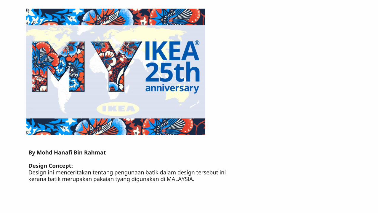
By Mohd Hanafi Bin Rahmat
Design Concept: Design ini menceritakan tentang pengunaan batik dalam design tersebut inikerana batik merupakan pakaian tyang digunakan di MALAYSIA.

By Nurul Jasmine Binti Abdul Khair
Design Concept: Design ini menceritakn tentang pengunaan bendera Malaysi didalamnya membawa maksudIKEA terdapat di Malaysia sepanjang 25tahun..dan BUNGA RAYA membawa maksud bungakebangsaan MALAYSIA

By Yuko Dohi
Design COncept: I am a Japanese who moved to Malaysia last year. My favorite flower has been hibiscus since I was a kid. It is too easy to fell in love Malaysia where the hibiscus are blooming all over the place. And this year is the year of ox, isn’t it?? I designed the 25th anniversary with the cow pattern.

By Masashi Morimoto
Design Concept:Night mode IKEA.The Plough and the Milk Dipper.Happy 25th anniversary.

By Chan Khuai Man
Design Concept:Malaysia is a multi-ethnic country and made up of many different cultures. In this design I added Malaysia know-well iconic buildings and animals such as KLCC and Malayan Tiger. At the same time, I added and brought out art of multi-ethnic that shows how Malaysia is so colourful and harmonious. The colors that I put in KLCC buildings and hibiscus flowers that show Malaysia and Sweden have the same color are blue and yellow that means hopefully IKEA in Malaysia have good business forever and expert that a lot furniture come out to make us easy in life. Wish IKEA Happy 25th Anniversary !

By Muhammad Hazmi Bin Abd Ghapar
Design Concept:My design is about our symbolic of Malaysia independence day, which we celebrated it every year. Alphabet MY represent " Jalur Gemilang ", the patterns inspired by our webbing technique, "tikar menkuang. Hibiscus, which our national flowers and symbol of love elements represent our love of the Malaysia country. As well, the silhouette of Tunku Abdul Rahman, Petronas twin towers as iconic elements with geometric patterns to add simplicity and freshness of the design.

By Lim Shi Ying
Design Concept:Happy 25 Anniversary!Glad you are 25 years old in Malaysia! Due to the epidemic situation in the past two years, I cannot patronize you often. I hope to visit again after the epidemic stabilizes! All the best! We will definitely wait for the rainbow after the rain!
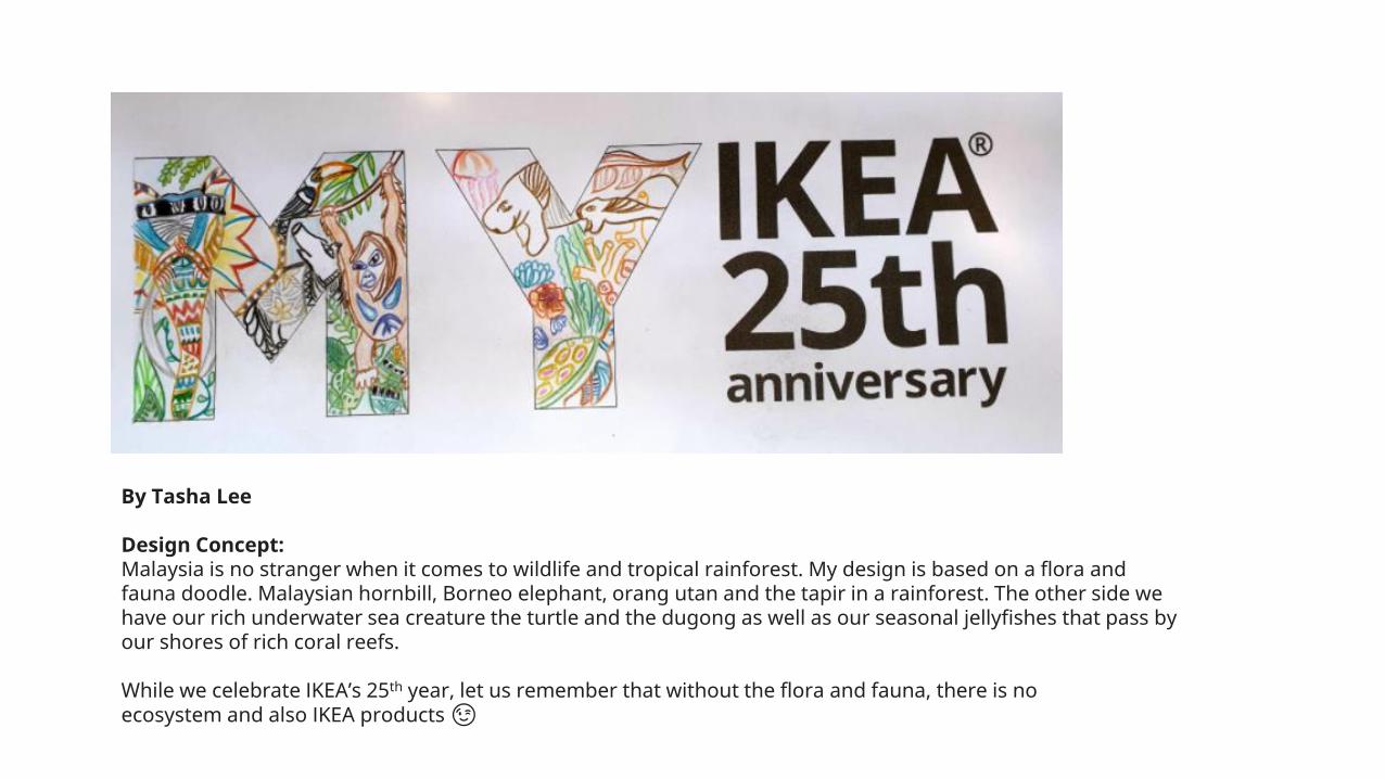
By Tasha Lee
Design Concept: Malaysia is no stranger when it comes to wildlife and tropical rainforest. My design is based on a flora and fauna doodle. Malaysian hornbill, Borneo elephant, orang utan and the tapir in a rainforest. The other side we have our rich underwater sea creature the turtle and the dugong as well as our seasonal jellyfishes that pass by our shores of rich coral reefs.
While we celebrate IKEA’s 25th year, let us remember that without the flora and fauna, there is no ecosystem and also IKEA products😉

By Pang Kah Yan
Design Concept:1.Flower & leaves symbolize love and family. IKEA care about you.2.Red roses carry meaning of passion and love.3.Colorful rhombus is a geometric represent equality with Malaysia is multi-racial country to promote equality, and harmony.4.Ocean is a symbol of power, strength, life and hope. IKEA I care to provide all the best to our customers.

By Zulfandy bin Nordin
Design Concept:M : Variety of food sell at Ikea MalaysiaY : Malaysia National Flower (Hibiscus)

By Iza Sazanita
Design Concept:When East meet West. Bright cheerful colour of hibiscus flower blended in soft pastel colours by cross stich element.

Design Concept- This design is story about our Malaysian food culture from different races we have in Malaysia, especially Malay, Chinese and Indian in background of our country landmark like a KL tower and KLCC.- Colour scheme that I use base on Malaysia flag as a main colour for this design.
By Mohd Izwan Bin Zainin
Design ConceptThis design is about Malaysia famous tourist attraction, it’s showing some iconic landmark in Malaysia likes KLCC, KL Tower, and more.

By Nurul Jasmin Binti Zolhairi
Design Concept:So what I did here was the beautiful pattern was actually inspired by this "swedish textiles" I found. These colourful flowers symbolizes on how beautiful IKEA is. And I also added a little Sweden and Malaysian flower (twinflowers) and (Hibiscus).

By Azman Manap
Design Concept:The blending beauty of Malaysia and how throughout the years Malaysia developed into a modern country and risen in such harmony and strong culture. It's the same with IKEA with a beautiful furniture system found by Ingvar Kamprad, came into Malaysia 25 years ago with a strong will and great team they develop and create a history of their own.

By Carsten Lim
Design Concept:I used elements of IKEA building, multiracial staff, uniform, measurement tape, Malaysia flag and SOP for prevention of COVID.
I would like to use this opportunity to send everyone a message, let's do our part, follow the SOP, so that we can end this pandemic as soon as possible.#kitajagakita #menangbersama
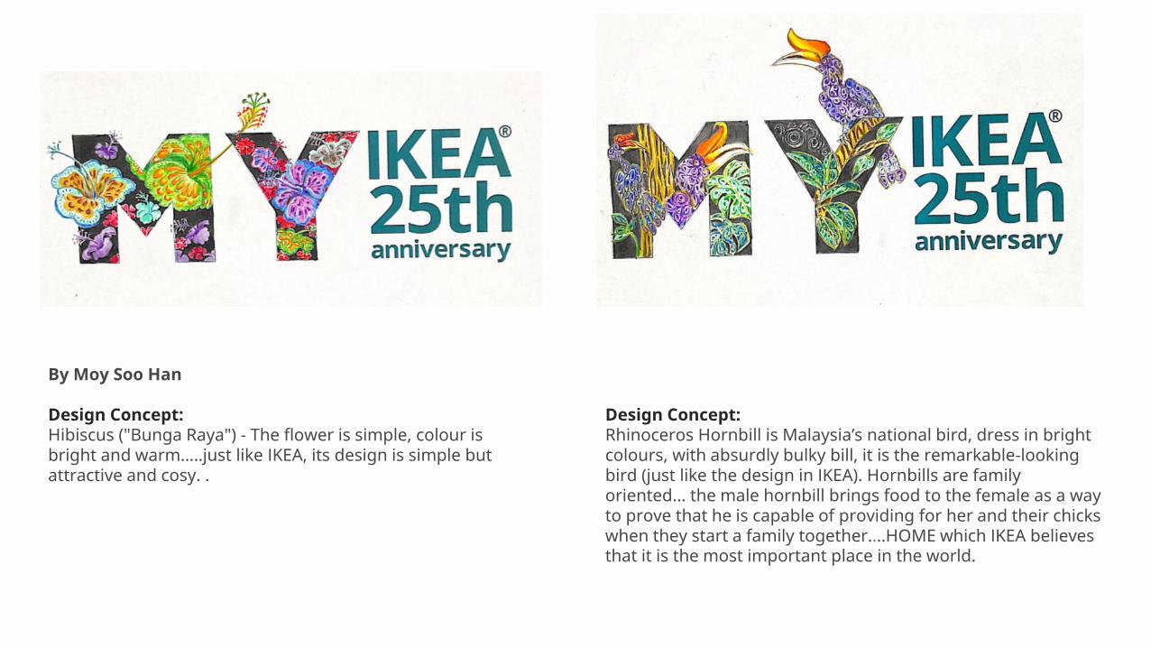
By Moy Soo Han
Design Concept: Hibiscus ("Bunga Raya") - The flower is simple, colour is bright and warm.....just like IKEA, its design is simple but attractive and cosy. .
Design Concept: Rhinoceros Hornbill is Malaysia’s national bird, dress in bright colours, with absurdly bulky bill, it is the remarkable-looking bird (just like the design in IKEA). Hornbills are family oriented... the male hornbill brings food to the female as a way to prove that he is capable of providing for her and their chicks when they start a family together....HOME which IKEA believes that it is the most important place in the world.

By Muhammad 'Abbas Shafiq bin Zairuddin
Design Concept:My design is about to show the buildings in KL which consist of all furniture products because most Malaysian or KL people use Ikea's products.

By Ammar bin Mohamad Riza
Design Concept:The design is mainly a series of traditional Malay houses that can be seen across the country. The reason why I choose this type of design is because I want to relate how Malaysians have evolved in using and designing their houses by just a simple mat and a mosquito net to a more unique fusion between modern and traditional furniture. To reflect the simplicity of life, the majority of IKEA's furniture really shows how simple and easy it is to be built using minimal tools.

By Ally Lau
Design Concept:There is no place more beautiful than our home, Malaysia with our unique culture and heritage.

By Chong Chiu Shih
Design Concept:Glorious lane of waving Malaysia flag with background of Ikea iconic colour. Showed love from Malaysia wishing of another 25 years ahead.

By Muhammad Iman Hakimi Bin Hashim
Design Concept: My design has a hot dog, an egg that is falling into a bowl and the words are casting shadows, it is simple like the design of IKEA's furniture etc.

Design Concept:Fun & Playful
Design Concept:Colourful Geometry
Design Concept:Jalur Gemilang
Design Concept:National flower
Design Concept:Celebrating Bunga Raya
Design Concept:International progression
By David Lim

By Samuel Lee Chee Zin
Design Concept:The design embrace the textile culture of both Malaysia and Sweden. The font M is filled with songket weaving pattern, an intricate traditional fabric found in Malaysia. On the other hand, the font Y is filled with Swedish knitting pattern. Although having different culture, the pattern are surprising similar in certain geometry and shape.I applied the IKEA iconic blue and yellow as the main colour scheme in both pattern design. Meanwhile, the red colour rug STOCKHOLM 2017 act as a common background. This is to emphasis the role of IKEA to connect the two countries.

By Tan Shin Yi (mother) & Tay Yi Thang (5 years old daughter)
Design Concept:IKEA concept painting

By Nur Hidayah Binti Abdullah
Design Concept: This logo design is themed on cheerful and simple flora and fauna. butterflies symbolize customers who come to IKEA to shop while flowers symbolize the various types of goods available at IKEA.

By Loke Jee Ann
Design Concept:
My first impression of the words "MY" is Malaysia. Therefore, my artwork idea adopts several Malaysia elements to represent the beauty of my country. The concept of colorful design is to express the feeling of harmony from different races and cultures.

By Yap Kim Hong
Design Concept:25 IKEA magazines, 25th IKEA Anniversary!

By Wong Jian Feng
Design Concept:Inspired by the 'Jalur Gemilang' (Malaysia' national flag), using the corak of batik to represent the identity of our unique patterns. The national flowers as a metaphor of 'historical moments' store at the IKEA shelf as the shelve itself is timeless to keep all the moments.

By Dalbert Lee
Design Concept:Iconic IKEA in Malaysia. who doesn’t know IKEA right?

By Manpreet Kaur
Design Concept: My Design is a mixture of tradisional batik designs which is featured as the background, 4 specific colours representing the Jalur Gemilang colours which are Blue ,Red ,Yellow and white . The [ M ] design portrays the things that represents Malaysia and Malaysia's tourist attractions .The [ Y ] design is specially dedicated to the frontliners who are currently fighting for Malaysians health .It's also a little of the current situation Malaysia is facing during the Merdeka season. That is about my design . Overall it is a mixture of the tradisional, things that represents Malaysia as a whole and the current situation.

By Lee Kho Sin
Design Concept:My IKEA My Home

By Jon Tham Nam San
Design Concept:My design is about IKEA, for 25 years, giving Malaysians a proud building experience. Smiles ignite in the faces of the rakyat when we unbox our IKEA furniture, assemble it and complete the duty.Nation building starts from the home.

By Norhayati Binti Ali
Design Concept:Peta dan Warna Bendera Johor - menunjukkan kebanyakan motif yang ditunjukkan dalam MY IKEA ini adalah dari negeri Johor. Dan warna bendera negeri Johor adalah Putih, Merah dan BiruHarimau - Selain kebesaran dan kegagahan harimau ini, ciri-ciri terpenting yang dimiliki harimau ialah corak belang menegak berwarna hitamyang melapisi bulunya yang berwarna keputihan atau merah kejinggaan dan terkenal dengan gelaran Harimau Selatan di Johor.Kuda Kepang - Tarian kuda kepang telah diiktiraf sebagai warisan kesenian rakyat khasnya masyarakat Johor.Motif Lada Hitam dan Gambir - Menurut buku Adat Istiadat Diraja Johor, motif lada hitam dan gambir dipopularkan oleh Sultan Abu Bakar sebagai tanda mengabadikan peranan yang dimainkan oleh kedua-dua tanaman itu dalam memajuman ekonomi negeri Johor.Kerawang berwarna emas sebagai motif corak hiasan yang biasa digunakan pada hiasan dinding rumah - rumah tradisional.Bunga raya - sebagai bunga kebangsaan Negara Malaysia yang menunjukkan bahawa Johor terletak di selatan negara Malaysia.
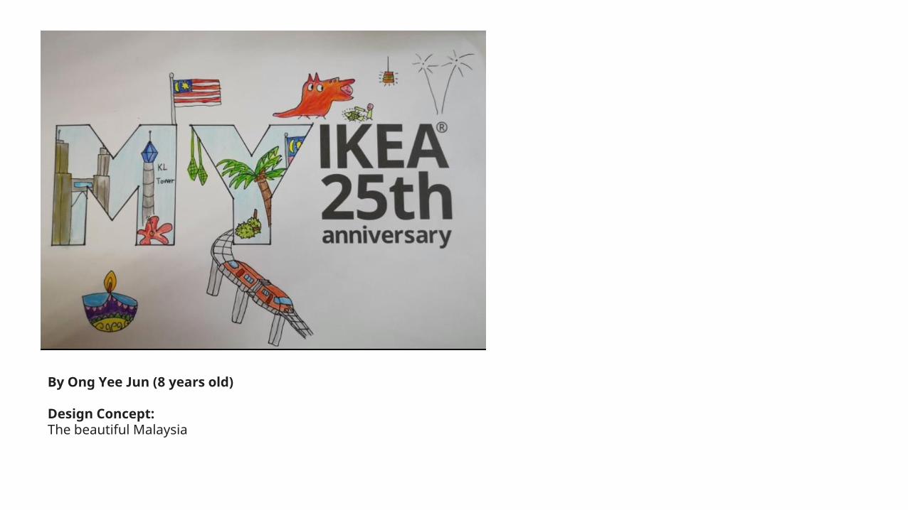
By Ong Yee Jun (8 years old)
Design Concept:The beautiful Malaysia

By Fatimah Binti Abdul Razak
Design Concept: I chose a simple and humble BATIK background with floral motif for my design.

By Cindy Poh
Design Concept: I named my design as 'HOME25' to thank IKEA for serving Malaysians and being our happy home 🏡 for 25 years now. The images in the logo represent the vibrance & colours of this country with the pride of our local fruits, animals, and a touch of modern lifestyle inspired by Swedish.
Happy 25th, IKEA Malaysia!

By Norazzatie Husna Rinase Binti Azmi
Design Concept: My design is about Malaysia National Flower which is Hibiscus

By Shafeqah Binti Rashidan
Design Concept:Since Malaysia Day are coming soon which is 16 September, I decided to design a geography of Malaysia in the alphabet M and Y. Together with small Malaysian flag at the bottom.
Design Concept: Ketupat is one of the must have food during Islamic festival which are Aidilfitri and Aidiladha. To make it, ones need to be very skillful when making the ketupat. In order to make it, coconut leaves is needed. Beside talking about the food, this coconut leaves also used to make the aboriginal home; the wall, rooftop and so many more. What I want to say here is I try to combine the Malay's art and the aboriginal's art unto 1 piece of art. Hope you enjoy the simplicity of the design that I make.

By Mohammed Luqman-hakim Bin Mohammed Rosdi
Design Concept: I'm using a simple design incorporated by 4 main colours from our country flag together with hibiscus and wau as the symbolic of Malaysian heritage. As how the symbolic in this design capture Malaysian's heart, same goes as how IKEA has reaches millions of hearts of Malaysian over these 25 years journey.

By Tan Guat Poh
Design Concept:💜Inside alphabets "MY" representing MY HEART IKEA,everthing is in my heart.💜Dots without a rope tights means Malaysia Free Covid.💜Dots with ropes means WE ARE TOGETHER HAND IN HAND WE WIN THE BATTLE .

By Elaine Yap Yoong Ling
Design Concept: My artwork concept is home sweet home. I used the color of IKEA with yellow and blue to present IKEA giving us ideal live with a better place to stay at Home.

By Md Fitri Bin Md Yusoff
Design Concept: This design tells about how the Swedish style and culture have been absorbed in Malaysian people for 25 years in which it became synonymous and loveable especially in home furniture and food.Combining the National flower of Malaysia (Bunga Raya) and National flower of Sweden (Blubell) explains everything.

By Muhammad Suhairi Bin Fakri
Design Concept: This design I use 'kain songket' in white color on the background because songket is the heritage of Malay in Malaysia, I also used the signature of Malaysia such as durian, nasi lemak, rambutan, teh tarik, hibiscus and rafflesia in the letters MY because it is the country's identity, as well as KLCC and Kuala Lumpur Tower are tourist attractions and Malaysian national identity. Besides that, im used black color cause symbolizes uniqueness and elegance. Overall I use the Malaysian identity in the artwork to be a symbol of this beloved country MY.

By Mohd Norfitry B Md Yusoff
Design Concept:
As one of Java land and Malaysia’s oldest heritage, Batik has been an inspiration for many people throughout many generations. It has so much part in our society that its importance goes beyond a physical attire. It forms a tangible and intangible cultural heritage.For that, I embraced the classic pattern of Malaysia Batik and poured it into this artwork.
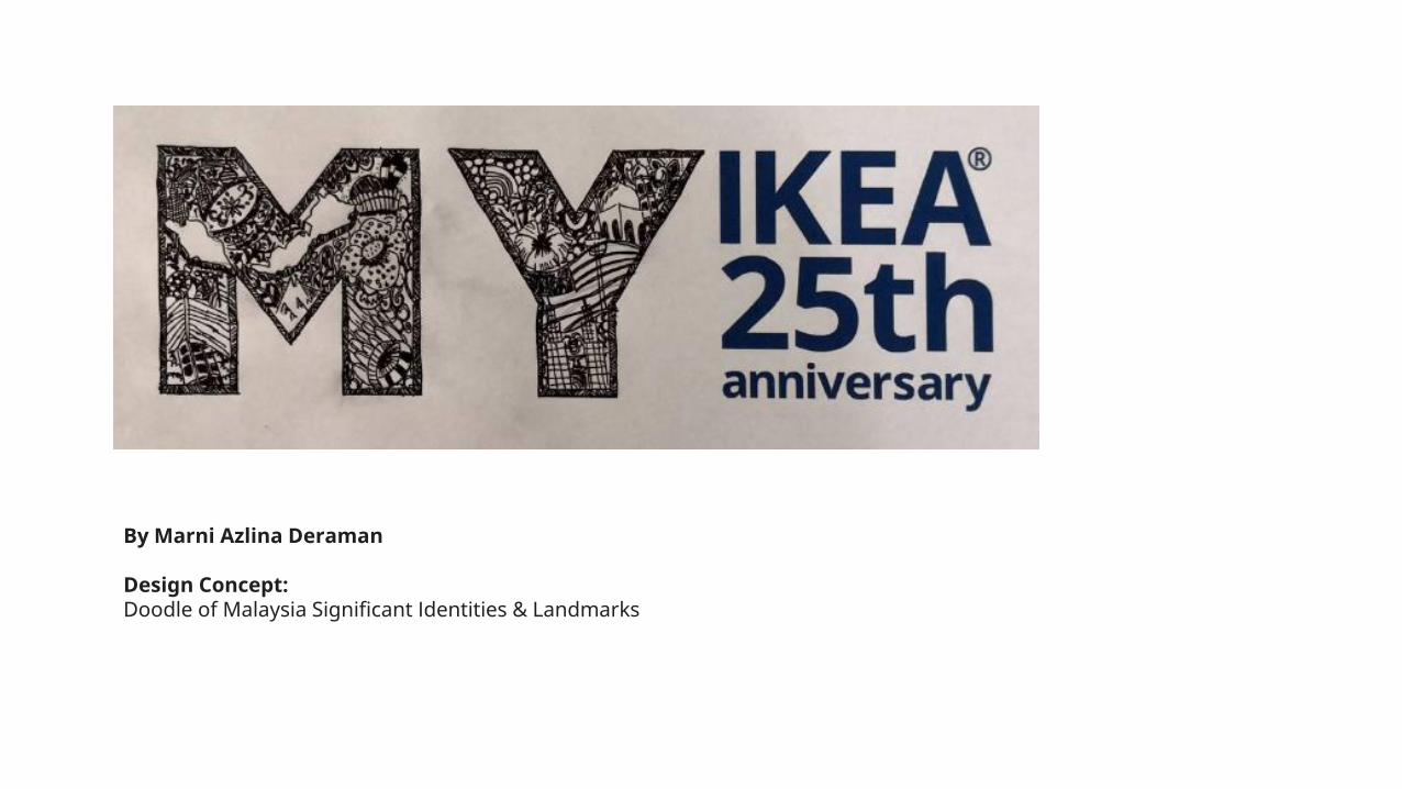
By Marni Azlina Deraman
Design Concept: Doodle of Malaysia Significant Identities & Landmarks

By Noraishah Che Ani
Design Concept: MY Flora symbolizes a lasting happy life where all flowers' blossoms for their own joy.May the flowers unfurl to greet you and make all people happier and better throughout these hard times.

By Lim Seng Seong
Design Concept:To celebrate 25 years as one of Malaysia’s favourite stores,I have placed the figures “2” and “5” at the center of MY IKEA logo.If you focus on the yellow parts of the letters “M” and “Y”, you’ll see “25.”The unusual zig-zag letters create a fun and playful mood for the logo.

By Liza Masrina Binti Ibrahim
Design Concept:
“Together in Everything” is the theme of my design. It combines all the elements that unite ‘Us’ together as a Proud Nation ; Our Tradition, Culture, Arts, Food and ke course IKEA!

By Muhammad Khairul Azmi Bin Ahmad
Design Concept: IKEA My StyleMalaysian Tropica Concept with simply outline & IKEA signature colour
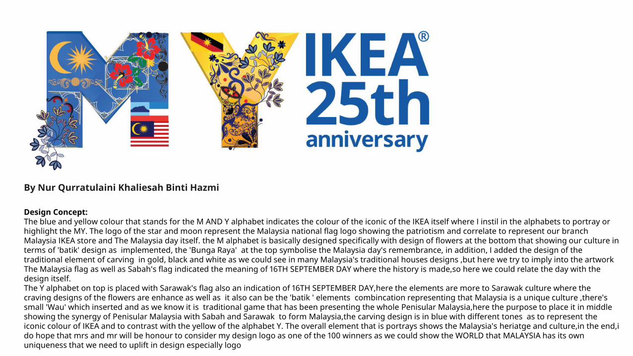
By Nur Qurratulaini Khaliesah Binti Hazmi
Design Concept:The blue and yellow colour that stands for the M AND Y alphabet indicates the colour of the iconic of the IKEA itself where I instil in the alphabets to portray or highlight the MY. The logo of the star and moon represent the Malaysia national flag logo showing the patriotism and correlate to represent our branchMalaysia IKEA store and The Malaysia day itself. the M alphabet is basically designed specifically with design of flowers at the bottom that showing our culture in terms of 'batik' design as implemented, the 'Bunga Raya' at the top symbolise the Malaysia day's remembrance, in addition, I added the design of the traditional element of carving in gold, black and white as we could see in many Malaysia's traditional houses designs ,but here we try to imply into the artworkThe Malaysia flag as well as Sabah's flag indicated the meaning of 16TH SEPTEMBER DAY where the history is made,so here we could relate the day with the design itself.The Y alphabet on top is placed with Sarawak's flag also an indication of 16TH SEPTEMBER DAY,here the elements are more to Sarawak culture where the craving designs of the flowers are enhance as well as it also can be the 'batik ' elements combincation representing that Malaysia is a unique culture ,there's small 'Wau' which inserted and as we know it is traditional game that has been presenting the whole Penisular Malaysia,here the purpose to place it in middle showing the synergy of Penisular Malaysia with Sabah and Sarawak to form Malaysia,the carving design is in blue with different tones as to represent the iconic colour of IKEA and to contrast with the yellow of the alphabet Y. The overall element that is portrays shows the Malaysia's heriatge and culture,in the end,ido hope that mrs and mr will be honour to consider my design logo as one of the 100 winners as we could show the WORLD that MALAYSIA has its own uniqueness that we need to uplift in design especially logo