Embed Size (px)
Citation preview
Branding Manual
�Branding Manual
The Summerside brand is shaped by the total experience people have when they interact with our city and see first-hand how we perform.
“Our Mission is to be Atlantic Canada’s premier city – the best city to visit, invest in and call home.”
The brand is defined by the way that people think, feel and respond on an emotional level when they see it. It embodies what Summerside is all about for the people who matter – our residents, businesses, employees, customers, partners and suppliers, investors, and neighbours.
Our brand promise is a suggestion of what can be found in the City of Summerside. The brand presented here represents many messages and feelings that were heard often during its creation:
InnovativeTimelessPotential to grow with usSpeaks to multiple audiencesMeets the needs of multiple stakeholders
This brand manual will provide you with all the information you need about when and how to use our new identity.
Back to index
�Branding Manual
Index
Message from the Mayor . . . . . . . . . . . . . . . . . . . . . . . . . . . . . . . . . . . . . . . . . . . . . . . . . . . . . . . . . . . 4
Partnership Acknowledgements . . . . . . . . . . . . . . . . . . . . . . . . . . . . . . . . . . . . . . . . . . . . . . . . . . 5
The Logo . . . . . . . . . . . . . . . . . . . . . . . . . . . . . . . . . . . . . . . . . . . . . . . . . . . . . . . . . . . . . . . . . . . . . . . . . . . . . . 6
Sizes . . . . . . . . . . . . . . . . . . . . . . . . . . . . . . . . . . . . . . . . . . . . . . . . . . . . . . . . . . . . . . . . . . . . . . . . . . . . . . . . . . . 8
Colours . . . . . . . . . . . . . . . . . . . . . . . . . . . . . . . . . . . . . . . . . . . . . . . . . . . . . . . . . . . . . . . . . . . . . . . . . . . . . . . . 9
Variations - Colours . . . . . . . . . . . . . . . . . . . . . . . . . . . . . . . . . . . . . . . . . . . . . . . . . . . . . . . . . . . . . . . . 10
Spacing . . . . . . . . . . . . . . . . . . . . . . . . . . . . . . . . . . . . . . . . . . . . . . . . . . . . . . . . . . . . . . . . . . . . . . . . . . . . . . . 11
Misuse of Logo . . . . . . . . . . . . . . . . . . . . . . . . . . . . . . . . . . . . . . . . . . . . . . . . . . . . . . . . . . . . . . . . . . . . . . 12
Stationery . . . . . . . . . . . . . . . . . . . . . . . . . . . . . . . . . . . . . . . . . . . . . . . . . . . . . . . . . . . . . . . . . . . . . . . . . . . . 13
Branding - Bills & Forms . . . . . . . . . . . . . . . . . . . . . . . . . . . . . . . . . . . . . . . . . . . . . . . . . . . . . . . . . . . 14
Branding - E-mail Signature . . . . . . . . . . . . . . . . . . . . . . . . . . . . . . . . . . . . . . . . . . . . . . . . . . . . . . . 15
Branding - Signage . . . . . . . . . . . . . . . . . . . . . . . . . . . . . . . . . . . . . . . . . . . . . . . . . . . . . . . . . . . . . . . . . 16
Branding - Vehicles . . . . . . . . . . . . . . . . . . . . . . . . . . . . . . . . . . . . . . . . . . . . . . . . . . . . . . . . . . . . . . . . . 17
Branding - Clothing & Marketing . . . . . . . . . . . . . . . . . . . . . . . . . . . . . . . . . . . . . . . . . . . . . . . . . 19
Taglines . . . . . . . . . . . . . . . . . . . . . . . . . . . . . . . . . . . . . . . . . . . . . . . . . . . . . . . . . . . . . . . . . . . . . . . . . . . . . . 22
Sub Brands . . . . . . . . . . . . . . . . . . . . . . . . . . . . . . . . . . . . . . . . . . . . . . . . . . . . . . . . . . . . . . . . . . . . . . . . . . 23
Sub Brand - City of . . . . . . . . . . . . . . . . . . . . . . . . . . . . . . . . . . . . . . . . . . . . . . . . . . . . . . . . . . . . . . . . . 24
Sub Brand - Downtown . . . . . . . . . . . . . . . . . . . . . . . . . . . . . . . . . . . . . . . . . . . . . . . . . . . . . . . . . . . . 27
Sub Brand - Tourism . . . . . . . . . . . . . . . . . . . . . . . . . . . . . . . . . . . . . . . . . . . . . . . . . . . . . . . . . . . . . . . . 31
Contact . . . . . . . . . . . . . . . . . . . . . . . . . . . . . . . . . . . . . . . . . . . . . . . . . . . . . . . . . . . . . . . . . . . . . . . . . . . . . . . 35
Back to index
�Branding Manual
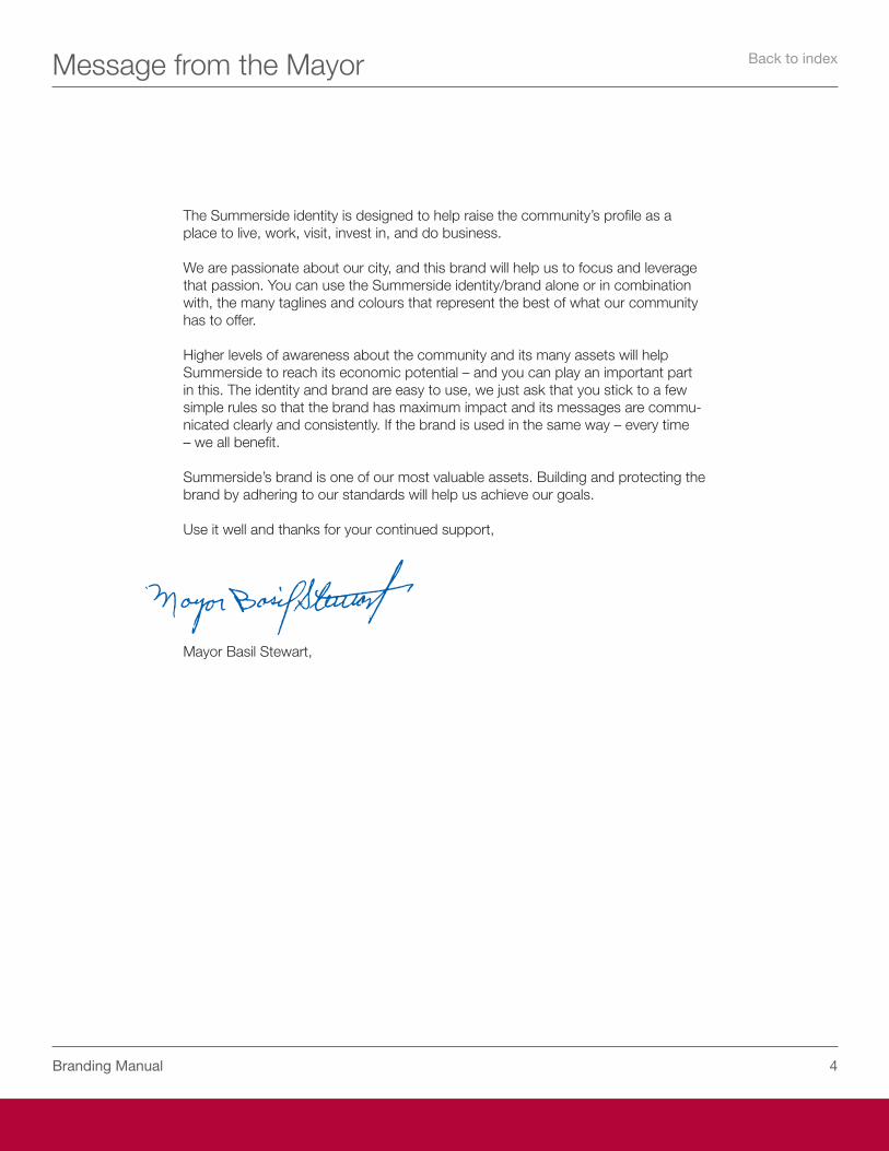
Message from the Mayor
The Summerside identity is designed to help raise the community’s profile as a place to live, work, visit, invest in, and do business.
We are passionate about our city, and this brand will help us to focus and leverage that passion. You can use the Summerside identity/brand alone or in combination with, the many taglines and colours that represent the best of what our community has to offer.
Higher levels of awareness about the community and its many assets will help Summerside to reach its economic potential – and you can play an important part in this. The identity and brand are easy to use, we just ask that you stick to a few simple rules so that the brand has maximum impact and its messages are commu-nicated clearly and consistently. If the brand is used in the same way – every time – we all benefit.
Summerside’s brand is one of our most valuable assets. Building and protecting the brand by adhering to our standards will help us achieve our goals.
Use it well and thanks for your continued support,
Mayor Basil Stewart,
Back to index
�Branding Manual
Partnership Acknowledgements
The Summerside Partnership was established with a short-term mandate: oversee the creation of a new marketing position and the development of a new brand for the city, and prepare a marketing and communications plan.
These guidelines represent the terrific work of the Summerside Partnership, a group comprised of professionals from every sector in our great city. We’d like to acknowledge and thank the following members of the Partnership who have been working diligently since early 2006 to help redefine our brand and unify our city:
Arnold Crocken, Tourism Summerside
Bill Thompson, Slemon Park
Reagh Ellis, Mark’s Work Warehouse
Ron Barrett, Century 21
Scott Fingler, Fiber Connections
Blake Craig, Jubilee Theatre
Scott McCauley, College of Piping
Dave Perry, Kodak Health Imaging
Nelson Snow, Fitzgerald and Snow
Bruce Hickey, Spinnaker’s Landing
Lori Ellis, City of Summerside
Mike Thususka, City of Summerside
While there is still much work to be done, the foundation has been set and we’ll be relying on the Summerside Partnership to build upon these efforts. Thank you for your enthusiastic support of our renewed efforts to build value for the Summerside brand.
Back to index
�Branding Manual
The Logo
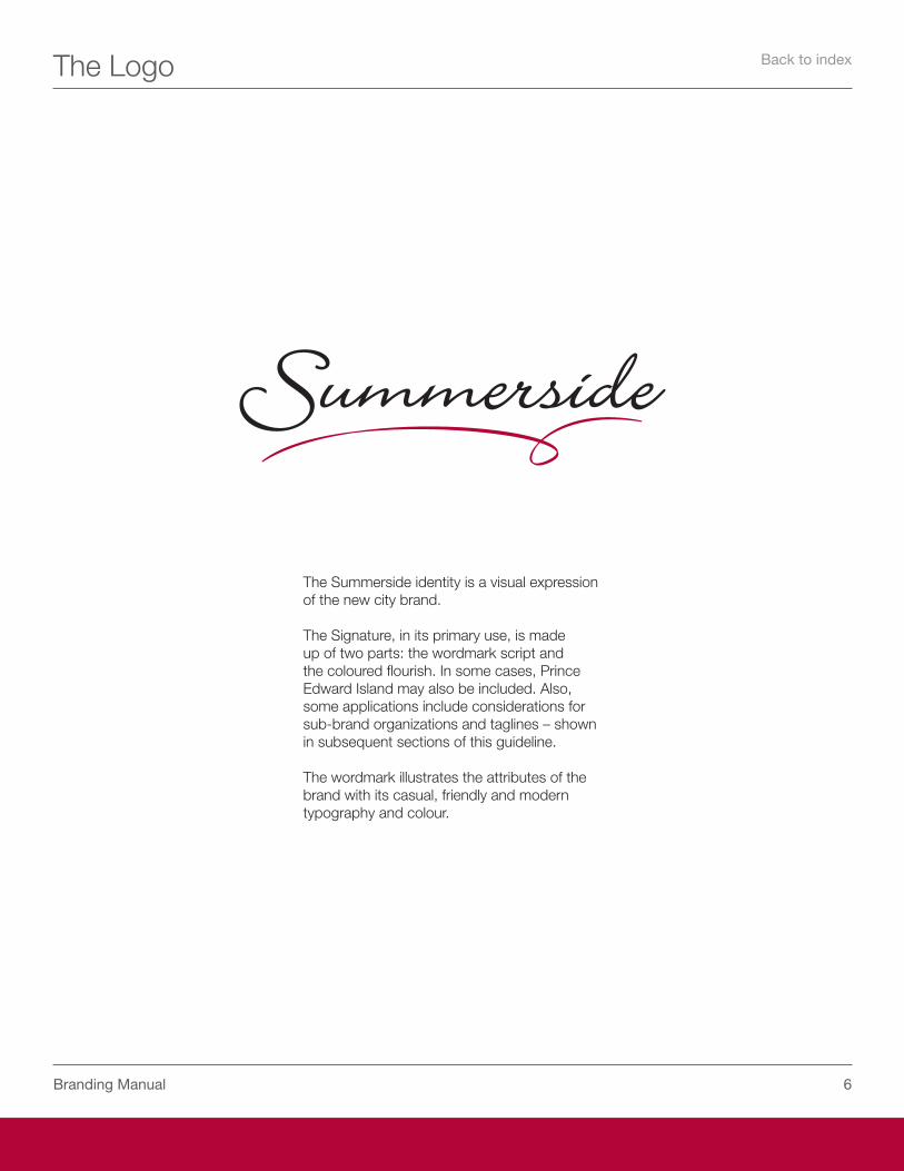
The Summerside identity is a visual expression of the new city brand.
The Signature, in its primary use, is made up of two parts: the wordmark script and the coloured flourish. In some cases, Prince Edward Island may also be included. Also, some applications include considerations for sub-brand organizations and taglines – shown in subsequent sections of this guideline.
The wordmark illustrates the attributes of the brand with its casual, friendly and modern typography and colour.
Back to index
�Branding Manual
The Logo
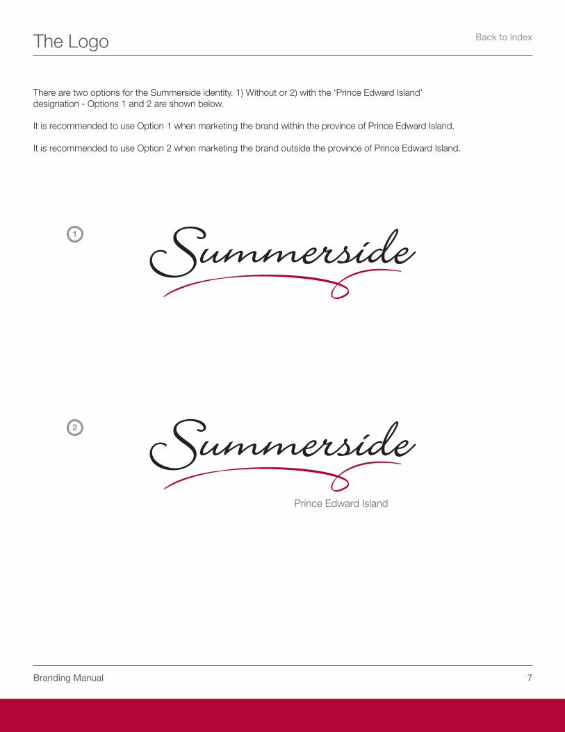
There are two options for the Summerside identity. 1) Without or 2) with the ‘Prince Edward Island’ designation - Options 1 and 2 are shown below.
It is recommended to use Option 1 when marketing the brand within the province of Prince Edward Island.
It is recommended to use Option 2 when marketing the brand outside the province of Prince Edward Island.
1
2
Back to index
�Branding Manual
Sizes
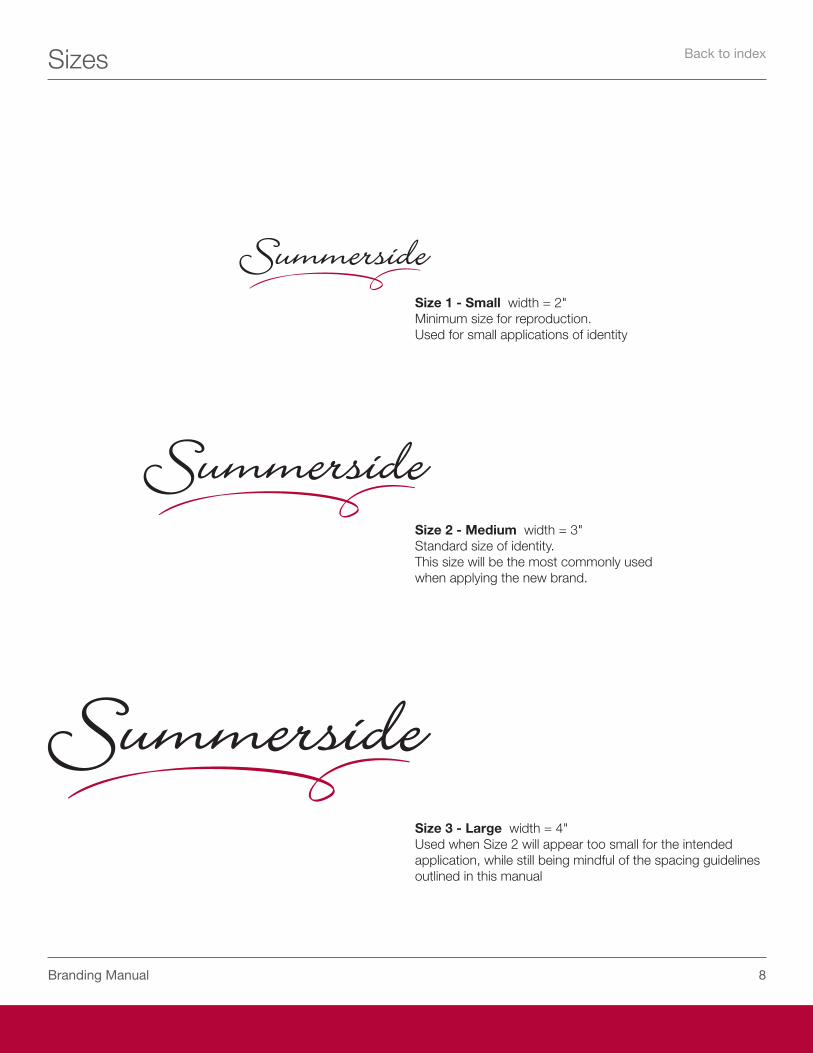
Size 1 - Small width = 2"Minimum size for reproduction.Used for small applications of identity
Size 2 - Medium width = 3" Standard size of identity.This size will be the most commonly usedwhen applying the new brand.
Size 3 - Large width = 4"Used when Size 2 will appear too small for the intended application, while still being mindful of the spacing guidelines outlined in this manual
Back to index
�Branding Manual
Colours
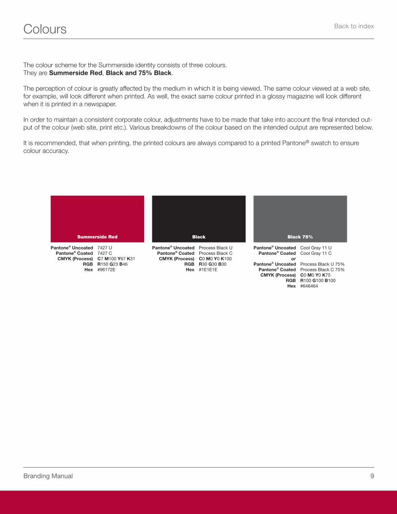
The colour scheme for the Summerside identity consists of three colours.They are Summerside Red, Black and 75% Black.
The perception of colour is greatly affected by the medium in which it is being viewed. The same colour viewed at a web site, for example, will look different when printed. As well, the exact same colour printed in a glossy magazine will look different when it is printed in a newspaper.
In order to maintain a consistent corporate colour, adjustments have to be made that take into account the final intended out-put of the colour (web site, print etc.). Various breakdowns of the colour based on the intended output are represented below.
It is recommended, that when printing, the printed colours are always compared to a printed Pantone® swatch to ensure colour accuracy.
Summerside Red
Pantone® Uncoated ���� U Pantone® Coated ���� C CMYK (Process) C� M100 Y�� K�1 RGB R1�0 G�� B�� Hex #��1��E
Black
Pantone® Uncoated Process Black U Pantone® Coated Process Black C CMYK (Process) C0 M0 Y0 K100 RGB R�0 G�0 B�0 Hex #1E1E1E
Black 75%
Pantone® Uncoated Cool Gray 11 U Pantone® Coated Cool Gray 11 C or Pantone® Uncoated Process Black U ��% Pantone® Coated Process Black C ��% CMYK (Process) C0 M0 Y0 K�� RGB R100 G100 B100 Hex #������
Back to index
10Branding Manual
Variations – Downloadable Files & Colour Formats
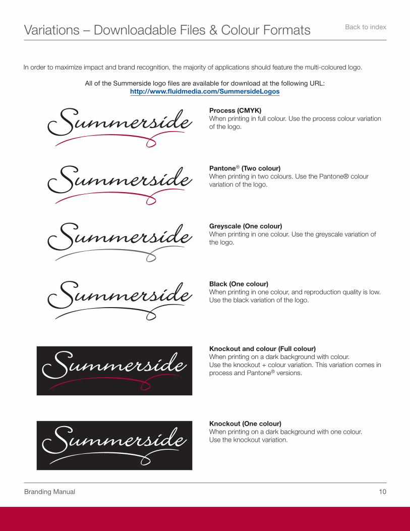
In order to maximize impact and brand recognition, the majority of applications should feature the multi-coloured logo.
All of the Summerside logo files are available for download at the following URL:http://www.fluidmedia.com/SummersideLogos
Process (CMYK)When printing in full colour. Use the process colour variation of the logo.
Greyscale (One colour)When printing in one colour. Use the greyscale variation of the logo.
Black (One colour)When printing in one colour, and reproduction quality is low. Use the black variation of the logo.
Knockout and colour (Full colour)When printing on a dark background with colour.Use the knockout + colour variation. This variation comes in process and Pantone® versions.
Knockout (One colour)When printing on a dark background with one colour.Use the knockout variation.
Pantone® (Two colour)When printing in two colours. Use the Pantone® colour variation of the logo.
Back to index
11Branding Manual
Spacing
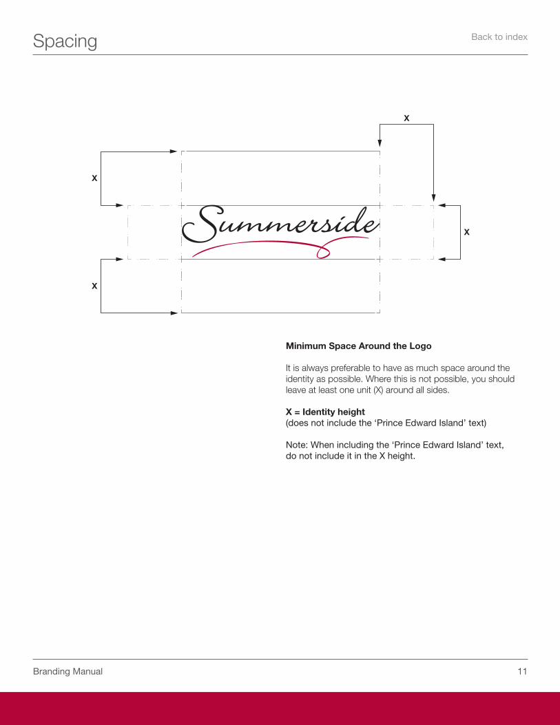
Minimum Space Around the Logo
It is always preferable to have as much space around the identity as possible. Where this is not possible, you should leave at least one unit (X) around all sides.
X = Identity height(does not include the ‘Prince Edward Island’ text)
Note: When including the ‘Prince Edward Island’ text, do not include it in the X height.
Back to index
1�Branding Manual
Misuse of Logo
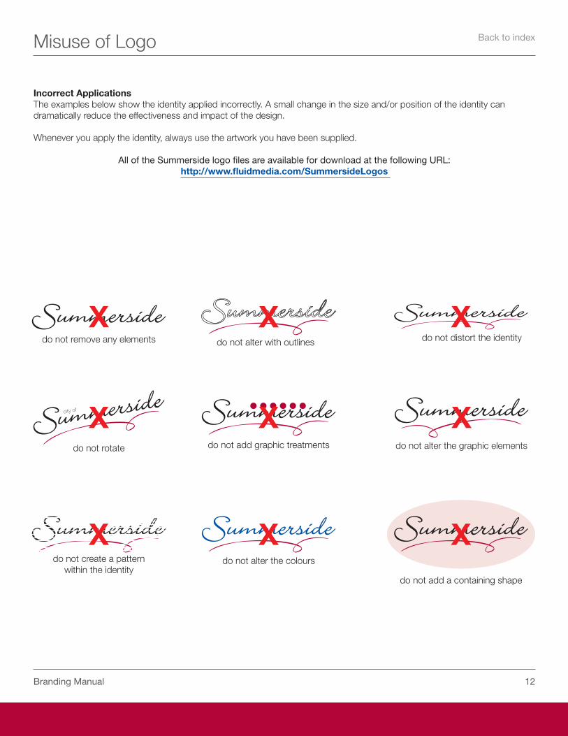
Incorrect ApplicationsThe examples below show the identity applied incorrectly. A small change in the size and/or position of the identity can dramatically reduce the effectiveness and impact of the design.
Whenever you apply the identity, always use the artwork you have been supplied.
All of the Summerside logo files are available for download at the following URL:http://www.fluidmedia.com/SummersideLogos
do not remove any elements
do not rotate
do not create a pattern within the identity
do not alter with outlines
do not add graphic treatments
do not alter the colours
do not distort the identity
do not alter the graphic elements
do not add a containing shape
Back to index

1�Branding Manual
Stationery
tel 902 432 1255fax 902 436 9296
Small city. Big Opportunity.
City of Summerside275 Fitzroy Street,Summerside, PE C1N 4K4 CANADA
www.city.summerside.pe.ca
From the Department of Economic Development
Small city. Big Opportunity.www.city.summerside.pe.ca
Mike Thususka EC. D.Director Economic Development
City of SummersideEconomic Development275 Fitzroy Street,Summerside, PE C1N 4K4 CANADA
tel 902 432 1255mobile 902 432 0103
fax 902 436 9296
City of Summerside275 Fitzroy Street,Summerside, PE C1N 4K4 CANADA
www.city.summerside.pe.ca
Suggested examples of letterhead, envelope and business card are shown.
Business Card Front
Business Card Back
Back to index
1�Branding Manual
Branding - Bills and Forms
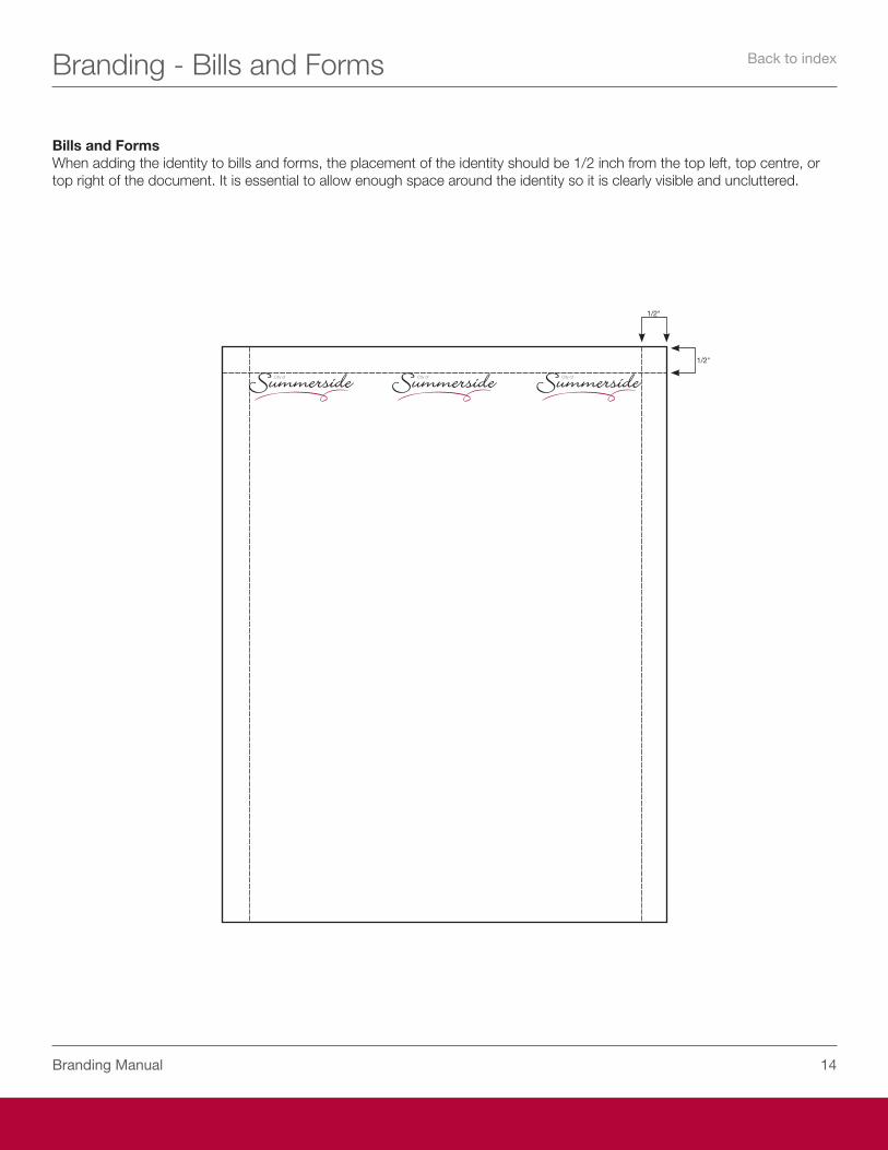
Bills and FormsWhen adding the identity to bills and forms, the placement of the identity should be 1/2 inch from the top left, top centre, or top right of the document. It is essential to allow enough space around the identity so it is clearly visible and uncluttered.
1/�"
1/�"
Back to index
1�Branding Manual
Branding - E-mail Signature
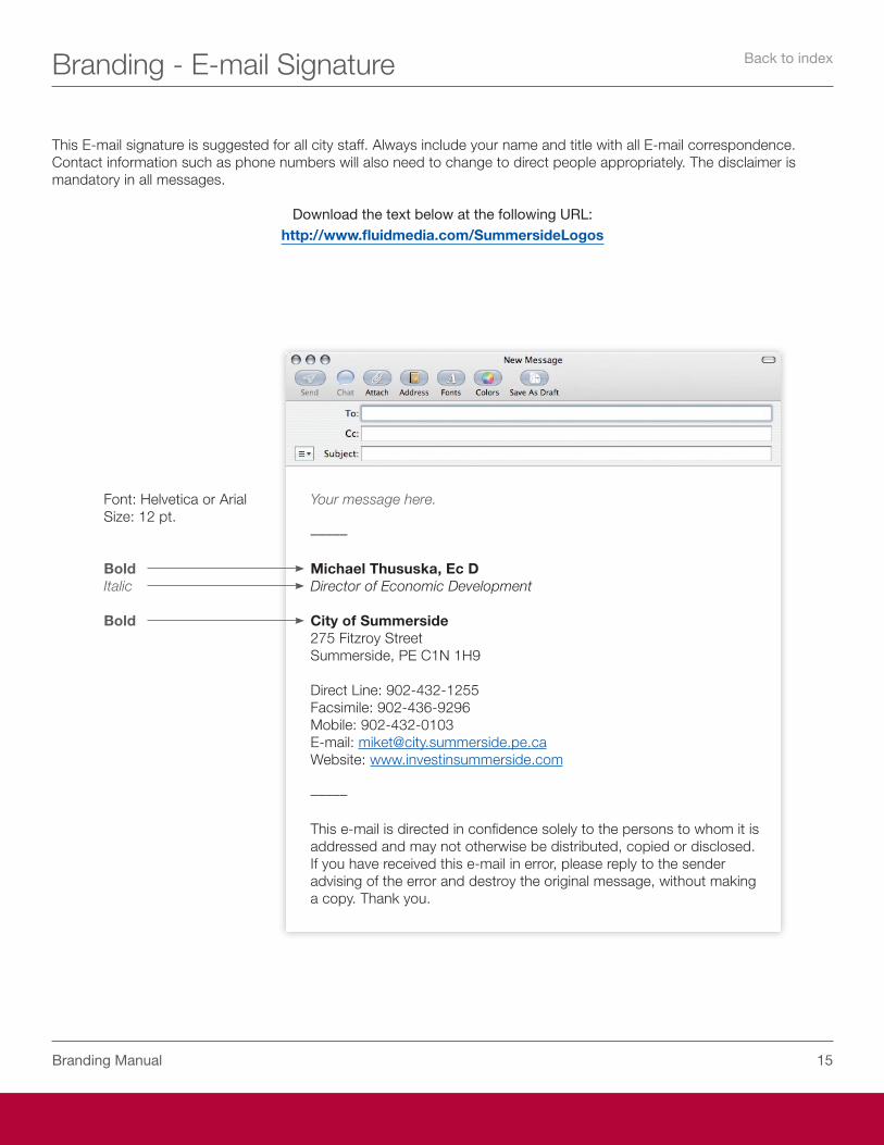
This E-mail signature is suggested for all city staff. Always include your name and title with all E-mail correspondence. Contact information such as phone numbers will also need to change to direct people appropriately. The disclaimer is mandatory in all messages.
Download the text below at the following URL:http://www.fluidmedia.com/SummersideLogos
Your message here.
–––––
Michael Thususka, Ec DDirector of Economic Development
City of Summerside275 Fitzroy StreetSummerside, PE C1N 1H9
Direct Line: 902-432-1255Facsimile: 902-436-9296Mobile: 902-432-0103E-mail: [email protected]: www.investinsummerside.com
–––––
This e-mail is directed in confidence solely to the persons to whom it is addressed and may not otherwise be distributed, copied or disclosed. If you have received this e-mail in error, please reply to the sender advising of the error and destroy the original message, without making a copy. Thank you.
Font: Helvetica or ArialSize: 12 pt.
BoldItalic
Bold
Back to index
1�Branding Manual
Branding - Signage
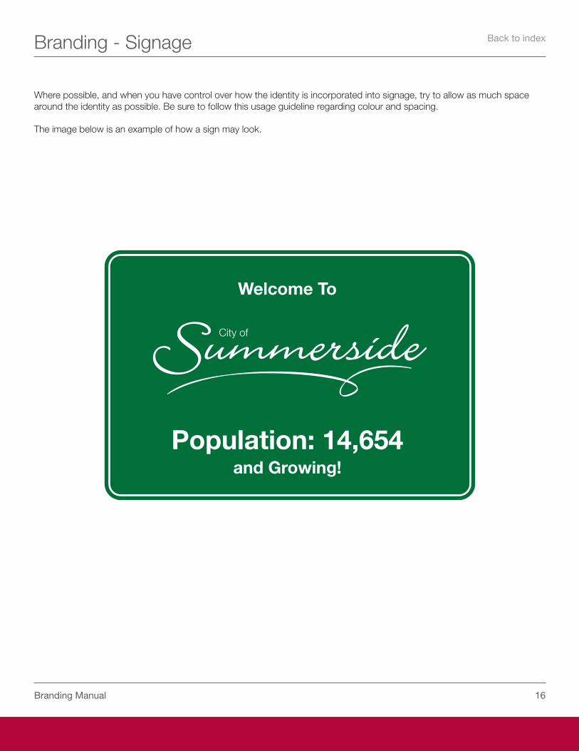
Where possible, and when you have control over how the identity is incorporated into signage, try to allow as much space around the identity as possible. Be sure to follow this usage guideline regarding colour and spacing.
The image below is an example of how a sign may look.
City of
Welcome To
Population: 14,654and Growing!
Back to index
1�Branding Manual
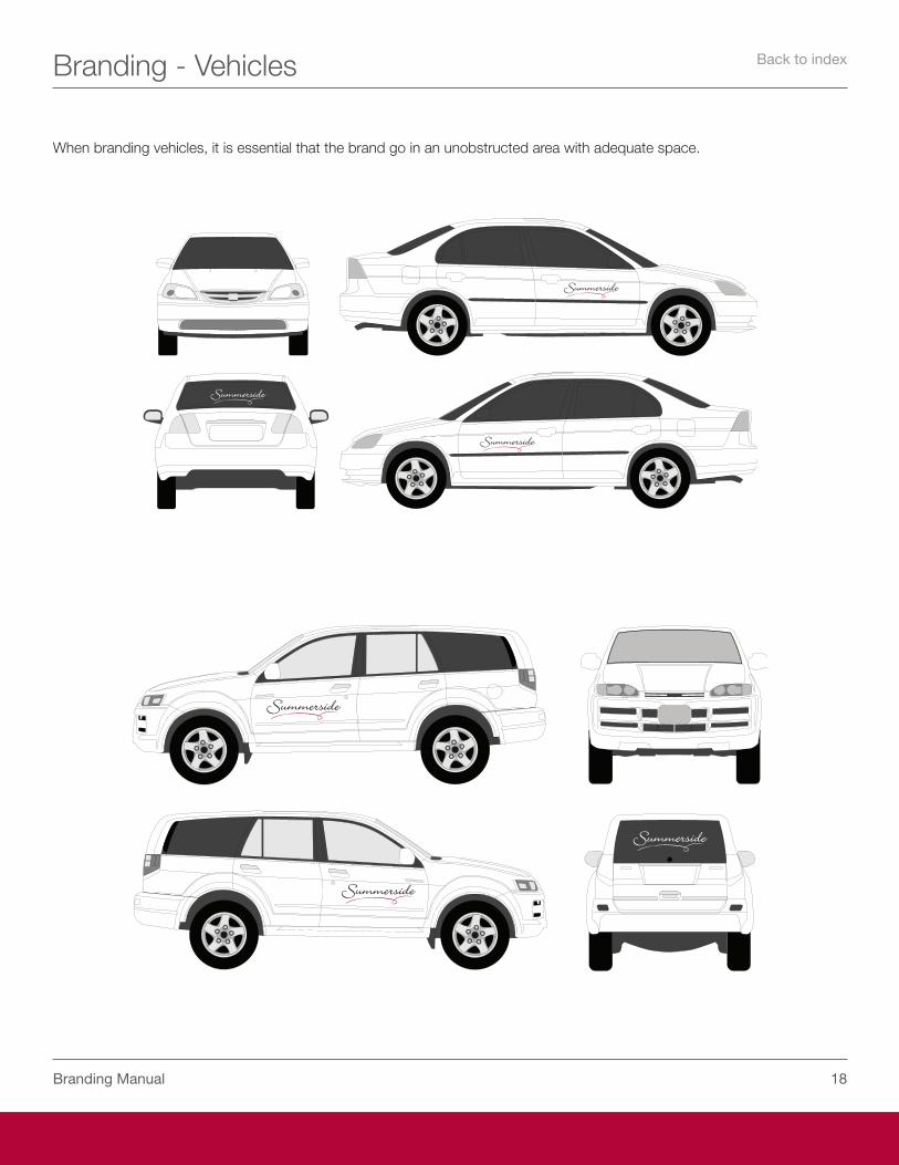
Branding - Vehicles
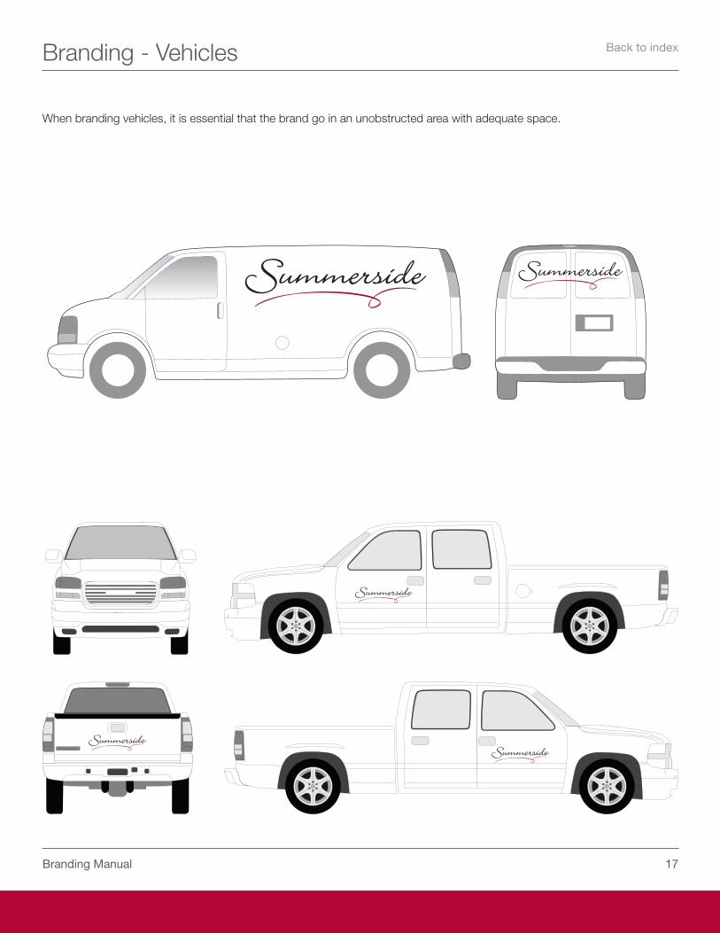
When branding vehicles, it is essential that the brand go in an unobstructed area with adequate space.
Back to index
1�Branding Manual
Branding - Vehicles
When branding vehicles, it is essential that the brand go in an unobstructed area with adequate space.
Back to index
1�Branding Manual
Branding - Clothing & Marketing
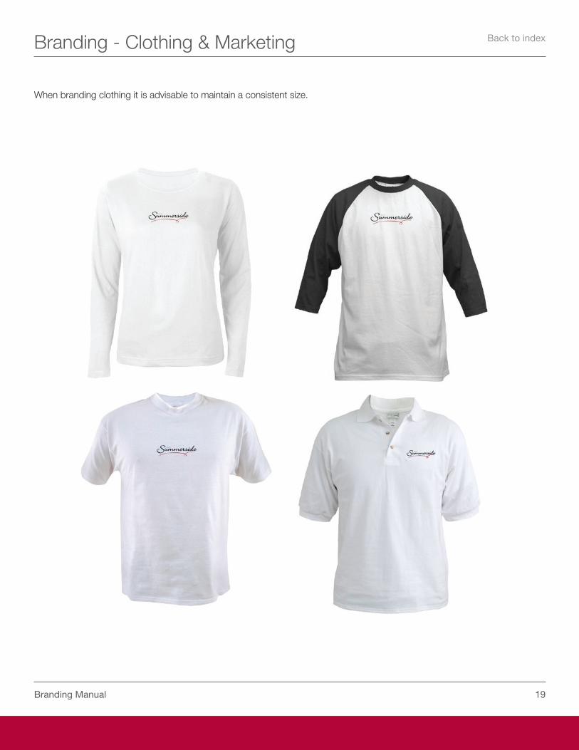
When branding clothing it is advisable to maintain a consistent size.
Back to index
�0Branding Manual
Branding - Clothing & Marketing
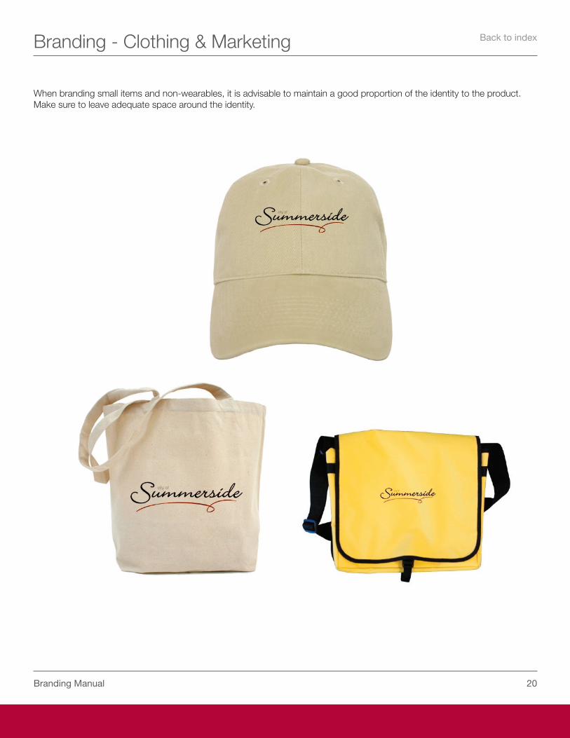
When branding small items and non-wearables, it is advisable to maintain a good proportion of the identity to the product. Make sure to leave adequate space around the identity.
Back to index
�1Branding Manual
Branding - Clothing & Marketing
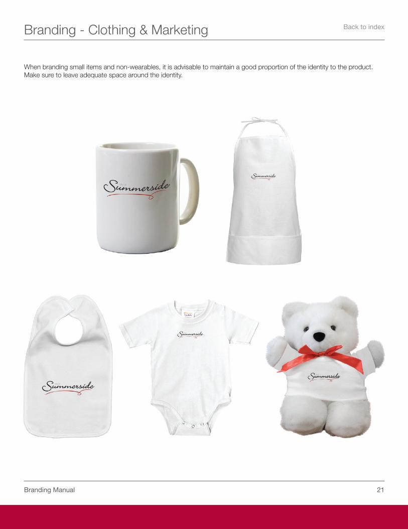
When branding small items and non-wearables, it is advisable to maintain a good proportion of the identity to the product. Make sure to leave adequate space around the identity.
Back to index
��Branding Manual
Taglines
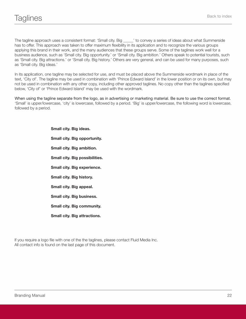
The tagline approach uses a consistent format: ‘Small city. Big _____’ to convey a series of ideas about what Summerside has to offer. This approach was taken to offer maximum flexibility in its application and to recognize the various groups applying this brand in their work, and the many audiences that these groups serve. Some of the taglines work well for a business audience, such as ‘Small city. Big opportunity.’ or ‘Small city. Big ambition.’ Others speak to potential tourists, such as ‘Small city. Big attractions.’ or ‘Small city. Big history.’ Others are very general, and can be used for many purposes, such as ‘Small city. Big ideas.’
In its application, one tagline may be selected for use, and must be placed above the Summerside wordmark in place of the text, ‘City of’. The tagline may be used in combination with ‘Prince Edward Island’ in the lower position or on its own, but may not be used in combination with any other copy, including other approved taglines. No copy other than the taglines specified below, ‘City of’ or ‘Prince Edward Island’ may be used with the wordmark.
When using the tagline separate from the logo, as in advertising or marketing material. Be sure to use the correct format. ‘Small’ is upper/lowercase, ‘city’ is lowercase, followed by a period. ‘Big’ is upper/lowercase, the following word is lowercase, followed by a period.
Small city. Big ideas.
Small city. Big opportunity.
Small city. Big ambition.
Small city. Big possibilities.
Small city. Big experience.
Small city. Big history.
Small city. Big appeal.
Small city. Big business.
Small city. Big community.
Small city. Big attractions.
If you require a logo file with one of the the taglines, please contact Fluid Media Inc.All contact info is found on the last page of this document.
Back to index
��Branding Manual
Sub Brands
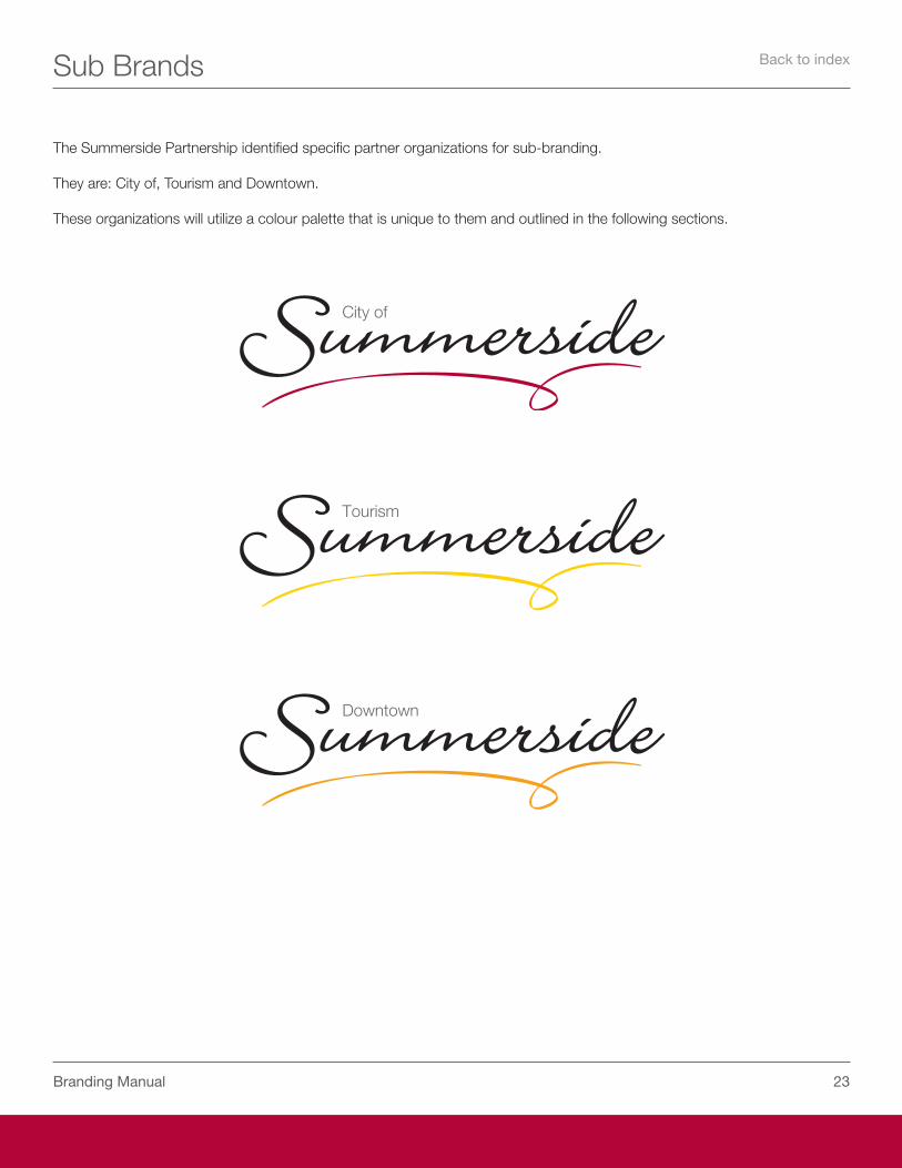
The Summerside Partnership identified specific partner organizations for sub-branding.
They are: City of, Tourism and Downtown.
These organizations will utilize a colour palette that is unique to them and outlined in the following sections.
Back to index

City of Summerside
��Branding Manual
City of Summerside
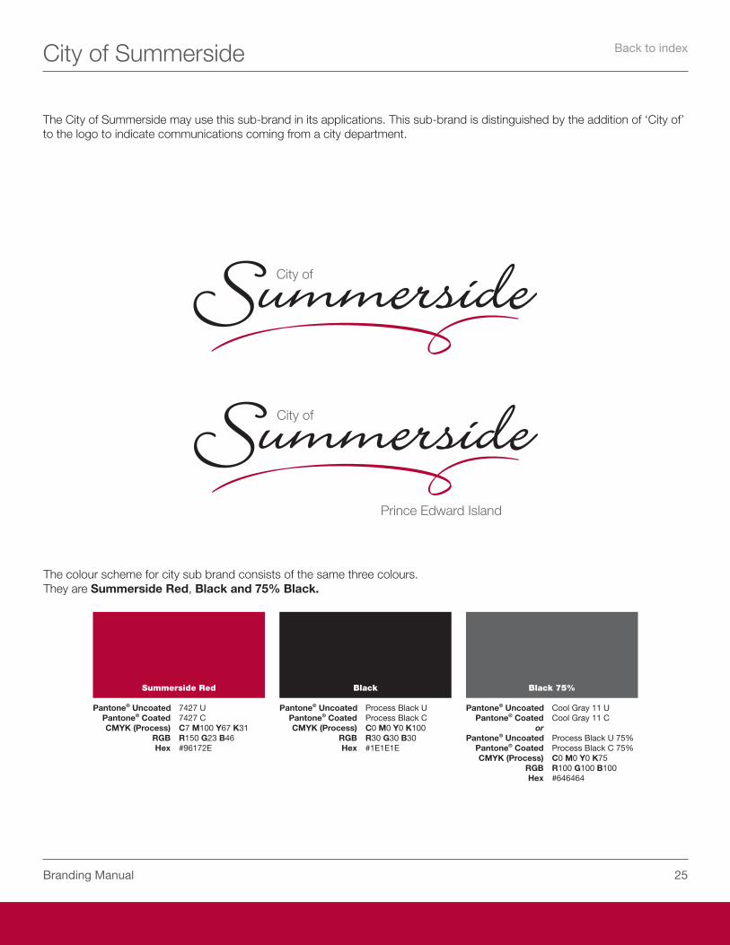
Summerside Red
Pantone® Uncoated ���� U Pantone® Coated ���� C CMYK (Process) C� M100 Y�� K�1 RGB R1�0 G�� B�� Hex #��1��E
Black
Pantone® Uncoated Process Black U Pantone® Coated Process Black C CMYK (Process) C0 M0 Y0 K100 RGB R�0 G�0 B�0 Hex #1E1E1E
Black 75%
Pantone® Uncoated Cool Gray 11 U Pantone® Coated Cool Gray 11 C or Pantone® Uncoated Process Black U ��% Pantone® Coated Process Black C ��% CMYK (Process) C0 M0 Y0 K�� RGB R100 G100 B100 Hex #������
The City of Summerside may use this sub-brand in its applications. This sub-brand is distinguished by the addition of ‘City of’ to the logo to indicate communications coming from a city department.
The colour scheme for city sub brand consists of the same three colours.They are Summerside Red, Black and 75% Black.
Back to index
��Branding Manual
City of Summerside
tel 902 432 1255fax 902 436 9296
Small city. Big Opportunity.
City of Summerside275 Fitzroy Street,Summerside, PE C1N 4K4 CANADA
www.city.summerside.pe.ca
From the Department of Economic Development
Small city. Big Opportunity.www.city.summerside.pe.ca
Mike Thususka EC. D.Director Economic Development
City of SummersideEconomic Development275 Fitzroy Street,Summerside, PE C1N 4K4 CANADA
tel 902 432 1255mobile 902 432 0103
fax 902 436 9296
City of Summerside275 Fitzroy Street,Summerside, PE C1N 4K4 CANADA
www.city.summerside.pe.ca
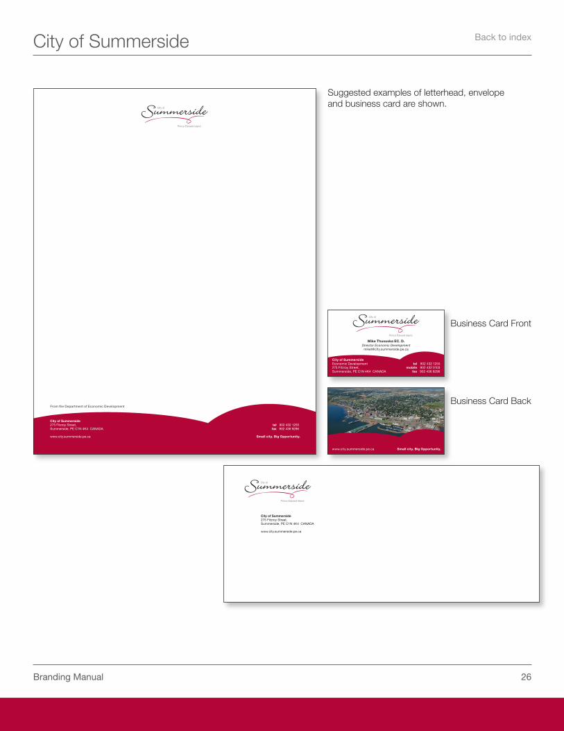
Suggested examples of letterhead, envelope and business card are shown.
Business Card Front
Business Card Back
Back to index
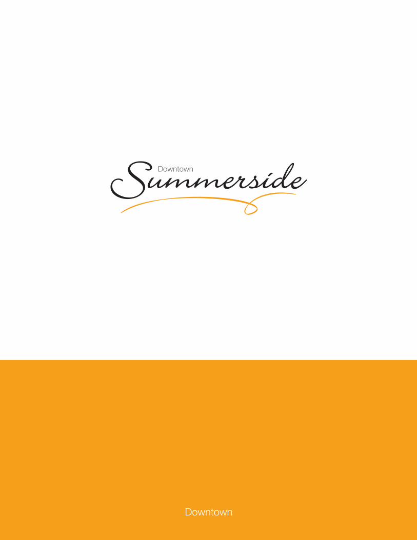
Downtown
��Branding Manual
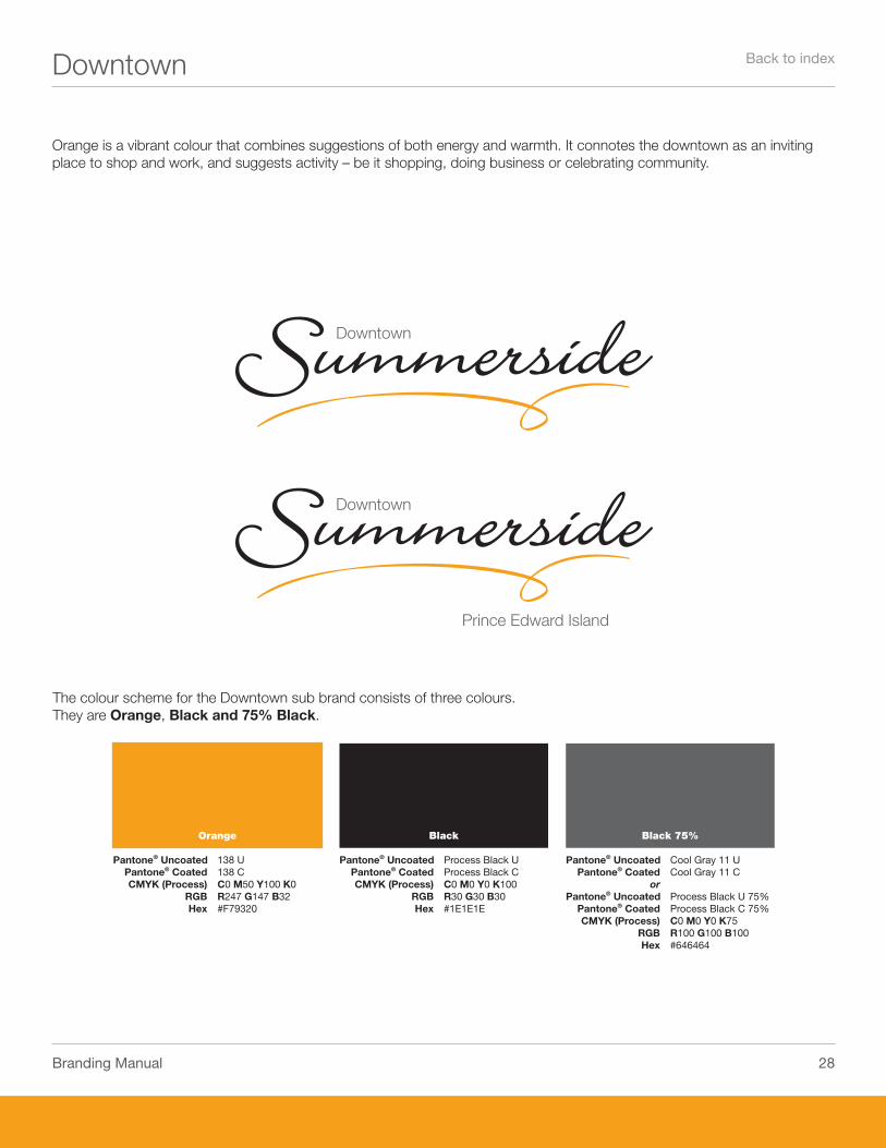
Downtown
Orange is a vibrant colour that combines suggestions of both energy and warmth. It connotes the downtown as an inviting place to shop and work, and suggests activity – be it shopping, doing business or celebrating community.
The colour scheme for the Downtown sub brand consists of three colours.They are Orange, Black and 75% Black.
Orange
Pantone® Uncoated 1�� U Pantone® Coated 1�� C CMYK (Process) C0 M�0 Y100 K0 RGB R��� G1�� B�� Hex #F����0
Black
Pantone® Uncoated Process Black U Pantone® Coated Process Black C CMYK (Process) C0 M0 Y0 K100 RGB R�0 G�0 B�0 Hex #1E1E1E
Black 75%
Pantone® Uncoated Cool Gray 11 U Pantone® Coated Cool Gray 11 C or Pantone® Uncoated Process Black U ��% Pantone® Coated Process Black C ��% CMYK (Process) C0 M0 Y0 K�� RGB R100 G100 B100 Hex #������
Back to index
��Branding Manual
Downtown
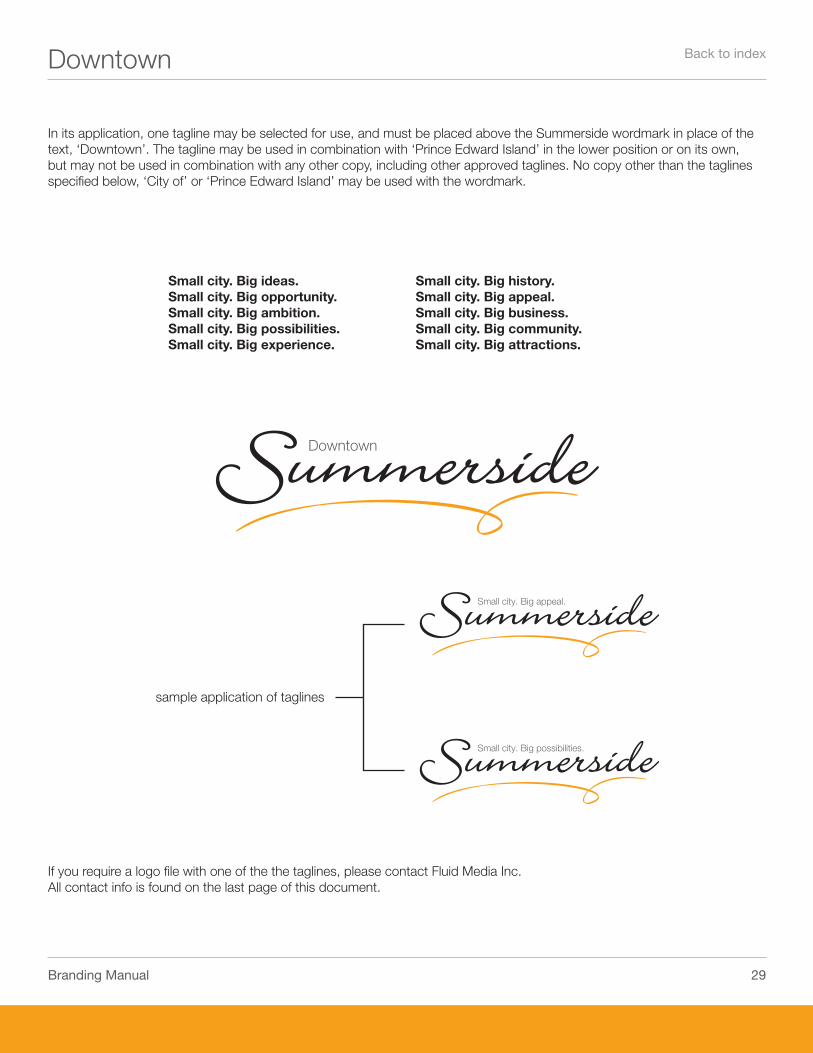
sample application of taglines
In its application, one tagline may be selected for use, and must be placed above the Summerside wordmark in place of the text, ‘Downtown’. The tagline may be used in combination with ‘Prince Edward Island’ in the lower position or on its own, but may not be used in combination with any other copy, including other approved taglines. No copy other than the taglines specified below, ‘City of’ or ‘Prince Edward Island’ may be used with the wordmark.
Small city. Big ideas.Small city. Big opportunity.Small city. Big ambition.Small city. Big possibilities.Small city. Big experience.
Small city. Big history.Small city. Big appeal.Small city. Big business.Small city. Big community.Small city. Big attractions.
If you require a logo file with one of the the taglines, please contact Fluid Media Inc.All contact info is found on the last page of this document.
Back to index
�0Branding Manual
Downtown
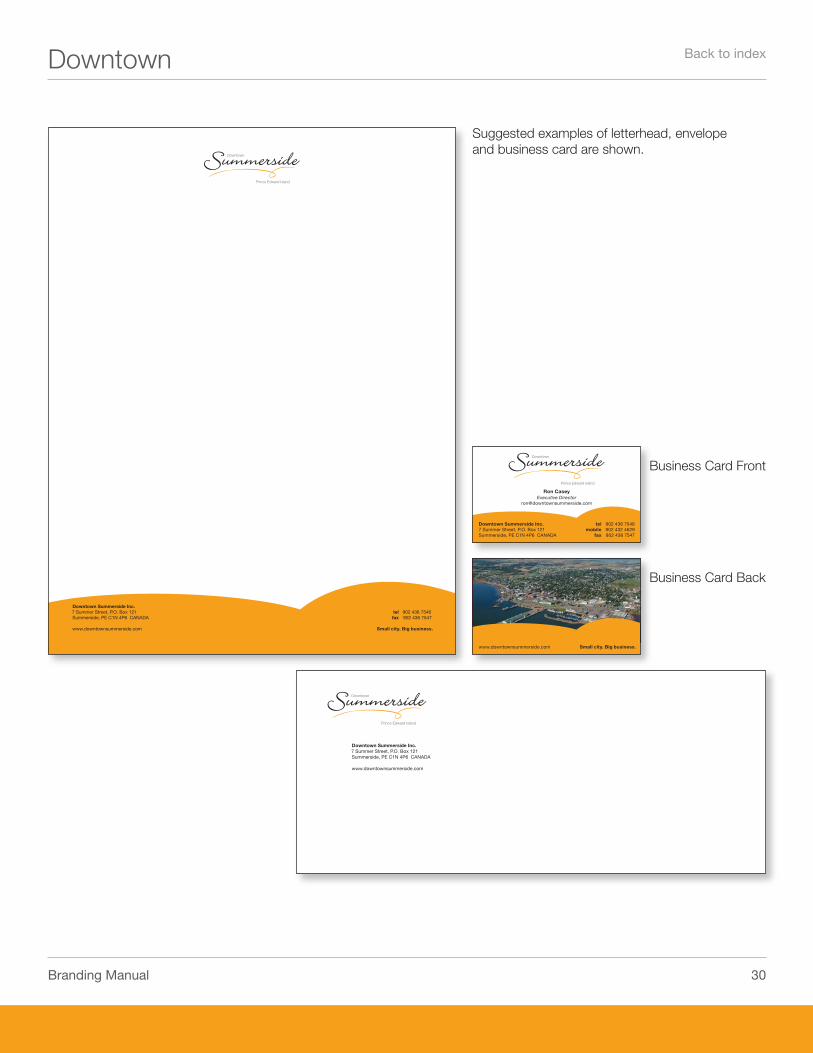
Suggested examples of letterhead, envelope and business card are shown.
Business Card Front
Business Card Back
tel 902 436 7546fax 902 436 7547
Small city. Big business.
Downtown Summerside Inc.7 Summer Street, P.O. Box 121Summerside, PE C1N 4P6 CANADA
www.downtownsummerside.com
Small city. Big business.www.downtownsummerside.com
Ron CaseyExecutive Director
Downtown Summerside Inc.7 Summer Street, P.O. Box 121Summerside, PE C1N 4P6 CANADA
tel 902 436 7546mobile 902 432 4629
fax 902 436 7547
Downtown Summerside Inc.7 Summer Street, P.O. Box 121Summerside, PE C1N 4P6 CANADA
www.downtownsummerside.com
Back to index
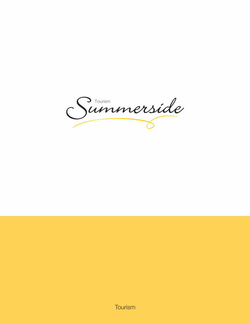
Tourism
��Branding Manual
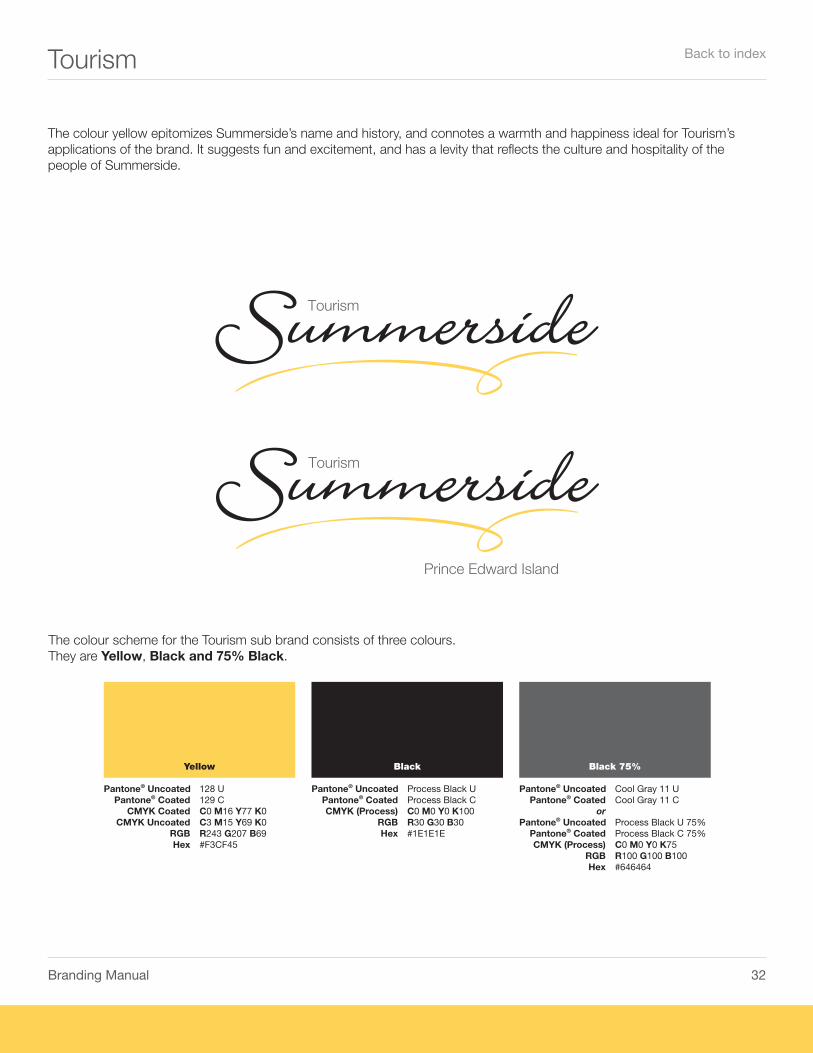
Tourism
The colour yellow epitomizes Summerside’s name and history, and connotes a warmth and happiness ideal for Tourism’s applications of the brand. It suggests fun and excitement, and has a levity that reflects the culture and hospitality of the people of Summerside.
The colour scheme for the Tourism sub brand consists of three colours.They are Yellow, Black and 75% Black.
Yellow
Pantone® Uncoated 1�� U Pantone® Coated 1�� C CMYK Coated C0 M1� Y�� K0 CMYK Uncoated C� M1� Y�� K0 RGB R��� G�0� B�� Hex #F�CF��
Black
Pantone® Uncoated Process Black U Pantone® Coated Process Black C CMYK (Process) C0 M0 Y0 K100 RGB R�0 G�0 B�0 Hex #1E1E1E
Black 75%
Pantone® Uncoated Cool Gray 11 U Pantone® Coated Cool Gray 11 C or Pantone® Uncoated Process Black U ��% Pantone® Coated Process Black C ��% CMYK (Process) C0 M0 Y0 K�� RGB R100 G100 B100 Hex #������
Back to index

��Branding Manual
Tourism
sample application of taglines
In its application, one tagline may be selected for use and must be placed above the Summerside wordmark in place of the text, ‘Tourism’. The tagline may be used in combination with ‘Prince Edward Island’ in the lower position or on its own, but may not be used in combination with any other copy, including other approved taglines. No copy other than the taglines specified below, ‘City of’ or ‘Prince Edward Island’ may be used with the wordmark.
Small city. Big ideas.Small city. Big opportunity.Small city. Big ambition.Small city. Big possibilities.Small city. Big experience.
Small city. Big history.Small city. Big appeal.Small city. Big business.Small city. Big community.Small city. Big attractions.
If you require a logo file with one of the the taglines, please contact Fluid Media Inc.All contact info is found on the last page of this document.
Back to index
��Branding Manual
Tourism
tel 902 436 7784fax 902 436 7782
Small city. Big opportunity.
Tourism Summerside Limited98 Water Street, Suite BSummerside, PE C1N 4N6 [email protected]
Small city. Big opportunity.www.visitsummerside.com
Janice HolmesManager
City of SummersideTourism Summerside Limited98 Water Street, Suite BSummerside, PE C1N 4N6 CANADA
tel 902 436 7784fax 902 436 7782
Tourism Summerside Limited98 Water Street, Suite BSummerside, PE C1N 4N6 CANADA
www.visitsummerside.com
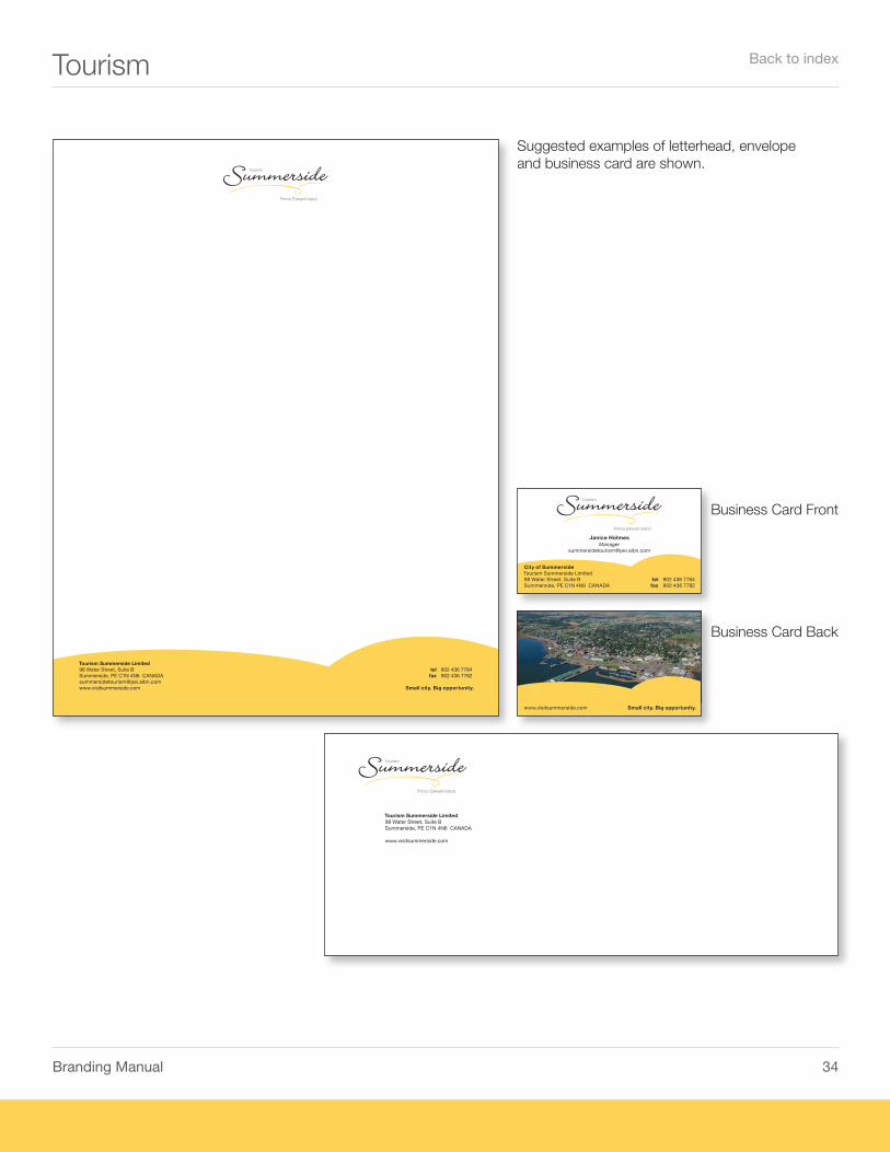
Suggested examples of letterhead, envelope and business card are shown.
Business Card Front
Business Card Back
Back to index
��Branding Manual
Contact
If there is a specific request regarding use of our identity please contact:
Michael ThususkaDirector Economic Development for the City of [email protected]
Phone: (902) 432-1331Fax: (902) 436-9296Cell: (902) 432-0103
Or our agency of record:
Fluid Media Inc.Phone: (905) 523-5898
Primary Contact:
Jim McGimpseyCreative [email protected]
Additional Support:
Creative Department Support [email protected]
www.fluidmedia.com
Summerside Brand Manual Version 070420
Back to index