Embed Size (px)
Citation preview

EXCEL TUTORIAL Using Excel
University of Utah – Department of Physics & Astronomy i
This is meant to be a short tutorial in how to effectively use Microsoft Excel, a software package that most people are generally familiar with, to plot and analyze scientific data.
Basic Excel:
First off, a quick discussion of basic Excel features. Excel is a spreadsheet program, designed to manipulate and interpret arrays of data, either directly inputted by the user, or calculated in some way by Excel itself.
Each square on the main grid of Excel, called a cell, has a row address and a column address. For instance, uppermost left cell on the grid is A1. The usefulness of this is that mathematical operations can be performed in other cells using data you entered into the spreadsheet by referring to the address that data occupies.
Figure 1: Excel’s data grid and addressing
Directly above the spreadsheet grid is the function bar. This area, labeled , is where the user inputs data into a cell or inputs mathematical commands to manipulate existing data.
Figure 2: Excel’s function bar
Say, for instance, that you had data in cells A1 and B1 and you wanted to add them together and place the result in cell C1. Of course, you could do this manually, but if you had thousands of data points, this would become tedious to say the least. Instead, you could select cell C1 and type the following command into the function bar:
=A1+B1
Not only will the sum be placed in cell C1, it will also be adaptive, that is, if you change the data in A1 or B1, the value in C1 will be recalculated.
Figure 3: An example of data being calculated by Excel and placed into a cell

EXCEL TUTORIAL Using Excel
University of Utah – Department of Physics & Astronomy ii
Something that will occur often is the need to sum a large column (or row) of data. Again, you could express this as =A1+B1+C1+…, but for large data sets, this gets cumbersome. Instead, we use the SUM command.
Let’s say you have measured five times with a stop watch and placed them in a row from A1 to E1. You then want to place their average value in cell G1. You would select cell G1 and put the following command into the function bar:
=SUM(A1:E1)/5
As should be obvious, the SUM command adds up the cells and the average is found by dividing by the number of cells. Even more convenient for this particular task, you could type the following command:
=AVERAGE(A1:E1)
which would eliminate the need to divide by 5.
Figure 4: A row of cells averaged using the AVERAGE command
There are, needless to say, a tremendous number of mathematical and statistical commands available in Excel. You can explore these functions by accessing the “Formulas” tab in the tool ribbon above the grid.
Figure 5: The Function portion of the Formulas tab on the tool ribbon
Figure 6: Snell’s Law being used to calculate and angle to illustrate a complex calculation

EXCEL TUTORIAL Using Excel
University of Utah – Department of Physics & Astronomy iii
Basic Plotting:
First off, how are data plotted in Excel? Needless to say, at least two columns of data will be required. To illustrate this, observe the following table of data:
x y
1 1
2 4
3 9
4 16
5 25
6 36
7 49
8 64
9 81
10 100
Given these data, there are many different types of plots that could be created. The one we will the most often by far is the scatter plot. This can be found by going to the “Insert” tab of the tool ribbon and selecting “Scatter” in the “Charts” section, as illustrated below:
Figure 7: Creating a scatter plot
The scatter plot is the most useful graph for our purposes because it is the only chart type that allows you to fully manipulate the horizontal and vertical axes. Once the plot is created, you can tell it what data you’d like to use. You will do this in the following way:
Step 1: Create the chart
Step 2: Click on the “Select Data” button that appears in the “Chart Tools” tab when the chart is selected, as illustrated in Figure 8:

EXCEL TUTORIAL Using Excel
University of Utah – Department of Physics & Astronomy iv
Figure 8: The “Select Data” button
Step 3: In the “Select Data” dialogue, press the “Add” button, middle-left:
Figure 9: The “Select Data Source” dialog box
Step 4: Once pressed, you can used the “Select Range” buttons to input the data that will define the x and y-axes of the plot. Do this by pressing the appropriate button and then dragging on the grid to select the full range of information you want to use for that axis. Also note that when the plot is created, the legend will display the name of the data as whatever you type in the “Series name” box.
Figure 10: Inputting the axis data series
Step 5: Once you press “OK”, you will return to the “Select Data Source” window. Notice that you can add multiple sets of data to the plot by repeating the above sets, removed data sets you no longer want, or edit existing sets of data. When you press “OK” again, you should have a completed plot:

EXCEL TUTORIAL Using Excel
University of Utah – Department of Physics & Astronomy v
Figure 11: Final plot of the data presented in the table
Plot Manipulation:
Once the plot exists, there are many ways to customize the plot to increase readability. Remember, other people, the TA in particular, must be able to easily read the plot and infer information correctly. To this end, you should always label the axes and the plot and change visual elements to maximize readability.
You can begin to customize any part of the plot by double-clicking on it:
Figure 12: Excel plot showing the individual regions that can be customized

EXCEL TUTORIAL Using Excel
University of Utah – Department of Physics & Astronomy vi
Here are some important examples of plot customization:
By double-clicking on the axes, you can customize the minimum and maximum value displayed, as well the axes tick marks
By double-clicking on the plot area, you can change the style of the markers that represent the data points, as well as the line style. This is very useful if you want to plot multiple data sets on the same graph
By double-clicking on the plot legend, you can change the position in which it appears on the plot. You can also add a customizable border.
Creating a Logarithmic Plot
Something that is very important to be able to do is to create a logarithmic plot. In a standard plot, each division on each axis has the same width. This is fine, if your data doesn’t cover a very large range. But say you wanted to plot how the capacitance of a circuit changes over a frequency sweep from 1 Hz to 50 MHz. In this case, the, you would have millions of data points on the horizontal axis and it would not be possible to put all of them on a plot at the same time…at least not linearly.
When you double-click on an axis, you are given the option to make that axis logarithmic, as shown below.
Figure 13: The “Format Axis” dialog highlighting the logarithmic scale checkbox
When activated, you have the option to choose the base. The tick marks representing powers of this number will be equidistance, but the ticks in between will be logarithmically compressed, allowing much more data to be fit onto a single axis. This gives rise to three types of plots:

EXCEL TUTORIAL Using Excel
University of Utah – Department of Physics & Astronomy vii
Figure 14a: A linear-linear plot of the data from Table 1
Figure 14b: A log-linear plot of the data from Table 1 (the vertical axis is logarithmic)
Figure 14c: A log-log plot of the data from Table 1
It is important to point out that it is the same data being plotted in each of the above plots. Log-log plots are particularly useful in that you can extract important information about the exponential relationship between two variables. For instance, notice that the slop of the line in Figure 14c, if you count in divisions of 10, is 2. This tells us that that there is a relationship

EXCEL TUTORIAL Using Excel
University of Utah – Department of Physics & Astronomy viii
between the x-axis and y-axis data such that ~ . This concept will be addressed in more detail in the labs (See Homework 5 – Graphical Analysis II).
Error Analysis and Curve Fitting:
Once the data is plotted, you will need to address the error in the data. The concept of error itself will be explained in great detail in Homework 1. You can represent error graphically in your plots using error bars. An error bar represents the range of uncertainly in a particular value. Say you are able to measure the distance and object falls (in meters) to the nearest centimeter and the time elapsed (in seconds) to the nearest tenth of a second. Then, with ten data points, you may have a data table that looks like this:
t y
0 0.0
0.5 ‐1.1
1 ‐5.0
1.5 ‐11.2
2 ‐19.5
2.5 ‐30.2
3 ‐44.4
3.5 ‐60.0
4 ‐78.6
4.5 ‐100.0 Table 2: Data showing the distance an object has fallen vs. time
If you plotted this data, you would arrive at something like this:

EXCEL TUTORIAL Using Excel
University of Utah – Department of Physics & Astronomy ix
Now, to add error bars to represent data uncertainty, you would go to the “Layout” tab of the “Chart Tools” section of the tool ribbon. The “Error Bars” button is near the end:
Figure 16: The “Layout” toolbar highlighting the Error Bars button
There are many error bar options available, depending on your needs. A good starting point is to select “Error Bars with Standard Error” from the pull-down when you click the “Error Bars” button. The result will be something like this:
Figure 17: Plot of the data in Table 2 with Standard error bars
Note that you can create error bars in both the horizontal and vertical direction, depending on what the situation calls for.
Once the error bars exist, you can double-click on them to play with options. You can click on the horizontal bars separately from the vertical. In the dialog that appears after double clicking, you have many options:
You can set the direction and color of the bars You can specify the size as either a fixed value, a percentage, a standard deviation, or
standard error, depending on the situation If each data point has its own uncertainty (i.e. error is not constant), you can use the
custom button so select the range of data that represents the error for each point.

EXCEL TUTORIAL Using Excel
University of Utah – Department of Physics & Astronomy x
Error bars are very important as they impart the level of uncertainty in the data to the reader. If you are presented with a data point that represents, say, latitude and longitude of an object with no error bar, you are inclined to conclude that you know exactly where it is. But, what if that data point has an error of ±1°? Then, you could be talking about a very large region of space where the object could potentially be. It is important the the reader be able to get this information from the plot.
Another important concept is that of curve fitting; Excel refers to it as creating a trendline. When you curve fit data, you find a “best fit” equation that describes you data. It could be a line, a polynomial, an exponential or logarithmic curve, pretty much anything. You can even create a custom function to fit data to. For this fit curve, you can get an of the relationship between the two sets of data and make a statement about the underlying physical law.
The “Trendline” feature in Excel is located in the same part of the tool bar as the “Error Bars” feature. When you press the button, you get several common options, but the most useful item is “More Trendline Options” at the bottom. As with the other windows, there are many options to choose from in the dialog box that appears
You can select the type of fitting function You can specify the name of the fit line in the legend, as well as its graphical
properties, such as color and line width You can display the equation on the plot
In the figure below, a polynomial of order 2 has been used to fit the data presented in Table 2:
Figure 18: Table 2 data plot with a fit curve (in black)

EXCEL TUTORIAL Using Excel
University of Utah – Department of Physics & Astronomy xi
In this case, the equation of the fit curve is 4.9818 0.263 0.0964. What information does this yield? Well, in this case, we know that the motion of the falling object is governed by the kinematic equation
12
So, according to our fit curve, we can see that 0.0964 , 0.263 / , and
4.9818 / . So, from the fit curve, we can extract physical data, such as the acceleration of the object or its starting position. Note that if we change the plot to a log-log plot, the fit curve changes as well.
Getting Uncertainties in the Trendline Fit Parameters
Excel allows you to get trendline fit parameters as well as the uncertainties in the trendline fit parameters. These uncertainties are based on the scatter of your data around the trendline. They are NOT based on what error bar you enter.
Suppose you have data that you want to fit linearly and you already have a trendline with equation y=0.97x+0.15.
How can you get the uncertainties in the trendline?
Procedure:
Find an empty cell which has room below and to the right (you need an “area” of 5 cells high and 2 cells wide).
In the empty cell write the following formula: =LINEST(G4:G8,F4:F8,,TRUE) (where G4:G8 are the fields where your y-data are located and F4:F8 where your x-data are located – you obviously need to modify that if your data are elsewhere). And click “Enter”
The cell will display “0.97”, which is the slope of the trendline.

EXCEL TUTORIAL Using Excel
University of Utah – Department of Physics & Astronomy xii
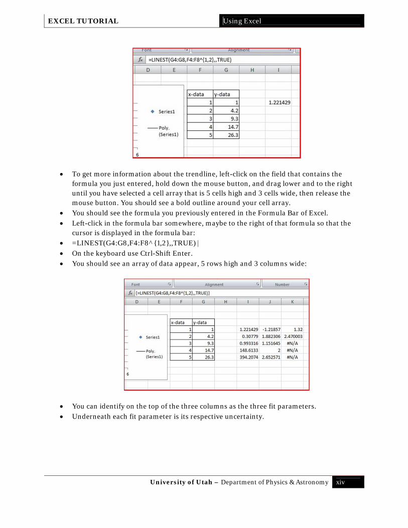
To get more information about the trendline, left-click on the field that contains the formula you just entered, hold down the mouse button, and drag lower and to the right until you have selected a cell array that is 5 cells high and 2 cells wide, then release the mouse button. You should see a bold outline around your cell array.
You should see the formula you previously entered in the Formula Bar of Excel. Left-click in the formula bar somewhere, maybe to the right of that formula so that the
cursor is displayed in the formula bar: =LINEST(G4:G8,F4:F8,,TRUE) On the keyboard use Ctrl-Shift Enter. You should see an array of data appear, 5 rows high and 2 columns wide:
You can identify on the top of the two columns the slope (0.97) and the y-intercept (0.15).
Underneath the slope, you will find the uncertainty in the slope (0.045826). Underneath the y-intercept, you will find the uncertainty in the y-intercept (0.151987). 0.993349 is the R2 value and then there are other statistical parameters. Feel free to
explore what they are, but we will not use them in our labs.

EXCEL TUTORIAL Using Excel
University of Utah – Department of Physics & Astronomy xiii
So, in our case, the slope of the trendline is
0.97 0.05 The y-intercept is
0.2 0.2 Suppose we want to do something similar but with a polynomial fit of order 2: Here are the data and the trendline equation is shown.
How can you get the uncertainties in the trendline?
Procedure:
Find an empty cell which has room below and to the right (you need an “area” of 5 cells high and 3 cells wide).
In the empty cell write the following formula: =LINEST(G4:G8,F4:F8^{1,2},,TRUE) (where G4:G8 are the fields where your y-data are located and F4:F8 where your x-data are located – you obviously need to modify that if your data are elsewhere). And click “Enter” Note that the ^{1,2} part indicates a polynomial fit with linear and with quadratic term.
The cell will display “0.97”, which is the slope of the trendline.
EXCEL TUTORIAL Using Excel
University of Utah – Department of Physics & Astronomy xiv
To get more information about the trendline, left-click on the field that contains the formula you just entered, hold down the mouse button, and drag lower and to the right until you have selected a cell array that is 5 cells high and 3 cells wide, then release the mouse button. You should see a bold outline around your cell array.
You should see the formula you previously entered in the Formula Bar of Excel. Left-click in the formula bar somewhere, maybe to the right of that formula so that the
cursor is displayed in the formula bar: =LINEST(G4:G8,F4:F8^{1,2},,TRUE) On the keyboard use Ctrl-Shift Enter. You should see an array of data appear, 5 rows high and 3 columns wide:
You can identify on the top of the three columns as the three fit parameters. Underneath each fit parameter is its respective uncertainty.