Embed Size (px)
Citation preview
1
The work that visualisation conventions do
Information, Communication and Society
Introduction
Data are becoming increasingly valued and relied upon, as they come to play an ever more important role in decision-making and knowledge about the world. The language of ‘facts’ is mobilised in media and other commentary about data, and we are invited to see ‘what the data tell us’ through the widespread use of data visualisations. These range from simple pie charts and line graphs to more complex, interactive and emotive illustrations, such as Periscopic’s widely circulated visualisation of data relating to lives lost to gun death in the US (Periscopic, 2014). As Gitelman and Jackson (2013) put it, ‘data are mobilized graphically’ (p. 12, emphasis in original). Beer and Burrows (2013) claim that we are witnessing a ‘visualization of culture’ (p. 63), in which more and more aspects of culture are first datafied and then visualised. Beer and Burrows’ understanding of what constitutes a data visualisation parallels our use of the term in this paper, to refer to visual representations of data and datasets which communicate precise information and values. Data visualisations in this sense are distinct from both infographics (which are often decorative and communicate a sense of data rather than precise values) and from the three-dimensional models or immersive environments found in art and architecture, which are visualisations in a much broader sense of the word than we use here.
Critical perspectives on visualisations are growing in prevalence, pointing to the ways in which they privilege certain viewpoints, perpetuate existing power relations and create new ones (for example Barnhurst, 1994; Latour, 1986; Scott, 1998). At the same time, visualisation practitioners assert that visualisations can promote greater understanding of data by making them accessible and transparent (e.g. Few, 2008; Zambrano & Engelhardt, 2008). Both of these views are persuasive, and yet they are contradictory. Rather than dismissing one or the other of them as either too critical or too idealistic, we need to try to make sense of these contradictory assertions about what visualisations are and can do. One way of doing this is to examine the resources available to visualisers as they produce visualisations, such as the conventions that have been established over time and that are considered to mark visualisations as professional or well-made. In this paper, we argue that conventions work to imbue visualisations with the quality of objectivity (which brings together other qualities like transparency, scientific-ness and facticity). This produces the impression that visualisations are showing the facts, telling it like it is, offering windows onto data. It is not visualisation designers who are creating this sense of objectivity, we propose, but rather the conventions on which they necessarily draw in producing visualisations. This is an important argument because, to date, criticisms of visualisations have not adequately identified the origins of the persuasive work that visualisations do, nor attended to the role of designers in this process. We make our argument by focusing on four conventions: a) the use of two-dimensional viewpoints; b) clean layouts; c) the use of geometric shapes and lines; and d) the inclusion of data sources.
2
We use a social semiotic approach in the paper, which actively links specific textual practices to the broader contexts in which they are embedded and the structures that shape them. This approach, we argue, advances understanding of visualisations and the role they play in our social world. This is an important undertaking, as visualisations are used in a growing variety of spheres and so increasingly, our knowledge of the world comes into being through the multimodal cues and styles chosen to ‘arrange’ data and present information – that is, through design. In other words, we often rely on visualised data’s ‘appearance’ to understand their ‘substance’ (Aiello, 2007). With its focus on the economic and political implications of semiotic activity, a social semiotic approach to data visualisation enables us to highlight the power of design.
In the paper, we draw together interviews with visualisation designers and semiotic analysis of visualisations circulating in the media, through which we assess how particular conventions have been used to produce meaning in the past, in sources such as artistic movements, magazines and newspapers. These histories of visualisation conventions matter: rooted in Enlightenment ideas about objectivity and rational knowledge, they play a role in making visualisations appear neutral. Our research was undertaken as part of Seeing Data (www.seeingdata.org), which aimed to enhance hitherto limited understanding of how ordinary people, not expert in data or their representation, engage with visualisations. In the following section, we explain what we mean by ‘convention’, how this concept relates to data visualisations, why social semiotics is helpful for understanding conventions and how we used it. We then summarise some key criticisms of data visualisation, after which we attend to claims made about how visualisations can ‘do good’. The subsequent section discusses the four conventions listed above which, we argue, lend a sense of scientific objectivity to visualisations and help us account for the contradiction between criticisms of visualisations and designers’ good intentions. In the final section, we reflect on what our discussion suggests for understanding the location of power in relation to data visualisations and their production.
Defining and approaching conventions
A convention is a symbolic or social practice that is shared, readily understood and widely accepted by members of a cultural group. In our social semiotic analysis of visualisations, we approach conventions from a broadly iconographic standpoint. A method predominantly used by art historians to analyse figurative art from the past, iconography makes a distinction between the representational meaning, iconographical symbolism and iconological symbolism of a particular work of art (Aiello, 2006; Van Leeuwen, 2001). Being able to describe the representational meaning – that is, the literal meaning – of an image means first deciphering the conventions used to ‘connect artistic motifs and combinations of artistic motifs (compositions) with themes or concepts’ (Panofsky, 1970, p. 64). For example, in medieval European art, striped motifs were used exclusively to depict deviant or demoniacal figures (Pastoureau, 2001). This association was a given to medieval artists and viewers, whereas we must decipher it in order to recognise its conventional meaning. Thus an understanding of iconographic symbolism – that is, accepted conventional meanings – is fundamental to visual analysis: the basic appearance of an image is always shaped by intertextual references and contextual demands. This also means that visual analysis ought to take into account iconological symbolism – that is, ideological meaning – in order to ‘ascertain those
3
underlying principles which reveal the basic attitude of a nation, a period, a class, a religious or philosophical persuasion’ (Panofsky, 1970, p. 55).
Like iconological analysis, social semiotics aims to link texts to contexts by examining the ideological underpinnings of particular conventions (Van Leeuwen, 2001). It also aims to examine the cultural histories and political implications of contemporary ‘micro-textual’ details – like visualisation conventions – that are often taken for granted or considered as natural, necessary or neutral (Aiello, 2006). For social semioticians, a central question is ‘who made the rules and how and why they might be changed’ (Jewitt & Oyama, 2001, p. 135). Thus this approach replaces traditional semiotics’ notion of code with that of semiotic resource. The notion of resource accounts for the agencies, variations, interests, power structures and imbalances that set apart different kinds of semiosis, or meaning-making processes, both in relation to production and reception. Drawing on these ideas, conventions may be defined as (semiotic) resources that become established and naturalised over time, accepted as the most sensible, accurate or even necessary ways of visualising given types of information (Peirce, 1931-1958). The range of conventions available to communicators within the limits of perceptual effectiveness is always broader than what is usually considered acceptable or appropriate. For example, in Western visual culture, linear perspective has become established as the most effective approach to representing three-dimensional space realistically. However, linear perspective, which is based on straight lines that typically converge to one central vanishing point, is only one of many available options for the realistic visual representation of spatial depth; others include curvilinear perspective, which uses curving lines and multiple vanishing points, or the layered and bird’s eye views found in traditional Japanese landscape painting. This supremacy of linear perspective is linked to the ideological currents and political interests of Renaissance humanism (Panofsky, 1991); the range of conventions that are considered to be effective is always limited, constrained and fixed to achieve particular ends (Fiske, 1990).
Technological developments also play a role in the production of visual conventions, because imaging depends upon the technologies it employs, which in turn gives rise to particular ways of seeing. In his history of data visualisation, Friendly (2008) argues that the emergence of conventions in data visualisation can be traced back to Medieval cartography and statistics, with new graphical formations developing throughout the 1600s, as studies in statistics and probability theory emerged. As the 17th century closed, ‘the necessary elements for the development of graphical methods were at hand’ (ibid, p. 21): statistical data, theories to make sense of the data, and modes to visualise them. Technological developments such as colour printing combined with new mapping techniques for geographical and statistical data, the emergence of cartograms, geometric figures. But it was during the latter half of the 18th century that the conventions of data visualisation really coalesced when innovations in visualisation form became the key building blocks of modern data visualisations. In the following century ‘all of the modern forms of data display were invented: bar and pie charts, histograms, line graphs and time-series plots, contour plots, scatterplots, and so forth’ (ibid , p.9), a development which was inextricably linked to increased governmental gathering of statistics. In the second half of the 20th century, computers provided new opportunities for invention. New forms appeared, yet like earlier forms, they relied on some of the conventions we discuss below. So despite the now widespread use of computer-generated and interactive visualisations, which often adopt current trends like personalisation and gamification (as seen
4
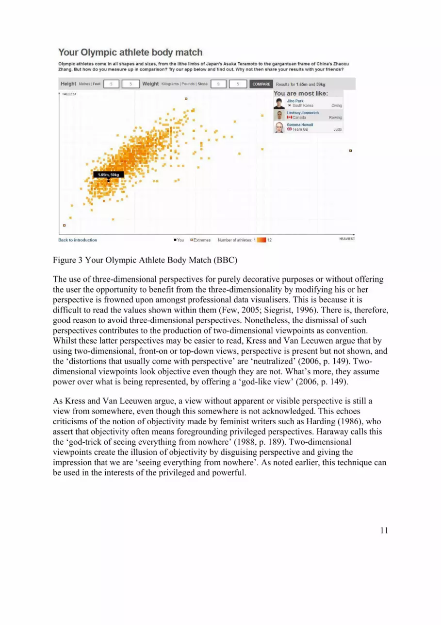
in the BBC’s Olympic Athlete Body Match visualisation shown in Figure 3 below), the forms devised by Playfair, his contemporaries and statistical descendants using pen and paper remain recognisable in modern data visualisations. These include bar charts, histograms, choropleth maps, mosaic plots, circle plots, rose diagrams and pie charts, amongst other forms. The visual resources on which early visualisers drew continue to be drawn upon by visualisers today: conventions have been established. As noted above, by using a social semiotic approach, we can identify the conventions used by designers and theorise how they work.
For the reasons outlined in this section, in this article we focus on the conventional nature of some of the major semiotic resources found across visualisations. In doing so, we highlight the relationship between designers’ intentions in their visualisation work, the often implicit histories of conventions, and the overall implications that visualisation conventions have for the power-laden reproduction of knowledge through data and information design. We do this by drawing on Skype interviews with 13 visualisations designers, selected because they are internationally recognised as field-leaders and therefore field-shaping. Three were women and 10 were men, and most were in their 30s. Their backgrounds include interaction design, computer science, art and design, media and communications, geography and architecture, and their countries of origin include the UK, Germany, the Netherlands, Switzerland, the US and Italy. We bring these together with detailed social semiotic analysis of 10 visualisations circulating in the media, chosen to reflect a range of chart types, media sources, styles of interactivity (static, gamified, malleable), subject matters and potential for evoking emotional responses. Four of these 10 visualisations were produced by interviewees. Drawing these two types of data together, we argue that designers’ intentions are located in wider social and practical contexts. These contexts have important implications for the ways that ideology, politics, and power are conveyed through the processes of visualising data and using visualisation conventions.
Visualisation as doing persuasive work
Critical commentators on visualisations have pointed out that turning data into a visualisation is not an automated process and that data visualisations are not neutral windows onto data (Amoore, 2009). Rather, a visualisation is the result of numerous choices involving a range of people (those who want the visualisation to be made, those making it, and others in between). Ambrosio (2015) argues that ‘visual manifestations [of data] are themselves informed by judgement, discernment and choice’ (ibid, p. 137). Or as Law and Whittaker (1988) have argued in relation to scientific representation, particular visualisations ‘may be treated as the end-product of technologies for simplifying, discriminating and interrelating objects’ (p. 178). But despite the distinctly subjective processes involved in visualising data, some critics argue, the resulting visualisation often ‘pretends to be coherent and tidy’ (Ruppert, 2014). As a result, visualisation is still regarded as a referential practice; that is, it is seen within the sciences to provide a window onto data (Coopmans, Vertesi, Lynch, & Woolgar, 2014), a belief which demands critical interrogation of its origins, structuring forces and politics.
Writing about visualisations in the media, Barnhurst (1994) also argues that they are tools of power because they ‘influence the perception of how the world works’ (p. 79). The power of charts is dependent on the acceptance of ‘a one-to-one correspondence between the
5
measurements of the real world and their graphic representation’ (p. 81) and the belief that they are accurate. This is easily achieved, because charts and other visualisations report numbers, historically trusted because they appear universal, impersonal and objective, as Porter (1995) has argued. Like Barnhurst, Valarakis (2014) argues that visualisations can be potent rhetorical devices which are harnessed for political ends. He examines a range of media visualisations which do such rhetorical work, such as the US Republican party’s visualisation of the Democrats’ proposed reforms to healthcare. He describes this as an over-complicated visualisation which serves to make the proposed reforms seem over-complicated too. Dick (2015) also examines political uses of infographics and visualisations, focusing on the ways in which the UK newspaper The Daily Express used them in the communication of an anti-trade union ideology. He offers a catalogue of examples, such as altered scales and misleading positioning of graph points, which he argues skew how the data look and so produce a particular perspective. Even attempts to visualise in ‘neutral’ ways are themselves located within particular historical and ideological contexts: Kinross surveys seemingly ordinary examples of 20th century train timetables and typefaces to argue they were actually linked to modernist beliefs in simplicity and ‘the most compelling reason of need—the need to save labor, time, and money’ (1985: 25). The epistemology of deriving ‘truth-to-nature’ (Daston & Galison, 2007, p.41) through visual representation (and its associated semiotic conventions) drives knowledge down a particular path.
Much data visualisation critique has its roots in critical cartography, which sees maps as particular visualisations of geographical terrains. Fabian (1983), for example, describes colonialists’ maps as mechanisms by which inhabitants of formerly ‘undiscovered’ lands are positioned as savages. Through the process of visualisation, the inhabitants become ‘them’ by means of categorisation, and once ‘them’ they are ‘other’. Monmonier (1996) argues that maps can be used to tell lies, as cartographic information can be represented in particular ways for particular purposes. Very different images can be generated, depending on the particular map-making conventions that are used from the available range. Trifonoff argues that ‘any map is just one of many maps that could have been made’ (1996, p. 36). Furthermore, maps use specific projections which introduce different forms of perspective. Distortions are introduced through geometric calculations that inflate or deflate the size or the shape of countries in the process of converting a 3D globe into a 2D map. These distortions may be used for political ends: the Mercator projection is widely criticised for producing a perspective that emphasised the then powerful Imperial position of the UK (Hodgson, 1963). Therefore, as with other visualisations, interrogating how maps are made is important, in order to uncover the purposes behind their making. However, these criticisms are not the only perspectives on visualisations, as we show in the next section.
Visualisation as ‘doing good with data’
Whilst it is undoubtedly the case that some visualisations are designed to promote particular viewpoints, as Dick (2015) and others illustrate, the perspectives discussed in the previous section contrast sharply with what visualisation designers say about their work. They often express a belief that, through visualisation, they can ‘do good with data’. This is the trademarked tagline of US-based visualisation agency Periscopic, which describes itself as a ‘socially conscious data visualisation firm that helps companies and organisations promote information transparency and public awareness’ (2014). It has produced data visualisations

6
about a range of issues with social or political dimensions: gun-related deaths, breast cancer, the gender gap in education and the reach, frequency and impact of terrorism around the world.
The idea that visualisation can promote public awareness and transparency is not new. It can be traced back to the work of Otto and Marie Neurath in the mid-19th century and their development of the graphical language Isotype, a visual way of representing quantitative information via icons (Zambrano and Engelhardt, (2008). The Neuraths believed that ‘visual education is related to the extension of intellectual democracy within single communities and within mankind’ (Neurath, Neurath, & Cohen, 1973, p. 247). They put their ideas into practice in museums they directed, such as the Museum of Society and Economy in Vienna. Here, they used charts, rather than just words and numbers, so that the general public could develop understanding of ‘the problems the community of Vienna had to tackle’ (Neurath, M., quoted in Zambrano & Engelhardt, 2008, p. 283).
Zambrano and Engelhardt link the ideas of the Neuraths to contemporary projects like the GapMinder project (http://www.gapminder.org/world), which describes itself as ‘a modern “museum” that helps making the world understandable, using the Internet’ (Stiftelsen Gapminder, n.d.) and aims to promote global sustainable development by visualising related statistics. The efforts of other contemporary visualisers can also be seen in this vein, such as Stefanie Posavec’s ‘Open Data Playground’ (http://www.stefanieposavec.co.uk/data/#/open-data-playground/), a set of floor-based games that provide people with the opportunity to play with materialisations of open datasets and make sense of the data for themselves.
All of these projects, in different ways, reflect the belief that visualisations can promote data transparency and awareness, summed up in the words of Stephen Few: ‘infovis can make the world a better place’ (2008). In this context, ‘doing good’ is tied to a belief in the benefits of information as a means of empowerment. In our interviews with visualisation designers, we found similar stances towards data visualisation. Many of the visualisers we interviewed expressed optimistic views about what data visualisation can do, even though many of their projects are commissioned by commercial corporations. Their comments suggest that visualisation designers aim to empower through their work, a position which stands in sharp contradiction to the critical views discussed in the previous section.
One way in which designers aim to empower through their work is simply by making visualisations, which they believe promote data transparency and so are a form of ‘doing good’. For some, producing data visualisations is a way of making data more accessible, as seen in the following quotes:
if you put a non-expert person in front of a visualisation like the ones that we do, and at the same time you put the same person in front of a very complex Excel tab full of numbers, I’d say it’s […] more attractive to start looking at the complexity through the visualisation (female, 33, co-directs Italian visualisation agency, background in architecture and information design).
7
[visualisations] tell the story you are trying to tell in a way that is more efficient than you could do through other means (male, age not given, co-directs US visualisation agency, background in design).
if people get in touch with me it is often, yeah, to take something that is difficult or unpalatable or to make people who are normal, like lay people, get interested in it (female, 33, freelance visualiser, background in art and communication design).
Another way that visualisation designers believe that they can do good with data is by being true to the datasets with which they work. Representing data accurately is important, and including links to data sources in visualisations is one way of providing evidence that this has been done. One interviewee summed up his company’s commitment to this ethos in the following words:
Sometimes it happens [that clients want to tell stories that are not present in the data], but then we just show them that the story isn’t there and that we cannot force the data telling that story. Sometimes the conversation goes like the client saying, ‘Okay, but can I do something to show the story?’ and we would just answer, ‘No, because the story’s not there and this is not what we do. We don’t do advertising and marketing and just communication, we do data visualisation, so if the story is not there ...’. We also try to suggest that if the story is not there they probably have to really revisit the idea that they had, and also it’s not good for them to put out something that is misleading (male, 29, employed by Dutch visualisation agency, background in media technology).
Some designers also demonstrated that they want the datasets that they are asked to visualise to feel truthful in themselves. One interviewee (male, 33, co-directs Swiss visualisation agency, background in interaction design) told us that his company had been asked to produce a visualisation that would show that his country’s energy gap (the gap between energy produced and energy consumed) could not be filled by sustainable energy resources. He and his colleagues felt that they had been given incomplete data, so they sought additional data from reliable academic sources in order to be able to produce a visualisation which communicated a fuller picture. Ultimately, his company did not make this visualisation, nor were they paid for their work on it, because the commissioning organisations did not like the ‘story’ that the fuller dataset told. As a result of taking this approach, the interviewee told us, some clients say that his company is difficult to work with, but nonetheless, their commitment to being true to data remains.
In our interviews, most designers acknowledged that the production of data visualisations necessarily involves making decisions, not only about chart types, units, scales, font, colour, layout and shapes, but also about which elements of the data to include and what perspectives emerge from the data. One interviewee described this as:
leaving out what is not relevant. It doesn’t help if you add all the variables and all the matrices you have in your datasets, it doesn’t help for clarity. So I think you can reach a bigger audience and make your points better if you leave out all the clutter and show where the important parts are (interviewee 4).
8
By acknowledging that such choices are integral to the visualisation production process, visualisation designers show their awareness of some of the criticisms of visualisations discussed above, such as the argument that they present partial perspectives on partial data. For designers, this is an inevitable part of visualisation design, but this does not mean that they attempt to manipulate or control. They make decisions, but as one interviewee put it, ‘the data can only be the shape that it is’ (interviewee 7). In this sense, too, they are true to the data. Because they recognise that visualisation design involves a series of decisions about inclusions and exclusions, some of our interviewees stated that users engaging with visualisations need to look critically at them and question not only what is shown to them, but also what is not shown and which perspective is prioritised. Rather than wanting users to simply trust visualisations, designers want users to develop the knowledge that they have about how visualisations come into being.
In our interviews and in the other comments discussed here, we see a strong commitment to the belief that visualisations can empower by promoting greater understanding of data, which stands in contrast to criticisms of visualisations’ persuasive and manipulative power discussed earlier. So how does what visualisers say about their practice square with concerns about visualisations as mechanisms of control? How can we think about visualisations and their aura of truthfulness without thinking simplistically that ‘they’ [visualisers] are trying to pull the wool over ‘our’ eyes? Whilst the intentions of visualisers may be laudable, visualisations themselves are not neutral; they are rooted in specific conventions, historical practices and philosophies. We make sense of the contradiction highlighted here by returning to the persuasive work that visualisations do, discussed above, and identifying how some of the core conventions available to visualisers contribute to visualisations’ objective aura and imbue them with the kinds of powers noted by critical commentators.
Visualisation, convention and the aura of objectivity
In this section, we argue that some of the conventions used in visualisations give them – and the data within them – a sense of objectivity, enabling them to do the persuasive, rhetorical work discussed above, and to become valued as explanations of our complex social world. We focus on four common conventions that emerged from our empirical, social semiotic analysis of 10 data visualisations circulated in print or online media: a) the use of two-dimensional viewpoints; b) clean layouts; c) the use of geometric shapes and lines; and d) the inclusion of data sources. These all play a role in creating a sense of objectivity, or of facticity and transparency. We identified individual elements of visualisations (such as chart type and positioning of the viewer) and assessed their historic meanings and their meanings within data visualisations. This enabled us to define the main conventions visible in visualisations and available to visualisation designers.
Two-dimensional viewpoints: creating objectivity
It is common for visualisations to use two-dimensional viewpoints, either through a top-down view, as in maps and pie charts, or a front-on view, as in graphs that use an x/y axis. For example in Figure 1: 2011 Census Map Analysis – Percentage of Respondents Born in the UK, we hover above England and Wales and look at these countries from a two-dimensional
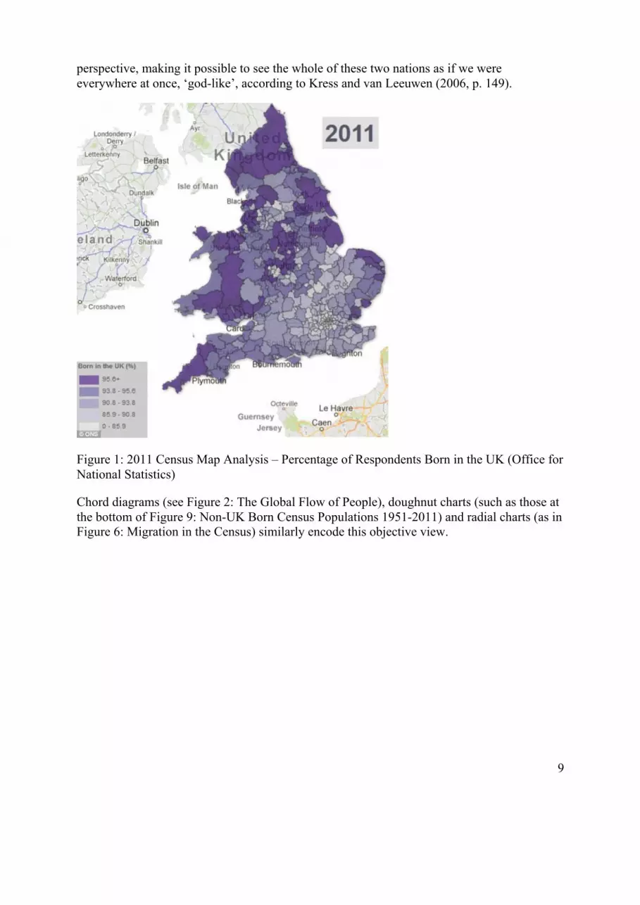
9
perspective, making it possible to see the whole of these two nations as if we were everywhere at once, ‘god-like’, according to Kress and van Leeuwen (2006, p. 149).
Figure 1: 2011 Census Map Analysis – Percentage of Respondents Born in the UK (Office for National Statistics)
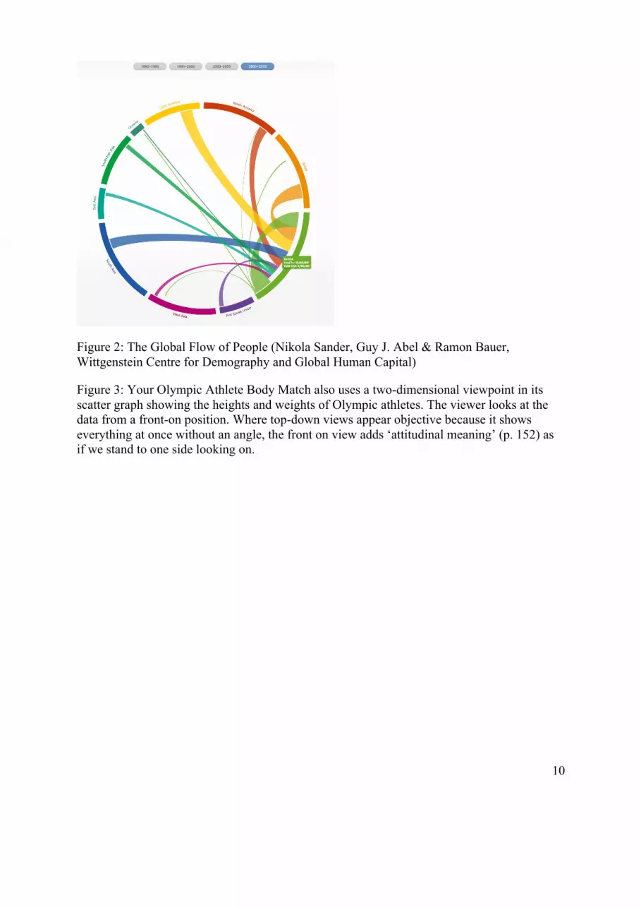
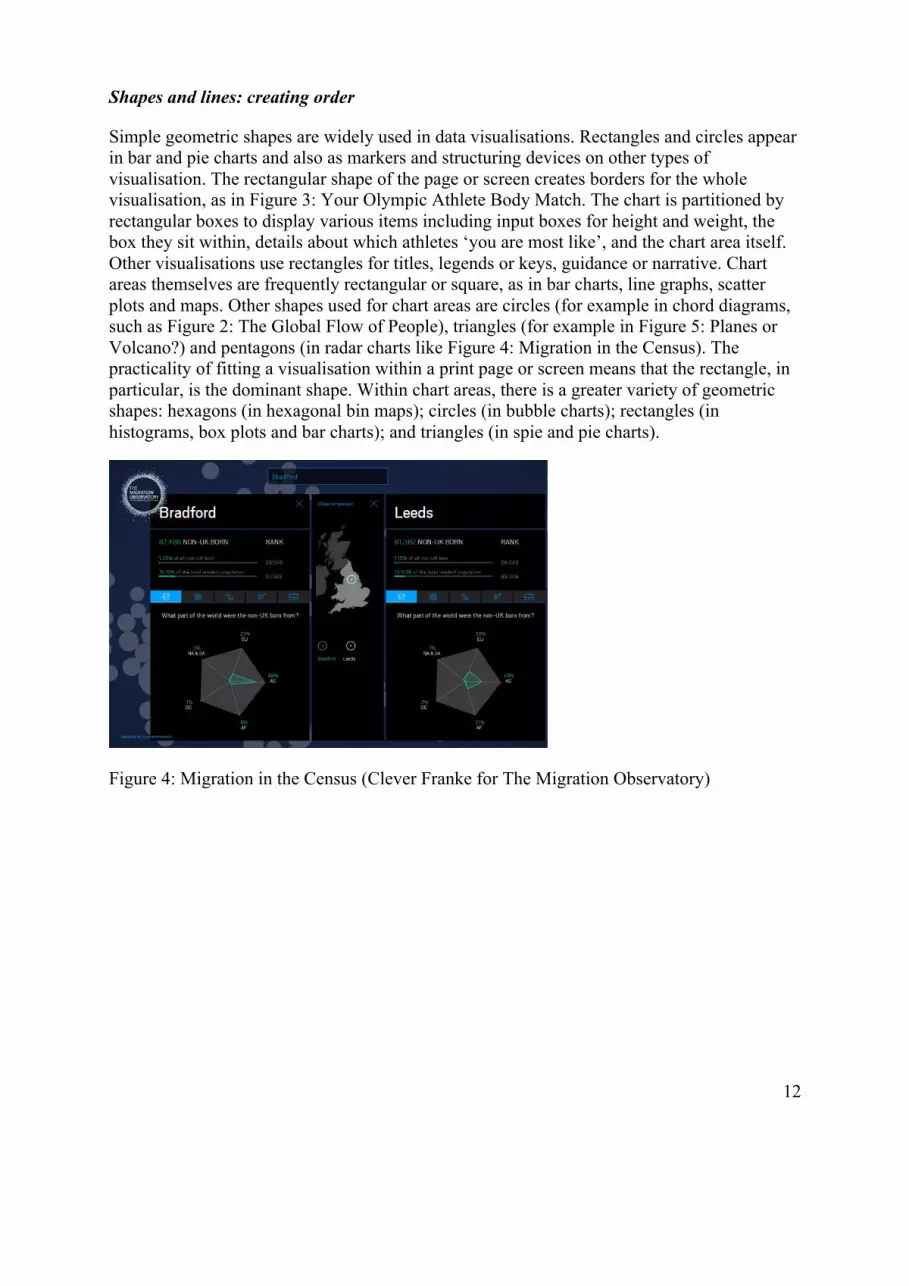
Chord diagrams (see Figure 2: The Global Flow of People), doughnut charts (such as those at the bottom of Figure 9: Non-UK Born Census Populations 1951-2011) and radial charts (as in Figure 6: Migration in the Census) similarly encode this objective view.
10
Figure 2: The Global Flow of People (Nikola Sander, Guy J. Abel & Ramon Bauer, Wittgenstein Centre for Demography and Global Human Capital)
Figure 3: Your Olympic Athlete Body Match also uses a two-dimensional viewpoint in its scatter graph showing the heights and weights of Olympic athletes. The viewer looks at the data from a front-on position. Where top-down views appear objective because it shows everything at once without an angle, the front on view adds ‘attitudinal meaning’ (p. 152) as if we stand to one side looking on.
11
Figure 3 Your Olympic Athlete Body Match (BBC)
The use of three-dimensional perspectives for purely decorative purposes or without offering the user the opportunity to benefit from the three-dimensionality by modifying his or her perspective is frowned upon amongst professional data visualisers. This is because it is difficult to read the values shown within them (Few, 2005; Siegrist, 1996). There is, therefore, good reason to avoid three-dimensional perspectives. Nonetheless, the dismissal of such perspectives contributes to the production of two-dimensional viewpoints as convention. Whilst these latter perspectives may be easier to read, Kress and Van Leeuwen argue that by using two-dimensional, front-on or top-down views, perspective is present but not shown, and the ‘distortions that usually come with perspective’ are ‘neutralized’ (2006, p. 149). Two-dimensional viewpoints look objective even though they are not. What’s more, they assume power over what is being represented, by offering a ‘god-like view’ (2006, p. 149).
As Kress and Van Leeuwen argue, a view without apparent or visible perspective is still a view from somewhere, even though this somewhere is not acknowledged. This echoes criticisms of the notion of objectivity made by feminist writers such as Harding (1986), who assert that objectivity often means foregrounding privileged perspectives. Haraway calls this the ‘god-trick of seeing everything from nowhere’ (1988, p. 189). Two-dimensional viewpoints create the illusion of objectivity by disguising perspective and giving the impression that we are ‘seeing everything from nowhere’. As noted earlier, this technique can be used in the interests of the privileged and powerful.
12
Shapes and lines: creating order
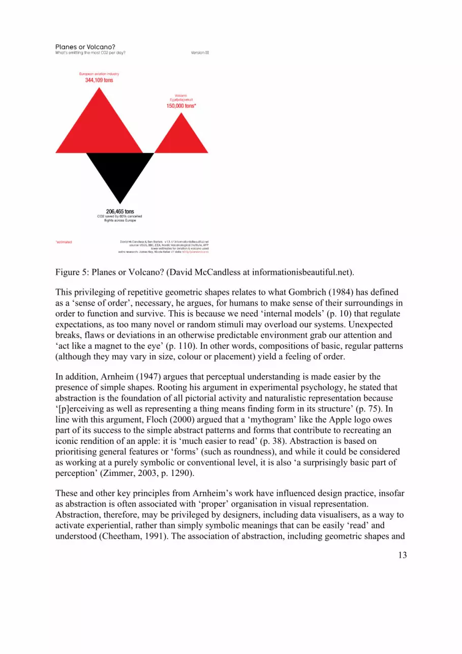
Simple geometric shapes are widely used in data visualisations. Rectangles and circles appear in bar and pie charts and also as markers and structuring devices on other types of visualisation. The rectangular shape of the page or screen creates borders for the whole visualisation, as in Figure 3: Your Olympic Athlete Body Match. The chart is partitioned by rectangular boxes to display various items including input boxes for height and weight, the box they sit within, details about which athletes ‘you are most like’, and the chart area itself. Other visualisations use rectangles for titles, legends or keys, guidance or narrative. Chart areas themselves are frequently rectangular or square, as in bar charts, line graphs, scatter plots and maps. Other shapes used for chart areas are circles (for example in chord diagrams, such as Figure 2: The Global Flow of People), triangles (for example in Figure 5: Planes or Volcano?) and pentagons (in radar charts like Figure 4: Migration in the Census). The practicality of fitting a visualisation within a print page or screen means that the rectangle, in particular, is the dominant shape. Within chart areas, there is a greater variety of geometric shapes: hexagons (in hexagonal bin maps); circles (in bubble charts); rectangles (in histograms, box plots and bar charts); and triangles (in spie and pie charts).
Figure 4: Migration in the Census (Clever Franke for The Migration Observatory)
13
Figure 5: Planes or Volcano? (David McCandless at informationisbeautiful.net).
This privileging of repetitive geometric shapes relates to what Gombrich (1984) has defined as a ‘sense of order’, necessary, he argues, for humans to make sense of their surroundings in order to function and survive. This is because we need ‘internal models’ (p. 10) that regulate expectations, as too many novel or random stimuli may overload our systems. Unexpected breaks, flaws or deviations in an otherwise predictable environment grab our attention and ‘act like a magnet to the eye’ (p. 110). In other words, compositions of basic, regular patterns (although they may vary in size, colour or placement) yield a feeling of order.
In addition, Arnheim (1947) argues that perceptual understanding is made easier by the presence of simple shapes. Rooting his argument in experimental psychology, he stated that abstraction is the foundation of all pictorial activity and naturalistic representation because ‘[p]erceiving as well as representing a thing means finding form in its structure’ (p. 75). In line with this argument, Floch (2000) argued that a ‘mythogram’ like the Apple logo owes part of its success to the simple abstract patterns and forms that contribute to recreating an iconic rendition of an apple: it is ‘much easier to read’ (p. 38). Abstraction is based on prioritising general features or ‘forms’ (such as roundness), and while it could be considered as working at a purely symbolic or conventional level, it is also ‘a surprisingly basic part of perception’ (Zimmer, 2003, p. 1290).
These and other key principles from Arnheim’s work have influenced design practice, insofar as abstraction is often associated with ‘proper’ organisation in visual representation. Abstraction, therefore, may be privileged by designers, including data visualisers, as a way to activate experiential, rather than simply symbolic meanings that can be easily ‘read’ and understood (Cheetham, 1991). The association of abstraction, including geometric shapes and
14
lines, with the universal emphasises a belief in their ability to offer the same meaning to all viewers and to present data which are universally true – Haraway’s notion of ‘the god-trick’ is intimated here. As Manovich notes, geometric shapes and other ‘graphical primitives’ (2011, p. 38) are used in data visualisations to represent – and so universalise – all manner of things, including ‘people, their social relations, stock prices, income of nations, unemployment statistics, or anything else’ (p. 38), a reductive process, as he notes:
We throw away 99 percent of what is specific about each object to represent only 1 per cent – in the hope of revealing patterns across this 1 per cent of objects’ characteristics (p. 38)
The use of geometrical shapes and lines therefore results in the dramatic and systematic simplification of data by highlighting only some of their characteristics.
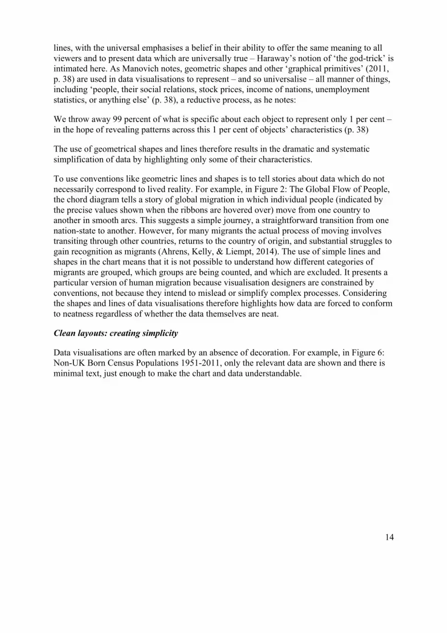
To use conventions like geometric lines and shapes is to tell stories about data which do not necessarily correspond to lived reality. For example, in Figure 2: The Global Flow of People, the chord diagram tells a story of global migration in which individual people (indicated by the precise values shown when the ribbons are hovered over) move from one country to another in smooth arcs. This suggests a simple journey, a straightforward transition from one nation-state to another. However, for many migrants the actual process of moving involves transiting through other countries, returns to the country of origin, and substantial struggles to gain recognition as migrants (Ahrens, Kelly, & Liempt, 2014). The use of simple lines and shapes in the chart means that it is not possible to understand how different categories of migrants are grouped, which groups are being counted, and which are excluded. It presents a particular version of human migration because visualisation designers are constrained by conventions, not because they intend to mislead or simplify complex processes. Considering the shapes and lines of data visualisations therefore highlights how data are forced to conform to neatness regardless of whether the data themselves are neat.
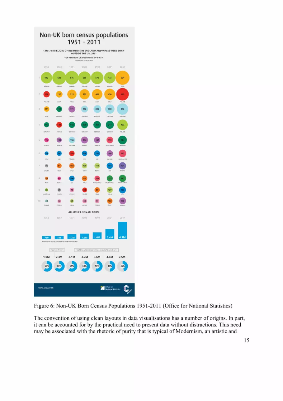
Clean layouts: creating simplicity
Data visualisations are often marked by an absence of decoration. For example, in Figure 6: Non-UK Born Census Populations 1951-2011, only the relevant data are shown and there is minimal text, just enough to make the chart and data understandable.
15
Figure 6: Non-UK Born Census Populations 1951-2011 (Office for National Statistics)
The convention of using clean layouts in data visualisations has a number of origins. In part, it can be accounted for by the practical need to present data without distractions. This need may be associated with the rhetoric of purity that is typical of Modernism, an artistic and
16
architectural movement in which simplicity, clarity of form and absence of clutter are considered key, and which has had a major influence on contemporary mainstream approaches to design (Cheetham, 1991). This clean layouts convention may also reflect the influence of the writings of visualisation pioneer Edward Tufte (1983), who advocated using the highest possible data-ink ratio (that is, the majority of the ink on the page should be devoted to data, not to other elements) without eliminating necessary content. Tufte also argued that ‘chart junk’ which impedes the display of data should be avoided. The use of clean layouts to present data in visualisations creates an aura of clarity and simplicity and this, like other conventions discussed here, has rhetorical, persuasive effects. This aura of simplicity ‘rubs off’ on the data, so that they too look clear and simple, as if the processes of visualising data were not subject to difficult decisions. This sense of simplicity obscures the complexity of data and their visualisation and contributes to the sense that in a visualisation, we can ‘see’ data directly: here they are, uncluttered and clear.
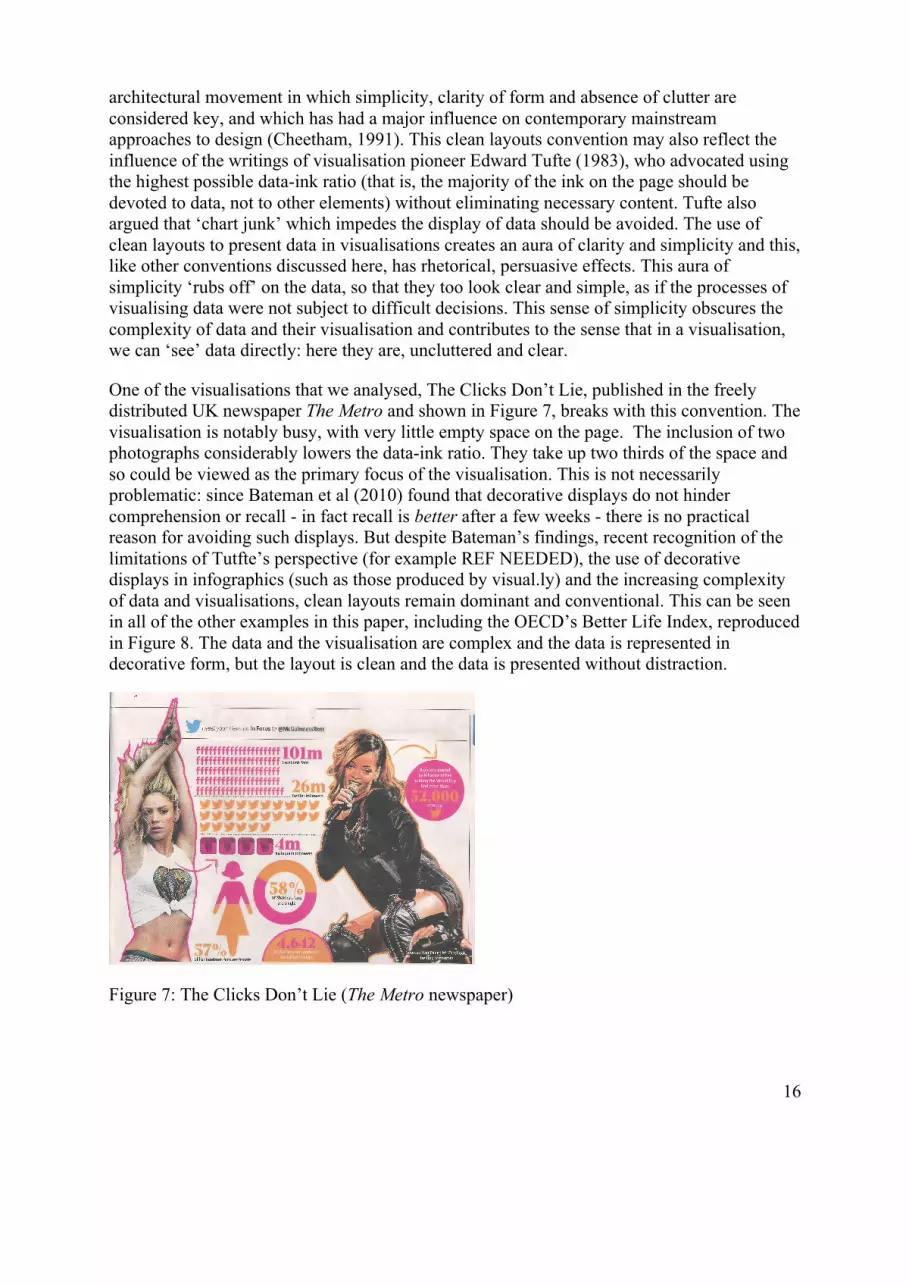
One of the visualisations that we analysed, The Clicks Don’t Lie, published in the freely distributed UK newspaper The Metro and shown in Figure 7, breaks with this convention. The visualisation is notably busy, with very little empty space on the page. The inclusion of two photographs considerably lowers the data-ink ratio. They take up two thirds of the space and so could be viewed as the primary focus of the visualisation. This is not necessarily problematic: since Bateman et al (2010) found that decorative displays do not hinder comprehension or recall - in fact recall is better after a few weeks - there is no practical reason for avoiding such displays. But despite Bateman’s findings, recent recognition of the limitations of Tutfte’s perspective (for example REF NEEDED), the use of decorative displays in infographics (such as those produced by visual.ly) and the increasing complexity of data and visualisations, clean layouts remain dominant and conventional. This can be seen in all of the other examples in this paper, including the OECD’s Better Life Index, reproduced in Figure 8. The data and the visualisation are complex and the data is represented in decorative form, but the layout is clean and the data is presented without distraction.
Figure 7: The Clicks Don’t Lie (The Metro newspaper)

17
Data sources: creating transparency
Visualisations often include a link to a downloadable data source or a brief line of text stating the source(s) of the data. In Figure 8: The Better Life Index, the data source appears at the bottom – a conventional location – and it links to the data in chart form, downloadable in a number of formats (see Figure 9: Link to Downloadable Data Source from The Better Life Index).
Figure 8: Better Life Index (by Moritz Stefaner for OECD)
Figure 9: Link to Downloadable Data on Better Life Index
The inclusion of data sources in visualisations makes them and the data within them seem transparent. Their inclusion means that users can examine the raw data, check the veracity of visualisations, and be sure that designers have been true to the data, something to which, as noted above, the designers we interviewed aspire. Indeed, as also noted above, links to data sources are included as evidence of this truthfulness. But the inclusion of data sources also does other, persuasive work. It suggests that the designer feels confident that s/he has been truthful to the data, and this in turn suggests that there may be no need for the user to check. People who are not specialists in data or in the subject matter of the visualisation are unlikely to be able make sense of raw data anyway (although sometimes the source is a written report rather than tabular data). Thus the inclusion of data sources performs the rhetorical, persuasive work of ascribing transparency and trustworthiness to visualisations. Furthermore,
18
visualisations that include additional details of the transformations that have been applied to the data (calculations, treatment, assumptions) from initial creation to final visualisation, are considered to be ‘good’ by professional visualisers: a high value is placed upon their traceability. Latour argues that the traceability of the stages of the creation of images is a key component of their ability to ‘transport truth’ (Latour, 1995, p. 180). In the case of data visualisations, the inclusion of data sources and these additional details offers a form of traceability.
Testing the boundaries of convention
Some visualisers use conventions in interesting and provocative ways, testing out their boundaries. In doing so, they still remain constrained by these very conventions. The work of Stefanie Posavec is one example. Figure 10 below shows Literary Organism, her visualisation of differences in writing style across different authors of fiction. Another example can be seen in Figure 11, a visualisation by the Acurat agency of the global brain drain in science. These visualisations are aesthetically distinctive and engaging and they appear, at first glance, experimental. However, they still adhere to convention: Figure 11 uses geometric lines and shapes, Figure 10 excludes chart junk, and both refer to data sources and use two-dimensional viewpoints. In these examples we can see that conventions are elastic: they are not always used, but they always inform the choices that designers are able to make.

19
Figure 10: Literary Organism (Stefanie Posavec)

20
Figure 11: Global Brain Drain (Acurat)
Conclusion: power and the visual representation of data
The tension between the expressed good intentions of visualisation designers and the views of critics who assert that visualisations are harnessed in the interests of powerful groups to do persuasive work can be understood through a close examination of their micro-textual details. Examining the relationship between the accepted conventional meanings and the ideological meanings of visualisations and the resources on which they draw helps to make sense of the work that visualisations do to render data objective through inferences of transparency and facticity. These resources and inferences, we argue, are rooted in power-laden assumptions about what makes good design and how design can do good.
Designers make choices about the data visualisations that they make in an effort to do good with data, but their choices are constrained by the conventions that are available to them, conventions which do persuasive work. The conventions used in visualisations sometimes work to undermine the good intentions of visualisers, by imbuing data with a sense of objectivity. This happens despite the fact that visualisers themselves are aware that data and the visualisation production process are not objective and that they both privilege some perspectives whilst ignoring others. And it happens despite visualisers’ desire to see such awareness extend to users. Visualisers do their best to ‘do good with data’ within structuring and constraining conventions.
Research into digital, creative work often fails to make good sense of the entanglements of power and practice in the production of digitally designed artefacts, and designers are too often assumed to be all-powerful (see for example Adam and Kreps (2006) on web designers and web accessibility and Munson (2014) on the designers of recommendation systems). But it is not the case that power operates in such simplistic ways: the location of power in digital design processes is more complex than this, as we have shown in this paper. We need better understanding of how power works in and through visualisations and the relationship between design and power. This paper represents an effort to contribute to such understanding.
Our social semiotic critique can be seen as an instrument to discuss the ‘rules’ of visualisation precisely in relation to these entanglements of designer intent and the persuasive work that visualisations and their conventions do. This is an important contribution to sociological understanding of data visualisation, insofar as these conventions are both rooted in the genealogies that we have outlined and productive of more or less novel ways of practicing visualisation and seeing data. Almost three decades ago, Fyfe and Law (1988) urged sociologists to take the visual seriously in the study of various aspects of social life, because “[d]epiction, picturing and seeing are ubiquitous features in the process by which most human beings come to know the world as it really is for them” (p. 2). In responding to this still current and urgent need, we have focused on the social semiotic ‘work’ that visualisations do in reproducing a limited range of ways of knowing the world through data as well as shaping particular relationships between ordinary people and data. As a form of enquiry, rather than a pre-determined theory or method, social semiotics enables us not only to approach meaning-making as social practice, but also highlight some of the major ways in which “the set of
21
semiotic choices that typify a given context” (Van Leeuwen, 2005, p. 14) constitute social action in their own right.
Examining the social semiotic resources used in visualisations as we have done in this article leads to more sophisticated understanding of the work of visualisation designers, who play a role in representing data but who are not all-powerful. Our research advances existing social scientific knowledge about visualisation by considering designers and what they say about their work within the structures which shape and constrain their work, like conventions. This in turn makes it possible to uncover the ways in which ideology, power, and politics are at work in data visualisation. As Fyfe and Law (1988) state, “[t]he argument here is that what can be seen is in part a question of what visual languages allow us to see” (p. 2). Such understandings of data visualisations unveil the entanglements of data and power within them. Since designers are often unaware of the ideological underpinnings and implications of the conventions they use or may tell a different story about their origins, the challenge that remains is to find ways of opening up a dialogue with them about the persuasive and ideological work that visualisation conventions do.
Acknowledgements
[to be added]
22
References
Adam, A., & Kreps, D. (2006). Enabling or disabling technologies? A critical approach to web accessibility. Information Technology & People, 19(3), 203-218.
Ahrens, J., Kelly, M., & Liempt, I. (2014). Free movement? The onward migration of EU citizens born in Somalia, Iran, and Nigeria. Population, Space and Place.
Aiello, G. (2006). Theoretical Advances in Critical Visual Analysis: Perception, Ideology, Mythologies, and Social Semiotics. Journal of Visual Literacy, 26(2), 89-102.
Aiello, G. (2007). The appearance of diversity: Visual design and the public communication of EU identity. In Bain J. and Holland M. (Eds.), European Union identity: Perceptions from Asia and Europe (pp. 147-181). Baden-Baden: Nomos.
Ambrosio, C. (2015). Objectivity and representative practices across artistic and scientific visualization. In A. Carusi, A. S. Hoel, T. Webmoor, & S. Woolgar (Eds.), Visualization in the Age of Computerization (pp. 118-144). London: Routledge.
Amoore, L. (2009). Lines of sight: on the visualization of unknown futures. Citizenship Studies, 13(1), 17-30.
Arnheim, R. (1947). Perceptual abstraction and art. Psychological Review, 54(2), 66.
Barnhurst, K. G. (1994). Seeing the newspaper. New York: St. Martin's Press.
Bateman, S., Mandryk, R. L., Gutwin, C., Genest, A., McDine, D., & Brooks, C. (2010). Useful junk?: the effects of visual embellishment on comprehension and memorability of charts. Paper presented at the Proceedings of the SIGCHI Conference on Human Factors in Computing Systems.
Beer, D., & Burrows, R. (2013). Popular culture, digital archives and the new social life of data. Theory, culture & society, 30(4), 47-71.
Coopmans, C., Vertesi, J., Lynch, M., & Woolgar, S. (2014). Introduction: representation in scientific practice revisited. In C. Coopmans, J. Vertesi, M. Lynch, & S. Woolgar (Eds.), Representation in scientific practice revisited (pp. 15-36). Cambridge, MA: The MIT Press.
Daston, L., & Galison, P. (2007). Objectivity. New York: Zone Books.
Dick, M. (2015). Just Fancy That: An analysis of infographic propaganda in The Daily Express, 1956–1959. Journalism Studies, 16(2), 152-174.
Fabian, J. (1983). Time and the other: how anthropology makes its object. New York: Columbia University Press.
Few, S. (2005). Bad Graphs: The Stealth Virus. DM Review, 15(1).
23
Few, S. (2008). What ordinary people need most from information visualization today. Perceptual Edge: Visual Business Intelligence Newsletter.
Fiske, J. (1990). Introduction to communication studies (Vol. 2nd; 2.). London: Routledge.
Floch, J.-M. (2000). Visual identities. London: Continuum.
Friendly, M. (2008). A brief history of data visualization. In C.-h. Chen, W. Hardle, & A. Unwin (Eds.), Handbook of data visualization (pp. 15-56). Berlin: Springer.
Fyfe, G. and Law, J. (1988) (Eds). Picturing Power: Visual Depiction and Social Relations. London and New York: Routledge.
Gitelman, L., & Jackson, V. (2013). Introduction. In L. Gitelman (Ed.), Raw Data is an Oxymoron. Cambridge, MA: MIT Press.
Gitelman, L. e. (2013). Raw data is an oxymoron. Cambridge, MA: MIT Press.
Gombrich, E. H., Gombrich, E. H., Gombrich, E. H., & Gombrich, E. H. (1984). The sense of order: a study in the psychology of decorative art: Phaidon London.
Haraway, D. (1988). Situated knowledges: The science question in feminism and the privilege of partial perspective. Feminist Studies, 575-599.
Harding, S. G. (1986). The science question in feminism. Milton Keynes: Open University Press.
Hodgson, M. G. (1963). The interrelations of societies in history. Comparative Studies in Society and History, 5(02), 227-250.
Jewitt, C., & Oyama, R. (2001). Visual meaning: A social semiotic approach. In T. van Leeuwen & C. Jewitt (Eds.), Handbook of visual analysis (pp. 134-156). London: Sage.
Kinross, R. (1985). The rhetoric of neutrality. Design Issues, 2(2): 18-30.
Kress, G. R., & Van Leeuwen, T. (2006). Reading images : the grammar of visual design (2nd ed. ed.). London: Routledge.
Latour, B. (1986). Visualization and cognition: Drawing things together. Knowledge and Society, 6, 1-40.
Latour, B. (1995). The “Pédofil” of Boa Vista. Common Knowledge, 4(1), 144-187.
Law, J. and Whittaker, J. (1988). On the art of representation: notes on the politics of visualisation. In Fyfe, G. and Law, J. (Eds.), Picturing Power: Visual Depiction and Social Relations. London and New York: Routledge.
Manovich, L. (2011). What is visualisation? Visual Studies, 26(1), 36-49.
24
Monmonier, M. S. (1996). How to lie with maps (Vol. 2nd). Chicago; London: University of Chicago Press.
Munson, S. (2014). Building and breaking bubbles: designing technological systems that select and present news. Paper presented at the ECREA, Lisbon, Portugal.
Neurath, O., Neurath, M., & Cohen, R. S. (1973). Empiricism and sociology (Vol. 1). Dordrecht: Reidel.
Panofsky, E. (1970). Meaning in the visual arts. New York: Pereguine.
Panofsky, E. (1991). Perspective as symbolic form. New York: Zone Books.
Pastoureau, M. (2001). The Devil's Cloth: A History of Stripes and Striped Fabric. New York: Columbia University Press.
Peirce, C. S. (1931-1958). Collected papers. Cambridge, MA: Harvard University Press.
Periscopic. (2014). home page. Retrieved from http://www.periscopic.com/
Porter, T. M. (1995). Trust in numbers : the pursuit of objectivity in science and public life. Chichester: Princeton University Press.
Ruppert, E. (2014). Visualising a Journal: Big Data and Society. Paper presented at the ICS Visual & Digital Cultures Research Seminar, Leeds.
Scott, J. C. (1998). Seeing like a state: how certain schemes to improve the human condition have failed. London: Yale University Press.
Siegrist, M. (1996). The use or misuse of three-dimensional graphs to represent lower-dimensional data. Behaviour & information technology, 15(2), 96-100.
Stiftelsen Gapminder. (n.d.). Gapminder. Retrieved from http://www.gapminder.org/
Trifonoff, K. M. (1996). Book Review: . “How to Lie With Maps.” Second Edition, by Mark Monmonier. Cartographic Perspectives, 25, 35-37.
Tufte, E. R. (1983). The visual display of quantitative information. Cheshire, CT: Graphics press
Valarakis, A. (2014). On Data Visualization: Rhetoric and the Revival of the Body Politic. (MA), University of Amsterdam.
Van Leeuwen, T. (2001). Semiotics and iconography. In T. van Leeuwen & C. Jewitt (Eds.), Handbook of visual analysis (Vol. Sage, pp. 92-118): London.
Van Leeuwen, T. (2005). Introducing Social Semiotics. London and New York: Routledge.
25
Zambrano, R. N., & Engelhardt, Y. (2008). Diagrams for the Masses. In G. Stapleton, J. Howse, & J. Lee (Eds.), Diagrams 2008 (pp. 282-292). Berlin, Heidelberg: Springer Verlag.
Zimmer, R. (2003). Abstraction in art with implications for perception. Philosophical Transactions of the Royal Society of London B: Biological Sciences, 358(1435), 1285-1291.
List of figures
Figure 1: Census map analysis - Country of Birth (ONS)
Figure 2: The Global Flow of People (Nikola Sander, Guy J. Abel & Ramon Bauer at the Wittgenstein Centre for Demography and Global Human Capital)
Figure 3: Your Olympic Athlete Body Match (BBC)
Figure 4: Better Life Index (Moritz Stefaner for OECD)
Figure 5: Link to Downloadable Data on Better Life Index
Figure 6: Migration in the Census (Clever Franke for the Migration Observatory)
Figure 7: Planes of Volcano? (David McCandless at informationisbeautiful.net)
Figure 8: Non-UK Born Census Populations 1951-2011 (ONS)
Figure 9: The Clicks Don’t Lie (The Metro)
Figure 10: Literary Organism (Stefanie Posavec)
Figure 11: Global Brain Drain (Acurat)