Embed Size (px)
Citation preview
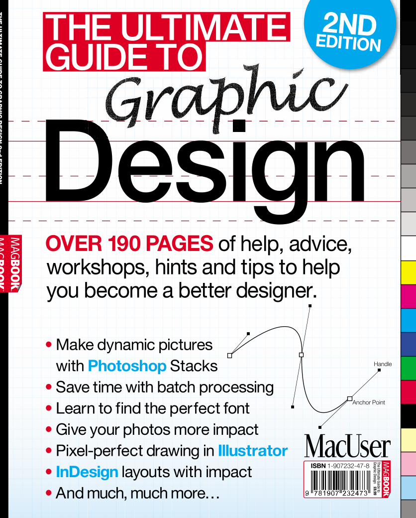
Design• Make dynamic pictures
with Photoshop Stacks• Save time with batch processing• Learn to find the perfect font• Give your photos more impact• Pixel-perfect drawing in Illustrator• InDesign layouts with impact• And much, much more…
OVER 190 PAGES of help, advice,workshops, hints and tips to helpyou become a better designer.
ISBN 1-907232-47-8
TheUltim
ateGuide
toGraphic
Design£8.99
Anchor Point
Handle
TH
EU
LTIM
AT
EG
UID
ETO
GR
AP
HIC
DE
SIG
N2nd
ED
ITIO
N
THE ULTIMATEGUIDE TO
2NDEDITION

So you’re a master of print design?Time to step it up a notch. Use your existingQuarkXPress skills to design for the weband bring your creations to full interactiveglory – without having to learn Flashor coding. The intuitive design interfaceof QuarkXPress 8 opens a world ofnew possibilities. Increase yourproductivity and offer your clients more(both print and web), right out of the box.
But, there’s more to this box of tricksthan meets the eye. Buy or upgrade toQuarkXPress 8 today to access £450+ ofExclusive Flash Resources for FREE to makeyour designs shine:
• hundreds of exclusive,fully editable Flash assets
• web templates, animations andvideo players
• Flash tutorials, eSeminars andeducational resources
Upgrade NOWfor just £279 (excl. VAT)
or BUY for £779 (excl. VAT)
Unleash the magicof Flash in QuarkXPress 8visit www.quark.com/magic
From printto web in a Flash.Work your magicwith QuarkXPress®8
PurchaseQuarkXPress®8
today and access£450+ worth
of Exclusive FlashResources for FREE
TheUltim
ateGuideto
Grap
hic
Desig
nWelcom
e003
Hello...There are almost as many definitions of ‘design’ as there arecolours in the spectrum. At its most basic, though, we can saythat it’s the creation of any inanimate object that motivates afellow human being. That motivation could be anything fromgoing out to buy a new car – the point of vehicle design and ofthose adverts that trumpet their benefits – to simply stoppingfor a moment and appreciating the art before them.
Design is a deeply ingrained part of the human psyche. Sincethe earliest days when we were painting on cave walls, we havebeen interested in creating objects that tell a story or simplybrighten up our surroundings, proving that the need to design isan inherent urge in all of us. Over the years, of course, thingshave changed, tastes have evolved and technology arrived, butstill that desire remains. The advent of the computer elevateddesign into a whole new level. No longer were we restricted tosculpting, painting or drawing with physical objects; now wecould create in a virtual space on a screen, change ourcreations as often as we wanted and finally output a definitivecopy to share with family, friends and the world at large.
And that’s where The Ultimate Guide to Graphic Design2nd Edition can help. Over the course of almost 200 pages,we’ll show you how you can harness the power of yourcomputer to create more professional, appealing and engagingwork that you’ll be proud to show, and which will impressthose who see it.
With full coverage of Photoshop, Illustrator, InDesign,QuarkXPress and more, our team of expert writers will guideyou step by step through each task at hand. And, if you needto brush up on your skills before launching yourself into someof the more ambitious projects, check out the comprehensiveA to Z of Design in the second half of the book, where weexplain key concepts that every professional or aspiringdesigner should have in their armoury.
Happy designing.
Nik Rawlinson
A note about the text: The examples shown in screenshots throughout this book usethe Mac interface, and we have used Mac-based shortcuts in the text. However, themajority of the applications covered – in particular, Photoshop, InDesign and QuarkXPress– work on both the Mac and Windows-based PCs and the on-screen interfaces are closeto identical on each platform. In most cases, keyboard shortcuts can be easily translatedfrom one platform to the other. ‘Command’ on the Mac is usually replaced with Ctrl on thePC; ‘Option’, where used, is replaced with ‘Alt’, and when we make reference tocontrol-clicking on a Mac, PC users need only right-click in the usual manner.
EDITORIALEDITOR Nik RawlinsonART EDITOR Camille NeilsonPRODUCTION EDITOR Jon LysonsSUB-EDITOR Kirsty FortuneDEPUTY EDITOR Kenny HemphillCONTRIBUTORS Adam Banks, Steve CaplinIMAGES Danny Bird, Steve Caplin, Chris Robson, Hugh Threlfall
ADVERTISING020 7907 6000, Fax 020 7907 [email protected] MANAGER Alexandra Skinner 020 7907 6623AD PRODUCTION EXEC Michael Hills 020 7907 6129DIGITAL PRODUCTION MANAGER Nicky Baker020 7907 6056US ADVERTISING MANAGER Matthew Sullivan-Pond++1 646 717 9555 [email protected]
PUBLISHING&MARKETING020 7907 6000, fax 020 7636 6122MANAGING DIRECTOR Ian Westwood 020 7907 6355PUBLISHER Paul Rayner 020 7907 6663BOOKAZINE MANAGER Dharmesh Mistry 020 7907 6100LIST RENTAL INSERTS EXECUTIVE John Perry020 7907 6151 [email protected] MANAGER Claire Scrase 020 7907 6113
DENNISPUBLISHINGLTDMANAGING DIRECTOR TECHNOLOGY AND MOTORING Ian WestwoodMANAGING DIRECTOR OF ADVERTISING Julian Lloyd-EvansNEWSTRADE DIRECTOR Martin BelsonCHIEF OPERATING OFFICER Brett ReynoldsGROUP FINANCE DIRECTOR Ian LeggettCHIEF EXECUTIVE James TyeCHAIRMAN Felix DennisTypography Neue Helvetica © Heidelberger Druckmaschinen AG, licensed by Linotype linotype.comCollis © 1993 The Enschedé Font Foundry teff.nl/fonts/collisPrinted in England by BGP Print Ltd, Chaucer International Estate, Launton Road, Bicester OX6 7QZ
MacUser, incorporating Apple User, DTP, MacShopper and MacBuyer, is published fortnightly byDennis Publishing Ltd, 30 Cleveland Street, London W1T 4JD, a company registered in Englandnumber 1138891. Entire contents © 2010 Dennis Publishing Ltd licensed by Felden. MacUser is anindependent journal, not affiliated with Apple Computer Inc. ‘Apple’ and the Apple logo, ‘Macintosh’,‘Mac’, the Mac logo and ‘MacUser’ are the trademarks of Apple Inc.PERMISSIONSANDLICENSINGMaterial in The Ultimate Guide to Graphic Design may not be reproduced in any form without thepublisher’s written permission. The Ultimate Guide to Graphic Design is available for licensingoverseas. For details contact Winnie Liesenfeld, International Licensing Manager,++44 (0) 20 7907 6134, [email protected]
HOWTOCONTACTUSMAIL MACUSER, 30 Cleveland Street, London, W1T 4JDEMAIL [email protected] WEB www.macuser.co.ukPHONE 020 7907 6000 Fax 020 7907 6369
The Ultimate Guideto Graphic Design
The paper used within this magazine is producedfrom sustainable fibre, manufactured by mills witha valid chain of custody.
004
TheUltim
ateGuideto
Graphic
Des
ign
Conten
ts
Design Techniques ...007Hints, tips and techniques that will inspire yourdesigns, allowing you to produce impressive resultsand, if you’re working professionally, an income, too.
David Carson ................................................................ 008
Line art ...........................................................................014
Photoshop for free....................................................... 020
Managing your photos ................................................ 026
Masterclass: Using Photoshopto create convincing rain effects............................... 032
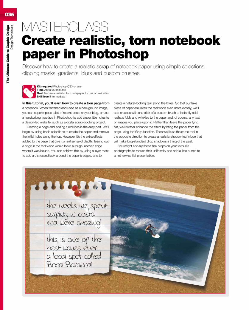
Masterclass: Create realistic, tornnotebook paper in Photoshop ................................... 036
Masterclass: Creating panographiccollaged images........................................................... 039
Masterclass: Create isometric projections ..............042
Masterclass: Create your owncustomised maps ........................................................ 045
A to Z of Design .......049A comprehensive guide to the most commonly usedterms in the world of design to enhance your knowledgeof the techniques employed by experienced designers.
Actions .......................................................................... 050
Adjustment layers........................................................ 052
Adobe Bridge................................................................ 054
Backgrounds ................................................................ 056
Baseline grid................................................................. 058
Batch processing 1...................................................... 060
Batch processing 2...................................................... 062
Bézier curves 1............................................................. 064
Bézier curves 2............................................................. 066
Colour balance............................................................. 068
Colour spaces ...............................................................070
Distortion .......................................................................072
Dodge and Burn ............................................................074
Embossing .....................................................................076
Extracting images ........................................................078
Fill and Stroke .............................................................. 080
Filters............................................................................. 082
Free-to-use pictures ................................................... 084
Free Transform............................................................. 086
Gradients ...................................................................... 088
Graphics tablets .......................................................... 090
Contents 014
090
008 032
005
TheUltim
ateGuideto
Grap
hic
Desig
nContents
Graphs in Illustrator .................................................... 092
Grep Styles in InDesign CS4 ...................................... 094
Hard Light mode .......................................................... 096
History........................................................................... 098
Image size......................................................................100
Image Stacks.................................................................102
Isometric projection.....................................................104
Jargon ............................................................................106
Joining and splitting paths in Illustrator ...................108
Jpeg ................................................................................110
Kerning and tracking....................................................112
Key commands 1 .......................................................... 114
Key commands 2 ..........................................................116
Layer blending...............................................................118
Layer Styles ...................................................................120
Light and shade ............................................................122
Liquify filter....................................................................124
Masks in Illustrator and Photoshop ...........................126
Measurements from a photo.......................................128
Moving objects..............................................................130
Noise reduction.............................................................132
Non-destructive editing...............................................134
OpenType .......................................................................136
Optimising Photoshop .................................................138
Paragraph rules ............................................................140
Pathfinder panel ...........................................................142
PDFs ...............................................................................144
Perspective....................................................................146
Plug-ins ..........................................................................148
QuicKeys........................................................................150
Quick Mask....................................................................152
Raw images ...................................................................154
Refine Edge ...................................................................156
Reflections ....................................................................158
Rule of thirds .................................................................160
Smart Objects ...............................................................162
Smart Guides ................................................................164
Style sheets ...................................................................166
TextEdit ..........................................................................168
Typography ....................................................................172
Unknown fonts ..............................................................174
Unsharp Mask ...............................................................176
Upscaling .......................................................................178
Vector objects ...............................................................180
Vector vs bitmap ...........................................................182
Workspaces...................................................................184
Wrapping text ................................................................186
X and Y axes ..................................................................188
Z axis ..............................................................................190
Zooming images ...........................................................192
184
168 174
124
192PAGES OFDesignKNOW-HOW

007
TheUltim
ateGuideto
Grap
hic
Desig
nDesign
Techniques
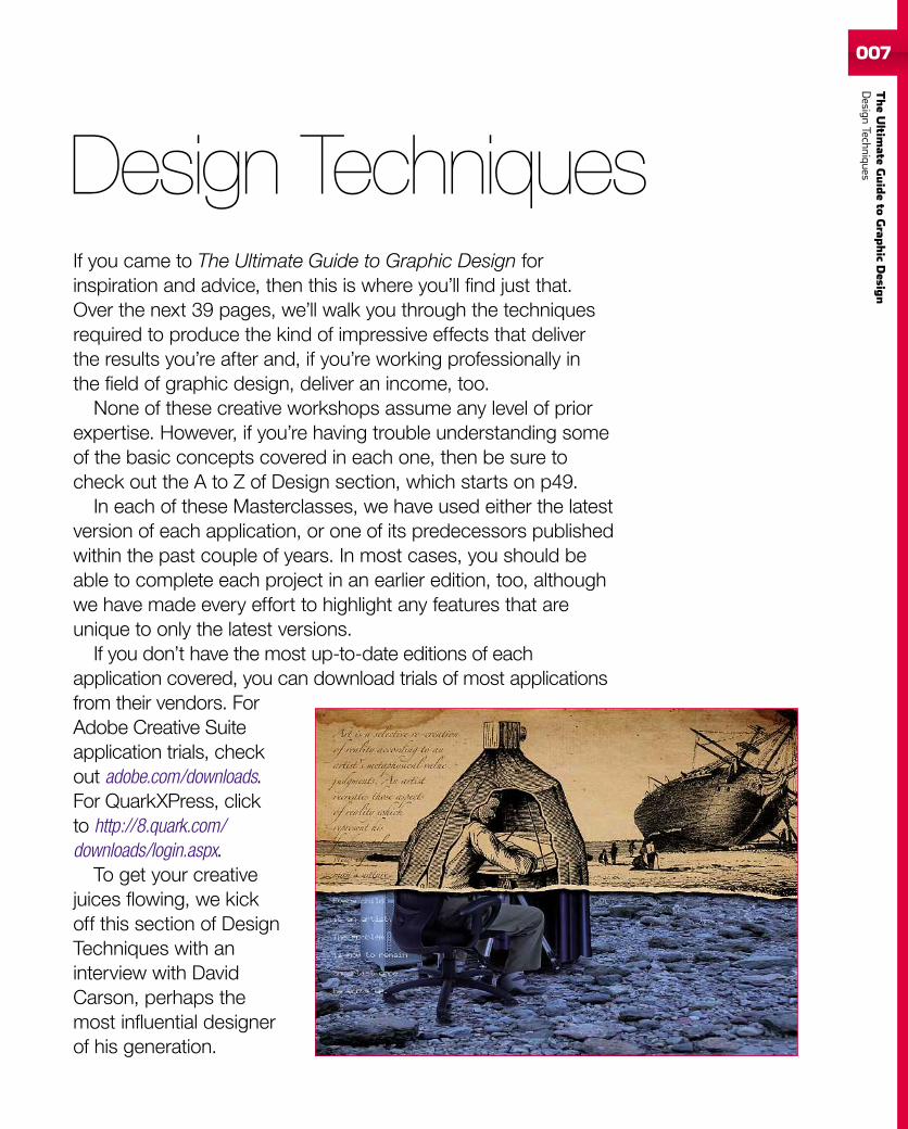
If you came to The Ultimate Guide to Graphic Design forinspiration and advice, then this is where you’ll find just that.Over the next 39 pages, we’ll walk you through the techniquesrequired to produce the kind of impressive effects that deliverthe results you’re after and, if you’re working professionally inthe field of graphic design, deliver an income, too.
None of these creative workshops assume any level of priorexpertise. However, if you’re having trouble understanding someof the basic concepts covered in each one, then be sure tocheck out the A to Z of Design section, which starts on p49.
In each of these Masterclasses, we have used either the latestversion of each application, or one of its predecessors publishedwithin the past couple of years. In most cases, you should beable to complete each project in an earlier edition, too, althoughwe have made every effort to highlight any features that areunique to only the latest versions.
If you don’t have the most up-to-date editions of eachapplication covered, you can download trials of most applicationsfrom their vendors. ForAdobe Creative Suiteapplication trials, checkout adobe.com/downloads.For QuarkXPress, clickto http://8.quark.com/downloads/login.aspx.
To get your creativejuices flowing, we kickoff this section of DesignTechniques with aninterview with DavidCarson, perhaps themost influential designerof his generation.
Design Techniques
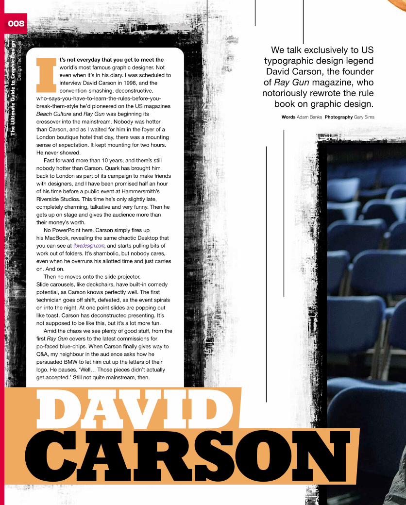
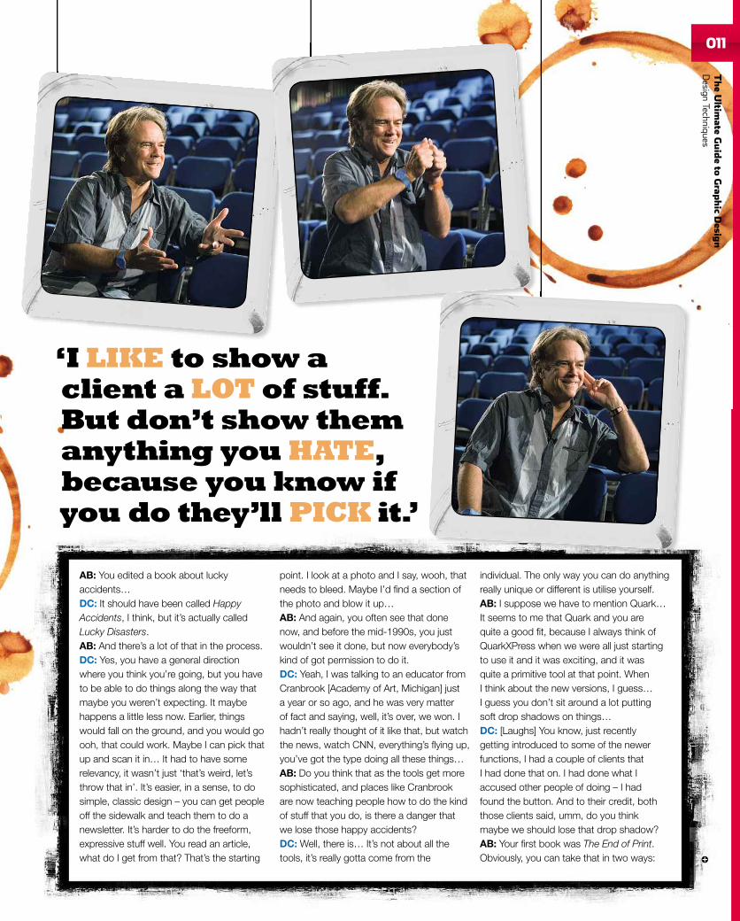
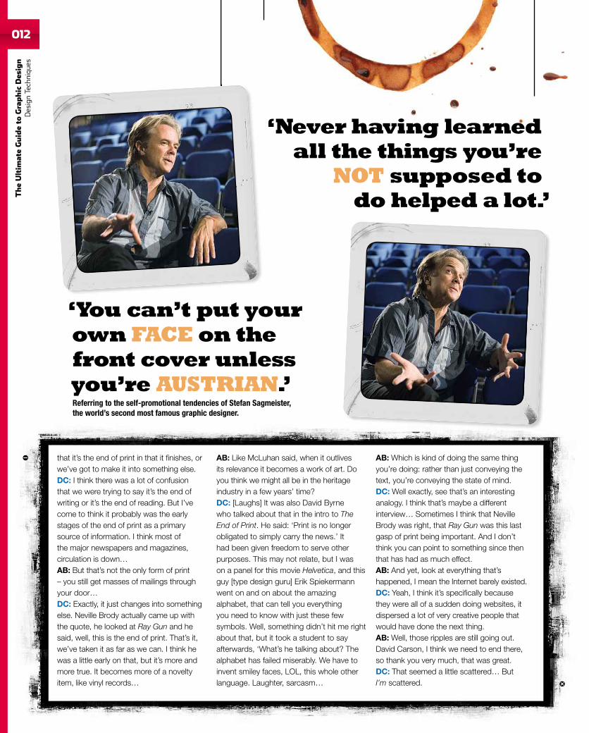
It’s not everyday that you get to meet theworld’s most famous graphic designer. Noteven when it’s in his diary. I was scheduled tointerview David Carson in 1998, and theconvention-smashing, deconstructive,
who-says-you-have-to-learn-the-rules-before-you-break-them-style he’d pioneered on the US magazinesBeach Culture and Ray Gun was beginning itscrossover into the mainstream. Nobody was hotterthan Carson, and as I waited for him in the foyer of aLondon boutique hotel that day, there was a mountingsense of expectation. It kept mounting for two hours.He never showed.
Fast forward more than 10 years, and there’s stillnobody hotter than Carson. Quark has brought himback to London as part of its campaign to make friendswith designers, and I have been promised half an hourof his time before a public event at Hammersmith’sRiverside Studios. This time he’s only slightly late,completely charming, talkative and very funny. Then hegets up on stage and gives the audience more thantheir money’s worth.
No PowerPoint here. Carson simply fires uphis MacBook, revealing the same chaotic Desktop thatyou can see at ilovedesign.com, and starts pulling bits ofwork out of folders. It’s shambolic, but nobody cares,even when he overruns his allotted time and just carrieson. And on.
Then he moves onto the slide projector.Slide carousels, like deckchairs, have built-in comedypotential, as Carson knows perfectly well. The firsttechnician goes off shift, defeated, as the event spiralson into the night. At one point slides are popping outlike toast. Carson has deconstructed presenting. It’snot supposed to be like this, but it’s a lot more fun.
Amid the chaos we see plenty of good stuff, from thefirst Ray Gun covers to the latest commissions forpo-faced blue-chips. When Carson finally gives way toQ&A, my neighbour in the audience asks how hepersuaded BMW to let him cut up the letters of theirlogo. He pauses. ‘Well… Those pieces didn’t actuallyget accepted.’ Still not quite mainstream, then.
Words Adam Banks Photography Gary Sims
We talk exclusively to UStypographic design legendDavid Carson, the founder
of Ray Gun magazine, whonotoriously rewrote the rule
book on graphic design.
CARSONDAVID
TheUltim
ateGuideto
Graphic
Des
ign
DesignTechniqu
es008
009
‘The first rule of graphicdesign is don’t announceyou’ve got a book comingoutwhen you haven’t done it.’On The Rules of Graphic Design, the book for which this was supposed to be the promotional tour.
TheUltim
ateGuideto
Grap
hic
Desig
nDesign
Techniques
010
TheUltim
ateGuideto
Graphic
Des
ign
DesignTechniqu
es
Adam Banks: You’ve just arrived in the UK?David Carson: Yes, I just got in fromZurich and I’m not quite all here. But that’smaybe not unusual.AB: I like your Desktop. It kind of lookslike our office.DC: And the funny thing is, that’s not evenparticularly bad.AB: It gets worse?DC: Someone sent me an email and Icouldn’t get it to open. Then I realised itwas open, it had just blended in.AB: It’s a creative way of working. Youhave music on as well?DC: I literally can’t work without music.AB: I think that goes together, becausethere’s chaos and there’s stimulation.You once said: ‘Don’t mistake legibilityfor communication.’ Sometimes peoplemisinterpret that and think you’re not tryingto communicate, that maybe it’s just some
designer’s game, but that’s not it at all – it’sabout engaging and stimulating, isn’t it?DC: It’s trying to communicate an idea, andin doing that, sometimes something becamea little harder to read, but I think the whole‘hard to read’ thing got way overblown.AB: Well you did set a whole article inDingbats…DC: [Laughs] That’s what I always hearabout. Thirty issues, and one article. Well,I admit that was one you could not actuallyread. But it has a lot to do with what you’reinterested in reading, too. People whoweren’t into the music or that particularband tended to write the whole thing offas being unreadable.AB: The reader has to make an effort, too.DC: Yes. When I first redesigned Surfermagazine, they took a copy to the famousAmerican designer Milton Glaser, andsurprise, surprise, he hated it.
AB: It’s hard to think of a designer moreunlike you, really.DC: [Laughs] Yeah. But my thing is to takeit to an 18-year-old kid coming out of thewater. If he loves it, it’s probably working.That’s kind of what happened with Ray Gun.The publishers were worried about thefirst issue. Maybe we’ve gone too far. Butthen from the start it got a good reaction,advertisers came in.AB: It was hugely influential obviously, RayGun and Beach Culture…DC: Yeah, well I tend to think Beach Culturewas actually a better magazine, but fewerpeople saw it. If you can somehow, whichyou can’t, construct a tree of influence, itwould be more than people realise. WhenI show some of that early work tonight, tostudents, for example, they might thinkwhat’s the big deal, but in the early 1990sthere wasn’t anything like that.
‘I did aBIGposter for themovie
. I set it in.’
AB: You edited a book about luckyaccidents…DC: It should have been called HappyAccidents, I think, but it’s actually calledLucky Disasters.AB: And there’s a lot of that in the process.DC: Yes, you have a general directionwhere you think you’re going, but you haveto be able to do things along the way thatmaybe you weren’t expecting. It maybehappens a little less now. Earlier, thingswould fall on the ground, and you would goooh, that could work. Maybe I can pick thatup and scan it in… It had to have somerelevancy, it wasn’t just ‘that’s weird, let’sthrow that in’. It’s easier, in a sense, to dosimple, classic design – you can get peopleoff the sidewalk and teach them to do anewsletter. It’s harder to do the freeform,expressive stuff well. You read an article,what do I get from that? That’s the starting
point. I look at a photo and I say, wooh, thatneeds to bleed. Maybe I’d find a section ofthe photo and blow it up…AB: And again, you often see that donenow, and before the mid-1990s, you justwouldn’t see it done, but now everybody’skind of got permission to do it.DC: Yeah, I was talking to an educator fromCranbrook [Academy of Art, Michigan] justa year or so ago, and he was very matterof fact and saying, well, it’s over, we won. Ihadn’t really thought of it like that, but watchthe news, watch CNN, everything’s flying up,you’ve got the type doing all these things…AB: Do you think that as the tools get moresophisticated, and places like Cranbrookare now teaching people how to do the kindof stuff that you do, is there a danger thatwe lose those happy accidents?DC: Well, there is… It’s not about all thetools, it’s really gotta come from the
individual. The only way you can do anythingreally unique or different is utilise yourself.AB: I suppose we have to mention Quark…It seems to me that Quark and you arequite a good fit, because I always think ofQuarkXPress when we were all just startingto use it and it was exciting, and it wasquite a primitive tool at that point. WhenI think about the new versions, I guess…I guess you don’t sit around a lot puttingsoft drop shadows on things…DC: [Laughs] You know, just recentlygetting introduced to some of the newerfunctions, I had a couple of clients thatI had done that on. I had done what Iaccused other people of doing – I hadfound the button. And to their credit, boththose clients said, umm, do you thinkmaybe we should lose that drop shadow?AB: Your first book was The End of Print.Obviously, you can take that in two ways:
‘I LIKE to showaclient a LOTof stuff.But don’t show themanything youHATE,because you know ifyou do they’ll PICK it.’
011
TheUltim
ateGuideto
Grap
hic
Desig
nDesign
Techniques
012
TheUltim
ateGuideto
Graphic
Des
ign
DesignTechniqu
es
that it’s the end of print in that it finishes, orwe’ve got to make it into something else.DC: I think there was a lot of confusionthat we were trying to say it’s the end ofwriting or it’s the end of reading. But I’vecome to think it probably was the earlystages of the end of print as a primarysource of information. I think most ofthe major newspapers and magazines,circulation is down…AB: But that’s not the only form of print– you still get masses of mailings throughyour door…DC: Exactly, it just changes into somethingelse. Neville Brody actually came up withthe quote, he looked at Ray Gun and hesaid, well, this is the end of print. That’s it,we’ve taken it as far as we can. I think hewas a little early on that, but it’s more andmore true. It becomes more of a noveltyitem, like vinyl records…
AB: Like McLuhan said, when it outlivesits relevance it becomes a work of art. Doyou think we might all be in the heritageindustry in a few years’ time?DC: [Laughs] It was also David Byrnewho talked about that in the intro to TheEnd of Print. He said: ‘Print is no longerobligated to simply carry the news.’ Ithad been given freedom to serve otherpurposes. This may not relate, but I wason a panel for this movie Helvetica, and thisguy [type design guru] Erik Spiekermannwent on and on about the amazingalphabet, that can tell you everythingyou need to know with just these fewsymbols. Well, something didn’t hit me rightabout that, but it took a student to sayafterwards, ‘What’s he talking about? Thealphabet has failed miserably. We have toinvent smiley faces, LOL, this whole otherlanguage. Laughter, sarcasm…
AB: Which is kind of doing the same thingyou’re doing: rather than just conveying thetext, you’re conveying the state of mind.DC: Well exactly, see that’s an interestinganalogy. I think that’s maybe a differentinterview… Sometimes I think that NevilleBrody was right, that Ray Gun was this lastgasp of print being important. And I don’tthink you can point to something since thenthat has had as much effect.AB: And yet, look at everything that’shappened, I mean the Internet barely existed.DC: Yeah, I think it’s specifically becausethey were all of a sudden doing websites, itdispersed a lot of very creative people thatwould have done the next thing.AB: Well, those ripples are still going out.David Carson, I think we need to end there,so thank you very much, that was great.DC: That seemed a little scattered… ButI’m scattered.
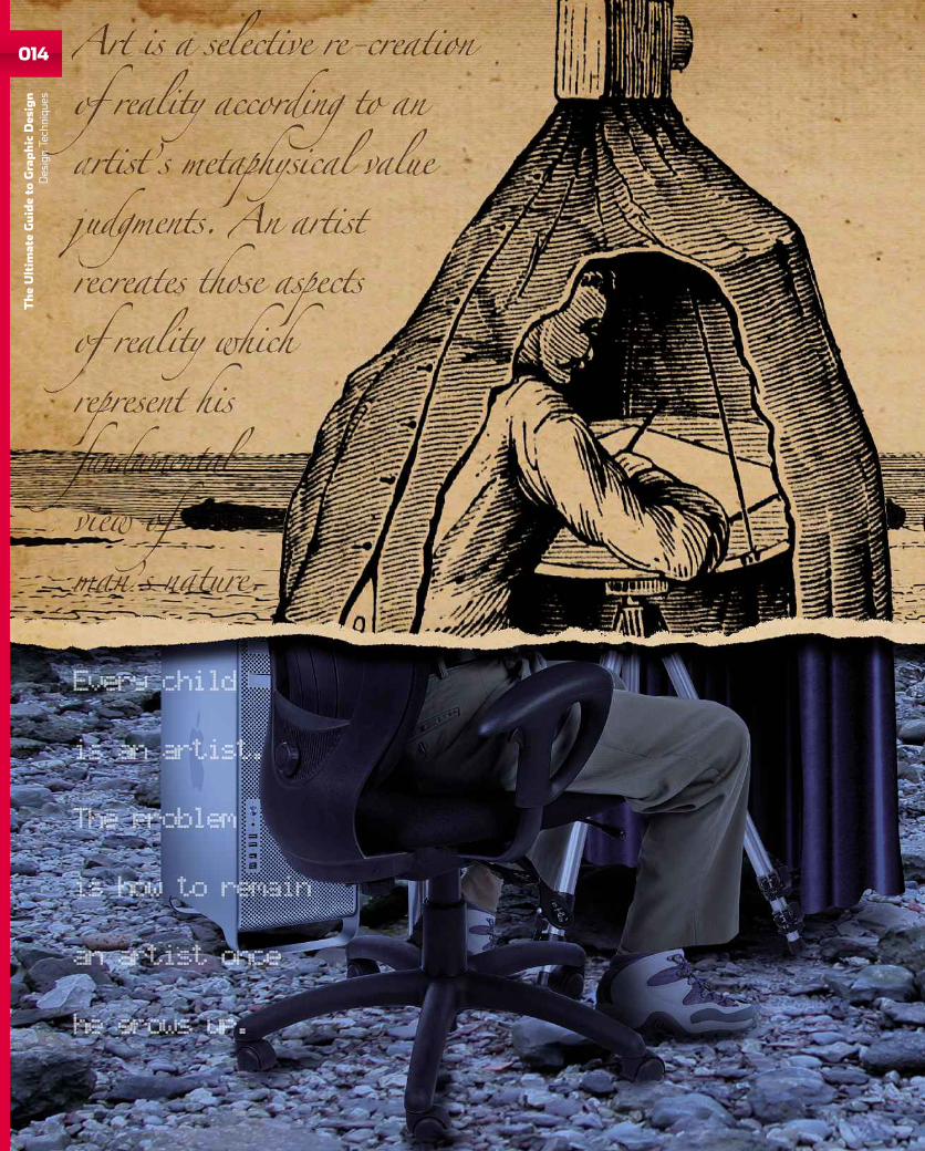
‘You can’t put yourownFACEon thefront cover unlessyou’re AUSTRIAN.’Referring to the self-promotional tendencies of Stefan Sagmeister,the world’s second most famous graphic designer.
‘Never having learnedall the things you’re
NOT supposed todohelped a lot.’

Visit Square today.We’re your local Apple experts.78 NEW OXFORD STREET, LONDON, WC1A 1HB 020 7692 6810EDEN SHOPPING CENTRE, HIGH WYCOMBE, BUCKS, HP11 2BY 01494 492 00021 IRON GATE, CATHEDRAL QUARTER, DERBY, DE1 3GP 0845 873 8215
NEW! BUY ONLINE ATWWW.SQUAREGROUP.CO.UK
Get more from your phone,iPhone 3GS - Now available
Available on Pay-As-You-Go, 18month contract or special business tariffs.Ask in-store or call our experts on 0800 08 27753 for details.
We want you tomake themost out of your iPhone, so visit us to takeadvantage of free training from our Apple experts.
Maps with GPS.Find your location, get
directions and see live trafficinformation.
The Internet in your pocket.Fast browsing on the gothrough 3G orWi-Fi.
With a built-in camera and anadvanced photo application,you can take and share photos
with ease.
20,000 Applicationsavailable on the App Store
and counting.
Visual Voicemail plays yourmessages in any order you want.See who has called you before
you listen.
Email on iPhone looks andworks just like email on your
computer, supporting rich HTMLemail plus PDF,Word, Excel and
PowerPoint attachments.
014
TheUltim
ateGuideto
Graphic
Des
ign
DesignTechniqu
es
015
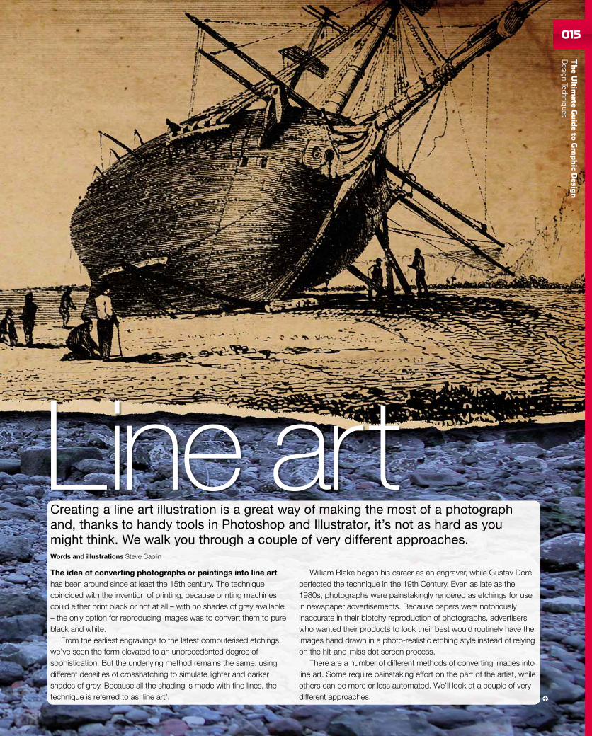
Line artThe idea of converting photographs or paintings into line arthas been around since at least the 15th century. The techniquecoincided with the invention of printing, because printing machinescould either print black or not at all – with no shades of grey available– the only option for reproducing images was to convert them to pureblack and white.
From the earliest engravings to the latest computerised etchings,we’ve seen the form elevated to an unprecedented degree ofsophistication. But the underlying method remains the same: usingdifferent densities of crosshatching to simulate lighter and darkershades of grey. Because all the shading is made with fine lines, thetechnique is referred to as ‘line art’.
William Blake began his career as an engraver, while Gustav Doréperfected the technique in the 19th Century. Even as late as the1980s, photographs were painstakingly rendered as etchings for usein newspaper advertisements. Because papers were notoriouslyinaccurate in their blotchy reproduction of photographs, advertiserswho wanted their products to look their best would routinely have theimages hand drawn in a photo-realistic etching style instead of relyingon the hit-and-miss dot screen process.
There are a number of different methods of converting images intoline art. Some require painstaking effort on the part of the artist, whileothers can be more or less automated. We’ll look at a couple of verydifferent approaches.
Creating a line art illustration is a great way of making the most of a photographand, thanks to handy tools in Photoshop and Illustrator, it’s not as hard as youmight think. We walk you through a couple of very different approaches.Words and illustrations Steve Caplin
TheUltim
ateGuideto
Grap
hic
Desig
nDesign
Techniques
016
TheUltim
ateGuideto
Graphic
Des
ign
DesignTechniqu
es
THE ILLUSTRATOR METHODAdobe Illustrator is the perfect tool for creating line art illustrations,since it’s designed from the ground up for drawing smooth, clean lineswith simple flat fills. The fact that every element is a separate editableobject makes it easy to apply different fills and strokes to them, and tochange these values at a later point. It’s also possible to repurposeartwork created in Illustrator. This means that if, for example, you’veproduced a complex illustration, like the one shown in workthroughone, you can reuse the illustration elsewhere with comparative ease.
Illustrations have far more clarity than photographs, and canbe reproduced far smaller without loss of information. This is whytechnical manuals always use line art illustrations rather thanphotographs, even though, like here, they will almost certainly havestarted with photographic images, which were then traced. Whenproducing these illustrations, you don’t have to worry about cleanbackgrounds, professional photographic lighting or even dirtyfingernails. You just need to get the raw image into Illustrator,so that you can produce the perfect illustration from it.
When drawing over a photograph, the problem, initially, is that thedrawings will cover the image to such an extent that you may nolonger be able to see what you’re trying to reproduce. It’s possible toget around this problem by lowering the opacity of the objects as youdraw them, using the Transparency palette – you can always returnthem to their full strength later on.
The question when producing technical drawings of this kind is howmuch detail do you include? The answer is to add in enough detail tomake the illustration clear to the viewer, but not so much that the spaceis cluttered up. You don’t need to add in every bump and screw head,every character of button text and every bevel.
THE PHOTOSHOP METHODThere are many ways of creating line art effects from images inPhotoshop, and many of the built-in ‘artistic’ and ‘sketch’ filterswill attempt to produce one-shot results for you. But these methodsalways look forced and artificial; it’s possible to do better with a littlehuman intervention. We’ve tried a couple of different approaches here,which produced two different results.
The first method involves tracing over the image by hand with thePen tool; then you can ‘stroke’ the resulting Pen path by switching tothe Brush tool (with the Pen path still visible) and pressing Enter. Thisapplies the current Brush as a stroke to the path, and is a usefulPhotoshop technique. You then use a copy of the original photograph,highly stylised using the Stamp filter, to add in the hair and eyes, beforeadding colour on a separate layer. The result of this method is toproduce a highly stylised, yet recognisable portrait. It does, however,require a certain degree of skill, as you will need to know where to drawin the Pen lines, and some judgement is needed in this process.
The second approach is more automated, and requires no drawingskills. It relies on using the Threshold adjustment to produce threecopies of the original photograph, each at a different threshold level. Adiagonal pattern can then be applied to the lightest of these threecopies, filling the final (and most minimal) copy with black to adddefinition. Although it’s remarkably easy to achieve, the results can beimpressive, with the diagonal lines giving the image a cross-hatchedlook that’s fully in keeping with the traditions of etching. For a morenaturalistic approach, try using concentric circles or wavy lines insteadof straight diagonals – although this takes some time to arrange thecurves convincingly.
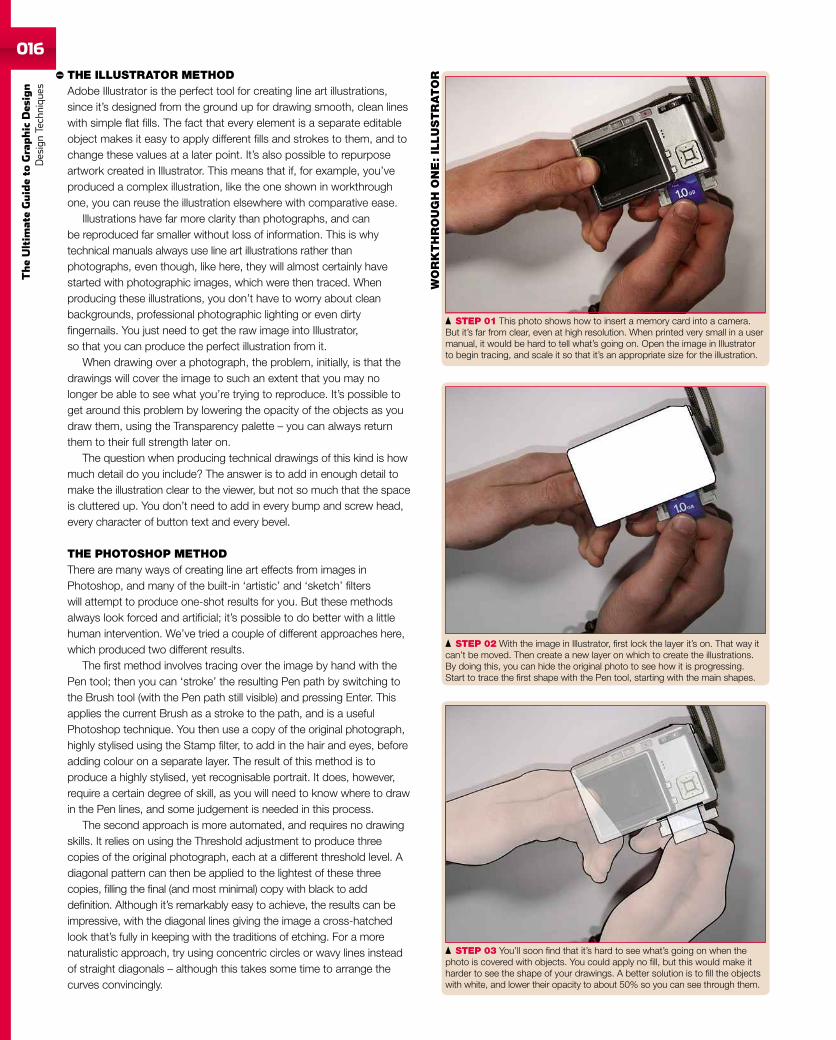
STEP 01 This photo shows how to insert a memory card into a camera.But it’s far from clear, even at high resolution. When printed very small in a usermanual, it would be hard to tell what’s going on. Open the image in Illustratorto begin tracing, and scale it so that it’s an appropriate size for the illustration.
STEP 02 With the image in Illustrator, first lock the layer it’s on. That way itcan’t be moved. Then create a new layer on which to create the illustrations.By doing this, you can hide the original photo to see how it is progressing.Start to trace the first shape with the Pen tool, starting with the main shapes.
STEP 03 You’ll soon find that it’s hard to see what’s going on when thephoto is covered with objects. You could apply no fill, but this would make itharder to see the shape of your drawings. A better solution is to fill the objectswith white, and lower their opacity to about 50% so you can see through them.
WO
RK
TH
RO
UG
HO
NE
:IL
LU
STR
ATO
R
TheUltim
ateGuideto
Grap
hic
Desig
nDesign
Techniques017
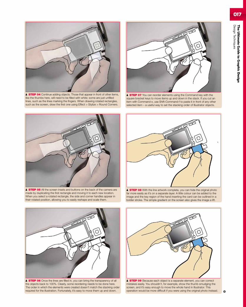
STEP 07 You can reorder elements using the Command key with thesquare bracket keys to move items up and down in the stack. If you cut anitem with Command-x, use Shift-Command-f to paste it in front of any otherselected item – a useful way to set the stacking order of Illustrator objects.
STEP 04 Continue adding objects. Those that appear in front of other items,like the thumbs here, will need to be filled with white; some are just unfilledlines, such as the lines marking the fingers. When drawing rotated rectangles,such as the screen, draw the first one using Effect > Stylize > Round Corners.
STEP 08 With the line artwork complete, you can hide the original photofar more easily as it’s on a separate layer. A little colour can be added to theimage and the key region of the hand inserting the card can be outlined in abolder stroke. The simple gradient on the screen also gives the image a lift.
STEP 05 All the screen insets and buttons on the back of the camera aremade by duplicating the first rectangle and moving it to each new location.When you select a rotated rectangle, the side and corner handles appear intheir rotated position, allowing you to easily reshape and scale them.
STEP 09 Because each object is a separate element, you can correctmistakes easily. You shouldn’t, for example, show the thumb smudging thescreen, and it’s easy enough to move the whole hand in Illustrator. Thisoperation would be more difficult if you were using the original photo instead.
STEP 06 Once the lines are filled in, you can bring the transparency of allthe objects back to 100%. Clearly, some reordering needs to be done here.The order in which the elements were created doesn’t match the stacking orderrequired for the illustration. Fortunately, it’s easy to move them up and down.
018
TheUltim
ateGuideto
Graphic
Des
ign
DesignTechniqu
es
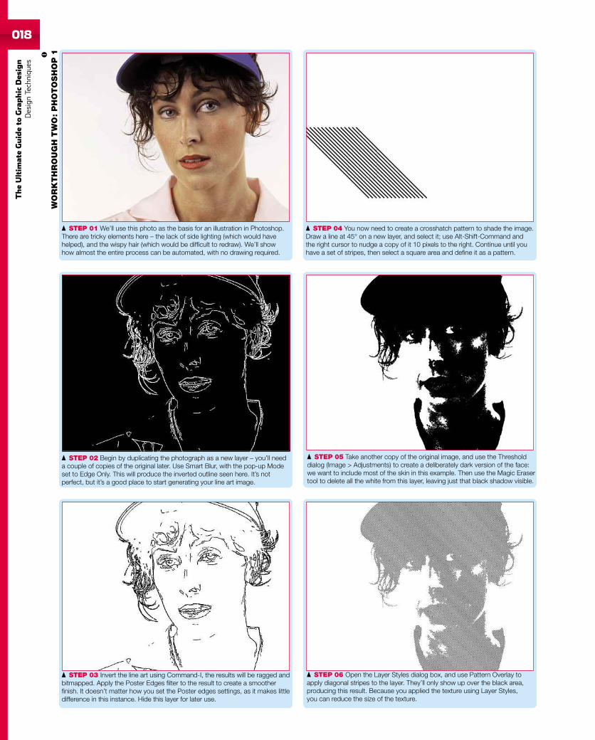
STEP 01 We’ll use this photo as the basis for an illustration in Photoshop.There are tricky elements here – the lack of side lighting (which would havehelped), and the wispy hair (which would be difficult to redraw). We’ll showhow almost the entire process can be automated, with no drawing required.
STEP 02 Begin by duplicating the photograph as a new layer – you’ll needa couple of copies of the original later. Use Smart Blur, with the pop-up Modeset to Edge Only. This will produce the inverted outline seen here. It’s notperfect, but it’s a good place to start generating your line art image.
STEP 03 Invert the line art using Command-I, the results will be ragged andbitmapped. Apply the Poster Edges filter to the result to create a smootherfinish. It doesn’t matter how you set the Poster edges settings, as it makes littledifference in this instance. Hide this layer for later use.
STEP 04 You now need to create a crosshatch pattern to shade the image.Draw a line at 45° on a new layer, and select it; use Alt-Shift-Command andthe right cursor to nudge a copy of it 10 pixels to the right. Continue until youhave a set of stripes, then select a square area and define it as a pattern.
STEP 05 Take another copy of the original image, and use the Thresholddialog (Image > Adjustments) to create a deliberately dark version of the face:we want to include most of the skin in this example. Then use the Magic Erasertool to delete all the white from this layer, leaving just that black shadow visible.
STEP 06 Open the Layer Styles dialog box, and use Pattern Overlay toapply diagonal stripes to the layer. They’ll only show up over the black area,producing this result. Because you applied the texture using Layer Styles,you can reduce the size of the texture.
WO
RK
TH
RO
UG
HT
WO
:P
HO
TO
SH
OP
1
TheUltim
ateGuideto
Grap
hic
Desig
nDesign
Techniques019
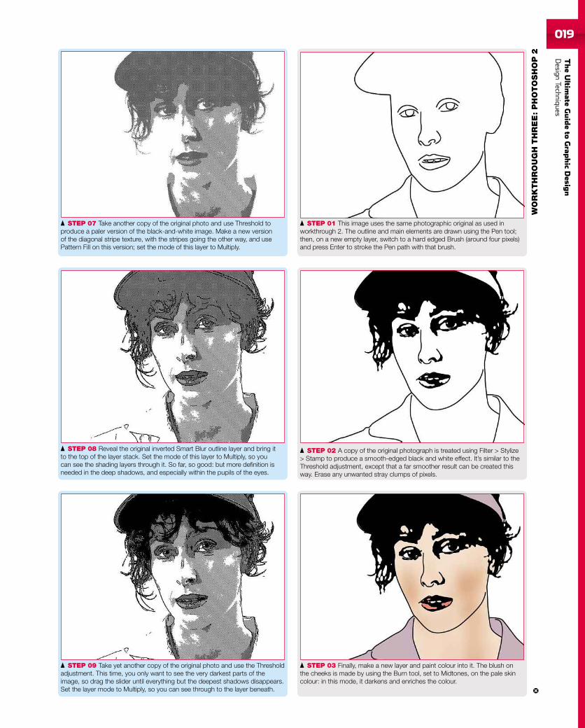
STEP 01 This image uses the same photographic original as used inworkthrough 2. The outline and main elements are drawn using the Pen tool;then, on a new empty layer, switch to a hard edged Brush (around four pixels)and press Enter to stroke the Pen path with that brush.
STEP 02 A copy of the original photograph is treated using Filter > Stylize> Stamp to produce a smooth-edged black and white effect. It’s similar to theThreshold adjustment, except that a far smoother result can be created thisway. Erase any unwanted stray clumps of pixels.
STEP 03 Finally, make a new layer and paint colour into it. The blush onthe cheeks is made by using the Burn tool, set to Midtones, on the pale skincolour: in this mode, it darkens and enriches the colour.
STEP 07 Take another copy of the original photo and use Threshold toproduce a paler version of the black-and-white image. Make a new versionof the diagonal stripe texture, with the stripes going the other way, and usePattern Fill on this version; set the mode of this layer to Multiply.
STEP 08 Reveal the original inverted Smart Blur outline layer and bring itto the top of the layer stack. Set the mode of this layer to Multiply, so youcan see the shading layers through it. So far, so good: but more definition isneeded in the deep shadows, and especially within the pupils of the eyes.
STEP 09 Take yet another copy of the original photo and use the Thresholdadjustment. This time, you only want to see the very darkest parts of theimage, so drag the slider until everything but the deepest shadows disappears.Set the layer mode to Multiply, so you can see through to the layer beneath.
WO
RK
TH
RO
UG
HT
HR
EE
:P
HO
TO
SH
OP
2
020
TheUltim
ateGuideto
Graphic
Des
ign
DesignTechniqu
es
021
TheUltim
ateGuideto
Grap
hic
Desig
nDesign
Techniques
With the growth of web-based applications, Adobe has made the bold movein developing a free online version of its heavyweight image editor, Photoshop.We take a look to see how it compares to its big brother.
Words Kenny Hemphill + Alan Stonebridge
ABCDEPrice FreeContact Adobe + photoshop.com/expressNeeds PowerPC G4 or better + Mac OS X 10.4 + 1GB RamPros Fantastic interface + Slick + Lots of editing featuresCons None
ONLINE IMAGE EDITOR
Photoshop Express
It’s been obvious for some time that more and more of thework we do on our Macs and PCs will be done online in web-basedapplications, rather than locally on our own machines. Email, wordprocessing, spreadsheeting and project management can already beperformed, albeit at a reasonably basic level, without ever opening anapplication on your hard drive. Photoshop Express, however, issomething very different. This isn’t some tiny start-up launching anAjax-based application that looks and performs well within strictlimitations. Nor is it an online giant like Google or Yahoo! making aplay for markets dominated by multinational software houses. This is
Adobe taking its flagship application, Photoshop, and putting it online.At least, that’s what it is on the surface. It doesn’t, however, take longonce you’ve started using Photoshop Express to realise that while itmay carry the Photoshop name, this has more to do with leveraging apowerful brand than any relationship it has with Photoshop CS4 orElements. While Express allows you to edit photographs and displaythem in galleries, share them with friends and download them againfor printing, it does it differently from CS4 and Elements. Nor does ithave much in common with Lightroom’s room-based approach. Butenough of what Photoshop Express isn’t. What is it?
PHOTOSHOPFOR FREE
022
TheUltim
ateGuideto
Graphic
Des
ign
DesignTechniqu
es
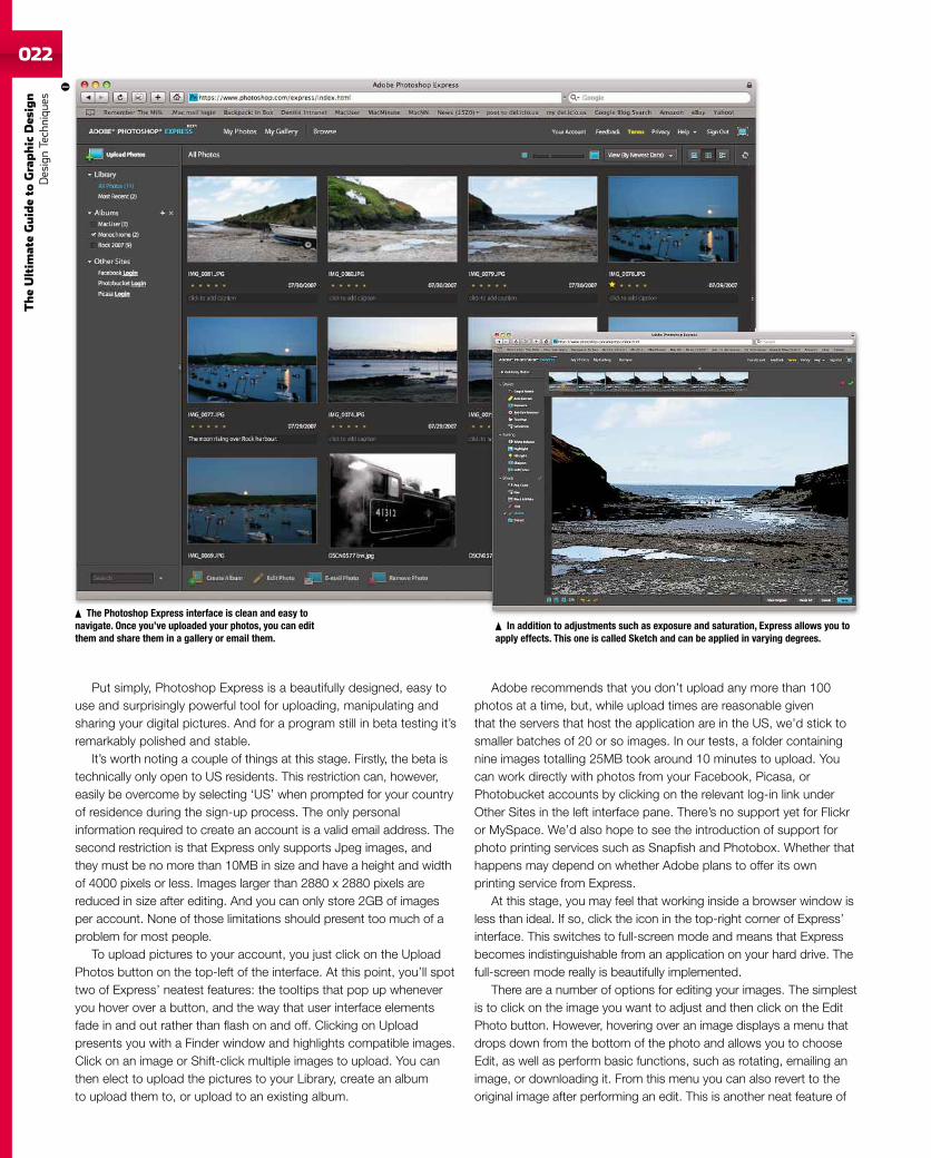
Put simply, Photoshop Express is a beautifully designed, easy touse and surprisingly powerful tool for uploading, manipulating andsharing your digital pictures. And for a program still in beta testing it’sremarkably polished and stable.
It’s worth noting a couple of things at this stage. Firstly, the beta istechnically only open to US residents. This restriction can, however,easily be overcome by selecting ‘US’ when prompted for your countryof residence during the sign-up process. The only personalinformation required to create an account is a valid email address. Thesecond restriction is that Express only supports Jpeg images, andthey must be no more than 10MB in size and have a height and widthof 4000 pixels or less. Images larger than 2880 x 2880 pixels arereduced in size after editing. And you can only store 2GB of imagesper account. None of those limitations should present too much of aproblem for most people.
To upload pictures to your account, you just click on the UploadPhotos button on the top-left of the interface. At this point, you’ll spottwo of Express’ neatest features: the tooltips that pop up wheneveryou hover over a button, and the way that user interface elementsfade in and out rather than flash on and off. Clicking on Uploadpresents you with a Finder window and highlights compatible images.Click on an image or Shift-click multiple images to upload. You canthen elect to upload the pictures to your Library, create an albumto upload them to, or upload to an existing album.
The Photoshop Express interface is clean and easy tonavigate. Once you’ve uploaded your photos, you can editthem and share them in a gallery or email them.
Adobe recommends that you don’t upload any more than 100photos at a time, but, while upload times are reasonable giventhat the servers that host the application are in the US, we’d stick tosmaller batches of 20 or so images. In our tests, a folder containingnine images totalling 25MB took around 10 minutes to upload. Youcan work directly with photos from your Facebook, Picasa, orPhotobucket accounts by clicking on the relevant log-in link underOther Sites in the left interface pane. There’s no support yet for Flickror MySpace. We’d also hope to see the introduction of support forphoto printing services such as Snapfish and Photobox. Whether thathappens may depend on whether Adobe plans to offer its ownprinting service from Express.
At this stage, you may feel that working inside a browser window isless than ideal. If so, click the icon in the top-right corner of Express’interface. This switches to full-screen mode and means that Expressbecomes indistinguishable from an application on your hard drive. Thefull-screen mode really is beautifully implemented.
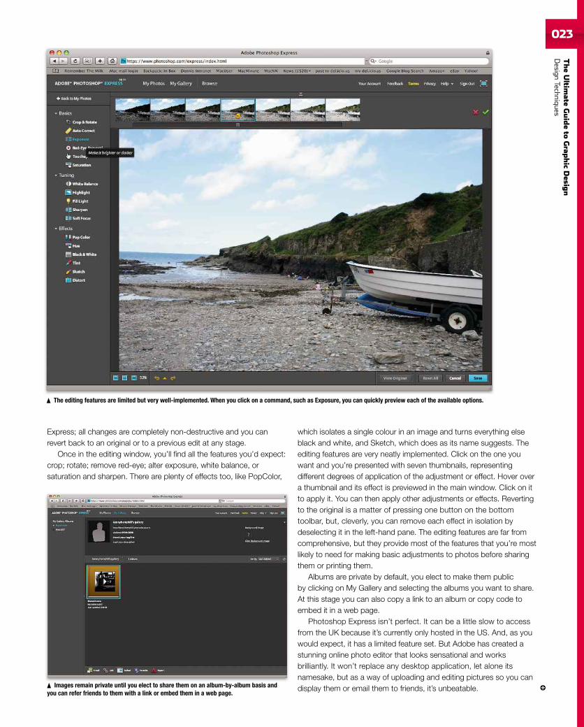
There are a number of options for editing your images. The simplestis to click on the image you want to adjust and then click on the EditPhoto button. However, hovering over an image displays a menu thatdrops down from the bottom of the photo and allows you to chooseEdit, as well as perform basic functions, such as rotating, emailing animage, or downloading it. From this menu you can also revert to theoriginal image after performing an edit. This is another neat feature of
In addition to adjustments such as exposure and saturation, Express allows you toapply effects. This one is called Sketch and can be applied in varying degrees.
TheUltim
ateGuideto
Grap
hic
Desig
nDesign
Techniques023
Express; all changes are completely non-destructive and you canrevert back to an original or to a previous edit at any stage.
Once in the editing window, you’ll find all the features you’d expect:crop; rotate; remove red-eye; alter exposure, white balance, orsaturation and sharpen. There are plenty of effects too, like PopColor,
which isolates a single colour in an image and turns everything elseblack and white, and Sketch, which does as its name suggests. Theediting features are very neatly implemented. Click on the one youwant and you’re presented with seven thumbnails, representingdifferent degrees of application of the adjustment or effect. Hover overa thumbnail and its effect is previewed in the main window. Click on itto apply it. You can then apply other adjustments or effects. Revertingto the original is a matter of pressing one button on the bottomtoolbar, but, cleverly, you can remove each effect in isolation bydeselecting it in the left-hand pane. The editing features are far fromcomprehensive, but they provide most of the features that you’re mostlikely to need for making basic adjustments to photos before sharingthem or printing them.
Albums are private by default, you elect to make them publicby clicking on My Gallery and selecting the albums you want to share.At this stage you can also copy a link to an album or copy code toembed it in a web page.
Photoshop Express isn’t perfect. It can be a little slow to accessfrom the UK because it’s currently only hosted in the US. And, as youwould expect, it has a limited feature set. But Adobe has created astunning online photo editor that looks sensational and worksbrilliantly. It won’t replace any desktop application, let alone itsnamesake, but as a way of uploading and editing pictures so you candisplay them or email them to friends, it’s unbeatable.Images remain private until you elect to share them on an album-by-album basis and
you can refer friends to them with a link or embed them in a web page.
The editing features are limited but very well-implemented. When you click on a command, such as Exposure, you can quickly preview each of the available options.
024
TheUltim
ateGuideto
Graphic
Des
ign
DesignTechniqu
es
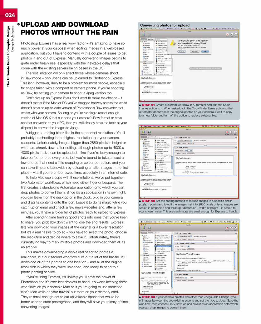
STEP 03 If your camera creates files other than Jpegs, add Change Typeof Images between the two existing actions and set the type to Jpeg. Save theworkflow, then choose File > Save As and save it as an application onto whichyou can drop images to convert them.
STEP 01 Create a custom workflow in Automator and add the ScaleImages action to it. When asked, add the Copy Finder Items action so thatAutomator doesn’t alter the original photos on your camera. Set it to copyto a new folder and turn off the option to replace existing files.
UPLOAD AND DOWNLOADPHOTOS WITHOUT THE PAIN
Photoshop Express has a real wow factor – it’s amazing to have somuch power at your disposal when editing images in a web-basedapplication, but you’ll have to contend with a couple of issues to getphotos in and out of Express. Manually converting images begins tograte under heavy use, especially with the inevitable delays thatcome with the existing servers being based in the US.
The first limitation will only affect those whose cameras shootin Raw mode – only Jpegs can be uploaded to Photoshop Express.This isn’t, however, likely to be a problem for most people, especiallyfor snaps taken with a compact or camera phone. If you’re shootingas Raw, try setting your camera to shoot a Jpeg version too.
Don’t give up on Express if you don’t want to make the change – itdoesn’t matter if the Mac or PC you’ve dragged halfway across the worlddoesn’t have an up-to-date version of Photoshop’s Raw converter thatworks with your camera. So long as you’re running a recent enoughversion of Mac OS X that supports your camera’s Raw format or haveanother converter on your PC, then you will already have the tools at yourdisposal to convert the images to Jpeg.
A bigger stumbling block lies in the supported resolutions. You’llprobably be shooting in the highest resolution that your camerasupports. Unfortunately, images bigger than 2880 pixels in height orwidth are shrunk down after editing, although photos up to 4000 x4000 pixels in size can be uploaded – fine if you’re lucky enough totake perfect photos every time, but you’re bound to take at least afew photos that need a little cropping or colour correction, and youcan save time and bandwidth by uploading smaller images in the firstplace – vital if you’re on borrowed time, especially in an Internet café.
To help Mac users cope with these irritations, we’ve put togethertwo Automator workflows, which need either Tiger or Leopard. Thefirst creates a standalone Automator application onto which you candrop photos to convert them. Since it’s an application in its own right,you can leave it on the desktop or in the Dock, plug in your cameraand drag its contents onto the icon. Leave it to do its magic while youcatch up on email and check a few news websites and, after a fewminutes, you’ll have a folder full of photos ready to upload to Express.
After spending time turning good shots into ones that you’re keento share, you probably don’t want to lose the end results. Expresslets you download your images at the original or a lower resolution,but it’s a real hassle to do so – you have to select the photo, choosethe resolution and decide where to save it. Unfortunately, there’scurrently no way to mark multiple photos and download them all asan archive.
This makes downloading a whole reel of edited photos areal chore, but our second workflow cuts out a lot of the hassle. It’lldownload all of the photos to one location – and all at the originalresolution in which they were uploaded, and ready to send to aphoto-printing service.
If you’re using Express, it’s unlikely you’ll have the power ofPhotoshop and it’s excellent droplets to hand. It’s worth keeping theseworkflows on your portable Mac or, if you’re going to use someoneelse’s Mac while on your travels, put them on your memory card.They’re small enough not to eat up valuable space that would bebetter used to store photographs, and they will save you plenty of timeconverting images.
STEP 02 Set the scaling method to reduce images to a specific size inpixels. If you intend to edit the images, set it to 2880 pixels or less. Images arescaled in proportion and the larger dimension – width or height – is scaled toyour chosen value. This ensures images are small enough for Express to handle.
Converting photos for upload
TheUltim
ateGuideto
Grap
hic
Desig
nDesign
Techniques025
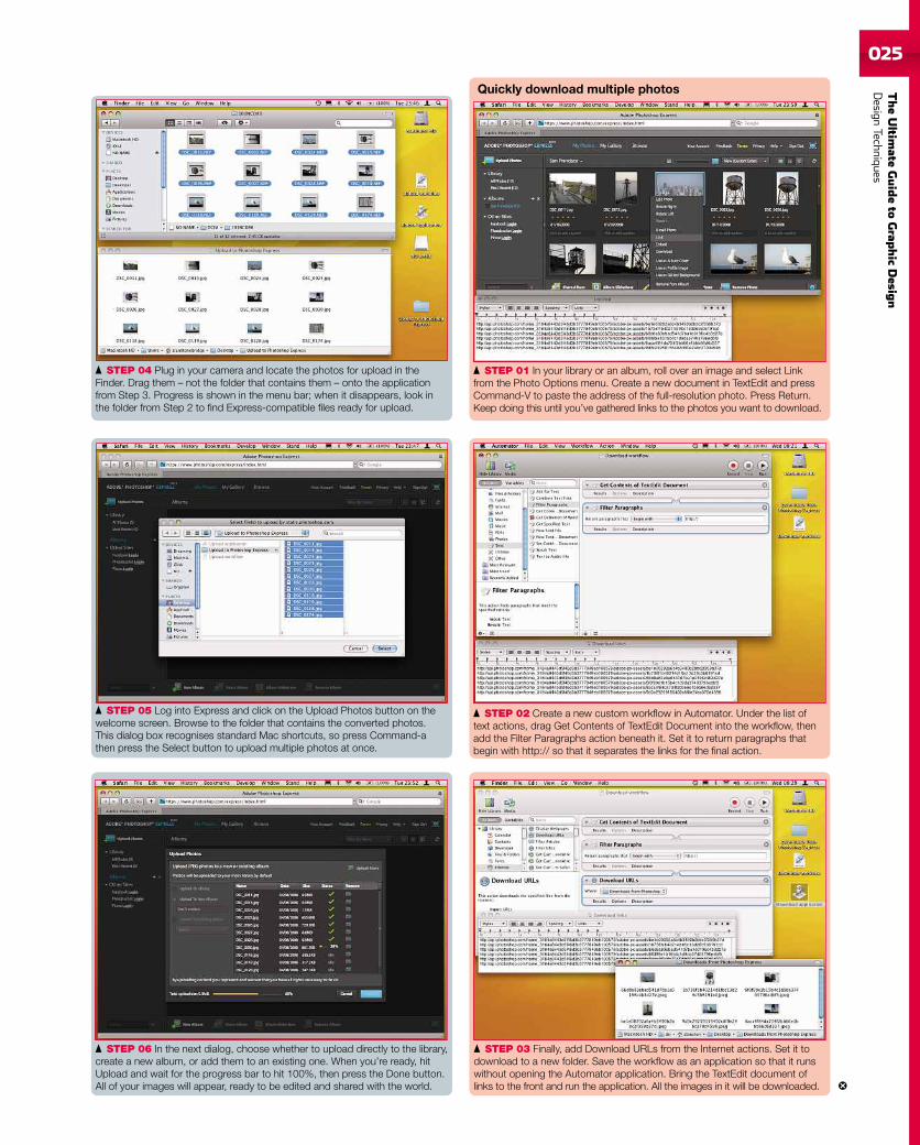
STEP 06 In the next dialog, choose whether to upload directly to the library,create a new album, or add them to an existing one. When you’re ready, hitUpload and wait for the progress bar to hit 100%, then press the Done button.All of your images will appear, ready to be edited and shared with the world.
STEP 05 Log into Express and click on the Upload Photos button on thewelcome screen. Browse to the folder that contains the converted photos.This dialog box recognises standard Mac shortcuts, so press Command-athen press the Select button to upload multiple photos at once.
STEP 04 Plug in your camera and locate the photos for upload in theFinder. Drag them – not the folder that contains them – onto the applicationfrom Step 3. Progress is shown in the menu bar; when it disappears, look inthe folder from Step 2 to find Express-compatible files ready for upload.
STEP 01 In your library or an album, roll over an image and select Linkfrom the Photo Options menu. Create a new document in TextEdit and pressCommand-V to paste the address of the full-resolution photo. Press Return.Keep doing this until you’ve gathered links to the photos you want to download.
STEP 03 Finally, add Download URLs from the Internet actions. Set it todownload to a new folder. Save the workflow as an application so that it runswithout opening the Automator application. Bring the TextEdit document oflinks to the front and run the application. All the images in it will be downloaded.
STEP 02 Create a new custom workflow in Automator. Under the list oftext actions, drag Get Contents of TextEdit Document into the workflow, thenadd the Filter Paragraphs action beneath it. Set it to return paragraphs thatbegin with http:// so that it separates the links for the final action.
Quickly download multiple photos
026
TheUltim
ateGuideto
Graphic
Des
ign
DesignTechniqu
es
027
TheUltim
ateGuideto
Grap
hic
Desig
nDesign
Techniques
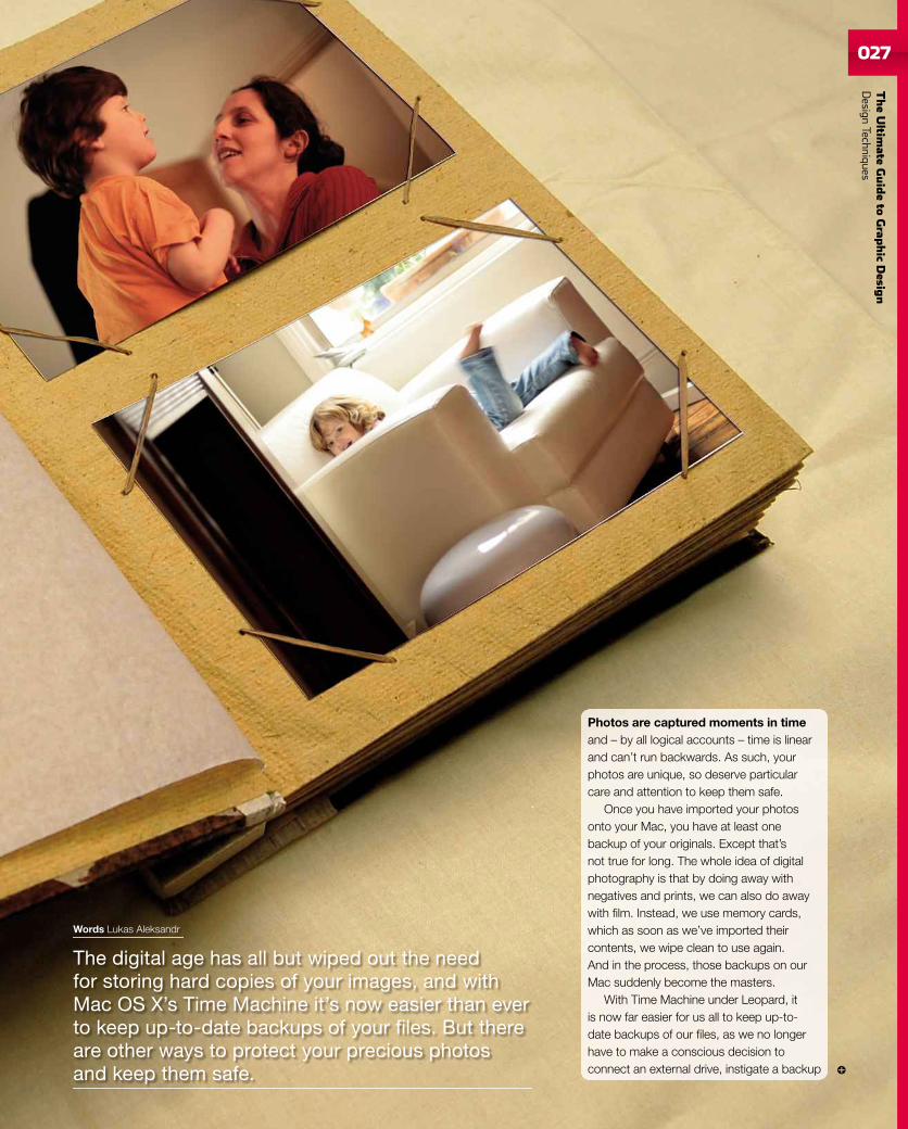
The digital age has all but wiped out the needfor storing hard copies of your images, and withMac OS X’s Time Machine it’s now easier than everto keep up-to-date backups of your files. But thereare other ways to protect your precious photosand keep them safe.
Words Lukas Aleksandr
Photos are captured moments in timeand – by all logical accounts – time is linearand can’t run backwards. As such, yourphotos are unique, so deserve particularcare and attention to keep them safe.
Once you have imported your photosonto your Mac, you have at least onebackup of your originals. Except that’snot true for long. The whole idea of digitalphotography is that by doing away withnegatives and prints, we can also do awaywith film. Instead, we use memory cards,which as soon as we’ve imported theircontents, we wipe clean to use again.And in the process, those backups on ourMac suddenly become the masters.
With Time Machine under Leopard, itis now far easier for us all to keep up-to-date backups of our files, as we no longerhave to make a conscious decision toconnect an external drive, instigate a backup
028
TheUltim
ateGuideto
Graphic
Des
ign
DesignTechniqu
es
script and then disconnect the same drive,and move it offsite every time we want toimport new pictures.
But whether you’re running Leopard or not,you should have a supplementary system inplace that will keep your photos safe. In an erawhere we can email them to friends, deletethe blurred, unflattering or poorly framed shotsand put the rest online, we are becomingincreasingly blasé about our digital assets andoften only realise quite how careless we’vebeen when it’s too late. In this feature, we’lltake you through the steps to ensuring youkeep your photos safe, and useful, for yearsto come.
FORMAT FIRSTTimes move on and standards change.Try opening an old MacWrite file on a modernMac, for example. While you may be able toextract the physical text, the chances areyou’ll lose most or all of your formatting. Dothe same with MacPaint, and you’ll have an
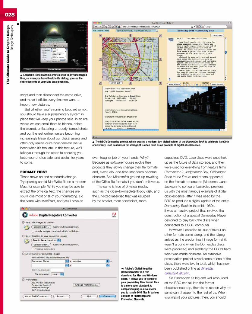
Leopard’s Time Machine creates links to any unchangedfiles, so when you travel back in its history, you see theentire contents of your Mac on a given day.
even tougher job on your hands. Why?Because as software houses evolve theirproducts they slowly change their file formatsand, eventually, one-time standards becomeobsolete. See Microsoft’s ground-up rewritingof the Office file formats if you don’t believe us.
The same is true of physical media,such as the close-to-obsolete floppy disk, andthe LP-sized laserdisc that was usurpedby the smaller, more convenient, more
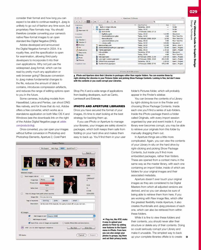
capacious DVD. Laserdiscs were once heldup as the future of data storage, and theywere used for everything from feature films(Terminator 2: Judgement Day, Cliffhanger,Back to the Future and others appearedon the format) to concerts (Madonna, JanetJackson) to software. Laserdisc providesus with the most famous example of digitalobsolescence, after it was used by theBBC to produce a digital update of the entireDomesday Book in the mid-1980s.It was a massive project that involved theconstruction of a special Domesday Playerdesigned to play back the discs whenconnected to a BBC computer.
However, Laserdisc fell out of favour asother formats came along, and then Jpegarrived as the predominant image format (itwasn’t around when the Domesday discswere produced) and suddenly the BBC’s hardwork was made obsolete. An extensivepreservation project saved some of one of thediscs, there were two in total, which has nowbeen published online at domesday.domesday1986.com.
So if someone as big and well resourcedas the BBC can fall into the formatobsolescence trap, there is no reason why thesame can’t happen to the rest of us. Whenyou import your pictures, then, you should
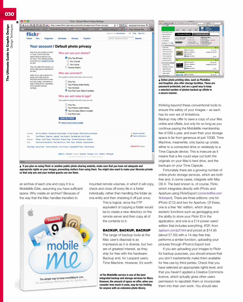
Adobe’s Digital Negative(DNG) Converter is a freedownload for Mac and Windowsusers. It allows you to translateyour proprietary Raw format filesto a more open standard. Acompanion plug-in also allowsyou to handle DNG files in variouseditions of Photoshop andPhotoshop Elements.
The BBC’s Domesday project, which created a modern-day, digital edition of the Domesday Book to celebrate its 900thanniversary, used Laserdiscs for storage. It is often cited as an example of digital obsolescence.
TheUltim
ateGuideto
Grap
hic
Desig
nDesign
Techniques029
consider their format and how long you canexpect to be able to continue reading it. Jpeg isunlikely to go out of fashion any time soon, butproprietary Raw formats may. You shouldtherefore consider converting your camera’snative Raw-format images to an openstandard like Digital Negative (DNG).
Adobe developed and announcedthe Digital Negative format in 2004. It isroyalty-free, and the specification is openfor examination, allowing third-partydevelopers to incorporate it into theirown applications. Why not just use thewidespread Jpeg format, which can beread by pretty much any application orweb browser going? Because conversionto Jpeg makes fundamental changes tothe file, reduces the amount of data itcontains, introduces compression artefacts,and reduces the range of editing options opento you in the future.
Some cameras, including models fromHasselblad, Leica and Pentax, can shoot DNGfiles natively, and for those that do not, Adobeoffers a free converter, which works as astandalone application on both Mac OS X andWindows (see the downloads link on the rightof the Adobe Digital Negative page at adobe.com/products/dng).
Once converted, you can open your imageswithout further conversion in Photoshop andPhotoshop Elements, Aperture 2, Corel Paint
Shop Pro X and a wide range of applicationsfrom leading developers, such as Canto,Lemkesoft and Extensis.
iPHOTO AND APERTURE LIBRARIESOnce you have secured the format of yourimages, it’s time to start looking at the beststrategy for backing them up.
If you use iPhoto or Aperture to manageyour libraries, your images are safely stored inpackages, which both keeps them safe fromfiddling on your hard drive and makes themeasy to back up. You’ll find them in your user
folder’s Pictures folder, which will probablyappear in the Finder’s sidebar.
You can browse the contents of a Libraryby right-clicking its icon in the Finder andchoosing Show Package Contents. Insideeach one you’ll find a series of sub-folders.Inside the iPhoto package there’s a foldercalled Originals, with every import sessionorganised by year and event inside it. If yourlibrary ever becomes corrupt, you may be ableto retrieve your originals from this folder bymanually dragging them out.
In Aperture things are a little morecomplicated. Again, you can view the contentsof your Library in-situ on the hard drive byright-clicking and picking Show PackageContents, but inside you’ll find moreembedded packages, rather than folders.These are opened from a context menu in thesame way as the master library, with each onecontaining an import folder, inside of which arefolders for your original images and theirassociated metadata.
Aperture doesn’t ever touch your originalimages as they are considered to be DigitalMasters from which all adjusted versions arederived, and so you can always be sure ofbeing able to retrieve them from here. If youare working with Raw image files, which offerthe greatest flexibility inside Aperture, it alsocreates thumbnails and Jpeg previews of eachone, which can also be retrieved from withinthese folders.
While it is fine to view these folders andtheir contents, you should never alter theirstructure or delete any of their contents. Doingso could seriously corrupt your Library andmake it unusable. The simplest way to backup your complete libraries offsite is to create
iPhoto and Aperture store their Libraries in packages rather than regular folders. You can examine these byright-clicking the Libraries in your Pictures folder and picking Show Package Contents. Looking is fine, but don’t messwith the contents or you could corrupt your Libraries.
Plug-ins, like iP2F, makeit easy to upload yourphotos to Flickr by addingnew features to the Exportmenu in iPhoto. From hereyou can also assign yourphotos to groups, tag themand set their privacy levels.
030
TheUltim
ateGuideto
Graphic
Des
ign
DesignTechniqu
es
an archive of each one and copy it to aMobileMe iDisk, assuming you have sufficientspace. Why create an archive? Because ofthe way that the Mac handles transfers to
mounted remote volumes, in which it will copy,check and close off every file in a folderindividually, rather than handling the folder asone entity and then checking it off just once.
This is logical, since the FTPequivalent of copying a folder wouldbe to create a new directory on theremote server and then copy all ofthe contents to it.
BACKUP, BACKUP, BACKUPThe range of backup tools at theMac user’s disposal is asimpressive as it is diverse, but twoare of greatest interest, as theyship for free with the hardware:Backup and, for Leopard users,Time Machine. However, it’s worth
thinking beyond these conventional tools toensure the safety of your images – as eachhas its own set of limitations.Backup may offer to save a copy of your filesonline and offsite, but only for so long as youcontinue paying the MobileMe membershipfee of £69 a year, and even then your storagespace is far from generous at just 10GB. TimeMachine, meanwhile, only backs up onsite,either to a connected drive or wirelessly to aTime Capsule device. This is insecure as itmeans that a fire could wipe out both theoriginals on your Mac’s hard drive, and thebackups on your Time Capsule.
Fortunately there are a growing number ofonline photo storage services, which are bothfree and, in some cases, integrate with MacOS X. The best known is, of course, Flickr,which integrates directly with iPhoto andAperture using FlickrExport (connectedflow.com/flickrexport). There are three editions: one foriPhoto (£12) and two for Aperture. Of these,one is a free ‘lite’ edition, which dropsesoteric functions such as geotagging andthe ability to store your Flickr ID in theapplication, and one is a £14 power users’edition that includes everything. iP2F, fromtagtraum.com/ip2f.html and priced at $14.95(about £7.50) with a 14-day free trial,performs a similar function, uploading yourpictures through iPhoto’s Export tool.
If you are uploading your images to Flickrfor backup purposes, you should ensure thatyou don’t inadvertently make them availablefor free use by third parties. Check that youhave selected an appropriate rights level, andthat you haven’t applied a Creative Commonslicence, which actually gives other userspermission to republish them or incorporatethem into their own work. You should also
The MobileMe service is one of the bestintegrated backup and storage services for Macs.However, the amount of space on offer, when youconsider how much it costs, may be too limitingfor anyone with an extensive photo library.
Online photo printing sites, such as PhotoBoxand Snapfish, also offer storage facilities. These arepassword protected, and are a good way to keepa selected number of photos backed up offsite ina secure manner.
If you plan on using Flickr or another public photo-sharing website, make sure that you have set adequate andappropriate rights on your images, preventing visitors from using them. You might also want to make your libraries privateso that only you and your invited guests can see them.
TheUltim
ateGuideto
Grap
hic
Desig
nDesign
Techniques031
check that your Flickrprivacy settings areappropriate to archiveuse rather than publicdisplay. Log in to youraccount, click yourmember name at the top ofthe screen, just above thesearch box, and pick thePrivacy and Permissions tab.Working through the entries inthe Global Settings section,you should then pick theoptions that make them visibleonly to yourself.
Flickr is by no means the onlyoption for storing your photosonline either, and you may find that you arebetter served by a printing service, such asSnapfish (snapfish.co.uk) or PhotoBox (photobox.co.uk), which give you server storage spacefrom which you can then share your photoswith friends and family, or use their services tomake prints.
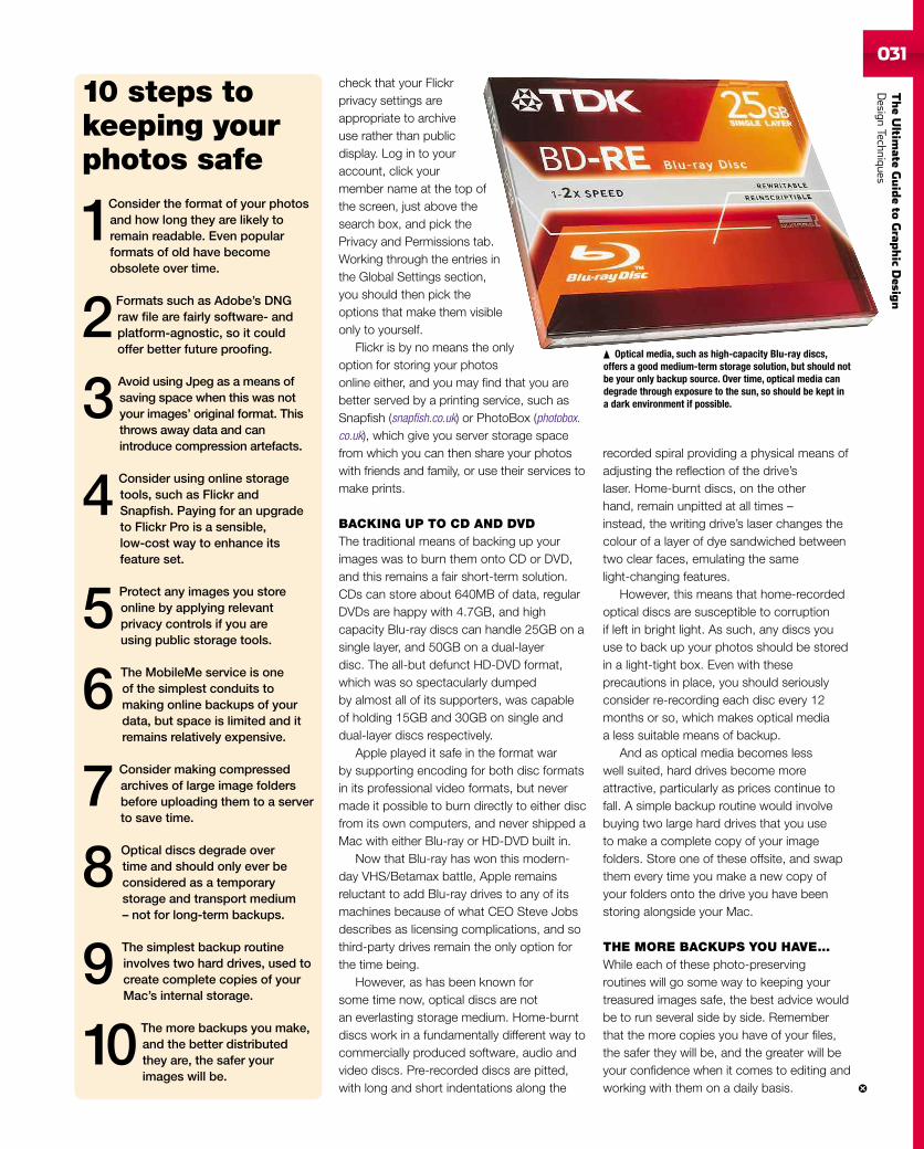
BACKING UP TO CD AND DVDThe traditional means of backing up yourimages was to burn them onto CD or DVD,and this remains a fair short-term solution.CDs can store about 640MB of data, regularDVDs are happy with 4.7GB, and highcapacity Blu-ray discs can handle 25GB on asingle layer, and 50GB on a dual-layerdisc. The all-but defunct HD-DVD format,which was so spectacularly dumpedby almost all of its supporters, was capableof holding 15GB and 30GB on single anddual-layer discs respectively.
Apple played it safe in the format warby supporting encoding for both disc formatsin its professional video formats, but nevermade it possible to burn directly to either discfrom its own computers, and never shipped aMac with either Blu-ray or HD-DVD built in.
Now that Blu-ray has won this modern-day VHS/Betamax battle, Apple remainsreluctant to add Blu-ray drives to any of itsmachines because of what CEO Steve Jobsdescribes as licensing complications, and sothird-party drives remain the only option forthe time being.
However, as has been known forsome time now, optical discs are notan everlasting storage medium. Home-burntdiscs work in a fundamentally different way tocommercially produced software, audio andvideo discs. Pre-recorded discs are pitted,with long and short indentations along the
recorded spiral providing a physical means ofadjusting the reflection of the drive’slaser. Home-burnt discs, on the otherhand, remain unpitted at all times –instead, the writing drive’s laser changes thecolour of a layer of dye sandwiched betweentwo clear faces, emulating the samelight-changing features.
However, this means that home-recordedoptical discs are susceptible to corruptionif left in bright light. As such, any discs youuse to back up your photos should be storedin a light-tight box. Even with theseprecautions in place, you should seriouslyconsider re-recording each disc every 12months or so, which makes optical mediaa less suitable means of backup.
And as optical media becomes lesswell suited, hard drives become moreattractive, particularly as prices continue tofall. A simple backup routine would involvebuying two large hard drives that you useto make a complete copy of your imagefolders. Store one of these offsite, and swapthem every time you make a new copy ofyour folders onto the drive you have beenstoring alongside your Mac.
THE MORE BACKUPS YOU HAVE…While each of these photo-preservingroutines will go some way to keeping yourtreasured images safe, the best advice wouldbe to run several side by side. Rememberthat the more copies you have of your files,the safer they will be, and the greater will beyour confidence when it comes to editing andworking with them on a daily basis.
10 steps tokeeping yourphotos safe
1Consider the format of your photosand how long they are likely toremain readable. Even popularformats of old have becomeobsolete over time.
2 Formats such as Adobe’s DNGraw file are fairly software- andplatform-agnostic, so it couldoffer better future proofing.
3 Avoid using Jpeg as a means ofsaving space when this was notyour images’ original format. Thisthrows away data and canintroduce compression artefacts.
4 Consider using online storagetools, such as Flickr andSnapfish. Paying for an upgradeto Flickr Pro is a sensible,low-cost way to enhance itsfeature set.
5 Protect any images you storeonline by applying relevantprivacy controls if you areusing public storage tools.
6 The MobileMe service is oneof the simplest conduits tomaking online backups of yourdata, but space is limited and itremains relatively expensive.
7 Consider making compressedarchives of large image foldersbefore uploading them to a serverto save time.
8 Optical discs degrade overtime and should only ever beconsidered as a temporarystorage and transport medium– not for long-term backups.
9 The simplest backup routineinvolves two hard drives, used tocreate complete copies of yourMac’s internal storage.
10 The more backups you make,and the better distributedthey are, the safer yourimages will be.
Optical media, such as high-capacity Blu-ray discs,offers a good medium-term storage solution, but should notbe your only backup source. Over time, optical media candegrade through exposure to the sun, so should be kept ina dark environment if possible.
032
TheUltim
ateGuideto
Graphic
Des
ign
DesignTechniqu
es
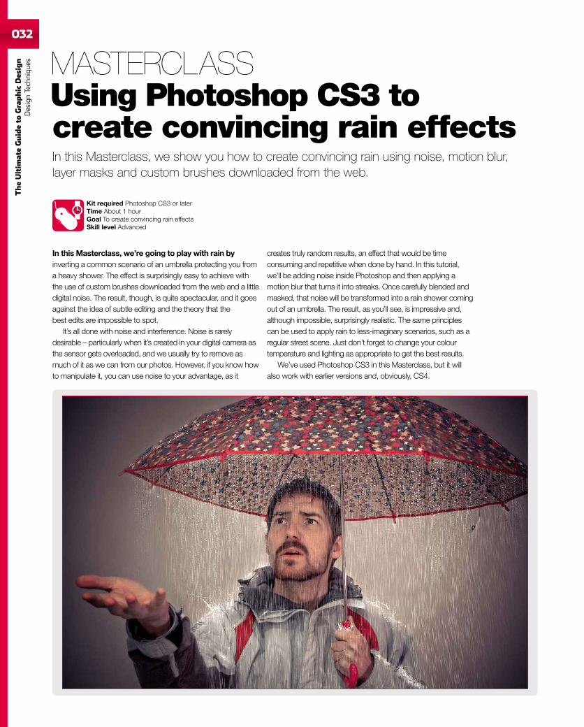
In this Masterclass, we show you how to create convincing rain using noise, motion blur,layer masks and custom brushes downloaded from the web.
Kit required Photoshop CS3 or laterTime About 1 hourGoal To create convincing rain effectsSkill level Advanced
In this Masterclass, we’re going to play with rain byinverting a common scenario of an umbrella protecting you froma heavy shower. The effect is surprisingly easy to achieve withthe use of custom brushes downloaded from the web and a littledigital noise. The result, though, is quite spectacular, and it goesagainst the idea of subtle editing and the theory that thebest edits are impossible to spot.
It’s all done with noise and interference. Noise is rarelydesirable – particularly when it’s created in your digital camera asthe sensor gets overloaded, and we usually try to remove asmuch of it as we can from our photos. However, if you know howto manipulate it, you can use noise to your advantage, as it
creates truly random results, an effect that would be timeconsuming and repetitive when done by hand. In this tutorial,we’ll be adding noise inside Photoshop and then applying amotion blur that turns it into streaks. Once carefully blended andmasked, that noise will be transformed into a rain shower comingout of an umbrella. The result, as you’ll see, is impressive and,although impossible, surprisingly realistic. The same principlescan be used to apply rain to less-imaginary scenarios, such as aregular street scene. Just don’t forget to change your colourtemperature and lighting as appropriate to get the best results.
We’ve used Photoshop CS3 in this Masterclass, but it willalso work with earlier versions and, obviously, CS4.
MASTERCLASSUsing Photoshop CS3 tocreate convincing rain effects
033
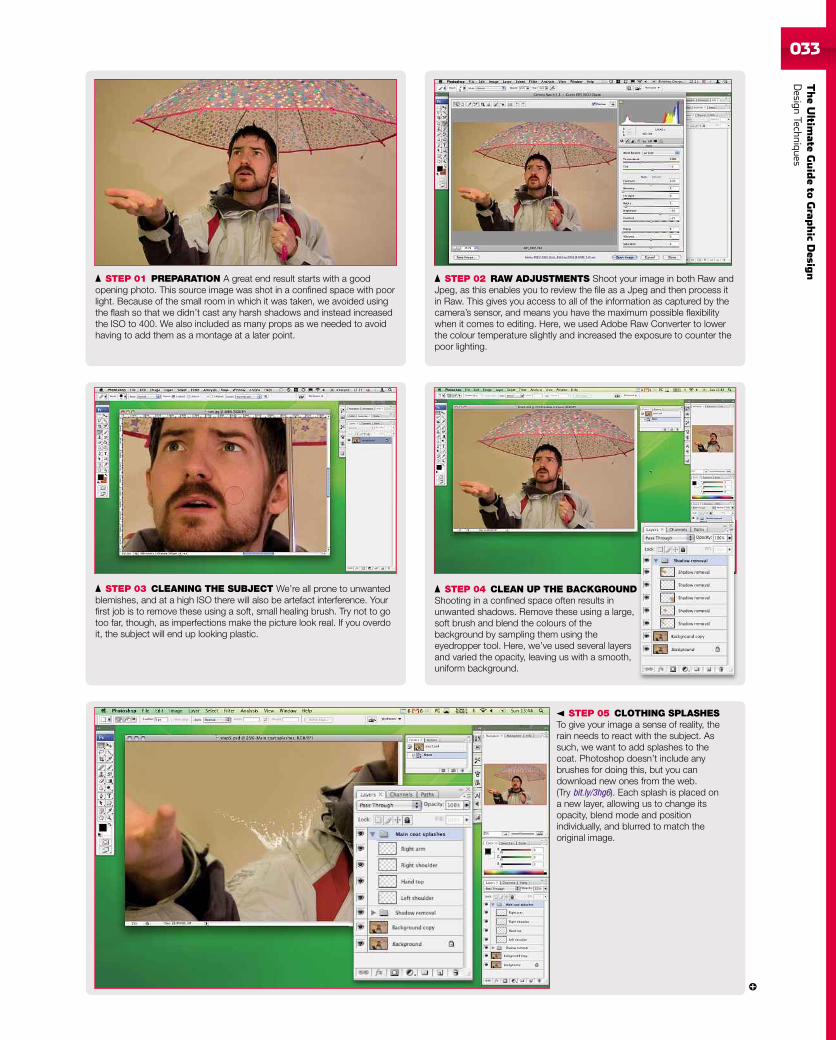
STEP 01 PREPARATION A great end result starts with a goodopening photo. This source image was shot in a confined space with poorlight. Because of the small room in which it was taken, we avoided usingthe flash so that we didn’t cast any harsh shadows and instead increasedthe ISO to 400. We also included as many props as we needed to avoidhaving to add them as a montage at a later point.
STEP 05 CLOTHING SPLASHESTo give your image a sense of reality, therain needs to react with the subject. Assuch, we want to add splashes to thecoat. Photoshop doesn’t include anybrushes for doing this, but you candownload new ones from the web.(Try bit.ly/3hg6). Each splash is placed ona new layer, allowing us to change itsopacity, blend mode and positionindividually, and blurred to match theoriginal image.
STEP 03 CLEANING THE SUBJECT We’re all prone to unwantedblemishes, and at a high ISO there will also be artefact interference. Yourfirst job is to remove these using a soft, small healing brush. Try not to gotoo far, though, as imperfections make the picture look real. If you overdoit, the subject will end up looking plastic.
STEP 02 RAW ADJUSTMENTS Shoot your image in both Raw andJpeg, as this enables you to review the file as a Jpeg and then process itin Raw. This gives you access to all of the information as captured by thecamera’s sensor, and means you have the maximum possible flexibilitywhen it comes to editing. Here, we used Adobe Raw Converter to lowerthe colour temperature slightly and increased the exposure to counter thepoor lighting.
STEP 04 CLEAN UP THE BACKGROUNDShooting in a confined space often results inunwanted shadows. Remove these using a large,soft brush and blend the colours of thebackground by sampling them using theeyedropper tool. Here, we’ve used several layersand varied the opacity, leaving us with a smooth,uniform background.
TheUltim
ateGuideto
Grap
hic
Desig
nDesign
Techniques
034
TheUltim
ateGuideto
Graphic
Des
ign
DesignTechniqu
es
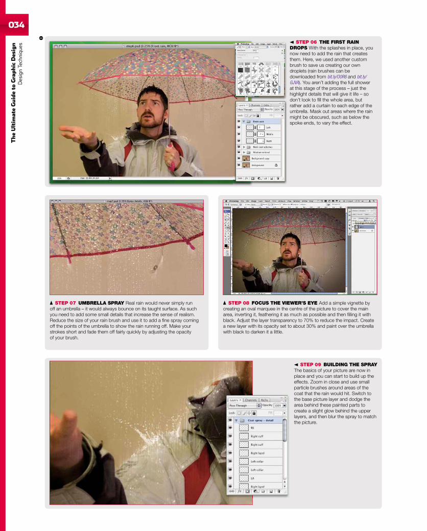
STEP 07 UMBRELLA SPRAY Real rain would never simply runoff an umbrella – it would always bounce on its taught surface. As suchyou need to add some small details that increase the sense of realism.Reduce the size of your rain brush and use it to add a fine spray comingoff the points of the umbrella to show the rain running off. Make yourstrokes short and fade them off fairly quickly by adjusting the opacityof your brush.
STEP 08 FOCUS THE VIEWER’S EYE Add a simple vignette bycreating an oval marquee in the centre of the picture to cover the mainarea, inverting it, feathering it as much as possible and then filling it withblack. Adjust the layer transparency to 70% to reduce the impact. Createa new layer with its opacity set to about 30% and paint over the umbrellawith black to darken it a little.
STEP 06 THE FIRST RAINDROPS With the splashes in place, younow need to add the rain that createsthem. Here, we used another custombrush to save us creating our owndroplets (rain brushes can bedownloaded from bit.ly/O0R6 and bit.ly/GJVA). You aren’t adding the full showerat this stage of the process – just thehighlight details that will give it life – sodon’t look to fill the whole area, butrather add a curtain to each edge of theumbrella. Mask out areas where the rainmight be obscured, such as below thespoke ends, to vary the effect.
STEP 09 BUILDING THE SPRAYThe basics of your picture are now inplace and you can start to build up theeffects. Zoom in close and use smallparticle brushes around areas of thecoat that the rain would hit. Switch tothe base picture layer and dodge thearea behind these painted parts tocreate a slight glow behind the upperlayers, and then blur the spray to matchthe picture.
035
TheUltim
ateGuideto
Grap
hic
Desig
nDesign
Techniques
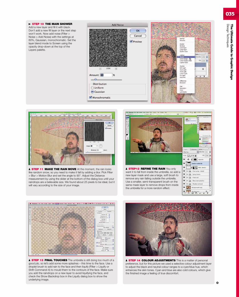
STEP 10 THE MAIN SHOWERAdd a new layer and fill it with black.Don’t add a new fill layer or the next stepwon’t work. Now add noise (Filter >Noise > Add Noise) with the settings at60%, Gaussian, monochromatic. Set thelayer blend mode to Screen using theopacity drop-down at the top of theLayers palette.
STEP 13 FINAL TOUCHES The umbrella is still doing too much of agood job, so let’s add some more splashes – this time to the face. Use adroplet brush to add rain to the face and then liquify (Filter > Liquify orShift-Command-X) to mould them to the contours of the face. Make sureyou add the raindrops on a new layer to avoid liquifying the face, andcheck the Show Backdrop box in the Liquify dialog box to show theunderlying image.
STEP 11 MAKE THE RAIN MOVE At the moment, the rain lookslike random snow, so you need to make it fall by adding a blur. Pick Filter> Blur > Motion Blur and set the angle to 90°. Adjust the Distancemeasurement by using the slider at the bottom of the dialog box until yourraindrops are a believable size. We found about 25 pixels to be ideal, but itwill vary according to the size of your image.
STEP12 REFINE THE RAIN You onlywant it to fall from inside the umbrella, so add anew layer mask and use a large, soft brush toremove any rain falling outside the umbrella.Use a smaller, semi-transparent brush on thesame mask layer to remove drops from insidethe umbrella for a more random effect.
STEP 14 COLOUR ADJUSTMENTS This is a matter of personalpreference, but for this picture we used a selective colour adjustment layerto adjust the black and neutral colour ranges to a cyan/blue hue, whichenhances the skin tones. Cyan and blue are also cold colours, which givethe finished image a feeling of true discomfort.
036
TheUltim
ateGuideto
Graphic
Des
ign
DesignTechniqu
es
Discover how to create a realistic scrap of notebook paper using simple selections,clipping masks, gradients, blurs and custom brushes.
Kit required Photoshop CS3 or laterTime About 30 minutesGoal To create realistic, torn notepaper for use on websitesSkill level Intermediate
In this tutorial, you’ll learn how to create a torn page froma notebook. When flattened and used as a background image,you can superimpose a list of recent posts on your blog, or usea handwriting typeface in Photoshop to add clever little notes toa design-led website, such as a digital scrap-booking project.
Creating a page and adding ruled lines is the easy part. We’llbegin by using basic selections to create the paper and removethe initial holes along the top. However, it’s the extra effectsadded to the page that give it a real sense of depth. Tearing outa page in the real world would leave a rough, uneven edgewhere it was bound. You can achieve this by using a layer maskto add a distressed look around the paper’s edges, and to
create a natural-looking tear along the holes. So that our fakepiece of paper emulates the real world even more closely, we’lladd creases with one click of a custom brush to instantly addrealistic folds and wrinkles to the paper and, of course, any textor images you place upon it. Rather than leave the paper lyingflat, we’ll further enhance the effect by lifting the paper from thepage using the Warp function. Then we’ll use the same tool inthe opposite direction to create a realistic shadow technique thatwill make bog-standard drop shadows a thing of the past.
You might also try these final steps on your favouritephotographs to reduce their uniformity and add a little punch toan otherwise flat presentation.
MASTERCLASSCreate realistic, torn notebookpaper in Photoshop
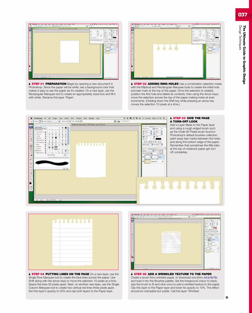
037
TheUltim
ateGuideto
Grap
hic
Desig
nDesign
Techniques
STEP 01 PREPARATION Begin by opening a new document inPhotoshop. Since the paper will be white, set a background color thatmakes it easy to see the paper as it’s created. On a new layer, use theRectangular Marquee tool to create an appropriately sized box and fill itwith white. Rename this layer ‘Paper’.
STEP 03 GIVE THE PAGEA TORN-OFF LOOKAdd a Layer Mask to the Paper layerand using a rough-edged brush suchas the Chalk 60 Pixels brush found inPhotoshop’s default brushes collection,paint away tear marks between the holesand along the bottom edge of the paper.Remember that sometimes the little tabsat the top of notebook paper get tornoff completely.
STEP 04 PUTTING LINES ON THE PAGE On a new layer, use theSingle Row Marquee tool to create the blue lines across the paper. UseShift along with the arrow keys to move the selection 10 pixels at a time.Space the lines 30 pixels apart. Next, on another new layer, use the SingleColumn Marquee tool to create two vertical red lines three pixels apart.Set this layer’s opacity to 30% and clip both layers to the Paper layer.
STEP 02 ADDING RING HOLES Use a combination selection madewith the Elliptical and Rectangular Marquee tools to create the initial holeand tear mark at the top of the paper. Once the selection is created,position the first hole and delete its contents, then using the Arrow keys,move the selection across the top of the paper making holes at evenincrements. (Holding down the Shift key while pressing an arrow keymoves the selection 10 pixels at a time.)
STEP 05 ADD A WRINKLED TEXTURE TO THE PAPERCreate a brush from wrinkled paper, or download one (from bit.ly/3ieTfy),and load it into the Brushes palette. Set the foreground colour to black,size the brush to fit and click once to add a wrinkled texture to the paper.Clip this layer to the Paper layer and lower its opacity to 10%. The effectshould be noticeable but subtle. Call this layer ‘Wrinkles’.
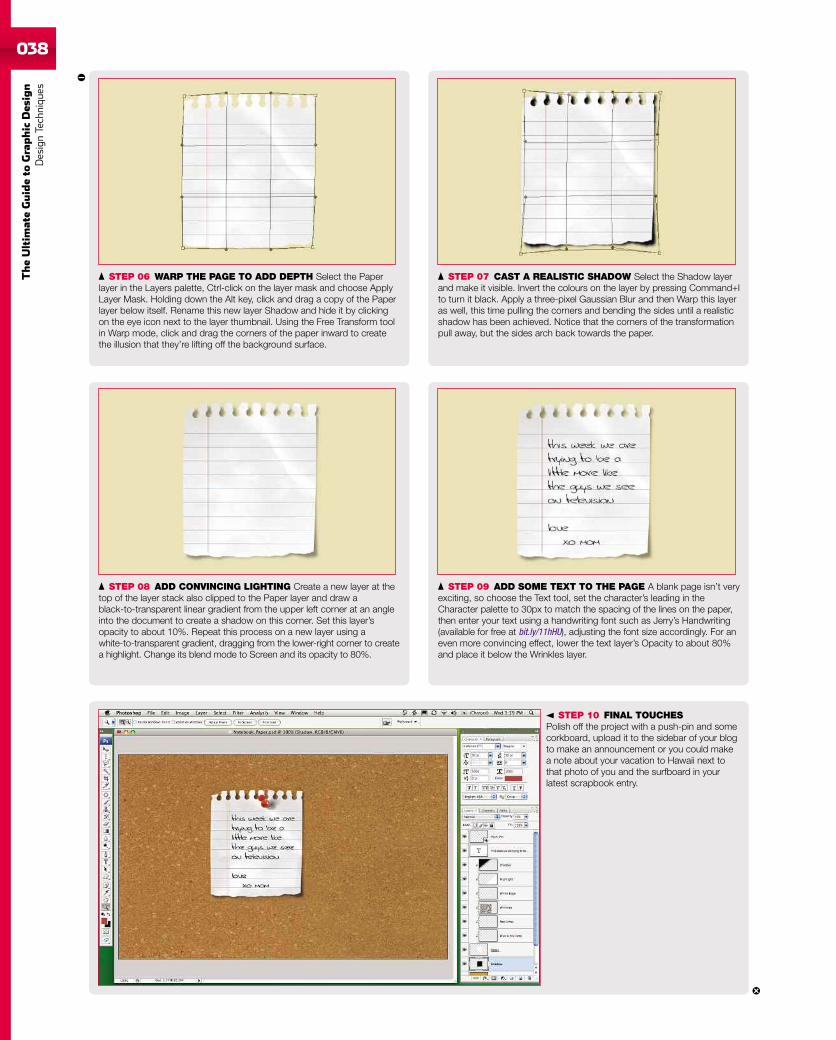
038
TheUltim
ateGuideto
Graphic
Des
ign
DesignTechniqu
es
STEP 10 FINAL TOUCHESPolish off the project with a push-pin and somecorkboard, upload it to the sidebar of your blogto make an announcement or you could makea note about your vacation to Hawaii next tothat photo of you and the surfboard in yourlatest scrapbook entry.
STEP 06 WARP THE PAGE TO ADD DEPTH Select the Paperlayer in the Layers palette, Ctrl-click on the layer mask and choose ApplyLayer Mask. Holding down the Alt key, click and drag a copy of the Paperlayer below itself. Rename this new layer Shadow and hide it by clickingon the eye icon next to the layer thumbnail. Using the Free Transform toolin Warp mode, click and drag the corners of the paper inward to createthe illusion that they’re lifting off the background surface.
STEP 08 ADD CONVINCING LIGHTING Create a new layer at thetop of the layer stack also clipped to the Paper layer and draw ablack-to-transparent linear gradient from the upper left corner at an angleinto the document to create a shadow on this corner. Set this layer’sopacity to about 10%. Repeat this process on a new layer using awhite-to-transparent gradient, dragging from the lower-right corner to createa highlight. Change its blend mode to Screen and its opacity to 80%.
STEP 07 CAST A REALISTIC SHADOW Select the Shadow layerand make it visible. Invert the colours on the layer by pressing Command+Ito turn it black. Apply a three-pixel Gaussian Blur and then Warp this layeras well, this time pulling the corners and bending the sides until a realisticshadow has been achieved. Notice that the corners of the transformationpull away, but the sides arch back towards the paper.
STEP 09 ADD SOME TEXT TO THE PAGE A blank page isn’t veryexciting, so choose the Text tool, set the character’s leading in theCharacter palette to 30px to match the spacing of the lines on the paper,then enter your text using a handwriting font such as Jerry’s Handwriting(available for free at bit.ly/11hHU), adjusting the font size accordingly. For aneven more convincing effect, lower the text layer’s Opacity to about 80%and place it below the Wrinkles layer.
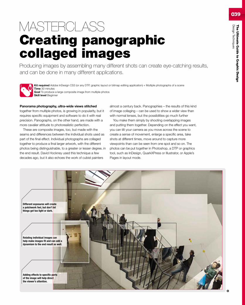
TheUltim
ateGuideto
Grap
hic
Desig
nDesign
Techniques039039
Producing images by assembling many different shots can create eye-catching results,and can be done in many different applications.
Kit required Adobe InDesign CS3 (or any DTP, graphic layout or bitmap editing application) + Multiple photographs of a sceneTime 30 minutesGoal To produce a large composite image from multiple photosSkill level Beginner
Panorama photography, ultra-wide views stitchedtogether from multiple photos, is growing in popularity, but itrequires specific equipment and software to do it with realprecision. Panographs, on the other hand, are made with amore cavalier attitude to photorealistic perfection.
These are composite images, too, but made with theseams and differences between the individual shots used aspart of the final effect. Individual photographs are collagedtogether to produce a final larger artwork, with the differentphotos being distinguishable, to a greater or lesser degree, inthe end result. David Hockney used this technique a fewdecades ago, but it also echoes the work of cubist painters
almost a century back. Panographies – the results of this kindof image collaging – can be used to show a wider view thanwith normal lenses, but the possibilities go much further
You make them simply by shooting overlapping imagesand putting them together. Depending on the effect you want,you can tilt your camera as you move across the scene tocreate a sense of movement, enlarge a specific area, takeshots at different times, move around to capture moreviewpoints than can be seen from one spot and so on. Thephotos can be put together in Photoshop, a DTP or graphicstool, such as InDesign, QuarkXPress or Illustrator, or Apple’sPages in layout mode.
MASTERCLASSCreating panographiccollaged images
Adding effects to specific partsof the image will help directthe viewer’s attention.
Rotating individual images canhelp make images fit and can add adynamism to the end result as well.
Different exposures will createa patchwork feel, but don’t letthings get too light or dark.
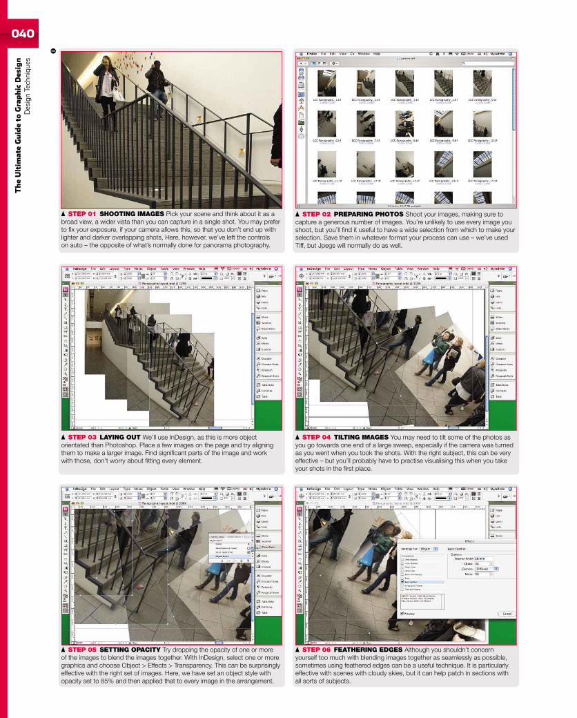
040
TheUltim
ateGuideto
Graphic
Des
ign
DesignTechniqu
es
STEP 02 PREPARING PHOTOS Shoot your images, making sure tocapture a generous number of images. You’re unlikely to use every image youshoot, but you’ll find it useful to have a wide selection from which to make yourselection. Save them in whatever format your process can use – we’ve usedTiff, but Jpegs will normally do as well.
STEP 01 SHOOTING IMAGES Pick your scene and think about it as abroad view, a wider vista than you can capture in a single shot. You may preferto fix your exposure, if your camera allows this, so that you don’t end up withlighter and darker overlapping shots, Here, however, we’ve left the controlson auto – the opposite of what’s normally done for panorama photography.
STEP 04 TILTING IMAGES You may need to tilt some of the photos asyou go towards one end of a large sweep, especially if the camera was turnedas you went when you took the shots. With the right subject, this can be veryeffective – but you’ll probably have to practise visualising this when you takeyour shots in the first place.
STEP 03 LAYING OUT We’ll use InDesign, as this is more objectorientated than Photoshop. Place a few images on the page and try aligningthem to make a larger image. Find significant parts of the image and workwith those, don’t worry about fitting every element.
STEP 06 FEATHERING EDGES Although you shouldn’t concernyourself too much with blending images together as seamlessly as possible,sometimes using feathered edges can be a useful technique. It is particularlyeffective with scenes with cloudy skies, but it can help patch in sections withall sorts of subjects.
STEP 05 SETTING OPACITY Try dropping the opacity of one or moreof the images to blend the images together. With InDesign, select one or moregraphics and choose Object > Effects > Transparency. This can be surprisinglyeffective with the right set of images. Here, we have set an object style withopacity set to 85% and then applied that to every image in the arrangement.
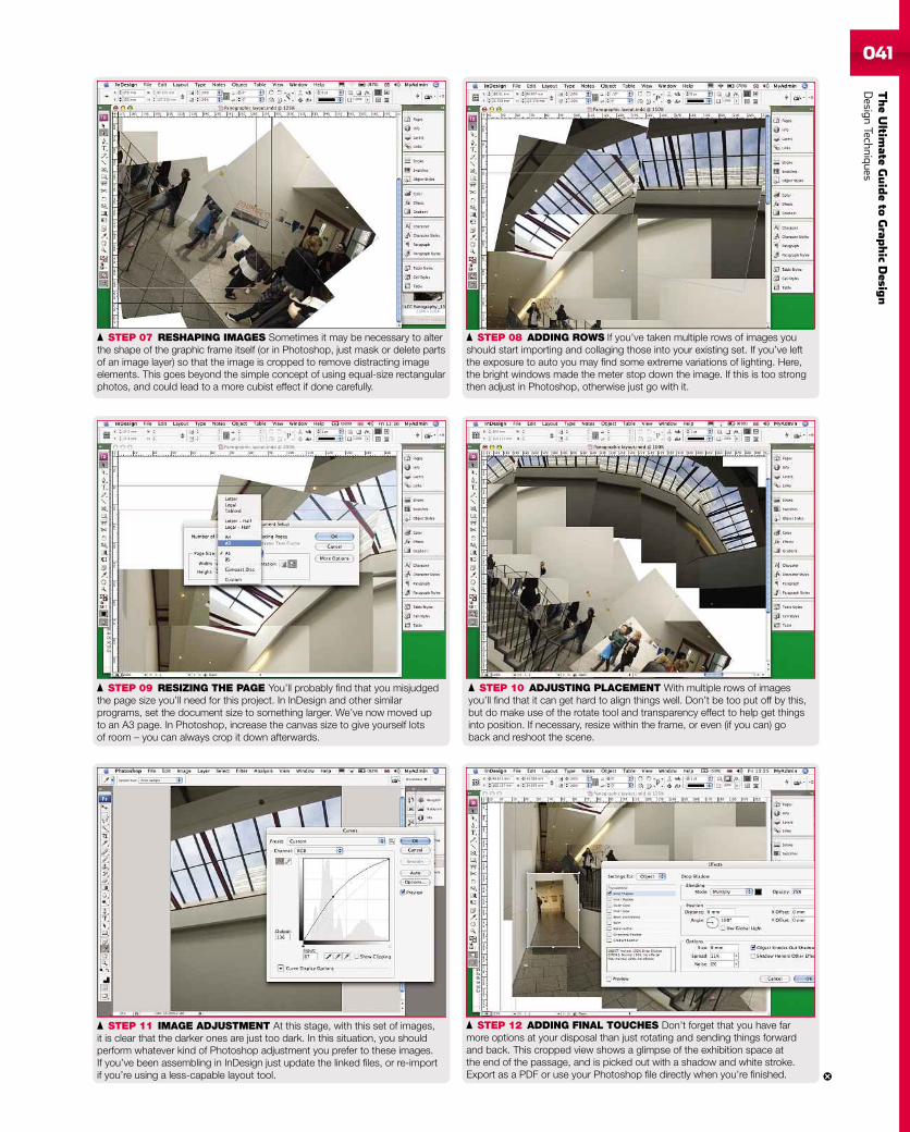
TheUltim
ateGuideto
Grap
hic
Desig
nDesign
Techniques041
STEP 08 ADDING ROWS If you’ve taken multiple rows of images youshould start importing and collaging those into your existing set. If you’ve leftthe exposure to auto you may find some extreme variations of lighting. Here,the bright windows made the meter stop down the image. If this is too strongthen adjust in Photoshop, otherwise just go with it.
STEP 07 RESHAPING IMAGES Sometimes it may be necessary to alterthe shape of the graphic frame itself (or in Photoshop, just mask or delete partsof an image layer) so that the image is cropped to remove distracting imageelements. This goes beyond the simple concept of using equal-size rectangularphotos, and could lead to a more cubist effect if done carefully.
STEP 10 ADJUSTING PLACEMENT With multiple rows of imagesyou’ll find that it can get hard to align things well. Don’t be too put off by this,but do make use of the rotate tool and transparency effect to help get thingsinto position. If necessary, resize within the frame, or even (if you can) goback and reshoot the scene.
STEP 09 RESIZING THE PAGE You’ll probably find that you misjudgedthe page size you’ll need for this project. In InDesign and other similarprograms, set the document size to something larger. We’ve now moved upto an A3 page. In Photoshop, increase the canvas size to give yourself lotsof room – you can always crop it down afterwards.
STEP 12 ADDING FINAL TOUCHES Don’t forget that you have farmore options at your disposal than just rotating and sending things forwardand back. This cropped view shows a glimpse of the exhibition space atthe end of the passage, and is picked out with a shadow and white stroke.Export as a PDF or use your Photoshop file directly when you’re finished.
STEP 11 IMAGE ADJUSTMENT At this stage, with this set of images,it is clear that the darker ones are just too dark. In this situation, you shouldperform whatever kind of Photoshop adjustment you prefer to these images.If you’ve been assembling in InDesign just update the linked files, or re-importif you’re using a less-capable layout tool.
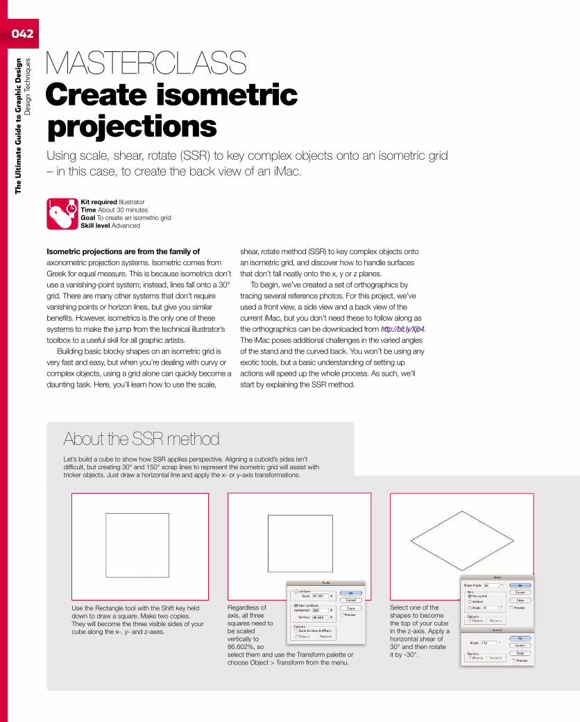
042
TheUltim
ateGuideto
Graphic
Des
ign
DesignTechniqu
es042
Using scale, shear, rotate (SSR) to key complex objects onto an isometric grid– in this case, to create the back view of an iMac.
Kit required IllustratorTime About 30 minutesGoal To create an isometric gridSkill level Advanced
Isometric projections are from the family ofaxonometric projection systems. Isometric comes fromGreek for equal measure. This is because isometrics don’tuse a vanishing-point system; instead, lines fall onto a 30°grid. There are many other systems that don’t requirevanishing points or horizon lines, but give you similarbenefits. However, isometrics is the only one of thesesystems to make the jump from the technical illustrator’stoolbox to a useful skill for all graphic artists.
Building basic blocky shapes on an isometric grid isvery fast and easy, but when you’re dealing with curvy orcomplex objects, using a grid alone can quickly become adaunting task. Here, you’ll learn how to use the scale,
shear, rotate method (SSR) to key complex objects ontoan isometric grid, and discover how to handle surfacesthat don’t fall neatly onto the x, y or z planes.
To begin, we’ve created a set of orthographics bytracing several reference photos. For this project, we’veused a front view, a side view and a back view of thecurrent iMac, but you don’t need these to follow along asthe orthographics can be downloaded from http://bit.ly/Xjb4.The iMac poses additional challenges in the varied anglesof the stand and the curved back. You won’t be using anyexotic tools, but a basic understanding of setting upactions will speed up the whole process. As such, we’llstart by explaining the SSR method.
MASTERCLASSCreate isometricprojections
Use the Rectangle tool with the Shift key helddown to draw a square. Make two copies.They will become the three visible sides of yourcube along the x-, y- and z-axes.
Regardless ofaxis, all threesquares need tobe scaledvertically to86.602%, soselect them and use the Transform palette orchoose Object > Transform from the menu.
Select one of theshapes to becomethe top of your cubein the z-axis. Apply ahorizontal shear of30° and then rotateit by -30°.
About the SSR methodLet’s build a cube to show how SSR applies perspective. Aligning a cuboid’s sides isn’tdifficult, but creating 30° and 150° scrap lines to represent the isometric grid will assist withtricker objects. Just draw a horizontal line and apply the x- or y-axis transformations.
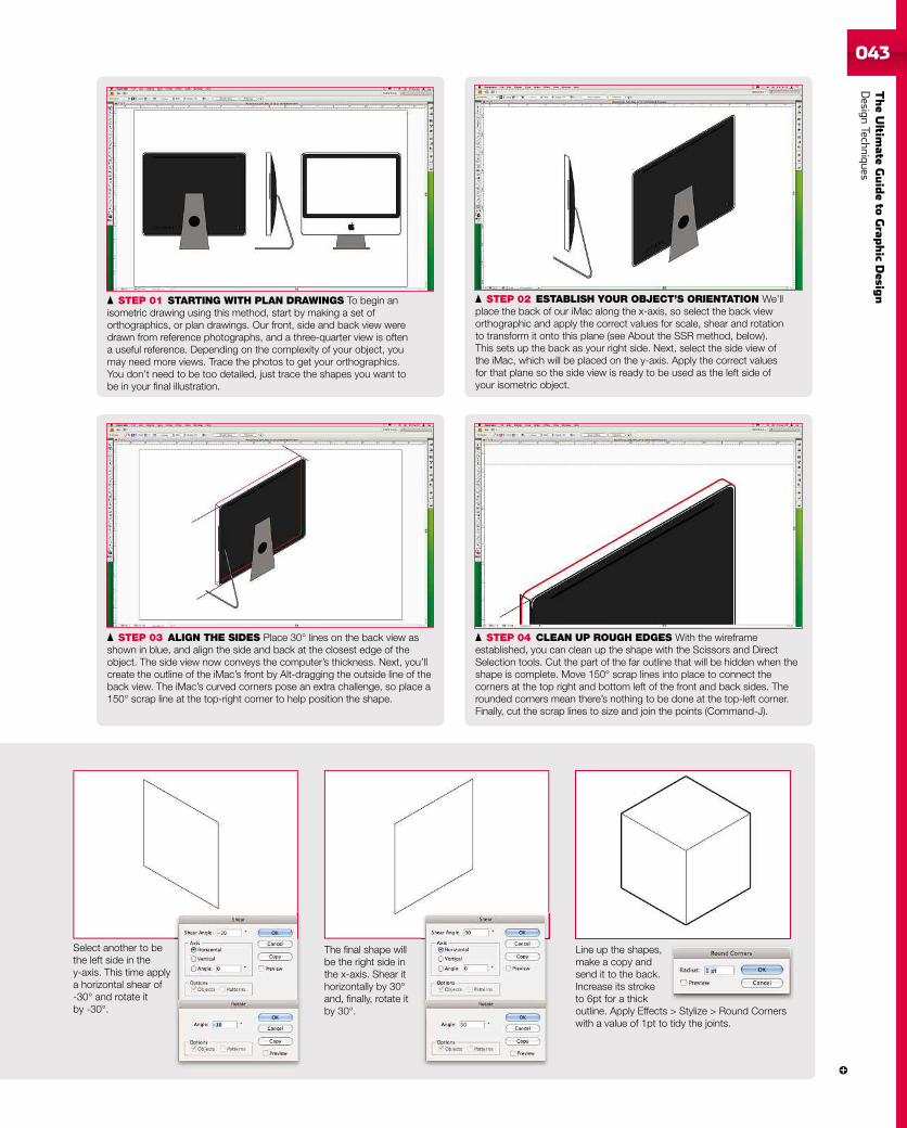
TheUltim
ateGuideto
Grap
hic
Desig
nDesign
Techniques043043
STEP 01 STARTING WITH PLAN DRAWINGS To begin anisometric drawing using this method, start by making a set oforthographics, or plan drawings. Our front, side and back view weredrawn from reference photographs, and a three-quarter view is oftena useful reference. Depending on the complexity of your object, youmay need more views. Trace the photos to get your orthographics.You don’t need to be too detailed, just trace the shapes you want tobe in your final illustration.
STEP 03 ALIGN THE SIDES Place 30° lines on the back view asshown in blue, and align the side and back at the closest edge of theobject. The side view now conveys the computer’s thickness. Next, you’llcreate the outline of the iMac’s front by Alt-dragging the outside line of theback view. The iMac’s curved corners pose an extra challenge, so place a150° scrap line at the top-right corner to help position the shape.
STEP 02 ESTABLISH YOUR OBJECT’S ORIENTATION We’llplace the back of our iMac along the x-axis, so select the back vieworthographic and apply the correct values for scale, shear and rotationto transform it onto this plane (see About the SSR method, below).This sets up the back as your right side. Next, select the side view ofthe iMac, which will be placed on the y-axis. Apply the correct valuesfor that plane so the side view is ready to be used as the left side ofyour isometric object.
STEP 04 CLEAN UP ROUGH EDGES With the wireframeestablished, you can clean up the shape with the Scissors and DirectSelection tools. Cut the part of the far outline that will be hidden when theshape is complete. Move 150° scrap lines into place to connect thecorners at the top right and bottom left of the front and back sides. Therounded corners mean there’s nothing to be done at the top-left corner.Finally, cut the scrap lines to size and join the points (Command-J).
Select another to bethe left side in they-axis. This time applya horizontal shear of-30° and rotate itby -30°.
The final shape willbe the right side inthe x-axis. Shear ithorizontally by 30°and, finally, rotate itby 30°.
Line up the shapes,make a copy andsend it to the back.Increase its stroketo 6pt for a thickoutline. Apply Effects > Stylize > Round Cornerswith a value of 1pt to tidy the joints.
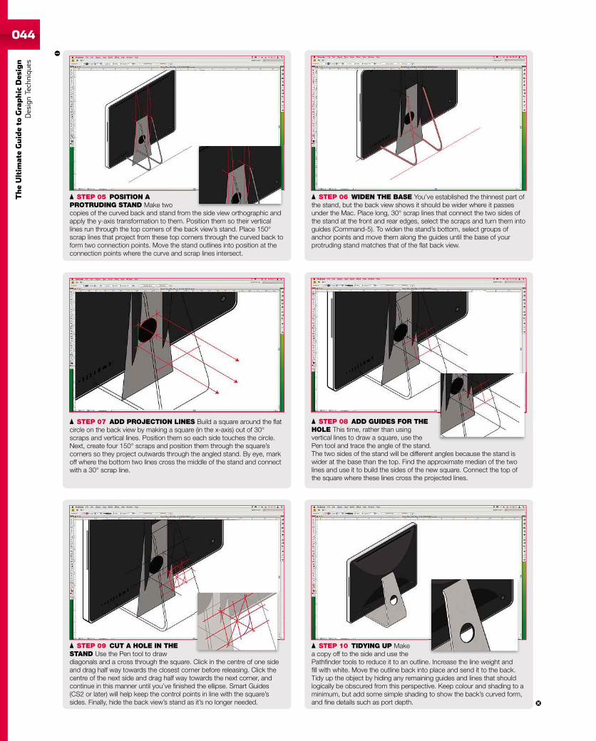
044
TheUltim
ateGuideto
Graphic
Des
ign
DesignTechniqu
es
STEP 07 ADD PROJECTION LINES Build a square around the flatcircle on the back view by making a square (in the x-axis) out of 30°scraps and vertical lines. Position them so each side touches the circle.Next, create four 150° scraps and position them through the square’scorners so they project outwards through the angled stand. By eye, markoff where the bottom two lines cross the middle of the stand and connectwith a 30° scrap line.
STEP 05 POSITION APROTRUDING STAND Make twocopies of the curved back and stand from the side view orthographic andapply the y-axis transformation to them. Position them so their verticallines run through the top corners of the back view’s stand. Place 150°scrap lines that project from these top corners through the curved back toform two connection points. Move the stand outlines into position at theconnection points where the curve and scrap lines intersect.
STEP 06 WIDEN THE BASE You’ve established the thinnest part ofthe stand, but the back view shows it should be wider where it passesunder the Mac. Place long, 30° scrap lines that connect the two sides ofthe stand at the front and rear edges, select the scraps and turn them intoguides (Command-5). To widen the stand’s bottom, select groups ofanchor points and move them along the guides until the base of yourprotruding stand matches that of the flat back view.
STEP 08 ADD GUIDES FOR THEHOLE This time, rather than usingvertical lines to draw a square, use thePen tool and trace the angle of the stand.The two sides of the stand will be different angles because the stand iswider at the base than the top. Find the approximate median of the twolines and use it to build the sides of the new square. Connect the top ofthe square where these lines cross the projected lines.
STEP 09 CUT A HOLE IN THESTAND Use the Pen tool to drawdiagonals and a cross through the square. Click in the centre of one sideand drag half way towards the closest corner before releasing. Click thecentre of the next side and drag half way towards the next corner, andcontinue in this manner until you’ve finished the ellipse. Smart Guides(CS2 or later) will help keep the control points in line with the square’ssides. Finally, hide the back view’s stand as it’s no longer needed.
STEP 10 TIDYING UP Makea copy off to the side and use thePathfinder tools to reduce it to an outline. Increase the line weight andfill with white. Move the outline back into place and send it to the back.Tidy up the object by hiding any remaining guides and lines that shouldlogically be obscured from this perspective. Keep colour and shading to aminimum, but add some simple shading to show the back’s curved form,and fine details such as port depth.
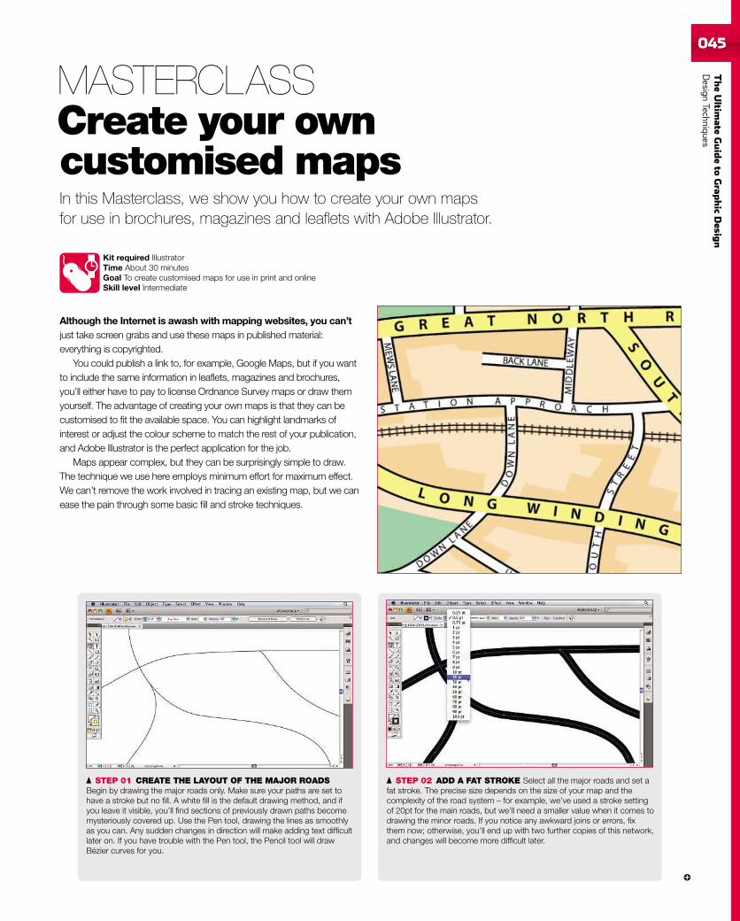
TheUltim
ateGuideto
Grap
hic
Desig
nDesign
Techniques045045
In this Masterclass, we show you how to create your own mapsfor use in brochures, magazines and leaflets with Adobe Illustrator.
Kit required IllustratorTime About 30 minutesGoal To create customised maps for use in print and onlineSkill level Intermediate
Although the Internet is awash with mapping websites, you can’tjust take screen grabs and use these maps in published material:everything is copyrighted.
You could publish a link to, for example, Google Maps, but if you wantto include the same information in leaflets, magazines and brochures,you’ll either have to pay to license Ordnance Survey maps or draw themyourself. The advantage of creating your own maps is that they can becustomised to fit the available space. You can highlight landmarks ofinterest or adjust the colour scheme to match the rest of your publication,and Adobe Illustrator is the perfect application for the job.
Maps appear complex, but they can be surprisingly simple to draw.The technique we use here employs minimum effort for maximum effect.We can’t remove the work involved in tracing an existing map, but we canease the pain through some basic fill and stroke techniques.
MASTERCLASSCreate your owncustomised maps
STEP 01 CREATE THE LAYOUT OF THE MAJOR ROADSBegin by drawing the major roads only. Make sure your paths are set tohave a stroke but no fill. A white fill is the default drawing method, and ifyou leave it visible, you’ll find sections of previously drawn paths becomemysteriously covered up. Use the Pen tool, drawing the lines as smoothlyas you can. Any sudden changes in direction will make adding text difficultlater on. If you have trouble with the Pen tool, the Pencil tool will drawBézier curves for you.
STEP 02 ADD A FAT STROKE Select all the major roads and set afat stroke. The precise size depends on the size of your map and thecomplexity of the road system – for example, we’ve used a stroke settingof 20pt for the main roads, but we’ll need a smaller value when it comes todrawing the minor roads. If you notice any awkward joins or errors, fixthem now; otherwise, you’ll end up with two further copies of this network,and changes will become more difficult later.
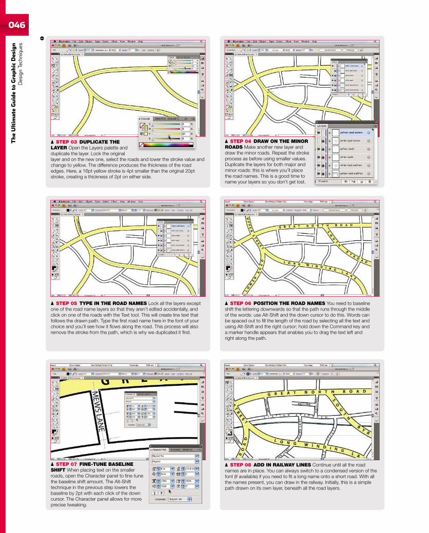
046
TheUltim
ateGuideto
Graphic
Des
ign
DesignTechniqu
es
STEP 05 TYPE IN THE ROAD NAMES Lock all the layers exceptone of the road name layers so that they aren’t edited accidentally, andclick on one of the roads with the Text tool. This will create line text thatfollows the drawn path. Type the first road name here in the font of yourchoice and you’ll see how it flows along the road. This process will alsoremove the stroke from the path, which is why we duplicated it first.
STEP 06 POSITION THE ROAD NAMES You need to baselineshift the lettering downwards so that the path runs through the middleof the words: use Alt-Shift and the down cursor to do this. Words canbe spaced out to fill the length of the road by selecting all the text andusing Alt-Shift and the right cursor; hold down the Command key anda marker handle appears that enables you to drag the text left andright along the path.
STEP 07 FINE-TUNE BASELINESHIFT When placing text on the smallerroads, open the Character panel to fine-tunethe baseline shift amount. The Alt-Shifttechnique in the previous step lowers thebaseline by 2pt with each click of the downcursor. The Character panel allows for moreprecise tweaking.
STEP 08 ADD IN RAILWAY LINES Continue until all the roadnames are in place. You can always switch to a condensed version of thefont (if available) if you need to fit a long name onto a short road. With allthe names present, you can draw in the railway. Initially, this is a simplepath drawn on its own layer, beneath all the road layers.
STEP 03 DUPLICATE THELAYER Open the Layers palette andduplicate the layer. Lock the originallayer and on the new one, select the roads and lower the stroke value andchange to yellow. The difference produces the thickness of the roadedges. Here, a 16pt yellow stroke is 4pt smaller than the original 20ptstroke, creating a thickness of 2pt on either side.
STEP 04 DRAW ON THE MINORROADS Make another new layer anddraw the minor roads. Repeat the strokeprocess as before using smaller values.Duplicate the layers for both major andminor roads: this is where you’ll placethe road names. This is a good time toname your layers so you don’t get lost.
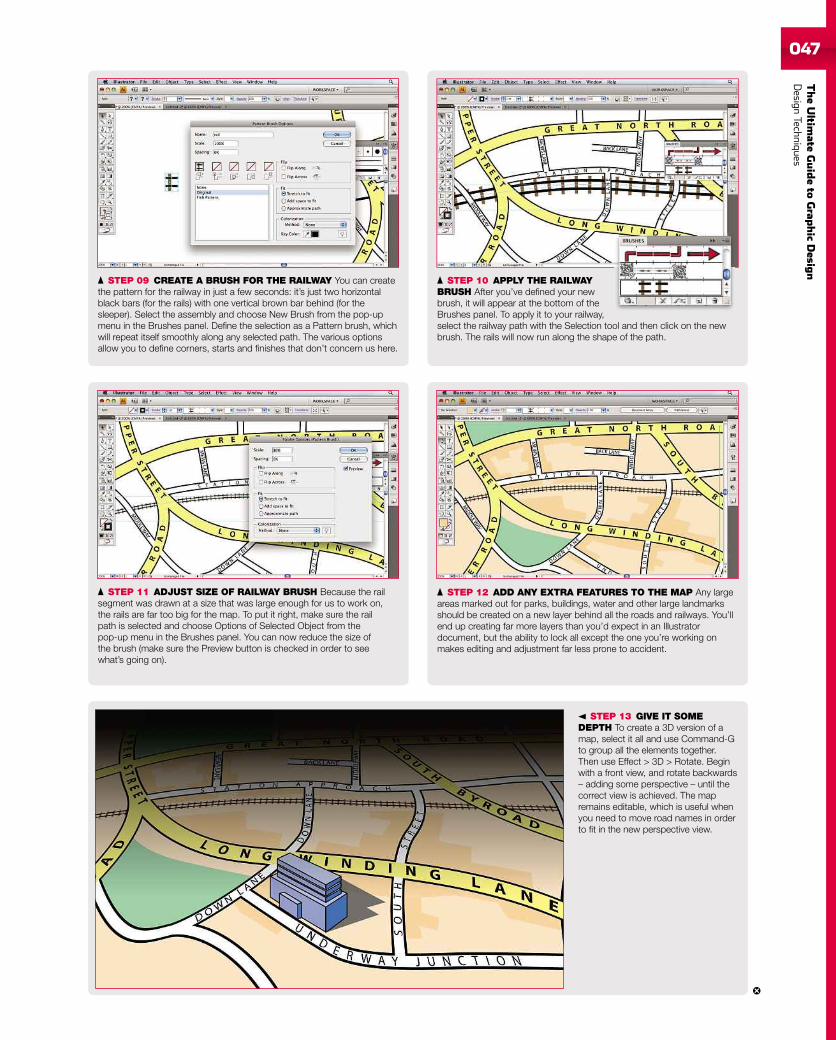
TheUltim
ateGuideto
Grap
hic
Desig
nDesign
Techniques047
STEP 11 ADJUST SIZE OF RAILWAY BRUSH Because the railsegment was drawn at a size that was large enough for us to work on,the rails are far too big for the map. To put it right, make sure the railpath is selected and choose Options of Selected Object from thepop-up menu in the Brushes panel. You can now reduce the size ofthe brush (make sure the Preview button is checked in order to seewhat’s going on).
STEP 09 CREATE A BRUSH FOR THE RAILWAY You can createthe pattern for the railway in just a few seconds: it’s just two horizontalblack bars (for the rails) with one vertical brown bar behind (for thesleeper). Select the assembly and choose New Brush from the pop-upmenu in the Brushes panel. Define the selection as a Pattern brush, whichwill repeat itself smoothly along any selected path. The various optionsallow you to define corners, starts and finishes that don’t concern us here.
STEP 10 APPLY THE RAILWAYBRUSH After you’ve defined your newbrush, it will appear at the bottom of theBrushes panel. To apply it to your railway,select the railway path with the Selection tool and then click on the newbrush. The rails will now run along the shape of the path.
STEP 12 ADD ANY EXTRA FEATURES TO THE MAP Any largeareas marked out for parks, buildings, water and other large landmarksshould be created on a new layer behind all the roads and railways. You’llend up creating far more layers than you’d expect in an Illustratordocument, but the ability to lock all except the one you’re working onmakes editing and adjustment far less prone to accident.
STEP 13 GIVE IT SOMEDEPTH To create a 3D version of amap, select it all and use Command-Gto group all the elements together.Then use Effect > 3D > Rotate. Beginwith a front view, and rotate backwards– adding some perspective – until thecorrect view is achieved. The mapremains editable, which is useful whenyou need to move road names in orderto fit in the new perspective view.
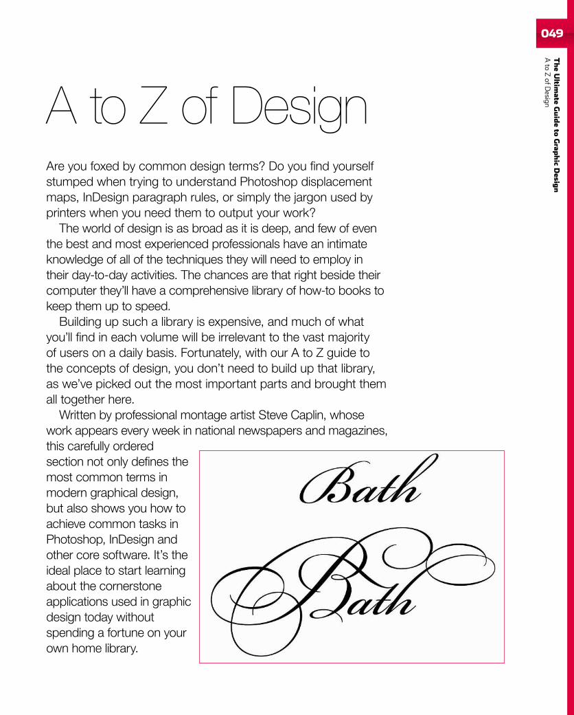
049
TheUltim
ateGuideto
Grap
hic
Desig
nAto
ZofD
esignA to Z of DesignAre you foxed by common design terms? Do you find yourselfstumped when trying to understand Photoshop displacementmaps, InDesign paragraph rules, or simply the jargon used byprinters when you need them to output your work?
The world of design is as broad as it is deep, and few of eventhe best and most experienced professionals have an intimateknowledge of all of the techniques they will need to employ intheir day-to-day activities. The chances are that right beside theircomputer they’ll have a comprehensive library of how-to books tokeep them up to speed.
Building up such a library is expensive, and much of whatyou’ll find in each volume will be irrelevant to the vast majorityof users on a daily basis. Fortunately, with our A to Z guide tothe concepts of design, you don’t need to build up that library,as we’ve picked out the most important parts and brought themall together here.
Written by professional montage artist Steve Caplin, whosework appears every week in national newspapers and magazines,this carefully orderedsection not only defines themost common terms inmodern graphical design,but also shows you how toachieve common tasks inPhotoshop, InDesign andother core software. It’s theideal place to start learningabout the cornerstoneapplications used in graphicdesign today withoutspending a fortune on yourown home library.
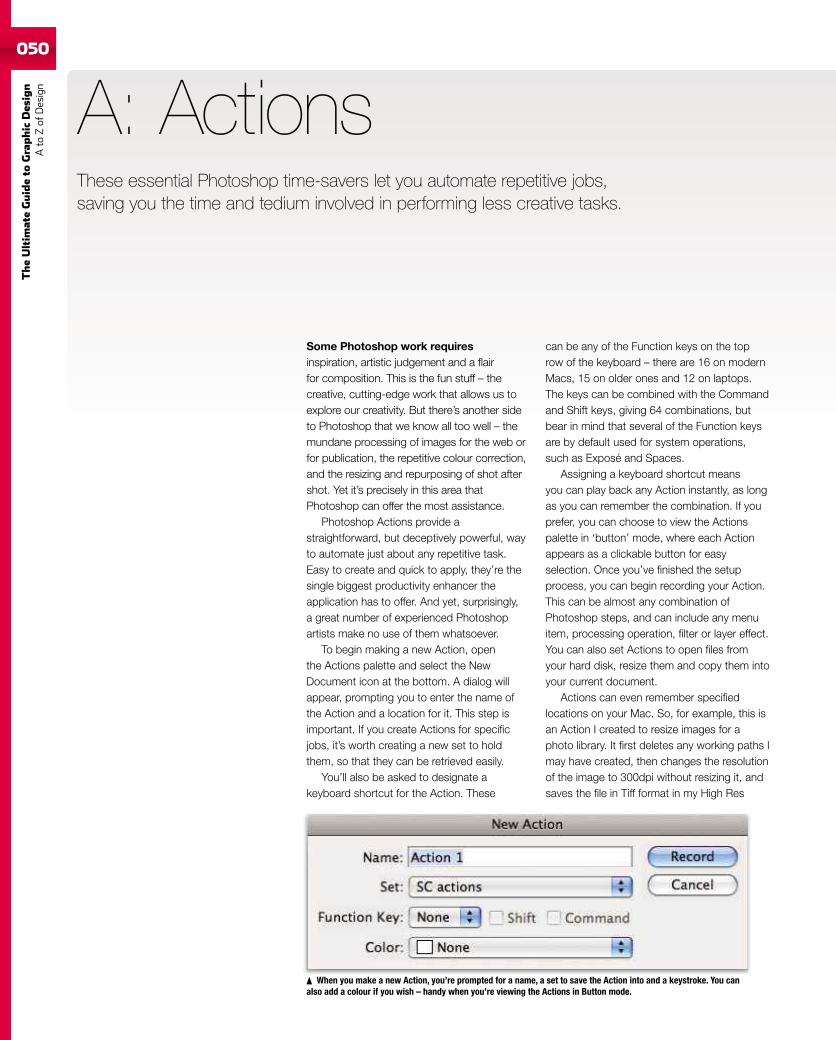
050
TheUltim
ateGuideto
Graphic
Des
ign
Ato
Zof
Design
050
These essential Photoshop time-savers let you automate repetitive jobs,saving you the time and tedium involved in performing less creative tasks.
Some Photoshop work requiresinspiration, artistic judgement and a flairfor composition. This is the fun stuff – thecreative, cutting-edge work that allows us toexplore our creativity. But there’s another sideto Photoshop that we know all too well – themundane processing of images for the web orfor publication, the repetitive colour correction,and the resizing and repurposing of shot aftershot. Yet it’s precisely in this area thatPhotoshop can offer the most assistance.
Photoshop Actions provide astraightforward, but deceptively powerful, wayto automate just about any repetitive task.Easy to create and quick to apply, they’re thesingle biggest productivity enhancer theapplication has to offer. And yet, surprisingly,a great number of experienced Photoshopartists make no use of them whatsoever.
To begin making a new Action, openthe Actions palette and select the NewDocument icon at the bottom. A dialog willappear, prompting you to enter the name ofthe Action and a location for it. This step isimportant. If you create Actions for specificjobs, it’s worth creating a new set to holdthem, so that they can be retrieved easily.
You’ll also be asked to designate akeyboard shortcut for the Action. These
A: Actions
can be any of the Function keys on the toprow of the keyboard – there are 16 on modernMacs, 15 on older ones and 12 on laptops.The keys can be combined with the Commandand Shift keys, giving 64 combinations, butbear in mind that several of the Function keysare by default used for system operations,such as Exposé and Spaces.
Assigning a keyboard shortcut meansyou can play back any Action instantly, as longas you can remember the combination. If youprefer, you can choose to view the Actionspalette in ‘button’ mode, where each Actionappears as a clickable button for easyselection. Once you’ve finished the setupprocess, you can begin recording your Action.This can be almost any combination ofPhotoshop steps, and can include any menuitem, processing operation, filter or layer effect.You can also set Actions to open files fromyour hard disk, resize them and copy them intoyour current document.
Actions can even remember specifiedlocations on your Mac. So, for example, this isan Action I created to resize images for aphoto library. It first deletes any working paths Imay have created, then changes the resolutionof the image to 300dpi without resizing it, andsaves the file in Tiff format in my High Res
When you make a new Action, you’re prompted for a name, a set to save the Action into and a keystroke. You canalso add a colour if you wish – handy when you’re viewing the Actions in Button mode.
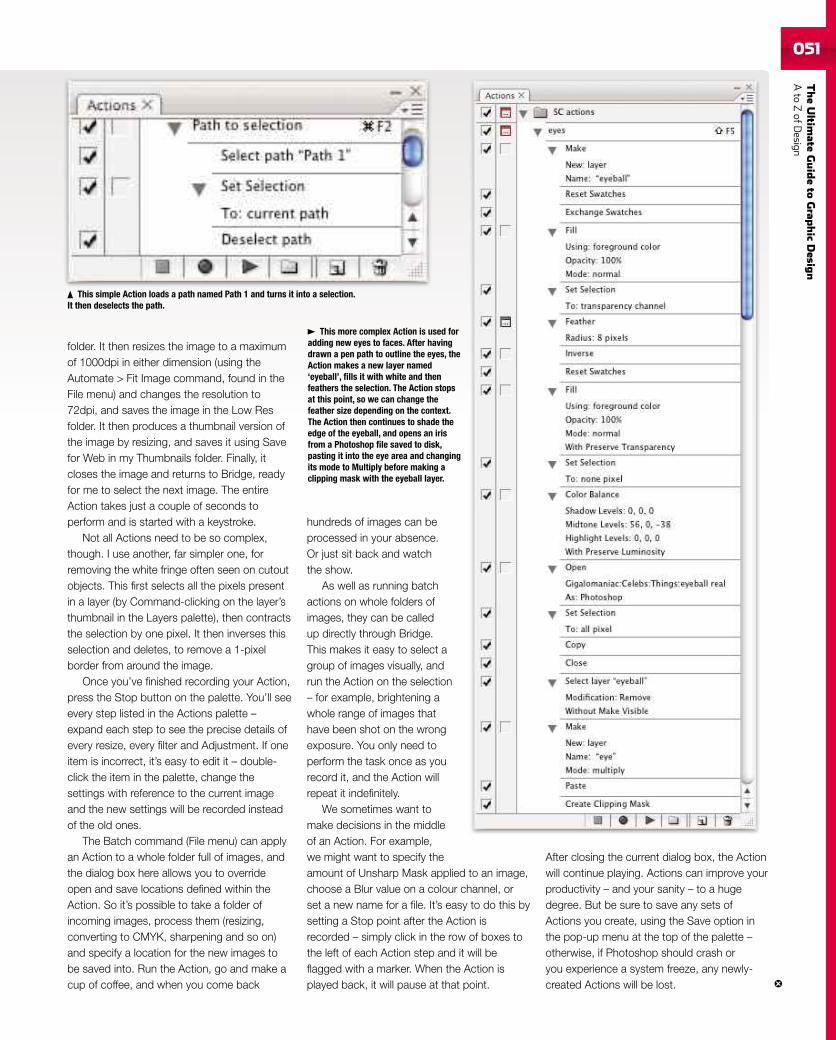
TheUltim
ateGuideto
Grap
hic
Desig
nAto
ZofD
esign051051
folder. It then resizes the image to a maximumof 1000dpi in either dimension (using theAutomate > Fit Image command, found in theFile menu) and changes the resolution to72dpi, and saves the image in the Low Resfolder. It then produces a thumbnail version ofthe image by resizing, and saves it using Savefor Web in my Thumbnails folder. Finally, itcloses the image and returns to Bridge, readyfor me to select the next image. The entireAction takes just a couple of seconds toperform and is started with a keystroke.
Not all Actions need to be so complex,though. I use another, far simpler one, forremoving the white fringe often seen on cutoutobjects. This first selects all the pixels presentin a layer (by Command-clicking on the layer’sthumbnail in the Layers palette), then contractsthe selection by one pixel. It then inverses thisselection and deletes, to remove a 1-pixelborder from around the image.
Once you’ve finished recording your Action,press the Stop button on the palette. You’ll seeevery step listed in the Actions palette –expand each step to see the precise details ofevery resize, every filter and Adjustment. If oneitem is incorrect, it’s easy to edit it – double-click the item in the palette, change thesettings with reference to the current imageand the new settings will be recorded insteadof the old ones.
The Batch command (File menu) can applyan Action to a whole folder full of images, andthe dialog box here allows you to overrideopen and save locations defined within theAction. So it’s possible to take a folder ofincoming images, process them (resizing,converting to CMYK, sharpening and so on)and specify a location for the new images tobe saved into. Run the Action, go and make acup of coffee, and when you come back
hundreds of images can beprocessed in your absence.Or just sit back and watchthe show.
As well as running batchactions on whole folders ofimages, they can be calledup directly through Bridge.This makes it easy to select agroup of images visually, andrun the Action on the selection– for example, brightening awhole range of images thathave been shot on the wrongexposure. You only need toperform the task once as yourecord it, and the Action willrepeat it indefinitely.
We sometimes want tomake decisions in the middleof an Action. For example,we might want to specify theamount of Unsharp Mask applied to an image,choose a Blur value on a colour channel, orset a new name for a file. It’s easy to do this bysetting a Stop point after the Action isrecorded – simply click in the row of boxes tothe left of each Action step and it will beflagged with a marker. When the Action isplayed back, it will pause at that point.
After closing the current dialog box, the Actionwill continue playing. Actions can improve yourproductivity – and your sanity – to a hugedegree. But be sure to save any sets ofActions you create, using the Save option inthe pop-up menu at the top of the palette –otherwise, if Photoshop should crash oryou experience a system freeze, any newly-created Actions will be lost.
This simple Action loads a path named Path 1 and turns it into a selection.It then deselects the path.
This more complex Action is used foradding new eyes to faces. After havingdrawn a pen path to outline the eyes, theAction makes a new layer named‘eyeball’, fills it with white and thenfeathers the selection. The Action stopsat this point, so we can change thefeather size depending on the context.The Action then continues to shade theedge of the eyeball, and opens an irisfrom a Photoshop file saved to disk,pasting it into the eye area and changingits mode to Multiply before making aclipping mask with the eyeball layer.
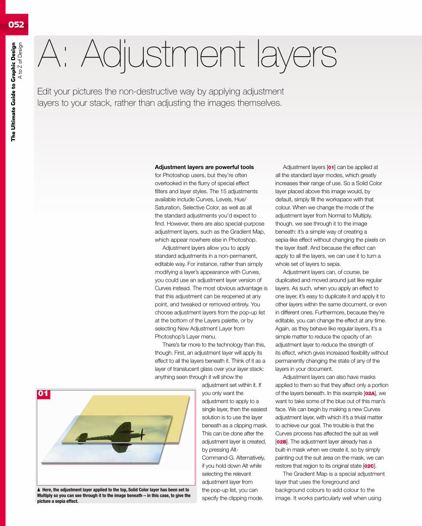
052
TheUltim
ateGuideto
Graphic
Des
ign
Ato
Zof
Design
Edit your pictures the non-destructive way by applying adjustmentlayers to your stack, rather than adjusting the images themselves.
Adjustment layers are powerful toolsfor Photoshop users, but they’re oftenoverlooked in the flurry of special effectfilters and layer styles. The 15 adjustmentsavailable include Curves, Levels, Hue/Saturation, Selective Color, as well as allthe standard adjustments you’d expect tofind. However, there are also special-purposeadjustment layers, such as the Gradient Map,which appear nowhere else in Photoshop.
Adjustment layers allow you to applystandard adjustments in a non-permanent,editable way. For instance, rather than simplymodifying a layer’s appearance with Curves,you could use an adjustment layer version ofCurves instead. The most obvious advantage isthat this adjustment can be reopened at anypoint, and tweaked or removed entirely. Youchoose adjustment layers from the pop-up listat the bottom of the Layers palette, or byselecting New Adjustment Layer fromPhotoshop’s Layer menu.
There’s far more to the technology than this,though. First, an adjustment layer will apply itseffect to all the layers beneath it. Think of it as alayer of translucent glass over your layer stack:anything seen through it will show the
adjustment set within it. Ifyou only want theadjustment to apply to asingle layer, then the easiestsolution is to use the layerbeneath as a clipping mask.This can be done after theadjustment layer is created,by pressing Alt-Command-G. Alternatively,if you hold down Alt whileselecting the relevantadjustment layer fromthe pop-up list, you canspecify the clipping mode.
A: Adjustment layers
Here, the adjustment layer applied to the top, Solid Color layer has been set toMultiply so you can see through it to the image beneath – in this case, to give thepicture a sepia effect.
Adjustment layers [01] can be applied atall the standard layer modes, which greatlyincreases their range of use. So a Solid Colorlayer placed above this image would, bydefault, simply fill the workspace with thatcolour. When we change the mode of theadjustment layer from Normal to Multiply,though, we see through it to the imagebeneath: it’s a simple way of creating asepia-like effect without changing the pixels onthe layer itself. And because the effect canapply to all the layers, we can use it to turn awhole set of layers to sepia.
Adjustment layers can, of course, beduplicated and moved around just like regularlayers. As such, when you apply an effect toone layer, it’s easy to duplicate it and apply it toother layers within the same document, or evenin different ones. Furthermore, because they’reeditable, you can change the effect at any time.Again, as they behave like regular layers, it’s asimple matter to reduce the opacity of anadjustment layer to reduce the strength ofits effect, which gives increased flexibility withoutpermanently changing the state of any of thelayers in your document.
Adjustment layers can also have masksapplied to them so that they affect only a portionof the layers beneath. In this example [02A], wewant to take some of the blue out of this man’sface. We can begin by making a new Curvesadjustment layer, with which it’s a trivial matterto achieve our goal. The trouble is that theCurves process has affected the suit as well[02B]. The adjustment layer already has abuilt-in mask when we create it, so by simplypainting out the suit area on the mask, we canrestore that region to its original state [02C].
The Gradient Map is a special adjustmentlayer that uses the foreground andbackground colours to add colour to theimage. It works particularly well when using
01
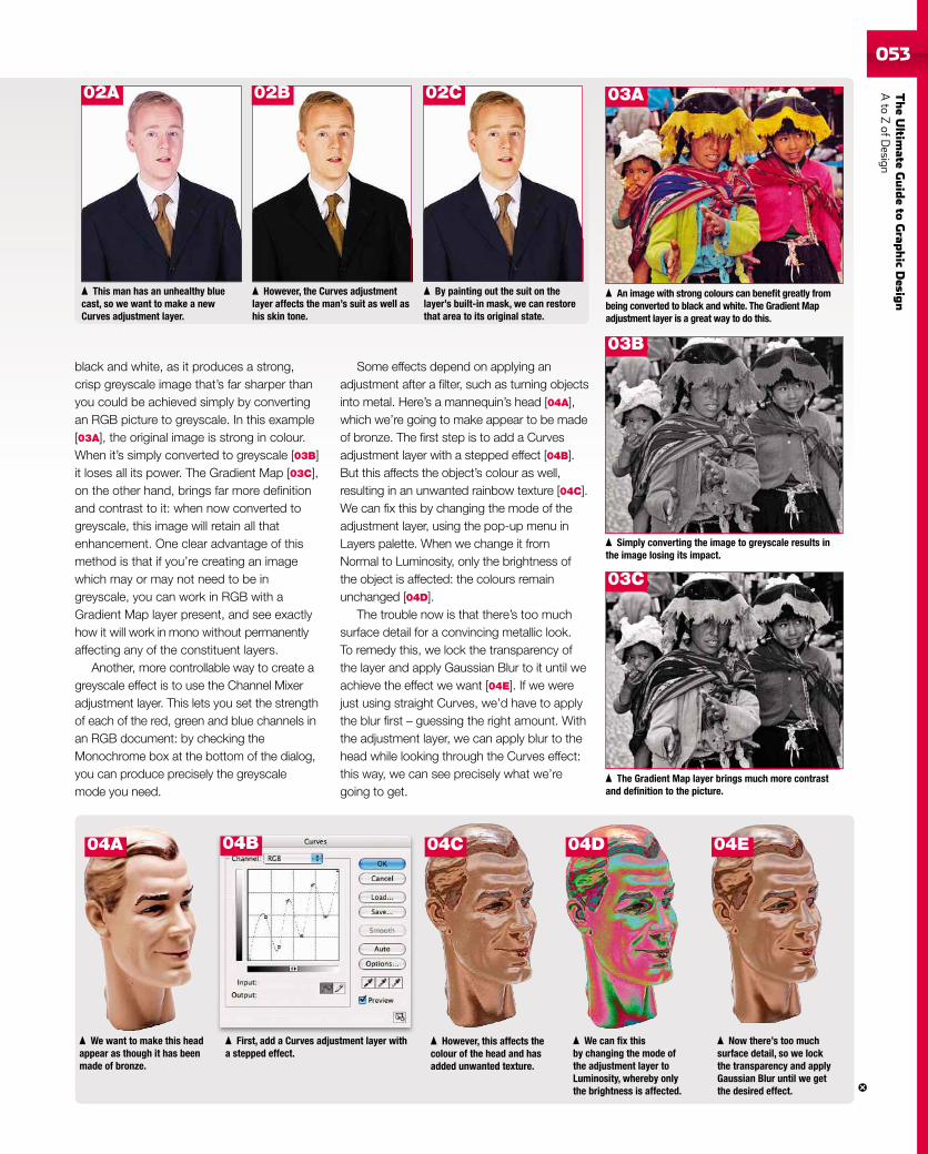
TheUltim
ateGuideto
Grap
hic
Desig
nAto
ZofD
esign053
black and white, as it produces a strong,crisp greyscale image that’s far sharper thanyou could be achieved simply by convertingan RGB picture to greyscale. In this example[03A], the original image is strong in colour.When it’s simply converted to greyscale [03B]it loses all its power. The Gradient Map [03C],on the other hand, brings far more definitionand contrast to it: when now converted togreyscale, this image will retain all thatenhancement. One clear advantage of thismethod is that if you’re creating an imagewhich may or may not need to be ingreyscale, you can work in RGB with aGradient Map layer present, and see exactlyhow it will work in mono without permanentlyaffecting any of the constituent layers.
Another, more controllable way to create agreyscale effect is to use the Channel Mixeradjustment layer. This lets you set the strengthof each of the red, green and blue channels inan RGB document: by checking theMonochrome box at the bottom of the dialog,you can produce precisely the greyscalemode you need.
We want to make this headappear as though it has beenmade of bronze.
An image with strong colours can benefit greatly frombeing converted to black and white. The Gradient Mapadjustment layer is a great way to do this.
Some effects depend on applying anadjustment after a filter, such as turning objectsinto metal. Here’s a mannequin’s head [04A],which we’re going to make appear to be madeof bronze. The first step is to add a Curvesadjustment layer with a stepped effect [04B].But this affects the object’s colour as well,resulting in an unwanted rainbow texture [04C].We can fix this by changing the mode of theadjustment layer, using the pop-up menu inLayers palette. When we change it fromNormal to Luminosity, only the brightness ofthe object is affected: the colours remainunchanged [04D].
The trouble now is that there’s too muchsurface detail for a convincing metallic look.To remedy this, we lock the transparency ofthe layer and apply Gaussian Blur to it until weachieve the effect we want [04E]. If we werejust using straight Curves, we’d have to applythe blur first – guessing the right amount. Withthe adjustment layer, we can apply blur to thehead while looking through the Curves effect:this way, we can see precisely what we’regoing to get.
This man has an unhealthy bluecast, so we want to make a newCurves adjustment layer.
However, the Curves adjustmentlayer affects the man’s suit as well ashis skin tone.
By painting out the suit on thelayer’s built-in mask, we can restorethat area to its original state.
Simply converting the image to greyscale results inthe image losing its impact.
The Gradient Map layer brings much more contrastand definition to the picture.
First, add a Curves adjustment layer witha stepped effect.
However, this affects thecolour of the head and hasadded unwanted texture.
We can fix thisby changing the mode ofthe adjustment layer toLuminosity, whereby onlythe brightness is affected.
Now there’s too muchsurface detail, so we lockthe transparency and applyGaussian Blur until we getthe desired effect.
02A 02B 02C 03A
03B
04A 04B 04C 04D 04E
03C
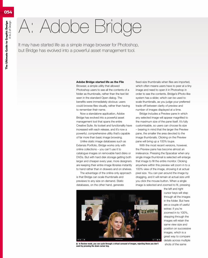
054
TheUltim
ateGuideto
Graphic
Des
ign
Ato
Zof
Design
It may have started life as a simple image browser for Photoshop,but Bridge has evolved into a powerful asset management tool.
Adobe Bridge started life as the FileBrowser, a simple utility that allowedPhotoshop users to see all the contents of afolder as thumbnails, rather than the text listseen in the standard Open dialog. Thebenefits were immediately obvious: userscould browse files visually, rather than havingto remember their name.
Now a standalone application, AdobeBridge has evolved into a powerful assetmanagement tool that spans the entireCreative Suite. Its toolset and functionality haveincreased with each release, and it’s now apowerful, comprehensive utility that’s capableof far more than basic image browsing.
Unlike static image databases such asExtensis Portfolio, Bridge works only withonline collections – you can’t use it tocatalogue images on removable hard disks orDVDs. But with hard disk storage getting bothlarger and cheaper every year, more designersare keeping their entire image libraries instantlyto hand rather than in drawers and on shelves.
The advantage of the online-only approachis that Bridge can scale thumbnails andpreviews to any size on-demand. Staticdatabases, on the other hand, generate
A: Adobe Bridge
fixed-size thumbnails when files are imported,which often means users have to peer at a tinyimage and need to open it in Photoshop inorder to see the contents. Bridge’s iPhoto-likesystem has a slider, which can be used toscale thumbnails, as you judge your preferredtrade-off between clarity of preview andnumber of images displayed at a time.
Bridge includes a Preview pane in whichany selected image will appear magnified tothe maximum size of the pane itself. It’s fullycustomisable, so users can choose its size– bearing in mind that the larger the Previewpane, the smaller the area devoted to theimage thumbnails. Clicking on the Previewpane will bring up a 100% loupe.
With the most recent versions, however,the Preview pane has become almost anirrelevance. Pressing the Spacebar when anysingle image thumbnail is selected will enlargethat image to fill the entire monitor. Clickinganywhere within this preview will zoom in to a100% view of the image, showing it at actualpixel size. You can pan around the image bydragging, and it will remain at actual size untilyou click the mouse button. When a singleimage is selected and zoomed to fit, pressing
the left and rightcursor keys will stepthrough all the imagesin the folder. But hereare a couple of usefulextras: if you’rezoomed in to 100%,stepping through theimages will retain thesame view size andposition on successiveimages, which is agreat way to comparedetails across multipleshots of the sameIn Review mode, you can cycle through a virtual carousel of images, rejecting those you don’t
want by pressing the down cursor key.
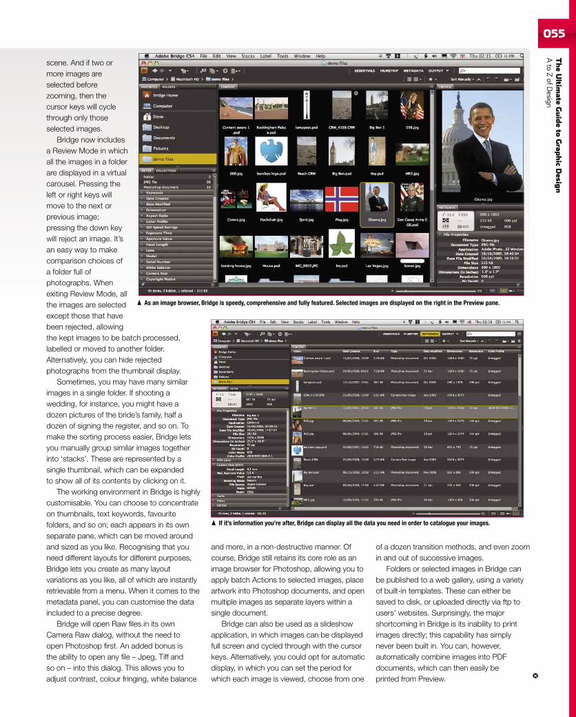
TheUltim
ateGuideto
Grap
hic
Desig
nAto
ZofD
esign055
scene. And if two ormore images areselected beforezooming, then thecursor keys will cyclethrough only thoseselected images.
Bridge now includesa Review Mode in whichall the images in a folderare displayed in a virtualcarousel. Pressing theleft or right keys willmove to the next orprevious image;pressing the down keywill reject an image. It’san easy way to makecomparison choices ofa folder full ofphotographs. Whenexiting Review Mode, allthe images are selectedexcept those that havebeen rejected, allowingthe kept images to be batch processed,labelled or moved to another folder.Alternatively, you can hide rejectedphotographs from the thumbnail display.
Sometimes, you may have many similarimages in a single folder. If shooting awedding, for instance, you might have adozen pictures of the bride’s family, half adozen of signing the register, and so on. Tomake the sorting process easier, Bridge letsyou manually group similar images togetherinto ‘stacks’. These are represented by asingle thumbnail, which can be expandedto show all of its contents by clicking on it.
The working environment in Bridge is highlycustomisable. You can choose to concentrateon thumbnails, text keywords, favouritefolders, and so on; each appears in its ownseparate pane, which can be moved aroundand sized as you like. Recognising that youneed different layouts for different purposes,Bridge lets you create as many layoutvariations as you like, all of which are instantlyretrievable from a menu. When it comes to themetadata panel, you can customise the dataincluded to a precise degree.
Bridge will open Raw files in its ownCamera Raw dialog, without the need toopen Photoshop first. An added bonus isthe ability to open any file – Jpeg, Tiff andso on – into this dialog. This allows you toadjust contrast, colour fringing, white balance
and more, in a non-destructive manner. Ofcourse, Bridge still retains its core role as animage browser for Photoshop, allowing you toapply batch Actions to selected images, placeartwork into Photoshop documents, and openmultiple images as separate layers within asingle document.
Bridge can also be used as a slideshowapplication, in which images can be displayedfull screen and cycled through with the cursorkeys. Alternatively, you could opt for automaticdisplay, in which you can set the period forwhich each image is viewed, choose from one
As an image browser, Bridge is speedy, comprehensive and fully featured. Selected images are displayed on the right in the Preview pane.
If it’s information you’re after, Bridge can display all the data you need in order to catalogue your images.
of a dozen transition methods, and even zoomin and out of successive images.
Folders or selected images in Bridge canbe published to a web gallery, using a varietyof built-in templates. These can either besaved to disk, or uploaded directly via ftp tousers’ websites. Surprisingly, the majorshortcoming in Bridge is its inability to printimages directly; this capability has simplynever been built in. You can, however,automatically combine images into PDFdocuments, which can then easily beprinted from Preview.
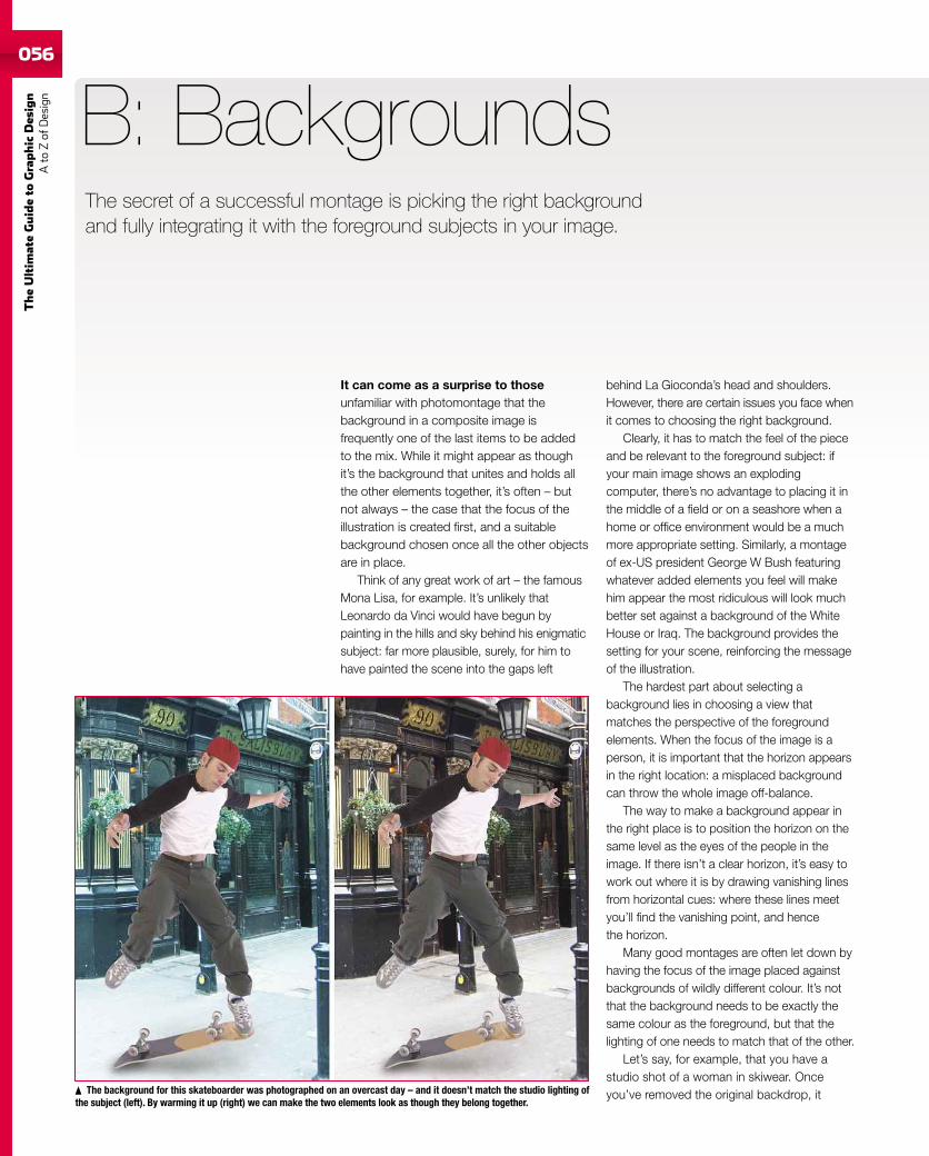
056
TheUltim
ateGuideto
Graphic
Des
ign
Ato
Zof
Design
056
The secret of a successful montage is picking the right backgroundand fully integrating it with the foreground subjects in your image.
It can come as a surprise to thoseunfamiliar with photomontage that thebackground in a composite image isfrequently one of the last items to be addedto the mix. While it might appear as thoughit’s the background that unites and holds allthe other elements together, it’s often – butnot always – the case that the focus of theillustration is created first, and a suitablebackground chosen once all the other objectsare in place.
Think of any great work of art – the famousMona Lisa, for example. It’s unlikely thatLeonardo da Vinci would have begun bypainting in the hills and sky behind his enigmaticsubject: far more plausible, surely, for him tohave painted the scene into the gaps left
B: Backgrounds
behind La Gioconda’s head and shoulders.However, there are certain issues you face whenit comes to choosing the right background.
Clearly, it has to match the feel of the pieceand be relevant to the foreground subject: ifyour main image shows an explodingcomputer, there’s no advantage to placing it inthe middle of a field or on a seashore when ahome or office environment would be a muchmore appropriate setting. Similarly, a montageof ex-US president George W Bush featuringwhatever added elements you feel will makehim appear the most ridiculous will look muchbetter set against a background of the WhiteHouse or Iraq. The background provides thesetting for your scene, reinforcing the messageof the illustration.
The hardest part about selecting abackground lies in choosing a view thatmatches the perspective of the foregroundelements. When the focus of the image is aperson, it is important that the horizon appearsin the right location: a misplaced backgroundcan throw the whole image off-balance.
The way to make a background appear inthe right place is to position the horizon on thesame level as the eyes of the people in theimage. If there isn’t a clear horizon, it’s easy towork out where it is by drawing vanishing linesfrom horizontal cues: where these lines meetyou’ll find the vanishing point, and hencethe horizon.
Many good montages are often let down byhaving the focus of the image placed againstbackgrounds of wildly different colour. It’s notthat the background needs to be exactly thesame colour as the foreground, but that thelighting of one needs to match that of the other.
Let’s say, for example, that you have astudio shot of a woman in skiwear. Onceyou’ve removed the original backdrop, itThe background for this skateboarder was photographed on an overcast day – and it doesn’t match the studio lighting of
the subject (left). By warming it up (right) we can make the two elements look as though they belong together.
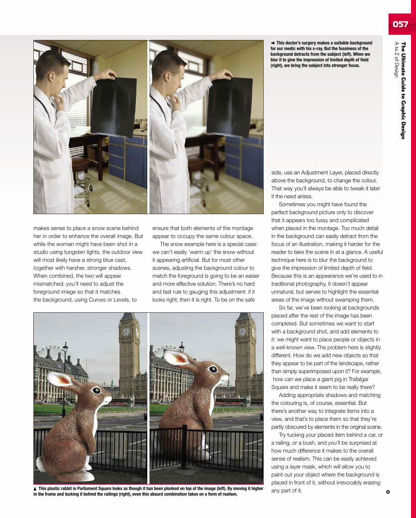
TheUltim
ateGuideto
Grap
hic
Desig
nAto
ZofD
esign057057
makes sense to place a snow scene behindher in order to enhance the overall image. Butwhile the woman might have been shot in astudio using tungsten lights, the outdoor viewwill most likely have a strong blue cast,together with harsher, stronger shadows.When combined, the two will appearmismatched; you’ll need to adjust theforeground image so that it matchesthe background, using Curves or Levels, to
ensure that both elements of the montageappear to occupy the same colour space.
The snow example here is a special case:we can’t easily ‘warm up’ the snow withoutit appearing artificial. But for most otherscenes, adjusting the background colour tomatch the foreground is going to be an easierand more effective solution. There’s no hardand fast rule to gauging this adjustment: if itlooks right, then it is right. To be on the safe
side, use an Adjustment Layer, placed directlyabove the background, to change the colour.That way you’ll always be able to tweak it laterif the need arises.
Sometimes you might have found theperfect background picture only to discoverthat it appears too fussy and complicatedwhen placed in the montage. Too much detailin the background can easily detract from thefocus of an illustration, making it harder for thereader to take the scene in at a glance. A usefultechnique here is to blur the background togive the impression of limited depth of field.Because this is an appearance we’re used to intraditional photography, it doesn’t appearunnatural, but serves to highlight the essentialareas of the image without swamping them.
So far, we’ve been looking at backgroundsplaced after the rest of the image has beencompleted. But sometimes we want to startwith a background shot, and add elements toit: we might want to place people or objects ina well-known view. The problem here is slightlydifferent. How do we add new objects so thatthey appear to be part of the landscape, ratherthan simply superimposed upon it? For example,how can we place a giant pig in TrafalgarSquare and make it seem to be really there?
Adding appropriate shadows and matchingthe colouring is, of course, essential. Butthere’s another way to integrate items into aview, and that’s to place them so that they’repartly obscured by elements in the original scene.
Try tucking your placed item behind a car, ora railing, or a bush, and you’ll be surprised athow much difference it makes to the overallsense of realism. This can be easily achievedusing a layer mask, which will allow you topaint out your object where the background isplaced in front of it, without irrevocably erasingany part of it.
This doctor’s surgery makes a suitable backgroundfor our medic with his x-ray. But the fussiness of thebackground detracts from the subject (left). When weblur it to give the impression of limited depth of field(right), we bring the subject into stronger focus.
This plastic rabbit in Parliament Square looks as though it has been plonked on top of the image (left). By moving it higherin the frame and tucking it behind the railings (right), even this absurd combination takes on a form of realism.
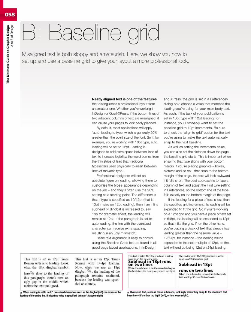
058
TheUltim
ateGuideto
Graphic
Des
ign
Ato
Zof
Design
Misaligned text is both sloppy and amateurish. Here, we show you how toset up and use a baseline grid to give your layout a more professional look.
Neatly aligned text is one of the featuresthat distinguishes a professional layout froman amateur one. Whether you’re working inInDesign or QuarkXPress, if the bottom lines oftwo adjacent columns of text are misaligned, itcan cause your pages to look badly planned.
By default, most applications will apply‘auto’ leading to type, which is generally 20%greater than the point size of the font. So if, forexample, you’re working with 10pt type, autoleading will be set to 12pt. Leading isdesigned to add extra space between lines oftext to increase legibility; the word comes fromthe thin strips of lead that traditionaltypesetters used physically to insert betweenlines of movable type.
Professional designers will set anabsolute figure on leading, allowing them tocustomise the type’s appearance dependingon the job – and they’ll often use the 20%setting as a starting point. The difference isthat if type is specified as 10/12pt (that is,10pt in size on 12pt leading), then if an inlinesubhead or dingbat is increased to, say,18p for dramatic effect, the leading willremain at 12pt. If the paragraph is set toauto leading, the line with the oversizedcharacter can receive extra spacing,resulting in an ugly mismatch.
Basic text alignment is easy to controlusing the Baseline Grids feature found in allgood page layout applications. In InDesign
B: Baseline grid
and XPress, the grid is set in a Preferencesdialog box: choose a value that matches theleading you’re using for your main body text.As such, if the bulk of your publication isset in 10pt type with 12pt leading, forinstance, you’ll probably want to set thebaseline grid to 12pt increments. Be sureto check the ‘align to grid’ option for the textyou’re using to make the text automaticallysnap to the next baseline.
As well as setting the incremental value,you can also set the distance down the pagethe baseline grid starts. This is important whenensuring that type aligns with your bottommargin. If you’re placing graphics – boxes,pictures and so on – that snap to the bottommargin of the page, the text will look awkwardif it falls short. The best approach is to type acolumn of text and adjust the First Line settingin Preferences, so the bottom line of the typefalls exactly on the bottom margin of the page.
If the leading for a piece of text is less thanthe specified grid increment, its leading will beexpanded to fit the grid. So if you’re workingon a 12pt grid and you have a piece of text setin 6/8pt, the leading will be expanded to 12ptso that it fits the grid. If, on the other hand,you’re placing a block of text that already hasleading greater than the baseline value –12/14pt, for instance – the leading will beexpanded to the next multiple of 12pt, so thetext will end up being 12pt on 24pt leading.
When leading is set to ‘auto’, over-sized characters such as the dingbat (left) can increase theleading of the entire line. If a leading value is specified, this can’t happen (right).
Oversized text, such as these subheads, look ugly when they snap to the standard textbaseline – it’s either too tight (left), or too loose (right).
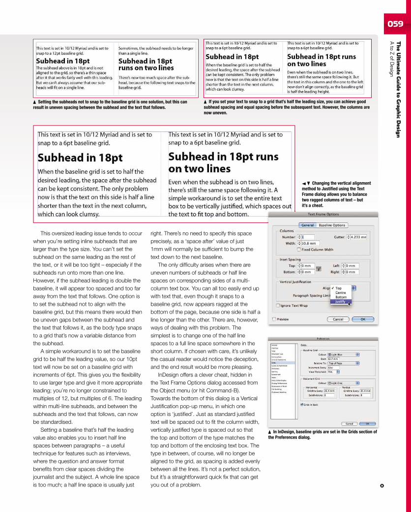
TheUltim
ateGuideto
Grap
hic
Desig
nAto
ZofD
esign059
Setting the subheads not to snap to the baseline grid is one solution, but this canresult in uneven spacing between the subhead and the text that follows.
If you set your text to snap to a grid that’s half the leading size, you can achieve goodsubhead spacing and equal spacing before the subsequent text. However, the columns arenow uneven.
Changing the vertical alignmentmethod to Justified using the TextFrame dialog allows you to balancetwo ragged columns of text – butit’s a cheat.
In InDesign, baseline grids are set in the Grids section ofthe Preferences dialog.
In InDesi baseline ids et in the Grids cti of
This oversized leading issue tends to occurwhen you’re setting inline subheads that arelarger than the type size. You can’t set thesubhead on the same leading as the rest ofthe text, or it will be too tight – especially if thesubheads run onto more than one line.However, if the subhead leading is double thebaseline, it will appear too spaced and too faraway from the text that follows. One option isto set the subhead not to align with thebaseline grid, but this means there would thenbe uneven gaps between the subhead andthe text that follows it, as the body type snapsto a grid that’s now a variable distance fromthe subhead.
A simple workaround is to set the baselinegrid to be half the leading value, so our 10pttext will now be set on a baseline grid withincrements of 6pt. This gives you the flexibilityto use larger type and give it more appropriateleading; you’re no longer constrained tomultiples of 12, but multiples of 6. The leadingwithin multi-line subheads, and between thesubheads and the text that follows, can nowbe standardised.
Setting a baseline that’s half the leadingvalue also enables you to insert half linespaces between paragraphs – a usefultechnique for features such as interviews,where the question and answer formatbenefits from clear spaces dividing thejournalist and the subject. A whole line spaceis too much; a half line space is usually just
right. There’s no need to specify this spaceprecisely, as a ‘space after’ value of just1mm will normally be sufficient to bump thetext down to the next baseline.
The only difficulty arises when there areuneven numbers of subheads or half linespaces on corresponding sides of a multi-column text box. You can all too easily end upwith text that, even though it snaps to abaseline grid, now appears ragged at thebottom of the page, because one side is half aline longer than the other. There are, however,ways of dealing with this problem. Thesimplest is to change one of the half linespaces to a full line space somewhere in theshort column. If chosen with care, it’s unlikelythe casual reader would notice the deception,and the end result would be more pleasing.
InDesign offers a clever cheat, hidden inthe Text Frame Options dialog accessed fromthe Object menu (or hit Command-B).Towards the bottom of this dialog is a VerticalJustification pop-up menu, in which oneoption is ‘justified’. Just as standard justifiedtext will be spaced out to fit the column width,vertically justified type is spaced out so thatthe top and bottom of the type matches thetop and bottom of the enclosing text box. Thetype in between, of course, will no longer bealigned to the grid, as spacing is added evenlybetween all the lines. It’s not a perfect solution,but it’s a straightforward quick fix that can getyou out of a problem.
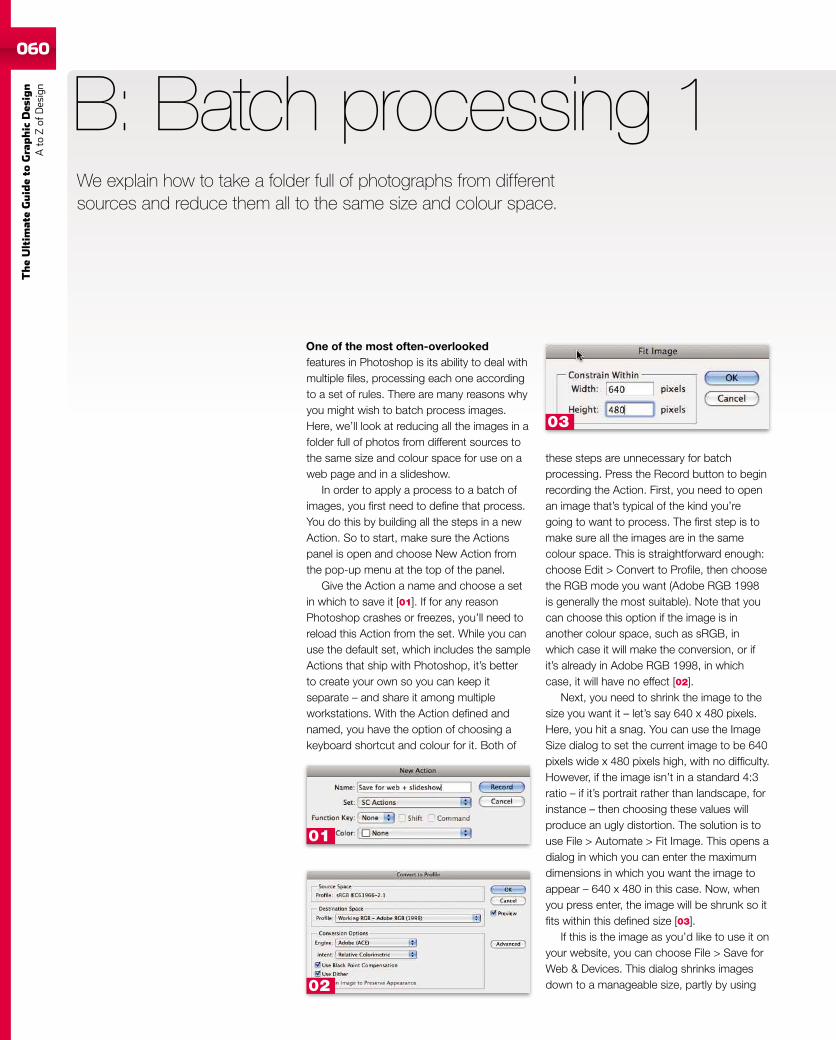
060
TheUltim
ateGuideto
Graphic
Des
ign
Ato
Zof
Design
We explain how to take a folder full of photographs from differentsources and reduce them all to the same size and colour space.
One of the most often-overlookedfeatures in Photoshop is its ability to deal withmultiple files, processing each one accordingto a set of rules. There are many reasons whyyou might wish to batch process images.Here, we’ll look at reducing all the images in afolder full of photos from different sources tothe same size and colour space for use on aweb page and in a slideshow.
In order to apply a process to a batch ofimages, you first need to define that process.You do this by building all the steps in a newAction. So to start, make sure the Actionspanel is open and choose New Action fromthe pop-up menu at the top of the panel.
Give the Action a name and choose a setin which to save it [01]. If for any reasonPhotoshop crashes or freezes, you’ll need toreload this Action from the set. While you canuse the default set, which includes the sampleActions that ship with Photoshop, it’s betterto create your own so you can keep itseparate – and share it among multipleworkstations. With the Action defined andnamed, you have the option of choosing akeyboard shortcut and colour for it. Both of
B: Batch processing 1
these steps are unnecessary for batchprocessing. Press the Record button to beginrecording the Action. First, you need to openan image that’s typical of the kind you’regoing to want to process. The first step is tomake sure all the images are in the samecolour space. This is straightforward enough:choose Edit > Convert to Profile, then choosethe RGB mode you want (Adobe RGB 1998is generally the most suitable). Note that youcan choose this option if the image is inanother colour space, such as sRGB, inwhich case it will make the conversion, or ifit’s already in Adobe RGB 1998, in whichcase, it will have no effect [02].
Next, you need to shrink the image to thesize you want it – let’s say 640 x 480 pixels.Here, you hit a snag. You can use the ImageSize dialog to set the current image to be 640pixels wide x 480 pixels high, with no difficulty.However, if the image isn’t in a standard 4:3ratio – if it’s portrait rather than landscape, forinstance – then choosing these values willproduce an ugly distortion. The solution is touse File > Automate > Fit Image. This opens adialog in which you can enter the maximumdimensions in which you want the image toappear – 640 x 480 in this case. Now, whenyou press enter, the image will be shrunk so itfits within this defined size [03].
If this is the image as you’d like to use it onyour website, you can choose File > Save forWeb & Devices. This dialog shrinks imagesdown to a manageable size, partly by using
01
02
03
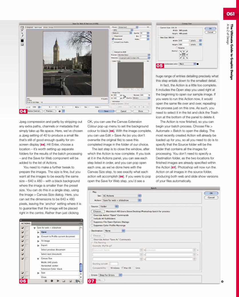
TheUltim
ateGuideto
Grap
hic
Desig
nAto
ZofD
esign061
Jpeg compression and partly by stripping outany extra paths, channels or metadata thatsimply take up file space. Here, we’ve chosena Jpeg setting of 40 to produce a small filethat’s still of good enough quality for on-screen display [04]. Hit Enter, choose alocation – it’s worth setting up separatefolders for the results of the batch processing– and the Save for Web component will beadded to the list of Actions.
You need to make a further tweak toprepare the images. The size is fine, but youwant all the images to be exactly the samesize – 640 x 480 – with a black backgroundwhere the image is smaller than the presetsize. You can do this in a single step, usingthe Image > Canvas Size dialog. Here, youcan set the dimensions to be 640 x 480pixels, leaving the ‘anchor’ setting where it isto guarantee that the image will be placedright in the centre. Rather than just clicking
OK, you can use the Canvas ExtensionColour pop-up menu to set the backgroundcolour to black [05]. With the image complete,you can use Edit > Save As (so you don’toverwrite the original file) to save thiscompleted image in the folder of our choice.
The last step is to close the window, afterwhich the Action is now complete. If you lookat it in the Actions panel, you can see eachstep listed in order, and you can pop openeach one, as we’ve done here with theCanvas Size step, to see exactly what eachaction will accomplish [06]. If you were to popopen the Save for Web step, you’d see a
huge range of entries detailing precisely whatthis step entails down to the smallest detail.
In fact, the Action is a little too complete.It includes the Open step you used right atthe beginning to open our sample image. Ifyou were to run this Action now, it wouldopen the same file over and over, repeatingthe process just on this one. As such, youneed to select it in the list and click the Trashicon at the bottom of the panel to delete it.
The Action is now finished, so you canbegin your batch process. Choose File >Automate > Batch to open the dialog. Themost recently created Action will already beloaded up for you, so all you need to do is tospecify that the Source folder will be thefolder that contains all the images forprocessing. You don’t need to specify aDestination folder, as the two locations forfinished images are already specified withinthe Action [07]. Photoshop will now run theAction on all images in the source folder,producing both web and slide show versionsof your files automatically.
07
04
06
05
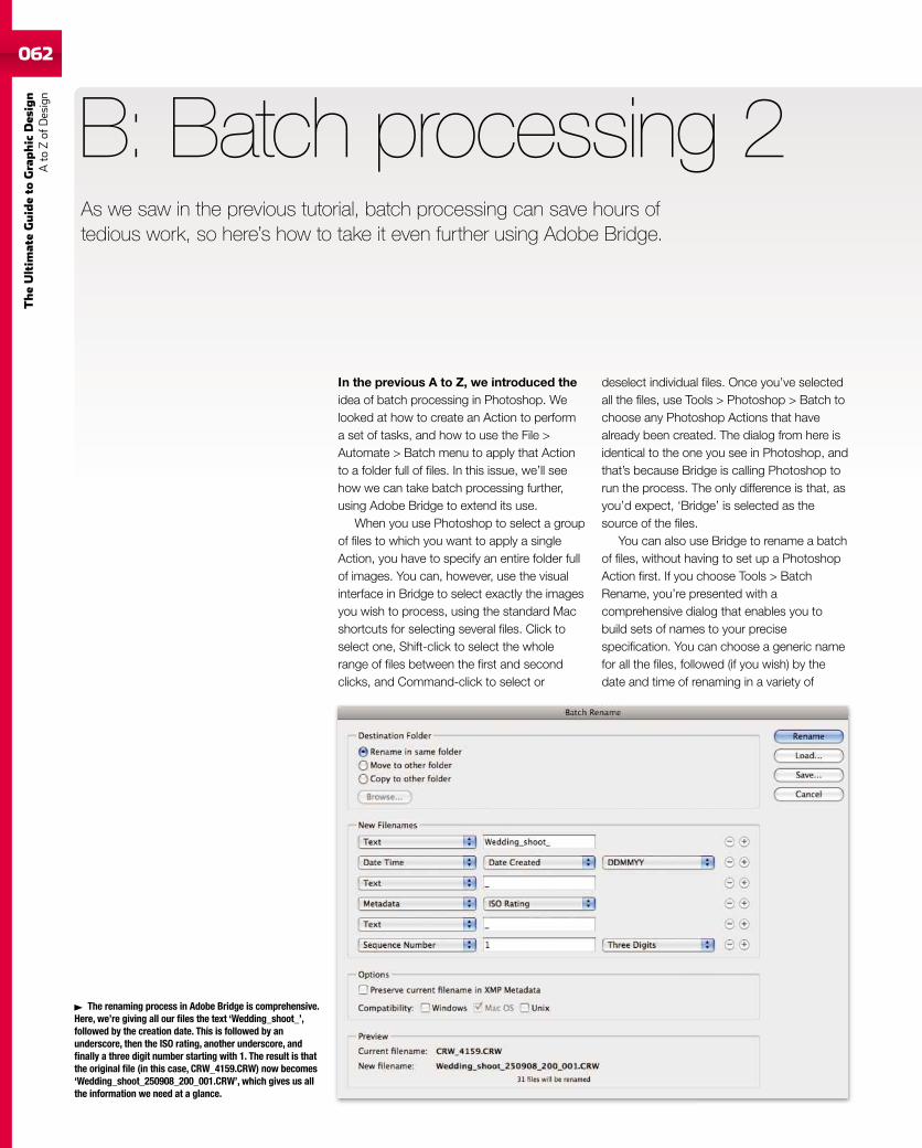
062
TheUltim
ateGuideto
Graphic
Des
ign
Ato
Zof
Design
As we saw in the previous tutorial, batch processing can save hours oftedious work, so here’s how to take it even further using Adobe Bridge.
In the previous A to Z, we introduced theidea of batch processing in Photoshop. Welooked at how to create an Action to performa set of tasks, and how to use the File >Automate > Batch menu to apply that Actionto a folder full of files. In this issue, we’ll seehow we can take batch processing further,using Adobe Bridge to extend its use.
When you use Photoshop to select a groupof files to which you want to apply a singleAction, you have to specify an entire folder fullof images. You can, however, use the visualinterface in Bridge to select exactly the imagesyou wish to process, using the standard Macshortcuts for selecting several files. Click toselect one, Shift-click to select the wholerange of files between the first and secondclicks, and Command-click to select or
B: Batch processing 2
deselect individual files. Once you’ve selectedall the files, use Tools > Photoshop > Batch tochoose any Photoshop Actions that havealready been created. The dialog from here isidentical to the one you see in Photoshop, andthat’s because Bridge is calling Photoshop torun the process. The only difference is that, asyou’d expect, ‘Bridge’ is selected as thesource of the files.
You can also use Bridge to rename a batchof files, without having to set up a PhotoshopAction first. If you choose Tools > BatchRename, you’re presented with acomprehensive dialog that enables you tobuild sets of names to your precisespecification. You can choose a generic namefor all the files, followed (if you wish) by thedate and time of renaming in a variety of
The renaming process in Adobe Bridge is comprehensive.Here, we’re giving all our files the text ‘Wedding_shoot_’,followed by the creation date. This is followed by anunderscore, then the ISO rating, another underscore, andfinally a three digit number starting with 1. The result is thatthe original file (in this case, CRW_4159.CRW) now becomes‘Wedding_shoot_250908_200_001.CRW’, which gives us allthe information we need at a glance.
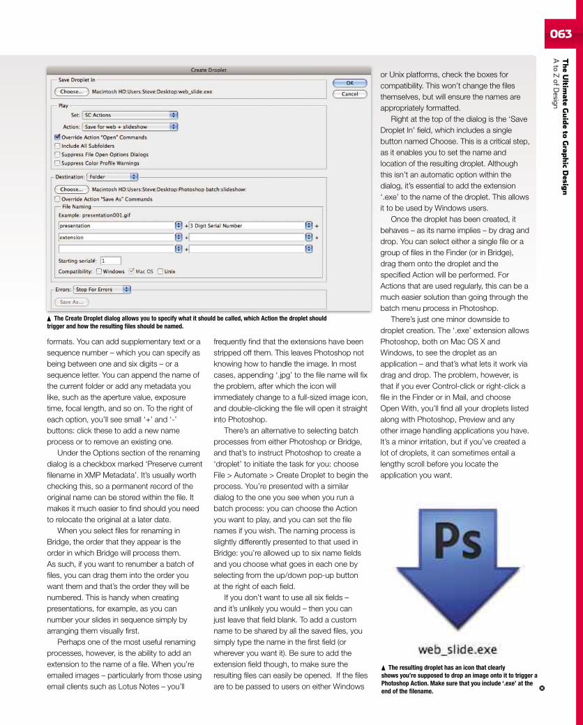
TheUltim
ateGuideto
Grap
hic
Desig
nAto
ZofD
esign063
formats. You can add supplementary text or asequence number – which you can specify asbeing between one and six digits – or asequence letter. You can append the name ofthe current folder or add any metadata youlike, such as the aperture value, exposuretime, focal length, and so on. To the right ofeach option, you’ll see small ‘+’ and ‘-’buttons: click these to add a new nameprocess or to remove an existing one.
Under the Options section of the renamingdialog is a checkbox marked ‘Preserve currentfilename in XMP Metadata’. It’s usually worthchecking this, so a permanent record of theoriginal name can be stored within the file. Itmakes it much easier to find should you needto relocate the original at a later date.
When you select files for renaming inBridge, the order that they appear is theorder in which Bridge will process them.As such, if you want to renumber a batch offiles, you can drag them into the order youwant them and that’s the order they will benumbered. This is handy when creatingpresentations, for example, as you cannumber your slides in sequence simply byarranging them visually first.
Perhaps one of the most useful renamingprocesses, however, is the ability to add anextension to the name of a file. When you’reemailed images – particularly from those usingemail clients such as Lotus Notes – you’ll
frequently find that the extensions have beenstripped off them. This leaves Photoshop notknowing how to handle the image. In mostcases, appending ‘.jpg’ to the file name will fixthe problem, after which the icon willimmediately change to a full-sized image icon,and double-clicking the file will open it straightinto Photoshop.
There’s an alternative to selecting batchprocesses from either Photoshop or Bridge,and that’s to instruct Photoshop to create a‘droplet’ to initiate the task for you: chooseFile > Automate > Create Droplet to begin theprocess. You’re presented with a similardialog to the one you see when you run abatch process: you can choose the Actionyou want to play, and you can set the filenames if you wish. The naming process isslightly differently presented to that used inBridge: you’re allowed up to six name fieldsand you choose what goes in each one byselecting from the up/down pop-up buttonat the right of each field.
If you don’t want to use all six fields –and it’s unlikely you would – then you canjust leave that field blank. To add a customname to be shared by all the saved files, yousimply type the name in the first field (orwherever you want it). Be sure to add theextension field though, to make sure theresulting files can easily be opened. If the filesare to be passed to users on either Windows
or Unix platforms, check the boxes forcompatibility. This won’t change the filesthemselves, but will ensure the names areappropriately formatted.
Right at the top of the dialog is the ‘SaveDroplet In’ field, which includes a singlebutton named Choose. This is a critical step,as it enables you to set the name andlocation of the resulting droplet. Althoughthis isn’t an automatic option within thedialog, it’s essential to add the extension‘.exe’ to the name of the droplet. This allowsit to be used by Windows users.
Once the droplet has been created, itbehaves – as its name implies – by drag anddrop. You can select either a single file or agroup of files in the Finder (or in Bridge),drag them onto the droplet and thespecified Action will be performed. ForActions that are used regularly, this can be amuch easier solution than going through thebatch menu process in Photoshop.
There’s just one minor downside todroplet creation. The ‘.exe’ extension allowsPhotoshop, both on Mac OS X andWindows, to see the droplet as anapplication – and that’s what lets it work viadrag and drop. The problem, however, isthat if you ever Control-click or right-click afile in the Finder or in Mail, and chooseOpen With, you’ll find all your droplets listedalong with Photoshop, Preview and anyother image handling applications you have.It’s a minor irritation, but if you’ve created alot of droplets, it can sometimes entail alengthy scroll before you locate theapplication you want.
The Create Droplet dialog allows you to specify what it should be called, which Action the droplet shouldtrigger and how the resulting files should be named.
The resulting droplet has an icon that clearlyshows you’re supposed to drop an image onto it to trigger aPhotoshop Action. Make sure that you include ‘.exe’ at theend of the filename.
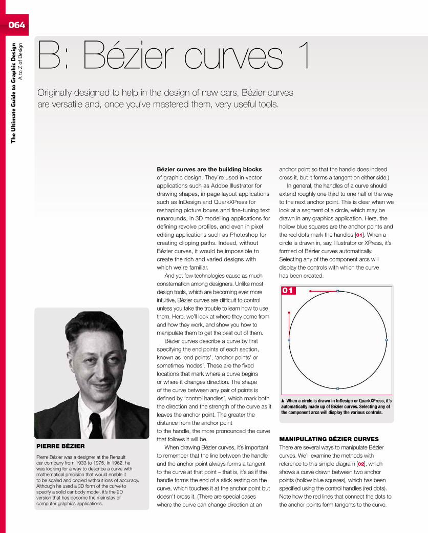
064
TheUltim
ateGuideto
Graphic
Des
ign
Ato
Zof
Design
Originally designed to help in the design of new cars, Bézier curvesare versatile and, once you’ve mastered them, very useful tools.
Bézier curves are the building blocksof graphic design. They’re used in vectorapplications such as Adobe Illustrator fordrawing shapes, in page layout applicationssuch as InDesign and QuarkXPress forreshaping picture boxes and fine-tuning textrunarounds, in 3D modelling applications fordefining revolve profiles, and even in pixelediting applications such as Photoshop forcreating clipping paths. Indeed, withoutBézier curves, it would be impossible tocreate the rich and varied designs withwhich we’re familiar.
And yet few technologies cause as muchconsternation among designers. Unlike mostdesign tools, which are becoming ever moreintuitive, Bézier curves are difficult to controlunless you take the trouble to learn how to usethem. Here, we’ll look at where they come fromand how they work, and show you how tomanipulate them to get the best out of them.
Bézier curves describe a curve by firstspecifying the end points of each section,known as ‘end points’, ‘anchor points’ orsometimes ‘nodes’. These are the fixedlocations that mark where a curve beginsor where it changes direction. The shapeof the curve between any pair of points isdefined by ‘control handles’, which mark boththe direction and the strength of the curve as itleaves the anchor point. The greater thedistance from the anchor pointto the handle, the more pronounced the curvethat follows it will be.
When drawing Bézier curves, it’s importantto remember that the line between the handleand the anchor point always forms a tangentto the curve at that point – that is, it’s as if thehandle forms the end of a stick resting on thecurve, which touches it at the anchor point butdoesn’t cross it. (There are special caseswhere the curve can change direction at an
B: Bézier curves 1
When a circle is drawn in InDesign or QuarkXPress, it’sautomatically made up of Bézier curves. Selecting any ofthe component arcs will display the various controls.
anchor point so that the handle does indeedcross it, but it forms a tangent on either side.)
In general, the handles of a curve shouldextend roughly one third to one half of the wayto the next anchor point. This is clear when welook at a segment of a circle, which may bedrawn in any graphics application. Here, thehollow blue squares are the anchor points andthe red dots mark the handles [01]. When acircle is drawn in, say, Illustrator or XPress, it’sformed of Bézier curves automatically.Selecting any of the component arcs willdisplay the controls with which the curvehas been created.
MANIPULATING BÉZIER CURVESThere are several ways to manipulate Béziercurves. We’ll examine the methods withreference to this simple diagram [02], whichshows a curve drawn between two anchorpoints (hollow blue squares), which has beenspecified using the control handles (red dots).Note how the red lines that connect the dots tothe anchor points form tangents to the curve.
PIERRE BÉZIER
Pierre Bézier was a designer at the Renaultcar company from 1933 to 1975. In 1962, hewas looking for a way to describe a curve withmathematical precision that would enable itto be scaled and copied without loss of accuracy.Although he used a 3D form of the curve tospecify a solid car body model, it’s the 2Dversion that has become the mainstay ofcomputer graphics applications.
01
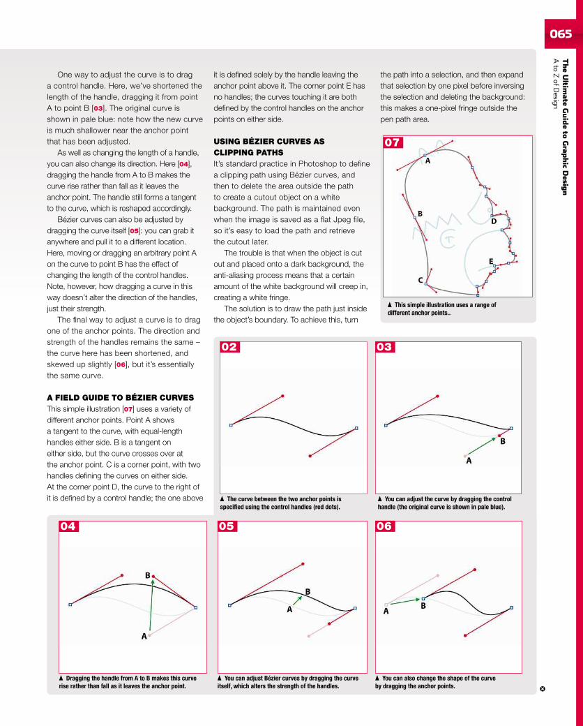
TheUltim
ateGuideto
Grap
hic
Desig
nAto
ZofD
esign065
One way to adjust the curve is to draga control handle. Here, we’ve shortened thelength of the handle, dragging it from pointA to point B [03]. The original curve isshown in pale blue: note how the new curveis much shallower near the anchor pointthat has been adjusted.
As well as changing the length of a handle,you can also change its direction. Here [04],dragging the handle from A to B makes thecurve rise rather than fall as it leaves theanchor point. The handle still forms a tangentto the curve, which is reshaped accordingly.
Bézier curves can also be adjusted bydragging the curve itself [05]: you can grab itanywhere and pull it to a different location.Here, moving or dragging an arbitrary point Aon the curve to point B has the effect ofchanging the length of the control handles.Note, however, how dragging a curve in thisway doesn’t alter the direction of the handles,just their strength.
The final way to adjust a curve is to dragone of the anchor points. The direction andstrength of the handles remains the same –the curve here has been shortened, andskewed up slightly [06], but it’s essentiallythe same curve.
A FIELD GUIDE TO BÉZIER CURVESThis simple illustration [07] uses a variety ofdifferent anchor points. Point A showsa tangent to the curve, with equal-lengthhandles either side. B is a tangent oneither side, but the curve crosses over atthe anchor point. C is a corner point, with twohandles defining the curves on either side.At the corner point D, the curve to the right ofit is defined by a control handle; the one above
Dragging the handle from A to B makes this curverise rather than fall as it leaves the anchor point.
You can adjust Bézier curves by dragging the curveitself, which alters the strength of the handles.
You can also change the shape of the curveby dragging the anchor points.
The curve between the two anchor points isspecified using the control handles (red dots).
You can adjust the curve by dragging the controlhandle (the original curve is shown in pale blue).
it is defined solely by the handle leaving theanchor point above it. The corner point E hasno handles; the curves touching it are bothdefined by the control handles on the anchorpoints on either side.
USING BÉZIER CURVES ASCLIPPING PATHSIt’s standard practice in Photoshop to definea clipping path using Bézier curves, andthen to delete the area outside the pathto create a cutout object on a whitebackground. The path is maintained evenwhen the image is saved as a flat Jpeg file,so it’s easy to load the path and retrievethe cutout later.
The trouble is that when the object is cutout and placed onto a dark background, theanti-aliasing process means that a certainamount of the white background will creep in,creating a white fringe.
The solution is to draw the path just insidethe object’s boundary. To achieve this, turn
This simple illustration uses a range ofdifferent anchor points..
the path into a selection, and then expandthat selection by one pixel before inversingthe selection and deleting the background:this makes a one-pixel fringe outside thepen path area.
07
04 05 06
0302
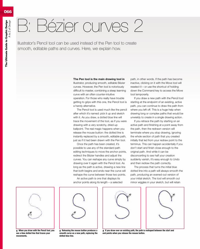
066
TheUltim
ateGuideto
Graphic
Des
ign
Ato
Zof
Design
Illustrator’s Pencil tool can be used instead of the Pen tool to createsmooth, editable paths and curves. Here, we explain how.
The Pen tool is the main drawing tool inIllustrator, producing smooth, editable Béziercurves. However, the Pen tool is notoriouslydifficult to master, combining a steep learningcurve with an often counter-intuitiveoperation. For those who really have troublegetting to grips with this one, the Pencil tool isa handy alternative.
The Pencil tool is used much like the pencilafter which it’s named: pick it up and sketchwith it. As you draw, a dotted blue line willtrace the movement of the tool, as if you weredrawing with a very scratchy, dried-upballpoint. The real magic happens when yourelease the mouse button: the dotted line isinstantly replaced by a smooth, editable path,just as if it had been drawn with the Pen tool.
Once the path has been created, it’spossible to use any of the standard pathediting techniques to move the anchor points,redirect the Bézier handles and adjust thecurves. You can reshape any curve simply bydrawing over it again with the Pencil tool. Aslong as the path is active, drawing a new linethat both begins and ends near the curve willreshape the curve between those two points.
An active path is one that displays itsanchor points along its length – a selected
B: Bézier curves 2
path, in other words. If the path has becomeinactive, clicking on it with the Move tool willreselect it – or use the shortcut of holdingdown the Command key to access the Movetool temporarily.
If you draw a new path with the Pencil toolstarting at the endpoint of an existing, activepath, you can continue to draw the path fromwhere you left off. This is a huge help whendrawing long or complex paths that would beunwieldy to create in a single drawing action.
If you retrace the path by starting on anactive path and finishing at a point away fromthe path, then the redrawn version willterminate where you stop drawing, ignoringthe whole section of path that you createdinitially that led from your redraw point to theterminus. This can happen accidentally if youdon’t start and finish close enough to theoriginal path. And while it can bedisconcerting to see half your creationsuddenly vanish, it’s easy enough to Undoand then redraw the path correctly.
The process that turns the initial bluedotted line into a path will always smooth thepath, producing an evened-out version ofyour initial sketch. The tool will smooth outminor wiggles in your sketch, but will retain
When you draw with the Pencil tool, yousee a blue dotted line that traces yourmovements.
Releasing the mouse button produces asmooth curve as a new path, replacing thedotted blue line.
If you draw over an existing path, the path is reshaped between the start andend points when you release the mouse button.
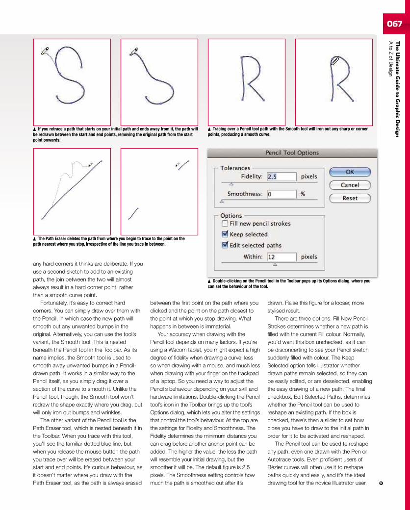
TheUltim
ateGuideto
Grap
hic
Desig
nAto
ZofD
esign067
any hard corners it thinks are deliberate. If youuse a second sketch to add to an existingpath, the join between the two will almostalways result in a hard corner point, ratherthan a smooth curve point.
Fortunately, it’s easy to correct hardcorners. You can simply draw over them withthe Pencil, in which case the new path willsmooth out any unwanted bumps in theoriginal. Alternatively, you can use the tool’svariant, the Smooth tool. This is nestedbeneath the Pencil tool in the Toolbar. As itsname implies, the Smooth tool is used tosmooth away unwanted bumps in a Pencil-drawn path. It works in a similar way to thePencil itself, as you simply drag it over asection of the curve to smooth it. Unlike thePencil tool, though, the Smooth tool won’tredraw the shape exactly where you drag, butwill only iron out bumps and wrinkles.
The other variant of the Pencil tool is thePath Eraser tool, which is nested beneath it inthe Toolbar. When you trace with this tool,you’ll see the familiar dotted blue line, butwhen you release the mouse button the pathyou trace over will be erased between yourstart and end points. It’s curious behaviour, asit doesn’t matter where you draw with thePath Eraser tool, as the path is always erased
between the first point on the path where youclicked and the point on the path closest tothe point at which you stop drawing. Whathappens in between is immaterial.
Your accuracy when drawing with thePencil tool depends on many factors. If you’reusing a Wacom tablet, you might expect a highdegree of fidelity when drawing a curve; lessso when drawing with a mouse, and much lesswhen drawing with your finger on the trackpadof a laptop. So you need a way to adjust thePencil’s behaviour depending on your skill andhardware limitations. Double-clicking the Penciltool’s icon in the Toolbar brings up the tool’sOptions dialog, which lets you alter the settingsthat control the tool’s behaviour. At the top arethe settings for Fidelity and Smoothness. TheFidelity determines the minimum distance youcan drag before another anchor point can beadded. The higher the value, the less the pathwill resemble your initial drawing, but thesmoother it will be. The default figure is 2.5pixels. The Smoothness setting controls howmuch the path is smoothed out after it’s
drawn. Raise this figure for a looser, morestylised result.
There are three options. Fill New PencilStrokes determines whether a new path isfilled with the current Fill colour. Normally,you’d want this box unchecked, as it canbe disconcerting to see your Pencil sketchsuddenly filled with colour. The KeepSelected option tells Illustrator whetherdrawn paths remain selected, so they canbe easily edited, or are deselected, enablingthe easy drawing of a new path. The finalcheckbox, Edit Selected Paths, determineswhether the Pencil tool can be used toreshape an existing path. If the box ischecked, there’s then a slider to set howclose you have to draw to the initial path inorder for it to be activated and reshaped.
The Pencil tool can be used to reshapeany path, even one drawn with the Pen orAutotrace tools. Even proficient users ofBézier curves will often use it to reshapepaths quickly and easily, and it’s the idealdrawing tool for the novice Illustrator user.
Double-clicking on the Pencil tool in the Toolbar pops up its Options dialog, where youcan set the behaviour of the tool.
The Path Eraser deletes the path from where you begin to trace to the point on thepath nearest where you stop, irrespective of the line you trace in between.
If you retrace a path that starts on your initial path and ends away from it, the path willbe redrawn between the start and end points, removing the original path from the startpoint onwards.
Tracing over a Pencil tool path with the Smooth tool will iron out any sharp or cornerpoints, producing a smooth curve.
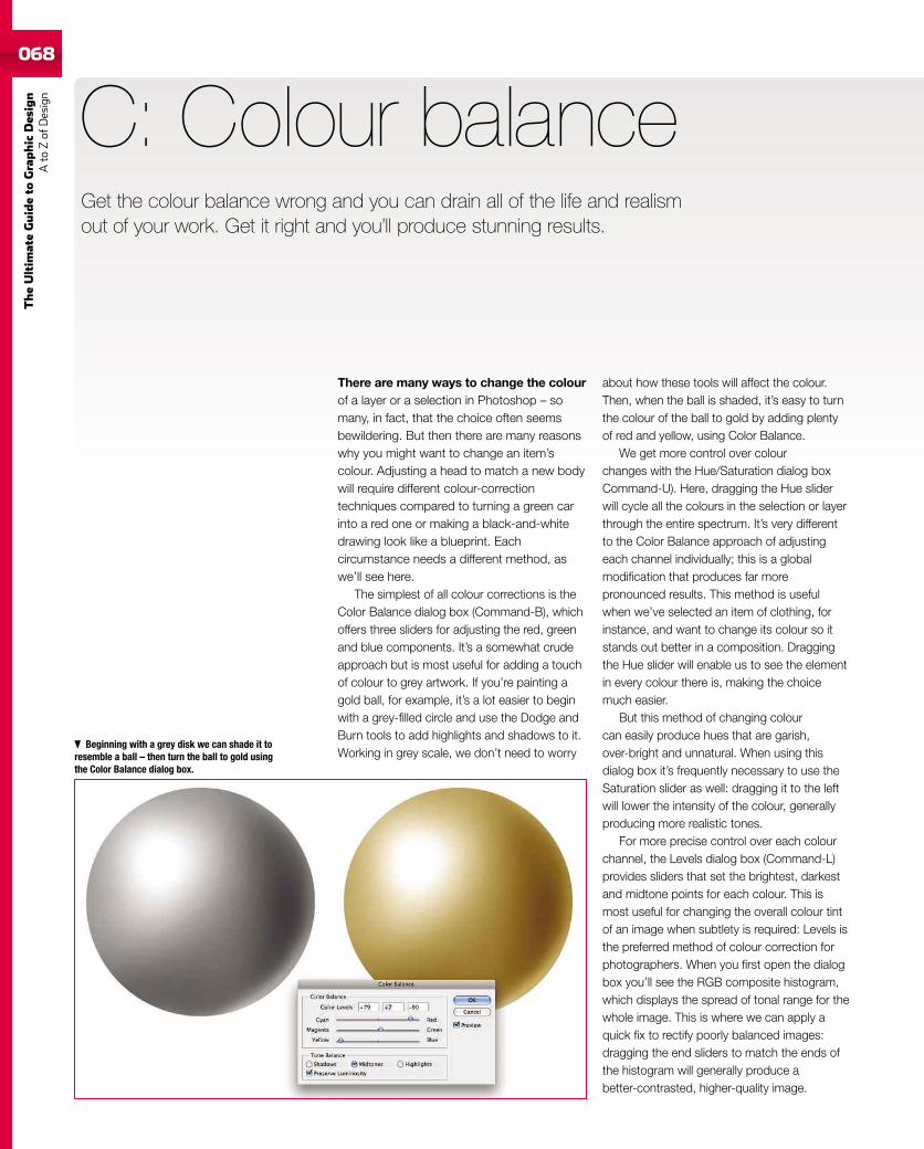
068
TheUltim
ateGuideto
Graphic
Des
ign
Ato
Zof
Design
068
There are many ways to change the colourof a layer or a selection in Photoshop – somany, in fact, that the choice often seemsbewildering. But then there are many reasonswhy you might want to change an item’scolour. Adjusting a head to match a new bodywill require different colour-correctiontechniques compared to turning a green carinto a red one or making a black-and-whitedrawing look like a blueprint. Eachcircumstance needs a different method, aswe’ll see here.
The simplest of all colour corrections is theColor Balance dialog box (Command-B), whichoffers three sliders for adjusting the red, greenand blue components. It’s a somewhat crudeapproach but is most useful for adding a touchof colour to grey artwork. If you’re painting agold ball, for example, it’s a lot easier to beginwith a grey-filled circle and use the Dodge andBurn tools to add highlights and shadows to it.Working in grey scale, we don’t need to worry
C: Colour balance
about how these tools will affect the colour.Then, when the ball is shaded, it’s easy to turnthe colour of the ball to gold by adding plentyof red and yellow, using Color Balance.
We get more control over colourchanges with the Hue/Saturation dialog boxCommand-U). Here, dragging the Hue sliderwill cycle all the colours in the selection or layerthrough the entire spectrum. It’s very differentto the Color Balance approach of adjustingeach channel individually; this is a globalmodification that produces far morepronounced results. This method is usefulwhen we’ve selected an item of clothing, forinstance, and want to change its colour so itstands out better in a composition. Draggingthe Hue slider will enable us to see the elementin every colour there is, making the choicemuch easier.
But this method of changing colourcan easily produce hues that are garish,over-bright and unnatural. When using thisdialog box it’s frequently necessary to use theSaturation slider as well: dragging it to the leftwill lower the intensity of the colour, generallyproducing more realistic tones.
For more precise control over each colourchannel, the Levels dialog box (Command-L)provides sliders that set the brightest, darkestand midtone points for each colour. This ismost useful for changing the overall colour tintof an image when subtlety is required: Levels isthe preferred method of colour correction forphotographers. When you first open the dialogbox you’ll see the RGB composite histogram,which displays the spread of tonal range for thewhole image. This is where we can apply aquick fix to rectify poorly balanced images:dragging the end sliders to match the ends ofthe histogram will generally produce abetter-contrasted, higher-quality image.
Beginning with a grey disk we can shade it toresemble a ball – then turn the ball to gold usingthe Color Balance dialog box.
Get the colour balance wrong and you can drain all of the life and realismout of your work. Get it right and you’ll produce stunning results.
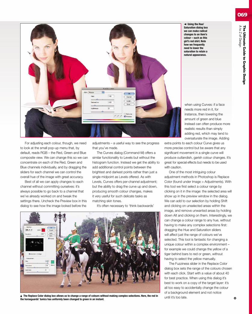
TheUltim
ateGuideto
Grap
hic
Desig
nAto
ZofD
esign069069
For adjusting each colour, though, we needto look at the small pop-up menu that, bydefault, reads RGB – the Red, Green and Bluecomposite view. We can change this so we canconcentrate on each of the Red, Green andBlue channels individually, and by dragging thesliders for each channel we can control theoverall hue of the image with great accuracy.
Best of all we can apply changes to eachchannel without committing ourselves: it’salways possible to go back to a channel thatwe’ve already worked on and tweak thesettings there. Uncheck the Preview box in thisdialog to see how the image looked before the
adjustments – a useful way to see the progressthat you’ve made.
The Curves dialog (Command-M) offers asimilar functionality to Levels but without thehistogram function. Instead we get the ability toadd additional control points between thebrightest and darkest points rather than just asingle midpoint as Levels offered. As withLevels, Curves offers per-channel adjustment;but the ability to drag the curve up and down,producing smooth colour changes, makesit very useful for such delicate tasks asmatching skin tones.
It’s often necessary to ‘think backwards’
when using Curves: if a faceneeds more red in it, forinstance, then lowering theamount of green and blueinstead can often produce morerealistic results than simplyadding red, which may tend tooversaturate the image. Adding
extra points to each colour Curve gives usmore precise control but be aware that anysignificant movement in a single curve willproduce outlandish, garish colour changes. It’sgreat for special effects but needs to be usedwith caution.
One of the most intriguing colouradjustment methods in Photoshop is ReplaceColor (found under Image > Adjustments). Withthis tool we first select a colour range byclicking on it in the image: the selected area willshow up in the preview window in the dialog.We can add to our selection by holding Shiftand clicking on unselected areas within theimage, and remove unwanted areas by holdingdown Alt and clicking on them. Interestingly, wecan change a colour range to any hue, withouthaving to make any complex selections first:dragging the Hue and Saturation sliderswill affect just the range of colours we’veselected. This tool is fantastic for changing aunique colour within a complex environment –for example we could change the yellow of atiger behind bars to red or green, withouthaving to select the yellow manually.
The Fuzziness slider in the Replace Colordialog box sets the range of the colours chosenwith each click. Start with a value of about 40for best practice. When using this dialog it’sbest to work on a copy of the target layer: it’sall too easy to accidentally change the colourof a background element and not noticeuntil it’s too late.
Using the Hue/Saturation dialog boxwe can make radicalchanges to an item’scolour – such as thisgirl’s red shirt. Notehow we frequentlyneed to lower thesaturation to retain anatural appearance.
The Replace Color dialog box allows us to change a range of colours without making complex selections. Here, the red inthe horseguards’ tunics has uniformly been changed to green in an instant.
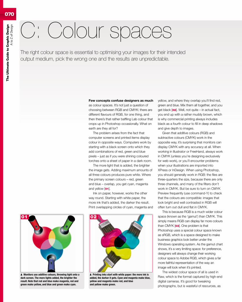
070
TheUltim
ateGuideto
Graphic
Des
ign
Ato
Zof
Design
Few concepts confuse designers as muchas colour spaces. It’s not just a question ofchoosing between RGB and CMYK: there aredifferent flavours of RGB, for one thing, andthen there’s that rather baffling Lab colour thatcrops up in Photoshop occasionally. What onearth are they all for?
The problem arises from the fact thatcomputer screens and printed items displaycolour in opposite ways. Computers work bystarting with a black screen onto which theyadd combinations of red, green and bluepixels – just as if you were shining colouredtorches onto a sheet of paper in a dark room.
The more light that is added, the brighterthe image gets. Adding maximum amounts ofall three colours produces pure white. Wherethe primary screen colours – red, greenand blue – overlap, you get cyan, magentaand yellow [01].
Ink on paper, however, works the otherway round. Starting with white paper, themore ink that’s added, the darker the result.Print overlapping circles of cyan, magenta and
C: Colour spaces
yellow, and where they overlap you'll find red,green and blue. Mix them all together, and youget black [02]. Well, not quite – in actual fact,you end up with a rather muddy brown, whichis why commercial printing always includesblack as a fourth colour to fill in deep shadowsand give depth to images.
Given that additive colours (RGB) andsubtractive colours (CMYK) work in theopposite way, it’s surprising that monitors candisplay CMYK with any accuracy at all. Whenworking in lllustrator or FreeHand, always workin CMYK (unless you’re designing exclusivelyfor web work), or you’ll encounter problemswhen your illustrations are imported intoXPress or InDesign. When using Photoshop,you should generally work in RGB: the files arethree-quarters the size, because there are onlythree channels, and many of the filters don’twork in CMYK. But be sure to turn on CMYKPreview frequently (use command-Y) to checkthat the colours are compatible: images thatlook bright and well contrasted in RGB willoften turn out dull and flat in CMYK.
This is because RGB is a much wider colourspace (known as the ‘gamut’) than CMYK. Thissimply means RGB can display far more coloursthan CMYK [03]. One problem is thatPhotoshop uses a special colour space knownas sRGB, which is a space designed to makebusiness graphics look better under theWindows operating system. As the gamut chartshows, it’s a very limiting space: for preference,designers will always change their workingcolour space to Adobe RGB, which gives a farmore faithful representation of the way animage will look when it’s printed.
The widest colour space of all is used inRaw, which is the format captured by high-enddigital cameras. It’s good for tweakingphotographs, but is wasteful of resources, as
Monitors use additive colours, throwing light onto adark screen. The more lights added, the brighter theresult. Note that red and blue make magenta, red andgreen make yellow, and blue and green make cyan.
Printing inks start with white paper: the more ink isadded, the darker it gets. Cyan and magenta make blue,yellow and magenta make red, and blueand yellow make green.
The right colour space is essential to optimising your images for their intendedoutput medium, pick the wrong one and the results are unpredictable.
01 02
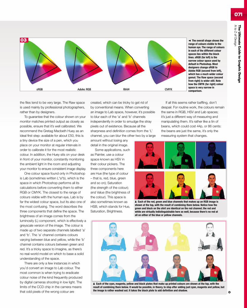
TheUltim
ateGuideto
Grap
hic
Desig
nAto
ZofD
esign071
the files tend to be very large. The Raw spaceis used mainly by professional photographers,rather than by designers.
To guarantee that the colour shown on yourmonitor matches printed output as closely aspossible, ensure that it’s well calibrated. Werecommend the Gretag Macbeth Huey as anideal first step: available for about £50, this isa tiny device the size of a pen, which youplace on your monitor at regular intervals inorder to calibrate it for the most realisticcolour. In addition, the Huey sits on your deskin front of your monitor, constantly monitoringthe ambient light in the room and adjustingyour monitor to ensure consistent image display.
One colour space found only in Photoshopis Lab (sometimes written L*a*b), which is thespace in which Photoshop performs all itscalculations before converting them to eitherRGB or CMYK. The closest to the range ofcolours visible with the human eye, Lab is byfar the widest colour space, but its also one ofthe most confusing. The word describes thethree components that define the space. Thebrightness of an image comes from theluminosity (L) component, which is effectively agreyscale version of the image. The colour ismade up of two separate channels labelled ‘a’and ‘b’. The ‘a’ channel contains coloursvarying between blue and yellow, while the ‘b’channel contains colours between green andred. It’s a tricky space to imagine, as there’sno real-world model on which to base a solidunderstanding of the space.
There are only a few instances in whichyou’d convert an image to Lab colour. Themost common is when trying to eradicatecolour noise of the kind frequently producedby digital cameras shooting in low light. Thelimits of the CCD chip in the camera meansthat odd pixels of the wrong colour are
created, which can be tricky to get rid ofby conventional means. When convertingan image to Lab space, however, it’s possibleto blur each of the ‘a’ and ‘b’ channelsindependently in order to smudge the straypixels out of existence. Because all thesharpness and definition comes from the ‘L’channel, you can blur the other two by a largeamount without losing anydetail in the original image.
Some applications, suchas Painter, use a colourspace known as HSV intheir colour pickers. Thethree components hereare Hue (the type of colour– that is, red, blue, greenand so on); Saturation(the strength of the colour);and Value (the brightness ofthe colour). This space isalso sometimes known asHSB, which stands for Hue,Saturation, Brightness.
If all this seems rather baffling, don’tdespair. For routine work, the colours remainthe same in RGB, HSV and Lab spaces;it’s just a different way of measuring andmanipulating them. It’s rather like a tin ofbeans, which could cost 44p, or 86 cents:the beans are just the same, it’s only themeasuring system that changes.
Each of the red, green and blue channels that makes up an RGB image isshown at the top, with the result of combining them below. Notice how thegreen and black on the shirt are identical on the red channel; the red andwhite are virtually indistinguishable here as well, because there’s no red atall on either of the blue or yellow channels.
Each of the cyan, magenta, yellow and black plates that make up printed colours are shown at the top, with theresult of combining them below. It would be possible, in theory, to stop after adding just cyan, magenta and yellow, butthe image is rather washed out. It takes the black plate to add definition and shadow.
The overall shape shows therange of colours visible to thehuman eye. The range of coloursin each of the different colourspaces lies within the blacklines. sRGB (far left) is thenarrow colour space used bydefault in Photoshop. Mostdesigners change sRGB toAdobe RGB (second from left),which has a much wider colourgamut. The Raw space (secondfrom right) is wider still. Notehow the CMYK (far right) colourspace is very narrow incomparison.
03
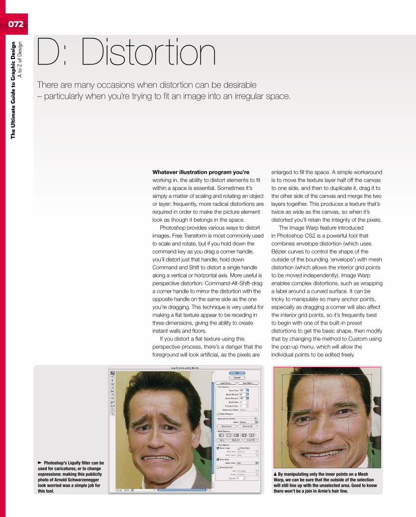
072
TheUltim
ateGuideto
Graphic
Des
ign
Ato
Zof
Design
072
Whatever illustration program you’reworking in, the ability to distort elements to fitwithin a space is essential. Sometimes it’ssimply a matter of scaling and rotating an objector layer; frequently, more radical distortions arerequired in order to make the picture elementlook as though it belongs in the space.
Photoshop provides various ways to distortimages. Free Transform is most commonly usedto scale and rotate, but if you hold down thecommand key as you drag a corner handle,you’ll distort just that handle; hold downCommand and Shift to distort a single handlealong a vertical or horizontal axis. More useful isperspective distortion: Command-Alt-Shift-draga corner handle to mirror the distortion with theopposite handle on the same side as the oneyou’re dragging. This technique is very useful formaking a flat texture appear to be receding inthree dimensions, giving the ability to createinstant walls and floors.
If you distort a flat texture using thisperspective process, there’s a danger that theforeground will look artificial, as the pixels are
D: Distortion
enlarged to fill the space. A simple workaroundis to move the texture layer half off the canvasto one side, and then to duplicate it, drag it tothe other side of the canvas and merge the twolayers together. This produces a texture that’stwice as wide as the canvas, so when it’sdistorted you’ll retain the integrity of the pixels.
The Image Warp feature introducedin Photoshop CS2 is a powerful tool thatcombines envelope distortion (which usesBézier curves to control the shape of theoutside of the bounding ‘envelope’) with meshdistortion (which allows the interior grid pointsto be moved independently). Image Warpenables complex distortions, such as wrappinga label around a curved surface. It can betricky to manipulate so many anchor points,especially as dragging a corner will also affectthe interior grid points, so it’s frequently bestto begin with one of the built-in presetdistortions to get the basic shape, then modifythat by changing the method to Custom usingthe pop-up menu, which will allow theindividual points to be edited freely.
Photoshop’s Liquify filter can beused for caricatures, or to changeexpressions: making this publicityphoto of Arnold Schwarzeneggerlook worried was a simple job forthis tool.
By manipulating only the inner points on a MeshWarp, we can be sure that the outside of the selectionwill still line up with the unselected area. Good to knowthere won’t be a join in Arnie’s hair line.
There are many occasions when distortion can be desirable– particularly when you’re trying to fit an image into an irregular space.
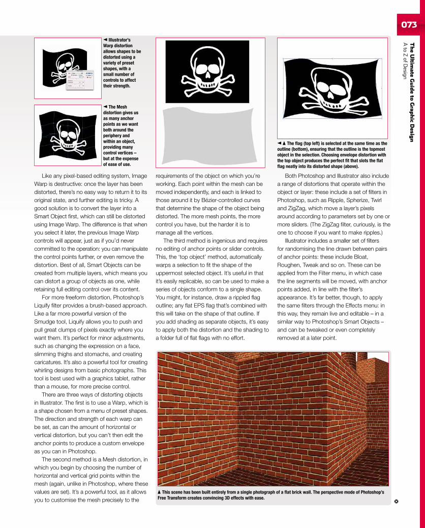
TheUltim
ateGuideto
Grap
hic
Desig
nAto
ZofD
esign073073
Like any pixel-based editing system, ImageWarp is destructive: once the layer has beendistorted, there’s no easy way to return it to itsoriginal state, and further editing is tricky. Agood solution is to convert the layer into aSmart Object first, which can still be distortedusing Image Warp. The difference is that whenyou select it later, the previous Image Warpcontrols will appear, just as if you’d nevercommitted to the operation: you can manipulatethe control points further, or even remove thedistortion. Best of all, Smart Objects can becreated from multiple layers, which means youcan distort a group of objects as one, whileretaining full editing control over its content.
For more freeform distortion, Photoshop’sLiquify filter provides a brush-based approach.Like a far more powerful version of theSmudge tool, Liquify allows you to push andpull great clumps of pixels exactly where youwant them. It’s perfect for minor adjustments,such as changing the expression on a face,slimming thighs and stomachs, and creatingcaricatures. It’s also a powerful tool for creatingwhirling designs from basic photographs. Thistool is best used with a graphics tablet, ratherthan a mouse, for more precise control.
There are three ways of distorting objectsin Illustrator. The first is to use a Warp, which isa shape chosen from a menu of preset shapes.The direction and strength of each warp canbe set, as can the amount of horizontal orvertical distortion, but you can’t then edit theanchor points to produce a custom envelopeas you can in Photoshop.
The second method is a Mesh distortion, inwhich you begin by choosing the number ofhorizontal and vertical grid points within themesh (again, unlike in Photoshop, where thesevalues are set). It’s a powerful tool, as it allowsyou to customise the mesh precisely to the
requirements of the object on which you’reworking. Each point within the mesh can bemoved independently, and each is linked tothose around it by Bézier-controlled curvesthat determine the shape of the object beingdistorted. The more mesh points, the morecontrol you have, but the harder it is tomanage all the vertices.
The third method is ingenious and requiresno editing of anchor points or slider controls.This, the ‘top object’ method, automaticallywarps a selection to fit the shape of theuppermost selected object. It’s useful in thatit’s easily replicable, so can be used to make aseries of objects conform to a single shape.You might, for instance, draw a rippled flagoutline; any flat EPS flag that’s combined withthis will take on the shape of that outline. Ifyou add shading as separate objects, it’s easyto apply both the distortion and the shading toa folder full of flat flags with no effort.
Both Photoshop and Illustrator also includea range of distortions that operate within theobject or layer: these include a set of filters inPhotoshop, such as Ripple, Spherize, Twirland ZigZag, which move a layer’s pixelsaround according to parameters set by one ormore sliders. (The ZigZag filter, curiously, is theone to choose if you want to make ripples.)
Illustrator includes a smaller set of filtersfor randomising the line drawn between pairsof anchor points: these include Bloat,Roughen, Tweak and so on. These can beapplied from the Filter menu, in which casethe line segments will be moved, with anchorpoints added, in line with the filter’sappearance. It’s far better, though, to applythe same filters through the Effects menu: inthis way, they remain live and editable – in asimilar way to Photoshop’s Smart Objects –and can be tweaked or even completelyremoved at a later point.
This scene has been built entirely from a single photograph of a flat brick wall. The perspective mode of Photoshop’sFree Transform creates convincing 3D effects with ease.
The flag (top left) is selected at the same time as theoutline (bottom), ensuring that the outline is the topmostobject in the selection. Choosing envelope distortion withthe top object produces the perfect fit that slots the flatflag neatly into its distorted shape (above).
The Meshdistortion gives usas many anchorpoints as we wantboth around theperiphery andwithin an object,providing manycontrol vertices –but at the expenseof ease of use.
Illustrator’sWarp distortionallows shapes to bedistorted using avariety of presetshapes, with asmall number ofcontrols to affecttheir strength.
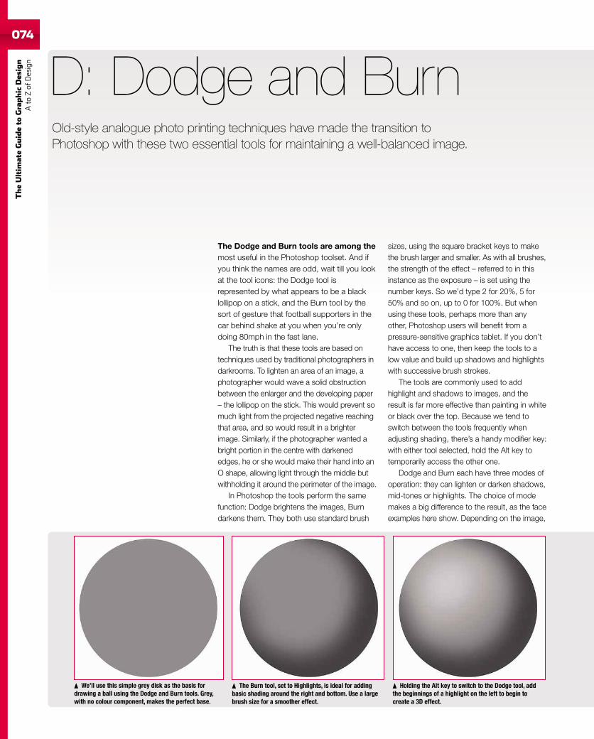
074
TheUltim
ateGuideto
Graphic
Des
ign
Ato
Zof
Design
The Dodge and Burn tools are among themost useful in the Photoshop toolset. And ifyou think the names are odd, wait till you lookat the tool icons: the Dodge tool isrepresented by what appears to be a blacklollipop on a stick, and the Burn tool by thesort of gesture that football supporters in thecar behind shake at you when you’re onlydoing 80mph in the fast lane.
The truth is that these tools are based ontechniques used by traditional photographers indarkrooms. To lighten an area of an image, aphotographer would wave a solid obstructionbetween the enlarger and the developing paper– the lollipop on the stick. This would prevent somuch light from the projected negative reachingthat area, and so would result in a brighterimage. Similarly, if the photographer wanted abright portion in the centre with darkenededges, he or she would make their hand into anO shape, allowing light through the middle butwithholding it around the perimeter of the image.
In Photoshop the tools perform the samefunction: Dodge brightens the images, Burndarkens them. They both use standard brush
D: Dodge and Burn
sizes, using the square bracket keys to makethe brush larger and smaller. As with all brushes,the strength of the effect – referred to in thisinstance as the exposure – is set using thenumber keys. So we’d type 2 for 20%, 5 for50% and so on, up to 0 for 100%. But whenusing these tools, perhaps more than anyother, Photoshop users will benefit from apressure-sensitive graphics tablet. If you don’thave access to one, then keep the tools to alow value and build up shadows and highlightswith successive brush strokes.
The tools are commonly used to addhighlight and shadows to images, and theresult is far more effective than painting in whiteor black over the top. Because we tend toswitch between the tools frequently whenadjusting shading, there’s a handy modifier key:with either tool selected, hold the Alt key totemporarily access the other one.
Dodge and Burn each have three modes ofoperation: they can lighten or darken shadows,mid-tones or highlights. The choice of modemakes a big difference to the result, as the faceexamples here show. Depending on the image,
We’ll use this simple grey disk as the basis fordrawing a ball using the Dodge and Burn tools. Grey,with no colour component, makes the perfect base.
The Burn tool, set to Highlights, is ideal for addingbasic shading around the right and bottom. Use a largebrush size for a smoother effect.
Holding the Alt key to switch to the Dodge tool, addthe beginnings of a highlight on the left to begin tocreate a 3D effect.
Old-style analogue photo printing techniques have made the transition toPhotoshop with these two essential tools for maintaining a well-balanced image.
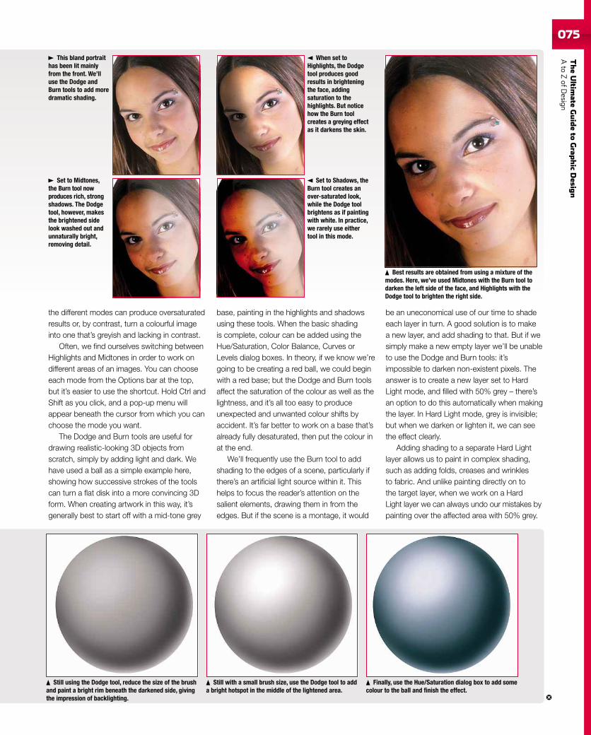
TheUltim
ateGuideto
Grap
hic
Desig
nAto
ZofD
esign075
the different modes can produce oversaturatedresults or, by contrast, turn a colourful imageinto one that’s greyish and lacking in contrast.
Often, we find ourselves switching betweenHighlights and Midtones in order to work ondifferent areas of an images. You can chooseeach mode from the Options bar at the top,but it’s easier to use the shortcut. Hold Ctrl andShift as you click, and a pop-up menu willappear beneath the cursor from which you canchoose the mode you want.
The Dodge and Burn tools are useful fordrawing realistic-looking 3D objects fromscratch, simply by adding light and dark. Wehave used a ball as a simple example here,showing how successive strokes of the toolscan turn a flat disk into a more convincing 3Dform. When creating artwork in this way, it’sgenerally best to start off with a mid-tone grey
base, painting in the highlights and shadowsusing these tools. When the basic shadingis complete, colour can be added using theHue/Saturation, Color Balance, Curves orLevels dialog boxes. In theory, if we know we’regoing to be creating a red ball, we could beginwith a red base; but the Dodge and Burn toolsaffect the saturation of the colour as well as thelightness, and it’s all too easy to produceunexpected and unwanted colour shifts byaccident. It’s far better to work on a base that’salready fully desaturated, then put the colour inat the end.
We’ll frequently use the Burn tool to addshading to the edges of a scene, particularly ifthere’s an artificial light source within it. Thishelps to focus the reader’s attention on thesalient elements, drawing them in from theedges. But if the scene is a montage, it would
Still using the Dodge tool, reduce the size of the brushand paint a bright rim beneath the darkened side, givingthe impression of backlighting.
Still with a small brush size, use the Dodge tool to adda bright hotspot in the middle of the lightened area.
Finally, use the Hue/Saturation dialog box to add somecolour to the ball and finish the effect.
be an uneconomical use of our time to shadeeach layer in turn. A good solution is to makea new layer, and add shading to that. But if wesimply make a new empty layer we’ll be unableto use the Dodge and Burn tools: it’simpossible to darken non-existent pixels. Theanswer is to create a new layer set to HardLight mode, and filled with 50% grey – there’san option to do this automatically when makingthe layer. In Hard Light mode, grey is invisible;but when we darken or lighten it, we can seethe effect clearly.
Adding shading to a separate Hard Lightlayer allows us to paint in complex shading,such as adding folds, creases and wrinklesto fabric. And unlike painting directly on tothe target layer, when we work on a HardLight layer we can always undo our mistakes bypainting over the affected area with 50% grey.
This bland portraithas been lit mainlyfrom the front. We’lluse the Dodge andBurn tools to add moredramatic shading.
When set toHighlights, the Dodgetool produces goodresults in brighteningthe face, addingsaturation to thehighlights. But noticehow the Burn toolcreates a greying effectas it darkens the skin.
Set to Midtones,the Burn tool nowproduces rich, strongshadows. The Dodgetool, however, makesthe brightened sidelook washed out andunnaturally bright,removing detail.
Set to Shadows, theBurn tool creates anover-saturated look,while the Dodge toolbrightens as if paintingwith white. In practice,we rarely use eithertool in this mode.
Best results are obtained from using a mixture of themodes. Here, we’ve used Midtones with the Burn tool todarken the left side of the face, and Highlights with theDodge tool to brighten the right side.
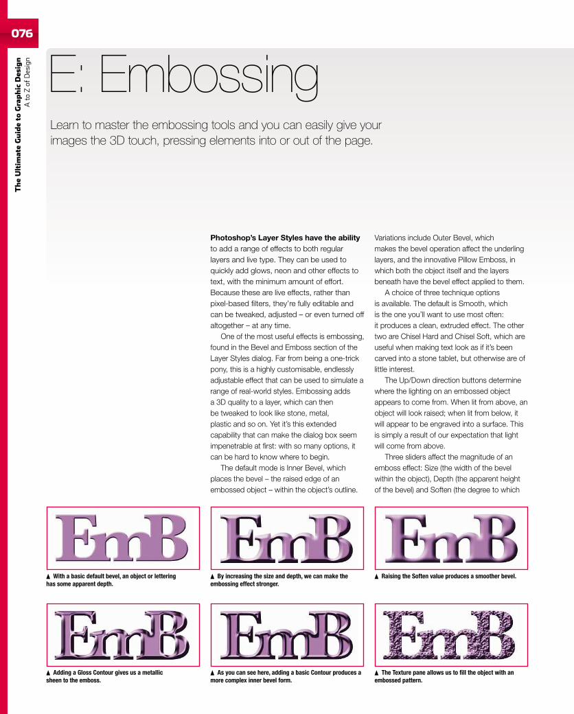
076
TheUltim
ateGuideto
Graphic
Des
ign
Ato
Zof
Design
076
Photoshop’s Layer Styles have the abilityto add a range of effects to both regularlayers and live type. They can be used toquickly add glows, neon and other effects totext, with the minimum amount of effort.Because these are live effects, rather thanpixel-based filters, they’re fully editable andcan be tweaked, adjusted – or even turned offaltogether – at any time.
One of the most useful effects is embossing,found in the Bevel and Emboss section of theLayer Styles dialog. Far from being a one-trickpony, this is a highly customisable, endlesslyadjustable effect that can be used to simulate arange of real-world styles. Embossing addsa 3D quality to a layer, which can thenbe tweaked to look like stone, metal,plastic and so on. Yet it’s this extendedcapability that can make the dialog box seemimpenetrable at first: with so many options, itcan be hard to know where to begin.
The default mode is Inner Bevel, whichplaces the bevel – the raised edge of anembossed object – within the object’s outline.
E: Embossing
Variations include Outer Bevel, whichmakes the bevel operation affect the underlinglayers, and the innovative Pillow Emboss, inwhich both the object itself and the layersbeneath have the bevel effect applied to them.
A choice of three technique optionsis available. The default is Smooth, whichis the one you’ll want to use most often:it produces a clean, extruded effect. The othertwo are Chisel Hard and Chisel Soft, which areuseful when making text look as if it’s beencarved into a stone tablet, but otherwise are oflittle interest.
The Up/Down direction buttons determinewhere the lighting on an embossed objectappears to come from. When lit from above, anobject will look raised; when lit from below, itwill appear to be engraved into a surface. Thisis simply a result of our expectation that lightwill come from above.
Three sliders affect the magnitude of anemboss effect: Size (the width of the bevelwithin the object), Depth (the apparent heightof the bevel) and Soften (the degree to which
Adding a Gloss Contour gives us a metallicsheen to the emboss.
As you can see here, adding a basic Contour produces amore complex inner bevel form.
The Texture pane allows us to fill the object with anembossed pattern.
By increasing the size and depth, we can make theembossing effect stronger.
With a basic default bevel, an object or letteringhas some apparent depth.
Raising the Soften value produces a smoother bevel.
Learn to master the embossing tools and you can easily give yourimages the 3D touch, pressing elements into or out of the page.
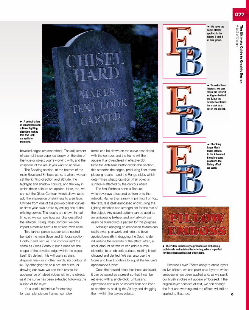
TheUltim
ateGuideto
Grap
hic
Desig
nAto
ZofD
esign077077
bevelled edges are smoothed). The adjustmentof each of these depends largely on the size ofthe type or object you’re working with, and thecrispness of the result you want to achieve.
The Shading section, at the bottom of themain Bevel and Emboss pane, is where we canset the lighting direction and altitude, thehighlight and shadow colours, and the way inwhich these colours are applied. Here, too, wecan set the Gloss Contour, which allows us toadd the impression of shininess to a surface.Choose from one of the pop-up preset curves,or draw your own profile by editing one of theexisting curves. The results are shown in realtime, so we can see how our changes affectthe artwork. Using Gloss Contour, we canimpart a metallic flavour to artwork with ease.
Two further panes appear to be nestedbeneath the main Bevel and Emboss section:Contour and Texture. The contour isn’t thesame as Gloss Contour, but it does set theshape of the bevelled edge within the objectitself. By default, this will use a straight,diagonal line – or in other words, no contour atall. By changing this to a pre-set curve, ordrawing our own, we can then create theappearance of raised ridges within the object,as if the curve has been extruded following theoutline of the layer.
It’s a useful technique for creating,for example, picture frames: complex
forms can be drawn on the curve associatedwith the contour, and the frame will thenappear lit and rendered in effective 3D.Note the Anti-Alias button within this section:this smooths the edges, producing finer, morepleasing results – and the Range slider, whichdetermines what proportion of an object’ssurface is affected by the contour effect.
The final Emboss pane is Texture,which overlays a textured pattern onto theartwork. Rather than simply imprinting it on top,the texture is itself embossed and lit using thelighting direction and strength set for the rest ofthe object. Any saved pattern can be used asan embossing texture, and any artwork caneasily be turned into a pattern for this purpose.
Although applying an embossed texture caneasily swamp artwork and hide the bevelapplied beneath it, dragging the Depth sliderwill reduce the intensity of the effect: often, asmall amount of texture can add a subtledistortion to an object’s surface, making it lookchipped and dented. We can also use theScale and Invert controls to adjust the texture’sappearance further.
Once the desired effect has been achieved,it can be saved as a preset so that it can beretrieved with a single click. Embossingoperations can also be copied from one layerto another by holding the Alt key and draggingthem within the Layers palette.
Because Layer Effects apply to entire layersas live effects, we can paint on a layer to whichembossing has been applied and, as we paint,our brush strokes will appear embossed. If theoriginal layer consists of text, we can changethe font and wording and the effects will still beapplied to that, too.
We have thesame effectsapplied to theletters E and Bin this group.
To make theminteract, we canmask the letter Bso it goes behindthe E, but thebevel effect treatsthe mask as acut in the object.
CheckingLayer MaskHides Effectsin the AdvancedBlending paneproduces thehiding effectwe want.
A combinationof Chisel Hard anda Down lightingdirection makesthis text lookcarved intothe stone.
The Pillow Emboss style produces an embossingboth inside and outside the lettering, which is perfectfor this embossed leather-effect look.
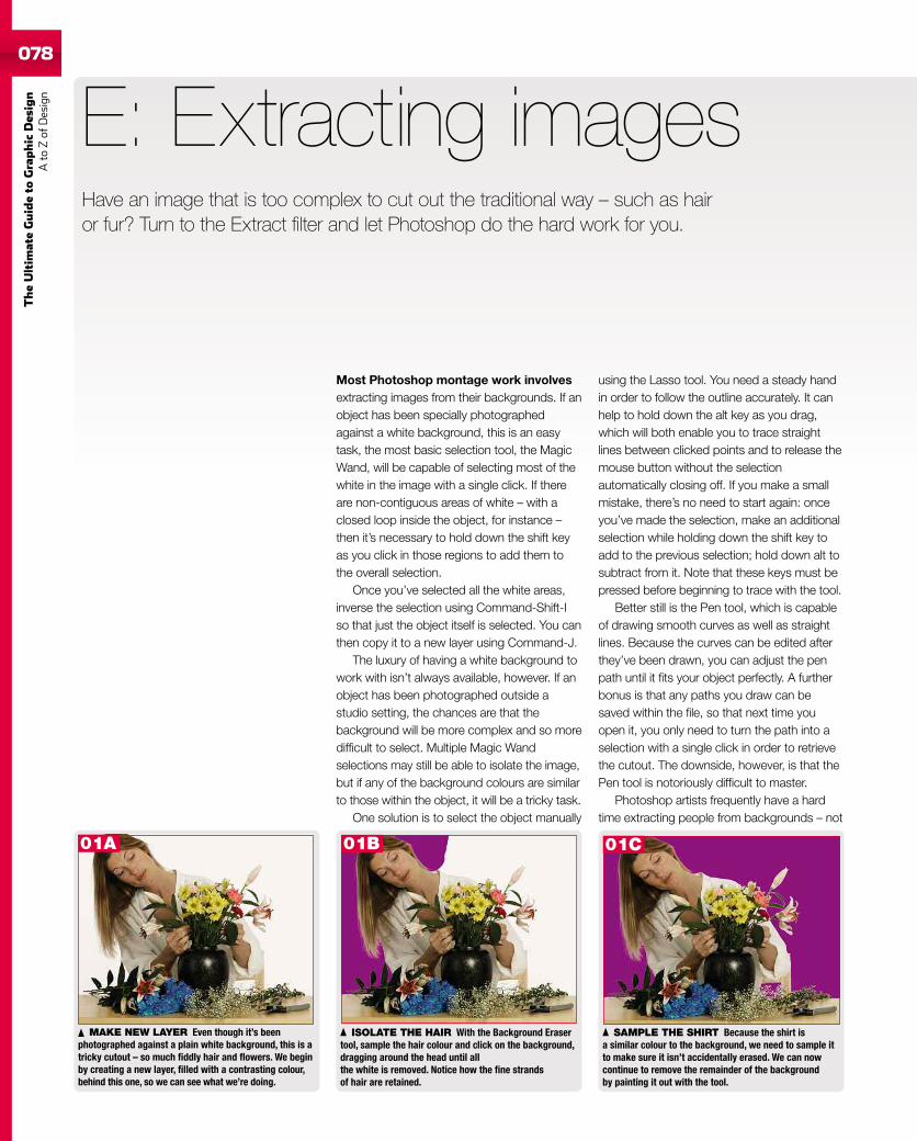
078
TheUltim
ateGuideto
Graphic
Des
ign
Ato
Zof
Design
Most Photoshop montage work involvesextracting images from their backgrounds. If anobject has been specially photographedagainst a white background, this is an easytask, the most basic selection tool, the MagicWand, will be capable of selecting most of thewhite in the image with a single click. If thereare non-contiguous areas of white – with aclosed loop inside the object, for instance –then it’s necessary to hold down the shift keyas you click in those regions to add them tothe overall selection.
Once you’ve selected all the white areas,inverse the selection using Command-Shift-Iso that just the object itself is selected. You canthen copy it to a new layer using Command-J.
The luxury of having a white background towork with isn’t always available, however. If anobject has been photographed outside astudio setting, the chances are that thebackground will be more complex and so moredifficult to select. Multiple Magic Wandselections may still be able to isolate the image,but if any of the background colours are similarto those within the object, it will be a tricky task.
One solution is to select the object manually
E: Extracting images
using the Lasso tool. You need a steady handin order to follow the outline accurately. It canhelp to hold down the alt key as you drag,which will both enable you to trace straightlines between clicked points and to release themouse button without the selectionautomatically closing off. If you make a smallmistake, there’s no need to start again: onceyou’ve made the selection, make an additionalselection while holding down the shift key toadd to the previous selection; hold down alt tosubtract from it. Note that these keys must bepressed before beginning to trace with the tool.
Better still is the Pen tool, which is capableof drawing smooth curves as well as straightlines. Because the curves can be edited afterthey’ve been drawn, you can adjust the penpath until it fits your object perfectly. A furtherbonus is that any paths you draw can besaved within the file, so that next time youopen it, you only need to turn the path into aselection with a single click in order to retrievethe cutout. The downside, however, is that thePen tool is notoriously difficult to master.
Photoshop artists frequently have a hardtime extracting people from backgrounds – not
MAKE NEW LAYER Even though it’s beenphotographed against a plain white background, this is atricky cutout – so much fiddly hair and flowers. We beginby creating a new layer, filled with a contrasting colour,behind this one, so we can see what we’re doing.
ISOLATE THE HAIR With the Background Erasertool, sample the hair colour and click on the background,dragging around the head until allthe white is removed. Notice how the fine strandsof hair are retained.
SAMPLE THE SHIRT Because the shirt isa similar colour to the background, we need to sample itto make sure it isn’t accidentally erased. We can nowcontinue to remove the remainder of the backgroundby painting it out with the tool.
Have an image that is too complex to cut out the traditional way – such as hairor fur? Turn to the Extract filter and let Photoshop do the hard work for you.
01A 01B 01C
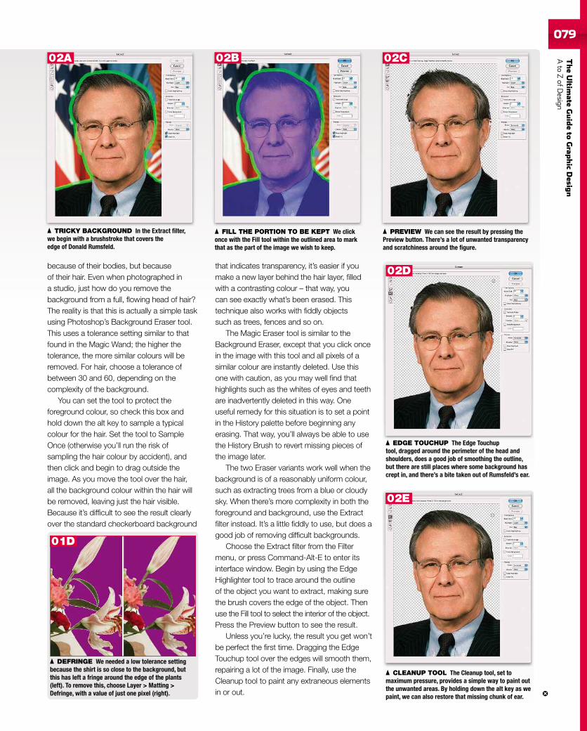
TheUltim
ateGuideto
Grap
hic
Desig
nAto
ZofD
esign079
because of their bodies, but becauseof their hair. Even when photographed ina studio, just how do you remove thebackground from a full, flowing head of hair?The reality is that this is actually a simple taskusing Photoshop’s Background Eraser tool.This uses a tolerance setting similar to thatfound in the Magic Wand; the higher thetolerance, the more similar colours will beremoved. For hair, choose a tolerance ofbetween 30 and 60, depending on thecomplexity of the background.
You can set the tool to protect theforeground colour, so check this box andhold down the alt key to sample a typicalcolour for the hair. Set the tool to SampleOnce (otherwise you’ll run the risk ofsampling the hair colour by accident), andthen click and begin to drag outside theimage. As you move the tool over the hair,all the background colour within the hair willbe removed, leaving just the hair visible.Because it’s difficult to see the result clearlyover the standard checkerboard background
that indicates transparency, it’s easier if youmake a new layer behind the hair layer, filledwith a contrasting colour – that way, youcan see exactly what’s been erased. Thistechnique also works with fiddly objectssuch as trees, fences and so on.
The Magic Eraser tool is similar to theBackground Eraser, except that you click oncein the image with this tool and all pixels of asimilar colour are instantly deleted. Use thisone with caution, as you may well find thathighlights such as the whites of eyes and teethare inadvertently deleted in this way. Oneuseful remedy for this situation is to set a pointin the History palette before beginning anyerasing. That way, you’ll always be able to usethe History Brush to revert missing pieces ofthe image later.
The two Eraser variants work well when thebackground is of a reasonably uniform colour,such as extracting trees from a blue or cloudysky. When there’s more complexity in both theforeground and background, use the Extractfilter instead. It’s a little fiddly to use, but does agood job of removing difficult backgrounds.
Choose the Extract filter from the Filtermenu, or press Command-Alt-E to enter itsinterface window. Begin by using the EdgeHighlighter tool to trace around the outlineof the object you want to extract, making surethe brush covers the edge of the object. Thenuse the Fill tool to select the interior of the object.Press the Preview button to see the result.
Unless you’re lucky, the result you get won’tbe perfect the first time. Dragging the EdgeTouchup tool over the edges will smooth them,repairing a lot of the image. Finally, use theCleanup tool to paint any extraneous elementsin or out.
DEFRINGE We needed a low tolerance settingbecause the shirt is so close to the background, butthis has left a fringe around the edge of the plants(left). To remove this, choose Layer > Matting >Defringe, with a value of just one pixel (right).
TRICKY BACKGROUND In the Extract filter,we begin with a brushstroke that covers theedge of Donald Rumsfeld.
FILL THE PORTION TO BE KEPT We clickonce with the Fill tool within the outlined area to markthat as the part of the image we wish to keep.
PREVIEW We can see the result by pressing thePreview button. There’s a lot of unwanted transparencyand scratchiness around the figure.
CLEANUP TOOL The Cleanup tool, set tomaximum pressure, provides a simple way to paint outthe unwanted areas. By holding down the alt key as wepaint, we can also restore that missing chunk of ear.
EDGE TOUCHUP The Edge Touchuptool, dragged around the perimeter of the head andshoulders, does a good job of smoothing the outline,but there are still places where some background hascrept in, and there’s a bite taken out of Rumsfeld’s ear.
01D
02A 02B 02C
02D
02E
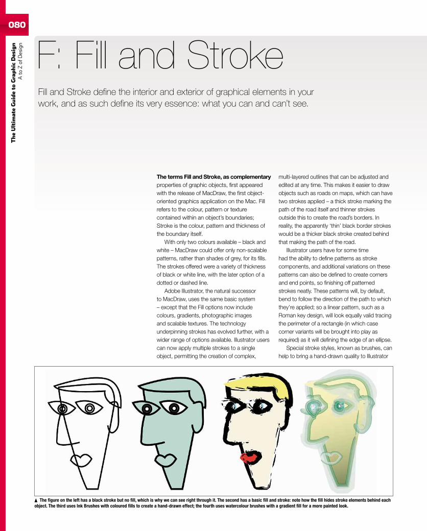
080
TheUltim
ateGuideto
Graphic
Des
ign
Ato
Zof
Design
080
The terms Fill and Stroke, as complementaryproperties of graphic objects, first appearedwith the release of MacDraw, the first object-oriented graphics application on the Mac. Fillrefers to the colour, pattern or texturecontained within an object’s boundaries;Stroke is the colour, pattern and thickness ofthe boundary itself.
With only two colours available – black andwhite – MacDraw could offer only non-scalablepatterns, rather than shades of grey, for its fills.The strokes offered were a variety of thicknessof black or white line, with the later option of adotted or dashed line.
Adobe Illustrator, the natural successorto MacDraw, uses the same basic system– except that the Fill options now includecolours, gradients, photographic imagesand scalable textures. The technologyunderpinning strokes has evolved further, with awider range of options available. Illustrator userscan now apply multiple strokes to a singleobject, permitting the creation of complex,
F: Fill and Stroke
multi-layered outlines that can be adjusted andedited at any time. This makes it easier to drawobjects such as roads on maps, which can havetwo strokes applied – a thick stroke marking thepath of the road itself and thinner strokesoutside this to create the road’s borders. Inreality, the apparently ‘thin’ black border strokeswould be a thicker black stroke created behindthat making the path of the road.
Illustrator users have for some timehad the ability to define patterns as strokecomponents, and additional variations on thesepatterns can also be defined to create cornersand end points, so finishing off patternedstrokes neatly. These patterns will, by default,bend to follow the direction of the path to whichthey’re applied; so a linear pattern, such as aRoman key design, will look equally valid tracingthe perimeter of a rectangle (in which casecorner variants will be brought into play asrequired) as it will defining the edge of an ellipse.
Special stroke styles, known as brushes, canhelp to bring a hand-drawn quality to Illustrator
The figure on the left has a black stroke but no fill, which is why we can see right through it. The second has a basic fill and stroke: note how the fill hides stroke elements behind eachobject. The third uses Ink Brushes with coloured fills to create a hand-drawn effect; the fourth uses watercolour brushes with a gradient fill for a more painted look.
Fill and Stroke define the interior and exterior of graphical elements in yourwork, and as such define its very essence: what you can and can’t see.
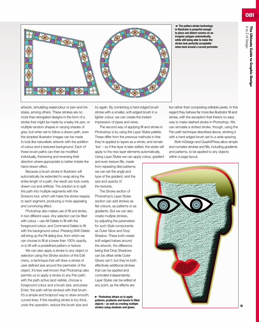
TheUltim
ateGuideto
Grap
hic
Desig
nAto
ZofD
esign081081
artwork, simulating watercolour or pen-and-inkstyles, among others. These strokes are nomore than elongated designs in the form of astroke that might be made by a leaky ink pen, ormultiple random shapes in varying shades ofgrey; but when set to follow a drawn path, eventhe simplest Illustrator images can be madeto look like naturalistic artwork with the additionof colour and a textured background. Each ofthese brush paths can then be modifiedindividually, thickening and reversing theirdirection where appropriate to better imitate thehand-drawn effect.
Because a brush stroke in Illustrator willautomatically be extended to wrap along theentire length of a path, the result can look overlydrawn-out and artificial. The solution is to splitthe path into multiple segments with theScissors tool, which will make the stroke reapplyto each segment, producing a more appealingand convincing effect.
Photoshop also makes use of fill and stroke,in two different ways. Any selection can be filledwith colour – use Alt-Delete to fill with theforeground colour, and Command-Delete to fillwith the background colour. Pressing Shift-Deletewill bring up the Fill dialog box, from which wecan choose to fill at a lower than 100% opacity,or to fill with a predefined pattern or texture.
We can also apply a stroke to any object orselection using the Stroke section of the Editmenu, a technique that will draw a stroke ofuser-defined size around the perimeter of theobject. It’s less well known that Photoshop alsopermits us to apply a stroke to any Pen path:with the path active (and visible), choose aforeground colour and a brush size, and pressEnter; the path will be stroked with that brush.It’s a simple and foolproof way to draw smooth,curved lines. If the resulting stroke is too thick,undo the operation, reduce the brush size and
try again. By combining a hard-edged brushstroke with a smaller, soft-edged brush in alighter colour, we can create the instantimpression of pipes and wires.
The second way of applying fill and stroke inPhotoshop is by using the Layer Styles palette.These differ from the previous methods in thatthey’re applied to layers as a whole, and remain‘live’ – so if the layer is later edited, the styles willapply to the new layer elements automatically.Using Layer Styles we can apply colour, gradientand even texture fills, madefrom repeating tiled patterns;we can set the angle andtype of the gradient, and thesize and opacity ofthe textures.
The Stroke section ofPhotoshop’s Layer Stylessection can add strokes asflat colours, as patterns or asgradients. But we can alsocreate multiple strokes,by adjusting the parametersfor such Style componentsas Outer Glow and DropShadow. These both createsoft-edged haloes aroundthe artwork, the differencebeing that Drop Shadowscan be offset while OuterGlows can’t; but they’re botheffectively additional strokesthat can be applied andcontrolled independently.Layer Styles can be edited atany point, as the effects are
live rather than comprising editable pixels. In thisregard they behave far more like Illustrator fill andstroke, with the exception that there’s no easyway to make dashed stroke in Photoshop. Wecan simulate a dotted stroke, though, using thePen path technique described above, stroking itwith a hard-edged brush set to a wide spacing.
Both InDesign and QuarkXPress allow simpleand complex strokes and fills, including gradientsand patterns, to be applied to any objectswithin a page layout.
The pattern stroke technologyin Illustrator is powerful enoughto place and distort corners on anirregular polygon automatically,while still being able to make thestroke look perfectly acceptablewhen bent around a curved perimeter.
Photoshop allows us to applypatterns, gradients and bevels to filledobjects – as well as creating multiplestrokes using shadows and glows.
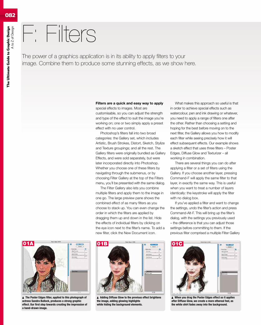
082
TheUltim
ateGuideto
Graphic
Des
ign
Ato
Zof
Design
Filters are a quick and easy way to applyspecial effects to images. Most arecustomisable, so you can adjust the strengthand type of the effect to suit the image you’reworking on; one or two simply apply a preseteffect with no user control.
Photoshop’s filters fall into two broadcategories: the Gallery set, which includesArtistic, Brush Strokes, Distort, Sketch, Stylizeand Texture groupings; and all the rest. TheGallery filters were originally bundled as GalleryEffects, and were sold separately, but werelater incorporated directly into Photoshop.Whether you choose one of these filters bynavigating through the submenus, or bychoosing Filter Gallery at the top of the Filtersmenu, you’ll be presented with the same dialog.
The Filter Gallery also lets you combinemultiple filters and apply them to the image inone go. The large preview pane shows thecombined effect of as many filters as youchoose to stack up. You can even change theorder in which the filters are applied bydragging them up and down in the list. Hidethe effects of individual filters by clicking onthe eye icon next to the filter’s name. To add anew filter, click the New Document icon.
F: Filters
What makes this approach so useful is thatin order to achieve special effects such aswatercolour, pen and ink drawing or whatever,you need to apply a range of filters one afterthe other. Rather than choosing a setting andhoping for the best before moving on to thenext filter, the Gallery allows you how to modifyeach filter while seeing precisely how it willeffect subsequent effects. Our example showsa sketch effect that uses three filters – PosterEdges, Diffuse Glow and Texturizer – allworking in combination.
There are several things you can do afterapplying a filter or a set of filters using theGallery. If you choose another layer, pressingCommand-F will apply the same filter to thatlayer, in exactly the same way. This is usefulwhen you want to treat a number of layersidentically: the keystroke will apply the filterwith no dialog box.
If you’ve applied a filter and want to changethe settings, undo the filter’s action and pressCommand-Alt-F. This will bring up the filter’sdialog, with the settings you previously used– the difference is that you can adjust thosesettings before committing to them. If theprevious filter comprised a multiple Filter Gallery
The Poster Edges filter, applied to this photograph ofactress Sandra Bullock, produces a strong graphiceffect. Our first step towards creating the impression ofa hand-drawn image.
Adding Diffuse Glow to the previous effect brightensthe image, adding glowing highlightswhile hiding the background elements.
When you drag the Poster Edges effect so it appliesafter Diffuse Glow, we create a more ethereal feel, asthe white shirt fades away into the background.
The power of a graphics application is in its ability to apply filters to yourimage. Combine them to produce some stunning effects, as we show here.
01A 01B 01C
TheUltim
ateGuideto
Grap
hic
Desig
nAto
ZofD
esign083
stack, pressing this combination will load upthe Gallery window with all the filters lined up asthey were the last time you used them.
There’s a third, very useful option:immediately after applying any filter, chooseUndo and press Command-Shift-F to bring upthe Fade dialog. This reapplies the filter exactlyas before, but with a slider that enables you tofade the effect of the filter: dragging to the leftwill reduce the strength, allowing more of theoriginal layer to show through. In addition, andmost usefully, you can change the mode inwhich the filter was applied using Photoshop’sstandard light modes: Screen, Multiply, HardLight and so on. Because you can see theeffect of changing to each of these modesbefore you commit to any of them, it’s easy tostep through the different modes until you findone that does the job you want. The Fadecommand means you can greatly enhanceeach filter’s range of operation using this rangeof extra settings. It’s worth noting that you caninvoke the Fade command after any brushstroke or adjustment, too.
While most of Photoshop’s filters use thecolour of the original image, most of thosegrouped under the Sketch menu (with the
exception of Chrome and Water paper)instead produce a two-colour effect using theforeground and background colours. Youcan’t change these colours while working inthe dialog, so you have to guess them beforeyou begin. This is another instance where theability to repeat a filter comes in useful. If theeffect isn’t what you want, undo the filter step,adjust the colours and apply the same filteragain. The foreground colour also effects oneor two other filters, such as the leading in theStained Glass filter.
The Texturizer filter applies one of four presettextures to an image, distorting the image so itappears to have been printed on a texturedsurface. You can adjust the lighting direction,and the scale and the strength of the effect,but you can also load other textures to varythe effect. The Patterns folder, inside thePresets folder in your main Photoshop folder,contains a variety of useful textures, and youcan also create your own: any Photoshopdocument can be used as a bump map withinthe Texturizer filter. So if you find, say, thepattern in the default Canvas texture too small
and repetitive, you can substitute it with amuch larger canvas texture of your own for amore convincing result.
Some of the filters make more controllablesubstitutes for other effects. The Thresholdadjustment, for example, turns an image topure black and white, with a slider that setsthe cutoff point between the two. However, itfrequently produces a very harsh effect, so it’sfar better to use the Stamp filter (in the Sketchmenu), which offers the same light/dark balanceslider, but also includes a Smoothness sliderthat can produce clean results with ease. Youcan get similar effects using the Note Paperfilter, which adds both controllable texture andan embossing effect, and the Torn Edges filter,which produces a threshold image withroughened outlines.
Photoshop CS3 and CS4 include SmartFilters, which enable you to adjust theeffect of any filter at a future point. In earlierversions, applying a filter to a Photoshop file isan irrevocable step: make sure you duplicatethe layer first, so you can easily revert to itand adjust the filter settings as required.
Adding Photoshop’s Texturizer filter with the Canvassetting completes the impression of a hand-drawnsketch on canvas.
Using the Fade commandimmediately after the filter,however, allows us to change itsmode: here, Linear Dodge gives usa more magical image.
When we apply a lot of GaussianBlur to this photograph of the HarryPotter train, we appear to havedamaged the image to the extentthat it’s now unrecognisable.
01D
02A
02B
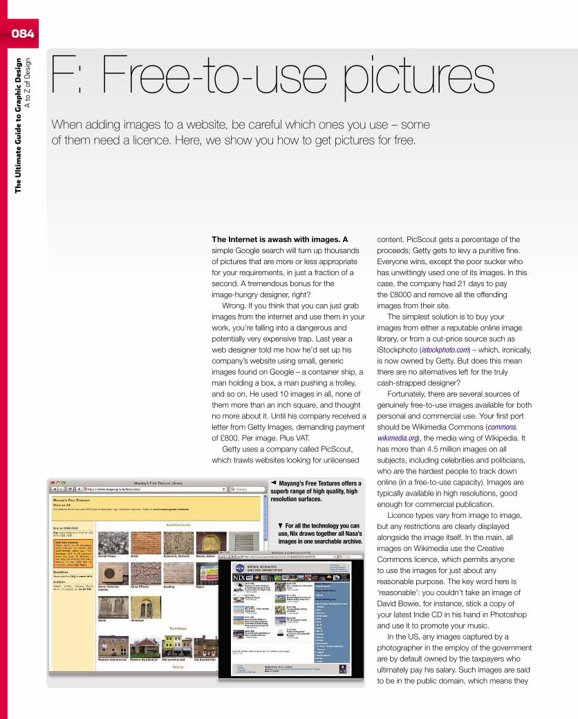
084
TheUltim
ateGuideto
Graphic
Des
ign
Ato
Zof
Design
The Internet is awash with images. Asimple Google search will turn up thousandsof pictures that are more or less appropriatefor your requirements, in just a fraction of asecond. A tremendous bonus for theimage-hungry designer, right?
Wrong. If you think that you can just grabimages from the internet and use them in yourwork, you’re falling into a dangerous andpotentially very expensive trap. Last year aweb designer told me how he’d set up hiscompany’s website using small, genericimages found on Google – a container ship, aman holding a box, a man pushing a trolley,and so on. He used 10 images in all, none ofthem more than an inch square, and thoughtno more about it. Until his company received aletter from Getty Images, demanding paymentof £800. Per image. Plus VAT.
Getty uses a company called PicScout,which trawls websites looking for unlicensed
F: Free-to-use pictures
content. PicScout gets a percentage of theproceeds; Getty gets to levy a punitive fine.Everyone wins, except the poor sucker whohas unwittingly used one of its images. In thiscase, the company had 21 days to paythe £8000 and remove all the offendingimages from their site.
The simplest solution is to buy yourimages from either a reputable online imagelibrary, or from a cut-price source such asiStockphoto (istockphoto.com) – which, ironically,is now owned by Getty. But does this meanthere are no alternatives left for the trulycash-strapped designer?
Fortunately, there are several sources ofgenuinely free-to-use images available for bothpersonal and commercial use. Your first portshould be Wikimedia Commons (commons.wikimedia.org), the media wing of Wikipedia. Ithas more than 4.5 million images on allsubjects, including celebrities and politicians,who are the hardest people to track downonline (in a free-to-use capacity). Images aretypically available in high resolutions, goodenough for commercial publication.
Licence types vary from image to image,but any restrictions are clearly displayedalongside the image itself. In the main, allimages on Wikimedia use the CreativeCommons licence, which permits anyoneto use the images for just about anyreasonable purpose. The key word here is‘reasonable’: you couldn’t take an image ofDavid Bowie, for instance, stick a copy ofyour latest Indie CD in his hand in Photoshopand use it to promote your music.
In the US, any images captured by aphotographer in the employ of the governmentare by default owned by the taxpayers whoultimately pay his salary. Such images are saidto be in the public domain, which means they
When adding images to a website, be careful which ones you use – someof them need a licence. Here, we show you how to get pictures for free.
Mayang’s Free Textures offers asuperb range of high quality, highresolution surfaces.
For all the technology you canuse, Nix draws together all Nasa’simages in one searchable archive.
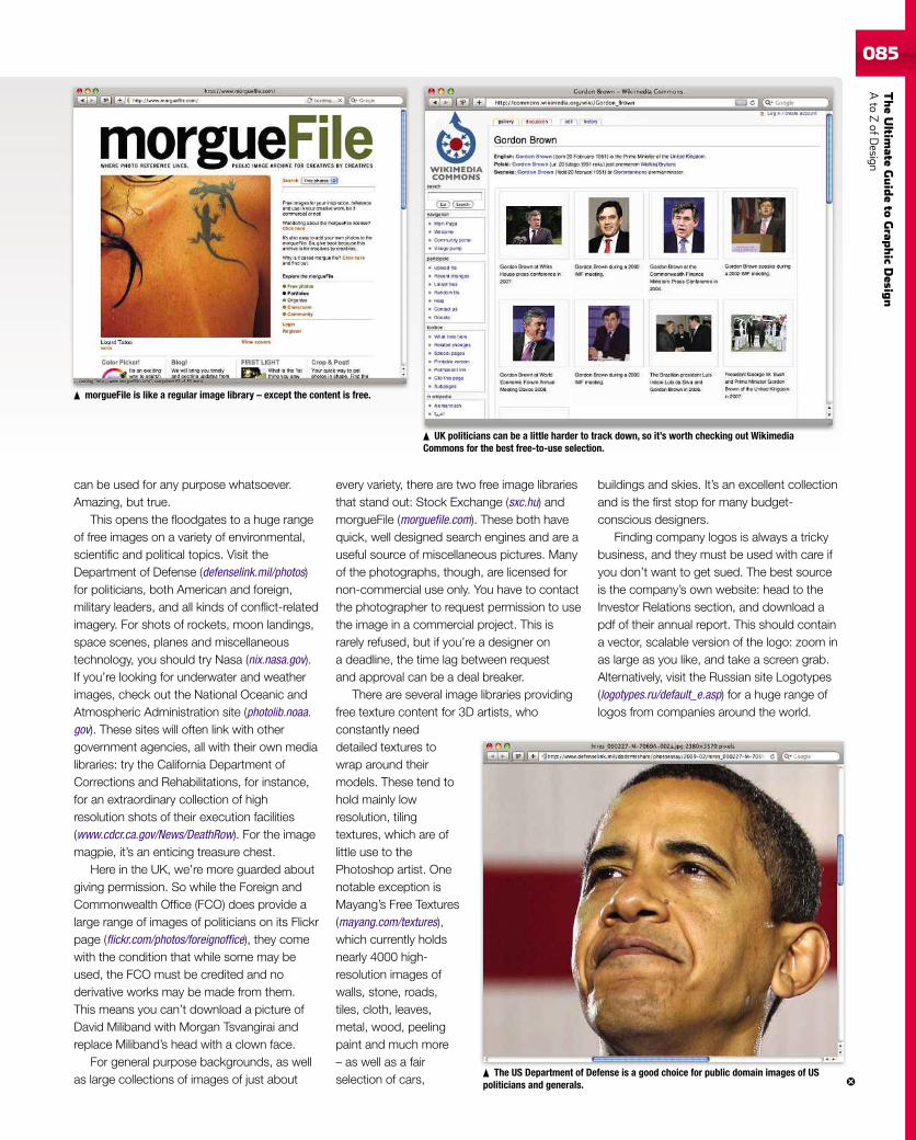
TheUltim
ateGuideto
Grap
hic
Desig
nAto
ZofD
esign085
can be used for any purpose whatsoever.Amazing, but true.
This opens the floodgates to a huge rangeof free images on a variety of environmental,scientific and political topics. Visit theDepartment of Defense (defenselink.mil/photos)for politicians, both American and foreign,military leaders, and all kinds of conflict-relatedimagery. For shots of rockets, moon landings,space scenes, planes and miscellaneoustechnology, you should try Nasa (nix.nasa.gov).If you’re looking for underwater and weatherimages, check out the National Oceanic andAtmospheric Administration site (photolib.noaa.gov). These sites will often link with othergovernment agencies, all with their own medialibraries: try the California Department ofCorrections and Rehabilitations, for instance,for an extraordinary collection of highresolution shots of their execution facilities(www.cdcr.ca.gov/News/DeathRow). For the imagemagpie, it’s an enticing treasure chest.
Here in the UK, we’re more guarded aboutgiving permission. So while the Foreign andCommonwealth Office (FCO) does provide alarge range of images of politicians on its Flickrpage (flickr.com/photos/foreignoffice), they comewith the condition that while some may beused, the FCO must be credited and noderivative works may be made from them.This means you can’t download a picture ofDavid Miliband with Morgan Tsvangirai andreplace Miliband’s head with a clown face.
For general purpose backgrounds, as wellas large collections of images of just about
every variety, there are two free image librariesthat stand out: Stock Exchange (sxc.hu) andmorgueFile (morguefile.com). These both havequick, well designed search engines and are auseful source of miscellaneous pictures. Manyof the photographs, though, are licensed fornon-commercial use only. You have to contactthe photographer to request permission to usethe image in a commercial project. This israrely refused, but if you’re a designer ona deadline, the time lag between requestand approval can be a deal breaker.
There are several image libraries providingfree texture content for 3D artists, whoconstantly needdetailed textures towrap around theirmodels. These tend tohold mainly lowresolution, tilingtextures, which are oflittle use to thePhotoshop artist. Onenotable exception isMayang’s Free Textures(mayang.com/textures),which currently holdsnearly 4000 high-resolution images ofwalls, stone, roads,tiles, cloth, leaves,metal, wood, peelingpaint and much more– as well as a fairselection of cars,
buildings and skies. It’s an excellent collectionand is the first stop for many budget-conscious designers.
Finding company logos is always a trickybusiness, and they must be used with care ifyou don’t want to get sued. The best sourceis the company’s own website: head to theInvestor Relations section, and download apdf of their annual report. This should containa vector, scalable version of the logo: zoom inas large as you like, and take a screen grab.Alternatively, visit the Russian site Logotypes(logotypes.ru/default_e.asp) for a huge range oflogos from companies around the world.
The US Department of Defense is a good choice for public domain images of USpoliticians and generals.
UK politicians can be a little harder to track down, so it’s worth checking out WikimediaCommons for the best free-to-use selection.
morgueFile is like a regular image library – except the content is free.
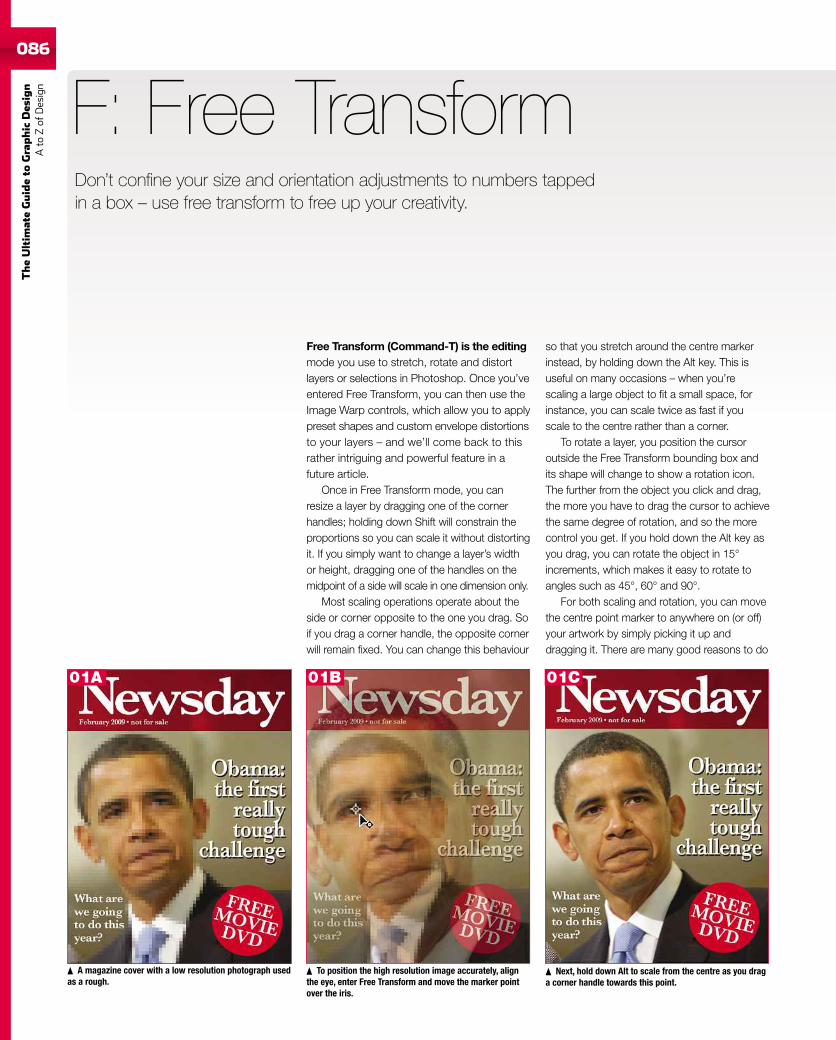
086
TheUltim
ateGuideto
Graphic
Des
ign
Ato
Zof
Design
Free Transform (Command-T) is the editingmode you use to stretch, rotate and distortlayers or selections in Photoshop. Once you’veentered Free Transform, you can then use theImage Warp controls, which allow you to applypreset shapes and custom envelope distortionsto your layers – and we’ll come back to thisrather intriguing and powerful feature in afuture article.
Once in Free Transform mode, you canresize a layer by dragging one of the cornerhandles; holding down Shift will constrain theproportions so you can scale it without distortingit. If you simply want to change a layer’s widthor height, dragging one of the handles on themidpoint of a side will scale in one dimension only.
Most scaling operations operate about theside or corner opposite to the one you drag. Soif you drag a corner handle, the opposite cornerwill remain fixed. You can change this behaviour
F: Free Transform
so that you stretch around the centre markerinstead, by holding down the Alt key. This isuseful on many occasions – when you’rescaling a large object to fit a small space, forinstance, you can scale twice as fast if youscale to the centre rather than a corner.
To rotate a layer, you position the cursoroutside the Free Transform bounding box andits shape will change to show a rotation icon.The further from the object you click and drag,the more you have to drag the cursor to achievethe same degree of rotation, and so the morecontrol you get. If you hold down the Alt key asyou drag, you can rotate the object in 15°increments, which makes it easy to rotate toangles such as 45°, 60° and 90°.
For both scaling and rotation, you can movethe centre point marker to anywhere on (or off)your artwork by simply picking it up anddragging it. There are many good reasons to do
Next, hold down Alt to scale from the centre as you draga corner handle towards this point.
A magazine cover with a low resolution photograph usedas a rough.
To position the high resolution image accurately, alignthe eye, enter Free Transform and move the marker pointover the iris.
Don’t confine your size and orientation adjustments to numbers tappedin a box – use free transform to free up your creativity.
01A 01B 01C
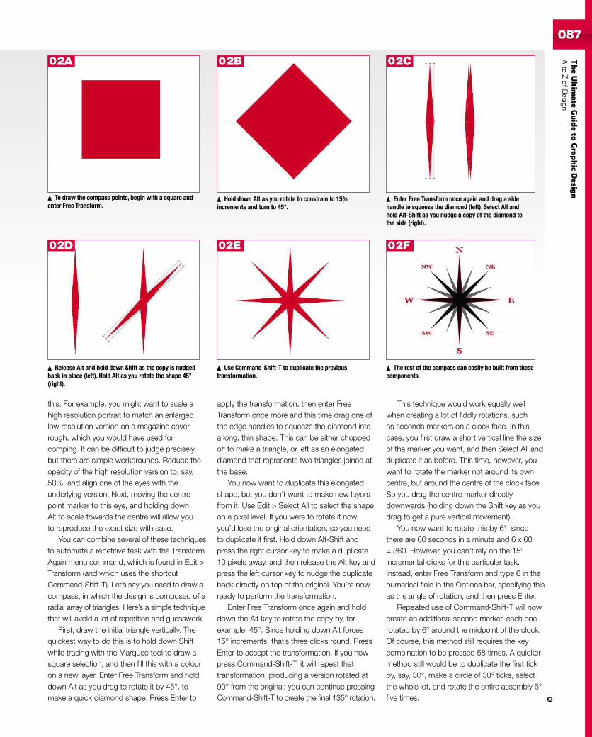
TheUltim
ateGuideto
Grap
hic
Desig
nAto
ZofD
esign087
this. For example, you might want to scale ahigh resolution portrait to match an enlargedlow resolution version on a magazine coverrough, which you would have used forcomping. It can be difficult to judge precisely,but there are simple workarounds. Reduce theopacity of the high resolution version to, say,50%, and align one of the eyes with theunderlying version. Next, moving the centrepoint marker to this eye, and holding downAlt to scale towards the centre will allow youto reproduce the exact size with ease.
You can combine several of these techniquesto automate a repetitive task with the TransformAgain menu command, which is found in Edit >Transform (and which uses the shortcutCommand-Shift-T). Let’s say you need to draw acompass, in which the design is composed of aradial array of triangles. Here’s a simple techniquethat will avoid a lot of repetition and guesswork.
First, draw the initial triangle vertically. Thequickest way to do this is to hold down Shiftwhile tracing with the Marquee tool to draw asquare selection, and then fill this with a colouron a new layer. Enter Free Transform and holddown Alt as you drag to rotate it by 45°, tomake a quick diamond shape. Press Enter to
apply the transformation, then enter FreeTransform once more and this time drag one ofthe edge handles to squeeze the diamond intoa long, thin shape. This can be either choppedoff to make a triangle, or left as an elongateddiamond that represents two triangles joined atthe base.
You now want to duplicate this elongatedshape, but you don’t want to make new layersfrom it. Use Edit > Select All to select the shapeon a pixel level. If you were to rotate it now,you’d lose the original orientation, so you needto duplicate it first. Hold down Alt-Shift andpress the right cursor key to make a duplicate10 pixels away, and then release the Alt key andpress the left cursor key to nudge the duplicateback directly on top of the original. You’re nowready to perform the transformation.
Enter Free Transform once again and holddown the Alt key to rotate the copy by, forexample, 45°. Since holding down Alt forces15° increments, that’s three clicks round. PressEnter to accept the transformation. If you nowpress Command-Shift-T, it will repeat thattransformation, producing a version rotated at90° from the original; you can continue pressingCommand-Shift-T to create the final 135° rotation.
This technique would work equally wellwhen creating a lot of fiddly rotations, suchas seconds markers on a clock face. In thiscase, you first draw a short vertical line the sizeof the marker you want, and then Select All andduplicate it as before. This time, however, youwant to rotate the marker not around its owncentre, but around the centre of the clock face.So you drag the centre marker directlydownwards (holding down the Shift key as youdrag to get a pure vertical movement).
You now want to rotate this by 6°, sincethere are 60 seconds in a minute and 6 x 60= 360. However, you can’t rely on the 15°incremental clicks for this particular task.Instead, enter Free Transform and type 6 in thenumerical field in the Options bar, specifying thisas the angle of rotation, and then press Enter.
Repeated use of Command-Shift-T will nowcreate an additional second marker, each onerotated by 6° around the midpoint of the clock.Of course, this method still requires the keycombination to be pressed 58 times. A quickermethod still would be to duplicate the first tickby, say, 30°, make a circle of 30° ticks, selectthe whole lot, and rotate the entire assembly 6°five times.
To draw the compass points, begin with a square andenter Free Transform.
Hold down Alt as you rotate to constrain to 15%increments and turn to 45°.
Enter Free Transform once again and drag a sidehandle to squeeze the diamond (left). Select All andhold Alt-Shift as you nudge a copy of the diamond tothe side (right).
Release Alt and hold down Shift as the copy is nudgedback in place (left). Hold Alt as you rotate the shape 45°(right).
Use Command-Shift-T to duplicate the previoustransformation.
The rest of the compass can easily be built from thesecomponents.
02A 02B
02D 02E
02C
02F
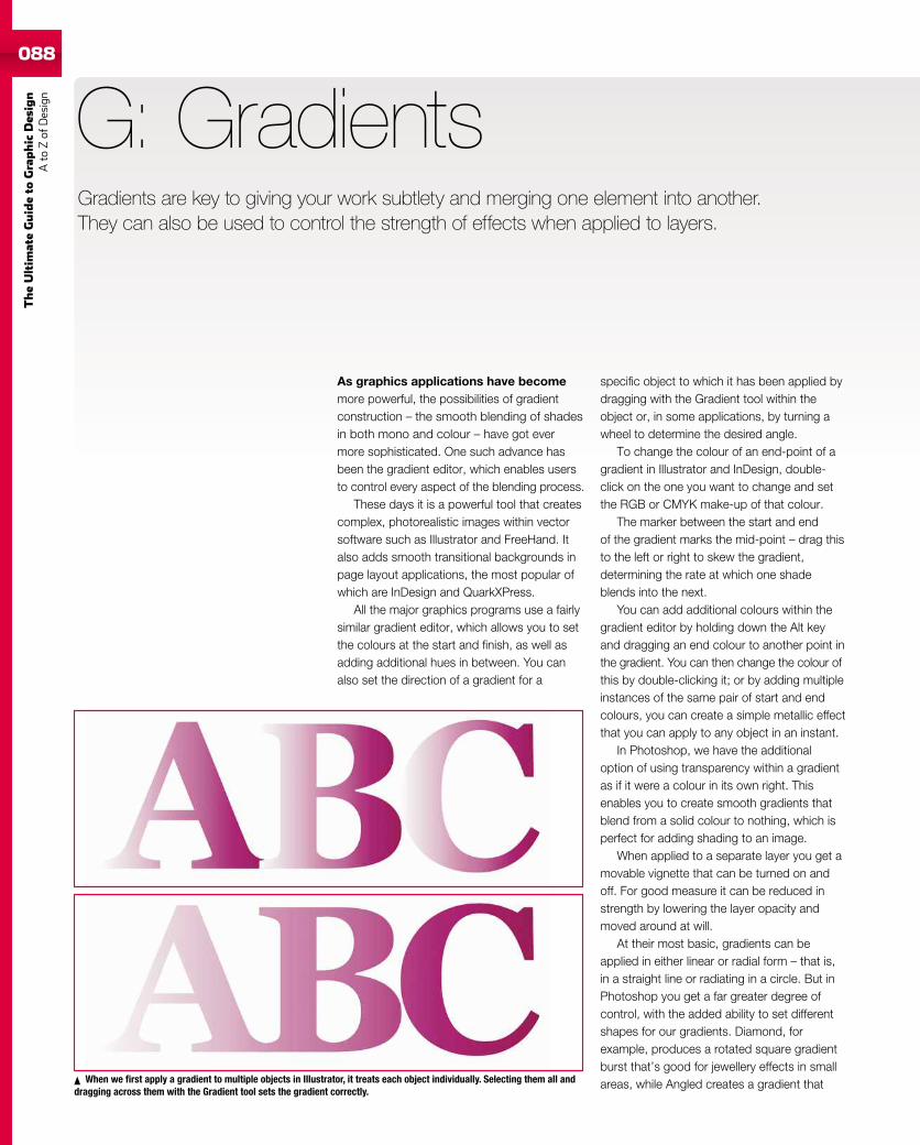
088
TheUltim
ateGuideto
Graphic
Des
ign
Ato
Zof
Design
088
As graphics applications have becomemore powerful, the possibilities of gradientconstruction – the smooth blending of shadesin both mono and colour – have got evermore sophisticated. One such advance hasbeen the gradient editor, which enables usersto control every aspect of the blending process.
These days it is a powerful tool that createscomplex, photorealistic images within vectorsoftware such as Illustrator and FreeHand. Italso adds smooth transitional backgrounds inpage layout applications, the most popular ofwhich are InDesign and QuarkXPress.
All the major graphics programs use a fairlysimilar gradient editor, which allows you to setthe colours at the start and finish, as well asadding additional hues in between. You canalso set the direction of a gradient for a
G: Gradients
specific object to which it has been applied bydragging with the Gradient tool within theobject or, in some applications, by turning awheel to determine the desired angle.
To change the colour of an end-point of agradient in Illustrator and InDesign, double-click on the one you want to change and setthe RGB or CMYK make-up of that colour.
The marker between the start and endof the gradient marks the mid-point – drag thisto the left or right to skew the gradient,determining the rate at which one shadeblends into the next.
You can add additional colours within thegradient editor by holding down the Alt keyand dragging an end colour to another point inthe gradient. You can then change the colour ofthis by double-clicking it; or by adding multipleinstances of the same pair of start and endcolours, you can create a simple metallic effectthat you can apply to any object in an instant.
In Photoshop, we have the additionaloption of using transparency within a gradientas if it were a colour in its own right. Thisenables you to create smooth gradients thatblend from a solid colour to nothing, which isperfect for adding shading to an image.
When applied to a separate layer you get amovable vignette that can be turned on andoff. For good measure it can be reduced instrength by lowering the layer opacity andmoved around at will.
At their most basic, gradients can beapplied in either linear or radial form – that is,in a straight line or radiating in a circle. But inPhotoshop you get a far greater degree ofcontrol, with the added ability to set differentshapes for our gradients. Diamond, forexample, produces a rotated square gradientburst that’s good for jewellery effects in smallareas, while Angled creates a gradient thatWhen we first apply a gradient to multiple objects in Illustrator, it treats each object individually. Selecting them all and
dragging across them with the Gradient tool sets the gradient correctly.
Gradients are key to giving your work subtlety and merging one element into another.They can also be used to control the strength of effects when applied to layers.
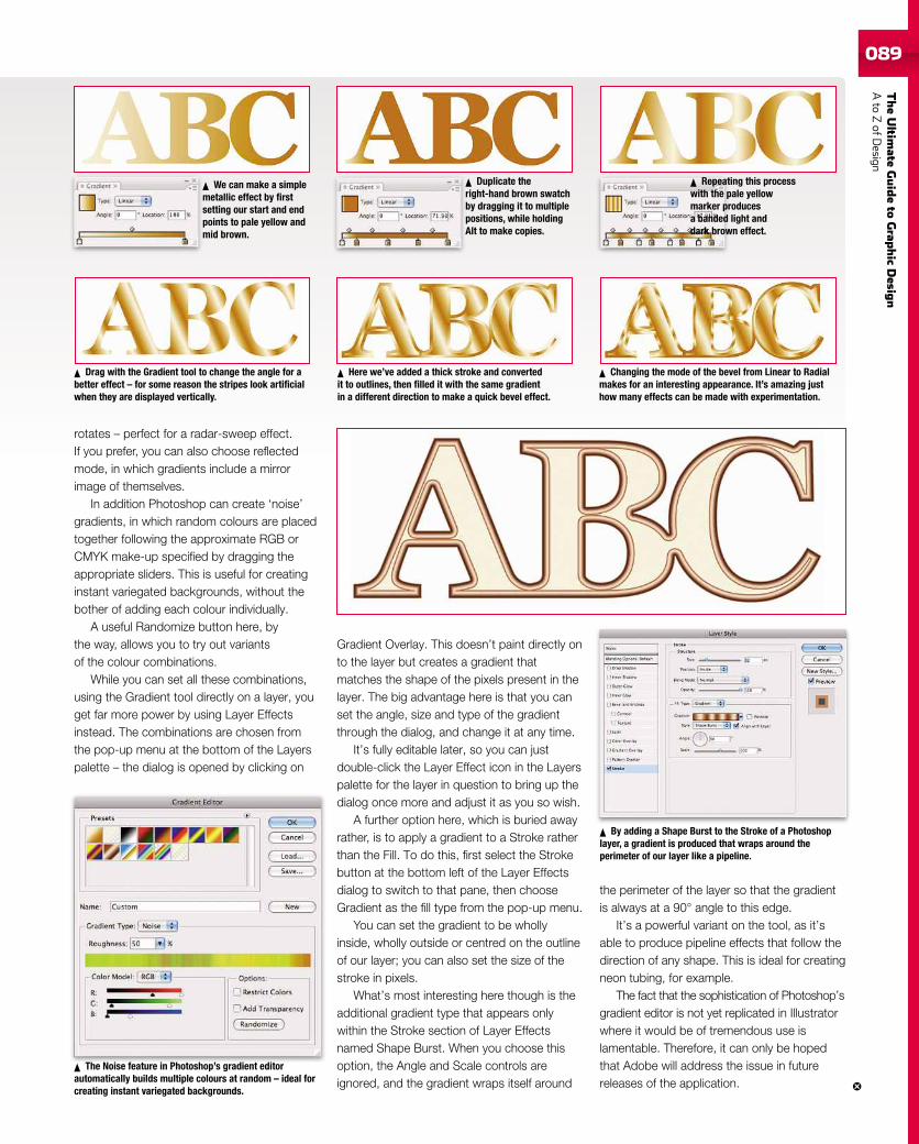
TheUltim
ateGuideto
Grap
hic
Desig
nAto
ZofD
esign089089
rotates – perfect for a radar-sweep effect.If you prefer, you can also choose reflectedmode, in which gradients include a mirrorimage of themselves.
In addition Photoshop can create ‘noise’gradients, in which random colours are placedtogether following the approximate RGB orCMYK make-up specified by dragging theappropriate sliders. This is useful for creatinginstant variegated backgrounds, without thebother of adding each colour individually.
A useful Randomize button here, bythe way, allows you to try out variantsof the colour combinations.
While you can set all these combinations,using the Gradient tool directly on a layer, youget far more power by using Layer Effectsinstead. The combinations are chosen fromthe pop-up menu at the bottom of the Layerspalette – the dialog is opened by clicking on
Gradient Overlay. This doesn’t paint directly onto the layer but creates a gradient thatmatches the shape of the pixels present in thelayer. The big advantage here is that you canset the angle, size and type of the gradientthrough the dialog, and change it at any time.
It’s fully editable later, so you can justdouble-click the Layer Effect icon in the Layerspalette for the layer in question to bring up thedialog once more and adjust it as you so wish.
A further option here, which is buried awayrather, is to apply a gradient to a Stroke ratherthan the Fill. To do this, first select the Strokebutton at the bottom left of the Layer Effectsdialog to switch to that pane, then chooseGradient as the fill type from the pop-up menu.
You can set the gradient to be whollyinside, wholly outside or centred on the outlineof our layer; you can also set the size of thestroke in pixels.
What’s most interesting here though is theadditional gradient type that appears onlywithin the Stroke section of Layer Effectsnamed Shape Burst. When you choose thisoption, the Angle and Scale controls areignored, and the gradient wraps itself around
the perimeter of the layer so that the gradientis always at a 90° angle to this edge.
It’s a powerful variant on the tool, as it’sable to produce pipeline effects that follow thedirection of any shape. This is ideal for creatingneon tubing, for example.
The fact that the sophistication of Photoshop’sgradient editor is not yet replicated in Illustratorwhere it would be of tremendous use islamentable. Therefore, it can only be hopedthat Adobe will address the issue in futurereleases of the application.
We can make a simplemetallic effect by firstsetting our start and endpoints to pale yellow andmid brown.
Duplicate theright-hand brown swatchby dragging it to multiplepositions, while holdingAlt to make copies.
Repeating this processwith the pale yellowmarker producesa banded light anddark brown effect.
Drag with the Gradient tool to change the angle for abetter effect – for some reason the stripes look artificialwhen they are displayed vertically.
Here we’ve added a thick stroke and convertedit to outlines, then filled it with the same gradientin a different direction to make a quick bevel effect.
Changing the mode of the bevel from Linear to Radialmakes for an interesting appearance. It’s amazing justhow many effects can be made with experimentation.
The Noise feature in Photoshop’s gradient editorautomatically builds multiple colours at random – ideal forcreating instant variegated backgrounds.
By adding a Shape Burst to the Stroke of a Photoshoplayer, a gradient is produced that wraps around theperimeter of our layer like a pipeline.
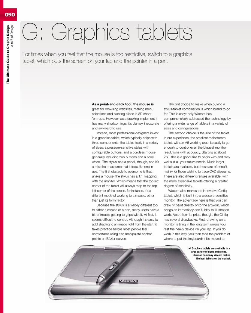
090
TheUltim
ateGuideto
Graphic
Des
ign
Ato
Zof
Design
As a point-and-click tool, the mouse isgreat for browsing websites, making menuselections and blasting aliens in 3D shoot-’em-ups. However, as a drawing implement ithas many shortcomings: it’s clumsy, inaccurateand awkward to use.
Instead, most professional designers investin a graphics tablet, which typically ships withthree components: the tablet itself, in a varietyof sizes; a pressure-sensitive stylus withconfigurable buttons; and a cordless mouse,generally including two buttons and a scrollwheel. The stylus isn’t a pencil, though, and it’sa mistake to assume that it feels like one inuse. The first obstacle to overcome is that,unlike a mouse, the stylus has a 1:1 mappingwith the monitor. Which means that the top leftcorner of the tablet will always map to the topleft corner of the screen, for instance. It’s adifferent mode of working to a mouse, otherthan just its form factor.
Because the stylus is a wholly different toolto either a mouse or a pen, many users have abit of trouble getting to grips with it. At first, itseems difficult to control. Although it’s easy toadd shading to an image right from the start, ittakes practice before most people feelcomfortable using it to manipulate anchorpoints on Bézier curves.
G: Graphics tablets
The first choice to make when buying astylus/tablet combination is which brand to gofor. This is easy: only Wacom hascomprehensively addressed the technology byoffering a wide range of tablets in a variety ofsizes and configurations.
The second choice is the size of the tablet.In our experience, the smallest mainstreamtablet, with an A6 working area, is easily largeenough to control even the biggest monitorresolutions with accuracy. Starting at about£60, this is a good size to begin with and maywell suit all your future needs. Much largertablets are available, but these are of benefitmainly for those wishing to trace CAD diagrams.There are also different ranges available, withthe more expensive tablets offering a greaterdegree of sensitivity.
Wacom also makes the innovative Cintiqtablet, which is built into a pressure-sensitivemonitor. The advantage here is that you candraw or paint directly onto the artwork, whichbrings an immediacy and fluidity to illustrationwork. Apart from its price, though, the Cintiqhas several drawbacks. First, drawing on amonitor is tiring in the long term unless yourest the heavy device on your lap. If you dowork in this way, you then face the problem ofwhere to put the keyboard: if it’s moved to
For times when you feel that the mouse is too restrictive, switch to a graphicstablet, which puts the screen on your lap and the pointer in a pen.
Graphics tablets are available in alarge variety of sizes and styles.
German company Wacom makesthe best tablets on the market.
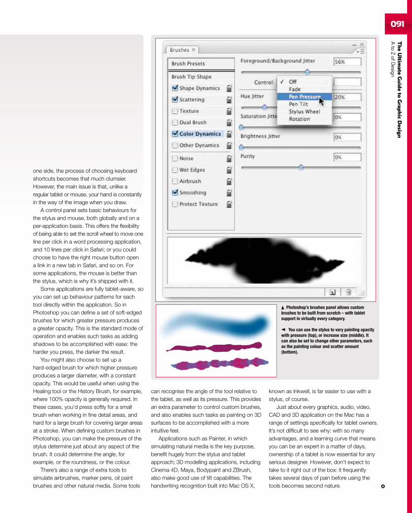
TheUltim
ateGuideto
Grap
hic
Desig
nAto
ZofD
esign091
one side, the process of choosing keyboardshortcuts becomes that much clumsier.However, the main issue is that, unlike aregular tablet or mouse, your hand is constantlyin the way of the image when you draw.
A control panel sets basic behaviours forthe stylus and mouse, both globally and on aper-application basis. This offers the flexibilityof being able to set the scroll wheel to move oneline per click in a word processing application,and 10 lines per click in Safari; or you couldchoose to have the right mouse button opena link in a new tab in Safari, and so on. Forsome applications, the mouse is better thanthe stylus, which is why it’s shipped with it.
Some applications are fully tablet-aware, soyou can set up behaviour patterns for eachtool directly within the application. So inPhotoshop you can define a set of soft-edgedbrushes for which greater pressure producesa greater opacity. This is the standard mode ofoperation and enables such tasks as addingshadows to be accomplished with ease: theharder you press, the darker the result.
You might also choose to set up ahard-edged brush for which higher pressureproduces a larger diameter, with a constantopacity. This would be useful when using theHealing tool or the History Brush, for example,where 100% opacity is generally required. Inthese cases, you’d press softly for a smallbrush when working in fine detail areas, andhard for a large brush for covering larger areasat a stroke. When defining custom brushes inPhotoshop, you can make the pressure of thestylus determine just about any aspect of thebrush. It could determine the angle, forexample, or the roundness, or the colour.
There’s also a range of extra tools tosimulate airbrushes, marker pens, oil paintbrushes and other natural media. Some tools
can recognise the angle of the tool relative tothe tablet, as well as its pressure. This providesan extra parameter to control custom brushes,and also enables such tasks as painting on 3Dsurfaces to be accomplished with a moreintuitive feel.
Applications such as Painter, in whichsimulating natural media is the key purpose,benefit hugely from the stylus and tabletapproach; 3D modelling applications, includingCinema 4D, Maya, Bodypaint and ZBrush,also make good use of tilt capabilities. Thehandwriting recognition built into Mac OS X,
known as Inkwell, is far easier to use with astylus, of course.
Just about every graphics, audio, video,CAD and 3D application on the Mac has arange of settings specifically for tablet owners.It’s not difficult to see why: with so manyadvantages, and a learning curve that meansyou can be an expert in a matter of days,ownership of a tablet is now essential for anyserious designer. However, don’t expect totake to it right out of the box: it frequentlytakes several days of pain before using thetools becomes second nature.
Photoshop’s brushes panel allows custombrushes to be built from scratch – with tabletsupport in virtually every category.
You can use the stylus to vary painting opacitywith pressure (top), or increase size (middle). Itcan also be set to change other parameters, suchas the painting colour and scatter amount(bottom).
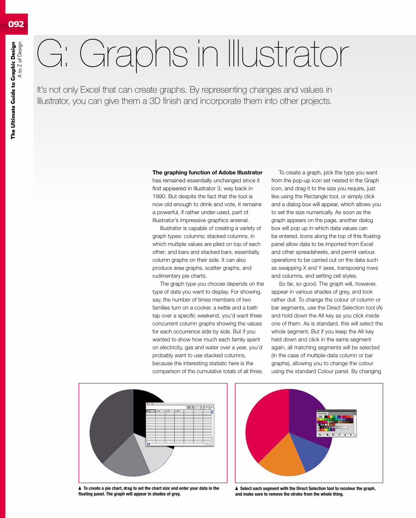
092
TheUltim
ateGuideto
Graphic
Des
ign
Ato
Zof
Design
The graphing function of Adobe Illustratorhas remained essentially unchanged since itfirst appeared in Illustrator 3, way back in1990. But despite the fact that the tool isnow old enough to drink and vote, it remainsa powerful, if rather under-used, part ofIllustrator’s impressive graphics arsenal.
Illustrator is capable of creating a variety ofgraph types: columns; stacked columns, inwhich multiple values are piled on top of eachother; and bars and stacked bars, essentially,column graphs on their side. It can alsoproduce area graphs, scatter graphs, andrudimentary pie charts.
The graph type you choose depends on thetype of data you want to display. For showing,say, the number of times members of twofamilies turn on a cooker, a kettle and a bathtap over a specific weekend, you’d want threeconcurrent column graphs showing the valuesfor each occurrence side by side. But if youwanted to show how much each family spenton electricity, gas and water over a year, you’dprobably want to use stacked columns,because the interesting statistic here is thecomparison of the cumulative totals of all three.
G: Graphs in Illustrator
To create a graph, pick the type you wantfrom the pop-up icon set nested in the Graphicon, and drag it to the size you require, justlike using the Rectangle tool, or simply clickand a dialog box will appear, which allows youto set the size numerically. As soon as thegraph appears on the page, another dialogbox will pop up in which data values canbe entered. Icons along the top of this floatingpanel allow data to be imported from Exceland other spreadsheets, and permit variousoperations to be carried out on the data suchas swapping X and Y axes, transposing rowsand columns, and setting cell styles.
So far, so good. The graph will, however,appear in various shades of grey, and lookrather dull. To change the colour of column orbar segments, use the Direct Selection tool (A)and hold down the Alt key as you click insideone of them. As is standard, this will select thewhole segment. But if you keep the Alt keyheld down and click in the same segmentagain, all matching segments will be selected(in the case of multiple-data column or bargraphs), allowing you to change the colourusing the standard Colour panel. By changing
To create a pie chart, drag to set the chart size and enter your data in thefloating panel. The graph will appear in shades of grey.
Select each segment with the Direct Selection tool to recolour the graph,and make sure to remove the stroke from the whole thing.
It’s not only Excel that can create graphs. By representing changes and values inIllustrator, you can give them a 3D finish and incorporate them into other projects.
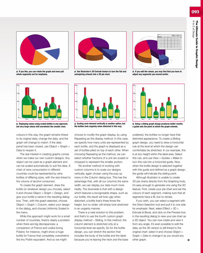
TheUltim
ateGuideto
Grap
hic
Desig
nAto
ZofD
esign093
colours in this way, the graph remains linkedto its original data; change the data, and thegraph will change to match. If the datapanel has been closed, use Object > Graph >Data to reopen it.
The real interest in creating graphs comeswhen we make our own custom designs. Anyobject can be used as a graph element andcan be scaled automatically to suit the data. Achart of wine consumption in differentcountries could be represented by winebottles of differing sizes, with the size linked tothe volume of alcohol consumed.
To create the graph element, draw thebottle (or whatever design you choose), selectit and choose Object > Graph > Design, andgive your bottle a name in the resulting dialogbox. Then, with the graph selected, chooseObject > Graph > Column, select your designin the dialog, and choose Uniformly Scaled inthe menu.
While this approach might work for a smallnumber of countries, there’s clearly a problemwhen there are big discrepancies: acomparison of France and vodka-lovingPoland, for instance, might show a hugebottle for France that completely overwhelmsthe tiny Polish equivalent. And so we might
choose to modify the graph display, by usingRepeating as the display method. In this case,we specify how many units are represented byeach bottle, and the graph is displayed as aset of bottles piled on top of each other. Whenchoosing Repeating as the method, we canselect whether fractions of a unit are scaled orchopped to represent the smaller portion.
Yet another method of working withcustom columns is to scale our designsvertically, again chosen using the pop-upmenu in the Column dialog box. This has theadvantage that, with all our columns the samewidth, we can display our data much moreneatly. The downside is that with a designwhich features a recognisable shape, such asour bottle, the result will look ugly whendistorted: a bottle that’s three times theheight, but no wider, will simply look stretchedin an ungainly manner.
There is a neat solution to this problem,and that’s to use the fourth custom graphdisplay method – Sliding. In this method, thecolumn element is stretched only at ahorizontal level we specify. So for the bottledesign, you can stretch the section thatincludes the body of the bottle and the label:because you’re leaving the neck and the base
unaltered, the bottles no longer have thatdistorted appearance. To create a Slidinggraph design, you need to draw a horizontalrule at the level at which the design cancomfortably be stretched. In our example, thisis at any height within the label area. Selectthis rule, and use View > Guides > Make toturn this rule into a horizontal guide. Now,when the bottle design is selected togetherwith this guide and defined as a graph design,the guide will indicate the sliding point.
Although Illustrator is unable to create3D pie charts directly from the Graphing tools,it’s easy enough to generate one using the 3Dfeature. First, create your pie chart and set thecolours of each segment, making sure that allsegments have a fill, but no stroke.
If you wish, you can select a segment withthe Direct Selection tool and pull it to one sidefor emphasis. Next, select Effect > 3D >Extrude & Bevel, and click on the Preview boxin the resulting dialog to view your pie chart asa 3D object. You can now rotate and view itfrom any angle. It’s even possible to edit thedata, as the 3D version is still linked to theoriginal chart: select it and choose Object >Graph > Data to change it as you would anyother graph.
If you like, you can rotate the graph and even pullwhole segments out for emphasis.
Displaying values using scaled bottles is one approach,but very large values will overwhelm the smaller ones.
Use Illustrator’s 3D Extrude feature to turn the flat anduninspiring artwork into a 3D pie chart.
Scaling each element vertically is another option, butthe bottles look ungainly when distorted in this way.
If you edit the values, you may find that you have toadjust any segments you moved earlier.
Using a sliding graph design produces better results:a guide sets the point at which the graph extends.
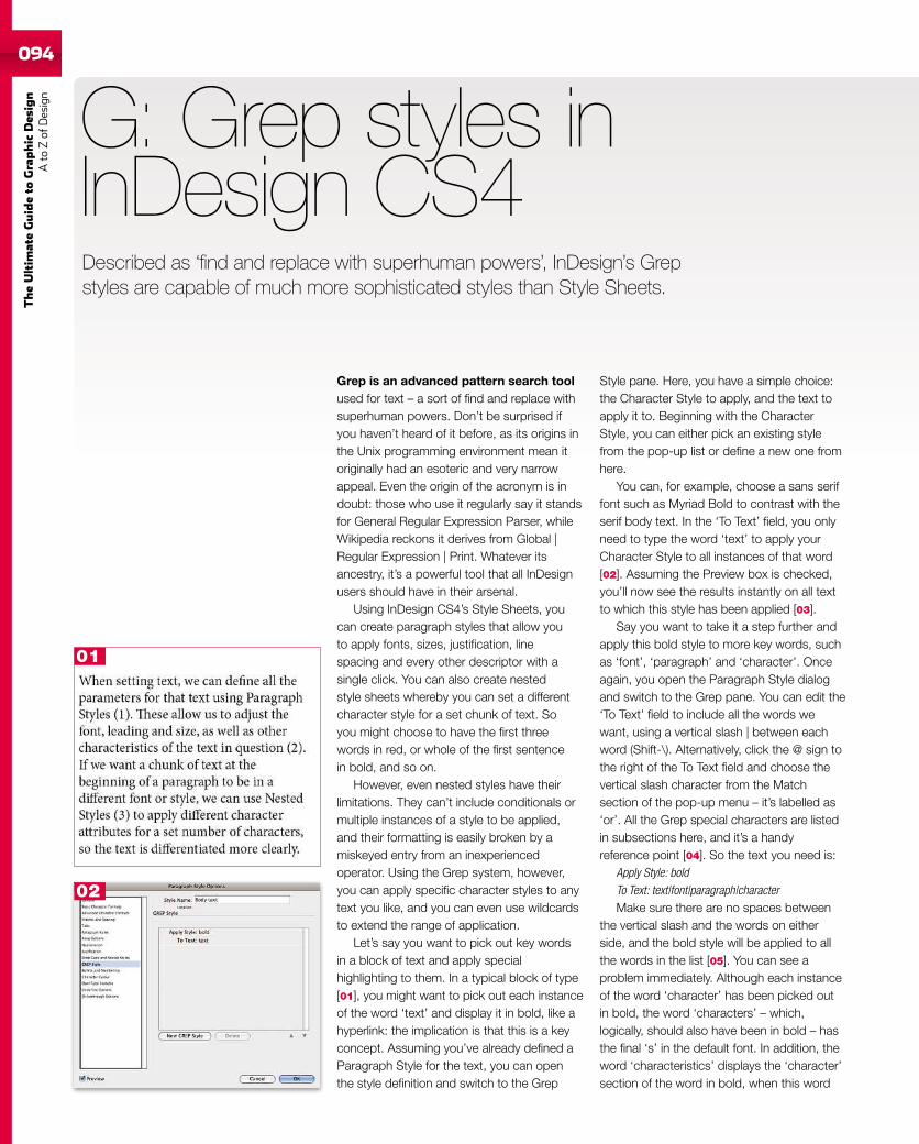
094
TheUltim
ateGuideto
Graphic
Des
ign
Ato
Zof
Design
Grep is an advanced pattern search toolused for text – a sort of find and replace withsuperhuman powers. Don’t be surprised ifyou haven’t heard of it before, as its origins inthe Unix programming environment mean itoriginally had an esoteric and very narrowappeal. Even the origin of the acronym is indoubt: those who use it regularly say it standsfor General Regular Expression Parser, whileWikipedia reckons it derives from Global |Regular Expression | Print. Whatever itsancestry, it’s a powerful tool that all InDesignusers should have in their arsenal.
Using InDesign CS4’s Style Sheets, youcan create paragraph styles that allow youto apply fonts, sizes, justification, linespacing and every other descriptor with asingle click. You can also create nestedstyle sheets whereby you can set a differentcharacter style for a set chunk of text. Soyou might choose to have the first threewords in red, or whole of the first sentencein bold, and so on.
However, even nested styles have theirlimitations. They can’t include conditionals ormultiple instances of a style to be applied,and their formatting is easily broken by amiskeyed entry from an inexperiencedoperator. Using the Grep system, however,you can apply specific character styles to anytext you like, and you can even use wildcardsto extend the range of application.
Let’s say you want to pick out key wordsin a block of text and apply specialhighlighting to them. In a typical block of type[01], you might want to pick out each instanceof the word ‘text’ and display it in bold, like ahyperlink: the implication is that this is a keyconcept. Assuming you’ve already defined aParagraph Style for the text, you can openthe style definition and switch to the Grep
G: Grep styles inInDesign CS4
Style pane. Here, you have a simple choice:the Character Style to apply, and the text toapply it to. Beginning with the CharacterStyle, you can either pick an existing stylefrom the pop-up list or define a new one fromhere.
You can, for example, choose a sans seriffont such as Myriad Bold to contrast with theserif body text. In the ‘To Text’ field, you onlyneed to type the word ‘text’ to apply yourCharacter Style to all instances of that word[02]. Assuming the Preview box is checked,you’ll now see the results instantly on all textto which this style has been applied [03].
Say you want to take it a step further andapply this bold style to more key words, suchas ‘font’, ‘paragraph’ and ‘character’. Onceagain, you open the Paragraph Style dialogand switch to the Grep pane. You can edit the‘To Text’ field to include all the words wewant, using a vertical slash | between eachword (Shift-\). Alternatively, click the @ sign tothe right of the To Text field and choose thevertical slash character from the Matchsection of the pop-up menu – it’s labelled as‘or’. All the Grep special characters are listedin subsections here, and it’s a handyreference point [04]. So the text you need is:
Apply Style: boldTo Text: text|font|paragraph|characterMake sure there are no spaces between
the vertical slash and the words on eitherside, and the bold style will be applied to allthe words in the list [05]. You can see aproblem immediately. Although each instanceof the word ‘character’ has been picked outin bold, the word ‘characters’ – which,logically, should also have been in bold – hasthe final ‘s’ in the default font. In addition, theword ‘characteristics’ displays the ‘character’section of the word in bold, when this word
Described as ‘find and replace with superhuman powers’, InDesign’s Grepstyles are capable of much more sophisticated styles than Style Sheets.
01
02
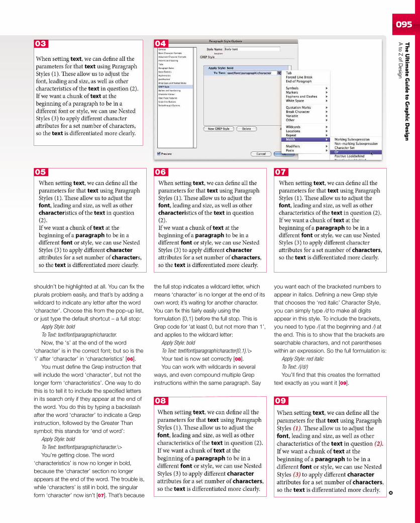
TheUltim
ateGuideto
Grap
hic
Desig
nAto
ZofD
esign095
shouldn’t be highlighted at all. You can fix theplurals problem easily, and that’s by adding awildcard to indicate any letter after the word‘character’. Choose this from the pop-up list,or just type the default shortcut – a full stop:
Apply Style: boldTo Text: text|font|paragraph|character.Now, the ‘s’ at the end of the word
‘character’ is in the correct font; but so is the‘i’ after ‘character’ in ‘characteristics’ [06].
You must define the Grep instruction thatwill include the word ‘character’, but not thelonger form ‘characteristics’. One way to dothis is to tell it to include the specified lettersin its search only if they appear at the end ofthe word. You do this by typing a backslashafter the word ‘character’ to indicate a Grepinstruction, followed by the Greater Thansymbol; this stands for ‘end of word’:
Apply Style: boldTo Text: text|font|paragraph|character.\>You’re getting close. The word
‘characteristics’ is now no longer in bold,because the ‘character’ section no longerappears at the end of the word. The trouble is,while ‘characters’ is still in bold, the singularform ‘character’ now isn’t [07]. That’s because
the full stop indicates a wildcard letter, whichmeans ‘character’ is no longer at the end of itsown word; it’s waiting for another character.You can fix this fairly easily using theformulation {0,1} before the full stop. This isGrep code for ‘at least 0, but not more than 1’,and applies to the wildcard letter:
Apply Style: boldTo Text: text|font|paragraph|character{0,1}.\>Your text is now set correctly [08].You can work with wildcards in several
ways, and even compound multiple Grepinstructions within the same paragraph. Say
03
05 06 07
04
08 09
you want each of the bracketed numbers toappear in italics. Defining a new Grep stylethat chooses the ‘red italic’ Character Style,you can simply type /d to make all digitsappear in this style. To include the brackets,you need to type /( at the beginning and /) atthe end. This is to show that the brackets aresearchable characters, and not parentheseswithin an expression. So the full formulation is:
Apply Style: red italicTo Text: /(/d/)You’ll find that this creates the formatted
text exactly as you want it [09].
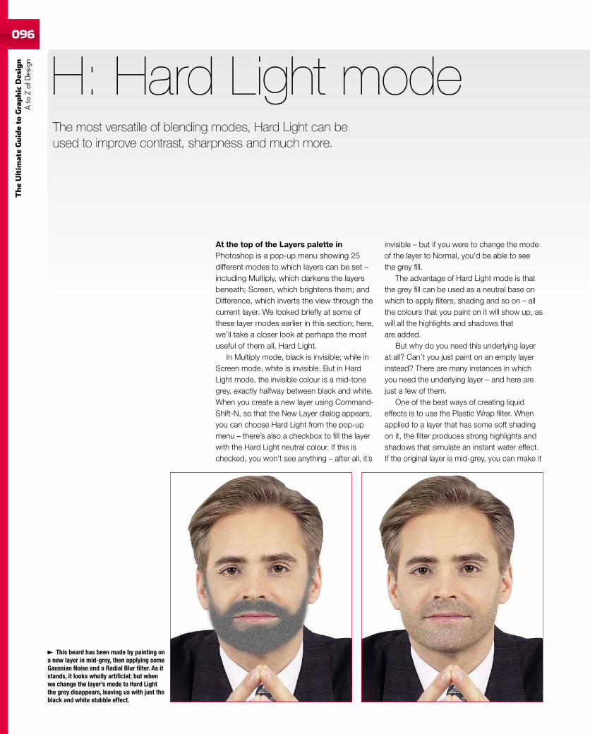
096
TheUltim
ateGuideto
Graphic
Des
ign
Ato
Zof
Design
096
At the top of the Layers palette inPhotoshop is a pop-up menu showing 25different modes to which layers can be set –including Multiply, which darkens the layersbeneath; Screen, which brightens them; andDifference, which inverts the view through thecurrent layer. We looked briefly at some ofthese layer modes earlier in this section; here,we’ll take a closer look at perhaps the mostuseful of them all, Hard Light.
In Multiply mode, black is invisible; while inScreen mode, white is invisible. But in HardLight mode, the invisible colour is a mid-tonegrey, exactly halfway between black and white.When you create a new layer using Command-Shift-N, so that the New Layer dialog appears,you can choose Hard Light from the pop-upmenu – there’s also a checkbox to fill the layerwith the Hard Light neutral colour. If this ischecked, you won’t see anything – after all, it’s
H: Hard Light mode
invisible – but if you were to change the modeof the layer to Normal, you’d be able to seethe grey fill.
The advantage of Hard Light mode is thatthe grey fill can be used as a neutral base onwhich to apply filters, shading and so on – allthe colours that you paint on it will show up, aswill all the highlights and shadows thatare added.
But why do you need this underlying layerat all? Can’t you just paint on an empty layerinstead? There are many instances in whichyou need the underlying layer – and here arejust a few of them.
One of the best ways of creating liquideffects is to use the Plastic Wrap filter. Whenapplied to a layer that has some soft shadingon it, the filter produces strong highlights andshadows that simulate an instant water effect.If the original layer is mid-grey, you can make it
This beard has been made by painting ona new layer in mid-grey, then applying someGaussian Noise and a Radial Blur filter. As itstands, it looks wholly artificial; but whenwe change the layer’s mode to Hard Lightthe grey disappears, leaving us with just theblack and white stubble effect.
The most versatile of blending modes, Hard Light can beused to improve contrast, sharpness and much more.
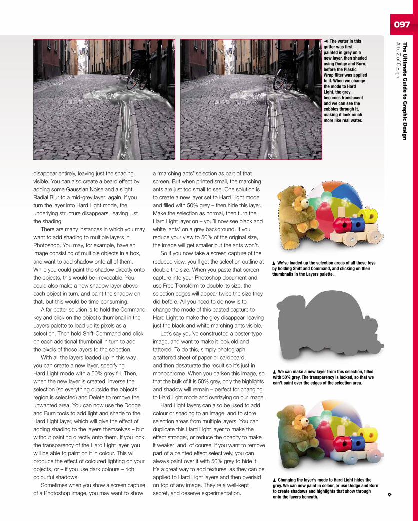
TheUltim
ateGuideto
Grap
hic
Desig
nAto
ZofD
esign097097
disappear entirely, leaving just the shadingvisible. You can also create a beard effect byadding some Gaussian Noise and a slightRadial Blur to a mid-grey layer; again, if youturn the layer into Hard Light mode, theunderlying structure disappears, leaving justthe shading.
There are many instances in which you maywant to add shading to multiple layers inPhotoshop. You may, for example, have animage consisting of multiple objects in a box,and want to add shadow onto all of them.While you could paint the shadow directly ontothe objects, this would be irrevocable. Youcould also make a new shadow layer aboveeach object in turn, and paint the shadow onthat, but this would be time-consuming.
A far better solution is to hold the Commandkey and click on the object’s thumbnail in theLayers palette to load up its pixels as aselection. Then hold Shift-Command and clickon each additional thumbnail in turn to addthe pixels of those layers to the selection.
With all the layers loaded up in this way,you can create a new layer, specifyingHard Light mode with a 50% grey fill. Then,when the new layer is created, inverse theselection (so everything outside the objects’region is selected) and Delete to remove theunwanted area. You can now use the Dodgeand Burn tools to add light and shade to theHard Light layer, which will give the effect ofadding shading to the layers themselves – butwithout painting directly onto them. If you lockthe transparency of the Hard Light layer, youwill be able to paint on it in colour. This willproduce the effect of coloured lighting on yourobjects, or – if you use dark colours – rich,colourful shadows.
Sometimes when you show a screen captureof a Photoshop image, you may want to show
a ‘marching ants’ selection as part of thatscreen. But when printed small, the marchingants are just too small to see. One solution isto create a new layer set to Hard Light modeand filled with 50% grey – then hide this layer.Make the selection as normal, then turn theHard Light layer on – you’ll now see black andwhite ‘ants’ on a grey background. If youreduce your view to 50% of the original size,the image will get smaller but the ants won’t.
So if you now take a screen capture of thereduced view, you’ll get the selection outline atdouble the size. When you paste that screencapture into your Photoshop document anduse Free Transform to double its size, theselection edges will appear twice the size theydid before. All you need to do now is tochange the mode of this pasted capture toHard Light to make the grey disappear, leavingjust the black and white marching ants visible.
Let’s say you’ve constructed a poster-typeimage, and want to make it look old andtattered. To do this, simply photographa tattered sheet of paper or cardboard,and then desaturate the result so it’s just inmonochrome. When you darken this image, sothat the bulk of it is 50% grey, only the highlightsand shadow will remain – perfect for changingto Hard Light mode and overlaying on our image.
Hard Light layers can also be used to addcolour or shading to an image, and to storeselection areas from multiple layers. You canduplicate this Hard Light layer to make theeffect stronger, or reduce the opacity to makeit weaker; and, of course, if you want to removepart of a painted effect selectively, you canalways paint over it with 50% grey to hide it.It’s a great way to add textures, as they can beapplied to Hard Light layers and then overlaidon top of any image. They’re a well-keptsecret, and deserve experimentation.
The water in thisgutter was firstpainted in grey on anew layer, then shadedusing Dodge and Burn,before the PlasticWrap filter was appliedto it. When we changethe mode to HardLight, the greybecomes translucentand we can see thecobbles through it,making it look muchmore like real water.
We’ve loaded up the selection areas of all these toysby holding Shift and Command, and clicking on theirthumbnails in the Layers palette.
We can make a new layer from this selection, filledwith 50% grey. The transparency is locked, so that wecan’t paint over the edges of the selection area.
Changing the layer’s mode to Hard Light hides thegrey. We can now paint in colour, or use Dodge and Burnto create shadows and highlights that show throughonto the layers beneath.
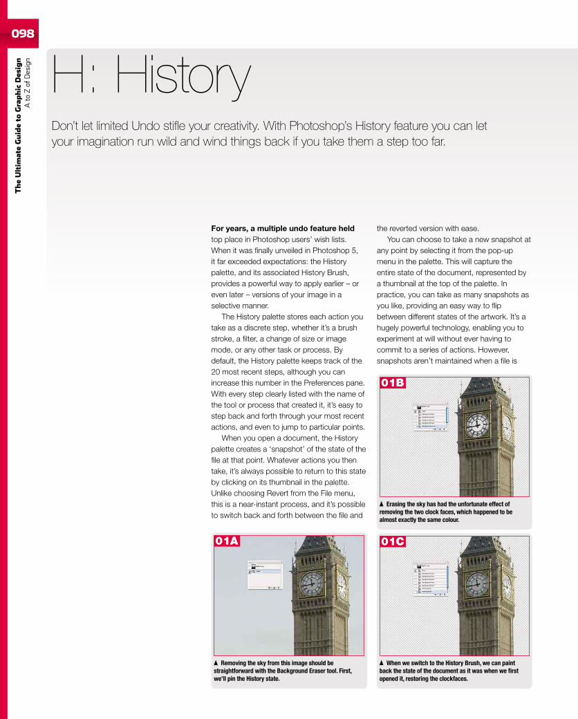
098
TheUltim
ateGuideto
Graphic
Des
ign
Ato
Zof
Design
For years, a multiple undo feature heldtop place in Photoshop users’ wish lists.When it was finally unveiled in Photoshop 5,it far exceeded expectations: the Historypalette, and its associated History Brush,provides a powerful way to apply earlier – oreven later – versions of your image in aselective manner.
The History palette stores each action youtake as a discrete step, whether it’s a brushstroke, a filter, a change of size or imagemode, or any other task or process. Bydefault, the History palette keeps track of the20 most recent steps, although you canincrease this number in the Preferences pane.With every step clearly listed with the name ofthe tool or process that created it, it’s easy tostep back and forth through your most recentactions, and even to jump to particular points.
When you open a document, the Historypalette creates a ‘snapshot’ of the state of thefile at that point. Whatever actions you thentake, it’s always possible to return to this stateby clicking on its thumbnail in the palette.Unlike choosing Revert from the File menu,this is a near-instant process, and it’s possibleto switch back and forth between the file and
H: History
When we switch to the History Brush, we can paintback the state of the document as it was when we firstopened it, restoring the clockfaces.
Removing the sky from this image should bestraightforward with the Background Eraser tool. First,we’ll pin the History state.
Erasing the sky has had the unfortunate effect ofremoving the two clock faces, which happened to bealmost exactly the same colour.
the reverted version with ease.You can choose to take a new snapshot at
any point by selecting it from the pop-upmenu in the palette. This will capture theentire state of the document, represented bya thumbnail at the top of the palette. Inpractice, you can take as many snapshots asyou like, providing an easy way to flipbetween different states of the artwork. It’s ahugely powerful technology, enabling you toexperiment at will without ever having tocommit to a series of actions. However,snapshots aren’t maintained when a file is
Don’t let limited Undo stifle your creativity. With Photoshop’s History feature you can letyour imagination run wild and wind things back if you take them a step too far.
01B
01A 01C
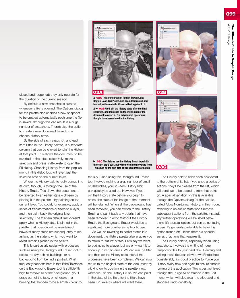
TheUltim
ateGuideto
Grap
hic
Desig
nAto
ZofD
esign099
closed and reopened: they only operate forthe duration of the current session.
By default, a new snapshot is createdwhenever a file is opened. The Options dialogfor the palette also enables a new snapshotto be created automatically each time the fileis saved, although this can result in a hugenumber of snapshots. There’s also the optionto create a new document based on achosen History state.
By the side of each snapshot, and eachitem listed in the History palette, is a separatecolumn that can be clicked to ‘pin’ the Historyat that point. This allows the document to bereverted to that state selectively: make aselection and press shift-delete to open theFill dialog. Choosing History from the pop-upmenu in this dialog box will revert just theselected area on the current layer.
Where the History palette really comes intoits own, though, is through the use of theHistory Brush. This allows the document tobe reverted to an earlier state – chosen bypinning it in the palette – by painting on thecurrent layer. You could, for example, apply aseries of transformations or filters to a layer,and then paint back the original layerselectively. The 20-item default limit doesn'tapply when a History state is pinned in thepalette: that position will be maintainedhowever many steps are subsequently taken,as long as the state to which you want torevert remains pinned in the palette.
This is particularly useful with processessuch as using the Background Eraser tool todelete the sky behind buildings, or abackground from behind a portrait. Whatfrequently happens here is that if the Toleranceon the Background Eraser tool is sufficientlyhigh to remove all of the background, you'llerase part of the face, or windows in abuilding that happen to be a similar colour to
02A This photograph of Patrick Stewart, akaCaptain Jean-Luc Picard, has been desaturated andblurred, with a metallic Curves effect applied to it.
the sky. Since using the Background Erasertool involves making a large number of smallbrushstrokes, your 20-item History limitcan quickly be used up. However, if youpin the History state before you begin toerase, the state of the image at that momentwill be retained. When all the background hasbeen removed, you can switch to the HistoryBrush and paint back any details that havebeen removed in error. Without the HistoryBrush, the Background Eraser would be asignificant more cumbersome tool to use.
As well as reverting to earlier states in adocument, the History palette also enables youto return to ‘future’ states. Let’s say we wantto add noise to a layer, but we only want it toshow up in certain areas. We can run the filterand then pin the History state after all theprocesses have been completed. We can nowreturn to the original state of the document byclicking on its position in the palette; now,when we use the History Brush, we can paintin the state of the file after the filters havebeen run, exactly where we want them.
The History palette adds each new eventto the bottom of its list. If you undo a series ofactions, they’ll be cleared from the list, whichwill continue to be added to from that pointon. A special variation on this is availablethrough the Options dialog for the palette,called Allow Non-Linear History. In this mode,reverting to an earlier state won’t removesubsequent actions from the palette. Instead,any further operations will be listed belowthem. It’s a useful option, but can be confusingin use: it’s generally preferable to have thisoption turned off, unless there’s a specificseries of actions that requires it.
The History palette, especially when usingsnapshots, involves the writing of hugetemporary files to your hard disk. Reading andwriting these files can slow down Photoshopconsiderably: it’s good practice to Purge yourHistory every now and again to ensure smoothrunning of the application. This is best achievedthrough the Purge All command in the Editmenu, which will also clear the clipboard andstandard Undo capability.
02C This lets us use the History Brush to paint inthe effect we’d built, but which we’d then reverted from.This could be the first step to full Borg transformation.
02B We’ll pin the history state after the finaloperation, and then click on the initial state of thedocument to revert it. The subsequent operations,though, have been stored in the History.
02A 02B
03C
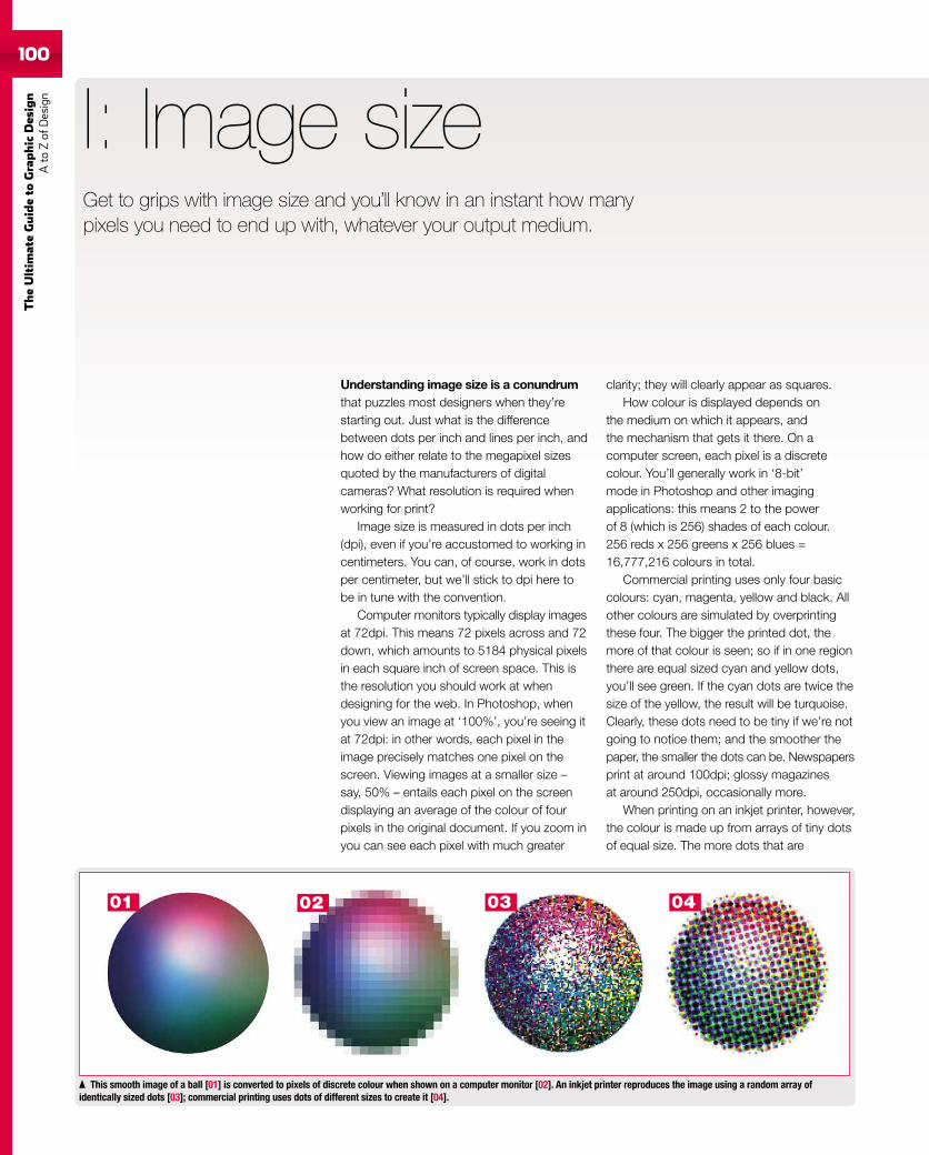
100
TheUltim
ateGuideto
Graphic
Des
ign
Ato
Zof
Design
100
Understanding image size is a conundrumthat puzzles most designers when they’restarting out. Just what is the differencebetween dots per inch and lines per inch, andhow do either relate to the megapixel sizesquoted by the manufacturers of digitalcameras? What resolution is required whenworking for print?
Image size is measured in dots per inch(dpi), even if you’re accustomed to working incentimeters. You can, of course, work in dotsper centimeter, but we’ll stick to dpi here tobe in tune with the convention.
Computer monitors typically display imagesat 72dpi. This means 72 pixels across and 72down, which amounts to 5184 physical pixelsin each square inch of screen space. This isthe resolution you should work at whendesigning for the web. In Photoshop, whenyou view an image at ‘100%’, you’re seeing itat 72dpi: in other words, each pixel in theimage precisely matches one pixel on thescreen. Viewing images at a smaller size –say, 50% – entails each pixel on the screendisplaying an average of the colour of fourpixels in the original document. If you zoom inyou can see each pixel with much greater
I: Image size
This smooth image of a ball [01] is converted to pixels of discrete colour when shown on a computer monitor [02]. An inkjet printer reproduces the image using a random array ofidentically sized dots [03]; commercial printing uses dots of different sizes to create it [04].
clarity; they will clearly appear as squares.How colour is displayed depends on
the medium on which it appears, andthe mechanism that gets it there. On acomputer screen, each pixel is a discretecolour. You’ll generally work in ‘8-bit’mode in Photoshop and other imagingapplications: this means 2 to the powerof 8 (which is 256) shades of each colour.256 reds x 256 greens x 256 blues =16,777,216 colours in total.
Commercial printing uses only four basiccolours: cyan, magenta, yellow and black. Allother colours are simulated by overprintingthese four. The bigger the printed dot, themore of that colour is seen; so if in one regionthere are equal sized cyan and yellow dots,you’ll see green. If the cyan dots are twice thesize of the yellow, the result will be turquoise.Clearly, these dots need to be tiny if we’re notgoing to notice them; and the smoother thepaper, the smaller the dots can be. Newspapersprint at around 100dpi; glossy magazinesat around 250dpi, occasionally more.
When printing on an inkjet printer, however,the colour is made up from arrays of tiny dotsof equal size. The more dots that are
Get to grips with image size and you’ll know in an instant how manypixels you need to end up with, whatever your output medium.
01 02 03 04
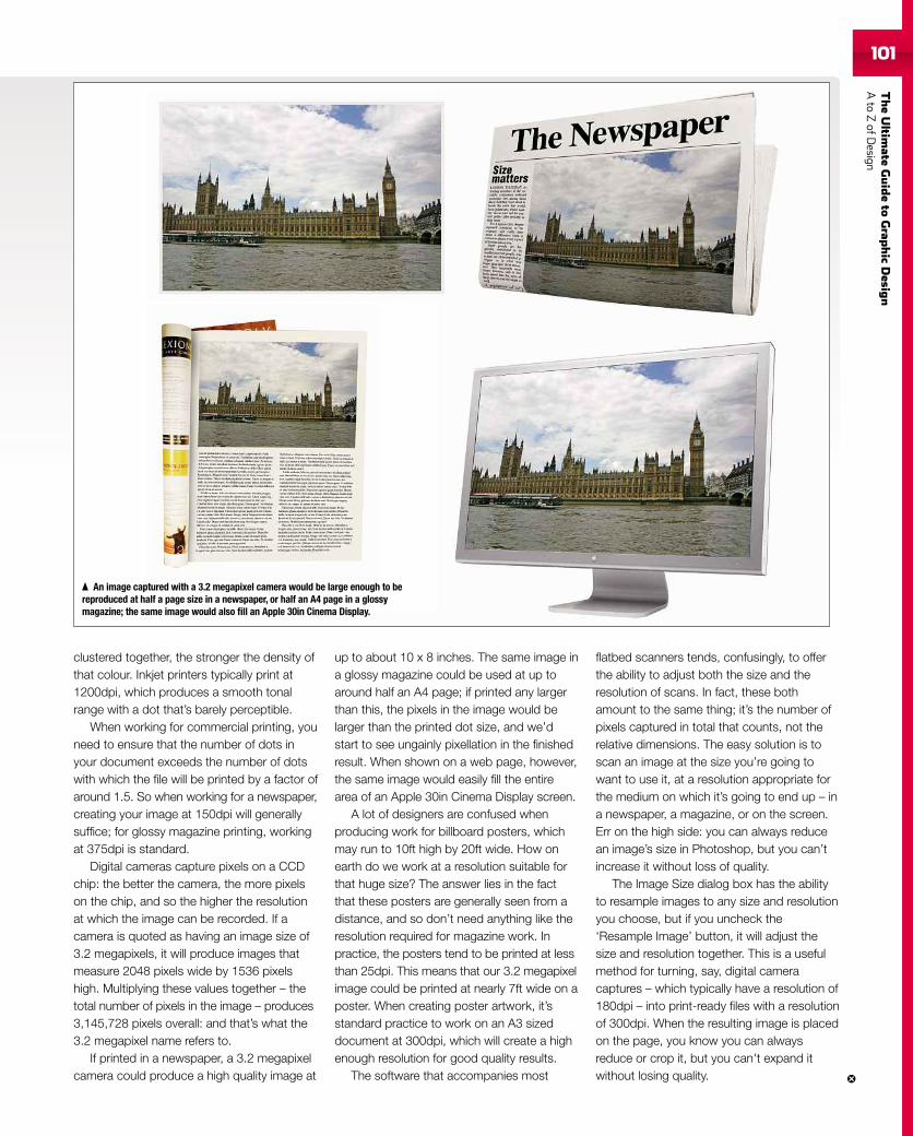
TheUltim
ateGuideto
Grap
hic
Desig
nAto
ZofD
esign101101
clustered together, the stronger the density ofthat colour. Inkjet printers typically print at1200dpi, which produces a smooth tonalrange with a dot that’s barely perceptible.
When working for commercial printing, youneed to ensure that the number of dots inyour document exceeds the number of dotswith which the file will be printed by a factor ofaround 1.5. So when working for a newspaper,creating your image at 150dpi will generallysuffice; for glossy magazine printing, workingat 375dpi is standard.
Digital cameras capture pixels on a CCDchip: the better the camera, the more pixelson the chip, and so the higher the resolutionat which the image can be recorded. If acamera is quoted as having an image size of3.2 megapixels, it will produce images thatmeasure 2048 pixels wide by 1536 pixelshigh. Multiplying these values together – thetotal number of pixels in the image – produces3,145,728 pixels overall: and that’s what the3.2 megapixel name refers to.
If printed in a newspaper, a 3.2 megapixelcamera could produce a high quality image at
up to about 10 x 8 inches. The same image ina glossy magazine could be used at up toaround half an A4 page; if printed any largerthan this, the pixels in the image would belarger than the printed dot size, and we’dstart to see ungainly pixellation in the finishedresult. When shown on a web page, however,the same image would easily fill the entirearea of an Apple 30in Cinema Display screen.
A lot of designers are confused whenproducing work for billboard posters, whichmay run to 10ft high by 20ft wide. How onearth do we work at a resolution suitable forthat huge size? The answer lies in the factthat these posters are generally seen from adistance, and so don’t need anything like theresolution required for magazine work. Inpractice, the posters tend to be printed at lessthan 25dpi. This means that our 3.2 megapixelimage could be printed at nearly 7ft wide on aposter. When creating poster artwork, it’sstandard practice to work on an A3 sizeddocument at 300dpi, which will create a highenough resolution for good quality results.
The software that accompanies most
flatbed scanners tends, confusingly, to offerthe ability to adjust both the size and theresolution of scans. In fact, these bothamount to the same thing; it’s the number ofpixels captured in total that counts, not therelative dimensions. The easy solution is toscan an image at the size you’re going towant to use it, at a resolution appropriate forthe medium on which it’s going to end up – ina newspaper, a magazine, or on the screen.Err on the high side: you can always reducean image’s size in Photoshop, but you can’tincrease it without loss of quality.
The Image Size dialog box has the abilityto resample images to any size and resolutionyou choose, but if you uncheck the‘Resample Image’ button, it will adjust thesize and resolution together. This is a usefulmethod for turning, say, digital cameracaptures – which typically have a resolution of180dpi – into print-ready files with a resolutionof 300dpi. When the resulting image is placedon the page, you know you can alwaysreduce or crop it, but you can't expand itwithout losing quality.
An image captured with a 3.2 megapixel camera would be large enough to bereproduced at half a page size in a newspaper, or half an A4 page in a glossymagazine; the same image would also fill an Apple 30in Cinema Display.
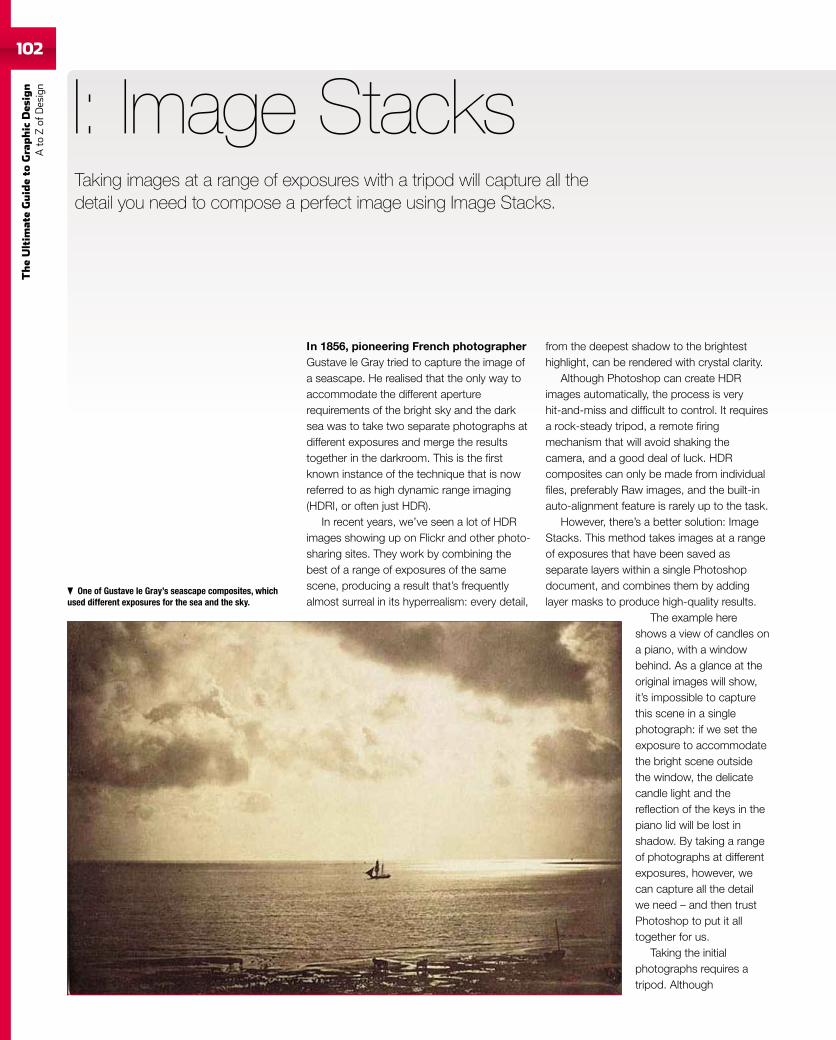
102
TheUltim
ateGuideto
Graphic
Des
ign
Ato
Zof
Design
In 1856, pioneering French photographerGustave le Gray tried to capture the image ofa seascape. He realised that the only way toaccommodate the different aperturerequirements of the bright sky and the darksea was to take two separate photographs atdifferent exposures and merge the resultstogether in the darkroom. This is the firstknown instance of the technique that is nowreferred to as high dynamic range imaging(HDRI, or often just HDR).
In recent years, we’ve seen a lot of HDRimages showing up on Flickr and other photo-sharing sites. They work by combining thebest of a range of exposures of the samescene, producing a result that’s frequentlyalmost surreal in its hyperrealism: every detail,
I: Image Stacks
from the deepest shadow to the brightesthighlight, can be rendered with crystal clarity.
Although Photoshop can create HDRimages automatically, the process is veryhit-and-miss and difficult to control. It requiresa rock-steady tripod, a remote firingmechanism that will avoid shaking thecamera, and a good deal of luck. HDRcomposites can only be made from individualfiles, preferably Raw images, and the built-inauto-alignment feature is rarely up to the task.
However, there’s a better solution: ImageStacks. This method takes images at a rangeof exposures that have been saved asseparate layers within a single Photoshopdocument, and combines them by addinglayer masks to produce high-quality results.
The example hereshows a view of candles ona piano, with a windowbehind. As a glance at theoriginal images will show,it’s impossible to capturethis scene in a singlephotograph: if we set theexposure to accommodatethe bright scene outsidethe window, the delicatecandle light and thereflection of the keys in thepiano lid will be lost inshadow. By taking a rangeof photographs at differentexposures, however, wecan capture all the detailwe need – and then trustPhotoshop to put it alltogether for us.
Taking the initialphotographs requires atripod. Although
Taking images at a range of exposures with a tripod will capture all thedetail you need to compose a perfect image using Image Stacks.
One of Gustave le Gray’s seascape composites, whichused different exposures for the sea and the sky.
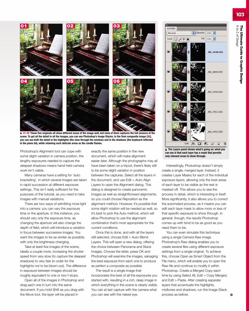
TheUltim
ateGuideto
Grap
hic
Desig
nAto
ZofD
esign103
Photoshop’s Alignment tool can cope withsome slight variation in camera position, thelengthy exposures needed to capture thedeepest shadows means hand-held camerawork isn’t viable.
Many cameras have a setting for ‘autobracketing’, in which several images are takenin rapid succession at different exposuresettings. This isn’t really sufficient for thepurposes of this tutorial, as you need to takeimages with manual variations.
There are two ways of admitting more lightinto a camera: you can vary the exposuretime or the aperture. In this instance, youshould vary only the exposure time, aschanging the aperture will also change thedepth of field, which will introduce a variationin focus between successive images. Youwant the images to be as similar as possible,with only the brightness changing.
Take at least five images of the scene,ideally a couple more, increasing the shutterspeed from very slow (to capture the deepestshadows) to very fast (in order for thehighlights not to be blown out). The differencein exposure between images should beroughly equivalent to one or two f-stops.
Open all of the images in Photoshop anddrag each one in turn into the samedocument. If you hold Shift as you drag withthe Move tool, the layer will be placed in
exactly the same position in the newdocument, which will make alignmenteasier later. Although the photographs may allhave been taken on a tripod, there’s likely stillto be some slight variation in positionbetween the captures. Select all the layers inthe document, and use Edit > Auto-AlignLayers to open the Alignment dialog. Thisdialog is designed to create panoramicimages as well as straightforward alignments,so you could choose Reposition as thealignment method. However, it’s possible thatsome slight rotation will be needed as well, soit’s best to pick the Auto method, which willallow Photoshop to use the alignmentcombination that’s most appropriate for thecurrent conditions.
Once this is done, and with all the layersstill selected, choose Edit > Auto-BlendLayers. This will open a new dialog, offeringthe choice between Panorama and StackImages. Choose the latter, press OK andPhotoshop will examine the images, salvagingthe best exposure from each one to produceas perfect a composite as possible.
The result is a single image thatincorporates the best of all the exposures youstarted with, resulting in a rich, deep image inwhich everything in the scene is clearly visible.You can at last capture with the camera whatyou can see with the naked eye.
Interestingly, Photoshop doesn’t simplycreate a single, merged layer. Instead, itcreates Layer Masks for each of the individualexposure layers, allowing only the best areasof each layer to be visible as the rest ismasked off. This allows you to see theprocess in detail, which is interesting in itself.More significantly, it also allows you to correctthe automated process, as it means you canedit each layer mask to allow more or less ofthat specific exposure to show through. Ingeneral, though, the results Photoshopcomes up with tend to be as good as youneed them to be.
You can even simulate this techniqueusing a single Camera Raw image.Photoshop’s Raw dialog enables you tocreate several files using different exposuresettings from a single original. To achievethis, choose Open as Smart Object from theFile menu, which will enable you to open theRaw file and continue to modify it withinPhotoshop. Create a Merged Copy eachtime by using Select All, Edit > Copy Merged,and Edit > Paste. After creating separatelayers that accentuate the highlights,midtones and shadows, run the Image Stackprocess as before.
01-05 These five originals all show different areas of the image well, but none of them captures the full essence of thescene. To get all the detail in all the images, you can use Photoshop’s Image Stacks. In the final composite image [06],you can see both the detail in the highlights (the view through the window) and in the shadows (the keyboard reflectedin the piano lid), while retaining such delicate areas as the candle flames.
01 02 03
04 05 06
The Layers panel shows what’s going on: what youcan see is that each layer has a mask that permitsonly relevant areas to show through.
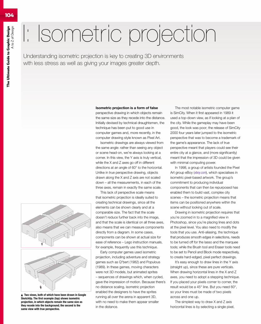
104
TheUltim
ateGuideto
Graphic
Des
ign
Ato
Zof
Design
Isometric projection is a form of falseperspective drawing in which objects remainthe same size as they recede into the distance.Initially devised by technical draughtsmen, thetechnique has been put to good use incomputer games and, more recently, in thecomputer drawing style known as Pixel Art.
Isometric drawings are always viewed fromthe same angle: rather than seeing any objector scene head-on, we’re always looking at acorner. In this view, the Y axis is truly vertical,while the X and Z axes go off in differentdirections at an angle of 60° to the horizontal.Unlike in true perspective drawing, objectsdrawn along the X and Z axis are not scaleddown – all the measurements, in each of thethree axes, remain in exactly the same scale.
This lack of perspective scale meansthat isometric projection is ideally suited tocreating technical drawings, since all theelements can be shown clearly and at acomparable size. The fact that the scaledoesn’t reduce further back into the image,and that the scale is identical on all three axes,also means that we can measure componentsdirectly from a diagram. In some cases,components can be shown at actual size forease of reference – Lego instruction manuals,for example, frequently use this technique.
Early computer games used isometricprojection, including adventure and strategygames such as Q*bert (1982) and Populous(1989). In these games, moving characterswere not 3D models, but animated sprites– sequences of drawings which, when cycled,gave the impression of motion. Because there’sno distance scaling, isometric projectionenabled the designers to have the spritesrunning all over the arena in apparent 3D,with no need to make them appear smallerin the distance.
I: Isometric projection
The most notable isometric computer gameis SimCity. When it first appeared in 1989 itused a top-down view, as if looking at a plan ofthe city. While the gameplay may have beengood, the look was poor; the release of SimCity2000 four years later jumped to the isometricperspective that was to become a trademark ofthe game’s appearance. The lack of trueperspective meant that players could see theirentire city at a glance, and (more significantly)meant that the impression of 3D could be givenwith minimal computing power.
In 1998, a group of artists founded the PixelArt group eBoy (eboy.com), which specialises inisometric pixel-based artwork. The group’scommitment to producing individualcomponents that can then be repurposed hasenabled them to build vast, complex cityscenes – the isometric projection means thatitems can be positioned anywhere within thescene without looking out of scale.
Drawing in isometric projection requires thatyou’re zoomed in to a magnified view inPhotoshop, since you’re placing lines and dotsat the pixel level. You also need to modify thetools that you use. Anti-aliasing, the techniquethat produces smooth edges in selections, needsto be turned off for the lasso and the marqueetools; while the Brush tool and Eraser tools needto be set to Pencil and Block mode respectively,to create hard-edged, pixel perfect drawings.
It’s easy enough to draw lines in the Y axis(straight up), since these are pure verticals.When drawing horizontal lines in the X and Zaxes, you need to adopt a stepping technique.If you placed your pixels corner to corner, theresult would be a 45° line. But you need 60°,so your lines must be made of two pixelsacross and one up.
The simplest way to draw X and Z axishorizontal lines is by selecting a single pixel,
Two views, both of which have been drawn in GoogleSketchUp. The first example (top) shows isometricprojection, in which objects remain the same size asthey recede into the background; the second is thesame view with true perspective.
Understanding isometric projection is key to creating 3D environmentswith less stress as well as giving your images greater depth.
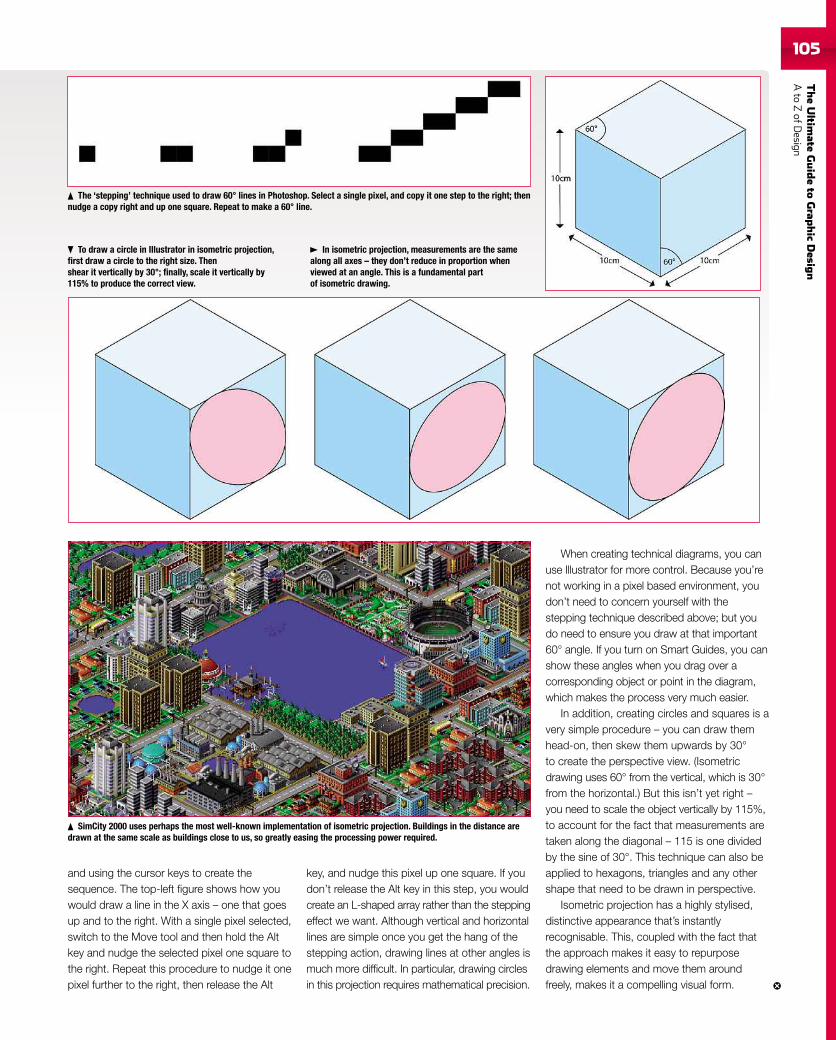
TheUltim
ateGuideto
Grap
hic
Desig
nAto
ZofD
esign105
and using the cursor keys to create thesequence. The top-left figure shows how youwould draw a line in the X axis – one that goesup and to the right. With a single pixel selected,switch to the Move tool and then hold the Altkey and nudge the selected pixel one square tothe right. Repeat this procedure to nudge it onepixel further to the right, then release the Alt
key, and nudge this pixel up one square. If youdon’t release the Alt key in this step, you wouldcreate an L-shaped array rather than the steppingeffect we want. Although vertical and horizontallines are simple once you get the hang of thestepping action, drawing lines at other angles ismuch more difficult. In particular, drawing circlesin this projection requires mathematical precision.
When creating technical diagrams, you canuse Illustrator for more control. Because you’renot working in a pixel based environment, youdon’t need to concern yourself with thestepping technique described above; but youdo need to ensure you draw at that important60° angle. If you turn on Smart Guides, you canshow these angles when you drag over acorresponding object or point in the diagram,which makes the process very much easier.
In addition, creating circles and squares is avery simple procedure – you can draw themhead-on, then skew them upwards by 30°to create the perspective view. (Isometricdrawing uses 60° from the vertical, which is 30°from the horizontal.) But this isn’t yet right –you need to scale the object vertically by 115%,to account for the fact that measurements aretaken along the diagonal – 115 is one dividedby the sine of 30°. This technique can also beapplied to hexagons, triangles and any othershape that need to be drawn in perspective.
Isometric projection has a highly stylised,distinctive appearance that’s instantlyrecognisable. This, coupled with the fact thatthe approach makes it easy to repurposedrawing elements and move them aroundfreely, makes it a compelling visual form.
In isometric projection, measurements are the samealong all axes – they don’t reduce in proportion whenviewed at an angle. This is a fundamental partof isometric drawing.
The ‘stepping’ technique used to draw 60° lines in Photoshop. Select a single pixel, and copy it one step to the right; thennudge a copy right and up one square. Repeat to make a 60° line.
To draw a circle in Illustrator in isometric projection,first draw a circle to the right size. Thenshear it vertically by 30°; finally, scale it vertically by115% to produce the correct view.
SimCity 2000 uses perhaps the most well-known implementation of isometric projection. Buildings in the distance aredrawn at the same scale as buildings close to us, so greatly easing the processing power required.
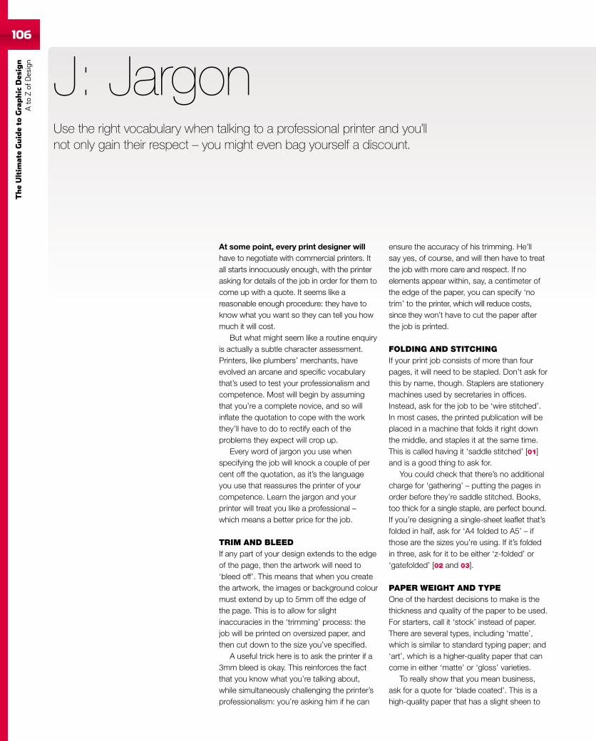
106
TheUltim
ateGuideto
Graphic
Des
ign
Ato
Zof
Design
106
At some point, every print designer willhave to negotiate with commercial printers. Itall starts innocuously enough, with the printerasking for details of the job in order for them tocome up with a quote. It seems like areasonable enough procedure: they have toknow what you want so they can tell you howmuch it will cost.
But what might seem like a routine enquiryis actually a subtle character assessment.Printers, like plumbers’ merchants, haveevolved an arcane and specific vocabularythat’s used to test your professionalism andcompetence. Most will begin by assumingthat you’re a complete novice, and so willinflate the quotation to cope with the workthey’ll have to do to rectify each of theproblems they expect will crop up.
Every word of jargon you use whenspecifying the job will knock a couple of percent off the quotation, as it’s the languageyou use that reassures the printer of yourcompetence. Learn the jargon and yourprinter will treat you like a professional –which means a better price for the job.
TRIM AND BLEEDIf any part of your design extends to the edgeof the page, then the artwork will need to‘bleed off’. This means that when you createthe artwork, the images or background colourmust extend by up to 5mm off the edge ofthe page. This is to allow for slightinaccuracies in the ‘trimming’ process: thejob will be printed on oversized paper, andthen cut down to the size you’ve specified.
A useful trick here is to ask the printer if a3mm bleed is okay. This reinforces the factthat you know what you’re talking about,while simultaneously challenging the printer’sprofessionalism: you’re asking him if he can
J: Jargon
ensure the accuracy of his trimming. He’llsay yes, of course, and will then have to treatthe job with more care and respect. If noelements appear within, say, a centimeter ofthe edge of the paper, you can specify ‘notrim’ to the printer, which will reduce costs,since they won’t have to cut the paper afterthe job is printed.
FOLDING AND STITCHINGIf your print job consists of more than fourpages, it will need to be stapled. Don’t ask forthis by name, though. Staplers are stationerymachines used by secretaries in offices.Instead, ask for the job to be ‘wire stitched’.In most cases, the printed publication will beplaced in a machine that folds it right downthe middle, and staples it at the same time.This is called having it ‘saddle stitched’ [01]and is a good thing to ask for.
You could check that there’s no additionalcharge for ‘gathering’ – putting the pages inorder before they’re saddle stitched. Books,too thick for a single staple, are perfect bound.If you’re designing a single-sheet leaflet that’sfolded in half, ask for ‘A4 folded to A5’ – ifthose are the sizes you’re using. If it’s foldedin three, ask for it to be either ‘z-folded’ or‘gatefolded’ [02 and 03].
PAPER WEIGHT AND TYPEOne of the hardest decisions to make is thethickness and quality of the paper to be used.For starters, call it ‘stock’ instead of paper.There are several types, including ‘matte’,which is similar to standard typing paper; and‘art’, which is a higher-quality paper that cancome in either ‘matte’ or ‘gloss’ varieties.
To really show that you mean business,ask for a quote for ‘blade coated’. This is ahigh-quality paper that has a slight sheen to
Use the right vocabulary when talking to a professional printer and you’llnot only gain their respect – you might even bag yourself a discount.
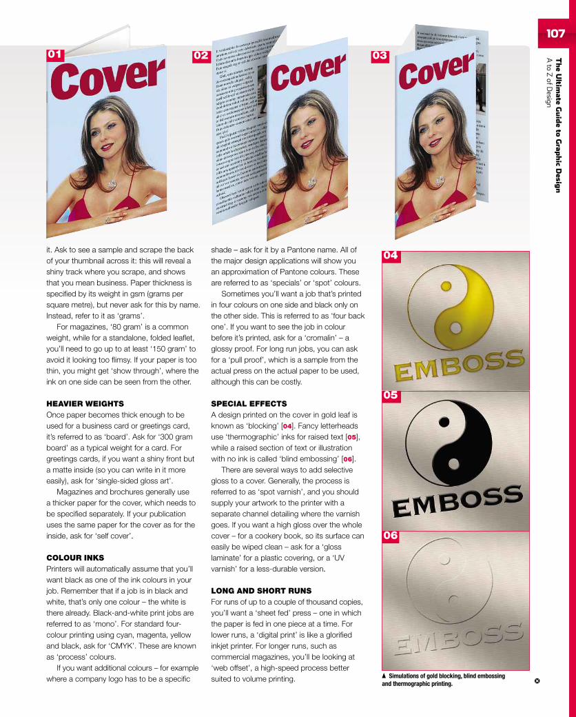
TheUltim
ateGuideto
Grap
hic
Desig
nAto
ZofD
esign107107
it. Ask to see a sample and scrape the backof your thumbnail across it: this will reveal ashiny track where you scrape, and showsthat you mean business. Paper thickness isspecified by its weight in gsm (grams persquare metre), but never ask for this by name.Instead, refer to it as ‘grams’.
For magazines, ‘80 gram’ is a commonweight, while for a standalone, folded leaflet,you’ll need to go up to at least ‘150 gram’ toavoid it looking too flimsy. If your paper is toothin, you might get ‘show through’, where theink on one side can be seen from the other.
HEAVIER WEIGHTSOnce paper becomes thick enough to beused for a business card or greetings card,it’s referred to as ‘board’. Ask for ‘300 gramboard’ as a typical weight for a card. Forgreetings cards, if you want a shiny front buta matte inside (so you can write in it moreeasily), ask for ‘single-sided gloss art’.
Magazines and brochures generally usea thicker paper for the cover, which needs tobe specified separately. If your publicationuses the same paper for the cover as for theinside, ask for ‘self cover’.
COLOUR INKSPrinters will automatically assume that you’llwant black as one of the ink colours in yourjob. Remember that if a job is in black andwhite, that’s only one colour – the white isthere already. Black-and-white print jobs arereferred to as ‘mono’. For standard four-colour printing using cyan, magenta, yellowand black, ask for ‘CMYK’. These are knownas ‘process’ colours.
If you want additional colours – for examplewhere a company logo has to be a specific
shade – ask for it by a Pantone name. All ofthe major design applications will show youan approximation of Pantone colours. Theseare referred to as ‘specials’ or ‘spot’ colours.
Sometimes you’ll want a job that’s printedin four colours on one side and black only onthe other side. This is referred to as ‘four backone’. If you want to see the job in colourbefore it’s printed, ask for a ‘cromalin’ – aglossy proof. For long run jobs, you can askfor a ‘pull proof’, which is a sample from theactual press on the actual paper to be used,although this can be costly.
SPECIAL EFFECTSA design printed on the cover in gold leaf isknown as ‘blocking’ [04]. Fancy letterheadsuse ‘thermographic’ inks for raised text [05],while a raised section of text or illustrationwith no ink is called ‘blind embossing’ [06].
There are several ways to add selectivegloss to a cover. Generally, the process isreferred to as ‘spot varnish’, and you shouldsupply your artwork to the printer with aseparate channel detailing where the varnishgoes. If you want a high gloss over the wholecover – for a cookery book, so its surface caneasily be wiped clean – ask for a ‘glosslaminate’ for a plastic covering, or a ‘UVvarnish’ for a less-durable version.
LONG AND SHORT RUNSFor runs of up to a couple of thousand copies,you’ll want a ‘sheet fed’ press – one in whichthe paper is fed in one piece at a time. Forlower runs, a ‘digital print’ is like a glorifiedinkjet printer. For longer runs, such ascommercial magazines, you’ll be looking at‘web offset’, a high-speed process bettersuited to volume printing.
04
Simulations of gold blocking, blind embossingand thermographic printing.
05
06
01 02 03
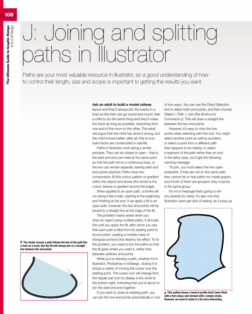
108
TheUltim
ateGuideto
Graphic
Des
ign
Ato
Zof
Design
Ask an adult to build a model railwaylayout and they’ll always join the tracks in aloop so the train can go round and round. Aska child to do the same thing and they’ll makethe track as long as possible, stretching fromone end of the room to the other. The adultwill argue that the child has done it wrong, butthe child knows better: after all, this is howtrain tracks are constructed in real life.
Paths in Illustrator work along a similarprinciple. They can be closed or open – that is,the start and end can meet at the same point,so that the path forms a continuous loop, orthe two can remain separate, leaving start andend points unjoined. Paths have twocomponents: fill (the colour, pattern or gradientwithin the object) and stroke (the stroke is thecolour, texture or gradient around the edge).
When applied to an open path, a stroke willrun along it like a train, starting at the beginningand finishing at the end. If we apply a fill to anopen path, however, the two end points will bejoined by a straight line at the edge of the fill.
The problem mainly arises when youdraw an object using multiple paths. It all looksfine until you apply the fill, after which you seethat each path is filled from its starting point toits end point, creating a horrible mess oftriangular portions that destroy the effect. To fixthe problem, you need to join the paths so thatthe fill goes where you want it, rather thanbetween arbitrary end points.
While you’re drawing a path, whether it’s inIllustrator, Photoshop or InDesign, closing it issimply a matter of moving the cursor over thestarting point. The cursor icon will change fromthe regular pen icon to display a tiny circle atthe bottom right, indicating that you’re about tojoin the start and end together.
If you want to close an existing path, youcan join the two end points automatically in one
J: Joining and splittingpaths in Illustrator
of two ways. You can use the Direct Selectiontool to select both end points, and then chooseObject > Path > Join (the shortcut isCommand-J). This will draw a straight linebetween the two end points.
However, it’s easy to miss the twopoints when selecting with this tool. You mightselect another point as well by accident,or select a point from a different paththat happens to be nearby, or selecta segment of the path rather than an end.In the latter case, you’ll get the followingwarning message:
‘To join, you must select the two openendpoints. If they are not on the same path,they cannot be on text paths nor inside graphs,and if both of them are grouped, they must bein the same group.’
It’s not a message that’s going to winany awards for clarity. It’s also one thatIllustrator users get sick of seeing, as it pops up
The stroke around a path follows the line of the path likea train on a track. But the fill will always join in a straightline between the end points.
This outline shows a head in profile that’s been filledwith a flat colour, and stroked with a simple stroke.However, we want to make it a bit more interesting.
Paths are your most valuable resource in Illustrator, so a good understanding of howto control their length, size and scope is important to getting the results you want.
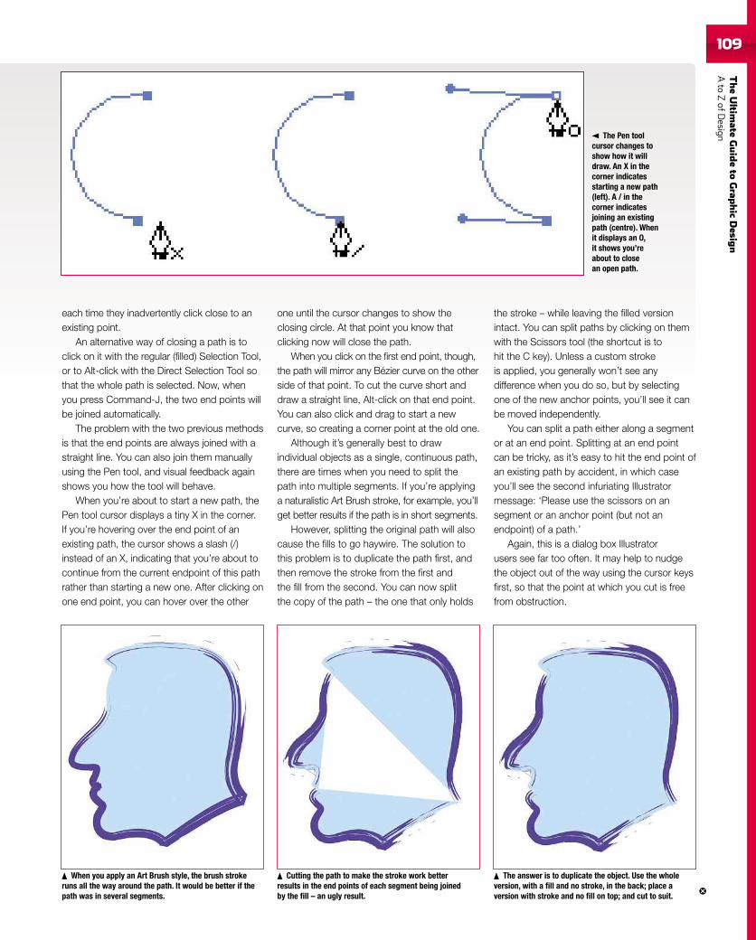
TheUltim
ateGuideto
Grap
hic
Desig
nAto
ZofD
esign109
each time they inadvertently click close to anexisting point.
An alternative way of closing a path is toclick on it with the regular (filled) Selection Tool,or to Alt-click with the Direct Selection Tool sothat the whole path is selected. Now, whenyou press Command-J, the two end points willbe joined automatically.
The problem with the two previous methodsis that the end points are always joined with astraight line. You can also join them manuallyusing the Pen tool, and visual feedback againshows you how the tool will behave.
When you’re about to start a new path, thePen tool cursor displays a tiny X in the corner.If you’re hovering over the end point of anexisting path, the cursor shows a slash (/)instead of an X, indicating that you’re about tocontinue from the current endpoint of this pathrather than starting a new one. After clicking onone end point, you can hover over the other
one until the cursor changes to show theclosing circle. At that point you know thatclicking now will close the path.
When you click on the first end point, though,the path will mirror any Bézier curve on the otherside of that point. To cut the curve short anddraw a straight line, Alt-click on that end point.You can also click and drag to start a newcurve, so creating a corner point at the old one.
Although it’s generally best to drawindividual objects as a single, continuous path,there are times when you need to split thepath into multiple segments. If you’re applyinga naturalistic Art Brush stroke, for example, you’llget better results if the path is in short segments.
However, splitting the original path will alsocause the fills to go haywire. The solution tothis problem is to duplicate the path first, andthen remove the stroke from the first andthe fill from the second. You can now splitthe copy of the path – the one that only holds
the stroke – while leaving the filled versionintact. You can split paths by clicking on themwith the Scissors tool (the shortcut is tohit the C key). Unless a custom strokeis applied, you generally won’t see anydifference when you do so, but by selectingone of the new anchor points, you’ll see it canbe moved independently.
You can split a path either along a segmentor at an end point. Splitting at an end pointcan be tricky, as it’s easy to hit the end point ofan existing path by accident, in which caseyou’ll see the second infuriating Illustratormessage: ‘Please use the scissors on ansegment or an anchor point (but not anendpoint) of a path.’
Again, this is a dialog box Illustratorusers see far too often. It may help to nudgethe object out of the way using the cursor keysfirst, so that the point at which you cut is freefrom obstruction.
The Pen toolcursor changes toshow how it willdraw. An X in thecorner indicatesstarting a new path(left). A / in thecorner indicatesjoining an existingpath (centre). Whenit displays an O,it shows you’reabout to closean open path.
When you apply an Art Brush style, the brush strokeruns all the way around the path. It would be better if thepath was in several segments.
Cutting the path to make the stroke work betterresults in the end points of each segment being joinedby the fill – an ugly result.
The answer is to duplicate the object. Use the wholeversion, with a fill and no stroke, in the back; place aversion with stroke and no fill on top; and cut to suit.
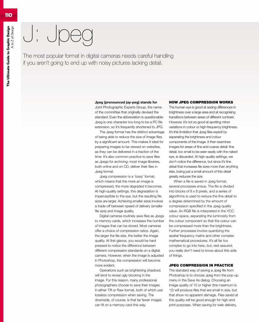
110
TheUltim
ateGuideto
Graphic
Des
ign
Ato
Zof
Design
Jpeg (pronounced jay-peg) stands forJoint Photographic Experts Group, the nameof the committee that originally devised thestandard. Even the abbreviation is questionable:Jpeg is one character too long to be a PC fileextension, so it’s frequently shortened to JPG.
The Jpeg format has the distinct advantageof being able to reduce the size of image filesby a significant amount. This makes it ideal forpreparing images to be viewed on websites,as they can be delivered in a fraction of thetime. It’s also common practice to save filesas Jpegs for archiving; most image libraries,both online and on CD, deliver their files inJpeg format.
Jpeg compression is a ‘lossy’ format,which means that the more an image iscompressed, the more degraded it becomes.At high-quality settings, this degradation isimperceptible to the eye, but the resulting filesizes are larger. Achieving smaller sizes involvesa trade-off between speed of delivery (smallerfile size) and image quality.
Digital cameras routinely save files as Jpegsto memory cards, which increases the numberof images that can be stored. Most camerasoffer a choice of compression ratios. Again,the larger the file size, the better the imagequality. At first glance, you would be hardpressed to notice the difference betweendifferent compression standards on a digitalcamera. However, when the image is adjustedin Photoshop, the compression will becomemore evident.
Operations such as brightening shadowswill tend to reveal ugly blocking in theimage. For this reason, many professionalphotographers choose to save their imagesin either Tiff or Raw format, both of which uselossless compression when saving. Thedownside, of course, is that far fewer imagescan fit on a memory card this way.
J: Jpeg
HOW JPEG COMPRESSION WORKSThe human eye is good at seeing differences inbrightness over a large area and at recognisingtransitions between areas of different contrast.However, it’s not so good at spotting minorvariations in colour or high-frequency brightness.It’s this limitation that Jpeg files exploit byseparating the brightness and colourcomponents of the image. It then examinesimages for areas of fine and coarse detail: finedetail, too small to be seen easily with the nakedeye, is discarded. At high-quality settings, wedon’t notice the difference, but since it’s finedetail that increases file sizes more than anythingelse, losing just a small amount of this detailgreatly reduces the size.
When a file is saved in Jpeg format,several processes ensue. The file is dividedinto blocks of 8 x 8 pixels, and a series ofalgorithms is used to reduce the fine detail toa degree determined by the amount ofcompression specified in the Jpeg qualityvalue. An RGB file is interpreted in the YCCcolour space, separating the luminosity fromthe colour component so that the colour canbe compressed more than the brightness.Further processes involve quantizing thespatial frequency matrix and other complexmathematical procedures. It’s all far toocomplex to go into here, but, rest assured,you really don’t need to know about this sideof things.
JPEG COMPRESSION IN PRACTICEThe standard way of saving a Jpeg file fromPhotoshop is to choose Jpeg from the pop-upmenu in the Save As dialog. Choosing animage quality of 10 or higher (the maximum is12) will produce files that are small in size, butthat show no apparent damage. Files saved atthis quality will be good enough for high-endprint purposes. When saving for web delivery,
The most popular format in digital cameras needs careful handlingif you aren’t going to end up with noisy pictures lacking detail.
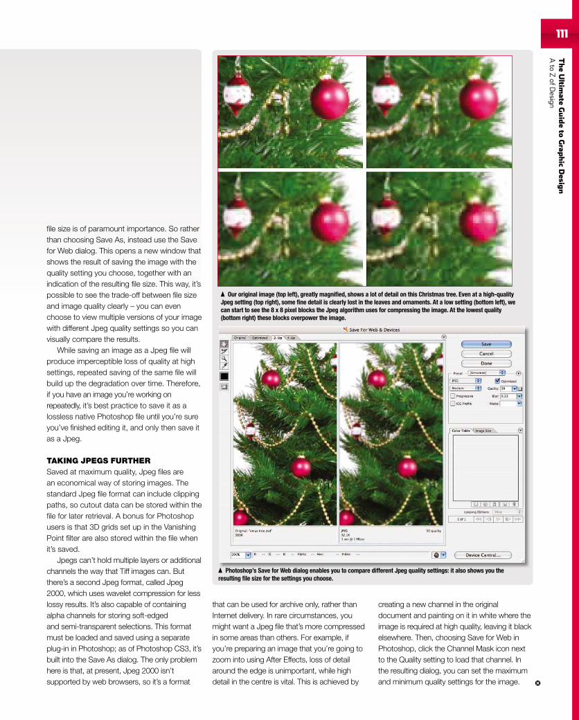
TheUltim
ateGuideto
Grap
hic
Desig
nAto
ZofD
esign111
file size is of paramount importance. So ratherthan choosing Save As, instead use the Savefor Web dialog. This opens a new window thatshows the result of saving the image with thequality setting you choose, together with anindication of the resulting file size. This way, it’spossible to see the trade-off between file sizeand image quality clearly – you can evenchoose to view multiple versions of your imagewith different Jpeg quality settings so you canvisually compare the results.
While saving an image as a Jpeg file willproduce imperceptible loss of quality at highsettings, repeated saving of the same file willbuild up the degradation over time. Therefore,if you have an image you’re working onrepeatedly, it’s best practice to save it as alossless native Photoshop file until you’re sureyou’ve finished editing it, and only then save itas a Jpeg.
TAKING JPEGS FURTHERSaved at maximum quality, Jpeg files arean economical way of storing images. Thestandard Jpeg file format can include clippingpaths, so cutout data can be stored within thefile for later retrieval. A bonus for Photoshopusers is that 3D grids set up in the VanishingPoint filter are also stored within the file whenit’s saved.
Jpegs can’t hold multiple layers or additionalchannels the way that Tiff images can. Butthere’s a second Jpeg format, called Jpeg2000, which uses wavelet compression for lesslossy results. It’s also capable of containingalpha channels for storing soft-edgedand semi-transparent selections. This formatmust be loaded and saved using a separateplug-in in Photoshop; as of Photoshop CS3, it’sbuilt into the Save As dialog. The only problemhere is that, at present, Jpeg 2000 isn’tsupported by web browsers, so it’s a format
that can be used for archive only, rather thanInternet delivery. In rare circumstances, youmight want a Jpeg file that’s more compressedin some areas than others. For example, ifyou’re preparing an image that you’re going tozoom into using After Effects, loss of detailaround the edge is unimportant, while highdetail in the centre is vital. This is achieved by
creating a new channel in the originaldocument and painting on it in white where theimage is required at high quality, leaving it blackelsewhere. Then, choosing Save for Web inPhotoshop, click the Channel Mask icon nextto the Quality setting to load that channel. Inthe resulting dialog, you can set the maximumand minimum quality settings for the image.
Our original image (top left), greatly magnified, shows a lot of detail on this Christmas tree. Even at a high-qualityJpeg setting (top right), some fine detail is clearly lost in the leaves and ornaments. At a low setting (bottom left), wecan start to see the 8 x 8 pixel blocks the Jpeg algorithm uses for compressing the image. At the lowest quality(bottom right) these blocks overpower the image.
Photoshop’s Save for Web dialog enables you to compare different Jpeg quality settings: it also shows you theresulting file size for the settings you choose.
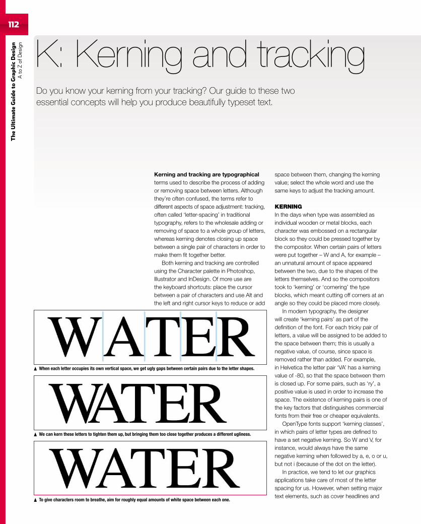
112
TheUltim
ateGuideto
Graphic
Des
ign
Ato
Zof
Design
112
Kerning and tracking are typographicalterms used to describe the process of addingor removing space between letters. Althoughthey’re often confused, the terms refer todifferent aspects of space adjustment: tracking,often called ‘letter-spacing’ in traditionaltypography, refers to the wholesale adding orremoving of space to a whole group of letters,whereas kerning denotes closing up spacebetween a single pair of characters in order tomake them fit together better.
Both kerning and tracking are controlledusing the Character palette in Photoshop,Illustrator and InDesign. Of more use arethe keyboard shortcuts: place the cursorbetween a pair of characters and use Alt andthe left and right cursor keys to reduce or add
K: Kerning and tracking
space between them, changing the kerningvalue; select the whole word and use thesame keys to adjust the tracking amount.
KERNINGIn the days when type was assembled asindividual wooden or metal blocks, eachcharacter was embossed on a rectangularblock so they could be pressed together bythe compositor. When certain pairs of letterswere put together – W and A, for example –an unnatural amount of space appearedbetween the two, due to the shapes of theletters themselves. And so the compositorstook to ‘kerning’ or ‘cornering’ the typeblocks, which meant cutting off corners at anangle so they could be placed more closely.
In modern typography, the designerwill create ‘kerning pairs’ as part of thedefinition of the font. For each tricky pair ofletters, a value will be assigned to be added tothe space between them; this is usually anegative value, of course, since space isremoved rather than added. For example,in Helvetica the letter pair ‘VA’ has a kerningvalue of -80, so that the space between themis closed up. For some pairs, such as ‘ry’, apositive value is used in order to increase thespace. The existence of kerning pairs is one ofthe key factors that distinguishes commercialfonts from their free or cheaper equivalents.
OpenType fonts support ‘kerning classes’,in which pairs of letter types are defined tohave a set negative kerning. So W and V, forinstance, would always have the samenegative kerning when followed by a, e, o or u,but not i (because of the dot on the letter).
In practice, we tend to let our graphicsapplications take care of most of the letterspacing for us. However, when setting majortext elements, such as cover headlines and
When each letter occupies its own vertical space, we get ugly gaps between certain pairs due to the letter shapes.
We can kern these letters to tighten them up, but bringing them too close together produces a different ugliness.
To give characters room to breathe, aim for roughly equal amounts of white space between each one.
Do you know your kerning from your tracking? Our guide to these twoessential concepts will help you produce beautifully typeset text.
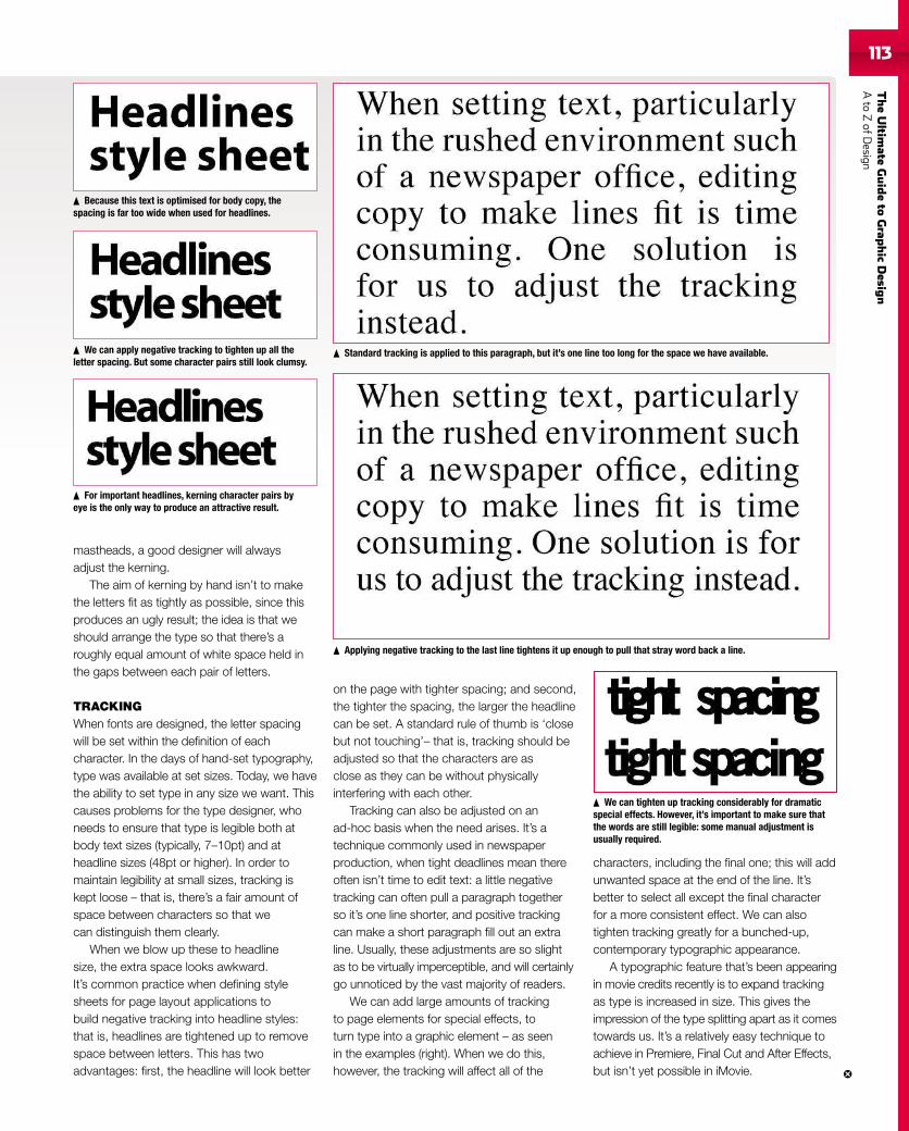
TheUltim
ateGuideto
Grap
hic
Desig
nAto
ZofD
esign113113
mastheads, a good designer will alwaysadjust the kerning.
The aim of kerning by hand isn’t to makethe letters fit as tightly as possible, since thisproduces an ugly result; the idea is that weshould arrange the type so that there’s aroughly equal amount of white space held inthe gaps between each pair of letters.
TRACKINGWhen fonts are designed, the letter spacingwill be set within the definition of eachcharacter. In the days of hand-set typography,type was available at set sizes. Today, we havethe ability to set type in any size we want. Thiscauses problems for the type designer, whoneeds to ensure that type is legible both atbody text sizes (typically, 7–10pt) and atheadline sizes (48pt or higher). In order tomaintain legibility at small sizes, tracking iskept loose – that is, there’s a fair amount ofspace between characters so that wecan distinguish them clearly.
When we blow up these to headlinesize, the extra space looks awkward.It’s common practice when defining stylesheets for page layout applications tobuild negative tracking into headline styles:that is, headlines are tightened up to removespace between letters. This has twoadvantages: first, the headline will look better
on the page with tighter spacing; and second,the tighter the spacing, the larger the headlinecan be set. A standard rule of thumb is ‘closebut not touching’– that is, tracking should beadjusted so that the characters are asclose as they can be without physicallyinterfering with each other.
Tracking can also be adjusted on anad-hoc basis when the need arises. It’s atechnique commonly used in newspaperproduction, when tight deadlines mean thereoften isn’t time to edit text: a little negativetracking can often pull a paragraph togetherso it’s one line shorter, and positive trackingcan make a short paragraph fill out an extraline. Usually, these adjustments are so slightas to be virtually imperceptible, and will certainlygo unnoticed by the vast majority of readers.
We can add large amounts of trackingto page elements for special effects, toturn type into a graphic element – as seenin the examples (right). When we do this,however, the tracking will affect all of the
characters, including the final one; this will addunwanted space at the end of the line. It’sbetter to select all except the final characterfor a more consistent effect. We can alsotighten tracking greatly for a bunched-up,contemporary typographic appearance.
A typographic feature that’s been appearingin movie credits recently is to expand trackingas type is increased in size. This gives theimpression of the type splitting apart as it comestowards us. It’s a relatively easy technique toachieve in Premiere, Final Cut and After Effects,but isn’t yet possible in iMovie.
We can tighten up tracking considerably for dramaticspecial effects. However, it’s important to make sure thatthe words are still legible: some manual adjustment isusually required.
Because this text is optimised for body copy, thespacing is far too wide when used for headlines.
We can apply negative tracking to tighten up all theletter spacing. But some character pairs still look clumsy.
For important headlines, kerning character pairs byeye is the only way to produce an attractive result.
Standard tracking is applied to this paragraph, but it’s one line too long for the space we have available.
Applying negative tracking to the last line tightens it up enough to pull that stray word back a line.
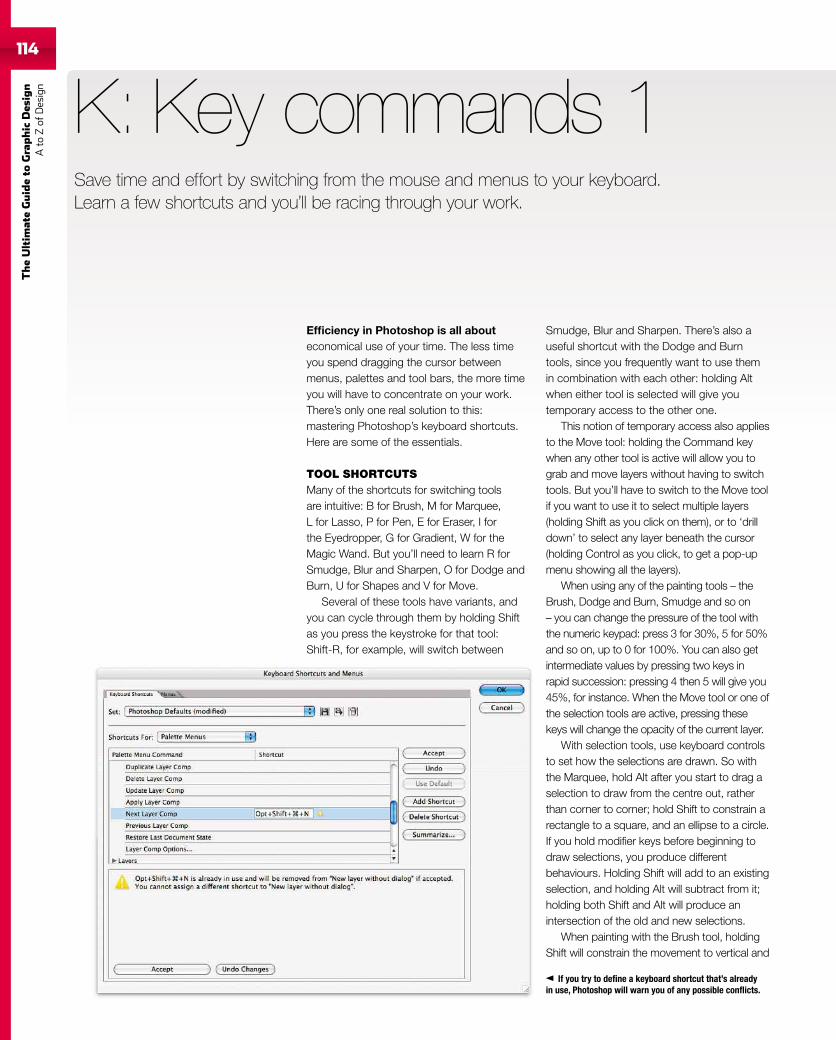
114
TheUltim
ateGuideto
Graphic
Des
ign
Ato
Zof
Design
If you try to define a keyboard shortcut that’s alreadyin use, Photoshop will warn you of any possible conflicts.
Efficiency in Photoshop is all abouteconomical use of your time. The less timeyou spend dragging the cursor betweenmenus, palettes and tool bars, the more timeyou will have to concentrate on your work.There’s only one real solution to this:mastering Photoshop’s keyboard shortcuts.Here are some of the essentials.
TOOL SHORTCUTSMany of the shortcuts for switching toolsare intuitive: B for Brush, M for Marquee,L for Lasso, P for Pen, E for Eraser, I forthe Eyedropper, G for Gradient, W for theMagic Wand. But you’ll need to learn R forSmudge, Blur and Sharpen, O for Dodge andBurn, U for Shapes and V for Move.
Several of these tools have variants, andyou can cycle through them by holding Shiftas you press the keystroke for that tool:Shift-R, for example, will switch between
K: Key commands 1
Smudge, Blur and Sharpen. There’s also auseful shortcut with the Dodge and Burntools, since you frequently want to use themin combination with each other: holding Altwhen either tool is selected will give youtemporary access to the other one.
This notion of temporary access also appliesto the Move tool: holding the Command keywhen any other tool is active will allow you tograb and move layers without having to switchtools. But you’ll have to switch to the Move toolif you want to use it to select multiple layers(holding Shift as you click on them), or to ‘drilldown’ to select any layer beneath the cursor(holding Control as you click, to get a pop-upmenu showing all the layers).
When using any of the painting tools – theBrush, Dodge and Burn, Smudge and so on– you can change the pressure of the tool withthe numeric keypad: press 3 for 30%, 5 for 50%and so on, up to 0 for 100%. You can also getintermediate values by pressing two keys inrapid succession: pressing 4 then 5 will give you45%, for instance. When the Move tool or one ofthe selection tools are active, pressing thesekeys will change the opacity of the current layer.
With selection tools, use keyboard controlsto set how the selections are drawn. So withthe Marquee, hold Alt after you start to drag aselection to draw from the centre out, ratherthan corner to corner; hold Shift to constrain arectangle to a square, and an ellipse to a circle.If you hold modifier keys before beginning todraw selections, you produce differentbehaviours. Holding Shift will add to an existingselection, and holding Alt will subtract from it;holding both Shift and Alt will produce anintersection of the old and new selections.
When painting with the Brush tool, holdingShift will constrain the movement to vertical and
Save time and effort by switching from the mouse and menus to your keyboard.Learn a few shortcuts and you’ll be racing through your work.
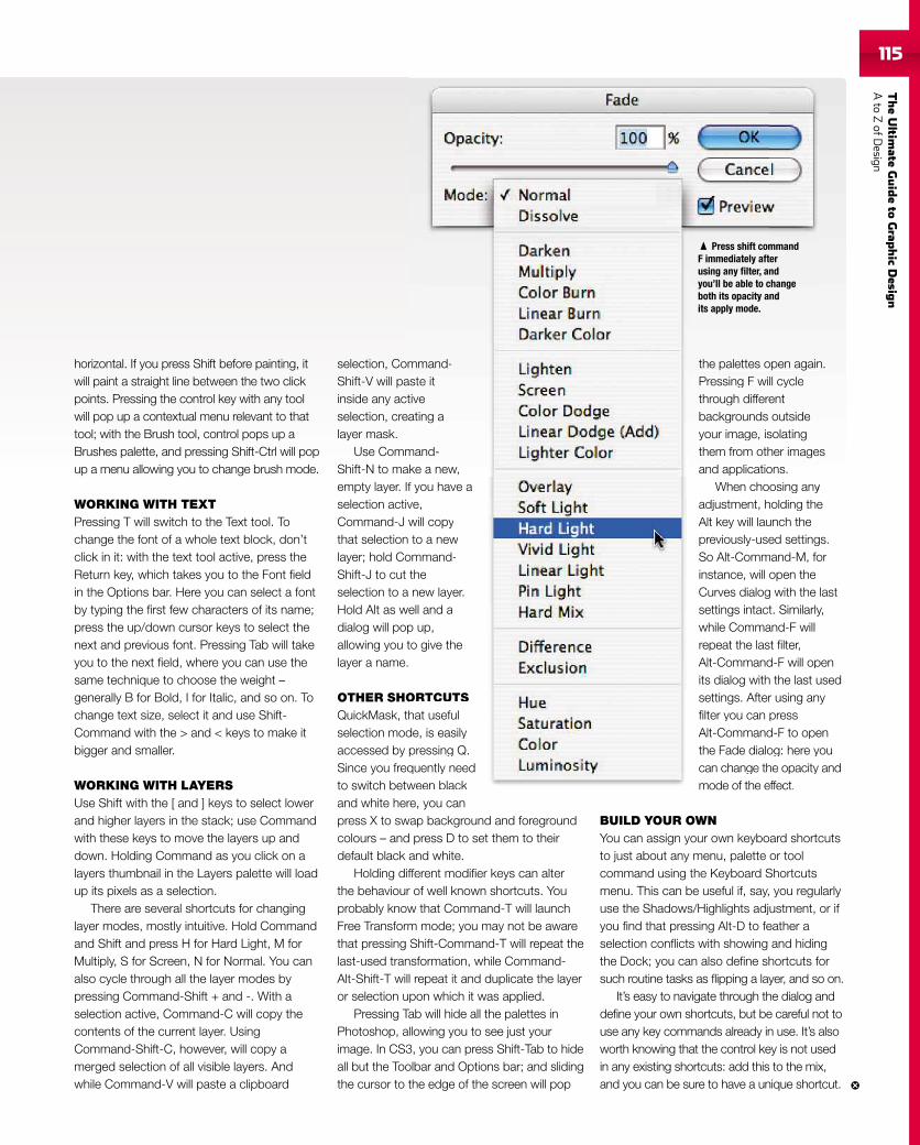
TheUltim
ateGuideto
Grap
hic
Desig
nAto
ZofD
esign115
horizontal. If you press Shift before painting, itwill paint a straight line between the two clickpoints. Pressing the control key with any toolwill pop up a contextual menu relevant to thattool; with the Brush tool, control pops up aBrushes palette, and pressing Shift-Ctrl will popup a menu allowing you to change brush mode.
WORKING WITH TEXTPressing T will switch to the Text tool. Tochange the font of a whole text block, don’tclick in it: with the text tool active, press theReturn key, which takes you to the Font fieldin the Options bar. Here you can select a fontby typing the first few characters of its name;press the up/down cursor keys to select thenext and previous font. Pressing Tab will takeyou to the next field, where you can use thesame technique to choose the weight –generally B for Bold, I for Italic, and so on. Tochange text size, select it and use Shift-Command with the > and < keys to make itbigger and smaller.
WORKING WITH LAYERSUse Shift with the [ and ] keys to select lowerand higher layers in the stack; use Commandwith these keys to move the layers up anddown. Holding Command as you click on alayers thumbnail in the Layers palette will loadup its pixels as a selection.
There are several shortcuts for changinglayer modes, mostly intuitive. Hold Commandand Shift and press H for Hard Light, M forMultiply, S for Screen, N for Normal. You canalso cycle through all the layer modes bypressing Command-Shift + and -. With aselection active, Command-C will copy thecontents of the current layer. UsingCommand-Shift-C, however, will copy amerged selection of all visible layers. Andwhile Command-V will paste a clipboard
selection, Command-Shift-V will paste itinside any activeselection, creating alayer mask.
Use Command-Shift-N to make a new,empty layer. If you have aselection active,Command-J will copythat selection to a newlayer; hold Command-Shift-J to cut theselection to a new layer.Hold Alt as well and adialog will pop up,allowing you to give thelayer a name.
OTHER SHORTCUTSQuickMask, that usefulselection mode, is easilyaccessed by pressing Q.Since you frequently needto switch between blackand white here, you canpress X to swap background and foregroundcolours – and press D to set them to theirdefault black and white.
Holding different modifier keys can alterthe behaviour of well known shortcuts. Youprobably know that Command-T will launchFree Transform mode; you may not be awarethat pressing Shift-Command-T will repeat thelast-used transformation, while Command-Alt-Shift-T will repeat it and duplicate the layeror selection upon which it was applied.
Pressing Tab will hide all the palettes inPhotoshop, allowing you to see just yourimage. In CS3, you can press Shift-Tab to hideall but the Toolbar and Options bar; and slidingthe cursor to the edge of the screen will pop
the palettes open again.Pressing F will cyclethrough differentbackgrounds outsideyour image, isolatingthem from other imagesand applications.
When choosing anyadjustment, holding theAlt key will launch thepreviously-used settings.So Alt-Command-M, forinstance, will open theCurves dialog with the lastsettings intact. Similarly,while Command-F willrepeat the last filter,Alt-Command-F will openits dialog with the last usedsettings. After using anyfilter you can pressAlt-Command-F to openthe Fade dialog: here youcan change the opacity andmode of the effect.
BUILD YOUR OWNYou can assign your own keyboard shortcutsto just about any menu, palette or toolcommand using the Keyboard Shortcutsmenu. This can be useful if, say, you regularlyuse the Shadows/Highlights adjustment, or ifyou find that pressing Alt-D to feather aselection conflicts with showing and hidingthe Dock; you can also define shortcuts forsuch routine tasks as flipping a layer, and so on.
It’s easy to navigate through the dialog anddefine your own shortcuts, but be careful not touse any key commands already in use. It’s alsoworth knowing that the control key is not usedin any existing shortcuts: add this to the mix,and you can be sure to have a unique shortcut.
ommaastective
atin
mmanake af yove,will cto a
Commthe
a newwell a
p upto gi
ORTChatde, ispres
equetween blackre, you can
n.
es
ye
gs.for
lastly,
penused
any
penyou
ty andmode of the effect.
mand-te it
ing a
and-a new,
you have a
copya new
mmand-
ew layer.and a
up,give the
TCUTSusefulis easily
essing Q.uently needeen black
the palettes open again.Pressing F will cyclethrough differentbackgrounds outsideyour image, isolatingthem from other imagesand applications.
When choosing anyadjustment, holding theAlt key will launch thepreviously-used settingsSo Alt-Command-M, foinstance, will open theCurves dialog with thesettings intact. Similarlywhile Command-F willrepeat the last filter,Alt-Command-F will opeits dialog with the last usettings. After using anfilter you can pressAlt-Command-F to opethe Fade dialog: here yocan change the opacitymode of the effect
Press shift commandF immediately afterusing any filter, andyou’ll be able to changeboth its opacity andits apply mode.
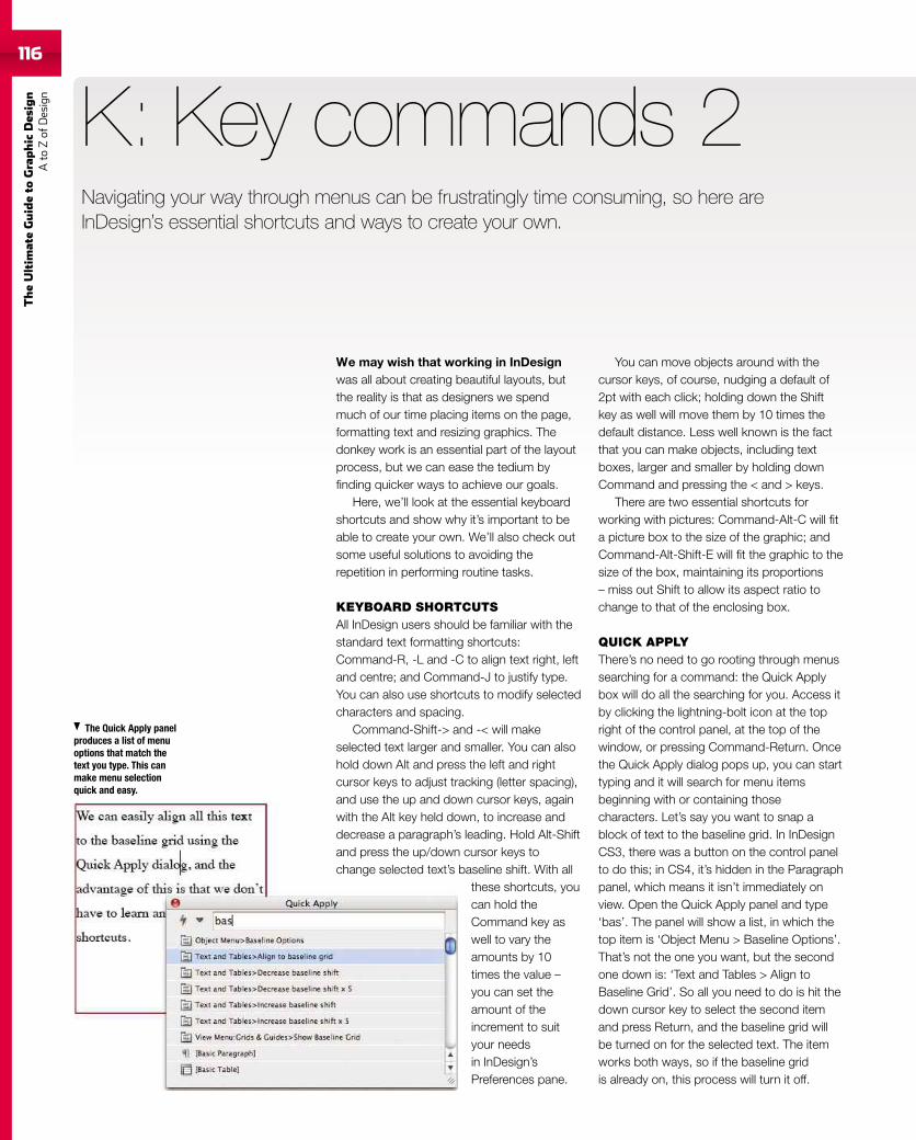
116
TheUltim
ateGuideto
Graphic
Des
ign
Ato
Zof
Design
K: Key commands 2
You can move objects around with thecursor keys, of course, nudging a default of2pt with each click; holding down the Shiftkey as well will move them by 10 times thedefault distance. Less well known is the factthat you can make objects, including textboxes, larger and smaller by holding downCommand and pressing the < and > keys.
There are two essential shortcuts forworking with pictures: Command-Alt-C will fita picture box to the size of the graphic; andCommand-Alt-Shift-E will fit the graphic to thesize of the box, maintaining its proportions– miss out Shift to allow its aspect ratio tochange to that of the enclosing box.
QUICK APPLYThere’s no need to go rooting through menussearching for a command: the Quick Applybox will do all the searching for you. Access itby clicking the lightning-bolt icon at the topright of the control panel, at the top of thewindow, or pressing Command-Return. Oncethe Quick Apply dialog pops up, you can starttyping and it will search for menu itemsbeginning with or containing thosecharacters. Let’s say you want to snap ablock of text to the baseline grid. In InDesignCS3, there was a button on the control panelto do this; in CS4, it’s hidden in the Paragraphpanel, which means it isn’t immediately onview. Open the Quick Apply panel and type‘bas’. The panel will show a list, in which thetop item is ‘Object Menu > Baseline Options’.That’s not the one you want, but the secondone down is: ‘Text and Tables > Align toBaseline Grid’. So all you need to do is hit thedown cursor key to select the second itemand press Return, and the baseline grid willbe turned on for the selected text. The itemworks both ways, so if the baseline gridis already on, this process will turn it off.
Navigating your way through menus can be frustratingly time consuming, so here areInDesign’s essential shortcuts and ways to create your own.
The Quick Apply panelproduces a list of menuoptions that match thetext you type. This canmake menu selectionquick and easy.
We may wish that working in InDesignwas all about creating beautiful layouts, butthe reality is that as designers we spendmuch of our time placing items on the page,formatting text and resizing graphics. Thedonkey work is an essential part of the layoutprocess, but we can ease the tedium byfinding quicker ways to achieve our goals.
Here, we’ll look at the essential keyboardshortcuts and show why it’s important to beable to create your own. We’ll also check outsome useful solutions to avoiding therepetition in performing routine tasks.
KEYBOARD SHORTCUTSAll InDesign users should be familiar with thestandard text formatting shortcuts:Command-R, -L and -C to align text right, leftand centre; and Command-J to justify type.You can also use shortcuts to modify selectedcharacters and spacing.
Command-Shift-> and -< will makeselected text larger and smaller. You can alsohold down Alt and press the left and rightcursor keys to adjust tracking (letter spacing),and use the up and down cursor keys, againwith the Alt key held down, to increase anddecrease a paragraph’s leading. Hold Alt-Shiftand press the up/down cursor keys tochange selected text’s baseline shift. With all
these shortcuts, youcan hold theCommand key aswell to vary theamounts by 10times the value –you can set theamount of theincrement to suityour needsin InDesign’sPreferences pane.
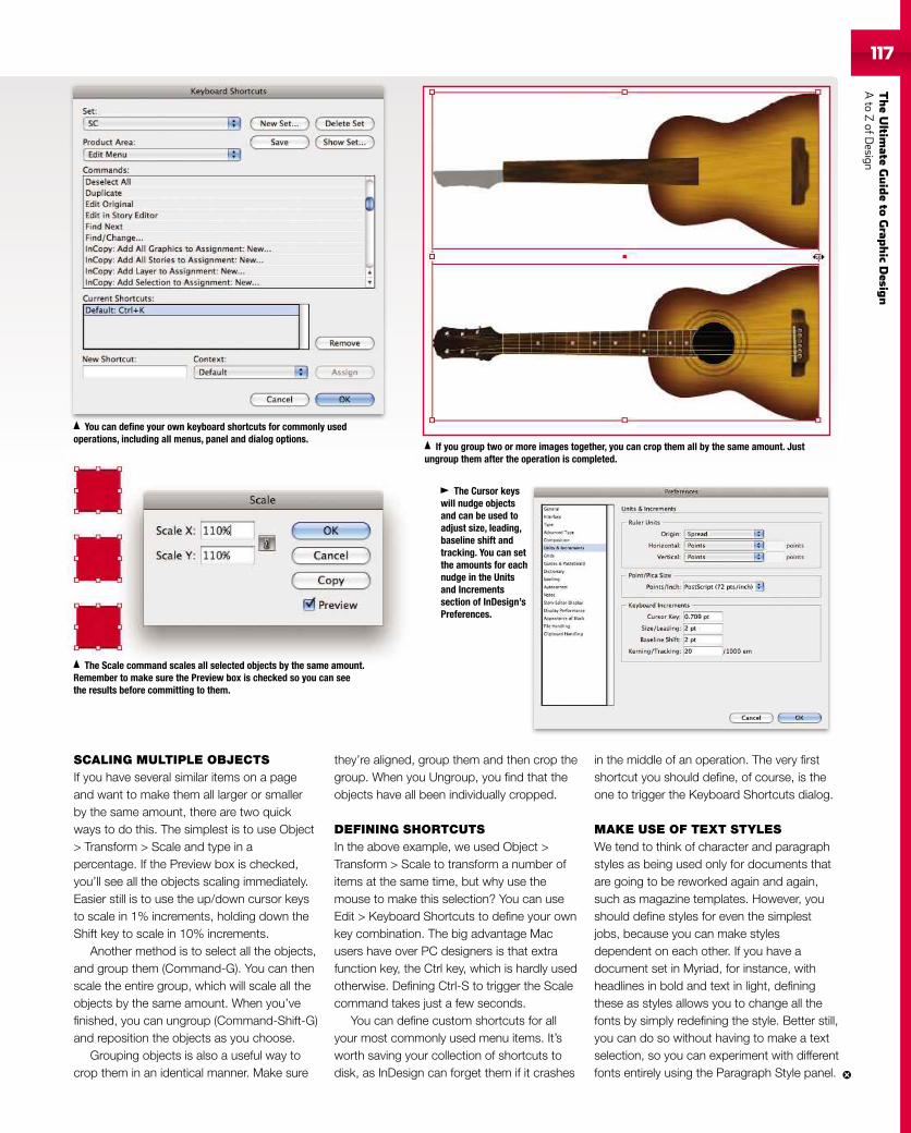
TheUltim
ateGuideto
Grap
hic
Desig
nAto
ZofD
esign117
SCALING MULTIPLE OBJECTSIf you have several similar items on a pageand want to make them all larger or smallerby the same amount, there are two quickways to do this. The simplest is to use Object> Transform > Scale and type in apercentage. If the Preview box is checked,you’ll see all the objects scaling immediately.Easier still is to use the up/down cursor keysto scale in 1% increments, holding down theShift key to scale in 10% increments.
Another method is to select all the objects,and group them (Command-G). You can thenscale the entire group, which will scale all theobjects by the same amount. When you’vefinished, you can ungroup (Command-Shift-G)and reposition the objects as you choose.
Grouping objects is also a useful way tocrop them in an identical manner. Make sure
they’re aligned, group them and then crop thegroup. When you Ungroup, you find that theobjects have all been individually cropped.
DEFINING SHORTCUTSIn the above example, we used Object >Transform > Scale to transform a number ofitems at the same time, but why use themouse to make this selection? You can useEdit > Keyboard Shortcuts to define your ownkey combination. The big advantage Macusers have over PC designers is that extrafunction key, the Ctrl key, which is hardly usedotherwise. Defining Ctrl-S to trigger the Scalecommand takes just a few seconds.
You can define custom shortcuts for allyour most commonly used menu items. It’sworth saving your collection of shortcuts todisk, as InDesign can forget them if it crashes
in the middle of an operation. The very firstshortcut you should define, of course, is theone to trigger the Keyboard Shortcuts dialog.
MAKE USE OF TEXT STYLESWe tend to think of character and paragraphstyles as being used only for documents thatare going to be reworked again and again,such as magazine templates. However, youshould define styles for even the simplestjobs, because you can make stylesdependent on each other. If you have adocument set in Myriad, for instance, withheadlines in bold and text in light, definingthese as styles allows you to change all thefonts by simply redefining the style. Better still,you can do so without having to make a textselection, so you can experiment with differentfonts entirely using the Paragraph Style panel.
You can define your own keyboard shortcuts for commonly usedoperations, including all menus, panel and dialog options.
The Scale command scales all selected objects by the same amount.Remember to make sure the Preview box is checked so you can seethe results before committing to them.
If you group two or more images together, you can crop them all by the same amount. Justungroup them after the operation is completed.
The Cursor keyswill nudge objectsand can be used toadjust size, leading,baseline shift andtracking. You can setthe amounts for eachnudge in the Unitsand Incrementssection of InDesign’sPreferences.
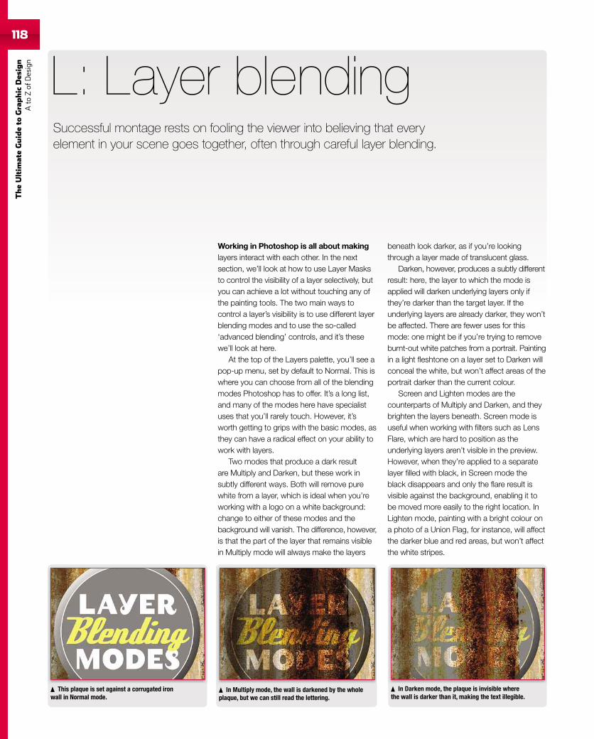
118
TheUltim
ateGuideto
Graphic
Des
ign
Ato
Zof
Design
118
Working in Photoshop is all about makinglayers interact with each other. In the nextsection, we’ll look at how to use Layer Masksto control the visibility of a layer selectively, butyou can achieve a lot without touching any ofthe painting tools. The two main ways tocontrol a layer’s visibility is to use different layerblending modes and to use the so-called‘advanced blending’ controls, and it’s thesewe’ll look at here.
At the top of the Layers palette, you’ll see apop-up menu, set by default to Normal. This iswhere you can choose from all of the blendingmodes Photoshop has to offer. It’s a long list,and many of the modes here have specialistuses that you’ll rarely touch. However, it’sworth getting to grips with the basic modes, asthey can have a radical effect on your ability towork with layers.
Two modes that produce a dark resultare Multiply and Darken, but these work insubtly different ways. Both will remove purewhite from a layer, which is ideal when you’reworking with a logo on a white background:change to either of these modes and thebackground will vanish. The difference, however,is that the part of the layer that remains visiblein Multiply mode will always make the layers
L: Layer blending
beneath look darker, as if you’re lookingthrough a layer made of translucent glass.
Darken, however, produces a subtly differentresult: here, the layer to which the mode isapplied will darken underlying layers only ifthey’re darker than the target layer. If theunderlying layers are already darker, they won’tbe affected. There are fewer uses for thismode: one might be if you’re trying to removeburnt-out white patches from a portrait. Paintingin a light fleshtone on a layer set to Darken willconceal the white, but won’t affect areas of theportrait darker than the current colour.
Screen and Lighten modes are thecounterparts of Multiply and Darken, and theybrighten the layers beneath. Screen mode isuseful when working with filters such as LensFlare, which are hard to position as theunderlying layers aren’t visible in the preview.However, when they’re applied to a separatelayer filled with black, in Screen mode theblack disappears and only the flare result isvisible against the background, enabling it tobe moved more easily to the right location. InLighten mode, painting with a bright colour ona photo of a Union Flag, for instance, will affectthe darker blue and red areas, but won’t affectthe white stripes.
This plaque is set against a corrugated ironwall in Normal mode.
In Multiply mode, the wall is darkened by the wholeplaque, but we can still read the lettering.
In Darken mode, the plaque is invisible wherethe wall is darker than it, making the text illegible.
Successful montage rests on fooling the viewer into believing that everyelement in your scene goes together, often through careful layer blending.
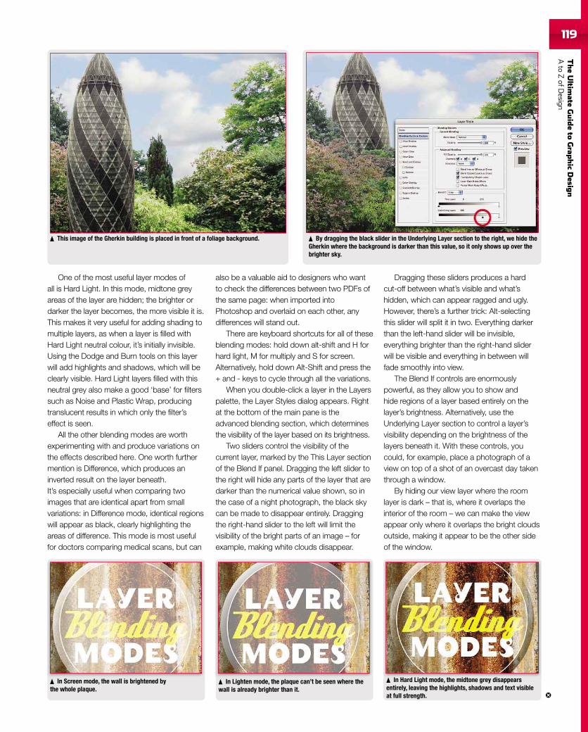
TheUltim
ateGuideto
Grap
hic
Desig
nAto
ZofD
esign119119
One of the most useful layer modes ofall is Hard Light. In this mode, midtone greyareas of the layer are hidden; the brighter ordarker the layer becomes, the more visible it is.This makes it very useful for adding shading tomultiple layers, as when a layer is filled withHard Light neutral colour, it’s initially invisible.Using the Dodge and Burn tools on this layerwill add highlights and shadows, which will beclearly visible. Hard Light layers filled with thisneutral grey also make a good ‘base’ for filterssuch as Noise and Plastic Wrap, producingtranslucent results in which only the filter’seffect is seen.
All the other blending modes are worthexperimenting with and produce variations onthe effects described here. One worth furthermention is Difference, which produces aninverted result on the layer beneath.It’s especially useful when comparing twoimages that are identical apart from smallvariations: in Difference mode, identical regionswill appear as black, clearly highlighting theareas of difference. This mode is most usefulfor doctors comparing medical scans, but can
also be a valuable aid to designers who wantto check the differences between two PDFs ofthe same page: when imported intoPhotoshop and overlaid on each other, anydifferences will stand out.
There are keyboard shortcuts for all of theseblending modes: hold down alt-shift and H forhard light, M for multiply and S for screen.Alternatively, hold down Alt-Shift and press the+ and - keys to cycle through all the variations.
When you double-click a layer in the Layerspalette, the Layer Styles dialog appears. Rightat the bottom of the main pane is theadvanced blending section, which determinesthe visibility of the layer based on its brightness.
Two sliders control the visibility of thecurrent layer, marked by the This Layer sectionof the Blend If panel. Dragging the left slider tothe right will hide any parts of the layer that aredarker than the numerical value shown, so inthe case of a night photograph, the black skycan be made to disappear entirely. Draggingthe right-hand slider to the left will limit thevisibility of the bright parts of an image – forexample, making white clouds disappear.
Dragging these sliders produces a hardcut-off between what’s visible and what’shidden, which can appear ragged and ugly.However, there’s a further trick: Alt-selectingthis slider will split it in two. Everything darkerthan the left-hand slider will be invisible,everything brighter than the right-hand sliderwill be visible and everything in between willfade smoothly into view.
The Blend If controls are enormouslypowerful, as they allow you to show andhide regions of a layer based entirely on thelayer’s brightness. Alternatively, use theUnderlying Layer section to control a layer’svisibility depending on the brightness of thelayers beneath it. With these controls, youcould, for example, place a photograph of aview on top of a shot of an overcast day takenthrough a window.
By hiding our view layer where the roomlayer is dark – that is, where it overlaps theinterior of the room – we can make the viewappear only where it overlaps the bright cloudsoutside, making it appear to be the other sideof the window.
In Screen mode, the wall is brightened bythe whole plaque.
In Lighten mode, the plaque can’t be seen where thewall is already brighter than it.
In Hard Light mode, the midtone grey disappearsentirely, leaving the highlights, shadows and text visibleat full strength.
In Hard Light mode, the midton di
This image of the Gherkin building is placed in front of a foliage background. By dragging the black slider in the Underlying Layer section to the right, we hide theGherkin where the background is darker than this value, so it only shows up over thebrighter sky.
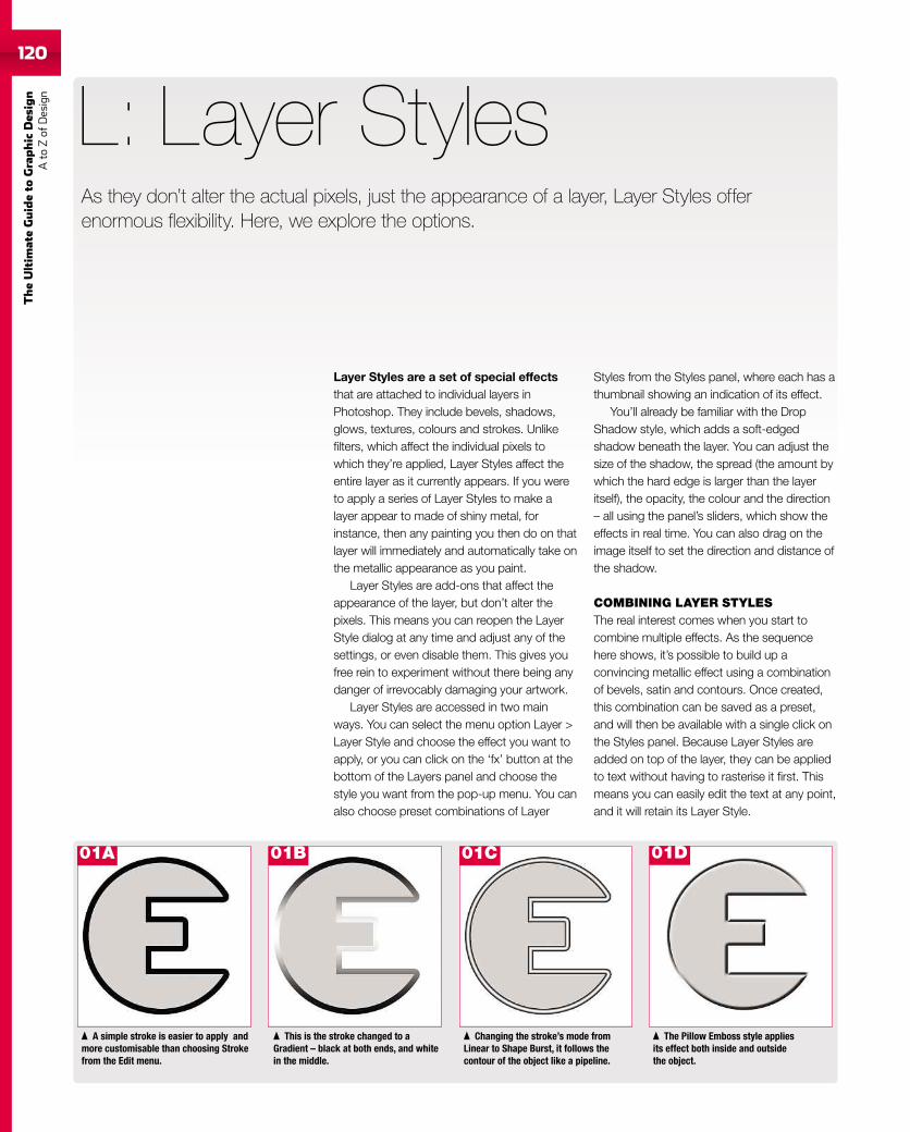
120
TheUltim
ateGuideto
Graphic
Des
ign
Ato
Zof
Design
Layer Styles are a set of special effectsthat are attached to individual layers inPhotoshop. They include bevels, shadows,glows, textures, colours and strokes. Unlikefilters, which affect the individual pixels towhich they’re applied, Layer Styles affect theentire layer as it currently appears. If you wereto apply a series of Layer Styles to make alayer appear to made of shiny metal, forinstance, then any painting you then do on thatlayer will immediately and automatically take onthe metallic appearance as you paint.
Layer Styles are add-ons that affect theappearance of the layer, but don’t alter thepixels. This means you can reopen the LayerStyle dialog at any time and adjust any of thesettings, or even disable them. This gives youfree rein to experiment without there being anydanger of irrevocably damaging your artwork.
Layer Styles are accessed in two mainways. You can select the menu option Layer >Layer Style and choose the effect you want toapply, or you can click on the ‘fx’ button at thebottom of the Layers panel and choose thestyle you want from the pop-up menu. You canalso choose preset combinations of Layer
L: Layer Styles
Styles from the Styles panel, where each has athumbnail showing an indication of its effect.
You’ll already be familiar with the DropShadow style, which adds a soft-edgedshadow beneath the layer. You can adjust thesize of the shadow, the spread (the amount bywhich the hard edge is larger than the layeritself), the opacity, the colour and the direction– all using the panel’s sliders, which show theeffects in real time. You can also drag on theimage itself to set the direction and distance ofthe shadow.
COMBINING LAYER STYLESThe real interest comes when you start tocombine multiple effects. As the sequencehere shows, it’s possible to build up aconvincing metallic effect using a combinationof bevels, satin and contours. Once created,this combination can be saved as a preset,and will then be available with a single click onthe Styles panel. Because Layer Styles areadded on top of the layer, they can be appliedto text without having to rasterise it first. Thismeans you can easily edit the text at any point,and it will retain its Layer Style.
As they don’t alter the actual pixels, just the appearance of a layer, Layer Styles offerenormous flexibility. Here, we explore the options.
The Pillow Emboss style appliesits effect both inside and outsidethe object.
Changing the stroke’s mode fromLinear to Shape Burst, it follows thecontour of the object like a pipeline.
This is the stroke changed to aGradient – black at both ends, and whitein the middle.
A simple stroke is easier to apply andmore customisable than choosing Strokefrom the Edit menu.
01A 01B 01C 01D
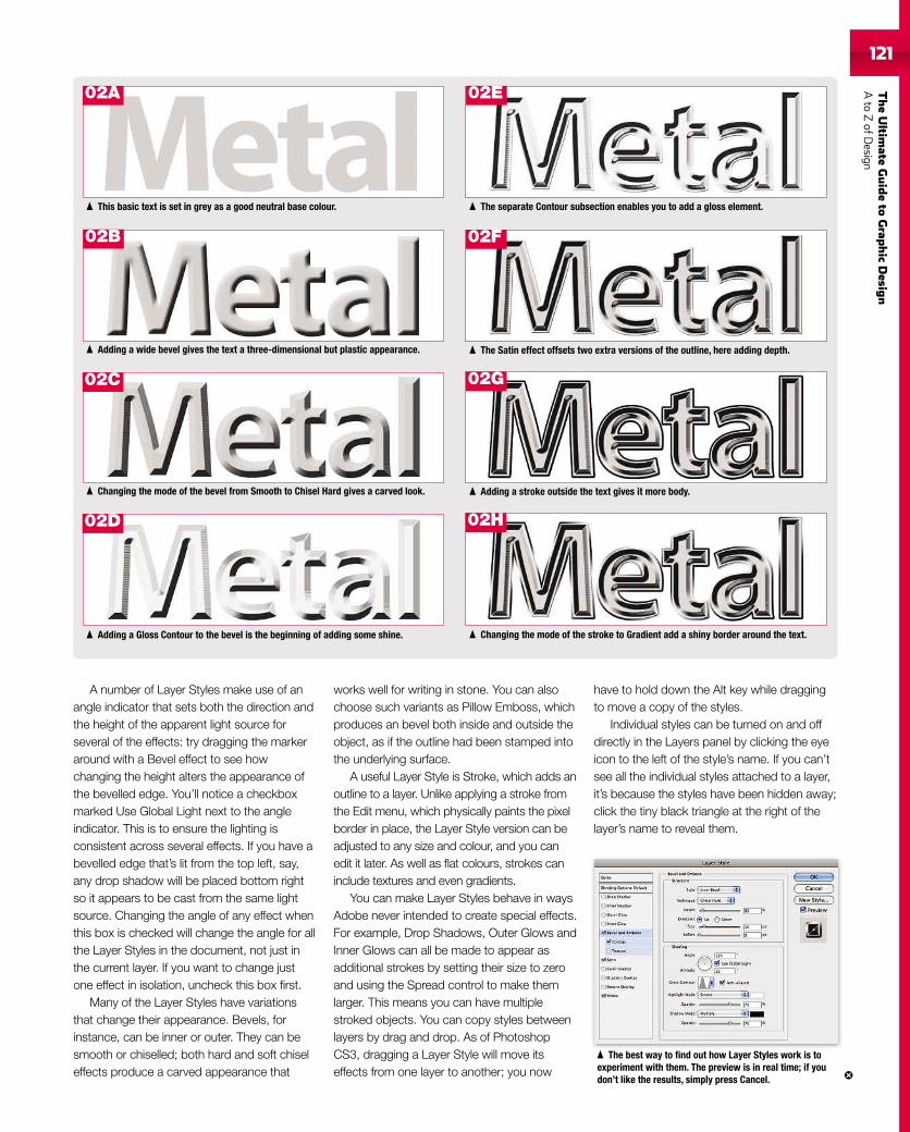
TheUltim
ateGuideto
Grap
hic
Desig
nAto
ZofD
esign121121
A number of Layer Styles make use of anangle indicator that sets both the direction andthe height of the apparent light source forseveral of the effects: try dragging the markeraround with a Bevel effect to see howchanging the height alters the appearance ofthe bevelled edge. You’ll notice a checkboxmarked Use Global Light next to the angleindicator. This is to ensure the lighting isconsistent across several effects. If you have abevelled edge that’s lit from the top left, say,any drop shadow will be placed bottom rightso it appears to be cast from the same lightsource. Changing the angle of any effect whenthis box is checked will change the angle for allthe Layer Styles in the document, not just inthe current layer. If you want to change justone effect in isolation, uncheck this box first.
Many of the Layer Styles have variationsthat change their appearance. Bevels, forinstance, can be inner or outer. They can besmooth or chiselled; both hard and soft chiseleffects produce a carved appearance that
works well for writing in stone. You can alsochoose such variants as Pillow Emboss, whichproduces an bevel both inside and outside theobject, as if the outline had been stamped intothe underlying surface.
A useful Layer Style is Stroke, which adds anoutline to a layer. Unlike applying a stroke fromthe Edit menu, which physically paints the pixelborder in place, the Layer Style version can beadjusted to any size and colour, and you canedit it later. As well as flat colours, strokes caninclude textures and even gradients.
You can make Layer Styles behave in waysAdobe never intended to create special effects.For example, Drop Shadows, Outer Glows andInner Glows can all be made to appear asadditional strokes by setting their size to zeroand using the Spread control to make themlarger. This means you can have multiplestroked objects. You can copy styles betweenlayers by drag and drop. As of PhotoshopCS3, dragging a Layer Style will move itseffects from one layer to another; you now
have to hold down the Alt key while draggingto move a copy of the styles.
Individual styles can be turned on and offdirectly in the Layers panel by clicking the eyeicon to the left of the style’s name. If you can’tsee all the individual styles attached to a layer,it’s because the styles have been hidden away;click the tiny black triangle at the right of thelayer’s name to reveal them.
The best way to find out how Layer Styles work is toexperiment with them. The preview is in real time; if youdon’t like the results, simply press Cancel.
The separate Contour subsection enables you to add a gloss element.
The Satin effect offsets two extra versions of the outline, here adding depth.
Adding a stroke outside the text gives it more body.
Changing the mode of the stroke to Gradient add a shiny border around the text.Adding a Gloss Contour to the bevel is the beginning of adding some shine.
Changing the mode of the bevel from Smooth to Chisel Hard gives a carved look.
Adding a wide bevel gives the text a three-dimensional but plastic appearance.
This basic text is set in grey as a good neutral base colour.
02A 02E
02B 02F
02C 02G
02D 02H
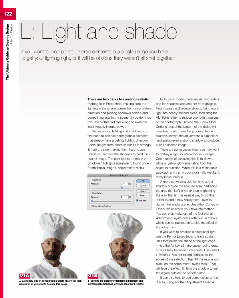
122
TheUltim
ateGuideto
Graphic
Des
ign
Ato
Zof
Design
There are two tricks to creating realisticmontages in Photoshop: making sure thelighting in the scene comes from a consistentdirection and placing shadows behind andbeneath objects in the scene. If you don’t dothis, the picture will feel wrong to even theleast visually literate viewer.
Before adding lighting and shadows, youfirst need to balance photographic elementsthat already have a definite lighting direction.Some images from photo libraries are stronglylit from the side, making them hard to useunless you remove the shadows to produce aneutral image. The best tool to do this is theShadows/Highlights adjustment, found underPhotoshop’s Image > Adjustments menu.
L: Light and shade
In its basic mode, there are just two sliders:one for Shadows and another for Highlights.Firstly, drag the Shadows slider to bring morelight into deeply shaded areas, then drag theHighlights slider to reduce over-bright regionsof the photograph. Clicking the ‘Show MoreOptions’ box at the bottom of the dialog willoffer finer control over the process. As ourexample shows, the adjustment is capable ofneutralising even a strong shadow to producea well balanced image.
There are some cases when you may wantto portray a light source within your image.One method of achieving this is to draw awhite or yellow glow emanating from theobject in question. While this is a reasonableapproach and can produce dramatic results, itrarely looks realistic.
A more convincing solution is to add ashadow outside the affected area, darkeningthe area that isn’t lit rather than brighteningthe area that is. The easiest way to do thisis first to add a new Adjustment Layer todarken the whole scene. Use either Curves orLevels, whichever is your favourite method.You can then make use of the fact that allAdjustment Layers come with built-in masks,which can be painted on to hide the effect ofthe adjustment.
If you want to produce a directional light,use the Pen or Lasso tools to trace straightlines that define the shape of the light cone– hold the Alt key with the Lasso tool to drawstraight lines between click points. Use Select> Modify > Feather to add softness to theedges of the selection, then fill this region withblack on the Adjustment Layer’s mask. Thiswill hide the effect, limiting the shadow to justthe region outside the selected area.
It can also help to add some colour to thelit area, using another Adjustment Layer. AA strongly side-lit portrait from a photo library can look
unnatural, so you need to balance this image.Opening the Shadows/Highlights adjustment and
increasing the Shadows level will boost dark regions.
If you want to incorporate diverse elements in a single image you haveto get your lighting right, or it will be obvious they weren’t all shot together.
01B01A
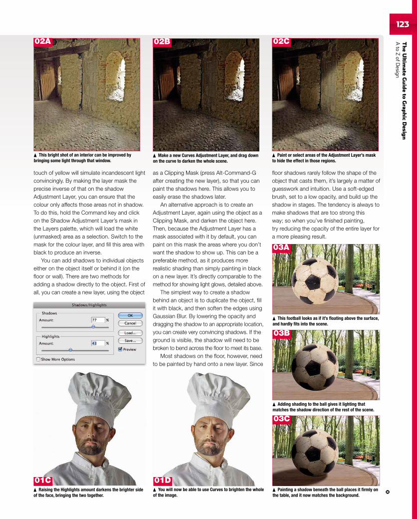
TheUltim
ateGuideto
Grap
hic
Desig
nAto
ZofD
esign123
touch of yellow will simulate incandescent lightconvincingly. By making the layer mask theprecise inverse of that on the shadowAdjustment Layer, you can ensure that thecolour only affects those areas not in shadow.To do this, hold the Command key and clickon the Shadow Adjustment Layer’s mask inthe Layers palette, which will load the white(unmasked) area as a selection. Switch to themask for the colour layer, and fill this area withblack to produce an inverse.
You can add shadows to individual objectseither on the object itself or behind it (on thefloor or wall). There are two methods foradding a shadow directly to the object. First ofall, you can create a new layer, using the object
as a Clipping Mask (press Alt-Command-Gafter creating the new layer), so that you canpaint the shadows here. This allows you toeasily erase the shadows later.
An alternative approach is to create anAdjustment Layer, again using the object as aClipping Mask, and darken the object here.Then, because the Adjustment Layer has amask associated with it by default, you canpaint on this mask the areas where you don’twant the shadow to show up. This can be apreferable method, as it produces morerealistic shading than simply painting in blackon a new layer. It’s directly comparable to themethod for showing light glows, detailed above.
The simplest way to create a shadowbehind an object is to duplicate the object, fillit with black, and then soften the edges usingGaussian Blur. By lowering the opacity anddragging the shadow to an appropriate location,you can create very convincing shadows. If theground is visible, the shadow will need to bebroken to bend across the floor to meet its base.
Most shadows on the floor, however, needto be painted by hand onto a new layer. Since
floor shadows rarely follow the shape of theobject that casts them, it’s largely a matter ofguesswork and intuition. Use a soft-edgedbrush, set to a low opacity, and build up theshadow in stages. The tendency is always tomake shadows that are too strong thisway; so when you’ve finished painting,try reducing the opacity of the entire layer fora more pleasing result.
Painting a shadow beneath the ball places it firmly onthe table, and it now matches the background.
This bright shot of an interior can be improved bybringing some light through that window.
Make a new Curves Adjustment Layer, and drag downon the curve to darken the whole scene.
Paint or select areas of the Adjustment Layer’s maskto hide the effect in those regions.
This football looks as if it’s floating above the surface,and hardly fits into the scene.
Adding shading to the ball gives it lighting thatmatches the shadow direction of the rest of the scene.
Raising the Highlights amount darkens the brighter sideof the face, bringing the two together.
You will now be able to use Curves to brighten the wholeof the image.
01D01C
03A
02B 02C
03B
03C
02A
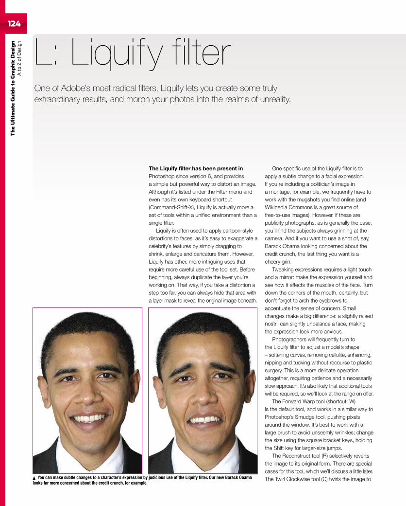
124
TheUltim
ateGuideto
Graphic
Des
ign
Ato
Zof
Design
The Liquify filter has been present inPhotoshop since version 6, and providesa simple but powerful way to distort an image.Although it’s listed under the Filter menu andeven has its own keyboard shortcut(Command-Shift-X), Liquify is actually more aset of tools within a unified environment than asingle filter.
Liquify is often used to apply cartoon-styledistortions to faces, as it’s easy to exaggerate acelebrity’s features by simply dragging toshrink, enlarge and caricature them. However,Liquify has other, more intriguing uses thatrequire more careful use of the tool set. Beforebeginning, always duplicate the layer you’reworking on. That way, if you take a distortion astep too far, you can always hide that area witha layer mask to reveal the original image beneath.
L: Liquify filter
One specific use of the Liquify filter is toapply a subtle change to a facial expression.If you’re including a politician’s image ina montage, for example, we frequently have towork with the mugshots you find online (andWikipedia Commons is a great source offree-to-use images). However, if these arepublicity photographs, as is generally the case,you’ll find the subjects always grinning at thecamera. And if you want to use a shot of, say,Barack Obama looking concerned about thecredit crunch, the last thing you want is acheery grin.
Tweaking expressions requires a light touchand a mirror: make the expression yourself andsee how it affects the muscles of the face. Turndown the corners of the mouth, certainly, butdon’t forget to arch the eyebrows toaccentuate the sense of concern. Smallchanges make a big difference: a slightly raisednostril can slightly unbalance a face, makingthe expression look more anxious.
Photographers will frequently turn tothe Liquify filter to adjust a model’s shape– softening curves, removing cellulite, enhancing,nipping and tucking without recourse to plasticsurgery. This is a more delicate operationaltogether, requiring patience and a necessarilyslow approach. It’s also likely that additional toolswill be required, so we’ll look at the range on offer.
The Forward Warp tool (shortcut: W)is the default tool, and works in a similar way toPhotoshop’s Smudge tool, pushing pixelsaround the window. It’s best to work with alarge brush to avoid unseemly wrinkles; changethe size using the square bracket keys, holdingthe Shift key for larger-size jumps.
The Reconstruct tool (R) selectively revertsthe image to its original form. There are specialcases for this tool, which we’ll discuss a little later.The Twirl Clockwise tool (C) twirls the image toYou can make subtle changes to a character’s expression by judicious use of the Liquify filter. Our new Barack Obama
looks far more concerned about the credit crunch, for example.
One of Adobe’s most radical filters, Liquify lets you create some trulyextraordinary results, and morph your photos into the realms of unreality.
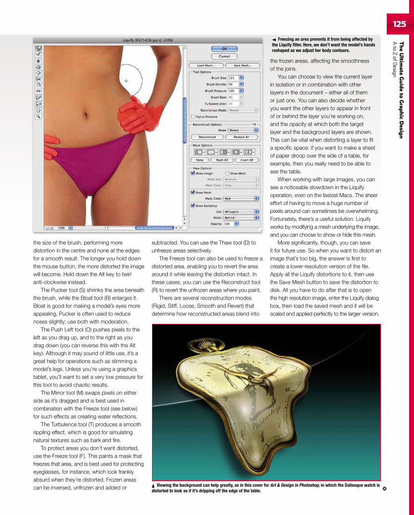
TheUltim
ateGuideto
Grap
hic
Desig
nAto
ZofD
esign125
the size of the brush, performing moredistortion in the centre and none at the edgesfor a smooth result. The longer you hold downthe mouse button, the more distorted the imagewill become. Hold down the Alt key to twirlanti-clockwise instead.
The Pucker tool (S) shrinks the area beneaththe brush, while the Bloat tool (B) enlarges it.Bloat is good for making a model’s eyes moreappealing, Pucker is often used to reducenoses slightly; use both with moderation.
The Push Left tool (O) pushes pixels to theleft as you drag up, and to the right as youdrag down (you can reverse this with the Altkey). Although it may sound of little use, it’s agreat help for operations such as slimming amodel’s legs. Unless you’re using a graphicstablet, you’ll want to set a very low pressure forthis tool to avoid chaotic results.
The Mirror tool (M) swaps pixels on eitherside as it’s dragged and is best used incombination with the Freeze tool (see below)for such effects as creating water reflections.
The Turbulence tool (T) produces a smoothrippling effect, which is good for simulatingnatural textures such as bark and fire.
To protect areas you don’t want distorted,use the Freeze tool (F). This paints a mask thatfreezes that area, and is best used for protectingeyeglasses, for instance, which look franklyabsurd when they’re distorted. Frozen areascan be inversed, unfrozen and added or
subtracted. You can use the Thaw tool (D) tounfreeze areas selectively.
The Freeze tool can also be used to freeze adistorted area, enabling you to revert the areaaround it while leaving the distortion intact. Inthese cases, you can use the Reconstruct tool(R) to revert the unfrozen areas where you paint.
There are several reconstruction modes(Rigid, Stiff, Loose, Smooth and Revert) thatdetermine how reconstructed areas blend into
the frozen areas, affecting the smoothnessof the joins.
You can choose to view the current layerin isolation or in combination with otherlayers in the document – either all of themor just one. You can also decide whetheryou want the other layers to appear in frontof or behind the layer you’re working on,and the opacity at which both the targetlayer and the background layers are shown.This can be vital when distorting a layer to fita specific space: if you want to make a sheetof paper droop over the side of a table, forexample, then you really need to be able tosee the table.
When working with large images, you cansee a noticeable slowdown in the Liquifyoperation, even on the fastest Macs. The sheereffort of having to move a huge number ofpixels around can sometimes be overwhelming.Fortunately, there’s a useful solution. Liquifyworks by modifying a mesh underlying the image,and you can choose to show or hide this mesh.
More significantly, though, you can saveit for future use. So when you want to distort animage that’s too big, the answer is first tocreate a lower-resolution version of the file.Apply all the Liquify distortions to it, then usethe Save Mesh button to save the distortion todisk. All you have to do after that is to openthe high resolution image, enter the Liquify dialogbox, then load the saved mesh and it will bescaled and applied perfectly to the larger version.
Viewing the background can help greatly, as in this cover for Art & Design in Photoshop, in which the Daliesque watch isdistorted to look as if it’s dripping off the edge of the table.
Freezing an area prevents it from being affected bythe Liquify filter. Here, we don’t want the model’s handsreshaped as we adjust her body contours.
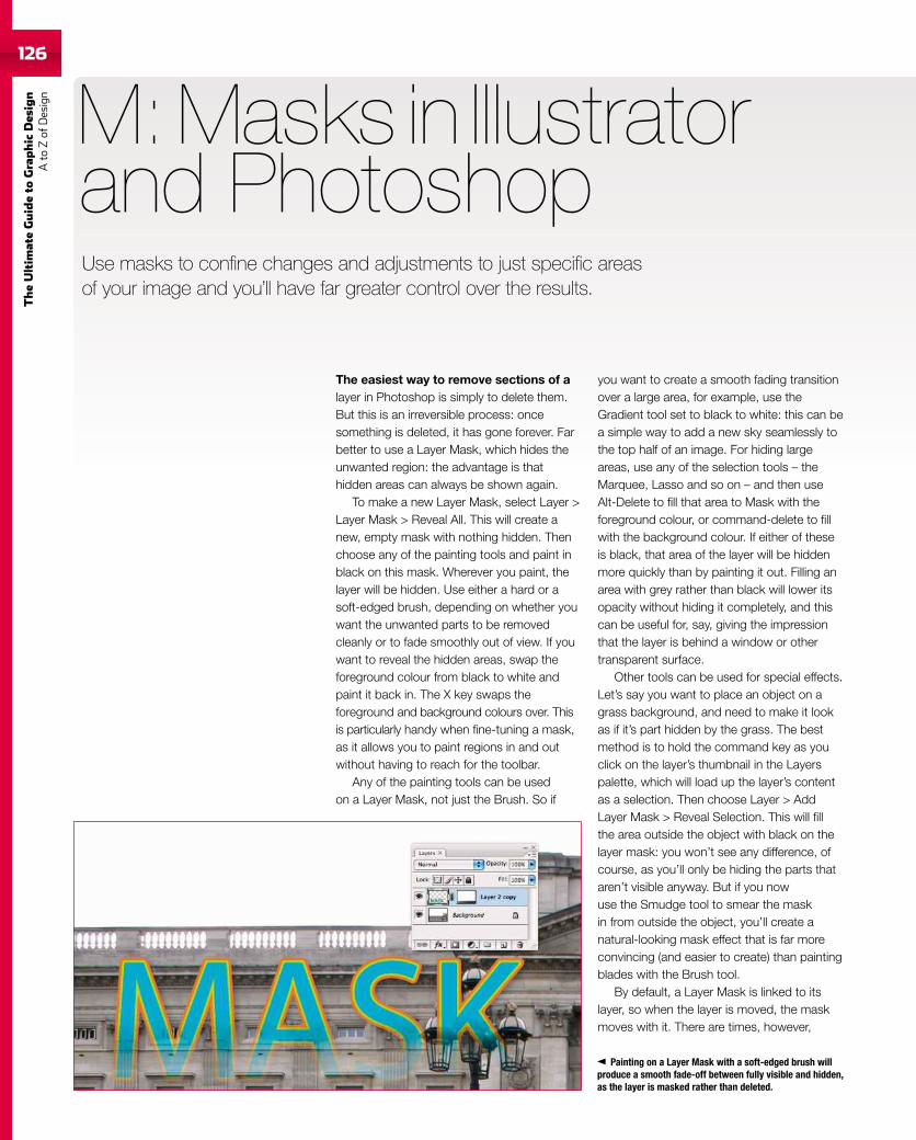
126
TheUltim
ateGuideto
Graphic
Des
ign
Ato
Zof
Design
126
The easiest way to remove sections of alayer in Photoshop is simply to delete them.But this is an irreversible process: oncesomething is deleted, it has gone forever. Farbetter to use a Layer Mask, which hides theunwanted region: the advantage is thathidden areas can always be shown again.
To make a new Layer Mask, select Layer >Layer Mask > Reveal All. This will create anew, empty mask with nothing hidden. Thenchoose any of the painting tools and paint inblack on this mask. Wherever you paint, thelayer will be hidden. Use either a hard or asoft-edged brush, depending on whether youwant the unwanted parts to be removedcleanly or to fade smoothly out of view. If youwant to reveal the hidden areas, swap theforeground colour from black to white andpaint it back in. The X key swaps theforeground and background colours over. Thisis particularly handy when fine-tuning a mask,as it allows you to paint regions in and outwithout having to reach for the toolbar.
Any of the painting tools can be usedon a Layer Mask, not just the Brush. So if
M: Masks in Illustratorand Photoshop
you want to create a smooth fading transitionover a large area, for example, use theGradient tool set to black to white: this can bea simple way to add a new sky seamlessly tothe top half of an image. For hiding largeareas, use any of the selection tools – theMarquee, Lasso and so on – and then useAlt-Delete to fill that area to Mask with theforeground colour, or command-delete to fillwith the background colour. If either of theseis black, that area of the layer will be hiddenmore quickly than by painting it out. Filling anarea with grey rather than black will lower itsopacity without hiding it completely, and thiscan be useful for, say, giving the impressionthat the layer is behind a window or othertransparent surface.
Other tools can be used for special effects.Let’s say you want to place an object on agrass background, and need to make it lookas if it’s part hidden by the grass. The bestmethod is to hold the command key as youclick on the layer’s thumbnail in the Layerspalette, which will load up the layer’s contentas a selection. Then choose Layer > AddLayer Mask > Reveal Selection. This will fillthe area outside the object with black on thelayer mask: you won’t see any difference, ofcourse, as you’ll only be hiding the parts thataren’t visible anyway. But if you nowuse the Smudge tool to smear the maskin from outside the object, you’ll create anatural-looking mask effect that is far moreconvincing (and easier to create) than paintingblades with the Brush tool.
By default, a Layer Mask is linked to itslayer, so when the layer is moved, the maskmoves with it. There are times, however,
Painting on a Layer Mask with a soft-edged brush willproduce a smooth fade-off between fully visible and hidden,as the layer is masked rather than deleted.
Use masks to confine changes and adjustments to just specific areasof your image and you’ll have far greater control over the results.
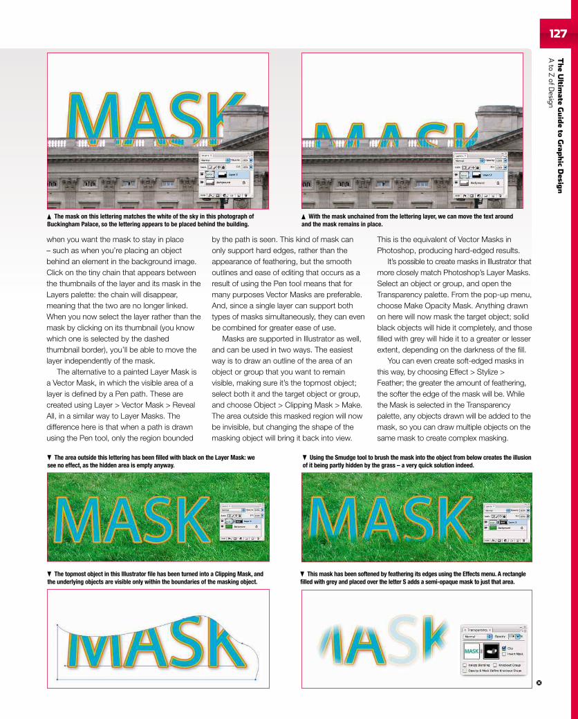
TheUltim
ateGuideto
Grap
hic
Desig
nAto
ZofD
esign127127
when you want the mask to stay in place– such as when you’re placing an objectbehind an element in the background image.Click on the tiny chain that appears betweenthe thumbnails of the layer and its mask in theLayers palette: the chain will disappear,meaning that the two are no longer linked.When you now select the layer rather than themask by clicking on its thumbnail (you knowwhich one is selected by the dashedthumbnail border), you’ll be able to move thelayer independently of the mask.
The alternative to a painted Layer Mask isa Vector Mask, in which the visible area of alayer is defined by a Pen path. These arecreated using Layer > Vector Mask > RevealAll, in a similar way to Layer Masks. Thedifference here is that when a path is drawnusing the Pen tool, only the region bounded
by the path is seen. This kind of mask canonly support hard edges, rather than theappearance of feathering, but the smoothoutlines and ease of editing that occurs as aresult of using the Pen tool means that formany purposes Vector Masks are preferable.And, since a single layer can support bothtypes of masks simultaneously, they can evenbe combined for greater ease of use.
Masks are supported in Illustrator as well,and can be used in two ways. The easiestway is to draw an outline of the area of anobject or group that you want to remainvisible, making sure it’s the topmost object;select both it and the target object or group,and choose Object > Clipping Mask > Make.The area outside this masked region will nowbe invisible, but changing the shape of themasking object will bring it back into view.
This is the equivalent of Vector Masks inPhotoshop, producing hard-edged results.
It’s possible to create masks in Illustrator thatmore closely match Photoshop’s Layer Masks.Select an object or group, and open theTransparency palette. From the pop-up menu,choose Make Opacity Mask. Anything drawnon here will now mask the target object; solidblack objects will hide it completely, and thosefilled with grey will hide it to a greater or lesserextent, depending on the darkness of the fill.
You can even create soft-edged masks inthis way, by choosing Effect > Stylize >Feather; the greater the amount of feathering,the softer the edge of the mask will be. Whilethe Mask is selected in the Transparencypalette, any objects drawn will be added to themask, so you can draw multiple objects on thesame mask to create complex masking.
With the mask unchained from the lettering layer, we can move the text aroundand the mask remains in place.
The mask on this lettering matches the white of the sky in this photograph ofBuckingham Palace, so the lettering appears to be placed behind the building.
The area outside this lettering has been filled with black on the Layer Mask: wesee no effect, as the hidden area is empty anyway.
Using the Smudge tool to brush the mask into the object from below creates the illusionof it being partly hidden by the grass – a very quick solution indeed.
The topmost object in this Illustrator file has been turned into a Clipping Mask, andthe underlying objects are visible only within the boundaries of the masking object.
This mask has been softened by feathering its edges using the Effects menu. A rectanglefilled with grey and placed over the letter S adds a semi-opaque mask to just that area.
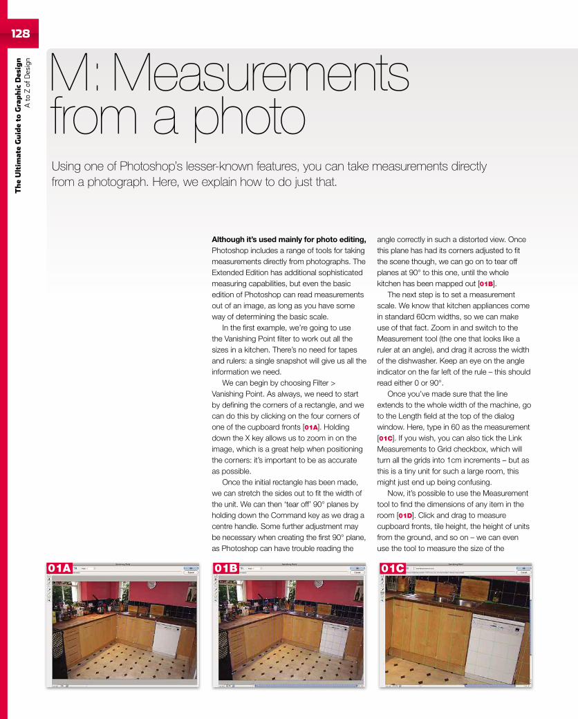
128
TheUltim
ateGuideto
Graphic
Des
ign
Ato
Zof
Design
Although it’s used mainly for photo editing,Photoshop includes a range of tools for takingmeasurements directly from photographs. TheExtended Edition has additional sophisticatedmeasuring capabilities, but even the basicedition of Photoshop can read measurementsout of an image, as long as you have someway of determining the basic scale.
In the first example, we’re going to usethe Vanishing Point filter to work out all thesizes in a kitchen. There’s no need for tapesand rulers: a single snapshot will give us all theinformation we need.
We can begin by choosing Filter >Vanishing Point. As always, we need to startby defining the corners of a rectangle, and wecan do this by clicking on the four corners ofone of the cupboard fronts [01A]. Holdingdown the X key allows us to zoom in on theimage, which is a great help when positioningthe corners: it’s important to be as accurateas possible.
Once the initial rectangle has been made,we can stretch the sides out to fit the width ofthe unit. We can then ‘tear off’ 90° planes byholding down the Command key as we drag acentre handle. Some further adjustment maybe necessary when creating the first 90° plane,as Photoshop can have trouble reading the
M: Measurementsfrom a photo
angle correctly in such a distorted view. Oncethis plane has had its corners adjusted to fitthe scene though, we can go on to tear offplanes at 90° to this one, until the wholekitchen has been mapped out [01B].
The next step is to set a measurementscale. We know that kitchen appliances comein standard 60cm widths, so we can makeuse of that fact. Zoom in and switch to theMeasurement tool (the one that looks like aruler at an angle), and drag it across the widthof the dishwasher. Keep an eye on the angleindicator on the far left of the rule – this shouldread either 0 or 90°.
Once you’ve made sure that the lineextends to the whole width of the machine, goto the Length field at the top of the dialogwindow. Here, type in 60 as the measurement[01C]. If you wish, you can also tick the LinkMeasurements to Grid checkbox, which willturn all the grids into 1cm increments – but asthis is a tiny unit for such a large room, thismight just end up being confusing.
Now, it’s possible to use the Measurementtool to find the dimensions of any item in theroom [01D]. Click and drag to measurecupboard fronts, tile height, the height of unitsfrom the ground, and so on – we can evenuse the tool to measure the size of the
Using one of Photoshop’s lesser-known features, you can take measurements directlyfrom a photograph. Here, we explain how to do just that.
01C01B01A
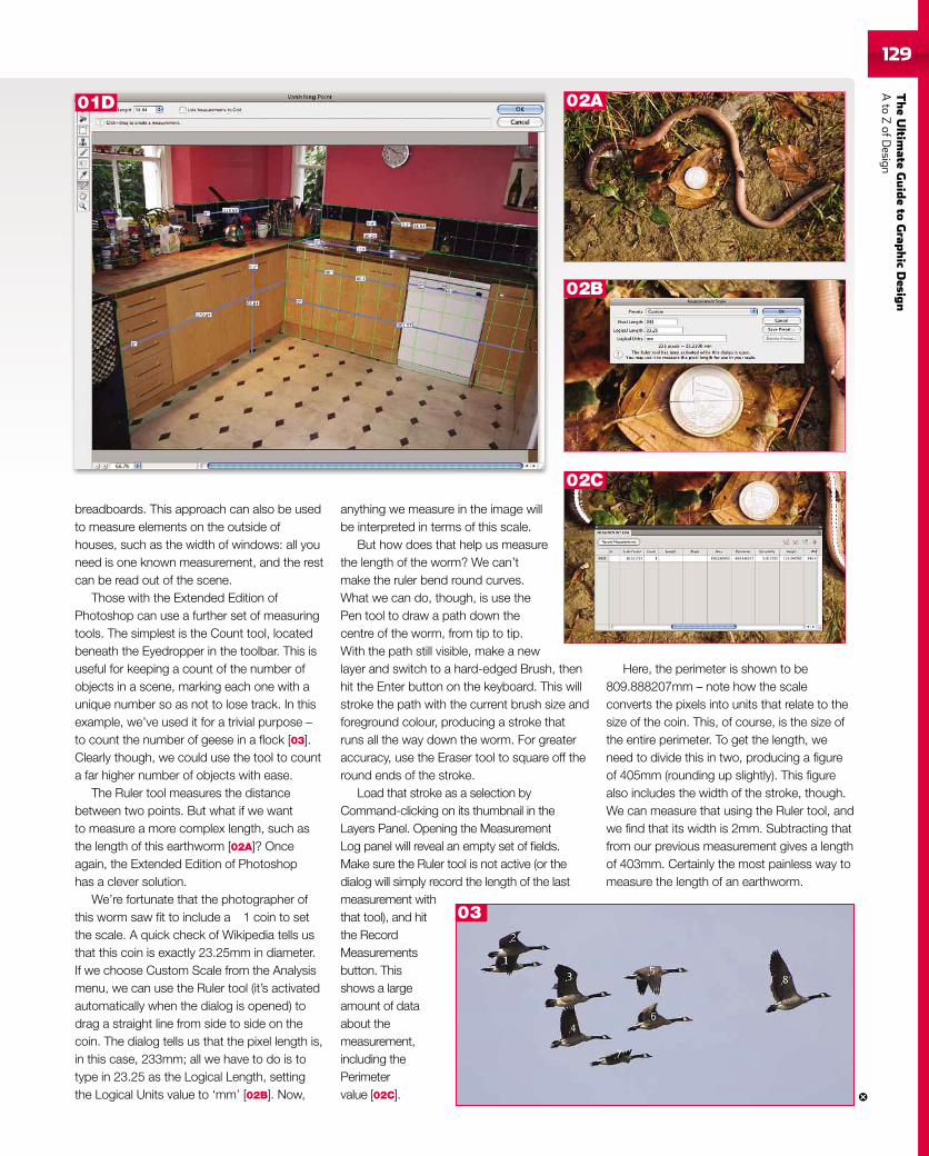
TheUltim
ateGuideto
Grap
hic
Desig
nAto
ZofD
esign129
breadboards. This approach can also be usedto measure elements on the outside ofhouses, such as the width of windows: all youneed is one known measurement, and the restcan be read out of the scene.
Those with the Extended Edition ofPhotoshop can use a further set of measuringtools. The simplest is the Count tool, locatedbeneath the Eyedropper in the toolbar. This isuseful for keeping a count of the number ofobjects in a scene, marking each one with aunique number so as not to lose track. In thisexample, we’ve used it for a trivial purpose –to count the number of geese in a flock [03].Clearly though, we could use the tool to counta far higher number of objects with ease.
The Ruler tool measures the distancebetween two points. But what if we wantto measure a more complex length, such asthe length of this earthworm [02A]? Onceagain, the Extended Edition of Photoshophas a clever solution.
We’re fortunate that the photographer ofthis worm saw fit to include a 1 coin to setthe scale. A quick check of Wikipedia tells usthat this coin is exactly 23.25mm in diameter.If we choose Custom Scale from the Analysismenu, we can use the Ruler tool (it’s activatedautomatically when the dialog is opened) todrag a straight line from side to side on thecoin. The dialog tells us that the pixel length is,in this case, 233mm; all we have to do is totype in 23.25 as the Logical Length, settingthe Logical Units value to ‘mm’ [02B]. Now,
anything we measure in the image willbe interpreted in terms of this scale.
But how does that help us measurethe length of the worm? We can’tmake the ruler bend round curves.What we can do, though, is use thePen tool to draw a path down thecentre of the worm, from tip to tip.With the path still visible, make a newlayer and switch to a hard-edged Brush, thenhit the Enter button on the keyboard. This willstroke the path with the current brush size andforeground colour, producing a stroke thatruns all the way down the worm. For greateraccuracy, use the Eraser tool to square off theround ends of the stroke.
Load that stroke as a selection byCommand-clicking on its thumbnail in theLayers Panel. Opening the MeasurementLog panel will reveal an empty set of fields.Make sure the Ruler tool is not active (or thedialog will simply record the length of the lastmeasurement withthat tool), and hitthe RecordMeasurementsbutton. Thisshows a largeamount of dataabout themeasurement,including thePerimetervalue [02C].
Here, the perimeter is shown to be809.888207mm – note how the scaleconverts the pixels into units that relate to thesize of the coin. This, of course, is the size ofthe entire perimeter. To get the length, weneed to divide this in two, producing a figureof 405mm (rounding up slightly). This figurealso includes the width of the stroke, though.We can measure that using the Ruler tool, andwe find that its width is 2mm. Subtracting thatfrom our previous measurement gives a lengthof 403mm. Certainly the most painless way tomeasure the length of an earthworm.
03
01D
02B
02C
02A
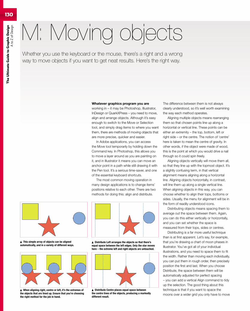
130
TheUltim
ateGuideto
Graphic
Des
ign
Ato
Zof
Design
Whatever graphics program you areworking in – it may be Photoshop, Illustrator,InDesign or QuarkXPress – you need to move,align and arrange objects. Although it’s easyenough to switch to the Move or Selectiontool, and simply drag items to where you wantthem, there are methods of moving objects thatare more precise, quicker and easier.
In Adobe applications, you can accessthe Move tool temporarily by holding down theCommand key. In Photoshop, this allows youto move a layer around as you are painting onit, and in Illustrator it means you can move ananchor point in a path while still drawing it withthe Pen tool. It’s a serious time-saver, and oneof the essential keyboard shortcuts.
The most common moving operation inmany design applications is to change items’positions relative to each other. There are twomethods for doing this: align and distribute.
M: Moving objects
The difference between them is not alwaysclearly understood, so it’s well worth examiningthe way each method operates.
Aligning multiple objects means rearrangingthem so that chosen points line up along ahorizontal or vertical line. These points can beeither an extremity – the top, bottom, left orright side – or the centre. The notion of ‘centre’here is taken to mean the centre of gravity. Inother words, if the object were made of wood,this is the point at which you would drive a nailthrough so it could spin freely.
Aligning objects vertically will move them all,so that they line up with the topmost object. It’sa slightly confusing term, in that verticalalignment means aligning along a horizontalline. Aligning objects horizontally, in contrast,will line them up along a single vertical line.When aligning objects in this way, you canchoose whether to align their tops, bottoms orsides. Usually, the menu for alignment will be inthe form of readily understood icons.
Distributing objects means spacing them toaverage out the space between them. Again,you can do this either vertically or horizontally,and you can set whether the space ismeasured from their tops, sides or centres.
Distributing is a far more useful techniquethan is at first apparent. Let’s say, for example,that you’re drawing a chart of moon phases inIllustrator. You’ve got all of your individualillustrations, and you need to space them to fitthe width. Rather than moving each individually,you can put them in rough order, then preciselyposition the first and last. When you chooseDistribute, the space between them will beautomatically adjusted for perfect spacing– you can add a vertical Align command to tidyup the selection. The good thing about thistechnique is that if you want to space themoons over a wider grid you only have to move
This simple array of objects can be alignedautomatically, and in a variety of different ways.
When aligning right, centre or left, it’s the extremes ofthe objects that are lined up. Ensure that you’re choosingthe right method for the job in hand.
Distribute Left arranges the objects so that there’sequal space between the left edges. Only the star moveshere – the extreme left and right objects are untouched.
Distribute Centre places equal space betweenthe centre lines of the objects, producing a markedlydifferent result.
Whether you use the keyboard or the mouse, there’s a right and a wrongway to move objects if you want to get neat results. Here’s the right way.
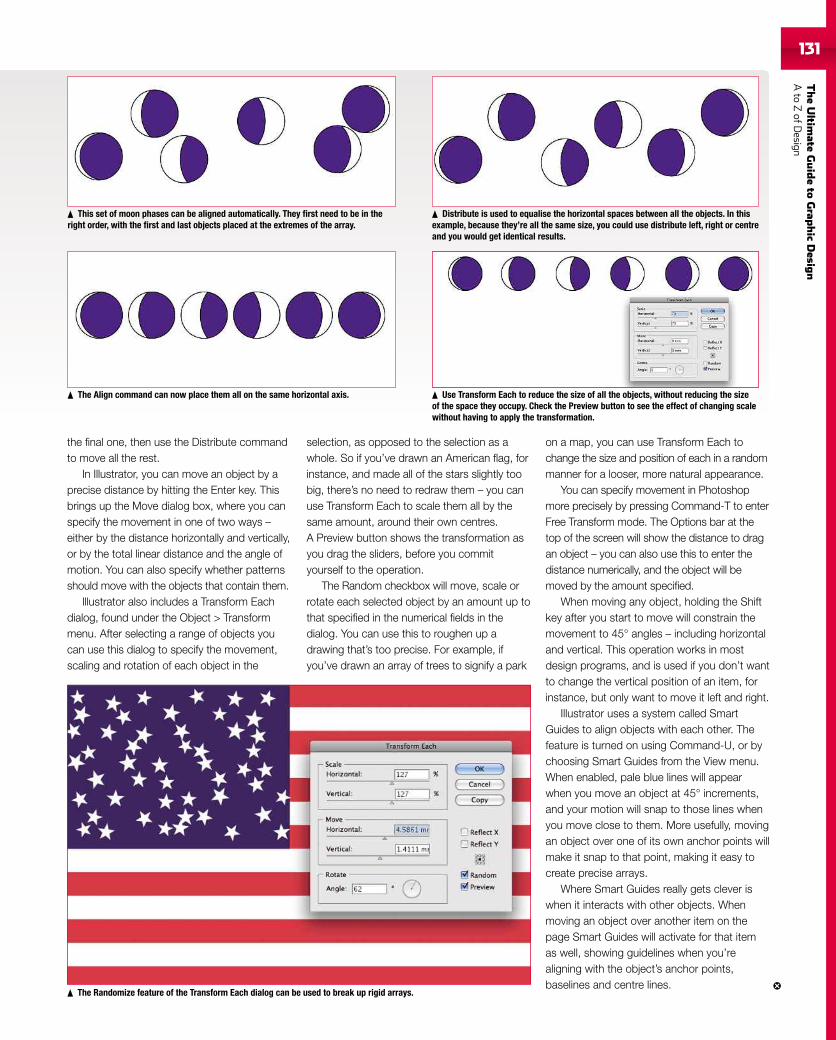
TheUltim
ateGuideto
Grap
hic
Desig
nAto
ZofD
esign131
the final one, then use the Distribute commandto move all the rest.
In Illustrator, you can move an object by aprecise distance by hitting the Enter key. Thisbrings up the Move dialog box, where you canspecify the movement in one of two ways –either by the distance horizontally and vertically,or by the total linear distance and the angle ofmotion. You can also specify whether patternsshould move with the objects that contain them.
Illustrator also includes a Transform Eachdialog, found under the Object > Transformmenu. After selecting a range of objects youcan use this dialog to specify the movement,scaling and rotation of each object in the
selection, as opposed to the selection as awhole. So if you’ve drawn an American flag, forinstance, and made all of the stars slightly toobig, there’s no need to redraw them – you canuse Transform Each to scale them all by thesame amount, around their own centres.A Preview button shows the transformation asyou drag the sliders, before you commityourself to the operation.
The Random checkbox will move, scale orrotate each selected object by an amount up tothat specified in the numerical fields in thedialog. You can use this to roughen up adrawing that’s too precise. For example, ifyou’ve drawn an array of trees to signify a park
on a map, you can use Transform Each tochange the size and position of each in a randommanner for a looser, more natural appearance.
You can specify movement in Photoshopmore precisely by pressing Command-T to enterFree Transform mode. The Options bar at thetop of the screen will show the distance to dragan object – you can also use this to enter thedistance numerically, and the object will bemoved by the amount specified.
When moving any object, holding the Shiftkey after you start to move will constrain themovement to 45° angles – including horizontaland vertical. This operation works in mostdesign programs, and is used if you don’t wantto change the vertical position of an item, forinstance, but only want to move it left and right.
Illustrator uses a system called SmartGuides to align objects with each other. Thefeature is turned on using Command-U, or bychoosing Smart Guides from the View menu.When enabled, pale blue lines will appearwhen you move an object at 45° increments,and your motion will snap to those lines whenyou move close to them. More usefully, movingan object over one of its own anchor points willmake it snap to that point, making it easy tocreate precise arrays.
Where Smart Guides really gets clever iswhen it interacts with other objects. Whenmoving an object over another item on thepage Smart Guides will activate for that itemas well, showing guidelines when you’realigning with the object’s anchor points,baselines and centre lines.
The Randomize feature of the Transform Each dialog can be used to break up rigid arrays.
This set of moon phases can be aligned automatically. They first need to be in theright order, with the first and last objects placed at the extremes of the array.
Distribute is used to equalise the horizontal spaces between all the objects. In thisexample, because they’re all the same size, you could use distribute left, right or centreand you would get identical results.
The Align command can now place them all on the same horizontal axis. Use Transform Each to reduce the size of all the objects, without reducing the sizeof the space they occupy. Check the Preview button to see the effect of changing scalewithout having to apply the transformation.
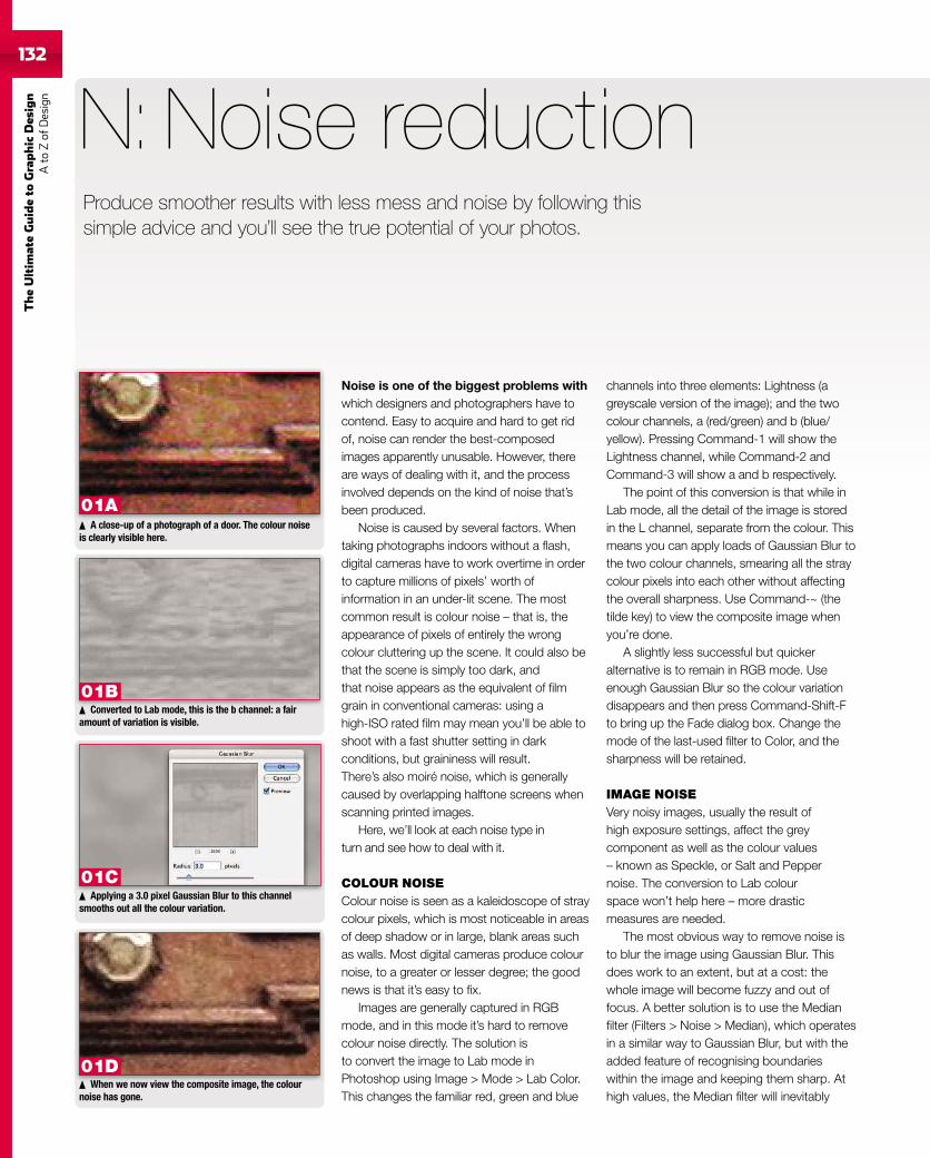
132
TheUltim
ateGuideto
Graphic
Des
ign
Ato
Zof
Design
132
Noise is one of the biggest problems withwhich designers and photographers have tocontend. Easy to acquire and hard to get ridof, noise can render the best-composedimages apparently unusable. However, thereare ways of dealing with it, and the processinvolved depends on the kind of noise that’sbeen produced.
Noise is caused by several factors. Whentaking photographs indoors without a flash,digital cameras have to work overtime in orderto capture millions of pixels’ worth ofinformation in an under-lit scene. The mostcommon result is colour noise – that is, theappearance of pixels of entirely the wrongcolour cluttering up the scene. It could also bethat the scene is simply too dark, andthat noise appears as the equivalent of filmgrain in conventional cameras: using ahigh-ISO rated film may mean you’ll be able toshoot with a fast shutter setting in darkconditions, but graininess will result.There’s also moiré noise, which is generallycaused by overlapping halftone screens whenscanning printed images.
Here, we’ll look at each noise type inturn and see how to deal with it.
COLOUR NOISEColour noise is seen as a kaleidoscope of straycolour pixels, which is most noticeable in areasof deep shadow or in large, blank areas suchas walls. Most digital cameras produce colournoise, to a greater or lesser degree; the goodnews is that it’s easy to fix.
Images are generally captured in RGBmode, and in this mode it’s hard to removecolour noise directly. The solution isto convert the image to Lab mode inPhotoshop using Image > Mode > Lab Color.This changes the familiar red, green and blue
N: Noise reduction
channels into three elements: Lightness (agreyscale version of the image); and the twocolour channels, a (red/green) and b (blue/yellow). Pressing Command-1 will show theLightness channel, while Command-2 andCommand-3 will show a and b respectively.
The point of this conversion is that while inLab mode, all the detail of the image is storedin the L channel, separate from the colour. Thismeans you can apply loads of Gaussian Blur tothe two colour channels, smearing all the straycolour pixels into each other without affectingthe overall sharpness. Use Command-~ (thetilde key) to view the composite image whenyou’re done.
A slightly less successful but quickeralternative is to remain in RGB mode. Useenough Gaussian Blur so the colour variationdisappears and then press Command-Shift-Fto bring up the Fade dialog box. Change themode of the last-used filter to Color, and thesharpness will be retained.
IMAGE NOISEVery noisy images, usually the result ofhigh exposure settings, affect the greycomponent as well as the colour values– known as Speckle, or Salt and Peppernoise. The conversion to Lab colourspace won’t help here – more drasticmeasures are needed.
The most obvious way to remove noise isto blur the image using Gaussian Blur. Thisdoes work to an extent, but at a cost: thewhole image will become fuzzy and out offocus. A better solution is to use the Medianfilter (Filters > Noise > Median), which operatesin a similar way to Gaussian Blur, but with theadded feature of recognising boundarieswithin the image and keeping them sharp. Athigh values, the Median filter will inevitably
Produce smoother results with less mess and noise by following thissimple advice and you’ll see the true potential of your photos.
When we now view the composite image, the colournoise has gone.
A close-up of a photograph of a door. The colour noiseis clearly visible here.
Converted to Lab mode, this is the b channel: a fairamount of variation is visible.
Applying a 3.0 pixel Gaussian Blur to this channelsmooths out all the colour variation.
01A
01B
01C
01D
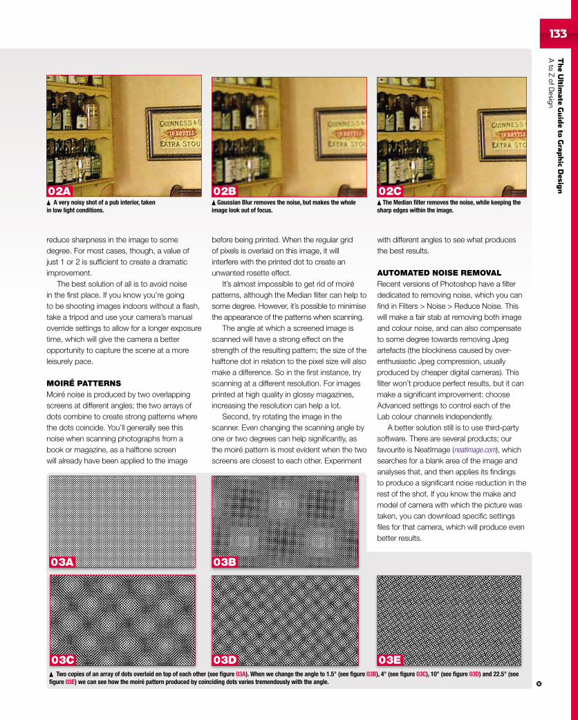
TheUltim
ateGuideto
Grap
hic
Desig
nAto
ZofD
esign133133
reduce sharpness in the image to somedegree. For most cases, though, a value ofjust 1 or 2 is sufficient to create a dramaticimprovement.
The best solution of all is to avoid noisein the first place. If you know you’re goingto be shooting images indoors without a flash,take a tripod and use your camera’s manualoverride settings to allow for a longer exposuretime, which will give the camera a betteropportunity to capture the scene at a moreleisurely pace.
MOIRÉ PATTERNSMoiré noise is produced by two overlappingscreens at different angles; the two arrays ofdots combine to create strong patterns wherethe dots coincide. You’ll generally see thisnoise when scanning photographs from abook or magazine, as a halftone screenwill already have been applied to the image
before being printed. When the regular gridof pixels is overlaid on this image, it willinterfere with the printed dot to create anunwanted rosette effect.
It’s almost impossible to get rid of moirépatterns, although the Median filter can help tosome degree. However, it’s possible to minimisethe appearance of the patterns when scanning.
The angle at which a screened image isscanned will have a strong effect on thestrength of the resulting pattern; the size of thehalftone dot in relation to the pixel size will alsomake a difference. So in the first instance, tryscanning at a different resolution. For imagesprinted at high quality in glossy magazines,increasing the resolution can help a lot.
Second, try rotating the image in thescanner. Even changing the scanning angle byone or two degrees can help significantly, asthe moiré pattern is most evident when the twoscreens are closest to each other. Experiment
with different angles to see what producesthe best results.
AUTOMATED NOISE REMOVALRecent versions of Photoshop have a filterdedicated to removing noise, which you canfind in Filters > Noise > Reduce Noise. Thiswill make a fair stab at removing both imageand colour noise, and can also compensateto some degree towards removing Jpegartefacts (the blockiness caused by over-enthusiastic Jpeg compression, usuallyproduced by cheaper digital cameras). Thisfilter won’t produce perfect results, but it canmake a significant improvement: chooseAdvanced settings to control each of theLab colour channels independently.
A better solution still is to use third-partysoftware. There are several products; ourfavourite is NeatImage (neatimage.com), whichsearches for a blank area of the image andanalyses that, and then applies its findingsto produce a significant noise reduction in therest of the shot. If you know the make andmodel of camera with which the picture wastaken, you can download specific settingsfiles for that camera, which will produce evenbetter results.
Gaussian Blur removes the noise, but makes the wholeimage look out of focus.
The Median filter removes the noise, while keeping thesharp edges within the image.
Two copies of an array of dots overlaid on top of each other (see figure 03A). When we change the angle to 1.5° (see figure 03B), 4° (see figure 03C), 10° (see figure 03D) and 22.5° (seefigure 03E) we can see how the moiré pattern produced by coinciding dots varies tremendously with the angle.
A very noisy shot of a pub interior, takenin low light conditions.
02A 02B 02C
03A 03B
03C 03D 03E
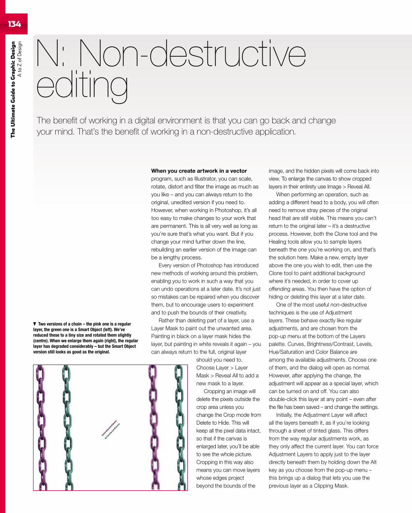
134
TheUltim
ateGuideto
Graphic
Des
ign
Ato
Zof
Design
When you create artwork in a vectorprogram, such as Illustrator, you can scale,rotate, distort and filter the image as much asyou like – and you can always return to theoriginal, unedited version if you need to.However, when working in Photoshop, it’s alltoo easy to make changes to your work thatare permanent. This is all very well as long asyou’re sure that’s what you want. But if youchange your mind further down the line,rebuilding an earlier version of the image canbe a lengthy process.
Every version of Photoshop has introducednew methods of working around this problem,enabling you to work in such a way that youcan undo operations at a later date. It’s not justso mistakes can be repaired when you discoverthem, but to encourage users to experimentand to push the bounds of their creativity.
Rather than deleting part of a layer, use aLayer Mask to paint out the unwanted area.Painting in black on a layer mask hides thelayer, but painting in white reveals it again – youcan always return to the full, original layer
should you need to.Choose Layer > LayerMask > Reveal All to add anew mask to a layer.
Cropping an image willdelete the pixels outside thecrop area unless youchange the Crop mode fromDelete to Hide. This willkeep all the pixel data intact,so that if the canvas isenlarged later, you’ll be ableto see the whole picture.Cropping in this way alsomeans you can move layerswhose edges projectbeyond the bounds of the
N: Non-destructiveediting
image, and the hidden pixels will come back intoview. To enlarge the canvas to show croppedlayers in their entirety use Image > Reveal All.
When performing an operation, such asadding a different head to a body, you will oftenneed to remove stray pieces of the originalhead that are still visible. This means you can’treturn to the original later – it’s a destructiveprocess. However, both the Clone tool and theHealing tools allow you to sample layersbeneath the one you’re working on, and that’sthe solution here. Make a new, empty layerabove the one you wish to edit, then use theClone tool to paint additional backgroundwhere it’s needed, in order to cover upoffending areas. You then have the option ofhiding or deleting this layer at a later date.
One of the most useful non-destructivetechniques is the use of Adjustmentlayers. These behave exactly like regularadjustments, and are chosen from thepop-up menu at the bottom of the Layerspalette. Curves, Brightness/Contrast, Levels,Hue/Saturation and Color Balance areamong the available adjustments. Choose oneof them, and the dialog will open as normal.However, after applying the change, theadjustment will appear as a special layer, whichcan be turned on and off. You can alsodouble-click this layer at any point – even afterthe file has been saved – and change the settings.
Initially, the Adjustment Layer will affectall the layers beneath it, as if you’re lookingthrough a sheet of tinted glass. This differsfrom the way regular adjustments work, asthey only affect the current layer. You can forceAdjustment Layers to apply just to the layerdirectly beneath them by holding down the Altkey as you choose from the pop-up menu –this brings up a dialog that lets you use theprevious layer as a Clipping Mask.
Two versions of a chain – the pink one is a regularlayer, the green one is a Smart Object (left). We’vereduced these to a tiny size and rotated them slightly(centre). When we enlarge them again (right), the regularlayer has degraded considerably – but the Smart Objectversion still looks as good as the original.
The benefit of working in a digital environment is that you can go back and changeyour mind. That’s the benefit of working in a non-destructive application.
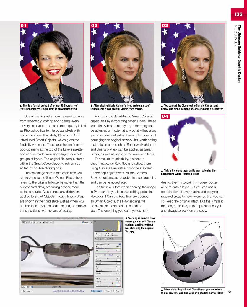
TheUltim
ateGuideto
Grap
hic
Desig
nAto
ZofD
esign135
One of the biggest problems used to comefrom repeatedly rotating and scaling layers– every time you do so, a bit more quality is lostas Photoshop has to interpolate pixels witheach operation. Thankfully, Photoshop CS2introduced Smart Objects, which gives theflexibility you need. These are chosen from thepop-up menu at the top of the Layers palette,and can be made from single layers or wholegroups of layers. The original file data is storedwithin the Smart Object layer, which can beedited by double-clicking on it.
The advantage here is that each time yourotate or scale the Smart Object, Photoshoprefers to the original full-size file rather than thecurrent pixel data, producing crisper, moreeditable results. As a bonus, any distortionsapplied to Smart Objects through Image Warpare shown in their grid state, just as when youapplied them – you can edit the grid, or removethe distortions, with no loss of quality.
Photoshop CS3 added to Smart Objects’capabilities by introducing Smart Filters. Thesework like Adjustment Layers, in that they canbe adjusted or hidden at any point – they allowyou to experiment with different effects withoutdamaging the original artwork. It’s worth notingthat adjustments such as Shadows/Highlightsand Unsharp Mask can be applied as SmartFilters, as well as some of the wackier effects.
For maximum editability, it’s best toshoot images as Raw files and adjust themusing Camera Raw rather than the standardPhotoshop adjustments. All the CameraRaw operations are recorded in a separate file,and can be removed later.
The trouble is that when opening the imagein Photoshop, you lose that editing potential.However, if Camera Raw files are openedas Smart Objects, the Raw settings willbe maintained and can still be editedlater. The one thing you can’t yet do non-
destructively is to paint, smudge, dodgeor burn onto a layer. But you can use acombination of layer masks and copyingrequired areas to new layers, so that you canstill keep the original intact. But the simplestmethod, of course, is to duplicate the layerand always to work on the copy.
This is a formal portrait of former US Secretary ofState Condoleezza Rice in front of an American flag.
After placing Nicole Kidman’s head on top, parts ofCondoleezza’s hair are still visible from behind.
You can set the Clone tool to Sample Current andBelow, and clone from the background onto a new layer.
This is the clone layer on its own, patching thebackground while leaving it intact.
When distorting a Smart Object layer, you can returnto it at any time and find your grid position as you left it.
Working in Camera Rawmeans you can edit files asmuch as you like, withoutever changing the originalfile copy.
01 02 03
04
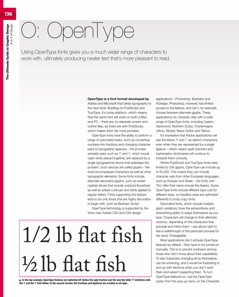
136
TheUltim
ateGuideto
Graphic
Des
ign
Ato
Zof
Design
136
OpenType is a font format developed byAdobe and Microsoft that takes typography tothe next level. Building on PostScript andTrueType, it’s cross-platform, which meansthat the same font will work on both a Macand PC – there are no separate screen andoutline files, as there are with PostScript,which makes them far more portable.
OpenType fonts have the ability to perform arange of automated tasks, such as convertingnumbers into fractions and changing characterpairs to typographic ligatures – the processwhereby pairs such as ‘f’ and ‘i’, which wouldclash when placed together, are replaced by asingle typographical device that sidesteps theproblem. Such devices are called glyphs – theword encompasses characters as well as othertypographic elements. Some fonts includealternate decorative glyphs, such as swashcapitals (those that include outsized flourishes)as well as added curlicues and twirls applied toregular letters. Fonts supporting this featuretend to be only those that are highly decorativeto begin with, such as Bickham Script.
OpenType technology is supported by thethree main Adobe CS3 and CS4 design
O: OpenType
applications – Photoshop, Illustrator andInDesign. Photoshop, however, has limitedaccess to the feature, and can’t, for example,choose between alternate glyphs. Theseapplications do, however, ship with a widerange of OpenType fonts, including Caslon,Garamond, Bickham Script, Charlemagne,Lithos, Myriad, News Gothic and Tekton.
It’s impressive that Adobe applications willsee the letters ‘f’ and ‘i’ as distinct characters,even when they are represented by a singleligature – which means spell checkers andhyphenation dictionaries will continue tointerpret them correctly.
Where PostScript and TrueType fonts werelimited to 256 glyphs, OpenType can include upto 65,000. This means they can includecharacter sets from other European languages,such as Russian and Greek – the fonts with‘Pro’ after their name include this feature. SomeOpenType fonts include different type cuts fordifferent sizes, so headline sizes are optimiseddifferently to body copy fonts.
Decorative fonts, which include multipleglyph variations, have the extraordinary andentertaining ability to adapt themselves as youtype. Characters will change to their alternateversions, depending on the characters thatprecede and follow them – see above right tosee a walkthrough of this particular process forthe word ‘Changeable’.
Most applications don’t activate OpenTypefeatures by default – they have to be turned onmanually. This is to prevent confusion amongthose who don’t know about their capabilities.To see characters changing all by themselvescan be unnerving, and it would be frustrating toend up with fractions when you don’t wantthem and weren’t expecting them. To turnOpenType features on, use the OpenTypeoption from the pop-up menu on the CharacterIn the top example, OpenType features are switched off. Notice the ugly fraction and the way the letter ‘f’ interferes with
the ‘l’ and the ‘i’ that follow. In the second version, the fractions and ligatures are created as we type.
Using OpenType fonts gives you a much wider range of characters towork with, ultimately producing neater text that’s more pleasant to read.
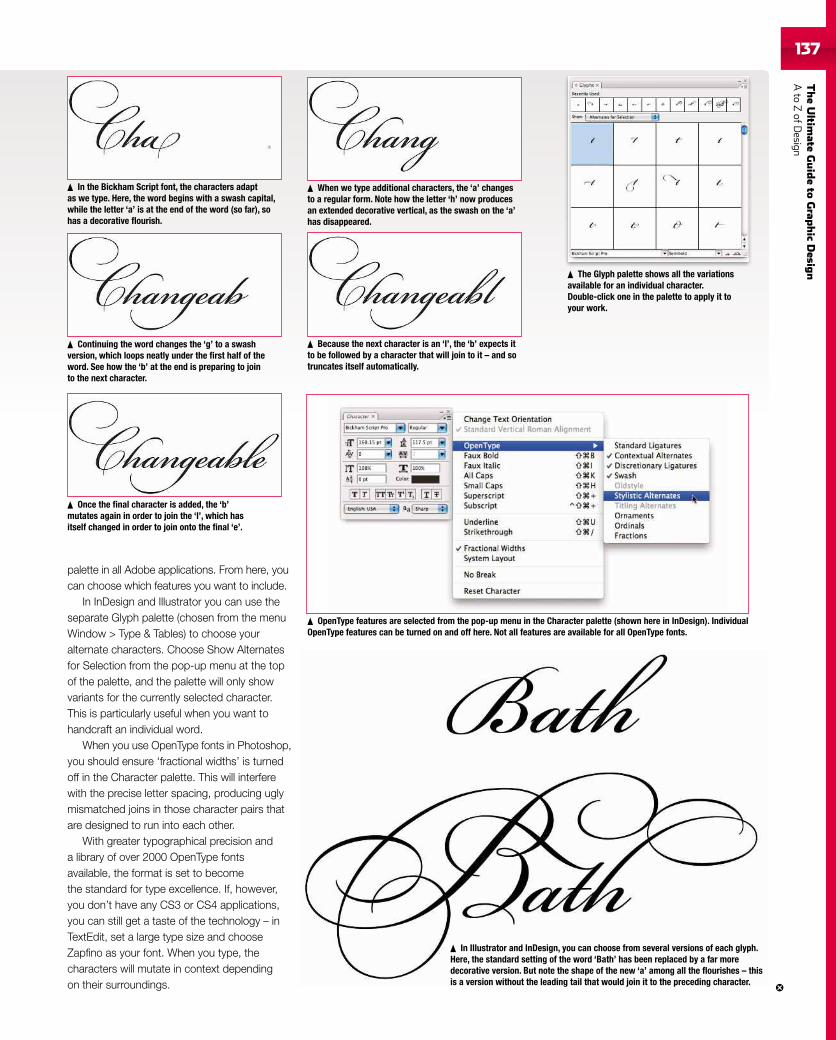
TheUltim
ateGuideto
Grap
hic
Desig
nAto
ZofD
esign137137
In the Bickham Script font, the characters adaptas we type. Here, the word begins with a swash capital,while the letter ‘a’ is at the end of the word (so far), sohas a decorative flourish.
Because the next character is an ‘l’, the ‘b’ expects itto be followed by a character that will join to it – and sotruncates itself automatically.
When we type additional characters, the ‘a’ changesto a regular form. Note how the letter ‘h’ now producesan extended decorative vertical, as the swash on the ‘a’has disappeared.
Continuing the word changes the ‘g’ to a swashversion, which loops neatly under the first half of theword. See how the ‘b’ at the end is preparing to jointo the next character.
Once the final character is added, the ‘b’mutates again in order to join the ‘l’, which hasitself changed in order to join onto the final ‘e’.
OpenType features are selected from the pop-up menu in the Character palette (shown here in InDesign). IndividualOpenType features can be turned on and off here. Not all features are available for all OpenType fonts.
The Glyph palette shows all the variationsavailable for an individual character.Double-click one in the palette to apply it toyour work.
In Illustrator and InDesign, you can choose from several versions of each glyph.Here, the standard setting of the word ‘Bath’ has been replaced by a far moredecorative version. But note the shape of the new ‘a’ among all the flourishes – thisis a version without the leading tail that would join it to the preceding character.
palette in all Adobe applications. From here, youcan choose which features you want to include.
In InDesign and Illustrator you can use theseparate Glyph palette (chosen from the menuWindow > Type & Tables) to choose youralternate characters. Choose Show Alternatesfor Selection from the pop-up menu at the topof the palette, and the palette will only showvariants for the currently selected character.This is particularly useful when you want tohandcraft an individual word.
When you use OpenType fonts in Photoshop,you should ensure ‘fractional widths’ is turnedoff in the Character palette. This will interferewith the precise letter spacing, producing uglymismatched joins in those character pairs thatare designed to run into each other.
With greater typographical precision anda library of over 2000 OpenType fontsavailable, the format is set to becomethe standard for type excellence. If, however,you don’t have any CS3 or CS4 applications,you can still get a taste of the technology – inTextEdit, set a large type size and chooseZapfino as your font. When you type, thecharacters will mutate in context dependingon their surroundings.
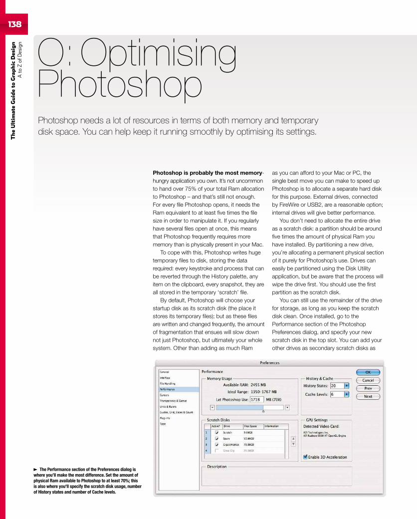
138
TheUltim
ateGuideto
Graphic
Des
ign
Ato
Zof
Design
Photoshop is probably the most memory-hungry application you own. It’s not uncommonto hand over 75% of your total Ram allocationto Photoshop – and that’s still not enough.For every file Photoshop opens, it needs theRam equivalent to at least five times the filesize in order to manipulate it. If you regularlyhave several files open at once, this meansthat Photoshop frequently requires morememory than is physically present in your Mac.
To cope with this, Photoshop writes hugetemporary files to disk, storing the datarequired: every keystroke and process that canbe reverted through the History palette, anyitem on the clipboard, every snapshot, they areall stored in the temporary ‘scratch’ file.
By default, Photoshop will choose yourstartup disk as its scratch disk (the place itstores its temporary files); but as these filesare written and changed frequently, the amountof fragmentation that ensues will slow downnot just Photoshop, but ultimately your wholesystem. Other than adding as much Ram
O: OptimisingPhotoshop
as you can afford to your Mac or PC, thesingle best move you can make to speed upPhotoshop is to allocate a separate hard diskfor this purpose. External drives, connectedby FireWire or USB2, are a reasonable option;internal drives will give better performance.
You don’t need to allocate the entire driveas a scratch disk: a partition should be aroundfive times the amount of physical Ram youhave installed. By partitioning a new drive,you’re allocating a permanent physical sectionof it purely for Photoshop’s use. Drives caneasily be partitioned using the Disk Utilityapplication, but be aware that the process willwipe the drive first. You should use the firstpartition as the scratch disk.
You can still use the remainder of the drivefor storage, as long as you keep the scratchdisk clean. Once installed, go to thePerformance section of the PhotoshopPreferences dialog, and specify your newscratch disk in the top slot. You can add yourother drives as secondary scratch disks as
The Performance section of the Preferences dialog iswhere you’ll make the most difference. Set the amount ofphysical Ram available to Photoshop to at least 70%; thisis also where you'll specify the scratch disk usage, numberof History states and number of Cache levels.
Photoshop needs a lot of resources in terms of both memory and temporarydisk space. You can help keep it running smoothly by optimising its settings.
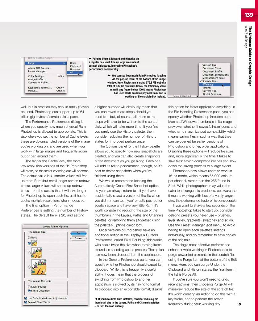
TheUltim
ateGuideto
Grap
hic
Desig
nAto
ZofD
esign139
well, but in practice they should rarely (if ever)be used. Photoshop can support up to 64billion gigabytes of scratch disk space.
The Performance Preferences dialog iswhere you specify how much physical RamPhotoshop is allowed to appropriate. This isalso where you set the number of Cache levels:these are downsampled versions of the imageyou’re working on, and are used when youwork with large images and frequently zoomout or pan around them.
The higher the Cache level, the morelow-resolution versions of the file Photoshopwill store, so the faster zooming out will become.The default value is 4; smaller values will freeup more Ram (but entail longer screen redrawtimes), larger values will speed up redrawtimes – but the cost is that it will take longerfor Photoshop to open each file, as it has tocache multiple resolutions when it does so.
The final option in PerformancePreferences is setting the number of Historystates. The default here is 20, and setting
a higher number will obviously mean thatyou can revert more steps should youneed to – but, of course, all these extrasteps will have to be written to the scratchdisk, which will take more time. If you findyou rarely use the History palette, thenconsider reducing the number of Historystates for improved performance.
The Options panel for the History paletteallows you to specify how new snapshots arecreated, and you can also create snapshotsof the document as you go along. Each onewill add its toll to performance, though, so it’sbest to delete snapshots when you’vefinished using them.
We would recommend keeping theAutomatically Create First Snapshot option,so you can always return to it if you haveaccidentally saved a version of the file whenyou didn’t mean to. If you’re really pushed forscratch space and have very little Ram, it’sworth considering reducing the size of thethumbnails in the Layers, Paths and Channelspalettes, or removing them altogether, usingthe palette’s Options dialog box.
Older versions of Photoshop have anadditional option in the Displays & CursorsPreferences, called Pixel Doubling: this workswith pixels twice the size when moving itemsaround, so speeding up the process. The optionhas now been dropped from the application.
In the General Preferences pane, you canspecify whether Photoshop should export itsclipboard. While this is frequently a usefulability, it does mean that the process ofswitching from Photoshop to anotherapplication is slowed by its having to formatits clipboard into an exportable format; disable
this option for faster application switching. Inthe File Handling Preferences pane, you canspecify whether Photoshop includes bothMac and Windows thumbnails in its imagepreviews, whether it saves full-size icons, andwhether to maximize psd compatibility, whichmeans saving files in such a way that theycan be opened be earlier versions ofPhotoshop and other, older applications.Disabling these options will reduce file sizesand, more significantly, the time it takes tosave files: saving composite images can slowdown the saving process to a large extent.
Photoshop now allows users to work in16-bit mode, which means 65,000 coloursper channel, rather than the 256 found in8-bit. While photographers may value theextra tonal range this produces, be aware thatit means working with files of a vastly largersize: the performance trade-off is considerable.
If you want to shave a few seconds off thetime Photoshop takes to start up, considerdeleting presets you never use – brushes,layer styles, gradients, swatches and so on.Use the Preset Manager (edit menu) to avoidhaving to open each palette’s settingsindividually, and do remember to save copiesof the originals.
The single most effective performanceenhancer while working in Photoshop is topurge unwanted elements in the scratch file,using the Purge item at the bottom of the Editmenu. Here, you can purge Undo, theClipboard and History states: the final item inthe list is Purge All.
If you’re sure you won’t need to undorecent actions, then choosing Purge All willmassively reduce the size of the scratch file.It's worth creating an Action to do this with akeystroke, and to perform the Actionfrequently during your working day.
You can see how much Ram Photoshop is usingvia the pop-up menu at the bottom of the image
window. Here, Photoshop is using 576.8 MB out of atotal of 1.32 GB available. Check the Efficiency value
as well: any figure below 100% means Photoshophas used all its available physical Ram, and is
working on the scratch disk instead.
Purging Undo, Clipboard and Histories ona regular basis will free up large amounts ofscratch disk space, improving Photoshop’sperformance considerably.
If you have little Ram installed, consider reducing thethumbnail size in the Layers, Paths and Channels palettes– or turn them off entirely.
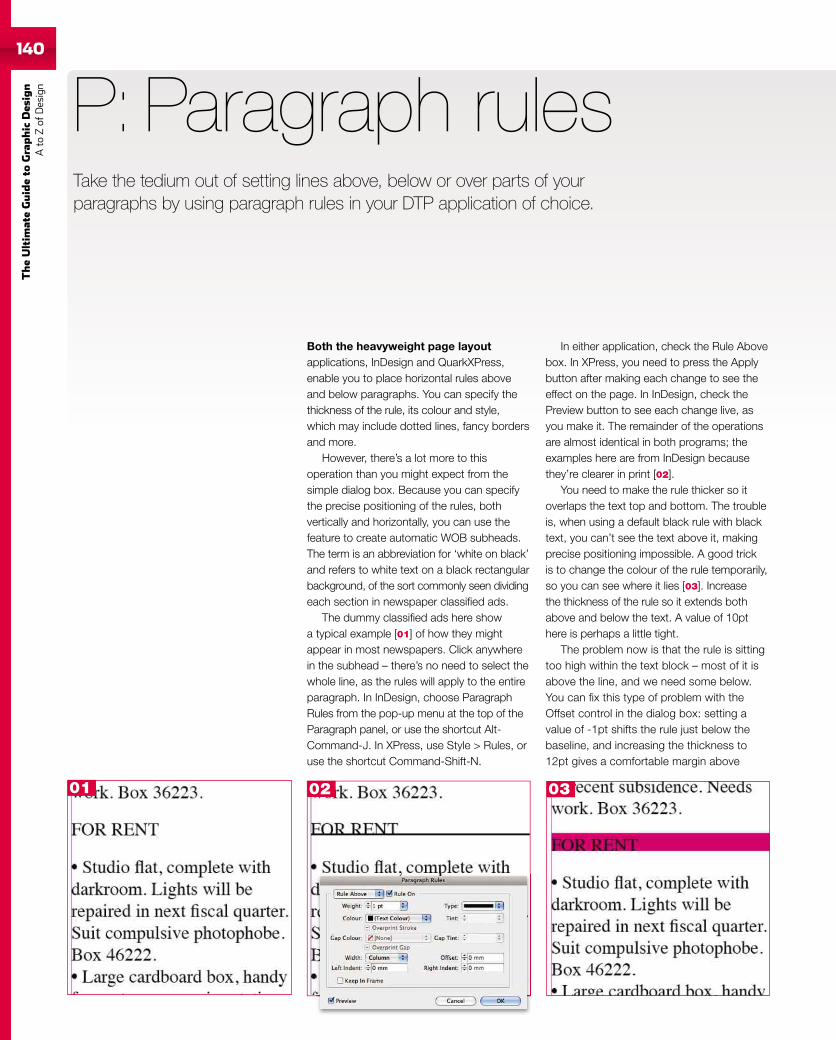
140
TheUltim
ateGuideto
Graphic
Des
ign
Ato
Zof
Design
140
Both the heavyweight page layoutapplications, InDesign and QuarkXPress,enable you to place horizontal rules aboveand below paragraphs. You can specify thethickness of the rule, its colour and style,which may include dotted lines, fancy bordersand more.
However, there’s a lot more to thisoperation than you might expect from thesimple dialog box. Because you can specifythe precise positioning of the rules, bothvertically and horizontally, you can use thefeature to create automatic WOB subheads.The term is an abbreviation for ‘white on black’and refers to white text on a black rectangularbackground, of the sort commonly seen dividingeach section in newspaper classified ads.
The dummy classified ads here showa typical example [01] of how they mightappear in most newspapers. Click anywherein the subhead – there’s no need to select thewhole line, as the rules will apply to the entireparagraph. In InDesign, choose ParagraphRules from the pop-up menu at the top of theParagraph panel, or use the shortcut Alt-Command-J. In XPress, use Style > Rules, oruse the shortcut Command-Shift-N.
P: Paragraph rules
In either application, check the Rule Abovebox. In XPress, you need to press the Applybutton after making each change to see theeffect on the page. In InDesign, check thePreview button to see each change live, asyou make it. The remainder of the operationsare almost identical in both programs; theexamples here are from InDesign becausethey’re clearer in print [02].
You need to make the rule thicker so itoverlaps the text top and bottom. The troubleis, when using a default black rule with blacktext, you can’t see the text above it, makingprecise positioning impossible. A good trickis to change the colour of the rule temporarily,so you can see where it lies [03]. Increasethe thickness of the rule so it extends bothabove and below the text. A value of 10pthere is perhaps a little tight.
The problem now is that the rule is sittingtoo high within the text block – most of it isabove the line, and we need some below.You can fix this type of problem with theOffset control in the dialog box: setting avalue of -1pt shifts the rule just below thebaseline, and increasing the thickness to12pt gives a comfortable margin above
Take the tedium out of setting lines above, below or over parts of yourparagraphs by using paragraph rules in your DTP application of choice.
01 02 03
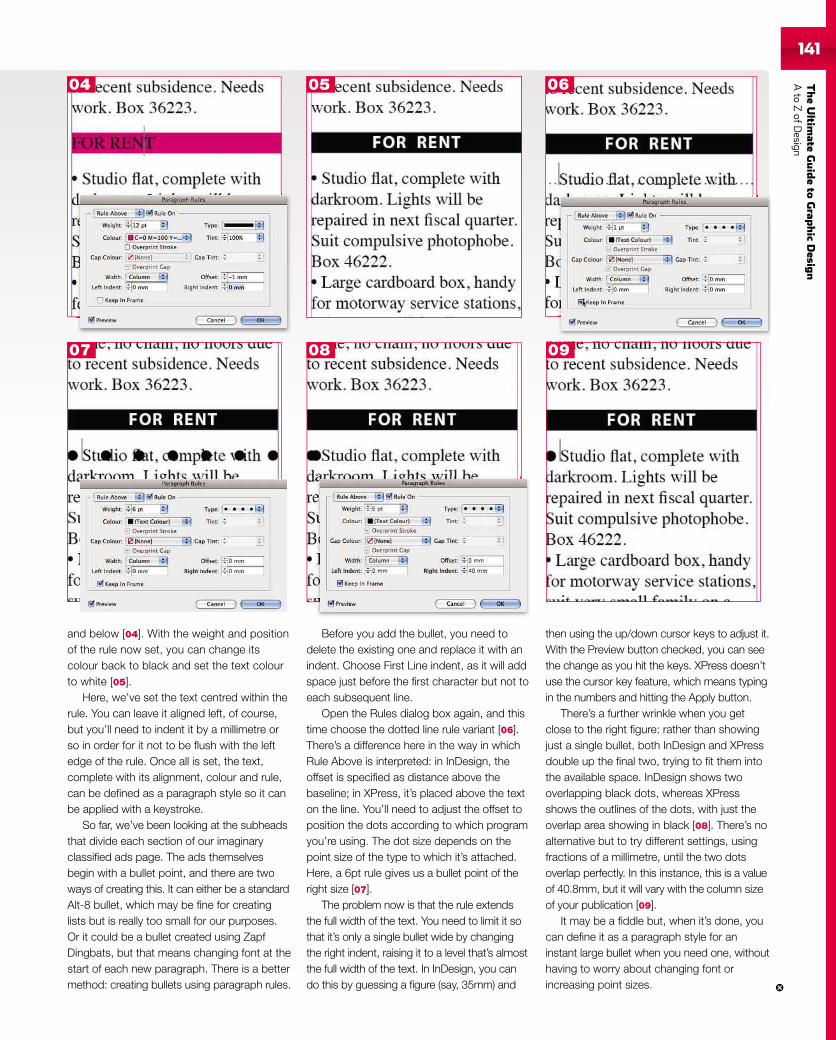
TheUltim
ateGuideto
Grap
hic
Desig
nAto
ZofD
esign141141
and below [04]. With the weight and positionof the rule now set, you can change itscolour back to black and set the text colourto white [05].
Here, we’ve set the text centred within therule. You can leave it aligned left, of course,but you’ll need to indent it by a millimetre orso in order for it not to be flush with the leftedge of the rule. Once all is set, the text,complete with its alignment, colour and rule,can be defined as a paragraph style so it canbe applied with a keystroke.
So far, we’ve been looking at the subheadsthat divide each section of our imaginaryclassified ads page. The ads themselvesbegin with a bullet point, and there are twoways of creating this. It can either be a standardAlt-8 bullet, which may be fine for creatinglists but is really too small for our purposes.Or it could be a bullet created using ZapfDingbats, but that means changing font at thestart of each new paragraph. There is a bettermethod: creating bullets using paragraph rules.
Before you add the bullet, you need todelete the existing one and replace it with anindent. Choose First Line indent, as it will addspace just before the first character but not toeach subsequent line.
Open the Rules dialog box again, and thistime choose the dotted line rule variant [06].There’s a difference here in the way in whichRule Above is interpreted: in InDesign, theoffset is specified as distance above thebaseline; in XPress, it’s placed above the texton the line. You’ll need to adjust the offset toposition the dots according to which programyou’re using. The dot size depends on thepoint size of the type to which it’s attached.Here, a 6pt rule gives us a bullet point of theright size [07].
The problem now is that the rule extendsthe full width of the text. You need to limit it sothat it’s only a single bullet wide by changingthe right indent, raising it to a level that’s almostthe full width of the text. In InDesign, you cando this by guessing a figure (say, 35mm) and
then using the up/down cursor keys to adjust it.With the Preview button checked, you can seethe change as you hit the keys. XPress doesn’tuse the cursor key feature, which means typingin the numbers and hitting the Apply button.
There’s a further wrinkle when you getclose to the right figure: rather than showingjust a single bullet, both InDesign and XPressdouble up the final two, trying to fit them intothe available space. InDesign shows twooverlapping black dots, whereas XPressshows the outlines of the dots, with just theoverlap area showing in black [08]. There’s noalternative but to try different settings, usingfractions of a millimetre, until the two dotsoverlap perfectly. In this instance, this is a valueof 40.8mm, but it will vary with the column sizeof your publication [09].
It may be a fiddle but, when it’s done, youcan define it as a paragraph style for aninstant large bullet when you need one, withouthaving to worry about changing font orincreasing point sizes.
04 05 06
07 08 09
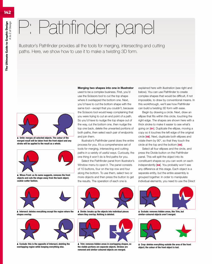
142
TheUltim
ateGuideto
Graphic
Des
ign
Ato
Zof
Design
Merging two shapes into one in Illustratorused to be a complex business. First, you’duse the Scissors tool to cut the top shapewhere it overlapped the bottom one. Next,you’d have to cut the bottom shape with thesame tool – except that you couldn’t, becausethe Scissors tool would keep complaining thatyou were trying to cut an end point of a path.So you’d have to nudge the top shape out ofthe way, cut the bottom one, then nudge thetop one back, delete the unwanted portions ofboth paths, then select each pair of endpointsand join them.
Illustrator’s Pathfinder panel does the entireprocess for you. It’s a comprehensive set oftools for merging, intersecting and cuttingpaths in a variety of useful ways. Curiously, theone thing it won’t do is find paths for you.
Select the Pathfinder panel from Illustrator’sWindow menu to open it. The panel consistsof 10 buttons, four on the top row and fouralong the bottom. To use them, select two ormore objects and then press the button to getthe results. The operation of each one is
P: Pathfinder panel
explained here with illustration (see right andbelow). You can use Pathfinder to createcomplex shapes that would be difficult, if notimpossible, to draw by conventional means. Inthis workthrough, we’ll see how Pathfindercan build a twisting 3D form with ease.
Begin by drawing a circle. Next, draw anellipse that fits within this circle, touching theright edge. The shapes are shown here with athick stroke to make it easier to see what’sgoing on [01]. Duplicate the ellipse, moving acopy so it touches the left edge of the originalcircle [02]. Next, duplicate both ellipses androtate them by 90°, so that they touch thecircle at the top and the bottom [03].
Select all four ellipses and the circle, andpress the Divide button on the Pathfinderpanel. This will split the object into itsconstituent shapes so you can work on eachindependently [04]. You probably won’t seeany difference at this stage. Each object is aseparate entity, but the entire assembly isgrouped together. In order to manipulateindividual elements, you need to use the Direct
Illustrator’s Pathfinder provides all the tools for merging, intersecting and cuttingpaths. Here, we show how to use it to make a twisting 3D form.
Unite: merges all selected objects. The colour of themerged result will be taken from the front object and anystroke will be applied to the result as a whole.
Intersect: deletes everything except the region where theshapes overlap.
Exclude: removes hidden areas, like Trim, butsimilar-coloured objects aren’t merged.
Minus Front: as its name suggests, removes the frontobjects and cuts the shape away from the back object,cookie-cutter fashion.
Trim: removes hidden areas in overlapping shapes, sothe visible portions are separate objects. Strokes areremoved and similar-coloured objects are merged.
Exclude: this is the opposite of Intersect, deleting theoverlapping region while keeping everything else.
Crop: deletes everything outside the area of the frontobject; the colour of the front object is lost.
Divide: breaks up the objects into individual pieceswhere they overlap. Nothing is deleted.
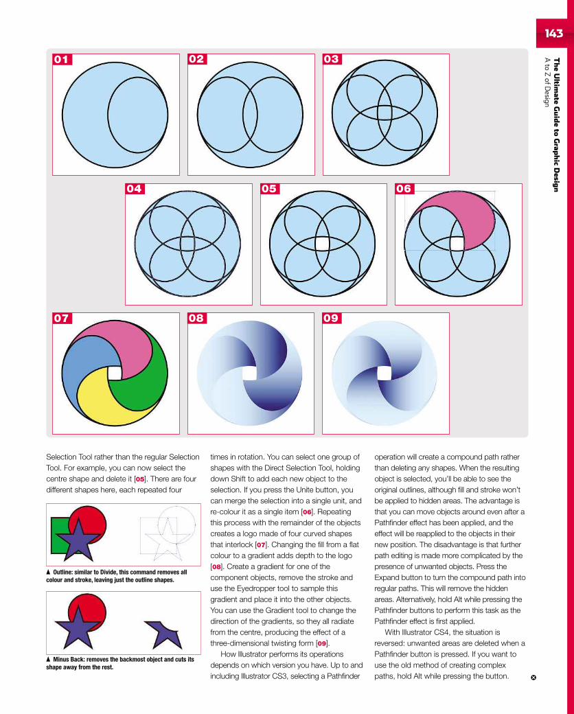
TheUltim
ateGuideto
Grap
hic
Desig
nAto
ZofD
esign143
Selection Tool rather than the regular SelectionTool. For example, you can now select thecentre shape and delete it [05]. There are fourdifferent shapes here, each repeated four
times in rotation. You can select one group ofshapes with the Direct Selection Tool, holdingdown Shift to add each new object to theselection. If you press the Unite button, youcan merge the selection into a single unit, andre-colour it as a single item [06]. Repeatingthis process with the remainder of the objectscreates a logo made of four curved shapesthat interlock [07]. Changing the fill from a flatcolour to a gradient adds depth to the logo[08]. Create a gradient for one of thecomponent objects, remove the stroke anduse the Eyedropper tool to sample thisgradient and place it into the other objects.You can use the Gradient tool to change thedirection of the gradients, so they all radiatefrom the centre, producing the effect of athree-dimensional twisting form [09].
How Illustrator performs its operationsdepends on which version you have. Up to andincluding Illustrator CS3, selecting a Pathfinder
operation will create a compound path ratherthan deleting any shapes. When the resultingobject is selected, you’ll be able to see theoriginal outlines, although fill and stroke won’tbe applied to hidden areas. The advantage isthat you can move objects around even after aPathfinder effect has been applied, and theeffect will be reapplied to the objects in theirnew position. The disadvantage is that furtherpath editing is made more complicated by thepresence of unwanted objects. Press theExpand button to turn the compound path intoregular paths. This will remove the hiddenareas. Alternatively, hold Alt while pressing thePathfinder buttons to perform this task as thePathfinder effect is first applied.
With Illustrator CS4, the situation isreversed: unwanted areas are deleted when aPathfinder button is pressed. If you want touse the old method of creating complexpaths, hold Alt while pressing the button.
02 03
04 05 06
07 08 09
01
Minus Back: removes the backmost object and cuts itsshape away from the rest.
Outline: similar to Divide, this command removes allcolour and stroke, leaving just the outline shapes.
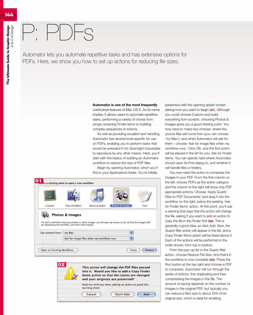
144
TheUltim
ateGuideto
Graphic
Des
ign
Ato
Zof
Design
Automator is one of the most frequentlyoverlooked features of Mac OS X. As its nameimplies, it allows users to automate repetitivetasks, performing a variety of chores fromsimply renaming Finder items to buildingcomplex sequences of actions.
As well as providing excellent text handling,Automator has several tools specific for useon PDFs, enabling you to perform tasks thatwould be awkward if not downright impossibleto reproduce by any other means. Here, you’llstart with the basics of building an Automatorworkflow to reduce the size of PDF files.
Begin by opening Automator, which you’llfind in your Applications folder. You’re initially
P: PDFs
presented with the opening splash screenasking how you want to begin (01). Althoughyou could choose Custom and buildeverything from scratch, choosing Photos &Images gives you a good starting point. Younow have to make two choices: where thesource files will come from (you can choose‘my Mac’), and when Automator will ask forthem – choose ‘Ask for image files when myworkflow runs’. Click OK, and the first actionwill be placed in the list for you: Ask for FinderItems. You can specify here where Automatorshould open its Find dialog to, and whether itwill handle files or folders.
You now need the action to compress theimages in your PDF. From the first column onthe left, choose PDFs as the action categoryand the column to the right will show only PDFappropriate actions. Choose ‘Apply QuartzFilter to PDF Documents’ and drag it into theworkflow on the right, below the existing ‘Askfor Finder Items’ action. At this point, you’ll seea warning that says that the action will changethe file, asking if you want to add an action tocopy the file in the Finder first (02). This isgenerally a good idea, so click Add. Now, theQuartz filter action will appear in the list, and aCopy Finder Items action will be listed above it.Each of the actions will be performed in theorder shown, from top to bottom.
From the pop-up list in the Quartz filteraction, choose Reduce File Size. And that’s it:the workflow is now complete (03). Press theRun button at the top right and choose a PDFto compress. Automator will run through theseries of actions, first duplicating and thencompressing the images in the file. Theamount of saving depends on the number ofimages in the original PDF, but typically youcan reduce a file’s size to about 20% of itsoriginal size, which is ideal for emailing.
Automator lets you automate repetitive tasks and has extensive options forPDFs. Here, we show you how to set up actions for reducing file sizes.
01
02
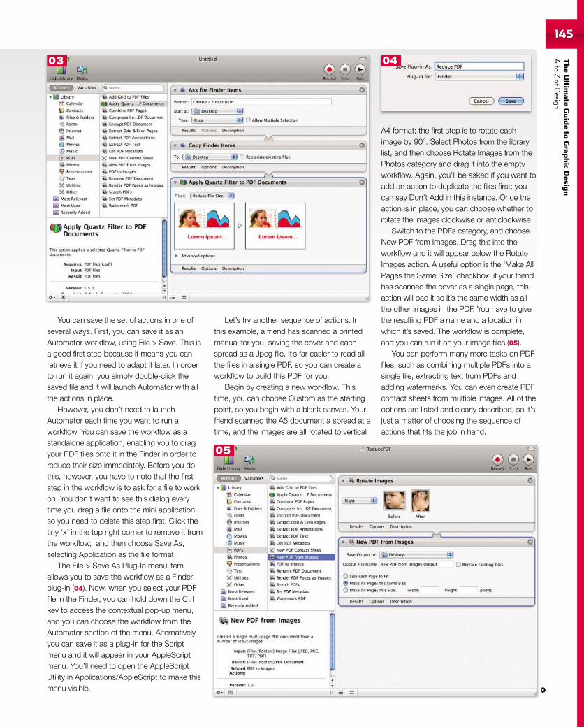
TheUltim
ateGuideto
Grap
hic
Desig
nAto
ZofD
esign145
You can save the set of actions in one ofseveral ways. First, you can save it as anAutomator workflow, using File > Save. This isa good first step because it means you canretrieve it if you need to adapt it later. In orderto run it again, you simply double-click thesaved file and it will launch Automator with allthe actions in place.
However, you don’t need to launchAutomator each time you want to run aworkflow. You can save the workflow as astandalone application, enabling you to dragyour PDF files onto it in the Finder in order toreduce their size immediately. Before you dothis, however, you have to note that the firststep in the workflow is to ask for a file to workon. You don’t want to see this dialog everytime you drag a file onto the mini application,so you need to delete this step first. Click thetiny ‘x’ in the top right corner to remove it fromthe workflow, and then choose Save As,selecting Application as the file format.
The File > Save As Plug-In menu itemallows you to save the workflow as a Finderplug-in (04). Now, when you select your PDFfile in the Finder, you can hold down the Ctrlkey to access the contextual pop-up menu,and you can choose the workflow from theAutomator section of the menu. Alternatively,you can save it as a plug-in for the Scriptmenu and it will appear in your AppleScriptmenu. You’ll need to open the AppleScriptUtility in Applications/AppleScript to make thismenu visible.
Let’s try another sequence of actions. Inthis example, a friend has scanned a printedmanual for you, saving the cover and eachspread as a Jpeg file. It’s far easier to read allthe files in a single PDF, so you can create aworkflow to build this PDF for you.
Begin by creating a new workflow. Thistime, you can choose Custom as the startingpoint, so you begin with a blank canvas. Yourfriend scanned the A5 document a spread at atime, and the images are all rotated to vertical
A4 format; the first step is to rotate eachimage by 90°. Select Photos from the librarylist, and then choose Rotate Images from thePhotos category and drag it into the emptyworkflow. Again, you’ll be asked if you want toadd an action to duplicate the files first; youcan say Don’t Add in this instance. Once theaction is in place, you can choose whether torotate the images clockwise or anticlockwise.
Switch to the PDFs category, and chooseNew PDF from Images. Drag this into theworkflow and it will appear below the RotateImages action. A useful option is the ‘Make AllPages the Same Size’ checkbox: if your friendhas scanned the cover as a single page, thisaction will pad it so it’s the same width as allthe other images in the PDF. You have to givethe resulting PDF a name and a location inwhich it’s saved. The workflow is complete,and you can run it on your image files (05).
You can perform many more tasks on PDFfiles, such as combining multiple PDFs into asingle file, extracting text from PDFs andadding watermarks. You can even create PDFcontact sheets from multiple images. All of theoptions are listed and clearly described, so it’sjust a matter of choosing the sequence ofactions that fits the job in hand.
03
05
04
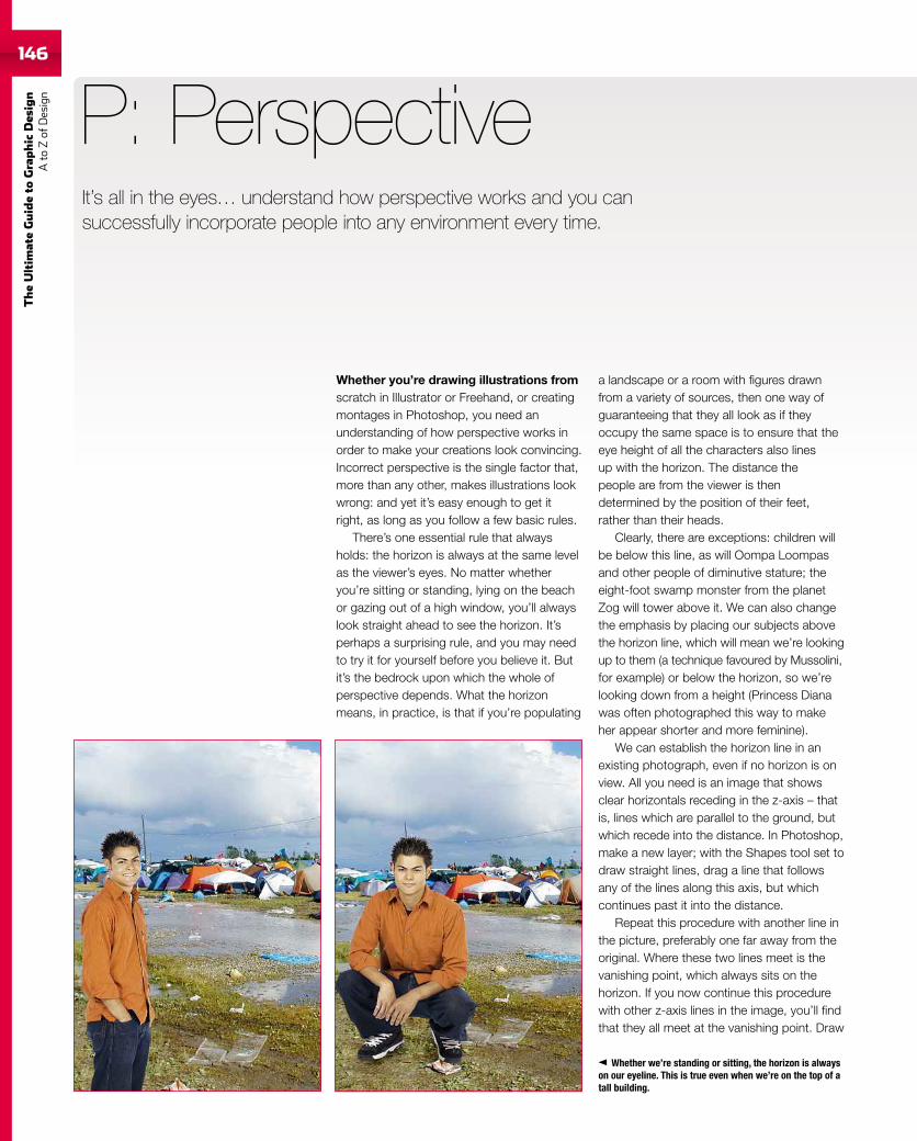
146
TheUltim
ateGuideto
Graphic
Des
ign
Ato
Zof
Design
Whether you’re drawing illustrations fromscratch in Illustrator or Freehand, or creatingmontages in Photoshop, you need anunderstanding of how perspective works inorder to make your creations look convincing.Incorrect perspective is the single factor that,more than any other, makes illustrations lookwrong: and yet it’s easy enough to get itright, as long as you follow a few basic rules.
There’s one essential rule that alwaysholds: the horizon is always at the same levelas the viewer’s eyes. No matter whetheryou’re sitting or standing, lying on the beachor gazing out of a high window, you’ll alwayslook straight ahead to see the horizon. It’sperhaps a surprising rule, and you may needto try it for yourself before you believe it. Butit’s the bedrock upon which the whole ofperspective depends. What the horizonmeans, in practice, is that if you’re populating
P: Perspective
a landscape or a room with figures drawnfrom a variety of sources, then one way ofguaranteeing that they all look as if theyoccupy the same space is to ensure that theeye height of all the characters also linesup with the horizon. The distance thepeople are from the viewer is thendetermined by the position of their feet,rather than their heads.
Clearly, there are exceptions: children willbe below this line, as will Oompa Loompasand other people of diminutive stature; theeight-foot swamp monster from the planetZog will tower above it. We can also changethe emphasis by placing our subjects abovethe horizon line, which will mean we’re lookingup to them (a technique favoured by Mussolini,for example) or below the horizon, so we’relooking down from a height (Princess Dianawas often photographed this way to makeher appear shorter and more feminine).
We can establish the horizon line in anexisting photograph, even if no horizon is onview. All you need is an image that showsclear horizontals receding in the z-axis – thatis, lines which are parallel to the ground, butwhich recede into the distance. In Photoshop,make a new layer; with the Shapes tool set todraw straight lines, drag a line that followsany of the lines along this axis, but whichcontinues past it into the distance.
Repeat this procedure with another line inthe picture, preferably one far away from theoriginal. Where these two lines meet is thevanishing point, which always sits on thehorizon. If you now continue this procedurewith other z-axis lines in the image, you’ll findthat they all meet at the vanishing point. Draw
Whether we’re standing or sitting, the horizon is alwayson our eyeline. This is true even when we’re on the top of atall building.
It’s all in the eyes… understand how perspective works and you cansuccessfully incorporate people into any environment every time.
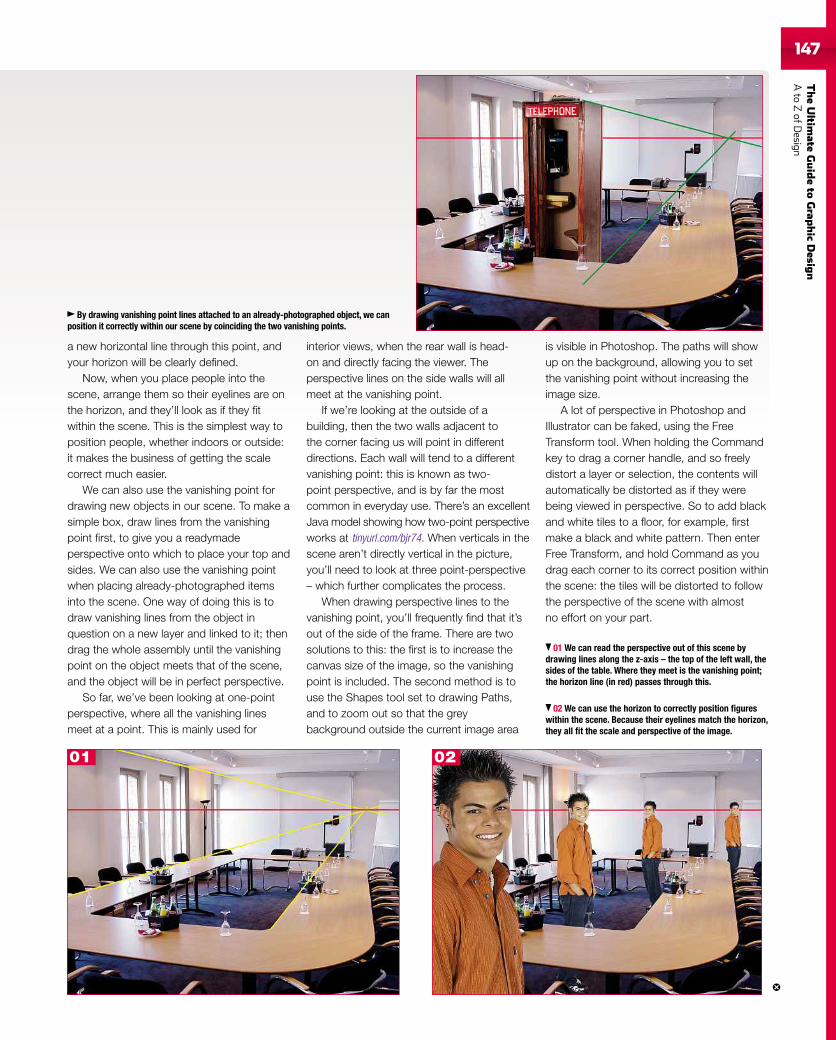
TheUltim
ateGuideto
Grap
hic
Desig
nAto
ZofD
esign147
a new horizontal line through this point, andyour horizon will be clearly defined.
Now, when you place people into thescene, arrange them so their eyelines are onthe horizon, and they’ll look as if they fitwithin the scene. This is the simplest way toposition people, whether indoors or outside:it makes the business of getting the scalecorrect much easier.
We can also use the vanishing point fordrawing new objects in our scene. To make asimple box, draw lines from the vanishingpoint first, to give you a readymadeperspective onto which to place your top andsides. We can also use the vanishing pointwhen placing already-photographed itemsinto the scene. One way of doing this is todraw vanishing lines from the object inquestion on a new layer and linked to it; thendrag the whole assembly until the vanishingpoint on the object meets that of the scene,and the object will be in perfect perspective.
So far, we’ve been looking at one-pointperspective, where all the vanishing linesmeet at a point. This is mainly used for
interior views, when the rear wall is head-on and directly facing the viewer. Theperspective lines on the side walls will allmeet at the vanishing point.
If we’re looking at the outside of abuilding, then the two walls adjacent tothe corner facing us will point in differentdirections. Each wall will tend to a differentvanishing point: this is known as two-point perspective, and is by far the mostcommon in everyday use. There’s an excellentJava model showing how two-point perspectiveworks at tinyurl.com/bjr74. When verticals in thescene aren’t directly vertical in the picture,you’ll need to look at three point-perspective– which further complicates the process.
When drawing perspective lines to thevanishing point, you’ll frequently find that it’sout of the side of the frame. There are twosolutions to this: the first is to increase thecanvas size of the image, so the vanishingpoint is included. The second method is touse the Shapes tool set to drawing Paths,and to zoom out so that the greybackground outside the current image area
is visible in Photoshop. The paths will showup on the background, allowing you to setthe vanishing point without increasing theimage size.
A lot of perspective in Photoshop andIllustrator can be faked, using the FreeTransform tool. When holding the Commandkey to drag a corner handle, and so freelydistort a layer or selection, the contents willautomatically be distorted as if they werebeing viewed in perspective. So to add blackand white tiles to a floor, for example, firstmake a black and white pattern. Then enterFree Transform, and hold Command as youdrag each corner to its correct position withinthe scene: the tiles will be distorted to followthe perspective of the scene with almostno effort on your part.
01 We can read the perspective out of this scene bydrawing lines along the z-axis – the top of the left wall, thesides of the table. Where they meet is the vanishing point;the horizon line (in red) passes through this.
02 We can use the horizon to correctly position figureswithin the scene. Because their eyelines match the horizon,they all fit the scale and perspective of the image.
By drawing vanishing point lines attached to an already-photographed object, we canposition it correctly within our scene by coinciding the two vanishing points.
01 02
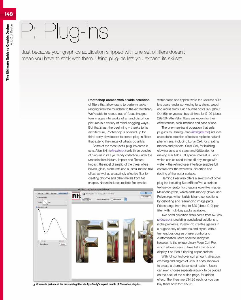
148
TheUltim
ateGuideto
Graphic
Des
ign
Ato
Zof
Design
Photoshop comes with a wide selectionof filters that allow users to perform tasksranging from the mundane to the extraordinary.We’re able to rescue out-of-focus images,turn images into works of art and distort ourpictures in a variety of mind-boggling ways.But that’s just the beginning – thanks to itsarchitecture, Photoshop is opened up forthird-party developers to create plug-in filtersthat extend the range of what’s possible.
Some of the most useful plug-ins come insets. Alien Skin (alienskin.com) sells three bundlesof plug-ins in its Eye Candy collection, under theumbrella titles Nature, Impact and Texture.Impact, the most dramatic of the three, offersbevels, glass, starbursts and a useful motion traileffect, as well as a dazzlingly effective filter forcreating chrome and other metals from flatshapes. Nature includes realistic fire, smoke,
P: Plug-ins
water drops and ripples; while the Textures suitelets users render convincing furs, stone, woodand reptile skins. Each bundle costs $99 (about£44.50), or you can buy all three for $199 (about£99.50). Alien Skin filters are known for theireffectiveness, slick interface and ease of use.
The one-man-band operation that sellsplug-ins as Flaming Pear (flamingpear.com) includesan esoteric selection of tools to replicate naturalphenomena, including Lunar Cell, for creatingmoons and planets; Solar Cell, for buildingglowing suns and stars; and Glitterato, formaking star fields. Of special interest is Flood,which can be used to half-fill any image withwater – the refined user interface enables fullcontrol over the waviness, distortion andrippling of the water surface.
Flaming Pear also offers a selection of otherplug-ins including SuperBladePro, a surfacetexture generator for creating jewel-like images;Melancholytron, which adds moody glows; andPolymerge, which builds bizarre concoctionsby distorting and rearranging image parts.Prices range from free to $20 (about £10) perfilter, with multi-buy packs available.
Two novel distortion filters come from AVBros(avbros.com), providing specialised solutions toniche problems. Puzzle Pro creates jigsaws ina huge variety of patterns and styles, with atremendous degree of user control andcustomisation. More spectacular by far,however, is the extraordinary Page Curl Pro,which allows users to take flat artwork anddisplay it as if on a rippling paper surface.
With full control over curl amount, direction,creasing and angles of view, it adds shadowsto create a dramatic sense of realism. Userscan even choose separate artwork to be placedon the back of the curled page, for addedeffect. The filters are £34.95 each, or you canbuy them both for £55.95.Chrome is just one of the outstanding filters in Eye Candy’s Impact bundle of Photoshop plug-ins.
Just because your graphics application shipped with one set of filters doesn’tmean you have to stick with them. Using plug-ins lets you expand its skillset.
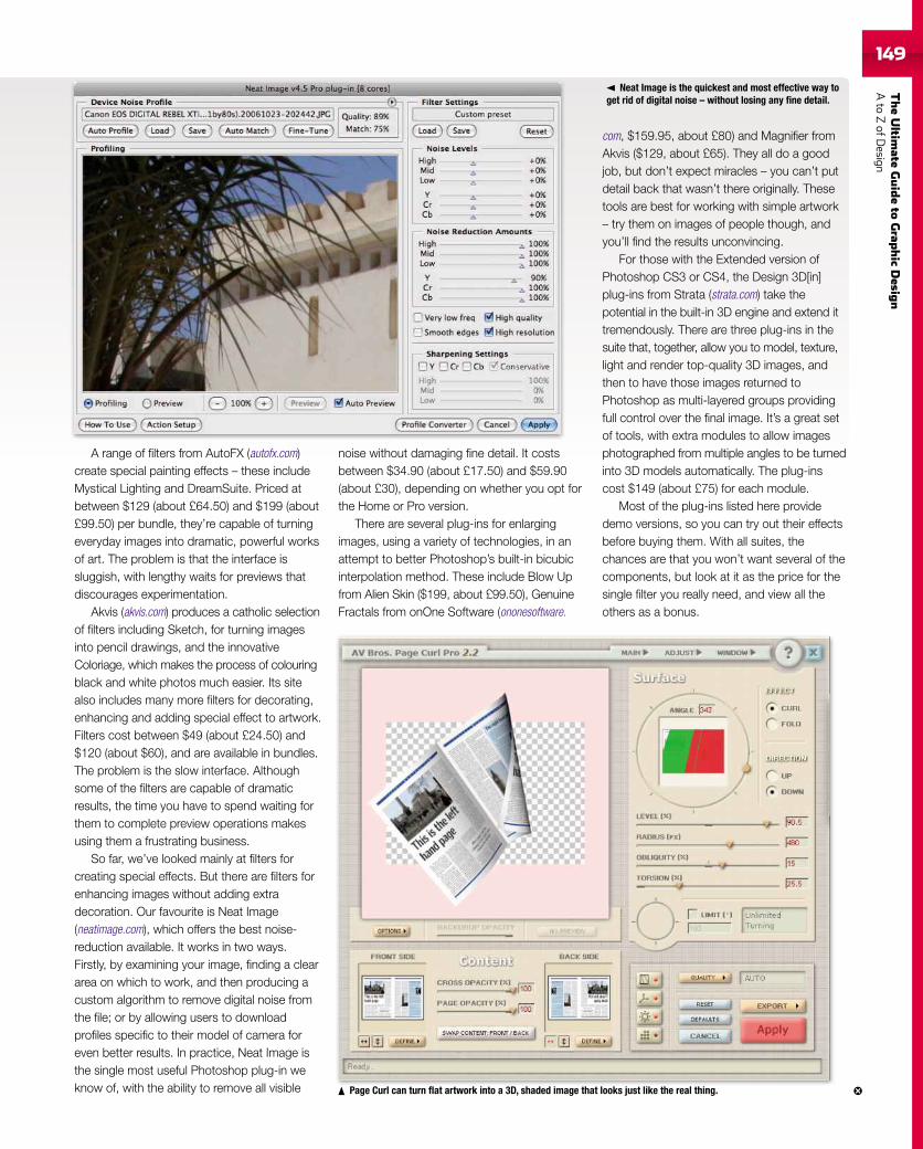
TheUltim
ateGuideto
Grap
hic
Desig
nAto
ZofD
esign149
A range of filters from AutoFX (autofx.com)create special painting effects – these includeMystical Lighting and DreamSuite. Priced atbetween $129 (about £64.50) and $199 (about£99.50) per bundle, they’re capable of turningeveryday images into dramatic, powerful worksof art. The problem is that the interface issluggish, with lengthy waits for previews thatdiscourages experimentation.
Akvis (akvis.com) produces a catholic selectionof filters including Sketch, for turning imagesinto pencil drawings, and the innovativeColoriage, which makes the process of colouringblack and white photos much easier. Its sitealso includes many more filters for decorating,enhancing and adding special effect to artwork.Filters cost between $49 (about £24.50) and$120 (about $60), and are available in bundles.The problem is the slow interface. Althoughsome of the filters are capable of dramaticresults, the time you have to spend waiting forthem to complete preview operations makesusing them a frustrating business.
So far, we’ve looked mainly at filters forcreating special effects. But there are filters forenhancing images without adding extradecoration. Our favourite is Neat Image(neatimage.com), which offers the best noise-reduction available. It works in two ways.Firstly, by examining your image, finding a cleararea on which to work, and then producing acustom algorithm to remove digital noise fromthe file; or by allowing users to downloadprofiles specific to their model of camera foreven better results. In practice, Neat Image isthe single most useful Photoshop plug-in weknow of, with the ability to remove all visible
noise without damaging fine detail. It costsbetween $34.90 (about £17.50) and $59.90(about £30), depending on whether you opt forthe Home or Pro version.
There are several plug-ins for enlargingimages, using a variety of technologies, in anattempt to better Photoshop’s built-in bicubicinterpolation method. These include Blow Upfrom Alien Skin ($199, about £99.50), GenuineFractals from onOne Software (ononesoftware.
com, $159.95, about £80) and Magnifier fromAkvis ($129, about £65). They all do a goodjob, but don’t expect miracles – you can’t putdetail back that wasn’t there originally. Thesetools are best for working with simple artwork– try them on images of people though, andyou’ll find the results unconvincing.
For those with the Extended version ofPhotoshop CS3 or CS4, the Design 3D[in]plug-ins from Strata (strata.com) take thepotential in the built-in 3D engine and extend ittremendously. There are three plug-ins in thesuite that, together, allow you to model, texture,light and render top-quality 3D images, andthen to have those images returned toPhotoshop as multi-layered groups providingfull control over the final image. It’s a great setof tools, with extra modules to allow imagesphotographed from multiple angles to be turnedinto 3D models automatically. The plug-inscost $149 (about £75) for each module.
Most of the plug-ins listed here providedemo versions, so you can try out their effectsbefore buying them. With all suites, thechances are that you won’t want several of thecomponents, but look at it as the price for thesingle filter you really need, and view all theothers as a bonus.
Neat Image is the quickest and most effective way toget rid of digital noise – without losing any fine detail.
Page Curl can turn flat artwork into a 3D, shaded image that looks just like the real thing.
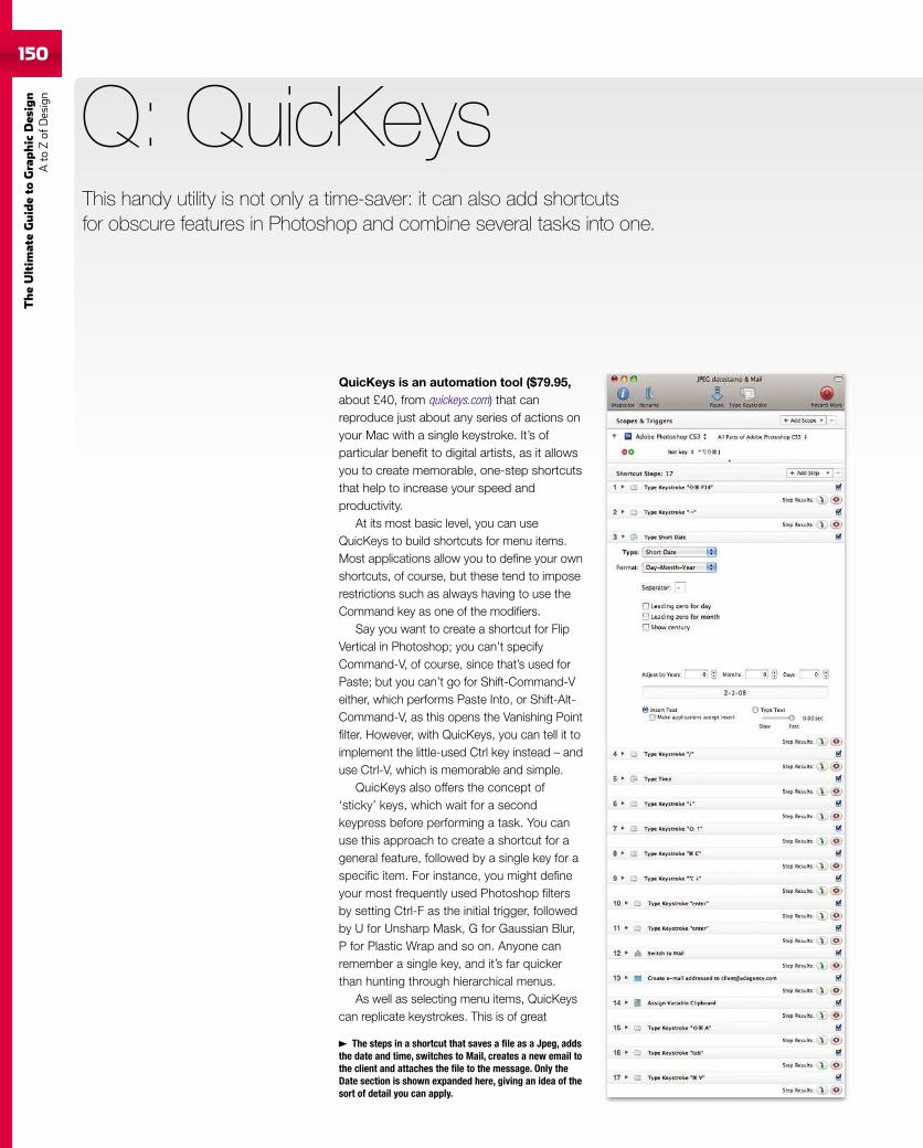
150
TheUltim
ateGuideto
Graphic
Des
ign
Ato
Zof
Design
150
QuicKeys is an automation tool ($79.95,about £40, from quickeys.com) that canreproduce just about any series of actions onyour Mac with a single keystroke. It’s ofparticular benefit to digital artists, as it allowsyou to create memorable, one-step shortcutsthat help to increase your speed andproductivity.
At its most basic level, you can useQuicKeys to build shortcuts for menu items.Most applications allow you to define your ownshortcuts, of course, but these tend to imposerestrictions such as always having to use theCommand key as one of the modifiers.
Say you want to create a shortcut for FlipVertical in Photoshop; you can’t specifyCommand-V, of course, since that’s used forPaste; but you can’t go for Shift-Command-Veither, which performs Paste Into, or Shift-Alt-Command-V, as this opens the Vanishing Pointfilter. However, with QuicKeys, you can tell it toimplement the little-used Ctrl key instead – anduse Ctrl-V, which is memorable and simple.
QuicKeys also offers the concept of‘sticky’ keys, which wait for a secondkeypress before performing a task. You canuse this approach to create a shortcut for ageneral feature, followed by a single key for aspecific item. For instance, you might defineyour most frequently used Photoshop filtersby setting Ctrl-F as the initial trigger, followedby U for Unsharp Mask, G for Gaussian Blur,P for Plastic Wrap and so on. Anyone canremember a single key, and it’s far quickerthan hunting through hierarchical menus.
As well as selecting menu items, QuicKeyscan replicate keystrokes. This is of great
Q: QuicKeys
The steps in a shortcut that saves a file as a Jpeg, addsthe date and time, switches to Mail, creates a new email tothe client and attaches the file to the message. Only theDate section is shown expanded here, giving an idea of thesort of detail you can apply.
This handy utility is not only a time-saver: it can also add shortcutsfor obscure features in Photoshop and combine several tasks into one.
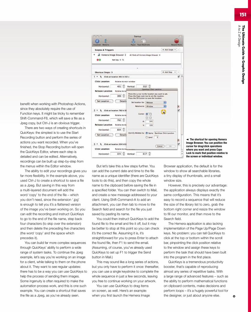
TheUltim
ateGuideto
Grap
hic
Desig
nAto
ZofD
esign151151
benefit when working with Photoshop Actions,since they absolutely require the use ofFunction keys. It might be tricky to rememberShift-Command-F8, which will save a file as aJpeg copy, but Ctrl-J is an obvious trigger.
There are two ways of creating shortcuts inQuicKeys: the simplest is to use the StartRecording button and perform the series ofactions you want recorded. When you’vefinished, the Stop Recording button will openthe QuicKeys Editor, where each step isdetailed and can be edited. Alternatively,recordings can be built up step-by-step fromthe menus within the Editor window.
The ability to edit your recordings gives youfar more flexibility. In the example above, youused Ctrl-J to create a shortcut to save a fileas a Jpeg. But saving in this way froma multi-layered document will add theword ‘copy’ to the end of the file – whichyou don’t need, since the extension ‘.jpg’is enough to tell you it’s a flattened versionof the image you’ve been working on. So youcan edit the recording and instruct QuicKeysto go to the end of the file name, step backfour characters (to skip over the extension)and then delete the preceding five characters(the word ‘copy’ and the space whichprecedes it).
You can build far more complex sequencesthrough QuicKeys’ ability to perform a widerange of system tasks. To continue the Jpegexample, let’s say you’re working on an imagefor a client, while talking to them on the phoneabout it. They want to see regular updates:there has to be a way you can use QuicKeys tohelp the process of sending them images.Some ingenuity is often required to make theautomation process work, and this is one suchexample. You can create a shortcut that savesthe file as a Jpeg, as you’ve already seen.
But let’s take this a few steps further. Youcan add the current date and time to the filename as a unique identifier (there are QuicKeystools to do this), and then copy the wholename to the clipboard before saving the file ina specified folder. You can then switch to Mail,and create a new message addressed to yourclient. Using Shift-Command-A to add anattachment, you can then tab to move to theSearch field and search for the file you justsaved by pasting its name.
You could then instruct QuicKeys to add thefound file to the email and fire it off, but it maybe better to stop at this point so you can checkit’s the correct file. Assuming it is, it’sstraightforward for you to press Enter to attachthe found file, then F1 to send the email.(Assuming, of course, you’ve already usedQuicKeys to set up F1 to trigger the Sendbutton in Mail.)
This may sound like a long series of actions,but you only have to perform it once: thereafter,you can use a single keystroke to complete thewhole sequence in just a few seconds, leavingyou free to continue working on your artwork.
You can use QuicKeys to drag itemson screen, as well. Here’s an example:when you first launch the Hemera Image
Browser application, the default is for thewindow to show all searchable libraries,a tiny display of thumbnails, and a smallwindow size.
However, this is precisely our advantage:the application always displays exactly thesame configuration. This means that it’seasy to record a sequence that will reducethe size of the library list to zero, grab thebottom right corner and resize the windowto fill our monitor, and then move to theSearch field.
The Hemera application is also lackingimplementation of the Page Up/Page Downkeys. No problem: you can tell QuicKeys toclick at the top or bottom within the scrollbar, pinpointing the click position relativeto the window and assign these keys toperform the task that should have been builtinto the program in the first place.
QuicKeys is a tremendous productivitybooster, that’s capable of reproducingalmost any series of repetitive tasks. Witha large range of advanced features – such asthe ability to perform mathematical functionson clipboard contents, make decisions andperform loops – it’s a hugely powerful tool forthe designer, or just about anyone else.
The shortcut for opening HemeraImage Browser. You can position thecursor for drag/click operationswhere you want and press CapsLock to mark that position relative tothe screen or individual window.
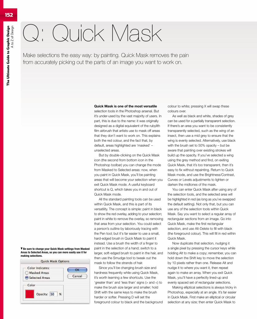
152
TheUltim
ateGuideto
Graphic
Des
ign
Ato
Zof
Design
Quick Mask is one of the most versatileselection tools in the Photoshop arsenal. Butit’s under-used by the vast majority of users. Inpart, this is due to the name: it was originallydesigned as a digital equivalent of the rubylithfilm airbrush that artists use to mask off areasthat they don’t want to work on. This explainsboth the red colour, and the fact that, bydefault, areas highlighted are ‘masked’ –unselected areas.
But by double-clicking on the Quick Maskicon (the second from bottom icon in thePhotoshop toolbar) you can change the modefrom Masked to Selected areas: now, whenyou paint in Quick Mask, you’ll be paintingareas that will become your selection when youexit Quick Mask mode. A useful keyboardshortcut is Q, which takes you in and out ofQuick Mask mode.
All the standard painting tools can be usedwithin Quick Mask, and this is part of itsversatility. The concept is simple: paint in blackto show the red overlay, adding to your selection;paint in white to remove the overlay, so removingthat area from your selection. You could selecta person’s outline by laboriously tracing withthe Pen tool; but it's far easier to use a small,hard-edged brush in Quick Mask to paint itinstead. Use a brush the width of a finger topaint in the selection of a hand; switch to alarger, soft-edged brush to paint in the hair, andthen use the Smudge tool to tweak out themask to follow the strands of hair.
Since you’ll be changing brush size andhardness frequently while using Quick Mask,it’s worth learning a few shortcuts. Use the‘greater than’ and ‘less than’ signs (> and <) tomake the brush size larger and smaller; holdShift with the same keys to make the brushharder or softer. Pressing D will set theforeground colour to black and the background
Q: Quick Mask
colour to white; pressing X will swap thesecolours over.
As well as black and white, shades of greycan be used for a partially transparent selection.If there’s an area you want to be consistentlytransparently selected, such as the wing of aninsect, then use a mid grey to ensure that thewing is evenly selected. Alternatively, use blackwith the brush set to 50% opacity – but beaware that painting over existing strokes willbuild up the opacity. If you’ve selected a wingusing the grey method and find, on exitingQuick Mask, that it’s too transparent, then it’seasy to fix without repainting. Return to QuickMask mode, and use the Brightness/Contrast,Curves or Levels adjustments to lighten ordarken the midtones of the mask.
You can enter Quick Mask after using any ofthe selection tools, and the selected area willbe highlighted in red (as long as you’ve swappedthe default setting). Not only that, but you canuse any of the selection tools within QuickMask. Say you want to select a regular array ofrectangular sections from an image. Go intoQuick Mask, make the first rectangularselection, and use Alt-Delete to fill with black(the foreground colour). This will fill in red withinQuick Mask.
Now duplicate that selection, nudging ita single pixel by pressing the cursor keys whileholding Alt to make a copy; remember, you canhold down the Shift key to move the selectionby 10 pixels rather than one. Release Alt andnudge it to where you want it, then repeatagain to make an array. When you exit QuickMask, you’ll have a perfectly lined-up andevenly spaced set of rectangular selections.
Making elliptical selections is always tricky inPhotoshop, especially at an angle. It’s far easierin Quick Mask. First make an elliptical or circularselection at any size; then enter Quick Mask to
Be sure to change your Quick Mask settings from MaskedAreas to Selected Areas, so you can more easily use it formaking selections.
Make selections the easy way: by painting. Quick Mask removes the painfrom accurately picking out the parts of an image you want to work on.
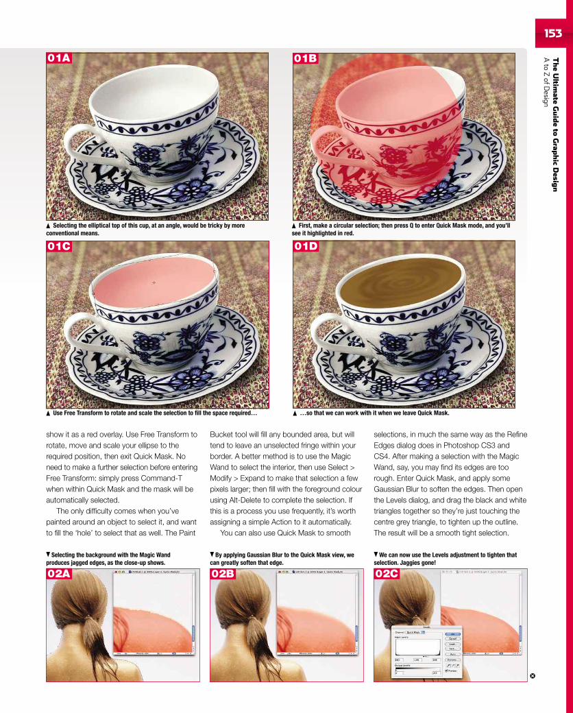
TheUltim
ateGuideto
Grap
hic
Desig
nAto
ZofD
esign153
show it as a red overlay. Use Free Transform torotate, move and scale your ellipse to therequired position, then exit Quick Mask. Noneed to make a further selection before enteringFree Transform: simply press Command-Twhen within Quick Mask and the mask will beautomatically selected.
The only difficulty comes when you’vepainted around an object to select it, and wantto fill the ‘hole’ to select that as well. The Paint
Bucket tool will fill any bounded area, but willtend to leave an unselected fringe within yourborder. A better method is to use the MagicWand to select the interior, then use Select >Modify > Expand to make that selection a fewpixels larger; then fill with the foreground colourusing Alt-Delete to complete the selection. Ifthis is a process you use frequently, it’s worthassigning a simple Action to it automatically.
You can also use Quick Mask to smooth
selections, in much the same way as the RefineEdges dialog does in Photoshop CS3 andCS4. After making a selection with the MagicWand, say, you may find its edges are toorough. Enter Quick Mask, and apply someGaussian Blur to soften the edges. Then openthe Levels dialog, and drag the black and whitetriangles together so they’re just touching thecentre grey triangle, to tighten up the outline.The result will be a smooth tight selection.
Selecting the elliptical top of this cup, at an angle, would be tricky by moreconventional means.
First, make a circular selection; then press Q to enter Quick Mask mode, and you’llsee it highlighted in red.
Use Free Transform to rotate and scale the selection to fill the space required… …so that we can work with it when we leave Quick Mask.
Selecting the background with the Magic Wandproduces jagged edges, as the close-up shows.
By applying Gaussian Blur to the Quick Mask view, wecan greatly soften that edge.
We can now use the Levels adjustment to tighten thatselection. Jaggies gone!
01A 01B
01C 01D
02A 02B 02C
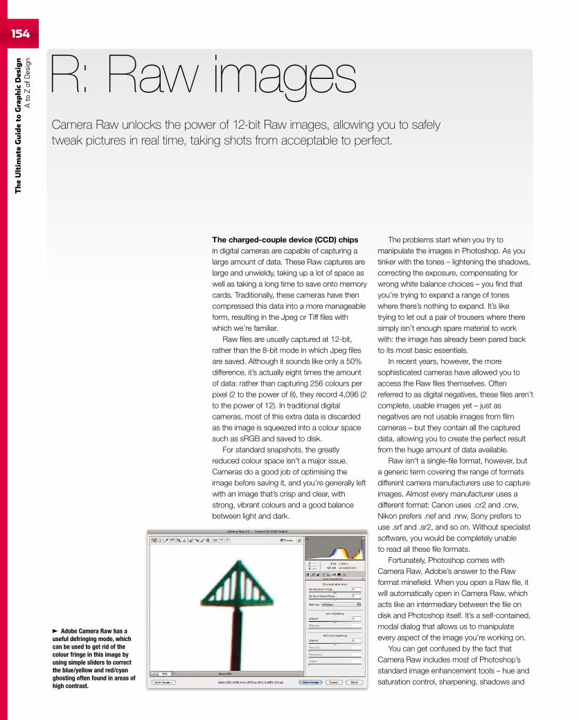
154
TheUltim
ateGuideto
Graphic
Des
ign
Ato
Zof
Design
The charged-couple device (CCD) chipsin digital cameras are capable of capturing alarge amount of data. These Raw captures arelarge and unwieldy, taking up a lot of space aswell as taking a long time to save onto memorycards. Traditionally, these cameras have thencompressed this data into a more manageableform, resulting in the Jpeg or Tiff files withwhich we’re familiar.
Raw files are usually captured at 12-bit,rather than the 8-bit mode in which Jpeg filesare saved. Although it sounds like only a 50%difference, it’s actually eight times the amountof data: rather than capturing 256 colours perpixel (2 to the power of 8), they record 4,096 (2to the power of 12). In traditional digitalcameras, most of this extra data is discardedas the image is squeezed into a colour spacesuch as sRGB and saved to disk.
For standard snapshots, the greatlyreduced colour space isn’t a major issue.Cameras do a good job of optimising theimage before saving it, and you’re generally leftwith an image that’s crisp and clear, withstrong, vibrant colours and a good balancebetween light and dark.
R: Raw images
The problems start when you try tomanipulate the images in Photoshop. As youtinker with the tones – lightening the shadows,correcting the exposure, compensating forwrong white balance choices – you find thatyou’re trying to expand a range of toneswhere there’s nothing to expand. It’s liketrying to let out a pair of trousers where theresimply isn’t enough spare material to workwith: the image has already been pared backto its most basic essentials.
In recent years, however, the moresophisticated cameras have allowed you toaccess the Raw files themselves. Oftenreferred to as digital negatives, these files aren’tcomplete, usable images yet – just asnegatives are not usable images from filmcameras – but they contain all the captureddata, allowing you to create the perfect resultfrom the huge amount of data available.
Raw isn’t a single-file format, however, buta generic term covering the range of formatsdifferent camera manufacturers use to captureimages. Almost every manufacturer uses adifferent format: Canon uses .cr2 and .crw,Nikon prefers .nef and .nrw, Sony prefers touse .srf and .sr2, and so on. Without specialistsoftware, you would be completely unableto read all these file formats.
Fortunately, Photoshop comes withCamera Raw, Adobe’s answer to the Rawformat minefield. When you open a Raw file, itwill automatically open in Camera Raw, whichacts like an intermediary between the file ondisk and Photoshop itself. It’s a self-contained,modal dialog that allows us to manipulateevery aspect of the image you’re working on.
You can get confused by the fact thatCamera Raw includes most of Photoshop’sstandard image enhancement tools – hue andsaturation control, sharpening, shadows and
Camera Raw unlocks the power of 12-bit Raw images, allowing you to safelytweak pictures in real time, taking shots from acceptable to perfect.
Adobe Camera Raw has auseful defringing mode, whichcan be used to get rid of thecolour fringe in this image byusing simple sliders to correctthe blue/yellow and red/cyanghosting often found in areas ofhigh contrast.
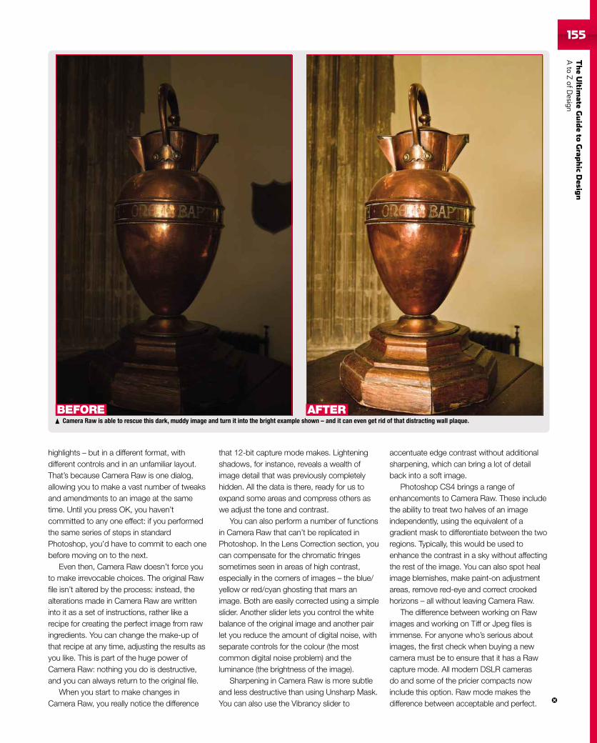
TheUltim
ateGuideto
Grap
hic
Desig
nAto
ZofD
esign155
Camera Raw is able to rescue this dark, muddy image and turn it into the bright example shown – and it can even get rid of that distracting wall plaque.BEFORE AFTER
highlights – but in a different format, withdifferent controls and in an unfamiliar layout.That’s because Camera Raw is one dialog,allowing you to make a vast number of tweaksand amendments to an image at the sametime. Until you press OK, you haven’tcommitted to any one effect: if you performedthe same series of steps in standardPhotoshop, you’d have to commit to each onebefore moving on to the next.
Even then, Camera Raw doesn’t force youto make irrevocable choices. The original Rawfile isn’t altered by the process: instead, thealterations made in Camera Raw are writteninto it as a set of instructions, rather like arecipe for creating the perfect image from rawingredients. You can change the make-up ofthat recipe at any time, adjusting the results asyou like. This is part of the huge power ofCamera Raw: nothing you do is destructive,and you can always return to the original file.
When you start to make changes inCamera Raw, you really notice the difference
that 12-bit capture mode makes. Lighteningshadows, for instance, reveals a wealth ofimage detail that was previously completelyhidden. All the data is there, ready for us toexpand some areas and compress others aswe adjust the tone and contrast.
You can also perform a number of functionsin Camera Raw that can’t be replicated inPhotoshop. In the Lens Correction section, youcan compensate for the chromatic fringessometimes seen in areas of high contrast,especially in the corners of images – the blue/yellow or red/cyan ghosting that mars animage. Both are easily corrected using a simpleslider. Another slider lets you control the whitebalance of the original image and another pairlet you reduce the amount of digital noise, withseparate controls for the colour (the mostcommon digital noise problem) and theluminance (the brightness of the image).
Sharpening in Camera Raw is more subtleand less destructive than using Unsharp Mask.You can also use the Vibrancy slider to
accentuate edge contrast without additionalsharpening, which can bring a lot of detailback into a soft image.
Photoshop CS4 brings a range ofenhancements to Camera Raw. These includethe ability to treat two halves of an imageindependently, using the equivalent of agradient mask to differentiate between the tworegions. Typically, this would be used toenhance the contrast in a sky without affectingthe rest of the image. You can also spot healimage blemishes, make paint-on adjustmentareas, remove red-eye and correct crookedhorizons – all without leaving Camera Raw.
The difference between working on Rawimages and working on Tiff or Jpeg files isimmense. For anyone who’s serious aboutimages, the first check when buying a newcamera must be to ensure that it has a Rawcapture mode. All modern DSLR camerasdo and some of the pricier compacts nowinclude this option. Raw mode makes thedifference between acceptable and perfect.
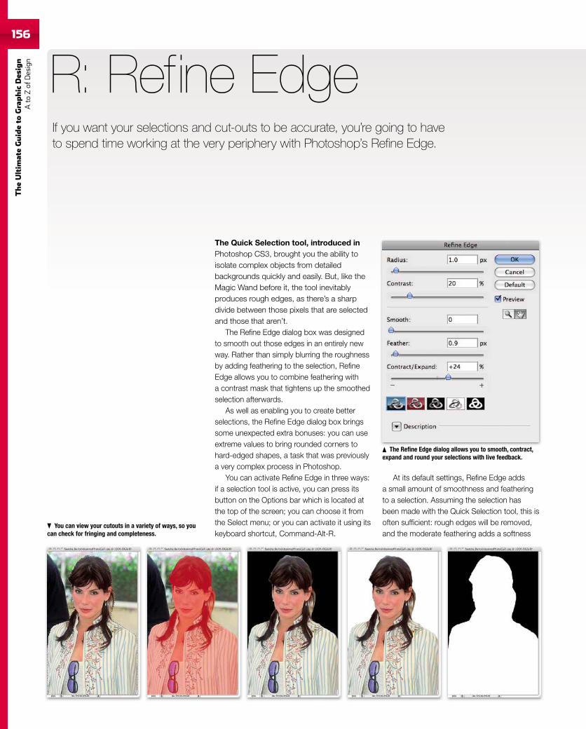
156
TheUltim
ateGuideto
Graphic
Des
ign
Ato
Zof
Design
156
The Quick Selection tool, introduced inPhotoshop CS3, brought you the ability toisolate complex objects from detailedbackgrounds quickly and easily. But, like theMagic Wand before it, the tool inevitablyproduces rough edges, as there’s a sharpdivide between those pixels that are selectedand those that aren’t.
The Refine Edge dialog box was designedto smooth out those edges in an entirely newway. Rather than simply blurring the roughnessby adding feathering to the selection, RefineEdge allows you to combine feathering witha contrast mask that tightens up the smoothedselection afterwards.
As well as enabling you to create betterselections, the Refine Edge dialog box bringssome unexpected extra bonuses: you can useextreme values to bring rounded corners tohard-edged shapes, a task that was previouslya very complex process in Photoshop.
You can activate Refine Edge in three ways:if a selection tool is active, you can press itsbutton on the Options bar which is located atthe top of the screen; you can choose it fromthe Select menu; or you can activate it using itskeyboard shortcut, Command-Alt-R.
R: Refine Edge
At its default settings, Refine Edge addsa small amount of smoothness and featheringto a selection. Assuming the selection hasbeen made with the Quick Selection tool, this isoften sufficient: rough edges will be removed,and the moderate feathering adds a softness
The Refine Edge dialog allows you to smooth, contract,expand and round your selections with live feedback.
You can view your cutouts in a variety of ways, so youcan check for fringing and completeness.
If you want your selections and cut-outs to be accurate, you’re going to haveto spend time working at the very periphery with Photoshop’s Refine Edge.
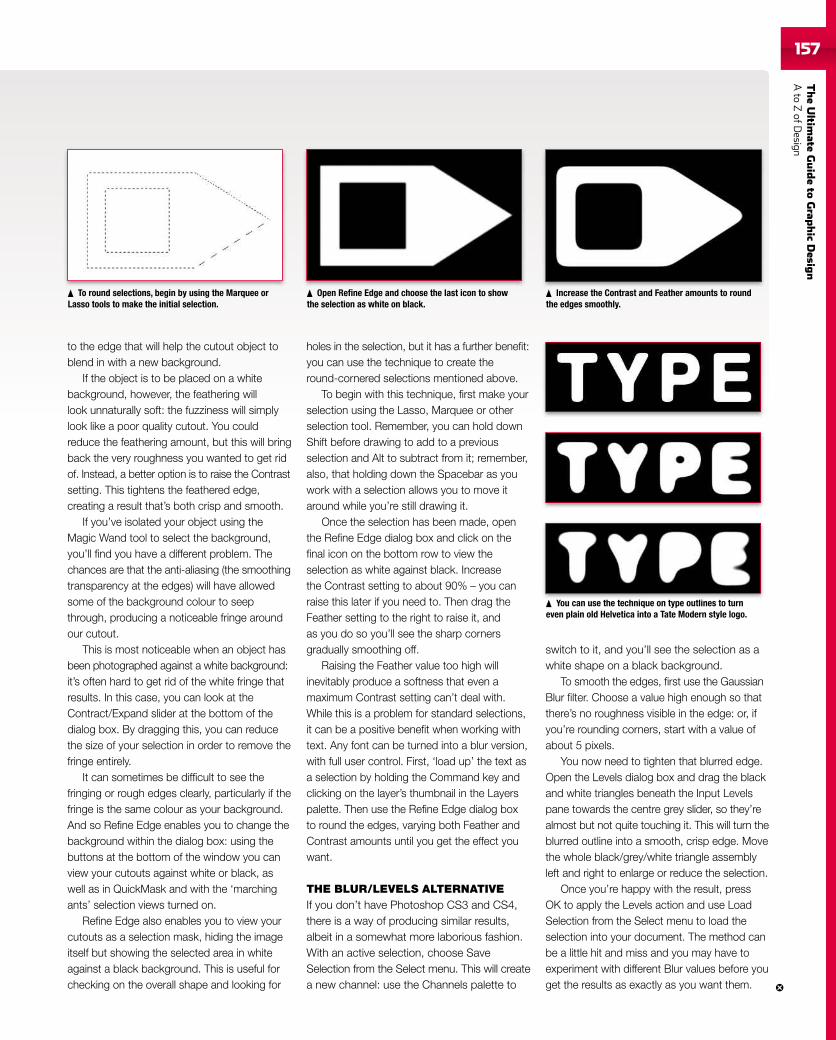
TheUltim
ateGuideto
Grap
hic
Desig
nAto
ZofD
esign157157
to the edge that will help the cutout object toblend in with a new background.
If the object is to be placed on a whitebackground, however, the feathering willlook unnaturally soft: the fuzziness will simplylook like a poor quality cutout. You couldreduce the feathering amount, but this will bringback the very roughness you wanted to get ridof. Instead, a better option is to raise the Contrastsetting. This tightens the feathered edge,creating a result that’s both crisp and smooth.
If you’ve isolated your object using theMagic Wand tool to select the background,you’ll find you have a different problem. Thechances are that the anti-aliasing (the smoothingtransparency at the edges) will have allowedsome of the background colour to seepthrough, producing a noticeable fringe aroundour cutout.
This is most noticeable when an object hasbeen photographed against a white background:it’s often hard to get rid of the white fringe thatresults. In this case, you can look at theContract/Expand slider at the bottom of thedialog box. By dragging this, you can reducethe size of your selection in order to remove thefringe entirely.
It can sometimes be difficult to see thefringing or rough edges clearly, particularly if thefringe is the same colour as your background.And so Refine Edge enables you to change thebackground within the dialog box: using thebuttons at the bottom of the window you canview your cutouts against white or black, aswell as in QuickMask and with the ‘marchingants’ selection views turned on.
Refine Edge also enables you to view yourcutouts as a selection mask, hiding the imageitself but showing the selected area in whiteagainst a black background. This is useful forchecking on the overall shape and looking for
holes in the selection, but it has a further benefit:you can use the technique to create theround-cornered selections mentioned above.
To begin with this technique, first make yourselection using the Lasso, Marquee or otherselection tool. Remember, you can hold downShift before drawing to add to a previousselection and Alt to subtract from it; remember,also, that holding down the Spacebar as youwork with a selection allows you to move itaround while you’re still drawing it.
Once the selection has been made, openthe Refine Edge dialog box and click on thefinal icon on the bottom row to view theselection as white against black. Increasethe Contrast setting to about 90% – you canraise this later if you need to. Then drag theFeather setting to the right to raise it, andas you do so you’ll see the sharp cornersgradually smoothing off.
Raising the Feather value too high willinevitably produce a softness that even amaximum Contrast setting can’t deal with.While this is a problem for standard selections,it can be a positive benefit when working withtext. Any font can be turned into a blur version,with full user control. First, ‘load up’ the text asa selection by holding the Command key andclicking on the layer’s thumbnail in the Layerspalette. Then use the Refine Edge dialog boxto round the edges, varying both Feather andContrast amounts until you get the effect youwant.
THE BLUR/LEVELS ALTERNATIVEIf you don’t have Photoshop CS3 and CS4,there is a way of producing similar results,albeit in a somewhat more laborious fashion.With an active selection, choose SaveSelection from the Select menu. This will createa new channel: use the Channels palette to
switch to it, and you’ll see the selection as awhite shape on a black background.
To smooth the edges, first use the GaussianBlur filter. Choose a value high enough so thatthere’s no roughness visible in the edge: or, ifyou’re rounding corners, start with a value ofabout 5 pixels.
You now need to tighten that blurred edge.Open the Levels dialog box and drag the blackand white triangles beneath the Input Levelspane towards the centre grey slider, so they’realmost but not quite touching it. This will turn theblurred outline into a smooth, crisp edge. Movethe whole black/grey/white triangle assemblyleft and right to enlarge or reduce the selection.
Once you’re happy with the result, pressOK to apply the Levels action and use LoadSelection from the Select menu to load theselection into your document. The method canbe a little hit and miss and you may have toexperiment with different Blur values before youget the results as exactly as you want them.
To round selections, begin by using the Marquee orLasso tools to make the initial selection.
Open Refine Edge and choose the last icon to showthe selection as white on black.
Increase the Contrast and Feather amounts to roundthe edges smoothly.
You can use the technique on type outlines to turneven plain old Helvetica into a Tate Modern style logo.
You the techniqu n t tli to tu
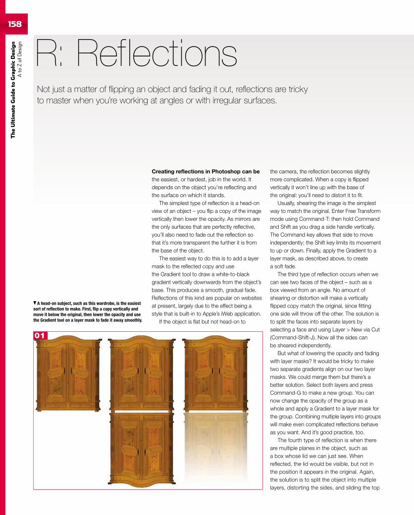
158
TheUltim
ateGuideto
Graphic
Des
ign
Ato
Zof
Design
A head-on subject, such as this wardrobe, is the easiestsort of reflection to make. First, flip a copy vertically andmove it below the original, then lower the opacity and usethe Gradient tool on a layer mask to fade it away smoothly.
Creating reflections in Photoshop can bethe easiest, or hardest, job in the world. Itdepends on the object you’re reflecting andthe surface on which it stands.
The simplest type of reflection is a head-onview of an object – you flip a copy of the imagevertically then lower the opacity. As mirrors arethe only surfaces that are perfectly reflective,you’ll also need to fade out the reflection sothat it’s more transparent the further it is fromthe base of the object.
The easiest way to do this is to add a layermask to the reflected copy and usethe Gradient tool to draw a white-to-blackgradient vertically downwards from the object’sbase. This produces a smooth, gradual fade.Reflections of this kind are popular on websitesat present, largely due to the effect being astyle that is built-in to Apple’s iWeb application.
If the object is flat but not head-on to
R: Reflections
the camera, the reflection becomes slightlymore complicated. When a copy is flippedvertically it won’t line up with the base ofthe original: you’ll need to distort it to fit.
Usually, shearing the image is the simplestway to match the original. Enter Free Transformmode using Command-T: then hold Commandand Shift as you drag a side handle vertically.The Command key allows that side to moveindependently; the Shift key limits its movementto up or down. Finally, apply the Gradient to alayer mask, as described above, to createa soft fade.
The third type of reflection occurs when wecan see two faces of the object – such as abox viewed from an angle. No amount ofshearing or distortion will make a verticallyflipped copy match the original, since fittingone side will throw off the other. The solution isto split the faces into separate layers byselecting a face and using Layer > New via Cut(Command-Shift-J). Now all the sides canbe sheared independently.
But what of lowering the opacity and fadingwith layer masks? It would be tricky to maketwo separate gradients align on our two layermasks. We could merge them but there’s abetter solution. Select both layers and pressCommand-G to make a new group. You cannow change the opacity of the group as awhole and apply a Gradient to a layer mask forthe group. Combining multiple layers into groupswill make even complicated reflections behaveas you want. And it’s good practice, too.
The fourth type of reflection is when thereare multiple planes in the object, such asa box whose lid we can just see. Whenreflected, the lid would be visible, but not inthe position it appears in the original. Again,the solution is to split the object into multiplelayers, distorting the sides, and sliding the top
Not just a matter of flipping an object and fading it out, reflections are trickyto master when you’re working at angles or with irregular surfaces.
01
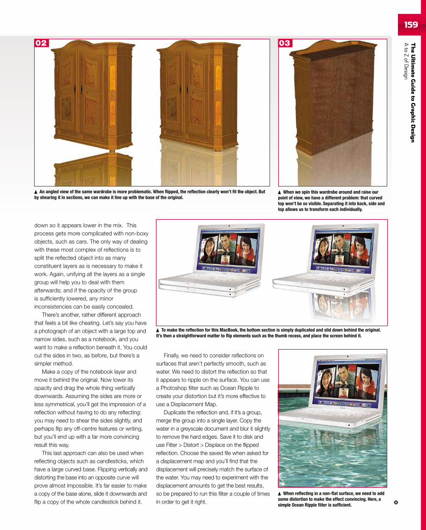
TheUltim
ateGuideto
Grap
hic
Desig
nAto
ZofD
esign159
down so it appears lower in the mix. Thisprocess gets more complicated with non-boxyobjects, such as cars. The only way of dealingwith these most complex of reflections is tosplit the reflected object into as manyconstituent layers as is necessary to make itwork. Again, unifying all the layers as a singlegroup will help you to deal with themafterwards; and if the opacity of the groupis sufficiently lowered, any minorinconsistencies can be easily concealed.
There’s another, rather different approachthat feels a bit like cheating. Let’s say you havea photograph of an object with a large top andnarrow sides, such as a notebook, and youwant to make a reflection beneath it. You couldcut the sides in two, as before, but there’s asimpler method.
Make a copy of the notebook layer andmove it behind the original. Now lower itsopacity and drag the whole thing verticallydownwards. Assuming the sides are more orless symmetrical, you’ll get the impression of areflection without having to do any reflecting:you may need to shear the sides slightly, andperhaps flip any off-centre features or writing,but you’ll end up with a far more convincingresult this way.
This last approach can also be used whenreflecting objects such as candlesticks, whichhave a large curved base. Flipping vertically anddistorting the base into an opposite curve willprove almost impossible. It’s far easier to makea copy of the base alone, slide it downwards andflip a copy of the whole candlestick behind it.
Finally, we need to consider reflections onsurfaces that aren’t perfectly smooth, such aswater. We need to distort the reflection so thatit appears to ripple on the surface. You can usea Photoshop filter such as Ocean Ripple tocreate your distortion but it’s more effective touse a Displacement Map.
Duplicate the reflection and, if it’s a group,merge the group into a single layer. Copy thewater in a greyscale document and blur it slightlyto remove the hard edges. Save it to disk anduse Filter > Distort > Displace on the flippedreflection. Choose the saved file when asked fora displacement map and you’ll find that thedisplacement will precisely match the surface ofthe water. You may need to experiment with thedisplacement amounts to get the best results,so be prepared to run this filter a couple of timesin order to get it right.
An angled view of the same wardrobe is more problematic. When flipped, the reflection clearly won’t fit the object. Butby shearing it in sections, we can make it line up with the base of the original.
When we spin this wardrobe around and raise ourpoint of view, we have a different problem: that curvedtop won’t be so visible. Separating it into back, side andtop allows us to transform each individually.
To make the reflection for this MacBook, the bottom section is simply duplicated and slid down behind the original.It’s then a straightforward matter to flip elements such as the thumb recess, and place the screen behind it.
When reflecting in a non-flat surface, we need to addsome distortion to make the effect convincing. Here, asimple Ocean Ripple filter is sufficient.
02 03
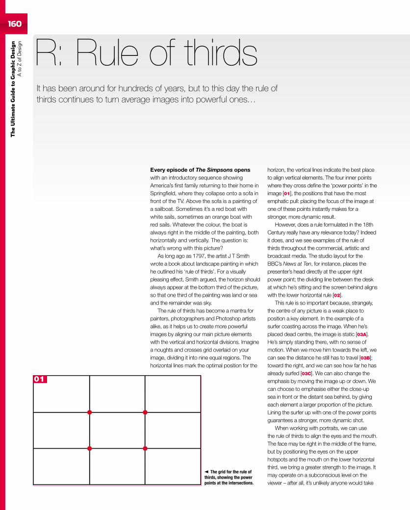
160
TheUltim
ateGuideto
Graphic
Des
ign
Ato
Zof
Design
Every episode of The Simpsons openswith an introductory sequence showingAmerica’s first family returning to their home inSpringfield, where they collapse onto a sofa infront of the TV. Above the sofa is a painting ofa sailboat. Sometimes it’s a red boat withwhite sails, sometimes an orange boat withred sails. Whatever the colour, the boat isalways right in the middle of the painting, bothhorizontally and vertically. The question is:what’s wrong with this picture?
As long ago as 1797, the artist J T Smithwrote a book about landscape painting in whichhe outlined his ‘rule of thirds’. For a visuallypleasing effect, Smith argued, the horizon shouldalways appear at the bottom third of the picture,so that one third of the painting was land or seaand the remainder was sky.
The rule of thirds has become a mantra forpainters, photographers and Photoshop artistsalike, as it helps us to create more powerfulimages by aligning our main picture elementswith the vertical and horizontal divisions. Imaginea noughts and crosses grid overlaid on yourimage, dividing it into nine equal regions. Thehorizontal lines mark the optimal position for the
R: Rule of thirdsIt has been around for hundreds of years, but to this day the rule ofthirds continues to turn average images into powerful ones…
The grid for the rule ofthirds, showing the powerpoints at the intersections.
horizon, the vertical lines indicate the best placeto align vertical elements. The four inner pointswhere they cross define the ‘power points’ in theimage [01], the positions that have the mostemphatic pull: placing the focus of the image atone of these points instantly makes for astronger, more dynamic result.
However, does a rule formulated in the 18thCentury really have any relevance today? Indeedit does, and we see examples of the rule ofthirds throughout the commercial, artistic andbroadcast media. The studio layout for theBBC’s News at Ten, for instance, places thepresenter’s head directly at the upper rightpower point; the dividing line between the deskat which he’s sitting and the screen behind alignswith the lower horizontal rule [02].
This rule is so important because, strangely,the centre of any picture is a weak place toposition a key element. In the example of asurfer coasting across the image. When he’splaced dead centre, the image is static [03A].He’s simply standing there, with no sense ofmotion. When we move him towards the left, wecan see the distance he still has to travel [03B];toward the right, and we can see how far he hasalready surfed [03C]. We can also change theemphasis by moving the image up or down. Wecan choose to emphasise either the close-upsea in front or the distant sea behind, by givingeach element a larger proportion of the picture.Lining the surfer up with one of the power pointsguarantees a stronger, more dynamic shot.
When working with portraits, we can usethe rule of thirds to align the eyes and the mouth.The face may be right in the middle of the frame,but by positioning the eyes on the upperhotspots and the mouth on the lower horizontalthird, we bring a greater strength to the image. Itmay operate on a subconscious level on theviewer – after all, it’s unlikely anyone would take
01
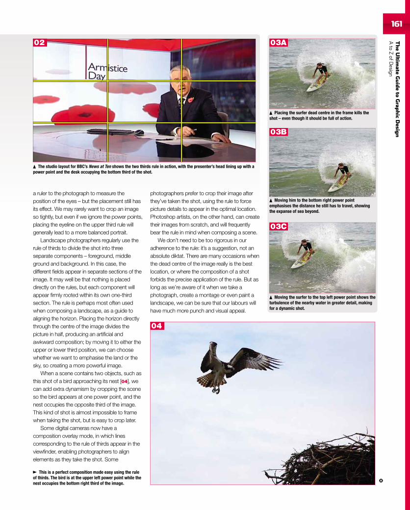
TheUltim
ateGuideto
Grap
hic
Desig
nAto
ZofD
esign161
The studio layout for BBC’s News at Ten shows the two thirds rule in action, with the presenter’s head lining up with apower point and the desk occupying the bottom third of the shot.
Placing the surfer dead centre in the frame kills theshot – even though it should be full of action.
Moving him to the bottom right power pointemphasises the distance he still has to travel, showingthe expanse of sea beyond.
Moving the surfer to the top left power point shows theturbulence of the nearby water in greater detail, makingfor a dynamic shot.
This is a perfect composition made easy using the ruleof thirds. The bird is at the upper left power point while thenest occupies the bottom right third of the image.
a ruler to the photograph to measure theposition of the eyes – but the placement still hasits effect. We may rarely want to crop an imageso tightly, but even if we ignore the power points,placing the eyeline on the upper third rule willgenerally lead to a more balanced portrait.
Landscape photographers regularly use therule of thirds to divide the shot into threeseparate components – foreground, middleground and background. In this case, thedifferent fields appear in separate sections of theimage. It may well be that nothing is placeddirectly on the rules, but each component willappear firmly rooted within its own one-thirdsection. The rule is perhaps most often usedwhen composing a landscape, as a guide toaligning the horizon. Placing the horizon directlythrough the centre of the image divides thepicture in half, producing an artificial andawkward composition; by moving it to either theupper or lower third position, we can choosewhether we want to emphasise the land or thesky, so creating a more powerful image.
When a scene contains two objects, such asthis shot of a bird approaching its nest [04], wecan add extra dynamism by cropping the sceneso the bird appears at one power point, and thenest occupies the opposite third of the image.This kind of shot is almost impossible to framewhen taking the shot, but is easy to crop later.
Some digital cameras now have acomposition overlay mode, in which linescorresponding to the rule of thirds appear in theviewfinder, enabling photographers to alignelements as they take the shot. Some
photographers prefer to crop their image afterthey’ve taken the shot, using the rule to forcepicture details to appear in the optimal location.Photoshop artists, on the other hand, can createtheir images from scratch, and will frequentlybear the rule in mind when composing a scene.
We don’t need to be too rigorous in ouradherence to the rule: it’s a suggestion, not anabsolute diktat. There are many occasions whenthe dead centre of the image really is the bestlocation, or where the composition of a shotforbids the precise application of the rule. But aslong as we’re aware of it when we take aphotograph, create a montage or even paint alandscape, we can be sure that our labours willhave much more punch and visual appeal.
02 03A
03B
03C
04
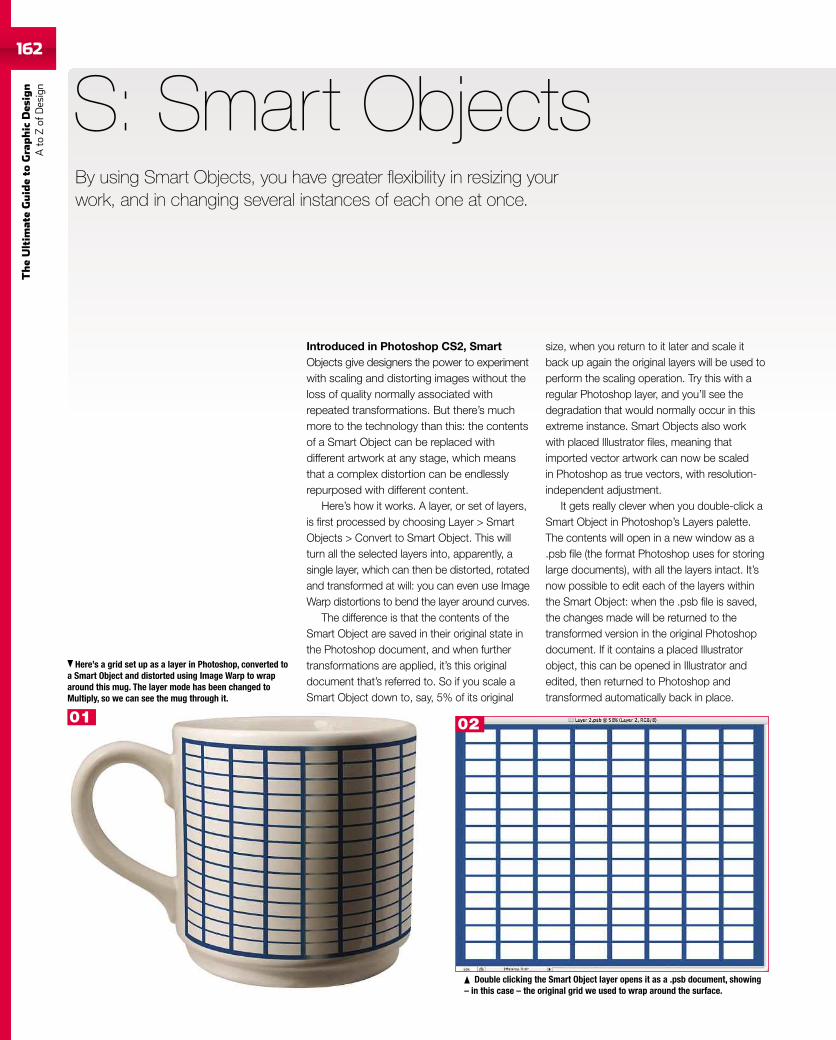
162
TheUltim
ateGuideto
Graphic
Des
ign
Ato
Zof
Design
162
Introduced in Photoshop CS2, SmartObjects give designers the power to experimentwith scaling and distorting images without theloss of quality normally associated withrepeated transformations. But there’s muchmore to the technology than this: the contentsof a Smart Object can be replaced withdifferent artwork at any stage, which meansthat a complex distortion can be endlesslyrepurposed with different content.
Here’s how it works. A layer, or set of layers,is first processed by choosing Layer > SmartObjects > Convert to Smart Object. This willturn all the selected layers into, apparently, asingle layer, which can then be distorted, rotatedand transformed at will: you can even use ImageWarp distortions to bend the layer around curves.
The difference is that the contents of theSmart Object are saved in their original state inthe Photoshop document, and when furthertransformations are applied, it’s this originaldocument that’s referred to. So if you scale aSmart Object down to, say, 5% of its original
S: Smart Objects
size, when you return to it later and scale itback up again the original layers will be used toperform the scaling operation. Try this with aregular Photoshop layer, and you’ll see thedegradation that would normally occur in thisextreme instance. Smart Objects also workwith placed Illustrator files, meaning thatimported vector artwork can now be scaledin Photoshop as true vectors, with resolution-independent adjustment.
It gets really clever when you double-click aSmart Object in Photoshop’s Layers palette.The contents will open in a new window as a.psb file (the format Photoshop uses for storinglarge documents), with all the layers intact. It’snow possible to edit each of the layers withinthe Smart Object: when the .psb file is saved,the changes made will be returned to thetransformed version in the original Photoshopdocument. If it contains a placed Illustratorobject, this can be opened in Illustrator andedited, then returned to Photoshop andtransformed automatically back in place.
Here’s a grid set up as a layer in Photoshop, converted toa Smart Object and distorted using Image Warp to wraparound this mug. The layer mode has been changed toMultiply, so we can see the mug through it.
Double clicking the Smart Object layer opens it as a .psb document, showing– in this case – the original grid we used to wrap around the surface.
By using Smart Objects, you have greater flexibility in resizing yourwork, and in changing several instances of each one at once.
01 02
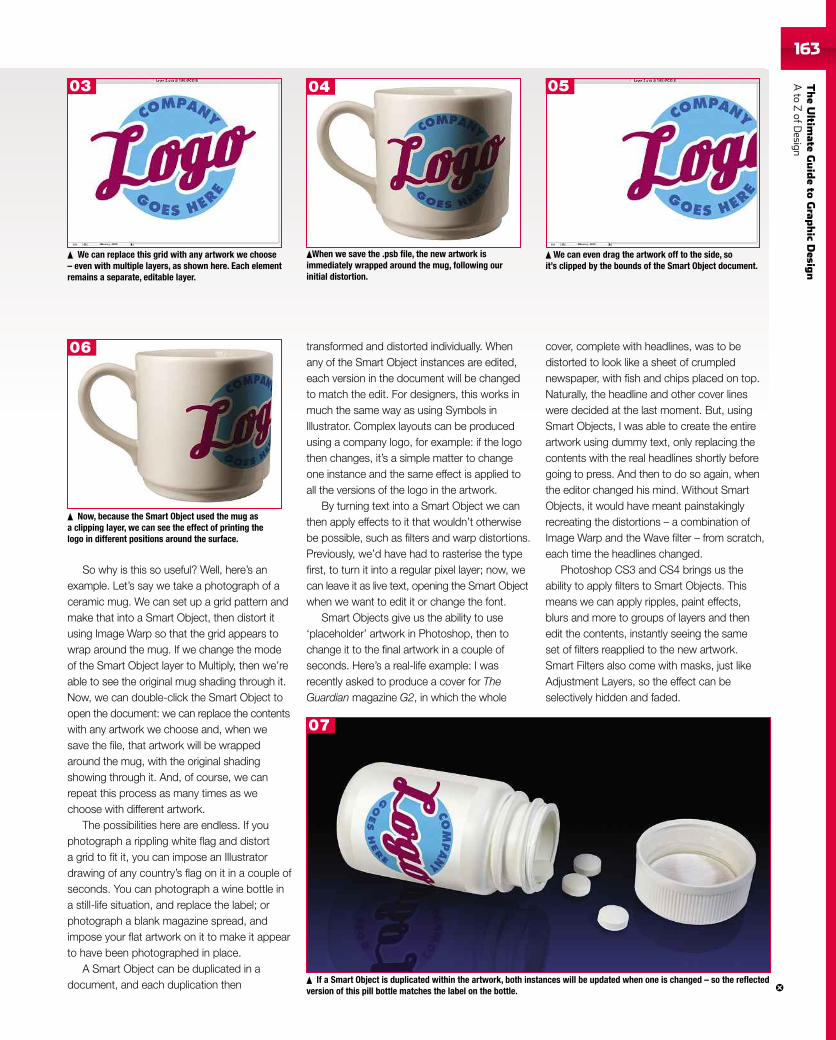
TheUltim
ateGuideto
Grap
hic
Desig
nAto
ZofD
esign163163
So why is this so useful? Well, here’s anexample. Let’s say we take a photograph of aceramic mug. We can set up a grid pattern andmake that into a Smart Object, then distort itusing Image Warp so that the grid appears towrap around the mug. If we change the modeof the Smart Object layer to Multiply, then we’reable to see the original mug shading through it.Now, we can double-click the Smart Object toopen the document: we can replace the contentswith any artwork we choose and, when wesave the file, that artwork will be wrappedaround the mug, with the original shadingshowing through it. And, of course, we canrepeat this process as many times as wechoose with different artwork.
The possibilities here are endless. If youphotograph a rippling white flag and distorta grid to fit it, you can impose an Illustratordrawing of any country’s flag on it in a couple ofseconds. You can photograph a wine bottle ina still-life situation, and replace the label; orphotograph a blank magazine spread, andimpose your flat artwork on it to make it appearto have been photographed in place.
A Smart Object can be duplicated in adocument, and each duplication then
transformed and distorted individually. Whenany of the Smart Object instances are edited,each version in the document will be changedto match the edit. For designers, this works inmuch the same way as using Symbols inIllustrator. Complex layouts can be producedusing a company logo, for example: if the logothen changes, it’s a simple matter to changeone instance and the same effect is applied toall the versions of the logo in the artwork.
By turning text into a Smart Object we canthen apply effects to it that wouldn’t otherwisebe possible, such as filters and warp distortions.Previously, we’d have had to rasterise the typefirst, to turn it into a regular pixel layer; now, wecan leave it as live text, opening the Smart Objectwhen we want to edit it or change the font.
Smart Objects give us the ability to use‘placeholder’ artwork in Photoshop, then tochange it to the final artwork in a couple ofseconds. Here’s a real-life example: I wasrecently asked to produce a cover for TheGuardian magazine G2, in which the whole
We can replace this grid with any artwork we choose– even with multiple layers, as shown here. Each elementremains a separate, editable layer.
If a Smart Object is duplicated within the artwork, both instances will be updated when one is changed – so the reflectedversion of this pill bottle matches the label on the bottle.
cover, complete with headlines, was to bedistorted to look like a sheet of crumplednewspaper, with fish and chips placed on top.Naturally, the headline and other cover lineswere decided at the last moment. But, usingSmart Objects, I was able to create the entireartwork using dummy text, only replacing thecontents with the real headlines shortly beforegoing to press. And then to do so again, whenthe editor changed his mind. Without SmartObjects, it would have meant painstakinglyrecreating the distortions – a combination ofImage Warp and the Wave filter – from scratch,each time the headlines changed.
Photoshop CS3 and CS4 brings us theability to apply filters to Smart Objects. Thismeans we can apply ripples, paint effects,blurs and more to groups of layers and thenedit the contents, instantly seeing the sameset of filters reapplied to the new artwork.Smart Filters also come with masks, just likeAdjustment Layers, so the effect can beselectively hidden and faded.
When we save the .psb file, the new artwork isimmediately wrapped around the mug, following ourinitial distortion.
We can even drag the artwork off to the side, soit’s clipped by the bounds of the Smart Object document.
Now, because the Smart Object used the mug asa clipping layer, we can see the effect of printing thelogo in different positions around the surface.
03 04 05
06
07
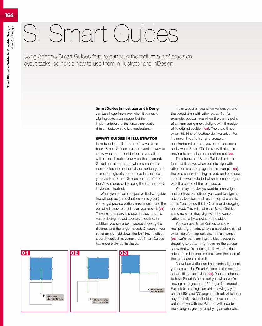
164
TheUltim
ateGuideto
Graphic
Des
ign
Ato
Zof
Design
Smart Guides in Illustrator and InDesigncan be a huge time-saver when it comes toaligning objects on a page, but theimplementations of the feature are subtlydifferent between the two applications.
SMART GUIDES IN ILLUSTRATORIntroduced into Illustrator a few versionsback, Smart Guides are a convenient way toshow when an object being moved alignswith other objects already on the artboard.Guidelines also pop up when an object ismoved close to horizontally or vertically, or ata preset angle of your choice. In Illustrator,you can turn Smart Guides on and off fromthe View menu, or by using the Command-Ukeyboard shortcut.
When you move an object vertically, a guideline will pop up (the default colour is green)showing a precise vertical movement – and theobject will snap to that line as you move it [01].The original square is shown in blue, and theversion being moved appears in outline. Inaddition, you see a text readout showing thedistance and the angle moved. Of course, youcould simply hold down the Shift key to effecta purely vertical movement, but Smart Guideshas more tricks up its sleeve.
S: Smart GuidesUsing Adobe’s Smart Guides feature can take the tedium out of precisionlayout tasks, so here’s how to use them in Illustrator and InDesign.
It can also alert you when various parts ofthe object align with other parts. So, forexample, you can see when the centre pointof an item being moved aligns with the edgeof its original position [02]. There are timeswhen this kind of feedback is invaluable. Forinstance, if you’re trying to create acheckerboard pattern, you can do so moreeasily when Smart Guides show that you’removing to a precise corner alignment [03].
The strength of Smart Guides lies in thefact that it shows when objects align withother items on the page. In this example [04],the blue square is being moved, and so showsin outline: we’re alerted when its centre alignswith the centre of the red square.
You may not always want to align edgesand centres: sometimes you want to align anarbitrary location, such as the top of a capitalletter. You can do this by Command-draggingan object. This will make the Smart Guidesshow up when they align with the cursor,rather than a fixed point on the object.
You can use Smart Guides to showmultiple alignments, which is particularly usefulwhen transforming objects. In this example[05], we’re transforming the blue square bydragging its bottom-right corner: the guidesshow that we’re aligning both with the rightedge of the blue square itself, and the base ofthe red square next to it.
As well as vertical and horizontal alignment,you can use the Smart Guides preferences toset additional behaviour [06]. You can chooseto have Smart Guides alert you when you’removing an object at a 45° angle, for example.For artists creating isometric drawings, youcan set 60° and 30° angles instead, which is ahuge benefit. Not just object movement, butpaths drawn with the Pen tool will snap tothese angles, greatly simplifying an otherwise
01 02 03
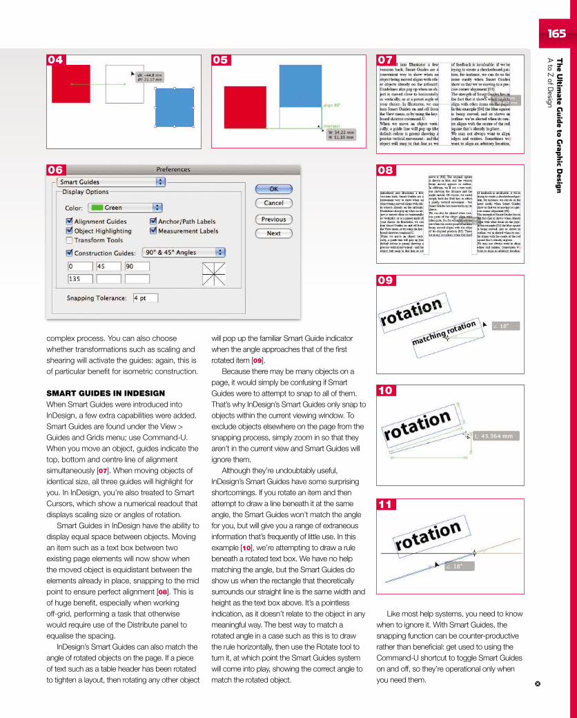
TheUltim
ateGuideto
Grap
hic
Desig
nAto
ZofD
esign165
complex process. You can also choosewhether transformations such as scaling andshearing will activate the guides: again, this isof particular benefit for isometric construction.
SMART GUIDES IN INDESIGNWhen Smart Guides were introduced intoInDesign, a few extra capabilities were added.Smart Guides are found under the View >Guides and Grids menu; use Command-U.When you move an object, guides indicate thetop, bottom and centre line of alignmentsimultaneously [07]. When moving objects ofidentical size, all three guides will highlight foryou. In InDesign, you’re also treated to SmartCursors, which show a numerical readout thatdisplays scaling size or angles of rotation.
Smart Guides in InDesign have the ability todisplay equal space between objects. Movingan item such as a text box between twoexisting page elements will now show whenthe moved object is equidistant between theelements already in place, snapping to the midpoint to ensure perfect alignment [08]. This isof huge benefit, especially when workingoff-grid, performing a task that otherwisewould require use of the Distribute panel toequalise the spacing.
InDesign’s Smart Guides can also match theangle of rotated objects on the page. If a pieceof text such as a table header has been rotatedto tighten a layout, then rotating any other object
will pop up the familiar Smart Guide indicatorwhen the angle approaches that of the firstrotated item [09].
Because there may be many objects on apage, it would simply be confusing if SmartGuides were to attempt to snap to all of them.That’s why InDesign’s Smart Guides only snap toobjects within the current viewing window. Toexclude objects elsewhere on the page from thesnapping process, simply zoom in so that theyaren’t in the current view and Smart Guides willignore them.
Although they’re undoubtably useful,InDesign’s Smart Guides have some surprisingshortcomings. If you rotate an item and thenattempt to draw a line beneath it at the sameangle, the Smart Guides won’t match the anglefor you, but will give you a range of extraneousinformation that’s frequently of little use. In thisexample [10], we’re attempting to draw a rulebeneath a rotated text box. We have no helpmatching the angle, but the Smart Guides doshow us when the rectangle that theoreticallysurrounds our straight line is the same width andheight as the text box above. It’s a pointlessindication, as it doesn’t relate to the object in anymeaningful way. The best way to match arotated angle in a case such as this is to drawthe rule horizontally, then use the Rotate tool toturn it, at which point the Smart Guides systemwill come into play, showing the correct angle tomatch the rotated object.
Like most help systems, you need to knowwhen to ignore it. With Smart Guides, thesnapping function can be counter-productiverather than beneficial: get used to using theCommand-U shortcut to toggle Smart Guideson and off, so they’re operational only whenyou need them.
04 05 07
06 08
09
10
11
166
TheUltim
ateGuideto
Graphic
Des
ign
Ato
Zof
Design
Style sheets are a way of recordingcharacteristics of a block of type – font,justification, spacing and so on – that canbe retrieved with a keystroke and appliedto the current text position. The system hasbecome more and more sophisticated overthe years, with greater functionality and easeof use built in. Style sheets are implementedin most page layout applications: here, we’lllook at how they work in Adobe’s InDesign.
There are three different kinds of style sheetin InDesign, operating on paragraph, characterand object level. We’ll begin with theparagraph version.
To create a new style sheet, first set upthe current paragraph of text so it’s formatted
S: Style sheets
as you want it, with the correct font, leading,before and after spacing, hyphenation settingsand so on. We’ll make this the standard bodytext style, so set a first line indent of 3mm (orwhatever you choose). This is so that the firstword of each new paragraph is automaticallyindented for ease of reading, which is standardpractice in books, magazines and newspapers.
To define the style, open the ParagraphStyles palette (Window > Type & Tables menu)and Alt-click the New Document icon at thebottom of the palette. This creates a new stylebased on the current selection: holding downthe Alt key also opens the dialog. Here, you canset a name for the style (let’s call it Body Text)and a keyboard shortcut to invoke it. Styleshortcuts in InDesign use the numerical keypad:let’s assign Command-2 to this style, forreasons that will become clear. Click on theApply Style to Selection checkbox, and thenclick on OK to create the new style.
The first paragraph of any story needs to be‘full out’ – that is, without an indented first line.You could do this manually each time, but itmakes more sense to define a style for it. Youcould define it by example, as you did for thebody text style. It’s easier and neater, though,to create the style using the palette.
Select the Body Text style in the ParagraphStyle palette and choose Duplicate Style fromthe pop-up menu at the top of the palette. In thedialog that appears, the new style will be giventhe default name Body Text copy: change this toFirst Para, or similar, and change the keyboardshortcut to Command-1.
The only difference between this style andthe body text is the first line indent, so changethe ‘Based on’ pop-up menu to Body Text. The
The easiest way to set up your paragraph stylesis to format your paragraph as you want, then createa new style based on the current selection.
Key to ensuring a standard look and feel to your work, every DTP professionalshould be using style sheets to control fonts, spacing, sizes and more.
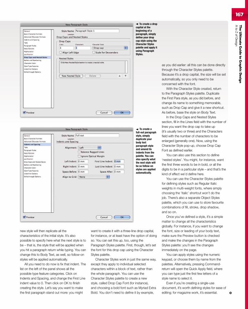
TheUltim
ateGuideto
Grap
hic
Desig
nAto
ZofD
esign167
new style will then replicate all thecharacteristics of the initial style. It’s alsopossible to specify here what the next style is tobe – that is, the style that will be applied whenyou hit a paragraph return while typing. You canchange this to Body Text, as well, so follow-onstyles will be applied automatically.
All you need to do now is fix that indent. Thelist on the left of the panel shows all thepossible type feature categories. Click onIndents and Spacing, and change the First Lineindent value to 0. Then click on OK to finishcreating the style. Let’s say you want to makethe first paragraph stand out more: you might
want to create it with a three-line drop capital,for instance, or at least have the option of doingso. You can set this up, too, using theParagraph Styles palette. First, though, let’s setthe font for this drop cap using the CharacterStyles palette.
Character Styles work in just the same way,except they apply to individual selectedcharacters within a block of text, rather thanthe whole paragraph. You can use theCharacter Styles palette to create a newstyle, called Drop Cap Font (for instance),and choosing a bold font such as Myriad ExtraBold. You don’t need to define it by example,
as you did earlier: all this can be done directlythrough the Character Styles palette.Because it’s a drop capital, the size will be setautomatically, so you only need to beconcerned with the font.
With the Character Style created, returnto the Paragraph Styles palette. Duplicatethe First Para style, as you did before, andchange its name to something memorable,such as Drop Cap and give it a new shortcut.As before, base the style on Body Text.
In the Drop Caps and Nested Stylessection, fill in the Lines field with the number oflines you want the drop cap to take up(it’s usually two or three) and the Charactersfield with the number of characters to beenlarged (generally one). Now, using theCharacter Style pop-up, choose Drop CapFont as defined earlier.
You can also use this section to define‘nested styles’. You might, for instance, wantthe first three words to be in bold, or all thedigits to be in a particular style – and that’s thekind of effect we’d define here.
You can use the Character Styles palettefor defining styles such as Regular Italicweights in multi-weight fonts, where simplychoosing the ‘italic’ shortcut won’t do thejob. There’s also a separate Object Stylespalette, which you can use to store favouritecombinations of fill, stroke, drop shadow,and so on.
Once you’ve defined a style, it’s a simplematter to change all the characteristicsglobally. For instance, if you want to changethe font, size or leading of your body text,make sure the Preview button is checkedand make the changes in the ParagraphStyles palette: you’ll see the changesimmediately on the page.
You can apply styles using the numerickeypad, or choose them by name from thepalettes. Alternatively, pressing Command-return will open the Quick Apply field, whereyou can type just the first few letters of astyle name to select it.
Even if you’re creating a single-usedocument, it’s worth defining styles for ease ofediting; for magazine work, it’s essential.
To create a dropcapital at thebeginning of aparagraph, simplydefine your dropcap style using theCharacter Stylespalette and apply itusing ParagraphStyles.
To create afull-out paragraphstyle, simplyduplicate yourbody textparagraph styleand amend itsindents from thepalette. You canalso specify whatthe next style willbe so follow-onstyles are appliedautomatically.
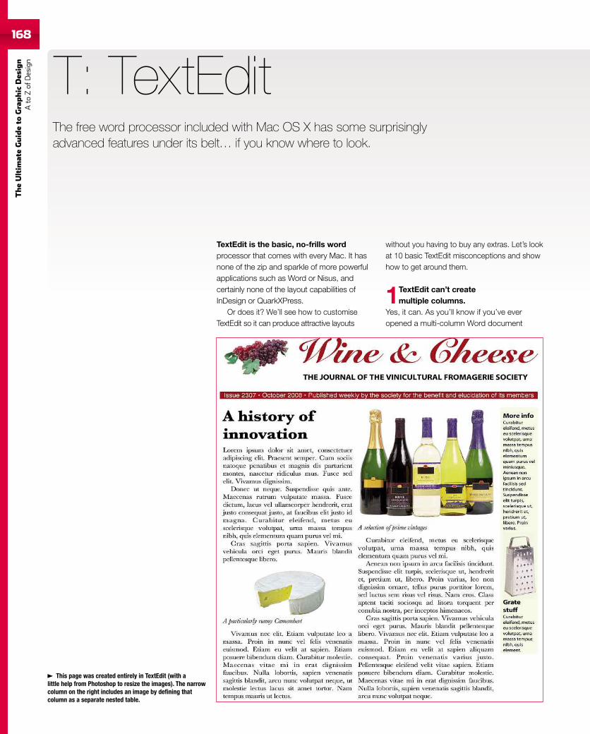
168
TheUltim
ateGuideto
Graphic
Des
ign
Ato
Zof
Design
168
TextEdit is the basic, no-frills wordprocessor that comes with every Mac. It hasnone of the zip and sparkle of more powerfulapplications such as Word or Nisus, andcertainly none of the layout capabilities ofInDesign or QuarkXPress.
Or does it? We’ll see how to customiseTextEdit so it can produce attractive layouts
T: TextEdit
without you having to buy any extras. Let’s lookat 10 basic TextEdit misconceptions and showhow to get around them.
1TextEdit can’t createmultiple columns.
Yes, it can. As you’ll know if you’ve everopened a multi-column Word document
This page was created entirely in TextEdit (with alittle help from Photoshop to resize the images). The narrowcolumn on the right includes an image by defining thatcolumn as a separate nested table.
The free word processor included with Mac OS X has some surprisinglyadvanced features under its belt… if you know where to look.
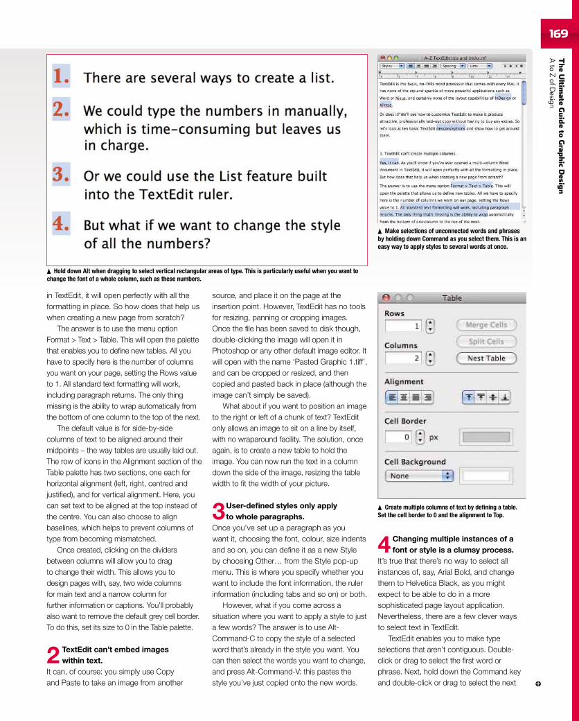
TheUltim
ateGuideto
Grap
hic
Desig
nAto
ZofD
esign169169
in TextEdit, it will open perfectly with all theformatting in place. So how does that help uswhen creating a new page from scratch?
The answer is to use the menu optionFormat > Text > Table. This will open the palettethat enables you to define new tables. All youhave to specify here is the number of columnsyou want on your page, setting the Rows valueto 1. All standard text formatting will work,including paragraph returns. The only thingmissing is the ability to wrap automatically fromthe bottom of one column to the top of the next.
The default value is for side-by-sidecolumns of text to be aligned around theirmidpoints – the way tables are usually laid out.The row of icons in the Alignment section of theTable palette has two sections, one each forhorizontal alignment (left, right, centred andjustified), and for vertical alignment. Here, youcan set text to be aligned at the top instead ofthe centre. You can also choose to alignbaselines, which helps to prevent columns oftype from becoming mismatched.
Once created, clicking on the dividersbetween columns will allow you to dragto change their width. This allows you todesign pages with, say, two wide columnsfor main text and a narrow column forfurther information or captions. You’ll probablyalso want to remove the default grey cell border.To do this, set its size to 0 in the Table palette.
2 TextEdit can’t embed imageswithin text.
It can, of course: you simply use Copyand Paste to take an image from another
source, and place it on the page at theinsertion point. However, TextEdit has no toolsfor resizing, panning or cropping images.Once the file has been saved to disk though,double-clicking the image will open it inPhotoshop or any other default image editor. Itwill open with the name ‘Pasted Graphic 1.tiff’,and can be cropped or resized, and thencopied and pasted back in place (although theimage can’t simply be saved).
What about if you want to position an imageto the right or left of a chunk of text? TextEditonly allows an image to sit on a line by itself,with no wraparound facility. The solution, onceagain, is to create a new table to hold theimage. You can now run the text in a columndown the side of the image, resizing the tablewidth to fit the width of your picture.
3User-defined styles only applyto whole paragraphs.
Once you’ve set up a paragraph as youwant it, choosing the font, colour, size indentsand so on, you can define it as a new Styleby choosing Other… from the Style pop-upmenu. This is where you specify whether youwant to include the font information, the rulerinformation (including tabs and so on) or both.
However, what if you come across asituation where you want to apply a style to justa few words? The answer is to use Alt-Command-C to copy the style of a selectedword that’s already in the style you want. Youcan then select the words you want to change,and press Alt-Command-V: this pastes thestyle you’ve just copied onto the new words.
4 Changing multiple instances of afont or style is a clumsy process.
It’s true that there’s no way to select allinstances of, say, Arial Bold, and changethem to Helvetica Black, as you mightexpect to be able to do in a moresophisticated page layout application.Nevertheless, there are a few clever waysto select text in TextEdit.
TextEdit enables you to make typeselections that aren’t contiguous. Double-click or drag to select the first word orphrase. Next, hold down the Command keyand double-click or drag to select the next
Make selections of unconnected words and phrasesby holding down Command as you select them. This is aneasy way to apply styles to several words at once.
Create multiple columns of text by defining a table.Set the cell border to 0 and the alignment to Top.
Hold down Alt when dragging to select vertical rectangular areas of type. This is particularly useful when you want tochange the font of a whole column, such as these numbers.
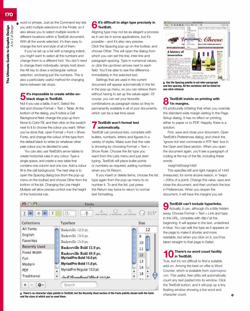
170
TheUltim
ateGuideto
Graphic
Des
ign
Ato
Zof
Design
word or phrase. Just as the Command key letsyou add multiple selections in the Finder, so italso allows you to select multiple words indifferent locations within a TextEdit document.With all the words selected, it’s then easy tochange the font and style of all of them.
If you’ve set up a list with a hanging indent,you might want to select all the numbers andchange them to a different font. You don’t needto change them individually: simply hold downthe Alt key to draw a rectangular verticalselection, enclosing just the numbers. This isalso a particularly useful method for changingitems between tab stops.
5 It’s impossible to create white-on-black slugs in TextEdit.
Not if you use a table, it isn’t. Select thetext and choose Format > Text > Table. At thebottom of the dialog, you’ll notice a CellBackground field: change the pop-up fromNone to Color Fill, and then click on the swatchnext to it to choose the colour you want. Whenyou’ve done that, open Format > Font > ShowFonts, and change the colour of the type fromthe default black to white (or whatever otherpale colour you’ve decided to use).
You can also use TextEdit’s arrow tables tocreate horizontal rules in any colour. Type asingle space, and create a new table thatcontains one column and one row. Add a colourfill to the cell background. The next step is toopen the Spacing dialog box (from the pop-upmenu on the toolbar) and choose Other from thebottom of the list. Changing the Line HeightMultiple will allow precise control over the heightof the horizontal rule.
6 It’s difficult to align type precisely inTextEdit.
Aligning type may not be as elegant a processas it can be in some applications, but it’spossible – and it’s also very precise.Click the Spacing pop-up on the toolbar, andchoose Other. This will open the dialog fromwhich you can set the line, inter-line andparagraph spacing. Type in numerical values,or click the up/down arrows next to eachfield. You’ll be able to see the differenceimmediately in the selected text.
Settings that are used in the currentdocument will appear automatically in the listin the pop-up menu, so you can retrieve themwithout having to set up the values again. Ofcourse, you can set your favouritecombinations as paragraph styles so they’repermanently available in all of your documents,which can be a real time-saver.
7TextEdit won’t format textautomatically.
TextEdit can produce lists, complete withbullets, numbers, letters and figures in avariety of styles. Make sure that the ruleris showing by choosing Format > Text >Show Ruler. Choose the list type youwant from the Lists menu and just starttyping. TextEdit will place bullet pointsor numbers as required, adding numberswhen you hit Return.
If you insert or delete items, choose the listtype again from the pop-up menu to re-number it. To end the list, just pressthe Return key twice to return to normaltext formatting.
8 TextEdit insists on printing with1in margins.
It’s profoundly irritating that when you overridethe standard wide margin setting in the PageSetup dialog, it has no effect on printing,either to paper or to PDF. Happily, there is asolution.
First, save and close your document. OpenTextEdit’s Preferences dialog, and check the‘Ignore rich text commands in RTF files’ box inthe Open and Save section. When you openthe document again, you’ll see a paragraph ofcoding at the top of the file, including thesewords:
\margl1440\margr1440\This specifies left and right margins of 1440
(measured, for some arcane reason, in ‘twips’– 20ths of a point). Change this value, save andclose the document, and then uncheck the boxin Preferences. When you reopen thedocument, it will have the margins you set.
9 TextEdit can’t include hyperlinks.Actually, it can, although it’s a little hidden
away. Choose Format > Text > Link and typein the URL, complete with http:// at thebeginning. It will appear in the text, underlinedin blue. You can edit the type as it appears onthe page to make it shorter and morereadable, but when you click on it, you’ll betaken straight to that page in Safari.
10 There’s no word count facilityin TextEdit.
True, but it’s not difficult to find a suitableadd-on. Among the best on offer is WordCounter, which is available from supermagnus.com. This useful, free utility will automaticallycount any text pasted into its window. Clickthe TextEdit button, and it will pop up a tinyfloating window showing a live word andcharacter count.There’s no character style palette in TextEdit, but the Recently Used section of the Fonts palette shows both the fonts
and the sizes at which you’ve used them.
Use the Spacing palette to set inter-paragraphand line spacing. All the variations will be listed forone-click retrieval.
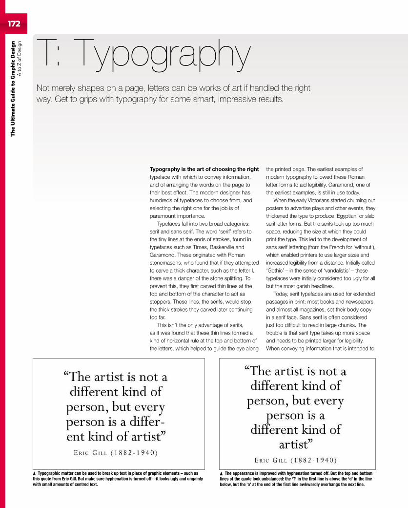
172
TheUltim
ateGuideto
Graphic
Des
ign
Ato
Zof
Design
Typography is the art of choosing the righttypeface with which to convey information,and of arranging the words on the page totheir best effect. The modern designer hashundreds of typefaces to choose from, andselecting the right one for the job is ofparamount importance.
Typefaces fall into two broad categories:serif and sans serif. The word ‘serif’ refers tothe tiny lines at the ends of strokes, found intypefaces such as Times, Baskerville andGaramond. These originated with Romanstonemasons, who found that if they attemptedto carve a thick character, such as the letter I,there was a danger of the stone splitting. Toprevent this, they first carved thin lines at thetop and bottom of the character to act asstoppers. These lines, the serifs, would stopthe thick strokes they carved later continuingtoo far.
This isn’t the only advantage of serifs,as it was found that these thin lines formed akind of horizontal rule at the top and bottom ofthe letters, which helped to guide the eye along
T: Typography
the printed page. The earliest examples ofmodern typography followed these Romanletter forms to aid legibility. Garamond, one ofthe earliest examples, is still in use today.
When the early Victorians started churning outposters to advertise plays and other events, theythickened the type to produce ‘Egyptian’ or slabserif letter forms. But the serifs took up too muchspace, reducing the size at which they couldprint the type. This led to the development ofsans serif lettering (from the French for ‘without’),which enabled printers to use larger sizes andincreased legibility from a distance. Initially called‘Gothic’ – in the sense of ‘vandalistic’ – thesetypefaces were initially considered too ugly for allbut the most garish headlines.
Today, serif typefaces are used for extendedpassages in print: most books and newspapers,and almost all magazines, set their body copyin a serif face. Sans serif is often consideredjust too difficult to read in large chunks. Thetrouble is that serif type takes up more spaceand needs to be printed larger for legibility.When conveying information that is intended to
The appearance is improved with hyphenation turned off. But the top and bottomlines of the quote look unbalanced: the ‘T’ in the first line is above the ‘d’ in the linebelow, but the ‘a’ at the end of the first line awkwardly overhangs the next line.
Typographic matter can be used to break up text in place of graphic elements – such asthis quote from Eric Gill. But make sure hyphenation is turned off – it looks ugly and ungainlywith small amounts of centred text.
Not merely shapes on a page, letters can be works of art if handled the rightway. Get to grips with typography for some smart, impressive results.
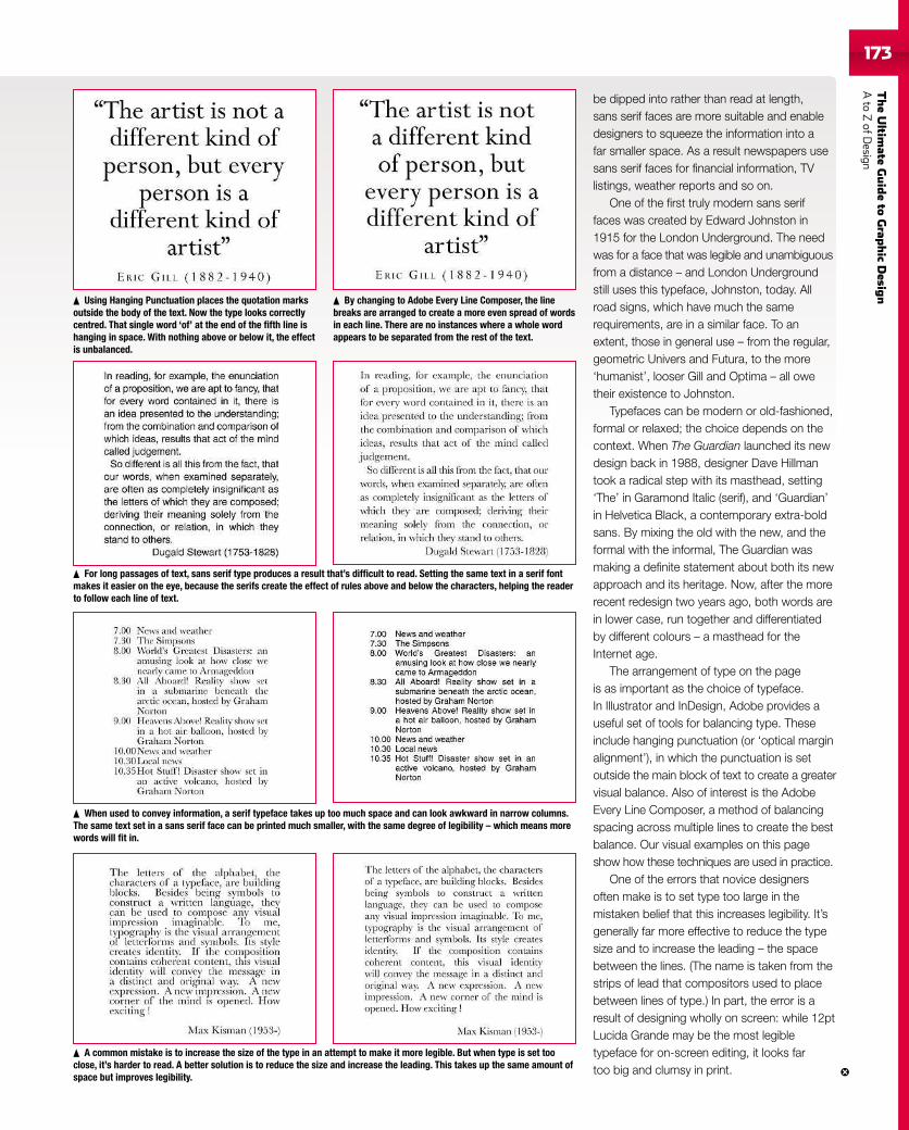
TheUltim
ateGuideto
Grap
hic
Desig
nAto
ZofD
esign173
Using Hanging Punctuation places the quotation marksoutside the body of the text. Now the type looks correctlycentred. That single word ‘of’ at the end of the fifth line ishanging in space. With nothing above or below it, the effectis unbalanced.
be dipped into rather than read at length,sans serif faces are more suitable and enabledesigners to squeeze the information into afar smaller space. As a result newspapers usesans serif faces for financial information, TVlistings, weather reports and so on.
One of the first truly modern sans seriffaces was created by Edward Johnston in1915 for the London Underground. The needwas for a face that was legible and unambiguousfrom a distance – and London Undergroundstill uses this typeface, Johnston, today. Allroad signs, which have much the samerequirements, are in a similar face. To anextent, those in general use – from the regular,geometric Univers and Futura, to the more‘humanist’, looser Gill and Optima – all owetheir existence to Johnston.
Typefaces can be modern or old-fashioned,formal or relaxed; the choice depends on thecontext. When The Guardian launched its newdesign back in 1988, designer Dave Hillmantook a radical step with its masthead, setting‘The’ in Garamond Italic (serif), and ‘Guardian’in Helvetica Black, a contemporary extra-boldsans. By mixing the old with the new, and theformal with the informal, The Guardian wasmaking a definite statement about both its newapproach and its heritage. Now, after the morerecent redesign two years ago, both words arein lower case, run together and differentiatedby different colours – a masthead for theInternet age.
The arrangement of type on the pageis as important as the choice of typeface.In Illustrator and InDesign, Adobe provides auseful set of tools for balancing type. Theseinclude hanging punctuation (or ‘optical marginalignment’), in which the punctuation is setoutside the main block of text to create a greatervisual balance. Also of interest is the AdobeEvery Line Composer, a method of balancingspacing across multiple lines to create the bestbalance. Our visual examples on this pageshow how these techniques are used in practice.
One of the errors that novice designersoften make is to set type too large in themistaken belief that this increases legibility. It’sgenerally far more effective to reduce the typesize and to increase the leading – the spacebetween the lines. (The name is taken from thestrips of lead that compositors used to placebetween lines of type.) In part, the error is aresult of designing wholly on screen: while 12ptLucida Grande may be the most legibletypeface for on-screen editing, it looks fartoo big and clumsy in print.
By changing to Adobe Every Line Composer, the linebreaks are arranged to create a more even spread of wordsin each line. There are no instances where a whole wordappears to be separated from the rest of the text.
For long passages of text, sans serif type produces a result that’s difficult to read. Setting the same text in a serif fontmakes it easier on the eye, because the serifs create the effect of rules above and below the characters, helping the readerto follow each line of text.
When used to convey information, a serif typeface takes up too much space and can look awkward in narrow columns.The same text set in a sans serif face can be printed much smaller, with the same degree of legibility – which means morewords will fit in.
A common mistake is to increase the size of the type in an attempt to make it more legible. But when type is set tooclose, it’s harder to read. A better solution is to reduce the size and increase the leading. This takes up the same amount ofspace but improves legibility.
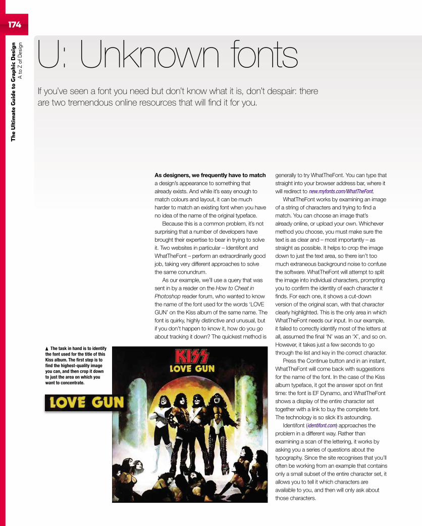
174
TheUltim
ateGuideto
Graphic
Des
ign
Ato
Zof
Design
As designers, we frequently have to matcha design’s appearance to something thatalready exists. And while it’s easy enough tomatch colours and layout, it can be muchharder to match an existing font when you haveno idea of the name of the original typeface.
Because this is a common problem, it’s notsurprising that a number of developers havebrought their expertise to bear in trying to solveit. Two websites in particular – Identifont andWhatTheFont – perform an extraordinarily goodjob, taking very different approaches to solvethe same conundrum.
As our example, we’ll use a query that wassent in by a reader on the How to Cheat inPhotoshop reader forum, who wanted to knowthe name of the font used for the words ‘LOVEGUN’ on the Kiss album of the same name. Thefont is quirky, highly distinctive and unusual, butif you don’t happen to know it, how do you goabout tracking it down? The quickest method is
U: Unknown fontsIf you’ve seen a font you need but don’t know what it is, don’t despair: thereare two tremendous online resources that will find it for you.
The task in hand is to identifythe font used for the title of thisKiss album. The first step is tofind the highest-quality imageyou can, and then crop it downto just the area on which youwant to concentrate.
generally to try WhatTheFont. You can type thatstraight into your browser address bar, where itwill redirect to new.myfonts.com/WhatTheFont.
WhatTheFont works by examining an imageof a string of characters and trying to find amatch. You can choose an image that’salready online, or upload your own. Whichevermethod you choose, you must make sure thetext is as clear and – most importantly – asstraight as possible. It helps to crop the imagedown to just the text area, so there isn’t toomuch extraneous background noise to confusethe software. WhatTheFont will attempt to splitthe image into individual characters, promptingyou to confirm the identity of each character itfinds. For each one, it shows a cut-downversion of the original scan, with that characterclearly highlighted. This is the only area in whichWhatTheFont needs our input. In our example,it failed to correctly identify most of the letters atall, assumed the final ‘N’ was an ‘X’, and so on.However, it takes just a few seconds to gothrough the list and key in the correct character.
Press the Continue button and in an instant,WhatTheFont will come back with suggestionsfor the name of the font. In the case of the Kissalbum typeface, it got the answer spot on firsttime: the font is EF Dynamo, and WhatTheFontshows a display of the entire character settogether with a link to buy the complete font.The technology is so slick it’s astounding.
Identifont (identifont.com) approaches theproblem in a different way. Rather thanexamining a scan of the lettering, it works byasking you a series of questions about thetypography. Since the site recognises that you’lloften be working from an example that containsonly a small subset of the entire character set, itallows you to tell it which characters areavailable to you, and then will only ask aboutthose characters.
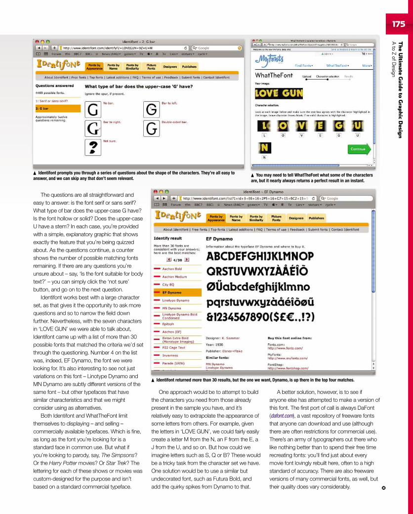
TheUltim
ateGuideto
Grap
hic
Desig
nAto
ZofD
esign175
Identifont prompts you through a series of questions about the shape of the characters. They’re all easy toanswer, and we can skip any that don’t seem relevant.
Identifont returned more than 30 results, but the one we want, Dynamo, is up there in the top four matches.
You may need to tell WhatTheFont what some of the charactersare, but it nearly always returns a perfect result in an instant.
The questions are all straightforward andeasy to answer: is the font serif or sans serif?What type of bar does the upper-case G have?Is the font hollow or solid? Does the upper-caseU have a stem? In each case, you’re providedwith a simple, explanatory graphic that showsexactly the feature that you’re being quizzedabout. As the questions continue, a countershows the number of possible matching fontsremaining. If there are any questions you’reunsure about – say, ‘Is the font suitable for bodytext?’ – you can simply click the ‘not sure’button, and go on to the next question.
Identifont works best with a large characterset, as that gives it the opportunity to ask morequestions and so to narrow the field downfurther. Nevertheless, with the seven charactersin ‘LOVE GUN’ we were able to talk about,Identifont came up with a list of more than 30possible fonts that matched the criteria we’d setthrough the questioning. Number 4 on the listwas, indeed, EF Dynamo, the font we werelooking for. It’s also interesting to see not justvariations on this font – Linotype Dynamo andMN Dynamo are subtly different versions of thesame font – but other typefaces that havesimilar characteristics and that we mightconsider using as alternatives.
Both Identifont and WhatTheFont limitthemselves to displaying – and selling –commercially available typefaces. Which is fine,as long as the font you’re looking for is astandard face in common use. But what ifyou’re looking to parody, say, The Simpsons?Or the Harry Potter movies? Or Star Trek? Thelettering for each of these shows or movies wascustom-designed for the purpose and isn’tbased on a standard commercial typeface.
One approach would be to attempt to buildthe characters you need from those alreadypresent in the sample you have, and it’srelatively easy to extrapolate the appearance ofsome letters from others. For example, giventhe letters in ‘LOVE GUN’, we could fairly easilycreate a letter M from the N, an F from the E, aJ from the U, and so on. But how could weimagine letters such as S, Q or B? These wouldbe a tricky task from the character set we have.One solution would be to use a similar butundecorated font, such as Futura Bold, andadd the quirky spikes from Dynamo to that.
A better solution, however, is to see ifanyone else has attempted to make a version ofthis font. The first port of call is always DaFont(dafont.com), a vast repository of freeware fontsthat anyone can download and use (althoughthere are often restrictions for commercial use).There’s an army of typographers out there wholike nothing better than to spend their free timerecreating fonts: you’ll find just about everymovie font lovingly rebuilt here, often to a highstandard of accuracy. There are also freewareversions of many commercial fonts, as well, buttheir quality does vary considerably.
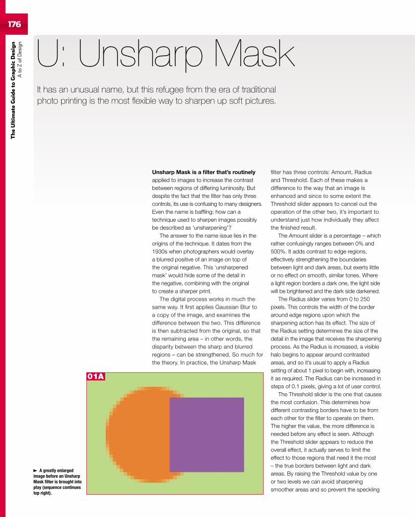
176
TheUltim
ateGuideto
Graphic
Des
ign
Ato
Zof
Design
176
Unsharp Mask is a filter that’s routinelyapplied to images to increase the contrastbetween regions of differing luminosity. Butdespite the fact that the filter has only threecontrols, its use is confusing to many designers.Even the name is baffling: how can atechnique used to sharpen images possiblybe described as ‘unsharpening’?
The answer to the name issue lies in theorigins of the technique. It dates from the1930s when photographers would overlaya blurred positive of an image on top ofthe original negative. This ‘unsharpenedmask’ would hide some of the detail inthe negative, combining with the originalto create a sharper print.
The digital process works in much thesame way. It first applies Gaussian Blur toa copy of the image, and examines thedifference between the two. This differenceis then subtracted from the original, so thatthe remaining area – in other words, thedisparity between the sharp and blurredregions – can be strengthened. So much forthe theory. In practice, the Unsharp Mask
U: Unsharp Mask
filter has three controls: Amount, Radiusand Threshold. Each of these makes adifference to the way that an image isenhanced and since to some extent theThreshold slider appears to cancel out theoperation of the other two, it’s important tounderstand just how individually they affectthe finished result.
The Amount slider is a percentage – whichrather confusingly ranges between 0% and500%. It adds contrast to edge regions,effectively strengthening the boundariesbetween light and dark areas, but exerts littleor no effect on smooth, similar tones. Wherea light region borders a dark one, the light sidewill be brightened and the dark side darkened.
The Radius slider varies from 0 to 250pixels. This controls the width of the borderaround edge regions upon which thesharpening action has its effect. The size ofthe Radius setting determines the size of thedetail in the image that receives the sharpeningprocess. As the Radius is increased, a visiblehalo begins to appear around contrastedareas, and so it’s usual to apply a Radiussetting of about 1 pixel to begin with, increasingit as required. The Radius can be increased insteps of 0.1 pixels, giving a lot of user control.
The Threshold slider is the one that causesthe most confusion. This determines howdifferent contrasting borders have to be fromeach other for the filter to operate on them.The higher the value, the more difference isneeded before any effect is seen. Althoughthe Threshold slider appears to reduce theoverall effect, it actually serves to limit theeffect to those regions that need it the most– the true borders between light and darkareas. By raising the Threshold value by oneor two levels we can avoid sharpeningsmoother areas and so prevent the speckling
A greatly enlargedimage before an UnsharpMask filter is brought intoplay (sequence continuestop right).
It has an unusual name, but this refugee from the era of traditionalphoto printing is the most flexible way to sharpen up soft pictures.
01A
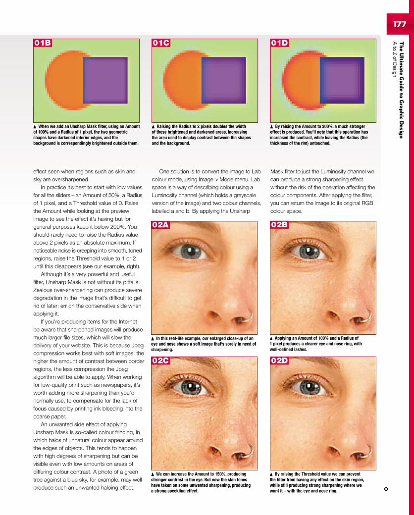
TheUltim
ateGuideto
Grap
hic
Desig
nAto
ZofD
esign177177
effect seen when regions such as skin andsky are oversharpened.
In practice it’s best to start with low valuesfor all the sliders – an Amount of 50%, a Radiusof 1 pixel, and a Threshold value of 0. Raisethe Amount while looking at the previewimage to see the effect it’s having but forgeneral purposes keep it below 200%. Youshould rarely need to raise the Radius valueabove 2 pixels as an absolute maximum. Ifnoticeable noise is creeping into smooth, tonedregions, raise the Threshold value to 1 or 2until this disappears (see our example, right).
Although it’s a very powerful and usefulfilter, Unsharp Mask is not without its pitfalls.Zealous over-sharpening can produce severedegradation in the image that’s difficult to getrid of later: err on the conservative side whenapplying it.
If you’re producing items for the Internetbe aware that sharpened images will producemuch larger file sizes, which will slow thedelivery of your website. This is because Jpegcompression works best with soft images: thehigher the amount of contrast between borderregions, the less compression the Jpegalgorithm will be able to apply. When workingfor low-quality print such as newspapers, it’sworth adding more sharpening than you’dnormally use, to compensate for the lack offocus caused by printing ink bleeding into thecoarse paper.
An unwanted side effect of applyingUnsharp Mask is so-called colour fringing, inwhich halos of unnatural colour appear aroundthe edges of objects. This tends to happenwith high degrees of sharpening but can bevisible even with low amounts on areas ofdiffering colour contrast. A photo of a greentree against a blue sky, for example, may wellproduce such an unwanted haloing effect.
One solution is to convert the image to Labcolour mode, using Image > Mode menu. Labspace is a way of describing colour using aLuminosity channel (which holds a greyscaleversion of the image) and two colour channels,labelled a and b. By applying the Unsharp
By raising the Amount to 200%, a much strongereffect is produced. You’ll note that this operation hasincreased the contrast, while leaving the Radius (thethickness of the rim) untouched.
Mask filter to just the Luminosity channel wecan produce a strong sharpening effectwithout the risk of the operation affecting thecolour components. After applying the filter,you can return the image to its original RGBcolour space.
When we add an Unsharp Mask filter, using an Amountof 100% and a Radius of 1 pixel, the two geometricshapes have darkened interior edges, and thebackground is correspondingly brightened outside them.
Raising the Radius to 2 pixels doubles the widthof these brightened and darkened areas, increasingthe area used to display contrast between the shapesand the background.
In this real-life example, our enlarged close-up of aneye and nose shows a soft image that’s sorely in need ofsharpening.
Applying an Amount of 100% and a Radius of1 pixel produces a clearer eye and nose ring, withwell-defined lashes.
We can increase the Amount to 150%, producingstronger contrast in the eye. But now the skin toneshave taken on some unwanted sharpening, producinga strong speckling effect.
By raising the Threshold value we can preventthe filter from having any effect on the skin region,while still producing strong sharpening where wewant it – with the eye and nose ring.
01B 01C 01D
02A 02B
02C 02D
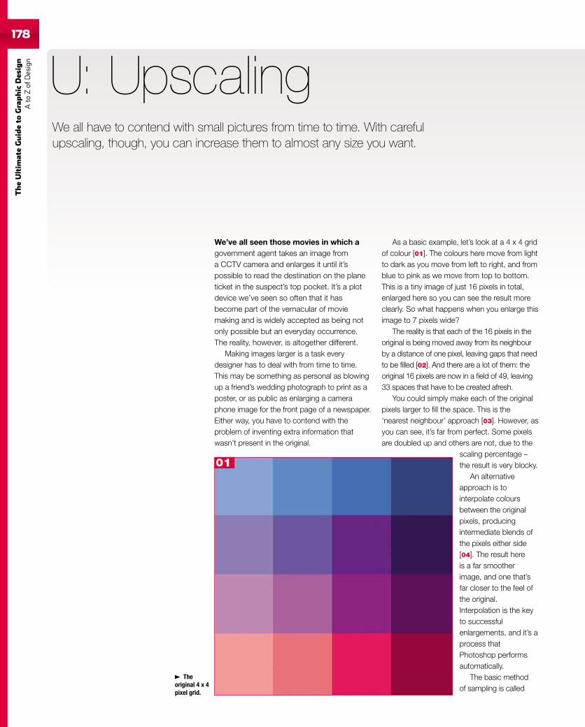
178
TheUltim
ateGuideto
Graphic
Des
ign
Ato
Zof
Design
We’ve all seen those movies in which agovernment agent takes an image froma CCTV camera and enlarges it until it’spossible to read the destination on the planeticket in the suspect’s top pocket. It’s a plotdevice we’ve seen so often that it hasbecome part of the vernacular of moviemaking and is widely accepted as being notonly possible but an everyday occurrence.The reality, however, is altogether different.
Making images larger is a task everydesigner has to deal with from time to time.This may be something as personal as blowingup a friend’s wedding photograph to print as aposter, or as public as enlarging a cameraphone image for the front page of a newspaper.Either way, you have to contend with theproblem of inventing extra information thatwasn’t present in the original.
U: Upscaling
As a basic example, let’s look at a 4 x 4 gridof colour [01]. The colours here move from lightto dark as you move from left to right, and fromblue to pink as we move from top to bottom.This is a tiny image of just 16 pixels in total,enlarged here so you can see the result moreclearly. So what happens when you enlarge thisimage to 7 pixels wide?
The reality is that each of the 16 pixels in theoriginal is being moved away from its neighbourby a distance of one pixel, leaving gaps that needto be filled [02]. And there are a lot of them: theoriginal 16 pixels are now in a field of 49, leaving33 spaces that have to be created afresh.
You could simply make each of the originalpixels larger to fill the space. This is the‘nearest neighbour’ approach [03]. However, asyou can see, it’s far from perfect. Some pixelsare doubled up and others are not, due to the
scaling percentage –the result is very blocky.
An alternativeapproach is tointerpolate coloursbetween the originalpixels, producingintermediate blends ofthe pixels either side[04]. The result hereis a far smootherimage, and one that’sfar closer to the feel ofthe original.Interpolation is the keyto successfulenlargements, and it’s aprocess thatPhotoshop performsautomatically.
The basic methodof sampling is called
Theoriginal 4 x 4pixel grid.
We all have to contend with small pictures from time to time. With carefulupscaling, though, you can increase them to almost any size you want.
01
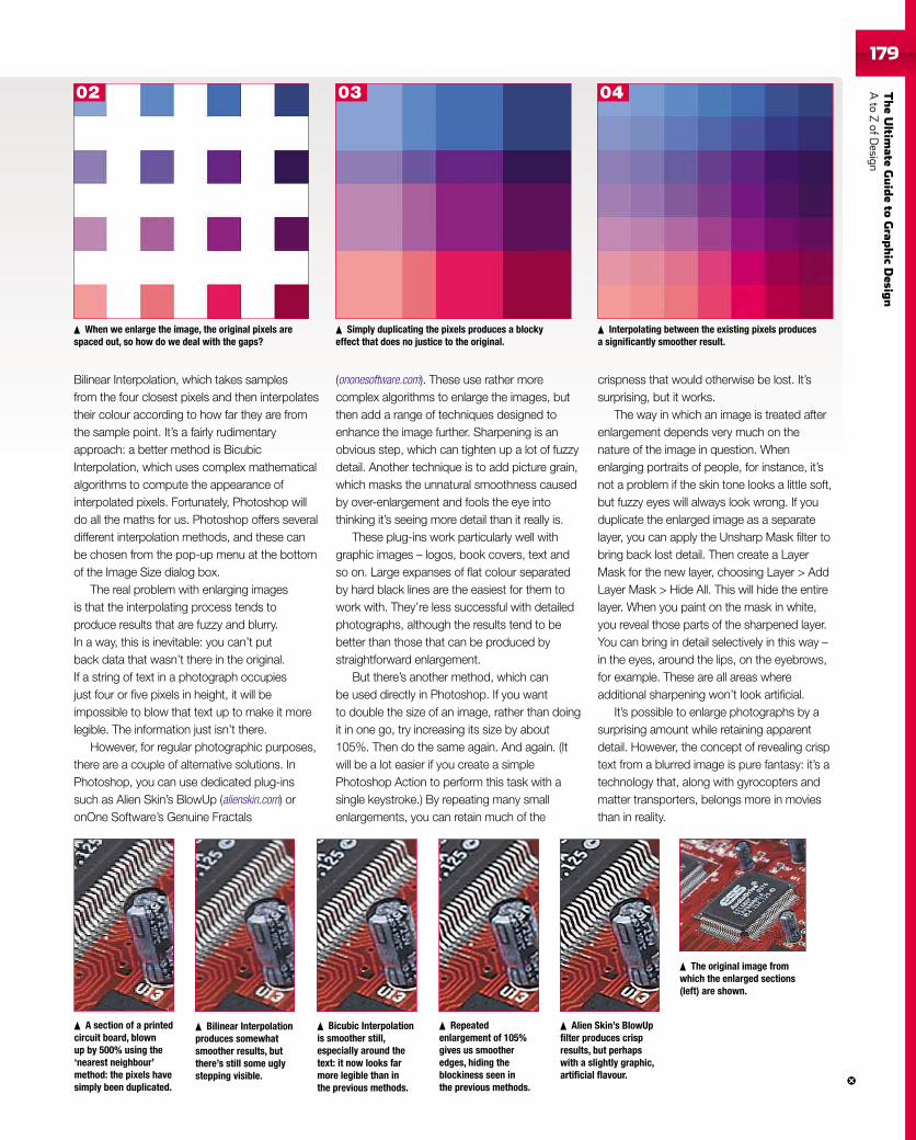
TheUltim
ateGuideto
Grap
hic
Desig
nAto
ZofD
esign179
Bilinear Interpolation, which takes samplesfrom the four closest pixels and then interpolatestheir colour according to how far they are fromthe sample point. It’s a fairly rudimentaryapproach: a better method is BicubicInterpolation, which uses complex mathematicalalgorithms to compute the appearance ofinterpolated pixels. Fortunately, Photoshop willdo all the maths for us. Photoshop offers severaldifferent interpolation methods, and these canbe chosen from the pop-up menu at the bottomof the Image Size dialog box.
The real problem with enlarging imagesis that the interpolating process tends toproduce results that are fuzzy and blurry.In a way, this is inevitable: you can’t putback data that wasn’t there in the original.If a string of text in a photograph occupiesjust four or five pixels in height, it will beimpossible to blow that text up to make it morelegible. The information just isn’t there.
However, for regular photographic purposes,there are a couple of alternative solutions. InPhotoshop, you can use dedicated plug-inssuch as Alien Skin’s BlowUp (alienskin.com) oronOne Software’s Genuine Fractals
(ononesoftware.com). These use rather morecomplex algorithms to enlarge the images, butthen add a range of techniques designed toenhance the image further. Sharpening is anobvious step, which can tighten up a lot of fuzzydetail. Another technique is to add picture grain,which masks the unnatural smoothness causedby over-enlargement and fools the eye intothinking it’s seeing more detail than it really is.
These plug-ins work particularly well withgraphic images – logos, book covers, text andso on. Large expanses of flat colour separatedby hard black lines are the easiest for them towork with. They’re less successful with detailedphotographs, although the results tend to bebetter than those that can be produced bystraightforward enlargement.
But there’s another method, which canbe used directly in Photoshop. If you wantto double the size of an image, rather than doingit in one go, try increasing its size by about105%. Then do the same again. And again. (Itwill be a lot easier if you create a simplePhotoshop Action to perform this task with asingle keystroke.) By repeating many smallenlargements, you can retain much of the
crispness that would otherwise be lost. It’ssurprising, but it works.
The way in which an image is treated afterenlargement depends very much on thenature of the image in question. Whenenlarging portraits of people, for instance, it’snot a problem if the skin tone looks a little soft,but fuzzy eyes will always look wrong. If youduplicate the enlarged image as a separatelayer, you can apply the Unsharp Mask filter tobring back lost detail. Then create a LayerMask for the new layer, choosing Layer > AddLayer Mask > Hide All. This will hide the entirelayer. When you paint on the mask in white,you reveal those parts of the sharpened layer.You can bring in detail selectively in this way –in the eyes, around the lips, on the eyebrows,for example. These are all areas whereadditional sharpening won’t look artificial.
It’s possible to enlarge photographs by asurprising amount while retaining apparentdetail. However, the concept of revealing crisptext from a blurred image is pure fantasy: it’s atechnology that, along with gyrocopters andmatter transporters, belongs more in moviesthan in reality.
When we enlarge the image, the original pixels arespaced out, so how do we deal with the gaps?
Simply duplicating the pixels produces a blockyeffect that does no justice to the original.
Interpolating between the existing pixels producesa significantly smoother result.
A section of a printedcircuit board, blownup by 500% using the‘nearest neighbour’method: the pixels havesimply been duplicated.
Bilinear Interpolationproduces somewhatsmoother results, butthere’s still some uglystepping visible.
Bicubic Interpolationis smoother still,especially around thetext: it now looks farmore legible than inthe previous methods.
Repeatedenlargement of 105%gives us smootheredges, hiding theblockiness seen inthe previous methods.
Alien Skin’s BlowUpfilter produces crispresults, but perhapswith a slightly graphic,artificial flavour.
The original image fromwhich the enlarged sections(left) are shown.
02 03 04
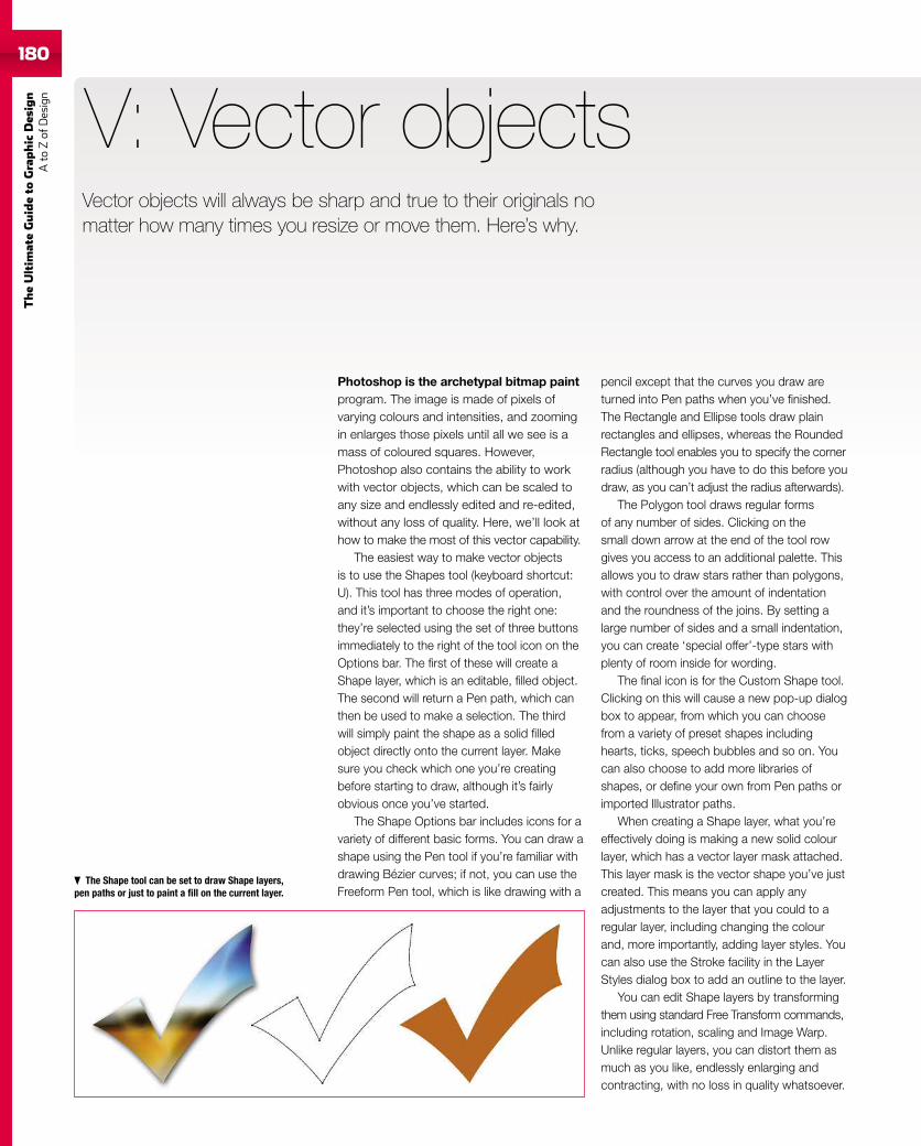
180
TheUltim
ateGuideto
Graphic
Des
ign
Ato
Zof
Design
180
Photoshop is the archetypal bitmap paintprogram. The image is made of pixels ofvarying colours and intensities, and zoomingin enlarges those pixels until all we see is amass of coloured squares. However,Photoshop also contains the ability to workwith vector objects, which can be scaled toany size and endlessly edited and re-edited,without any loss of quality. Here, we’ll look athow to make the most of this vector capability.
The easiest way to make vector objectsis to use the Shapes tool (keyboard shortcut:U). This tool has three modes of operation,and it’s important to choose the right one:they’re selected using the set of three buttonsimmediately to the right of the tool icon on theOptions bar. The first of these will create aShape layer, which is an editable, filled object.The second will return a Pen path, which canthen be used to make a selection. The thirdwill simply paint the shape as a solid filledobject directly onto the current layer. Makesure you check which one you’re creatingbefore starting to draw, although it’s fairlyobvious once you’ve started.
The Shape Options bar includes icons for avariety of different basic forms. You can draw ashape using the Pen tool if you’re familiar withdrawing Bézier curves; if not, you can use theFreeform Pen tool, which is like drawing with a
V: Vector objects
pencil except that the curves you draw areturned into Pen paths when you’ve finished.The Rectangle and Ellipse tools draw plainrectangles and ellipses, whereas the RoundedRectangle tool enables you to specify the cornerradius (although you have to do this before youdraw, as you can’t adjust the radius afterwards).
The Polygon tool draws regular formsof any number of sides. Clicking on thesmall down arrow at the end of the tool rowgives you access to an additional palette. Thisallows you to draw stars rather than polygons,with control over the amount of indentationand the roundness of the joins. By setting alarge number of sides and a small indentation,you can create ‘special offer’-type stars withplenty of room inside for wording.
The final icon is for the Custom Shape tool.Clicking on this will cause a new pop-up dialogbox to appear, from which you can choosefrom a variety of preset shapes includinghearts, ticks, speech bubbles and so on. Youcan also choose to add more libraries ofshapes, or define your own from Pen paths orimported Illustrator paths.
When creating a Shape layer, what you’reeffectively doing is making a new solid colourlayer, which has a vector layer mask attached.This layer mask is the vector shape you’ve justcreated. This means you can apply anyadjustments to the layer that you could to aregular layer, including changing the colourand, more importantly, adding layer styles. Youcan also use the Stroke facility in the LayerStyles dialog box to add an outline to the layer.
You can edit Shape layers by transformingthem using standard Free Transform commands,including rotation, scaling and Image Warp.Unlike regular layers, you can distort them asmuch as you like, endlessly enlarging andcontracting, with no loss in quality whatsoever.
The Shape tool can be set to draw Shape layers,pen paths or just to paint a fill on the current layer.
Vector objects will always be sharp and true to their originals nomatter how many times you resize or move them. Here’s why.
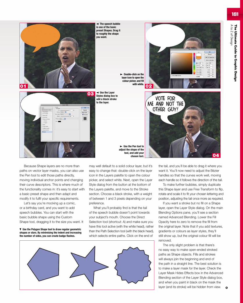
TheUltim
ateGuideto
Grap
hic
Desig
nAto
ZofD
esign181181
Because Shape layers are no more thanpaths on vector layer masks, you can also usethe Pen tool to edit those paths directly,moving individual anchor points and changingtheir curve descriptors. This is where much ofthe functionality comes in: it’s easy to start witha basic preset shape and then adapt andmodify it to fulfil your specific requirements.
Let’s say you’re mocking up a comic,or a birthday card, and you want to addspeech bubbles. You can start with thebasic bubble shape using the CustomShape tool, dragging it to the size you want. It
may well default to a solid colour layer, but it’seasy to change that: double-click on the layericon in the Layers palette to open the colourpicker, and select white. Next, open the LayerStyle dialog from the button at the bottom ofthe Layers palette, and move to the Strokesection. Choose a black stroke, with a weightof between 1 and 3 pixels depending on yourpreference.
What you’ll probably find is that the tailof the speech bubble doesn’t point towardsyour subject’s mouth. Choose the DirectSelection tool (shortcut: A) and make sure youhave this tool active (with the white head), ratherthan the Path Selection tool (with the black head),which selects entire paths. Click on the end of
the tail, and you’ll be able to drag it where youwant it. You’ll now need to adjust the Bézierhandles so that the curves work well, movingeach handle so it follows the direction of the tail.
To make further bubbles, simply duplicatethis Shape layer and use Free Transform to flip,rotate and scale it to fit your chosen lettering andposition, adjusting the tail once more as required.
If you want a stroke but no fill on a Shapelayer, open the Layer Style dialog. On the mainBlending Options pane, you’ll see a sectionnamed Advanced Blending. Lower the FillOpacity here to zero to remove the fill fromthe original layer. Note that if you add textures,gradients or colours as layer styles, they’llstill show up, but the original colour fill will beremoved.
The only slight problem is that there’sno easy way to make open-ended strokedpaths as Shape objects. Fills and strokeswill always join the beginning and end ofthe path in a straight line. The best solution isto make a layer mask for the layer. Check theLayer Mask Hides Effects box in the AdvancedBlending section of the Layer Style dialog box,and when you paint in black on the mask thelayer (and its stroke) will be hidden from view.
The speech bubbleis one of the basicpreset Shapes. Drag itto roughly the shapeyou want.
Use the Polygon Shape tool to draw regular geometricshapes or stars. By minimising the indent and increasingthe number of sides, you can create badge flashes.
Double-click on thelayer icon to open thecolour picker, and fill
with white.
Use the LayerStyles dialog box toadd a black stroketo the layer.
Use the Pen tool toadjust the shape of the
tool, and add yourchosen text.
03
01 02
04
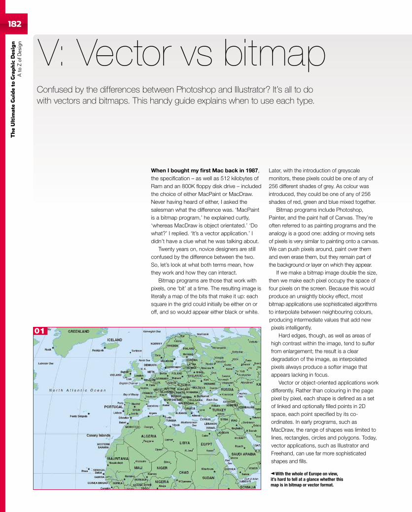
182
TheUltim
ateGuideto
Graphic
Des
ign
Ato
Zof
Design
When I bought my first Mac back in 1987,the specification – as well as 512 kilobytes ofRam and an 800K floppy disk drive – includedthe choice of either MacPaint or MacDraw.Never having heard of either, I asked thesalesman what the difference was. ‘MacPaintis a bitmap program,’ he explained curtly,‘whereas MacDraw is object orientated.’ ‘Dowhat?’ I replied. ‘It’s a vector application.’ Ididn’t have a clue what he was talking about.
Twenty years on, novice designers are stillconfused by the difference between the two.So, let’s look at what both terms mean, howthey work and how they can interact.
Bitmap programs are those that work withpixels, one ‘bit’ at a time. The resulting image isliterally a map of the bits that make it up: eachsquare in the grid could initially be either on oroff, and so would appear either black or white.
V: Vector vs bitmap
Later, with the introduction of greyscalemonitors, these pixels could be one of any of256 different shades of grey. As colour wasintroduced, they could be one of any of 256shades of red, green and blue mixed together.
Bitmap programs include Photoshop,Painter, and the paint half of Canvas. They’reoften referred to as painting programs and theanalogy is a good one: adding or moving setsof pixels is very similar to painting onto a canvas.We can push pixels around, paint over themand even erase them, but they remain part ofthe background or layer on which they appear.
If we make a bitmap image double the size,then we make each pixel occupy the space offour pixels on the screen. Because this wouldproduce an unsightly blocky effect, mostbitmap applications use sophisticated algorithmsto interpolate between neighbouring colours,producing intermediate values that add newpixels intelligently.
Hard edges, though, as well as areas ofhigh contrast within the image, tend to sufferfrom enlargement; the result is a cleardegradation of the image, as interpolatedpixels always produce a softer image thatappears lacking in focus.
Vector or object-oriented applications workdifferently. Rather than colouring in the pagepixel by pixel, each shape is defined as a setof linked and optionally filled points in 2Dspace, each point specified by its co-ordinates. In early programs, such asMacDraw, the range of shapes was limited tolines, rectangles, circles and polygons. Today,vector applications, such as Illustrator andFreehand, can use far more sophisticatedshapes and fills.
With the whole of Europe on view,it’s hard to tell at a glance whether thismap is in bitmap or vector format.
Confused by the differences between Photoshop and Illustrator? It’s all to dowith vectors and bitmaps. This handy guide explains when to use each type.
01
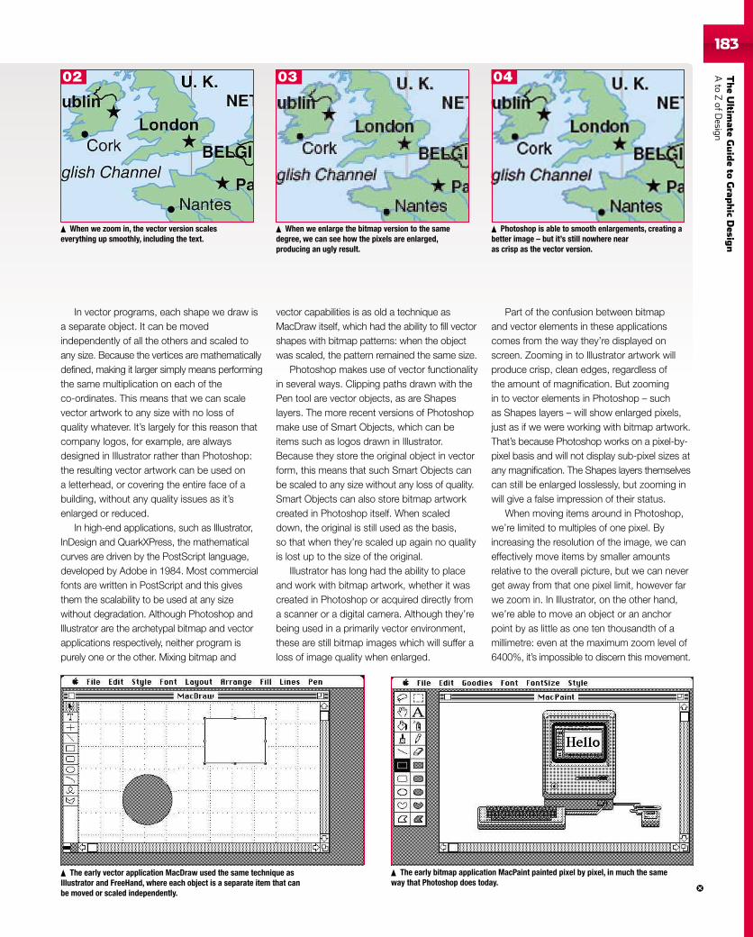
TheUltim
ateGuideto
Grap
hic
Desig
nAto
ZofD
esign183
In vector programs, each shape we draw isa separate object. It can be movedindependently of all the others and scaled toany size. Because the vertices are mathematicallydefined, making it larger simply means performingthe same multiplication on each of theco-ordinates. This means that we can scalevector artwork to any size with no loss ofquality whatever. It’s largely for this reason thatcompany logos, for example, are alwaysdesigned in Illustrator rather than Photoshop:the resulting vector artwork can be used ona letterhead, or covering the entire face of abuilding, without any quality issues as it’senlarged or reduced.
In high-end applications, such as Illustrator,InDesign and QuarkXPress, the mathematicalcurves are driven by the PostScript language,developed by Adobe in 1984. Most commercialfonts are written in PostScript and this givesthem the scalability to be used at any sizewithout degradation. Although Photoshop andIllustrator are the archetypal bitmap and vectorapplications respectively, neither program ispurely one or the other. Mixing bitmap and
vector capabilities is as old a technique asMacDraw itself, which had the ability to fill vectorshapes with bitmap patterns: when the objectwas scaled, the pattern remained the same size.
Photoshop makes use of vector functionalityin several ways. Clipping paths drawn with thePen tool are vector objects, as are Shapeslayers. The more recent versions of Photoshopmake use of Smart Objects, which can beitems such as logos drawn in Illustrator.Because they store the original object in vectorform, this means that such Smart Objects canbe scaled to any size without any loss of quality.Smart Objects can also store bitmap artworkcreated in Photoshop itself. When scaleddown, the original is still used as the basis,so that when they’re scaled up again no qualityis lost up to the size of the original.
Illustrator has long had the ability to placeand work with bitmap artwork, whether it wascreated in Photoshop or acquired directly froma scanner or a digital camera. Although they’rebeing used in a primarily vector environment,these are still bitmap images which will suffer aloss of image quality when enlarged.
Part of the confusion between bitmapand vector elements in these applicationscomes from the way they’re displayed onscreen. Zooming in to Illustrator artwork willproduce crisp, clean edges, regardless ofthe amount of magnification. But zoomingin to vector elements in Photoshop – suchas Shapes layers – will show enlarged pixels,just as if we were working with bitmap artwork.That’s because Photoshop works on a pixel-by-pixel basis and will not display sub-pixel sizes atany magnification. The Shapes layers themselvescan still be enlarged losslessly, but zooming inwill give a false impression of their status.
When moving items around in Photoshop,we’re limited to multiples of one pixel. Byincreasing the resolution of the image, we caneffectively move items by smaller amountsrelative to the overall picture, but we can neverget away from that one pixel limit, however farwe zoom in. In Illustrator, on the other hand,we’re able to move an object or an anchorpoint by as little as one ten thousandth of amillimetre: even at the maximum zoom level of6400%, it’s impossible to discern this movement.
When we zoom in, the vector version scaleseverything up smoothly, including the text.
When we enlarge the bitmap version to the samedegree, we can see how the pixels are enlarged,producing an ugly result.
Photoshop is able to smooth enlargements, creating abetter image – but it’s still nowhere nearas crisp as the vector version.
The early vector application MacDraw used the same technique asIllustrator and FreeHand, where each object is a separate item that canbe moved or scaled independently.
The early bitmap application MacPaint painted pixel by pixel, in much the sameway that Photoshop does today.
02 03 04
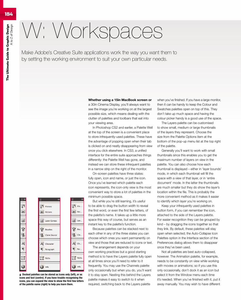
184
TheUltim
ateGuideto
Graphic
Des
ign
Ato
Zof
Design
184
Whether using a 15in MacBook screen ora 30in Cinema Display, you’ll always want tosee the image you’re working on at the largestpossible size, which means dealing with theclutter of palettes and toolbars that eat intoyour viewing area.
In Photoshop CS2 and earlier, a Palette Wellat the top of the screen is a convenient placeto store infrequently-used palettes. These havethe advantage of popping open when their tabis clicked on and neatly disappearing from viewonce you click elsewhere. In CS3, a unifiedinterface for the entire suite approaches thingsdifferently: the Palette Well has gone, andinstead we can store these infrequent palettesin a narrow strip on the right of the monitor.
On-screen palettes have three states:fully open, icon and name, or just the icon.Once you’ve learned which palette eachicon represents, the icon-only view is the mostconvenient way to store a lot of palettes in theminimum possible space.
But while you’re still learning, it’s usefulto be able to drag the button width to revealthe first word, or even the first few letters, ofthe palette’s name. It takes up a little morespace this way of course, but serves as aninstant key to the palette’s function.
Because palettes can be stacked next toeach other in any of the three states you canchoose which ones you want permanently onview and those that are reduced to icons or text.
The arrangement depends on yourown working practices but a good startingmethod is to have the Layers palette fully openat all times since you’ll need to refer to itfrequently. You may use the Channels paletteonly occasionally but when you do, you’ll wantit to stay open. Nesting this behind the Layerspalette makes it easy to switch to it whenrequired, switching back to the Layers palette
W: Workspaces
when you’ve finished. If you have a large monitor,then it can be handy to keep the Colour andSwatches palettes open on top of this. Theydon’t take up much space and having thecolour picker handy is a good use of the space.
The Layers palette can be customisedto show small, medium or large thumbnailsof the layers they represent. Choose thesize from the Palette Options item at thebottom of the pop-up menu list at the top rightof the palette.
Generally you’ll want to work with smallthumbnails since this enables you to get themaximum number of layers on view in thepalette. You can also choose how eachthumbnail is displayed – either in ‘layer bounds’mode, in which each thumbnail will fill thespace with a view of that layer, or in ‘entiredocument’ mode. In the latter the thumbnailsare much smaller but they do show the layer’slocation within the file. This is probably themore convenient method as it makes it easierto identify which layer you’re working on.
Keep your infrequently used palettes inbutton form, if you can remember the icon,attached to the side of the Layers palette.For easier recognition they can be grouped bykind – by dragging the icons together so thatthey link. By default, these palettes will stayopen when selected; the Auto-Collapse IconPalettes option in the Interface section of thePreferences dialog allows them to disappearonce they’ve been used.
Not all palettes are best auto-collapsed,however. The Animation palette, for example,needs to be constantly on view while workingwith movies or animations; so if you use thisonly occasionally, don’t dock it as an icon butselect it from the Window menu each timeit’s needed. When you’ve finished with it, put itaway manually. You may wish to have different
Docked palettes can be stored as icons only (left), or asicons and text (centre). If you have trouble recognising theicons, you can expand the view to show the first few lettersof the palette name (right) to help you learn them.
Make Adobe’s Creative Suite applications work the way you want them toby setting the working environment to suit your own particular needs.
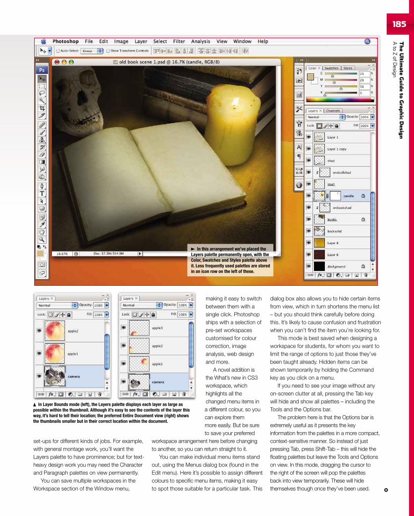
TheUltim
ateGuideto
Grap
hic
Desig
nAto
ZofD
esign185185
set-ups for different kinds of jobs. For example,with general montage work, you’ll want theLayers palette to have prominence; but for text-heavy design work you may need the Characterand Paragraph palettes on view permanently.
You can save multiple workspaces in theWorkspace section of the Window menu,
making it easy to switchbetween them with asingle click. Photoshopships with a selection ofpre-set workspacescustomised for colourcorrection, imageanalysis, web designand more.
A novel addition isthe What’s new in CS3workspace, whichhighlights all thechanged menu items ina different colour, so youcan explore themmore easily. But be sureto save your preferred
workspace arrangement here before changingto another, so you can return straight to it.
You can make individual menu items standout, using the Menus dialog box (found in theEdit menu). Here it’s possible to assign differentcolours to specific menu items, making it easyto spot those suitable for a particular task. This
dialog box also allows you to hide certain itemsfrom view, which in turn shortens the menu list– but you should think carefully before doingthis. It’s likely to cause confusion and frustrationwhen you can’t find the item you’re looking for.
This mode is best saved when designing aworkspace for students, for whom you want tolimit the range of options to just those they’vebeen taught already. Hidden items can beshown temporarily by holding the Commandkey as you click on a menu.
If you need to see your image without anyon-screen clutter at all, pressing the Tab keywill hide and show all palettes – including theTools and the Options bar.
The problem here is that the Options bar isextremely useful as it presents the keyinformation from the palettes in a more compact,context-sensitive manner. So instead of justpressing Tab, press Shift-Tab – this will hide thefloating palettes but leave the Tools and Optionson view. In this mode, dragging the cursor tothe right of the screen will pop the palettesback into view temporarily. These will hidethemselves though once they’ve been used.
In this arrangement we’ve placed theLayers palette permanently open, with theColor, Swatches and Styles palette aboveit. Less frequently used palettes are storedin an icon row on the left of these.
In Layer Bounds mode (left), the Layers palette displays each layer as large aspossible within the thumbnail. Although it’s easy to see the contents of the layer thisway, it’s hard to tell their location; the preferred Entire Document view (right) showsthe thumbnails smaller but in their correct location within the document.
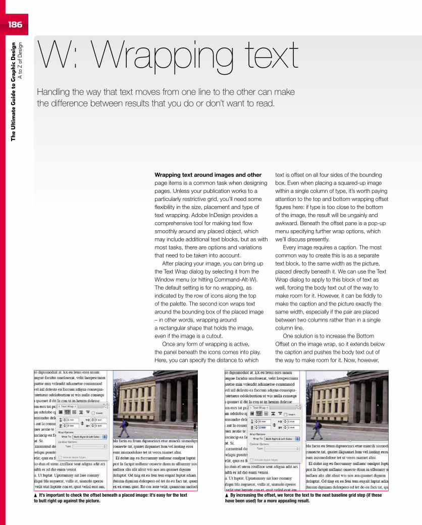
186
TheUltim
ateGuideto
Graphic
Des
ign
Ato
Zof
Design
Wrapping text around images and otherpage items is a common task when designingpages. Unless your publication works to aparticularly restrictive grid, you’ll need someflexibility in the size, placement and type oftext wrapping. Adobe InDesign provides acomprehensive tool for making text flowsmoothly around any placed object, whichmay include additional text blocks, but as withmost tasks, there are options and variationsthat need to be taken into account.
After placing your image, you can bring upthe Text Wrap dialog by selecting it from theWindow menu (or hitting Command-Alt-W).The default setting is for no wrapping, asindicated by the row of icons along the topof the palette. The second icon wraps textaround the bounding box of the placed image– in other words, wrapping arounda rectangular shape that holds the image,even if the image is a cutout.
Once any form of wrapping is active,the panel beneath the icons comes into play.Here, you can specify the distance to which
W: Wrapping text
text is offset on all four sides of the boundingbox. Even when placing a squared-up imagewithin a single column of type, it’s worth payingattention to the top and bottom wrapping offsetfigures here: if type is too close to the bottomof the image, the result will be ungainly andawkward. Beneath the offset pane is a pop-upmenu specifying further wrap options, whichwe’ll discuss presently.
Every image requires a caption. The mostcommon way to create this is as a separatetext block, to the same width as the picture,placed directly beneath it. We can use the TextWrap dialog to apply to this block of text aswell, forcing the body text out of the way tomake room for it. However, it can be fiddly tomake the caption and the picture exactly thesame width, especially if the pair are placedbetween two columns rather than in a singlecolumn line.
One solution is to increase the BottomOffset on the image wrap, so it extends belowthe caption and pushes the body text out ofthe way to make room for it. Now, however,
It’s important to check the offset beneath a placed image: it’s easy for the textto butt right up against the picture.
By increasing the offset, we force the text to the next baseline grid step (if thesehave been used) for a more appealing result.
Handling the way that text moves from one line to the other can makethe difference between results that you do or don’t want to read.
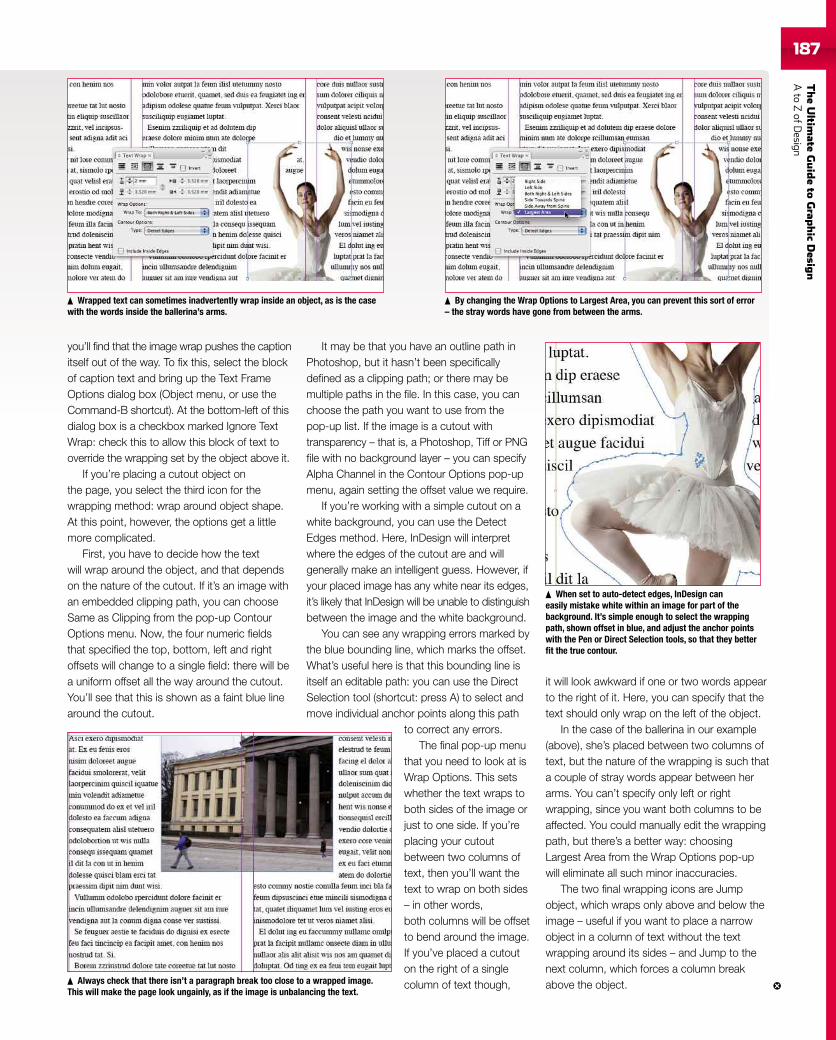
TheUltim
ateGuideto
Grap
hic
Desig
nAto
ZofD
esign187
you’ll find that the image wrap pushes the captionitself out of the way. To fix this, select the blockof caption text and bring up the Text FrameOptions dialog box (Object menu, or use theCommand-B shortcut). At the bottom-left of thisdialog box is a checkbox marked Ignore TextWrap: check this to allow this block of text tooverride the wrapping set by the object above it.
If you’re placing a cutout object onthe page, you select the third icon for thewrapping method: wrap around object shape.At this point, however, the options get a littlemore complicated.
First, you have to decide how the textwill wrap around the object, and that dependson the nature of the cutout. If it’s an image withan embedded clipping path, you can chooseSame as Clipping from the pop-up ContourOptions menu. Now, the four numeric fieldsthat specified the top, bottom, left and rightoffsets will change to a single field: there will bea uniform offset all the way around the cutout.You’ll see that this is shown as a faint blue linearound the cutout.
It may be that you have an outline path inPhotoshop, but it hasn’t been specificallydefined as a clipping path; or there may bemultiple paths in the file. In this case, you canchoose the path you want to use from thepop-up list. If the image is a cutout withtransparency – that is, a Photoshop, Tiff or PNGfile with no background layer – you can specifyAlpha Channel in the Contour Options pop-upmenu, again setting the offset value we require.
If you’re working with a simple cutout on awhite background, you can use the DetectEdges method. Here, InDesign will interpretwhere the edges of the cutout are and willgenerally make an intelligent guess. However, ifyour placed image has any white near its edges,it’s likely that InDesign will be unable to distinguishbetween the image and the white background.
You can see any wrapping errors marked bythe blue bounding line, which marks the offset.What’s useful here is that this bounding line isitself an editable path: you can use the DirectSelection tool (shortcut: press A) to select andmove individual anchor points along this path
to correct any errors.The final pop-up menu
that you need to look at isWrap Options. This setswhether the text wraps toboth sides of the image orjust to one side. If you’replacing your cutoutbetween two columns oftext, then you’ll want thetext to wrap on both sides– in other words,both columns will be offsetto bend around the image.If you’ve placed a cutouton the right of a singlecolumn of text though,
it will look awkward if one or two words appearto the right of it. Here, you can specify that thetext should only wrap on the left of the object.
In the case of the ballerina in our example(above), she’s placed between two columns oftext, but the nature of the wrapping is such thata couple of stray words appear between herarms. You can’t specify only left or rightwrapping, since you want both columns to beaffected. You could manually edit the wrappingpath, but there’s a better way: choosingLargest Area from the Wrap Options pop-upwill eliminate all such minor inaccuracies.
The two final wrapping icons are Jumpobject, which wraps only above and below theimage – useful if you want to place a narrowobject in a column of text without the textwrapping around its sides – and Jump to thenext column, which forces a column breakabove the object.
Wrapped text can sometimes inadvertently wrap inside an object, as is the casewith the words inside the ballerina’s arms.
By changing the Wrap Options to Largest Area, you can prevent this sort of error– the stray words have gone from between the arms.
Always check that there isn’t a paragraph break too close to a wrapped image.This will make the page look ungainly, as if the image is unbalancing the text.
When set to auto-detect edges, InDesign caneasily mistake white within an image for part of thebackground. It’s simple enough to select the wrappingpath, shown offset in blue, and adjust the anchor pointswith the Pen or Direct Selection tools, so that they betterfit the true contour.
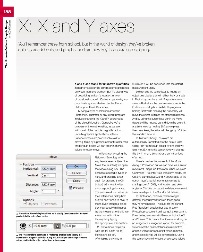
188
TheUltim
ateGuideto
Graphic
Des
ign
Ato
Zof
Design
188
X and Y can stand for unknown quantitiesin mathematics or the chromosome differencebetween men and women. But it’s also a wayof describing an item’s location in two-dimensional space in Cartesian geometry – acoordinate system devised by the Frenchphilosopher René Descartes.
Moving a layer or selection around inPhotoshop, Illustrator or any layout programinvolves changing the X and Y coordinatesof the object’s location. Generally, we’reunaware of the mathematics, as we arewith most of the complex algorithms thatunderlie graphics applications’ effects.But coordinates are an invaluable aid formoving items by a precise amount; rather thandragging an object we can enter numericalvalues for every move.
In Illustrator, pressing theReturn or Enter key whenany item is selected (and theMove tool is active) will openthe Move dialog box. Thedistance required is typed inhere, and pressing Enteragain (or pressing the OKbutton) will move the itema corresponding distance.The units used are defined inthe Preferences dialog boxbut we don’t need to stick tothem. Even though a dialogbox may specify millimetresas the measurement unit, wecan change it on thefly simply by typingthe appropriate abbreviation– 20 px to move 20 pixels,with ‘pt’ for point, ‘in’ forinches and so on.After typing the value in
X: X and Y axes
Illustrator, it will be converted into the defaultmeasurement units.
We can use the cursor keys to nudge anobject one pixel at a time in either the X or Y axisin Photoshop, and one unit of a predeterminedvalue in Illustrator – the precise value is set in thePreferences dialog box. With both programs,holding Shift while pressing the cursor key willmove the object 10 times the standard distance.And by using the cursor keys within the Movedialog it will be nudged up and down by one unitat a time. Also by holding Shift as we pressthe cursor keys, the value will change by 10 timesthe standard amount.
In Illustrator though, as values areautomatically translated into the default units,typing ‘1in’ to move an object by one inch willturn into 25.4mm; the cursor keys will changethis by 1mm at a time rather than in fractionsof an inch.
There’s no direct equivalent of the Movedialog in Photoshop but we can produce a similarmovement using Free Transform. When we pressCommand-T to enter Free Transform mode, theOptions bar displays X and Y coordinates of thecurrent layer’s top left corner (as well as itsstarting size of 100%, and rotation and skewangles of 0%). We can type the distance we wantto move a layer in the X and Y fields here.
In Photoshop, however, when we typedifferent measurement units in these fields,they’re remembered – not just for the currentFree Transform session but also in everyPhotoshop document until we quit the program.Even better, we can set different units for the Xand Y axes. This means that if we’re working onan image to fit a magazine layout, for example,we can set the horizontal units to millimetresand the vertical units to point measurements,and these settings will be remembered. Usingthe cursor keys to increase or decrease values
Illustrator’s Move dialog box allows us to specify the movement of an objectprecisely in the units of our choice.
fy of
The Free Transform command in Photoshop enables us to specify themovement of a layer or selection in any unit. Clicking on the triangle icon setsvalues relative to the object rather than to the canvas.
You’ll remember these from school, but in the world of design they’ve brokenout of spreadsheets and graphs, and are now key to accurate positioning.
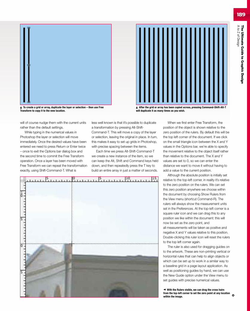
TheUltim
ateGuideto
Grap
hic
Desig
nAto
ZofD
esign189189
will of course nudge them with the current unitsrather than the default settings.
While typing in the numerical values inPhotoshop the layer or selection will moveimmediately. Once the desired values have beenentered we need to press Return or Enter twice– once to exit the Options bar dialog box andthe second time to commit the Free Transformoperation. Once a layer has been moved withFree Transform we can repeat the transformationexactly, using Shift-Command-T. What is
less well known is that it’s possible to duplicatea transformation by pressing Alt-Shift-Command-T. This will move a copy of the layeror selection, leaving the original in place. In turn,this makes it easy to set up grids in Photoshop,with precise spacing between the items.
Each time we press Alt-Shift-Command-Twe create a new instance of the item, so wecan keep the Alt, Shift and Command keys helddown, and then repeatedly press the T key tobuild an entire array in just a matter of seconds.
When we first enter Free Transform, theposition of the object is shown relative to thezero position of the rulers. By default this will bethe top left corner of the document. If we clickon the small triangle icon between the X and Yvalues in the Options bar, we’re able to specifythe movement relative to the object itself ratherthan relative to the document. The X and Yvalues are set to 0, so we can enter thedistance we want to move it without having toadd a value to the current position.
Although the absolute position is initially setrelative to the top-left corner, in reality it’s relativeto the zero position on the rulers. We can setthis zero position anywhere we choose withinthe document by choosing Show Rulers fromthe View menu (shortcut Command-R). Therulers will always show the measurement unitsset in the Preferences. At the top-left corner is asquare ruler icon and we can drag this to anyposition we like within the document: this willnow be set as the zero point, andall measurements will be taken as positive andnegative X and Y values relative to this position.Double-clicking this ruler icon will reset the rulersto the top left corner again.
The ruler is also used for dragging guides onto the artwork. These are non-printing vertical orhorizontal rules that can help to align objects orwhich can be set up to work in a similar way toa baseline grid in a page layout application. Aswell as positioning guides by hand, we can usethe New Guide option under the View menu toset guides with precise numerical values.
To create a grid or array, duplicate the layer or selection – then use FreeTransform to copy it to the new location.
With the Rulers visible, we can drag the cross hairsfrom the top-left corner to set the zero point at any locationwithin the image.
After the grid or array has been copied across, pressing Command-Shift-Alt-Twill duplicate it as many times as you wish.
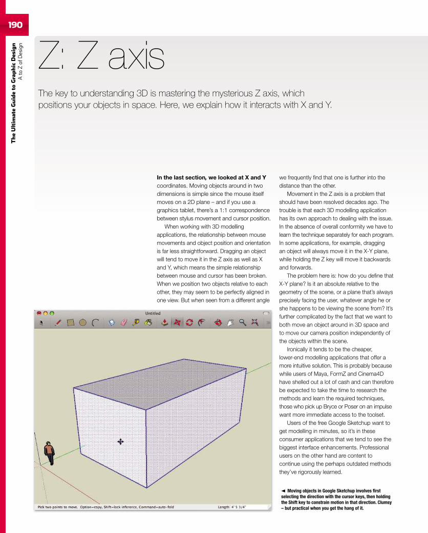
190
TheUltim
ateGuideto
Graphic
Des
ign
Ato
Zof
Design
190
In the last section, we looked at X and Ycoordinates. Moving objects around in twodimensions is simple since the mouse itselfmoves on a 2D plane – and if you use agraphics tablet, there’s a 1:1 correspondencebetween stylus movement and cursor position.
When working with 3D modellingapplications, the relationship between mousemovements and object position and orientationis far less straightforward. Dragging an objectwill tend to move it in the Z axis as well as Xand Y, which means the simple relationshipbetween mouse and cursor has been broken.When we position two objects relative to eachother, they may seem to be perfectly aligned inone view. But when seen from a different angle
Z: Z axis
we frequently find that one is further into thedistance than the other.
Movement in the Z axis is a problem thatshould have been resolved decades ago. Thetrouble is that each 3D modelling applicationhas its own approach to dealing with the issue.In the absence of overall conformity we have tolearn the technique separately for each program.In some applications, for example, draggingan object will always move it in the X-Y plane,while holding the Z key will move it backwardsand forwards.
The problem here is: how do you define thatX-Y plane? Is it an absolute relative to thegeometry of the scene, or a plane that’s alwaysprecisely facing the user, whatever angle he orshe happens to be viewing the scene from? It’sfurther complicated by the fact that we want toboth move an object around in 3D space andto move our camera position independently ofthe objects within the scene.
Ironically it tends to be the cheaper,lower-end modelling applications that offer amore intuitive solution. This is probably becausewhile users of Maya, FormZ and Cinema4Dhave shelled out a lot of cash and can thereforebe expected to take the time to research themethods and learn the required techniques,those who pick up Bryce or Poser on an impulsewant more immediate access to the toolset.
Users of the free Google Sketchup want toget modelling in minutes, so it’s in theseconsumer applications that we tend to see thebiggest interface enhancements. Professionalusers on the other hand are content tocontinue using the perhaps outdated methodsthey’ve rigorously learned.
Moving objects in Google Sketchup involves firstselecting the direction with the cursor keys, then holdingthe Shift key to constrain motion in that direction. Clumsy– but practical when you get the hang of it.
The key to understanding 3D is mastering the mysterious Z axis, whichpositions your objects in space. Here, we explain how it interacts with X and Y.
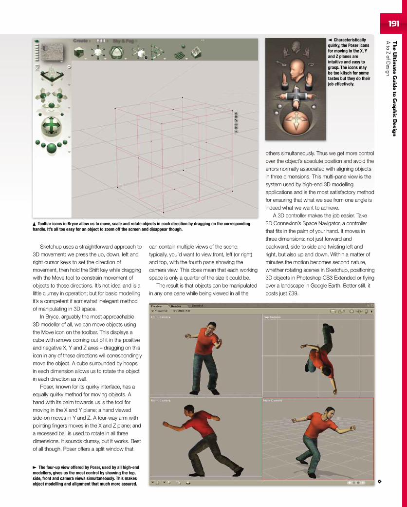
TheUltim
ateGuideto
Grap
hic
Desig
nAto
ZofD
esign191191
Sketchup uses a straightforward approach to3D movement: we press the up, down, left andright cursor keys to set the direction ofmovement, then hold the Shift key while draggingwith the Move tool to constrain movement ofobjects to those directions. It’s not ideal and is alittle clumsy in operation; but for basic modellingit’s a competent if somewhat inelegant methodof manipulating in 3D space.
In Bryce, arguably the most approachable3D modeller of all, we can move objects usingthe Move icon on the toolbar. This displays acube with arrows coming out of it in the positiveand negative X, Y and Z axes – dragging on thisicon in any of these directions will correspondinglymove the object. A cube surrounded by hoopsin each dimension allows us to rotate the objectin each direction as well.
Poser, known for its quirky interface, has aequally quirky method for moving objects. Ahand with its palm towards us is the tool formoving in the X and Y plane; a hand viewedside-on moves in Y and Z. A four-way arm withpointing fingers moves in the X and Z plane; anda recessed ball is used to rotate in all threedimensions. It sounds clumsy, but it works. Bestof all though, Poser offers a split window that
can contain multiple views of the scene:typically, you’d want to view front, left (or right)and top, with the fourth pane showing thecamera view. This does mean that each workingspace is only a quarter of the size it could be.
The result is that objects can be manipulatedin any one pane while being viewed in all the
others simultaneously. Thus we get more controlover the object’s absolute position and avoid theerrors normally associated with aligning objectsin three dimensions. This multi-pane view is thesystem used by high-end 3D modellingapplications and is the most satisfactory methodfor ensuring that what we see from one angle isindeed what we want to achieve.
A 3D controller makes the job easier. Take3D Connexion’s Space Navigator, a controllerthat fits in the palm of your hand. It moves inthree dimensions: not just forward andbackward, side to side and twisting left andright, but also up and down. Within a matter ofminutes the motion becomes second nature,whether rotating scenes in Sketchup, positioning3D objects in Photoshop CS3 Extended or flyingover a landscape in Google Earth. Better still, itcosts just £39.
The four-up view offered by Poser, used by all high-endmodellers, gives us the most control by showing the top,side, front and camera views simultaneously. This makesobject modelling and alignment that much more assured.
Characteristicallyquirky, the Poser iconsfor moving in the X, Yand Z planes areintuitive and easy tograsp. The icons maybe too kitsch for sometastes but they do theirjob effectively.
Toolbar icons in Bryce allow us to move, scale and rotate objects in each direction by dragging on the correspondinghandle. It’s all too easy for an object to zoom off the screen and disappear though.
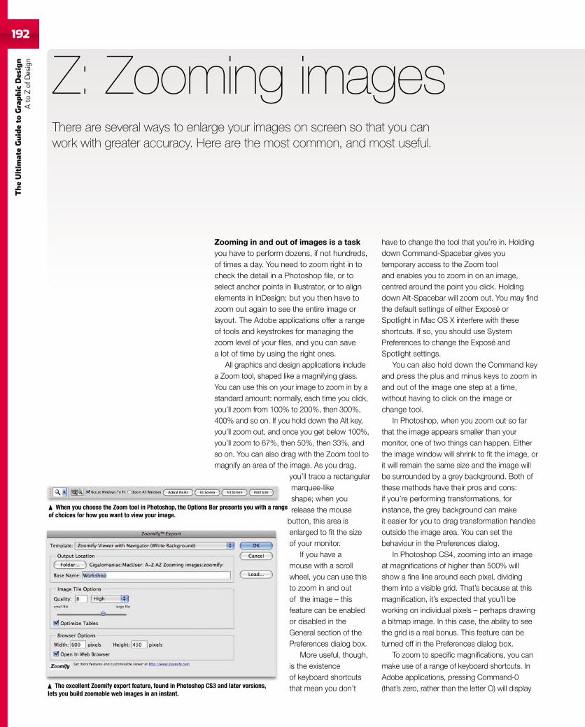
192
TheUltim
ateGuideto
Graphic
Des
ign
Ato
Zof
Design
Zooming in and out of images is a taskyou have to perform dozens, if not hundreds,of times a day. You need to zoom right in tocheck the detail in a Photoshop file, or toselect anchor points in Illustrator, or to alignelements in InDesign; but you then have tozoom out again to see the entire image orlayout. The Adobe applications offer a rangeof tools and keystrokes for managing thezoom level of your files, and you can savea lot of time by using the right ones.
All graphics and design applications includea Zoom tool, shaped like a magnifying glass.You can use this on your image to zoom in by astandard amount: normally, each time you click,you’ll zoom from 100% to 200%, then 300%,400% and so on. If you hold down the Alt key,you’ll zoom out, and once you get below 100%,you’ll zoom to 67%, then 50%, then 33%, andso on. You can also drag with the Zoom tool tomagnify an area of the image. As you drag,
you’ll trace a rectangularmarquee-likeshape; when yourelease the mouse
button, this area isenlarged to fit the sizeof your monitor.
If you have amouse with a scrollwheel, you can use thisto zoom in and outof the image – thisfeature can be enabledor disabled in theGeneral section of thePreferences dialog box.
More useful, though,is the existenceof keyboard shortcutsthat mean you don’t
Z: Zooming images
have to change the tool that you’re in. Holdingdown Command-Spacebar gives youtemporary access to the Zoom tooland enables you to zoom in on an image,centred around the point you click. Holdingdown Alt-Spacebar will zoom out. You may findthe default settings of either Exposé orSpotlight in Mac OS X interfere with theseshortcuts. If so, you should use SystemPreferences to change the Exposé andSpotlight settings.
You can also hold down the Command keyand press the plus and minus keys to zoom inand out of the image one step at a time,without having to click on the image orchange tool.
In Photoshop, when you zoom out so farthat the image appears smaller than yourmonitor, one of two things can happen. Eitherthe image window will shrink to fit the image, orit will remain the same size and the image willbe surrounded by a grey background. Both ofthese methods have their pros and cons:if you’re performing transformations, forinstance, the grey background can makeit easier for you to drag transformation handlesoutside the image area. You can set thebehaviour in the Preferences dialog.
In Photoshop CS4, zooming into an imageat magnifications of higher than 500% willshow a fine line around each pixel, dividingthem into a visible grid. That’s because at thismagnification, it’s expected that you’ll beworking on individual pixels – perhaps drawinga bitmap image. In this case, the ability to seethe grid is a real bonus. This feature can beturned off in the Preferences dialog box.
To zoom to specific magnifications, you canmake use of a range of keyboard shortcuts. InAdobe applications, pressing Command-0(that’s zero, rather than the letter O) will display
When you choose the Zoom tool in Photoshop, the Options Bar presents you with a rangeof choices for how you want to view your image.
The excellent Zoomify export feature, found in Photoshop CS3 and later versions,lets you build zoomable web images in an instant.
There are several ways to enlarge your images on screen so that you canwork with greater accuracy. Here are the most common, and most useful.
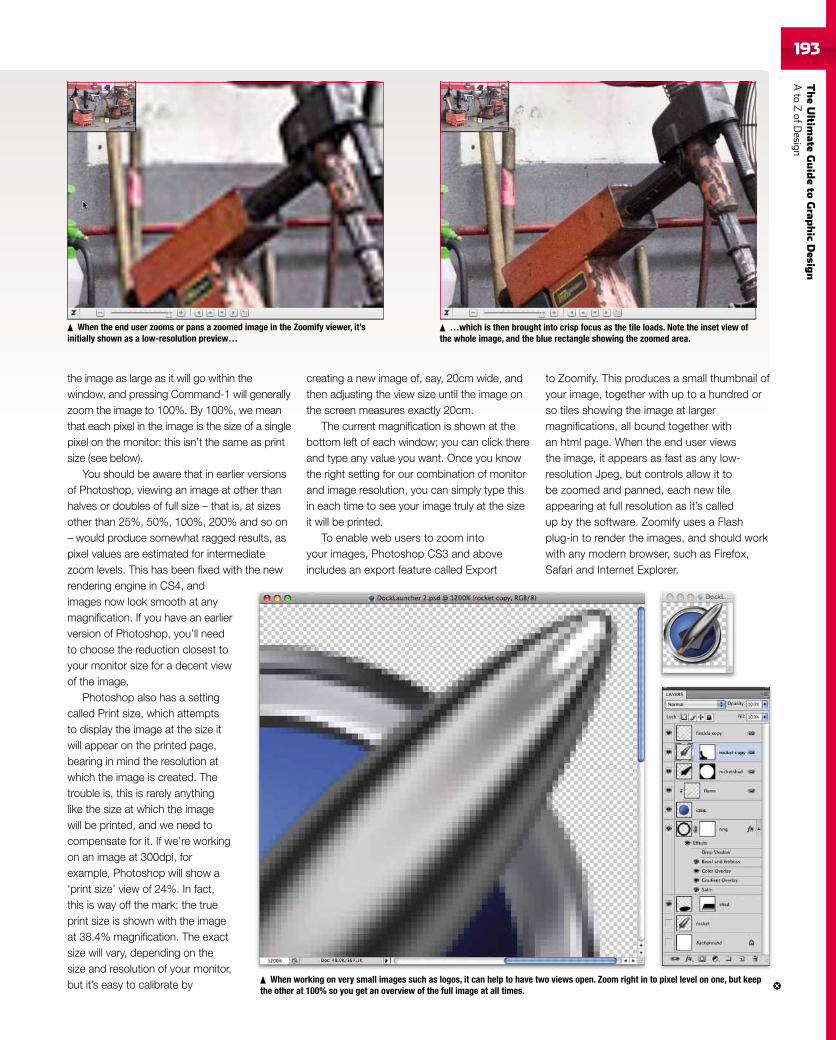
TheUltim
ateGuideto
Grap
hic
Desig
nAto
ZofD
esign193
the image as large as it will go within thewindow, and pressing Command-1 will generallyzoom the image to 100%. By 100%, we meanthat each pixel in the image is the size of a singlepixel on the monitor: this isn’t the same as printsize (see below).
You should be aware that in earlier versionsof Photoshop, viewing an image at other thanhalves or doubles of full size – that is, at sizesother than 25%, 50%, 100%, 200% and so on– would produce somewhat ragged results, aspixel values are estimated for intermediatezoom levels. This has been fixed with the newrendering engine in CS4, andimages now look smooth at anymagnification. If you have an earlierversion of Photoshop, you’ll needto choose the reduction closest toyour monitor size for a decent viewof the image.
Photoshop also has a settingcalled Print size, which attemptsto display the image at the size itwill appear on the printed page,bearing in mind the resolution atwhich the image is created. Thetrouble is, this is rarely anythinglike the size at which the imagewill be printed, and we need tocompensate for it. If we’re workingon an image at 300dpi, forexample, Photoshop will show a‘print size’ view of 24%. In fact,this is way off the mark: the trueprint size is shown with the imageat 38.4% magnification. The exactsize will vary, depending on thesize and resolution of your monitor,but it’s easy to calibrate by
creating a new image of, say, 20cm wide, andthen adjusting the view size until the image onthe screen measures exactly 20cm.
The current magnification is shown at thebottom left of each window; you can click thereand type any value you want. Once you knowthe right setting for our combination of monitorand image resolution, you can simply type thisin each time to see your image truly at the sizeit will be printed.
To enable web users to zoom intoyour images, Photoshop CS3 and aboveincludes an export feature called Export
to Zoomify. This produces a small thumbnail ofyour image, together with up to a hundred orso tiles showing the image at largermagnifications, all bound together withan html page. When the end user viewsthe image, it appears as fast as any low-resolution Jpeg, but controls allow it tobe zoomed and panned, each new tileappearing at full resolution as it’s calledup by the software. Zoomify uses a Flashplug-in to render the images, and should workwith any modern browser, such as Firefox,Safari and Internet Explorer.
When the end user zooms or pans a zoomed image in the Zoomify viewer, it’sinitially shown as a low-resolution preview…
…which is then brought into crisp focus as the tile loads. Note the inset view ofthe whole image, and the blue rectangle showing the zoomed area.
When working on very small images such as logos, it can help to have two views open. Zoom right in to pixel level on one, but keepthe other at 100% so you get an overview of the full image at all times.


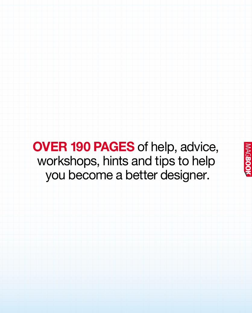
OVER 190 PAGES of help, advice,workshops, hints and tips to help
you become a better designer.


