Embed Size (px)
Citation preview
Farkas Layering as a ‘Safety Net’ for Minimalist Documentation
1
Layering as a “Safety Net” for Minimalist Documentation
David K. Farkas
from:
“Layering as a ‘Safety Net’ for Minimalist Documentation,” in Minimalism Beyond the Nurnberg Funnel, ed. J.M. Carroll, MIT Press, 1998, pp. 247-74.
Note: The published article may be slightly different from this draft version
In this chapter I argue the value of adding supplementary material to minimalist documentation so
as to provide a "safety net" for users. We can, in other words, use the rhetorical technique of
"layering" to give users access to extra information that they may need if minimalist
documentation does not provide all the information they require.
In making this argument I look broadly at computer documentation. I classify the various
forms of computer documentation and consider the degree to which the various categories are
minimalist (or can be minimalist) in character and how amenable each category is to the layering
strategy. While there are various ways to classify computer documentation, I have found it most
useful to delineate these four fundamental categories:
1. Procedures (found in Help systems, user’s guides, and minimalist tutorials)
2. Standard print and online tutorials
3. Performance support Help (wizards and coaches)
Farkas Layering as a ‘Safety Net’ for Minimalist Documentation
2
4. Balloon Help and other forms of interface-based documentation
All but the performance support category exist in both the print and online media, but
throughout this chapter I emphasize online documentation. This is because the online medium has
become dominant and because the dynamic nature of online text and graphics is more suitable
than is print to layering.
Of the four categories, I focus heavily on procedures. This is because procedures are by far
the most prevalent category of documentation and the category that minimalist designers have
most often worked with. Standard tutorial documentation and performance support, I believe,
have less affinity with minimalism than the other two categories, and so I treat them in less depth.
Balloon Help is covered in detail. This is because, as I maintain, balloon Help is an inherently
minimalist form of documentation, because balloon Help is a very useful and flexible form of
Help, and because balloon Help can be effectively layered.
The first three categories, while distinct from each another, share one trait. They are "task
based." They list, in an online table of contents, index, and other places, tasks that users will want
to perform, and then guide the user through completing these tasks. Balloon Help is interface-
based. Users who explore the interface looking for a an interface element relevant to their goals
get explanations of the functions of the various interface elements. The chapter closes with a look
at Microsoft's "ghosted" Help topics, an intriguing design that combines balloon Help with task-
based procedural Help and, at times, includes elements of performance support Help.
The Risk in Minimalist Documentation
Farkas Layering as a ‘Safety Net’ for Minimalist Documentation
3
Minimalism is a complex and evolving strategy, but to summarize briefly, we can say that
minimalism is an action-oriented strategy that attempts to accommodate the desire of many users
to focus on the interface rather than on the documentation, to experiment and to exercise their
problem-solving skills. To achieve this goal, minimalist documentation is brief and excludes or
abridges some of the components found in procedures and standard tutorials. Minimalist
documentation, however, does include information to assist users in recognizing and recovering
from the errors that users are apt to commit when they experiment with the interface.
Minimalism addresses a problem well known in the documentation community and computer
industry in general: the reluctance of many users to read documentation.1-4 When users are unable
to accomplish a task or are confused by what they see on the screen, they often try to solve the
problem on their own. If they do consult a user's guide or Help system, they are apt to scan for
just the item of information they hope will solve their problem, and if they cannot get the desired
information quickly, they will likely abandon the documentation. Often users will simply give up
on what they were trying to accomplish and look for a workaround. Users’ resistance to
documentation and related aspects of user behavior were first analyzed by Carroll and Rosson5
and provided much of the impetus for the minimalist strategy.
While minimalism encourages users to actually read documentation, it is not without risks.
Several commentators on minimalism have expressed concern with reducing the information that
users receive. 3, 6-7 Carroll himself acknowledges a potential problem: “learners might not have
access to enough information to reason successfully and might be anxious about bearing such
responsibilities.” 8
The risks, as I see them, are these:
Farkas Layering as a ‘Safety Net’ for Minimalist Documentation
4
1. The user may be unable to successfully complete the task.
2. The user may complete the task but expend more time and energy than he or she wished to.
3. In the process of completing the task (or attempting to) the user may develop an incorrect
mental model of the system that will cause difficulties later on.
The degree of risk depends, of course, on how radically information is cut and just what is cut
and how. Carroll's more recent formulations of minimalism 9-10 are more cautious in this regard
than earlier formulations of minimalism. 11, 1 Still, this risk, though different in each minimalist
design, is always present.
Reiterative usability testing has always been a core requirement of minimalism 1-10, and so
one minimalist response to those concerned about sparse information is that first-rate design skills
and reiterative usability testing should enable documentors to provide just the information that
users need and no more. Maybe so, but as Carroll and van der Meij 10 themselves recognize,
providing just the right amount of information is a challenging endeavor. Furthermore, because
documentation departments are often understaffed and because software development schedules
are often very demanding, documentors often lack the opportunity to test and re-test their
documentation.
Another minimalist response is that learning from errors can be a productive experience. In
particular, reasoning about errors increases understanding and promotes retention. This is
certainly true to a point, and minimalist designers should certainly attempt to help users learn
from their errors. But the efficacy of errors is highly situational. Users won’t learn if they get
seriously confused, and they may not appreciate this kind of learning if they are under work
pressure or if they have no interest in remembering how the task is performed. 12
Farkas Layering as a ‘Safety Net’ for Minimalist Documentation
5
Another complication for minimalism is that often documentors (in my experience, at least)
believe that they don't have a fully adequate profile of their users. This situation comes about
when documentors are cut off from marketers and others who are closer to the customers, or
when the company as a whole has a fuzzy view of its customers.
Finally, we have the issue of diverse audiences. If the users of a software product are
composed of diverse groups, the safest approach is usually to create separate documentation for
the major groups. But the diversity of the audiences often exceeds the willingness of software
companies to create separate documentation components. In fact, we commonly see a single
document set serving the needs of a very diverse audience. The need to write documentation for
diverse audiences, which is inadequately addressed by minimalists, severely complicates the task
of providing “just” the information that is necessary. For all these reasons, minimalist designers
walk the tightrope or, more precisely, skirt the precipice of insufficient information.
Layering in Print and Electronic Documents
Layering is a familiar concept in technical communication. It means providing clearly marked
and useful reading choices, alternative channels through the information that accommodate
different needs. Layering can be provided for novices who need more basic information and for
experts who need more advanced information. It can also be provided for segments of an
audience with special concerns. For example, a report might include an appendix of legal details
intended primarily for the organization's attorneys. The concept of layering presents at least some
theoretical difficulty. This is because in many print and electronic documents headings and
subheadings only approximate a layering strategy. A clarifying perspective is to say that true
layering exists when the channels through the document are part of an explicit strategy for
Farkas Layering as a ‘Safety Net’ for Minimalist Documentation
6
accommodating selective reading. For a careful analysis of layering (though it uses the term
“compartmentalization”), see Holland, Charrow, and Wright. 13
As Horton has noted 14 , layering is more effective online than in print. This is because in the
online medium layering can be accomplished through various kinds of hypertext links (or
"jumps") that keep the supplemental information out of the way until it is needed. We will now
examine each of the categories of documentation set forth above with an eye to their minimalist
character and potential for layering.
Procedures
Procedural discourse is all around us. Recipes, travel directions, administrative procedures, and
instructions for assembling and operating all kinds of equipment are just some of the forms of
procedural discourse. Within the world of computer documentation, procedures make up the
central part of most Help systems and user's guides. Procedures, however, are often closely
associated with conceptual overviews, definitions, and other kinds of information. The basic
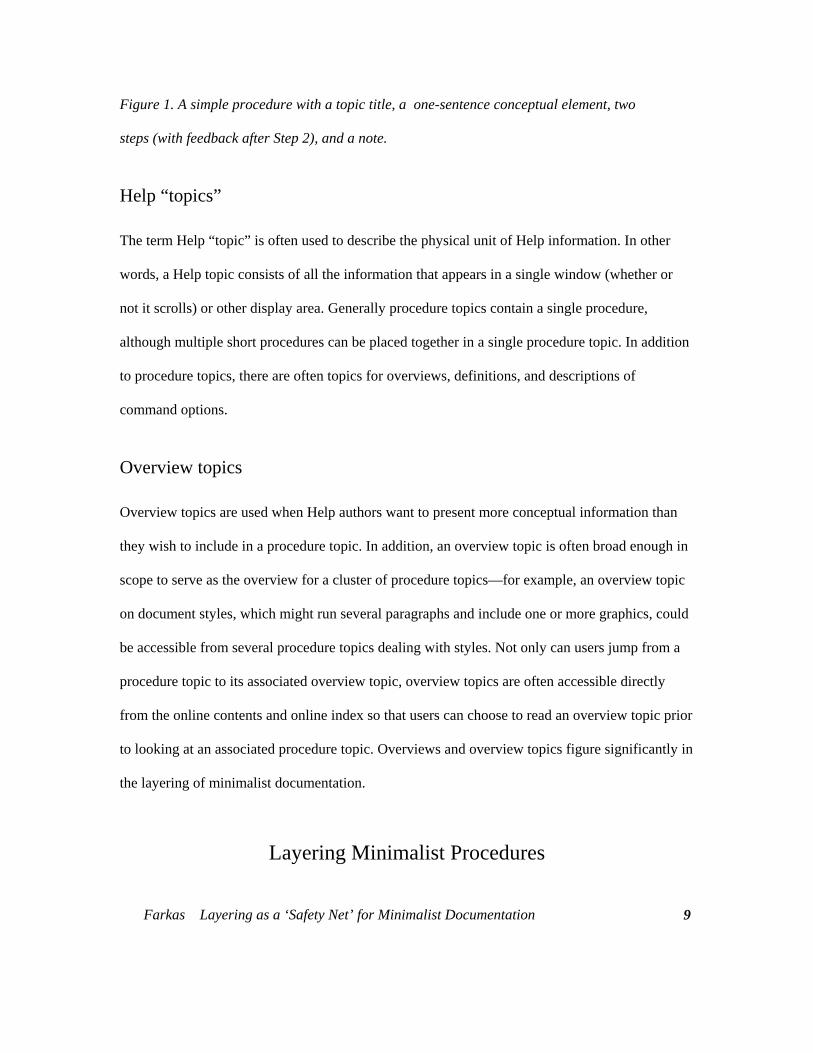
components of computer procedures are briefly described below and can be seen in Figure 1. For
a more complete discussion of the components of procedures, see Boggan et al. 15
The starting point of procedures are the tasks that users want to accomplish, or, in other
words, the user's goal or purpose. Almost always the purpose of the procedure is expressed in the
procedure’s title. Documentors often elaborate on the procedure title in a brief paragraph or two,
sometimes called the "conceptual element." The conceptual element clarifies the purpose of the
procedure, states any conditions that must be met before the procedure can be carried out, and
makes clear any major implications ("side effects") of carrying out the procedure.
Farkas Layering as a ‘Safety Net’ for Minimalist Documentation
7
The information in the title and conceptual element enables users to decide whether they want
to carry out the procedure. If they decide to, they need to know the specific actions they must
take. These actions are described in a set of steps (or, on occasion, a single step). Steps often
consist of nothing more than straightforward actions:
Under Pagination, click Keep with Next.
Other steps are more complex. For example, they may describe optional actions that users may or
may not want to take:
To download your files in compressed form, click Compression.
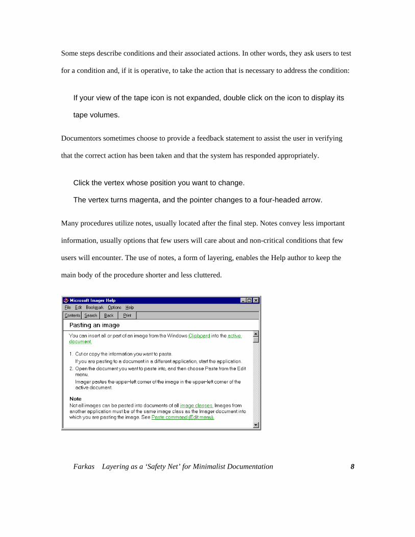
Some steps describe conditions and their associated actions. In other words, they ask users to test
for a condition and, if it is operative, to take the action that is necessary to address the condition:
If your view of the tape icon is not expanded, double click on the icon to display its
tape volumes.
Documentors sometimes choose to provide a feedback statement to assist the user in verifying
that the correct action has been taken and that the system has responded appropriately.
Click the vertex whose position you want to change.
The vertex turns magenta, and the pointer changes to a four-headed arrow.
Many procedures utilize notes, usually located after the final step. Notes convey less important
information, usually options that few users will care about and non-critical conditions that few
users will encounter. The use of notes, a form of layering, enables the Help author to keep the
main body of the procedure shorter and less cluttered.
Farkas Layering as a ‘Safety Net’ for Minimalist Documentation
8
Farkas Layering as a ‘Safety Net’ for Minimalist Documentation
9
Figure 1. A simple procedure with a topic title, a one-sentence conceptual element, two
steps (with feedback after Step 2), and a note.
Help “topics”
The term Help “topic” is often used to describe the physical unit of Help information. In other
words, a Help topic consists of all the information that appears in a single window (whether or
not it scrolls) or other display area. Generally procedure topics contain a single procedure,
although multiple short procedures can be placed together in a single procedure topic. In addition
to procedure topics, there are often topics for overviews, definitions, and descriptions of
command options.
Overview topics
Overview topics are used when Help authors want to present more conceptual information than
they wish to include in a procedure topic. In addition, an overview topic is often broad enough in
scope to serve as the overview for a cluster of procedure topics—for example, an overview topic
on document styles, which might run several paragraphs and include one or more graphics, could
be accessible from several procedure topics dealing with styles. Not only can users jump from a
procedure topic to its associated overview topic, overview topics are often accessible directly
from the online contents and online index so that users can choose to read an overview topic prior
to looking at an associated procedure topic. Overviews and overview topics figure significantly in
the layering of minimalist documentation.
Layering Minimalist Procedures
Farkas Layering as a ‘Safety Net’ for Minimalist Documentation
10
Procedure topics are highly amenable to layering, and there are many ways to use layering to
provide a safety net for minimalist procedures. Such procedure topics might have, at the initial
level of presentation, the following characteristics:
1. No conceptual information other than the topic title
2. Steps written at a high level of generality
3. Omission of "note material" (little-used options and non-critical, infrequently encountered
conditions)
Through these means, documentation becomes briefer and less intimidating than conventional
procedures. Also, users are encouraged to explore the user interface and exercise their problem-
solving skills. At the same time, complete information is available through layering for users who
want the extra support.
This plan does not challenge or subvert minimalism. Rather, it is a sensible addition. From a
certain perspective, back-up information can be regarded as information for error recognition and
correction—a part of minimalist theory—although users are at least as likely to display back-up
information to avoid making errors. Moreover, if it turns out that a minimalist Help system or
manual is perfectly “on target” with regard to the needs of its audience, the back-up information
will rarely be used. Assuming designers can carefully monitor how users work with the
documentation, the designers might ultimately discard little-used back-up topics. Alternatively, if
they discover instances in which many users must resort to the back-up topics, they can move this
information into the initial topics that users encounter. Layering, then, might serve as a means of
refining minimalist documentation in the early stages of its use, a substitute for extensive
Farkas Layering as a ‘Safety Net’ for Minimalist Documentation
11
usability testing. We can further explore layering in minimalist procedures, by examining some
layered Help systems.
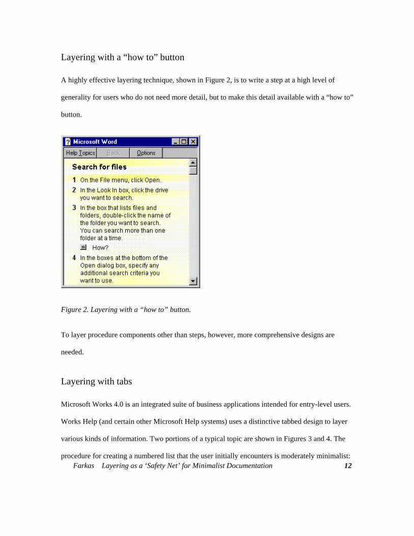
Layering with a “how to” button
A highly effective layering technique, shown in Figure 2, is to write a step at a high level of
generality for users who do not need more detail, but to make this detail available with a “how to”
button.
Figure 2. Layering with a “how to” button.
To layer procedure components other than steps, however, more comprehensive designs are
needed.
Layering with tabs
Farkas Layering as a ‘Safety Net’ for Minimalist Documentation
12
Microsoft Works 4.0 is an integrated suite of business applications intended for entry-level users.
Works Help (and certain other Microsoft Help systems) uses a distinctive tabbed design to layer
various kinds of information. Two portions of a typical topic are shown in Figures 3 and 4. The
procedure for creating a numbered list that the user initially encounters is moderately minimalist:
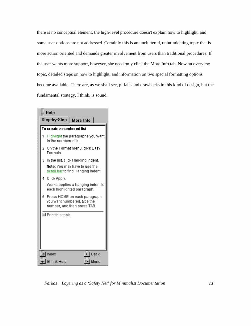
there is no conceptual element, the high-level procedure doesn't explain how to highlight, and
some user options are not addressed. Certainly this is an uncluttered, unintimidating topic that is
more action oriented and demands greater involvement from users than traditional procedures. If
the user wants more support, however, she need only click the More Info tab. Now an overview
topic, detailed steps on how to highlight, and information on two special formatting options
become available. There are, as we shall see, pitfalls and drawbacks in this kind of design, but the
fundamental strategy, I think, is sound.
Farkas Layering as a ‘Safety Net’ for Minimalist Documentation
13
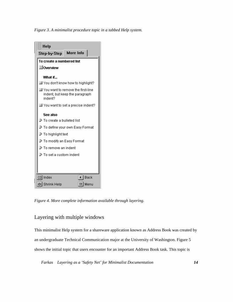
Figure 3. A minimalist procedure topic in a tabbed Help system.
Figure 4. More complete information available through layering.
Layering with multiple windows
This minimalist Help system for a shareware application known as Address Book was created by
an undergraduate Technical Communication major at the University of Washington. Figure 5
shows the initial topic that users encounter for an important Address Book task. This topic is
Farkas Layering as a ‘Safety Net’ for Minimalist Documentation
14
Farkas Layering as a ‘Safety Net’ for Minimalist Documentation
15
decidedly minimalist in character: there is no purpose information other than the topic title, and
there is only a single, very general step (although including the appropriate menu with the topic
title is akin to a step). When the user chooses the Find command, the Find dialog box will
display. In addition to typing text into the text box, the user must also make selections from a
cluster of checkboxes and must choose the OK or Cancel button. The designer is assuming that
many users will be able to interpret the labels on the checkboxes and so has avoided lengthy steps
(or possibly a table) explaining these choices. The design goal is that a proficient computer user
or else a novice with a yen for experimentation should succeed in many tasks using only the
initial, minimalist topic. Layering, however, makes extensive back-up information readily
available. Six graphical hotspots provide supplementary information for users who want (1)
conceptual information, (2) an example, (3) detailed steps, (4) explanations of little-used options
and infrequently encountered conditions, (5) tips for the more efficient use of the command, and
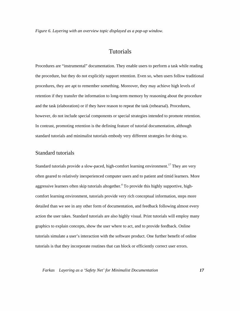
(6) jumps to related topics. Figure 6 shows this topic after the user has clicked the overview
hotspot to display a pop-up overview topic.
Layering, unfortunately, is not an ideal solution: layering tends to make documentation more
complex to create and more complex to use. In case of Address Book Help, the Help author must
write and code a cluster of Help topics for each task. Because not every procedure will need the
full set of back-up topics (for example, in some procedures there will be no need for a "What If"
topic), the Help author must also create grayed-out hotspots. This complexity creates barriers for
users. Users of Address Book Help must learn that the graphics are hotspots, must learn what
kind of information each graphic represents, and must learn not to click the grayed-out hotspots.
In the case of the Microsoft Works Help system, the tabbed design makes implementation more
complex, and some users have had difficulty understanding the operation of the tabs.16
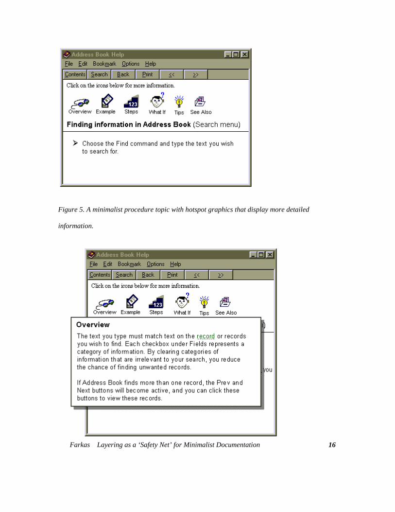
Figure 5. A minimalist procedure topic with hotspot graphics that display more detailed
information.
Farkas Layering as a ‘Safety Net’ for Minimalist Documentation
16
Farkas Layering as a ‘Safety Net’ for Minimalist Documentation
17
Figure 6. Layering with an overview topic displayed as a pop-up window.
Tutorials
Procedures are “instrumental” documentation. They enable users to perform a task while reading
the procedure, but they do not explicitly support retention. Even so, when users follow traditional
procedures, they are apt to remember something. Moreover, they may achieve high levels of
retention if they transfer the information to long-term memory by reasoning about the procedure
and the task (elaboration) or if they have reason to repeat the task (rehearsal). Procedures,
however, do not include special components or special strategies intended to promote retention.
In contrast, promoting retention is the defining feature of tutorial documentation, although
standard tutorials and minimalist tutorials embody very different strategies for doing so.
Standard tutorials
Standard tutorials provide a slow-paced, high-comfort learning environment.17 They are very
often geared to relatively inexperienced computer users and to patient and timid learners. More
aggressive learners often skip tutorials altogether.4 To provide this highly supportive, high-
comfort learning environment, tutorials provide very rich conceptual information, steps more
detailed than we see in any other form of documentation, and feedback following almost every
action the user takes. Standard tutorials are also highly visual. Print tutorials will employ many
graphics to explain concepts, show the user where to act, and to provide feedback. Online
tutorials simulate a user’s interaction with the software product. One further benefit of online
tutorials is that they incorporate routines that can block or efficiently correct user errors.
Farkas Layering as a ‘Safety Net’ for Minimalist Documentation
18
Standard tutorials seek to achieve retention through transfer. In other words, users do not
work on their own tasks. Rather, they work on pre-defined, “canned” tasks and then transfer what
they have learned to their own work. The benefit of canned tasks is that the tutorial designer
determines the tasks that the user will work on and the sequence in which the user will undertake
these tasks. On the other hand, there is the considerable risk that the canned task will not be very
similar to the user's actual goals, which frustrates both learning and transfer.
Standard tutorials promote retention through rehearsal and elaboration. For this reason, they
tend to have extra components beyond those used in standard procedures. They are apt to have
behavioral objectives, previews, reviews, and exercises. Sometimes the exercises are rote drill
and practice; other times they are more meaningful. In standard tutorials, layering—at least in the
usual sense—is not a central strategy. Tutorials, especially online tutorials, do feature alternative
pathways, remedial pathways for users who make errors, and “fast-track” pathways for users who
are moving quickly. Very often, however, the choice of pathways is managed by the tutorial
rather than the user.
Minimalist tutorials
Minimalists reject the standard tutorial model. First, minimalists want users to work on their own
tasks, and so try to avoid canned tasks. When the domain is sufficiently complex that they feel the
need to manage the instructional environment for users, they create “canned” tasks that are as
realistic as possible.8-9 Furthermore, minimalists reject the slow-paced highly elaborated form of
instruction characteristic of standard tutorials. Minimalist tutorials do not provide rich conceptual
information, extensive feedback, and highly detailed steps. Instead, they try to achieve retention
Farkas Layering as a ‘Safety Net’ for Minimalist Documentation
19
through deeper-level processing. In other words, durable learning results from sparse information
and other strategies intended to engage and challenge the user.
To a large degree, the minimalist strategy in tutorial documentation is much like the strategy
employed in other kinds of minimalist manuals and minimalist Help systems. For example,
minimalist documentation, whether or not it is labeled “tutorial” documentation, is apt to include
components for recognizing and correcting errors and components that invite users to practice
what they have learned. Furthermore, in encouraging users to pursue their own tasks and, hence,
jump around in the documentation, minimalist tutorials are akin to user’s guide and Help systems
and quite unlike standard tutorial.1, 10 Minimalists do not in fact distinguish crisply between
instrumental and instructional discourse. Because the minimalist model for tutorial documentation
is not greatly different from the minimalist model for procedures, the arguments and design
techniques for layering minimalist tutorials are much like those for layering minimalist
procedures. For this same reason, I regard minimalist tutorials as a kind of procedural
documentation.
Performance Support Help
Performance support Help is a relatively new form of user assistance. Performance support Help
attempts to provide the high level of support characteristic of standard tutorials while
transcending the great limitation of tutorials by enabling users to undertake their own work.
Performance support systems do this by maintaining an ongoing dialog with the user, in effect
“walking” the user through the tasks she wishes to accomplish. Because there is branching logic
built into this dialog, the tasks can be made easier for the user and the amount of text can be
reduced. For example, if the user chooses an optional action that makes a subsequent step
Farkas Layering as a ‘Safety Net’ for Minimalist Documentation
20
inapplicable, the system does not display the inapplicable step. Also, performance support Help
systems are very often tightly integrated with the system. So, for example, rather than presenting
the user with steps that ask the user to test for a certain condition and, if necessary, perform a
required action, the performance support system tests for the condition itself and, if necessary,
performs the actions for the user.
Performance support consists of two categories: wizards and coaches. Neither is strongly
minimalist in character, and so my treatment of performance support is brief. I explain the two
forms of performance support Help, indicate what I think is their relationship to minimalism, and
discuss their use of layering. For a more complete treatment of performance support Help see
Gery 18, Boggan 15, and Microsoft. 19
Wizards
Wizards are increasingly prevalent in contemporary software. Whether or not wizards are truly
Help, they are definitely an aspect of the user interface that, like Help, is highly advisory in
nature. A wizard provides a simple, single-purpose interface that enables the user to very quickly
produce a useful end result. For example, in RayDream’s Add Depth, a product for creating 3-D
display text and copying that text into documents, a wizard enables the user to create the 3-D text
using a limited set of Add Depth’s features with virtually no investment in time. Another example
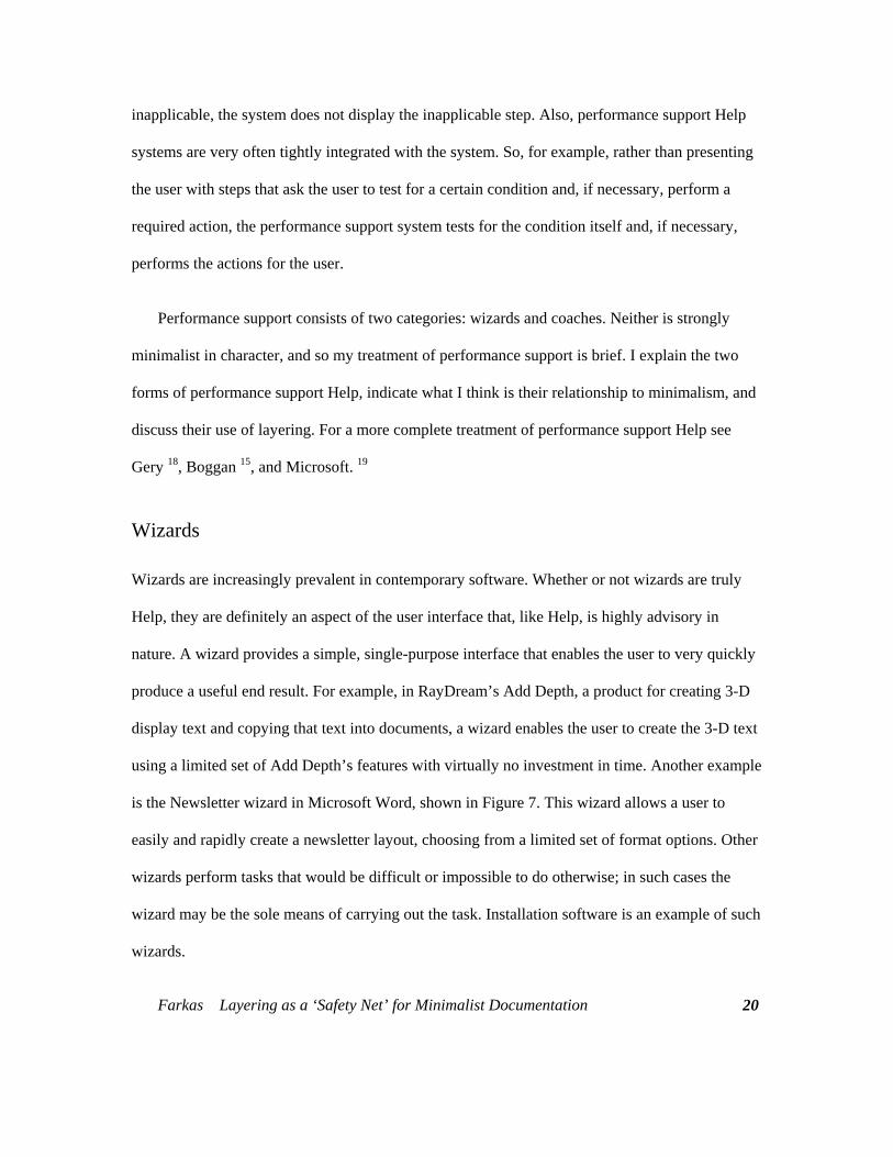
is the Newsletter wizard in Microsoft Word, shown in Figure 7. This wizard allows a user to
easily and rapidly create a newsletter layout, choosing from a limited set of format options. Other
wizards perform tasks that would be difficult or impossible to do otherwise; in such cases the
wizard may be the sole means of carrying out the task. Installation software is an example of such
wizards.
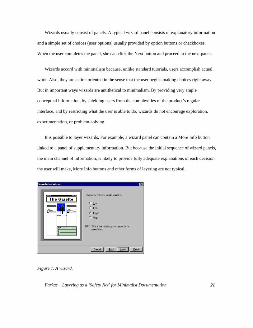
Wizards usually consist of panels. A typical wizard panel consists of explanatory information
and a simple set of choices (user options) usually provided by option buttons or checkboxes.
When the user completes the panel, she can click the Next button and proceed to the next panel.
Wizards accord with minimalism because, unlike standard tutorials, users accomplish actual
work. Also, they are action oriented in the sense that the user begins making choices right away.
But in important ways wizards are antithetical to minimalism. By providing very ample
conceptual information, by shielding users from the complexities of the product’s regular
interface, and by restricting what the user is able to do, wizards do not encourage exploration,
experimentation, or problem-solving.
It is possible to layer wizards. For example, a wizard panel can contain a More Info button
linked to a panel of supplementary information. But because the initial sequence of wizard panels,
the main channel of information, is likely to provide fully adequate explanations of each decision
the user will make, More Info buttons and other forms of layering are not typical.
Figure 7. A wizard.
Farkas Layering as a ‘Safety Net’ for Minimalist Documentation
21
Coach Help
Coach Help systems consist of sequences of brief Help topics that "walk" the user through a task.
The defining feature of coach Help is that users work with the product’s regular interface. The
typical sequence is this: the user chooses a coach-supported task from some kind of list, reads the
first coach topic, performs an action (or a few closely related actions) with the product’s regular
interface, clicks the coach Help topic’s Next button or chooses from a set of options, reads the
next coach Help topic, and continues. Coach Help systems are often tightly integrated with the
application so that the coach can block user errors and indicate the correct action (as in the Cue
Card coach Help for Microsoft Publisher 2.0) or else can carry out a task if the user encounters
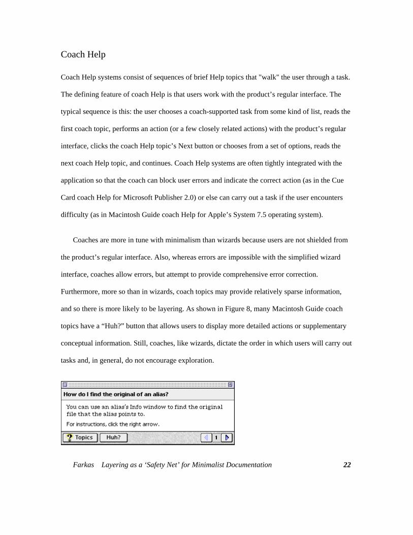
difficulty (as in Macintosh Guide coach Help for Apple’s System 7.5 operating system).
Coaches are more in tune with minimalism than wizards because users are not shielded from
the product’s regular interface. Also, whereas errors are impossible with the simplified wizard
interface, coaches allow errors, but attempt to provide comprehensive error correction.
Furthermore, more so than in wizards, coach topics may provide relatively sparse information,
and so there is more likely to be layering. As shown in Figure 8, many Macintosh Guide coach
topics have a “Huh?” button that allows users to display more detailed actions or supplementary
conceptual information. Still, coaches, like wizards, dictate the order in which users will carry out
tasks and, in general, do not encourage exploration.
Farkas Layering as a ‘Safety Net’ for Minimalist Documentation
22
Farkas Layering as a ‘Safety Net’ for Minimalist Documentation
23
Figure 8. Layering in Macintosh Guide coach Help.
Task-based vs. Interface-based Documentation
We have now considered three of the four categories of documentation in the classification I
employ in this chapter. We should note that all three are similar in that they are based on
procedures. Procedures themselves make up one category. Standard tutorial documentation
consists of procedures augmented by elements designed to create a high-comfort environment for
the user and to promote retention. Performance support also consists of procedures, though the
procedures are decomposed into a sequence of wizard panels or coach topics.
These three categories can be described as “task-based.” They have as their starting point
tasks that the user wants to perform. Usually the user is shown a list of tasks—such as the entries
in a table of contents. The user chooses the task that corresponds to his or her current goal. (In the
case of tutorials, the situation is somewhat different: often the user performs the task chosen by
the tutorial designer.) To sum up, we can say that in task-based documentation the user
encounters a task, asks the question “How do I do this?” and is shown steps and other information
that provide an answer to that question.20
The fourth category is interface-based documentation.—of which balloon Help is the most
important kind. Here the user does not begin with a goal set forth in some kind of list. Rather the
user examines the various parts of the interface asking “What is this and what is this for?”20
Interface-based documentation provides brief answers to these questions. It serves users who are
simply exploring, trying to better understand what the software product can do. More frequently,
the user has a goal in mind but has formulated this goal on her own rather than from a list of
tasks. We will now look closely at balloon Help, and we will glance at other forms of interface-
based documentation.
Balloon Help
Although there were precursors, balloon Help was introduced to most of the computer world in
1991 by Apple Computer as part of the System 7.0 release of the Macintosh operating system.
Balloon Help has now been widely adopted in the computer industry and modified in various
ways. This form of Help has been given various names, including "Bubble Help" (Lotus),
"What’s This? Help" and "Tool Tips" (Microsoft), and "Object Help" (Borland). Amid all these
names, however, “balloon Help” remains a serviceable and prevalent general term. Currently,
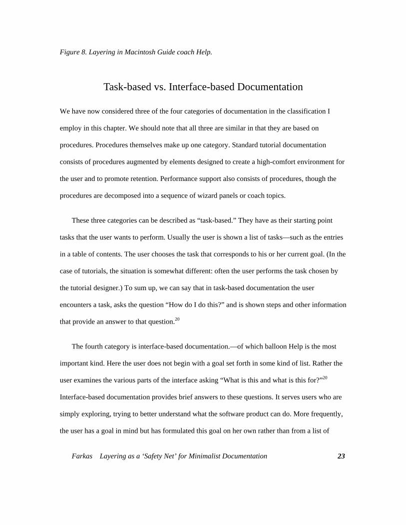
Microsoft's What's This? Help (Figure 9) is the most complete implementation of balloon Help,
and so it is the implementation I will describe here.
Figure 9. A What’s This? Help topic.
Farkas Layering as a ‘Safety Net’ for Minimalist Documentation
24
Farkas Layering as a ‘Safety Net’ for Minimalist Documentation
25
A What’s This? Help topic consists of a (usually) small, non-scrolling window that appears
next to an element of interest on the user interface. This window has no controls, although jumps
to other topics can be implemented. Simplifying somewhat, these topics are displayed when the
user clicks on the element of interest or, in certain circumstances, presses the F1 key.19 They are
dismissed by a click anywhere on the screen. Other forms of balloon Help display a balloon when
the user pauses the pointer over an interface element for which a balloon topic has been written.
This mechanism can result in a barrage of unwanted balloons, which was the case in Apple's
original implementation.
Balloon Help’s brief descriptions of interface elements can take various forms. Often the user
simply learns the purpose of the interface element:
Saves the document you are working with.
The documentor can also explain how to act on the interface element:
Click here to save the document you are working with.
At times, brief conceptual information is included:
Increases or decreases the amount of information that appears on your screen. Your
monitor and display adapter determine whether your can change the setting. This is
sometimes referred to as “resolution.”
Finally, some balloons (e.g., Tool Tips) provide the names of toolbar buttons (or similar
elements) that have icons rather than text to identify them. These balloons are typically displayed
when the user pauses the mouse over the button.
Farkas Layering as a ‘Safety Net’ for Minimalist Documentation
26
The power of the balloon Help model lies in the speed and convenience with which users can
get just the information they want.21 Often users need nothing more than an elaboration on the
necessarily brief labels that appear on many interface elements. For example, the labels on
checkboxes and option buttons typically do not exceed two or three words, and so if a user sees
the checkbox label “Keep with Next,” the user may well wonder what is being kept with what. A
one-sentence explanation of the checkbox’s function, rapidly displayed and easily dismissed,
resolves the problem.
Balloon Help and Minimalism
Balloon Help is inherently minimalist in nature and, indeed, is perhaps the most prevalent form of
minimalism. The minimalist principles that balloon Help most fully accords with are presented
below.
Action oriented. A central principal of minimalism is that documentation should be action
oriented and let the user work with the software interface immediately.9 Balloon Help certainly
follows this principle. It never stands between the user and the interface. Indeed, it is an extension
of the interface.
Users focus on the interface and explore the interface. In accordance with minimalism, balloon
Help keeps the user’s attention on the interface and encourages exploration.
Users exercise problem-solving abilities and learn from problem solving. In accordance with
minimalism, balloon Help encourages users to exercise their problem-solving abilities. Users
must find the part of the interface relevant to the task they wish to perform before they can
display a helpful balloon. Furthermore, balloon Help topics are typically brief and only explain
Farkas Layering as a ‘Safety Net’ for Minimalist Documentation
27
the function of the interface object rather than presenting a complete procedure or any overview
information. Users therefore must infer the necessary procedure from this sparse information. We
should remember, however, that requiring users to exercise their problem-solving abilities is not
always desirable. Some users may not succeed in figuring out the procedure from balloons or may
prefer following the steps of an explicit procedure.
Error correction. Minimalism traditionally provides means for users to detect and recover from
errors. This is highly desirable when users learn by exploring the interface. The convenience and
speed with which balloons can be displayed can be viewed as a kind of error correction.22 For
example, if a user chooses a checkbox in a dialog box and gets the wrong result, she can easily
display that checkbox’s balloon and will likely learn why that checkbox was the wrong choice.
Then, by displaying the balloons of the other controls on the dialog box she will very possibly get
on the right track.
Layering balloon Help to provide a “safety net” for users
Although balloon Help is an effective form of minimalist documentation, it is easy, I think, to
envision instances in which users will want more detailed information than balloon Help topics
usually provide. For example, users might want some kind of conceptual overview; or, if the
particular control is typically used as part of a complex task involving other parts of the interface,
the user might want a complete procedure.23 Thus, just as balloons themselves can be seen as a
kind of layering, a more communicative extension of the user interface, there is much to say for
layering balloon Help topics with supplementary information. This can be accomplished in
various ways. For example, in some help systems there are hypertext jumps from balloon Help
topics to topics providing supplementary information. What we want, I think, in balloon Help and
Farkas Layering as a ‘Safety Net’ for Minimalist Documentation
28
in documentation generally is a “least first” strategy. In other words, users should be able to
easily display the smallest amount of information that will, in most cases, suffice for the
successful completion of the task; and, they should be able to quickly display more complete
information if the need arises.
Other forms of interface-based Help
In addition to balloon Help, the category of interface-based Help includes status-line Help
messages and command topics. Status-line Help messages consist usually of brief descriptions of
the function of an interface element displayed—often in rapid succession and without any
intention on the user’s part—at the bottom of a window as the user moves the pointer over
various elements of the interface.19 Because they do not appear near the element of interest,
status-line Help messages are not obtrusive. On the other hand, if the user is not attuned to their
presence, the user is apt to miss them altogether.
Command topics (Figure 10) are the online successor to printed command references. They
are full-size Help topics that explain the function of each of the interface elements on a dialog
box. Users generally access command topics from an open dialog box by pressing the F1 key or
clicking a special Help button on the dialog box. Command topic are now facing stiff competition
from balloon Help. Balloon Help topics are superior to command topics because users can display
a balloon explaining just the interface element that interests them, whereas command topics
require users to scan the command topic for the text pertaining to the element of interest. On the
other hand, with command topics it is easy and natural to write an overview paragraph that
explains or introduces the explanations of all the specific interface elements. Command topics are
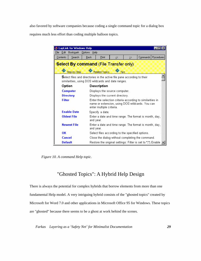
also favored by software companies because coding a single command topic for a dialog box
requires much less effort than coding multiple balloon topics.
Figure 10. A command Help topic.
"Ghosted Topics": A Hybrid Help Design
There is always the potential for complex hybrids that borrow elements from more than one
fundamental Help model. A very intriguing hybrid consists of the "ghosted topics" created by
Microsoft for Word 7.0 and other applications in Microsoft Office 95 for Windows. These topics
are "ghosted" because there seems to be a ghost at work behind the scenes.
Farkas Layering as a ‘Safety Net’ for Minimalist Documentation
29
Farkas Layering as a ‘Safety Net’ for Minimalist Documentation
30
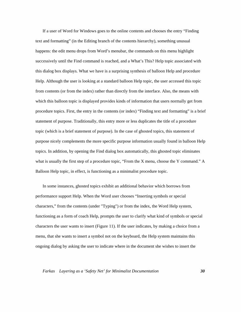
If a user of Word for Windows goes to the online contents and chooses the entry “Finding
text and formatting” (in the Editing branch of the contents hierarchy), something unusual
happens: the edit menu drops from Word’s menubar, the commands on this menu highlight
successively until the Find command is reached, and a What’s This? Help topic associated with
this dialog box displays. What we have is a surprising synthesis of balloon Help and procedure
Help. Although the user is looking at a standard balloon Help topic, the user accessed this topic
from contents (or from the index) rather than directly from the interface. Also, the means with
which this balloon topic is displayed provides kinds of information that users normally get from
procedure topics. First, the entry in the contents (or index) “Finding text and formatting” is a brief
statement of purpose. Traditionally, this entry more or less duplicates the title of a procedure
topic (which is a brief statement of purpose). In the case of ghosted topics, this statement of
purpose nicely complements the more specific purpose information usually found in balloon Help
topics. In addition, by opening the Find dialog box automatically, this ghosted topic eliminates
what is usually the first step of a procedure topic, “From the X menu, choose the Y command.” A
Balloon Help topic, in effect, is functioning as a minimalist procedure topic.
In some instances, ghosted topics exhibit an additional behavior which borrows from
performance support Help. When the Word user chooses “Inserting symbols or special
characters,” from the contents (under "Typing") or from the index, the Word Help system,
functioning as a form of coach Help, prompts the user to clarify what kind of symbols or special
characters the user wants to insert (Figure 11). If the user indicates, by making a choice from a
menu, that she wants to insert a symbol not on the keyboard, the Help system maintains this
ongoing dialog by asking the user to indicate where in the document she wishes to insert the
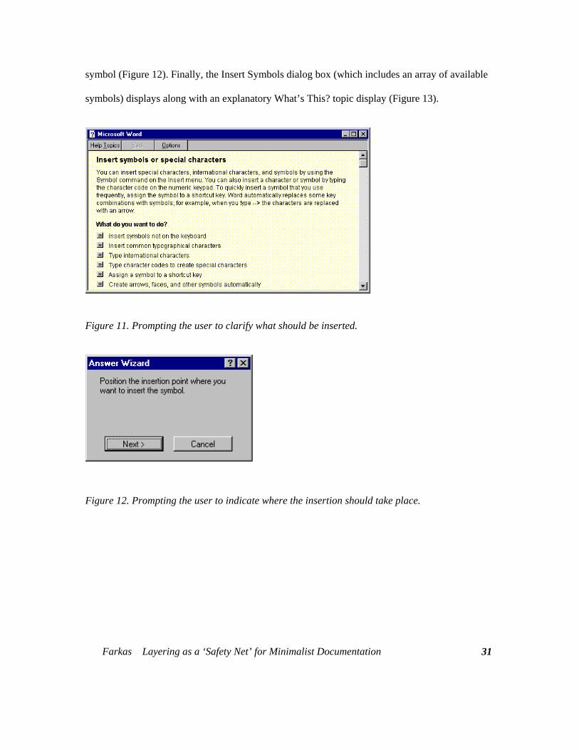
symbol (Figure 12). Finally, the Insert Symbols dialog box (which includes an array of available
symbols) displays along with an explanatory What’s This? topic display (Figure 13).
Figure 11. Prompting the user to clarify what should be inserted.
Figure 12. Prompting the user to indicate where the insertion should take place.
Farkas Layering as a ‘Safety Net’ for Minimalist Documentation
31
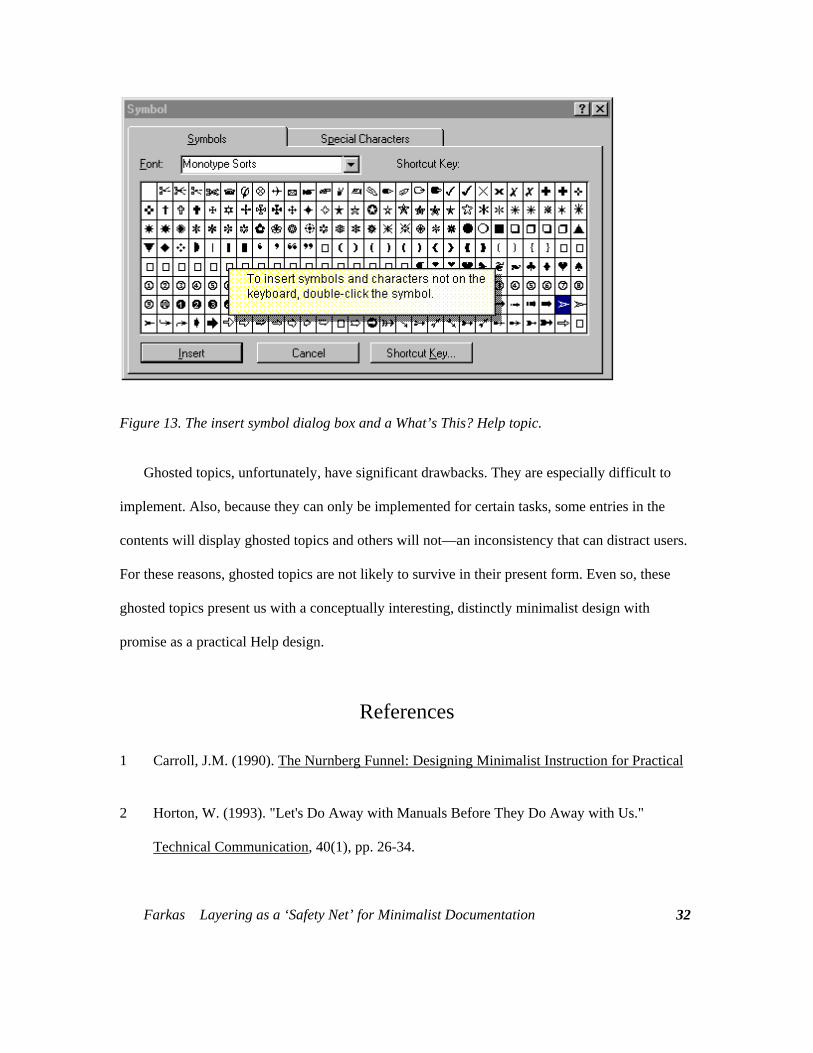
Figure 13. The insert symbol dialog box and a What’s This? Help topic.
Ghosted topics, unfortunately, have significant drawbacks. They are especially difficult to
implement. Also, because they can only be implemented for certain tasks, some entries in the
contents will display ghosted topics and others will not—an inconsistency that can distract users.
For these reasons, ghosted topics are not likely to survive in their present form. Even so, these
ghosted topics present us with a conceptually interesting, distinctly minimalist design with
promise as a practical Help design.
References
1 Carroll, J.M. (1990). The Nurnberg Funnel: Designing Minimalist Instruction for Practical
2 Horton, W. (1993). "Let's Do Away with Manuals Before They Do Away with Us."
Technical Communication, 40(1), pp. 26-34.
Farkas Layering as a ‘Safety Net’ for Minimalist Documentation
32
Farkas Layering as a ‘Safety Net’ for Minimalist Documentation
33
3 Brockmann, R.J. (1990) Writing Better Computer Documentation: From Paper to
Hypertext. New York: Wiley.
4 Mirel, B. (1991). “Designing Manuals for Active Learning Styles.” Technical
Communication 38:1, pp. 75-88.
5 Carroll, J.M., and Rosson, M.B. (1987). The paradox of the active user. In J.M. Carroll
(ed.), Interfacing Thought: Cognitive Aspects of Human-Computer Interaction. Cambridge,
MA: MIT Press/Bradford Books, pp. 80-111.
6 Farkas, D.K., and Williams, T.R. (1990). "John Carroll's Nurnberg Funnel and Minimalist
Documentation." IEEE Transactions in Professional Communication, 33 (4), pp. 182-87.
7 Redish, J. (1996). “Minimalism in Technical Communication: Some Issues to Consider.”
This volume.
8 Carrol, J.M. (1996 ). “Reconstructing Minimalism,” This volume.
9 van der Meij, H., and Carroll, J.M., (1995). “Principles and Heuristics for Designing
Minimalist Instruction.” Technical Communication, 42 (2), pp. 243-61.
10 Carroll, J.M., and van der Meij, H. (1996). “Ten Misconceptions about Minimalism.” IEEE
Transactions in Professional Communication, 39 (2), pp. 72-86.
11 Carroll, J.M., Smith-Kerker, P.A., Ford, J.R., and Mazur-Rimetz, S.A. (1987-1988). “The
Minimal Manual.” Human-Computer Interaction, 3, 123-153.
Farkas Layering as a ‘Safety Net’ for Minimalist Documentation
34
12 Williams, T.R., and Farkas, D.K. (1992). "Minimalism Reconsidered: Should We Design
Documentation for Exploratory Learning?" SIGCHI Bulletin 24 (2), pp. 41-50.
13 Holland, V.M., Charrow, V.R.., and Wright, W.W. (1988). “How Can Technical Writers
Write Effectively for Several Audiences at Once?,” in L. Beene and P. White, ed. Solving
Problems in Technical Writing, Oxford: Oxford University Press, 1988.
14 Horton, W. (1994). Designing and Writing Online Documentation: Hypermedia for Self-
Supporting Products, 2nd. ed. New York: Wiley.
15 Boggan, S., Farkas, D.K., and Welinske, J. (1996). Developing Online Help for Windows
95. Boston, MA: International Thomson Computer Press.
16 Lenocker, G. (1996). Personal communication, May 31, 1996. Redmond, WA (Gerry
Lenocker is the Microsoft Works documentation manager).
17 Price, J., and Korman H. (1993). How to Communicate Technical Information : A
Handbook of Software and Hardware Documentation. Redwood City, CA:
Benjamin/Cummings.
18 Gery, G., ed. (1995). Performance Improvement Quarterly, volume 8, no. 1, (a special issue
on performance support).
19 Microsoft. (1995). The Windows Interface Guidelines for Software Design. Microsoft
Press: Redmond, WA.
20 Sellen, A., and Nichol, A. (1990). “Building User-Centered On-line Help,” in B. Laurel,
(ed.) The Art of Human-Computer Interface Design, Reading, MA: Addison-Wesley.
Farkas Layering as a ‘Safety Net’ for Minimalist Documentation
35
21 Farkas, D.K. (1993). "The Role of Balloon Help in the Documentation Set." Journal of
Computer Documentation, 17 (2), 1993, pp. 3-20.
22 Carroll, J.M. (1995). Workshop discussion, Blacksburg, VA, November 18, 1995.Computer
Skill. Cambridge, MA: MIT Press.
23 Clark, D. (1992). “Object-Lessons from Self-Explanatory Objects.” Computers and
Education, 18 (1-3), pp. 11-22.


