Embed Size (px)
Citation preview

Hat Graphs 1
Running Header: INTRODUCING HAT GRAPHS
Introducing Hat Graphs
Jessica K. Witt
Colorado State University
Under review at Cognitive Research: Principles and Implications
Hat Graphs 2
Visualizing data through graphs can be an effective way to communicate one’s results. A ubiquitous
graph and common technique to communicate behavioral data is the bar graph. The bar graph was first
invented in 1786 and little has changed in its format. Here, a replacement for the bar graph is proposed.
The new format, called a hat graph, maintains some of the critical features of the bar graph such as its
discrete elements, but eliminates redundancies that are problematic when the baseline is not at 0. Hat
graphs also include elements designed to improve Gestalt grouping principles and engage object-based
attention. The effectiveness of the hat graph was tested in two empirical studies for which participants
had to find and identify the condition that lead to the biggest improvement from baseline to final test.
Performance with hat graphs was 30 - 40% faster than with bar graphs.
Key words: Information visualization; graphs
Significance Statement: Visualizations are an important way to communicate results from data. As Big
Data has increased impact on daily life, communication of data is of critical importance. The bar graph is
ubiquitous and yet has not been fundamentally updated since its inception in the 18th century. The hat
graph is offered as a modernized version that more effectively communicates differences across
conditions. Hat graphs increased the speed to find the condition associated with the biggest difference
by 30-40% relative to bar graphs. Hat graphs can significantly improve how scientists communicate their
data.
Hat Graphs 3
Introducing Hat Graphs
Bar graphs are a common technique to visualize data in psychology. In a recent issue of
Psychological Science, 50% of the articles included a bar graph (2018, v 29, issue 12). The bar graph
dates back to 1786 (Playfair, 1786), and the first bar graph bares great resemblance to typical bar graphs
used today. Bar graphs are problematic for behavioral research. Bar graphs depict differences in two
ways: one is by the relative position of the end of each bar and the other is by length of each bar (and,
perhaps a third, is by area of each bar). If the baseline of the graph is not set to 0, these various sources
of information will be inconsistent with each other. The relative position of the bar ends will accurately
reflect the differences between the bars, but the relative difference in length will be exaggerated (in
cases for which the baseline is greater than 0 and the bars are positive) or understated (in cases for
which the baseline is less than 0 and the bars are positive). For this reason, users are encouraged to
always use a baseline of 0 for bar graphs (Pandey, Rall, Satterthwaite, Nov, & Bertini, 2015). However,
this baseline creates large biases in readers’ perceptions of the size of effects depicted in bar graphs
(Witt, in press). Even big effects appear small with a baseline at 0. An ideal baseline is one that is at
least 0.75 standard deviations (SDs) below the general mean so as to maximize compatibility between
the visual size of the effect and the effect size being depicted. Given that effect size in psychology is
often measured in terms of SDs, and an effect size of 0.8 is considered “big” (Cohen, 1988), it is sensible
to set the range of the y-axis to be 1.5 SDs. This range is problematic when using bar graphs, however,
given the mixed meanings across the different features when the baseline is not set to 0.
Alternatives to bar graphs include point graphs and line graphs. Point graphs have the
advantage that only one feature specifies the data, namely relative position. Thus, inconsistencies are
not created by non-zero baselines. But point graphs do not have as strong Gestalt grouping principles to
help facilitate perceptual grouping of pairs of data points. This grouping problem can be solved by
connecting the points with a line, thus making the graph a line graph. Line graphs are a natural choice
Hat Graphs 4
when communicating trends, such as differences in a dependent variable across a continuous
independent. Line graphs are not, however, a natural choice when communicating discrete values.
They can even lead to misinterpretations of discrete variables, such as when comparing across distinct
groups like construction workers versus librarians.
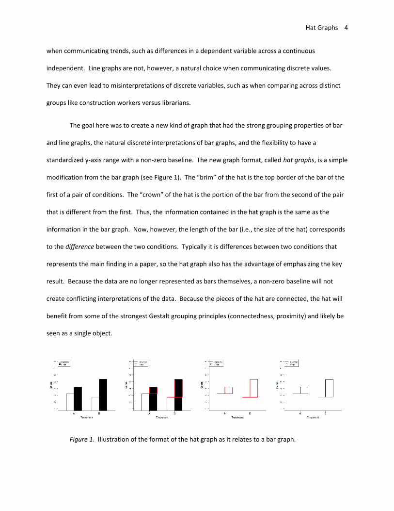
The goal here was to create a new kind of graph that had the strong grouping properties of bar
and line graphs, the natural discrete interpretations of bar graphs, and the flexibility to have a
standardized y-axis range with a non-zero baseline. The new graph format, called hat graphs, is a simple
modification from the bar graph (see Figure 1). The “brim” of the hat is the top border of the bar of the
first of a pair of conditions. The “crown” of the hat is the portion of the bar from the second of the pair
that is different from the first. Thus, the information contained in the hat graph is the same as the
information in the bar graph. Now, however, the length of the bar (i.e., the size of the hat) corresponds
to the difference between the two conditions. Typically it is differences between two conditions that
represents the main finding in a paper, so the hat graph also has the advantage of emphasizing the key
result. Because the data are no longer represented as bars themselves, a non-zero baseline will not
create conflicting interpretations of the data. Because the pieces of the hat are connected, the hat will
benefit from some of the strongest Gestalt grouping principles (connectedness, proximity) and likely be
seen as a single object.
Figure 1. Illustration of the format of the hat graph as it relates to a bar graph.

Hat Graphs 5
To corroborate these theoretical advantages for hat graphs, empirical studies were conducted
to explore the relative benefits of hat graphs versus bar graphs. In three experiments, participants
made judgments about the best advertisement on change in attitudes from baseline to final test based
on information displayed in bar graphs or hat graphs.
Experiment 1
Participants were shown images depicting attitude scores on baseline and final tests for 3 or 6
advertisements. Their task was to indicate which advertisement produced the largest improvement in
attitude at final score over baseline.
Method
Participants. Twenty-two participants volunteered in exchange for course credit. Given the
theoretical reasons to think hat graphs would have an advantage over bar graphs, a large effect was
assumed. A power analysis for a paired-samples t-test with an effect size of d = 0.80 and alpha = 0.05
(two-tailed) showed that 14 pairs are needed to achieve 80% power. Data collection was scheduled to
stop on a day for which this number was likely to be achieved, although more participants were
collected than needed, resulting in 95% power to find an effect size of d = 0.80.
Ethics, Consent and Permissions. All participants provided informed consent, and the protocol
was approved by Colorado State University’s IRB (protocol number 12-3709H).
Stimuli and Apparatus. Stimuli were displayed on computer monitors. The stimuli were
created using data simulated and plotted in R (R Core Team, 2017). Four factors were manipulated.
One factor was graph type (hat graph versus bar graph). Each set of simulated data were plotted with a
hat graph and with a bar graph. Another factor was number of advertisements (3 or 6). A third factor
was the position of the target (best) advertisement. These were evenly distributed across the locations,
Hat Graphs 6
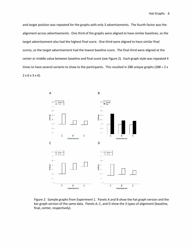
and target position was repeated for the graphs with only 3 advertisements. The fourth factor was the
alignment across advertisements. One third of the graphs were aligned to have similar baselines, so the
target advertisement also had the highest final score. One third were aligned to have similar final
scores, so the target advertisement had the lowest baseline score. The final third were aligned at the
center or middle value between baseline and final score (see Figure 2). Each graph style was repeated 4
times to have several variants to show to the participants. This resulted in 288 unique graphs (288 = 2 x
2 x 6 x 3 x 4).
A B
C D
Figure 2. Sample graphs from Experiment 1. Panels A and B show the hat graph version and the bar graph version of the same data. Panels A, C, and D show the 3 types of alignment (baseline, final, center, respectively).
Hat Graphs 7
Data for the graphs were created from simulations. As noted below, the task for participants
was to indicate which advertisement produced the largest change in attitude, so the critical data are the
differences between conditions. For the non-target advertisements, the differences between baseline
and final scores were the mean value of 100 samples from a normal distribution with a mean of 1 and a
SD of 2. For the target advertisements, the differences between baseline and final scores were the
mean value of 100 samples from a normal distribution with a mean of 2.5 and a SD of 1. Thus, the
target advertisement produced a bump in attitude scores 2.5 times more than the non-target
advertisements. These difference scores were added to the baseline scores for the baseline aligned and
center aligned graphs. For these graphs, the baseline scores were the mean value of 100 samples from
a normal distribution with a mean of 3 and a SD of 1. For the final align graphs, the final scores were the
mean value of 100 samples from a normal distribution with a mean of 5.5 and a SD of 1, and the
difference score were subtracted from the final scores. The process was the same for the target
conditions with the exception that .5 was subtracted from the baseline condition so that it would not
align with the other baseline conditions.
For each set of data, two graphs were created. One was a bar graph and one was a hat graph.
Thus, the data contained in the graphs were identical across graph types. For the bar graph, the
baseline condition was white and the final condition was black. For the hat graphs, the lines were black
and the crown was white. The y-axis ranged from 1 to 8 on every graph. Advertisements were labeled A
– F and were always in alphabetical order.
Procedure. Participants completed two blocks of trials, one with bar graphs and one with hat
graphs. Start order was counterbalanced across participants. For the hat graphs, they were shown
these initial instructions: “An advertising company is interested in which ads lead to the biggest changes
in attitude. They ran a study testing several different ads. In each study, they measured attitude at
BASELINE (before seeing any ads) and again at the FINAL test (after seeing the ads). All of the ads
Hat Graphs 8
increased attitude. Your task is to determine which ad produced the BIGGEST increase in attitude. The
baseline attitude will be shown as a horizontal line. The final attitude is shown as the top of the box. The
height of the box shows the change in attitude from baseline to final test. Which ad produces the
biggest change? Enter your response for each graph on the keyboard. Respond as fast and accurately as
possible. Press ENTER to begin”. For the bar graphs, the instructions were the same except instead of
describing the hat graph, they were told the following: “The baseline attitude will be shown in white
boxes. The final attitude will be shown in black boxes. The difference between the white and black
boxes shows change in attitude from baseline to final test.”
On each trial, after a fixation screen of 500ms, a graph was shown and participants entered a
response A-C (for graphs with 3 advertisements) or A-F (for graphs with 6 advertisements). The graph
remained visible until participants made their response. At which point, a blank screen was shown for
500ms before the next trial began. Participants completed 144 trials with one type of graph before
switching to the block of trials with the other graph type. Order within block was randomized.
Results and Discussion
The data were initially explored for outliers. Reaction times (RTs) beyond 1.5 times the
interquartile range (IQR) for each subject for each condition were excluded (6.2% of the data). Next,
median RTs and mean accuracy scores were calculated for each subject and each condition and
submitted to separate boxplots. No participants were beyond the IQR on the RTs but four were beyond
1.5 times the IQR for accuracy scores. These participants were excluded. For remaining participants,
accuracy was nearly perfect (M = 98.9%, SD = 1.2%), so the analysis focused on RTs.
RTs are positively skewed, so they were log-transformed. Data were analyzed with linear mixed
models using the LME4 and LMERTEST packages in R (Bates, Machler, Bolker, & Walker, 2015;
Kuznetsova, Brockhoff, & Christensen, 2017). A linear mixed model was run with the log RTs as the
Hat Graphs 9
dependent factor. The independent factors were graph type (bar or hat), number of advertisers (3 or 6;
entered as a factor), graph alignment (baseline, final, center), and start condition. Only two-way
interactions with graph type were included in the model. Random effects were included for participant
including intercepts and slopes for graph type and number of advertises. The model did not converge
with the inclusion of a random slope for graph alignment. Random intercepts were also included for
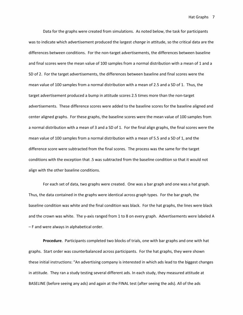
each set of simulated data that was plotted in both the hat and bar graphs. The main effect of graph
type was significant, t = 12.66, p < .001, estimate = 0.48, SE = .04. Relative to hat graphs, responses to
bar graphs were 38% slower (see Figure 3).
Figure 3. Reaction time is plotted as a function of number of items and graph type for Experiment 1. The brim of the hat corresponds to the RTs for the hat graph condition, and the top of the crown of the hat corresponds to RTs for the bar graph condition. The size of the crown indicates the difference in RTs between the two conditions. Error bars are 1 SEM calculated within-subjects. The range of the y-axis is 4 within-subjects SDs.
Hat Graphs 10
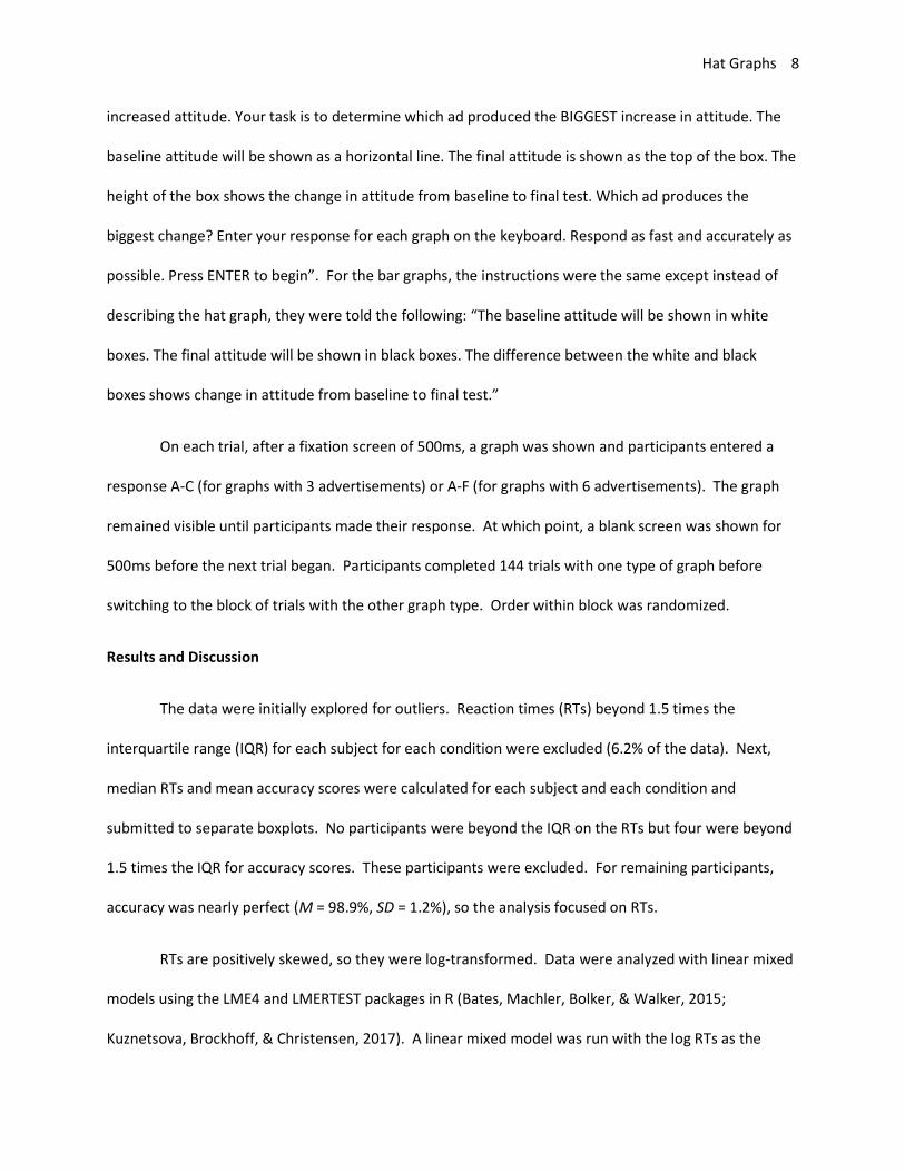
The main effect of number of items was significant, t = 5.90, p < .001, estimate = .13, SE = .02.
Going from 3 to 6 items was associated with a 14% increase in reaction time. The interaction between
graph type and number of items was not significant, t = -0.27, p = .78, estimate < .01, SE = .01. Thus, hat
graphs made people faster at finding the target item but not necessarily more efficient given the similar
search slopes (see Figure 3). Graph alignment had a significant effect on RTs. RTs were 5% slower when
the final scores were aligned than when the baseline scores were aligned, t = 2.23, p = .027, estimate =
.054, SE = .02. RTs were just less than 5% slower when the center of both scores were aligned than
when the baseline scores were aligned, t = 1.97, p = .050, estimate = .048, SE = .02. The interaction
between graph type and graph alignment was significant. RTs were 6% faster with hat graphs than with
bar graphs when the baseline scores were aligned than when the final score were aligned, t = 3.88, p <
.001, estimate = .06, SE = .02, and were less than 3% faster with hat graphs than with bar graphs when
baseline scores were align than when center values were aligned, though this did not reach statistical
significance, t = 1.67, p = .096, estimate = .026, SE = .015 (see Figure 4).
Figure 4. Reaction time is plotted as a function of number of items and graph type for Experiment 1. The brim of the hat corresponds to the RTs for the hat graph condition, and the
Hat Graphs 11
top of the crown of the hat corresponds to RTs for the bar graph condition. The size of the crown indicates the difference in RTs between the two conditions. Error bars are 1 SEM calculated within-subjects. The range of the y-axis is 4 within-subjects SDs.
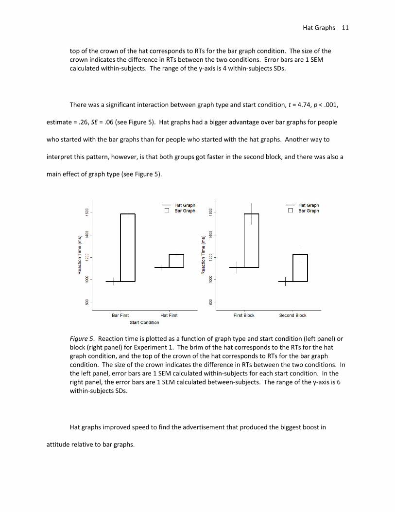
There was a significant interaction between graph type and start condition, t = 4.74, p < .001,
estimate = .26, SE = .06 (see Figure 5). Hat graphs had a bigger advantage over bar graphs for people
who started with the bar graphs than for people who started with the hat graphs. Another way to
interpret this pattern, however, is that both groups got faster in the second block, and there was also a
main effect of graph type (see Figure 5).
Figure 5. Reaction time is plotted as a function of graph type and start condition (left panel) or block (right panel) for Experiment 1. The brim of the hat corresponds to the RTs for the hat graph condition, and the top of the crown of the hat corresponds to RTs for the bar graph condition. The size of the crown indicates the difference in RTs between the two conditions. In the left panel, error bars are 1 SEM calculated within-subjects for each start condition. In the right panel, the error bars are 1 SEM calculated between-subjects. The range of the y-axis is 6 within-subjects SDs.
Hat graphs improved speed to find the advertisement that produced the biggest boost in
attitude relative to bar graphs.
Hat Graphs 12
Experiment 2
Experiment 2 serves as a replication of Experiment 1. The effect size depicted in the graphs was
slightly smaller than in Experiment 1.
Method
Seventeen students volunteered in exchange for course credit. Everything was the same as in
Experiment 1 except the target difference was simulated as a magnitude of 2 (rather than 2.5).
Results and Discussion
Data were analyzed as before, and 5% of trials were excluded because the RT was beyond 1.5
times the IQR for that participant for that condition. RTs were then summarized for each participant for
each condition, and 3 participants were identified as having a median RT greater than 1.5 times the IQR
for the group and 4 participants had mean accuracy scores less than 1.5 times the IQR for the group. All
7 were excluded. This eliminated a large portion of the data, but resulted in the inclusion of 10
participants, which was sufficient to achieve 95% power to find an effect of d = 1.28 (as a one-sample t-
test). For the included participants, mean accuracy was 98.9% (SD = 1.2%).
The data were submitted to a linear mixed model with the log of the reaction times as the
dependent factor, graph type and number of items as independent factors, and subject and graph image
as random effects (including random slopes for subject for both independent factors). The main effect
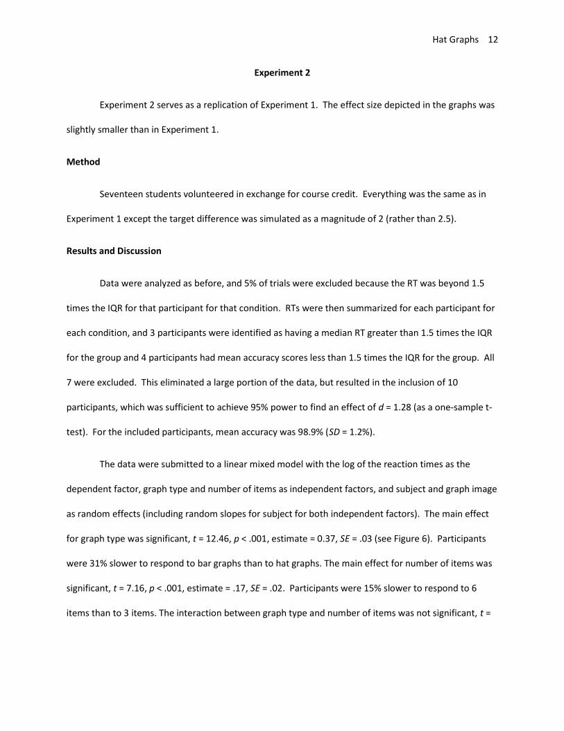
for graph type was significant, t = 12.46, p < .001, estimate = 0.37, SE = .03 (see Figure 6). Participants
were 31% slower to respond to bar graphs than to hat graphs. The main effect for number of items was
significant, t = 7.16, p < .001, estimate = .17, SE = .02. Participants were 15% slower to respond to 6
items than to 3 items. The interaction between graph type and number of items was not significant, t =
Hat Graphs 13
0.46, p = .64, estimate < .01, SE = .02. Hat graphs lead to faster response times but not more efficient
search slopes.
Figure 6. Reaction time is plotted as a function of number of items and graph type for Experiment 2. The brim of the hat corresponds to the RTs for the hat graph condition, and the top of the crown of the hat corresponds to RTs for the bar graph condition. The size of the crown indicates the difference in RTs between the two conditions. Error bars are 1 SEM calculated within-subjects. The range of the y-axis is 5 within-subjects SDs.
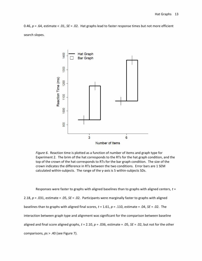
Responses were faster to graphs with aligned baselines than to graphs with aligned centers, t =
2.18, p = .031, estimate = .05, SE = .02. Participants were marginally faster to graphs with aligned
baselines than to graphs with aligned final scores, t = 1.61, p = .110, estimate = .04, SE = .02. The
interaction between graph type and alignment was significant for the comparison between baseline
aligned and final score aligned graphs, t = 2.10, p = .036, estimate = .05, SE = .02, but not for the other
comparisons, ps > .40 (see Figure 7).
Hat Graphs 14
Figure 7. Reaction time is plotted as a function of number of items and graph type for Experiment 2. The brim of the hat corresponds to the RTs for the hat graph condition, and the top of the crown of the hat corresponds to RTs for the bar graph condition. The size of the crown indicates the difference in RTs between the two conditions. Error bars are 1 SEM calculated within-subjects. The range of the y-axis is 4 within-subjects SDs.
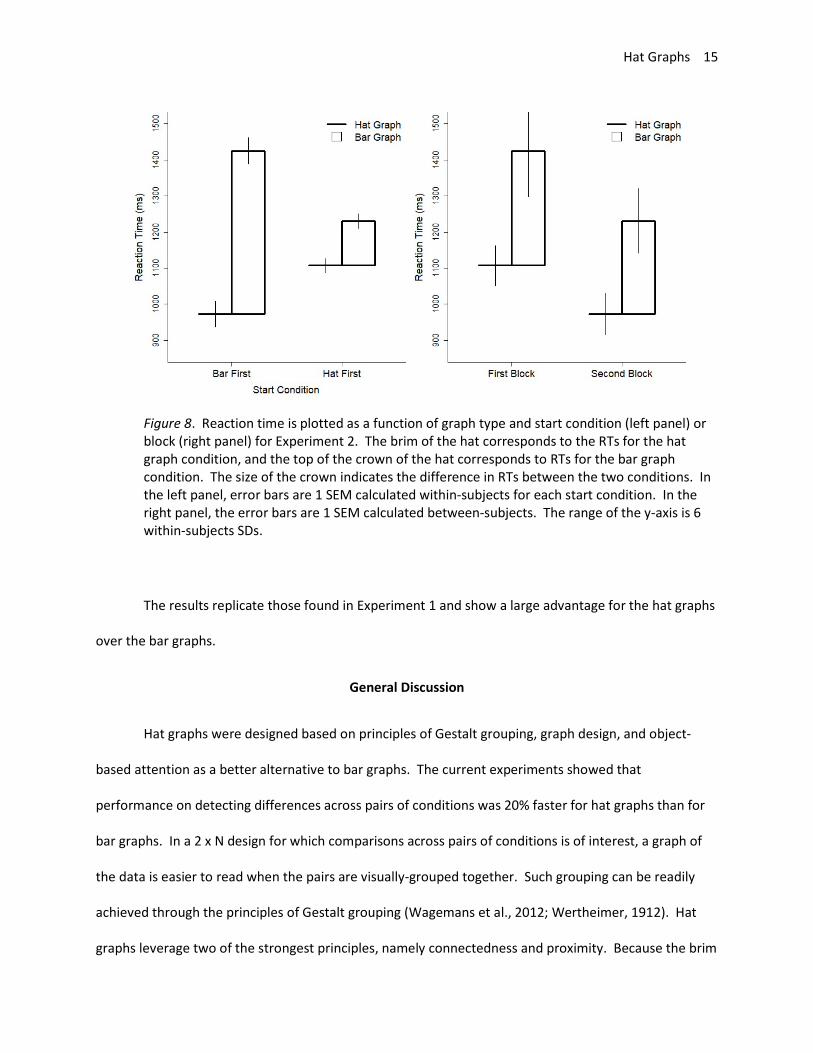
The interaction between graph type and start condition was significant, t = 7.02, p < .001,
estimate = .25, SE = .04. Participants who started with bar graphs were even faster with hat graphs
relative to bar graphs compared with participants who started with hat graphs (see Figure 8). An
alternative explanation is that both groups got faster from block 1 to block 2, and there was also a main
effect of graph type.
Hat Graphs 15
Figure 8. Reaction time is plotted as a function of graph type and start condition (left panel) or block (right panel) for Experiment 2. The brim of the hat corresponds to the RTs for the hat graph condition, and the top of the crown of the hat corresponds to RTs for the bar graph condition. The size of the crown indicates the difference in RTs between the two conditions. In the left panel, error bars are 1 SEM calculated within-subjects for each start condition. In the right panel, the error bars are 1 SEM calculated between-subjects. The range of the y-axis is 6 within-subjects SDs.
The results replicate those found in Experiment 1 and show a large advantage for the hat graphs
over the bar graphs.
General Discussion
Hat graphs were designed based on principles of Gestalt grouping, graph design, and object-
based attention as a better alternative to bar graphs. The current experiments showed that
performance on detecting differences across pairs of conditions was 20% faster for hat graphs than for
bar graphs. In a 2 x N design for which comparisons across pairs of conditions is of interest, a graph of
the data is easier to read when the pairs are visually-grouped together. Such grouping can be readily
achieved through the principles of Gestalt grouping (Wagemans et al., 2012; Wertheimer, 1912). Hat
graphs leverage two of the strongest principles, namely connectedness and proximity. Because the brim
Hat Graphs 16
of the hat is close to and physically connected to the crown, the hat should be seen as a grouped object.
This is likely to have contributed to why performance was better with the hat graphs than the bar
graphs.
Graph design principles also contributed to the creation of the hat graphs. According to graph
design, discrete elements (like in bar graphs) are more likely to be interpreted as a discrete effect (e.g.
“males are taller than females”) whereas continuous lines (like in line plots) are more likely to be
interpreted as a continuous effect even when such an interpretation is in appropriate (e.g. “the more
male a person is, the taller he is”, Zacks & Tversky, 1999). Although not directly tested here, the hat
graphs bare more of a resemblance to the discrete elements of the bar graph than the continuous
elements of the line graph. It is recommended that hat graphs be used instead of bar graphs for plotting
discrete data, whereas line graphs continue to be used for continuous data.
In addition to performance being better with hat graphs than with bar graphs, hat graphs have
another advantage related to graph design in that they are not restricted to having a baseline at zero.
Bar graphs should always have a zero baseline so that the impression given by the length of the bars is
consistent with the differences between the values of the various conditions (e.g., Pandey et al., 2015).
Hat graphs do not have the same restriction because they do not contain the misleading element within
bar graphs, namely bar length. It is important to not have the baseline be restricted to zero because
graph design indicates that for behavioral studies for which effect size is measured in terms of standard
deviations, the range of the y-axis should be 1.5 standard deviations (Witt, in press). Setting the y-axis
in this way helps to maximize compatibility between the visual impression of the effect and the size of
the effect. Small effects will look small and big effects will look big. In cases for which the size of the
effect is too big to fit within 1.5 SDs (as was the case in the current studies), the y-axis should be
expanded and its range noted in the figure caption.
Hat Graphs 17
Another graph design principle concerns the data-to-ink ratio (Tufte, 2001). According to this
principle, redundant ink should be minimized within reason. For the bar graph, both the length of the
two side lines and the position of the top of the bar are all redundant, so to minimize redundant ink, one
could remove two of the three indicators. The hat graph has a higher data-to-ink ratio than the bar
graph, which could be one of the factors contributing to its advantage. The hat graph still contains
redundant elements (such as the brim of the hat). However, sometimes redundancy can be
advantageous for reading graphs, so it is important to not take the data-to-ink ratio too far (Carswell,
1992; Gillan & Richman, 1994). Future studies could determine whether adding or deleting ink from hat
graphs improves performance.
A third cognitive principle at play with hat graphs relates to attention. Attention can be
deployed spatially or towards a particular object (e.g., Posner, 1980; Scholl, 2001). With hat graphs, the
difference between conditions is itself an object and thus could benefit from object-based attention,
whereas the difference in spatial location between the brim of the hat and the crown of the hat could
benefit from spatial attention. With hat graphs, either type of attention would result in the same
outcome. Neither bar graphs nor point graphs would likely benefit as much as hat graphs from object-
based attention. The added benefit of the difference between conditions being represented as an
object and thus engaging object-based attention could contribute to the advantage for hat graphs over
bar graphs.
When researchers want to emphasize differences across two conditions (such as difference in
RTs), there is a dilemma whether to highlight the differences themselves by plotting those differences in
a bar graph versus plotting the raw RTs and having the reader infer the differences between the bars or
the points. Hat graphs solve this dilemma by plotting both at the same time. One disadvantage to the
hat graphs compared with plotting the differences themselves is that the crowns in the hat graphs are
unlikely to be perfectly aligned. The relative lengths of aligned bars are easier to discriminate than the
Hat Graphs 18
relative lengths of misaligned bars (Cleveland & McGill, 1985). Thus, researchers will have to decide if
the added benefit of more precise estimate of length outweighs the benefit of showing both the
differences (as misaligned bars in the crown of the hat) and the raw scores. Of course, if precision is an
important goal for the researcher, the researcher could put the actual number corresponding to the
differences in or near the crown of the hat or in the text itself.
Hat graphs have a number of limitations and future research questions. One question concerns
the best way to add error bars. The figures here show one way to do so, but this format was not
empirically tested. Another limitation is how best to signal when the direction of the hat is reversed
from one condition to another (such as would be found in a crossed interaction). Perhaps filling in
crowns of hats that are “upside-down” would be beneficial, but reversing the hat so the brim points to
the right is another alternative. The Appendix provides R code for creating hat graphs, which can be
manipulated to try various options.
A critical limitation is that hat graphs are limited to 2 x N designs for which comparisons across
pairs are the critical comparisons. It is unclear how to expand hat graphs to allow comparison across 3
or more conditions. Many reported studies involve designs with factors that have 2 levels, so there is
plenty of room for hat graphs to exert their advantage even if they are not generalizable to all research
scenarios.
An unknown factor, and potential limitation, is that the current studies focused on a task for
which participants had to identify differences between baseline and final scores. The nature of the task
dictates which graph will be most appropriate (e.g., Gillan, Wickens, Hollands, & Carswell, 1998). For
finding differences, hat graphs proved to be more effective than bar graphs. However, if the task is
instead to ignore differences and identify the precise value of a given condition or identify the baseline
with the highest value, another format may prove more effective than hat graphs. According to the

Hat Graphs 19
proximity compatibility principle (Wickens & Carswell, 1995), the greater proximity achieved in the hat
graphs should improve performance on an information integration task (such as finding the biggest
difference) but should decrease performance on a focused attention task (such as finding the precise
value of a particular condition).
In conclusion, hat graphs resulted in better performance than bar graphs. Hat graphs show that
design principles based on the nature of cognitive processes (e.g., Gestalt grouping principles, object-
based attention) can significantly improve how researchers visualize and communicate their data.

Hat Graphs 20
Author Note
Jessica K. Witt, Department of Psychology, Colorado State University.
Data, scripts, and supplementary materials available at https://osf.io/khjb9/. For peer-review
process, use this link: https://osf.io/khjb9/?view_only=6c453d634ee24b019d1b247c5be14b6b. This
work was supported by a grant from the National Science Foundation (BCS-1632222). Author has no
competing interests to declare.
Address correspondence to JKW, Department of Psychology, Colorado State University, Fort
Collins, CO 80523, USA. Email: [email protected]

Hat Graphs 21
Appendix: R Code for Creating Hat Graphs # Note: You can run code as is to get random data and see how graphs work # Instructions how to implement with your data below - see [1] # Instructions for how to add error bars - see [2] # Instructions for how to shade in upside-down hats - see [3] dt <- data.frame(subjectID = seq(1,30),DV = rnorm(30,50,20),IV1 = rep(c(1,2),15), IV2 = c(rep(1,15),rep(2,15))) #dt <- read.csv("YourDataHere.csv",header=T) #### [1] - HOW TO IMPLEMENT WITH YOUR DATA #### # Replace DV with your dependent measure (or name your dependent measure "DV") # Replace IV1 with your independent measure that you want paired in your hats (or name this measure "IV1") # Assumes only two levels of IV1 # Replace IV2 with your independent measure that you want spaced across the x-axis (or name this measure "IV2") # # Also replace label names here to match how you want your axes labeled: xLab <- "Independent Variable 2" yLab <- "Dependent Variable" legendLab <- c("IV1: Level 1","IV1: Level 2") upsideDownColor <- "black" #[3] Color to fill hat crown when second part is less than first part - set to "white" if you do not want shading ## Computes means for plotting # Also computes SD for setting y-axis range and for error bars # If your design involves within-subjects, see Loftus & Masson (1994) for computing SEM within-subjects dtMeans <- aggregate(DV ~ IV1 + IV2, dt, mean) dtSEM <- aggregate(DV ~ IV1 + IV2, dt, sd) #assumes between-subjects effects only dtMeans$SEM <- dtSEM$DV / sqrt(length(unique(dt$subjectID))) dtMeans$hatPos <- as.integer(as.factor(dtMeans$IV1)) dtMeans$xPos <- as.integer(as.factor(dtMeans$IV2)) ## Values for setting the range of the y-axis # Based on recommendations from Witt (in press) # If data do not fit in graph with this value, increase .75 to greater number # Should not decrease .75 grandMean <- mean(dtMeans$DV) grandSD <- mean(dtSEM$DV) * .75 # produces y-axis range of 1.5 SDs (see Witt (in press) for details) hatWidth <- .25

Hat Graphs 22
plot(dtMeans$IV1,dtMeans$DV,ylim=c(grandMean - grandSD,grandMean + grandSD),xlim=c(min(dtMeans$xPos) - (2 * hatWidth),max(dtMeans$xPos) + (2 * hatWidth)),xaxt="n",col="white",bty="l",xlab=xLab,ylab=yLab) axis(side = 1, at=dtMeans$xPos,labels = dtMeans$IV2) for (i in unique(dtMeans$xPos)) { m1 <- which(dtMeans$xPos == i & dtMeans$hatPos == 1) m2 <- which(dtMeans$xPos == i & dtMeans$hatPos == 2) segments(i-hatWidth,dtMeans$DV[m1],i,dtMeans$DV[m1],lwd=3) # Brim of the hat if (dtMeans$DV[m2] > dtMeans$DV[m1]) { rect(i,dtMeans$DV[m1],i+hatWidth,dtMeans$DV[m2],lwd=3) # Crown of the hat } else { rect(i,dtMeans$DV[m1],i+hatWidth,dtMeans$DV[m2],lwd=3, col=upsideDownColor) # Crown of the hat } } # [2] - Add error bars dtMeans$semPos <- ifelse(dtMeans$hatPos == 1, dtMeans$xPos - (hatWidth/2), dtMeans$xPos + (hatWidth/2)) for (i in 1:length(dtMeans$semPos)) { segments(dtMeans$semPos[i],dtMeans$DV[i] - dtMeans$SEM[i],dtMeans$semPos[i],dtMeans$DV[i] + dtMeans$SEM[i]) } # Add Legend legend("topleft",pch=c(NA,0),lwd=c(3,NA),pt.cex=c(NA,3),cex=1.5,legend=legendLab,bty="n")
Hat Graphs 23
References
Bates, D., Machler, M., Bolker, B., & Walker, S. (2015). Fitting Linear Mixed-Effects Models Using lme4.
Journal of Statistical Software, 67(1), 1-48. doi:10.18637/jss.v067.i01
Carswell, C. M. (1992). Choosing Specifiers: An Evaluation of the Basic Tasks Model of Graphical
Perception. Human Factors, 34(5), 535-554. doi:10.1177/001872089203400503
Cleveland, W. S., & McGill, R. (1985). Graphical Perception and Graphical Methods for Analyzing
Scientific Data. Science, 229(4716), 828-833. doi:10.1126/science.229.4716.828
Cohen, J. (1988). Statistical Power Analyses for the Behavioral Sciences. New York, NY: Routledge
Academic.
Gillan, D. J., & Richman, E. H. J. H. F. (1994). Minimalism and the syntax of graphs. Human Factors, 36(4),
619-644.
Gillan, D. J., Wickens, C. D., Hollands, J. G., & Carswell, C. M. J. H. F. (1998). Guidelines for presenting
quantitative data in HFES publications. Human Factors, 40(1), 28-41.
Kuznetsova, A., Brockhoff, P. B., & Christensen, R. H. B. (2017). lmerTest Package: Tests in Linear Mixed
Effects Models. Journal of Statistical Software, 82(13), 1-26. doi:10.18637/jss.v082.i13
Pandey, A. V., Rall, K., Satterthwaite, M. L., Nov, O., & Bertini, E. (2015). How Deceptive are Deceptive
Visualizations?: An Empirical Analysis of Common Distortion Techniques. Paper presented at the
Proceedings of the 33rd Annual ACM Conference on Human Factors in Computing Systems,
Seoul, Republic of Korea.
Playfair, W. (1786). Commercial and political atlas: Representing, by copper-plate charts, the progress of
the commerce, revenues, expenditure, and debts of England, during the whole of the eighteenth
century. London, Corry.
Posner, M. I. (1980). Orienting of attention. Quarterly Journal of Experimental Psychology, 32(1), 3-25.
Scholl, B. J. (2001). Objects and attention: The state of the art. Cognition, 80(1-2), 1-46.
Hat Graphs 24
Team, R. C. (2017). R: A language and environment for statistical computing. Retrieved from
https://www.r-project.org
Tufte, E. R. (2001). The Visual Display of Quantitative Information (Second Edition ed.). Cheshire, CT:
Graphics Press.
Wagemans, J., Elder, J. H., Kubovy, M., Palmer, S. E., Peterson, M. A., Singh, M., & von der Heydt, R. J.
(2012). A century of Gestalt psychology in visual perception: I. Perceptual grouping and figure–
ground organization. Psychological Bulletin, 138(6), 1172-1217.
Wertheimer, M. (1912). Experimentelle studien uber das sehen von bewegung. Zeitschrift fur
Psychologie, 61, 161-265. (Translated extract reprinted as “Experimental studies on the seeing
of motion”. In T. Shipley (Ed.), (1961). Classics in psychology (pp. 1032–1089). New York, NY:
Philosophical Library.).
Wickens, C. D., & Carswell, C. M. J. H. f. (1995). The proximity compatibility principle: Its psychological
foundation and relevance to display design. Human Factors, 37(3), 473-494.
Witt, J. K. (in press). Graph Construction: An Empirical Investigation on Setting the Range of the Y-Axis.
Meta-Psychology.
Zacks, J., & Tversky, B. (1999). Bars and lines: A study of graphic communication. Memory & Cognition,
27(6), 1073-1079.