Embed Size (px)
Citation preview

Hat Graphs 1
Running Header: INTRODUCING HAT GRAPHS
Introducing Hat Graphs
Jessica K. Witt
Colorado State University
Under Review
Address correspondence to [email protected]

Hat Graphs 2
Visualizing data through graphs can be an effective way to communicate one’s results. A ubiquitous
graph and common technique to communicate behavioral data is the bar graph. The bar graph was first
invented in 1786 and little has changed in its format. Here, a replacement for the bar graph is proposed.
The new format, called a hat graph, maintains some of the critical features of the bar graph such as its
discrete elements, but eliminates redundancies that are problematic when the baseline is not at zero.
Hat graphs also include design elements based on Gestalt principles of grouping and graph design
principles. The effectiveness of the hat graph was tested in three empirical studies. Participants were
nearly 40% faster to find and identify the condition that led to the biggest difference from baseline to
final test when the data were plotted with hat graphs than with bar graphs. Participants were also more
sensitive to the magnitude of an effect plotted with a hat graph compared with a bar graph that was
restricted to having its baseline at zero. The recommendation is to use hat graphs when plotting data
from discrete categories.
Key words: Information visualization; graphs
Significance Statement: Visualizations are an important way to communicate results from data. As Big
Data has increased impact on daily life, communication of data is of critical importance. The bar graph is
ubiquitous and yet has not been fundamentally updated since its inception in the 18th century. The hat
graph is offered as a modernized version that more effectively communicates differences across
conditions. Hat graphs increased the speed to find the condition associated with the biggest difference
by nearly 40% relative to bar graphs. Hat graphs also increased sensitivity to the size of an effect by 30%
and eliminated bias in estimating effect size. Hat graphs can significantly improve how scientists
communicate their data.
Hat Graphs 3
Introducing Hat Graphs
Bar graphs are a common technique to visualize data in psychology. In a recent issue of
Psychological Science, 50% of the articles included a bar graph (2018, v 29, issue 12). The bar graph
dates back to 1786 (Playfair, 1786), and the first bar graph bares great resemblance to typical bar graphs
used today. Bar graphs are problematic for presenting results from behavioral research. Bar graphs
depict values in two ways: one is by the relative position of the end of the bar and the other is by length
of the bar (and, perhaps a third, is by area of the bar). If the baseline of the graph is not set to zero,
these various sources of information will be inconsistent with each other. When comparing conditions
represented by separate bars, the relative position of the ends of the bars will accurately reflect the
differences between the conditions, but the relative difference in length will exaggerate the differences.
(Healy, 2019; Pandey, Rall, Satterthwaite, Nov, & Bertini, 2015; Pennington & Tuttle, 2009). Thus, the
rule for bar graphs is to always set the baseline to zero. Of the articles that used bar graphs referenced
above, all but one used baselines at zero. However, even a baseline at zero creates large biases in
readers’ perceptions of the size of effects depicted in bar graphs: Big effects can appear small with a
baseline at zero (Witt, in press). One way to improve readers’ perceptions is to maximize compatibility
between the visual size of the effect and the effect size being depicted. Given that effect size in
psychology is often measured in terms of SDs, and an effect size of 0.8 is considered “big” (Cohen,
1988), it is sensible to set the range of the y-axis to be 1.5 SDs. With this range, big effects look big and
small effects look small (Witt, in press). This range is problematic when using bar graphs, however,
given the mixed meanings across the different features when the baseline is not set to zero.
Alternatives to bar graphs include point graphs and line graphs. Point graphs have the
advantage that only one feature specifies the data, namely relative position. Thus, inconsistencies are
not created by non-zero baselines. But point graphs do not have as strong Gestalt grouping principles to
help facilitate perceptual grouping of pairs of data points. This grouping problem can be solved by
Hat Graphs 4
connecting the points with a line, thus making the graph a line graph. Line graphs are a natural choice
when communicating trends, such as differences in a dependent variable across a continuous
independent, because a feature of the line (the slope) represents the trend, without having to integrate
across multiple features (Carswell & Wickens, 1996). Line graphs are not, however, a natural choice
when communicating discrete values. They can even lead to misinterpretations of discrete variables as
continuous. For example, when comparing across distinct groups like construction workers versus
librarians, people were more likely to make continuous comparisons like ‘the more librarian a person is,
the shorter he is’ rather than discrete comparisons like ‘librarians tend to be shorter than construction
workers’ when presented with line graphs than with bar graphs (Zacks & Tversky, 1999). Lines are also
an excellent choice for communicating interactions because the interactions are represented by the
intersection in the lines, so the interaction can be perceived by comparison across the slopes of the
lines, rather than integrating across 4 or more bars. Some have recommended that line graphs be used
to display interactions even across discrete categories (Kosslyn, 2006).
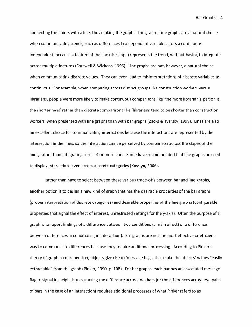
Rather than have to select between these various trade-offs between bar and line graphs,
another option is to design a new kind of graph that has the desirable properties of the bar graphs
(proper interpretation of discrete categories) and desirable properties of the line graphs (configurable
properties that signal the effect of interest, unrestricted settings for the y-axis). Often the purpose of a
graph is to report findings of a difference between two conditions (a main effect) or a difference
between differences in conditions (an interaction). Bar graphs are not the most effective or efficient
way to communicate differences because they require additional processing. According to Pinker’s
theory of graph comprehension, objects give rise to ‘message flags’ that make the objects’ values “easily
extractable” from the graph (Pinker, 1990, p. 108). For bar graphs, each bar has an associated message
flag to signal its height but extracting the difference across two bars (or the differences across two pairs
of bars in the case of an interaction) requires additional processes of what Pinker refers to as

Hat Graphs 5
interrogation. In the case of bar graphs, this will require top-down visual search processes to locate the
relevant bars and then mentally compare their relative heights. A better way to communicate
differences is to represent the difference as a single object. Thus, the difference would have its own
message flag automatically associated with it, rather than require these additional interrogation
processes.
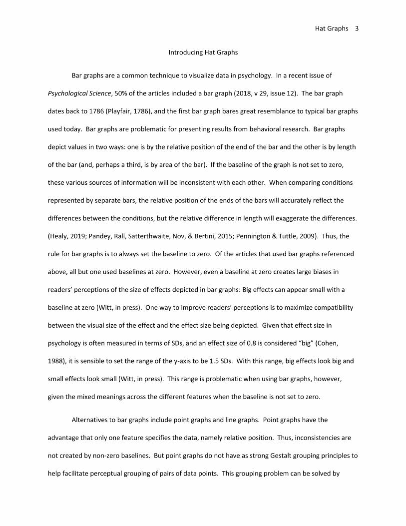
To achieve these objectives, the traditional bar graph was transformed. First, the tops of the
bars were retained while the bars themselves were removed. This removes the redundancy between
specifying the values by the tops of the bars and by the length of the bars. Removing redundancy is one
of the recommendations by Tufte (2001), and by removing bar length as a signifier of value, the y-axis
does not have to start at zero because now the tops are the only indicator of value and not also bar
length. Second, the difference between two sets of bars was highlighted by enclosing this difference as
its own object by keeping the portion of the second bar that differed from the first bar (see Figure 1).
Third, the components directly abutted each other in order to evoke strong Gestalt principles of
grouping, namely connectedness and proximity. The new format is called a hat graph because they
ended up bearing a resemblance to hats. The “brim” of the hat represents the value for condition 1, and
the top of the “crown” of the hat represents the value for condition 2. The height of the crown
represents the difference. A single object (the crown) represents the difference, so it should be easier
and faster to see the differences represented in the graph. This prediction was tested in Experiments 1
and 2.
Hat Graphs 6
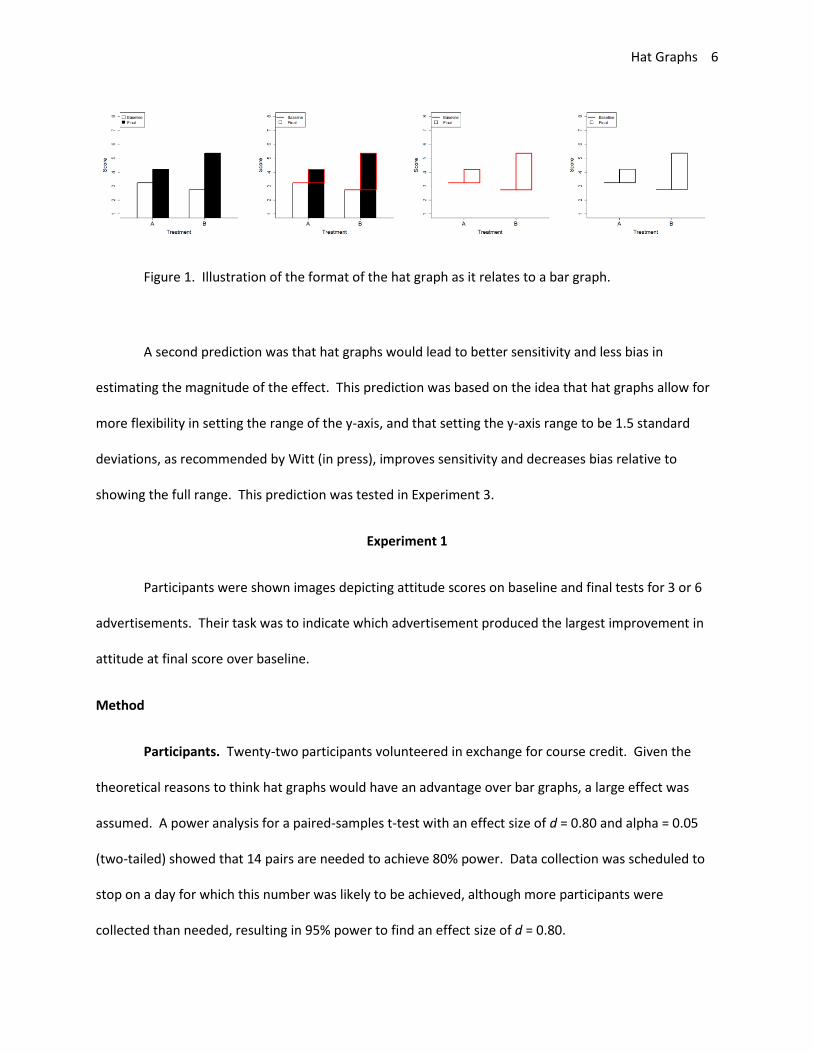
Figure 1. Illustration of the format of the hat graph as it relates to a bar graph.
A second prediction was that hat graphs would lead to better sensitivity and less bias in
estimating the magnitude of the effect. This prediction was based on the idea that hat graphs allow for
more flexibility in setting the range of the y-axis, and that setting the y-axis range to be 1.5 standard
deviations, as recommended by Witt (in press), improves sensitivity and decreases bias relative to
showing the full range. This prediction was tested in Experiment 3.
Experiment 1
Participants were shown images depicting attitude scores on baseline and final tests for 3 or 6
advertisements. Their task was to indicate which advertisement produced the largest improvement in
attitude at final score over baseline.
Method
Participants. Twenty-two participants volunteered in exchange for course credit. Given the
theoretical reasons to think hat graphs would have an advantage over bar graphs, a large effect was
assumed. A power analysis for a paired-samples t-test with an effect size of d = 0.80 and alpha = 0.05
(two-tailed) showed that 14 pairs are needed to achieve 80% power. Data collection was scheduled to
stop on a day for which this number was likely to be achieved, although more participants were
collected than needed, resulting in 95% power to find an effect size of d = 0.80.
Hat Graphs 7
Stimuli and Apparatus. Stimuli were displayed on computer monitors. The stimuli were
created using data simulated and plotted in R (R Core Team, 2017). Four factors were manipulated.
One factor was graph type (hat graph versus bar graph). Each set of simulated data were plotted with a
hat graph and with a bar graph. Another factor was number of advertisements (3 or 6). A third factor
was the position of the target (best) advertisement. These were evenly distributed across the locations,
and target position was repeated for the graphs with only 3 advertisements. The fourth factor was the
alignment across advertisements. One third of the graphs were aligned to have similar baselines, so the
target advertisement also had the highest final score. One third were aligned to have similar final
scores, so the target advertisement had the lowest baseline score. And one third were aligned at the
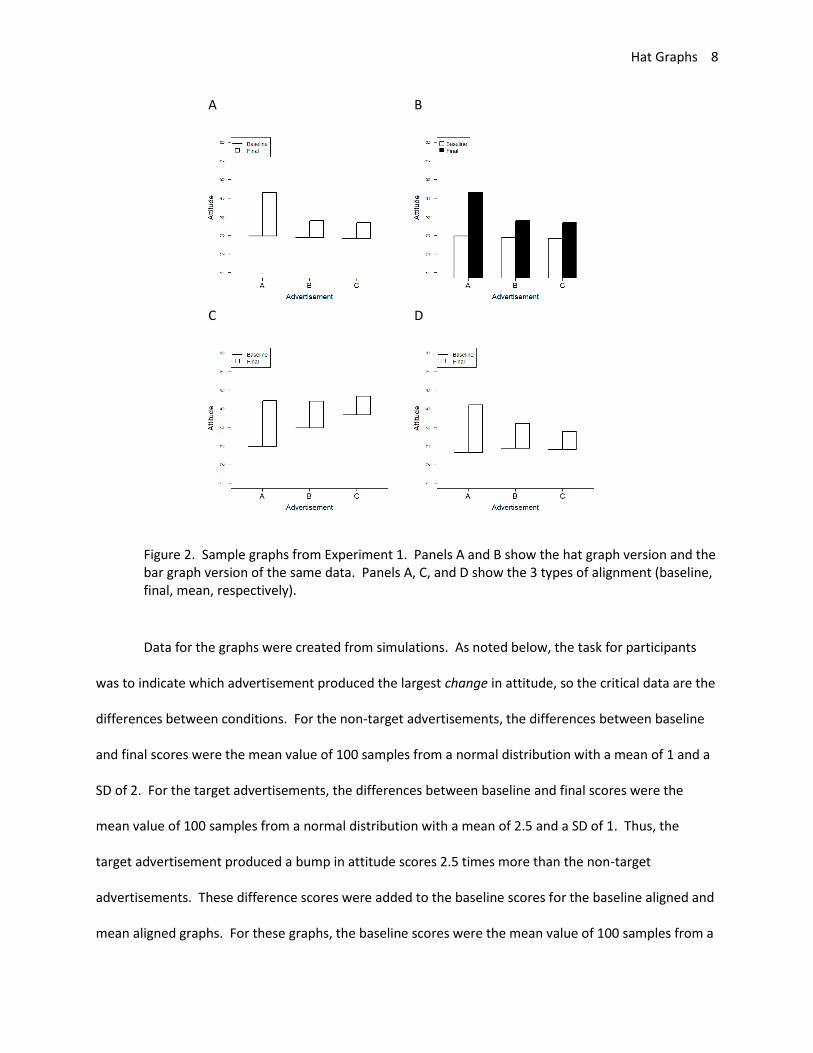
mean value between baseline and final scores (see Figure 2). Each graph style was repeated 4 times to
have several variants to show to the participants. This resulted in 288 unique graphs (288 = 2 x 2 x 6 x 3
x 4).
Hat Graphs 8
A B
C D
Figure 2. Sample graphs from Experiment 1. Panels A and B show the hat graph version and the bar graph version of the same data. Panels A, C, and D show the 3 types of alignment (baseline, final, mean, respectively).
Data for the graphs were created from simulations. As noted below, the task for participants
was to indicate which advertisement produced the largest change in attitude, so the critical data are the
differences between conditions. For the non-target advertisements, the differences between baseline
and final scores were the mean value of 100 samples from a normal distribution with a mean of 1 and a
SD of 2. For the target advertisements, the differences between baseline and final scores were the
mean value of 100 samples from a normal distribution with a mean of 2.5 and a SD of 1. Thus, the
target advertisement produced a bump in attitude scores 2.5 times more than the non-target
advertisements. These difference scores were added to the baseline scores for the baseline aligned and
mean aligned graphs. For these graphs, the baseline scores were the mean value of 100 samples from a

Hat Graphs 9
normal distribution with a mean of 3 and a SD of 1. For the final align graphs, the final scores were the
mean value of 100 samples from a normal distribution with a mean of 5.5 and a SD of 1, and the
difference scores were subtracted from the final scores to compute baseline scores. The process was
the same for the target conditions with the exception that .5 was subtracted from the baseline condition
so that it would not align with the other baseline conditions.
For each set of data, two graphs were created. One was a bar graph and one was a hat graph.
Thus, the data contained in the graphs were identical across graph types. For the bar graph, the
baseline condition was white and the final condition was black. For the hat graphs, the lines were black
and the crown was white. The y-axis ranged from 1 to 8 on every graph. Advertisements were labeled A
– F and were always in alphabetical order.
Procedure. Participants completed two blocks of trials, one with bar graphs and one with hat
graphs. Start order was counterbalanced across participants. For the hat graphs, they were shown
these initial instructions: “An advertising company is interested in which ads lead to the biggest changes
in attitude. They ran a study testing several different ads. In each study, they measured attitude at
BASELINE (before seeing any ads) and again at the FINAL test (after seeing the ads). All of the ads
increased attitude. Your task is to determine which ad produced the BIGGEST increase in attitude. The
baseline attitude will be shown as a horizontal line. The final attitude is shown as the top of the box. The
height of the box shows the change in attitude from baseline to final test. Which ad produces the
biggest change? Enter your response for each graph on the keyboard. Respond as fast and accurately as
possible. Press ENTER to begin”. For the bar graphs, the instructions were the same except instead of
describing the hat graph, they were told the following: “The baseline attitude will be shown in white
boxes. The final attitude will be shown in black boxes. The difference between the white and black
boxes shows change in attitude from baseline to final test.”

Hat Graphs 10
On each trial, after a fixation screen of 500ms, a graph was shown and participants entered a
response A-C (for graphs with 3 advertisements) or A-F (for graphs with 6 advertisements). The graph
remained visible until participants made their response. At which point, a blank screen was shown for
500ms before the next trial began. Participants completed 144 trials with one type of graph before
switching to the block of trials with the other graph type. Order within block was randomized.
Results and Discussion
Reaction times (RTs) are positively skewed, so they were log-transformed. The data were
initially explored for outliers. RTs beyond 1.5 times the interquartile range (IQR) for each subject for
each condition were excluded (3% of the data). Next, mean RTs and mean accuracy scores were
calculated for each subject and each condition and plotted in separate boxplots. One participant was
beyond the IQR for both, and three participants were beyond 1.5 times the IQR for accuracy scores.
These participants were excluded. For remaining participants, accuracy was nearly perfect (M = 98.9%,
SD = 1.3%), so the analysis focused on RTs.
Data were analyzed with linear mixed models using the lme4 and lmerTest packages in R (Bates,
Machler, Bolker, & Walker, 2015; Kuznetsova, Brockhoff, & Christensen, 2017). A linear mixed model
was run with the log RTs as the dependent factor. The independent factors were graph type (bar or
hat), number of advertisers (3 or 6), graph alignment (baseline, final, mean), and initial graph type (bar
or hat). All independent factors were entered as a factor with the reference factor being the first as
listed above. Two-way interactions between graph type and each factor were also included. The
random effects for participant included intercepts and slopes associated with graph type. Estimation
was done using restricted maximum likelihood and Satterthwaite's method for degrees of freedom.
Effect sizes were calculated based on formula from Westfall, Kenny, and Judd (2014). The emmeans R
Hat Graphs 11
package was used to extract marginal means on the original scale (non-transformed RTs) from the
model for the plots (Lenth, 2019).
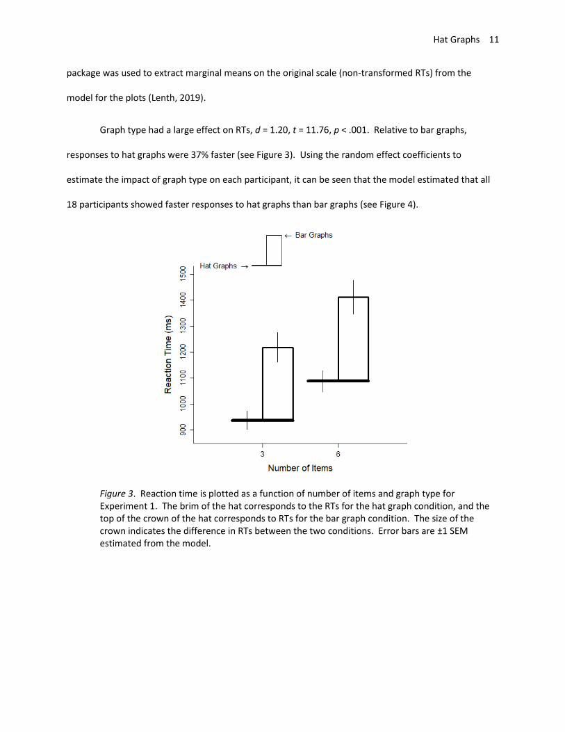
Graph type had a large effect on RTs, d = 1.20, t = 11.76, p < .001. Relative to bar graphs,
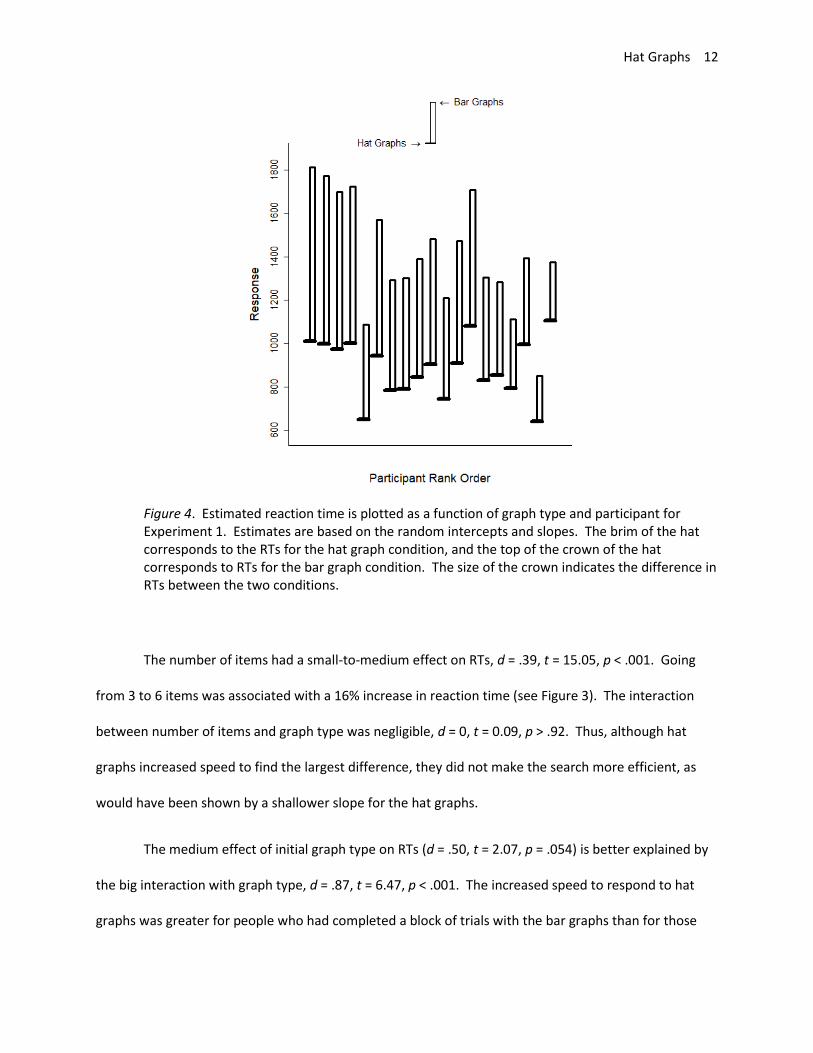
responses to hat graphs were 37% faster (see Figure 3). Using the random effect coefficients to
estimate the impact of graph type on each participant, it can be seen that the model estimated that all
18 participants showed faster responses to hat graphs than bar graphs (see Figure 4).
Figure 3. Reaction time is plotted as a function of number of items and graph type for Experiment 1. The brim of the hat corresponds to the RTs for the hat graph condition, and the top of the crown of the hat corresponds to RTs for the bar graph condition. The size of the crown indicates the difference in RTs between the two conditions. Error bars are ±1 SEM estimated from the model.
Hat Graphs 12
Figure 4. Estimated reaction time is plotted as a function of graph type and participant for Experiment 1. Estimates are based on the random intercepts and slopes. The brim of the hat corresponds to the RTs for the hat graph condition, and the top of the crown of the hat corresponds to RTs for the bar graph condition. The size of the crown indicates the difference in RTs between the two conditions.
The number of items had a small-to-medium effect on RTs, d = .39, t = 15.05, p < .001. Going
from 3 to 6 items was associated with a 16% increase in reaction time (see Figure 3). The interaction
between number of items and graph type was negligible, d = 0, t = 0.09, p > .92. Thus, although hat
graphs increased speed to find the largest difference, they did not make the search more efficient, as
would have been shown by a shallower slope for the hat graphs.
The medium effect of initial graph type on RTs (d = .50, t = 2.07, p = .054) is better explained by
the big interaction with graph type, d = .87, t = 6.47, p < .001. The increased speed to respond to hat
graphs was greater for people who had completed a block of trials with the bar graphs than for those
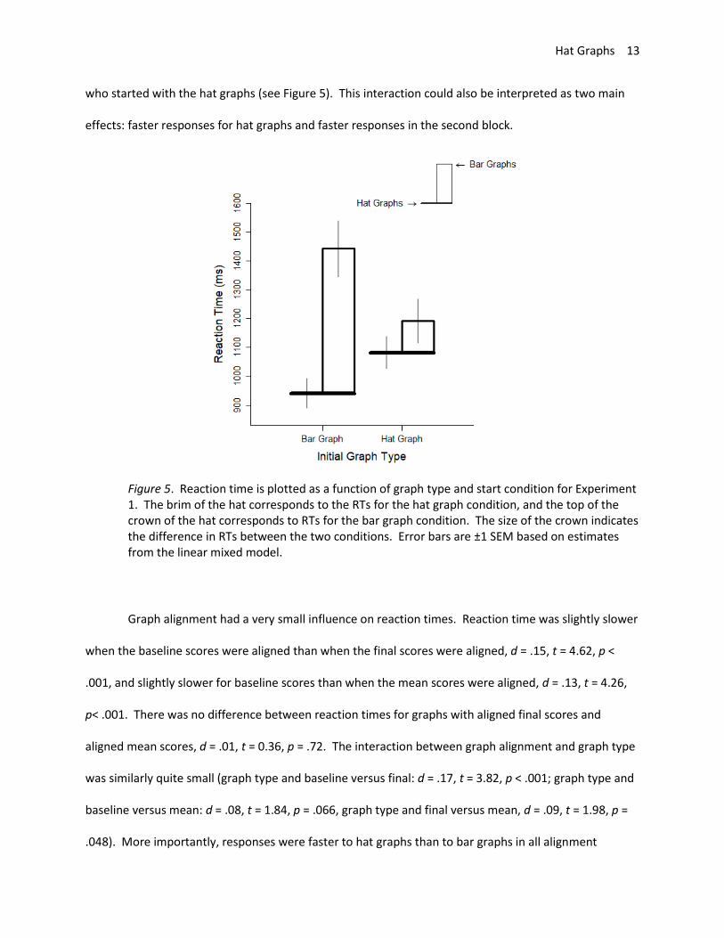
Hat Graphs 13
who started with the hat graphs (see Figure 5). This interaction could also be interpreted as two main
effects: faster responses for hat graphs and faster responses in the second block.
Figure 5. Reaction time is plotted as a function of graph type and start condition for Experiment 1. The brim of the hat corresponds to the RTs for the hat graph condition, and the top of the crown of the hat corresponds to RTs for the bar graph condition. The size of the crown indicates the difference in RTs between the two conditions. Error bars are ±1 SEM based on estimates from the linear mixed model.
Graph alignment had a very small influence on reaction times. Reaction time was slightly slower
when the baseline scores were aligned than when the final scores were aligned, d = .15, t = 4.62, p <
.001, and slightly slower for baseline scores than when the mean scores were aligned, d = .13, t = 4.26,
p< .001. There was no difference between reaction times for graphs with aligned final scores and
aligned mean scores, d = .01, t = 0.36, p = .72. The interaction between graph alignment and graph type
was similarly quite small (graph type and baseline versus final: d = .17, t = 3.82, p < .001; graph type and
baseline versus mean: d = .08, t = 1.84, p = .066, graph type and final versus mean, d = .09, t = 1.98, p =
.048). More importantly, responses were faster to hat graphs than to bar graphs in all alignment
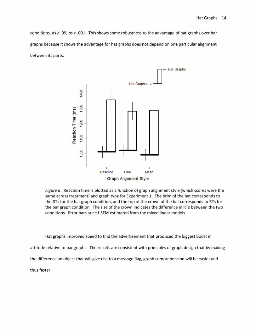
Hat Graphs 14
conditions, ds ≥ .99, ps < .001. This shows some robustness to the advantage of hat graphs over bar
graphs because it shows the advantage for hat graphs does not depend on one particular alignment
between its parts.
Figure 6. Reaction time is plotted as a function of graph alignment style (which scores were the same across treatment) and graph type for Experiment 1. The brim of the hat corresponds to the RTs for the hat graph condition, and the top of the crown of the hat corresponds to RTs for the bar graph condition. The size of the crown indicates the difference in RTs between the two conditions. Error bars are ±1 SEM estimated from the mixed linear models.
Hat graphs improved speed to find the advertisement that produced the biggest boost in
attitude relative to bar graphs. The results are consistent with principles of graph design that by making
the difference an object that will give rise to a message flag, graph comprehension will be easier and
thus faster.
Hat Graphs 15
Experiment 2
Experiment 2 serves as a replication of Experiment 1. The effect size depicted in the graphs was
slightly smaller than in Experiment 1.
Method
Seventeen students volunteered in exchange for course credit. Everything was the same as in
Experiment 1 except the target difference was simulated as a magnitude of 2 (rather than 2.5).
Results and Discussion
Data were analyzed as before, and 3% of trials were excluded because the (log) RT was beyond
1.5 times the IQR for that participant for that condition. Mean RTs and proportion correct scores were
summarized for each participant for each condition. Nine participants were identified as outliers based
on these summary scores, which seems like a large portion of the data. Statistical models were
conducted with all participants, without RT outliers (n = 4), without accuracy outliers (n = 5), without
either RT or accuracy outliers (n = 9), and without participants with accuracy scores less than .9 (n = 3).
The outcomes from the various statistical models were the same regardless of which outliers were
excluded with the exceptions of the main effect of graph alignment style and the interaction between
graph alignment style and graph type for baseline versus final alignments. That the findings are
generally the same speaks to the robustness of the effect of graph style given that outlier removal did
not have much influence. The final model reported was one for which the 3 participants with accuracy
scores less than .9 were eliminated because it seems reasonable that participants who had accuracy
scores of .7 were different from the participants who had accuracy scores greater than .9 (M = .98, SD =
.03).
Hat Graphs 16
The data were submitted to a linear mixed model with the log of the reaction times as the
dependent factor and graph type, number of items, graph alignment style, and starting graph type as
independent factors. Two-way interactions with graph type and each of the other factors were
included. Random effects for participants included the intercepts and slopes for graph type.
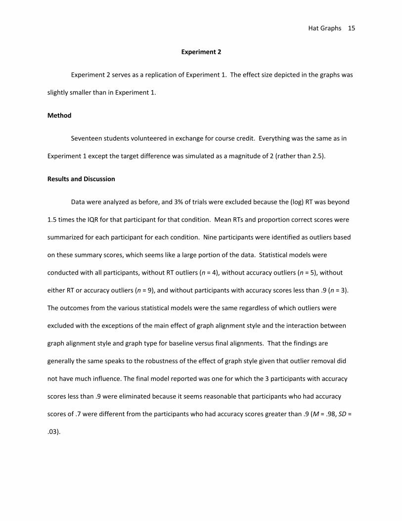
Graph type had a large effect on reaction time, d = .90, t = 6.82, p < .001 (see Figure 7).
Participants were 37% faster to respond to hat graphs than to bar graphs. All participants showed a
benefit for hat graphs over bar graphs (see Figure 8). The number of items had a small effect on reaction
time, d = .34, t = 14.77, p < .001. Participants were 21% slower to respond to 6 items than to 3 items.
The interaction between graph type and number of items was negligible, d = .03, t = 0.84, p = .40. Thus,
although hat graphs increased speed to find the largest difference, it did not make the search more
efficient, as would have been shown by a shallower slope for the hat graphs relative to the bar graphs.
Figure 7. Reaction time is plotted as a function of number of items and graph type for Experiment 2. The brim of the hat corresponds to the RTs for the hat graph condition, and the top of the crown of the hat corresponds to RTs for the bar graph condition. The size of the
Hat Graphs 17
crown indicates the difference in RTs between the two conditions. Error bars are ±1 SEM estimated from the linear mixed model.
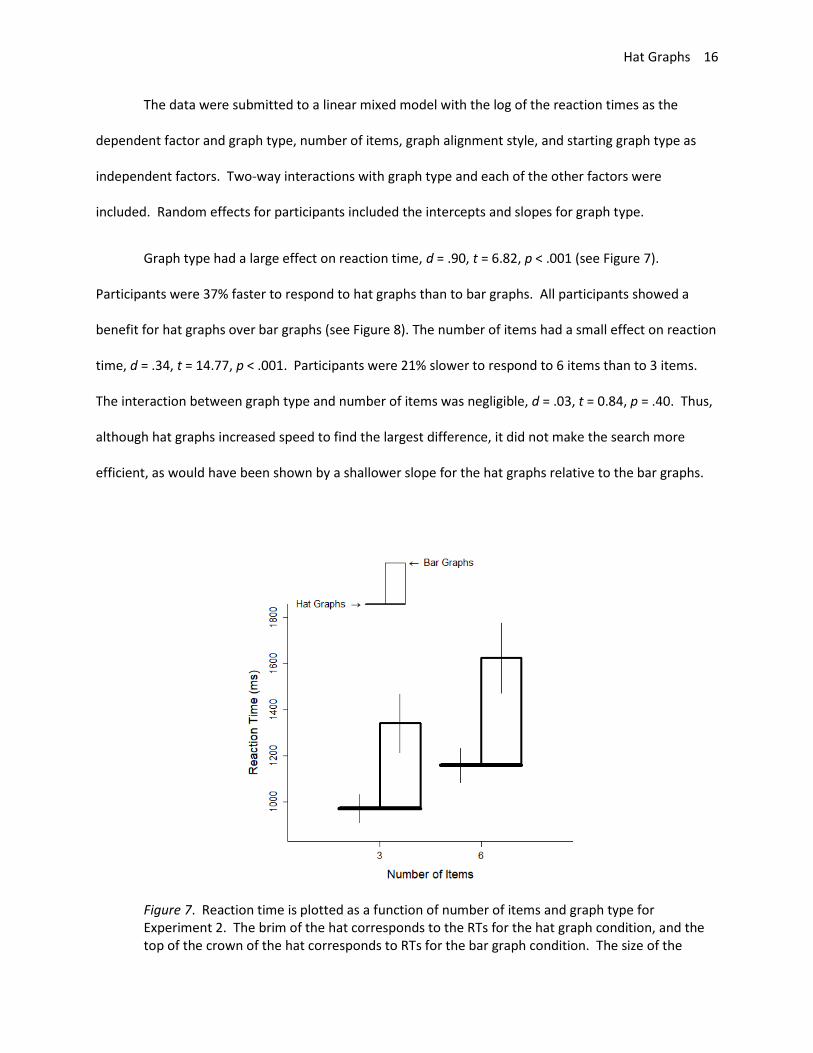
Figure 8. Reaction time is plotted as a function of graph type and participant for Experiment 2. Estimates are based on the random intercepts and slopes from the linear mixed model. The brim of the hat corresponds to the RTs for the hat graph condition, and the top of the crown of the hat corresponds to RTs for the bar graph condition. The size of the crown indicates the difference in RTs between the two conditions.
Reaction times were similar regardless of the alignment in the graph. For the comparison
between aligned baseline scores and aligned final scores, the difference in reaction times was very
small, d = .12, t = 3.83, p < .001. This difference was similarly small for the comparison between aligned
baseline scores and aligned mean scores, d = .15, t = 4.81, p < .001, and there was no difference
between aligned final scores and aligned mean scores, d = .03, t = 0.98, p = .33. The interaction between
graph type and aligned baseline versus final scores was also very small, d = .14, t = 3.72, p < .001. The
interaction between graph type and aligned baseline versus mean scores was negligible, d = .05, t = 1.12,
Hat Graphs 18
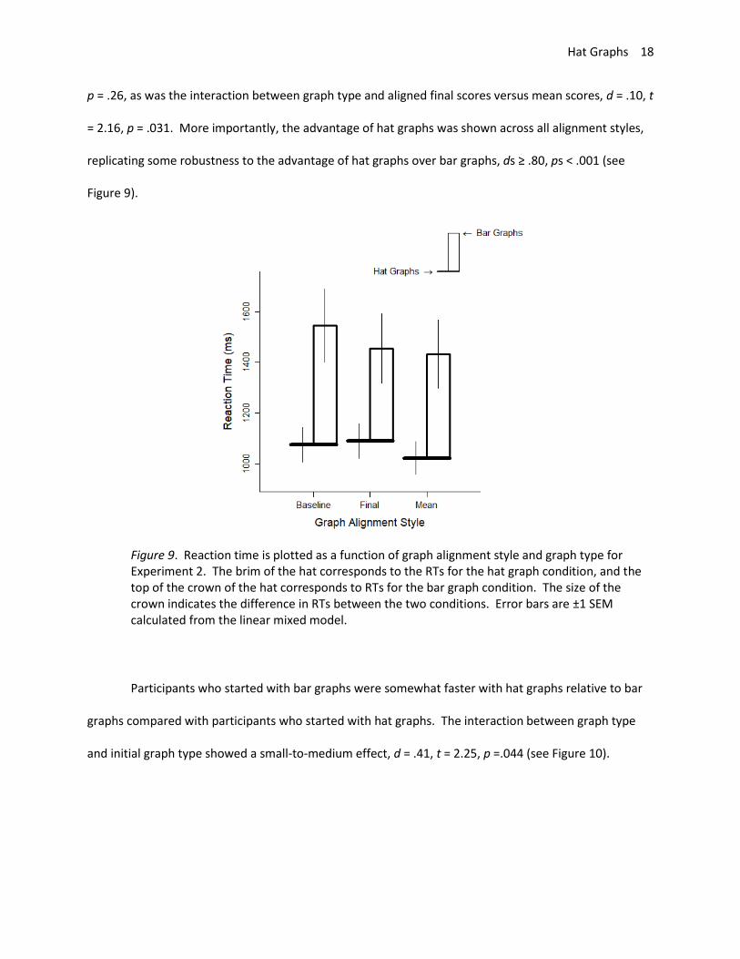
p = .26, as was the interaction between graph type and aligned final scores versus mean scores, d = .10, t
= 2.16, p = .031. More importantly, the advantage of hat graphs was shown across all alignment styles,
replicating some robustness to the advantage of hat graphs over bar graphs, ds ≥ .80, ps < .001 (see
Figure 9).
Figure 9. Reaction time is plotted as a function of graph alignment style and graph type for Experiment 2. The brim of the hat corresponds to the RTs for the hat graph condition, and the top of the crown of the hat corresponds to RTs for the bar graph condition. The size of the crown indicates the difference in RTs between the two conditions. Error bars are ±1 SEM calculated from the linear mixed model.
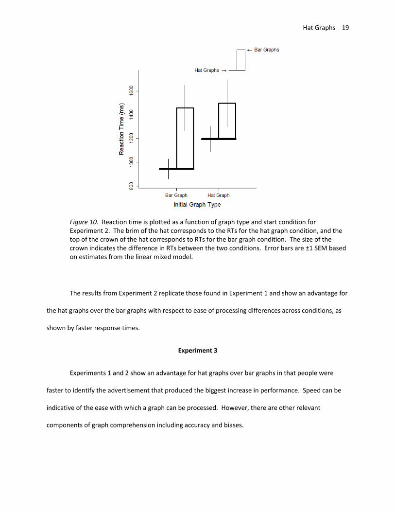
Participants who started with bar graphs were somewhat faster with hat graphs relative to bar
graphs compared with participants who started with hat graphs. The interaction between graph type
and initial graph type showed a small-to-medium effect, d = .41, t = 2.25, p =.044 (see Figure 10).
Hat Graphs 19
Figure 10. Reaction time is plotted as a function of graph type and start condition for Experiment 2. The brim of the hat corresponds to the RTs for the hat graph condition, and the top of the crown of the hat corresponds to RTs for the bar graph condition. The size of the crown indicates the difference in RTs between the two conditions. Error bars are ±1 SEM based on estimates from the linear mixed model.
The results from Experiment 2 replicate those found in Experiment 1 and show an advantage for
the hat graphs over the bar graphs with respect to ease of processing differences across conditions, as
shown by faster response times.
Experiment 3
Experiments 1 and 2 show an advantage for hat graphs over bar graphs in that people were
faster to identify the advertisement that produced the biggest increase in performance. Speed can be
indicative of the ease with which a graph can be processed. However, there are other relevant
components of graph comprehension including accuracy and biases.
Hat Graphs 20
One of the motivators for hat graphs as a replacement for bar graphs is that the hat graphs are
not restricted to have the y-axis range start at zero. For bar graphs, the top of the bar and the length of
the bar both signify the value for that condition. Consequently, bar graphs must start at zero to avoid
having a conflict between the two indicators that could produce misleading impressions (Pandey et al.,
2015; Pennington & Tuttle, 2009). This restriction does not apply to hat graphs because there is only the
one indicator for the condition’s value. Thus, one of the benefits of hat graphs is to be able to control
the range of the y-axis to better convey the magnitude of the effect. Small effects should look small,
and big effects should look big. One way to achieve this is to set the range of the y-axis to be 1.5 SDs
(Witt, in press). In Experiment 3, hat graphs were plotted with this 1.5 SD range whereas bar graphs
were plotted such that the y-axis started at zero to empirically test whether this theoretical advantage
of hat graphs leads to empirical benefits.
Method
Participants. Twenty-three participants completed the experiment in exchange for course
credit. The first 13 completed the experiment with the two graph types presented in separate blocks,
and the last 10 completed the experiment with the two graph types intermixed having decided the
latter is more akin to what people are likely to experience.
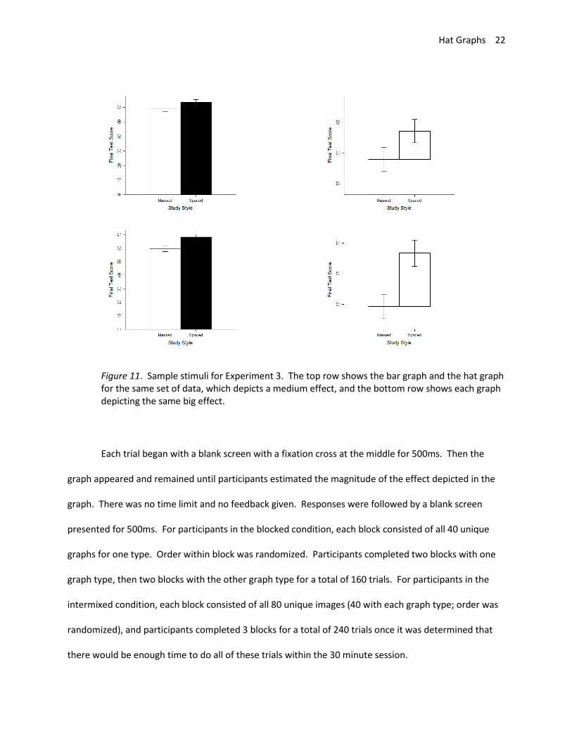
Stimuli and Apparatus. The experimental set-up was the same as in Experiments 1 and 2. The
stimuli were 80 unique graphs, 40 of which were hat graphs and 40 were bar graphs. Each graph
depicted two means based on simulated data. The data were simulated to mimic scores on a memory
test from 0 to 100 after engaging in 1 of 2 study styles. Massed refers to studying everything at once, as
in cramming just before the exam. Spaced refers to dispersing studying across time. The simulated
mean for the massed study style was 60. The simulated mean for the spaced study style was set to 1 of
4 values (60, 63, 65, 68). For both groups, the simulated standard deviation was 10, so the differences

Hat Graphs 21
between the two groups correspond to 4 different effect sizes as measured with Cohen’s d (0, .3, .5, .8).
These four values coincide with the naming conventions of a null, small, medium, and big effect. For
each effect size, means for both groups were simulated based on a sample size of 100 per group, and for
each effect size, simulations were conducted 10 times for a total of 40 unique data sets. For each data
set, the final effect size was compared to the intended effect size, and discarded and replaced if they
were not within 0.05 SDs of each other. For each data set, one bar graph and one hat graph were
created with error bars that corresponded to 95% confidence intervals (see Figure 11). For the bar
graph, the y-axis started at 0 and went to 4% beyond the top of the range necessary to see both error
bars (as is the default in R). For the hat graph, the same restriction of having a baseline of zero does not
apply. Therefore, the range of the y-axis was set to be 1.5 SDs based on the recommendations of Witt
(in press). The y-axis range was the grand mean of both groups minus 7.5 to the grand mean plus 7.5 for
a total range of 15, which is 1.5 times the simulated standard deviation of 10.
Procedure. Initial instructions explained the two study styles and that participants would make
a judgment about whether study style affected final test performance. They were to judge whether
study style had no effect, a small effect, a medium effect, or a big effect, and press the corresponding
number (1-4, respectively). They were then given an overview of each type of graph showing what
corresponded to the mean for each group and what the error bars signified. For the first group of
participants (n = 14), the two graph types were presented in different blocks, so instructions for each
type of graph preceded that block. For the second group, the graph types were intermixed within block,
so instructions for both graph types were presented at the beginning.
Hat Graphs 22
Figure 11. Sample stimuli for Experiment 3. The top row shows the bar graph and the hat graph for the same set of data, which depicts a medium effect, and the bottom row shows each graph depicting the same big effect.
Each trial began with a blank screen with a fixation cross at the middle for 500ms. Then the
graph appeared and remained until participants estimated the magnitude of the effect depicted in the
graph. There was no time limit and no feedback given. Responses were followed by a blank screen
presented for 500ms. For participants in the blocked condition, each block consisted of all 40 unique
graphs for one type. Order within block was randomized. Participants completed two blocks with one
graph type, then two blocks with the other graph type for a total of 160 trials. For participants in the
intermixed condition, each block consisted of all 80 unique images (40 with each graph type; order was
randomized), and participants completed 3 blocks for a total of 240 trials once it was determined that
there would be enough time to do all of these trials within the 30 minute session.
Hat Graphs 23
Results and Discussion
The data were analyzed using a linear mixed model with Satterthwaite's estimation for degrees
of freedom. The dependent variable was estimated effect size, centered from the original scale of 1 to 4
by subtracting 3. One independent factor was depicted effect size. Although four effect sizes were used
in the experiment, following Witt (in press), only the non-null effects were included in the analysis
because there are differences in sensitivity when estimating between a null and a non-null effect
compared with estimating across non-null effects, and it is the latter that is typically of greater interest.
The three depicted effect sizes were converted to the same scale as the response and centered by
subtracting 3 (-1, 0, 1 for .3, .5, and .8, respectively). The other independent factors were graph type
(bar graph and hat graph) and block type (blocked or intermixed). Depicted effect size and graph type
were within-subjects factors, and block type was a between-subjects factor. Random effects for
participant including intercepts and main effects for each within-subjects factors and their interaction
were included. These random coefficients were initially examined for outliers. One participant showed
no sensitivity to effect size in either condition, and was excluded. The model was re-run but did not
converge so the interaction term for the random effects was excluded to achieve convergence.
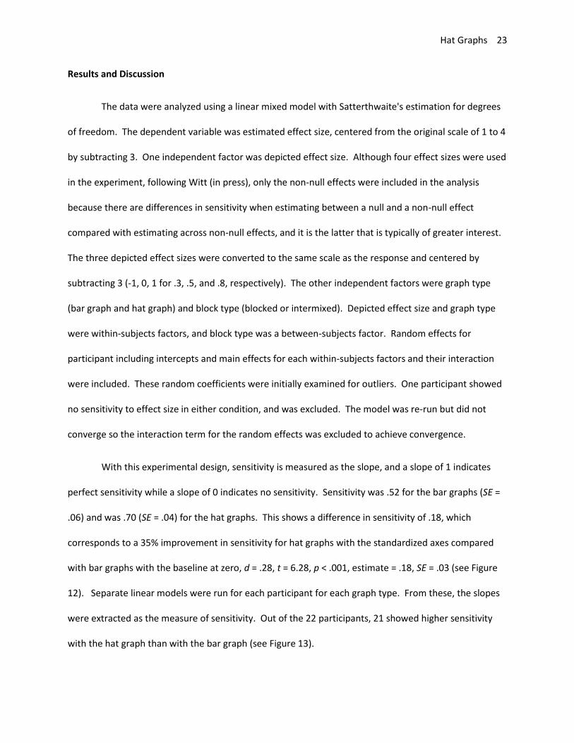
With this experimental design, sensitivity is measured as the slope, and a slope of 1 indicates
perfect sensitivity while a slope of 0 indicates no sensitivity. Sensitivity was .52 for the bar graphs (SE =
.06) and was .70 (SE = .04) for the hat graphs. This shows a difference in sensitivity of .18, which
corresponds to a 35% improvement in sensitivity for hat graphs with the standardized axes compared
with bar graphs with the baseline at zero, d = .28, t = 6.28, p < .001, estimate = .18, SE = .03 (see Figure
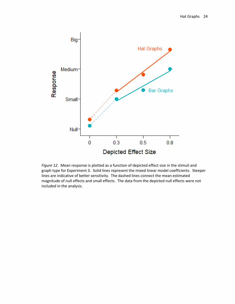
12). Separate linear models were run for each participant for each graph type. From these, the slopes
were extracted as the measure of sensitivity. Out of the 22 participants, 21 showed higher sensitivity
with the hat graph than with the bar graph (see Figure 13).
Hat Graphs 24
Figure 12. Mean response is plotted as a function of depicted effect size in the stimuli and graph type for Experiment 3. Solid lines represent the mixed linear model coefficients. Steeper lines are indicative of better sensitivity. The dashed lines connect the mean estimated magnitude of null effects and small effects. The data from the depicted null effects were not included in the analysis.
Hat Graphs 25
Figure 13. Sensitivity is plotted for each participant for each graph type. The brim of the hat corresponds to sensitivity with the bar graphs, and the crown corresponds to sensitivity with the hat graphs. Sensitivity was measured as the slope in linear regressions, and higher values correspond to better sensitivity. A slope of 1 corresponds to perfect sensitivity whereas a slope of 0 indicates no sensitivity. The brims correspond to the bar graph condition whereas the crowns correspond to the hat graph condition. Participants are grouped by design (blocked versus intermixed) then ranked with respect to how much more sensitive they were with the hat graphs compared with the bar graphs.
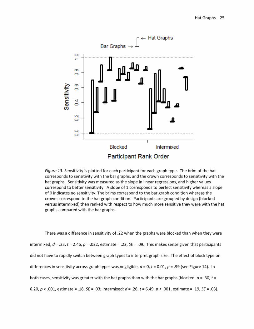
There was a difference in sensitivity of .22 when the graphs were blocked than when they were
intermixed, d = .33, t = 2.46, p = .022, estimate = .22, SE = .09. This makes sense given that participants
did not have to rapidly switch between graph types to interpret graph size. The effect of block type on
differences in sensitivity across graph types was negligible, d = 0, t = 0.01, p = .99 (see Figure 14). In
both cases, sensitivity was greater with the hat graphs than with the bar graphs (blocked: d = .30, t =
6.20, p < .001, estimate = .18, SE = .03; intermixed: d = .26, t = 6.49, p < .001, estimate = .19, SE = .03).
Hat Graphs 26
Figure 14. Sensitivity is potted as a function of block type and graph type. Sensitivity is measured as the slope. Higher scores indicate better sensitivity. Scores at 1 indicate perfect sensitivity and scores at 0 indicate no sensitivity. The brims correspond to the bar graph condition whereas the crowns correspond to the hat graph condition. Error bars are ±1 SEM calculated from the linear mixed models.
In addition to sensitivity, the data also reveal biases associated with the various graph types.
Bias is measured by the intercepts. Graph type had a medium effect on bias, d = .61, t = 4.33, p < .001,
estimate = .40, SE = .09. To assess bias for each, separate linear mixed models were run for each graph
type, and the intercepts were transformed into percent overestimation scores. When reading bar
graphs, participants underestimated depicted effect size by 16%, d = .68, t = -4.73, p < .001, estimate = -
0. 74, SE = .10. When reading hat graphs, the bias was 2% underestimation and was negligible, d = .11, t
= -0.79, p = .44, estimate = -.07, SE = .09. Thus, not only do hat graphs improve sensitivity to effect size,
they also reduce bias in estimating effect size relative to bar graphs because of their flexibility to allow
Hat Graphs 27
the y-axis to start at a value other than zero. Because bar graphs must start at zero, this leads to a bias
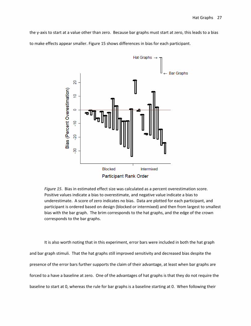
to make effects appear smaller. Figure 15 shows differences in bias for each participant.
Figure 15. Bias in estimated effect size was calculated as a percent overestimation score.
Positive values indicate a bias to overestimate, and negative value indicate a bias to
underestimate. A score of zero indicates no bias. Data are plotted for each participant, and
participant is ordered based on design (blocked or intermixed) and then from largest to smallest
bias with the bar graph. The brim corresponds to the hat graphs, and the edge of the crown
corresponds to the bar graphs.
It is also worth noting that in this experiment, error bars were included in both the hat graph
and bar graph stimuli. That the hat graphs still improved sensitivity and decreased bias despite the
presence of the error bars further supports the claim of their advantage, at least when bar graphs are
forced to a have a baseline at zero. One of the advantages of hat graphs is that they do not require the
baseline to start at 0, whereas the rule for bar graphs is a baseline starting at 0. When following their

Hat Graphs 28
respective rules, the hat graphs lead to increased sensitivity to the size of the effect depicted in the
graph and reduced biased.
Experiment 4: Same Axes for Both Graph Types
The rule is that bar graphs should have a baseline at zero. But rules are made to be broken,
right? Currently, there is moderate agreement that bar charts should have the baseline at zero (Healy,
2018). Much of the debate takes place in blogs and on Twitter. For example, while Nathan Yau admits
that most graphing rules have exceptions, he has not come across a worthwhile reason to break the
baseline-at-zero rule for bar graphs (Yau, 2015). Stephen Few agrees (Few, 2019). In contrast, Kosslyn
argues for maximizing compatibility between the visual impression of the display and the actual
difference, and his specific example includes using a non-zero baseline with the bar graph (Kosslyn,
1994, p. 79). Others do not see the rule as specific to bar graphs given that non-zero baselines can lead
to distortions for other kinds of graphs such as line graphs (Kosara, 2013; Skelton, 2018). Previously, I
offered a way to avoid these distortions, at least for psychology and other behavioral sciences, by
setting the range of the y-axis to equal 1.5 SDs (Witt, in press). This range increases sensitivity and
minimizes bias relative to showing the minimal range or the full range. However, it means breaking the
baseline-at-zero rule for bar graphs. Experiment 3 showed that sticking to the rule for bar graphs means
that hat graphs have the advantage over bar graphs. Experiment 4 explored whether abandoning this
rule would give bar graphs the advantage. Two other graph types were also included for comparison:
boxplots and scatterplots.
Method
Participants. Fifteen students participated in exchange for course credit.
Stimuli and Apparatus. The stimuli were graphs based on data that was simulated from normal
distributions. As in Experiment 3, data were simulated for two hypothetical groups with different study
Hat Graphs 29
styles. The mean for the spaced study group was 50, and the mean for the massed study group was 50,
47, 45, or 42, which corresponds to an effect size of d = 0, .3, .5, or .8. The standard deviation was 10 for
all simulations for both groups. The other factor was the number of samples drawn from each
distribution. This number was determined based on achieving a power of .80 or .95 to achieve the
intended effect size. For each effect size and for each power, there were 10 repetitions. When the
effect size was 0, power was based on intending to get one of the other effect sizes, and this varied
across the 10 repetitions. Simulated data were checked to ensure that they were within 0.05 SDs of the
intended effect size, otherwise the simulation was repeated until this condition was met. Altogether,
there were 80 unique datasets.
Each simulated dataset was plotted four different ways for a total of 320 graphs. For the hat
graphs, the massed style was the brim and the spaced was the crown. For bar graphs, the first bar was
white and represented the massed style, and the second bar was black and represented the spaced
style. For both the bar and the hat graphs, the y-axis was centered on the grand mean and extended
0.75 SDs in either direction. In addition, error bars representing ±1 SEM were also displayed. For the
scatterplot, each data point was plotted as a separate open circle, and each was aligned along the x-axis
based on study style (i.e., there was no jitter). For the boxplot, the default parameters in R were used,
so data points greater than 1.5 times the interquartile range were shown as open circles. For both the
scatterplot and the boxplot, the y-axis range was the default in R, which was ±4% of the data range.
Procedure. Participants were given initial instructions that they would see data from two
groups with different study styles and would have to indicate the size of the effect of study style on final
test score. They were then given specific instructions on how to read each graph. The first two
instructions pointed out the x-axis (study style) and the y-axis (final test score), which were the same for
all graphs. Three images explained boxplot (the center line is the median score; the box represents 50%
of all the scores in each group; the tails represent minimum and maximum values and the circles
Hat Graphs 30
represent outliers that are likely not representative of the population). One image explained the
scatterplot by stating that each point represents data from one participant. Three images explained bar
graphs (the top of the box is the mean for each condition; the difference in heights is the difference
between conditions; the error bars represent the precision of the estimate with longer lines meaning we
are less certain of the accuracy of the mean). Three images explained hat graphs in the same way as the
bar graphs.
On each test trial, a fixation was present for 500ms followed by a graph. The graph was visible
until participants indicated their response by pressing 1, 2, 3, or 4 on the keyboard. A blank screen was
presented for 500ms. Each graph was presented once, and order was randomized for a total of 320
trials.
Results and Discussion
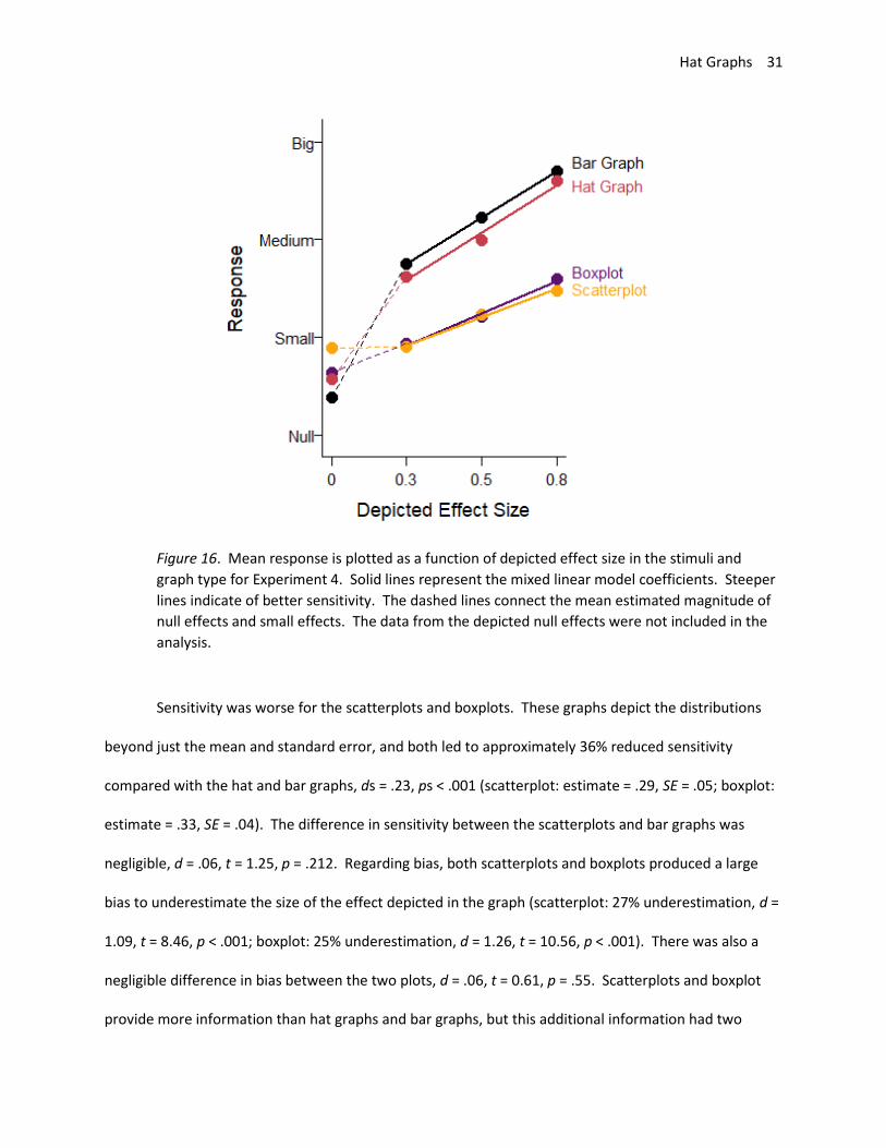
The data were analyzed as in Experiment 3. As shown in Figure 16, there were differences in
sensitivity to effect size across graph types. However, these differences were primarily between graphs
that showed means and SEMs (hat graphs and bar graphs) and graphs that showed more of the
distribution (scatterplots and boxplots). Sensitivity for the hat graphs (estimate = .49, SE = .06) and
sensitivity for the bar graphs (.48, SE = .06) were equivalent, d = .01, t = 0.30, p = .76. When the bar
graph had the same axes as the hat graph, it led to similar levels of sensitivity. However, with respect to
bias, the hat graph had a small advantage over the bar graph, d = .23, t = 4.33, p < .001. With the bar
graph, there was a small bias to overestimate the size of the effect by 7% (d = .35, t = 2.15, p = .050).
The bias was only 2% overestimation with the hat graph (d = .11, t = 0.65, p = .53). Even when playing by
“hat graph rules” rather than “bar graph rules”, the bar graph was still not as good as the hat graph
because it produced more bias in how the effects were interpreted.
Hat Graphs 31
Figure 16. Mean response is plotted as a function of depicted effect size in the stimuli and
graph type for Experiment 4. Solid lines represent the mixed linear model coefficients. Steeper
lines indicate of better sensitivity. The dashed lines connect the mean estimated magnitude of
null effects and small effects. The data from the depicted null effects were not included in the
analysis.
Sensitivity was worse for the scatterplots and boxplots. These graphs depict the distributions
beyond just the mean and standard error, and both led to approximately 36% reduced sensitivity
compared with the hat and bar graphs, ds = .23, ps < .001 (scatterplot: estimate = .29, SE = .05; boxplot:
estimate = .33, SE = .04). The difference in sensitivity between the scatterplots and bar graphs was
negligible, d = .06, t = 1.25, p = .212. Regarding bias, both scatterplots and boxplots produced a large
bias to underestimate the size of the effect depicted in the graph (scatterplot: 27% underestimation, d =
1.09, t = 8.46, p < .001; boxplot: 25% underestimation, d = 1.26, t = 10.56, p < .001). There was also a
negligible difference in bias between the two plots, d = .06, t = 0.61, p = .55. Scatterplots and boxplot
provide more information than hat graphs and bar graphs, but this additional information had two

Hat Graphs 32
negative impacts for graph comprehension: decreased sensitivity and increased bias. The current data
support the idea that less can be more. A potentially relevant factor is that boxplots may not have been
familiar to our participants, but scatterplots are fairly common, and performance was similar for the two
graph types.
Experiment 5: Same Axes and Feedback
Although the hat graphs and bar graphs lead to better sensitivity and worse bias than the
boxplots and scatterplots, sensitivity was still far from ideal performance. Furthermore, all graphs
except the hat graph lead to bias in how the effects were interpreted. In this experiment, feedback was
provided after each trial to determine whether people could quickly learn how to accurately read each
type of graph.
Method
The experiment was the same as in Experiment 5 except that feedback was given on every trial.
Specifically, the correct response was provided after participants made each response regardless of the
accuracy of their response. Eleven students participated in exchange for course credit.
Results and Discussion
The data were analyzed as in Experiment 4. One participant had negative slopes for two of the
graph types and was excluded. The results are shown in Figure 17. All graphs showed good but
attenuated sensitivity (hat graph: estimate = .69, SE = .07; bar graph: estimate = .73, SE = .07; boxplot:
estimate = .63, SE = .06; scatterplot: estimate = .56, SE = .06). Compared with Experiment 4, feedback
improved performance for all the conditions, estimates = .20-.30, SEs = .07-.09, ps < .05 (see Figure 18).
Feedback nearly equated performance across the graph types. The hat graphs and bar graphs were
equivalent to each other, d = .06, p = .34. The difference between the hat graphs and bar graphs from
Hat Graphs 33
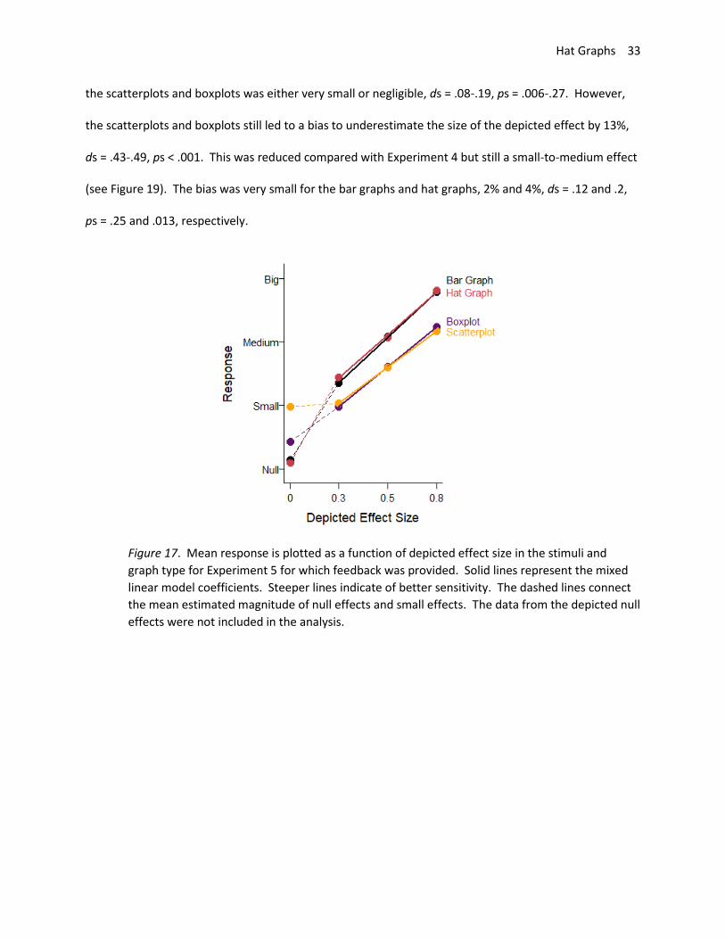
the scatterplots and boxplots was either very small or negligible, ds = .08-.19, ps = .006-.27. However,
the scatterplots and boxplots still led to a bias to underestimate the size of the depicted effect by 13%,
ds = .43-.49, ps < .001. This was reduced compared with Experiment 4 but still a small-to-medium effect
(see Figure 19). The bias was very small for the bar graphs and hat graphs, 2% and 4%, ds = .12 and .2,
ps = .25 and .013, respectively.
Figure 17. Mean response is plotted as a function of depicted effect size in the stimuli and
graph type for Experiment 5 for which feedback was provided. Solid lines represent the mixed
linear model coefficients. Steeper lines indicate of better sensitivity. The dashed lines connect
the mean estimated magnitude of null effects and small effects. The data from the depicted null
effects were not included in the analysis.
Hat Graphs 34
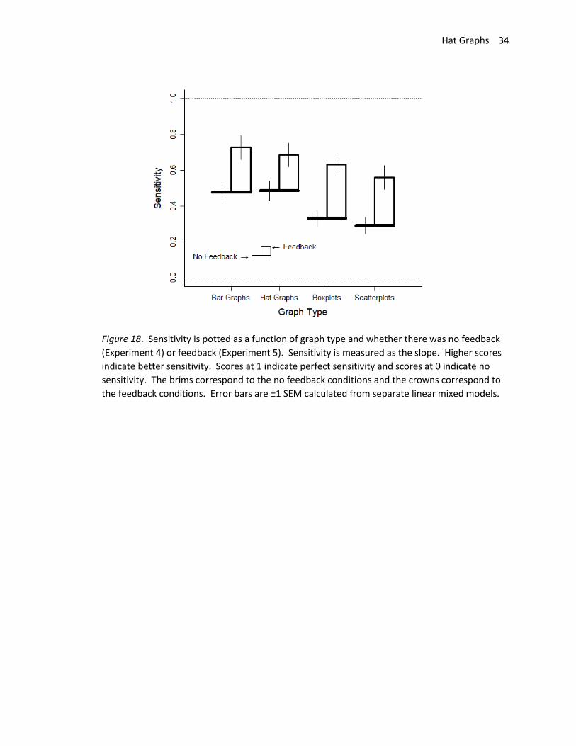
Figure 18. Sensitivity is potted as a function of graph type and whether there was no feedback
(Experiment 4) or feedback (Experiment 5). Sensitivity is measured as the slope. Higher scores
indicate better sensitivity. Scores at 1 indicate perfect sensitivity and scores at 0 indicate no
sensitivity. The brims correspond to the no feedback conditions and the crowns correspond to
the feedback conditions. Error bars are ±1 SEM calculated from separate linear mixed models.
Hat Graphs 35
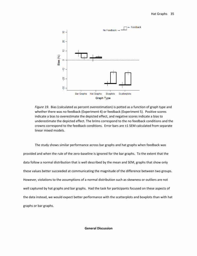
Figure 19. Bias (calculated as percent overestimation) is potted as a function of graph type and
whether there was no feedback (Experiment 4) or feedback (Experiment 5). Positive scores
indicate a bias to overestimate the depicted effect, and negative scores indicate a bias to
underestimate the depicted effect. The brims correspond to the no feedback conditions and the
crowns correspond to the feedback conditions. Error bars are ±1 SEM calculated from separate
linear mixed models.
The study shows similar performance across bar graphs and hat graphs when feedback was
provided and when the rule of the zero-baseline is ignored for the bar graphs. To the extent that the
data follow a normal distribution that is well described by the mean and SEM, graphs that show only
these values better succeeded at communicating the magnitude of the difference between two groups.
However, violations to the assumptions of a normal distribution such as skewness or outliers are not
well captured by hat graphs and bar graphs. Had the task for participants focused on these aspects of
the data instead, we would expect better performance with the scatterplots and boxplots than with hat
graphs or bar graphs.
General Discussion
Hat Graphs 36
Hat graphs were designed based on principles of graph design and Gestalt grouping to be a
better alternative to bar graphs. Bar graphs are essentially unchanged since their inception in the late
18th century (Playfair, 1786). Hat graphs were designed as a simple but important modernization of the
classic bar graph in an attempt to improve ease of graph comprehension. Two aspects of the benefits of
hat graphs were explored here. One related to ease to ascertain differences represented in the graph.
The other related to restrictions on the range of the y-axis and how eliminating these restrictions could
improve sensitivity to and reduce bias of estimates of the magnitude of the effect depicted in the graph.
Each will be discussed in turn.
Often the purpose of a graph is to invite comparison between two or more conditions. These
comparisons are better served by maximizing proximity between the objects that represent each
condition, but bar graphs have no inherent restrictions on the spacing between the bars, thereby
allowing the bars to be spaced far apart and making the comparison more difficult. Hat graphs remedy
this by using two of the strongest Gestalt principles of grouping: connectedness and proximity (Han,
Humphreys, & Chen, 1999; Palmer & Rock, 1994; Wagemans et al., 2012; Wertheimer, 1912). For the
hat graph, two conditions that should be compared are placed adjacent to each other in a way that their
components are connected. The visual system should therefore group the elements into a single
perceptual object. Hat graphs necessitate this visual grouping, whereas bar graphs can have proximity
and connectedness to help visually group objects, but it is optional and left to the designer’s choices.
Hat graphs also improve comparison across conditions because they make the difference
between conditions an object on itself, rather than the space between two objects as is the case with
the bar graph. With bar graphs, each bar has an associated message flag signaling its height, and
additional processes of interrogation are necessary to visually compare across heights (Pinker, 1990).
With the hat graph, the difference is represented as an object. The height of this object, which
represents the magnitude of the difference, has its own message flag signaling this value. Thus, the
Hat Graphs 37
difference can be automatically extracted from the graph, thereby reducing the number of processing
steps and improving ease to comprehend the graph. The current experiments empirically tested this
prediction by assessing the speed by which people could identify the biggest difference across
conditions. Participants viewed graphs depicting attitude scores at a baseline test and at a final test
across 3 or 6 advertisements. Their task was to indicate the advertisement that led to the biggest boost
in attitude. Participants were nearly 40% faster when the data were presented in hat graphs than in bar
graphs. Nearly all participants showed faster response times with the hat graphs than the bar graphs.
This result provides a good test of Pinker’s model of graph comprehension, and the outcomes are
consistent with the model’s predictions.
Prior evidence showed that discrete elements (like in bar graphs) are more likely to be
interpreted as a discrete effect (e.g. “males are taller than females”) whereas continuous lines (like in
line plots) are more likely to be interpreted as a continuous effect even when such an interpretation is in
appropriate (e.g. “the more male a person is, the taller he is”, Zacks & Tversky, 1999). Although not
directly tested here, the hat graphs bear more of a resemblance to the discrete elements of the bar
graph than the continuous elements of the line graph. It is recommended that hat graphs be used
instead of bar graphs for plotting discrete data, whereas line graphs continue to be used for continuous
data.
Another graph design principle concerns the data-to-ink ratio (Tufte, 2001). According to this
principle, redundant ink should be minimized within reason. For the bar graph, both the length of the
two side lines and the position of the top of the bar are all redundant, so to minimize redundant ink, one
could remove two of the three indicators (Tufte, 2001, p. 101). The hat graph has a higher data-to-ink
ratio than the bar graph, which could be one of the factors contributing to its advantage. The hat graph
still contains redundant elements (such as retaining the brim of the hat rather than just the crown).
However, sometimes redundancy can be advantageous for reading graphs, so it is important to not take
Hat Graphs 38
the data-to-ink ratio too far (Carswell, 1992; Gillan & Richman, 1994). Future studies could determine
whether adding or deleting ink from hat graphs improves performance.
Perhaps more importantly than improving the data-to-ink ratio is that removing the redundancy
in the bar graphs between the bar heights and the bar lengths eliminated the restriction to have the
baseline of the y-axis be at zero. Bar graphs should always have a zero baseline so that the impression
given by the length of the bars is consistent with the values for each condition (e.g., Pandey et al., 2015;
Pennington & Tuttle, 2009). Hat graphs do not have the same restriction because they do not contain
the misleading element within bar graphs, namely bar length. The benefit of an unrestricted baseline is
that the y-axis range can be set so that the visual impression of the size of the effect depicted in the
graph aligns with the actual size of the effect. This setting improves sensitivity to and reduces bias to
the magnitude of the effect (Witt, in press). In psychology, effect size is measured in terms of standard
deviations and an effect of 0.8 SDs is considered big. Therefore, the range of the y-axis should be
approximately 1.5 SDs (and never less than 1 SD). Setting the y-axis in this way helps to maximize
compatibility between the visual impression of the effect and the size of the effect. Small effects will
look small and big effects will look big.
That this control over setting the range of the y-axis would be an advantage for hat graphs
compared to bar graphs was tested in Experiment 3. Participants viewed two means, presented in a hat
graph or in a bar graph, and had to judge whether the difference between the means showed a null,
small, medium, or big effect. For the hat graph, the range of the y-axis was set to be 1.5 SDs. For the
bar graph, the baseline of the y-axis was zero and the maximum value was 4% higher than the 95%
confidence interval of the largest mean. This coincides with the default for R. The measures of
sensitivity and bias were the slopes and intercepts from linear regressions, respectively. The slopes
were steeper, indicating heightened sensitivity, for the hat graphs relative to the bar graphs.
Participants were better able to detect the magnitude of the effect depicted in the graphs when the
Hat Graphs 39
data were plotted using hats rather than bars. The intercepts also showed a bias to underestimate
effect size with bar graphs but no bias with the hat graphs. Setting the baseline of the y-axis to zero can
make effects appear smaller than they are, leading to misimpressions of effect size. With a y-axis range
of 1.5 SDs, this bias is eliminated and participants can accurately discern effect size.
If the baseline-at-zero rule is ignored, bar graphs produced similar sensitivity as hat graphs, as
shown in Experiments 4 and 5. However, without feedback, the bar graph produced more bias to
overestimate the size of the effect compared with the hat graph, showing an advantage for the hat
graph even when both had the same axis range. Thus, to produce the same sensitivity as the hat graph,
the bar graph must be designed to violate the baseline-at-zero rule, which means that there are
conflicting indicators (edge of the bar and length of the bar) that could produce misleading impressions,
and the bar graph will lead to more bias.
Hat graphs were designed to clearly show the mean values for each condition and the difference
between them. Another design alternative is to show just the difference scores as bars. This has the
advantage of highlighting these differences but at the expense of eliminating data about the means for
each condition. Hat graphs solve this dilemma by plotting both at the same time. One disadvantage to
the hat graphs compared with plotting the difference scores is that the hats are unlikely to be perfectly
aligned. The relative lengths of aligned bars are easier to discriminate than the relative lengths of
misaligned bars (Cleveland & McGill, 1985). Thus, researchers will have to decide if the added benefit of
more precise estimation of length outweighs the benefit of showing both the differences (as misaligned
bars in the crown of the hat) and the condition means. Alternatively, numbers could be placed near the
corresponding components of the hat.
Hat graphs have a number of limitations and future research questions. One question concerns
the best way to add error bars. The graph stimuli used in Experiment 3 and the graphs presented
Hat Graphs 40
throughout this paper show one way to do so, but this format was not empirically tested. Another
limitation is how best to signal when the direction of the hat is reversed from one condition to another
(such as would be found in a crossed interaction). The figures throughout this paper used the technique
of drawing the brim to be considerably thicker than the rest of the hat. Another option is to use a fill
color for hats that are “upside-down,” although this would likely draw attention to these particular hats
in ways that may not be best for the purpose of the graph. For example, if the goal is to find the
advertisement that leads to the best boost in performance, highlighting advertisements that lead to
decrements in performance by filling in those hats will distract readers to those hats instead of the ones
showing the best improvement. A hat graph function in R has been provided at the osf.io link, and
researchers can determine which options best suit their needs.
A critical limitation is that hat graphs are limited to 2 x N designs for which comparisons across
pairs are the critical comparisons. It is unclear how to expand hat graphs to allow comparison across 3
or more conditions. Many reported studies involve designs with factors that have 2 levels, so hat graphs
can certainly exert their advantage even if they are not generalizable to all research scenarios.
An unknown factor, and potential limitation, is that the current studies focused on a task for
which participants had to identify differences between baseline and final scores. Other tasks could be to
compare across baseline scores or across final scores. The nature of the task dictates which graph will
be most appropriate (e.g., Gillan, Wickens, Hollands, & Carswell, 1998). For finding differences and
identifying their magnitude, hat graphs proved to be more effective than bar graphs, boxplots, or
scatterplots. Given the prevalence of research that reveals significant differences, hat graphs can better
communicate these differences than bar graphs.
Hat graphs show that design principles based on the nature of cognitive processes (e.g., Gestalt
grouping principles, message flags) can improve how researchers visualize and communicate their data.

Hat Graphs 41
Relative to bar graphs, hat graphs improved ease to comprehend a graph, as revealed by increased
speed to compare differences across conditions, and as revealed by increased sensitivity and reduced
bias to comprehend the magnitude of an effect depicted in the graph, particularly when bar graphs were
forced to adhere to the rule that the baseline should always be set to zero.

Hat Graphs 42
Author Note
Jessica K. Witt, Department of Psychology, Colorado State University.
Data, scripts, and supplementary materials available at https://osf.io/khjb9/. For peer-review
process, use this link: https://osf.io/khjb9/?view_only=6c453d634ee24b019d1b247c5be14b6b. This
work was supported by a grant from the National Science Foundation (BCS-1632222).
Address correspondence to JKW, Department of Psychology, Colorado State University, Fort
Collins, CO 80523, USA. Email: [email protected]

Hat Graphs 43
Declarations
Ethics, Consent and Permissions. All participants provided informed consent, and the protocol
was approved by Colorado State University’s IRB (protocol number 12-3709H).
Consent for Publication. No individual person’s data are presented outside of group aggregates.
Availability of Data and Materials. Data, scripts, and supplementary materials available at
https://osf.io/khjb9/.
Competing Interests. Author has no competing interests to declare.
Funding. This work was supported by a grant from the National Science Foundation (BCS-
1632222).
Author Contributions. JW is solely responsible for this manuscript.
Hat Graphs 44
References
Bates, D., Machler, M., Bolker, B., & Walker, S. (2015). Fitting Linear Mixed-Effects Models Using lme4.
Journal of Statistical Software, 67(1), 1-48. doi:10.18637/jss.v067.i01
Carswell, C. M. (1992). Choosing Specifiers: An Evaluation of the Basic Tasks Model of Graphical
Perception. Human Factors, 34(5), 535-554. doi:10.1177/001872089203400503
Carswell, C. M., & Wickens, C. D. (1996). Mixing and matching lower-level codes for object displays:
Evidence for two sources of proximity compatibility. Human Factors, 38(1), 1-22.
Cleveland, W. S., & McGill, R. (1985). Graphical Perception and Graphical Methods for Analyzing
Scientific Data. Science, 229(4716), 828-833. doi:10.1126/science.229.4716.828
Cohen, J. (1988). Statistical Power Analyses for the Behavioral Sciences. New York, NY: Routledge
Academic.
Few, S. (2019). A design problem. Retrieved from https://www.perceptualedge.com/example14.php
Gillan, D. J., & Richman, E. H. (1994). Minimalism and the syntax of graphs. Human Factors, 36(4), 619-
644.
Gillan, D. J., Wickens, C. D., Hollands, J. G., & Carswell, C. M. (1998). Guidelines for presenting
quantitative data in HFES publications. Human Factors, 40(1), 28-41.
Han, S., Humphreys, G. W., & Chen, L. (1999). Uniform connectedness and classical Gestalt principles of
perceptual grouping. Perception & Psychophysics, 61(4), 661-674.
Healy, K. (2018). Data Visualization: A Practical Introduction: Princeton University Press.
Kosslyn, S. M. (1994). Elements of Graph Design. New York: W. H. Freeman and Company.
Kosslyn, S. M. (2006). Graph Design for the Eye and Mind. New York: Oxford University Press.
Kuznetsova, A., Brockhoff, P. B., & Christensen, R. H. B. (2017). lmerTest Package: Tests in Linear Mixed
Effects Models. Journal of Statistical Software, 82(13), 1-26. doi:10.18637/jss.v082.i13
Hat Graphs 45
Lenth, R. (2019). emmeans: Estimated Marginal Means, aka Least-Squares Means (Version version
1.3.3). Retrieved from https://CRAN.R-project.org/package=emmeans
Palmer, S., & Rock, I. (1994). Rethinking perceptual organization: The role of uniform connectedness.
Psychonomic Bulletin & Review, 1(1), 29-55.
Pandey, A. V., Rall, K., Satterthwaite, M. L., Nov, O., & Bertini, E. (2015). How Deceptive are Deceptive
Visualizations?: An Empirical Analysis of Common Distortion Techniques. Paper presented at the
Proceedings of the 33rd Annual ACM Conference on Human Factors in Computing Systems,
Seoul, Republic of Korea.
Pennington, R., & Tuttle, B. (2009). Managing impressions using distorted graphs of income and earnings
per share: The role of memory. International Journal of Accounting Information Systems, 10(1),
25-45. doi: https://doi.org/10.1016/j.accinf.2008.10.001
Pinker, S. (1990). A theory of graph comprehension. In R. Freedle (Ed.), Artificial Intelligence and the
Future of Testing (pp. 73-125). Hillsdale, NJ: Lawrence Erlbaum Associates.
Playfair, W. (1786). Commercial and political atlas: Representing, by copper-plate charts, the progress of
the commerce, revenues, expenditure, and debts of England, during the whole of the eighteenth
century. London: Corry.
Skelton, C. (2018). Bar charts should always start at zero. But what about line charts? Retrieved from
http://www.chadskelton.com/2018/06/bar-charts-should-always-start-at-zero.html
R Core Team (2017). R: A language and environment for statistical computing. Retrieved from
https://www.r-project.org
Tufte, E. R. (2001). The Visual Display of Quantitative Information (Second Edition ed.). Cheshire, CT:
Graphics Press.

Hat Graphs 46
Wagemans, J., Elder, J. H., Kubovy, M., Palmer, S. E., Peterson, M. A., Singh, M., & von der Heydt, R. J.
(2012). A century of Gestalt psychology in visual perception: I. Perceptual grouping and figure–
ground organization. Psychological Bulletin, 138(6), 1172-1217.
Wertheimer, M. (1912). Experimentelle studien uber das sehen von bewegung. Zeitschrift fur
Psychologie, 61, 161-265. (Translated extract reprinted as “Experimental studies on the seeing
of motion”. In T. Shipley (Ed.), (1961). Classics in psychology (pp. 1032–1089). New York, NY:
Philosophical Library.).
Westfall, J., Kenny, D. A., & Judd, C. M. (2014). Statistical power and optimal design in experiments in
which samples of participants respond to samples of stimuli. Journal of Experimental
Psychology: General, 143(5), 2020-2045. doi:10.1037/xge0000014
Witt, J. K. (in press). Graph Construction: An Empirical Investigation on Setting the Range of the Y-Axis.
Meta-Psychology.
Yau, N. (2015). Bar chart baselines start at zero. Retrieved from
https://flowingdata.com/2015/08/31/bar-chart-baselines-start-at-zero/
Zacks, J., & Tversky, B. (1999). Bars and lines: A study of graphic communication. Memory & Cognition,
27(6), 1073-1079.