Embed Size (px)
Citation preview

Getting in touch with text: Designing a mobile phone application for illiterate users to harness SMS
Elsa Friscira EPFL
Station 14, IC LDM 1015 Lausanne, Switzerland
+33 63 112 3494
Hendrik Knoche EPFL
Station 14, IC LDM 1015 Lausanne, Switzerland
+41 21 693 1315
Jeffrey Huang EPFL
Station 14, IC LDM 1015 Lausanne, Switzerland
+41 21 693 1341
ABSTRACT A large number of illiterate people – 800 million worldwide – are currently excluded from the benefits of asynchronous and cheap communication through text messages also known as SMS. Smart phones with touch screen will soon be in financial reach of illiterate people in developing countries. Our application EasyTexting allows illiterate users to listen to received SMS and compose text messages by augmenting words with touch-initiated text-to-speech support, icons for frequent phrases and by re-using words from previous messages. The application sends and receives plain SMS and makes no assumption on second parties’ SMS editors. We present the motivation for this application derived from interviews and the evolution of the design along with an exploratory evaluation of the interface both with illiterate immigrants.
Categories and Subject Descriptors H.5.1 [Information Systems]: Multimedia Information Systems – animations, audio input/output.
General Terms Design, Experimentation, Human Factors.
Keywords ICTD, mobile phones, touch screens, texting, SMS, illiterate people
1. INTRODUCTION Around 800 million people worldwide cannot read or write their mother tongue. Most of them live in developing countries – mainly in rural areas. Mobile phones have been a phenomenal success in terms of sustainable development and its business model proved viable in many developing countries despite huge infrastructural shortcomings in terms of e.g. the availability of electricity. Coverage has seen huge improvements and most of the growth for mobile provider now lies in attracting customers in rural areas who mainly work in agriculture. Low-end smart phones with touch screens have already dropped below the $100 mark and will be soon within financial reach of less affluent rural populations in developing countries. However, so far the cheap
asynchronous communication channel of text messaging has been inaccessible to illiterate or semi-literate people. Much of the previous work on illiterate user interfaces (UI) on mobile devices and computers has been pointing to shortcomings in terms of usability of UIs that were not adapted to this special user group. However, the uptake of mobile phones in developing countries is staggering and research has shown that incentives in real world contexts were high enough [19] to overcome initial usability hurdles in learning a UI or technology. While much of the ICT4D literature is at odds with the use of text in user interfaces for illiterate users we see a great potential to connect illiterate users through text messaging - a cheap, asynchronous and convenient communication channel. Touch screen smart phones offer a new opportunity for illiterate people to interact with textual content in connections with text-to-speech solutions. To that effect, we present the design evolution and evaluation of EasyTexting an application that enables illiterate users to use this medium via text-to-speech for reading out words and by making composition possible through icons and reuse of previous words. The application sends and receives plain SMS and there is no requirement for a second party to utilize the application. The goal of this paper was to address the following questions: How do illiterate people use mobile phones or other artifacts within their coping strategies in general and how SMS in particular? Which UI conventions from current SMS editors can be kept and how can illiterate users be enabled to use text messaging in conjunction with audio, text, and visuals through a touch screen interface? After the first prototypes were developed, our goal was to understand how users would experience this novel interaction with text. We addressed these questions by following a user-centered design method with illiterate users in Switzerland consisting of initial interviews, various prototyping with expert reviews and an initial exploration through task-based scenarios. Our study was focused on illiterate users in Western countries but we think that some of our findings will generalize to illiterate people in developing regions. We summarize previous research in section 2 and our own results from interviews with illiterate immigrants in section 3. We detail our early design work, the design evolution of EasyTexting and an exploratory evaluation with illiterate users in sections 3-5. We discuss our findings in relation to previous research in section 6 and the final design in section 7.
Permission to make digital or hard copies of all or part of this work for personal or classroom use is granted without fee provided that copies are not made or distributed for profit or commercial advantage and that copies bear this notice and the full citation on the first page. To copy otherwise, or republish, to post on servers or to redistribute to lists, requires prior specific permission and/or a fee. DEV '12, March 11-12, Atlanta, GA Copyright © 2012 ACM 978-1-4503-1262-2/12/03... $10.00
2. BACKGROUND Literacy can be defined in many ways. The U.N. defines a literate person as someone who can “…with understanding, both read and write a short simple statement in his or her everyday life” [21]. Semi-literates represent another large group struggling with reading simple text passages [7]. Many illiterate people have basic numeracy skills, i.e., they can to some degree understand, read and write numbers. Huenerfauth distinguished between technological illiteracy and written language illiteracy [4]. A large number of development initiatives now evolve around the use of mobile phones but so far most of the commercial offerings (see [16] for an overview on mobile information services for agriculture) require their users to be literate. A number of ICTD projects have aimed at improving rural communication and knowledge building for illiterate users, e.g. through audio wikis [8], discussion forums that extend existing mass media coverage such as community radios [14], and spoken web interfaces for user generated content [9]. However, to the best of our knowledge no previous work has tried to empower illiterate users to use text-based communication through mobile phones. Possibly the closest to our idea is Shankar’s work on speech writing or spriting [17]. As a hardware platform for ICT the mobile phone poses various challenges to illiterate users. According to Chipchase work turning on the mobile phone and accepting incoming calls were the most successfully completed tasks by illiterate users of low-end or feature phones [2]. Dialing numbers for an outgoing call already proved more difficult. More complicated features such as contact management or asynchronous text messaging were outside their current reach. To make mobile phones accessible for illiterate users he proposed: a design not recognizable as targeting illiterate people due to the associated stigma and a minimal feature set by supporting only incoming and outgoing calls and a simplified way to store contacts through call logs [2]. The Motorola Motofone F3 fit many checkboxes to be designed for poor, illiterate people. It was light, very rugged, and provided audio feedback for its functions from power on throughout its main (minimal) menu. Its e-ink screen could easily be read in bright sunlight, it had a phenomenal battery life (nominally 30 days on standby) useful in rural areas with long power cuts and, at around 20 USD it was affordable. However, it was not a success. According to an unnamed Motorola source the company had underestimated the aspirational aspects of the device. Given that many people see mobile phones as extensions of themselves they did not want to be seen with a cheap phone. Most studies that we surveyed employed illiterate users who were numerate but all agreed that they could not understand text-based UIs. Researchers advocated minimal use of text and some even text-free UIs [13]. In the greater socio-technical context, however, many illiterate people rely on proxy-literacy and seek out literate helpers to mitigate encounters with text. These helpers can benefit from the existence of text, making their involvement less onerous in comparison to text-free UIs. Fore example, Chipchase argued for the value of textual descriptions to accompany icons and deemed icon-only interfaces inferior for use by illiterate users. The value of icons in UIs for illiterate users has been acknowledged and demonstrated in many studies, e.g. [2], [12], [10], [3] but they are not universally recognizable and need to be adapted culturally. For instance, participants understood the “house” icon as a village hut and mistook musical notes for birds [10]. Hand-drawn icons were preferred to realistic photos in studies by Medhi et al. and she noted that icons, which indicate an action may require visual cues for indicating motion [12].
Otherwise users might think the icons represent locations or objects, for instance a kitchen instead of cooking [13]. Prasad et al. found that the metaphor of a postcard symbol worked well in a video mail application and helped users overcome their difficulties in understanding the notion of asynchronicity in a video mail application [15]. Bhamidipaty & Deepak improved contact management for illiterates by adding symbols to the phone’s physical number keypad, which allowed users to filter contacts through combinations of these symbols [1]. The meaning of an icon represents a learnt concept some of which can be more easily understood and recalled than others. However, if additional modalities are available in the UI to explain their meaning designers often discount concerns about their lack of appropriateness or intuitiveness. Audio feedback and voice annotation support represent two such modalities, which are used in many designs for illiterate users e.g. [2], [11], [12], [18], [13], [14]. Audible instructions given to illiterate users needed to be short and simple and instructions containing multiple steps have to be avoided [18], [10], [15]. When given audio instructions with multiple steps, illiterate users usually performed only the first or the last one. Findlater et al. reported that the combination of text and audio disturbed illiterate users but that semi-literates - with rudimentary reading skills - benefitted from them in transitions from audio+text to text-only interactions [3]. To illiterate users text in the UI simply represented visual noise. In the search for optimal audio-visual representations for illiterate users of health kiosks Medhi et al. created visual representations of health symptoms. Voice annotations helped the user in speed of comprehension and increased correct responses. If not told, however, some participants did not understand that the voice annotations were meant to explain the visuals [12]. As an input method voice has yet to overcome some hurdles. During a longitudinal field trial of Avaaj Otalo - an interactive voice forum for small farmers accessed through voice calls – the users could choose between voice commands and touchtone as input methods to navigate menus. Touchtone input was preferred in the large majority of cases over voice and users unanimously preferred touchtone navigation. Users found voice input more error prone. However, this could have been due to the low accuracy of the speech recognizer, which was trained on American English and often faced inputs with noisy background [14]. Common UI conventions and elements presented problems for lingual and technologically illiterate people. Chipchase cautioned against the use of soft-buttons and suggested that each hardware button on mobile phones should map to one task only. Prasad et al. found that users were confused when faced with modes e.g., when creating a mail required them to choose from: video, audio, drawn images and text as input methods [15]. Lalji & Good found the use of lists far more effective than a hierarchical classification. According to this study, participants remembered that they could use the ‘up’ and ‘down’ buttons but easily forgot how to access features when presented with a menu-based interface accessible through soft keys [10]. They warned that color-coding was insufficient if users’ instructions were based on identifying different colored buttons. In their lab studies, users often pressed the green button when instructed to press the blue, and vice versa [10]. In a study by Prasad et al. participants were likely to click on anything green when asked to click on a green arrow [15]. Medhi et al. mentioned that scrollbars were not initially understood in the sense that subjects did not realize that there were functions displayed below the fold. These users coincided with the ones

who had mobile phones restricted to making voice calls [11]. Screen navigation was an issue frequently quoted in previous work [11], [10], [15]. To curb confusion from abrupt screen changes, Prasad et al. proposed that navigation employed animation to transition from one screen to the next [15] - now supported and common in e.g. iPhone and Android UIs. Katre argued focusing on thumb-based interaction in the design of applications for semi- and illiterate users on smart phones with touch screen [5]. He claimed that this user group lacked fine motor skills due to non-practice in writing. This made stylus and index finger based input slower compared with literates. Methodologically, involving illiterate users in HCI studies is more challenging than with literate users in advanced economies. Participants in previous studies typically had no faith in technology [13], had difficulties understanding abstract questions and were not used to being tested [18], lacked self-confidence and felt they were not clever enough to use technology and wanted to observe and be taught [10]. Sherwani et al. proposed incremental tutorials for participants before the study in order to better prepare them to use a UI [18]. Prasad et al. reported that congratulatory audio messages after users performed a task seemed to produce encouragement and excitement in order for them to continue navigation the application with more self-confidence. For instance, after successfully logging in to an application, an audio congratulatory message informing the users that they had successfully entered their inbox and that they could now retrieve their mails [15]. In summary previous research on designing for illiterate users has produced many recommendations, which are, however, often remind us of the problems faced by all novice users of computers such as conventions of UIs and the affordances controls have. The recommendations were often derived from usability studies in which people encounter systems for the very first time and outside the context in which they typically discover and learn a new technology. Most of the previous work focused on mobile phones with keypads that soon might become obsolete. In particular, some of the described hurdles in basic and feature phones e.g. the problems with soft keys could be overcome if illiterate users were able to find out what effect a button press would have analogously to a mouse-over help text, i.e. without the need for pressing the button and carrying out its action. In order to look at requirements we wanted to find out more about illiterate people actual use, specifically with respect to text messaging and possibly on more advanced mobile phones that were used six years ago when Chipchase conducted his seminal work on illiterate people’s mobile phone use.
3. STUDY 1 We conducted interviews with illiterate immigrants in Switzerland to study their use of mobile phones. We got access to them through schools in Switzerland that taught adults how to read and write French. We told the school directors that we were interested in illiterate peoples’ coping strategies as well as their use of mobile phones and the tricks they employ to overcome their inability to read and write. Coming from a scientifically reputable school helped only to some extent as the teachers and directors of the schools found it hard to understand what would come out of this study, whether their students would be treated with respect, anonymity would be guaranteed and overall what benefit the students and the school would enjoy in return. Some of the teachers were not even sure that many of their students were using mobile phones. A retired researcher that had worked extensively
with illiterate people before and her involvement eventually proved helpful to establish a trusted connection with the schools.
3.1 Participants We carried out semi-structured interviews (60-90 minutes in duration) in cafés or if they felt comfortable with it in the participants’ home. All of the 9 participants (7f, 2m) living in Switzerland had immigration backgrounds from Africa and Brasil and had only very recently started a course to learn how to read and write. Most of them did not currently hold a job and were supported by either partners or the state. Except one retired woman all participants had enrolled in the school to be able to find jobs. They received 20 CHF/h as compensation for their time.
The interview script included the description of a typical day in their life, problems or inconveniences faced, technology used in the home, their use of means of communication, interacting with necessary machinery e.g. automated teller machines (ATMs) and with a special focus on the use of their mobile phones including receiving and placing calls, SMS, managing contacts and other functionality used.
3.2 Results In this paper we focus on the use and coping mechanisms for text messaging. The broader results from the interviews are reported in [1]. Living in a foreign country our Swiss participants needed to stay in touch with family and friends in their home countries. Calling abroad was expensive and they often used internet cafes’ to make calls through special operators or VoIP which required synchronizing with the called party to be at a place at a certain time. Many regarded asynchronous communication such as SMS as a convenient and cost-efficient alternative to stay in a touch. As one woman whose daughter was living in Morocco stated: “I would love to send an SMS to my daughter such as ‘I’m thinking of you’, but unfortunately, this is far too complicated for me.” Moreover, some had been asked by others to send texts rather than call. However, its reliance on literacy seemed an insurmountable barrier to using it to contact people. All of them had received text messages often unsolicited. Dealing with received text messages varied and depended to some degree on the content. Three of our interviewees had stored SMS that contained telephone numbers for months as another way of looking up contacts. “I know X sent me this text message that has the telephone number from a friend of mine in Togo. So I go back here [to the inbox of his messages] and need to find his message. Here this is it, he wrote this text in front of the number – my wife read it to me. It’s the name of the friend.” Some had developed simple heuristics in detecting unsolicited SMS through the length of the sending telephone numbers and the fact that it contained lots of text. Mostly interviewees responded to an incoming SMS by calling the sender – either they had memorized how to do this through the context menu or they noted down the number and typed it into the phone again. Some interviewees treated all text messages as spam and had learned how to either exit the mode into which the phone switched on reception or how to quickly delete them without checking the content or their origin. Others asked for help with the content of the text messages. None of the interviewees felt bad about being read to but one of them who was in a new relationship found asking close friends to read SMS with romantic content exciting at first but recently increasingly annoying. One participant wondered whether it would be possible to forward the SMS to a service and
listen to the content on the phone through a human or machine voice. The signing of receipts for the payment turned out to be a problem for three of our participants. They never signed any documents unless a trusted person was present to make sure they are not being taken advantage of.
4. EasyTexting Inspired by the findings around illiterate people’s use and non-use of SMS and their interest in this form of communication we developed a prototype for a voice-assisted SMS application dubbed EasyTexting. This idea was born during a design course, which evolved around four expert reviews. The first author of this paper developed the conceptual idea iteratively during this course and obtained feedback from interaction designers and researchers who had published in the area of ICT4D. First explorations of the concept were carried out with paper and post-it notes to simulate screen navigation and later Powerpoint slides to simulate interactivity with audio. These early evaluations were based on the idea of sending an SMS through icons only.
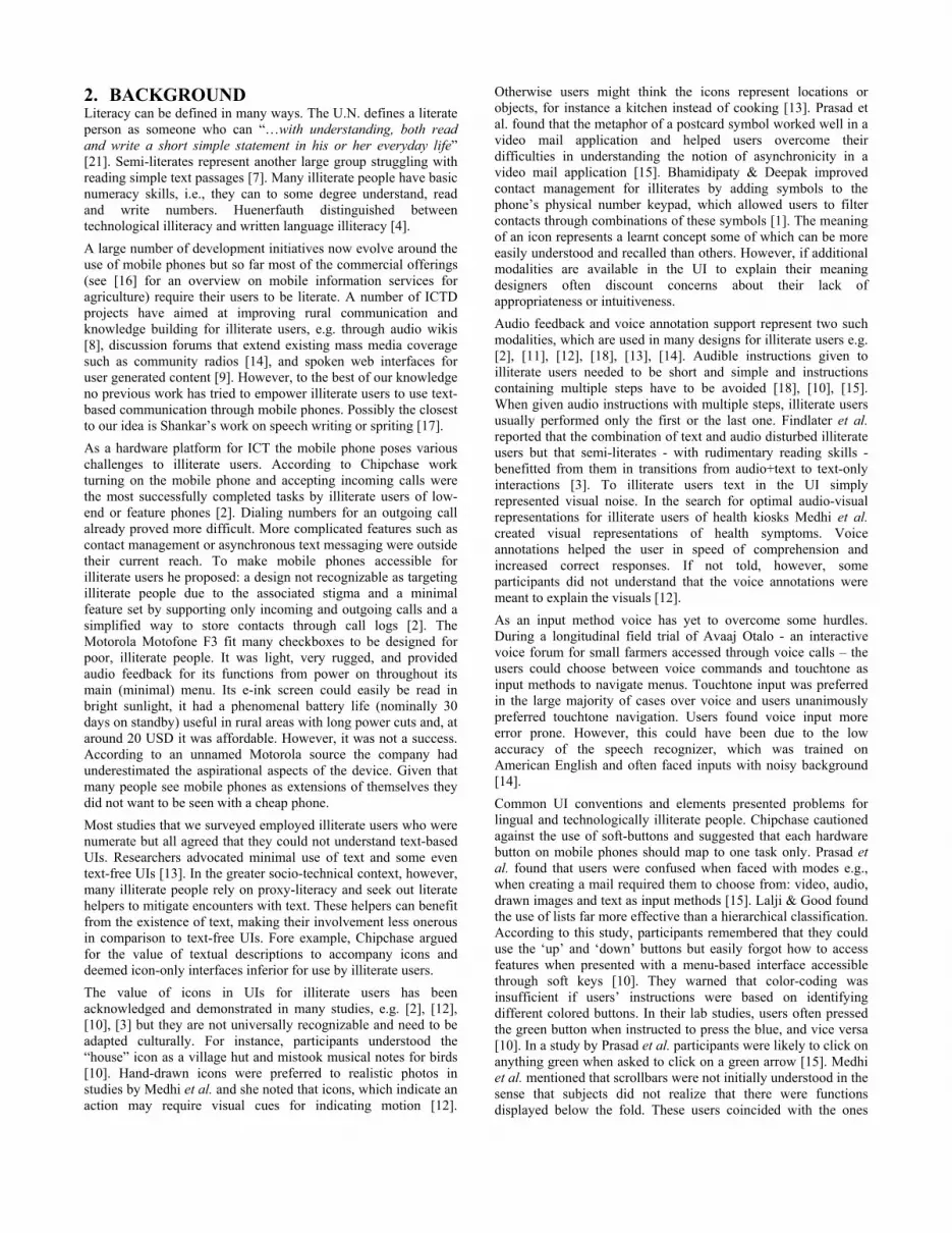
4.1 First prototype In order to be able to test the application with users we developed an interactive prototype (see Figure 1) with Microsoft Expression Blend on an LG Optimus 7 - a WVGA (800x480 at 246ppi) multi-touch screen phone running the Windows Phone 7 (WP7) operating system. It allowed for users to ‘read’ SMS through text-to-speech audio rendition and compose SMS through a range of icons the user can drag into the message editor and by re-using words from previous messages. The icons represented common text messages such as ‘Yes’ and ‘No’. We used generic faces drawing to represent contacts in the phone. This prototype was composed of five main screens: the thread overview or Inbox screen (entry point), the individual thread or Conversation screen (see Figure 1, left), the Quick Sender screen, the Multi-sentences icon or Customize icon screen and the Message reviewing (see Figure 1, right). (1) The Inbox screen enabled users to see an overview of message threads by contact. (2) The Conversation screen allowed users to see all the messages with a contact chronologically ordered. It also allowed users to read incoming messages and to create a new message by: selecting icons for most frequently used messages (in the Quick sender screen), selecting multi-sentence icons by category (Customize screen) and turning into an edit mode to reuse words from previous messages. (4) The Message reviewing screen helped users reviewing the content of messages during their creation. (5) A part from selecting multi-sentences icons by category the Customize screen enabled users to create new entries for multi-sentence icons (to extend the repertoire of available sentences through icons). The Inbox screen contained all the inbox messages displayed as a vertical list. It contained an iconic picture of a person, their first name and envelopes that represented the new messages (closed) and read messages (open). Tapping on a thread in the list brought up the Conversation screen Figure 1 (left). The Conversation screen represented the history of all the messages the user exchanged with a particular person. Each message could be listened to and visually contain combination of icons and text (cf. Figure 1, left).
To compose a new message, the user could re-use words from previous messages or rely on icons. In the former case when the user tapped on the “Edit” button (see fig 2 left), the whole message was added to the New Message editor area. By tapping on the pencil button the application switched into the edit mode and the user could select only some parts of the previous messages. In the latter case by tapping on the smiley icon, the user could navigate to two selection screens: 1. The Quick sender screen contained nine icons representing the
most frequent messages sent such as “ok”, “no”, “I miss you”. The icons did not have text labels, however, each of them had a sound support. When the user selected one icon to be added to the message, the icon in itself was added to the message editor (see the question mark icon “Why” in Figure 1 left).
2. The Customize screen contained multi-sentence icons arranged by topics such as “Places and activities, feelings”. Each icon had multiple meanings: For instance, the skyscraper icon, had three associated sentences: “1_ I am at work. 2_ I cannot answer, I am busy. 3_ I am doing some shopping in the city”. By long tapping on this icon the user could listen to all the sentences associated to it. If the user wanted to use the second sentence, he had to tap the icon twice. There was no visual/audio feedback on how many times he had already tapped. Voice prompts read out the content but did not provide any action cues. There was the possibility to “add a new entry” to extend the repertoire and add sentences from previous messages to some of the existing icons. For instance, after reception of a message e.g. “I really miss you today”, the user could add this sentence to his repertoire in the Feelings section.
Figure 1: First prototype Conversation screen (left) and
Message reviewing screen (right) After composing a new message, the user could navigate to the Message reviewing screen and listen to its audio rendition. The icons were transformed into text and read out through text-to-speech. Each group of words played and its corresponding icon was highlighted. For instance, in Figure 1 (right), the skyscraper icon and the sentence “I am at work” are highlighted while the phone plays this group of words. We carried out walk-throughs with four experts, brainstorming sessions and corridor testing with students to improve the design. We did not test this prototype with any illiterate user. The biggest concern was that there were too many screens to go through. For instance the Conversation screen could be combined with the Message reviewing screen. The edit mode was deemed too

complicated, especially for illiterate users and gestures available on touch screens such as scrolling and drag and drop could reduce the amount of taps required.
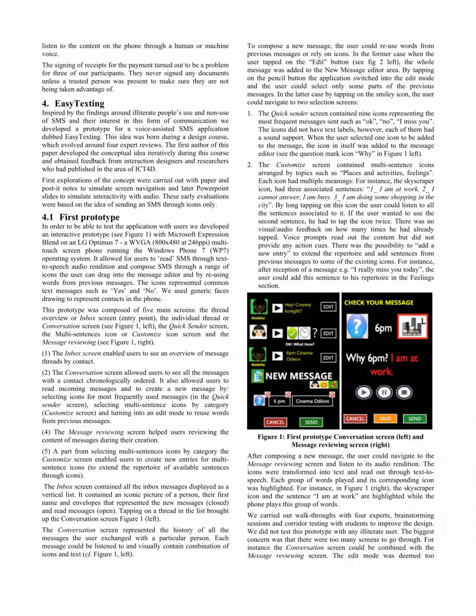
4.2 Second prototype The second prototype was simplified yet contained additional information. It included the same main screens as the first prototype: Inbox screen, Conversation screen, Quick sender, Customize screen but we removed the Message reviewing screen. The Inbox screen included the date of the last message received and the telephone numbers of the contact. By tapping on a thread, the application brought up the Conversation screen that lists all SMS with a given contact. We removed the need for an editing mode by turning every word into a button. This allowed the users to single tap on them to listen to its spoken form and to reuse them by dragging them into the New message editor area that was fixed on the bottom of the Conversation screen (see Figure 2). During the audio playback of a read out word it was visually highlighted in synch. We will refer to this assistive function as karaoke from hereon. This represented a new way of reviewing the message composed and due to its fixed placement allowed for removing the Message reviewing screen.
Figure 2: Second prototype: Message details screen
To select icons, the user could horizontally scroll the top part of the Conversation screen to bring up the screens containing icons: Quick sender, Feelings and Places and Activities. While the top part of the screen was horizontally scrollable, the New message editor area remained fixed on the bottom of the screen. To select an icon, the user simply had to drag it into the New message editor and to listen to its meaning he had to single tap on it. As in the previous prototype, icons themselves were appended to the message editor. We introduced a second approach for multi-sentences icons. It required the user to tap and hold a multi-sentence icon to open a pop-up on the right hand side of the icon with all associated sentences. A small play button at the end of each sentence allowed for playing it. To append the sentence the user had to tap on it in the pop-up. We tried both this pop-up based version and the pre-listen version described in section 4.1 in study 2.
5. STUDY 2 5.1 Participants We conducted exploratory lab-based tests with three paid (20 CHF/h) participants that had participated in study 1. All of them spoke French as their second language and had recently started a course to learn how to read and write in French. All three of them were from a course for beginners from one of the aforementioned
language schools. According to them none knew how to read or write in their mother tongue either. A 40-year old woman from Angola was married and her husband was literate. She had a feature phone without a touch-screen. A 35-year old Moroccan widow (her late husband was a researcher) and mother of a three year old had had an iPhone, which broke after being thrown in the toilet by her toddler. She was planning on buying a newer iPhone model with an Internet subscription in the near future but for the transition was using a Nokia feature phone. A 35-year old Senegalese father of a six-month old, married to a literate nurse had an iPhone with an international subscription.
5.2 Method We invited the participants for lunch before their session to make them feel at ease. We started by introducing the motivation and the purpose of the application. We guaranteed anonymity and explained that our goal was not to test them but to obtain their feedback as illiterate users. To boost their confidence, we stressed that they were ‘the experts’ who tested applications designed by students. For data collection we used note taking by the experimenter in-situ while the participants were performing the tasks. With their permission we video recorded the interaction of their hands with the UI of the phone along with the soundtrack. Each session lasted about 40 minutes and consisted of four parts: 1. a socio-demographic questionnaire, 2. a semi-structured interview, 3. a usability test of the application including a participatory element around the design of the employed icons, and 4. a debrief interview. Before starting the questionnaire we introduced ourselves and tried to establish some common ground with the participants. The teachers assured us that the participants did not know how to read or write simple sentences in French. Hence we did not perform additional literacy tests. Since we tried to establish a setting in which the participants were encouraged to provide feedback in a confident way we deemed literacy tests counterproductive to this end. The semi-structure interview focused on their use of mobile phones and SMS in their every day lives. We asked them to show us their mobile phones and the main functions they used. Specifically we probed how they checked call logs, if they stored contacts on their phones and how they interacted with SMS. We used note taking by the experimenter in-situ and a video camera that recorded the participant’s actions on the mobile phone and the discussions we had with them. We started the usability test by demonstrating the application, the content of which was entirely in French. We demonstrated navigating through the different screens to check for new messages, listen to a new message and reply to a message by double tapping on icons and re-using existing words from previous messages. Before having them listen to the meaning of selected icons, we asked them what their meaning might be. When they could not infer the meaning of an icon we used for a particular phrase we asked them to sketch or to explain us how they would represent this idea visually. We then demonstrated how the audio counterpart of an icon was invoked by tapping on it. After this demonstration we asked our participants to repeat the same actions and encouraged them to take the phone to scroll, tap and double tap to get familiar with the touch screen UI. This watch and repeat approach was supposed to emulate their learning strategy when confronted with new technology with a

literate helper, as mentioned in study 1. Throughout the session we tried using simple, non-technical language for all explanations. For example, the participants were not familiar with terms like application and icons. The pictograms and icons we referred to as ‘little pictures’, for example. We encouraged them to talk-out-loud especially about any problems they encountered or parts they found unclear. We stressed that if they did not understand the application or parts of it was not their fault but the programmers. Once we felt that they were confident and understood the main features of the application we started the usability test, which focused on multi-sentence icons, message composition and reading, and specifically the karaoke feature. We started with the two different versions of the multi-sentence icons both of which were available from different icons on the same screen. We compared the pre-listen version we introduced in the first prototype with the pop-up based one introduced in the second prototype. Recall that in the pre-listen version users had to tap and hold on the icon to listen to all the sentences associated to it in a row. Then, to select the sentence number i, users had to tap on the icon i times. In the pop-up version users were required to tap and hold on the icon and a little pop-up appeared on the screen with all the associated sentences. To select a sentence, users simply had to tap on it. For both versions we asked them to long-tap on the multi-sentence icon and queried whether they had an idea on how to append one of the offered sentences to the message editor. For the composition, we situated them in the following scenario: “Let’s suppose you received an SMS from Amisha a friend of yours. You can see you have a new message from Amisha in your INBOX [participants are in the thread screen]. Now, you can tap on this message to see why Amisha is sending you this SMS [participants navigate to the message details screen (see Figure 1)].” After they had navigated to the Conversation screen we made them listen to what Amisha had sent by tapping on the play button next to the text message “Cinema tonight?” that was on top of the list. To double check that they had understood the audio message we asked them to explain why Amisha had sent them an SMS. After their explanation, we asked them to reply that they were not free tonight with “Tonight, no.” To make it easier, we broke this task into two subtasks through which we walked the participants: (1) We asked them to reuse the word “tonight” from the previous
message by first finding it in the previous message and to append it to the message editor. When necessary we reminded them to use a double tap on the word.
(2) We asked them to find the icon “No” from the list of icons in the Quick sender screen and to append it to the editor.
Before sending they had to review the composed message by tapping on the “play” button. For reading we tested what happened if we removed the karaoke function (the words currently played were highlighted in red). We had two versions of the application: one with karaoke support and another one in which the whole sentence was played out but with no visual feedback in the UI. We tested two sentences in French “When do you come back?“ (“Tu rentres quand?”) and “Cinema tonight?” (“Cine ce soir?”). First we asked the participants to play out the sentences and identify as many words as they could in the karaoke version. Then we asked them to repeat this with the same sentences in the version without the karaoke. They could listen to the message as many times as they wanted. At the end of each sub-task completed we provided congratulatory or encouraging feedback.
For the usability test, the video recordings were our first source of data collection. We reviewed the recordings and for each performed task reviewed the kind of errors they made and on which screen it occurred. Due to the low number of participants we did not conduct any statistical tests, however. During the debrief interviews, we elicited if they found the application easy to use and whether it would be useful for them in their everyday lives.
5.3 Results All three participants were comfortable with their own phones. They navigated very quickly on it and used several functionalities such as radio, photo camera apart from making and receiving calls. The man from Senegal even used a football app on his iPhone to check the outcome of football matches and who scored since he understood both the number format of scores and the roster, which featured players’ head shots along with icons for goals scored. In terms of SMS all of them knew how to handle and open incoming SMS and used literate helpers for the content. The three of them were numerate and knew how to read date and time but they found the latter easier from a digital than from an analog clock with handles. When asked if she knew how to search for her messages one participant proudly showed how quick she was at searching for new SMS. She knew how to create a new SMS but could not compose text in it. She used SMS very often with the help of literate friends and had 256 SMS in her inbox. “I know how to check the call logs, how to delete, how to do almost everything on my cell phone, the only problem I have is reading and writing SMS.” The Senegalese man never used SMS since it was too long and too complicated for him to try composing one but he had a number of SMS in his inbox, which mostly contained telephone numbers of people along with their names. His wife had read the SMS to him and he consulted them when he needed the phone number of that contact. The two iPhone owners succeeded in sending the SMS “Tonight, no”. The third participant seemed not as confident. She hardly touched the phone during the whole interview even if we encouraged her several times to do so. Worrying that this might embarrass or stress her too much we refrained from pushing her further through the scenario. This participant found it difficult to come up with possible meanings of the icons and struggled with the concept of text being associated with the icons. For her icons represented or were related to actions: “this [pointing to the smiling emoticon] means I am talking with someone and this pointing to [sad emoticon] represents the person I am talking with”. The two iPhone owners roughly understood the meaning of the icons but were not entirely sure. Asked about the meaning of the call icon (depicting a receiver) one said: “This might mean ‘Call me’ or maybe ‘I will call you later’”. Hearing the audio counterpart removed any doubts for them. The idea of having multiple meaning for an icon and making them available (in both versions) through multiple taps was challenging for all participants. None of them succeeded in appending a sentence to the editor and asked for help on what they had to do. In the pre-listen version the length of the entire prompt “One: sentence 1, Two: sentence 2, Three: sentence 3” was too long and at the end the participants could not remember the first sentence anymore. In the version with the pop-up, they were surprised by it and did not know where to tap to listen to the several associated sentences. The corresponding play buttons at the end of each sentence in the pop-up were relatively small but clearly visible. We tested playing back a message with and without the karaoke. With the karaoke, all of them succeeded matching some words to

the played sound. While the karaoke was playing, the woman from Morocco remarked: “Oh, yes, cinema, this word is cinema… Ci ne ma” she pointed at the word and tapped on it to check she was right. Without the karaoke, the participants did not even realize there was a link between what they were hearing and the sentence played by the phone. None of our participants seemed uncomfortable with being tested but their confidence varied. The woman from Angola often asked “Am I right? Am I saying the right thing?” while the other two were more self-confident. The man from Senegal immediately wanted to touch the phone, play the messages, drag some icons into the message editor and scroll to go through all the screens. When he and the other iPhone user succeeded in sending the SMS, they asked: “That's it? Is my message really sent?” They seemed surprised by the simplicity. From the beginning, the woman from Morocco was excited about the application: “This could be wonderful for people like me, is it possible to get the application on my mobile phone today?” The other iPhone owner called us one hour after the interview to thank us about dedicating our time to help “people like him” and expressing his interest in obtaining the application. At the end of the test, they seemed proud for helping us and for being useful to help researchers from a respected university. The feedback we obtained from the teachers of the school was very positive and conveyed that the man from Senegal was “transformed” after the session and for the first time he learned his lesson for the next day.
6. DISCUSSION Although our two studies were based on a small number of users we found consistently how proficient illiterate users were in navigating and using their mobile phones – be it low-end, feature or smart phones. Since two out of three users in study 2 had iPhones already, our results were biased compared to users who had never used smartphones before but it added to the existing evidence that using a smartphone proficiently is not a cognitive matter but a matter of habits. Illiterate users who are used to smartphones can be as proficient as literate users in using their mobile phones at least for the functions that are important to them. Similar to Lalji & Good’s finding in which participants were uncomfortable with touch screens our feature phone owner from Angola, despite encouragement was disinclined to touch the phone. In the few cases when she did her styled, long and curved fingernails made interactions with the touch screen seem a little awkward because they would click on the screen first and the angle for touching was quite low. But both iPhone users had no problem interacting with our touch screen based application whatsoever and with initial explanations managed to compose messages successfully. Like Medhi et al., we do not believe this to be a cognitive issue since the other two participants were confident using the touch screen even with an application that they had no previous experience with. Before testing touch-screen applications users need to be taught the basics of touch screen interaction. In contrast to Katre’s study, our participants had no problems using their index fingers for interacting with the touch screen although some of the icons were relatively small. We are aware that these differences with Katre’s observations might be due to the difference between our users (Swiss immigrants from developing countries) and the rural farmers he studied. As can be expected, the icons we used – although carefully chosen - were not self-explanatory. Each participant had his own representation of an idea. Audio support for icons was helpful to
avoid misinterpretations especially when seeing them for the first time. Additionally, any mistakes could easily be corrected by deleting erroneously added words from the editor. The corpus of icons was limited but we hope that this will provide an initial entry point for illiterate users to create words through which they can express themselves. Obviously a speech recognition facility could be more versatile and powerful. The participants struggled with the concept of multi-sentence icons. For the pre-listen version none our participants understood that the numbers “1, 2, 3” corresponded to the number of times they had to tap on the icon to add the sentence to the message editor. Thus, after long-tapping on the icons and listening to the three options, the users did not know what to do since the voice prompts did not provide any action cues. Instead of having the rather abstract guideline “One: I will be late. Two: …” we should have given an action cue such as “Tap this icon once for I will be late, tap it twice for…”. The combined prompts were too long and in hindsight reminded us of Medhi et al.’s recommendations about short and simple audio instructions [12]. Our participants did not succeed in memorizing the three different meanings for a single icon. Once reminded of the sentence and that the numbers corresponded on how many times they had to tap on the icon, their main problem was that there was no feedback on how many times they had already tapped on the icon. This behavior was also inconsistent with how words and regular icons responded to taps. Compared to voice mail or voice-based SMS services (e.g. India’s VoiceSMS) our application offers additional value. In voice mail, users need to have network access to compose a new SMS, with our application however, users can review and compose their SMS offline. Standard SMS are cheap or even free (e.g. a hundred SMS per day) as part of certain prepaid contracts. Most importantly voice mails offer no potential learning whereas our application provides an audio-visual matching between text and audio, which can represent a source of learning for users. According to Srivastava [20] an India NGO has started encouraging women to buy mobile phones English because of the potential to learn various alphabets through them. We do not want to claim that illiterate users will learn how to read and write with this application alone. But we see potential for it in providing additional encounters with text with concrete short-term goals providing reading practice and thereby incentivizing and catalyzing literacy acquisition. Particularly the fact that our participants were not able to identify words after removing the karaoke function convince us that illiterate, neo-literate and semi-literate users will find this application helpful. Every day exposure to text in conjunction with audio in same language subtitles of movie content was also shown to improve reading and writing skills in neo-literates [7]. Semi-literates in Findlater et al.’s study benefited from combination of text and audio and had superior word recognition at the end of each session after the second day of use [3]. Chipchase recommended that phones for illiterates should not be recognizable as such because of the associated stigma [2]. The only thing that might reveal a user’s illiteracy to by-standers while using our application is the sound played when tapping on words and icons. This can be mitigated by headphone use. Moreover, all the SMS sent from our application are regular SMS. If an EasyTexting user sends an SMS there will be no way for the recipient to know that it was written with an application for illiterates. Recruiting and running studies with illiterate users in Western countries is a challenge since they are not numerous and since

they usually try to hide their illiteracy. Our way to get in contact with them was via schools. Establishing initial contacts with the schools and to gain the trust of the staff and teachers took time. Partly, they wanted to make sure we were going to treat their students with respect and without a patronizing attitude. Despite the testimonials of teachers only some of the students volunteered to participate despite remuneration. Almost all of our participants were financially relying on their partners.
7. FINAL DESIGN The entry screen of the application depicted in Figure 3 is the Inbox screen, which contains all the threads of received messages. Each thread item contains the picture, phone number, name of the contact and one line of the last exchanged message. The last three digits are highlighted by putting them apart from the rest to aid recognition of contacts by phone numbers as mentioned in [6]. Tapping on a list item brings up all the messages exchanged with this particular contact.
Figure 3: Third prototype: Inbox screen
Contrary to the other prototypes, we added a text label underneath each icon (cf. Figure 4, right). For the composition of a message the user can rely on icons, re-use of words or both. Double tapping on a word in a previous message results in appending the word to the message editor (the grey speech bubbles in Figure 4). Icons only have one meaning and the user has to scroll horizontally to the Quick Sender screen as illustrated in Figure 4. Analogously to words, single taps on icons play the sound of the words or sentence associated with it. Contrary to the previous prototypes in which double tapping on an icon placed the icon itself on the message editor, double taps on icons place their corresponding words in the message editor. As with received messages each word of the sentence under composition is a button and on tap delivers its audio. Double tapping on words in the message editor results in its deletion. We enlarged the word borders to improve tapping on single letter words and punctuation. Initially we had experimented with single taps on icons and words to add them to the editor and long taps for the audio. But after some corridor tests long-taps proved to be too time-consuming. Since the equivalent of a mouse over event does not exist on touch screens we needed to find a way to provide its audio rendition without triggering another action. We settled with single taps to play the sound and double tap to add the icon’s associated text to the message editor. Thus, a single tap was used to represent a mouse over event. This is akin to the iPhones accessibility
approach for blind users. We used monochrome simple icons to mimic the WP7 metro design’s look and feel.
Figure 4: Third prototype: Conversation screen (left) Quick
sender sub-screen (right) The final design of EasyTexting application is composed of two main screens: the Inbox and the Conversation, the latter of which extends to the sub-screens providing access to icons (Quick sender, Feelings, Places and activites). The Inbox screen is similar to the existing SMS composition tool on WP7 except for the added contact picture and the last three digits of the phone numbers that are visually separated. The Conversation screen with the history of all the previous messages exchanged with someone differs in various points from the WP7 counterpart. The picture, phone number and name of the contact users are exchanging SMS with are displayed at the top of the page. While the middle of the screen is scrollable, this part at the top is fixed. We followed the Windows convention and displayed SMS in speech bubbles. However, each word is a button the user can reuse in a new message. This removes the need for copy and paste functionality of the regular SMS version. But words can only be added sequentially to the end of the message editor. The current application does not allow users to use the keyboard, attach a picture (MMS) or to save it as a draft. Comparing to the standard SMS application on WP7, our application includes sound support. Each word is a playable button and each SMS can be played with karaoke support. Without this feature, users cannot “read” or understand the content of an SMS by themselves and not make use of text messaging. From the Conversation screen, users can directly access the icons dictionaries screens by scrolling horizontally. Each icon is playable and has a predefined sentence associated with it.
8. CONCLUSION Along this research we discovered that illiterate people did use their mobile phones a lot but were unable to use text-based applications. Managing their contacts and dealing with SMS were the two things they struggled with most or could not do at all. However when it came to SMS, they used some tricks such as asking their relatives to read SMS or calling back the senders. On our prototype, we kept many UI conventions that we had found usable for illiterate users such as the threaded view of SMS and

the main presentation of the inbox screen. No previous applications on touch-screen phones for illiterate users were developed before. Our findings from two studies add to the evidence that using touch-screen phones does not represent a cognitive problem for illiterate users but only a problem in terms of lacking confidence or technological literacy. We found promising first evidence that illiterate users can use text messaging in conjunction with audio, text and visuals when initial training is provided. Overall, users we interviewed were interested in making use of text messaging and some of them wanted to take the application home with them. From our findings we argue that ICTD research should not reduce mobile phones to mere telephones with simplified storage for contacts. This restrictive approach would most likely fail in the market place because it denies illiterates to enjoy other functions such as entertainment through music, pictures and video. Touch screen phones with on-demand voice feedback can enable illiterate users to use potentially important information services by leveraging the affordances of multimedia UIs on touch screen phones. Chipchase concluded that to improve literacy skills the best solution would be a phone. We aimed at this by providing an application that allows illiterates to compose and listen to SMS. We combined icons, audio and text and in-synch highlighting of read out words to aid recognition and possibly reading acquisition. In our application words are objects that react to taps and reveal their meaning in audio form. Initial tests with touch-screen experienced participants showed potential for this approach.
9. FUTURE WORK We plan to further add to this application by improving the input of text a) through keyboard entries, e.g. for numbers b) through speech recognition c) by reusing words from previous SMS from all threads d) providing tactile feedback when words are added to the message composer e) by providing a movable insertion point. We would like to improve the contact manager for illiterate users both for picking contacts and the management itself. Searching through a contact long list of contacts is time consuming for illiterate users since the search is based on alphabetic order. Moreover, creating a new entry can be difficult when written names are required for a contact – see [6] for more details. We plan to port the application to the Android platform and extend it with speech recognition for the composition of messages and carry out field studies. We would like to evaluate the application with illiterate and semi-literate users was well as elderly.
10. ACKNOWLEDGMENTS We would like to express our gratitude to Oscar Bolanos and Lukas Frelich for helping with the implementation; Anne Marquis, Catherine Wick, Annick Mello Spano and the teachers from Lire-et-écrire and Français-en-jeu and all interviewees for their time; Jeffrey Huang, Jan Blom, Florian Egger, Mairi Willis, Daniel Keller, Gunnar Harboe and Saket Sathe for providing valuable feedback and guidance. This research has been funded by the Swiss Development Council in collaboration with cooperation@EPFL.
11. REFERENCES 1. Bhamidipaty, A. Symab: Symbol-based address book for the
semi-literate mobile user. Human-Computer Interaction–INTERACT 2007, (2007), 389–392.
2. Chipchase, J. Understanding non-literacy as a barrier to mobile phone communication.
http://research.nokia.com/bluesky/non-literacy-001-2005/index.html.
3. Findlater, L., Balakrishnan, R., and Toyama, K. Comparing semiliterate and illiterate users’ ability to transition from audio+text to text-only interaction. Proceedings of the 27th international conference on Human factors in computing systems, ACM (2009), 1751–1760.
4. Huenerfauth, M.P. Design approaches for developing user-interfaces accessible to illiterate users. University College Dublin, Ireland, (2002).
5. Katre, D. One-handed thumb use on smart phones by semi-literate and illiterate users in India: A usability report with design improvements for precision and ease. Proceedings of Workshop on Cultural Usability and Human Work Interaction Design, NordiCHI Conference, Lund, Sweden, (2008).
6. Knoche, H., Huang, J. Text is not the enemy - How illiterates use their mobile phones. NUIs for New Worlds: New Interaction Forms and Interfaces for Mobile Applications in Developing Countries - CHI’2012 workshop, (2012).
7. Kothari, B., Takeda, J., Joshi, A., and Pandey, A. Same language subtitling: a butterfly for literacy? International Journal of Lifelong Education 21, 1 (2002), 55–66.
8. Kotkar, P., Thies, W., and Amarasinghe, S. An audio wiki for publishing user-generated content in the developing world. HCI for Community and International Development (Workshop at CHI 2008), Florence, Italy, (2008).
9. Kumar, A., Agarwal, S.K., and Manwani, P. The spoken web application framework: user generated content and service creation through low-end mobiles. Proceedings of the 2010 International Cross Disciplinary Conference on Web Accessibility (W4A), ACM (2010), 1–10.
10. Lalji, Z. and Good, J. Designing new technologies for illiterate populations: A study in mobile phone interface design. Interacting with Computers 20, 6 (2008), 574–586.
11. Medhi, I., Gautama, S.N., and Toyama, K. A comparison of mobile money-transfer UIs for non-literate and semi-literate users. Proceedings of the 27th international conference on Human factors in computing systems, (2009), 1741–1750.
12. Medhi, I., Prasad, A., and Toyama, K. Optimal audio-visual representations for illiterate users of computers. Proceedings of the 16th international conference on World Wide Web, (2007), 882.
13. Medhi, I., Sagar, A., and Toyama, K. Text-free user interfaces for illiterate and semiliterate users. Information Technologies and International Development 4, 1 (2007), 37–50.
14. Patel, N., Chittamuru, D., Jain, A., Dave, P., and Parikh, T.S. Avaaj Otalo—A Field Study of an Interactive Voice Forum for Small Farmers in Rural India. Proceedings of the Proceedings of the 28th international conference on Human factors in computing systems (Atlanta, GA, USA, 2010). ACM, (2010).
15. Prasad, A., Medhi, I., Toyama, K., and Balakrishnan, R. Exploring the feasibility of video mail for illiterate users. Proceedings of the working conference on Advanced visual interfaces, (2008), 103–110.
16. Rao, K.V. and Sonar, R.M. M4D Applications in Agriculture: Some Developments and Perspectives in India. Defining the “D”in ICT4D, (2009), 104–111.
17. Shankar, T.M.R. Speaking on the Record. 2004. 18. Sherwani, J., Palijo, S., Mirza, S., Ahmed, T., Ali, N., and
Rosenfeld, R. Speech vs. touch-tone: Telephony interfaces for information access by low literate users. Proc. IEEE/ACM Int’l Conference on Information and Communication Technologies and Development, (2009).

19. Smyth, T.N., Kumar, S., Medhi, I., and Toyama, K. Where there’s a will there’s a way: mobile media sharing in urban india. Proceedings of the 28th international conference on Human factors in computing systems, (2010), 753–762.
21. UNESCO. Gender and Education for All: The Leap to equality. 2003. http://www.unesco.org/new/en/education/themes/leading-the-international-agenda/efareport/reports/20034-gender/.
20. Srivastava, Kendra. Indian Women Learn Alphabets on Handsets. Mobiledia. http://www.mobiledia.com/news/122456.html


