Embed Size (px)
Citation preview
Bivariate/Trivariate Data DisplayDrawing Scatterplots in R
Bruce Dudek
2020-05-18
Contents1 Introduction 2
2 The R Environment 2
3 Load the Primary Data Set 2
4 Best Practices for Scatterplots 3
5 XY Scatterplots with base system graphics 6
6 Base R Scatterplots with marginal univariate distributions. 86.1 Adding Boxplots to the margins . . . . . . . . . . . . . . . . . . . . . . . . . . . . . . . . . . . 86.2 Scatterplot with marginal frequency histograms . . . . . . . . . . . . . . . . . . . . . . . . . . 96.3 A 2D density plot called a Bagplot . . . . . . . . . . . . . . . . . . . . . . . . . . . . . . . . . 116.4 2D Kernel Smoothing . . . . . . . . . . . . . . . . . . . . . . . . . . . . . . . . . . . . . . . . 12
7 Using base system graphics to include a third variable 13
8 A publication ready graph with base R 15
9 XY Scatterplots with ggplot2 179.1 A basic ggplot scatterplot . . . . . . . . . . . . . . . . . . . . . . . . . . . . . . . . . . . . . . 179.2 A Series of graphs depicting 2D density . . . . . . . . . . . . . . . . . . . . . . . . . . . . . . 209.3 Scatterplot with marginal univariate displays . . . . . . . . . . . . . . . . . . . . . . . . . . . 26
10 Scatterplots using Plotly 30
11 3D Scatterplot of three variables 3111.1 Fit the 2 predictor “additive” model . . . . . . . . . . . . . . . . . . . . . . . . . . . . . . . . 31
11.1.1 Examine the fit of the plane in a 3D wireframe plot: . . . . . . . . . . . . . . . . . . . 3211.2 Interactive 3D scatterplot with Shiny . . . . . . . . . . . . . . . . . . . . . . . . . . . . . . . . 33
12 3D Scatterplot with plotly 34
13 Documentation for Reproducibility 35
14 References 36
1
1 IntroductionOne of the more common data visualizations is the display of bivariate data in an XY scatterplot. In R thereare numerous ways of obtaining basic and enhanced versions of the scatterplot. For purposes of quick EDA,simple methods exist. For presentation graphics and publication quality products, more effort is required.This document provides the range of those possibilities using both base system graphics, add-on packagefunctions, the ggplot2 approach which is fast becoming a de facto R standard, and illustrations with a Plotlyimplementation for R.
At the end of the document, two approaches to 3D scatterplots are shown for trivariate data. Doing 3Dscatterplots well is a bit more of a technical challenge and the readily accessible options are limited. Oneshown here is also one that can take advantage of RGL capabilities to grab the plot with a mouse and performrotation such that perspectives can be maximized. A second approach, using Plotly, has the interactivecapability built in.
2 The R EnvironmentSeveral packages are required for the work in this document. They are loaded here, but comments/remindersare placed in some code chunks so that it is clear which package some of the functions come from.library(aplpack)library(UsingR)library(plotrix)library(psych)library(car)library(broom)library(knitr)library(ggplot2)library(ggthemes)library(ggExtra)library(grid)library(lattice)library(ppcor)library(plotrix)library(plot3D)library(plot3Drgl)library(plotly)library(reshape2)library(rmarkdown)library(shiny)library(UsingR)
3 Load the Primary Data SetAlthough several data sets are used in this document, one data set will be the primary exemplar and isdescribed here. Howell’s table 9.2 (7th or 8th edition) (Howell, 2014). has an example of the relationshipbetween stress and mental health as reported in a study by Wagner, et al., (1988, as cited in the Howell text).This Health Psychology study examined a variable that was the subject’s perceived degree of social andenvironmental stress (called “stress” in the data set“). There was also a measure of psychological symptomsbased on the Hopkins Symptom Checklist (called”symptoms") in the data file. One interesting aspect of thevariables in the data set is that they both have some positive skewness. With that in mind some scatterplotsare enhanced with marginal plots of the univariate distributions of both variables. Other scatterplots willhelp visualize the fact that the bivariate distribution of the two variables is not bivariate normal.
2
First, we will read the data file. The data are found in a .csv file called “howell_9_2.csv”.
The data frame is “attached” to make variable naming simpler/shorter in later functions.# read the csv file and create a data frame called data1data1 <- read.csv(file="data/howell_9_2.csv")# notice that the stress variable was read as a "integer".# We will change it to a numeric variable and will do the same for symptomsstr(data1)
## 'data.frame': 107 obs. of 3 variables:## $ id : int 1 2 3 4 5 6 7 8 9 10 ...## $ stress : int 30 27 9 20 3 15 5 10 23 34 ...## $ symptoms: int 99 94 80 70 100 109 62 81 74 121 ...data1$stress <- as.numeric(data1$stress)data1$symptoms <- as.numeric(data1$symptoms)attach(data1)kable(head(data1))
id stress symptoms1 30 992 27 943 9 804 20 705 3 1006 15 109
4 Best Practices for ScatterplotsBuilding on the work of Tufte (2001) and Cleveland (1984, 1994), we can review some of the basic characteristicsof an xy scatterplot that reflect best practices for scientific graphing.
1. The data rectangle should be only slightly smaller than the scale/axis rectangle. This often impliesthat axis scales are truncated.
2. A visual indicator of axis truncation is desireable.3. Scatterplots work best in a 1:1 aspect ratio. I.e., they should be square.4. Care should be taken to find a good size for points in the scatterplot so that they are easily visible, yet
not too prominent.5. Ticks marks should be limited in number to that necessary for visualization of the scale - too many tick
marks and tick labels clutter the plot.6. Font choices and sizes require care, as do line widths. Very often, default font sizes are too small. These
choices depend on the medium in which the plot is displayed.7. Use color judiciously - as an important element of the graph and not just decoration.8. Show the data! (Tufte’s axiom). This implies things like rug plots for univariate dimensions.
The following images set up some basic components and permit understanding points 1 and 3.
First, we can define the scale rectangle:
3
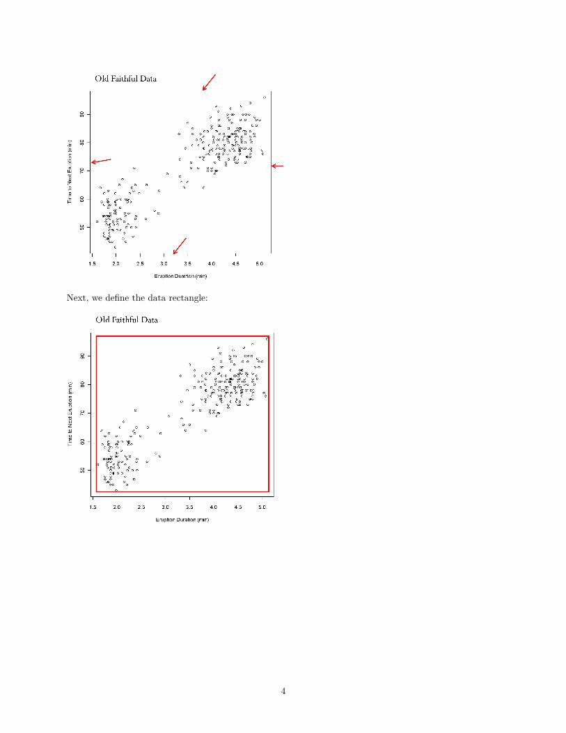
Next, we define the data rectangle:
4
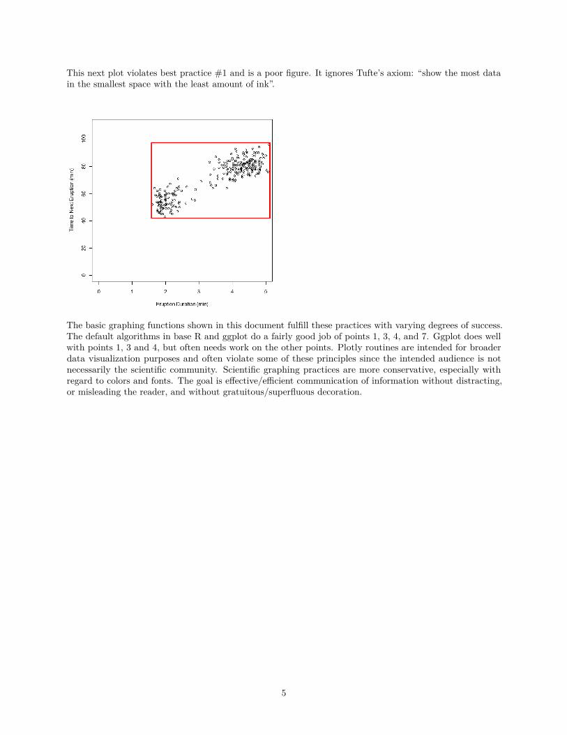
This next plot violates best practice #1 and is a poor figure. It ignores Tufte’s axiom: “show the most datain the smallest space with the least amount of ink”.
The basic graphing functions shown in this document fulfill these practices with varying degrees of success.The default algorithms in base R and ggplot do a fairly good job of points 1, 3, 4, and 7. Ggplot does wellwith points 1, 3 and 4, but often needs work on the other points. Plotly routines are intended for broaderdata visualization purposes and often violate some of these principles since the intended audience is notnecessarily the scientific community. Scientific graphing practices are more conservative, especially withregard to colors and fonts. The goal is effective/efficient communication of information without distracting,or misleading the reader, and without gratuitous/superfluous decoration.
5
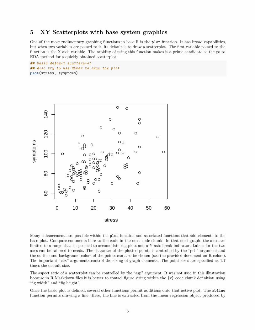
5 XY Scatterplots with base system graphicsOne of the most rudimentary graphing functions in base R is the plot function. It has broad capabilities,but when two variables are passed to it, its default is to draw a scatterplot. The first variable passed to thefunction is the X axis variable. The rapidity of using this function makes it a prime candidate as the go-toEDA method for a quickly obtained scatterplot.## Basic default scatterplot## Also try to use RCmdr to draw the plotplot(stress, symptoms)
0 10 20 30 40 50 60
6080
100
120
140
stress
sym
ptom
s
Many enhancements are possible within the plot function and associated functions that add elements to thebase plot. Compare comments here to the code in the next code chunk. In that next graph, the axes arelimited to a range that is specified to accomodate rug plots and a Y axis break indicator. Labels for the twoaxes can be tailored to needs. The character of the plotted points is controlled by the “pch” argument andthe outline and background colors of the points can also be chosen (see the provided document on R colors).The important “cex” arguments control the sizing of graph elements. The point sizes are specified as 1.7times the default size.
The aspect ratio of a scatterplot can be controlled by the “asp” argument. It was not used in this illustrationbecause in R Markdown files it is better to control figure sizing within the {r} code chunk definition using“fig.width” and “fig.height”.
Once the basic plot is defined, several other functions permit additions onto that active plot. The ablinefunction permits drawing a line. Here, the line is extracted from the linear regression object produced by
6
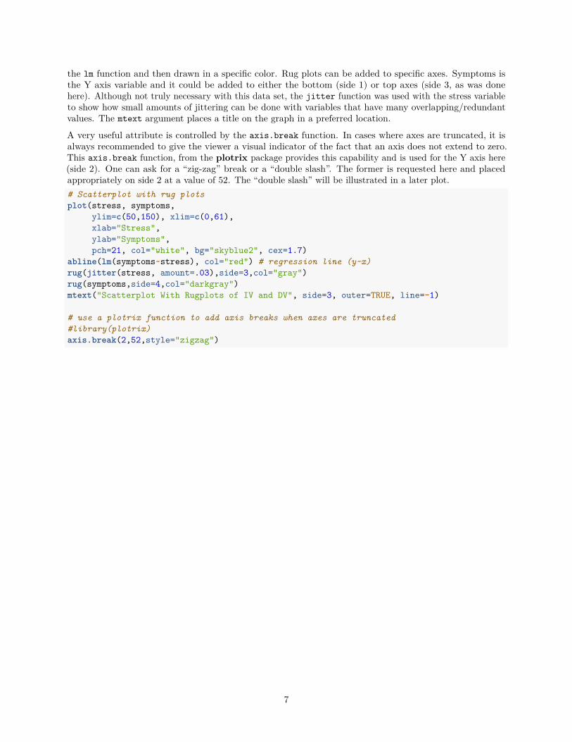
the lm function and then drawn in a specific color. Rug plots can be added to specific axes. Symptoms isthe Y axis variable and it could be added to either the bottom (side 1) or top axes (side 3, as was donehere). Although not truly necessary with this data set, the jitter function was used with the stress variableto show how small amounts of jittering can be done with variables that have many overlapping/redundantvalues. The mtext argument places a title on the graph in a preferred location.
A very useful attribute is controlled by the axis.break function. In cases where axes are truncated, it isalways recommended to give the viewer a visual indicator of the fact that an axis does not extend to zero.This axis.break function, from the plotrix package provides this capability and is used for the Y axis here(side 2). One can ask for a “zig-zag” break or a “double slash”. The former is requested here and placedappropriately on side 2 at a value of 52. The “double slash” will be illustrated in a later plot.# Scatterplot with rug plotsplot(stress, symptoms,
ylim=c(50,150), xlim=c(0,61),xlab="Stress",ylab="Symptoms",pch=21, col="white", bg="skyblue2", cex=1.7)
abline(lm(symptoms~stress), col="red") # regression line (y~x)rug(jitter(stress, amount=.03),side=3,col="gray")rug(symptoms,side=4,col="darkgray")mtext("Scatterplot With Rugplots of IV and DV", side=3, outer=TRUE, line=-1)
# use a plotrix function to add axis breaks when axes are truncated#library(plotrix)axis.break(2,52,style="zigzag")
7
0 10 20 30 40 50 60
6080
100
120
140
Stress
Sym
ptom
sScatterplot With Rugplots of IV and DV
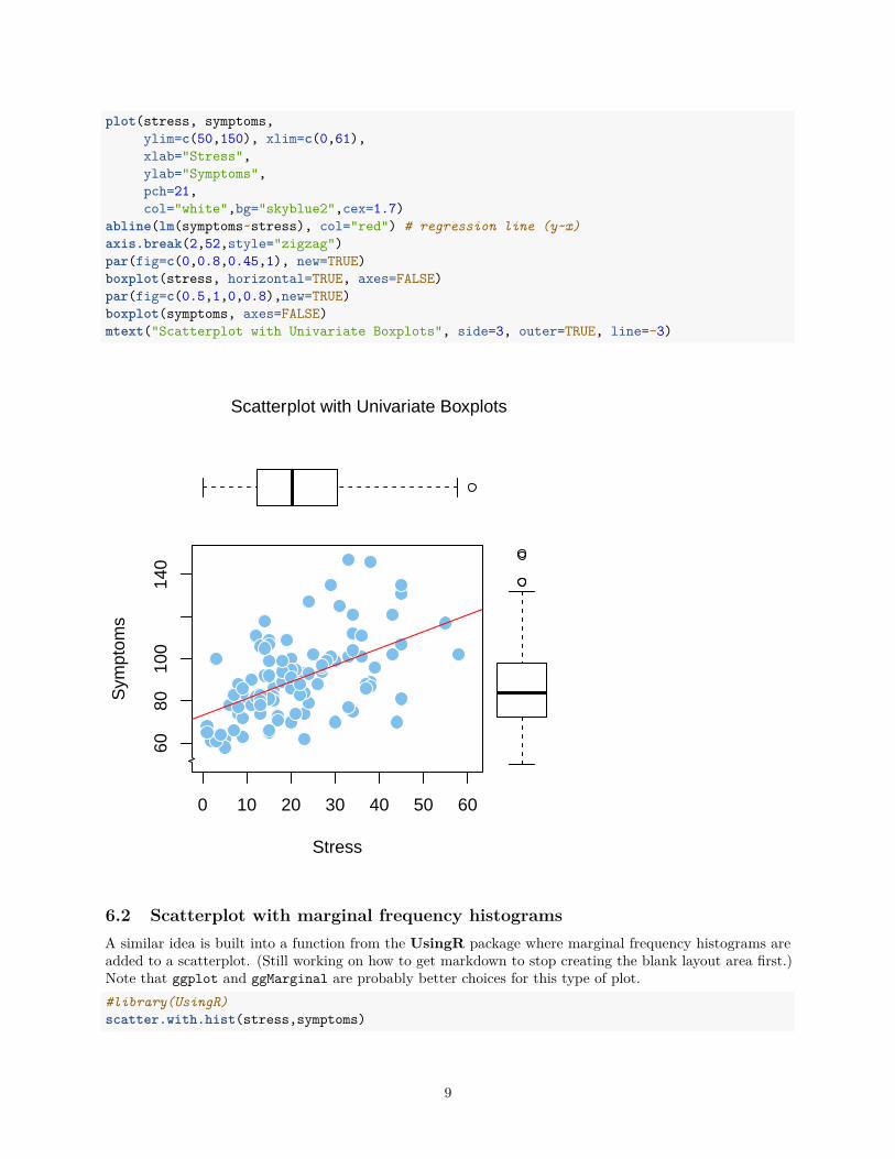
6 Base R Scatterplots with marginal univariate distributions.One can combine some aspects of univariate EDA with the bivariate scatterplot by drawing various visualiza-tions in the margins of the scatterplot, with the same scale properties of each of the X and Y variables. Thetwo examples here are done manually with the first and with a ready-made function for the second.
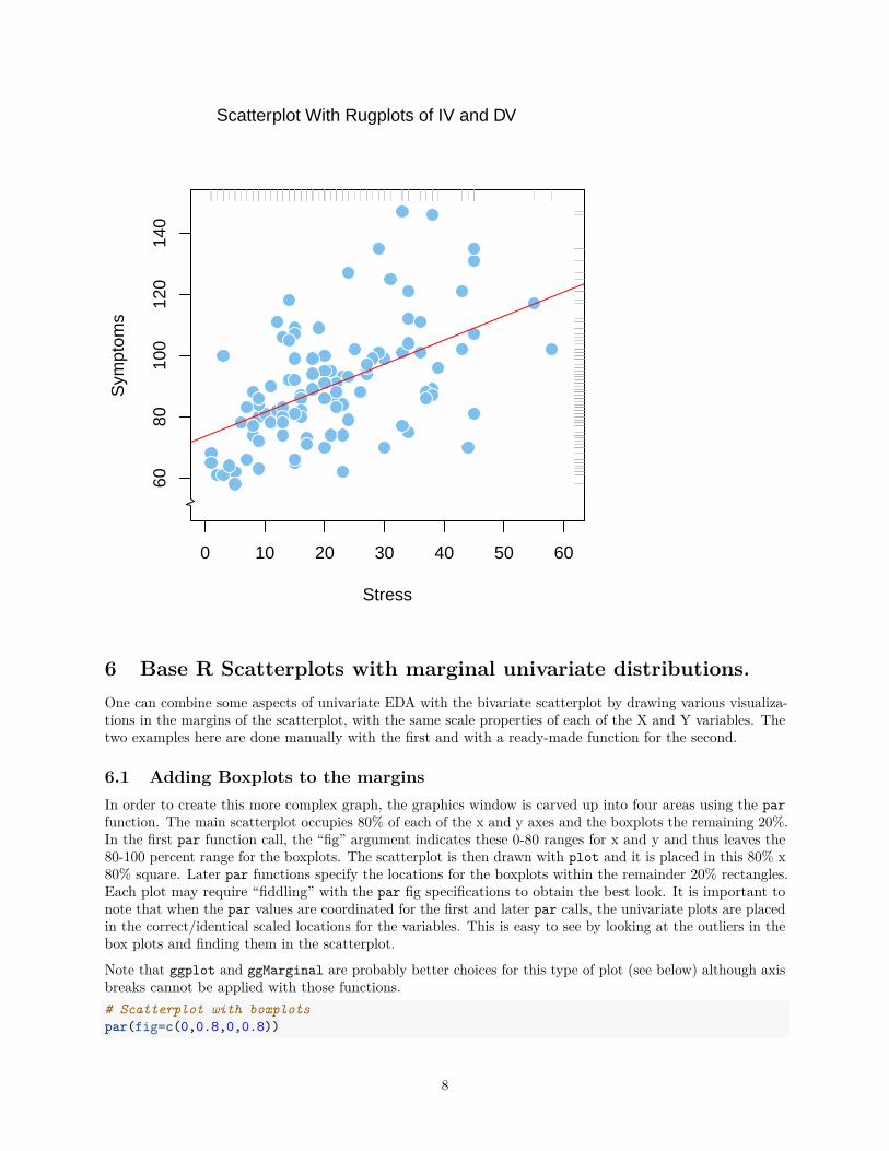
6.1 Adding Boxplots to the marginsIn order to create this more complex graph, the graphics window is carved up into four areas using the parfunction. The main scatterplot occupies 80% of each of the x and y axes and the boxplots the remaining 20%.In the first par function call, the “fig” argument indicates these 0-80 ranges for x and y and thus leaves the80-100 percent range for the boxplots. The scatterplot is then drawn with plot and it is placed in this 80% x80% square. Later par functions specify the locations for the boxplots within the remainder 20% rectangles.Each plot may require “fiddling” with the par fig specifications to obtain the best look. It is important tonote that when the par values are coordinated for the first and later par calls, the univariate plots are placedin the correct/identical scaled locations for the variables. This is easy to see by looking at the outliers in thebox plots and finding them in the scatterplot.
Note that ggplot and ggMarginal are probably better choices for this type of plot (see below) although axisbreaks cannot be applied with those functions.# Scatterplot with boxplotspar(fig=c(0,0.8,0,0.8))
8
plot(stress, symptoms,ylim=c(50,150), xlim=c(0,61),xlab="Stress",ylab="Symptoms",pch=21,col="white",bg="skyblue2",cex=1.7)
abline(lm(symptoms~stress), col="red") # regression line (y~x)axis.break(2,52,style="zigzag")par(fig=c(0,0.8,0.45,1), new=TRUE)boxplot(stress, horizontal=TRUE, axes=FALSE)par(fig=c(0.5,1,0,0.8),new=TRUE)boxplot(symptoms, axes=FALSE)mtext("Scatterplot with Univariate Boxplots", side=3, outer=TRUE, line=-3)
0 10 20 30 40 50 60
6080
100
140
Stress
Sym
ptom
s
Scatterplot with Univariate Boxplots
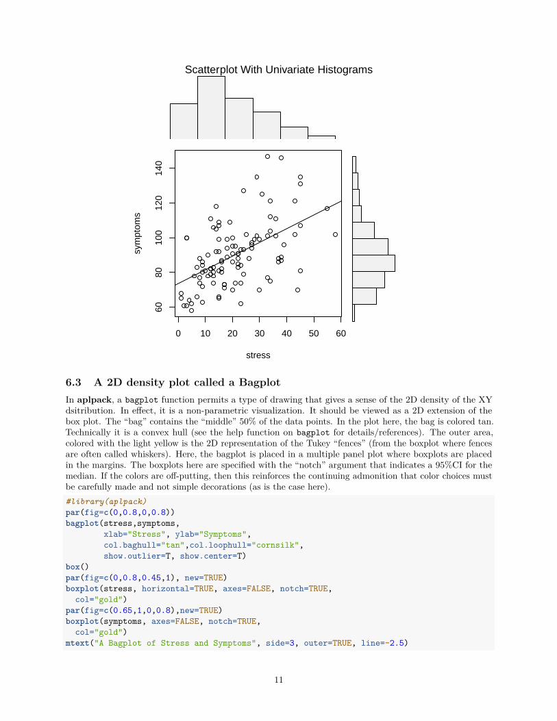
6.2 Scatterplot with marginal frequency histogramsA similar idea is built into a function from the UsingR package where marginal frequency histograms areadded to a scatterplot. (Still working on how to get markdown to stop creating the blank layout area first.)Note that ggplot and ggMarginal are probably better choices for this type of plot.#library(UsingR)scatter.with.hist(stress,symptoms)
9
1
23
mtext("Scatterplot With Univariate Histograms", side=3, outer=TRUE,line=-.8)
10
0 10 20 30 40 50 60
6080
100
120
140
stress
sym
ptom
s
Scatterplot With Univariate Histograms
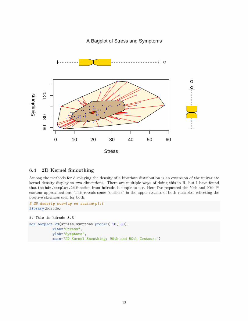
6.3 A 2D density plot called a BagplotIn aplpack, a bagplot function permits a type of drawing that gives a sense of the 2D density of the XYdsitribution. In effect, it is a non-parametric visualization. It should be viewed as a 2D extension of thebox plot. The “bag” contains the “middle” 50% of the data points. In the plot here, the bag is colored tan.Technically it is a convex hull (see the help function on bagplot for details/references). The outer area,colored with the light yellow is the 2D representation of the Tukey “fences” (from the boxplot where fencesare often called whiskers). Here, the bagplot is placed in a multiple panel plot where boxplots are placedin the margins. The boxplots here are specified with the “notch” argument that indicates a 95%CI for themedian. If the colors are off-putting, then this reinforces the continuing admonition that color choices mustbe carefully made and not simple decorations (as is the case here).#library(aplpack)par(fig=c(0,0.8,0,0.8))bagplot(stress,symptoms,
xlab="Stress", ylab="Symptoms",col.baghull="tan",col.loophull="cornsilk",show.outlier=T, show.center=T)
box()par(fig=c(0,0.8,0.45,1), new=TRUE)boxplot(stress, horizontal=TRUE, axes=FALSE, notch=TRUE,
col="gold")par(fig=c(0.65,1,0,0.8),new=TRUE)boxplot(symptoms, axes=FALSE, notch=TRUE,
col="gold")mtext("A Bagplot of Stress and Symptoms", side=3, outer=TRUE, line=-2.5)
11
0 10 20 30 40 50 60
6080
120
Stress
Sym
ptom
s
A Bagplot of Stress and Symptoms
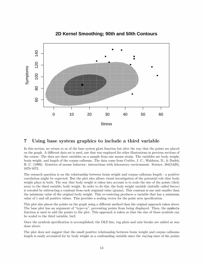
6.4 2D Kernel SmoothingAmong the methods for displaying the density of a bivariate distribution is an extension of the univariatekernel density display to two dimentions. There are multiple ways of doing this in R, but I have foundthat the hdr.boxplot.2d function from hdrcde is simple to use. Here I’ve requested the 50th and 90th %contour approximations. This reveals some “outliers” in the upper reaches of both variables, reflecting thepositive skewness seen for both.# 2D density overlay on scatterplotlibrary(hdrcde)
## This is hdrcde 3.3hdr.boxplot.2d(stress,symptoms,prob=c(.10,.50),
xlab="Stress",ylab="Symptoms",main="2D Kernel Smoothing; 90th and 50th Contours")
12
0 10 20 30 40 50 60
6080
100
120
140
2D Kernel Smoothing; 90th and 50th Contours
Stress
Sym
ptom
s
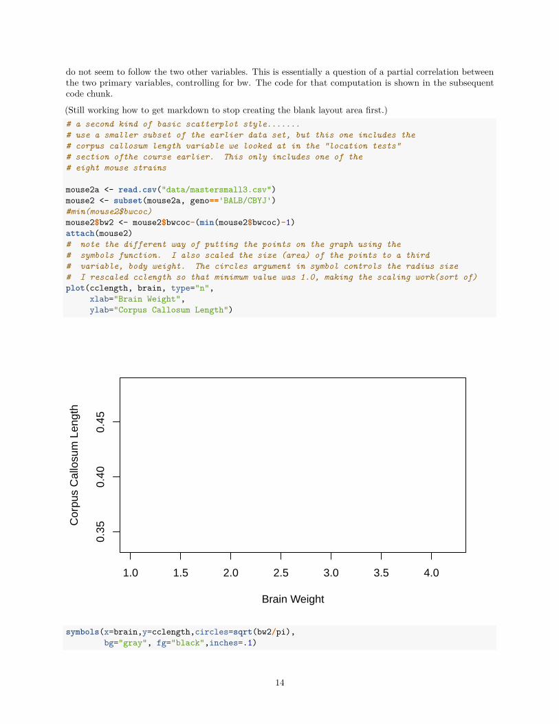
7 Using base system graphics to include a third variableIn this section, we return to ue of the base system plot function but alter the way that the points are placedon the graph. A different data set is used, one that was employed for other illustrations in previous sections ofthe course. The data are three variables on a sample from one mouse strain. The variables are body weight,brain weight, and length of the corpus callosum. The data come from Crabbe, J. C., Wahlsten, D., & Dudek,B. C. (1999). Genetics of mouse behavior: interactions with laboratory environment. Science, 284(5420),1670-1672.
The research question is on the relationship between brain weight and corpus callosum length - a positivecorrelation might be expected. But the plot also allows visual investigation of the potential role that bodyweight plays in both. The way that body weight is taken into account is to scale the size of the points (theirarea) to the third variable, body weight. In order to do this, the body weight variable (initially called bwcoc)is rescaled by subtracting a constant from each origninal value (grams). This constant is one unit smaller thanthe minimum value of the original body weight. This re-centering produces a variable that has a minimumvalue of 1 and all positive values. This provides a scaling vector for the point area specification.
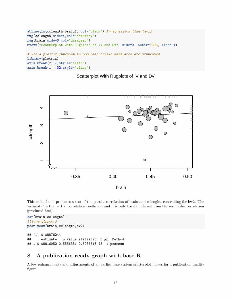
This plot also places the points on the graph using a different method than the original approach taken above.The base plot has an argument of “type=n”, preventing points from being displayed. Then, the symbolsfunction is used to add the points to the plot. This approach is taken so that the size of those symbols canbe scaled to the third variable, bw2.
Once the symbols specification is accomplished, the OLS line, rug plots and axis breaks are added as wasdone above.
The plot does not suggest that the small positive relationship between brain weight and corpus callosumlength is easily accounted for by body weight as a confounding variable since the varying sizes of the points
13
do not seem to follow the two other variables. This is essentially a question of a partial correlation betweenthe two primary variables, controlling for bw. The code for that computation is shown in the subsequentcode chunk.
(Still working how to get markdown to stop creating the blank layout area first.)# a second kind of basic scatterplot style.......# use a smaller subset of the earlier data set, but this one includes the# corpus callosum length variable we looked at in the "location tests"# section ofthe course earlier. This only includes one of the# eight mouse strains
mouse2a <- read.csv("data/mastersmall3.csv")mouse2 <- subset(mouse2a, geno=='BALB/CBYJ')#min(mouse2$bwcoc)mouse2$bw2 <- mouse2$bwcoc-(min(mouse2$bwcoc)-1)attach(mouse2)# note the different way of putting the points on the graph using the# symbols function. I also scaled the size (area) of the points to a third# variable, body weight. The circles argument in symbol controls the radius size# I rescaled cclength so that minimum value was 1.0, making the scaling work(sort of)plot(cclength, brain, type="n",
xlab="Brain Weight",ylab="Corpus Callosum Length")
1.0 1.5 2.0 2.5 3.0 3.5 4.0
0.35
0.40
0.45
Brain Weight
Cor
pus
Cal
losu
m L
engt
h
symbols(x=brain,y=cclength,circles=sqrt(bw2/pi),bg="gray", fg="black",inches=.1)
14
abline(lm(cclength~brain), col="black") # regression line (y~x)rug(cclength,side=4,col="darkgray")rug(brain,side=3,col="darkgray")mtext("Scatterplot With Rugplots of IV and DV", side=3, outer=TRUE, line=-1)
# use a plotrix function to add axis breaks when axes are truncatedlibrary(plotrix)axis.break(2,.7,style="slash")axis.break(1, .32,style="slash")
0.35 0.40 0.45 0.50
12
34
brain
ccle
ngth
Scatterplot With Rugplots of IV and DV
This code chunk produces a test of the partial correlation of brain and cclenght, controlling for bw2. The“estimate” is the partial correlation coefficient and it is only barely different from the zero order correlation(produced first).cor(brain,cclength)#library(ppcor)pcor.test(brain,cclength,bw2)
## [1] 0.08876244## estimate p.value statistic n gp Method## 1 0.08816952 0.5556381 0.5937716 48 1 pearson
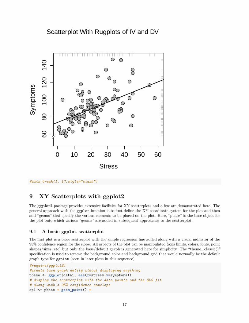
8 A publication ready graph with base RA few enhancements and adjustments of an earlier base system scatterplot makes for a publication qualityfigure.
15
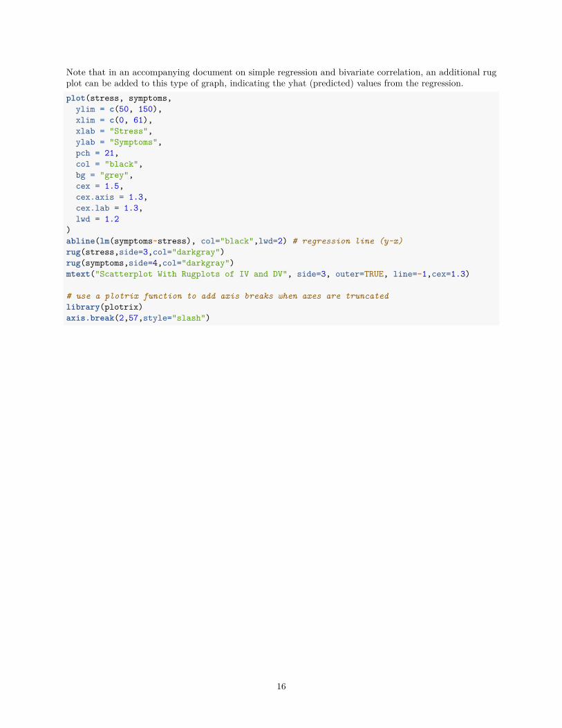
Note that in an accompanying document on simple regression and bivariate correlation, an additional rugplot can be added to this type of graph, indicating the yhat (predicted) values from the regression.plot(stress, symptoms,
ylim = c(50, 150),xlim = c(0, 61),xlab = "Stress",ylab = "Symptoms",pch = 21,col = "black",bg = "grey",cex = 1.5,cex.axis = 1.3,cex.lab = 1.3,lwd = 1.2
)abline(lm(symptoms~stress), col="black",lwd=2) # regression line (y~x)rug(stress,side=3,col="darkgray")rug(symptoms,side=4,col="darkgray")mtext("Scatterplot With Rugplots of IV and DV", side=3, outer=TRUE, line=-1,cex=1.3)
# use a plotrix function to add axis breaks when axes are truncatedlibrary(plotrix)axis.break(2,57,style="slash")
16
0 10 20 30 40 50 60
6080
100
120
140
Stress
Sym
ptom
sScatterplot With Rugplots of IV and DV
#axis.break(1, 17,style="slash")
9 XY Scatterplots with ggplot2The ggplot2 package provides extensive facilities for XY scatterplots and a few are demonstrated here. Thegeneral approach with the ggplot function is to first define the XY coordinate system for the plot and thenadd “geoms” that specify the various elements to be placed on the plot. Here, “pbase” is the base object forthe plot onto which various “geoms” are added in subsequent approaches to the scatterplot.
9.1 A basic ggplot scatterplotThe first plot is a basic scatterplot with the simple regression line added along with a visual indicator of the95% confidence region for the slope. All aspects of the plot can be manipulated (axis limits, colors, fonts, pointshapes/sizes, etc) but only the base/default graph is generated here for simplicity. The “theme_classic()”specification is used to remove the background color and background grid that would normally be the defaultgraph type for ggplot (seen in later plots in this sequence)#require(ggplot2)#create base graph entity wthout displaying anythingpbase <- ggplot(data1, aes(x=stress,y=symptoms))# display the scatterplot with the data points and the OLS fit# along with a 95% confidence envelopesp1 <- pbase + geom_point() +
17
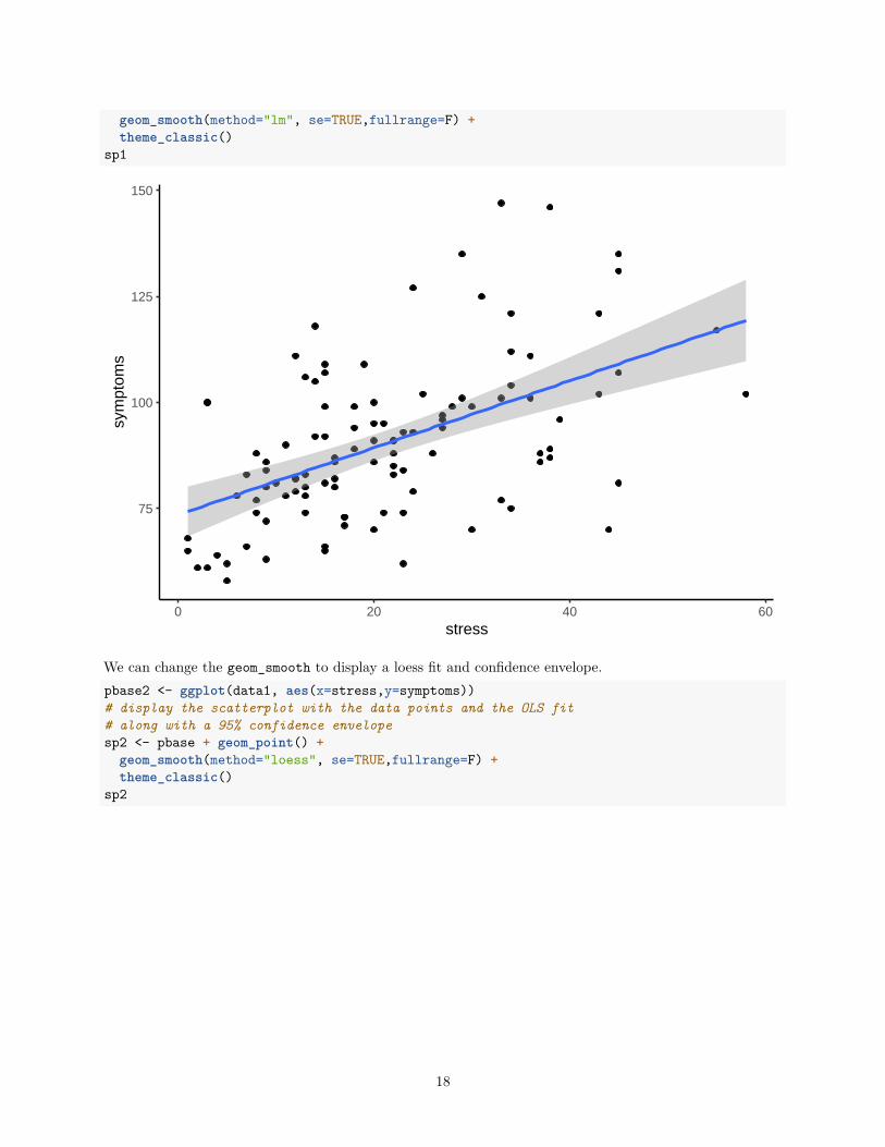
geom_smooth(method="lm", se=TRUE,fullrange=F) +theme_classic()
sp1
75
100
125
150
0 20 40 60stress
sym
ptom
s
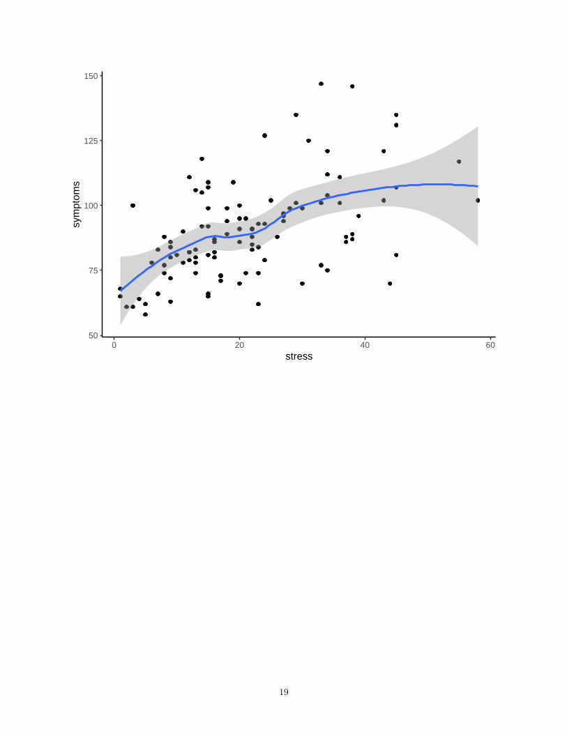
We can change the geom_smooth to display a loess fit and confidence envelope.pbase2 <- ggplot(data1, aes(x=stress,y=symptoms))# display the scatterplot with the data points and the OLS fit# along with a 95% confidence envelopesp2 <- pbase + geom_point() +
geom_smooth(method="loess", se=TRUE,fullrange=F) +theme_classic()
sp2
18
50
75
100
125
150
0 20 40 60stress
sym
ptom
s
19
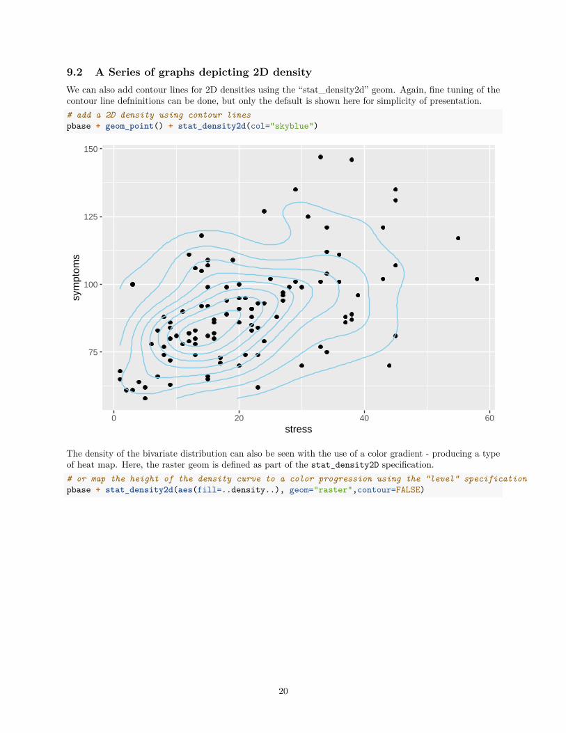
9.2 A Series of graphs depicting 2D densityWe can also add contour lines for 2D densities using the “stat_density2d” geom. Again, fine tuning of thecontour line defninitions can be done, but only the default is shown here for simplicity of presentation.# add a 2D density using contour linespbase + geom_point() + stat_density2d(col="skyblue")
75
100
125
150
0 20 40 60stress
sym
ptom
s
The density of the bivariate distribution can also be seen with the use of a color gradient - producing a typeof heat map. Here, the raster geom is defined as part of the stat_density2D specification.# or map the height of the density curve to a color progression using the "level" specificationpbase + stat_density2d(aes(fill=..density..), geom="raster",contour=FALSE)
20
75
100
125
150
0 20 40 60stress
sym
ptom
s
2e−04
4e−04
6e−04
8e−04
density
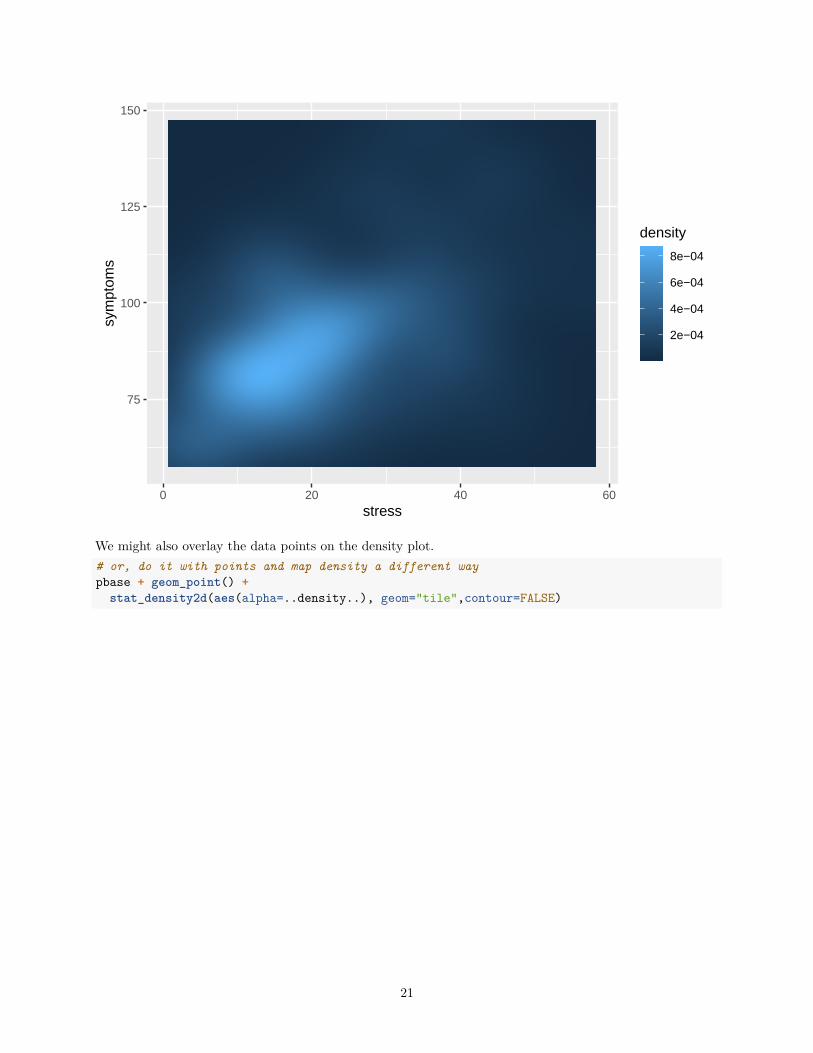
We might also overlay the data points on the density plot.# or, do it with points and map density a different waypbase + geom_point() +
stat_density2d(aes(alpha=..density..), geom="tile",contour=FALSE)
21
75
100
125
150
0 20 40 60stress
sym
ptom
s
density
2e−04
4e−04
6e−04
8e−04
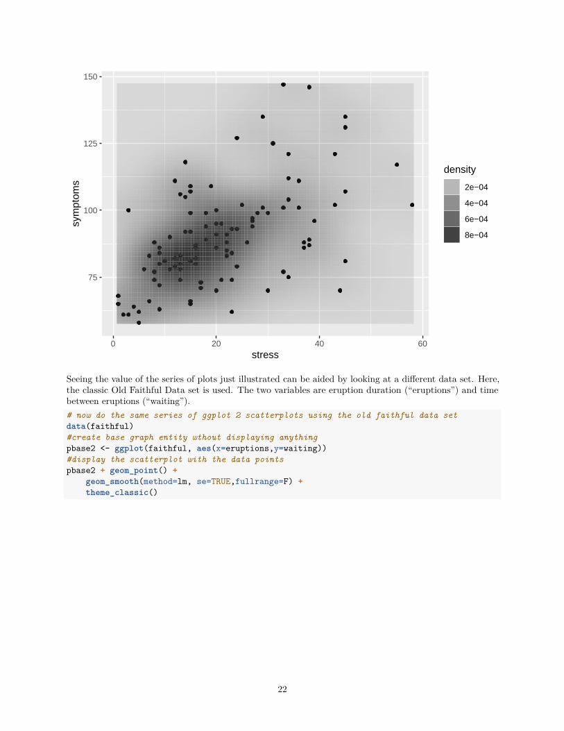
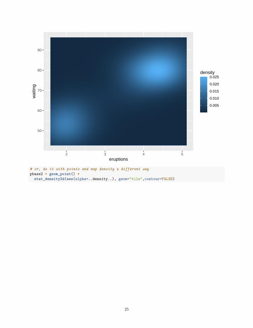
Seeing the value of the series of plots just illustrated can be aided by looking at a different data set. Here,the classic Old Faithful Data set is used. The two variables are eruption duration (“eruptions”) and timebetween eruptions (“waiting”).# now do the same series of ggplot 2 scatterplots using the old faithful data setdata(faithful)#create base graph entity wthout displaying anythingpbase2 <- ggplot(faithful, aes(x=eruptions,y=waiting))#display the scatterplot with the data pointspbase2 + geom_point() +
geom_smooth(method=lm, se=TRUE,fullrange=F) +theme_classic()
22
50
60
70
80
90
2 3 4 5eruptions
wai
ting
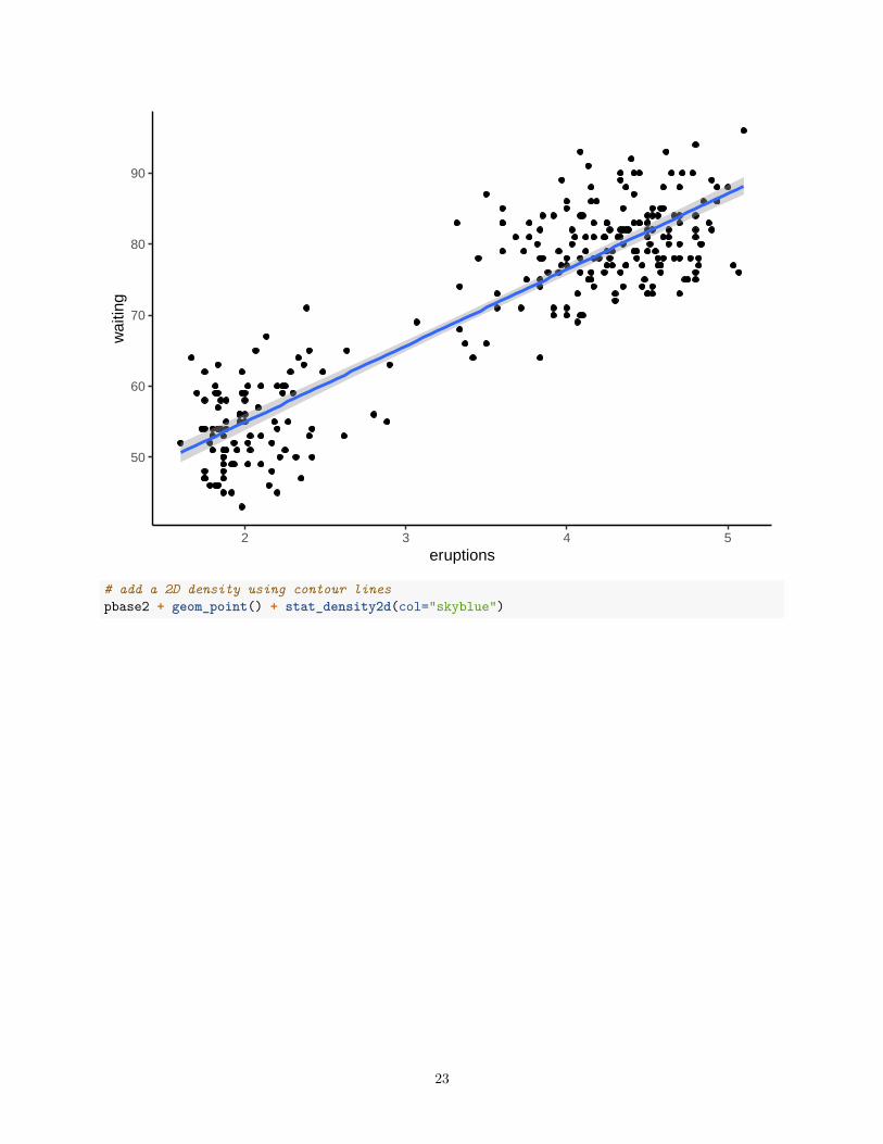
# add a 2D density using contour linespbase2 + geom_point() + stat_density2d(col="skyblue")
23
50
60
70
80
90
2 3 4 5eruptions
wai
ting
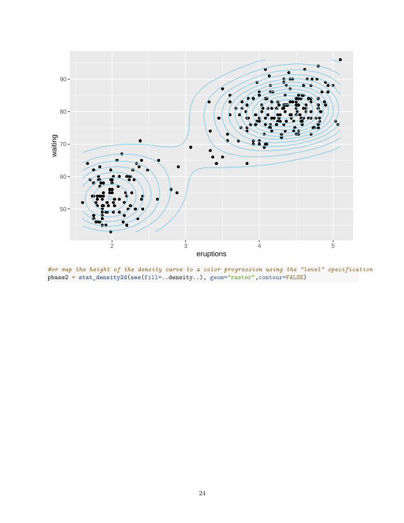
#or map the height of the density curve to a color progression using the "level" specificationpbase2 + stat_density2d(aes(fill=..density..), geom="raster",contour=FALSE)
24
50
60
70
80
90
2 3 4 5eruptions
wai
ting
0.005
0.010
0.015
0.020
0.025density
# or, do it with points and map density a different waypbase2 + geom_point() +
stat_density2d(aes(alpha=..density..), geom="tile",contour=FALSE)
25
50
60
70
80
90
2 3 4 5eruptions
wai
ting
density
0.005
0.010
0.015
0.020
0.025
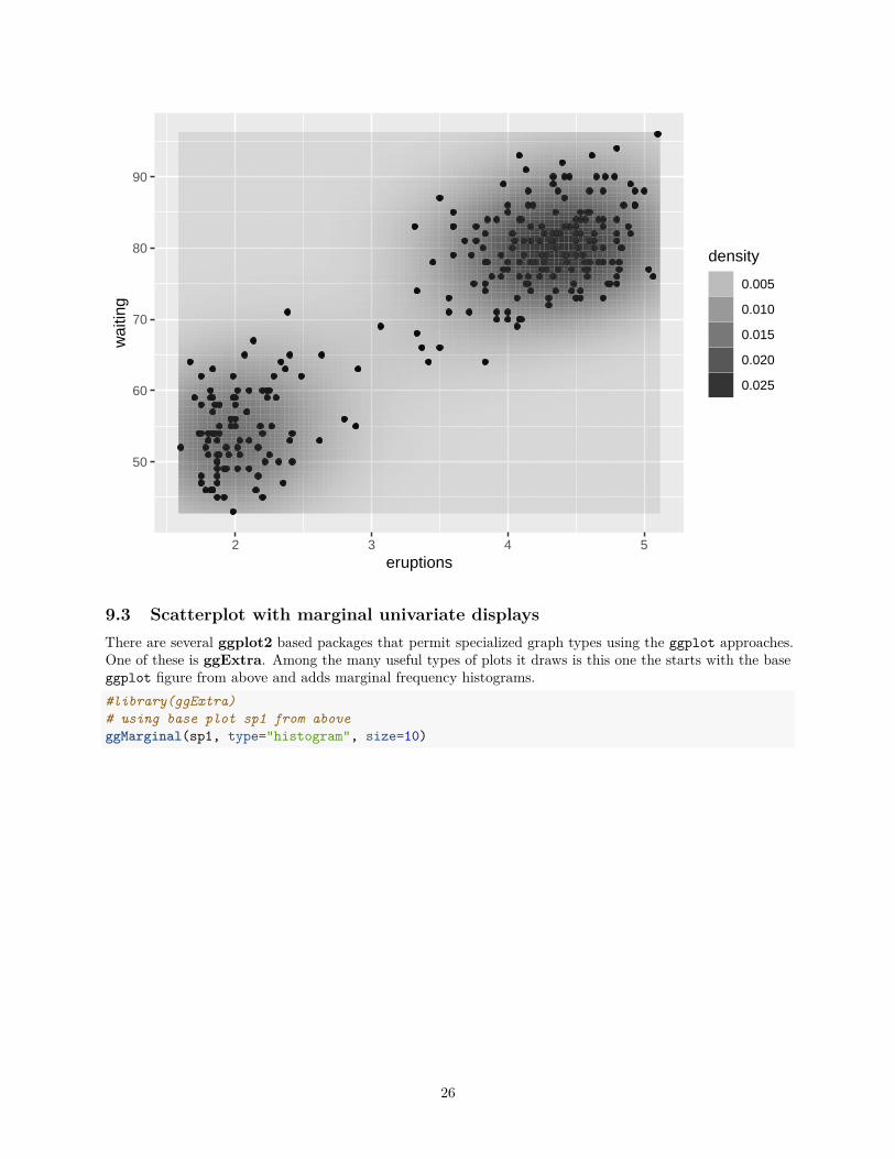
9.3 Scatterplot with marginal univariate displaysThere are several ggplot2 based packages that permit specialized graph types using the ggplot approaches.One of these is ggExtra. Among the many useful types of plots it draws is this one the starts with the baseggplot figure from above and adds marginal frequency histograms.#library(ggExtra)# using base plot sp1 from aboveggMarginal(sp1, type="histogram", size=10)
26
75
100
125
150
0 20 40 60stress
sym
ptom
s
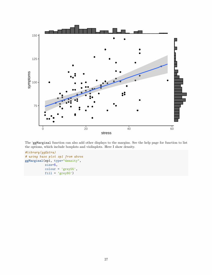
The ‘ggMarginal function can also add other displays to the margins. See the help page for function to listthe options, which include boxplots and violinplots. Here I show density.#library(ggExtra)# using base plot sp1 from aboveggMarginal(sp1, type="density",
size=5,colour = 'grey55',fill = 'grey80')
27
75
100
125
150
0 20 40 60stress
sym
ptom
s
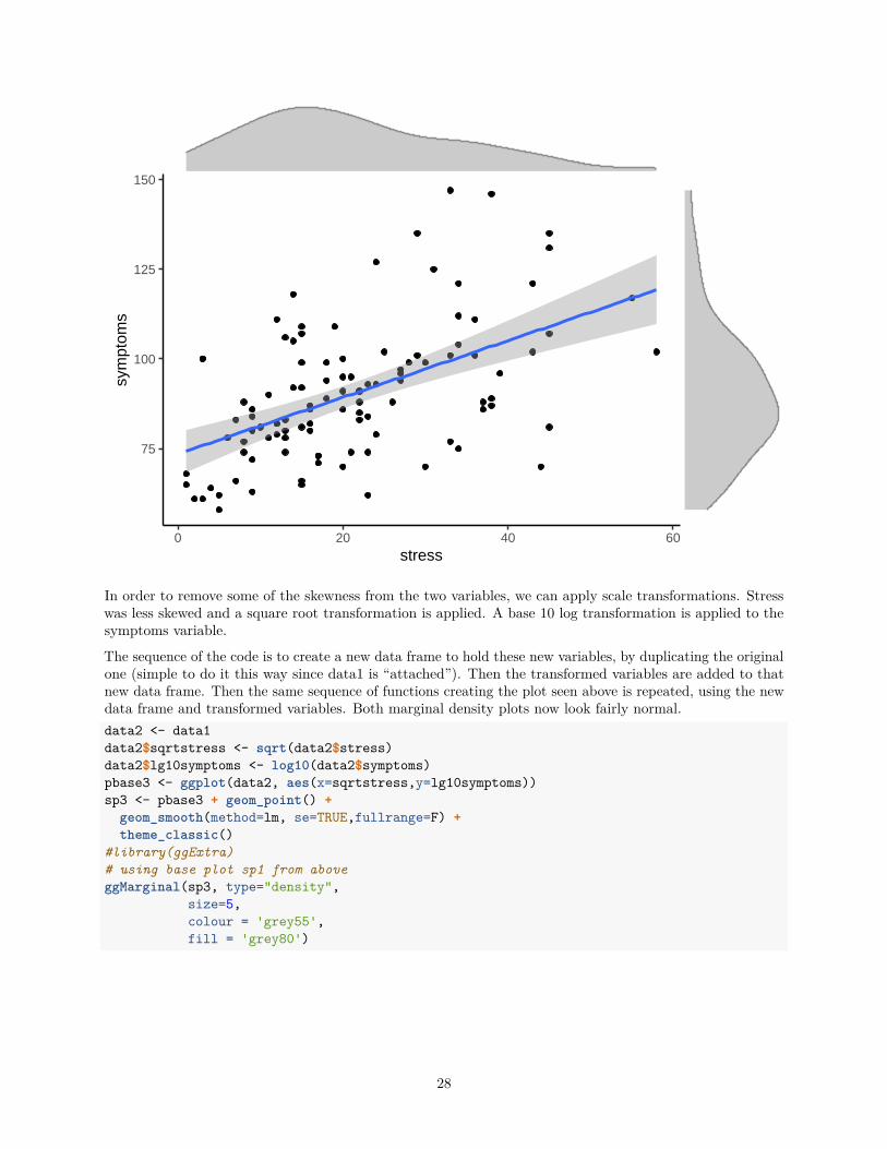
In order to remove some of the skewness from the two variables, we can apply scale transformations. Stresswas less skewed and a square root transformation is applied. A base 10 log transformation is applied to thesymptoms variable.
The sequence of the code is to create a new data frame to hold these new variables, by duplicating the originalone (simple to do it this way since data1 is “attached”). Then the transformed variables are added to thatnew data frame. Then the same sequence of functions creating the plot seen above is repeated, using the newdata frame and transformed variables. Both marginal density plots now look fairly normal.data2 <- data1data2$sqrtstress <- sqrt(data2$stress)data2$lg10symptoms <- log10(data2$symptoms)pbase3 <- ggplot(data2, aes(x=sqrtstress,y=lg10symptoms))sp3 <- pbase3 + geom_point() +
geom_smooth(method=lm, se=TRUE,fullrange=F) +theme_classic()
#library(ggExtra)# using base plot sp1 from aboveggMarginal(sp3, type="density",
size=5,colour = 'grey55',fill = 'grey80')
28
1.8
1.9
2.0
2.1
2 4 6sqrtstress
lg10
sym
ptom
s
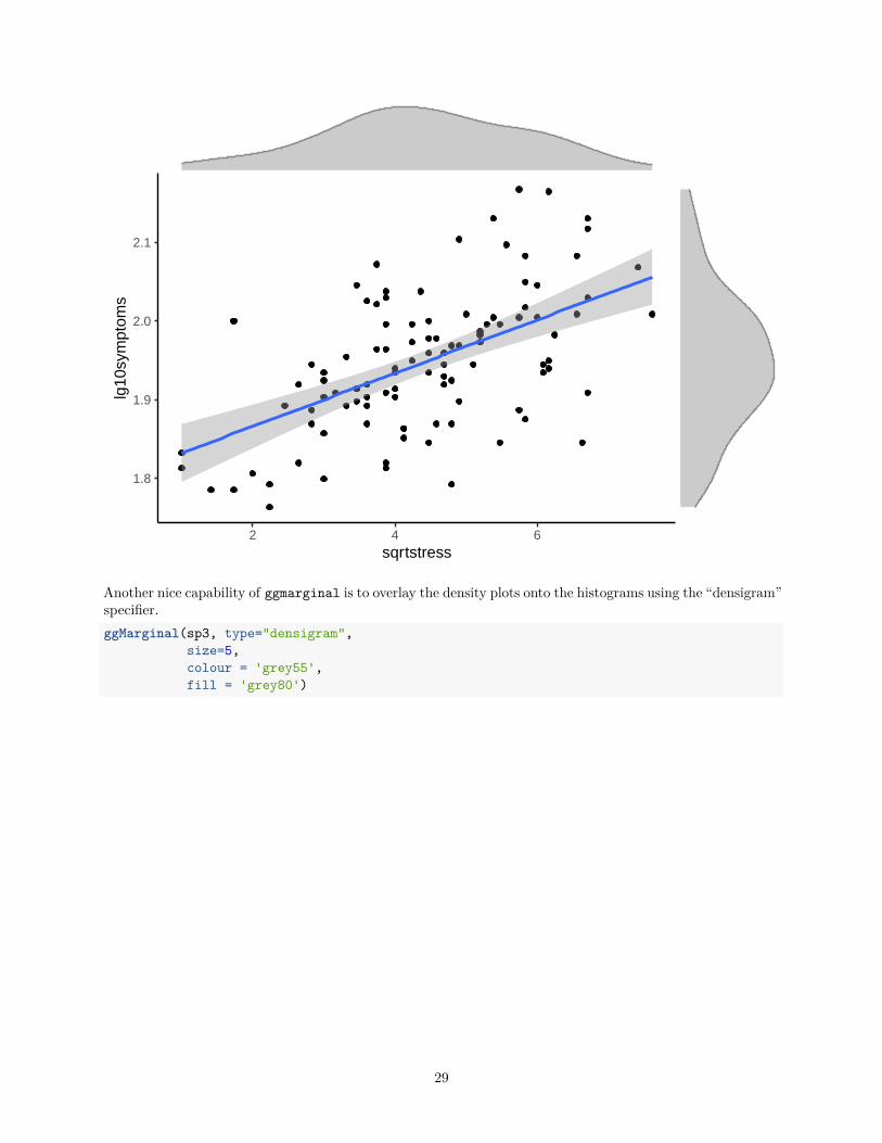
Another nice capability of ggmarginal is to overlay the density plots onto the histograms using the “densigram”specifier.ggMarginal(sp3, type="densigram",
size=5,colour = 'grey55',fill = 'grey80')
29
1.8
1.9
2.0
2.1
2 4 6sqrtstress
lg10
sym
ptom
s
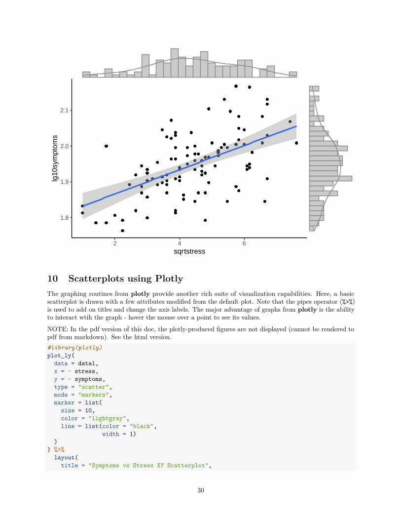
10 Scatterplots using PlotlyThe graphing routines from plotly provide another rich suite of visualization capabilities. Here, a basicscatterplot is drawn with a few attributes modified from the default plot. Note that the pipes operator (%>%)is used to add on titles and change the axis labels. The major advantage of graphs from plotly is the abilityto interact wtih the graph - hover the mouse over a point to see its values.
NOTE: In the pdf version of this doc, the plotly-produced figures are not displayed (cannot be rendered topdf from markdown). See the html version.#library(plotly)plot_ly(
data = data1,x = ~ stress,y = ~ symptoms,type = "scatter",mode = "markers",marker = list(
size = 10,color = "lightgray",line = list(color = "black",
width = 1))
) %>%layout(
title = "Symptoms vs Stress XY Scatterplot",
30
xaxis = list(title = "Stress"),yaxis = list(title = "Symptoms")
)
## PhantomJS not found. You can install it with webshot::install_phantomjs(). If it is installed, please make sure the phantomjs executable can be found via the PATH variable.
Adding an OLS line to the plot_ly figure can be done.#library(plotly)fit1 <- lm(symptoms ~ stress, data = data1)plot_ly(data = data1,
x = ~ stress,mode = "markers") %>%
add_markers(data = data1,y = ~ symptoms,marker = list(
size = 10,color = "lightgray",line = list(color = "black",
width = 1))
) %>%add_lines(x = ~ stress,
y = fitted(fit1),color = I("black")) %>%
layout(title = "Symptoms vs Stress XY Scatterplot",xaxis = list(title = "Stress"),yaxis = list(title = "Symptoms"),showlegend = FALSE
)
11 3D Scatterplot of three variablesScatterplots with three variables are more challenging to draw using R. While several methods are possible,it is desireable to have the capability to fit a linear model surface onto the scatterplot. I have found that thescatter3D function from the plot3D package permits this type of figure to be drawn, albeit with a bit ofwork required to set it up and to specify the plot features.
11.1 Fit the 2 predictor “additive” modelFor this illustration a data set has been provided by Professor James Boswell. A sample of participants in aclinical study were measured, at “baseline” on a series of psychological variables. For our purposes, these area measure of depression severity (“bods”), a measurer of anxiety severity (“boasev”) and a measure of positiveaffect (“bpa”). The research question of interest in this 3D scatterplot visualization is whether the bods canbe predicted from the other two variables. This requres a two-IV multiple regression or linear model.
First, the data set is imported. In addition, the three variables are duplicated and renamed z, x, and y tobetter fit the requirements of the scatter3D function. Note that even though bods is the DV in the modeljust described, it is relabeled as z here since z is the vertical axis in the 3D wireframe plot generated below.
Next, we will fit the two-IV “additive” model with bods as the DV. Both IVs are significant predictorsalthough note that the signs of their regression coefficents differ, as one would expect for these variables.
31
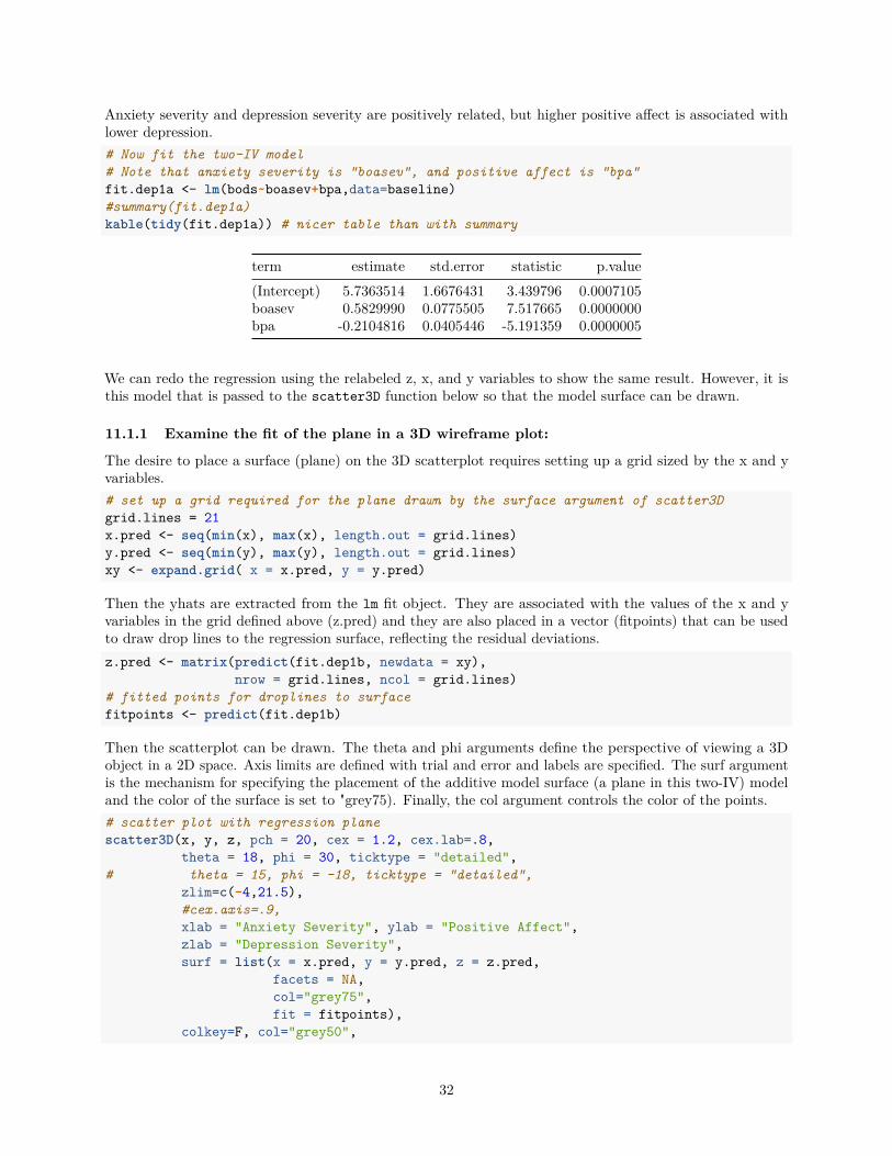
Anxiety severity and depression severity are positively related, but higher positive affect is associated withlower depression.# Now fit the two-IV model# Note that anxiety severity is "boasev", and positive affect is "bpa"fit.dep1a <- lm(bods~boasev+bpa,data=baseline)#summary(fit.dep1a)kable(tidy(fit.dep1a)) # nicer table than with summary
term estimate std.error statistic p.value(Intercept) 5.7363514 1.6676431 3.439796 0.0007105boasev 0.5829990 0.0775505 7.517665 0.0000000bpa -0.2104816 0.0405446 -5.191359 0.0000005
We can redo the regression using the relabeled z, x, and y variables to show the same result. However, it isthis model that is passed to the scatter3D function below so that the model surface can be drawn.
11.1.1 Examine the fit of the plane in a 3D wireframe plot:
The desire to place a surface (plane) on the 3D scatterplot requires setting up a grid sized by the x and yvariables.# set up a grid required for the plane drawn by the surface argument of scatter3Dgrid.lines = 21x.pred <- seq(min(x), max(x), length.out = grid.lines)y.pred <- seq(min(y), max(y), length.out = grid.lines)xy <- expand.grid( x = x.pred, y = y.pred)
Then the yhats are extracted from the lm fit object. They are associated with the values of the x and yvariables in the grid defined above (z.pred) and they are also placed in a vector (fitpoints) that can be usedto draw drop lines to the regression surface, reflecting the residual deviations.z.pred <- matrix(predict(fit.dep1b, newdata = xy),
nrow = grid.lines, ncol = grid.lines)# fitted points for droplines to surfacefitpoints <- predict(fit.dep1b)
Then the scatterplot can be drawn. The theta and phi arguments define the perspective of viewing a 3Dobject in a 2D space. Axis limits are defined with trial and error and labels are specified. The surf argumentis the mechanism for specifying the placement of the additive model surface (a plane in this two-IV) modeland the color of the surface is set to "grey75). Finally, the col argument controls the color of the points.# scatter plot with regression planescatter3D(x, y, z, pch = 20, cex = 1.2, cex.lab=.8,
theta = 18, phi = 30, ticktype = "detailed",# theta = 15, phi = -18, ticktype = "detailed",
zlim=c(-4,21.5),#cex.axis=.9,xlab = "Anxiety Severity", ylab = "Positive Affect",zlab = "Depression Severity",surf = list(x = x.pred, y = y.pred, z = z.pred,
facets = NA,col="grey75",fit = fitpoints),
colkey=F, col="grey50",
32
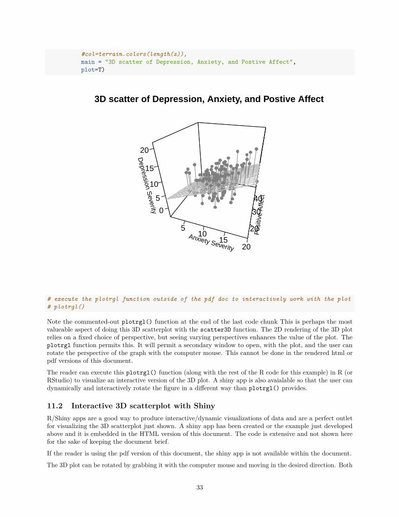
#col=terrain.colors(length(z)),main = "3D scatter of Depression, Anxiety, and Postive Affect",plot=T)
Anxiety Severity
510
1520
Pos
itive
Affe
ct
20
30
40
Depression S
everity 0
5
10
15
20
3D scatter of Depression, Anxiety, and Postive Affect
# execute the plotrgl function outside of the pdf doc to interactively work with the plot# plotrgl()
Note the commented-out plotrgl() function at the end of the last code chunk This is perhaps the mostvalueable aspect of doing this 3D scatterplot with the scatter3D function. The 2D rendering of the 3D plotrelies on a fixed choice of perspective, but seeing varying perspectives enhances the value of the plot. Theplotrgl function permits this. It will permit a secondary window to open, with the plot, and the user canrotate the perspective of the graph with the computer mouse. This cannot be done in the rendered html orpdf versions of this document.
The reader can execute this plotrgl() function (along with the rest of the R code for this example) in R (orRStudio) to visualize an interactive version of the 3D plot. A shiny app is also avaialable so that the user candynamically and interactively rotate the figure in a different way than plotrgl() provides.
11.2 Interactive 3D scatterplot with ShinyR/Shiny apps are a good way to produce interactive/dynamic visualizations of data and are a perfect outletfor visualizing the 3D scatterplot just shown. A shiny app has been created or the example just developedabove and it is embedded in the HTML version of this document. The code is extensive and not shown herefor the sake of keeping the document brief.
If the reader is using the pdf version of this document, the shiny app is not available within the document.
The 3D plot can be rotated by grabbing it with the computer mouse and moving in the desired direction. Both
33
the additive model surface (a plane) and the interaction model surface (a warped plane) can be visualized bychoosing the respective radio button.
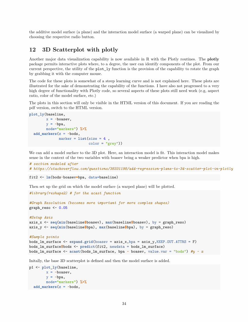
12 3D Scatterplot with plotlyAnother major data visualization capability is now available in R with the Plotly routines. The plotlypackage permits interactive plots where, to a degree, the user can identify components of the plot. From ourcurrent perspective, the utility of the plot_ly function is the provision of the capability to rotate the graphby grabbing it with the computer mouse.
The code for these plots is somewhat of a steep learning curve and is not explained here. These plots areillustrated for the sake of demonstrating the capability of the functions. I have also not progressed to a veryhigh degree of functionality with Plotly code, so several aspects of these plots still need work (e.g, aspectratio, color of the model surface, etc.)
The plots in this section will only be visible in the HTML version of this document. If you are reading thepdf version, switch to the HTML version.plot_ly(baseline,
x = ~boasev,y = ~bpa,mode="markers") %>%
add_markers(z = ~bods,marker = list(size = 4 ,
color = "grey"))
We can add a model surface to the 3D plot. Here, an interaction model is fit. This interaction model makessense in the context of the two variables with boasev being a weaker predictor when bpa is high.# section modeled after# https://stackoverflow.com/questions/38331198/add-regression-plane-to-3d-scatter-plot-in-plotly
fit2 <- lm(bods~boasev*bpa, data=baseline)
Then set up the grid on which the model surface (a warped plane) will be plotted.#library(reshape2) # for the acast function
#Graph Resolution (becomes more important for more complex shapes)graph_reso <- 0.05
#Setup Axisaxis_x <- seq(min(baseline$boasev), max(baseline$boasev), by = graph_reso)axis_y <- seq(min(baseline$bpa), max(baseline$bpa), by = graph_reso)
#Sample pointsbods_lm_surface <- expand.grid(boasev = axis_x,bpa = axis_y,KEEP.OUT.ATTRS = F)bods_lm_surface$bods <- predict(fit2, newdata = bods_lm_surface)bods_lm_surface <- acast(bods_lm_surface, bpa ~ boasev, value.var = "bods") #y ~ x
Initally, the base 3D scatterplot is defined and then the model surface is added.p1 <- plot_ly(baseline,
x = ~boasev,y = ~bpa,mode="markers") %>%
add_markers(z = ~bods,
34
marker = list(size = 3 ,color = "grey"))
p2 <- add_surface(p = p1,z = bods_lm_surface,x = axis_x,y = axis_y,type = "surface", opacity=.6,colorscale="Blues", showscale=F, opacity=.6)
p2
13 Documentation for ReproducibilityR software products such as this markdown document should be simple to reproduce, if the code is available.But it is also important to document the exact versions of the R installation, the OS, and the R packages inplace when the document is created.sessionInfo()
## R version 3.6.3 (2020-02-29)## Platform: x86_64-w64-mingw32/x64 (64-bit)## Running under: Windows 10 x64 (build 18362)#### Matrix products: default#### locale:## [1] LC_COLLATE=English_United States.1252## [2] LC_CTYPE=English_United States.1252## [3] LC_MONETARY=English_United States.1252## [4] LC_NUMERIC=C## [5] LC_TIME=English_United States.1252#### attached base packages:## [1] grid stats graphics grDevices utils datasets methods## [8] base#### other attached packages:## [1] hdrcde_3.3 shiny_1.4.0.2 rmarkdown_2.1 reshape2_1.4.4## [5] plotly_4.9.2.1 plot3Drgl_1.0.1 rgl_0.100.54 plot3D_1.3## [9] ppcor_1.1 ggExtra_0.9 ggthemes_4.2.0 knitr_1.28## [13] broom_0.5.6 car_3.0-7 carData_3.0-3 psych_1.9.12.31## [17] plotrix_3.7-8 UsingR_2.0-6 Hmisc_4.4-0 ggplot2_3.3.0## [21] Formula_1.2-3 survival_3.1-12 lattice_0.20-41 HistData_0.8-6## [25] MASS_7.3-51.6 aplpack_1.3.3#### loaded via a namespace (and not attached):## [1] nlme_3.1-147 ash_1.0-15 httr_1.4.1## [4] webshot_0.5.2 RColorBrewer_1.1-2 tools_3.6.3## [7] backports_1.1.6 R6_2.4.1 rpart_4.1-15## [10] mgcv_1.8-31 lazyeval_0.2.2 colorspace_1.4-1## [13] manipulateWidget_0.10.1 nnet_7.3-14 withr_2.2.0
35
## [16] tidyselect_1.1.0 gridExtra_2.3 mnormt_1.5-7## [19] curl_4.3 compiler_3.6.3 htmlTable_1.13.3## [22] isoband_0.2.1 labeling_0.3 scales_1.1.1## [25] checkmate_2.0.0 stringr_1.4.0 digest_0.6.25## [28] foreign_0.8-76 rio_0.5.16 base64enc_0.1-3## [31] jpeg_0.1-8.1 pkgconfig_2.0.3 htmltools_0.4.0## [34] highr_0.8 fastmap_1.0.1 htmlwidgets_1.5.1## [37] rlang_0.4.6 readxl_1.3.1 rstudioapi_0.11## [40] farver_2.0.3 generics_0.0.2 jsonlite_1.6.1## [43] crosstalk_1.1.0.1 acepack_1.4.1 dplyr_0.8.5## [46] zip_2.0.4 magrittr_1.5 Matrix_1.2-18## [49] Rcpp_1.0.4.6 munsell_0.5.0 abind_1.4-5## [52] lifecycle_0.2.0 stringi_1.4.6 yaml_2.2.1## [55] plyr_1.8.6 misc3d_0.8-4 parallel_3.6.3## [58] promises_1.1.0 forcats_0.5.0 crayon_1.3.4## [61] miniUI_0.1.1.1 haven_2.2.0 splines_3.6.3## [64] hms_0.5.3 pillar_1.4.4 tcltk_3.6.3## [67] glue_1.4.1 evaluate_0.14 latticeExtra_0.6-29## [70] data.table_1.12.8 png_0.1-7 vctrs_0.3.0## [73] httpuv_1.5.2 cellranger_1.1.0 gtable_0.3.0## [76] purrr_0.3.4 tidyr_1.0.3 assertthat_0.2.1## [79] xfun_0.13 openxlsx_4.1.5 mime_0.9## [82] xtable_1.8-4 later_1.0.0 viridisLite_0.3.0## [85] tibble_3.0.1 cluster_2.1.0 ellipsis_0.3.0
14 References
Cleveland, W. S. (1984). Graphs in scientific publications. The American Statistician, 38, 261–269. JournalArticle.
Cleveland, W. S. (1994). The elements of graphing data (Rev., p. 297 p.). Book, Murray Hill, N.J.: AT&TBell Laboratories.
Howell, D. C. (2014). Fundamental statistics for the behavioral sciences (8th ed., pp. xvii, 649pages). Book,Belmont, Calif.: Wadsworth, Cengage Learning.
Tufte, E. R. (2001). The visual display of quantitative information (2nd ed., p. 197 p.). Book, Cheshire,Conn.: Graphics Press.
36


