Embed Size (px)
Citation preview

Optimizing the Visual Presentation of Your Data
Mary Beth Hasselquist, MD
#stc15

Graphs constructed using principles derived from knowledge of visual science present • the user with easy-to-perform visual
tasks and • a visual message that’s congruent with
the intended message.
© 2015 Aktiva Design, Mary Beth Hasselquist

Designers encode data. Users visually decode the data. A graph is successful only if the decoding process is effective. Different types of graphs require different tasks to decode the data.
© 2015 Aktiva Design, Mary Beth Hasselquist

Position along a common scale Position along identical, nonaligned scales Length
Angle Slope
Area (and volume)
Color value
© 2015 Aktiva Design, Mary Beth Hasselquist
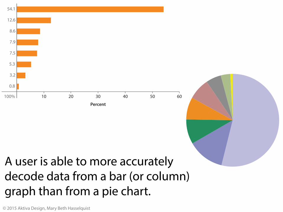
Decoding tasks from most accurate to least accurate
605040302010
54.1
12.6
8.6
7.9
7.5
5.3
3.2
0.8
100%
Percent
A user is able to more accurately decode data from a bar (or column) graph than from a pie chart.
© 2015 Aktiva Design, Mary Beth Hasselquist

Column and bar graphs encode data in two ways: • Length • Position along a common scale
In order to encode the data accurately, column and bar charts must start at zero.
© 2015 Aktiva Design, Mary Beth Hasselquist

Incorrect construction!
© 2015 Aktiva Design, Mary Beth Hasselquist
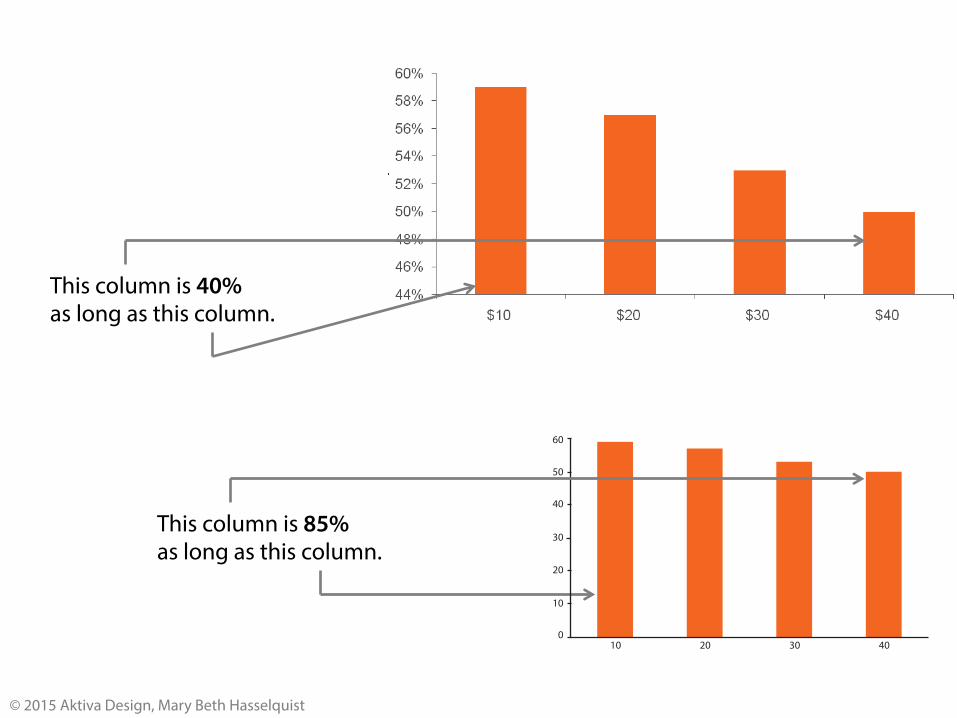
This column is 40% as long as this column.
This column is 85% as long as this column.
60
50
40
30
20
10
010 20 30 40
Predicted probability of adherence (%)
Copayment for 30-day supply of statin (USD)
Adherence to Statin Medication by Copayment
© 2015 Aktiva Design, Mary Beth Hasselquist

60
50
40
30
20
10
010 20 30 40
Predicted probability of adherence (%)
Copayment for 30-day supply of statin (USD)
Adherence to Statin Medication by Copayment
44
46
48
50
52
54
56
58
60
10 20 30 40Copayment for 30-day supply of statin (USD)
Adherence to Statin Medication by Copayment
Predicted probability of adherence (%)
If the intended purpose of a graph is to highlight the differences between the variables and a column (or bar) graph doesn’t meet this intended purpose, a point (dot) graph can be used. Point graphs encode data using position along a common scale.
© 2015 Aktiva Design, Mary Beth Hasselquist
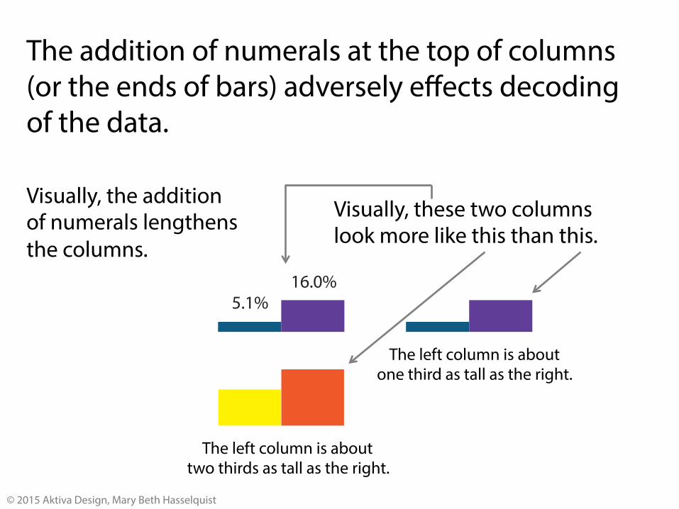
5.1%16.0%
The addition of numerals at the top of columns (or the ends of bars) adversely effects decoding of the data.
Visually, the addition of numerals lengthens the columns.
The left column is about two thirds as tall as the right.
The left column is about one third as tall as the right.
Visually, these two columns look more like this than this.
© 2015 Aktiva Design, Mary Beth Hasselquist

Gestalt principle of Proximity Items that are closer together will appear to belong together as compared to items that are further away.
Comp EPO HMOPOS PPO POS w/caCDHP HDHP Unknown
item 1item 2item 3
item 4item 5item 6
item 7item 8item 9
not Comp EPO HMOPOS PPO POS w/caCDHP HDHP Unknow
item 1item 4item 7
item 2item 5item 8
item 3item 6item 9
© 2015 Aktiva Design, Mary Beth Hasselquist
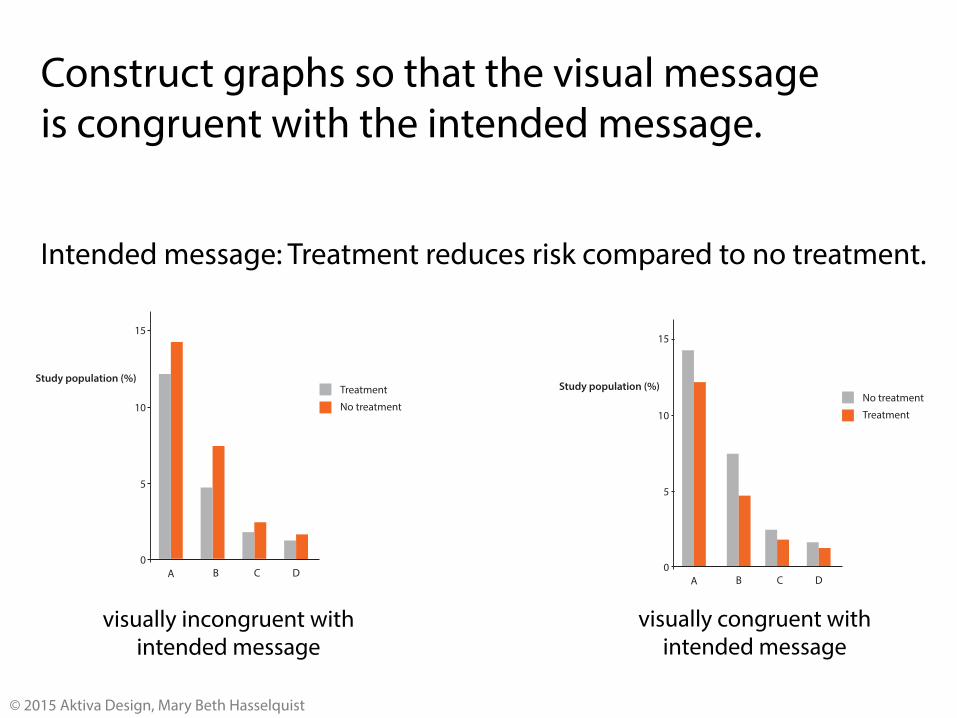
Construct graphs so that the visual message is congruent with the intended message.
A
10
0
5
15
Study population (%)TreatmentNo treatment
DCBA
10
0
5
15
Study population (%)No treatmentTreatment
DCB
Intended message: Treatment reduces risk compared to no treatment.
visually incongruent with intended message
visually congruent with intended message
© 2015 Aktiva Design, Mary Beth Hasselquist

Whenever possible, construct graphs so that the math is done for the viewer.
A
10
0
5
15
Study population (%)No treatmentTreatment
DCB
3.02.52.01.51.00.50
Absolute Risk Reduction of Treatment
B
A
C
D
Absolute risk reduction (%)
In this graph, users must visually do the math to determine the difference between no treatment and treatment for each category.
In this graph, the math has been done for users. © 2015 Aktiva Design, Mary Beth Hasselquist
Employing 3D effects, gradients and shadows is almost always a poor design choice when constructing graphs.
© 2015 Aktiva Design, Mary Beth Hasselquist
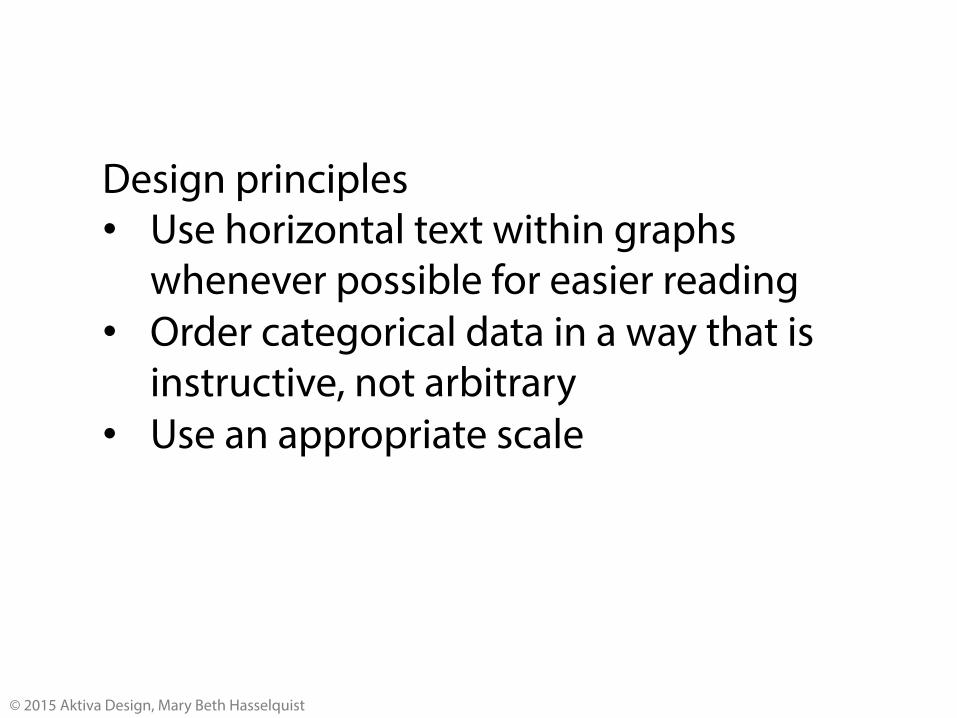
Design principles • Use horizontal text within graphs
whenever possible for easier reading • Order categorical data in a way that is
instructive, not arbitrary • Use an appropriate scale
© 2015 Aktiva Design, Mary Beth Hasselquist

Hue
Saturation
Value
Color has three dimensions
© 2015 Aktiva Design, Mary Beth Hasselquist

Hue has no semantic meaning. Any meaning associated with a given hue is culturally determined.
© 2015 Aktiva Design, Mary Beth Hasselquist
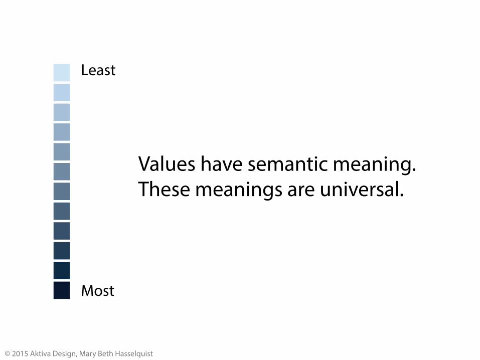
Values have semantic meaning. These meanings are universal.
Least
Most
© 2015 Aktiva Design, Mary Beth Hasselquist
Adobe Illustrator default Better
© 2015 Aktiva Design, Mary Beth Hasselquist
3.02.52.01.51.00.50
Absolute Risk Reduction of Influenza-Related Complications 30-Days after Influenza Diagnosis in Children with Chronic Medical Conditions Provided by Antiviral Treatment with Oseltamivir
Influenza-related complication
Respiratory illness other than pneumonia
Otitis media and related complications
Pneumonia
Hospitalizations—all-cause
Hospitalizations—pneumonia-related
Hospitalizations—non-pneumonia respiratory illness
Absolute risk reduction (%)3.02.52.01.51.00.50
Absolute Risk Reduction of Influenza-Related Complications 30-Days after Influenza Diagnosis in Children with Chronic Medical Conditions Provided by Antiviral Treatment with Oseltamivir
Influenza-related complication
Respiratory illness other than pneumonia
Otitis media and related complications
Pneumonia
Hospitalizations—all-cause
Hospitalizations—pneumonia-related
Hospitalizations—non-pneumonia respiratory illness
Absolute risk reduction (%)
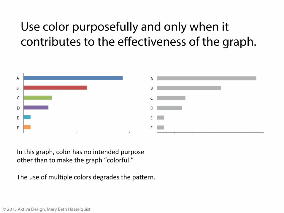
Use color purposefully and only when it contributes to the effectiveness of the graph.
A A
C
B
E
D
F F
E
D
C
B
In this graph, color has no intended purpose other than to make the graph “colorful.” The use of mul:ple colors degrades the pa;ern.
© 2015 Aktiva Design, Mary Beth Hasselquist

Any image created in color must work in grayscale. • Color documents are often reproduced
in grayscale. • Certain visual information, such as information
about figure and ground, is carried to the brain only in grayscale.
© 2015 Aktiva Design, Mary Beth Hasselquist
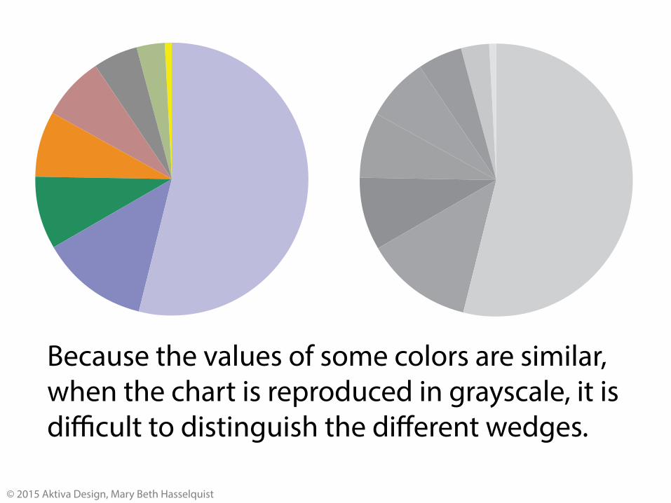
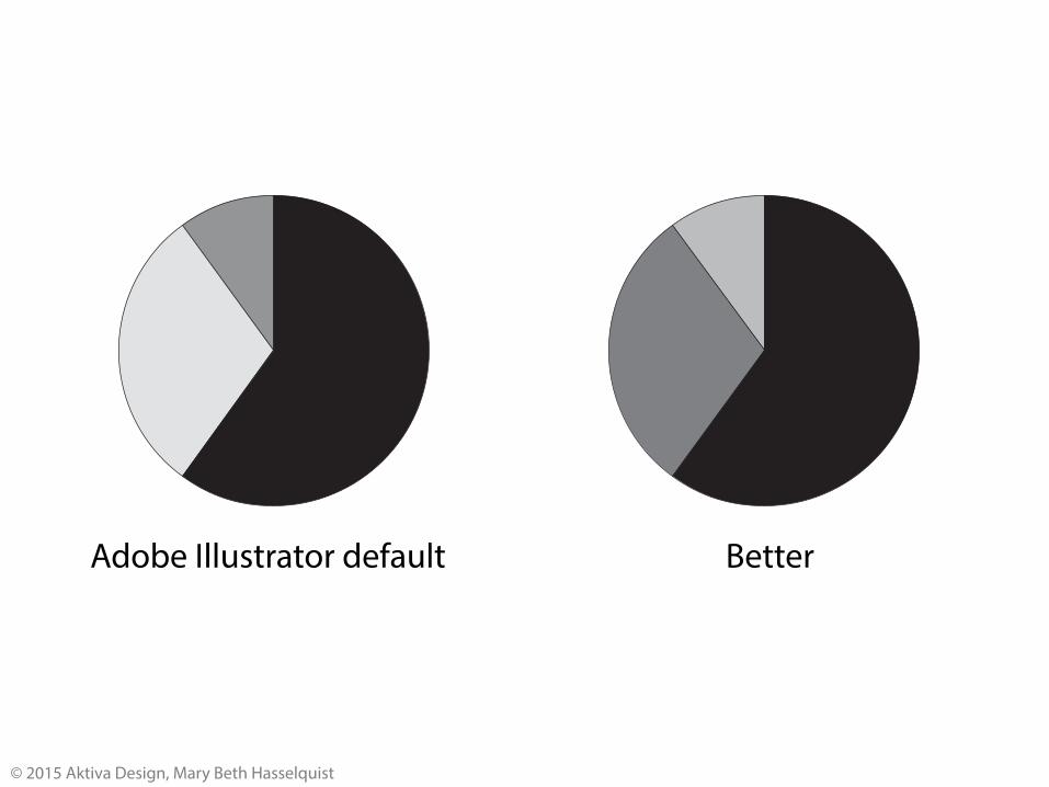
Because the values of some colors are similar, when the chart is reproduced in grayscale, it is difficult to distinguish the different wedges.
© 2015 Aktiva Design, Mary Beth Hasselquist

In order for us to easily read, there must be sufficient contrast between figure (text) and ground (background).
In order for us to easily read, there must be sufficient contrast between figure (text) and ground (background).
In order for us to easily read, there must be sufficient contrast between figure (text) and ground (background).
© 2015 Aktiva Design, Mary Beth Hasselquist

Mary Beth Hasselquist, MD [email protected] 206-660-9474
© 2015 Aktiva Design, Mary Beth Hasselquist