Embed Size (px)
Citation preview

VIRTUAL USER EXPERIENCE EVALUATION AND SOLUTIONGRDS 784: GRAPHIC DESIGN STUDIO: USER EXPERIENCE PRACTICERebecca Hemstad / Spring 2014

15. PROJECT B OVERVIEW
16. Project B, Part 1: Design Proposal, Personas, and Scenarios
17. Project B, Part 1: Timeline18. Project B, Part 1: Research19. Project B, Part 1: Personas20. Project B, Part 1: Design & UX Peers21. Project B, Part 1: Initial Sketches23. Project B, Part 1: Functionality &
Storyboards25. Project B, Part 1: Style Tile26. Project B, Part 1: Scenarios
1. COVER PAGE2. TABLE OF CONTENT
3. PROJECT A OVERVIEW
4. Project A, Part 1: User Experience5. Project A, Part 1: Candidates6. Project A, Part 1: User Experience7. Project A, Part 1: Figures
8. Project A, Part 2: Usability9. Project A, Part 2: Usability Evaluation
TABLE OF CONTENTS
27. Project B, Part 2: Usability Testing28. Project B, Part 2: Usability Test Script30. Project B, Part 2: Prototype for
Usability Testing35. Project B, part 2: Peer Design
Feedback36. Project B, Part 2: Usability Testing
Results37. Project B, Part 2: Assessment of the
Findings
38. Project B, Part 3: Final Design Iterations
39. Project B, Part 3: Peer Feedback40. Project B, Part 3: Written Assessment41. Project B, Part 3: Final High-Fidelity
Prototype42. Project B, Part 3: Mobile Device App
Icon & Favicon
43. RESOURCES & TECHNOLOGY

PROJECT A OVERVIEWThe ongoing projects in this course focus on the design of a new virtual user experience solution, such as an application or Web site. This design will be based upon usability evaluations of a well-known, existing site. For Project A, you will evaluate the usability of an existing application or Web site by performing a heuristic evaluation and writing an assessment based on your findings.
SCHEDULE
Unless otherwise noted, each project part is due by 11:59 p.m. U.S. EST/EDT on the day and unit specified. Project A is comprised of the following parts, which are due during the units specified:
1. Part 1: User Experience, due at the end of Day 7 of Unit 22. Part 2: Usability, due at the end of Day 7 of Unit 3.

PROJECT A PART 1PROJECT A, PART 1: USER EXPERIENCE
1. Identify an established virtual user experience solution (i.e., desktop or mobile application, Web site, 3-D graphic environment) that you feel has user experience problems. For Project B, you will prototype a competing user experience solution. Therefore, the application that you identify should cover a topic, service, or concept that interests you.
2. In no more than 1,000 words, describe why you believe that the media solution you identified has user experience problems. This should be a subjective reflection on your own experiences interacting with the solution. Include screenshots or other media elements to help support your reflection.
3. Your writing must meet the following requirements:• It should not exceed 1,000 words.• Font size should not exceed 12 points.• Citations and document formatting should be in MLA style.

WEST VIRGINIA UNIVERSITY CREDIT UNION
I hate using their website, and I have to use it on a weekly basis. The colors don’t reflect West Virginia University at all, the design is inappropriate for a banking environment, and a lot doesn’t function on the website. They recently launched a new website design that offers ‘home banking’, but the same user experience problems from before persist in tee new design. When a user visits the website on a mobile device they are inundated with too much vertical scrolling, when the user logs into the ‘home banking’ they jump to another website and a completely different design, and there is a mobile device detector that forwards to a different website as opposed to utilizing screen width and lazy-loading to improve the user experience. You can check out how the website looks in Responsinator, and I think progressive enhancement has been thrown right out of the window on this project.
THE VIMEO ANDROID OS MOBILE APP
Using icons and simplifying is sometimes best; however, the Vimeo app for Android OS is too simple, unsophisticated, and isn’t as intuitive as similar apps like YouTube. My impression is that it goes completely against everything that most Android apps utilize, and in general the simplicity causes frustration in the viewer. Granted, the app is a over a year old at this point, but I think by making it a little more complex, adding a level of sophistication by taking advantage of the Android input mechanisms and button structure, and making it actually match the desktop website version with its aesthetics, this app could be a greatly improved.
MY EBAY
Unfortunately you can’t see this website subdomain unless you have an ebay account, but I can assure you that I have spent hours-upon-hours in the desktop subdomain just trying to find how to check the status of something I was selling. Eventually I went back to the email that ebay sent, and followed the link from there. Funny enough, the mobile version of the My ebay subdomain is fantastic, is simple, and communicates effectively and allows for simple navigation. So, the desktop version would need to be totally reworked to provide a positive user experience. Did I mention the website is littered with ads and pop-up ads?
PROJECT A, PART 1 CANDIDATESSo at this point I have made some initial selections of established virtual user experience solutions that I feel have experience problems:

WEST VIRGINIA UNIVERSITY EMPLOYEES’ FEDERAL CREDIT UNION WEBSITE
The West Virginia University Employees’ Federal Credit Union (WVUCU) website is a perfect example of an established virtual user experience solution – a desktop or mobile application, a website, or a 3-D graphic environment - that has user experience problems.
The West Virginia University Employees’ Federal Credit Union was chartered as a not-for- profit organization by the National Credit Union Administration, it is owned entirely by its members, is operated for them exclusively, and WVUCU members’ savings provide the lending funds… and so the WVUCU’s philosophy of “people helping people” is carried out by its savings and lending services.
The WVUCU website is used on a daily basis by potential members (as visitors), and its members preview balances, manage accounts, transfer funds, make payments, and manage loans through the WVUCU’s home banking mechanism. The WVUCU recently launched a new website design that offers ‘home banking’, but the same user experience problems from before persist in tee new design.
The WVUCU website doesn’t keep users informed about what is going on through appropriate feedback within reasonable time, the colors don’t reflect West Virginia University color pallet (which can be found at http://brand.wvu.edu/), and there is a mismatch between the banking system and the real world due to the design being more appropriate for a tanning salon or beachfront rental business (see fig.1).
The WVUCU’s website system should speak the users’ language, with words, phrases and concepts familiar to the user, rather than not responding; in contrast, the website seems unprofessional, unsophisticated, and at time amusing… all of which are not the emotions that one would expect to see in a banking or credit union website.
Users that use mobile banking or app solutions with Bank of America, Capital One, or Huntington Banks all expect a level of real-world convention, which makes information appear in a natural and logical order; however, when a user visits the WVUCU website on a mobile device they are inundated with too much vertical scrolling that doesn’t take the screen size of mobile devices or smartphones into consideration (see fig. 2).
Additionally, when a WVUCU member logs into ‘home banking’ they jump to another website and a completely different design. This is done through a mobile device detector that forwards to a different website as opposed to utilizing screen width, JavaScript lazy-loading to improve the user experience, and progressive enhancement doesn’t seem to be present at all (See fig.3).
In conclusion, the WVUCU website is an excellent candidate for resolving user experience problems with an established virtual user experience solution, by reworking the design and user interface to improve the user experience.
PROJECT A, PART 1 USER EXPERIENCE

Figure 1 WVUCU, West Virginia University Employees’ Federal Credit Union (website screenshot), 2014. https://www.wvucu.com/
Figure 2 WVUCU, West Virginia University Employees’ Federal Credit Union (website as seen through Responsinator), 2014. http://www.responsinator.com/?url=https%3A%2F%2Fwww.wvucu.com%2F
Figure 3 WVUCU, West Virginia University Employees’ Federal Credit Union (website mobile banking as seen through Samsung Galaxy Note 2), 2014.
PROJECT A, PART 1 FIGURES

PROJECT A PART 2PROJECT A, PART 2: USABILITY
1. Perform a usability evaluation of the media solution that you identified in Project A, Part 1. Unlike Part 1, this is a more formalized, objective analysis of the solution based on a minimum of 10 assessment heuristics. You may use the heuristics listed in the following articles, modify these heuristics, and/or create your own heuristics to complete your evaluation:
• These 10 heuristics from UX pioneer Jakob Nielsen are the best-known and most commonly used heuristics in software development.
• The Web article “6 Tips for a Great Flex UX: Part 5” by Theresa Neil provides several examples for each of Nielsen’s 10 heuristics.
2. Construct a detailed presentation of your findings. This presentation should include screenshots that visualize how various elements in the media solution violate or achieve each of the 10 heuristics.
3. Your writing must meet the following requirements:• The evaluation of the solution must be based on a minimum of 10 heuristics.• Font size should not exceed 12 points.• Citations and document formatting should be in MLA style.

PROJECT A, PART 2 USABILITY EVALUATIONThe following is a usability evaluation of the West Virginia University Employees’ Federal Credit Union (WVUCU) media solution that was identified in Project A, Part 1.

VISIBILITY OF SYSTEM STATUS
The system should always keep users informed about what is going on, through appropriate feedback within reasonable time.
On a mobile device like a smartphone or tablet, when the user clicks on the ‘Home Banking’ button they are redirected to an external website and system located at https://hb.cmsnw.com/cu/550462111/login.asp. This external system doesn’t appear like the same aesthetics than the West Virginia University Employee’s Federal Credit Union website, and there is nothing informing them that they are being redirected to a different website or system
MATCH BETWEEN SYSTEM AND THE REAL WORLDThe system should speak the users’ language, with words, phrases and concepts familiar to the user, rather than system-oriented terms. Follow real-world conventions, making information appear in a natural and logical order.
The West Virginia University Employee’s Federal Credit Union uses the Term ‘Home Banking’ when peer websites utilize the term ‘Online Banking’. When you look at top rated banks that have successful user experience they also use the term ‘Online Banking’ in desktop versions of their websites; however, if a person is on a mobile app or website of their bank, they don’t even reference the term ‘Online Banking’, but rather use the typical banking language for transfers, deposits, etc. (after prompting the visitor to download the mobile app if one is available).

ERROR PREVENTION
Either eliminate error-prone conditions or check for them and present users with a confirmation option before they commit to the action.
USER CONTROL AND FREEDOM
Users often choose system functions by mistake and will need a clearly marked “emergency exit” to leave the unwanted state without having to go through an extended dialogue.
When a member of the West Virginia University Employee’s Federal Credit Union mistypes their username or password in the ‘Home Banking’ section of the website they receive an error that tells them to wait 10 seconds to be redirected back to the login webpage, and doesn’t alert the visitor of how many times they can enter a password before timing out.
Also, the account creation page uses a Captcha which has been tested and proven as to not only add time to filling out online forms, but also contributes to people not wanting to complete the form at all.

RECOGNITION RATHER THAN RECALL
Minimize the user’s memory load by making objects, actions, and options visible. Instructions for use of the system should be visible or easily retrievable whenever appropriate.
CONSISTENCY AND STANDARDS
Users should not have to wonder whether different words, situations, or actions mean the same thing. Follow platform conventions.
There are more than one instance of application for each type of loan on the West Virginia University Employee’s Federal Credit Union website. When the viewer wants to apply for a loan there and the click on the appropriate pages and links to apply for a used car loan for example, the end up on a webpage that has three different buttons that all say loan application. Additionally, there is a separate ‘My Loan Application Account’ that is accessible in the main navigation which adds to the viewer’s confusion when applying for a loan.

FLEXIBILITY AND EFFICIENCY OF USE
Allow users to tailor frequent actions.
AESTHETIC AND MINIMALIST DESIGN
Every extra unit of information in a dialogue competes with the relevant units of information and diminishes their relative visibility.
Currently the West Virginia University Employee’s Federal Credit Union doesn’t allow visitors or members of the website to tailor any content to themselves. In fact, when anyone clicks on the ‘Products’ link in the main navigation, so much webspace at https://www.wvucu.com/?q=products is taken up with superfluously large stock art buttons that span more than one page.
These ridiculously large buttons really contribute to a longer amount of time that is required for customers to find specific services, as well as a return hassle every time someo0ne comes back to the webpage to locate information or a specific service. Furthermore, on a mobile device or at smaller screen resolutions the buttons don’t decrease in size, but simply stack vertically, which requires even more scrolling on the part of the visitor or member.

HELP USERS RECOGNIZE, DIAGNOSE, AND RECOVER FROM ERRORS
Error messages should be expressed in plain language, precisely indicate the problem, and constructively suggest a solution.
HELP AND DOCUMENTATION
Even though it is better if the system can be used without documentation, it may be necessary to provide help and documentation.
Areas that need improvement in regards to the West Virginia University Employee’s Federal Credit Union website that specifically pertain to errors and help/documentation, are with the ‘Home Banking’ section of the website. This section has no formal documentation or procedures to assist a viewer with their banking experience. Also, all contact and support information leads a visitor directly to calling the credit union, even when they encounter online errors. The implementation of help documentation would provide assistance to a viewer, and the boot-out/three try approach of the ‘Home Banking’ security could be better optimized with a system to reset a password (As opposed to having to call in the website).

PROJECT B OVERVIEWFor Project B, you will work through the five phases of software development in an effort to design a competing virtual user experience solution (i.e., application, Web site) to the virtual user experience solution that you evaluated in Project A. These five phases are:
Phase 1: Planning, Scoping, and DefinitionPhase 2: Exploration, Synthesis, and Design ImplicationsPhase 3: Concept Generation and Early Prototype IterationPhase 4: Evaluation, Refinement, and ProductionPhase 5: Launch and Monitor.
This will be a self-directed project design in which you will define the scope and breadth of exploration. However, it is expected that you execute a comprehensive virtual user experience solution with full interactive capabilities. You should maintain a sketchbook throughout the course, which can be used for drafting concepts, prototypes, task flow diagrams, and low-fidelity prototypes. You will be required to post weekly updates on your progress for peer review in the course discussion board, and key milestones will be marked with course submissions.

PROJECT B, PART 1: DESIGN PROPOSAL, PERSONAS, AND SCENARIOS
1. Develop a task visualization that includes a timeline breakdown for executing initial ideation, exploration, prototyping phases, usability testing, and design iteration. You will likely revise and refine this timeline throughout this project. The following is a list of task areas and milestones to include in your timeline:
• topic research and exploration• ethnographic research of the user group• creation of personas• creation of scenarios• creation of initial sketches• creation of low-fidelity prototypes• development of coding, modeling, and/or screenshots• creation of high-fidelity prototypes• preparation for usability testing• execution of usability testing• assessment of usability testing results• creation of final design iterations.
2. Create a design proposal that presents your work on the first three phases of development:
• Phase 1: Planning, Scoping, and Definition ■ Document initial ideation and brainstorming processes. ■ Define the function of the virtual user experience solution. ■ Define how this solution will improve the user experience evaluated in Project A.
• Phase 2: Exploration, Synthesis, and Design Implications ■ Define the functionality and scope of the project. ■ Define the user group.
• Phase 3: Concept Generation and Early Prototype Iteration ■ Write three personas that define different user roles. For each persona, include
the individual’s background information, demographics, and reasons for using the solution.
■ Write six scenarios that identify typical user goals for the product. Based upon these scenarios, you will create a usability test script for your chosen product in Project B, Part 2.
■ Present initial visual mood boards, storyboards, and low-fidelity prototypes.3. Compile your working timeline and comprehensive design proposal into a multiple-page
PDF document.
PROJECT B, PART 1 DESIGN PROPOSAL, PERSONAS AND SCENARIOS

PROJECT B, PART 1 TIMELINE
| Unit 1 | Unit 2 | Unit 3 | Unit 4 | Unit 5 | Unit 6 | Unit 7 | Unit 8 | Unit 9 | Unit 10
ETHNOGRAPHIC RESEARCH OF THE
USER GROUP
CREATION OF PERSONAS, SCENARIOS, AND INITIAL
SKETCHES
TOPIC RESEARCH
AND EXPLORATION
CREATION OF FINAL DESIGN ITERATIONS
CREATION OF HIGH-FIDELITY PROTOTYPES AND PREPARATION FOR
USABILITY TESTING
EXECUTION OF USABILITY TESTING AND ASSESSMENT
OF USABILITY TESTING RESULTS
CREATION OF LOW-FIDELITY
PROTOTYPES AND DEVELOPMENT OF
CODING, MODELING, AND/OR SCREENSHOTS

VISUAL RESEARCH
I started my research process with visual research of the West Virginia University Employee’s federal Credit Union’s local peers. The following is a list of the nearest institutions that are of the same credit union business market:
• http://www.aesfcu.com/ASP/home.asp• https://www.fairmontfcu.com/• http://www.tufcu.org/• http://www.triagwvfcu.virtualcu.net/
QUALITATIVE RESEARCH
Next I focused on doing some qualitative research by investigating the following question: What do Customers want in a banking website? I found a couple useful resources that look specifically at answering this question, and essentially here are the general answers about what customers want from a bank:
• More customer service related communication from email or phone• Upfront communication about fees• No-cost method of sending money to and from family and friends• Helpfulness• Good customer service
QUANTITATIVE RESEARCH
I found some more specific quantitative research as to what customers really want in their banking website, and that bank websites differ significantly despite sharing common design characteristics. I discovered that the top three consumer bank websites are 18% more usable, 14% more engaging, and 27% more likely to convert than the bottom performing bank web site. Funny enough, the website with the poorest success rate in their online website is Bank of America, despite it being so large. The following is a list of the highest rated user experience by customer on a banking website:
• RBC Bank• US Bank• BMO Harris• ALLY Bank• BB&T• EverBank
So, I’m now looking at the previous six examples as a design and user experience baseline. US Bank, Ally Bank, BB&T Bank, and EverBank are fantastic, but more than the rest Ally Bank, BB&T and EverBank are the best examples. EverBank I feel is the strongest design and user experience peer due to its use of a responsive website for all devices, a mobile website, and app; however both AllyBank and BB&T are strong contenders, even though they use device detection to customize their mobile user experience.
PROJECT B, PART 1 RESEARCH

CHRIS RABILSO
Professor Chris Rabilso is an assistant professor in the Department of Social Sciences. He earned his PhD in Kinesiology Sociology from Ohio State University, and an undergraduate degree in Business and Economics from Western Maryland College.
DEMOGRAPHICChris Rabilso makes $81,923.75 as an assistant professor in the Department of Social Sciences. He is married, own a house, and has two daughters in public school at 5th and 7th grade. Chris received his house loan for $225,000.00 from the West Virginia University Employees Federal Credit Union (WVUCU), he also has both a savings and checking account through the WVUCU, and he has money take automatically from his paycheck each pay period going into multiple WVUCU accounts and towards the mortgage loan.
USAGE REASONChris Rabilso needs to be able to login from a mobile device and switch money from checking/saving/ loan account, as well as pay bills from his iPhone.
PROJECT B, PART 1 PERSONAS
HENRY BURNZ
Henry Burnz is Administrative Secretary to the Department Chair of the Department of Art & Design. Henry earned a specialized Associates degree in business administration from Pennsylvania Junior College.
DEMOGRAPHICHenry Burnz has $100.00 dollars from out of every paycheck at West Virginia University going into a WVUCU savings account. Henry does this to save money to spend on Christmas gifts at the end of the year on his large family. Henry lives alone, rents an apartment near his place of work, and makes $23,866.48 a year.
USAGE REASONHenry Burnz has a savings account only at WVUCU, but also has a debit card linked to that account in case of emergencies. Often time Henry checks his account balance and checks his accrued interest on his savings account from a computer.
MILY SMITH
Like many students, Emily started her undergraduate career with every intention of becoming a doctor. After taking an anthropology course as a part of her general education curriculum, she switched her major to anthropology.
DEMOGRAPHICEmily has a graduate assistantship through West Virginia University for Anthropology, and has setup her first checking account through WVUCU. She makes roughly $12,000.00 a year with her assistantship, which also pays for her tuition.
USAGE REASONEmily uses her WVUCU checking account for pretty much groceries and spending money, so she has a lot of activity occurring in her checking account on a daily basis. Emily doesn’t balance her checkbook, but rather utilizes a WVUCU debit card attached to her checking account, and checks her balance electronically from her Samsung Galaxy S5.

PROJECT B, PART 1 DESIGN & UX PEERS

PROJECT B, PART 1 INITIAL SKETCHES


PROJECT B, PART 1 FUNCTIONALITY & STORYBOARDS


PROJECT B, PART 1 STYLE TILE

PROJECT B, PART 1 SCENARIOS
CLICKABILITY
The users we be able to recognize common app and website iconography to better navigate the WVUCU website.
CONTACT INFO
At all times should the contact information be apparent and accessible to the viewer, no matter if it is location, contact forms, or telephone numbers.
EASE-OF-LOGIN
The users will have a better, more stream-lined login procedure with clear error messaging.
MOBILE FORMS
All form on the website should not be in .PDF format, should be completable on a mobile device, and should be an easy experience.
SCROLLING
Searching within the mobile banking experience will be suited for a mobile browser, instead of stacking a desktop website to and increasing vertical scrolling.
ACCESSIBILITY
Using HTML5 tags, Aria Roles, and input tags to mobile device keyboards will afford accessibility compliance for users with disabilities.

PROJECT B, PART 2 USABILITY TESTING
PROJECT B, PART 1: DESIGN PROPOSAL, PERSONAS, AND SCENARIOS
For Project B, Part 2, you will gather feedback on the storyboards and prototypes created in Project B, Part 1 and will begin to develop your virtual user experience solution.
1. Prepare for usability testing by doing the following: • Schedule a minimum of three test participants.• Write a usability test script.• Finalize prototypes for usability testing.• Prepare for “Wizard of Oz” testing of each prototype. (For each prototype, the
user should be able to imagine that he or she is testing a working application. For example, testing may be completed on screenshots or static images.)
2. Complete usability testing of project prototypes with participants by doing the following:• Videotape the usability testing session.• Document mental models of each participant (i.e., ask user to look at each prototype
and explain what he or she thinks is happening).• Once the testing is complete, write an assessment of the findings. The assessment
should focus on three primary findings. As part of your assessment, you should justify why the problems are occurring. For example, are heuristics being violated?
3. Redesign problems identified in the usability test. Depending on the findings, this phase may contain several iterative cycles of design and evaluation. If problems were identified during testing, you may need to redesign the prototype and then have it reevaluated once again to ensure that the design changes have effectively resolved the problems.
4. Create a design presentation of your work on Phase 4: Evaluation, Refinement, and Production of development. This presentation must include:
• usability testing preparation documents (i.e., test scripts and prototypes used for usability testing)
• documentation of your usability testing sessions• written assessments of testing sessions• iterations of your working prototypes.
5. You are free to use any format that best suits your presentation.

INTRODUCTION
My name is Tim Broadwater, and I’m going to be walking you through this form. I’m testing a website redesign that I’m working on to see what it’s like for actual people to use. I want to make it clear right away that I’m testing the site, not you, so you can’t do anything wrong and you don’t have to worry about making mistakes.
Furthermore, I want to hear exactly what you think, so please don’t worry that you’re going to hurt my feelings. I want to improve the website, so I need to know honestly what you think.
BACKGROUND INFORMATION QUESTIONS
1. Before we look at the sites, I’d like to ask you just a few quick questions. First, what’s your occupation?
2. Now, roughly how many hours a week would you say you spend using the Internet, including email?
3. How do you spend that time? In a typical day, for instance, tell me what you do, at work and at home.
4. Do you have any favorite websites?5. Now, finally, have you bought anything on the Internet? How do you feel about buying
things on the Internet, and what have you bought?
LET’S START LOOKING
Please briefly look at the home page of the redesign website. Look for a few seconds only, and just look. OK, stop looking! 1. What’s your first impression of this website?2. What website is it? 3. What/who do you think it is for? 4. Without clicking, describe the options you see? What do you think they are for?
NOW, LOOK DEEPER AT THINGS
1. Look at the redesign and tell me what strikes you about it? What emotions, if any, do you feel?
2. What you would click on first? 3. Is the website navigation obvious and self-explanatory?4. Do you think that the website works well, and that a person of average ability or
experience can use this website?5. Do you have to think about what to do or where to navigate, or does it come
naturally?6. Do you think that there any content that is extraneous, and could be eliminated?7. Were you looking for a search box? Do you think that the website needs a search
box?8. Do you have any suggestions to improve your experience?
MOBILE EXPERIENCE
1. Do you have a mobile device or smartphone?2. What is your mobile device or smartphone?3. Look at the redesign on a mobile device. What are your thoughts?4. How easy was it to navigate the website?5. How would describe your overall mobile experience?6. Do you have any suggestions to improve your mobile experience?
COMPARE AND CONTRAST
1. Have you seen the current WVUCU website before today?2. What are your thoughts concerning the two designs?3. Which website design do you prefer, the WVUCU website or the redesign?4. Do you have any suggestions, or think that there is a better way to redesign the
website?
THANK YOUI appreciate your time, comments, and consideration!
PROJECT B, PART 2 USABILITY TEST SCRIPT

Introduction My name is Tim Broadwater, and I'm going to be walking you through this form. I’m testing a website redesign that I’m working
on to see what it's like for actual people to use. I want to make it clear right away that I’m testing the site, not you, so you can't
do anything wrong and you don't have to worry about making mistakes.
Furthermore, I want to hear exactly what you think, so please don't worry that you're going to hurt my feelings. I want to
improve the website, so I need to know honestly what you think.
Background information questions
1. Before we look at the sites, I'd like to ask you just a few quick questions. First, what's your occupation?
2. Now, roughly how many hours a week would you say you spend using the Internet, including email?
3. How do you spend that time? In a typical day, for instance, tell me what you do, at work and at home.
4. Do you have any favorite websites?
5. Now, finally, have you bought anything on the Internet? How do you feel about buying things on the Internet, and
what have you bought? Let’s start looking Please briefly look at the home page of this website. Look for a few seconds only, and just look. OK, stop looking!
1. What’s your first impression of this website?
2. What website is it? 3. What/who do you think it is for?
4. Without clicking, describe the options you see? What do you think they are for?
Now, look deeper at things 1. Look at this webpage and tell me what strikes you about it? What emotions, if any, do you feel?
2. What you would click on first?
3. Is the website navigation obvious and self-explanatory?
4. Do you think that the website works well, and that a person of average ability or experience can use this website?
5. Do you have to think about what to do or where to navigate, or does it come naturally?
6. Do you think that there any content that is extraneous, and could be eliminated?
7. Were you looking for a search box? Do you think that the website needs a search box?
8. Do you have any suggestions to improve your experience?
Mobile experience 1. Do you have a mobile device or smartphone?
2. What is your mobile device or smartphone?
3. Look at this webpage on a mobile device. What are your thoughts?
4. How easy was it to navigate the website?
5. How would describe your overall mobile experience?
6. Do you have any suggestions to improve your mobile experience?
Compare and contrast 1. Have you seen the current WVUCU website before today?
2. What are your thoughts concerning the two designs?
3. Which website design do you prefer, the WVUCU website or the webpage redesign?
4. Do you have any suggestions, or think that there is a better way to redesign the website?
Thank you I appreciate your time, comments, and consideration!
USABILITY TEST SCRIPT DELIVERY
The usability Test Script Delivery was done through an Internet browser of the tester’s choice, and was created through Secure Online Learning Environment’s (SOLE) Survey Module at http://bit.ly/1jjluDU.
Furthermore, SOLE allowed for the storage of all of the data inputed by the testers into a database, and allowed for export of the data in CSV or XLS file format.

The prototype for usability testing of the West Virginia University Employees’ Federal Credit Union redesign, was built using the following languages, software applications, and third-party support:
1. Adobe Dreamweaver2. Adobe Photoshop3. CSS34. SMCASS (Scalable and Modular Architecture for CSS)5. Font Awesome (icons)6. Google Fonts (Source Sans Pro)7. HTML58. JavaScript
PROJECT B, PART 2 PROTOTYPE FOR USABILITY TESTING


PROJECT B, PART 2 PEER DESIGN FEEDBACK I’m very much focusing on user experience by developing a lot in the browser and testing functionality as I go, and I have been utilizing pretty much just HTML5 and scalebale and modular architecture with CSS3 at this point (see more abut that at http://smacss.com/). Also, by keeping progressive enhancement in mind, I don’t have an JavaScript incorporated at this point, but I probably will for some iframe controlling, lazy-loading, etc. I have also decided to switch to the Google font Open Sans as my primary web font, using Arial as a backup, play around with incorporating Font Awesome, and my color pallet has pretty much stayed the same. I think that it is a cleaner, more professional sans-serif font, and isn’t too generic like Arial or Helvetica. All in all, you can see where I’m so far at http://timbroadwater.com/websites/wvucu/, as well as go to this link to see it develop over the next couple of weeks. So, thanks in advance for any comments and feedback; it is a work in progress.Tim Broadwater
Tim this is looking really good. I tried it on both desktop and mobile and it translates very well. The only thing I found a little weird was the main top navigation being on two lines. Would it be feasible to make it on one for desktop then maybe list for mobile? Martin Furgal
Great progress Tim - thanks for the update. Another font you might want to check out is Source Sans Pro (google) - I was using Open Sans for a project for a while but moved to Source Sans Pro because I found it actually rendered much cleaning and nicer across multiple browsers. Rebecca Hemstad
Everything is looking good. I would look at some different solutions for the text over the image. It’s a bit hard to read on my window’s computer at work. Other than that, the responsive design is working well and I can see where you’re headed. Courtney Simpkins
This looks great Tim! I like the visual impact of the home page and the initial amount of content seen before I begin to scroll down is very balanced. Have you considered moving the “News and security” section to the top? It seems like that would be an important aspect to feature in the initial view when the page loads.Brittany Davis
Great work on this so far Tim. These are looking great. I would mirror Rebecca’s comments above about Open Sans vs. Source Sans. Source Sans render much more “evenly” across different platforms and user agents than Open Sans.Erin Lynch
I have a couple more things that I want to integrate this week - a simulated login and banking page, some header data, favicon, advertisements, and footer forms - but I’m pretty good in regards to all the newest versions of popular browsers (IE11, Chrome, and Firefox 29) and my mobile implementation is almost there. Also, I’m still wondering if I’m going to use a hamburger or not for a mobile toggle. I’ve implemented most everyone’s suggestions, and some CSS transitions, so at this point I’m identifying some people - most likely a teacher, a systems admin, and another web designer - to do my usability testing (I’m hoping to get a Google Hangout video out of it for my process book). Please let me know if you have any thoughts, and I should be posting in a couple days.Tim Broadwater
All set. I agree with chip and only because some stuf like links get lost with the blue on blue.Martin Furgal
Do you really need a home button? Is it viable that most users are now familiar with clicking on the site title as a primary method of “home navigation” instead of a dedicated “home button”. Is it appropriate to have a “home button” without any visual cue of it being in selected state on the actual home page?
On smaller devices - do you have adequate tap sizing between links? For example - About page - directors links, also another example - footer links.
Do the icons provide additional information to the affiliated text that the text along does not articulate? for example - the question mark next to the about in the buttons - if not - do you really need both the icons and the text? Are they simply superfluous “aesthetic accents”?
I like your typography - the variances of sizing, the clear information hierarchy - all are strong. The reflow to different device sizes is great.Rebecca Hemstad

PROJECT B, PART 2 TESTING RESULTS
A complete listing of all Usability Testing Results that have been completed as of 5/18/2014 can be seen in the documents folder. These include submission times, individual answers to each question, background information, in depth usability testing feedback, and compare and contrast information from thirteen different testers (one a banker at the WVUCU) utilizing different Internet browsers and devices.
The following is an overall sampling of a variety of responses, which speak to common and general feedback from the thirteen different testers:
BACKGROUND INFORMATION QUESTIONS
Occupation: Systems Engineer, Web Developer, PR Specialist, Graphic Designer, Training Development Coordinator, Software Engineer, and Departmental SecretaryInternet Hours: 14 to 100Online Activity: Work, school, social media, and entertainmentFavorite Websites: Amazon, Facebook, Google, and YouTubeOnline Purchasing: Yes, a variety of purchases, and Christmas shopping
LET’S START LOOKING First Impression: Big, blue, calming, cool, clean.What: Bank, financial institution, credit unionAudience: Employees, customers, potential bank customer, banking needsDescribe Options: Online banking, accounts, products, money options
NOW, LOOK DEEPER AT THINGS
What Strikes You: Too blueClick First: Online Banking, About Us Obvious Navigation: Yes, ObviousWorks Well: Yes, Buttons may be too bigHave To Think: Yes, There are too many optionsExtraneous: Too many Buttons, Logos at bottom, Buttons too bigSuggestions: Reduce blue, Change color pallet, Shrink button sizes, Fix favicon,
MOBILE EXPERIENCE
Smartphone: 100% Yes, Predominantly iPhonesWebsite On Mobile: It works, Great, Clean, Maybe too much scrollingEasy To Navigate: Easy, Very Easy
Mobile Experience: Excellent, Ok, Appropriate
Suggestions: Add color, reduce scrolling
COMPARE AND CONTRAST
Have you seen the current WVUCU website before today? 80% No / 20% YesThoughts: It should look more different than the originalWhich website design do you prefer, the WVUCU website or the webpage redesign? 80% Redesign / 20% OldSuggestions: Desktop is too massive in size, shrink it down, smaller buttons, too large icons, change picture to brighter outdoor picture, add colors

Of the thirteen people who performed Usability Testing with the redesigned West Virginia University Employees’ Federal Credit Union website, it was apparent that there are some strengths and weaknesses with the new design. Of all the people who were involved with the usability testing – including the WVUCU banker who participated – all seemed to use computers, digital devices, and the Internet on a weekly basis.
All of the Usability Testing volunteers were also familiar with financial transactions through apps, Internet browsers, or mobile devices either trough online purchasing and shopping, or online banking. So, despite the age group or profession of the testers – be it a Systems Engineer, Web Developer, PR Specialist, Graphic Designer, Training Development Coordinator, Software Engineer, and Departmental Secretary – all of them were familiar with similar mechanisms and usability, which only benefited the testing.
The first impressions that most people had were very positive, successful, which is what I expected. All of the testers knew immediately that this was a financial institution, a bank, or credit union. All of the testers also would most likely click on online banking first, were able to navigate around the website with ease, and knew what type of experience to expect with the website.
I was very happy with the mobile experience testing that people conducted, and the redesign received a lot of positive responses along these lines. The testers all had smartphones or other mobile devices, they thought that the navigation was very easy, and commented on how their mobile experiences were excellent and appropriate.
However, the first impressions I didn’t expect were that there was too much blue for most visitors, and that a lot of the testers commented on the elements of the website – calls to actions, buttons, or products – being too big or overwhelming. So, a lot of comments throughout the testing were to reduce the amount of blue, add more color, and generally ‘simplify’, less complicate, and unclutter the website even more than I had already.All in all, the website is very close to completion, definitely headed in the right direction, and I plan to implement the suggestions about diversifying the colors, reducing element sizes, and changing the photograph.
CONCLUSION
After completing Usability Testing I’m happy with content, navigation, and general structure. Fortunately most of the changes that would need to be made to improve the user experience are aesthetic in nature. The following changes concern CSS, and I plan to implement these changes between Project B, Part 2 and Project B, Part 3:
• Reduce the amount of blue being used in the color pallet• Add more color to the design• Change the photo to something more colorful and relevant to banking• Reduce size of buttons on desktop homepage• Reduce the size of products on the desktop homepage• Reduce scrolling for Products on mobile homepage• Reduce special images in size• Add photos to back pages• Refine mobile banking login• Examine the need for a ‘Home’ button and icons
PROJECT B, PART 2 ASSESSMENT OF THE FINDINGS

PROJECT B, PART 3 FINAL DESIGN ITERATIONS
PROJECT B, PART 3: FINAL DESIGN ITERATIONS
For Project B, Part 2, you will gather feedback on the storyboards and prototypes created in Project B, Part 1 and will begin to develop your virtual user experience solution.
1. Create a final design presentation of your work on Phase 5: Launch and Monitor of development. This presentation must include:
• a written assessment explaining how user-testing findings impacted the final design• the final high-fidelity prototype.
2. You are free to use any format that best suits your presentation.

PROJECT B, PART 3 PEER FEEDBACK
I’m going ahead and attaching my Project B, Part 2 here because I think it got lost in Unit 8’s post. I’ve been steadily working through most of the changes, revisions, and suggestions that were identified in my usability testing. As you can see I have already reduced some of the blue being used, added more color to the design, explored different photo options, reduced the size and roundness of the buttons, removed excessive iconography, and swapped out the ‘Home’ button for the logo as a link to the homepage. The movement from desktop to tablet to mobile is much more smooth, the collapsing breaks down a lot better for smaller devices, and I implemented a mobile navigation that is expanded by a hamburger/menu/button (which I think it really needed). All in all the mobile to desktop transition is working, but I want to include some CSS transitions to even more smooth the collapsing. I still need to develop a favicon, add photos to the backpages, correct some links, and refine the mobile banking login, but all in all it seems to be going great. I’m not really sure what to do with the 12 products on the homepage. For some reason they appear to me like circa mid-1990s webdesign buttons, and not really conceptualized very well. I’ve literally recoded them and designed them three times at this point - I do want them to be more flat, minimal, and simple - so I’m open to any suggestions that anyone wants to offer. I’ve been looking for inspiration, and I think I found some great examples in the https://econsultancy.com/blog/64096-18-pivotal-web-design-trends-for-2014#i.pvfu4adv4ea210 article, but I may just be burning out at this point. Any comments, suggestions, or thoughts are as always appreciated. Thanks!Tim Broadwater
Looking good Tim. In response to your comment about the products buttons in the web version, I think you already answered your own question “I do want them to be more flat, minimal, and simple”. You’ve already got that happening on your touch versions. Michele Buchanan
Tim,I really like the changes you have made. As far as “I’m not really sure what to do with the 12 products on the homepage. For some reason they appear to me like circa mid-1990s webdesign buttons, and not really conceptualized very well.” I have to agree. Now I am strictly a Mac user but one design element I thought would be a nice fit is some of the Windows 8 flat look. Love the use of color, text and photography.
Another idea would be to list these as simple text links directly under Online Banking, Loan Application and Our Services, maybe in a yellow bar to differentiate. Most of these are pretty clear and a visual representation isn’t totally necessary. Nice work. Lawrence Stites
Nice work Tim. I think this is coming along really well. The breakdown across screen sizes is smooth and seems to adapt well. In response to your comment about the buttons at the bottom, I see what you are talking about. My personal take is that there are just too many images across all those buttons and they are way too literal. My feeling is that if you went with a strong solid and flat color scheme with a bold, large type style you would create more impact for each of these and reduce the amount of image content on the page a bit. If you needed to add a small, modern icon to each button that would take care of a need for imagery but without being too literal. That’s my 2.5 cents. I think the page overall is good, but that one section could be massaged a bit further. Erin Lynch

PROJECT B, PART 3 WRITTEN ASSESSMENT
ASSESSMENT EXPLAINING HOW USER-TESTING FINDINGS IMPACTED THE FINAL DESIGN....
In setting out to redesign the user experience of the WVU Employees’ Federal Credit Union website, I wanted to improve both the mobile experience as well as the desktop experience for users. The usability testing that I implemented was completed by thirteen people, and identified a lot of positive feedback, as well as some negative feedback that I used to change the design.
The content strategy that I implemented in the redesigned WVU Employees’ Federal Credit Union website seemed to be working well for navigation and readability; however, I overlooked some basic design issues, and I changed them in the final design.
First and foremost, based on a majority of user feedback and impressions, I reduce the amount of blue being used in the color pallet of the website, and instead implemented a more diverse color pallet, as well as alternate color photos that were more relevant to the purpose of the website, banking. By adding more color to the overall design, I think this helped diversify the color pallet, and ultimately added more sophistication and energy to the final design.
Secondly and also based on a large amount of feedback, I reduced the size of the many buttons, advertisements, and products throughout the entire website. These were translating well on mobile devices, but were too large for desktop and tablet devices. So, a lot of these size disparities were noticeable on the desktop homepage version of the website, but the sizes being implemented by the products on the desktop homepage – which contributed to a prolonged scrolling for this section on mobile devices – I drastically sized down and reduced to appropriate visual proportions across all device types.
Furthermore, I addressed a lot of individual comments that I thought contributed to lowering the overall quality of the design. Examples of these individual comments was creating an app icon and favicon to brand and set the website apart when being visited, performing systematic accessibility testing to make sure that the redesign met peripheral device compliance, and reducing access iconography in the main navigation.
Other similar changes that I made post the usability testing and feedback was abandoning a ‘Home’ button for the website logo becoming a clickable home button, improving the readability of the text/photo overlays, using a more flat graphic design for the product buttons, and enlarging the size of the logo – all of which were based on various user comments and feedback from usability testing.

PROJECT B, PART 3 FINAL HIGH-FIDELITY PROTOTYPEThe final high-fidelity prototype of the West Virginia University Employees’ Federal Credit Union (WVUCU) website can be viewed on any desktop, tablet, or mobile device with Internet connection.

PROJECT B, PART 3 MOBILE DEVICE APP ICON & FAVICON
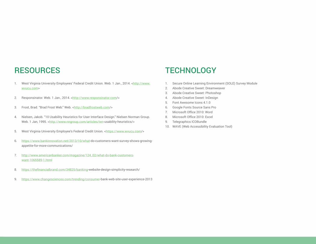
RESOURCES1. West Virginia University Employees’ Federal Credit Union. Web. 1 Jan., 2014. <http://www.
wvucu.com>
2. Responsinator. Web. 1 Jan., 2014. <http://www.responsinator.com/>
3. Frost, Brad. “Brad Frost Web.” Web. <http://bradfrostweb.com/>
4. Nielsen, Jakob. “10 Usability Heuristics for User Interface Design.” Nielsen Norman Group. Web. 1 Jan, 1995. <http://www.nngroup.com/articles/ten-usability-heuristics/>
5. West Virginia University Employee’s Federal Credit Union. <https://www.wvucu.com/>
6. https://www.bankinnovation.net/2013/10/what-do-customers-want-survey-shows-growing-appetite-for-more-communications/
7. http://www.americanbanker.com/magazine/124_02/what-do-bank-customers-want-1065589-1.html
8. https://thefinancialbrand.com/34825/banking-website-design-simplicity-research/
9. https://www.changesciences.com/trending/consumer-bank-web-site-user-experience-2013
TECHNOLOGY1. Secure Online Learning Environment (SOLE) Survey Module2. Abode Creative Sweet: Dreamweaver3. Abode Creative Sweet: Photoshop4. Abode Creative Sweet: InDesign5. Font Awesome Icons 4.1.06. Google Fonts Source Sans Pro7. Microsoft Office 2010: Word8. Microsoft Office 2010: Excel9. Telegraphics ICOBundle 10. WAVE (Web Accessibility Evaluation Tool)