Embed Size (px)
Citation preview
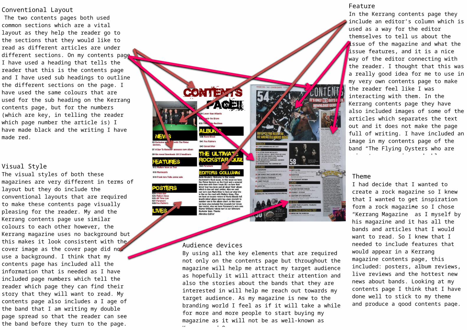
Visual StyleThe visual styles of both these magazines are very different in terms of layout but they do include the conventional layouts that are required to make these contents page visually pleasing for the reader. My and the Kerrang contents page use similar colours to each other however, the Kerrang magazine uses no background but this makes it look consistent with the cover image as the cover page did not use a background. I think that my contents page has included all the information that is needed as I have included page numbers which tell the reader which page they can find their story that they will want to read. My contents page also includes a I age of the band that I am writing my double page spread so that the reader can see the band before they turn to the page.
Conventional Layout The two contents pages both used common sections which are a vital layout as they help the reader go to the sections that they would like to read as different articles are under different sections. On my contents page I have used a heading that tells the reader that this is the contents page and I have used sub headings to outline the different sections on the page. I have used the same colours that are used for the sub heading on the Kerrang contents page, but for the numbers (which are key, in telling the reader which page number the article is) I have made black and the writing I have made red.
FeatureIn the Kerrang contents page they include an editor’s column which is used as a way for the editor themselves to tell us about the issue of the magazine and what the issue features, and it is a nice way of the editor connecting with the reader. I thought that this was a really good idea for me to use in my very own contents page to make the reader feel like I was interacting with them. In the Kerrang contents page they have also included images of some of the articles which separates the text out and it does not make the page full of writing. I have included an image in my contents page of the band “The Flying Oysters who are going to appear in my double page spread.
ThemeI had decide that I wanted to create a rock magazine so I knew that I wanted to get inspiration form a rock magazine so I chose “Kerrang Magazine” as I myself by his magazine and it has all the bands and articles that I would want to read. So I knew that I needed to include features that would appear in a Kerrang magazine contents page, this included: posters, album reviews, live reviews and the hottest new news about bands. Looking at my contents page I think that I have done well to stick to my theme and produce a good contents page.
Audience devicesBy using all the key elements that are required not only on the contents page but throughout the magazine will help me attract my target audience as hopefully it will attract their attention and also the stories about the bands that they are interested in will help me reach out towards my target audience. As my magazine is new to the branding world I feel as if it will take a while for more and more people to start buying my magazine as it will not be as well-known as Kerrang and Q.